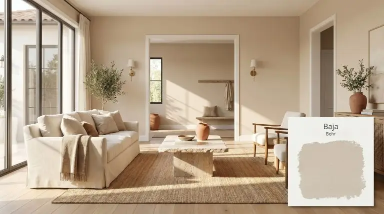
Behr Baja: Harnessing a Golden Sepia Beige for Sun-Baked, Custom-Feeling Spaces
You walk into a room painted in Behr Baja and immediately feel the visual temperature rise. This is not a flat, lifeless builder-grade neutral that fades quietly into the background. Instead, it acts as a highly intentional architectural finish that wraps the walls in a gentle, sun-baked warmth.
When you layer this golden sepia with the right tactile materials—think nubby boucle, raw travertine, and unlacquered brass—it fundamentally changes the energy of the house. Standard drywall suddenly feels richer, denser, and far more custom.
By understanding how this specific pigment interacts with natural light and surrounding hardwoods, you can use it to completely redefine the boundaries of your home.
Behr Baja: Temperature, Undertones & LRV
Behr Baja is a definitively warm neutral that instantly injects a room with a cozy, sunlit atmosphere. Understanding its exact color structure is the critical first step to pairing it correctly with your home’s existing hard finishes, flooring, and natural lighting.
With a light reflectance value (LRV) of 55, Behr PPU7-08 sits squarely in the mid-tone category. It absorbs a moderate amount of light, meaning it holds its chromatic profile beautifully without washing out in bright, open spaces. This specific LRV provides enough visual density to establish a room’s character without making it feel enclosed or heavy.
You can apply wallpapers, paints, etc. on walls and see how they look in various interiors.

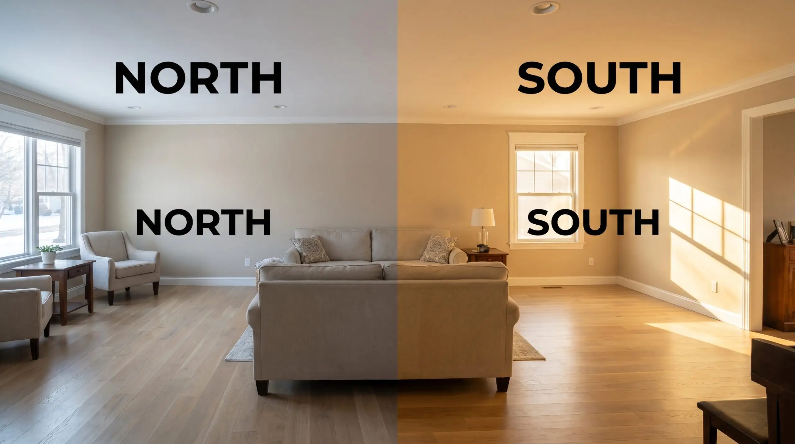
Lighting Effects: How the Hue Shifts Throughout the Day
A paint’s chromatic profile is never static, and this mid-tone beige is highly responsive to the temperature of the light hitting it.
Popular Room Applications for This Golden Sepia
Applying Behr PPU7-08 requires treating it as a foundational layer rather than just a simple background color. Because it carries such a distinct warmth, it dictates the styling and material pairings in every space it touches.
Refined Coastal Bedrooms
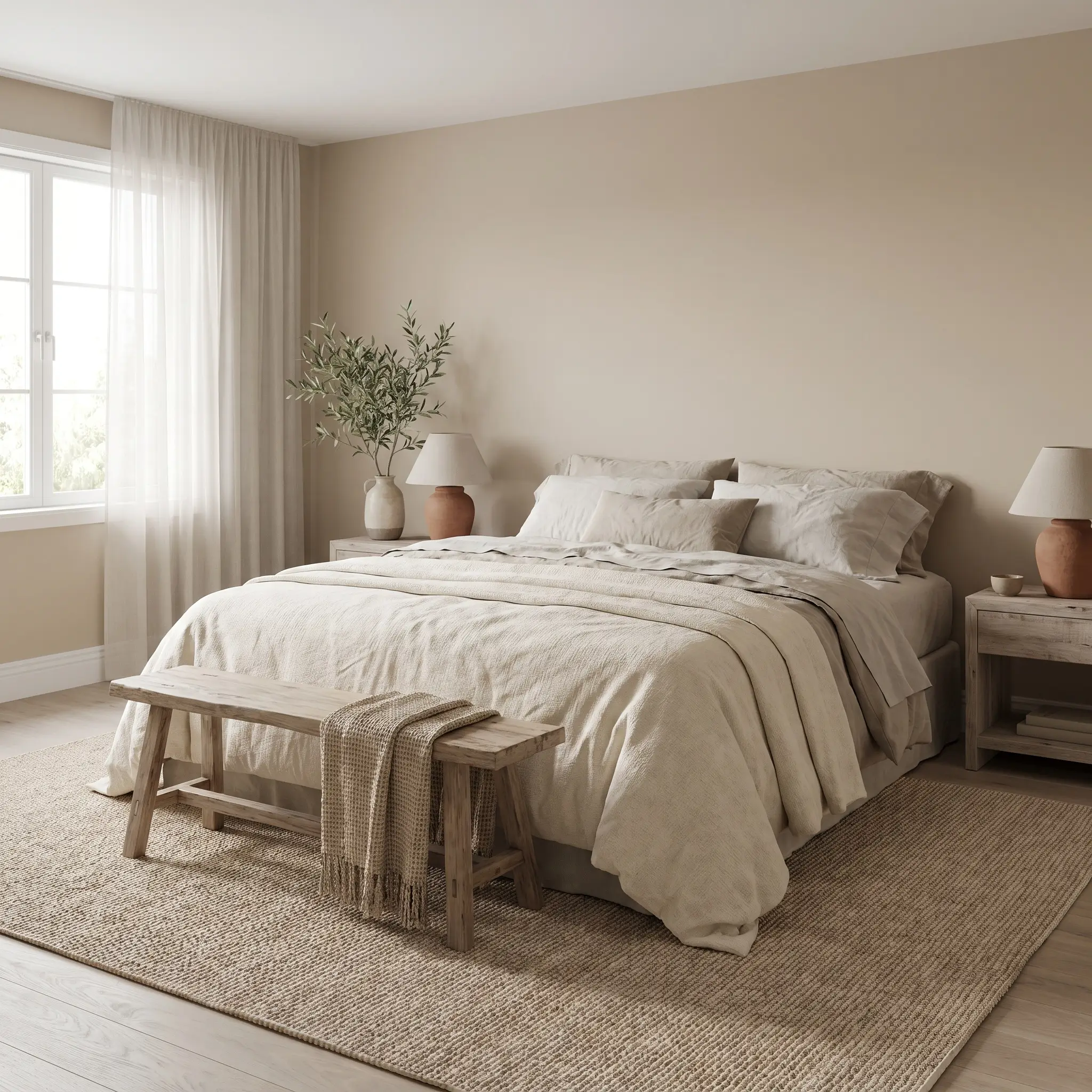
Do not mistake “coastal” for predictable seashell motifs or distressed nautical signs. When applied to bedroom walls, this sandy beige creates a sophisticated, Mediterranean-inspired retreat. The golden undertones beautifully mimic the warmth of sun-warmed stone, establishing a deeply restful environment for winding down at night.
To maximize this aesthetic, lean into highly tactile, organic textiles. Layer the bed with washed linen sheets, a heavy cotton canvas duvet, and sheer voile window treatments that softly filter the morning light. Ground the room with a large sisal or jute rug to echo the earthy nature of the paint.
When working with Baja, be highly strategic with your bedroom furniture. Avoid yellow-toned woods (like clear pine or golden oak), as they will aggressively compete with the paint’s yellow-orange hue. Instead, opt for rift-sawn white oak or deeply saturated walnut to create intentional, beautiful contrast.
Hackrea Pro-Tip (The Wood Tone Rule)
Open-Concept Living Rooms
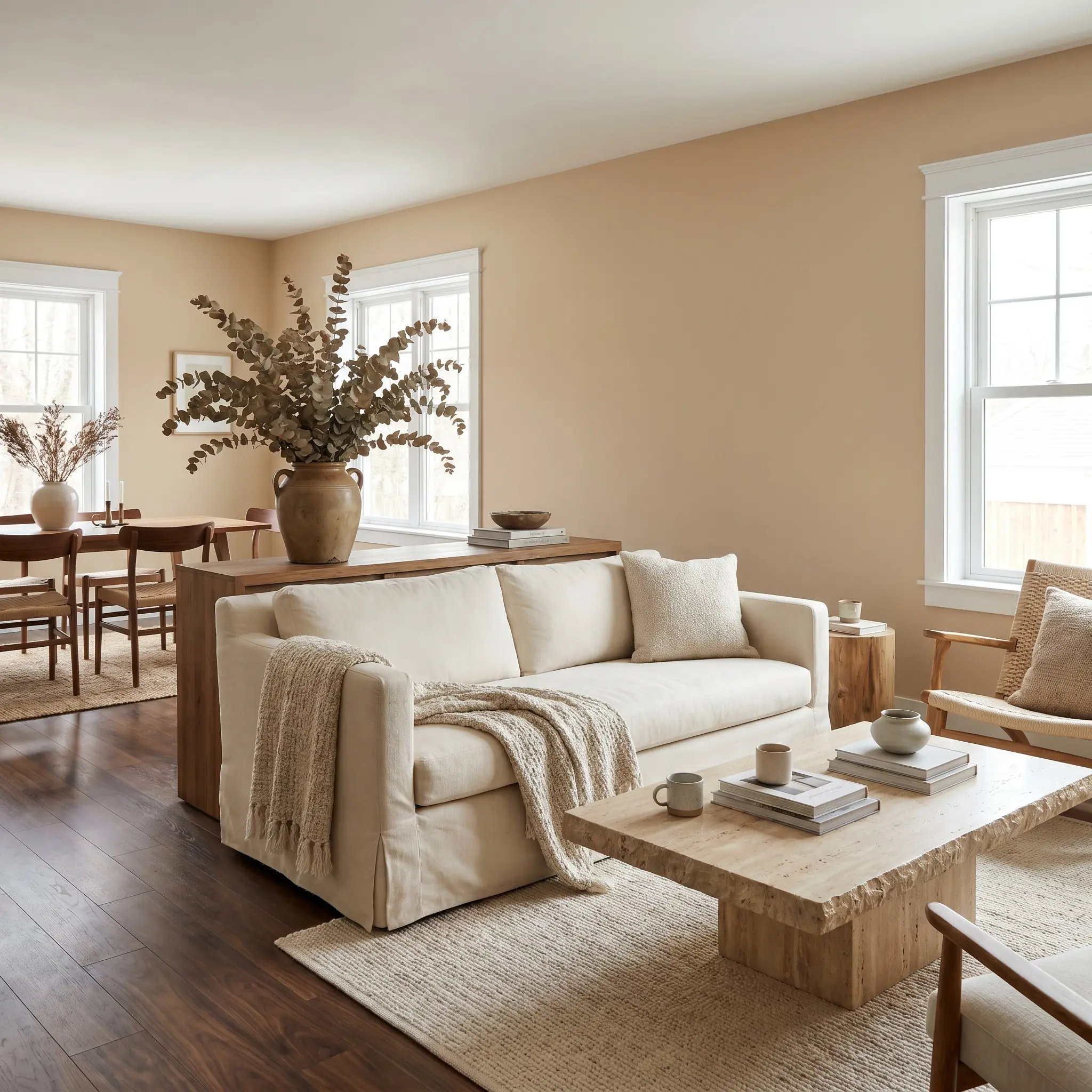
In large, open-concept suburban homes, stark white walls can often feel cold and cavernous. Wrapping the entire main living area in this warm neutral instantly pulls the walls inward, making expansive floor plans feel connected and intimate. The mid-tone LRV ensures the space retains its brightness while adding crucial visual texture.
Style these living rooms with a nod toward Organic Modernism. Pair the golden sepia walls with a relaxed, ivory slipcovered sofa and a raw travertine coffee table. Introduce oversized botanical branches in vintage pottery to break up the vast wall space and bring life into the room.
Kitchen Cabinetry
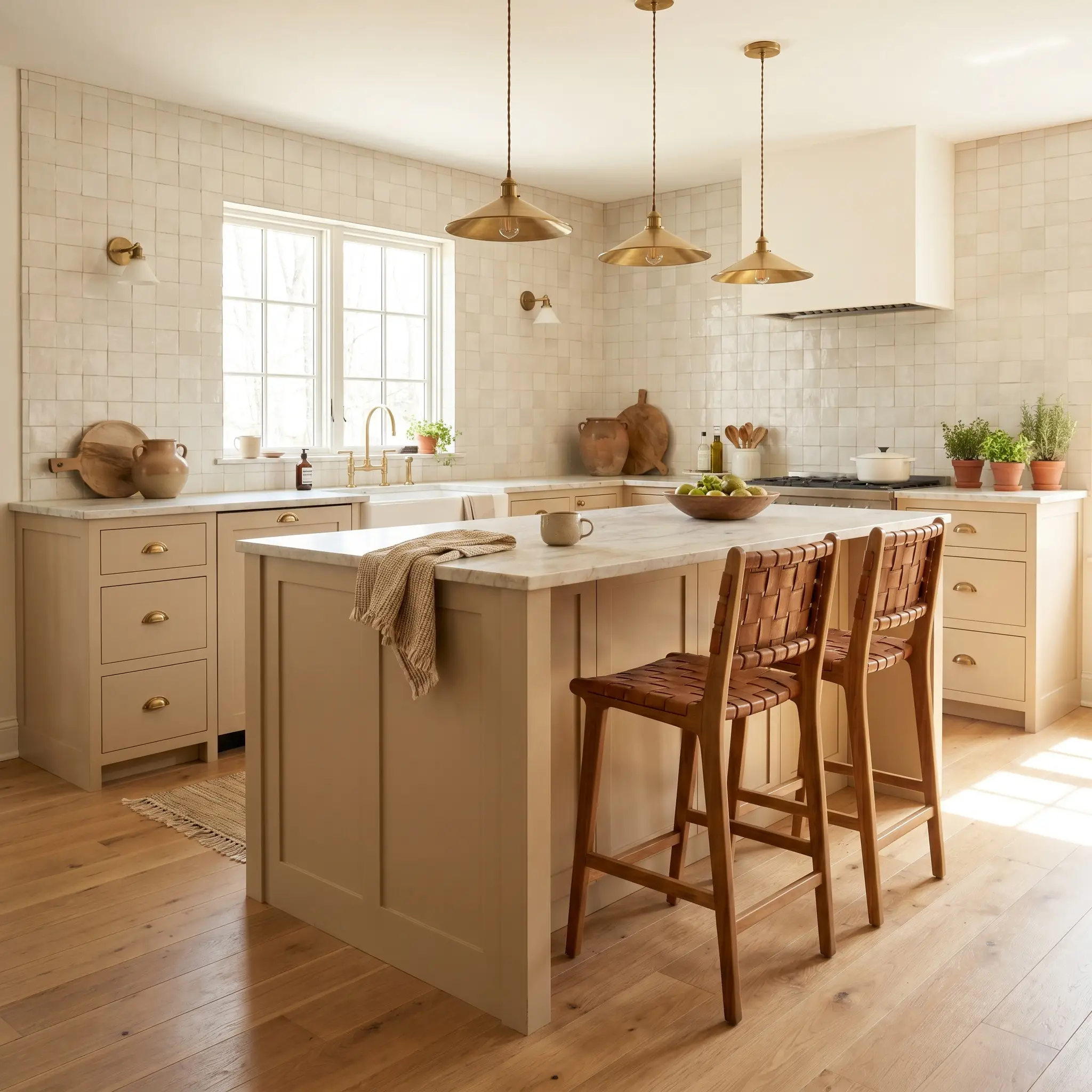
Painting outdated kitchen cabinets in this sun-baked beige is a highly effective way to completely modernize the heart of the home. It offers a softer, more inviting alternative to stark white kitchens while remaining incredibly versatile. When applied to lower cabinets or a central island, it grounds the room with a rich, custom-built energy.
Pair the freshly painted cabinetry with honed marble or dark soapstone countertops for a stunning tactile collision. Install unlacquered brass drawer pulls and cabinet latches; the living finish of the brass will age beautifully alongside the sepia tones.
Never pair this golden beige with cool, blue-toned gray backsplashes or stark white subway tiles with heavy black grout. The cool undertones of the gray will actively fight the warm peach and yellow-orange micro-nuances in the paint, resulting in a visually confusing, muddy kitchen. Stick to creamy zellige tiles or warm, off-white ceramics.
Clash Warning (The Gray Backsplash)
Hallways and Transitional Spaces
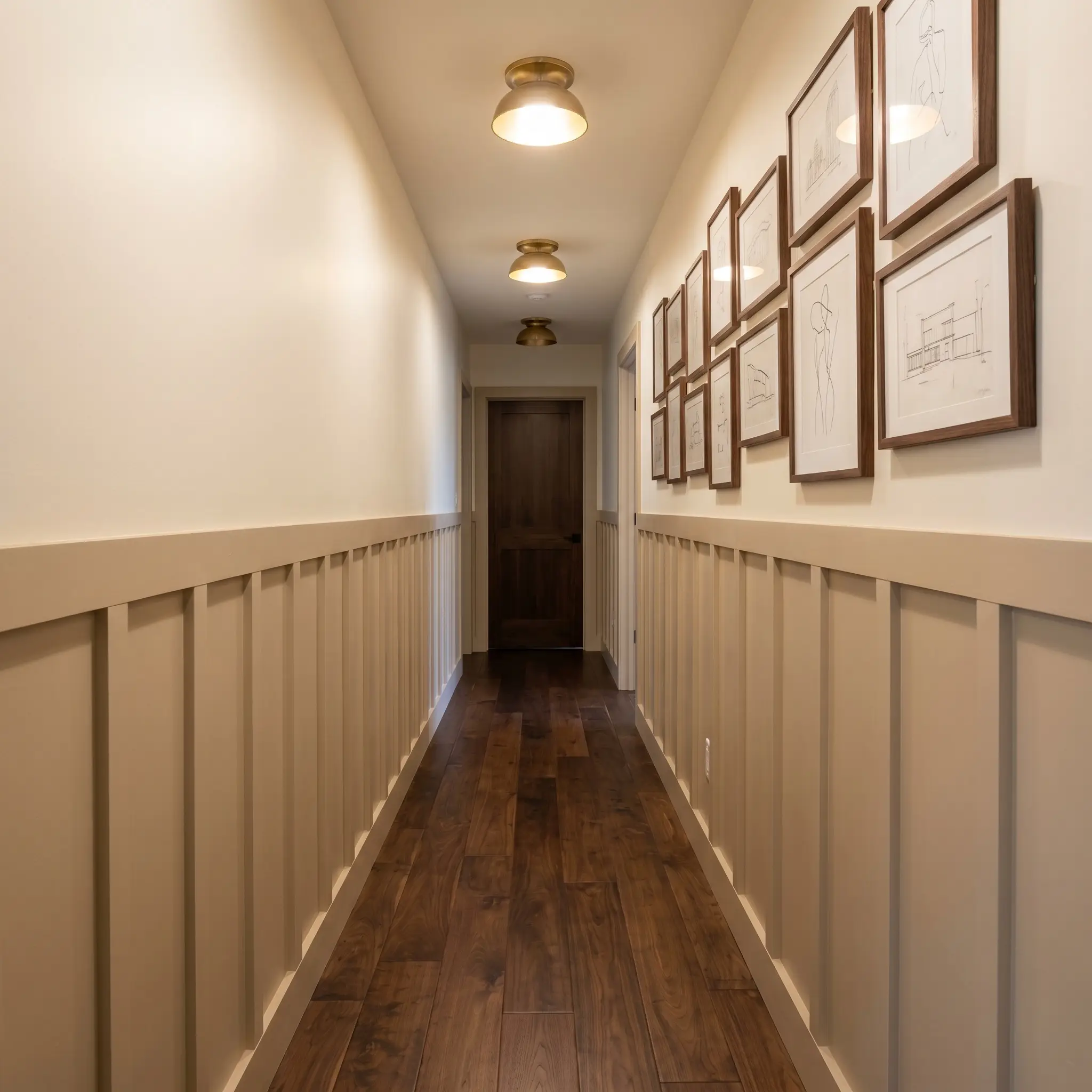
Hallways are notoriously deprived of natural light, often relying entirely on ambient lighting. Instead of fighting the shadows with a sterile white, lean into the warmth. Applying this color to hallway walls creates a glowing, welcoming corridor that connects the different wings of the house.
For a highly tailored look, install board and batten or picture frame molding along the lower half of the hallway. Paint the millwork in Behr Baja and pair it with a soft, creamy white on the upper walls. Finish the space with an asymmetrical gallery wall featuring minimalist line art and architectural sketches.
Warm Exterior Trim
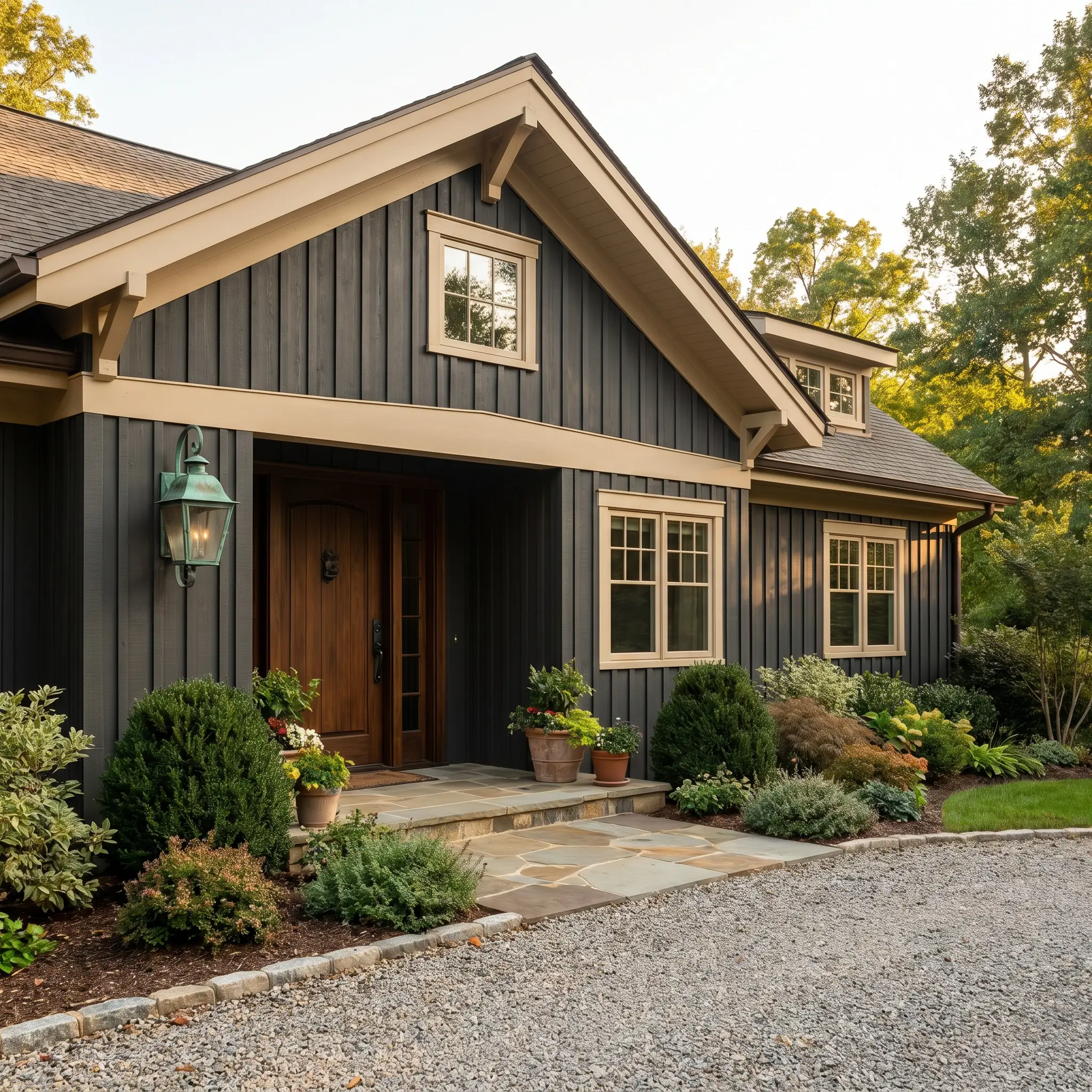
When taken outside, the intense natural sunlight will slightly wash out the color, pulling its LRV higher. However, it remains a brilliant choice for exterior trim, window sashes, and rooflines. It provides a softer, more historically rooted framing option than a harsh, bright white.
Use this coastal tan to frame windows against a dark charcoal or olive green exterior siding. The contrast is sharp but earthy, giving the facade a beautifully curated, intentional curb appeal. Complete the exterior styling with oxidized copper sconces flanking the front door.
Coordinating Colors & Material Pairings for Behr Baja
This warm neutral demands surrounding finishes that either ground its sunny disposition or cleanly carve out its boundaries. Because the pigment naturally radiates warmth, it relies on crisp, structural contrast to prevent the room from feeling overly soft or formless.
Tailored Trim & Baseboards
Hardware, Wood & Material Pairings
Curated Color Palette
Designer Mood Boards
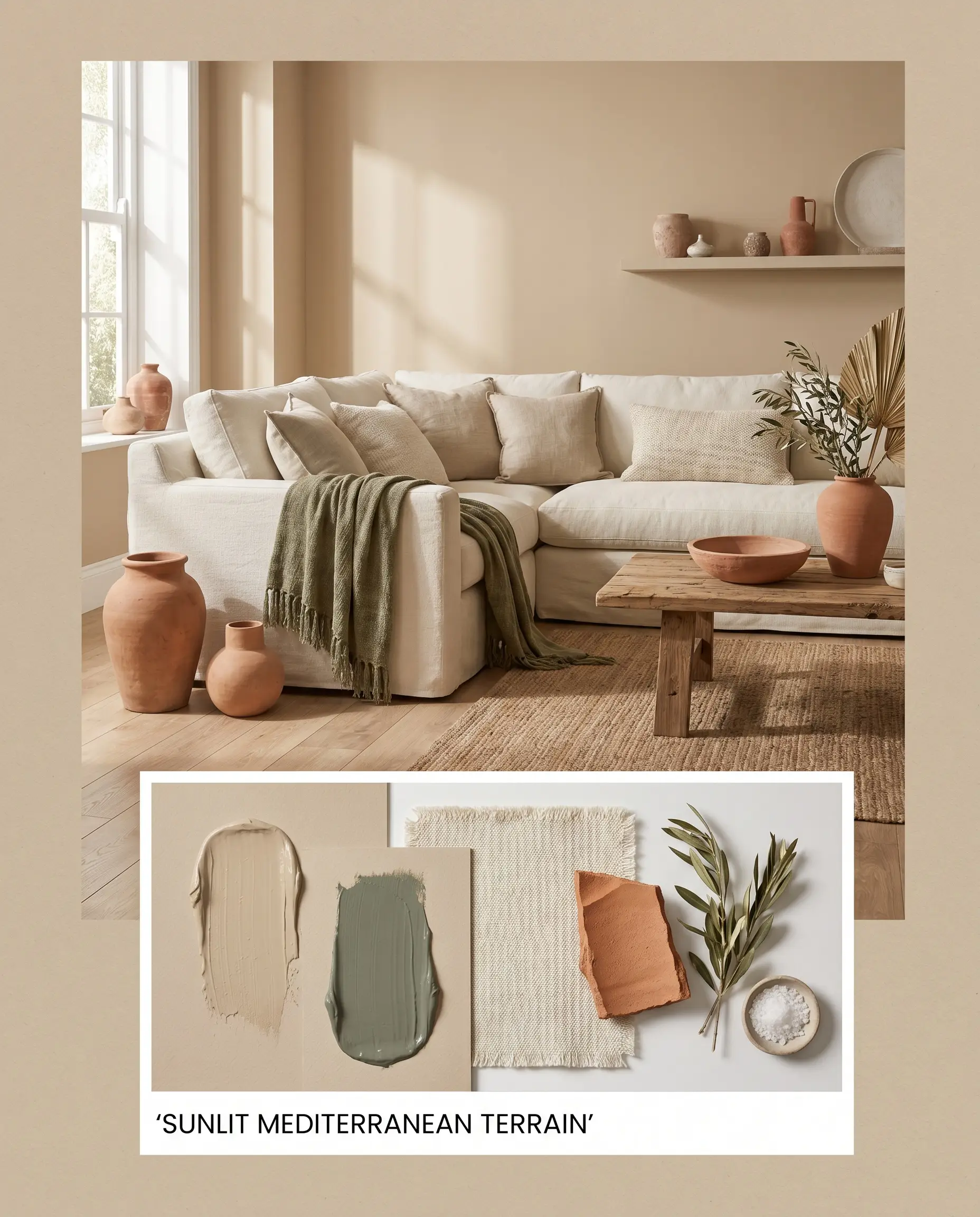
Sunlit Mediterranean Terrain: This palette captures the relaxed, deeply tactile energy of a late afternoon along a rugged coastline. By pairing the golden sepia walls with thick cotton canvas upholstery and raw terracotta accents, the environment feels instantly grounded and restorative. Layering in accents of Farrow & Ball Green Smoke introduces an earthy, stabilizing tension against the warm walls. The resulting atmosphere is unpretentious yet incredibly rich, relying on raw textures rather than high-gloss finishes to create visual interest.
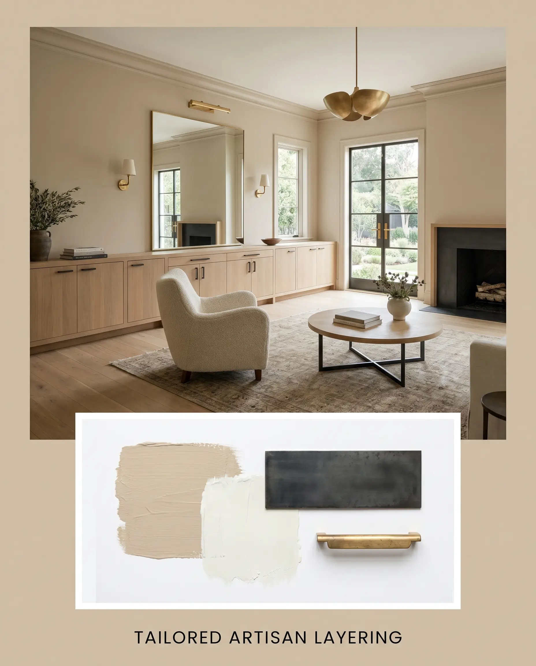
Tailored Artisan Layering: This aesthetic leverages sharp, intentional contrast to modernize the warm beige foundation. The introduction of blackened steel hardware cuts cleanly across the soft walls, giving the space a decisive, architectural edge. Grounding the floor plan with rift-sawn white oak ensures the room retains an organic warmth without leaning into rustic clichés. When illuminated by warm ambient lighting, the unlacquered brass fixtures softly echo the wall’s hidden peach undertones, building a quiet, sophisticated luxury.
Head-to-Head Paint Comparisons
Choosing the right neutral often comes down to the specific lighting conditions and architectural exposures of your home. If your space lacks natural light or features prominently competing wood tones, you may need a hue that leans slightly cooler or carries a different light reflectance value.
Behr Baja vs. Behr Aged Beige PPU7-09
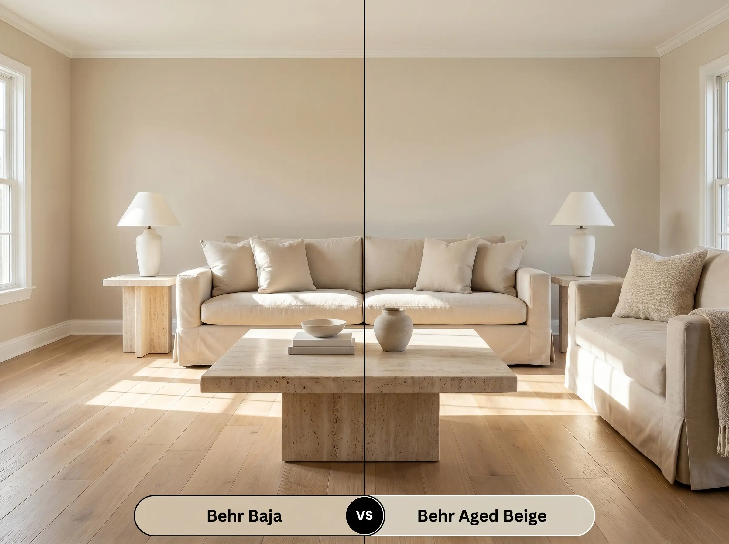
Aged Beige is slightly deeper and strips away the pronounced golden energy found in Baja. If your room receives intense, direct southern light, then Aged Beige is often the safer choice to prevent the walls from glowing too yellow. However, if you want to actively warm up a chilly, north-facing space, Baja provides the necessary visual heat.
Behr Baja vs. Sherwin-Williams Sand Beach SW 7529
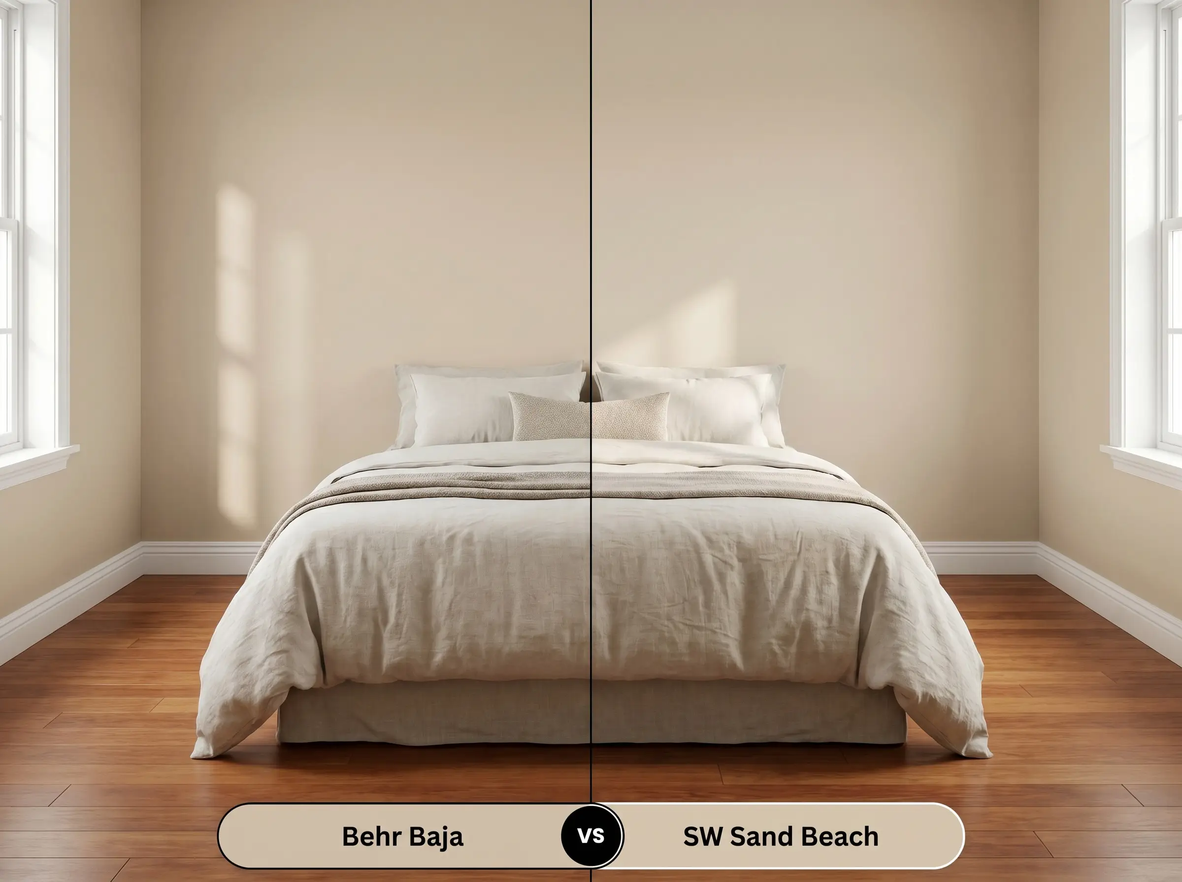
Sand Beach carries a more muted, traditional tan profile, dialing back the vibrant peach micro-nuances. If you are working with existing warm-toned flooring like cherry or mahogany, then Sand Beach creates a more neutral, forgiving backdrop. Conversely, Baja offers a much more saturated, custom-feeling color structure for homes with neutral or dark-stained floors.
Behr Baja vs. Benjamin Moore Shaker Beige HC-45
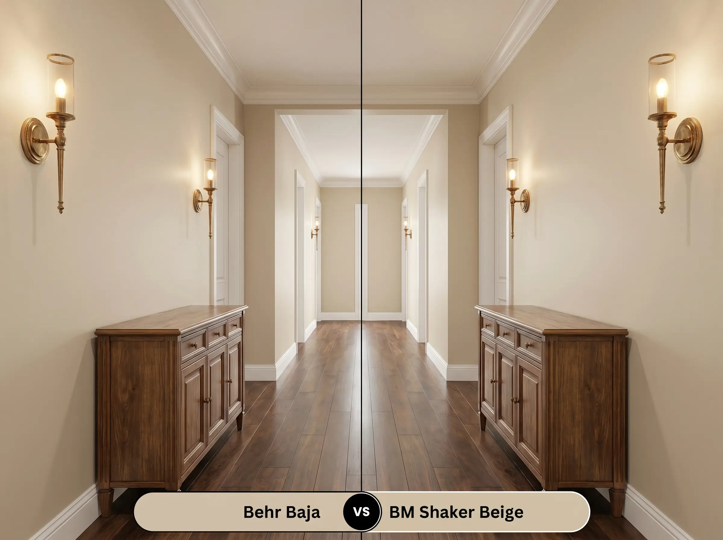
Shaker Beige is a classic, highly adaptable neutral that leans slightly more toward a true beige, whereas the Behr option naturally radiates a yellow-orange hue. If you are aiming for a strictly traditional or transitional aesthetic, then Shaker Beige offers unparalleled predictability. Baja, however, excels in organic modern spaces that demand a more vibrant, sun-baked personality.
Similar Colors & Alternative Brand Matches
Sometimes a color profile is nearly perfect, but you need a slight adjustment in depth or a direct match from a different manufacturer to accommodate your painter’s preferences.
Closest Same-Brand Alternatives
Cross-Brand Color Equivalents
Practical Application & DIY Advice for Behr PPU7-08
Moving from color theory to application requires a strict understanding of how this pigment behaves on the roller.
The Dynamic Sheen Guide
Primer Strategy
This mid-tone beige requires a high-quality, white acrylic primer to ensure the yellow-orange hue develops accurately. Skipping primer over dark or richly saturated walls will cause the underlying colors to muddy the delicate peach micro-nuances.
Coverage & Success Tips
Expect to apply two full coats to achieve a truly opaque, professional finish. Because this color carries a moderate LRV of 55, it is highly susceptible to “flashing”—visible, uneven roller marks caused by inconsistent pressure or stretching the paint too thin. Always maintain a wet edge while rolling, and never go back over partially dried sections, as touch-ups on this specific warmth level will visibly stand out.
Frequently Asked Questions
Because of its moderate LRV and golden sepia base, this color performs beautifully on textured stucco. The high-UV sunlight will slightly wash out the intensity, pulling it closer to a soft, sun-baked sand rather than a stark, blinding white.
The yellow-orange undertones in this paint can actively compete with the strong pink and red tones found in un-stained red oak. To ensure a cohesive look, it is best to pair this wall color with neutral white oak, dark walnut, or floors treated with a neutralizing stain.
Under cool 4000K lighting, the vibrant peach and golden micro-nuances are immediately flattened out. The paint will lose its sunlit energy and shift into a much flatter, conventional tan, making it crucial to swap your bulbs to 3000K if you want to maintain the intended warmth.
When applied to cabinetry, the color looks incredibly rich and intentional, provided you control the surrounding finishes. Pairing the painted cabinets with crisp white countertops and matte black hardware will ground the warmth and prevent the yellow undertones from dominating the room.
Final Verdict: Is This Golden Sepia Right for You?
Behr Baja is an exceptional architectural tool for homeowners looking to inject a sun-baked, organic warmth into their spaces. It is perfectly suited for organic modern, Mediterranean, and tactile coastal designs where its vibrant, sandy beige profile can anchor natural textures. When paired with the right high-contrast metals and crisp white trim, it transforms standard drywall into a highly intentional, premium-feeling backdrop.
While this color is incredibly versatile, you must actively avoid using it in homes dominated by cool, blue-toned gray finishes. If you attempt to pair this radiating golden beige with prominently veined Carrera marble, cool gray luxury vinyl plank flooring, or icy blue furnishings, the underlying color structures will actively reject each other. The coolness of the gray will visually pull the yellow-orange hue out of the paint, making the walls look sickly and muddy, while the gray finishes will appear stark and uninviting. Instead, reserve this paint for environments rich in warm woods, earthy stones, and creamy textiles where its natural warmth can be celebrated.
Clash Warning (The Cool Gray Conflict)