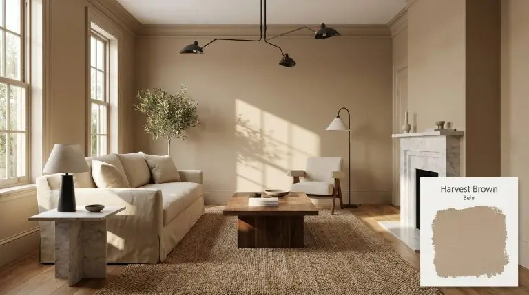
Behr Harvest Brown (710D-4) is a medium-light, warm brown with a distinct golden-beige cast and subtle khaki undertones. With an LRV of 39, it provides cozy, earthy depth without becoming overly dark, making it an excellent choice for rustic interiors and craftsman exteriors.
Designing with Behr Harvest Brown: The Earthy Caramel Redefining Everyday Spaces
True architectural warmth rarely comes from stark white walls or flat, predictable neutrals. When you want a room to feel intentionally designed and structurally sound, you need a color that visually wraps the space in a tangible, tactile layer. Behr Harvest Brown provides exactly that kind of foundational stability.
This muted architectural finish acts less like a simple coat of paint and more like a rich, structural material imported straight from nature. It establishes an immediate sense of history and permanence, turning standard drywall into a curated backdrop for everyday life.
By leaning into an earthy chromatic profile, Harvest Brown secures a room without making it feel enclosed or shadowed. It is the ultimate tool for homeowners looking to inject a sophisticated, sun-baked warmth into their living spaces while maintaining a highly adaptable canvas for furnishings.
Behr Harvest Brown: Temperature, Undertones & LRV
If you are wondering whether this paint leans warm or cool, Harvest Brown is definitively and unapologetically warm. It operates within the yellow-orange spectrum, projecting a robust, welcoming energy that immediately stabilizes a room.
To understand how this color will actually behave on your walls, we have to look at its underlying structure:
Sitting at a medium-light reflectance with an LRV of 39, this rustic brown base absorbs a significant amount of incoming light. This means the color visually pulls the walls slightly inward, creating a highly enveloping, cozy atmosphere. Because it sits comfortably in the middle of the light-reflectance scale, it avoids reading as a dark, shadowy cavern in well-lit spaces while still providing substantial visual presence.
You can apply wallpapers, paints, etc. on walls and see how they look in various interiors.

Lighting Effects & The Chameleon Factor
Because Harvest Brown features low-to-moderate chroma, its hidden khaki and golden layers are highly reactive to the shifting temperature of the sun. You must anticipate how your room’s natural and artificial lighting will manipulate this color throughout the day.

When using this paint on an exterior facade, remember that direct, unobstructed sunlight dramatically increases light reflectance. Outdoors, Harvest Brown will lose a portion of its perceived depth, reading noticeably lighter and slightly more beige than it does on an interior swatch.
Hackrea Pro-Tip (The Exterior Washout Rule)
Popular Applications for Harvest Brown
The beauty of a medium-depth, earthy color is its ability to transition seamlessly between highly utilitarian workspaces and spaces designed purely for rest. By manipulating the finishes and textures around it, you can push this warm beige in entirely different stylistic directions.
Rustic Kitchen Cabinetry
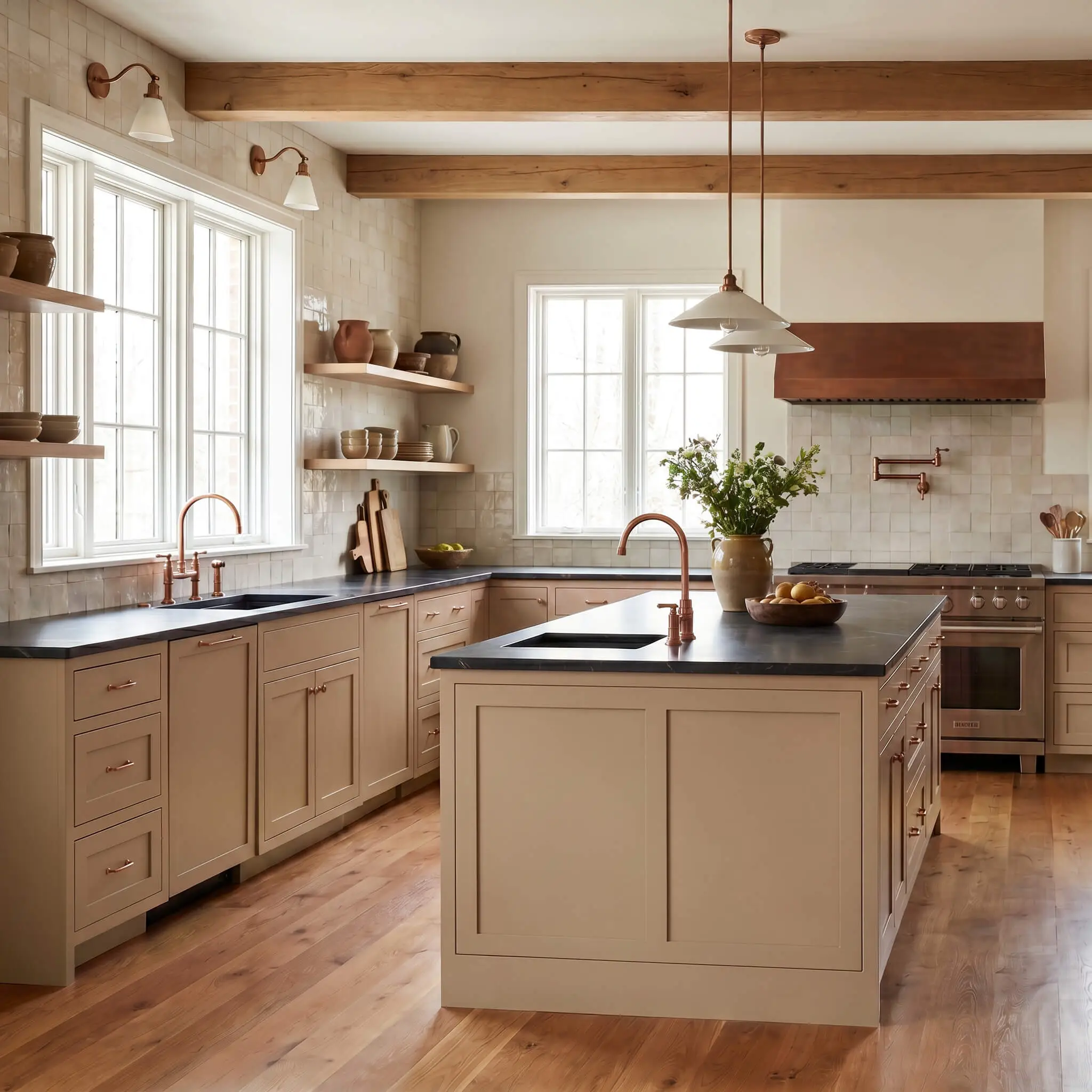
Applying this color to kitchen cabinetry instantly moves the heart of the home away from the clinical feel of stark white kitchens. While the color naturally leans rustic, you can easily pull it into a refined, transitional European farmhouse aesthetic by pairing it with the right hardware.
Focus the application on lower cabinets or a central island, pairing the earthy base with honed soapstone countertops and unlacquered copper fixtures. The metallic warmth of the copper beautifully echoes the paint’s golden sepia undertone. To keep the space feeling open, use a textured, creamy zellige tile for the backsplash to bounce light around the room.
Avoid pairing this paint with cool, stark white marbles that feature heavy gray or blue veining. The strict, icy tones of the stone will fiercely clash with the warm, yellow-orange spectrum of the cabinets, making the paint look dirty rather than intentional.
Clash Warning (Countertop Pairings)
Cozy, Enveloping Living Rooms
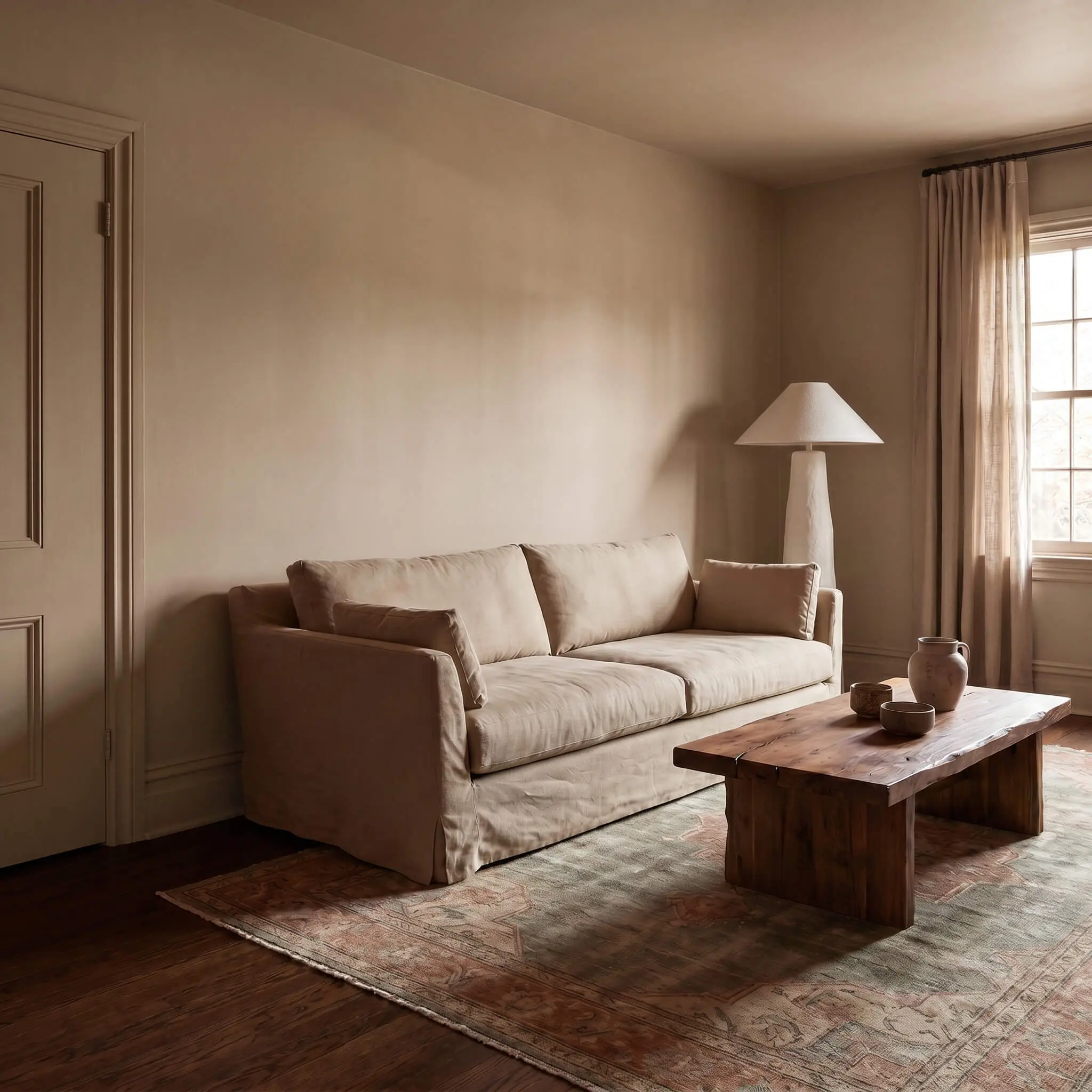
For living spaces meant for evening unwinding, use this color to visually lower the ceiling and pull the walls inward. Consider a full color-drenching approach, painting the walls, baseboards, and interior doors in the same shade to create a seamless, uninterrupted wrap of color.
This application serves as a stunning backdrop for tactile, 1970s-inspired organic modern styling. Introduce heavy canvas slipcovered sofas, a brutalist walnut coffee table, and sculptural plaster lamps to build layers of texture. The low-to-moderate chroma of the walls allows you to introduce secondary colors like dusty sage or muted terracotta through layered vintage rugs without overwhelming the eye.
Craftsman Exterior Siding & Trim
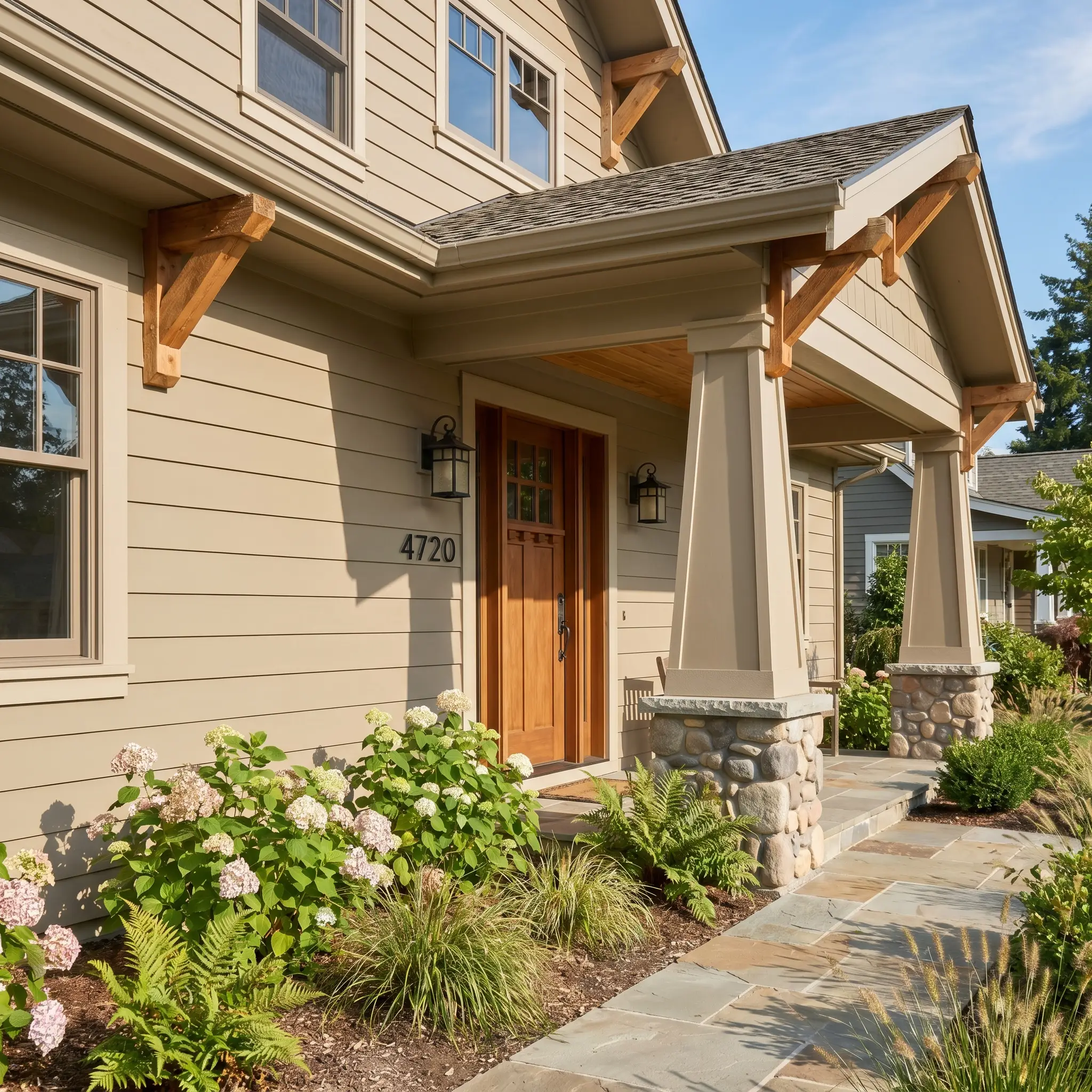
On an exterior facade, this color roots the architecture firmly into the surrounding landscape. While it is a classic choice for traditional Craftsman homes with wide-plank siding and tapered columns, it is equally effective for updating mid-century split-levels or standard suburban transitional exteriors.
Use it as the primary siding color to establish a warm, welcoming curb appeal. Ground the soft beige cast by pairing it with high-contrast, structural accents. Matte black iron house numbers, blackened bronze light fixtures, and raw cedar architectural corbels will sharpen the soft edges of the paint, giving the exterior a tailored, custom-built finish.
Mudrooms & Transitional Entryways
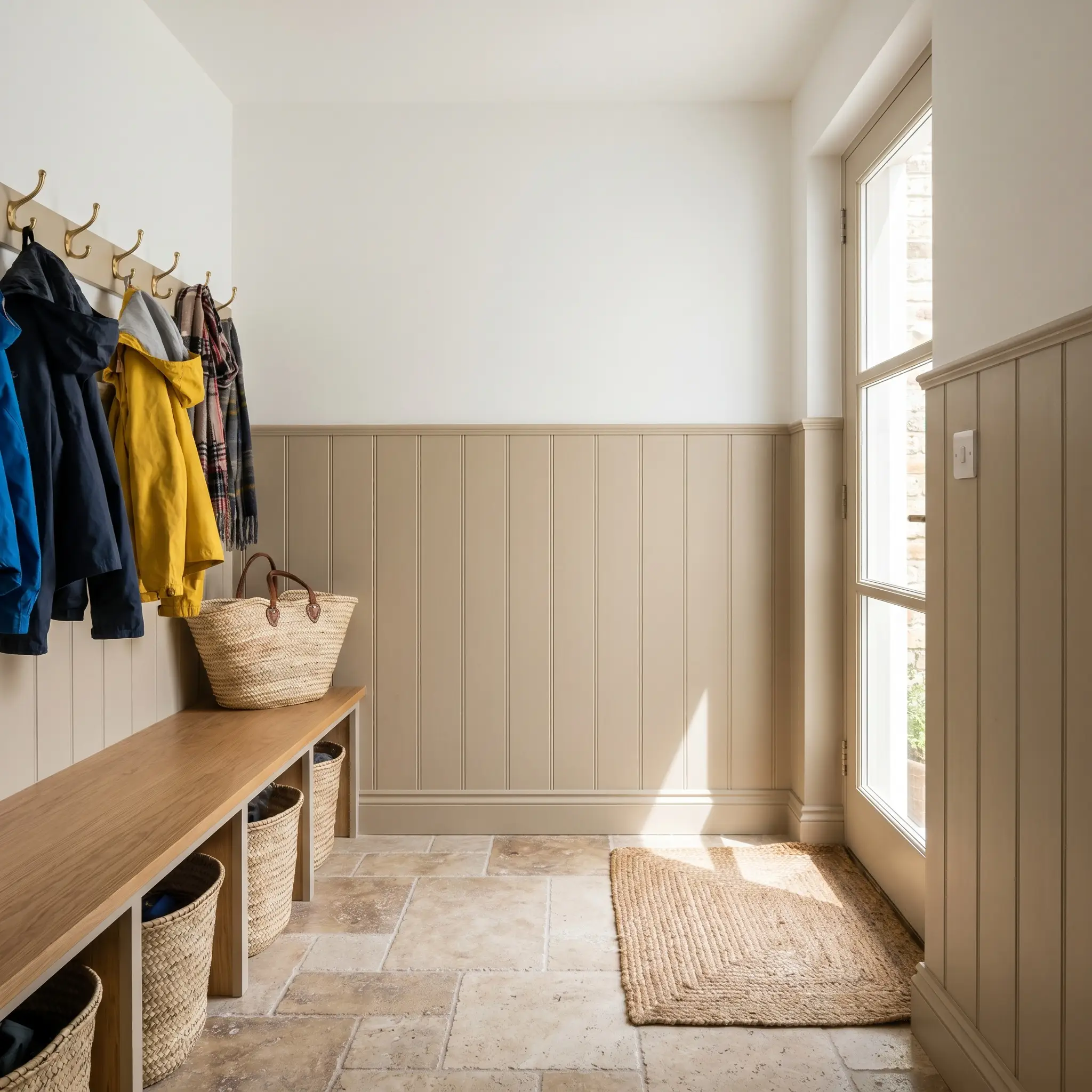
Utilitarian drop zones often suffer from a lack of design intention, but a saturated color instantly gives these small spaces a distinct personality. Installing vertical shiplap or traditional beadboard halfway up the wall provides a durable, scuff-resistant surface for busy households.
Paint the millwork in Harvest Brown using a satin or semi-gloss finish to highlight the khaki structure of the color. Above the millwork, use a subtle ticking stripe wallpaper or a crisp off-white paint to maintain a sense of height. Finish the space with tumbled travertine or dark slate floors, woven baskets, and brass coat hooks to create a highly functional, beautifully styled entryway.
Curating the Palette & Material Pairings
This earthy chromatic profile requires highly intentional surrounding elements to thrive, actively absorbing the textures placed next to it rather than sitting flatly on the wall. Soft tonal bleeds create a deeply serene, immersive atmosphere, while high-contrast boundaries sharpen the color into a tailored, structural backdrop.
Tailored Millwork & Baseboards
Tactile Finishes & Hardware
Secondary Color Integration
Curated Room Concepts
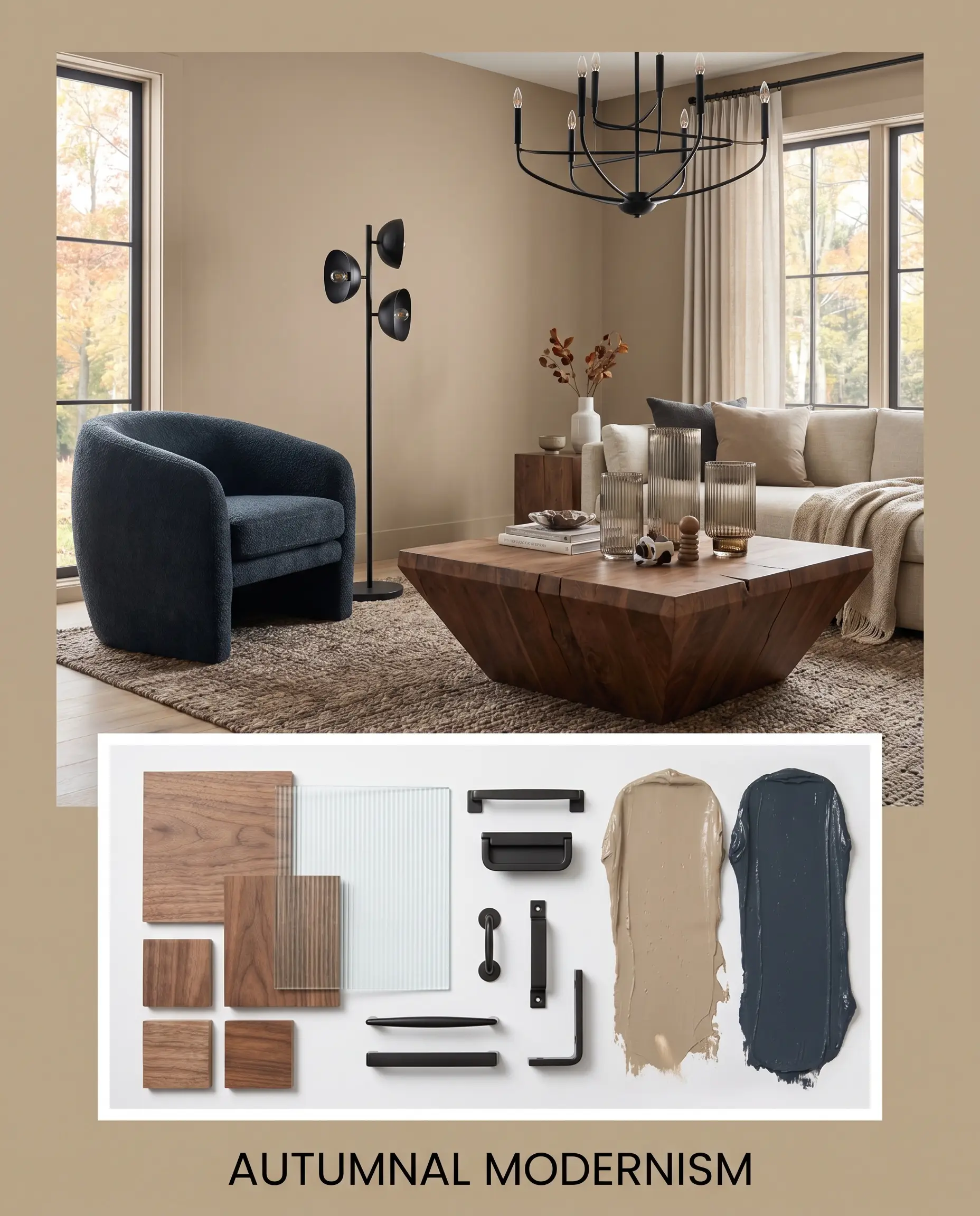
Autumnal Modernism This aesthetic leverages the structural weight of the paint to anchor mid-century silhouettes and crisp, tailored finishes. The walls serve as a warm beige backdrop for a brutalist walnut coffee table, matte black iron lighting fixtures, and deeply saturated accents of Sherwin-Williams Naval SW 6244. By incorporating fluted glass elements and subtle geometric prints, the earthy base sheds its rustic stereotype and adopts a highly refined, curated energy.
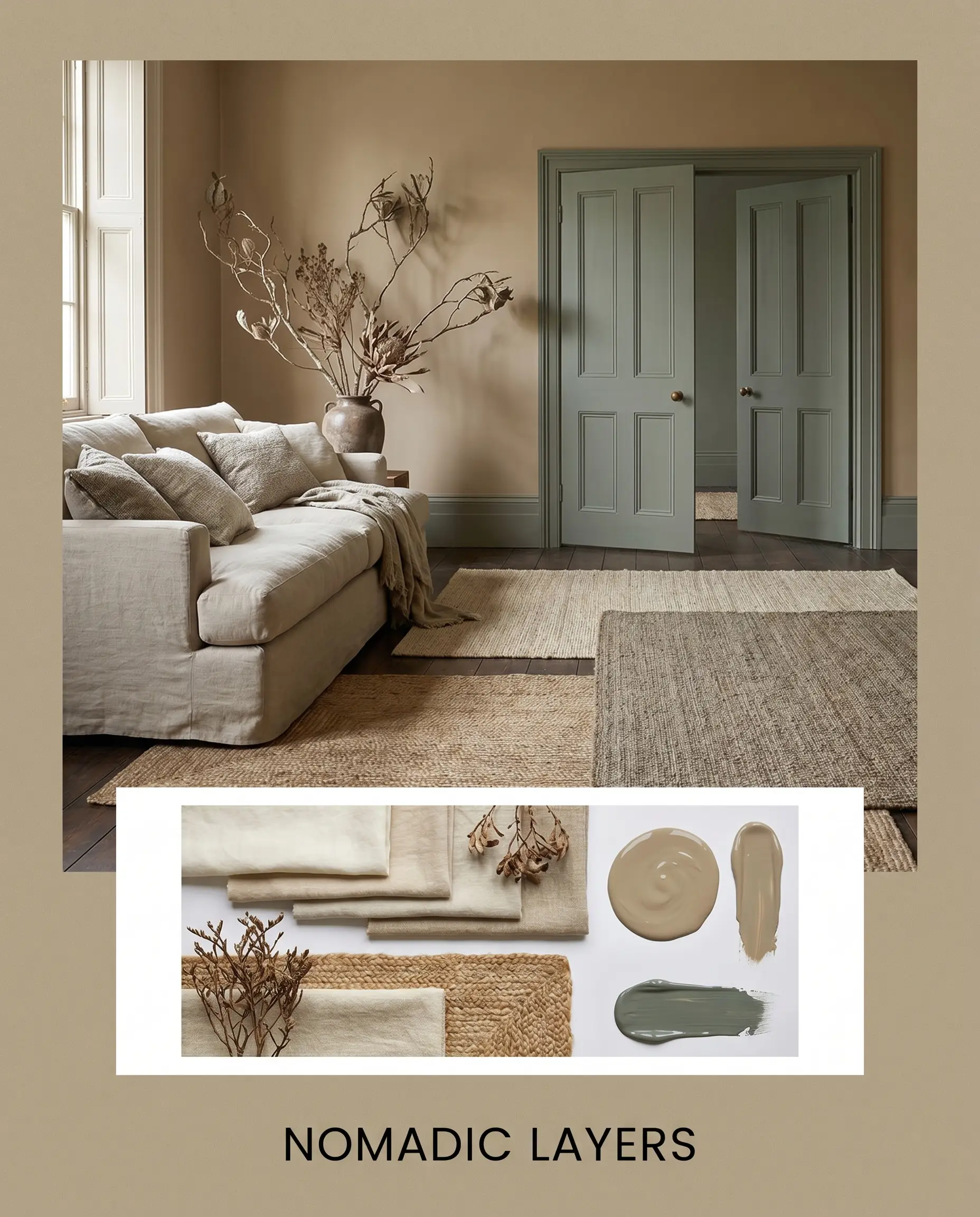
Nomadic Layers Focusing entirely on tactile comfort, this approach embraces the paint’s golden sepia undertone through a heavy reliance on organic textures. Washed linen textiles, layered jute rugs, and oversized asymmetrical branches build a deeply immersive, globally inspired atmosphere. The introduction of Farrow & Ball Green Smoke No. 47 on interior doors or painted built-ins completes the look, resulting in a space that feels collected, deeply rooted, and effortlessly relaxed.
Comparing Behr Harvest Brown to Industry Rivals
While this rich beige excels in sunlit, organic spaces, specific lighting conditions or existing architectural hard finishes might require a subtle shift in tone. Understanding how this color behaves against its direct competitors will help you navigate tricky exposures and prevent unwanted undertones from taking over your room.
Behr Harvest Brown vs. Behr Baja PPU7-08
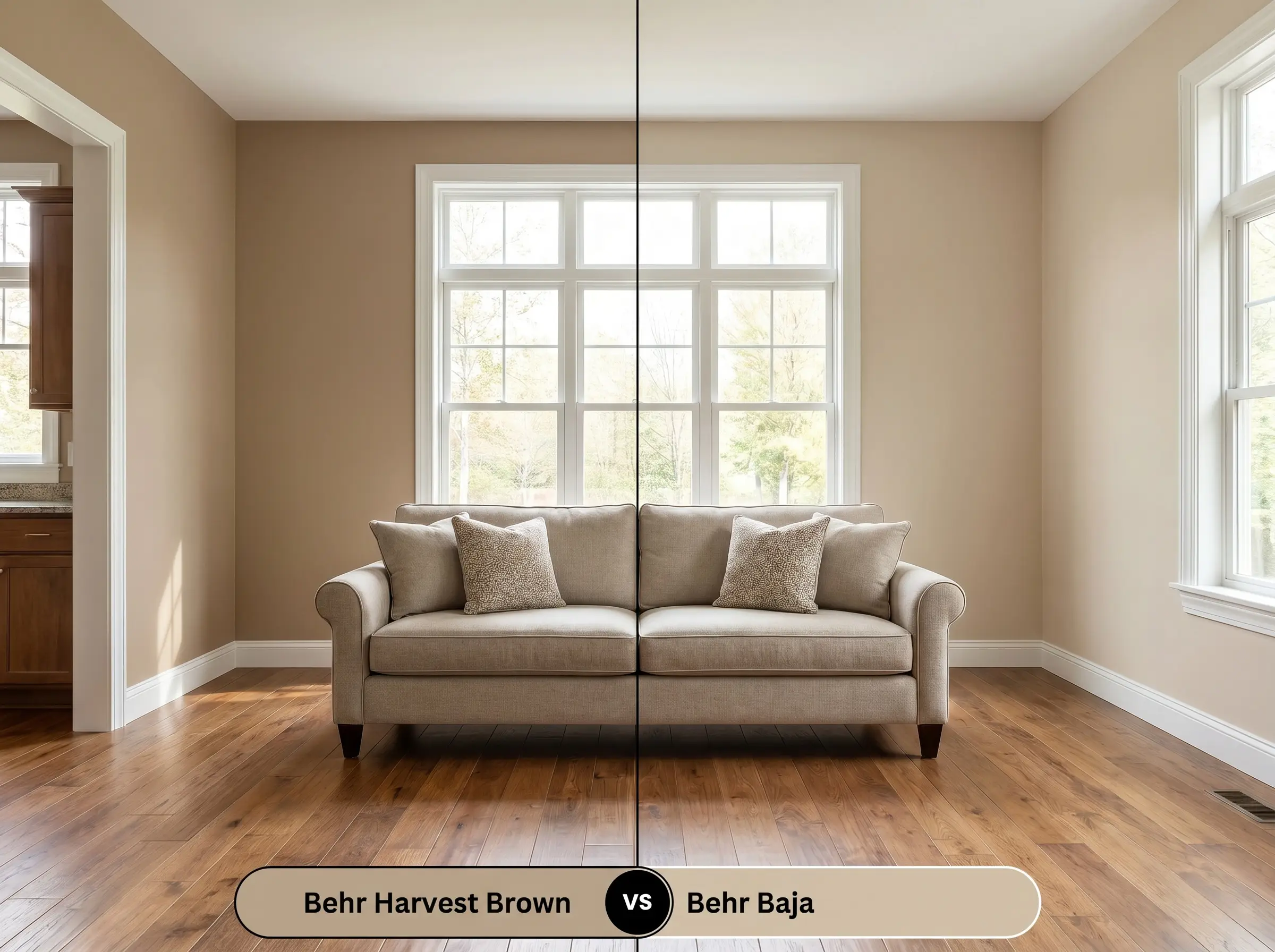
If your room lacks natural light and feels overly shadowed, then Behr Baja PPU7-08 is the better choice. Baja provides a significantly higher light reflectance, offering a lighter, breezier canvas while sacrificing the deep, enveloping structure of the darker hue.
Behr Harvest Brown vs. Sherwin-Williams Universal Khaki SW 6150
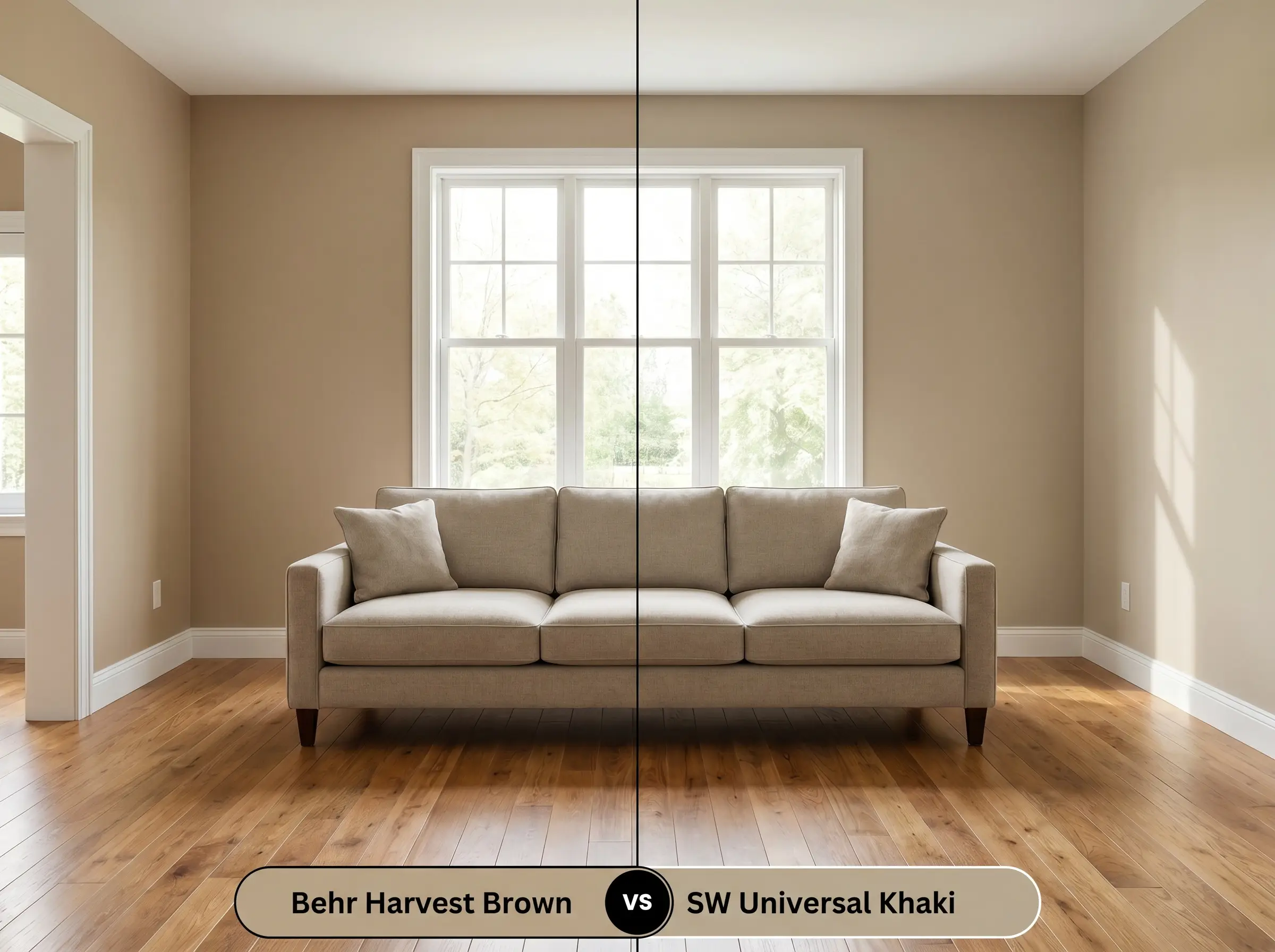
If your existing flooring features strong yellow or orange tones, then Sherwin-Williams Universal Khaki SW 6150 will provide better balance. Universal Khaki carries a stronger, more pronounced green undertone that actively neutralizes competing warm woods, whereas the Behr option might amplify them.
Behr Harvest Brown vs. Benjamin Moore Shaker Beige HC-45
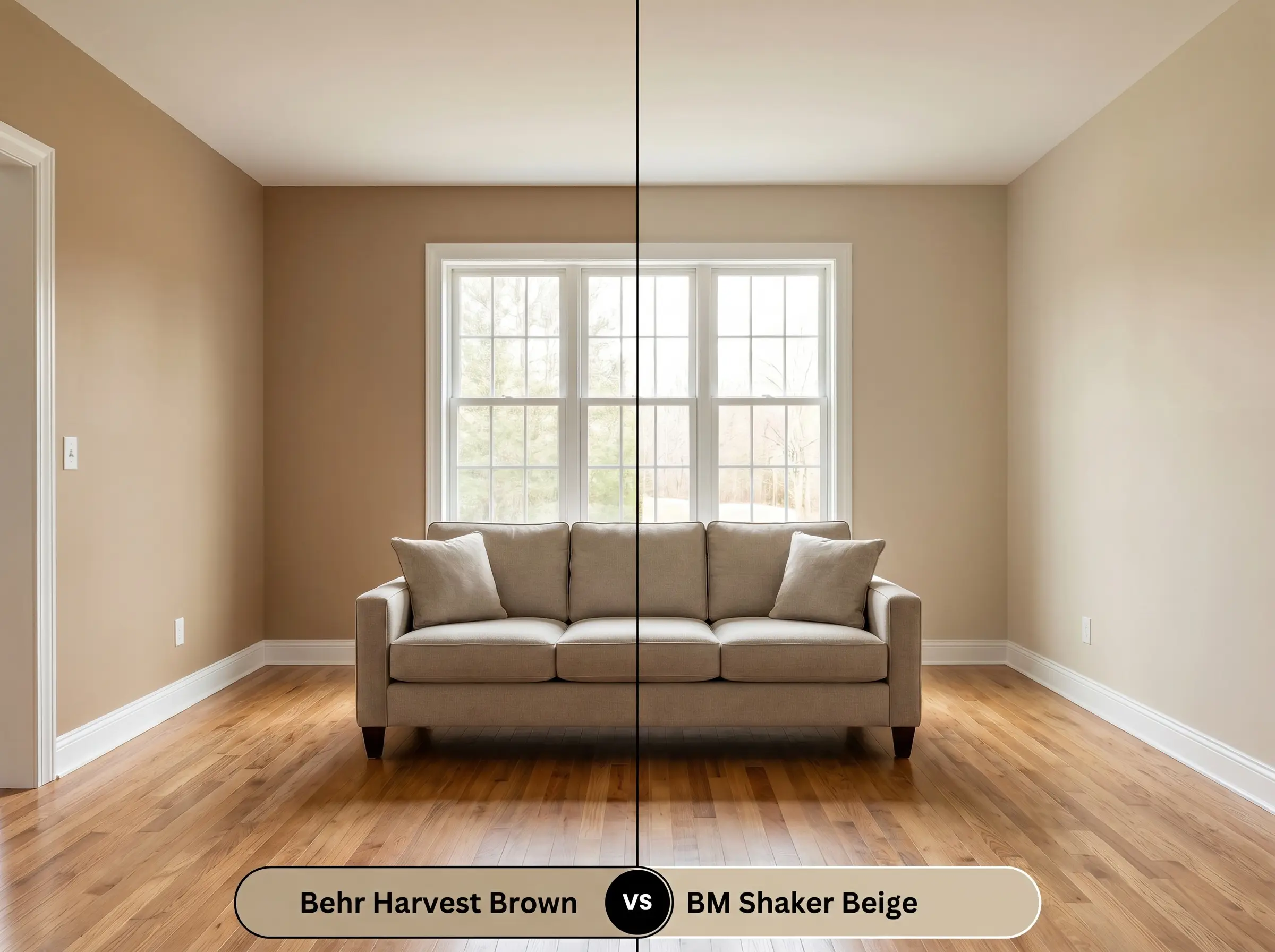
If you desire a truly neutral backdrop without the golden micro-nuances, then Benjamin Moore Shaker Beige HC-45 is the superior alternative. Shaker Beige delivers a flatter, highly versatile tan that adapts easily to both warm and cool palettes, lacking the specific sepia glow of its rival.
Exploring Alternative Shades & Matches
Homeowners often need to pivot their color strategy slightly to accommodate regional brand availability or to find a shade with just a fraction more lightness.
Behr Catalog Alternatives
Competitor Brand Equivalents
Technical Execution & Finish Selection
Translating a beautiful color swatch into a flawless architectural finish requires strict attention to sheens and application methods.
The Dynamic Sheen Guide
Primer Strategy
This earthy chromatic profile requires a high-quality, warm-tinted primer to prevent the beige from looking chalky or washed out.
Coverage & Success Tips
Expect to apply two full coats for absolute opacity and to achieve the true, rich depth of the color. Roll with a high-quality microfiber cover and maintain a wet edge to prevent flashing, as medium-depth browns will easily show uneven roller marks in direct sunlight.
Frequently Asked Questions
Because of its low-to-moderate chroma, the rough texture of stucco will create tiny micro-shadows that make the paint appear slightly darker and more muted. On smooth HardiePlank siding, the color reflects sunlight more evenly, allowing the golden sepia undertone to read much warmer and brighter.
When placed next to strong red tones, the yellow-orange spectrum of this paint can become overwhelmingly amplified. To successfully pair this color with cherry wood, you must bridge the gap with crisp, neutralizing elements like matte black iron hardware or cool-toned natural stone.
Thanks to its medium-light reflectance (LRV 39), this color is actually an exceptional choice for color-drenching dark spaces. It provides enough depth to feel cinematic and cozy, while the inherent warm beige cast prevents the walls from feeling like a black hole.
By surrounding the paint with the intense orange heat of terracotta, you actively pull the contrasting khaki and green undertones forward. The paint will read noticeably flatter and more earthy, acting as a cooling, grounding force against the vibrant flooring.
Final Design Verdict & Essential Warnings
Behr Harvest Brown is an incredibly dependable, structural color designed for homeowners who want to inject tangible warmth into their spaces without resorting to aggressive yellows or flat, lifeless grays. It thrives as a foundational building material in 1970s organic modern revivals, transitional European farmhouses, and curated suburban exteriors. When styled with heavy tactile fabrics, rich walnuts, and crisp metallic hardware, this rustic brown base elevates standard rooms into deeply intentional, enveloping environments.
While this paint is highly adaptable, you must absolutely avoid pairing it with stark, cool-toned grays or icy, blue-based white trims. The warm, yellow-orange spectrum of Harvest Brown fundamentally rejects cold, concrete-like tones. When forced together, the cool grays will look unintentionally dirty and bruised, while the brown will lose its inviting warmth, turning muddy and discordant on the wall. Always surround this color with creamy off-whites and natural, earthy textures to maintain its curated integrity.
Hackrea Design Secret (The Temperature Clash)