15 Unexpected Powder Room Wallpaper Ideas for a Jaw-Dropping Space
The powder room is often dismissed as a mere functional necessity, but in high-end residential design, it is the ultimate design laboratory. We are officially retiring the tired cliché of the basic “jewel box” and approaching this micro-footprint as a canvas for radical spatial manipulation. Because the square footage is so restricted and the door is frequently closed, the conventional rules of visual flow and sightline continuity simply do not apply.
Exploring unexpected powder room wallpaper ideas is not about slapping a loud color on the wall; it is an architectural exercise in manipulating scale, bouncing ambient light, and crafting a deeply immersive sensory experience. From tactile grasscloths to mesmerizing murals, the right wallcovering completely redefines the physical boundaries of a half-bath.
Abandon the safety of neutral paint and embrace the psychological thrill of high-impact, immersive pattern.
Optical Illusions: Wallpapers That Manipulate Small Spaces
When designing a windowless 5×5 room, wallpaper ceases to be flat decor and becomes an architectural tool. By deploying the right pattern and scale, you can execute a brilliant spatial illusion that blurs the physical boundaries of the walls and tricks the eye into perceiving an entirely different volume of space.
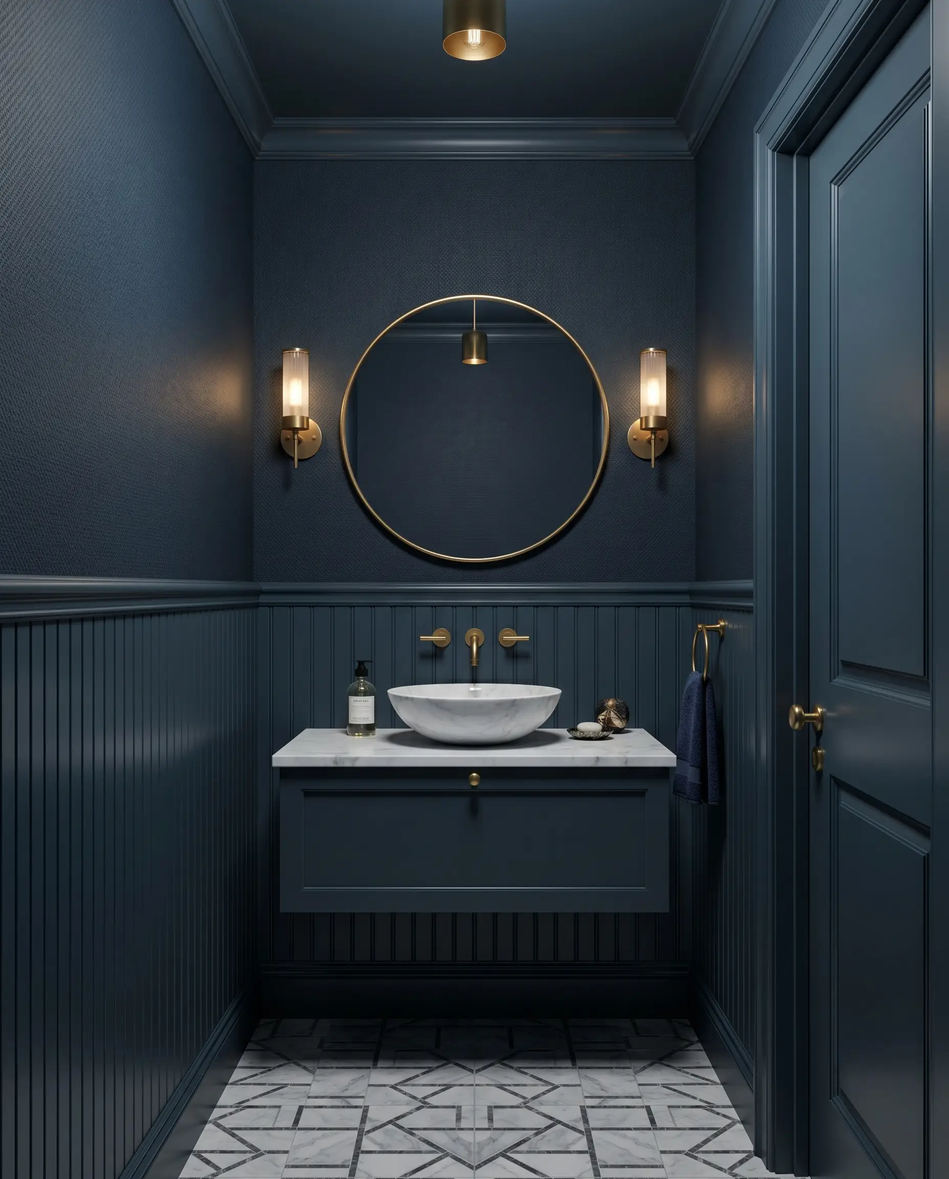
1. The Infinity Effect: Ceiling-Wrapped Celestial Prints
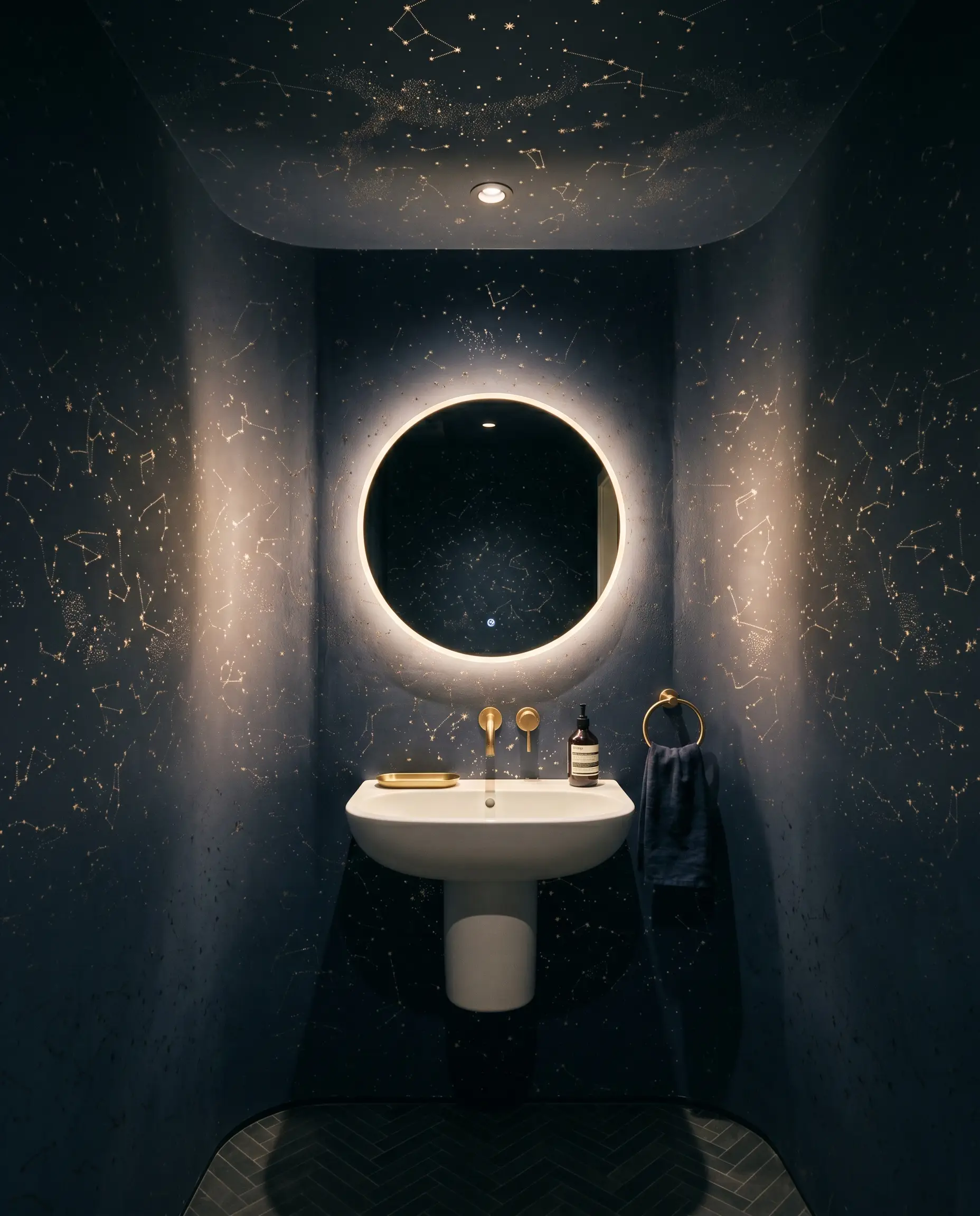
Extending a dark, celestial, or subtle geometric print up and over the ceiling entirely eliminates the sharp visual stop of the room’s corners. This continuous application removes the contrast between the wall and ceiling, making the exact height of the room impossible for the eye to gauge and faking a much grander volume.
- Vibe: Boundless, atmospheric, and highly tailored.
- Key Motif: Saturated midnight skies, subtle metallic constellations, or repeating micro-geometrics.
- Color Match: Benjamin Moore Hale Navy.
Wrapping a ceiling requires a flawless Level 5 drywall skim-coat so the paper sits perfectly flat without telegraphing any underlying plaster texture.
Design Laboratory Tip
2. Trompe L’Oeil: Faux Architectural Millwork & Straw Marquetry
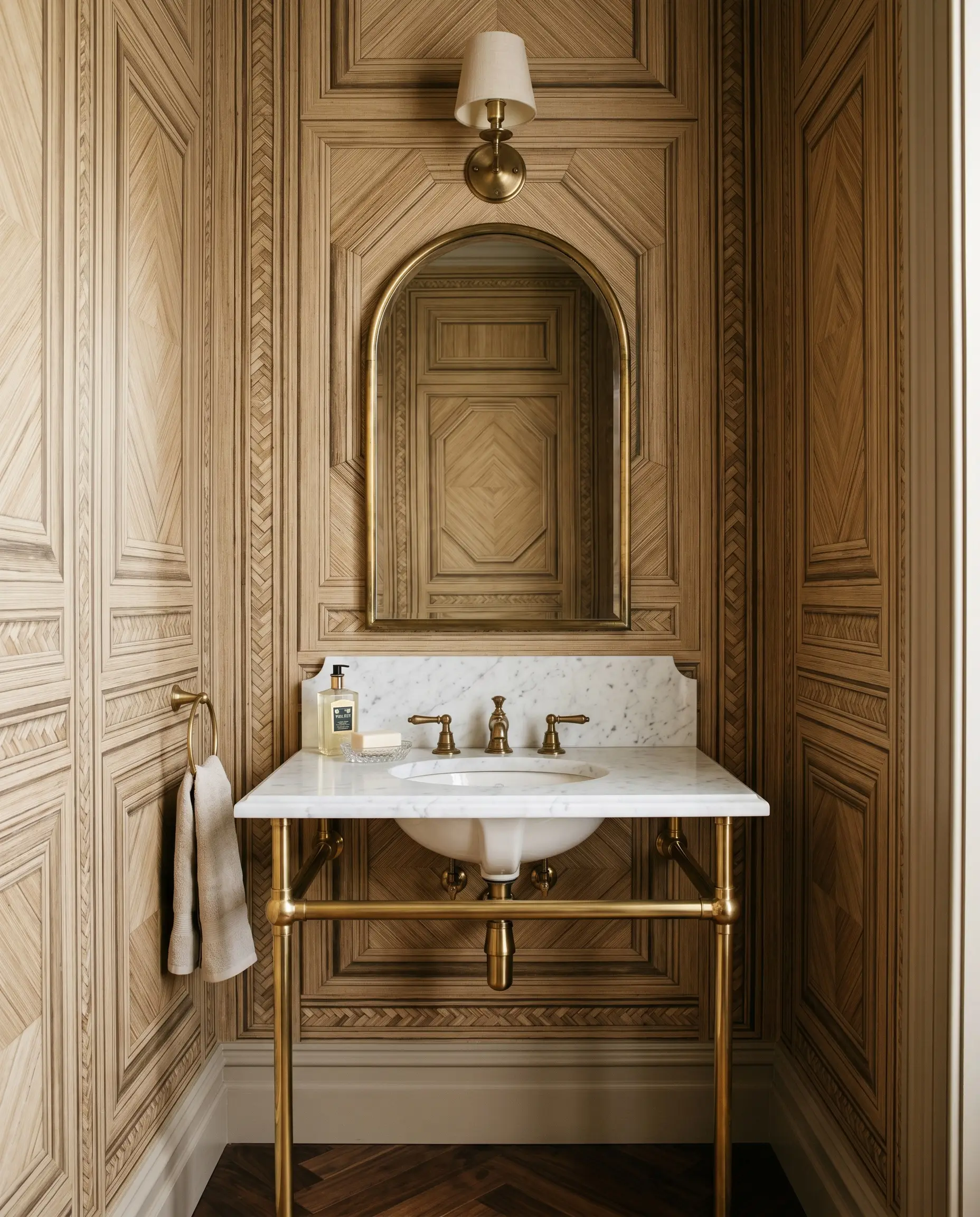
Deploying Trompe l’oeil papers that mimic three-dimensional depth adds immediate historical or bespoke gravitas without the exorbitant carpentry costs. Highly realistic faux fluting, traditional paneling, or Italian-inspired straw marquetry tricks the eye and elevates the room into the realm of accessible luxury.
- Vibe: Heritage luxury and architectural deceit.
- Material Focus: Heavyweight non-woven papers with high-definition shadow printing.
- Color Match: Farrow & Ball London Stone.
3. Panoramic Murals: Ditching the Traditional Repeat
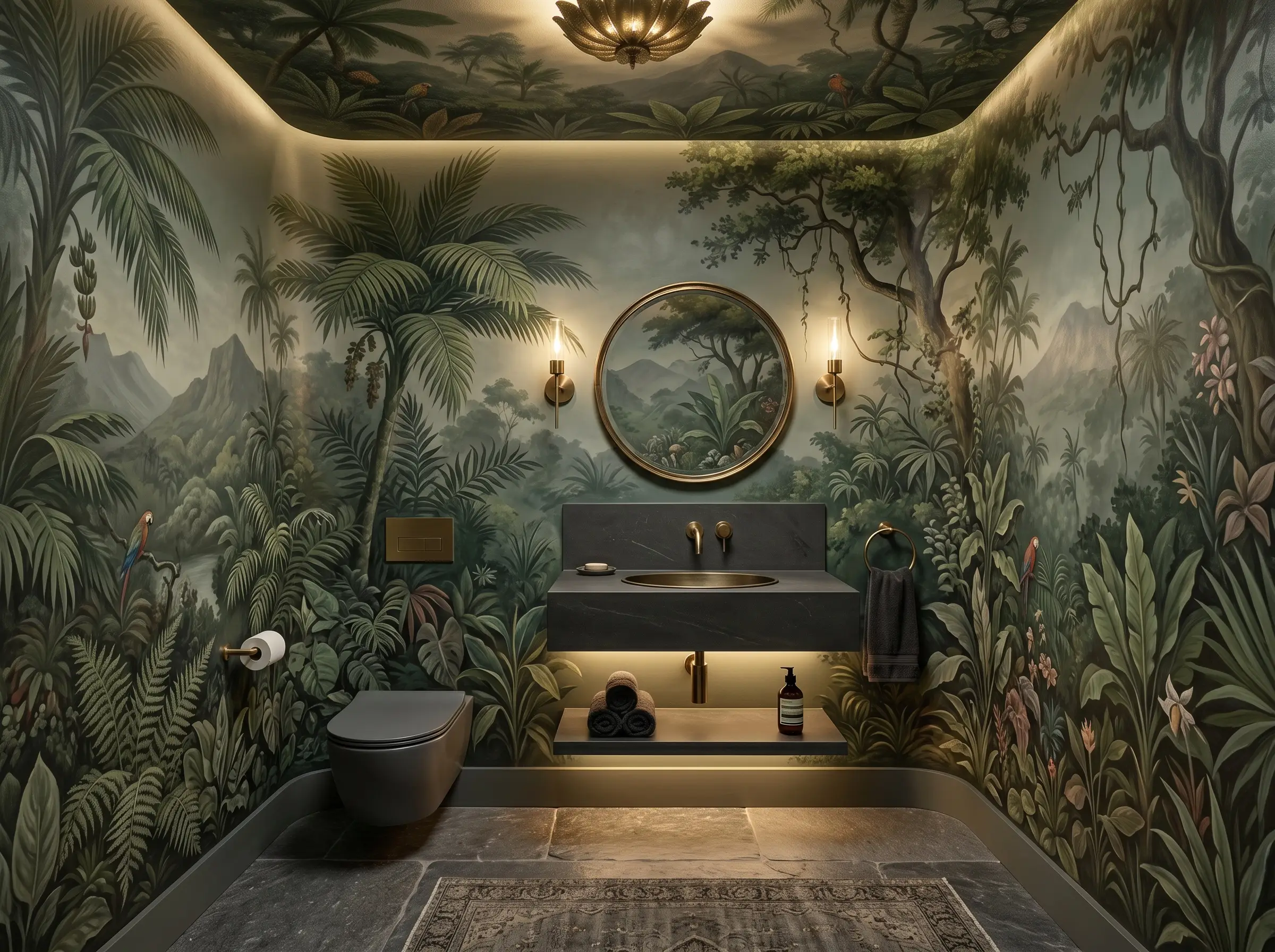
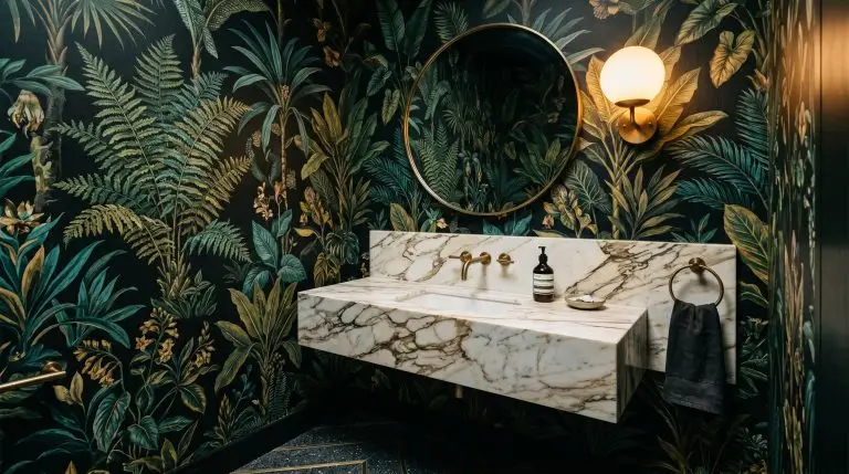
Traditional wallpapers utilize a repeat scale that can inadvertently emphasize the tight dimensions of a small wall. Installing a continuous, non-repeating panoramic mural—like a vintage landscape or dense jungle—pushes the walls outward and treats the room as a singular, deeply immersive canvas.
- Vibe: Escapist, grand, and highly curated.
- Scene Style: Sepia-toned historical etchings or lush, oversized botanicals.
- Color Match: Sherwin-Williams Pewter Green.
4. High-Gloss Metallic Grounds to Bounce Sconce Light
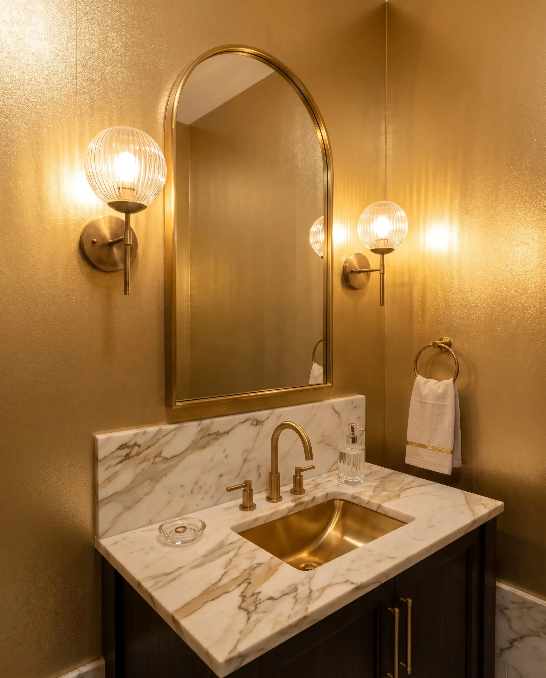
Windowless powder rooms rely heavily on the precise calibration of artificial light. Wallpapers printed on a high-gloss metallic ground or mica base catch the ambient light from your fixtures, bouncing it around the tight space and giving the walls a luminous, expansive glow.
- Vibe: Glamorous, radiant, and slick.
- Hardware Pairing: Fluted or frosted-glass globe sconces to diffuse the bulb and prevent harsh, direct glare against the reflective paper.
- Color Match: Benjamin Moore Goldtone.
5. Oversized Geometric Scales in Micro-Footprints
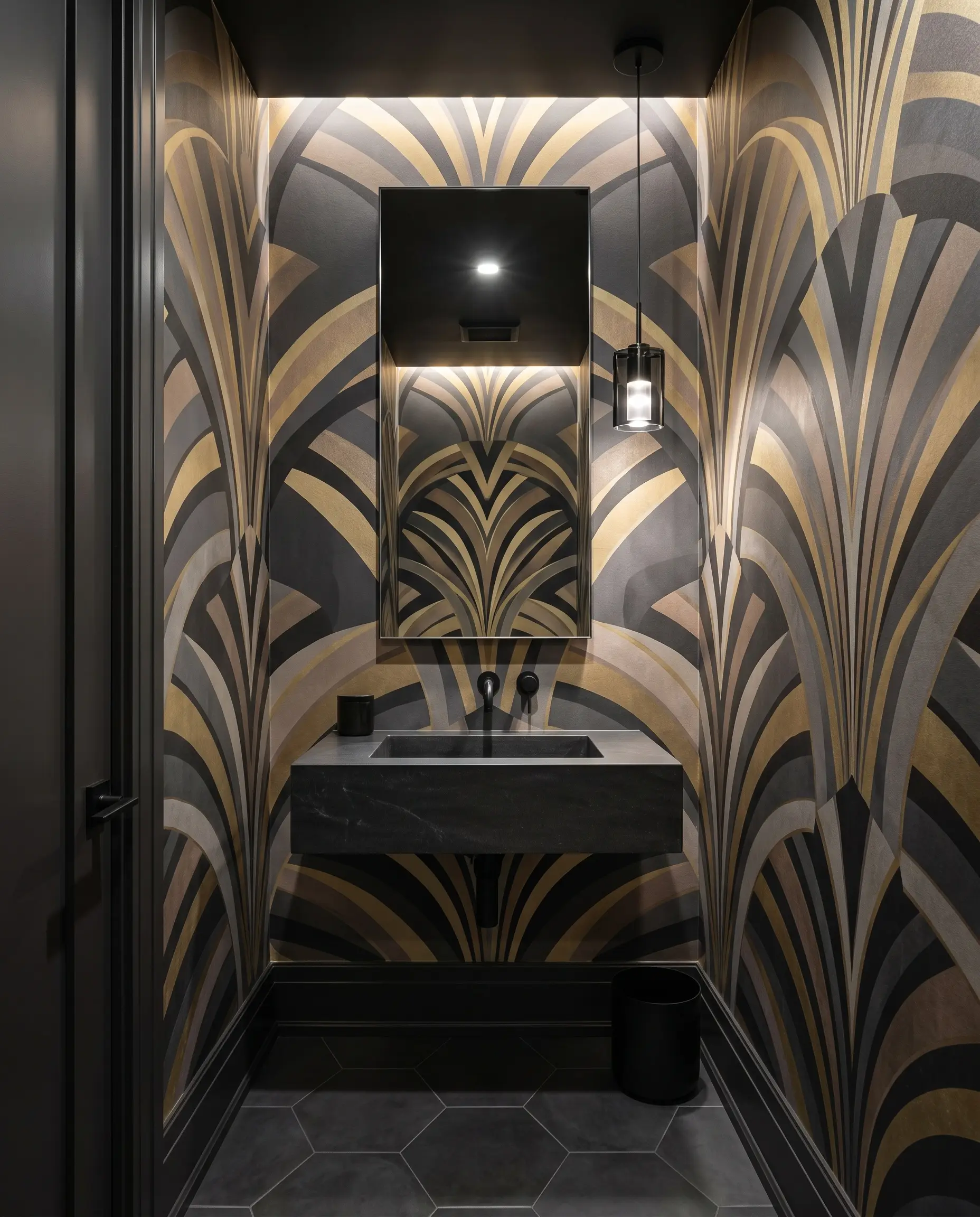
The outdated myth that tiny rooms require tiny prints is strictly forbidden in modern spatial design. Deploying a massive, oversized postmodern or Art Deco geometric scale forces the eye to track sweeping shapes rather than the tight corners, paradoxically making the footprint feel incredibly grand.
- Vibe: Bold, avant-garde, and mathematically precise.
- Scale Rule: The pattern repeat should be no smaller than 24 inches wide to ensure maximum visual expansion.
- Color Match: Sherwin-Williams Tricorn Black.
The “Dark Academia” & Immersive Mood Trend
Validating the instinct to envelop a space in darkness is crucial when designing a half-bath. Saturated, dark colors naturally recede visually, making an intensely moody, atmospheric palette an exceptionally smart architectural choice for tiny, enclosed spaces.
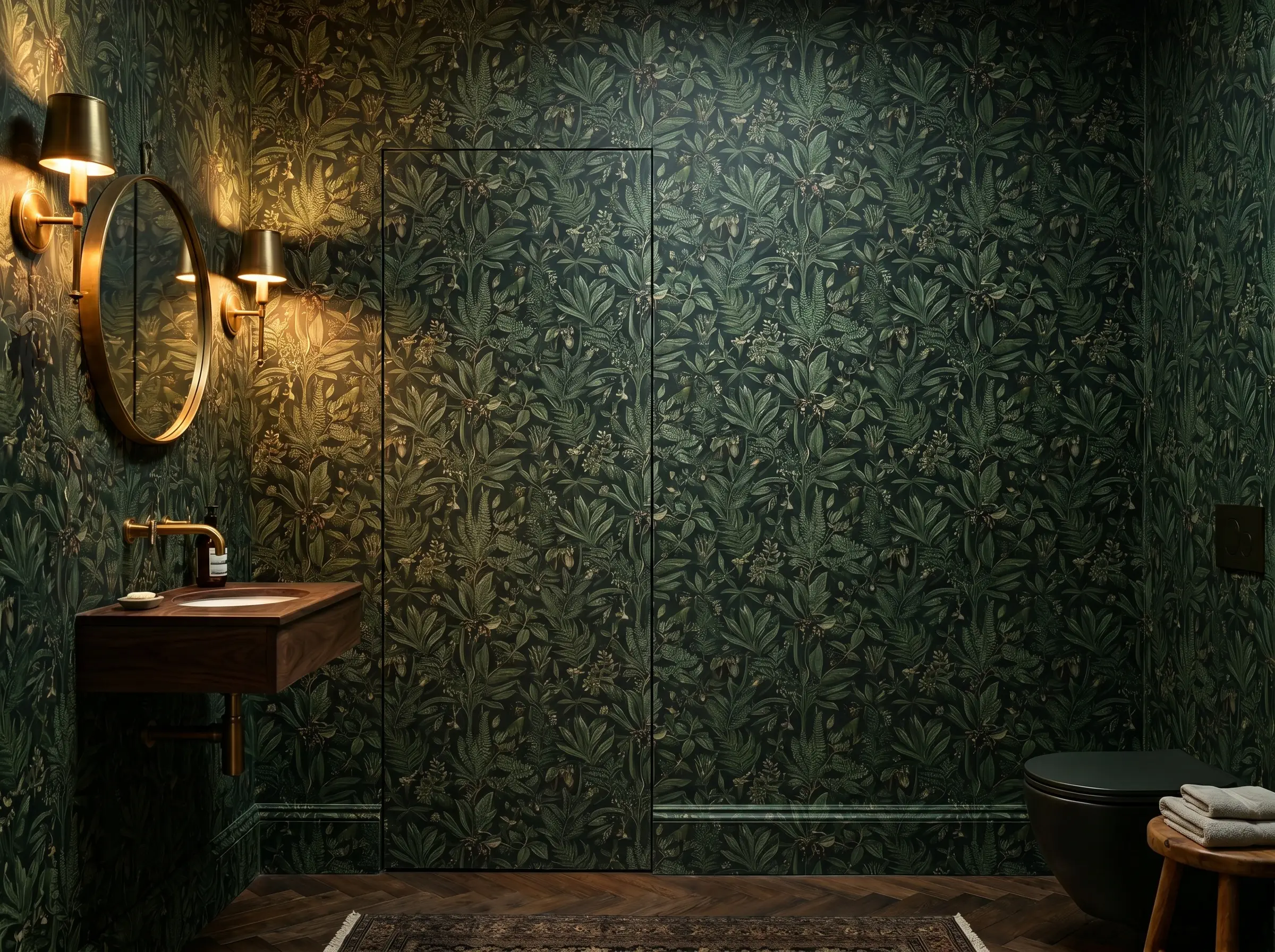
6. Oversized Dutch Master Florals on a Pitch-Black Canvas
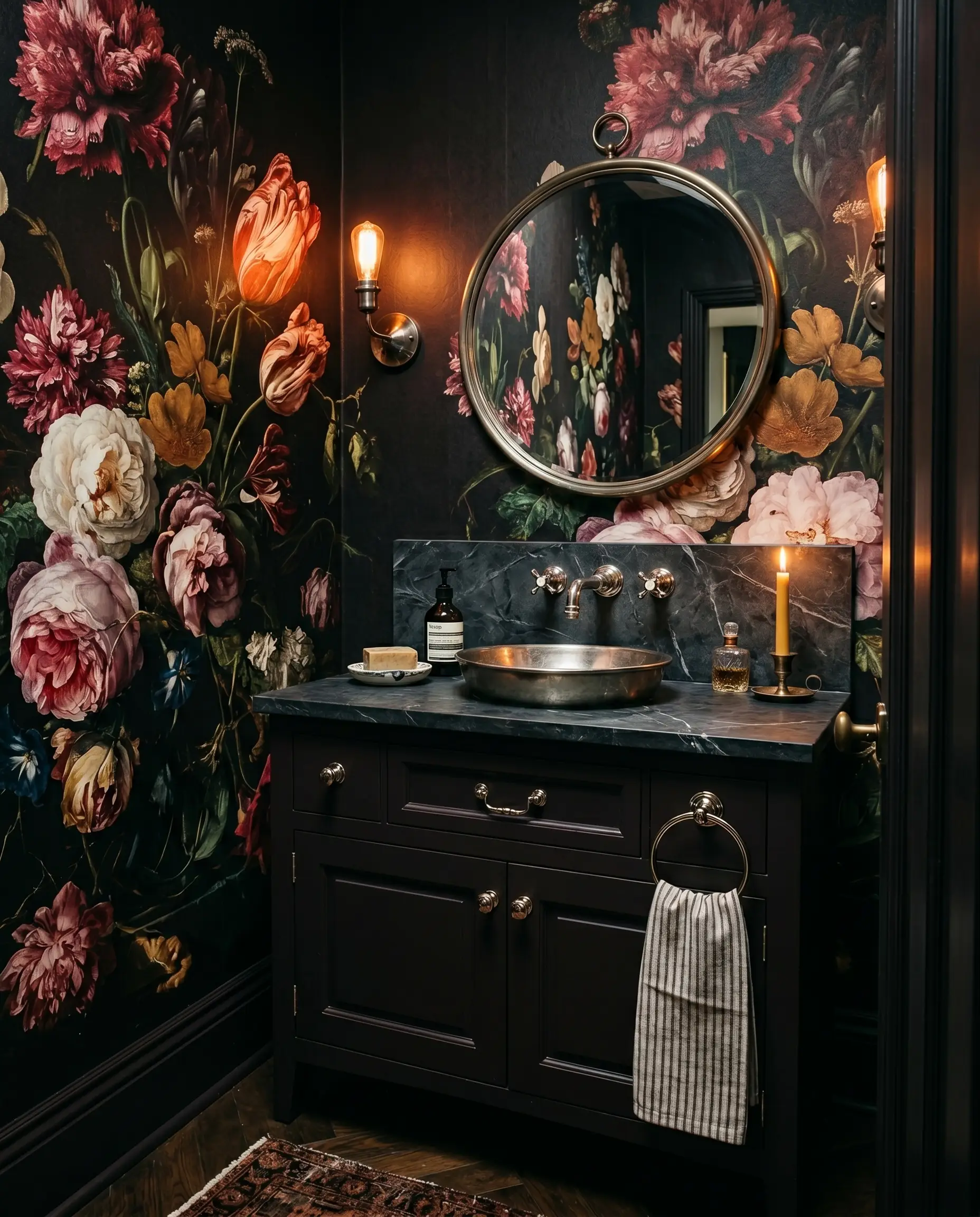
We are moving entirely past bright, preppy florals in favor of dramatic, moody botanicals inspired by 17th-century Dutch still-life paintings. Placed against a pitch-black or deep plum canvas, this large-scale repeat creates a deeply romantic, almost theatrical tension in the room.
- Vibe: Theatrical, romantic, and historically rich.
- Key Motif: Hyper-realistic, oversized peonies, roses, and decaying foliage.
- Color Match: Farrow & Ball Brinjal.
7. Subtle Macabre: Toiles with Hidden Surprises
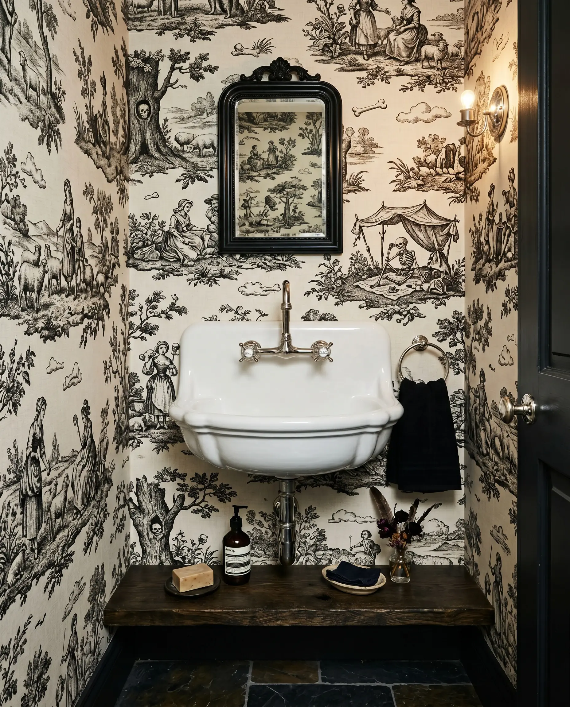
Traditional Toile de Jouy or Damask papers offer an unexpected, slightly macabre twist when they feature hidden skulls, whimsical animals, or surreal landscapes upon closer inspection. This subversive design choice rewards the observant guest and serves as the ultimate conversation starter for a home that entertains frequently.
- Vibe: Playful, subversive, and aristocratic.
- Motif Detail: Classic monochromatic pastoral scenes embedded with subtle Gothic or surrealist elements.
- Color Match: Benjamin Moore Black Beauty.
8. Charcoal Woodland Motifs Paired with Unlacquered Brass
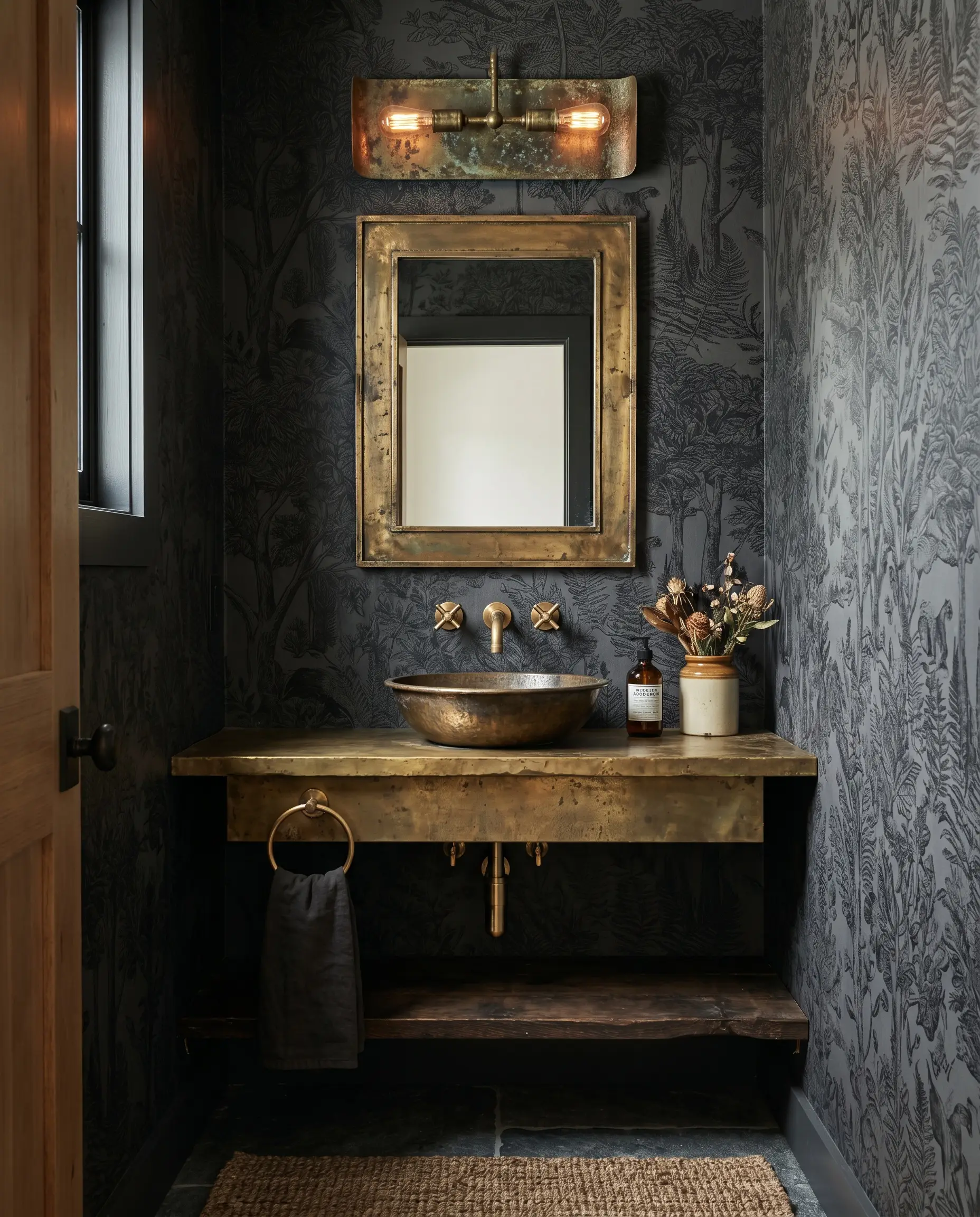
A charcoal, etched-style woodland motif establishes a cool, intensely dark graphite canvas that begs for a warm, tactile counterpoint. The living patina of raw metal strikes a perfect, high-contrast relationship against the dark, immersive paper.
- Vibe: Earthy, sophisticated, and dramatically grounded.
- Hardware Pairing: Raw, unlacquered brass plumbing fixtures and sconces that will naturally tarnish and age over time.
- Color Match: Sherwin-Williams Peppercorn.
Architectural Pairings: Anchoring the Boldness
An unexpected wallpaper will completely fail if it is not properly anchored to the room’s hard finishes. To achieve true bespoke harmony, the bold pattern must be intentionally tethered to the wainscoting, the trim, and the vanity, establishing a grounded architectural hierarchy.
9. Color-Drenched Wainscoting Matched to the Paper’s Base Tone
Defaulting to stark white wainscoting creates a jarring horizontal cut that ruins the spatial illusion of a micro-footprint. Instead, pull the darkest or most dominant background color from the wallpaper and utilize color-drenching across the wainscoting, trim, and baseboards to seamlessly anchor the room.
- Vibe: Monolithic, seamless, and highly tailored.
- Execution Rule: Use a satin or semi-gloss finish on the millwork to provide a subtle sheen contrast against matte wallpapers.
| Wallpaper Base Tone | Color-Drenched Wainscoting Match | Brand & Finish Recommendation |
|---|---|---|
| Midnight Blue | Hague Blue (No. 30) | Farrow & Ball (Modern Eggshell) |
| Warm Terracotta | Cavern Clay (SW 7701) | Sherwin-Williams (Emerald Satin) |
| Deep Forest Green | Salamander (2050-10) | Benjamin Moore (Advance Satin) |
10. Brutalist Stone Vanities Against Delicate Chinoiserie
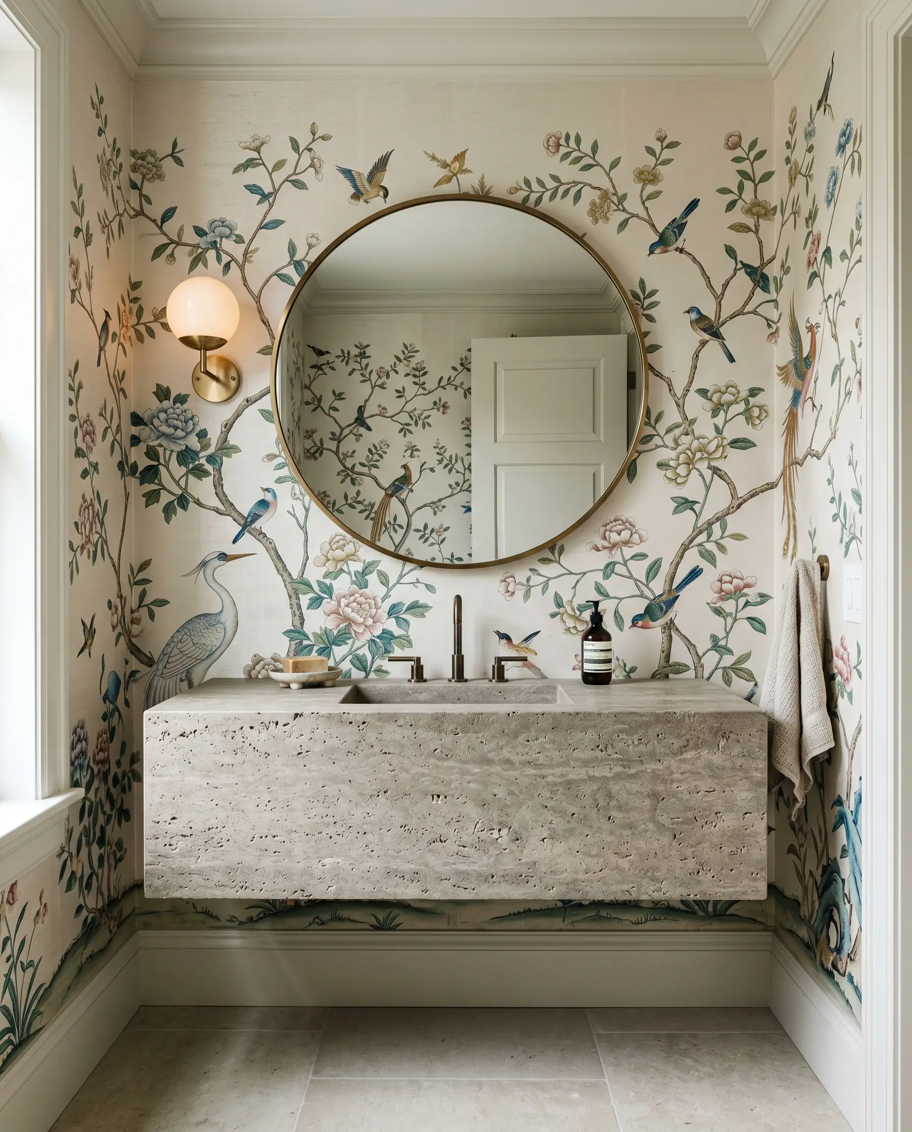
The hallmark of elite bespoke design is high-impact juxtaposition, specifically contrasting a delicate, intricate Chinoiserie or silk-look bird motif against a heavy, brutalist floating vanity. The tension between the fragile, historical paper and the rigid, honed travertine or concrete creates an unforgettable architectural dynamic.
- Vibe: Sophisticated tension and curated luxury.
- Material Contrast: Hand-painted silk-textured paper paired with raw, unfilled travertine or board-formed concrete.
- Color Match: Benjamin Moore White Dove.
11. Matte Black Fixtures to Modernize Vintage Florals
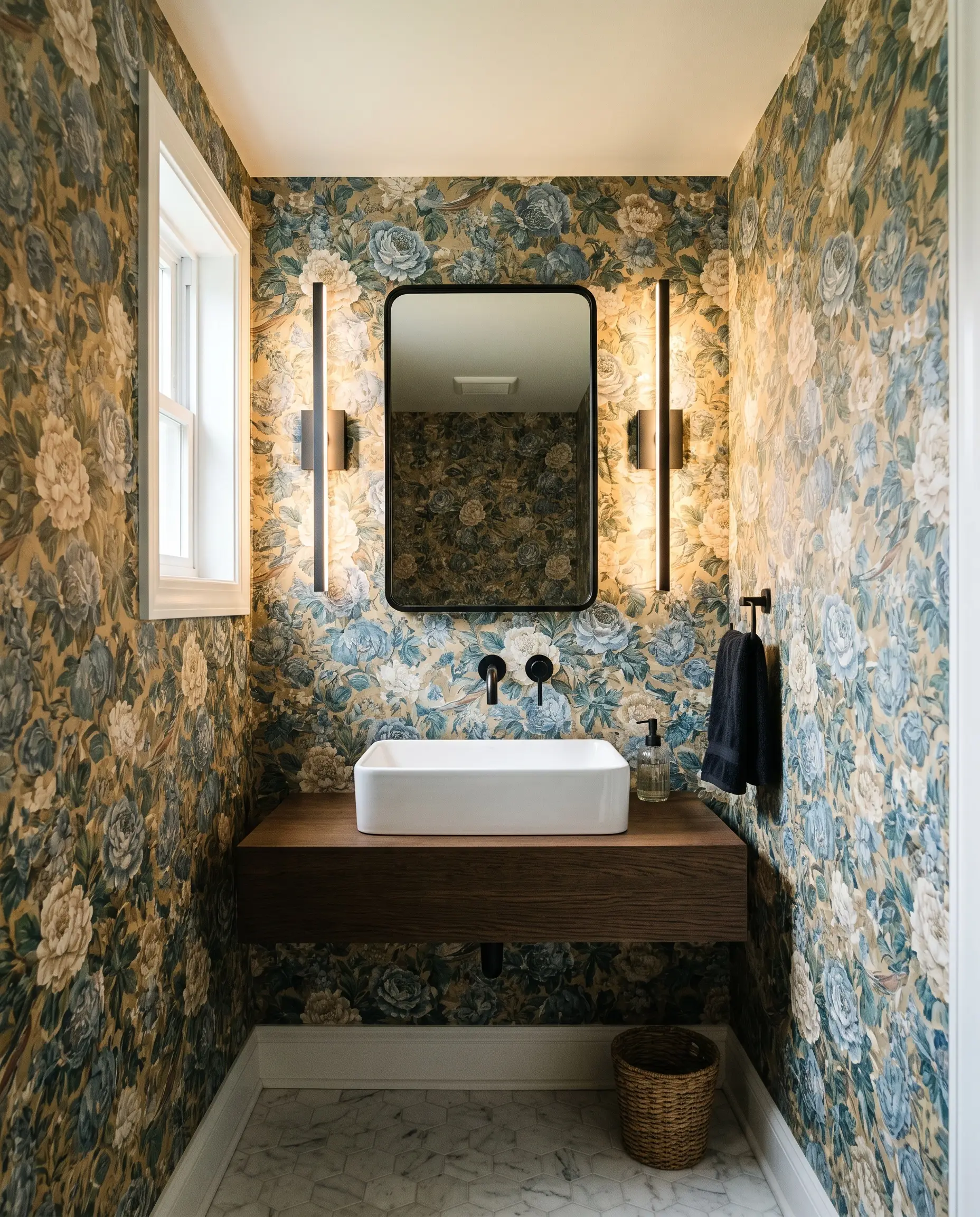
When deploying a grandmillennial or highly vintage-inspired floral print, it is imperative to anchor the heritage design with sleek, ultra-modern elements. The stark, contemporary lines of dark, matte hardware prevent the room from feeling like a dusty time capsule.
- Vibe: Transitional, sharp, and perfectly balanced.
- Hardware Pairing: Ultra-minimalist matte black wall-mounted faucets and linear sconces.
- Color Match: Sherwin-Williams Iron Ore.
12. Seamless Camouflage: Wallpapering Over Concealed Doors
For a truly immersive, uninterrupted spatial experience, run the wallpaper directly over a flush jib door and the baseboards. This seamless camouflage creates a secret, hidden-room effect that instantly elevates the space into the highest tier of custom architecture.
- Vibe: Mysterious, hyper-custom, and flawlessly integrated.
- Execution Focus: Requires precise pattern matching across the door seams to maintain the illusion of a solid wall.
- Color Match: Farrow & Ball Studio Green.
Executing a seamless jib door requires a perfectly flat, trimless slab door and specialized concealed hinges (like Soss hinges) to ensure the paper doesn’t tear when the door operates.
Design Laboratory Tip
The Tactile Rebellion: Sensory Wallcoverings
True luxury in a micro-footprint extends far beyond flat, printed paper; it demands a tactile rebellion. Because the square footage is so tight, the user is physically closer to the walls, making sensory, woven, and rigid textures highly impactful to the overall experience.
13. Flocked Velvets for a 1970s Sensory Revival
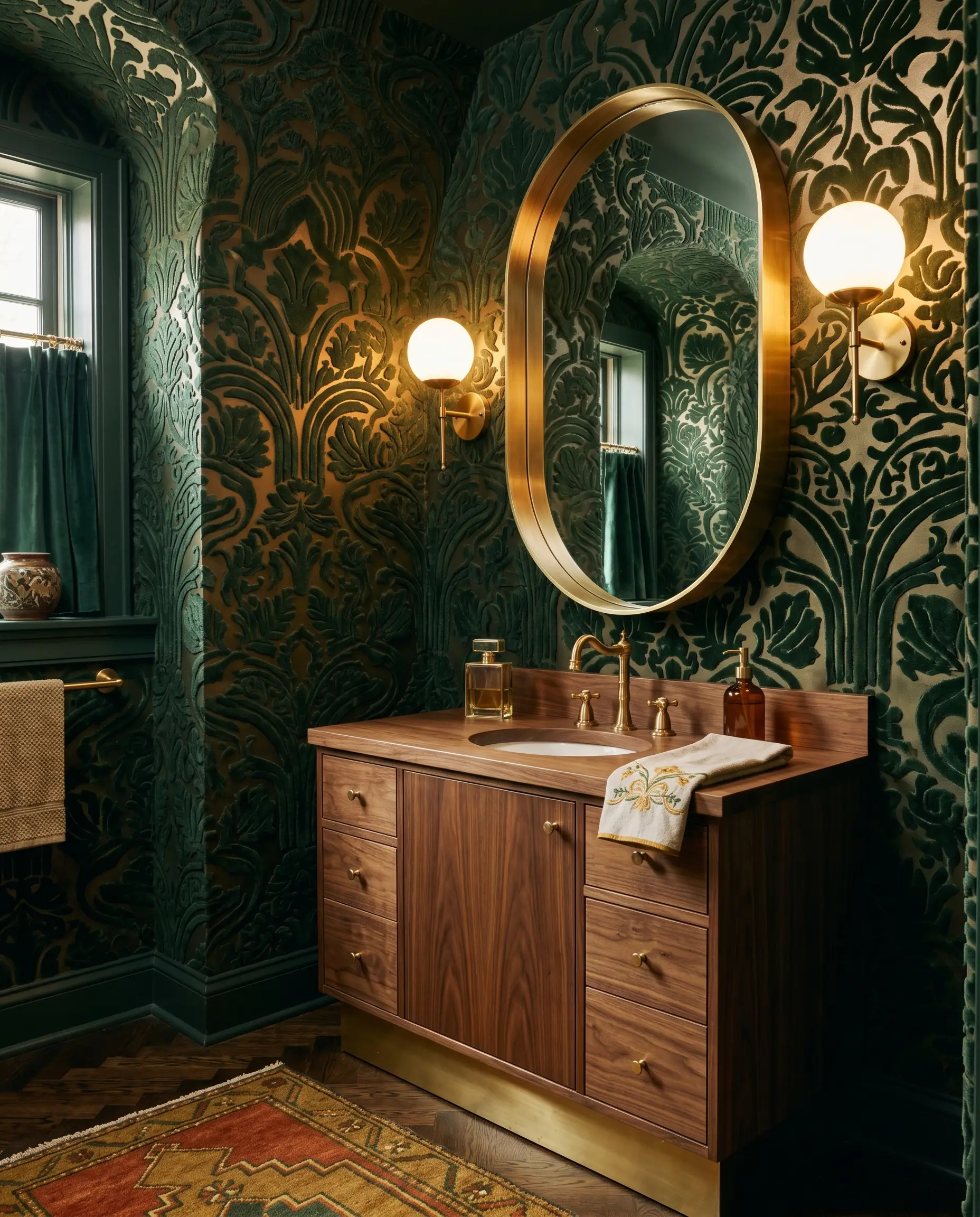
Flocked wallpapers featuring raised velvet patterns offer immediate visual warmth and a deeply glamorous retro edge. This sophisticated revival of 1970s texture not only begs to be touched but provides a subtle, highly beneficial layer of acoustic dampening.
- Vibe: Decadent, tactile, and unapologetically retro.
- Texture Profile: Dense, raised velvet motifs on a smooth, metallic, or matte ground.
- Color Match: Benjamin Moore Hunter Green.
14. Cork and Wood-Veneer Wallcoverings for Organic Warmth
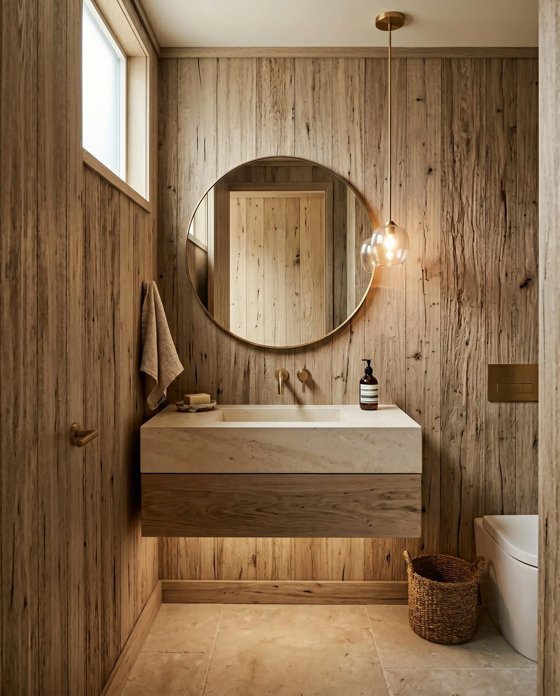
For an Organic Modern approach that eschews loud prints, deploy ultra-textured wallcoverings crafted from thinly sliced cork or natural wood veneer. These accessible luxury materials deliver a stunning, unexpected aesthetic through sheer raw materiality and organic warmth rather than chaotic color.
- Vibe: Grounded, earthy, and architecturally raw.
- Material Focus: Sustainably harvested metallic-flecked cork or vertically oriented walnut veneers.
- Color Match: Sherwin-Williams Accessible Beige.
15. Deep Jewel-Toned Grasscloth for Acoustic Dampening
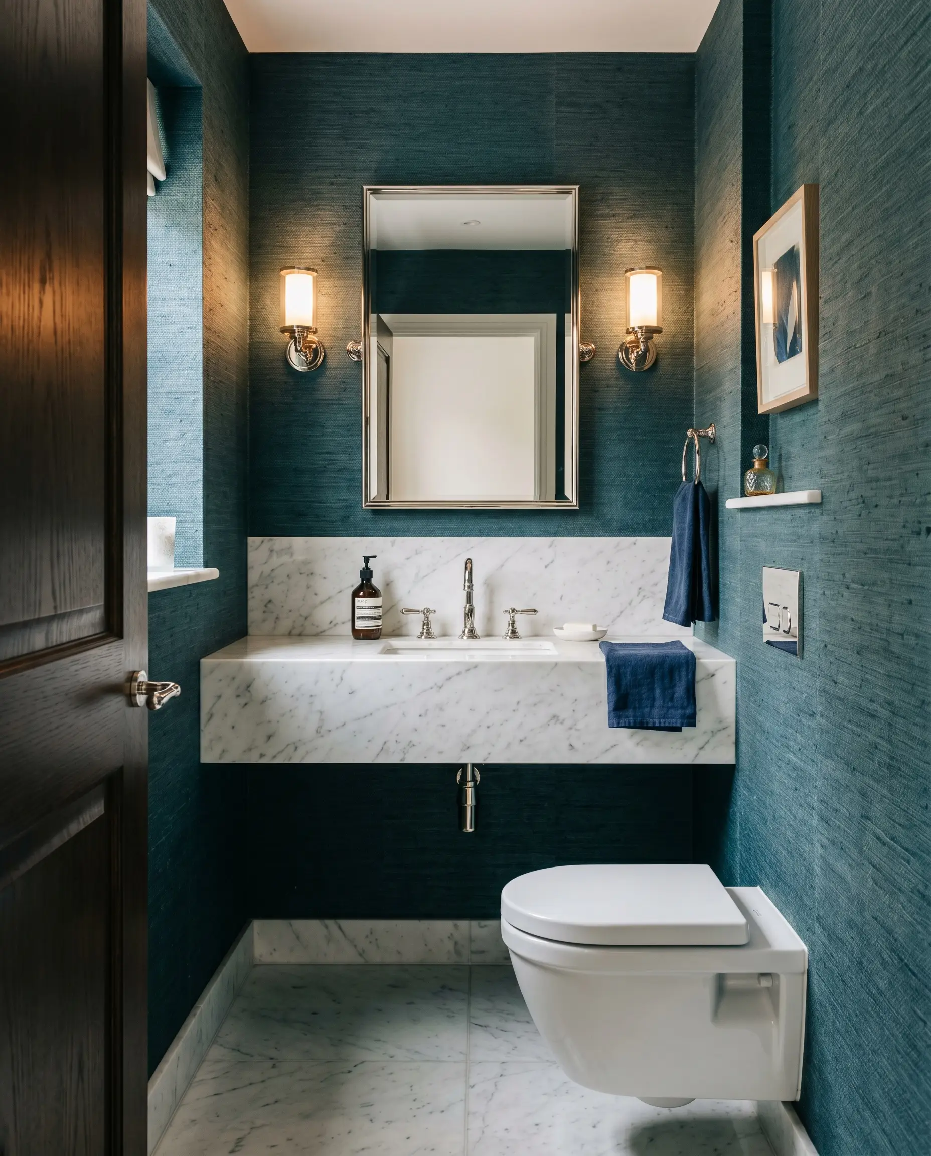
Because powder rooms are frequently located adjacent to living or dining spaces, they require highly practical acoustic privacy. A thick, exceptionally high-quality, deep jewel-toned grasscloth looks incredibly bespoke while its woven natural fibers actively absorb sound.
- Vibe: Tailored, rich, and functionally superior.
- Functional Benefit: The dense, organic weave breaks up sound waves, significantly reducing echo in a room full of hard porcelain and stone surfaces.
- Color Match: Farrow & Ball Inchyra Blue.
The Blueprint: Executing Your Bold Paper Flawlessly
Powder rooms operate under unique environmental conditions; while they endure hand-washing splashes, they completely lack the heavy, steamy humidity of full baths. This allows you the freedom to choose between modern luxury peel-and-sticks for a high-impact, accessible update, or heritage paste-the-wall applications for a permanent, bespoke finish. Always order large-scale samples and tape them to the wall to observe how your specific sconce lighting interacts with the paper’s ground before committing.
| Wallcovering Material | Best For | Pros | Cons |
|---|---|---|---|
| Vinyl-Coated Wallpaper | High Traffic / Splash Zones | Highly durable, wipeable, resists water spots near the vanity. | Can look slightly synthetic; lacks the tactile depth of luxury papers. |
| Traditional Paper & Grasscloth | Bespoke Luxury / Delicate Styling | Unmatched tactile richness, authentic matte finishes, organic warmth. | Susceptible to water stains; requires professional paste-the-wall installation. |
Anchor your choices with intention, demand spatial harmony, and transform your powder room into the most unforgettable architectural moment in your home.
The Hackrea Style Desk treats interior decoration as an exact visual science. Rather than focusing on demolition or floor plans, this desk masters the art of color theory, undertone matching, material pairings, and spatial proportion. From balancing the visual weight of mixed metals to finding the perfect bridging tone between disparate wood species, this desk provides the rigorous aesthetic rules needed to achieve high-end, editorial-quality harmony in any space.