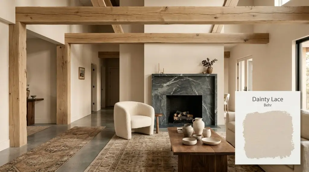
Dainty Lace MQ3-11
BehrBehr Dainty Lace (MQ3-11) is a warm, creamy beige with an LRV of 64. It features a soft orange-brown undertone that prevents it from feeling stark, making it an incredibly versatile, inviting neutral for both interior walls and exterior accents.
Paint Technical Profile
| Color ID / SKU | MQ3-11 |
| HEX Code | #DECFBB |
| Light Reflectance (LRV) | 64 |
| Use | Interior, Exterior |
| Best Exposures | North-Facing, East-Facing |
| Best For | Living rooms, bedrooms, and transitional spaces requiring a soft, enveloping warmth. |
Behr Dainty Lace: How to Build a Luminous, Earthy Foundation in Any Room
The most compelling rooms often start with a quiet, structural backdrop that allows raw materials to truly shine. When you pair rough-hewn white oak or honed marble with a stark white wall, the resulting contrast can sometimes feel jarring and unfinished. By introducing a nuanced, earthy neutral like Behr Dainty Lace, you immediately soften that friction and create a beautifully cohesive atmosphere.
This particular shade acts as a highly versatile architectural finish, wrapping the room in a gentle, welcoming energy. It is not just another flat tan; it possesses a distinct chromatic warmth that responds dynamically to its surroundings. Whether you are updating a suburban living room or layering an urban bedroom with tactile fabrics, this paint lays a luminous, intentional foundation.
Behr Dainty Lace: Undertones & LRV
If you are wondering whether this shade leans warm or cool, the answer is definitively warm. Behr’s Dainty Lace is a beautifully structured warm beige that completely avoids the icy, sterile shadows of cooler neutrals. It establishes a highly inviting warm neutral base that breathes life into both interior spaces and exterior facades.
To truly understand how this color behaves, we have to look at its underlying color structure:
At a light reflectance value (LRV) of 64, this paint sits right in the sweet spot of mid-tone luminosity. It reflects enough light to keep a standard-sized room feeling open and airy, while holding enough pigment to provide a distinct, intentional contrast against crisp white trim.
Mastering the Lighting Effects & The Chameleon Factor
Because of its complex pigment profile, this earthy beige is highly responsive to the shifting temperature of the sun. As the light moves across your home throughout the day, you will notice a distinct visual transformation.
Here is exactly how this color shifts across different lighting environments:
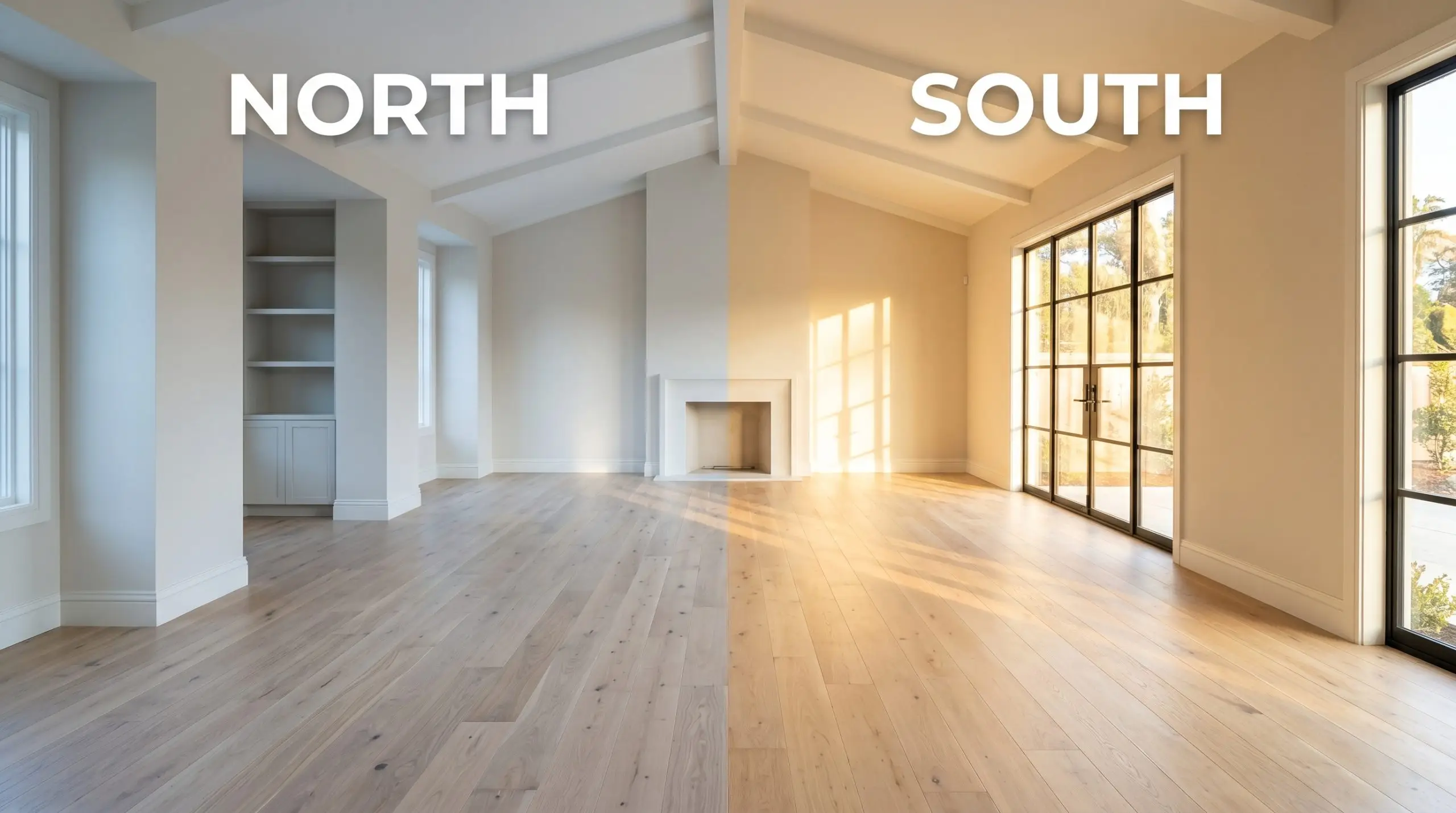
If you are considering this shade for a home exterior, remember that direct, unfiltered sunlight will wash out a significant portion of the pigment. On a sun-drenched facade, this color will read much closer to a warm, creamy off-white rather than a distinct beige.
Hackrea Pro-Tip (The Exterior Washout)
Popular Applications for Dainty Lace
Understanding the data behind a paint color is only half the battle; the real magic happens when you apply it to a physical space. Because this mid-tone neutral is so adaptable, it can dramatically alter the mood of a room depending on how you layer your materials and furnishings.
Crafting Restful Master Bedrooms
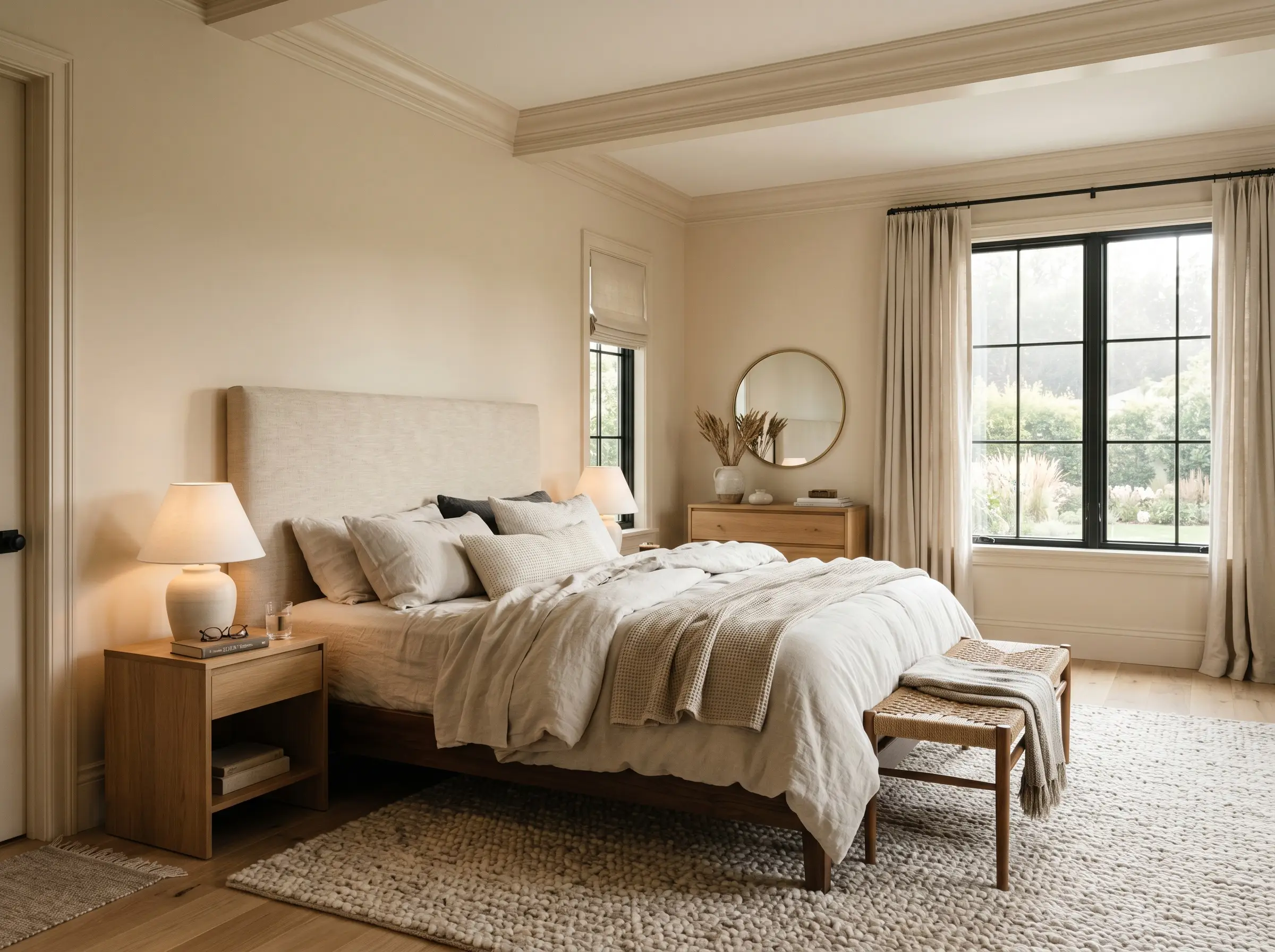
When applying this muted neutral in a bedroom, the goal is to cultivate a serene, restorative retreat. Instead of a standard wall application, consider wrapping the entire room—including the baseboards and crown molding—in this soft shade to create a seamless, enveloping atmosphere. This continuous application minimizes visual interruptions, which is incredibly soothing for anyone seeking a sensory-friendly, calming environment at the end of a long day.
To elevate the aesthetic, layer in a rich mix of textiles and natural materials. A headboard upholstered in raw silk or nubuck leather pairs beautifully with the earthy nature of the walls. Introduce soft, washed linen drapery and a chunky wool rug to add crucial texture without overwhelming the room’s quiet palette.
Elevating Transitional Hallways and Entryways
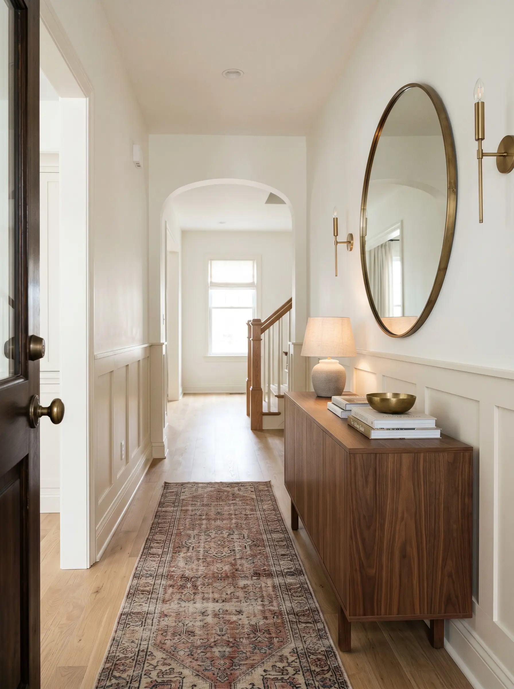
Transitional spaces like hallways and foyers are often starved for natural light, making them the perfect candidates for a luminous mid-tone. Because this shade holds its own without turning muddy in shadows, it provides a warm, welcoming embrace the moment you step through the front door.
To make a standard suburban entryway feel custom-built, apply this color to classic wainscoting or picture frame molding along the lower half of the walls. Pair it with a crisp, slightly warm white on the upper half to draw the eye upward and visually expand the ceiling height. Finish the vignette with a vintage runner, a sleek walnut console, and an oversized brass mirror to bounce whatever light is available throughout the corridor.
Rustic and Farmhouse Kitchen Cabinetry
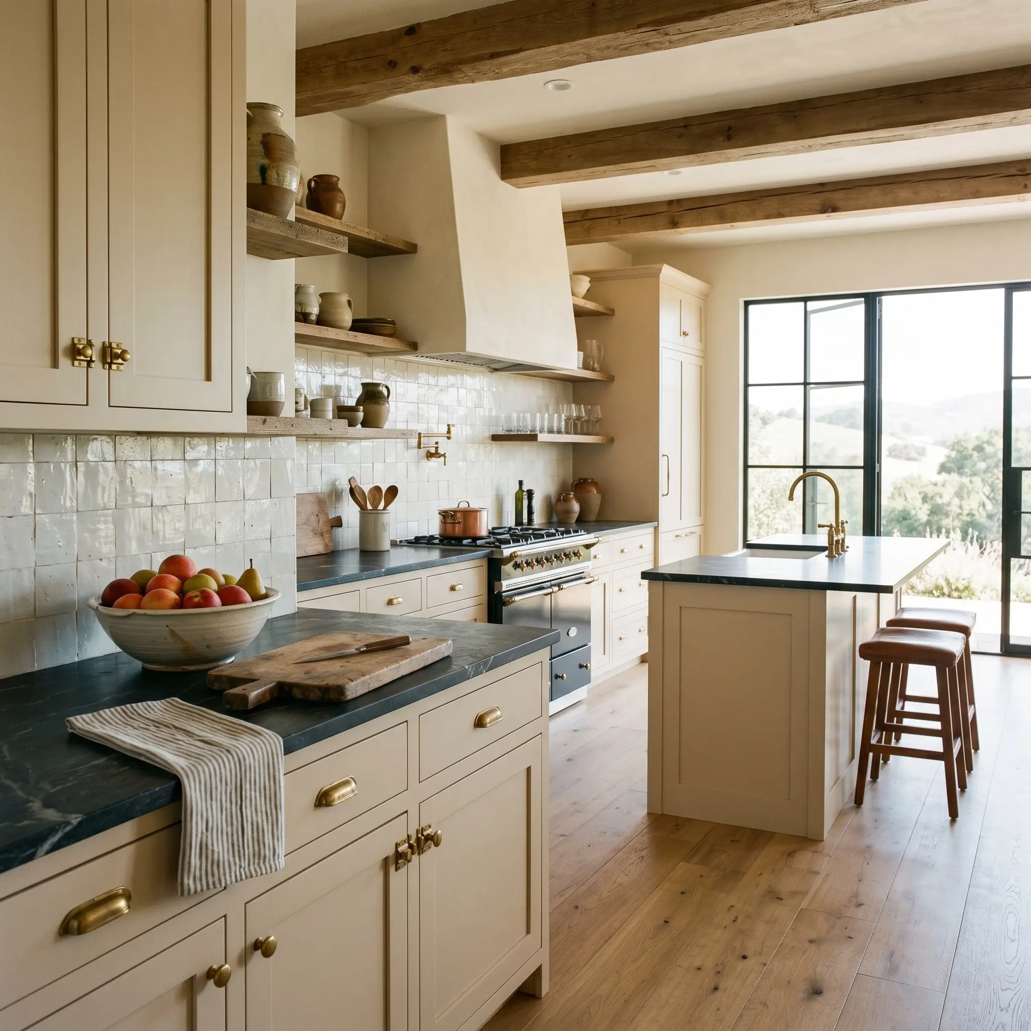
While stark white kitchens often dominate modern feeds, painting your cabinetry in this luminous beige instantly injects a timeless, lived-in character. It is an exceptional choice for rustic or elevated farmhouse designs, where the goal is to balance hard-working utility with undeniable warmth.
When dealing with earthy, warm-leaning cabinetry, unlacquered brass or aged copper hardware is your best friend. The living finish of the metal will naturally patina over time, echoing the organic, authentic nature of the paint.
Hackrea Design Secret (The Hardware Harmony)
To complete the culinary space, pair these painted cabinets with honed soapstone countertops and a textured zellige tile backsplash. The subtle imperfections in the tile will catch the light, highlighting the gentle warmth of the woodwork. Stabilize the entire design with wide-plank white oak flooring to establish a truly cohesive, rustic foundation.
Living Rooms Anchored in Natural Wood
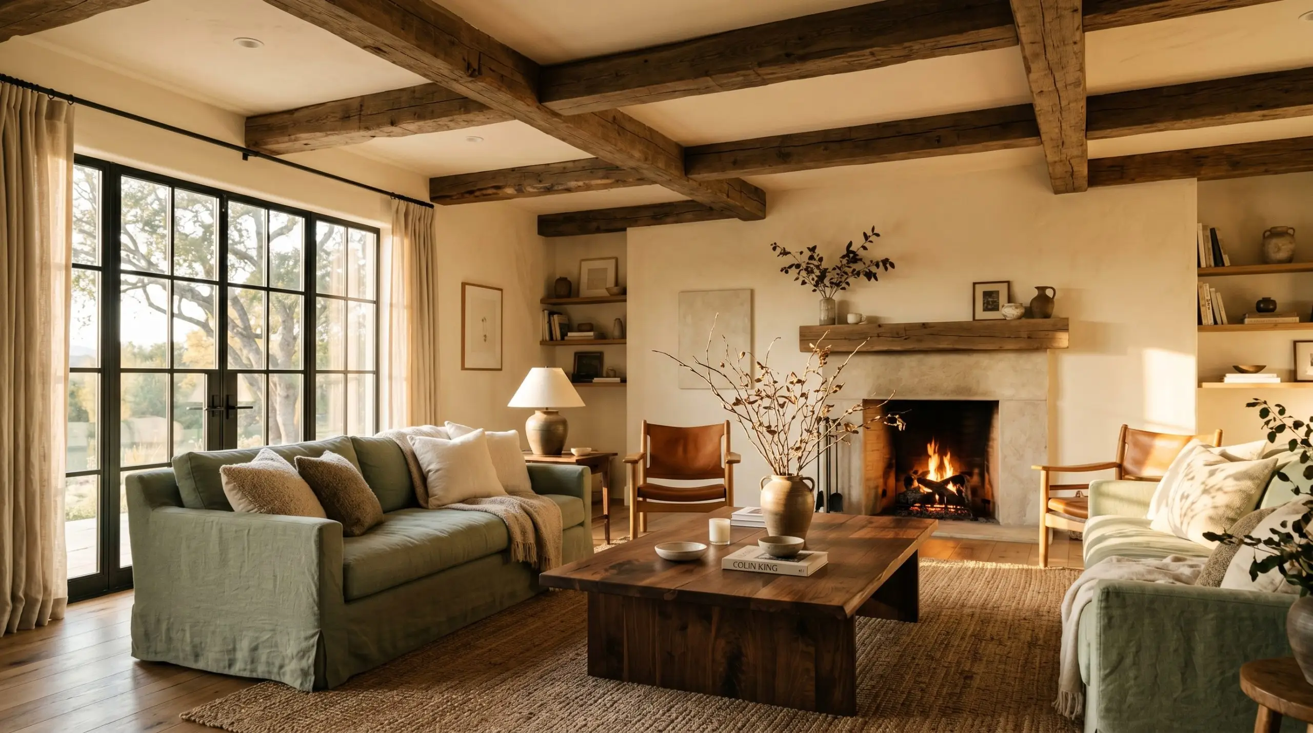
This shade was practically engineered to sit alongside rich, natural wood grains. In a living room setting, the paint’s subtle terracotta notes act as a brilliant bridge, softening the contrast between the walls and heavy timber elements. Whether you have exposed ceiling beams, a mid-century teak credenza, or a heavily grained walnut coffee table, this color makes those materials feel intentional and harmonious.
Avoid overly matched, monotonous styling by introducing contrasting textures and cooler accent tones. A slipcovered sofa in a soft sage or muted olive green will pop beautifully against the warm walls, creating a sophisticated, balanced energy. Add a few sculptural branches in a hand-thrown ceramic vase to bring a touch of organic modernism into the space.
Coordinating Colors and Material Pairings for Behr Dainty Lace
Instead of relying on crisp boundaries to hold its shape, this muted beige thrives when it bleeds softly into complementary textures and organic tones. It requires thoughtful material pairings to pull out its underlying warmth without letting the room feel muddy.
Crafting the Perfect Architectural Boundary
To keep this warm neutral from feeling overly dense, you need a trim color that provides a crisp, luminous contrast. Farrow & Ball All White No. 2005 is a brilliant choice because it lacks the stark, blue undertones found in standard builder-grade whites. This pure white establishes a clean, tailored boundary that allows the earthy walls to glow beautifully without creating a harsh visual clash.
Tactile Materials that Elevate the Room
Building a Cohesive Interior Palette
Curated Aesthetic Concepts
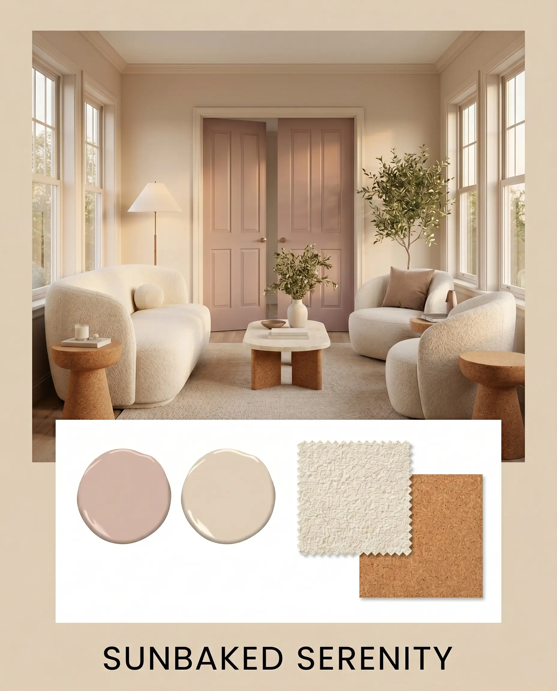
Sunbaked Serenity This aesthetic leans entirely into the warmth of the paint by layering it with natural, light-absorbing textiles. Imagine creamy boucle seating, warm cork accents, and a generous wash of Farrow & Ball Sulking Room Pink No. 295 on the interior doors. The vibe is incredibly soft, relaxed, and bathed in a gentle, sunset-like glow.
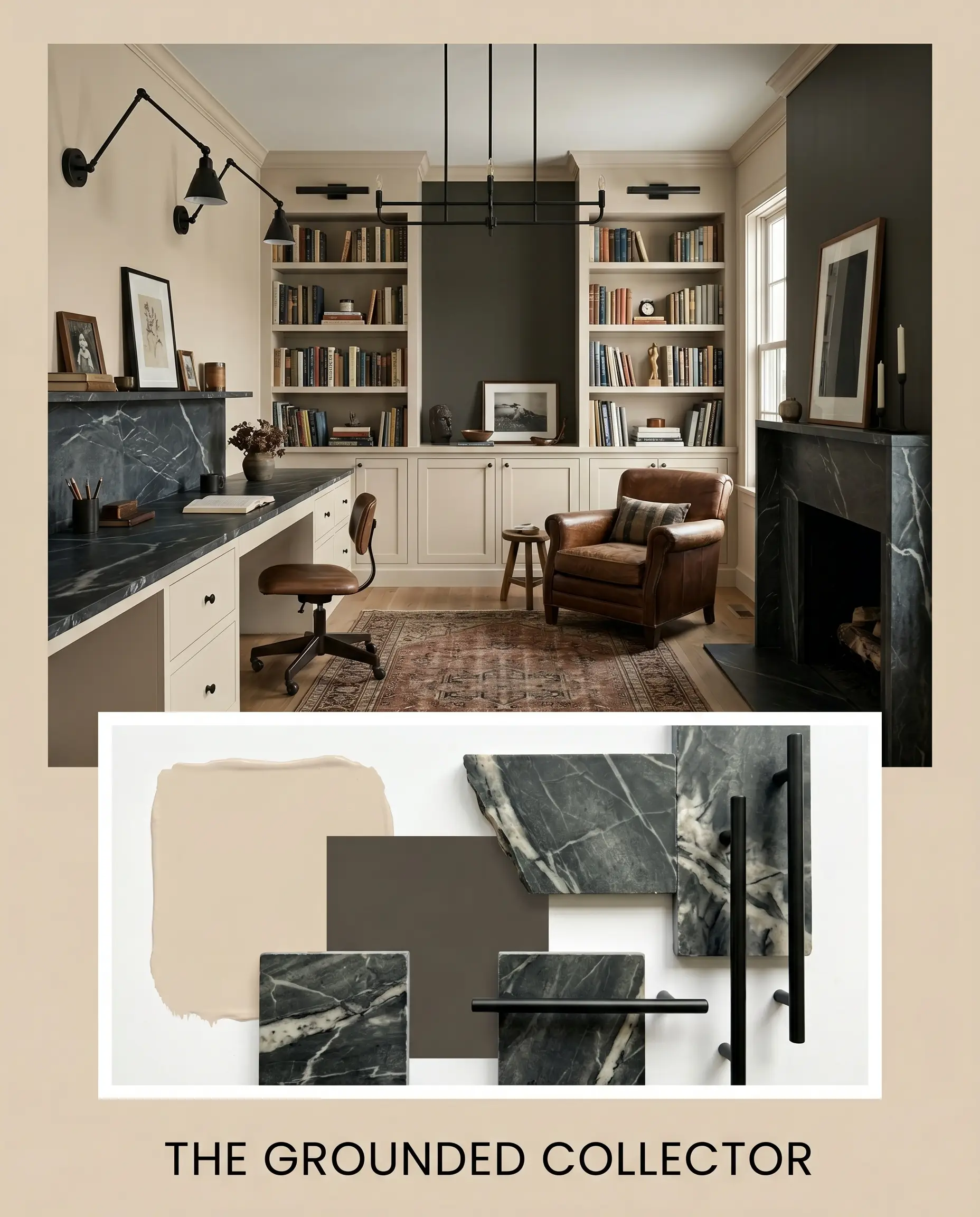
The Grounded Collector For a more structured, moody atmosphere, this concept uses the beige as a quiet canvas for high-contrast elements. Matte black iron lighting fixtures and dramatically veined soapstone surfaces provide rigid, architectural weight against the walls. A striking accent feature painted in Sherwin-Williams Urbane Bronze SW 7048 completes this sophisticated, deeply intentional environment.
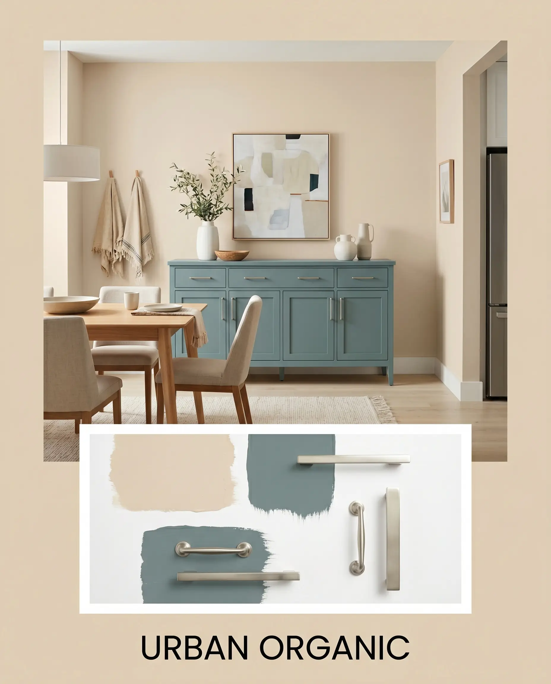
Urban Organic This palette balances the warmth of the beige with refreshing, cooler tones to create a vibrant, balanced energy. Benjamin Moore Aegean Teal 2136-40 is introduced through plush velvet drapery or a painted credenza, slicing through the room’s inherent warmth. Finished with sleek brushed nickel hardware, this look feels modern, tailored, and effortlessly chic.
Navigating Direct Color Comparisons
While this warm beige is incredibly adaptable, there are specific lighting conditions where its depth might feel too intense for your goals. If you are dealing with a dark, north-facing room or looking for a brighter, more reflective canvas, you will want to evaluate how it stacks up against lighter, creamier alternatives.
Behr Dainty Lace vs. Sherwin-Williams Alabaster SW 7008
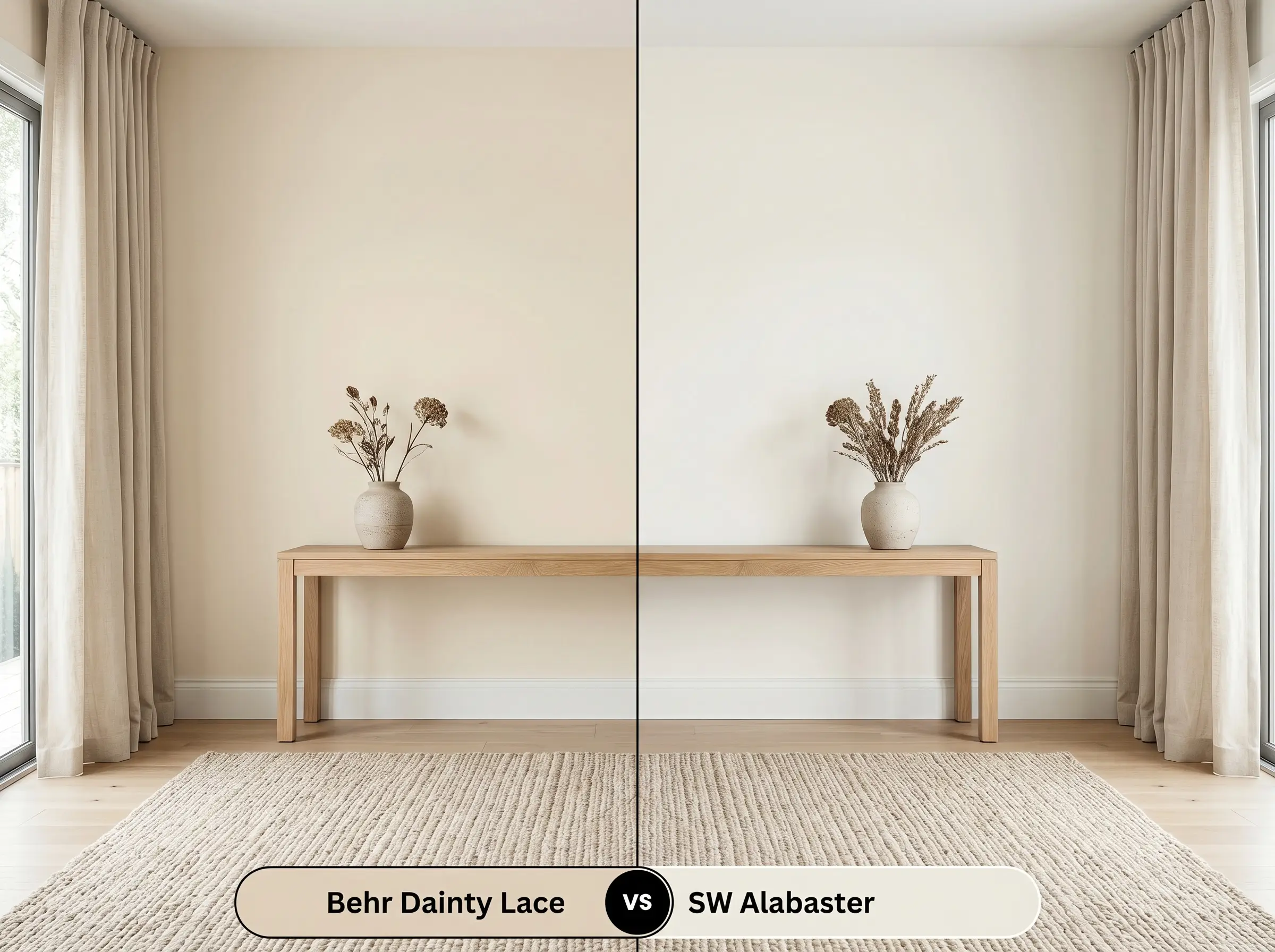
Sherwin-Williams Alabaster SW 7008 is a highly reflective off-white, offering significantly less pigment and depth than the Behr option. If your room lacks natural light and you need to visually expand the walls, then Alabaster will bounce light far more effectively. However, if you want a distinct, earthy contrast against white trim, the Behr paint provides the necessary structural weight that Alabaster lacks.
Behr Dainty Lace vs. Benjamin Moore Swiss Coffee OC-45
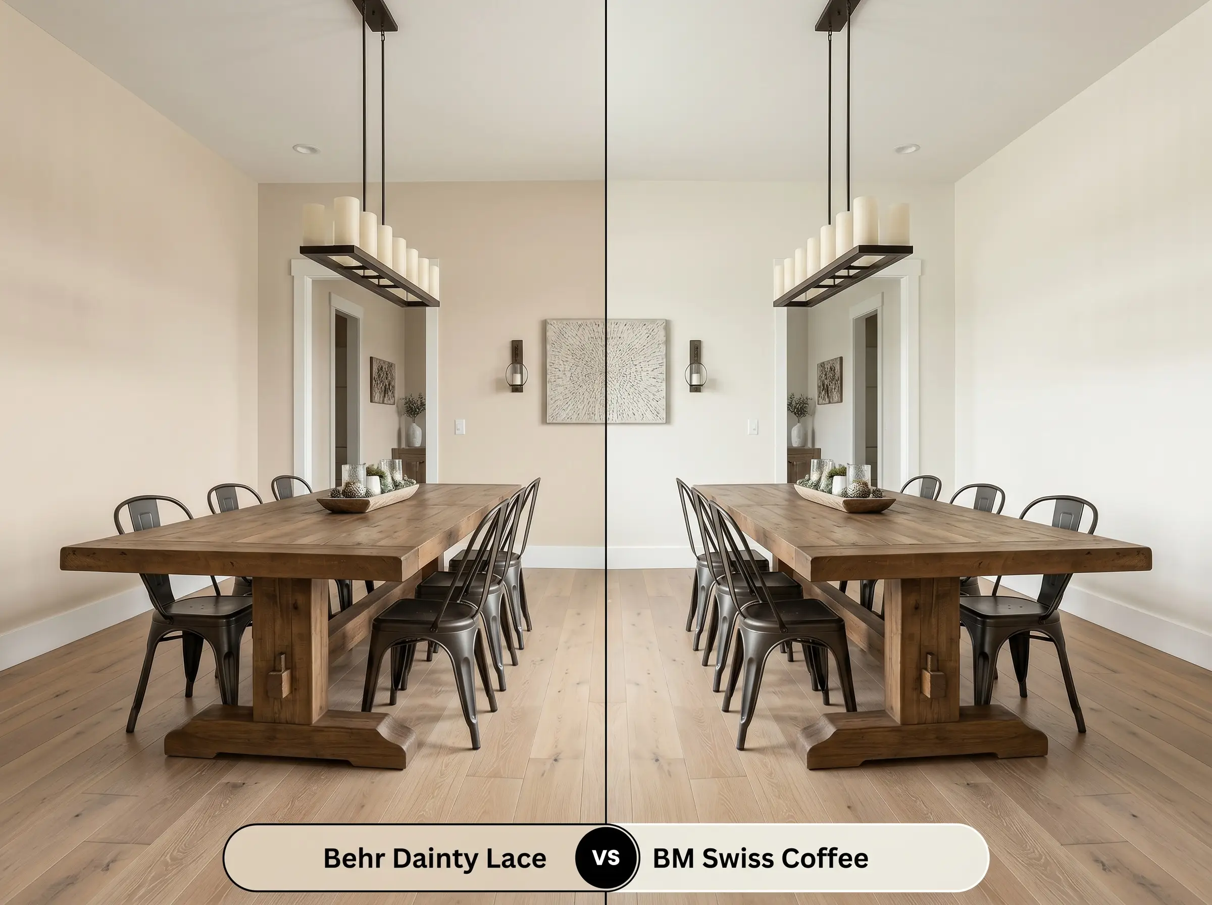
Benjamin Moore Swiss Coffee OC-45 is a legendary, creamy off-white that reads much softer and less distinctly beige. If you are aiming for a subtle, barely-there warmth, then Swiss Coffee is the safer, more traditional choice. Conversely, if your design relies on grounding dense, rustic woods or dark metals, Dainty Lace carries the intense pigment required to stand up to those bold materials.
Exploring Alternatives and Brand Matches
Sometimes a color is almost perfect, but you need a slight shift in its underlying structure to accommodate your home’s specific lighting. Whether you are looking for a deeper sibling shade or need to color-match across different manufacturers, these alternatives offer excellent flexibility.
Sibling Shades Within the Same Catalog
Color Matches Across Rival Brands
Professional Application Strategies
Transitioning this beautiful pigment from a digital screen onto your physical walls requires a clear execution plan. The sheen you select and the preparation you put in will ultimately dictate how this color behaves in your home.
The Dynamic Sheen Guide
Primer Strategy and Coverage Expectations
Because this mid-tone beige carries a solid amount of pigment, a standard high-quality white primer is usually sufficient to establish a neutral base. You will typically need two full coats to achieve true color accuracy and ensure the hidden terracotta notes develop evenly across the wall.
When working with mid-tone warm colors, rolling back over semi-dry paint will cause “flashing”—visible, uneven streaks that ruin the finish. Always maintain a wet edge as you work across the wall, and resist the urge to touch up spots until the entire first coat is completely dry.
Hackrea Pro-Tip (Avoiding the Flashing Trap)
Frequently Asked Questions
Because exterior sunlight intensely washes out mid-tone colors, the terracotta notes will become much more prominent on a textured surface. To prevent your exterior from reading as overtly peach, always test a large swatch on the south-facing side of your home to see how the pigment reacts to full sun.
The rich, yellow-brown base of this paint actually harmonizes beautifully with warm woods by creating a low-contrast, tonal environment. If you want to avoid the room feeling entirely monochromatic, introduce a cool-toned rug or dark metallic hardware to break up the warmth.
Wrapping a vaulted ceiling in this earthy shade is a brilliant way to visually lower the ceiling and make a massive room feel intimate. The color absorbs enough light to draw the eye downward, enveloping the space in a cozy, unified glow.
In spaces completely devoid of natural light, the paint becomes entirely dependent on your bulb temperature. Warm bulbs will amplify its golden characteristics, while cool daylight bulbs will flatten the color, making it read as a much stricter, flatter tan.
The Final Verdict on Behr Dainty Lace
This luminous beige is an exceptional choice for homeowners seeking a warm, grounded alternative to stark white walls. It performs beautifully in living rooms, bedrooms, and rustic kitchens where its earthy pigment can interact with natural woods and tactile fabrics. By establishing a soft, stable foundation, this color effortlessly elevates everyday materials and creates a deeply inviting, lived-in atmosphere.
However, this paint is not a universal solution for every design style. If your home features distinctly cool-toned fixed elements—like icy gray luxury vinyl plank flooring, blue-veined Carrara marble, or stark, cool-white cabinetry—this warm beige will actively fight against those surfaces. The resulting visual friction will make the floors look muddy and the walls appear unpleasantly yellow. To ensure a cohesive design, only commit to this shade if you are willing to embrace a genuinely warm, earthy palette throughout the entire space.
Closest Cross-Brand Equivalents
The absolute closest scientific color matches for Dainty Lace across top paint brands.