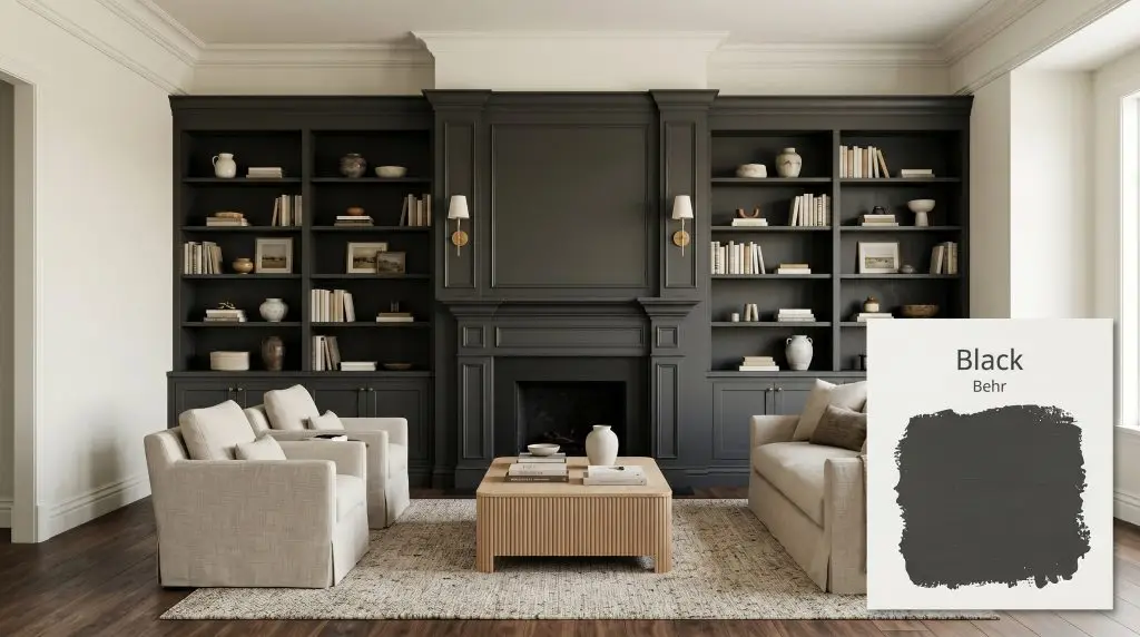
Black
BehrBehr Black is a pure, deep, and dramatic true black paint color with an LRV of 5. Lacking strong blue or green undertones, it functions as a highly versatile, neutral dark shade perfect for grounding a space, painting interior doors, or adding striking exterior contrast.
Paint Technical Profile
| HEX Code | #3f3f3e |
| Light Reflectance (LRV) | 5 |
| Use | Interior, Exterior |
| Best Exposures | South, East, West, North |
| Best For | Accent walls, cabinetry, exterior trim, interior doors |
Behr Black: The True Neutral That Redefines Architectural Focus
Treating a pure, saturated dark shade simply as a paint color is a missed opportunity. When applied intentionally, a true black acts as an architectural boundary, framing your sightlines and forcing the eye to focus on the textures and materials layered within the room. It is the ultimate defining line.
Behr Black is a masterclass in this specific type of visual control. It strips away the competing noise of complex undertones, leaving behind a crisp, definitive shadow that makes surrounding elements pop with incredible clarity. Whether it is highlighting the raw grain of an oak console or framing a view through a living room window, this shade works as a structural tool.
You do not need a sprawling, light-filled loft to pull this off. By understanding its specific color structure and how it manipulates ambient light, you can use this striking neutral to completely redefine the scale and mood of your home.
Behr Black: Temperature, Undertones & LRV
When evaluating Behr Black for your home, you need to know immediately: is this a warm, cool, or truly neutral black? The answer is a near-perfect neutral, but it carries an imperceptible, microscopic warm micro-cast. This tiny hint of warmth is the secret to its success, ensuring the color never shifts into a sterile, icy blue-black on your walls.
A close look at its chromatic profile reveals exactly why it behaves this way:
This shade has a light reflectance value (LRV) of 5. In practical terms, this means it provides massive ambient light absorption, swallowing 95% of the light that hits it. Instead of bouncing light around a room, it creates a visual void, establishing maximum depth and allowing your lighter furnishings to take center stage.
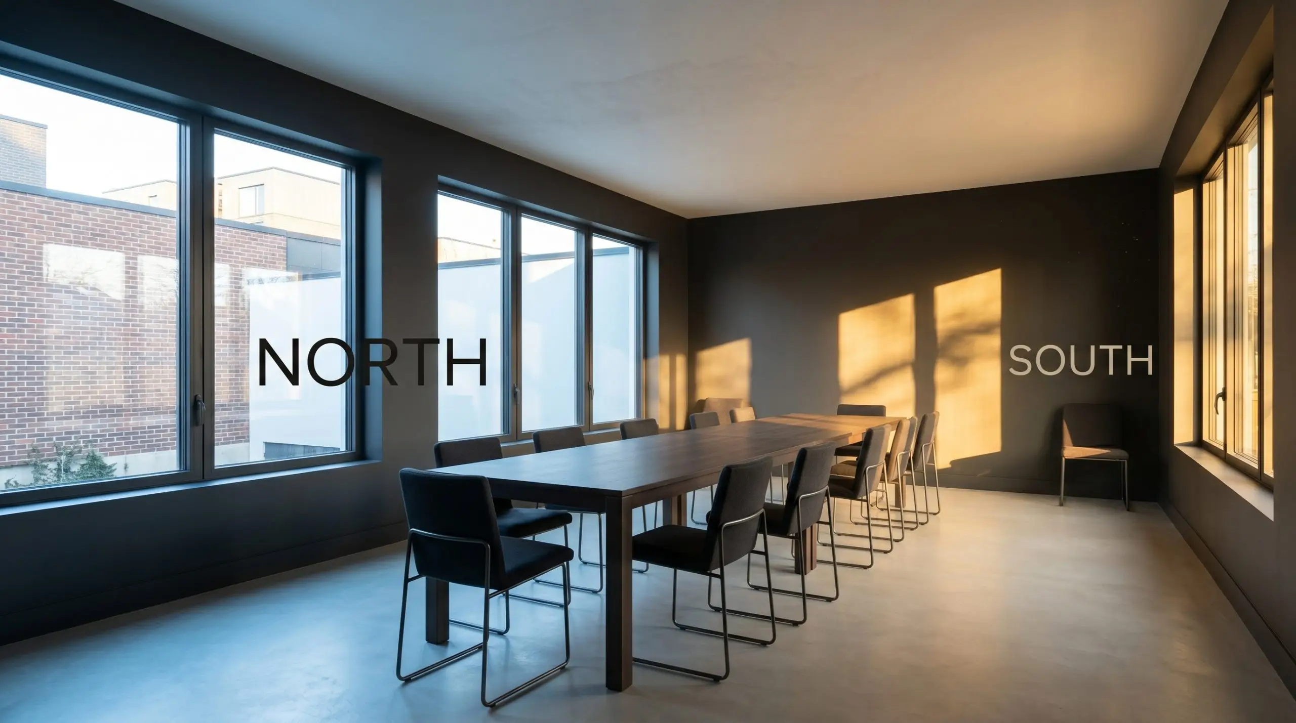
Lighting and Environmental Shifts
Because this deep neutral shade absorbs so much light, its appearance is dictated entirely by the temperature of the bulbs and the direction of the sun hitting your room. It is a highly stable color, but it will soften or sharpen depending on its environment.
When working with a color this dark, your chosen sheen dictates the final look just as much as the lighting. A flat or matte finish will absorb light and look like rich velvet, while an eggshell or satin finish will reflect light off the subtle bumps in your drywall, slightly lightening the perceived color.
Hackrea Design Secret (The Finish Matters)
Popular Applications for This Deep Neutral Shade
The most successful ways to use Behr Black involve treating it as a deliberate architectural feature rather than an afterthought. Because it secures the boundaries of a space so effectively, it works beautifully in applications where you want to draw the eye, frame a view, or create a highly intentional focal point.
Kitchen Cabinetry and Central Islands
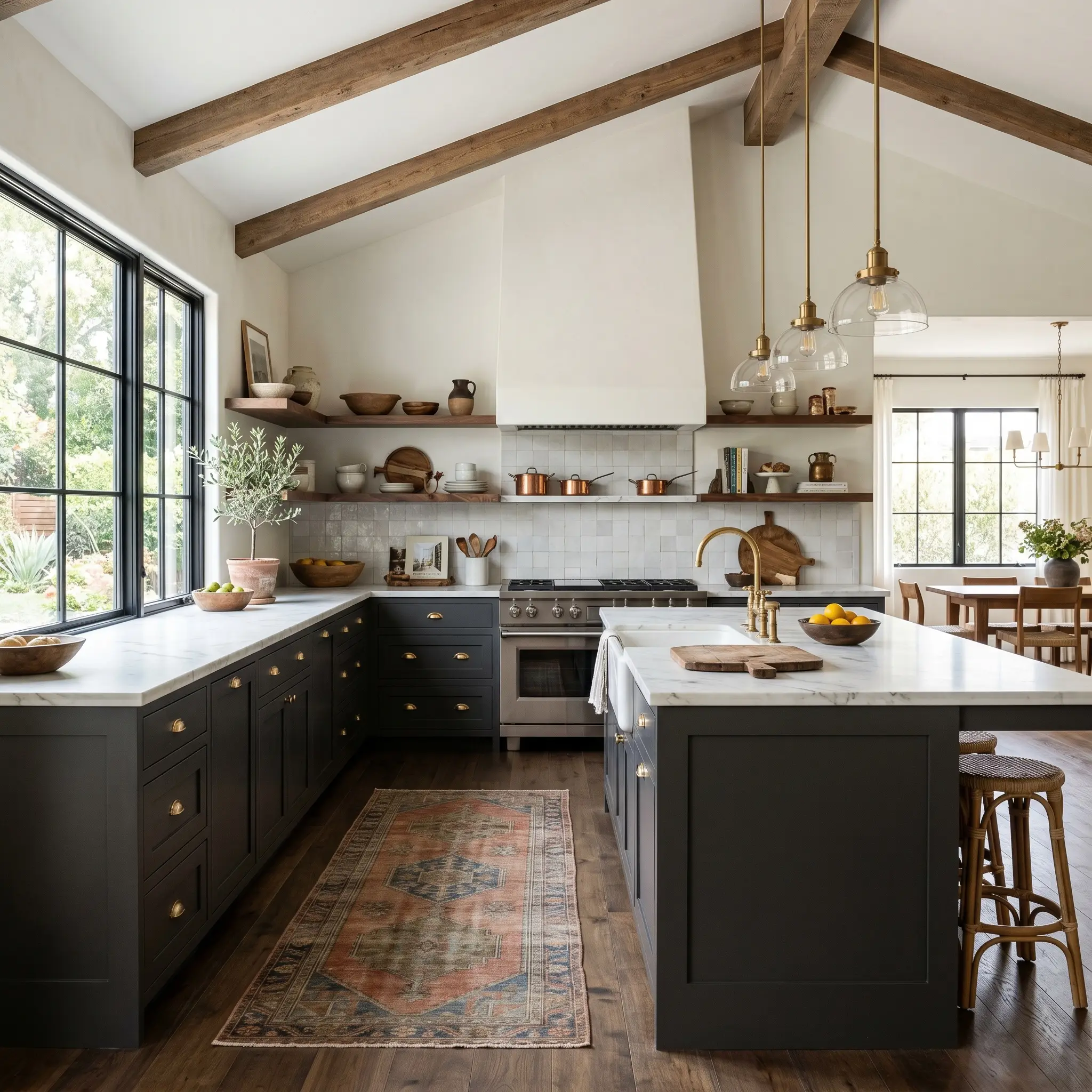
Transforming a kitchen island or a row of lower cabinets with this shade is one of the most effective ways to stabilize a busy cooking space. Matte black cabinetry provides a stunning, high-contrast base that immediately makes standard countertops look more expensive.
To keep the kitchen from feeling stark, you must introduce warmth through your hardware and styling. Pair the dark cabinets with unlacquered brass cup pulls, a vintage runner rug with faded terracotta tones, and raw wood elements like a butcher block cutting board or floating walnut shelves.
Always balance the dark base with highly reflective upper elements. If you are painting the lowers black, keep the upper walls bright with a warm white or a wall of glossy zellige tile to maintain a welcoming, airy atmosphere.
Interior Doors and Window Sashes
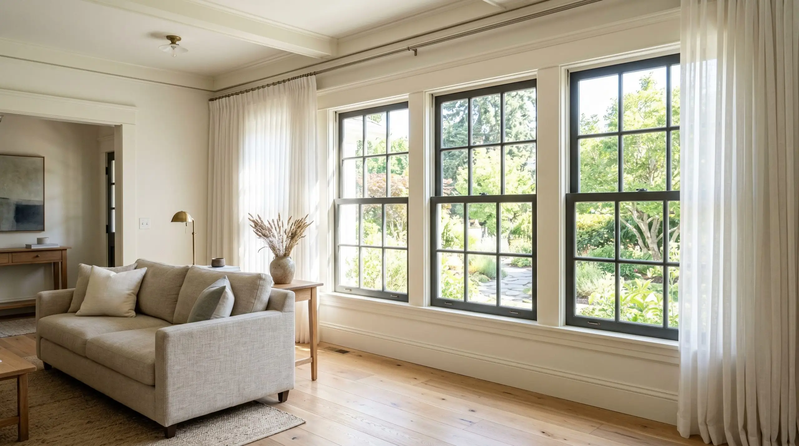
Painting interior doors and window sashes is a brilliant, high-impact strategy for homes that lack built-in architectural character. High-contrast trim acts like eyeliner for a room, framing your view of the outdoors and making standard six-panel doors look entirely custom.
This is also an incredibly practical choice for busy households. A dark, satin-finish door brilliantly hides fingerprints, scuffs, and daily wear in high-traffic hallways or mudrooms.
If you paint your window sashes black, leave the surrounding window casing and trim white. This draws the eye directly out to the landscape, creating the illusion of larger, more expensive windows.
Hackrea Pro-Tip (The Eyeliner Effect)
Exterior Siding, Brick, and Fascia
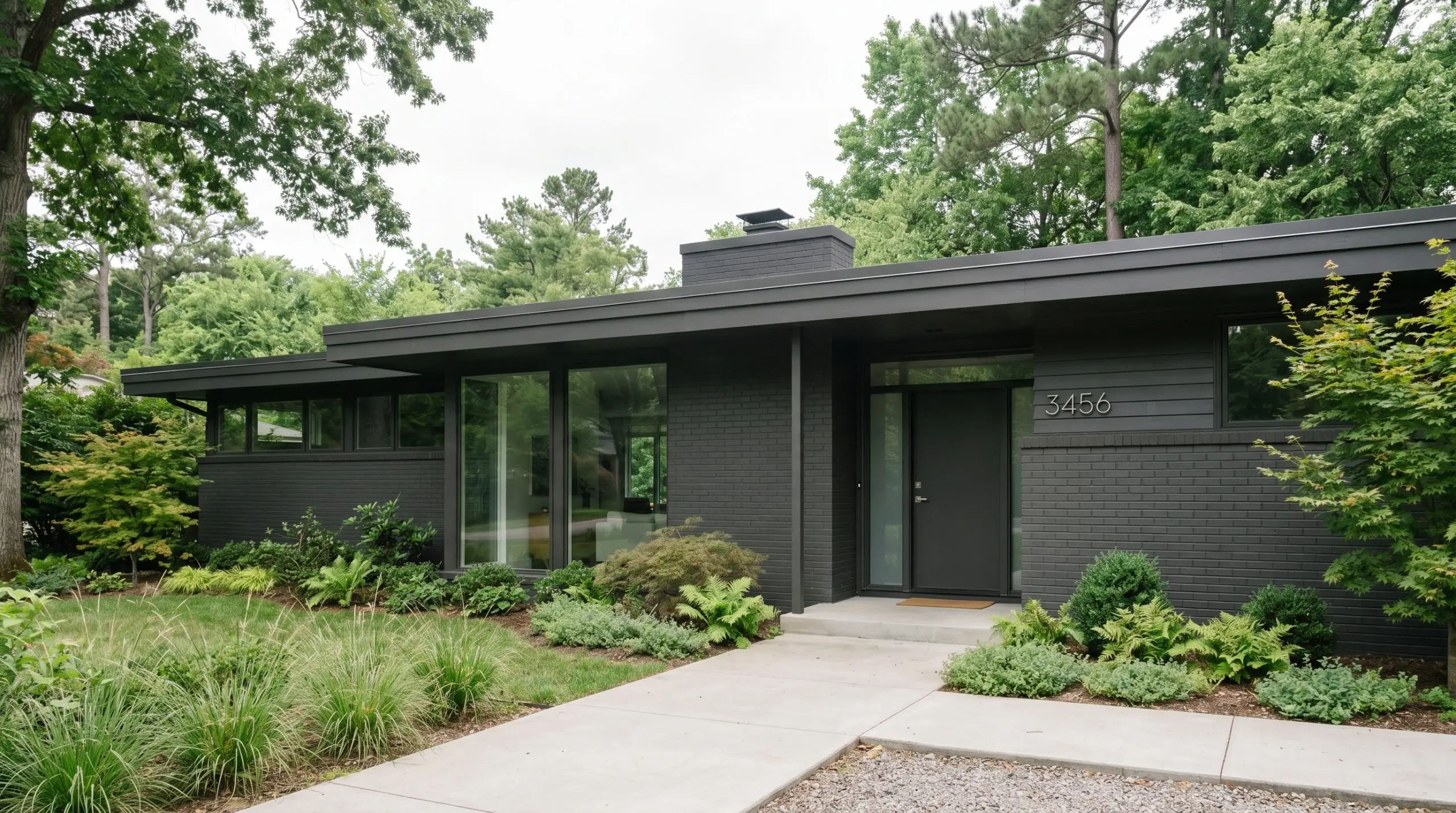
On an exterior facade, this color creates a striking, modern silhouette that pops beautifully against natural green landscaping. It works exceptionally well on modern cabins, mid-century brick ranches, or as a sharp update for suburban fascia and trim.
When taking this shade outdoors, you must account for how the sun interacts with the paint. Full, direct sunlight will slightly wash out the color, making it read a touch softer than it does on an interior color swatch.
Dark colors absorb massive amounts of solar heat. If you are painting a front door or exterior siding that receives punishing, direct afternoon sun, ensure your door material (like fiberglass or steel) and siding are rated for dark paint to prevent warping over time.
Clash Warning (The Heat Trap)
Powder Rooms
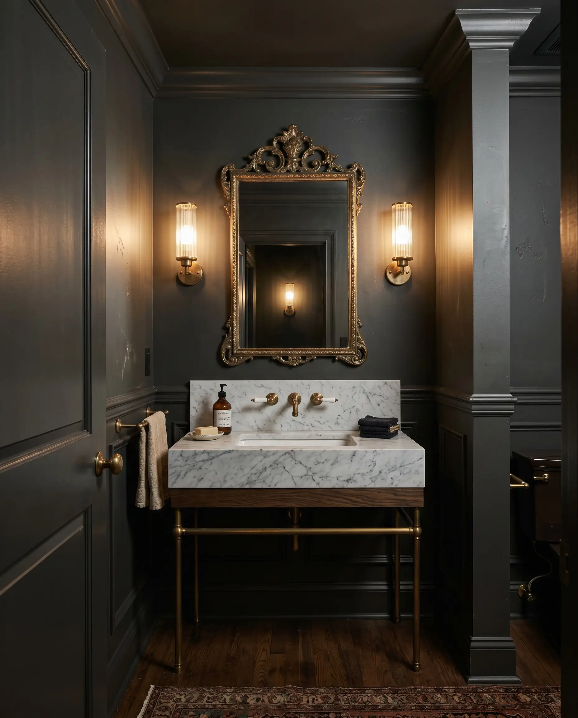
A small, windowless powder room is the perfect candidate for full color drenching. By painting the walls, trim, and ceiling in Behr Black, you completely erase the visual boundaries of the room, making the small space feel endless rather than cramped.
To bring this moody interior palette to life, focus entirely on texture and metallic reflection. Layer in an ornate, antique brass mirror, reeded glass sconces, and a honed marble sink basin. The dark walls will act as a quiet, receding backdrop, allowing these beautiful materials to shine with incredible clarity.
Home Theaters and Moody Bedrooms
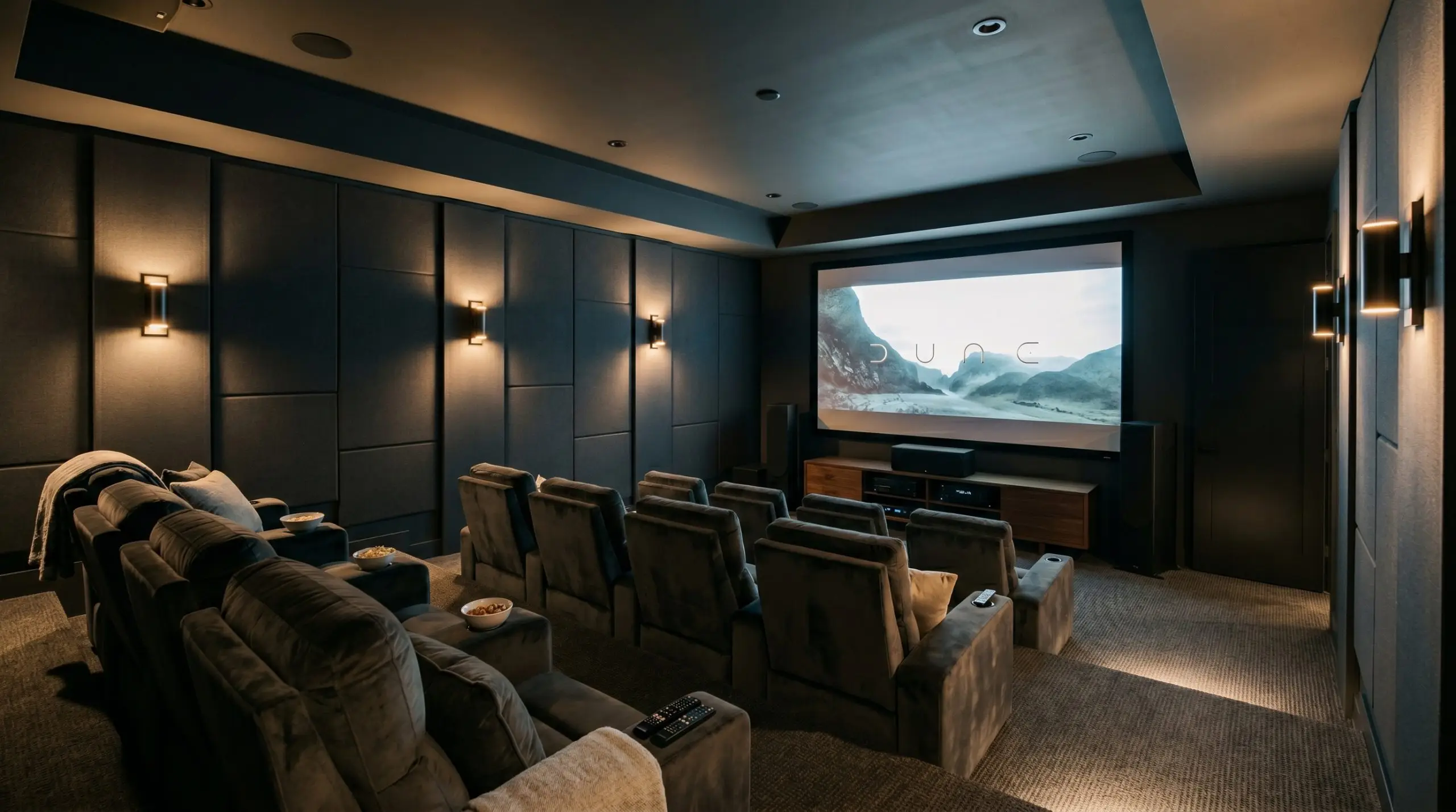
In spaces dedicated to rest or entertainment, this shade excels at creating a wrapping, immersive atmosphere. In a media room, painting the walls and ceiling dark eliminates screen glare and visually removes the room from your peripheral vision.
If you are using this in a bedroom, you must prevent the space from feeling flat or unwelcoming. Introduce massive amounts of tactile softness through your textiles. Think nubby wool rugs, washed linen bedding in warm greige tones, sheer cotton curtains, and warm, 2700K ambient lighting from bedside lamps to create a cozy, restorative retreat.
Coordinating Colors & Material Pairings for Behr Black
Instead of relying on rigid design formulas, you must treat this saturated dark neutral as a reactive canvas that either absorbs or highlights whatever you place next to it. It demands tactile contrast to prevent the room from feeling flat, thriving when paired with materials that offer distinct light reflection or raw organic texture.
Crisp Trim & Baseboard Combinations
Pairing a dark wall with the right white trim establishes the architectural boundaries of the room. A crisp, ultra-clean white visually sharpens the edges of this black, making the entire space feel tailored and highly intentional.
Tactile Elements & Hardware Finishes
When styling this light-absorbing shade, your materials must provide the visual movement that the paint itself lacks.
Coordinating Paint Palettes
Introducing secondary colors requires a deliberate strategy to ensure they do not get swallowed by the dominant dark walls.
Curated Aesthetic Profiles
The true power of this shade lies in its ability to completely change its personality based on the surrounding styling.
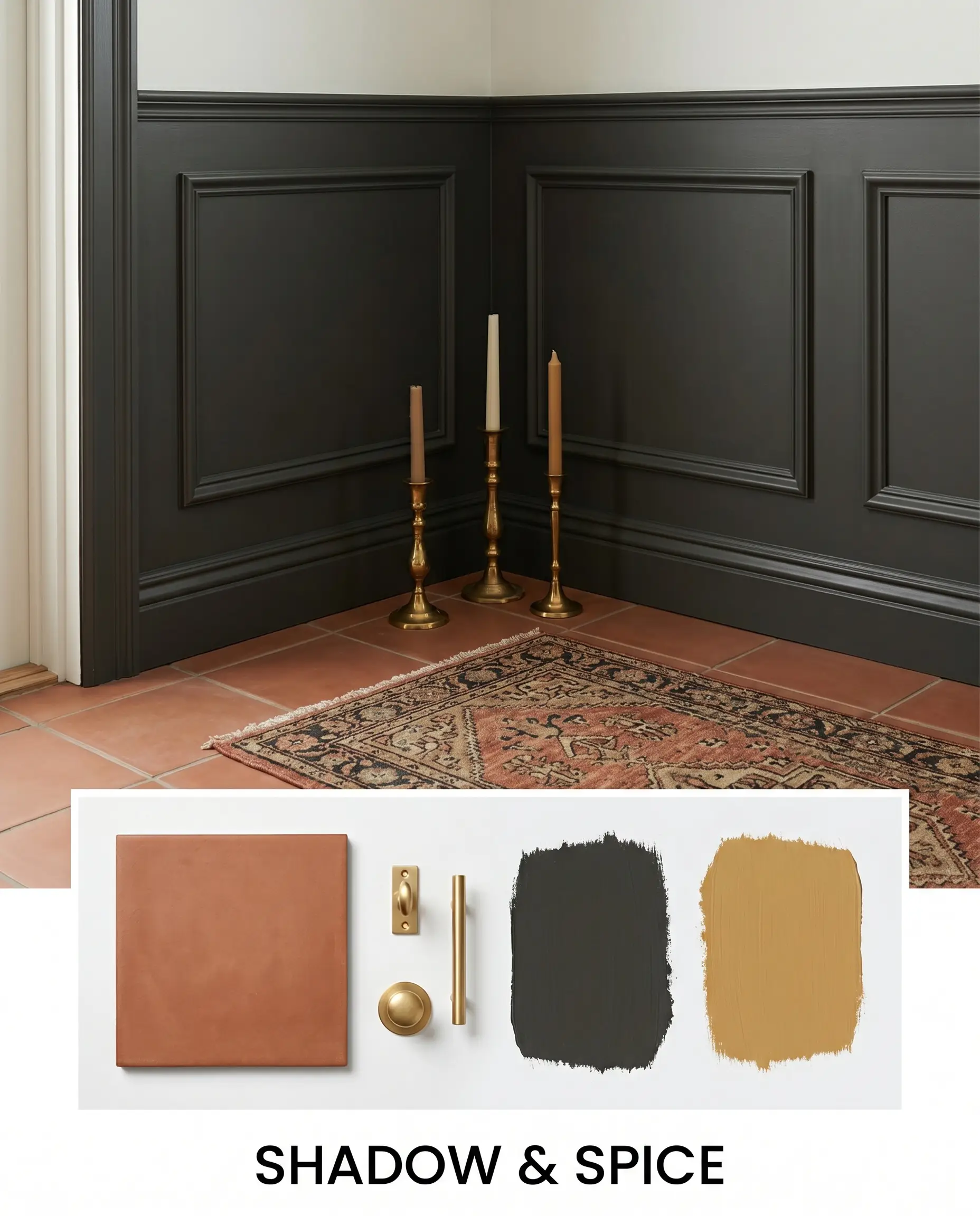
Shadow & Spice This palette thrives on rich, saturated tension. By combining walls painted in this dark neutral with accents of Farrow & Ball India Yellow No.66, you create a vibrant, engaging energy. Layer in unlacquered brass candlesticks, a vintage runner rug, and matte terracotta floor tiles to build a vibe that feels curated, warm, and highly collected.
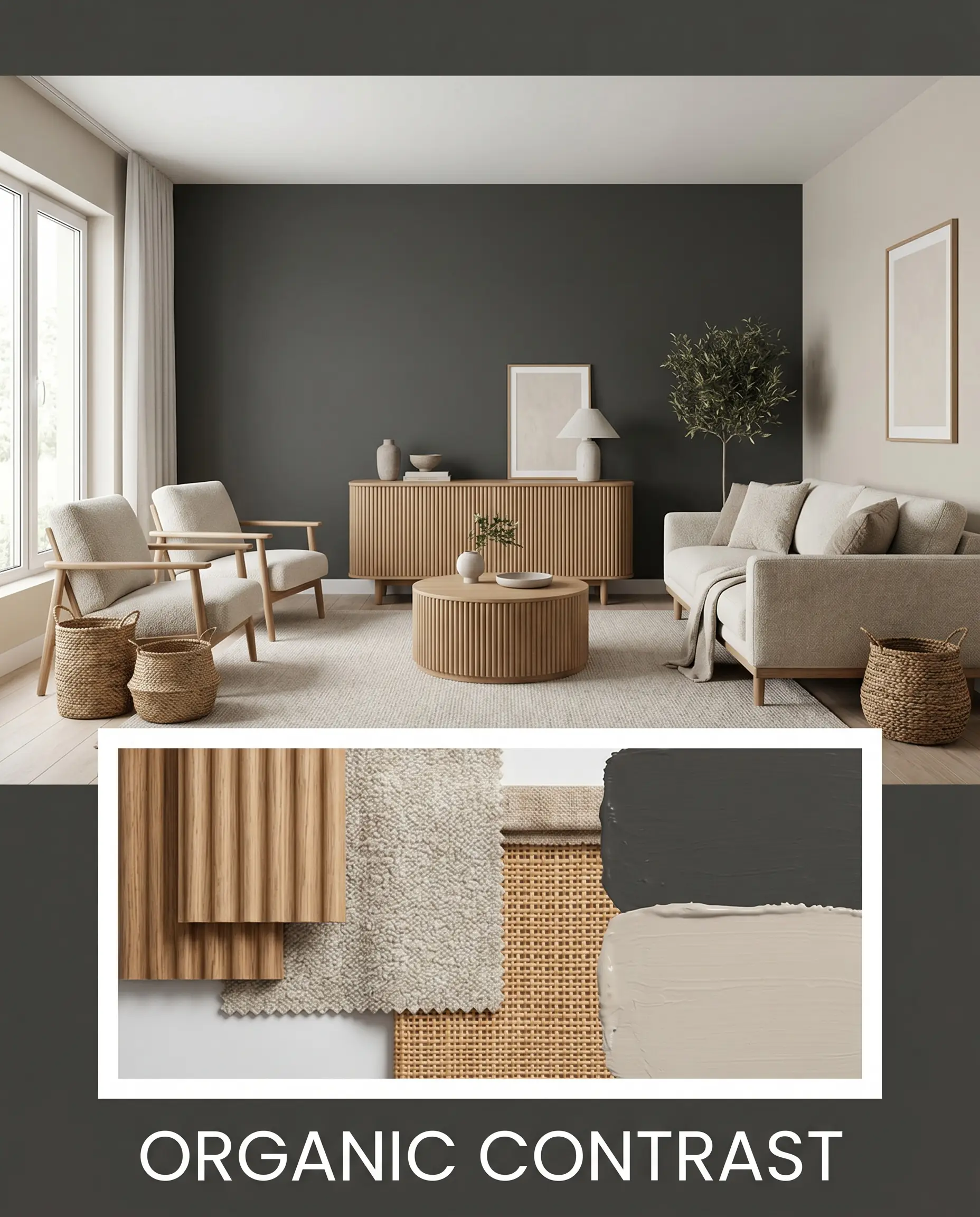
Organic Contrast This aesthetic relies on tactile softness to balance the intense light absorption of the paint. Pair the dark backdrop with adjoining walls in Sherwin-Williams Accessible Beige SW 7036 for a gentle visual transition. Introduce fluted wood furniture, nubby wool textiles, and woven baskets to ensure the aesthetic feels relaxed, layered, and effortlessly modern.
Comparing This Saturated Neutral to Industry Rivals
While this shade is incredibly versatile, specific lighting conditions or architectural styles might demand a slightly different undertone behavior. If your room receives intense, direct sunlight or you need a softer visual edge, exploring a rival paint might be the smarter choice.
Behr Black vs. Sherwin-Williams Tricorn Black SW 6258
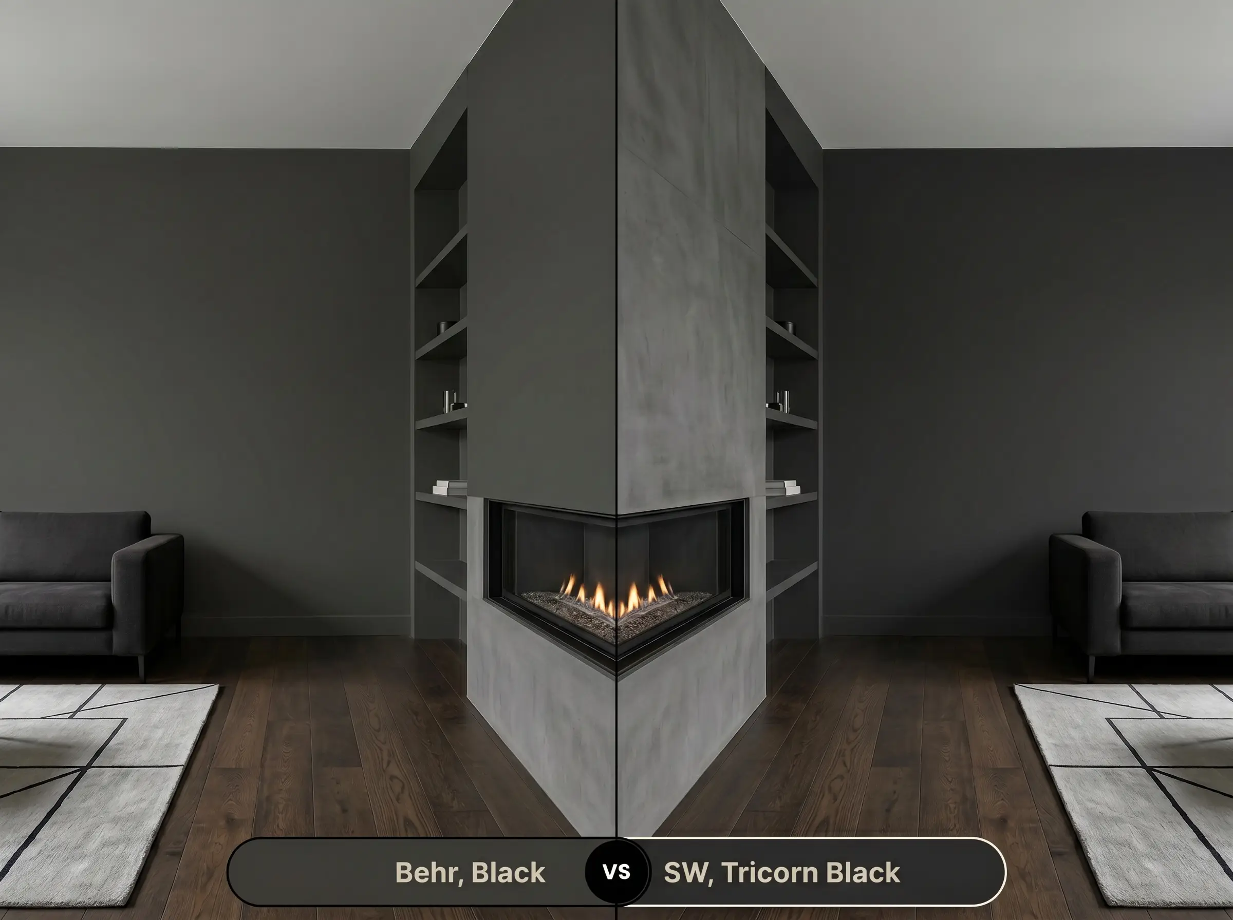
Tricorn Black is widely considered the absolute baseline for a true, undertone-free black. If your room is flooded with unpredictable, shifting natural light, Tricorn Black will maintain its pure, inky appearance without ever pulling warm or cool. However, if you want a dark shade that feels slightly more forgiving and less severe in a residential setting, Behr’s fractional hint of warmth makes it the more approachable option.
Behr Black vs. Benjamin Moore Onyx 2133-10
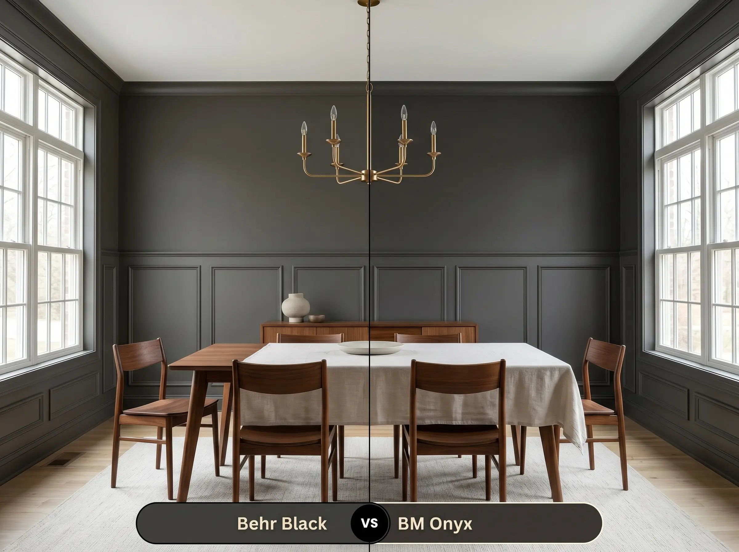
Onyx carries a much more pronounced warm, almost brown undertone compared to Behr’s incredibly subtle base. If you are painting a north-facing room and want to actively counteract the chilly, blue-toned natural light, Onyx will provide that necessary warmth. Conversely, if you are looking for a stark, modern boundary for window sashes or kitchen islands, Behr will deliver a crisper, more definitive silhouette.
Alternative Options for a Dark Palette
Sometimes a project requires a minor pivot in light reflectance or a slightly different brand formulation to achieve the perfect finish.
Same-Brand Alternatives
Staying within the same manufacturer ensures a familiar formula while subtly tweaking the visual output.
Cross-Brand Matches
If you need to color-match due to local availability, these rival shades offer incredibly similar chromatic profiles.
Practical Application for Behr Black
Transitioning this striking color from a swatch to your walls requires a deliberate approach to finish and preparation.
The Dynamic Sheen Guide
Your choice of sheen will dramatically alter how this dark pigment reflects light and handles daily wear.
Primer Strategy & Coverage Expectations
You must start with a deep gray tinted primer to ensure this saturated shade develops its full, rich opacity. Attempting to paint this color directly over a standard white primer will force you to apply three or four coats, increasing the risk of an uneven finish.
Dark paints are notoriously prone to “flashing,” which leaves visible, shiny roller marks when light hits the wall. To prevent this, always maintain a wet edge while rolling, avoid excessive touch-ups once the paint begins to dry, and invest in a high-quality microfiber roller cover.
Hackrea Pro-Tip (The Flashing Warning)
Frequently Asked Questions
Because of its extremely low LRV, intense direct sunlight will inevitably lighten its perceived depth. However, its fractional warm base prevents it from looking chalky, allowing it to soften into a rich, welcoming charcoal rather than a faded gray.
When applied to highly textured surfaces like brick, a flat finish will absorb light and emphasize the shadow-play of the masonry. A satin finish will reflect the sun, making the dark pigment appear slightly lighter while providing crucial protection against the elements.
Yes, this shade is actually highly successful in windowless spaces. By painting the walls, trim, and ceiling in the same dark hue, you erase the visual corners of the room, creating an expansive, infinite backdrop that allows your metallic hardware and mirrors to shine.
A blue-leaning dark shade will actively cool down a room and pair best with stark whites and polished chrome. In contrast, Behr Black’s neutral structure makes it far more versatile, allowing it to harmonize effortlessly with both warm brass tones and crisp, modern silhouettes.
Final Verdict on Behr’s Ultimate Shadow
Behr Black is a highly intentional architectural tool designed for homeowners who want to establish crisp boundaries and bold focal points. Its near-perfect neutral structure makes it incredibly versatile, allowing it to transition seamlessly from modern farmhouse window sashes to moody, color-drenched transitional powder rooms. It performs best when used to frame views, define custom cabinetry, or highlight the tactile beauty of surrounding organic materials.
However, this intense shade is not a universal solution for every dimly lit room in your home. If you attempt to use this color in a cramped, north-facing hallway with zero natural light and cold-toned LED bulbs, the lack of illumination will cause the paint to feel incredibly flat and unwelcoming. Furthermore, pairing this pure dark shade with large expanses of muddy, mid-tone grays or overly yellow oak floors will create a jarring, disjointed visual tension that ruins the curated aesthetic.
Clash Warning (The Lighting & Undertone Trap)
Closest Cross-Brand Equivalents
The absolute closest scientific color matches for Black across top paint brands.