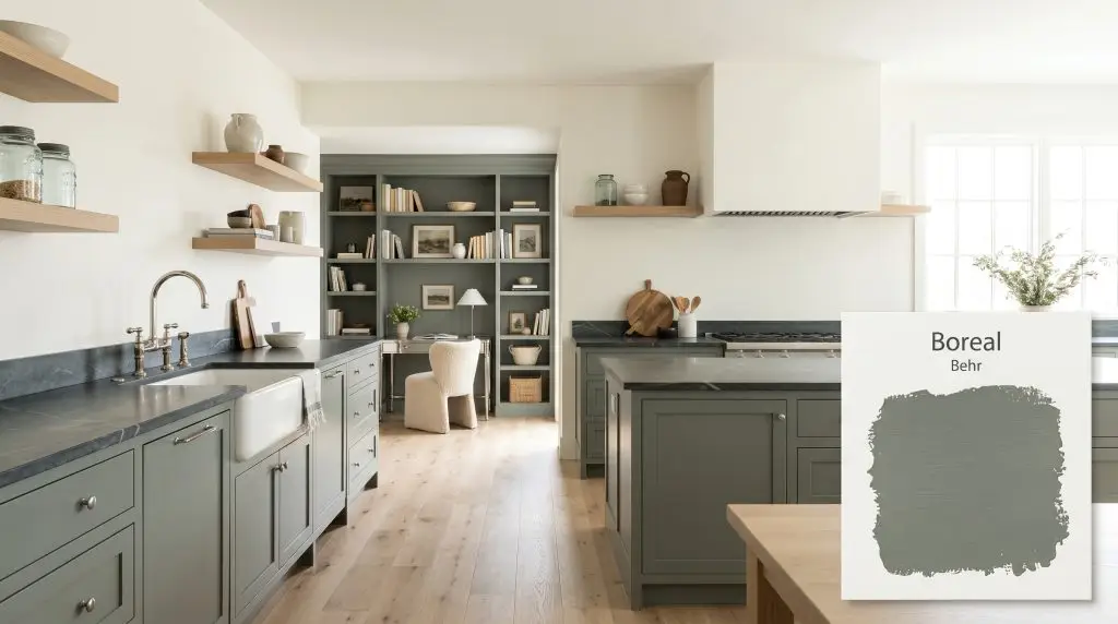
Boreal N420-5
BehrBehr Boreal (N420-5) is a deep, muted green-gray with a Light Reflectance Value of 20. Characterized by a subtle slate-blue undertone, this rich architectural finish provides a grounding, earthy presence ideal for cabinetry, moody home offices, and sophisticated exteriors.
Paint Technical Profile
| Color ID / SKU | N420-5 |
| HEX Code | #717e73 |
| Light Reflectance (LRV) | 20 |
| Use | Interior, Exterior |
| Best Exposures | South, West |
| Best For | Cabinetry, Exteriors, Accent Walls |
Behr Boreal: The Muted Green-Gray That Redefines Structural Presence
Some paint colors sit quietly in the background, while others actively reshape the boundaries of a room. Behr Boreal falls into the latter category, acting less like a simple wall covering and more like a moody architectural finish. This color fundamentally changes how a space feels, pulling the walls inward to create a sense of tailored intimacy.
By stepping away from predictable grays and stark blacks, this earthy chromatic profile offers a highly sophisticated alternative for establishing visual weight. It is a color that demands intentional styling, thriving alongside rich textures and thoughtful lighting plans. When used strategically, this muted green-gray instantly elevates standard drywall into a curated, tactile experience.
Decoding Behr Boreal: Undertones & LRV
If you are trying to determine exactly how this shade will read on your walls, you are likely asking: is Behr Boreal warm or cool? Boreal is a definitively cool-toned green. While many greens lean warm and yellow, the underlying color structure here pulls the temperature down, resulting in a crisp, sophisticated finish that feels incredibly refreshing.
To truly understand how this Behr #717e73 pigment operates, we have to look at its structural DNA:
With an LRV (Light Reflectance Value) of 20, Boreal commands a room through substantial light absorption. It absorbs 80% of the ambient light in your space. This means it will never act as a bright, reflective neutral; instead, it establishes a firm foundation that requires adequate illumination to maintain its complex character.
Because this low-LRV shade swallows light, you must introduce high-contrast materials to keep the room from feeling flat. Pair it with reflective surfaces like unlacquered brass hardware, polished nickel sconces, or glossy zellige tiles to bounce illumination back into the space.
Hackrea Pro-Tip (The Contrast Rule)
The Chameleon Factor: How Light Alters This Earthy Chromatic Profile
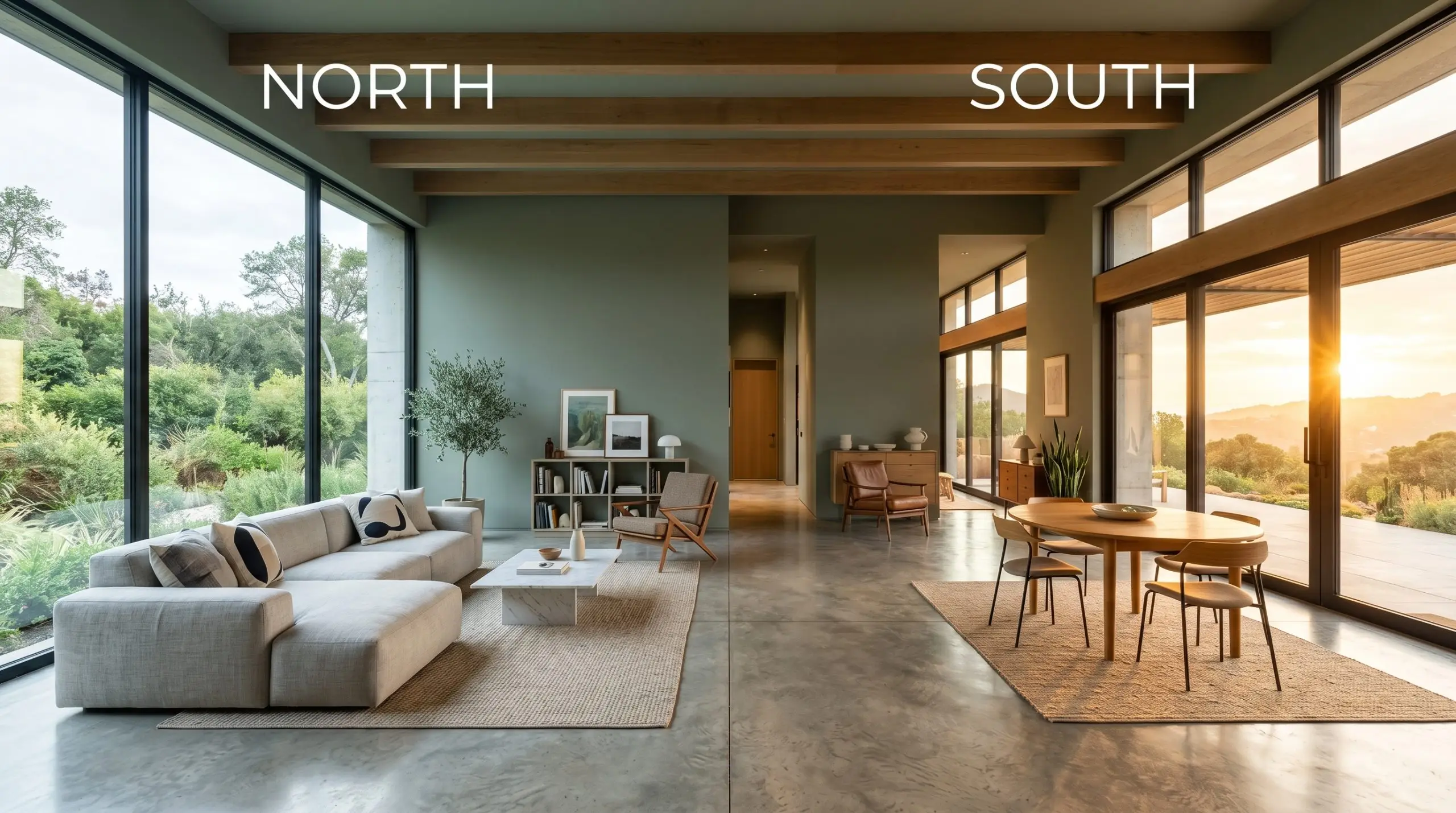
Because of that hidden slate-blue cast, Behr’s Boreal is highly reactive to the shifting temperature of your lighting. The direction your windows face will completely alter which part of the color’s personality takes center stage.
Popular Applications for a Custom-Curated Palette
Because this shade establishes such a commanding visual weight, it is incredibly effective at highlighting specific architectural features or defining functional zones. The secret to mastering this color is knowing exactly where to place it and what materials to pair it with.
Kitchen Cabinetry and Islands
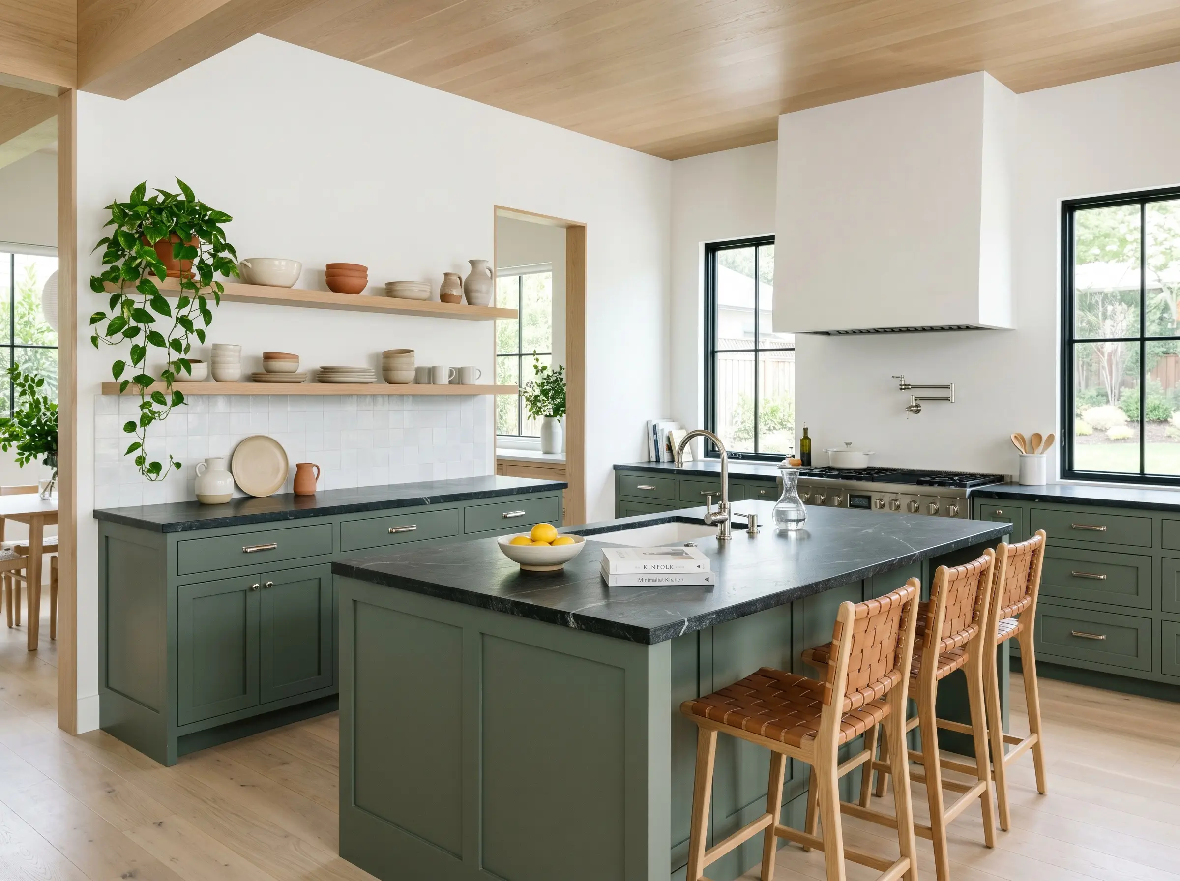
Applying this cool-toned green to lower kitchen cabinets or a central island is a brilliant way to anchor a bright, bustling family kitchen. Instead of defaulting to a predictable farmhouse aesthetic, push the design toward a sleek, transitional style. Pair the painted cabinetry with honed soapstone countertops and polished nickel hardware for a crisp, contemporary contrast.
To keep the space feeling expansive, leave the upper walls and ceiling a stark, reflective white. You can soften the transition between the dark lower cabinets and the bright uppers by introducing natural white oak floating shelves. Styling these shelves with hand-thrown pottery and trailing pothos beautifully highlights the paint’s biophilic roots.
Home Offices and Studies
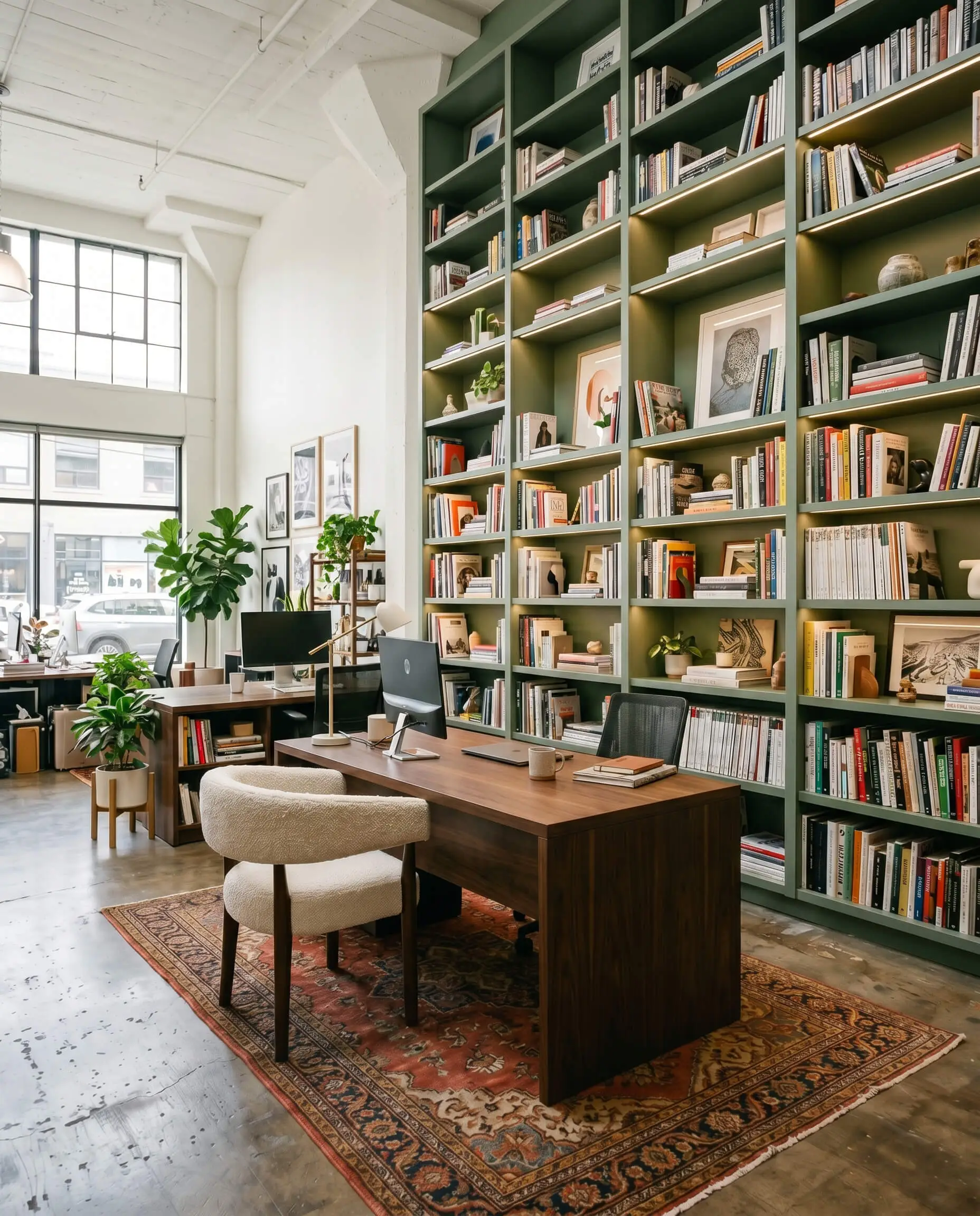
While dark greens are often stereotyped into traditional, dark academia libraries, this specific shade is perfect for a vibrant, modern creative studio. Consider applying the paint exclusively to custom ceiling-height built-ins, turning your storage into a massive, cohesive architectural feature. This provides a brilliant backdrop for remote workers who need a professional, tailored background for video calls.
Offset the firm presence of the painted shelves with soft, tactile furnishings. A nubby bouclé desk chair or a plush vintage rug in shades of terracotta and mustard will instantly warm up the room. The tension between the crisp, slate-blue undertones and the warm, textured fabrics creates a highly dynamic, energizing workspace.
Be incredibly careful when mixing this paint with wood finishes that have strong red or cherry undertones. The cool slate-blue in the paint will clash uncomfortably with the red wood, creating a disjointed aesthetic. Stick to neutral white oak, pale ash, or deep, espresso-stained walnut.
Clash Warning (The Wood Tone Trap)
Exterior Siding and Shutters
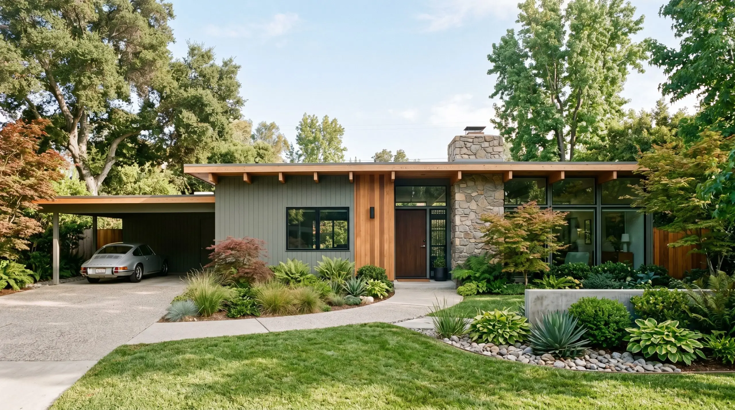
Taking this muted green-gray outdoors allows it to interact with raw, natural sunlight, which beautifully enhances its organic qualities. It is an exceptional choice for exterior siding, especially on mid-century or contemporary suburban homes surrounded by mature landscaping. The color acts as a natural bridge between the home’s architecture and the surrounding environment.
If painting the entire facade feels like too much of a commitment, use it strategically on window shutters or a front door. When paired with a creamy, off-white exterior brick, the green-gray creates a striking, high-contrast focal point. Finish the look with oversized, blackened steel house numbers and modern brass sconces for a polished curb appeal update.
Windowless Powder Rooms
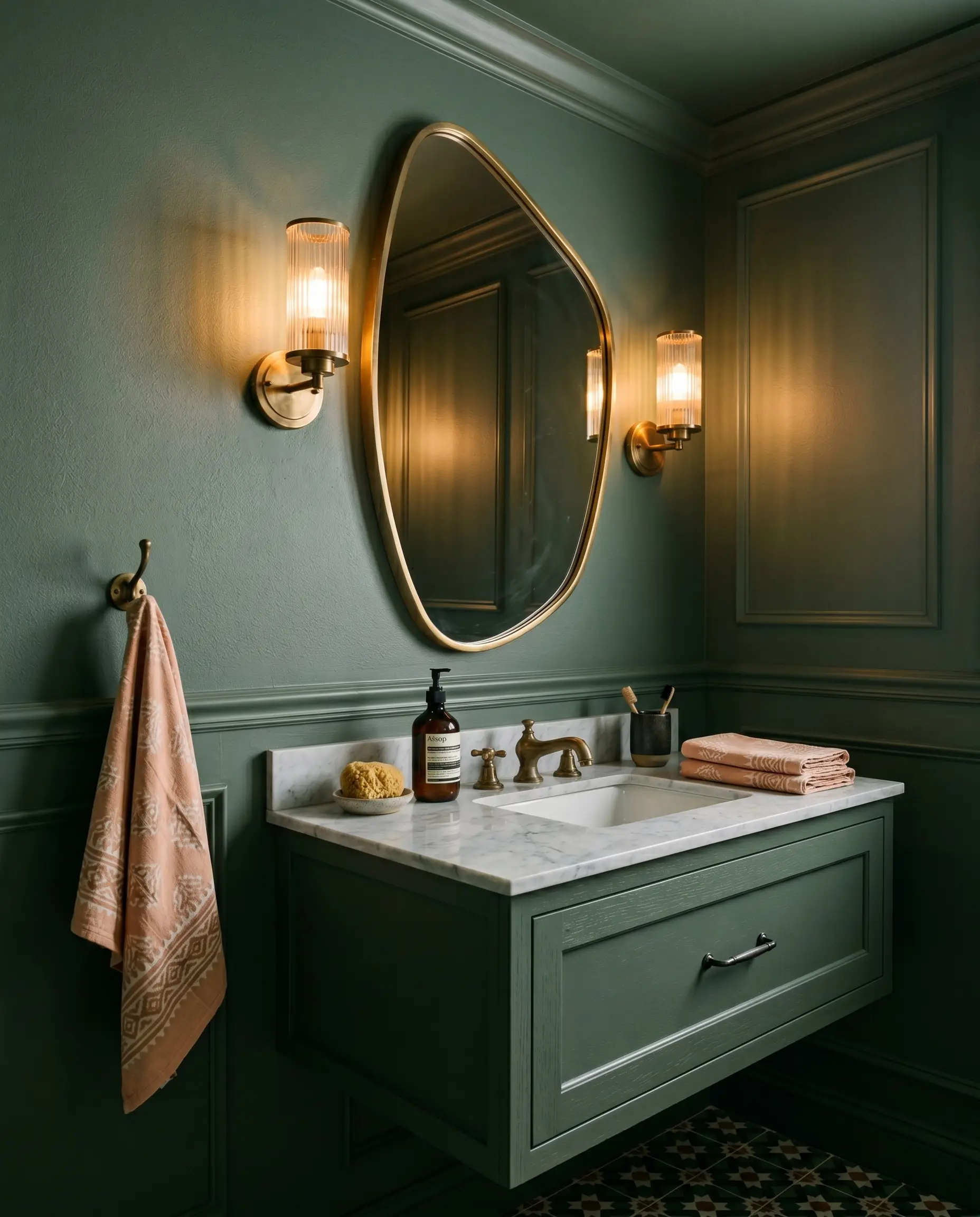
Windowless powder rooms are the perfect place to lean into the light-absorbing qualities of LRV 20. Instead of fighting the lack of natural light, embrace it by enveloping the entire space—walls, trim, and even the ceiling—in this rich hue. This continuous application blurs the sharp corners of the room, creating an intimate, sensory retreat for your guests.
To break up the solid color and add visual interest, introduce highly textured wall decor or lighting. A pair of fluted glass sconces and a large, asymmetrical brass mirror will instantly bounce your artificial light around the small space. Finish the vanity with block-print hand towels in soft peach or camel to introduce a subtle, unexpected pop of warmth.
Mudroom Built-ins
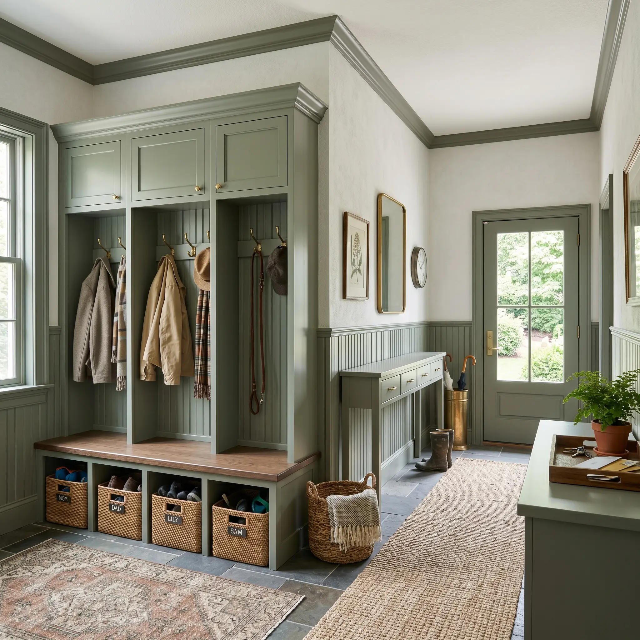
Mudrooms require materials and colors that can handle the daily chaos of active households, muddy boots, and sports equipment. Applying this durable green-gray to mudroom lockers or beadboard wainscoting is a highly practical choice, as the muted depth effortlessly conceals everyday scuffs and fingerprints. It turns a purely utilitarian drop-zone into a stylish, intentional space.
Enhance the organization by outfitting the built-ins with unlacquered brass hooks and durable rattan storage baskets. The warm, woven textures of the baskets beautifully contrast the cool, slate-blue undertones of the paint. Add a durable sisal runner to the floor, and you have created a hardworking entryway that still feels incredibly curated.
Building a Custom Palette Around Behr Boreal
This cool-toned pigment relies on distinct material boundaries to hold its structural shape. Without intentional, contrasting textures, this deep hue can easily absorb the energy of a room and fall visually flat. The secret to styling this specific green-gray is surrounding it with elements that either aggressively bounce light or introduce a grounding, earthy warmth.
Selecting the Right Trim
Choosing the correct white for your baseboards and crown molding fundamentally dictates how crisp this paint will appear. It is never just about matching a color; it is about managing the visual transition between the wall and the architecture.
Tactile Material Pairings
To bring out the absolute best in this moody architectural finish, you must introduce a deliberate mix of reflective and matte textures. These specific materials create a vital visual dialogue with the paint’s underlying color structure.
Harmonizing Paint Colors
Building a cohesive room requires secondary colors that support, rather than compete with, your primary hue.
Curated Aesthetic Concepts
To understand how versatile this Behr pigment truly is, we must look at how it shifts across different design styles. By swapping out your textiles and hardware, you can completely alter the emotional resonance of the space.
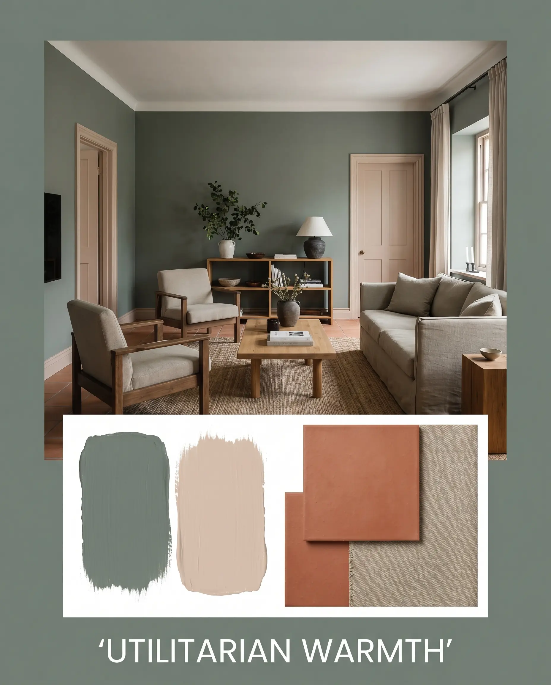
Utilitarian Warmth This aesthetic leans into a grounded, highly practical energy that still feels incredibly curated. By pairing the green-gray walls with matte terracotta floors and durable brushed canvas upholstery, you create a space that feels both resilient and inviting. Brushing Farrow & Ball Setting Plaster on the ceiling or interior doors injects a soft, unexpected glow that beautifully cuts through the utilitarian ruggedness.
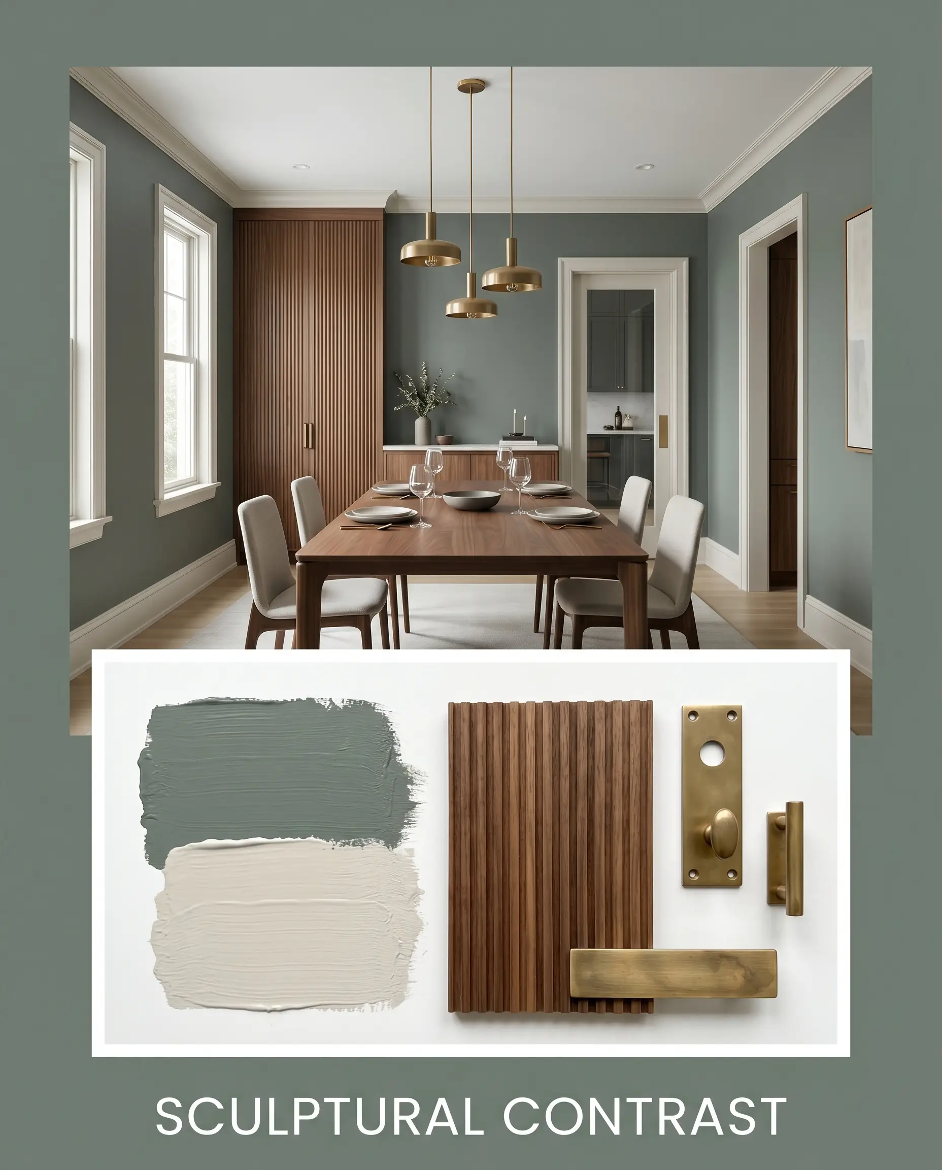
Sculptural Contrast For a more elevated, tension-filled design, surround the dark paint with sharp silhouettes and luxurious finishes. Custom millwork rendered in reeded walnut provides a handsome, deeply textured companion to the cool-toned green walls. Adding unlacquered brass lighting fixtures against a backdrop of Benjamin Moore Pale Oak instantly creates a magazine-ready, high-contrast environment.
Head-to-Head Paint Comparisons
Sometimes a specific lighting exposure or existing architectural feature demands a subtle pivot in your color strategy. If your room receives entirely cool northern light, or if your flooring leans slightly yellow, you may need to compare alternative options to ensure a flawless execution.
Behr Boreal vs. Sherwin-Williams Pewter Green SW 6208
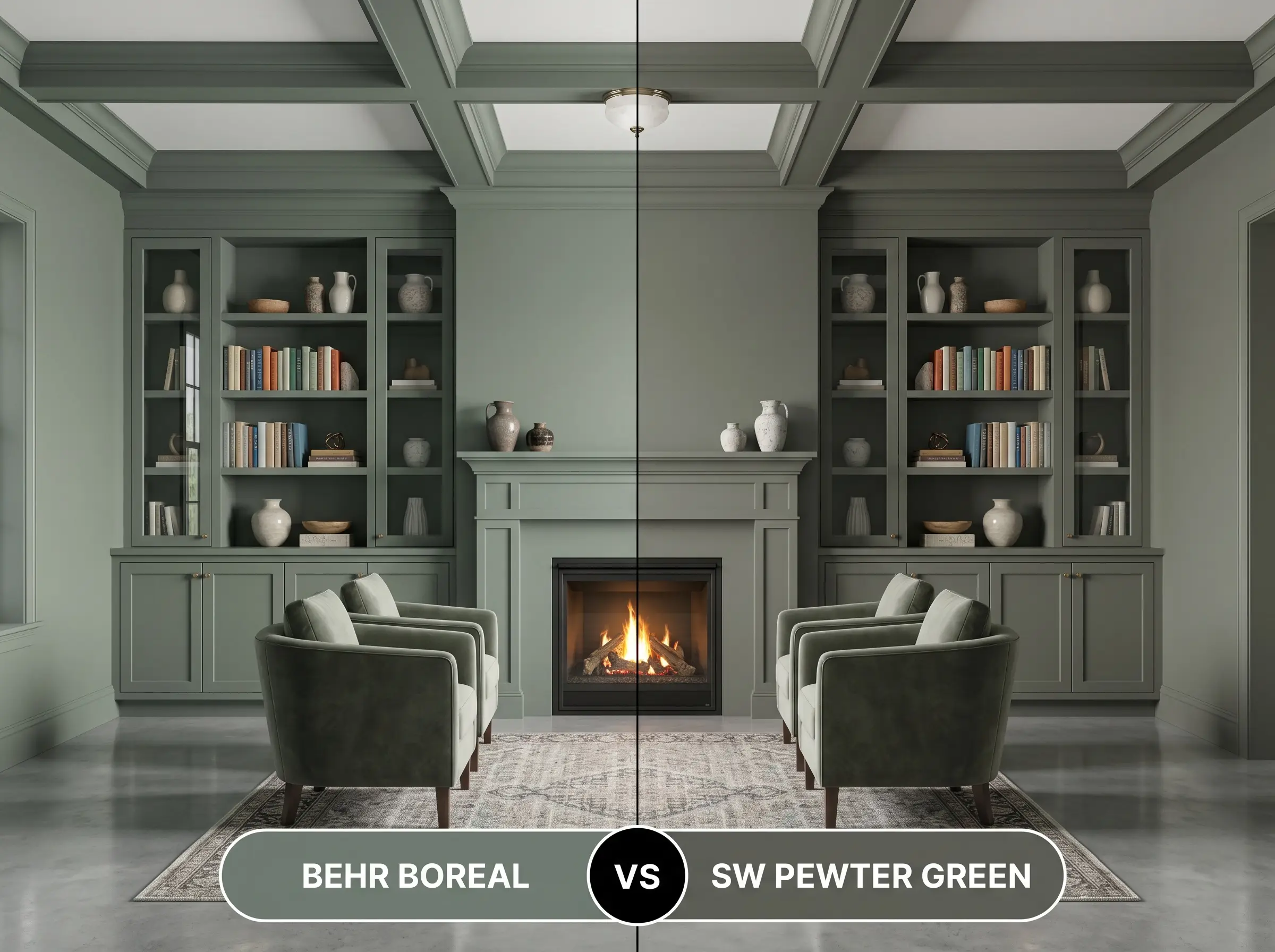
If your space feels too cold, you might find Pewter Green to be the superior choice. While both are muted greens, the Sherwin-Williams option features a distinct olive undertone that radiates a subtle warmth. Boreal, with its slate-blue cast, will always read significantly cooler and crisper on the wall.
Behr Boreal vs. Benjamin Moore Cushing Green HC-125
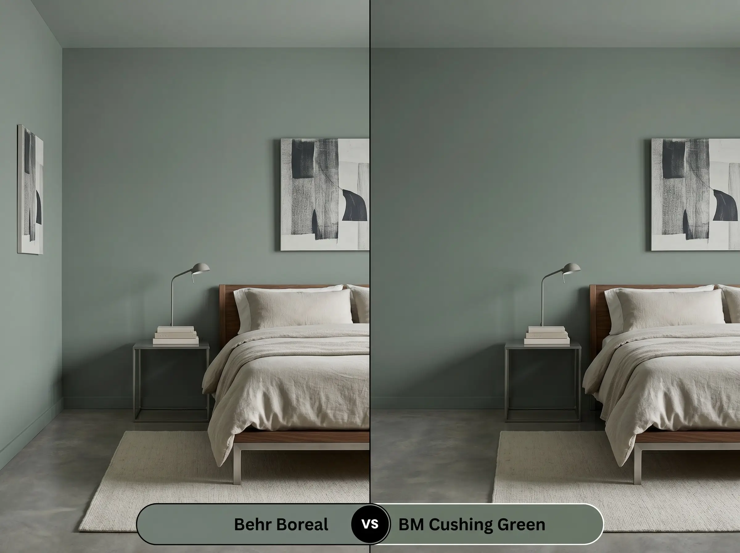
When you need a color that holds its vibrancy in low light, Cushing Green steps forward with a slightly higher chromatic intensity. The Behr option absorbs more light and grays out much faster in shadowy corners. If you want a definitive, undeniable green, choose Cushing Green; if you want a moody, shifting neutral, stick with Behr.
Behr Boreal vs. Farrow & Ball Card Room Green No. 79
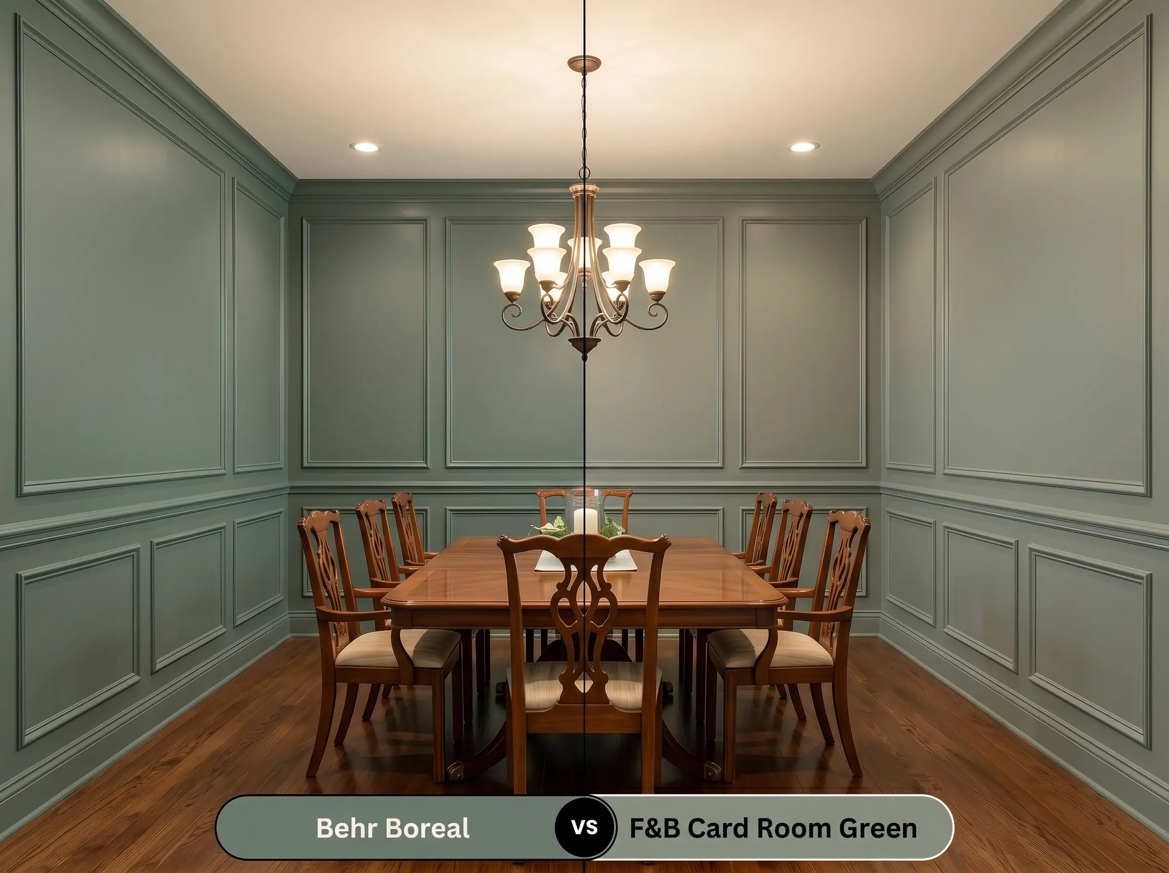
These two colors share a remarkably similar depth, but they behave differently under artificial lighting. Card Room Green possesses a complex, historical muddiness that feels incredibly traditional and soft. In contrast, the Behr #717e73 pigment retains a sharper, more contemporary edge due to its modern blue undertones.
Navigating Similar Colors and Brand Matches
You may find yourself needing a slight adjustment in light reflectance, or perhaps you simply need to source your paint from a different manufacturer. Reviewing closely related shades helps you dial in the exact energy your specific room requires.
Within the Same Collection
If you love the fundamental DNA of this color but need a minor tweak in depth or intensity, Behr offers several excellent alternatives.
Cross-Brand Equivalents
When shopping across different paint counters, finding an exact 1:1 match is rare due to different proprietary tinting bases. However, these alternatives will provide a nearly identical aesthetic experience.
Professional Application and Finish Strategy
Transitioning from conceptual color theory to the physical reality of a roller and brush requires careful planning. Darker, low-LRV paints demand specific application techniques to ensure a flawless, professional-grade result.
Selecting the Ideal Sheen
The finish you choose will dramatically alter how this color reflects light and how easily it can be maintained over time.
Priming and Coverage Guidelines
Because this Behr pigment sits at an LRV of 20, painting it directly over a standard white wall is a recipe for frustration. You must use a high-quality primer tinted to a deep gray. This crucial step reduces the number of expensive topcoats required and ensures the slate-blue undertones develop correctly.
Dark, matte paints are notorious for “flashing”—those visible, uneven roller marks that appear when the paint dries at different rates. To avoid this, you must maintain a wet edge while rolling and strictly avoid going back over semi-dry sections to touch them up.
Hackrea Design Secret (The Flashing Warning)
Plan for a minimum of two generous coats of the premium color over your tinted primer. If you attempt to stretch the paint too thin to save time, the underlying wall color will bleed through, completely ruining the rich, moody architectural finish you are trying to achieve.
Frequently Asked Questions
Because textured stucco naturally casts its own micro-shadows, applying a low-LRV paint in a heavily shaded area will significantly deepen its appearance. To prevent it from looking completely lost in the shadows, pair it with crisp, bright white exterior trim to force a sharp visual boundary.
The interaction here is actually highly complementary, as the cool slate-blue undertones provide a beautiful, crisp contrast to the golden warmth of the oak. Just ensure your artificial vanity lighting leans slightly crisp (around 3500K) to keep the green from graying out completely.
Applying this commanding hue to the ceiling is a brilliant strategy for making a tall room feel more intimate and tailored. To maintain an inviting atmosphere, ensure the surrounding walls are painted a highly reflective, warm white to keep light moving freely around the space.
The stark contrast between the cool green-gray and the fiery red brick can create an uncomfortable, vibrating tension. If you have a prominent red brick feature, you are much better off selecting a green with a warmer, yellow-olive base to bridge the gap gracefully.
Final Verdict and Crucial Warnings
Behr Boreal is an exceptional choice for homeowners seeking a sophisticated, architectural color that commands attention without relying on vibrant saturation. It performs flawlessly when used to anchor custom cabinetry, envelop intimate powder rooms, or modernize exterior facades. This paint is perfect for those who understand the value of intentional lighting and are willing to pair their wall color with rich, contrasting textures.
However, this color requires a specific environment to truly succeed. You must avoid pairing this cool-toned green with large expanses of cool, blue-toned gray flooring, as the combination will instantly drain all the life from the room, leaving it feeling chilly and stark. Additionally, if your home features predominantly cherry wood furniture or bright red brick, the slate-blue undertone of this paint will fight aggressively against those red hues. Always ensure you are introducing warm, neutral elements—like white oak or unlacquered brass—to give this beautiful, moody shade the balanced environment it needs to thrive.
Closest Cross-Brand Equivalents
The absolute closest scientific color matches for Boreal across top paint brands.