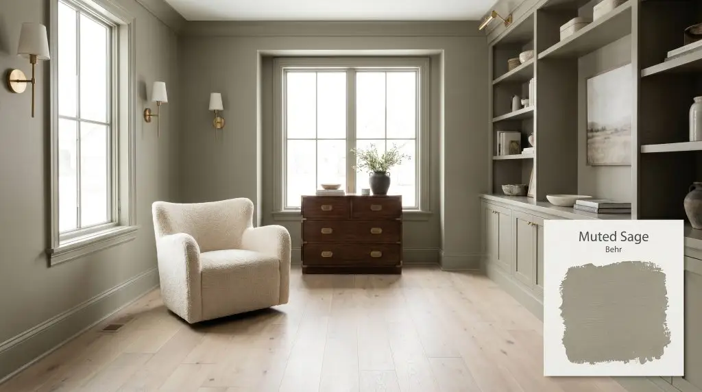
Muted Sage N350-5
BehrBehr Muted Sage (N350-5) is a medium-dark, earthy green-gray with a Light Reflectance Value of 28. Featuring a soft, natural color structure, it acts as a calming neutral that shifts between a warm herbal green in bright daylight and a moody, grounded gray in the shadows.
Paint Technical Profile
| Color ID / SKU | N350-5 |
| HEX Code | #93907e |
| Light Reflectance (LRV) | 28 |
| Use | Interior, Exterior |
| Best Exposures | South, West |
| Best For | Cabinetry, millwork, cozy living spaces, exterior accents |
Behr Muted Sage: The Architectural Secret to an Earthy, Enveloping Home
True architectural presence rarely comes from vivid, highly saturated colors. Instead, it emerges from the quiet, muddy neutrals that subtly shift the entire atmosphere of a room. Behr Muted Sage is one of those rare, transformative pigments that feels less like a simple coat of paint and more like a structural material.
When you roll this earthy green onto a wall, it immediately establishes a profound sense of calm and permanence. It acts as the ultimate foundation for biophilic design, pulling the organic textures of the outdoors directly into your living space. The magic of this color lies in its restraint, offering enough pigment to make a definitive statement without ever overwhelming the eye.
To successfully execute a room with Muted Sage, you must treat it as a textural canvas. It demands to be paired with tactile, honest materials—think saddle leather, unlacquered brass, and honed soapstone. By understanding the underlying structure of this color, you can turn standard drywall into a rich, enveloping environment.
Undertones & LRV of Behr Muted Sage
When homeowners ask if Behr Muted Sage is warm or cool, the answer leans definitively warm. This temperature is entirely dictated by a subtle, earthy brown-gray undertone that completely alters the paint’s personality on the wall. Instead of reading as a crisp, minty pastel, it settles into a rich, muddy neutral.
To truly understand how this color operates, we have to look at its core components:
With a light reflectance value (LRV) of 28, this architectural finish absorbs a significant amount of light. Sitting firmly in the medium-dark category, this paint will command substantial visual weight in any room. Rather than expanding a small space, it intentionally creates an intimate, enclosed atmosphere that feels incredibly cozy.
Because this color absorbs light, applying it in a flat or matte finish will enhance its velvety, shadow-rich qualities. If you are using it on high-traffic trim or doors, opt for a satin finish to provide durability while maintaining its subdued elegance.
Hackrea Pro-Tip (The Finish Strategy)
How Natural Light Manipulates This Earthy Green
The true beauty of Behr Muted Sage is that it never remains static throughout the day. Because of its complex color structure, shifting sunlight acts as a catalyst, pulling different undertones to the surface.
Here is exactly how you can expect this paint to behave across different lighting scenarios:
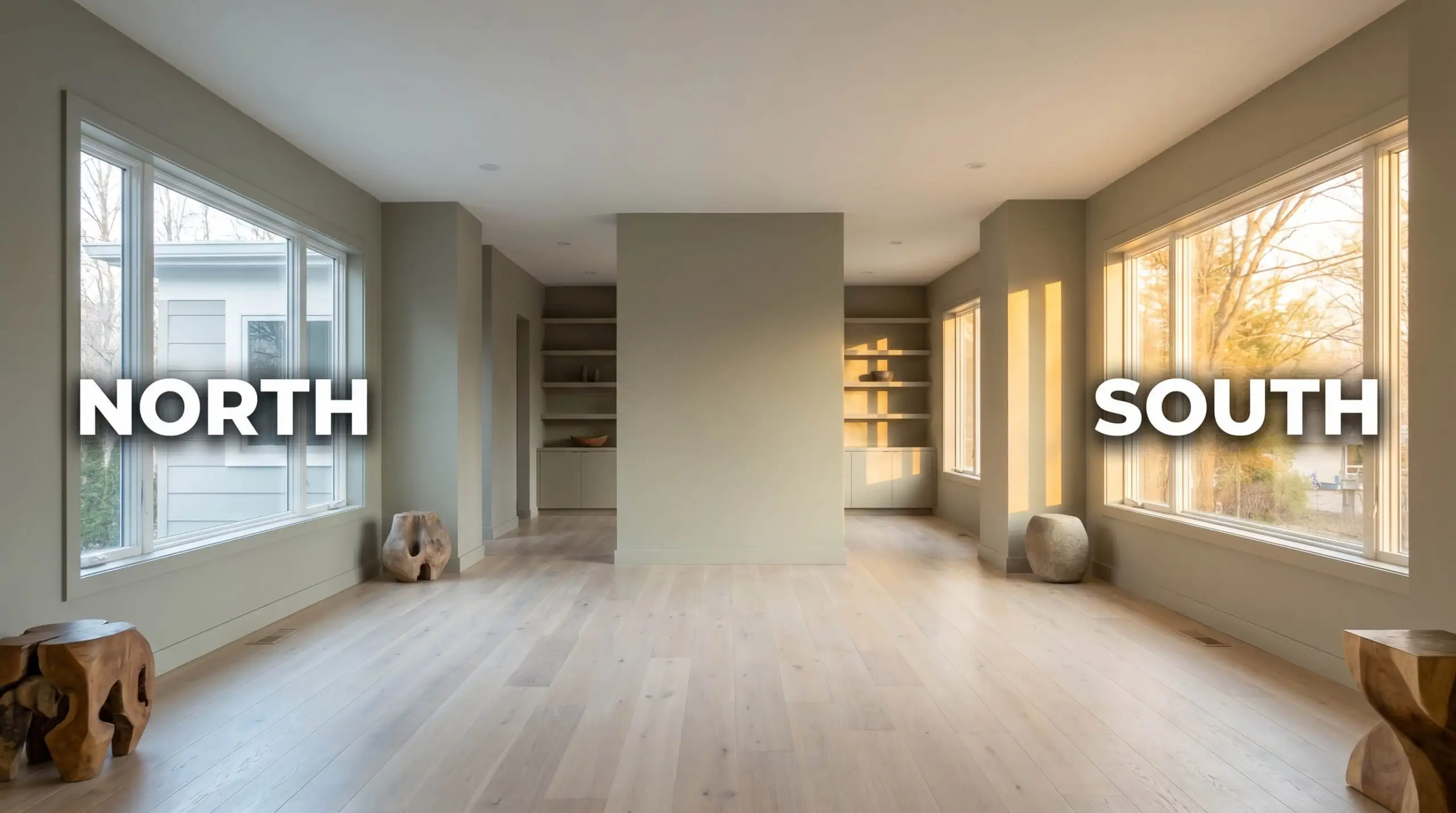
Be incredibly mindful of your overhead lighting. If you mix warm lamps with cool 4000K overhead LEDs in the same room, this paint will visually fracture, appearing muddy brown in one corner and sterile gray in another. Always standardize your bulbs to a single temperature.
Clash Warning (Bulb Temperatures)
Transformative Applications for Muted Sage
The most successful interiors treat paint as an active participant in the room’s architecture, not just an afterthought. Because Behr Muted Sage carries such a substantial visual weight, it excels in applications where you want to intentionally define a space or highlight a specific feature. Here is how to utilize this earthy neutral across your home’s most impactful zones.
Kitchen Cabinetry & Islands
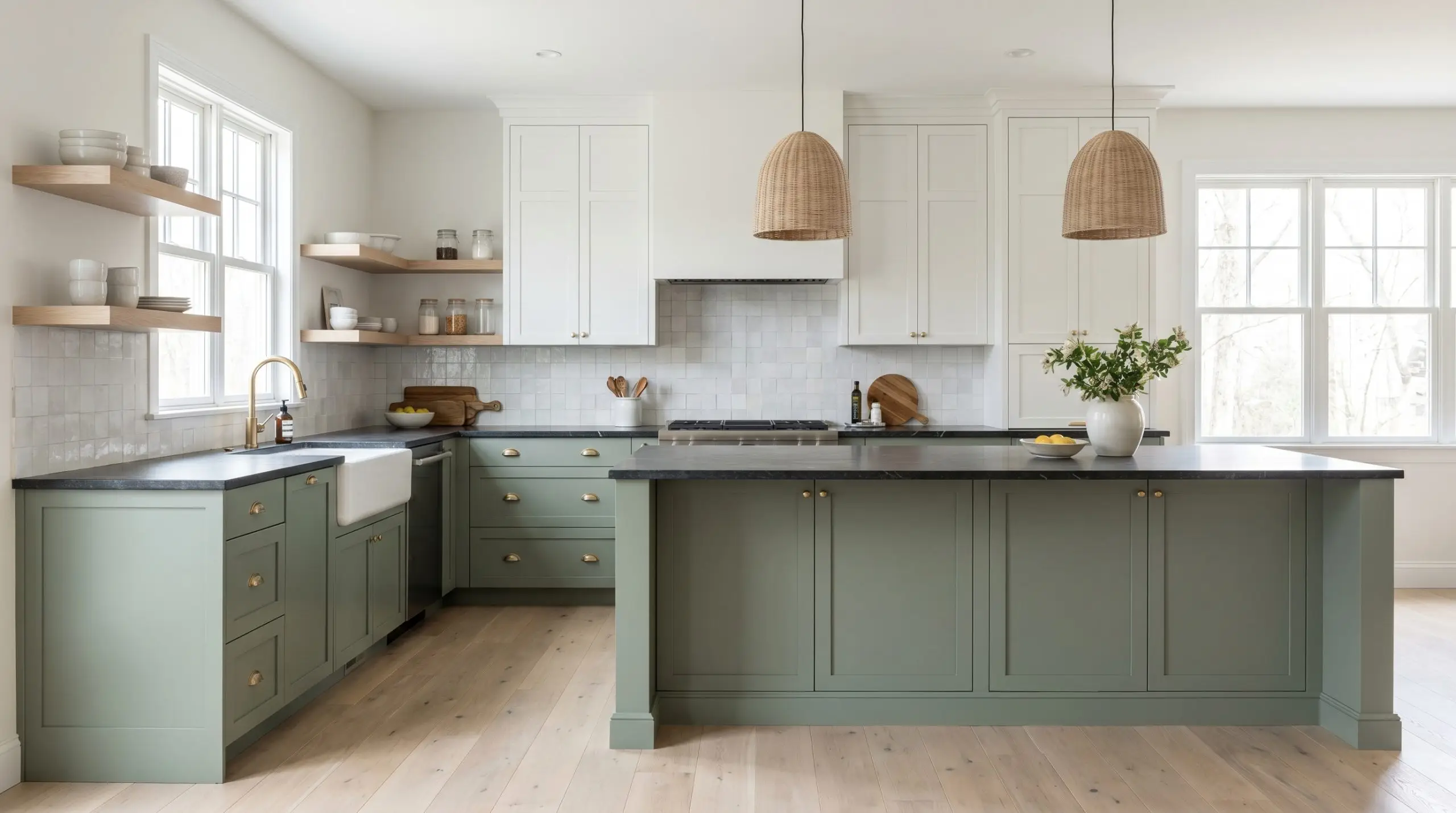
Using this color as a primary cabinetry finish instantly moves a standard kitchen away from the predictable all-white aesthetic into something highly curated. Because of its brown-gray base, it pairs flawlessly with transitional elements like honed soapstone countertops and unlacquered brass cup pulls. The warmth of the paint softens the hard, utilitarian edges of a kitchen, making it feel more like a collected living space.
For a dynamic two-tone application, consider painting your lower cabinets and island in Muted Sage while keeping the uppers a creamy, warm white. Pair this setup with bleached oak floating shelves and handmade zellige tile to introduce organic texture. This approach works brilliantly for suburban renovators who want a custom look without replacing their existing cabinetry boxes.
Cozy Dens and Libraries
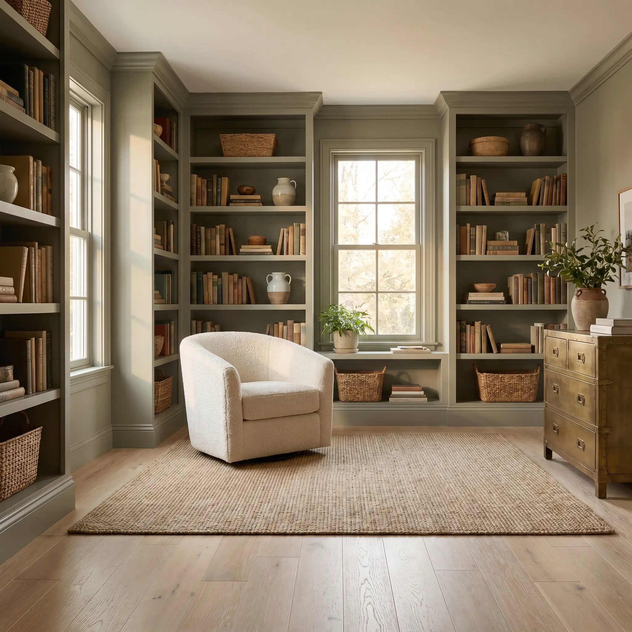
In spaces dedicated to quiet focus—like a home office or an avid reader’s library—this paint truly shines when applied across every surface. Color drenching the walls, baseboards, and built-in shelving in this medium-dark hue creates a seamless, enveloping environment that reduces visual clutter. The natural light exposure in these rooms will gently shift the mood from a crisp morning green to a shadowy, olive-toned retreat by evening.
To prevent the room from feeling too enclosed, introduce an organic modern styling approach. Layer in a plush boucle armchair, a vintage campaign dresser, and woven sisal rugs to break up the solid blocks of color. The tactile contrast between the smooth painted walls and the rough, natural fibers keeps the design feeling fresh and intentional.
Wainscoting and Millwork Accents
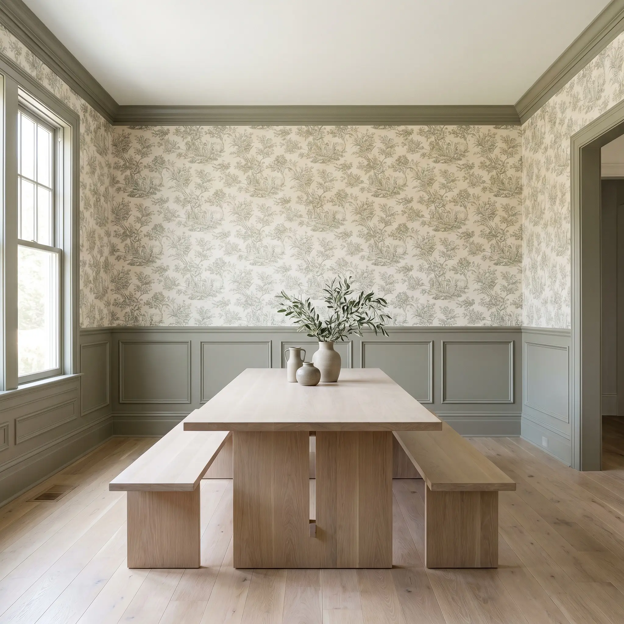
If you are not ready to commit to a fully green room, applying this hue to lower architectural features is a brilliant compromise. Painting beadboard, board and batten, or traditional wainscoting in this rich color establishes a strong foundation for the room’s design. It visually centers the space, allowing you to play with lighter textures and patterns on the upper half of the wall.
For a slightly unexpected twist, pair the painted lower millwork with a botanical toile wallpaper or a highly textured grasscloth above the chair rail. Ensure your baseboards match the wainscoting to create a continuous, uninterrupted line of color that makes standard ceiling heights feel far more expansive.
Exterior Shutters and Front Doors
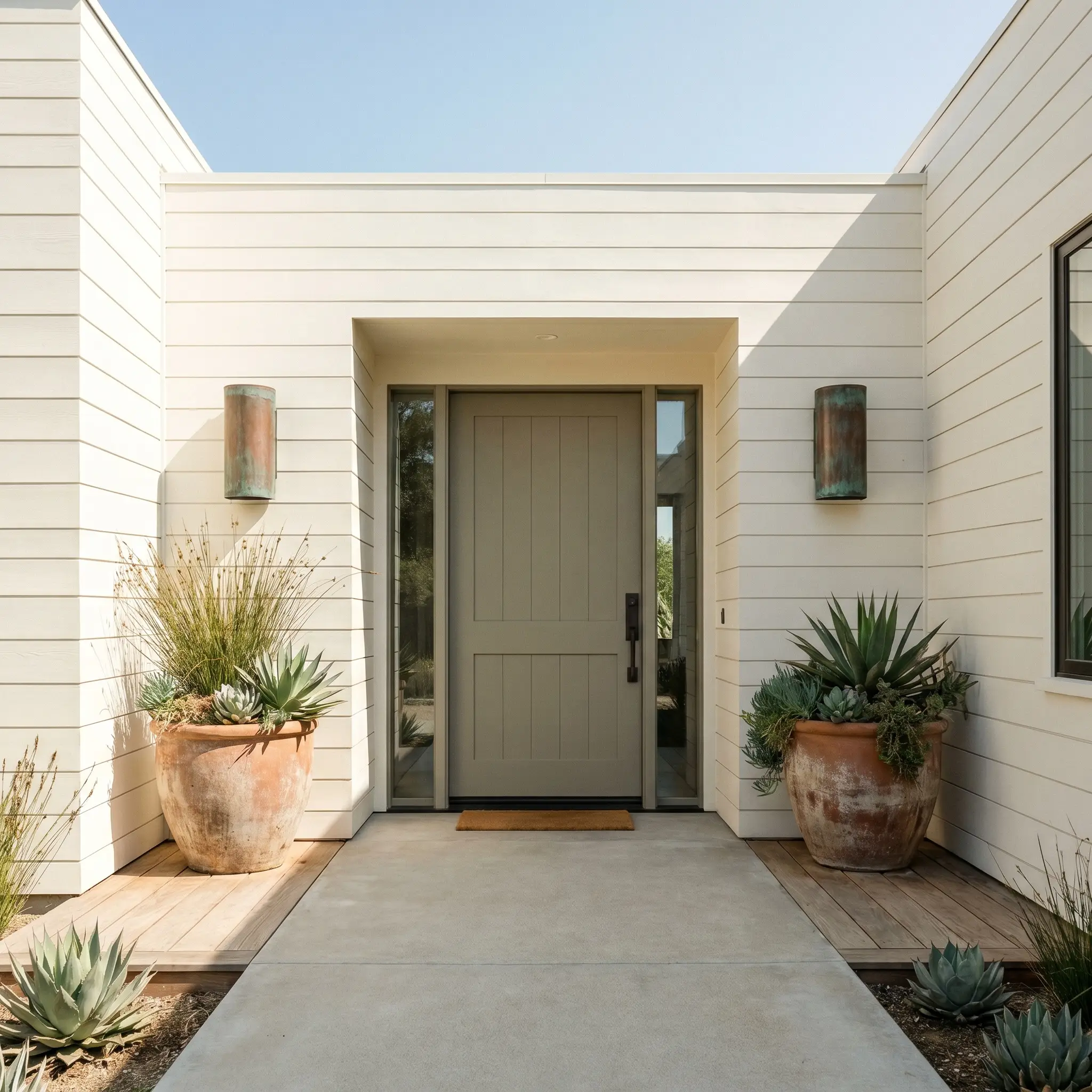
When taken outside, the bright, unfiltered sunlight will slightly wash out the color, allowing the earthy brown-gray undertones to take center stage. This makes it an exceptional choice for exterior shutters or a welcoming front door, especially on homes surrounded by mature landscaping or echoing the dry brush of the chaparral hills. It acts as a natural bridge between your home’s facade and the surrounding environment.
To elevate your curb appeal, pair a Muted Sage front door with oxidized copper sconces and oversized terracotta planters flanking the entryway. It looks particularly stunning against limewash brick or creamy, off-white siding, providing a soft, organic contrast that feels incredibly welcoming.
Coordinating Colors & Material Pairings for Behr Muted Sage
The true beauty of this earthy green emerges when it interacts with the specific elements around it. Its muddy undertones thrive on contrast, requiring either crisp architectural boundaries to hold its shape or warm, tonal bleeds to feel serene.
Framing the Room with the Right Trim
Choosing the right trim dictates how modern or traditional the walls will feel. Pairing it with Benjamin Moore White Dove OC-17 creates a seamless, atmospheric glow, as the creamy undertones in the white gently pull the warmth out of the green. For a sharper, more tailored boundary, Sherwin-Williams SW 7006 Extra White provides a crisp, highly reflective edge that forces the muddy pigment to look distinctly modern.
If you want a truly enveloping, heritage-inspired transition, Farrow & Ball Pointing No. 2003 offers a red-based warmth that beautifully softens the visual line between your wall and woodwork.
Tactile Finishes and Hardware Pairings
To keep this medium-dark hue from absorbing all the energy in a room, you must introduce textures that bounce light and add structural interest. Unlacquered brass hardware serves as the ultimate premium focal point, as its living finish naturally oxidizes over time to mirror the earthy warmth of the paint. Balance that aspirational metal with the approachable warmth of bleached oak flooring, which provides a light, raw contrast that keeps the green feeling fresh rather than vintage.
Finally, layer in a chunky jute rug and handmade ceramic lighting fixtures. These rougher, organic textures engage in a beautiful visual dialogue with the paint’s muddy profile, cementing a relaxed, intentional vibe.
Building a Cohesive Palette
Curated Aesthetics and Styling Profiles
The Artisan’s Retreat This aesthetic leans into the soulful, collected energy of handmade objects and raw natural fibers. By pairing the muddy green walls with bleached oak furniture and a chunky jute rug, the room immediately feels grounded and intentionally relaxed. Introduce Benjamin Moore Audubon Russet HC-51 through textural throw pillows or a vintage runner to spark a warm, inviting tension.
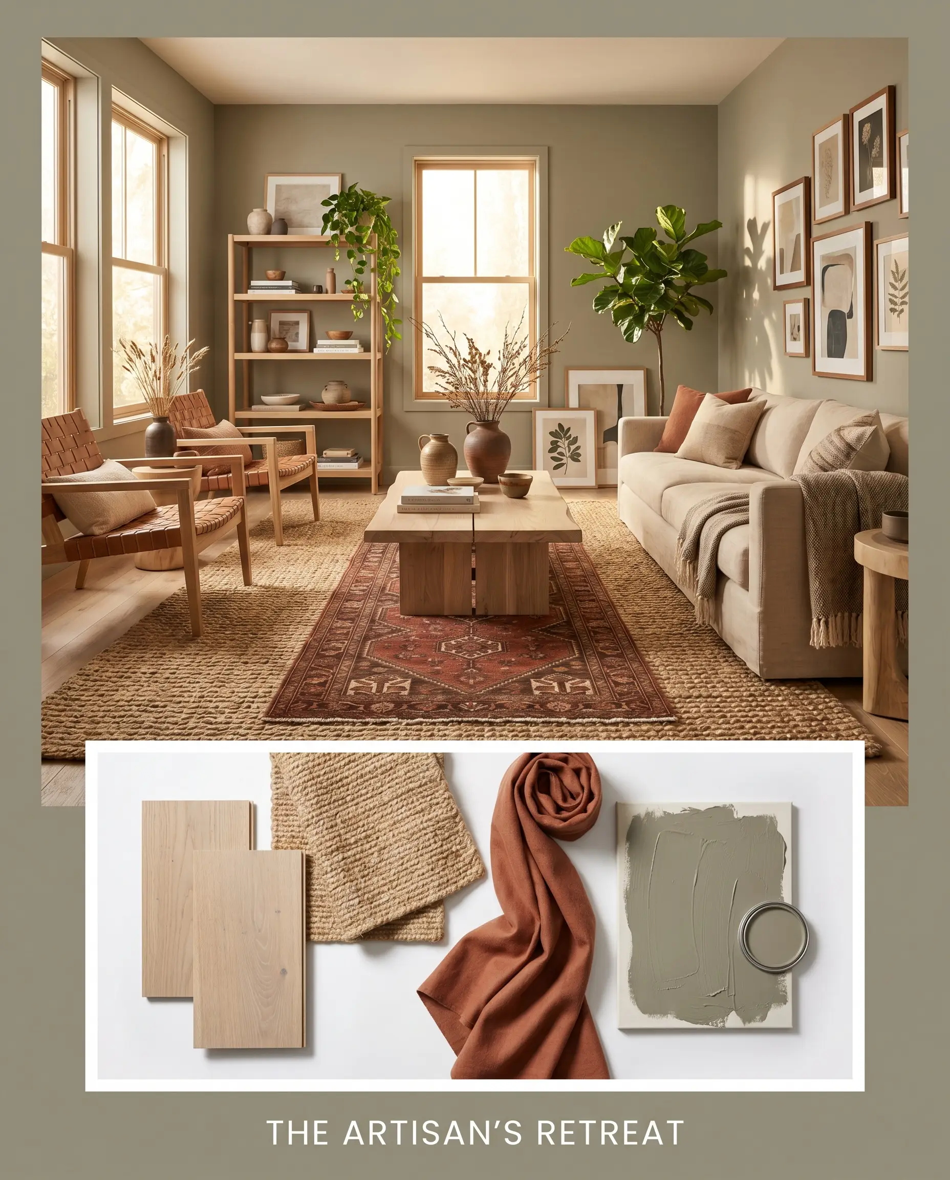
Layering sculptural ceramics and stacked art books on open shelving completes an atmosphere that feels incredibly personal, creative, and endlessly comforting.
Botanical Minimalism For a cleaner, more streamlined vibe, this palette relies on sharp contrasts and sleek silhouettes. The dark walls are sharply defined by crisp white trim, while unlacquered brass minimalist sconces bounce warm light back into the room. Introducing Behr Silver Ash GR-W11 on an adjacent ceiling or hallway creates a refreshing, cool-toned boundary that keeps the design feeling modern.
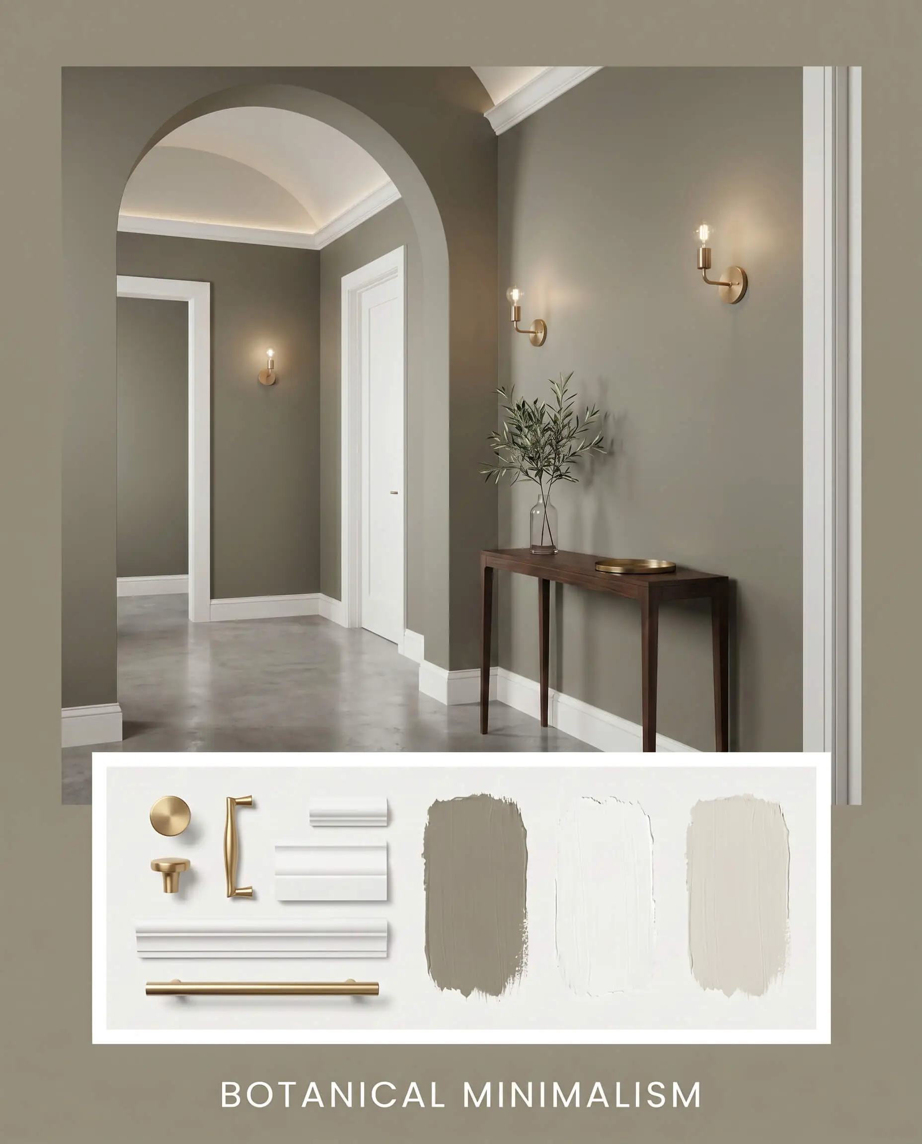
The resulting energy is quietly sophisticated, proving that earthy greens can feel incredibly tailored when paired with the right lighting and minimal, intentional decor.
Head-to-Head Paint Comparisons
Sometimes a color’s specific undertone simply will not cooperate with your home’s unique lighting conditions or fixed elements. If your room lacks natural light or your flooring leans too yellow, this specific green might pull too dark or lose its vibrant depth. In those scenarios, evaluating a direct rival is the smartest way to ensure your walls achieve the exact energy you envision.
Behr Muted Sage N390-4 vs. Behr Bitter Sage N390-4
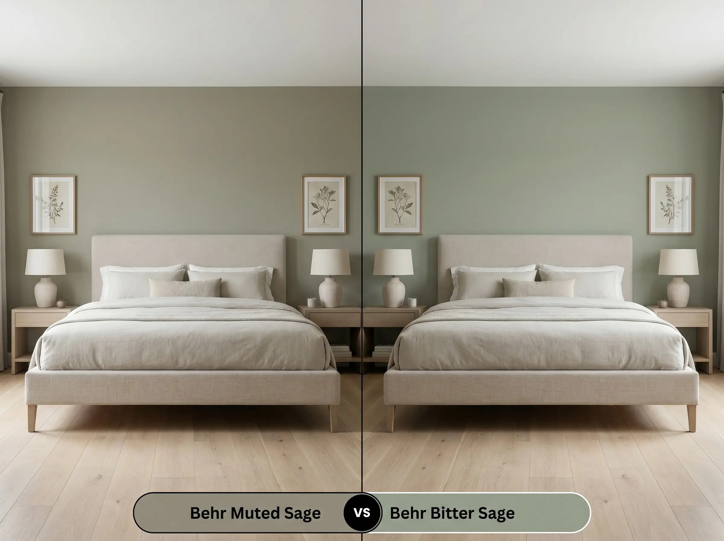
While these two share a remarkably similar DNA, Behr Bitter Sage introduces a slightly sharper, more pronounced yellow-green bite. If your room features cool northern light that washes out subtle colors, Bitter Sage will hold onto its green identity much better. However, if you want a softer, more atmospheric shadow-tone that seamlessly blends with warm woods, the original Muted Sage remains the superior choice.
Behr Muted Sage N390-4 vs. Sherwin-Williams SW 9130 Evergreen Fog
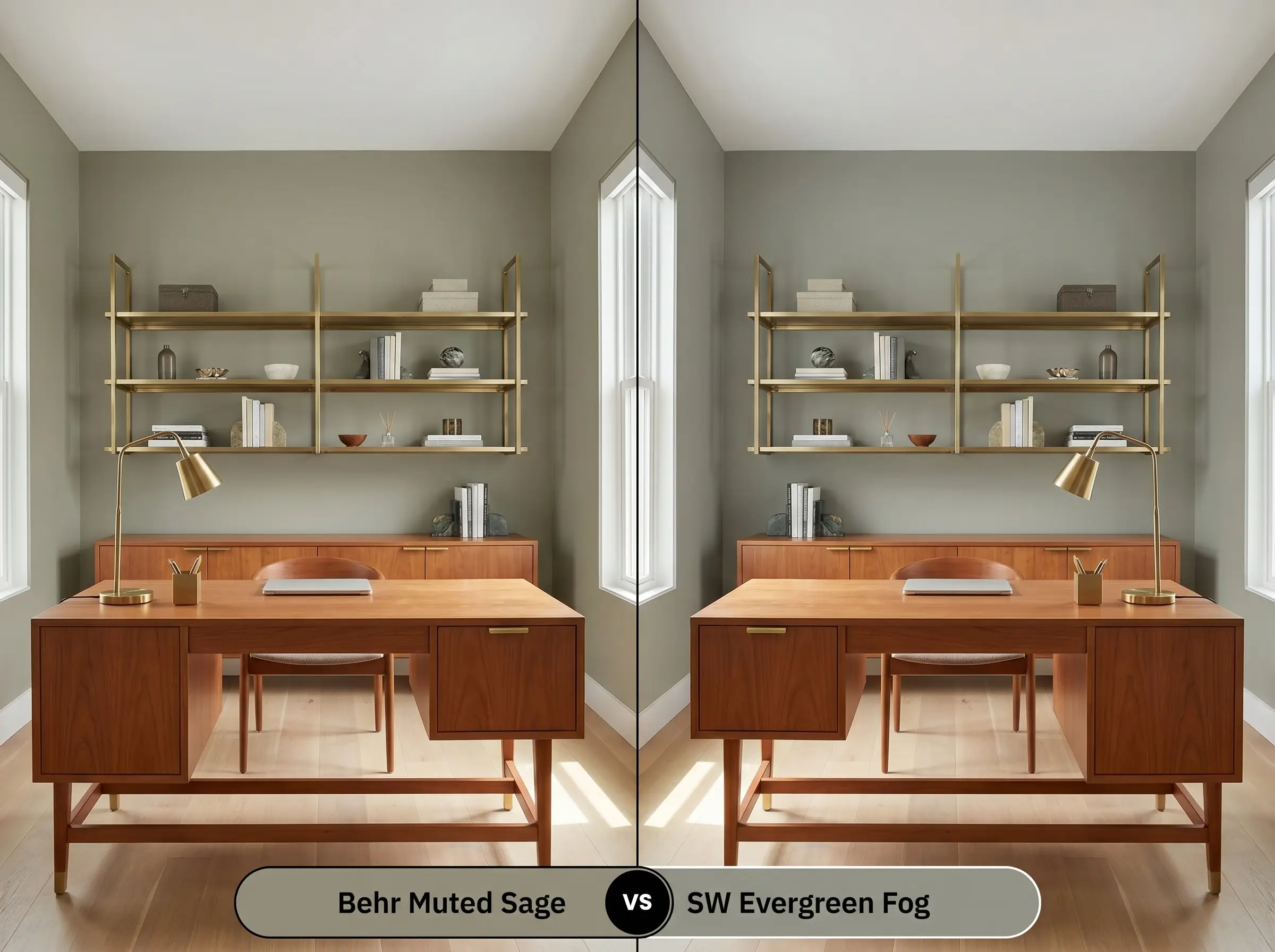
Sherwin-Williams Evergreen Fog sits just a touch lighter on the reflectance scale and carries a significantly cooler, more prominent gray undertone. If you are working with warm cherry cabinetry or red oak floors, Evergreen Fog provides a cooler counterweight that prevents the room from feeling overly warm. Conversely, Muted Sage offers a much richer brown base, making it the better candidate for spaces that need an injection of cozy, earthy warmth.
Behr Muted Sage N390-4 vs. Benjamin Moore Saybrook Sage HC-114
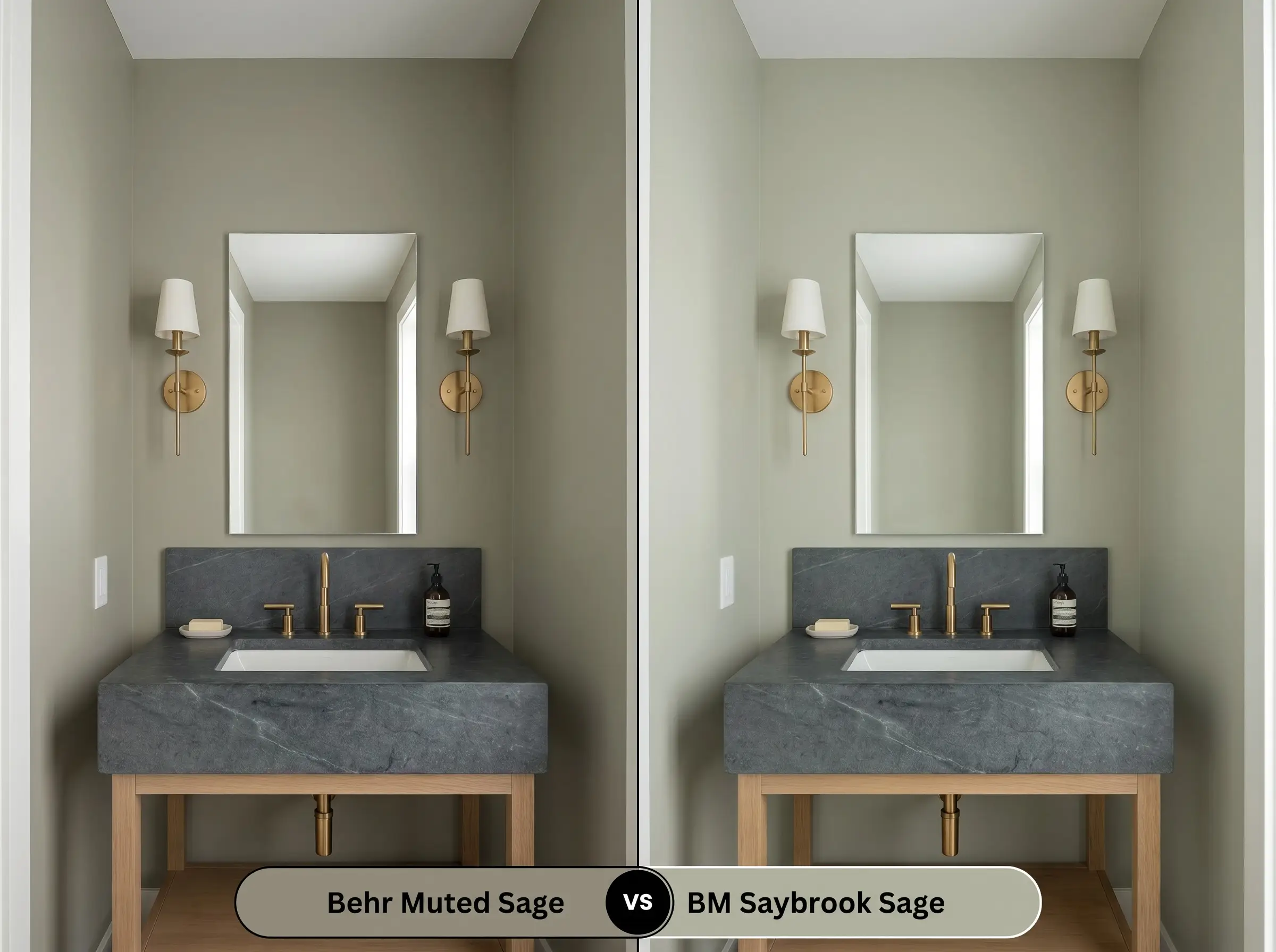
Benjamin Moore Saybrook Sage is a substantially lighter, more silvery hue that reflects far more natural light around a room. If you are painting a dim hallway or a small, enclosed bathroom, Saybrook Sage will prevent the space from feeling enclosed. Reserve Muted Sage for rooms where you actively want to create visual weight, as its darker profile is designed to anchor a space rather than expand it.
Exploring Similar Tones and Brand Match Alternatives
Even when you fall in love with a specific color profile, the realities of your home might demand a slight pivot. Whether you need a touch more lightness to combat a dark corner or you simply need to color-match across different paint manufacturers, these alternatives offer beautiful solutions.
Same-Brand Alternatives
Cross-Brand Matches
Executing Your Paint Job Like a Professional
Transitioning a beautiful color from a swatch to your actual walls requires strategic planning and the right materials. The sheen you select and the tools you use will completely dictate how this earthy green performs in your daily life.
The Sheen Strategy
Primer and Coverage Guidelines
Because this color sits in the medium-dark category, it demands a high-quality, tinted primer to ensure the brown-gray base develops correctly. Ask your paint desk for a gray-tinted primer, which will prevent the existing wall color from bleeding through and altering the final green.
When applying this depth of pigment, plan for two generous coats to achieve a truly professional, opaque finish. Darker matte paints are notorious for “flashing”—those frustrating, uneven roller marks that appear when the paint dries at different rates. To avoid this, maintain a wet edge while rolling, work in small sections, and resist the urge to touch up semi-dry spots, which will permanently scar the finish.
Frequently Asked Questions About Behr Muted Sage
Because of its low light reflectance and strong brown-gray base, this color will absolutely lean into its darkest, moodiest shadow-tones without natural light. This actually makes it a brilliant candidate for a dramatic powder room, provided you balance the dark walls with highly reflective brass sconces and a crisp white ceiling.
Crisp 4000K daylight bulbs will immediately strip away the warm, earthy brown undertones, forcing the paint to read as a much cooler, flatter gray-green. To maintain the cozy, welcoming nature of this hue over your kitchen counters, it is highly recommended to swap your bulbs to a warmer 3000K temperature.
With an LRV of 28, this paint sits right on the edge of the medium-dark spectrum, meaning it will absorb a moderate amount of thermal energy from direct sunlight. It performs beautifully on exterior brick, but if you live in an exceptionally hot climate with zero shade, you might want to explore a slightly lighter alternative to ensure long-term exterior durability.
The strong red pigments in cherry wood act as a direct complementary contrast to the green, which will visually intensify both the wood and the paint. The earthy brown-gray base of the sage handles this tension beautifully, creating a rich, heritage-inspired look that feels incredibly intentional rather than accidental.
The Final Design Verdict
Behr Muted Sage is an incredibly sophisticated, architectural neutral designed for homeowners who want to introduce color without sacrificing calm. Its absolute best application is as a color-drenched canvas in a cozy den or as a transformative finish on kitchen cabinetry. It perfectly anchors Organic Modern and Transitional design styles, providing a rich, earthy foundation that elevates every piece of furniture placed in front of it.
While this earthy green is remarkably versatile, it will actively fight against intensely gray-washed luxury vinyl plank flooring or blue-leaning carpets. The muddy, brown-based warmth of the paint requires equally warm or neutral companions to make visual sense.
Clash Warning (The Cool-Toned Flooring Conflict)
When placed directly against a sterile, icy gray floor, the green will suddenly look dirty rather than sophisticated, while the flooring will appear artificially stark. Always bridge the gap with massive, warm-toned area rugs or pivot to a cooler, silver-based green to maintain a cohesive aesthetic.