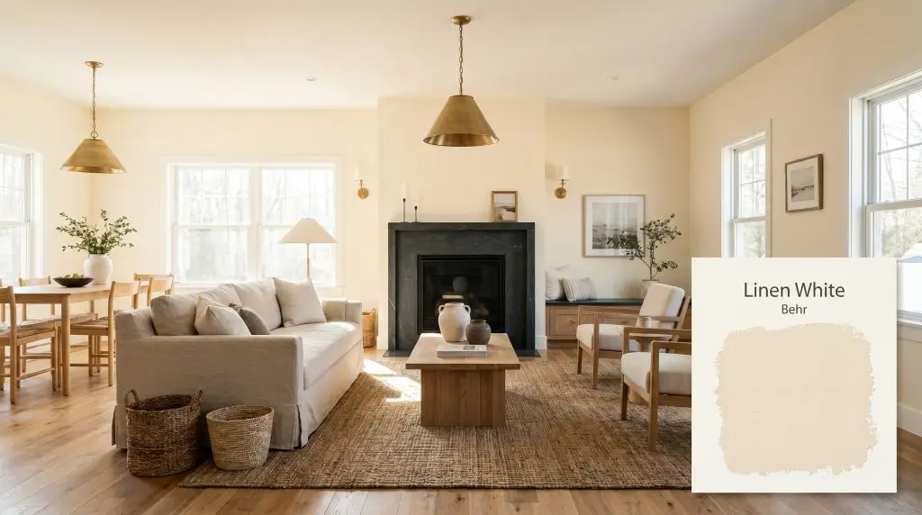
Linen White 70
BehrBehr Linen White (70) is a highly reflective, warm off-white paint color with an LRV of 85. It features distinct creamy yellow and subtle beige undertones, making it an inviting, luminous choice that avoids the starkness of pure white while adding gentle warmth to any space.
Paint Technical Profile
| Color ID / SKU | 70 |
| HEX Code | #f7edd8 |
| Light Reflectance (LRV) | 85 |
| Use | Interior, Exterior |
| Best Exposures | North, East, South |
| Best For | Living rooms, traditional kitchens, historic home exteriors, cozy bedrooms |
The Warmth of Behr Linen White: Crafting a Luminous Architectural Canvas
Finding the perfect neutral often feels like an endless pursuit of balance. You want a room to feel expansive and bright, but you desperately want to avoid the sterile, hospital-like chill that accompanies so many pure white paints.
Behr Linen White 70 offers a brilliant solution to this common design challenge.
By relying on a highly specific chromatic profile, this creamy hue establishes a glowing, inviting foundation that immediately softens the hard edges of a room. It acts as an incredibly versatile architectural finish, wrapping your walls in a subtle tint that responds beautifully to shifting sunlight and layered textures.
The Color DNA: Undertones & LRV of Behr Linen White
If you are wondering whether this color leans warm or cool, the answer is definitive: Behr Linen White is an unapologetically warm off-white. It completely rejects icy tones, relying instead on a radiant color structure to generate its welcoming atmosphere.
To understand exactly how this paint will behave on your walls, we have to look at the specific pigments hiding beneath its surface.
Understanding the Light Reflectance Value (LRV)
With an LRV of 85, Behr 70 is highly reflective.
This means it bounces a massive amount of ambient lighting back into the room, effortlessly expanding the visual boundaries of smaller spaces. However, because it holds onto that yellow-beige pigment, it retains just enough depth to contrast beautifully against crisp, bright white trim.
Lighting Effects: How Sunlight Shifts This Creamy Hue
Every paint color is at the mercy of the sun, but warm off-whites are particularly sensitive to the shifting temperature of light. Because of its luminous base, Linen White acts as a subtle chameleon throughout the day.
If you love the color during the day but find it too yellow at night, swap your standard 2700K bulbs for 3000K or 3500K LEDs. This slight shift in temperature preserves the warmth without letting the yellow base take over the room.
Hackrea Pro-Tip (The Bulb Strategy)
Popular Applications
The true value of a warm off-white lies in its ability to adapt to almost any material or styling choice you throw at it. By understanding how the yellow-beige base interacts with different textures, you can completely redefine the atmosphere of your home.
Here is how to maximize the impact of this color across various spaces.
Reviving Kitchen Cabinetry
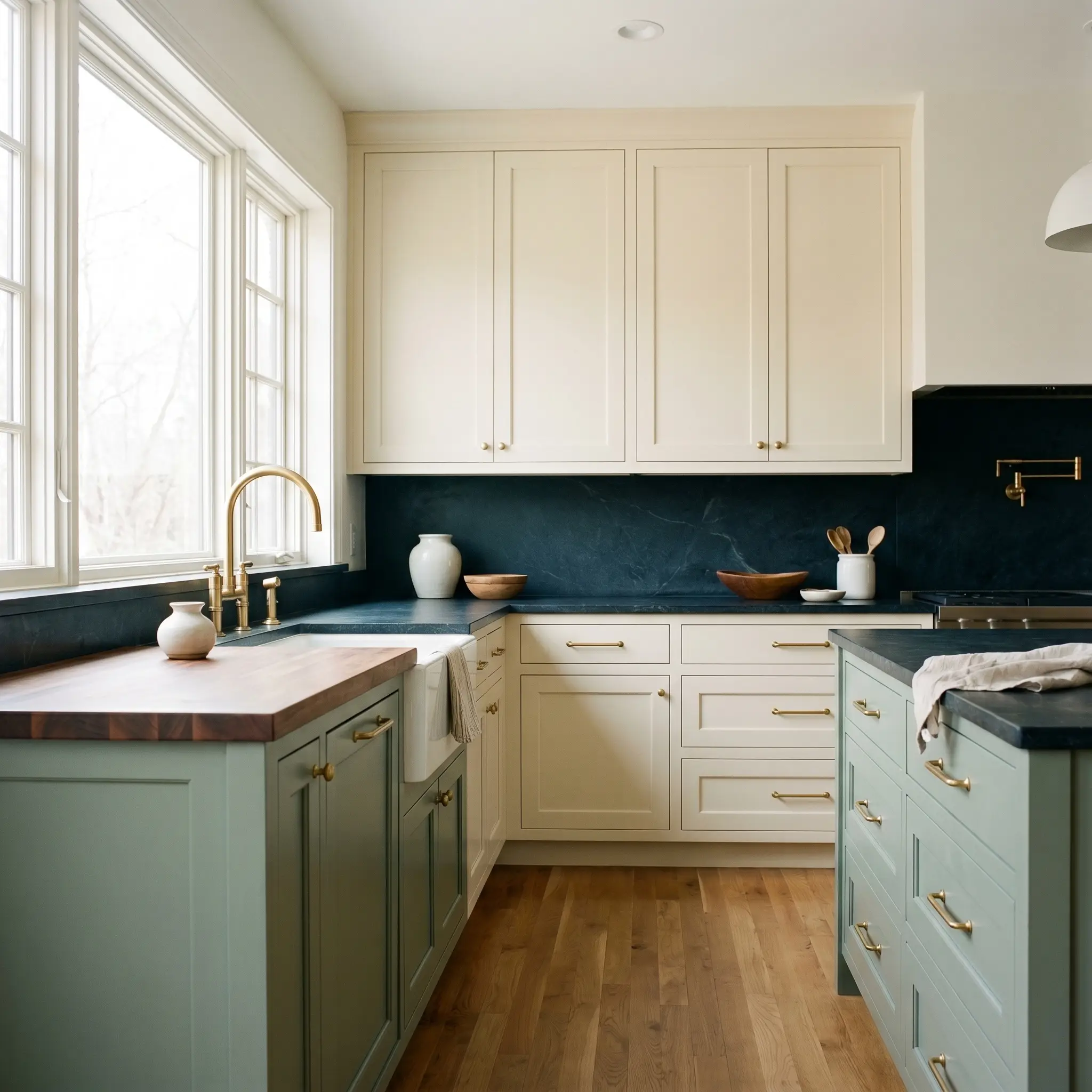
While often associated with traditional cabinetry, this creamy hue is the perfect tool for softening a modern kitchen. The warm base beautifully counteracts the coldness of stainless steel appliances and hard tile floors.
For a high-impact, transitional design, pair Linen White upper cabinets with honed soapstone countertops and unlacquered brass hardware.
If you are an avid home cook who spends hours in the kitchen, consider painting the lower island a dusty sage or muted plum. This establishes a bespoke palette that feels incredibly custom, moving far beyond the standard all-white builder-grade kitchen.
Be incredibly careful when pairing this paint with stark white quartz or cool-toned marble. The icy undertones of the stone will make the yellow base of the cabinets look dingy or aged. Always opt for warmer stones, butcher block, or dark, contrasting materials.
Clash Warning (The Countertop Conflict)
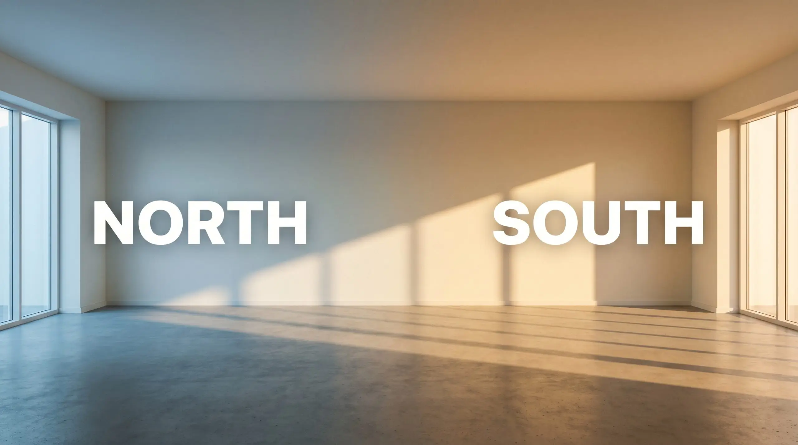
Warming Up North-Facing Living Spaces
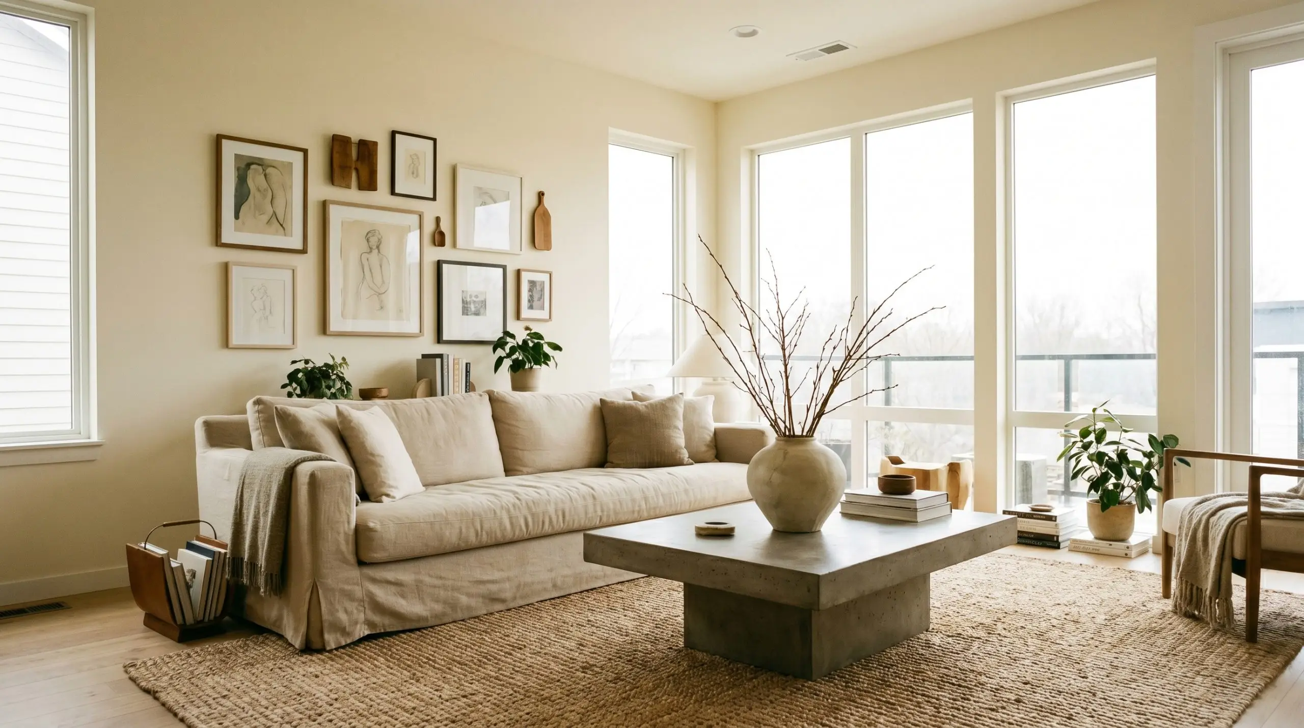
North-facing light can make a living room feel flat, shadowy, and uninviting. Applying Behr 70 to the walls instantly counteracts that chill, as the cool light neutralizes the yellow and leaves behind a highly sophisticated, soft beige-white.
Lean into a relaxed contemporary aesthetic to make the space feel lived-in and intentional.
Center the room with a slipcovered linen sofa, layer a heavy jute rug over the floors, and introduce a brutalist poured-concrete coffee table for textural tension. You can further enrich the design by styling the space with oversized branches in organic ceramic vases and an asymmetrical gallery wall.
Refreshing Exterior Facades
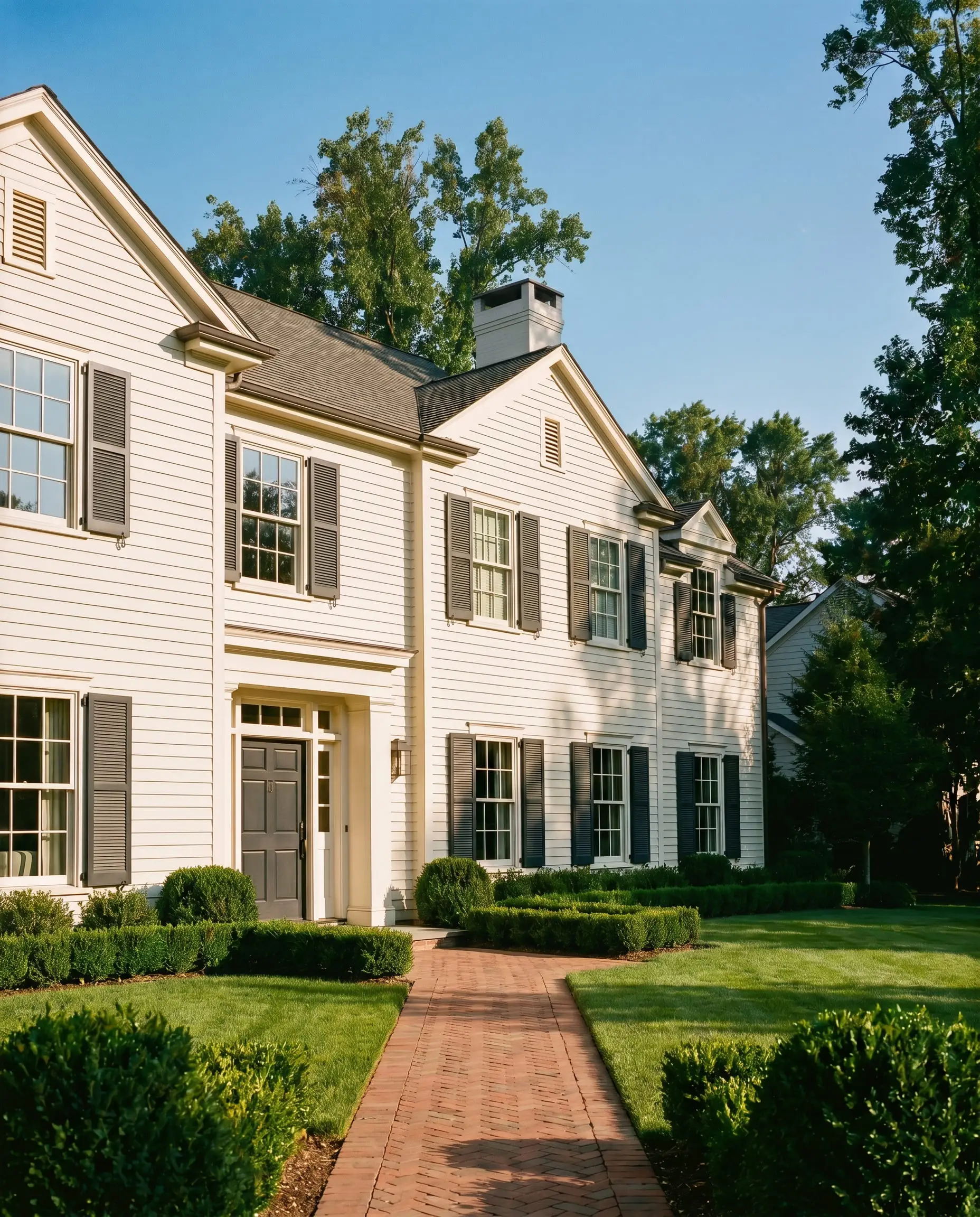
When taken outside, an LRV of 85 means this paint will reflect a massive amount of direct sunlight. On a bright afternoon, the subtle peach and beige undertones will largely wash out, leaving a brilliant, clean exterior.
To update a standard suburban facade, use this color on the main siding or brick.
You must then secure the design by painting the shutters, trim, and front door in a high-contrast color like charcoal, slate blue, or even a muted oxblood. This sharp contrast prevents the bright exterior from looking undefined and gives the home a crisp, tailored presence.
Designing Layered, Restful Bedrooms
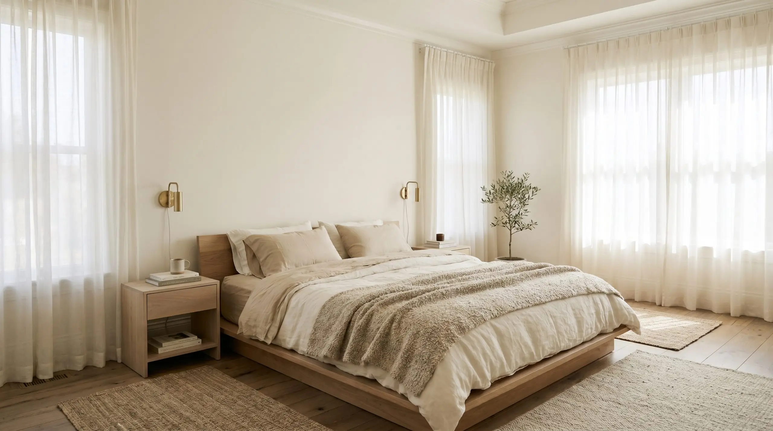
A bedroom should be a sensory retreat, and this luminous base provides the perfect backdrop for a restorative environment. Instead of a standard wall application, consider color-drenching the room by painting the walls, baseboards, and ceiling in the exact same finish.
This technique blurs the architectural boundaries, making the room feel endlessly cozy.
Enhance the organic modern vibe by layering the bed with washed linen sheets, raw silk throw pillows, and a nubby wool blanket. Introduce bleached oak nightstands and low-profile minimalist sconces to complete the serene, tactile experience.
Elevating Lower-Wall Architectural Accents
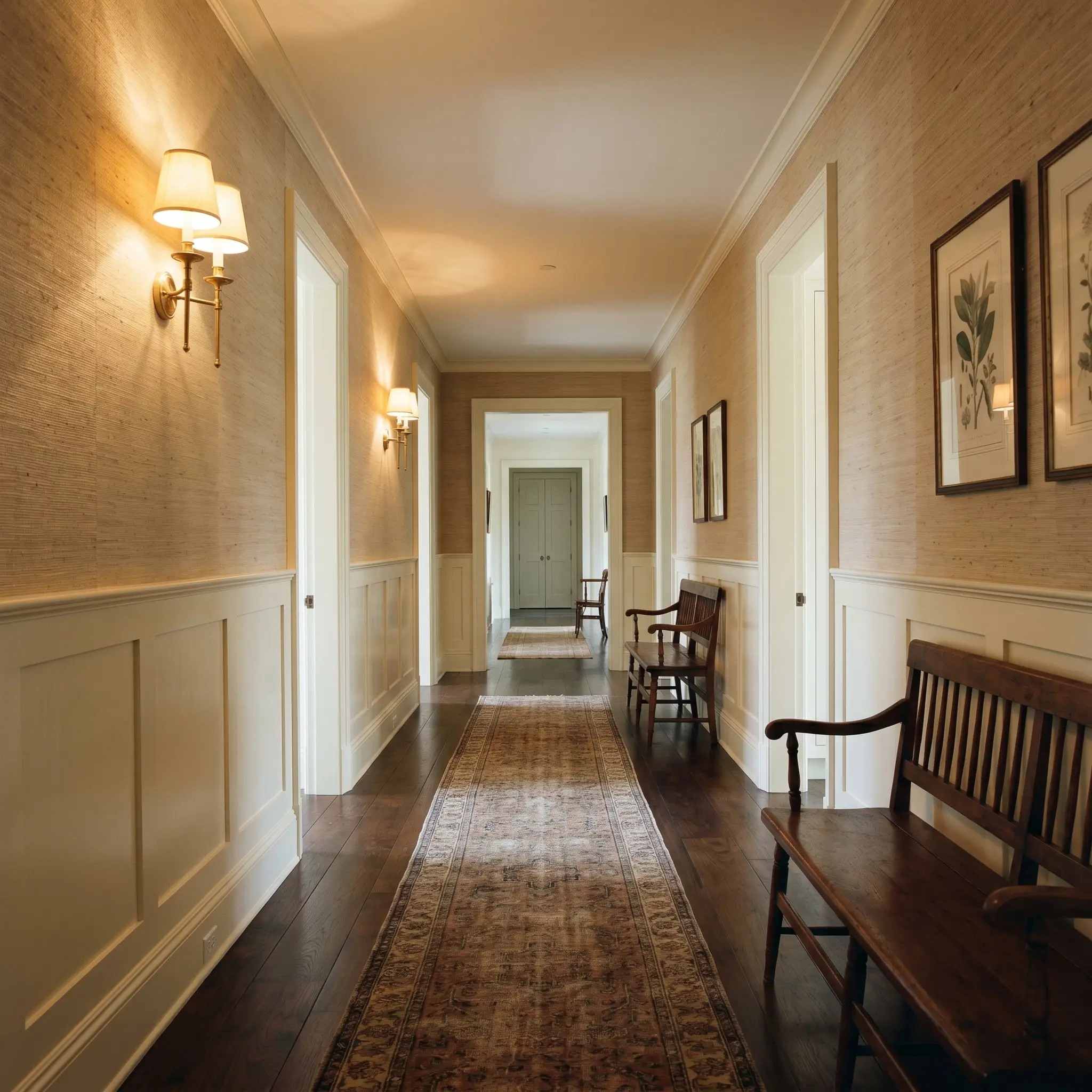
If you are a weekend DIYer looking for a transformative project, applying this color to beadboard or wainscoting is a brilliant strategy. The warm off-white highlights the physical shadows and grooves of the woodwork, adding instant architectural character to a flat hallway or dining room.
Use a satin or semi-gloss finish on the lower trim to increase durability and light reflection.
To finish the look, install a textured grasscloth wallpaper or paint the upper half of the wall in a contrasting, saturated tone like navy or olive green. This classic application technique makes standard hallways and powder rooms feel incredibly thoughtful and layered.
Building an Intentional Palette: Coordinating Colors & Material Pairings
Behr Linen White requires intentional contrast to prevent its distinct yellow-beige cast from blurring into a muddy, undefined haze. When placed against sharp, clean elements or deeply saturated tones, this paint’s creamy warmth feels highly purposeful rather than accidental.
Framing the Room: Ideal Trim Pairings
To make this warm off-white truly sing, you must frame it with crisp, clean boundaries.
Hardware, Wood & Material Pairings
The materials you introduce into the space will dictate how this paint behaves. You can easily manipulate its energy by pairing it with specific tactile finishes.
Harmonizing Tones: The Color Palette
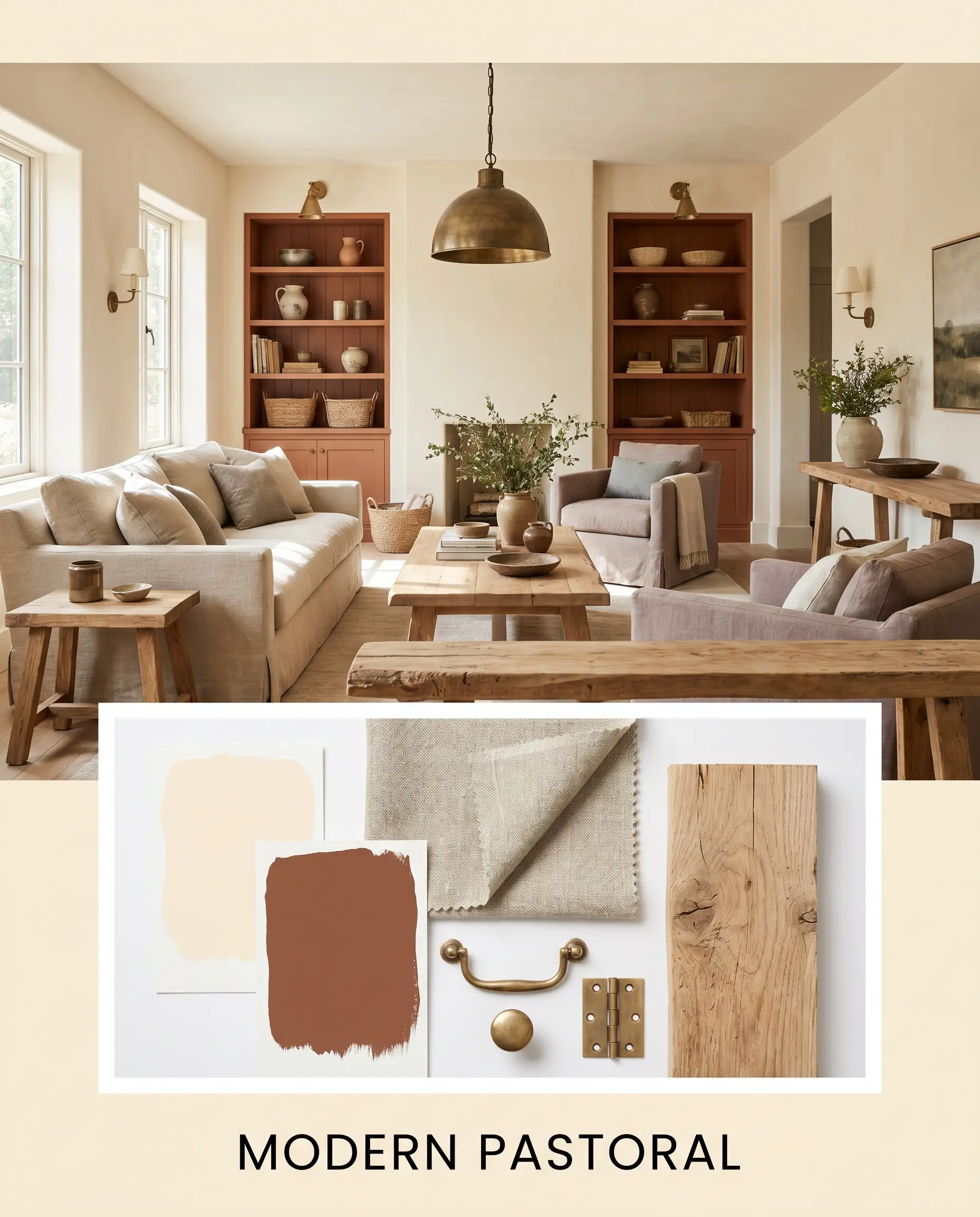
Designer Mood Boards
Modern Pastoral This aesthetic relies on earthy warmth and lived-in textures to create a highly inviting, rustic energy. The walls establish a glowing foundation that perfectly supports accents painted in Sherwin-Williams Rookwood Terra Cotta. To complete the vibe, layer in slubby washed linen textiles, unlacquered brass light fixtures, and raw, unfinished wood furniture.
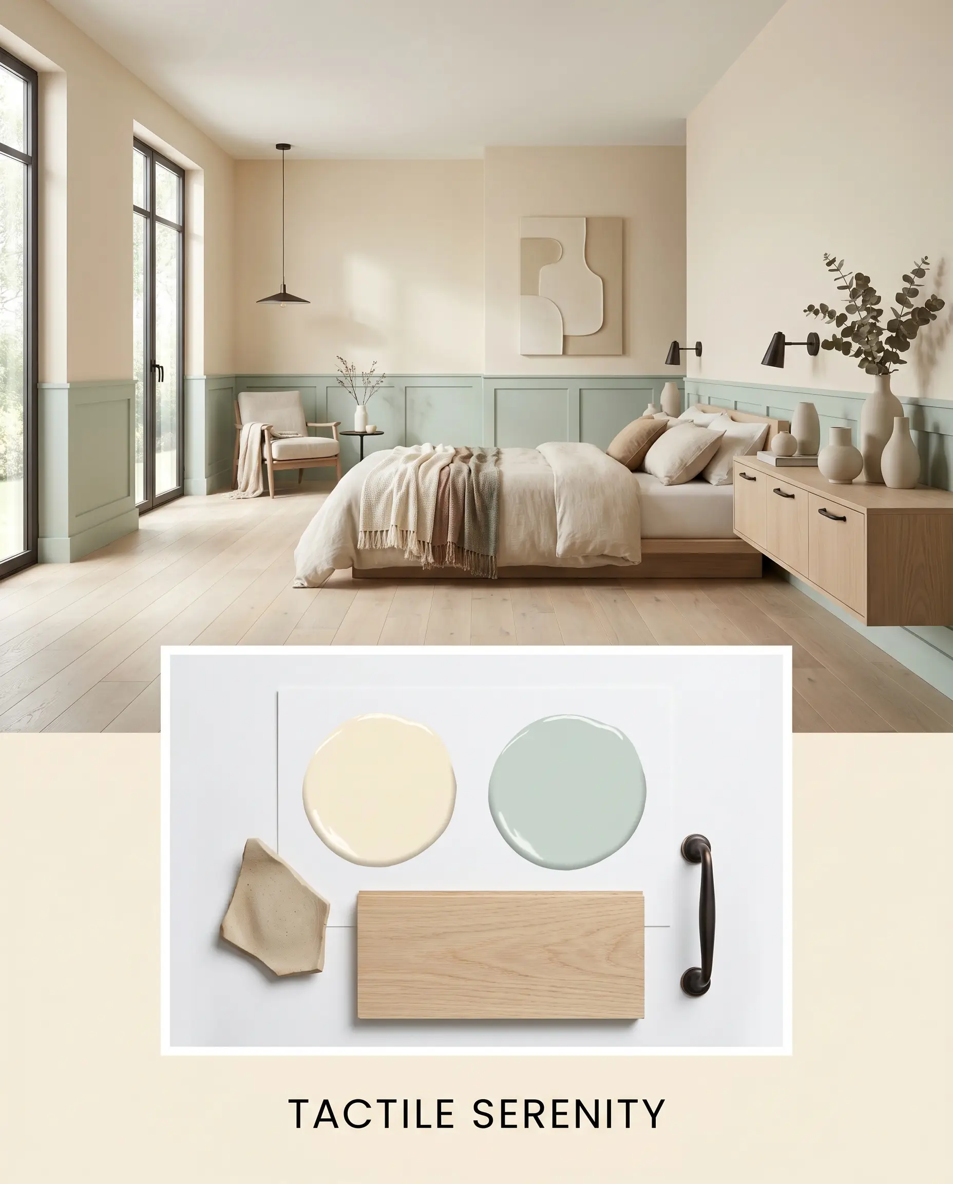
Tactile Serenity If you want to cool down the yellow-beige cast, this breezy, organic approach introduces refreshing visual relief. Pair the creamy walls with soft accents in PPG Geyser to create a gentle, watery contrast. To complete the vibe, introduce pale white oak flooring, matte ceramic decor, and sharp oil-rubbed bronze hardware to secure the airy palette.
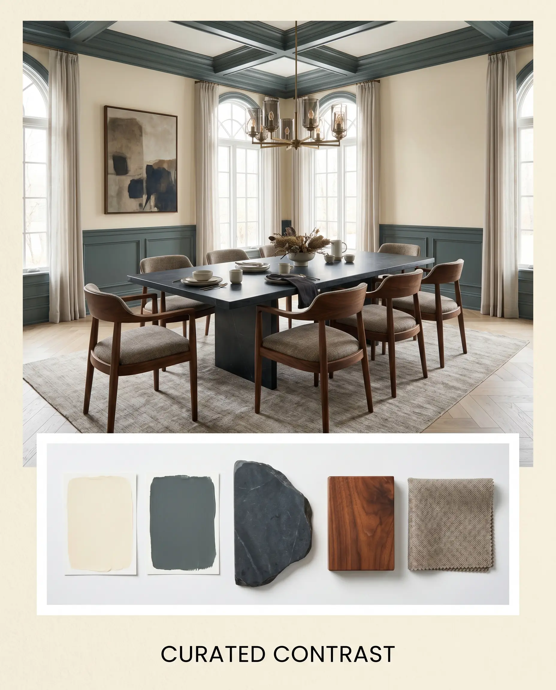
Curated Contrast For a deeply sophisticated and slightly moody atmosphere, you must rely on sharp tonal differences. The luminous walls act as a brilliant backdrop against dramatic millwork painted in Benjamin Moore Knoxville Gray. To complete the vibe, incorporate honed soapstone surfaces, rich walnut wood tones, and tailored, structured upholstery.
Behr Linen White vs. The Competition: Head-to-Head Comparisons
Sometimes a home’s natural light will push a cream too far into yellow territory, requiring a slight pivot. Knowing exactly how these rival paints behave under pressure ensures you select the perfect foundation for your specific architectural features.
Behr Linen White vs. Sherwin-Williams Alabaster SW 7008
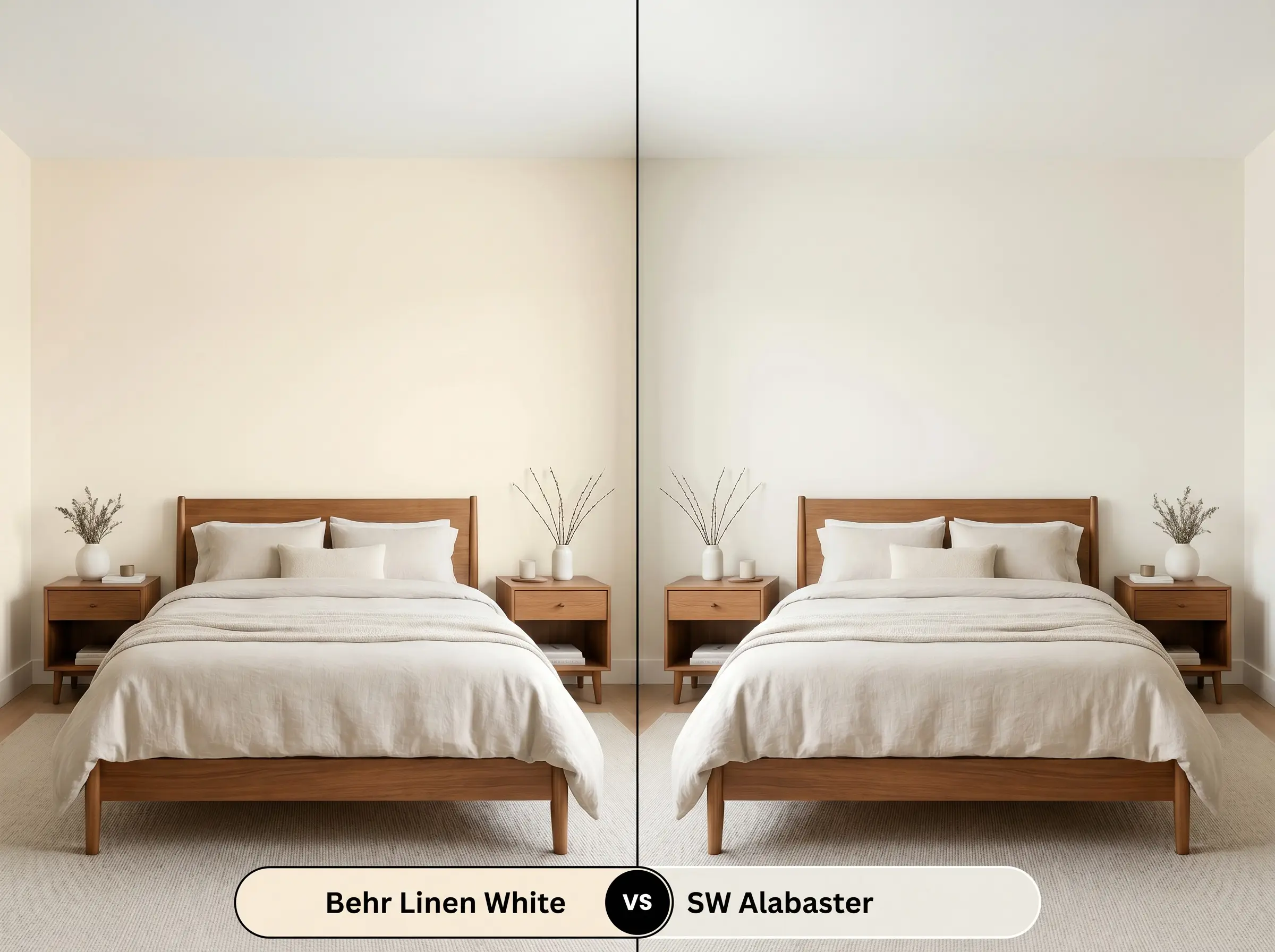
Sherwin-Williams Alabaster is slightly less reflective and features a much more muted, neutral beige base. If your southern-facing windows make Behr 70 look intensely yellow during the afternoon, then Alabaster offers a beautifully subdued alternative. It provides a similar warmth but with significantly more restraint.
Behr Linen White vs. Behr Swiss Coffee 12
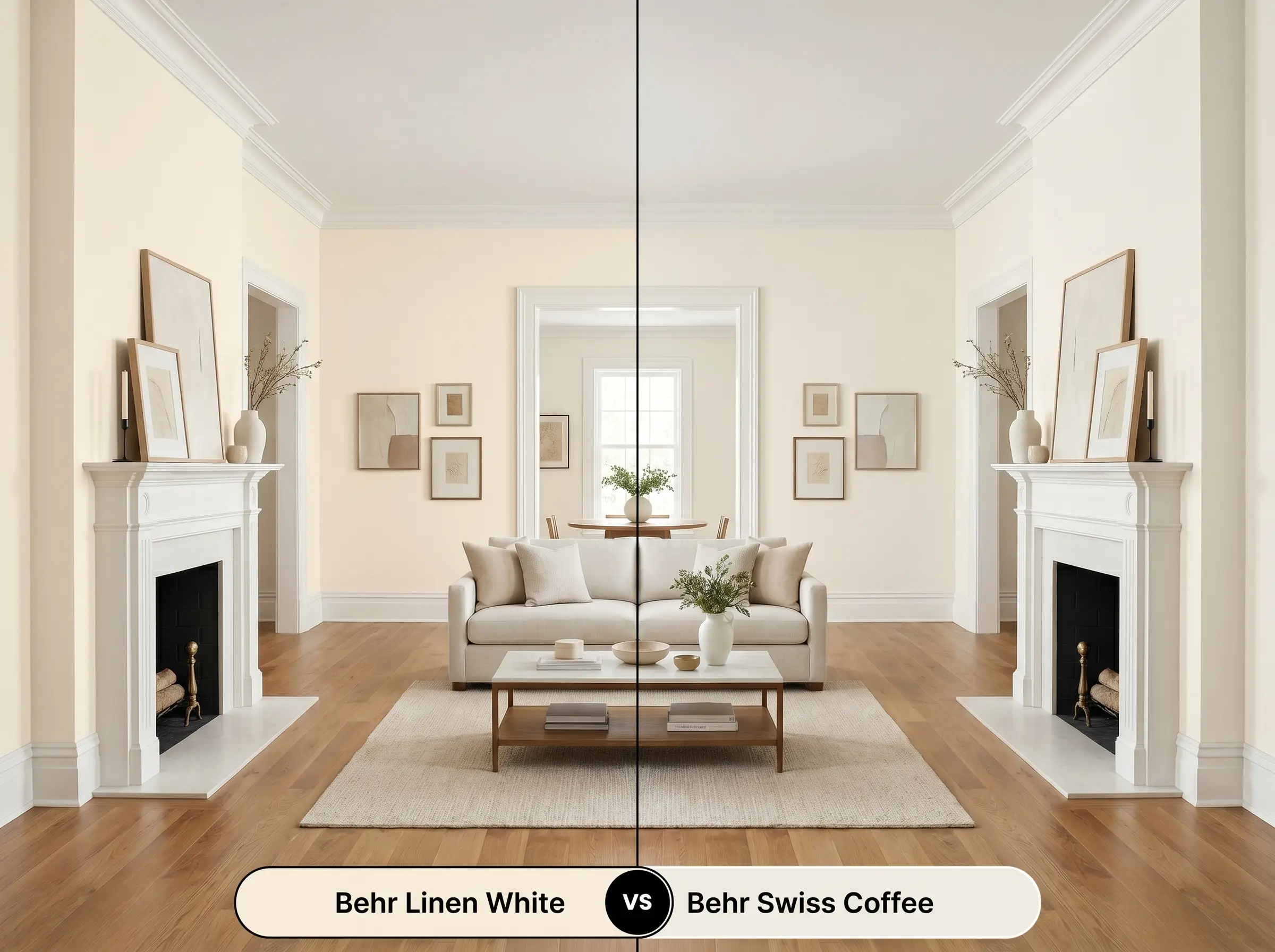
While both are incredibly popular, Behr Swiss Coffee relies on subtle green-gray undertones rather than peach and yellow. If you are working with cool-toned flooring and need a creamy white that bridges the gap without clashing, then Swiss Coffee is the safer, more adaptable choice.
Behr Linen White vs. Benjamin Moore White Dove OC-17
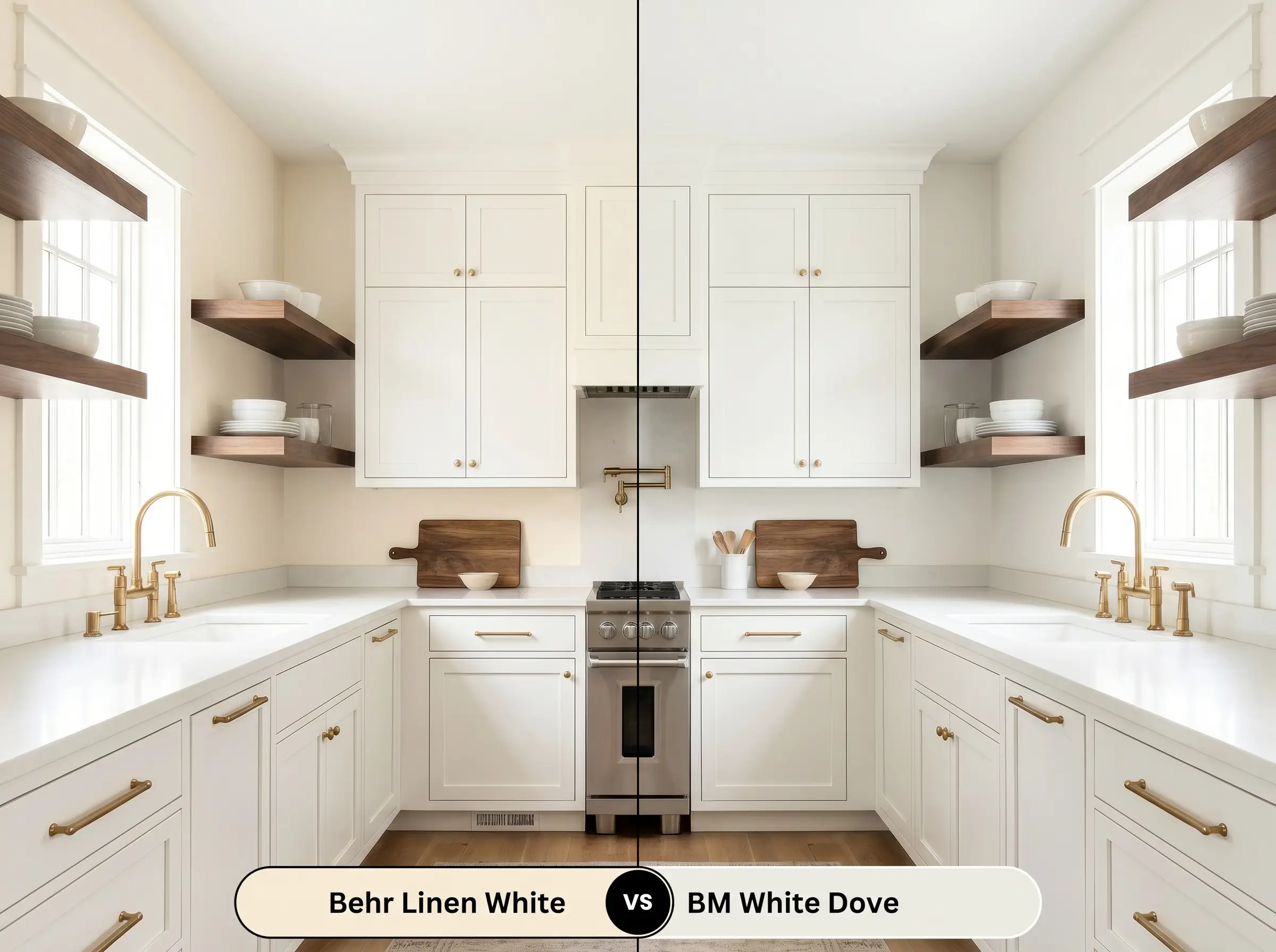
Benjamin Moore White Dove shares a nearly identical light reflectance value but features a distinct greige undertone. If you want a bright, creamy look but fear the distinct peach cast of Behr 70, then White Dove provides a much cleaner finish. It remains warm without ever reading as a true yellow.
Exploring Alternatives: Similar Colors and Brand Matches
You might find yourself needing a slightly different depth of color, or you may need to shop at a different hardware store. Here are the closest visual matches to keep your project moving forward without compromising the design.
Same-Brand Alternatives
Cross-Brand Equivalents
Bringing Behr Linen White to Life: Practical Application
Moving from color theory to the physical act of rolling paint onto drywall requires a shift in strategy. The finish you choose and how you prep the walls will dictate whether this color looks like a high-end architectural feature or a rushed weekend project.
The Dynamic Sheen Guide
Primer Strategy & Coverage
Because of its high light reflectance value, this specific off-white covers standard, light-colored drywall quite well.
However, if you are painting over a dark or highly saturated wall, a high-quality, tinted white primer is absolutely non-negotiable. Skipping primer over dark walls will cause the old color to bleed through, fatally altering the delicate peach and yellow undertones.
Plan for two solid coats to achieve a professional, fully opaque finish.
When touching up a high-LRV off-white, the new paint often dries with a slightly different sheen, creating visible, uneven patches known as “flashing.” To prevent this, always feather the edges of your touch-up with a nearly dry roller, or simply plan to repaint the entire wall corner-to-corner for a flawless result.
Hackrea Pro-Tip (Avoiding the Flashing Trap)
Frequently Asked Questions
Because stucco has a highly textured surface that creates micro-shadows, the yellow base of this paint is often amplified in direct sunlight. If you want a traditional, warm cream exterior, it works beautifully, but if you are aiming for a crisp white facade, you should choose a cooler alternative.
This specific lighting temperature is actually ideal for this paint’s chromatic profile. The 3000K bulbs provide just enough crispness to keep the yellow-beige base from looking dingy, generating a warm, inviting glow in spaces lacking natural sunlight.
Pairing a distinctly warm cream with icy, gray-veined marble creates an uncomfortable visual tension. The cool stone will actively pull the yellow out of the cabinets, making the paint look aged and mismatched rather than intentional.
The natural red and orange tones inherent in red oak will absolutely reflect onto the surrounding walls. This environmental bounce will amplify the subtle peach undertones, making the paint read significantly warmer and more tonal throughout the day.
Final Verdict: Is Behr Linen White Right For You?
Behr Linen White 70 is the ultimate foundational color for homeowners who want to inject genuine, sunlit warmth into their interiors. It excels in relaxed, transitional spaces where its luminous base can interact seamlessly with organic textures, natural woods, and rich, contrasting tones.
While this paint is incredibly versatile, it will actively fight against stark, icy elements in your home. You must avoid pairing it with cool gray luxury vinyl plank flooring, blue-toned LED lighting, or stark white quartz countertops. These cold elements will instantly clash with the yellow-beige cast, stripping the paint of its premium feel and leaving the room looking mismatched and unintentionally dated.
Clash Warning (The Cool-Tone Conflict)
Closest Cross-Brand Equivalents
The absolute closest scientific color matches for Linen White across top paint brands.