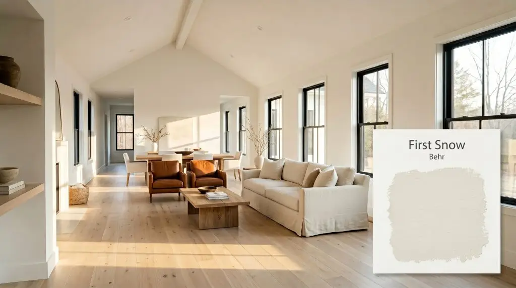
First Snow DC-006
BehrBehr First Snow (DC-006) is a soft, powdery off-white with subtle warm yellow-beige undertones. With an LRV of 82, it provides a bright, airy feel without the starkness of a pure white, making it a versatile choice for both cozy interiors and welcoming exteriors.
Paint Technical Profile
| Color ID / SKU | DC-006 |
| HEX Code | #eceae2 |
| Light Reflectance (LRV) | 82 |
| Use | Interior, Exterior |
| Best Exposures | North, South, East |
| Best For | Living rooms, bedrooms, kitchen cabinets, trim |
Behr First Snow: Shaping Light and Atmosphere with a Powdery Off-White
Finding an off-white that avoids feeling like a sterile hospital corridor is one of the most common challenges in residential design. You want the brightness of a clean slate, but you need the subtle warmth that makes a room feel lived-in and inviting. Behr First Snow achieves this delicate balance by acting as a soft, luminous veil over your walls.
This powdery white from the Behr Designer Collection captures natural daylight beautifully, softening the hard edges of a room. It provides a brilliant backdrop for rich textures like tumbled travertine, bleached oak, and washed linen. Instead of blinding you with stark brightness, this color absorbs shadows and diffuses light, creating a calm, restorative atmosphere.
Behr First Snow: Undertones & LRV Breakdown
If you are wondering whether Behr First Snow is warm or cool, the answer is definitively warm. This color temperature is rooted in a subtle, earthy base that prevents it from feeling icy or clinical. To truly understand how this warm off-white will behave in your home, we have to look closely at its chromatic profile.
At a light reflectance value of 82, this shade bounces a significant amount of light around the room. It sits perfectly in that sweet spot where it is bright enough to expand the boundaries of the room, yet it retains enough depth to avoid washing out completely when hit with direct sunlight.
Lighting Effects: The Chameleon Factor
The true beauty of a complex off-white lies in its ability to adapt to its environment. Because of its yellow-beige undertones, First Snow reacts dynamically to the shifting angle and temperature of the sun throughout the day.
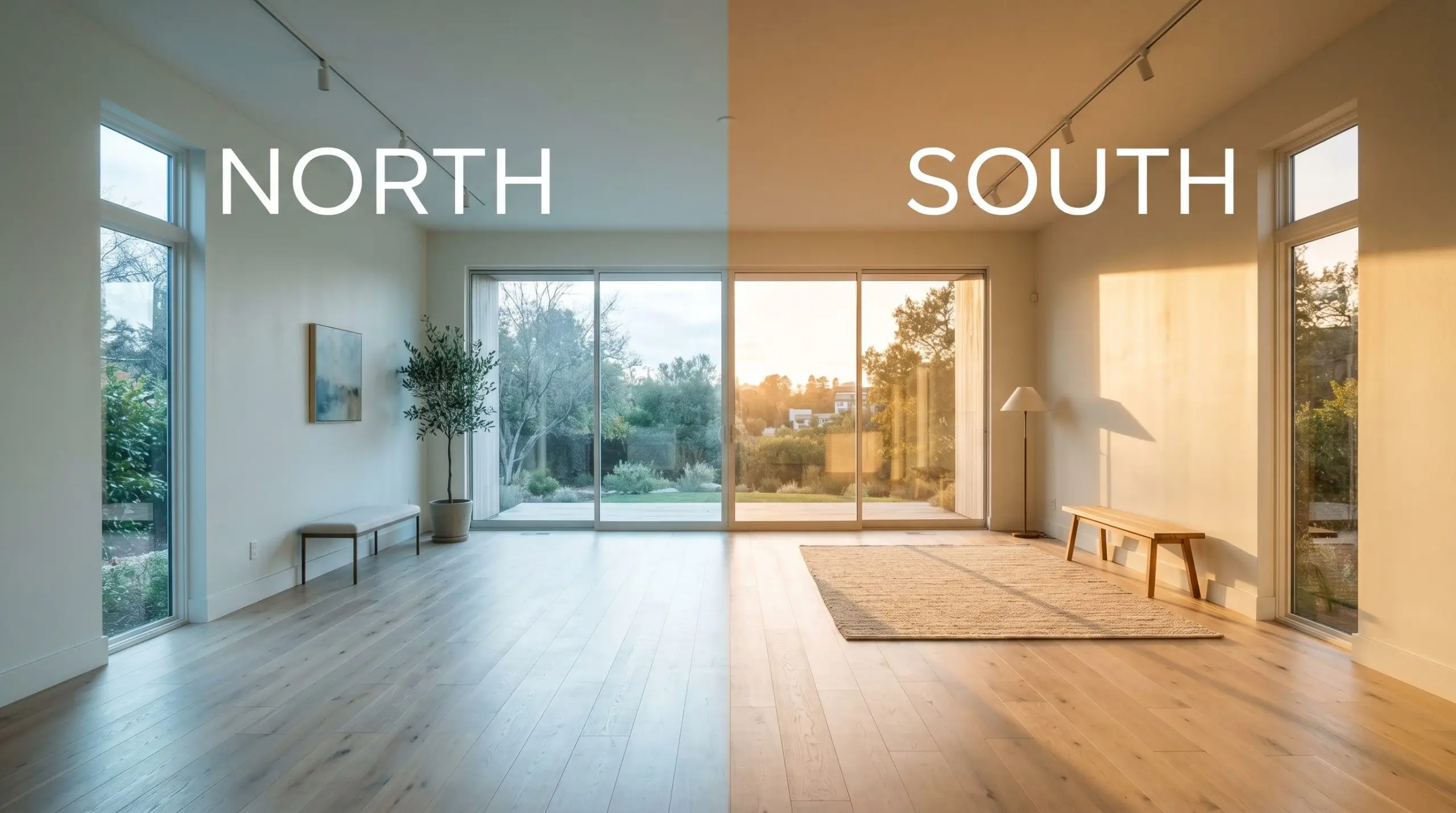
When testing this color, always paint your swatches on a piece of foam board rather than directly on the wall. Move the board from the darkest corner of the room to the brightest window over 24 hours so you can witness exactly how the yellow-beige base reacts to your specific lighting.
Hackrea Lighting Secret
Where to Use Behr First Snow
This powdery white is incredibly adaptable, serving as a quiet but impactful foundation across various rooms. Whether you are updating a busy family hub or refreshing an exterior facade, its forgiving nature makes it a highly reliable choice.
Kitchen Cabinetry
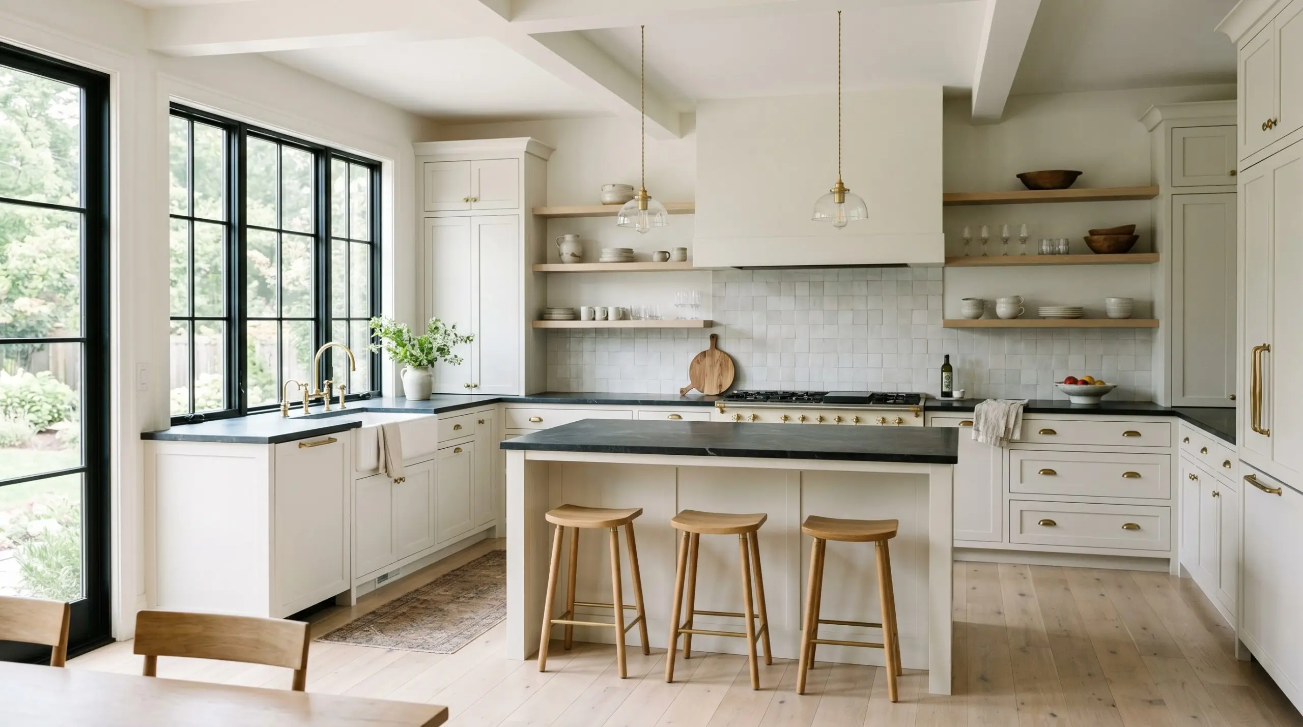
Using this luminous off-white as a cabinetry paint offers a brilliant alternative to stark, modern whites. It provides a soft, sophisticated finish that feels incredibly custom, especially when paired with the right hardware.
For a transitional, slightly European aesthetic, pair these creamy cabinets with honed soapstone countertops and unlacquered brass pulls. The warmth of the brass pulls out the yellow-beige undertones beautifully. If you prefer a more streamlined, soft-modern look, flat-panel cabinet doors painted in this shade look stunning against a zellige tile backsplash and matte black steel fixtures.
Always use a high-quality enamel or urethane-alkyd finish for kitchen applications to ensure the surface can withstand daily wear and tear.
Open-Concept Living Areas
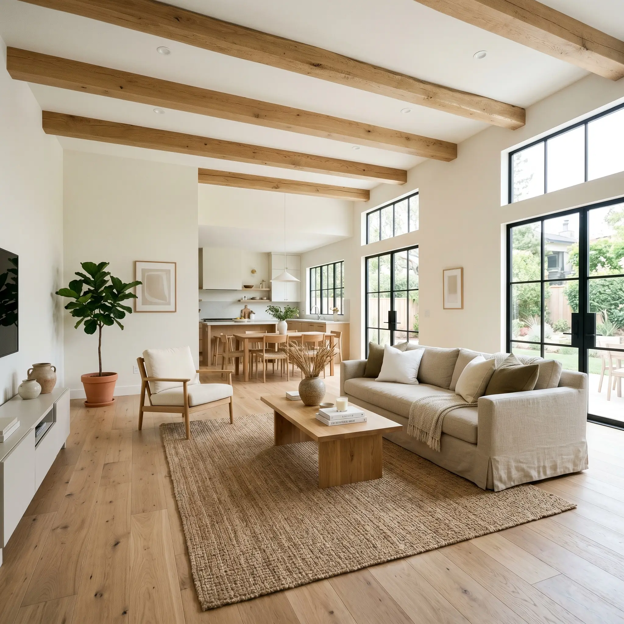
In expansive, multi-use spaces, you need a wall color that unifies the architecture without feeling overwhelmingly clinical. This warm off-white acts as the perfect connective tissue, bouncing natural daylight effortlessly from the dining zone to the lounge area.
To build an organic, relaxed atmosphere, layer the room with highly textural elements. Think slipcovered washed linen sofas, a chunky jute rug, and oversized branches in vintage pottery. The powdery finish of the paint softens the transition between these raw materials.
If your open floor plan features prominent architectural details like exposed beams or a central fireplace, this color allows those features to command attention without competing for the spotlight.
North-Facing Bedrooms
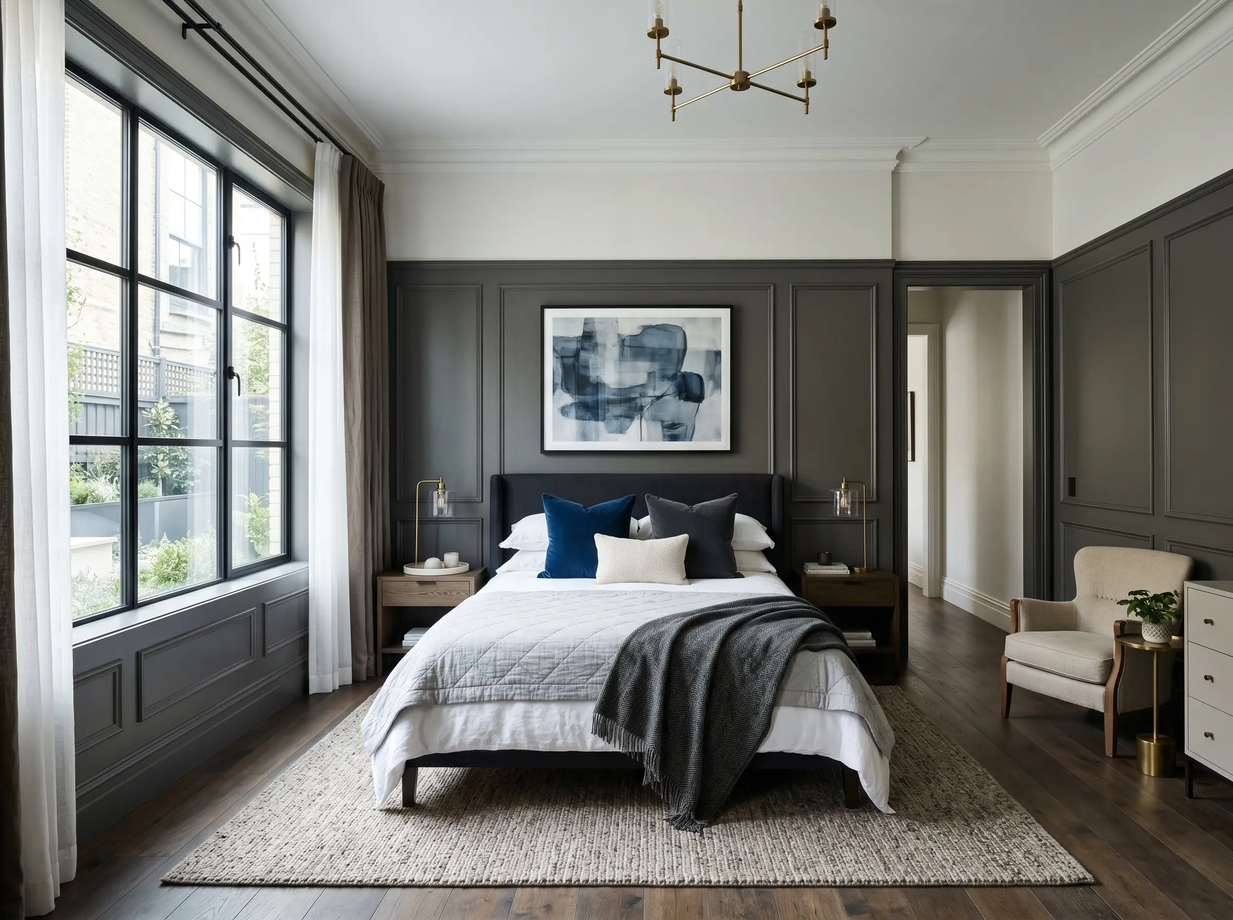
Bedrooms that lack direct, warm sunlight can often feel chilly or shadowed. Because the cooler light in these rooms neutralizes the yellow cast, this paint will read as a very crisp, muted stone-white.
This creates a fantastic opportunity for high-contrast, intentional design. Use this crisp white on the upper walls and ceiling, and pair it with a rich, dark wainscoting—like a deep plum or charcoal—on the lower half of the room.
Soften the resulting contrast with layers of tactile fabrics, such as a worsted wool throw or velvet pile accent pillows. This approach turns a potentially gloomy north-facing room into a sophisticated, tailored retreat.
In rooms with limited natural light, avoid using flat paint on the walls. Upgrading to an eggshell or satin finish will help bounce the available light around the room, preventing the muted stone-white tone from falling flat in the shadows.
Hackrea Pro-Tip (The Shadow Effect)
Exterior Trim and Siding
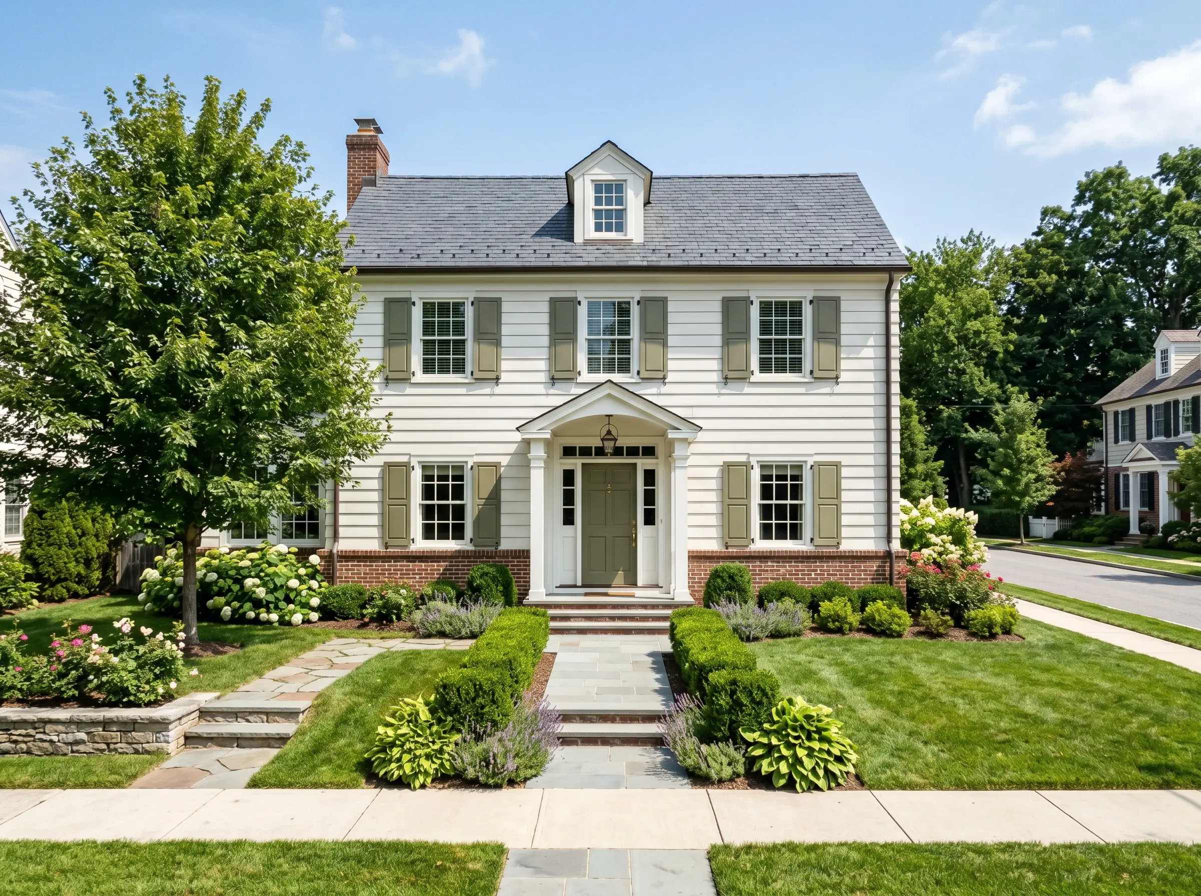
On an exterior facade, the intense glare of the sun washes out most colors, making true whites completely blinding. The 82 LRV of this shade provides the perfect solution, offering a bright, clean look that retains just enough depth to remain comfortable on the eyes.
When used as a primary siding color, it pairs beautifully with contrasting trim pairings like an olive green or a muted navy blue on the shutters and front door. This combination instantly revitalizes a standard suburban exterior, giving it a curated, intentional curb appeal.
If you are using it strictly for trim, it frames brick or darker siding with a soft, forgiving border. Be aware that direct afternoon sunlight will amplify the creamy base, so always test a large swatch on the south-facing side of your home before committing to the full exterior.
Styling Behr First Snow: Coordinating Colors & Material Pairings
Because of its soft, powdery finish, this warm off-white thrives when it has clear, intentional boundaries to interact with. When placed next to rich, saturated tones, the yellow-beige undertones act as a luminous cushion, preventing stark transitions. It requires a thoughtful mix of textiles and hard finishes to truly bring its color structure to life.
Tailoring the Architectural Boundaries
When selecting trim to frame this Behr Designer Collection shade, you must decide whether you want a crisp, tailored border or a soft, atmospheric melt.
Tactile Finishes and Hardware Selections
To elevate this powdery white, anchor the room with materials that either absorb its creamy warmth or provide a sharp, grounding contrast.
Building a Cohesive Palette
Curated Aesthetic Concepts
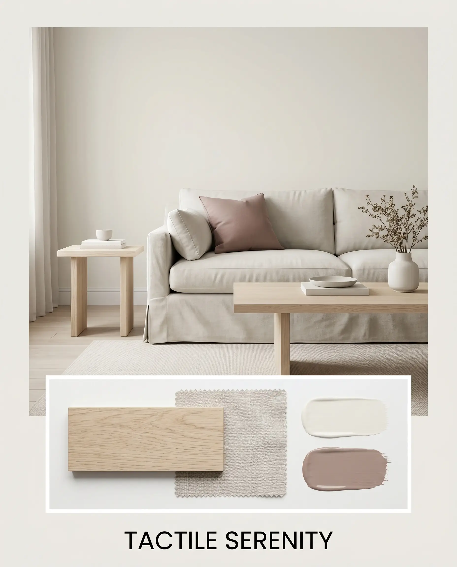
Tactile Serenity This palette relies on soft, tonal layering to create a calm, restorative environment. The walls are bathed in First Snow DC-003, serving as a gentle backdrop for bleached oak furniture and expansive, slipcovered washed linen seating. A touch of Farrow & Ball Sulking Room Pink on an accent piece or woven textile introduces a quiet, sophisticated warmth that makes the entire space feel effortlessly curated.
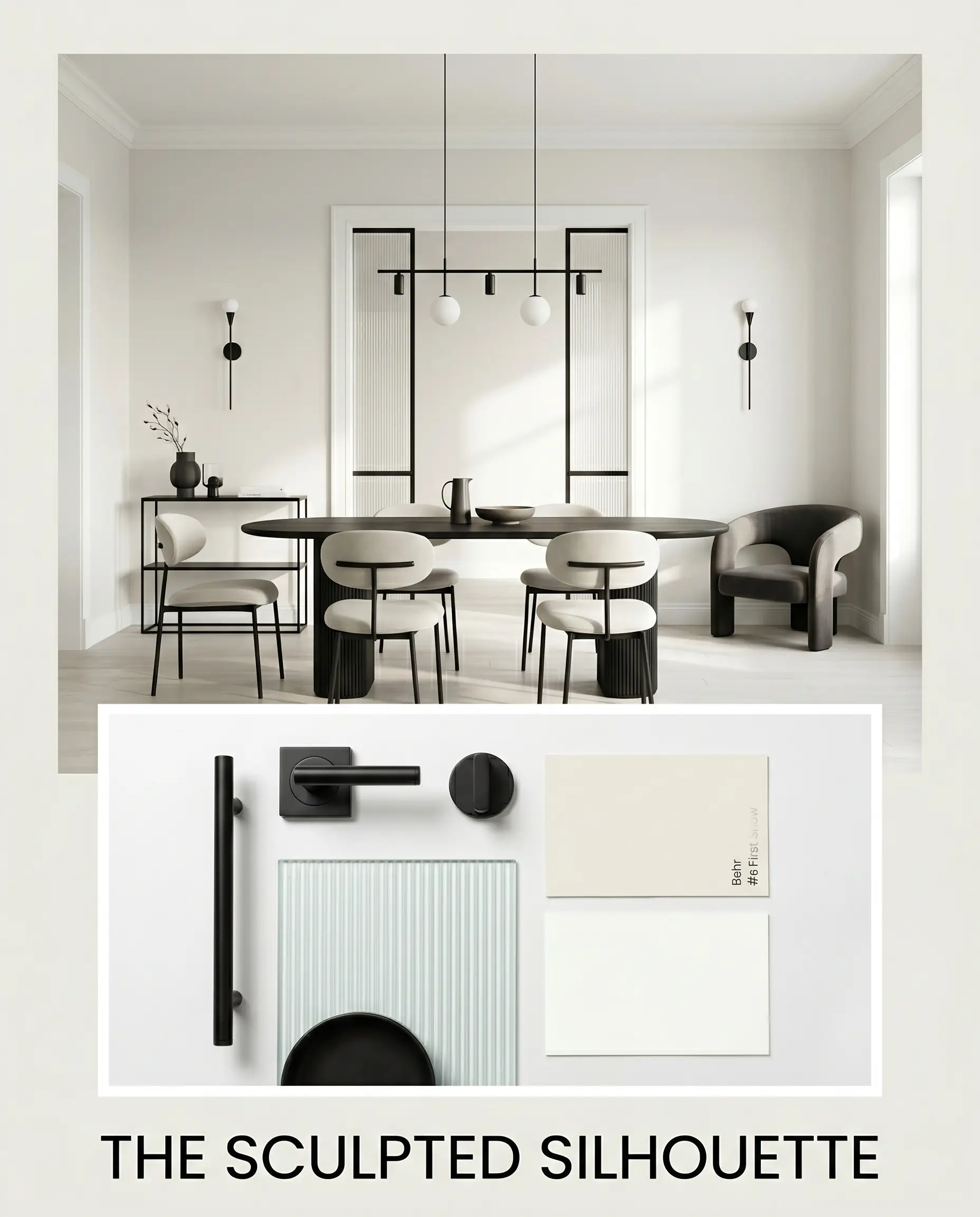
The Sculpted Silhouette Designed for high-contrast impact, this concept uses stark boundaries to define the room’s energy. The creamy walls are sharply framed by matte black steel fixtures and crisp Chantilly Lace trim. To soften the bold contrast, incorporate fluted glass elements and sculptural accent chairs, allowing the diffused light to playfully interact with the structured, modern lines.
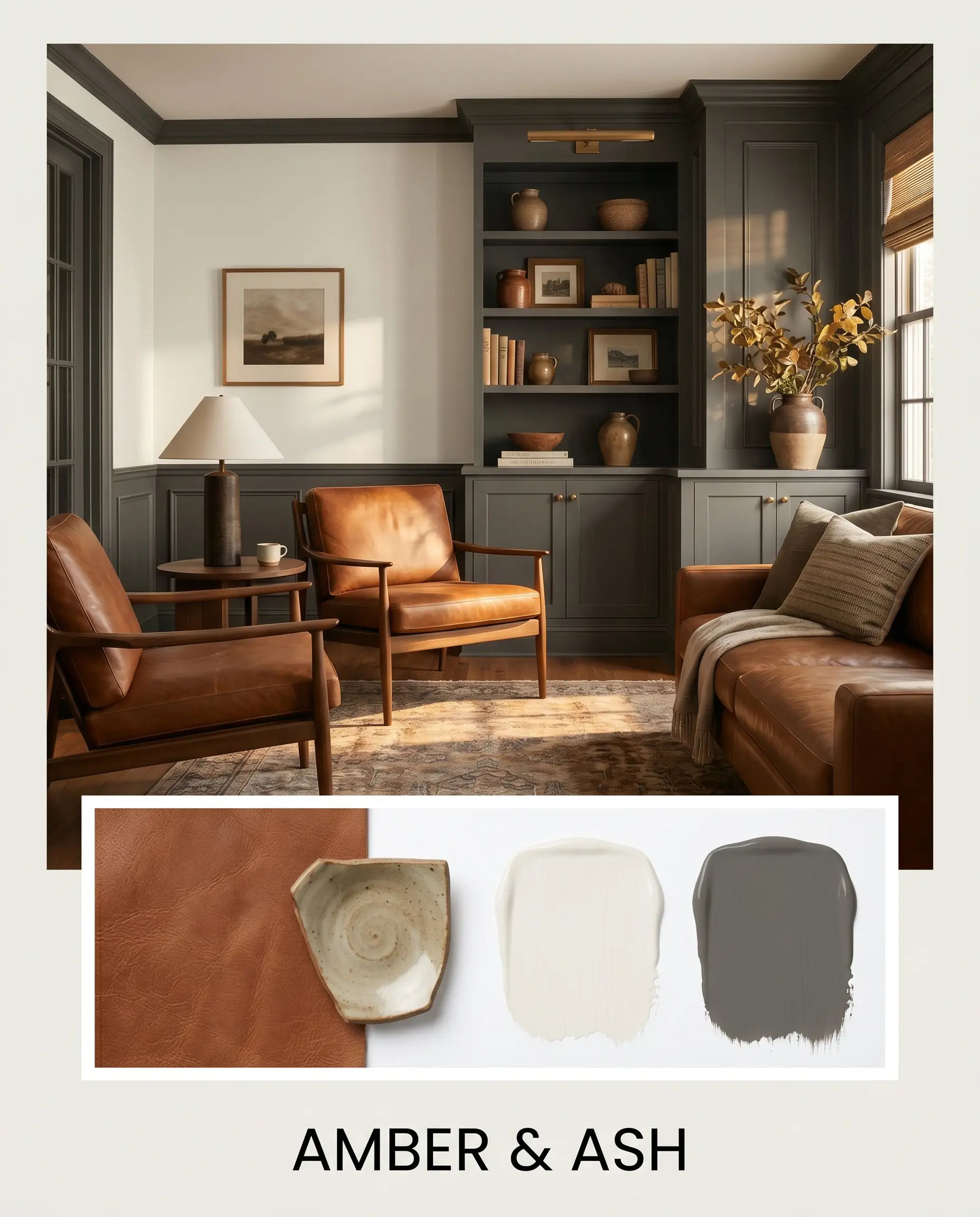
Amber & Ash This mood board embraces a rich, grounded aesthetic by leaning into deep, earthy tones. The luminous off-white walls provide relief against dark, grounding elements like Kendall Charcoal millwork or doors. Warmth is reintroduced through rich saddle leather seating and vintage pottery, creating a deeply inviting, lived-in atmosphere that feels both rugged and highly refined.
Head-to-Head Paint Comparisons
Sometimes a room’s specific natural daylight or your existing hard finishes demand a slight shift in your color strategy. If your space pulls too much yellow or you need a slightly different light reflectance value, testing a rival shade against this Behr off-white is crucial for a confident decision.
Behr First Snow vs. Sherwin-Williams Snowbound SW 7004
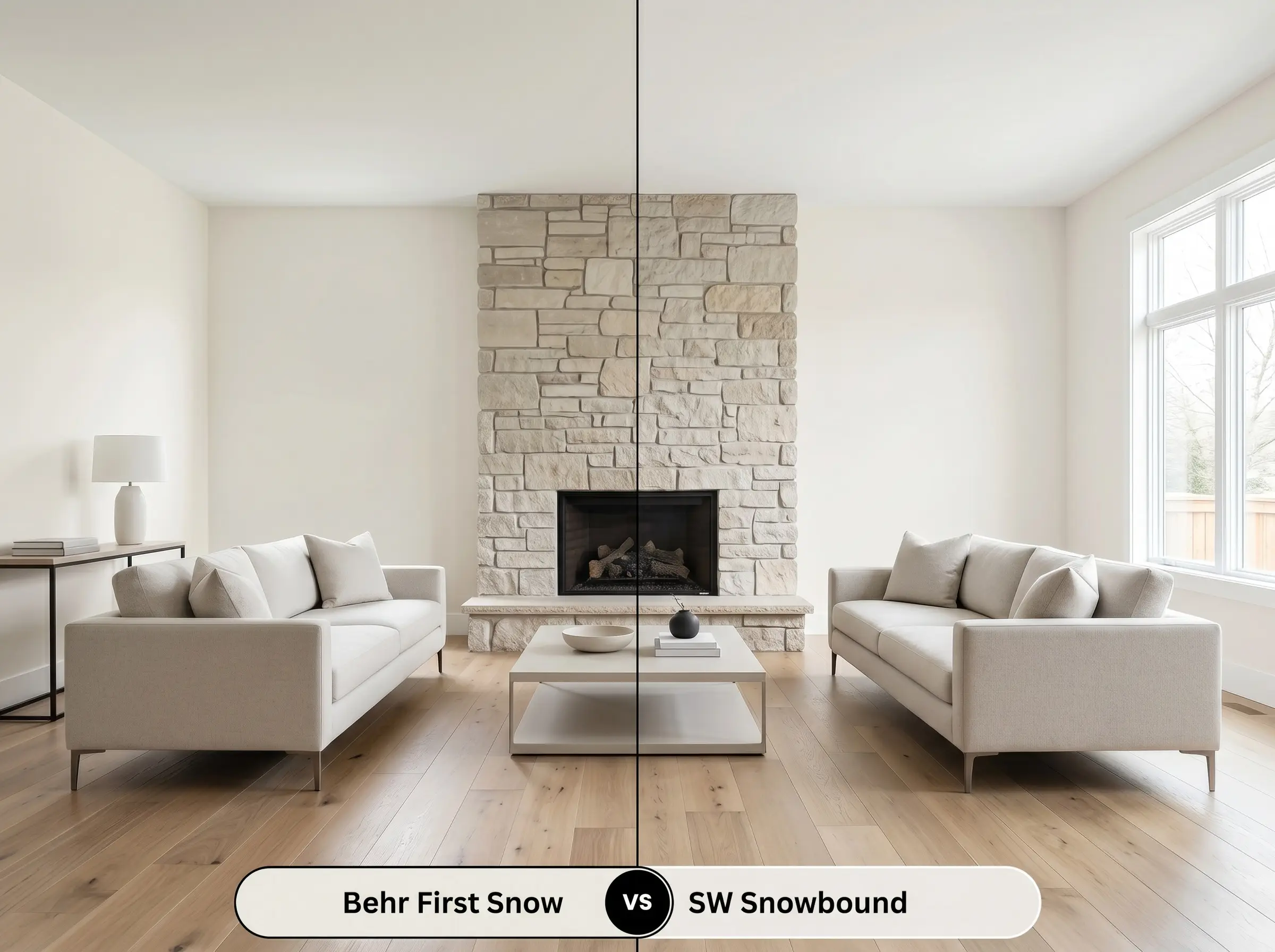
While both of these shades are incredibly popular off-whites, their underlying DNA behaves very differently on the wall. Snowbound features a subtle pinkish-taupe undertone, whereas the Behr option relies on a yellow-beige base. If your room features cool-toned gray flooring or icy blue accents, Snowbound will harmonize beautifully, whereas First Snow might clash and appear overly yellow.
Behr First Snow vs. Benjamin Moore White Dove OC-17
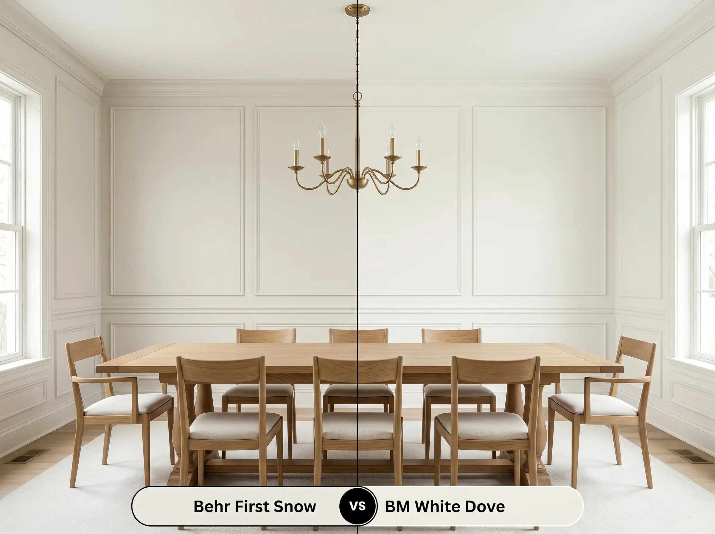
White Dove is a classic standard for warm off-whites, sharing a very similar light reflectance value but introducing a touch more gray into its base. If you find that the Behr color pushes a bit too creamy in south-facing afternoon sun, White Dove offers a slightly more muted, shadowed alternative. Choose White Dove if you need to tone down the warmth, but stick with the Behr shade if you want a truly luminous, sunny glow.
Similar Colors to First Snow DC-003
Finding the exact right off-white often requires micro-adjustments in depth or warmth to perfectly suit your spatial perception. If this specific shade is not quite hitting the mark, evaluating a few close alternatives can help you pinpoint the perfect foundation for your home.
Same-Brand Alternatives
Cross-Brand Matches
Practical Application & DIY Advice
Moving from color theory to the physical act of painting requires an understanding of how this specific pigment behaves on the roller. Your choice of finish and preparation will ultimately dictate how the final color is perceived in your home.
The Dynamic Sheen Guide
Primer Strategy & Coverage
Because this shade has a high light reflectance value, it is highly susceptible to showing the previous wall color underneath. You must use a high-quality, bright white bonding primer, especially if you are transitioning from a dark or highly saturated tone.
Never attempt to stretch this paint into a single coat. To achieve the true, rich chromatic profile intended by the Behr Designer Collection, plan for two full, even coats over a primed surface.
Hackrea Pro-Tip (The Coverage Rule)
When applying this color, maintain a wet edge on your roller to prevent “flashing.” Flashing occurs when overlapping layers of paint dry at different rates, leaving visible, uneven streaks that catch the light. Roll from ceiling to floor in smooth, continuous motions, and avoid the temptation to touch up partially dried sections.
Frequently Asked Questions
Because its core color structure relies on yellow-beige rather than red or taupe, it rarely flashes pink. In heavily shaded exterior conditions, it is much more likely to neutralize into a muted, flat stone-white rather than pulling peach.
The cooler temperature of 4000K daylight bulbs will actively suppress the yellow-beige undertones. This transforms the paint into a much crisper, cleaner architectural finish, making the windowless hallway feel bright and expansive rather than overly warm.
Warm amber oak flooring will amplify the paint’s creamy base, creating a highly cohesive, glowing atmosphere. Conversely, pairing it with cool-toned gray LVP creates a visual friction that can make the paint look unintentionally yellow or dingy by comparison.
Thanks to its high LRV of 82, it performs beautifully on textured surfaces by bouncing enough ambient light to prevent deep shadows from forming in the texture. However, you must use a dead-flat finish to ensure the texture itself is minimized rather than highlighted.
Final Verdict on Behr First Snow
Behr First Snow is a highly capable, forgiving off-white that excels at bringing a quiet, luminous warmth to residential spaces. It is the perfect foundation for homeowners who want the expansive, clean feeling of a white room but crave the cozy, lived-in energy provided by its subtle yellow-beige undertones. This color truly shines in transitional and organic modern homes, especially when layered with raw, tactile materials like bleached oak, natural stone, and washed linens. It acts as a brilliant, restorative backdrop that shifts beautifully with the moving sun.
However, you must be cautious of the surrounding hard finishes before committing to this shade. If your home features prominent cool-toned elements—such as icy blue glass tiles, stark blue-gray luxury vinyl plank flooring, or violet-toned marble countertops—this paint is not for you. The creamy, yellow-beige base will fiercely reject those cooler tones, resulting in a visual clash that makes the walls appear sallow or artificially aged. To ensure a cohesive design, always pair this warm off-white with equally warm, earthy, or starkly neutral materials that support its luminous glow.
Closest Cross-Brand Equivalents
The absolute closest scientific color matches for First Snow across top paint brands.