Winter White DC-004
BehrBehr Winter White (DC-004) is a frosty, cool-toned off-white with an LRV of 86. Despite its icy name, its mathematical color structure reveals subtle gray and green micro-nuances, making it a highly versatile neutral for modern interiors and refined exteriors.
Paint Technical Profile
| Color ID / SKU | DC-004 |
| HEX Code | #eeefe8 |
| Light Reflectance (LRV) | 86 |
| Use | Interior, Exterior |
| Best Exposures | South-Facing, West-Facing |
| Best For | Trim, Ceilings, Modern Living Rooms, Bathrooms |
Sculpting Light with Behr Winter White: The Crisp, High-Reflectance Neutral
Some white paints merely coat a wall, while others actively reshape the boundaries of your room. Winter White by Behr falls firmly into the latter category, acting as a highly reflective architectural tool that manipulates natural light. It delivers a coveted, crisp aesthetic without ever crossing into a sterile, unwelcoming territory.
As a standout in the Behr Designer Collection, this frosty off-white carries a hidden complexity that shifts depending on what you pair it with. It thrives on contrast, begging to be layered against rich textures and darker, more saturated materials.
If you are tired of neutrals that pull aggressively yellow or cream in the afternoon sun, this might be your exact solution. Let us break down exactly how this shade behaves on your walls.
Behr Winter White: Temperature, Undertones & LRV
When evaluating Behr Winter White (DC-004), the most immediate question is whether this shade leans warm or cool. It is a decisively cool white, formulated to bring a crisp, refreshing energy to your interiors. However, its underlying color structure prevents it from feeling like an arctic freeze.
Here is the exact chromatic profile that drives its visual behavior:
With a Light Reflectance Value (LRV) of 86, this architectural finish is highly reflective and actively bounces light around the room. It absorbs very little natural daylight, making it an exceptional choice for expanding the visual footprint of tighter spaces. It also retains just enough pigment to contrast beautifully against pure, un-tinted white trim.
Manipulating Light: The Chameleon Factor
Because this off-white relies on a delicate balance of gray and faint green-yellow notes, its final appearance is entirely at the mercy of your lighting. You must treat this paint as an active participant in your room’s environment.
Here is exactly how shifting light dictates the mood:
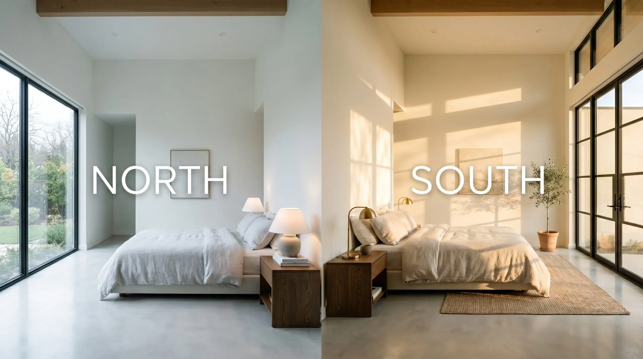
If you want to maintain the crisp, modern edge of this paint without it feeling like a commercial office, stick to 3000K to 3500K LED bulbs. This temperature provides clarity and brightness without stripping away the subtle gray nuances that give the color its character.
Hackrea Pro-Tip (The Bulb Rule)
Architectural Applications and Styling
Winter White is incredibly versatile, but its high reflectance means it requires intentional styling to avoid feeling unfinished or empty. Here is how to utilize this crisp neutral across different functional spaces, using texture, contrast, and clever architectural details to bring it to life.
Sculpting Clean-Lined Kitchens
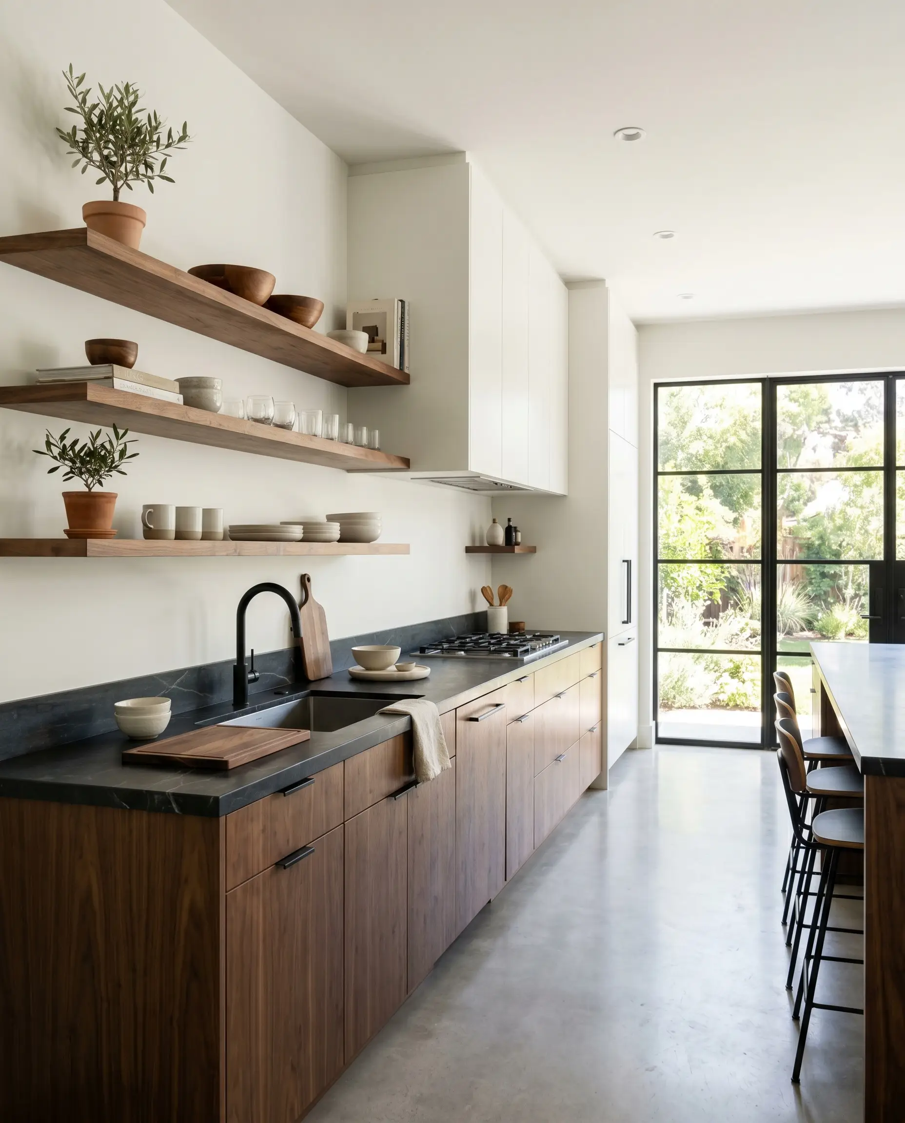
While it is easy to default to an all-white, stark aesthetic in a modern kitchen, this paint truly shines when you introduce organic friction. For the avid home chef who wants a bright, energizing workspace, use this frosty off-white on the primary walls, but immediately introduce warmth through your hard materials.
Consider floating shelves crafted from raw walnut or bleached oak to break up the expansiveness of the walls. To balance the cool tones, install soapstone countertops or matte black steel hardware, which provide a rich, sophisticated contrast. If you want a seamless, built-in look, try color-drenching your upper cabinets and the surrounding drywall in the exact same finish. This technique blurs the structural lines of the cabinetry, making the kitchen feel significantly larger and highly custom.
Tranquil Bathing Spaces
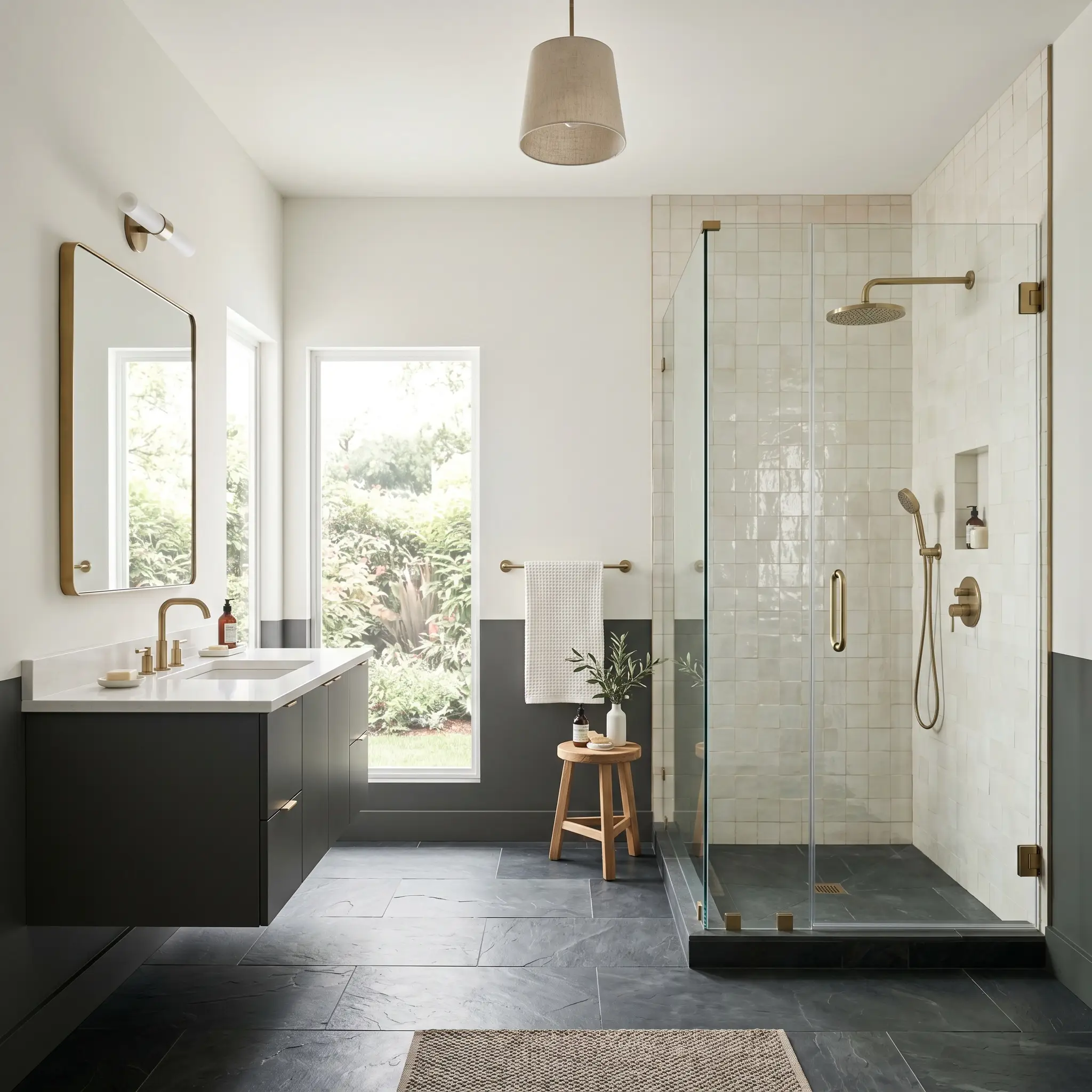
A tranquil, spa-inspired bathroom does not have to rely on predictable sea-glass greens or pale blues. The icy cool tones of this Behr neutral create an incredibly refreshing morning environment when paired with the right reflective surfaces.
To elevate the space, layer the walls against a shower surround of slightly imperfect, pearlescent zellige tile. The subtle variations in the handmade tile will play beautifully off the paint’s high LRV. Introduce a floating vanity painted in a muted olive or charcoal to secure the room visually, and finish the space with brushed brass or blackened bronze plumbing fixtures to add a necessary touch of metallic warmth.
Never pair this frosty neutral with creamy, yellow-based travertine or beige ceramic tiles. The crisp gray undertones of the paint will clash against the warm stone, making the walls look dingy and the tile look dirty. Always stick to cool-toned marbles, crisp white subway tiles, or dark slate floors.
Clash Warning (The Tile Trap)
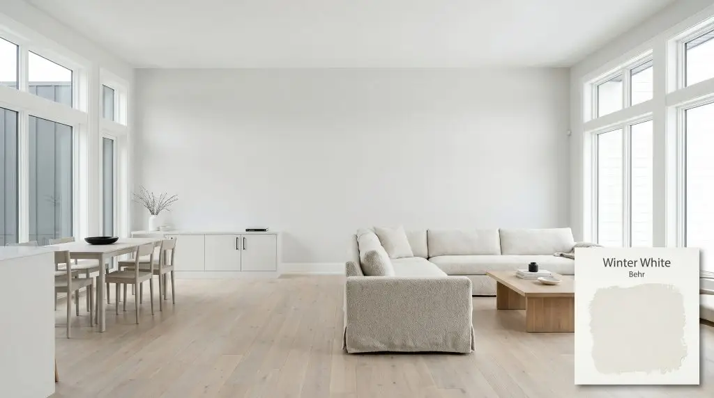
Layering Tactile Living Areas
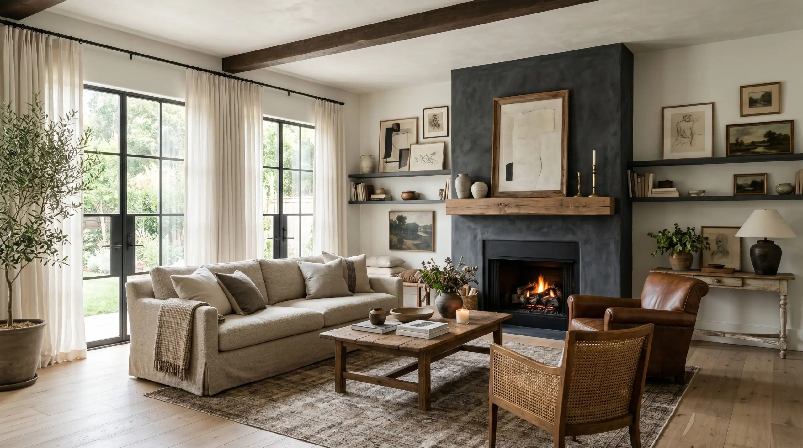
In a large living room, highly reflective cool whites run the risk of feeling a bit too expansive if left entirely unstyled. The secret to making this color work in a family gathering space is an aggressive layering of textiles and contrasting finishes.
Start by softening the crisp walls with window treatments made from washed linen or sheer cotton. Introduce a slipcovered sofa in a nubby bouclé or a performance tweed to add physical texture that the smooth walls lack. You can also use this paint as a flawless, gallery-white backdrop for a curated collection of asymmetrical art or oversized canvases. To create a striking focal point, consider applying a dark charcoal Roman clay or limewash to the fireplace surround, allowing the bright off-white walls to frame the texture perfectly.
Unifying Transitional Hallways
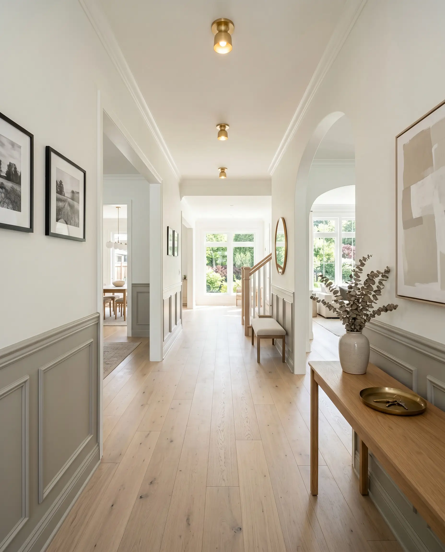
Hallways and open-concept corridors often suffer from a lack of natural light, making the impressive 86 LRV of this color a massive functional asset. It actively captures whatever light spills out from adjoining rooms and pulls it down the corridor.
Instead of just rolling it from baseboard to ceiling, use this opportunity to introduce architectural interest. Install tall beadboard or traditional picture molding along the lower half of the walls and paint it in a contrasting greige or soft mushroom tone. Then, apply this crisp off-white to the upper half and the ceiling. This two-tone application creates a beautiful, traditional flow through the home while keeping the upper sightlines bright and airy.
Designing with Behr Winter White: Curated Pairings and Materials
Because this frosty off-white carries a faint gray shadow, it requires crisp, intentional boundaries to hold its shape. When placed next to muddy or overly warm tones, it loses its sophisticated edge and can feel undefined. The goal is to use contrasting elements that actively engage with the paint’s high reflectance rather than letting it wash out.
Tailored Trim and Boundary Lines
To highlight the subtle icy cool tones of this wall color, you must frame it with an un-tinted, ultra-pure white. A brilliant trim creates a sharp, tailored boundary that makes the subtle gray undertones of the walls look intentional rather than accidental.
Tactile Finishes and Architectural Hardware
Selecting the right hard finishes is crucial when working with a highly reflective, cool-toned neutral. You need materials that either warm up the visual temperature or provide a stark, graphic contrast to keep the room grounded.
Strategic Color Palette Additions
To build a cohesive room, you need secondary colors that either lean into the frostiness of this neutral or offer a deep, grounding contrast.
Curated Aesthetic Concepts
To truly understand the versatility of this Behr favorite, you must see how it shifts its personality based on the surrounding decor. Here is how to manipulate its undertones to achieve entirely different design styles.
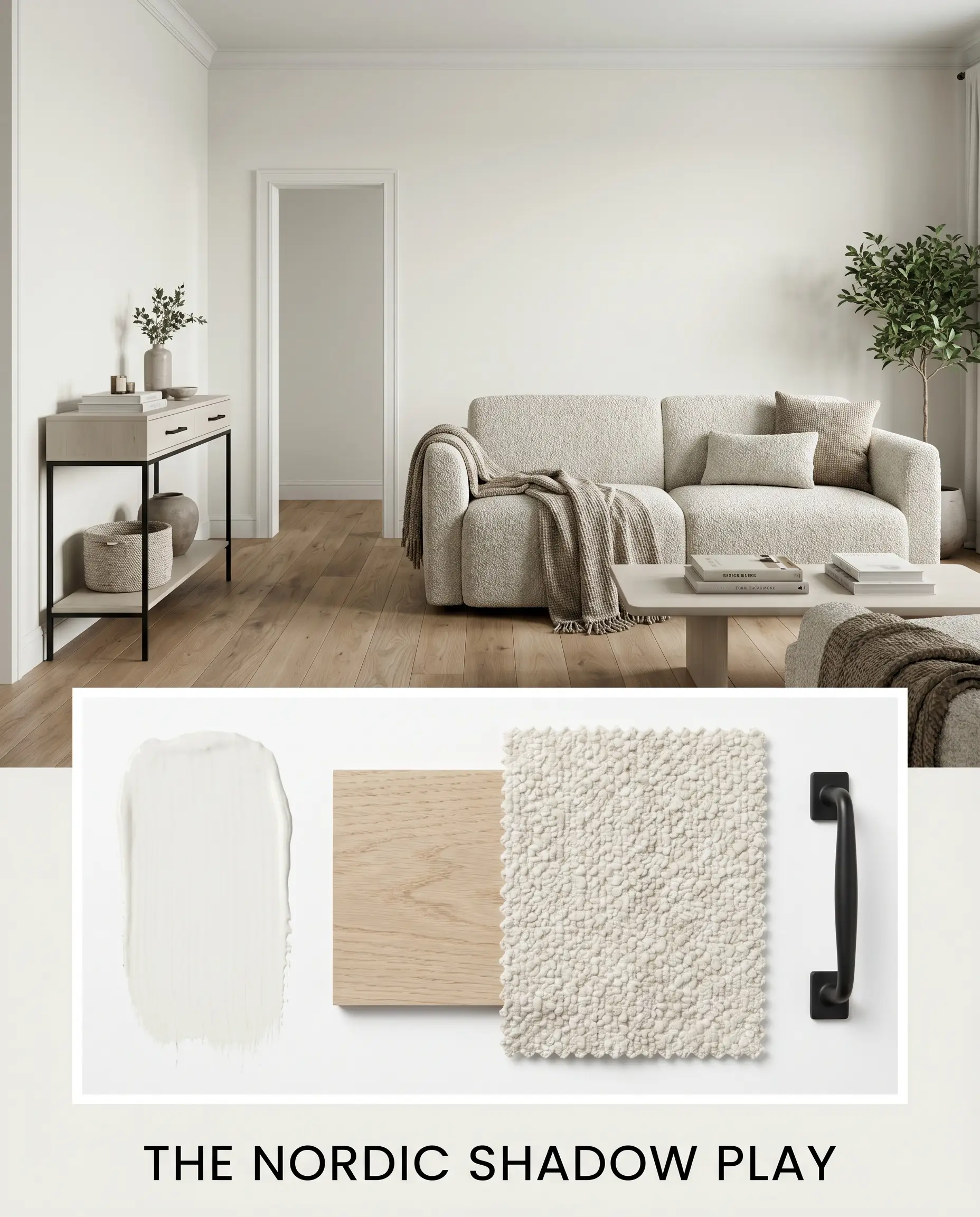
The Nordic Shadow Play
This aesthetic relies on the soft, desaturated grain of bleached oak to gently warm the frosty walls without interrupting their clean lines. Matte black steel hardware slices through the airy color structure, offering a necessary graphic edge. By layering a nubby bouclé sofa and a minimalist console, the environment feels both highly tailored and effortlessly relaxed.
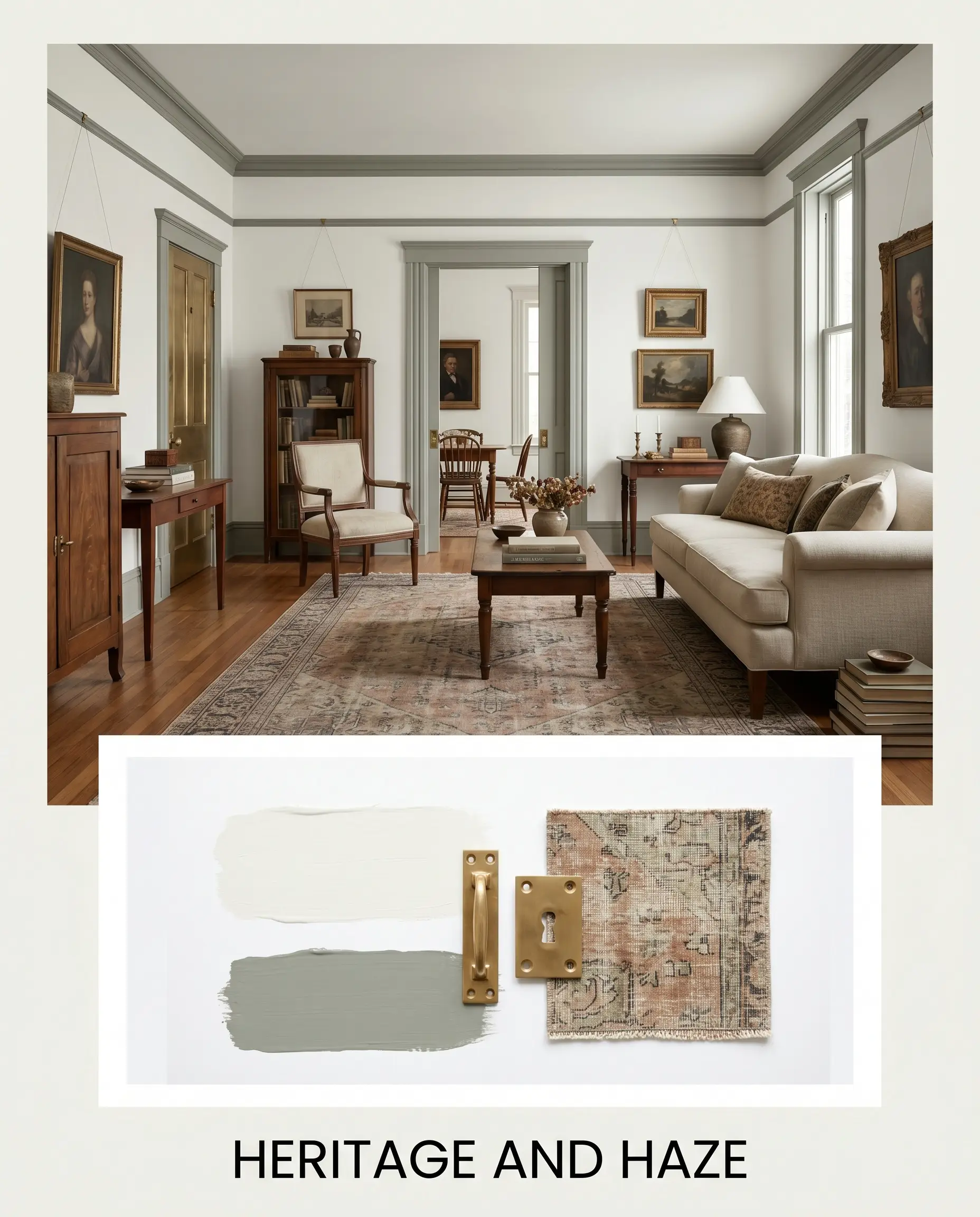
Heritage and Haze
By pairing the crisp walls with trim painted in Farrow & Ball Pigeon No. 25, you create a beautifully moody, historic tension. The living patina of unlacquered brass hardware glows against the cool backdrop, injecting a quiet luxury into the styling. Layering faded vintage rugs and traditional picture molding establishes a deeply collected, soulful energy.
Analyzing the Competition: Color Theory Clashes
While this Behr favorite is highly adaptable, specific lighting conditions or architectural exposures often demand a slight shift in undertone. If your room faces north or lacks natural light, you might find that this frosty shade leans too chilly, prompting a look at a few notable rivals.
Behr Winter White vs. Sherwin-Williams Alabaster SW 7008
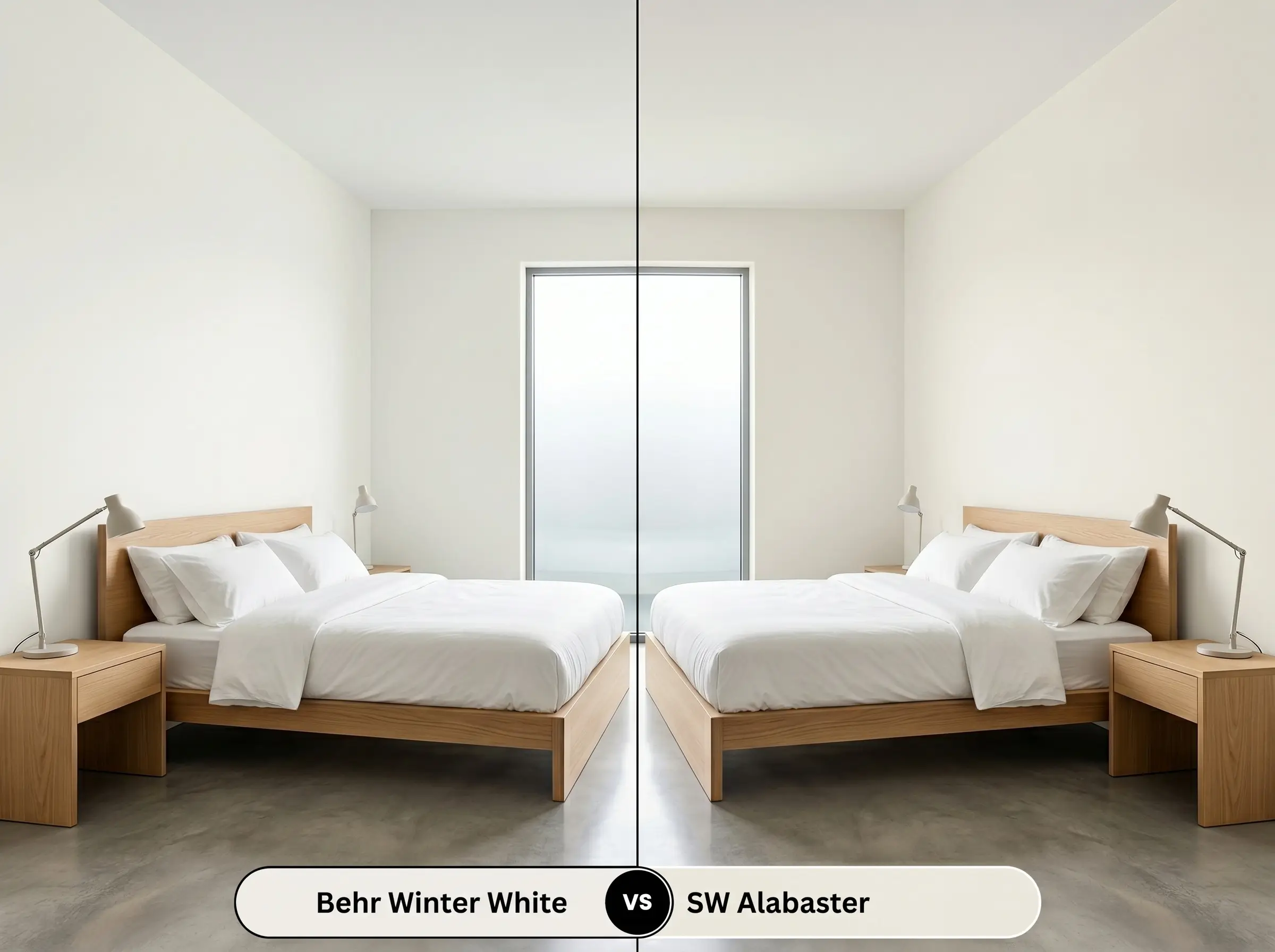
If you are dealing with a heavily shaded room that feels inherently cold, Alabaster SW 7008 offers a much creamier, warmer base. While the Behr option relies on gray and subtle green to stay crisp, the Sherwin-Williams alternative uses a beige undertone to mimic the glow of natural sunlight. Choose Alabaster when you need to actively warm up a space, but stick with the Behr finish for a sleeker, modernized edge.
Behr Winter White vs. Benjamin Moore Decorator’s White CC-20
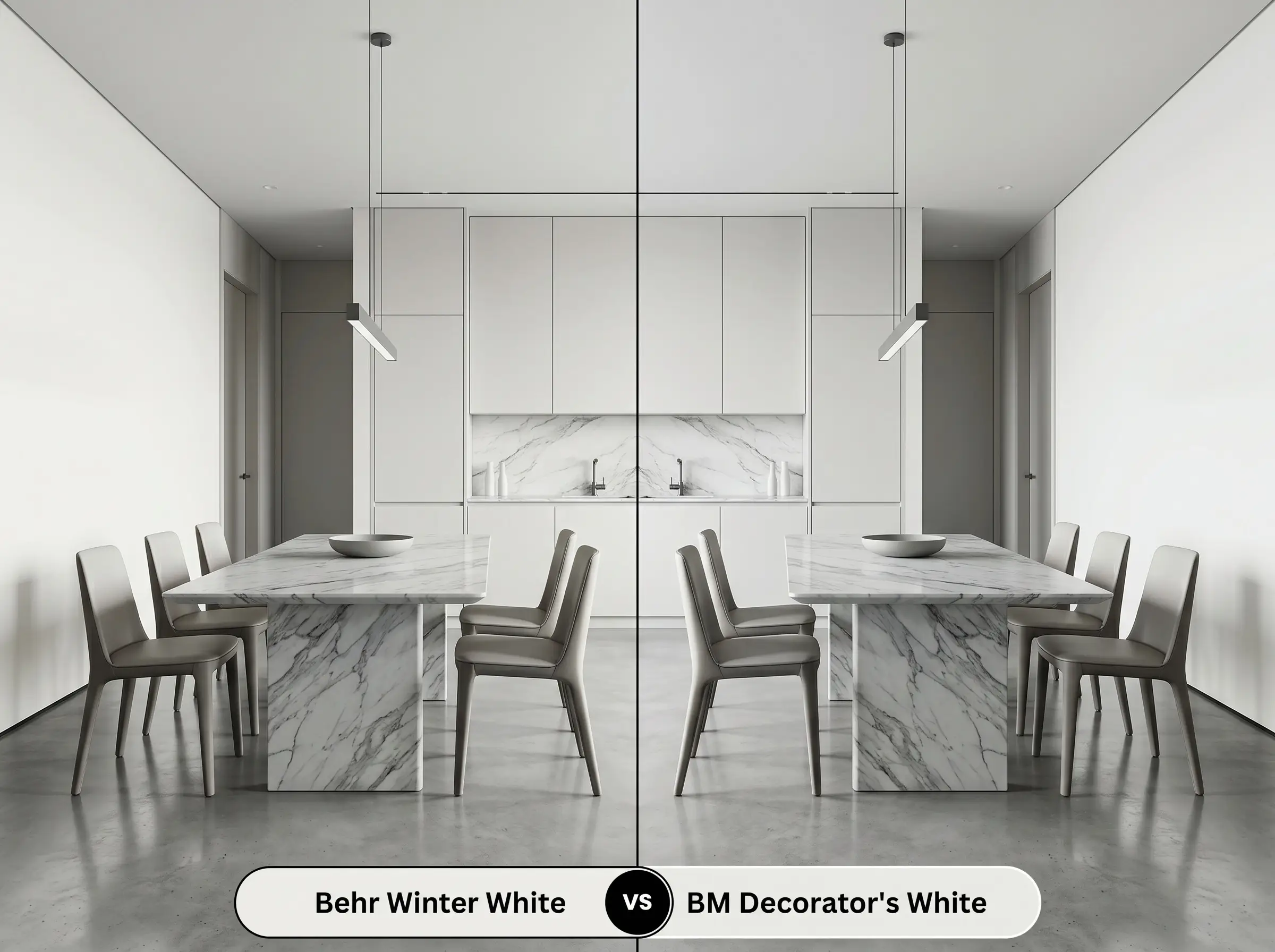
These two shades often compete for the same crisp, contemporary projects, but they handle light very differently. Decorator’s White CC-20 carries a distinct drop of magenta and gray, making it slightly cooler and more stark than the faint yellow-green hidden inside the Behr formula. If you are pairing your walls with pure, cool-toned marble, the Benjamin Moore option provides a seamless match, whereas Behr DC-004 offers just a fraction more softness.
Sourcing Alternatives for Behr DC-004
Sometimes a room requires a nearly identical vibe but needs a fractional shift in light reflectance or a slightly different undertone to harmonize perfectly with your existing hard finishes.
Staying Within the Behr Portfolio
Competitor Color Matches
Execution Strategy and Application
Transitioning a color from a digital mood board to a physical wall requires a solid understanding of how light interacts with different paint finishes. The wrong sheen can completely alter the perceived depth of this delicate off-white.
Selecting the Optimal Finish
Preparation and Coverage Rules
Because this shade has such a high LRV, it lacks the deep pigmentation needed to hide dark colors or stains underneath. You must apply a high-quality, pure white stain-blocking primer before your first coat of color.
Expect to roll at least two full coats to achieve a professional, opaque finish. Be highly aware of your roller pressure, as high-reflectance colors are notorious for flashing—leaving visible, uneven streaks—if the final coat is not applied flawlessly.
To prevent those dreaded roller marks on highly reflective walls, always maintain a “wet edge” by working in small, three-foot vertical sections. Never let the paint dry halfway across the wall before rolling the next section, as the overlap will cast a permanent shadow once dry.
Hackrea Design Secret (The Wet-Edge Technique)
Frequently Asked Questions
Because it lacks natural sunlight to activate its subtle warmth, it can lean a bit chilly in a windowless space. To counteract this, rely on warm 3000K artificial lighting and introduce brass hardware to inject a welcoming glow.
Its high light reflectance actually makes it a brilliant choice for lifting the energy of a shaded exterior. Just be prepared for the gray undertones to become much more prominent under the canopy of green trees.
The soft green notes will actually pull forward the red tones in cherry wood due to their opposing positions on the color wheel. If you want to neutralize the red in your cabinets, this pairing works, but it will create a very high-contrast, traditional look.
Placing this frosty, cool-toned white directly above a warm cream wall will make the ceiling look slightly gray and dingy. It is much better to pair it with walls that share its crisp, cool color structure.
The Final Design Verdict
Behr Winter White is an exceptional architectural tool for homeowners who want to sculpt a bright, expansive space without resorting to a stark, blinding white. It performs beautifully in modern, transitional, and Scandinavian-inspired homes where its icy cool tones can contrast against rich woods and tactile fabrics. This paint is perfect for those who understand the power of layering textures to warm up a highly reflective foundation.
While this shade is incredibly adaptable, it absolutely struggles when forced to interact with heavy, yellow-based earth tones. If your home features prominent Tuscan-style travertine floors, golden-oak trim, or warm beige upholstery, the frosty gray undertones in this paint will actively fight those finishes. The resulting visual tension makes the walls appear slightly bruised and shadowy, while the warm materials will suddenly look dated and overly yellow. To ensure success, you must commit to a cooler, crisper palette and avoid mixing this shade with overly muddy, warm-leaning elements.
Clash Warning (The Warm Earth Tone Trap)
Closest Cross-Brand Equivalents
The absolute closest scientific color matches for Winter White across top paint brands.