Cream Puff 2174-70
Benjamin MooreBenjamin Moore Cream Puff 2174-70 is a light-as-air, chalky pale pink that functions as a warm off-white. With an LRV of 82.08, it reflects massive amounts of light, offering a soft, gossamer veil of blush without feeling overly saturated or juvenile.
Paint Technical Profile
| Color ID / SKU | 2174-70 |
| HEX Code | #F9E9E4 |
| Light Reflectance (LRV) | 82.08 |
| Use | Interior |
| Best Exposures | North, South, East |
| Best For | Nurseries, Powder Rooms, Ceilings, Primary Bedrooms |
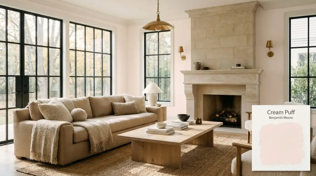
Benjamin Moore Cream Puff: The Architectural Blush Off-White You Didn’t Know You Needed
Pink is arguably the most intimidating color to put on a wall. Homeowners often fear they will accidentally turn their living room into a sugary, neon nightmare. Benjamin Moore Cream Puff 2174-70 solves this exact problem by acting as a sophisticated blush off-white rather than a standard pastel.
This warm chromatic profile behaves like a soft, gossamer veil over your walls. It offers the warmth of a pale peach without the overwhelming saturation of a true pink. When paired with the right lighting and materials, it becomes a stunning architectural finish.
Benjamin Moore Cream Puff: Undertones & LRV
If you are wondering about the color temperature of Cream Puff, the answer is definitively warm. This paint is built on a highly luminous red-orange base that gives it a welcoming, sunlit energy. However, its true magic lies in the hidden hues that keep it beautifully restrained.
With a light reflectance value (LRV) of 82.08, this shade acts as a highly luminous neutral. It absorbs very little light, meaning in flooded, sunlit spaces, the pink tint may wash out entirely. Instead of a definitive color structure, you are left with a soft, warm glow.
Ambient Lighting & Color Temperature Shifts
Because of its high reflectance and delicate undertones, BM 2174-70 acts as a true chameleon. The shifting sun and your choice of ambient lighting will drastically alter how the color translates in your room.
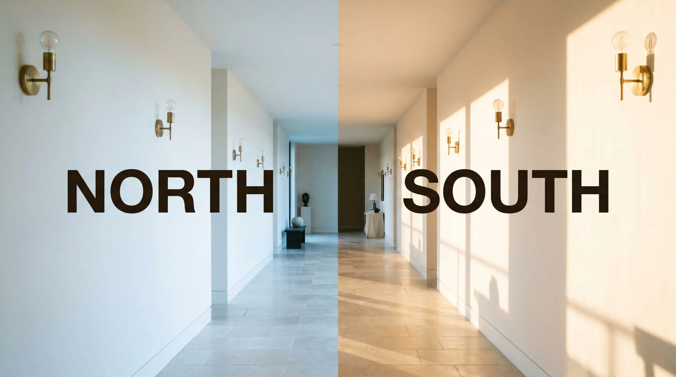
If you are using this highly reflective paint in a room with massive, unshaded south-facing windows, be prepared to lose the pink pigment during peak afternoon sun. It will read almost entirely as a warm, creamy off-white.
Hackrea Pro-Tip (The Washout Warning)
Styling This Chalky Pastel in Your Home
The beauty of a muted blush is its ability to transition seamlessly across different aesthetics. By manipulating your textiles, hard finishes, and furniture, you can pull this paint in entirely unexpected directions.
Nurseries and Children’s Rooms
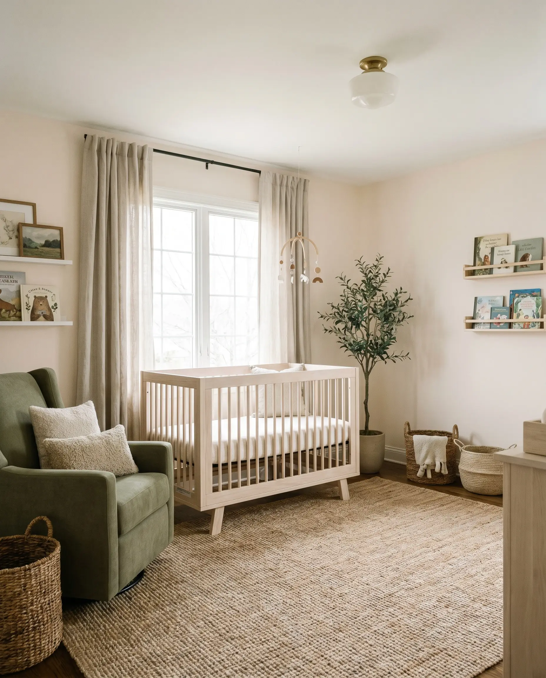
The traditional approach to a child’s room is often a hyper-saturated, literal pink. You can bypass that cliché entirely by using this muted peach cast as a neutral backdrop. It provides a soft, comforting energy while remaining incredibly sophisticated.
To stabilize the space, pair the walls with natural, tactile materials like a bleached oak crib, a jute rug, and washed linen curtains. Introduce soft olive green accents through an upholstered glider or textured throw pillows. This mix of accessible natural fibers and a premium wall color creates a transitional space that a child can easily grow into.
Powder Rooms
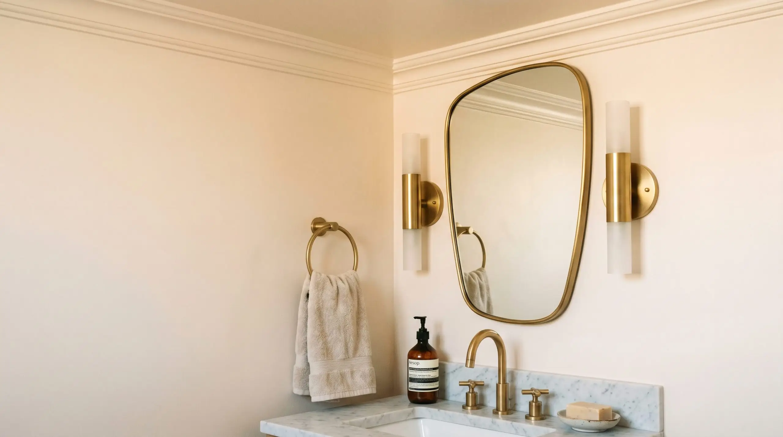
Small, windowless spaces are the perfect canvas for intentional design tension. Instead of playing it safe with standard white, wrap the entire room—walls, trim, and ceiling—in this blush off-white. This color-drenching technique creates a jewel-box effect that feels incredibly intentional.
Lean into a Parisian Modern aesthetic by pairing the chalky walls with a honed marble vanity and unlacquered brass plumbing fixtures. Add a vintage-inspired asymmetrical mirror and sleek, minimalist sconces to complete the look. The gray undertone in the paint will beautifully offset the warm metallic finishes.
In a powder room, a warm, highly reflective paint acts like a real-life beauty filter. The subtle red-orange base bounces incredibly flattering light onto the face, making it a brilliant choice for spaces where you get ready.
Hackrea Design Secret (The Mirror Effect)
Primary Bedrooms
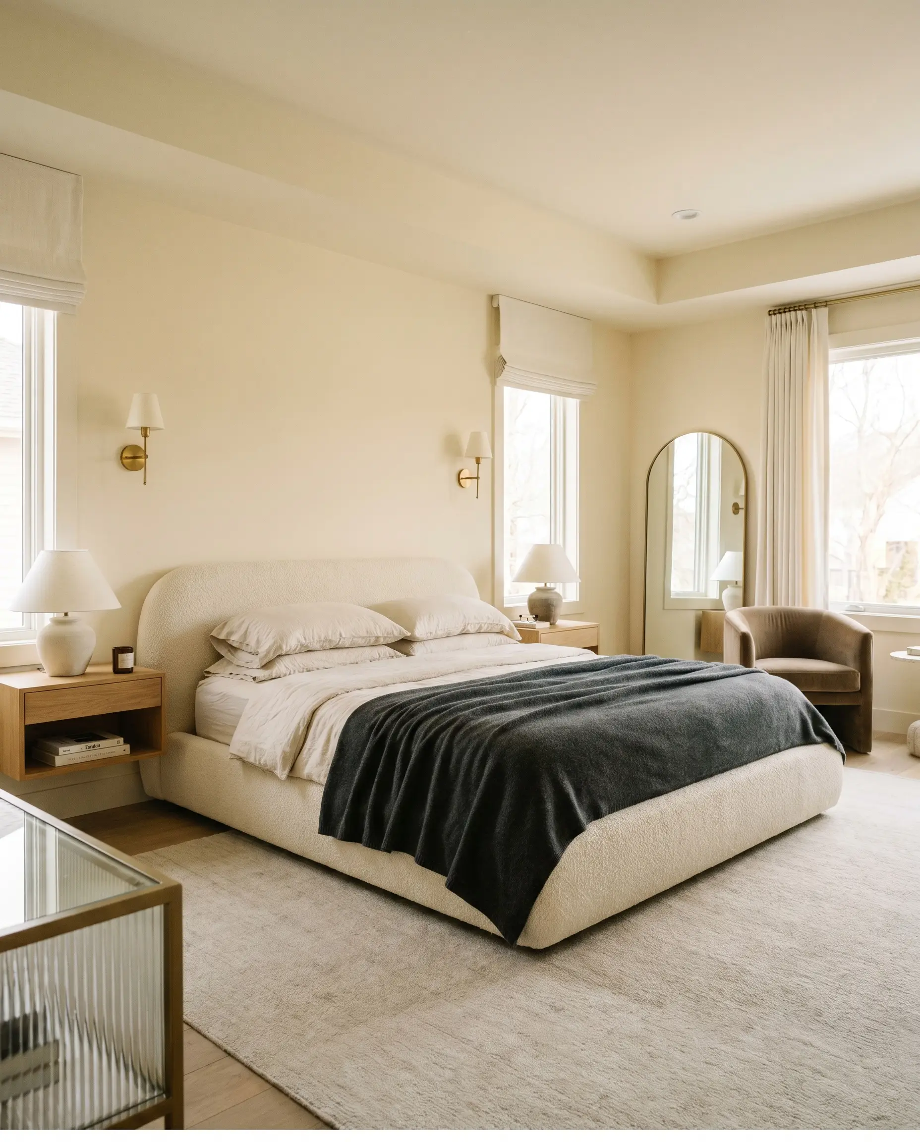
For a primary suite, you want to cultivate a restful, luxurious atmosphere without relying on predictable grays or blues. This color provides a subtle, romantic warmth that pairs beautifully with Soft Deco or Contemporary Minimalist styling.
Root the room with a low-profile, curved bouclé bed frame and floating oak nightstands. Layer the bedding with crushed cotton sheets and a cashmere throw in rich charcoal or warm taupe. The contrast between the dark, substantial textiles and the airy, light-reflective walls creates a beautifully balanced, high-end hotel vibe.
Ceilings
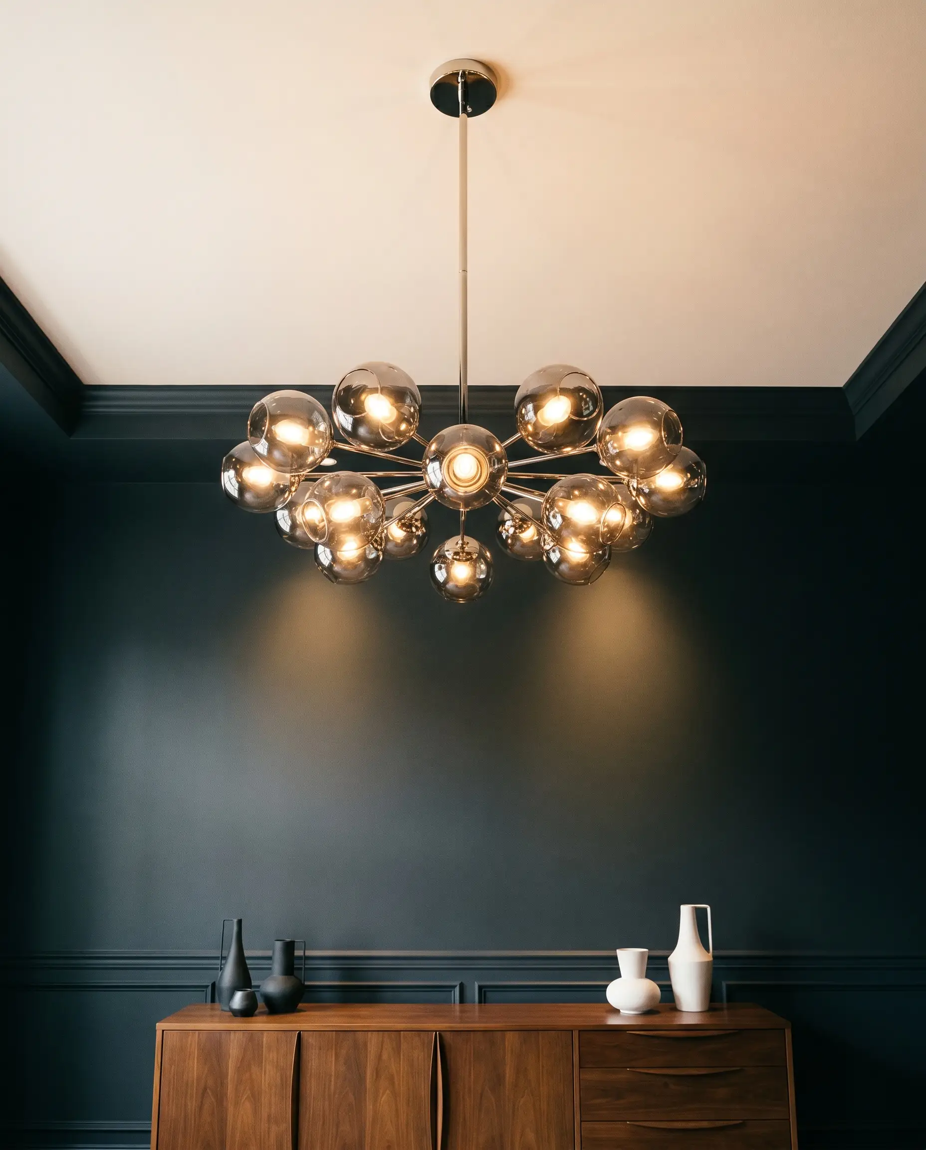
Treating the ceiling as a fifth wall is a brilliant way to introduce a blush tone without committing to an entire room. Using this warm alternative to stark white instantly lowers the visual ceiling, making a large, echoing room feel more intimate.
In a dining room with stark white or slate charcoal walls, a painted ceiling draws the eye upward and adds a layer of unexpected warmth. Pair it with a statement chandelier featuring smoked glass or polished nickel. This application works beautifully with mid-century credenzas and sculptural ceramics, proving that pastel tones belong in sophisticated entertaining spaces.
Building a Cohesive Palette Around Benjamin Moore Cream Puff
Instead of relying on stark, dramatic contrasts, this delicate tone requires thoughtful, tonal bleeds to maintain its serene energy. When placed next to harsh, highly saturated primary colors, its subtle peach base can quickly look washed out or overly timid. The key to success is pairing it with deeply grounded neutrals and rich textures that let its luminous warmth take center stage.
Tailored Trim and Baseboard Selections
To define the edges of your room without creating a jarring transition, you must carefully consider the undertone of your trim paint. A brilliant, cool-toned white will aggressively highlight the pink in the walls, while a softer white creates a seamless, high-end look.
Tactile Materials and Hardware Finishes
When curating the hard finishes for this specific shade, you must focus on elements that stabilize its airy nature. Highly polished, mirrored surfaces can make the room feel overly fragile or clinical. Instead, lean into materials that offer substantial visual weight and organic texture.
Secondary Palette Additions
Curated Designer Mood Boards
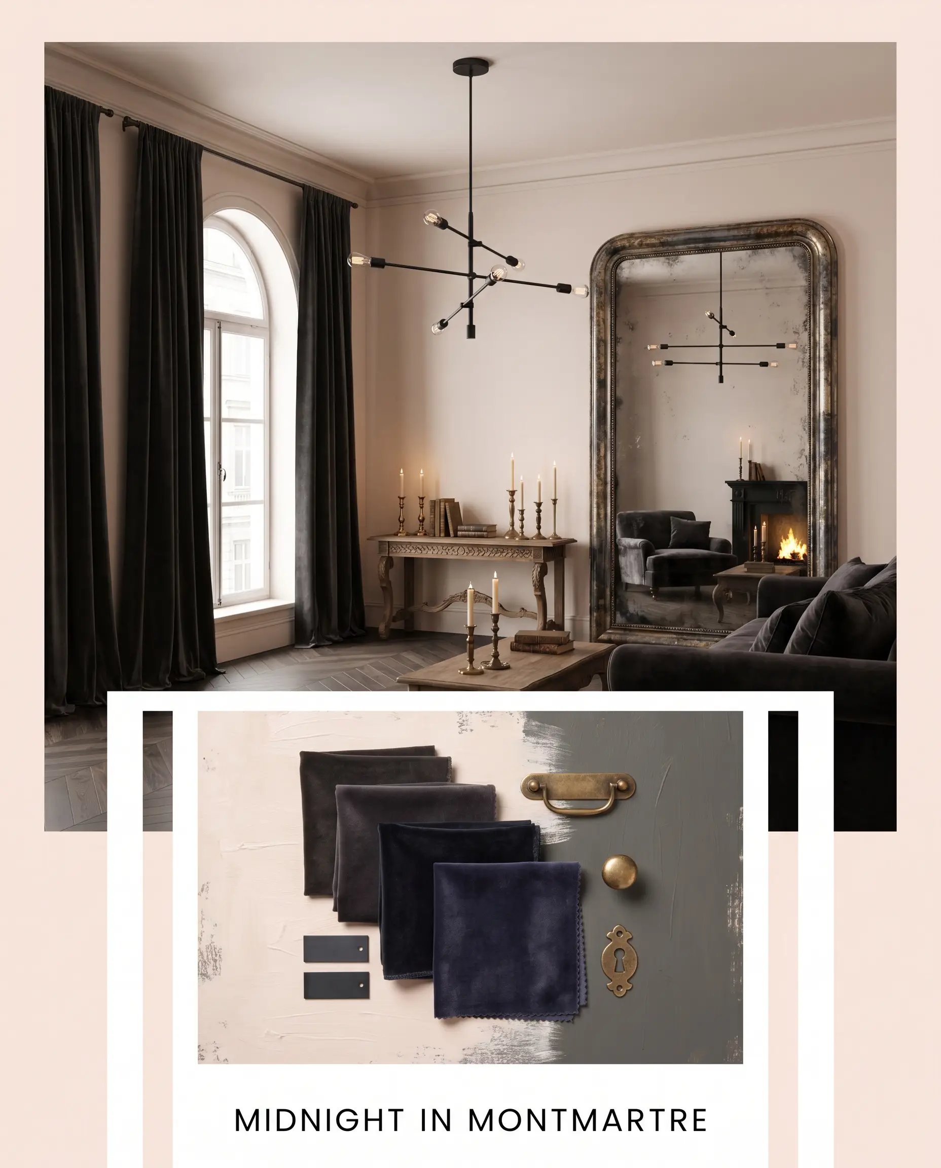
Midnight in Montmartre This aesthetic leans deeply into moody elegance and romantic tension. The luminous blush walls are aggressively contrasted by velvet drapery in Benjamin Moore Kendall Charcoal and sleek matte black steel lighting fixtures. An oversized antique mirror and unlacquered brass candlesticks reflect a warm, flickering glow, creating an atmosphere that feels historic yet undeniably sharp.
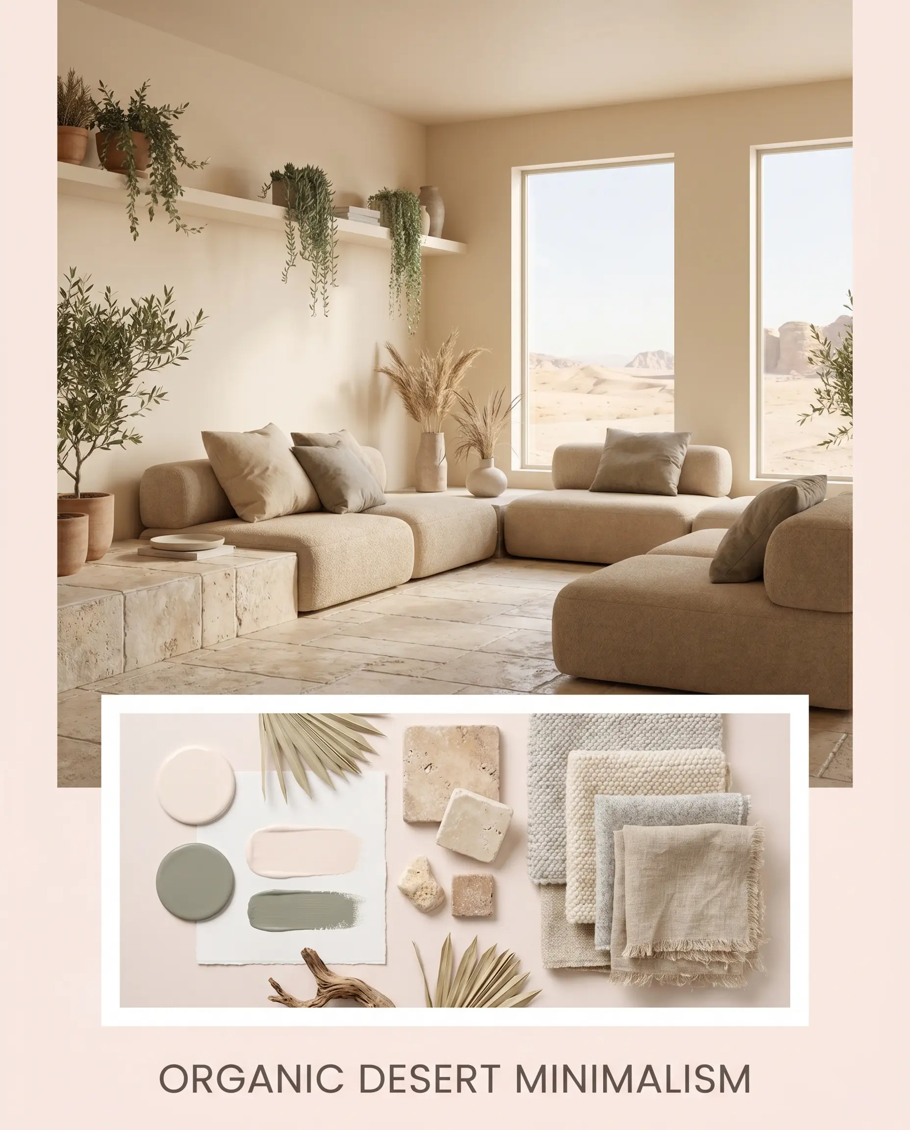
Organic Desert Minimalism Here, the paint serves as a sun-bleached backdrop for a highly textural, earthy palette. Tumbled limestone surfaces and low-profile modular seating in warm beige anchor the room’s energy. Accent pillows in nubby wool and a subtle introduction of Sherwin-Williams Evergreen Fog through trailing greenery bring the outside in, forming a serene, restorative retreat.
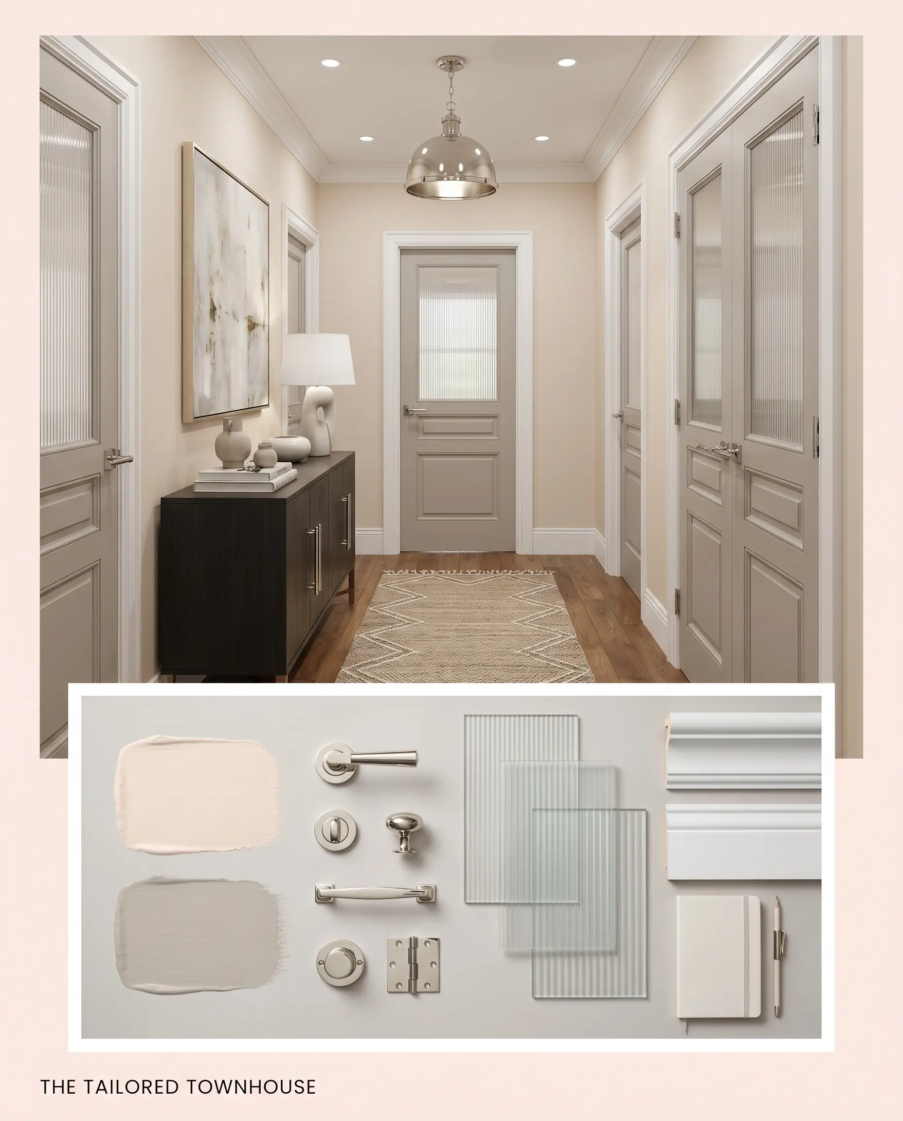
The Tailored Townhouse This palette champions transitional sophistication by blending crisp lines with soft undertones. The walls are framed by brilliant, clean trim, while Farrow & Ball Elephant’s Breath is utilized on interior doors for a subtle tonal shift. Fluted glass accents and polished nickel hardware keep the energy bright, structured, and flawlessly curated.
Head-to-Head Paint Comparisons
Comparing similar shades helps clarify exactly how a color behaves under different lighting conditions. If your room lacks natural sunlight or leans heavily toward cool northern exposures, a slightly different undertone might be the more successful candidate. Reviewing these subtle shifts ensures you select the exact right foundation for your home.
Benjamin Moore Cream Puff 2174-70 vs. Benjamin Moore First Light 2102-70
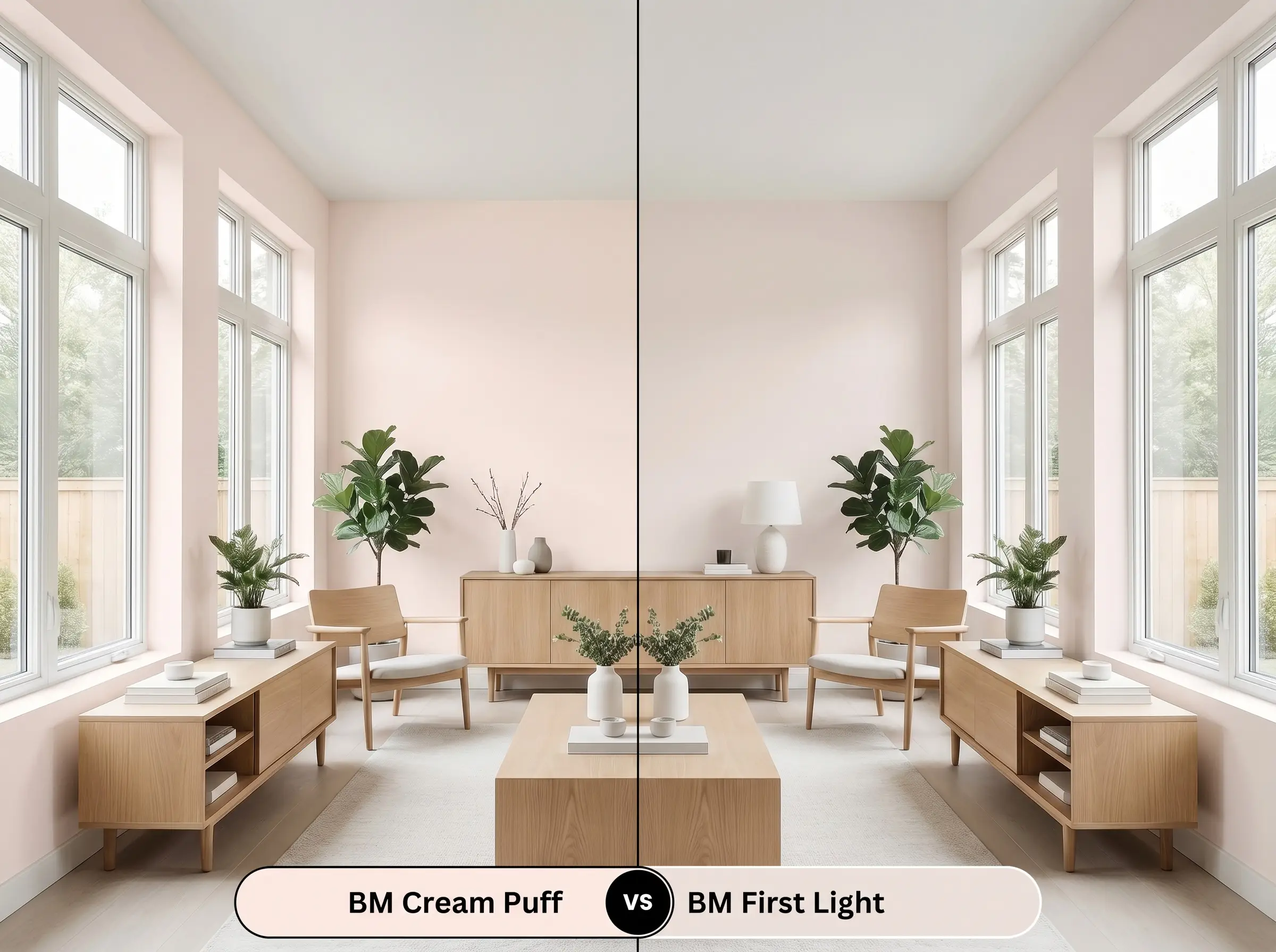
First Light is a significantly cooler, more traditional “millennial pink” with a subtle icy quality. If your room receives intense, warm southern light, First Light will maintain its crisp pink identity beautifully. However, if your space is north-facing, First Light can occasionally read as chilly, whereas the red-orange base of BM 2174-70 will maintain a welcoming, sunlit warmth.
Benjamin Moore Cream Puff 2174-70 vs. Sherwin-Williams Intimate White SW 6322
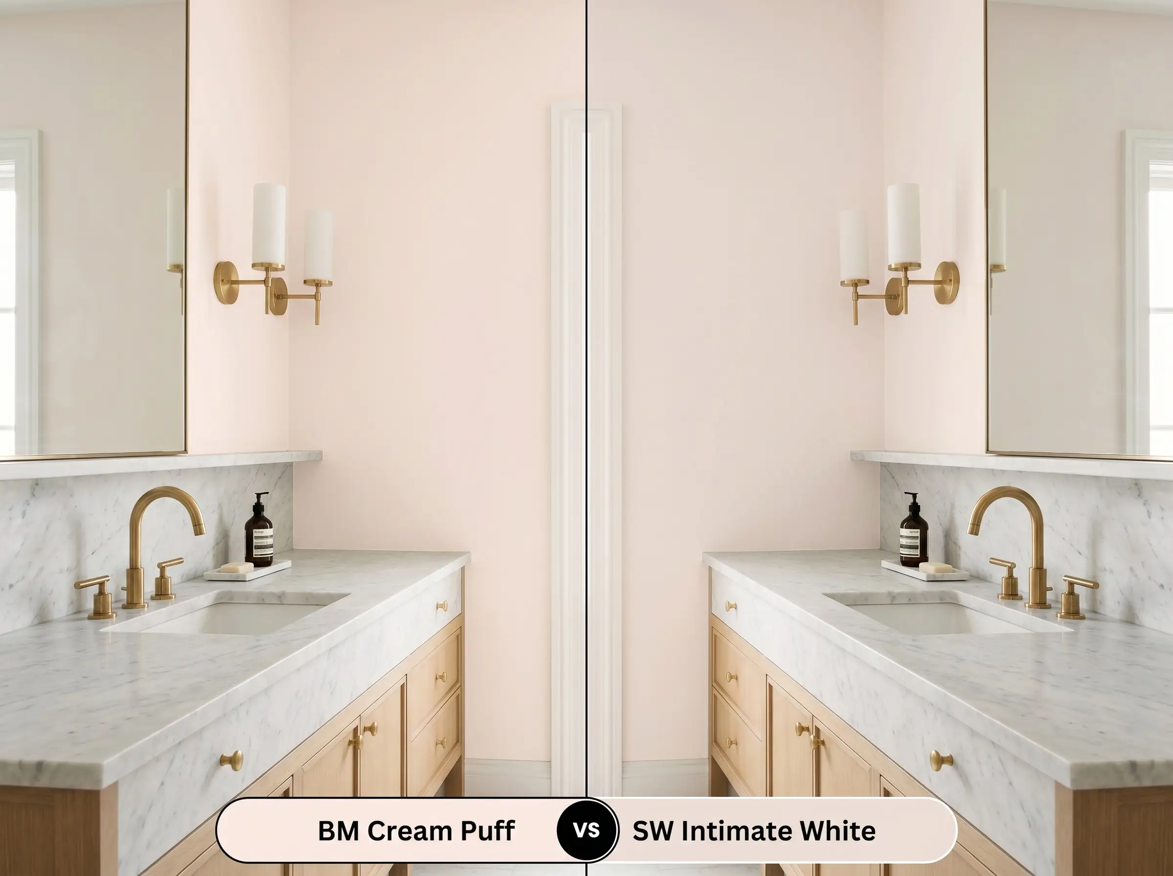
Intimate White carries a slightly more pronounced pink-red base, making it read as a more definitive pastel on the wall. If you want a color that proudly announces itself as pink, Intimate White is the stronger choice. If you prefer a highly muted, chameleon-like shade that often masquerades as a warm cream, stick with the Benjamin Moore option.
Exploring Similar Shades and Brand Alternatives
You might find yourself needing an alternative if your space requires just a touch more depth or a slightly crisper finish. Subtle adjustments in LRV or saturation can make all the difference in a tricky room.
Next-Door Neighbors in the Benjamin Moore Collection
Cross-Brand Matches for Your Local Paint Store
Practical Application: Executing Cream Puff 2174-70 on the Wall
Transitioning from design theory to the reality of rolling this soft hue onto your walls requires a strategic approach. High-LRV pastels have specific quirks during the painting process that you must anticipate to achieve a flawless finish.
The Dynamic Sheen Guide
Primer Strategy and Coverage Expectations
Because this shade is essentially a tinted off-white, it requires a pristine, neutral canvas to show its true undertones. You must use a high-quality, bright white primer, especially if you are covering a dark or heavily saturated existing wall color. Skipping the primer will allow the old color to alter the delicate red-orange base, ruining the intended warmth.
Plan for a strict two-coat application to achieve true opacity. Do not attempt to stretch the paint. Rolling it on too thin will result in severe flashing—where the paint dries with visible, uneven streaks and roller marks that catch the light poorly.
Flat finishes in highly luminous colors are notoriously difficult to touch up later without the new spot showing. Always keep a small amount of the original paint stored properly, and when touching up, use a dry-brush technique to gently feather the edges into the existing wall.
Hackrea Pro-Tip (The Touch-Up Warning)
Frequently Asked Questions
Because of its muted gray undertones, this shade easily bypasses the typical nursery aesthetic. When styled intentionally with dark, grounding elements like charcoal textiles or matte black hardware, it feels incredibly sophisticated and restful in an adult space.
The heavy texture of a popcorn ceiling casts thousands of micro-shadows that will significantly darken the perceived color. While it looks like a luminous blush on flat drywall, it may read as a muddy, dense beige-pink on a heavily textured ceiling.
High-LRV pastels often wash out completely in direct, unshaded sunlight. On an exterior facade, this delicate color would lose its pink pigment entirely and simply look like a glaring, stark white.
Cooler artificial lighting strips away the warm peach base and emphasizes the hidden gray undertones. The paint will read as a much crisper, slightly cooler dusty pink rather than a warm, glowing blush.
Final Verdict: Mastering This Luminous Hue
Benjamin Moore Cream Puff 2174-70 is an incredibly versatile, high-performing neutral for those who want warmth without committing to a standard beige or cream. Its absolute best application is in north or east-facing rooms where its inherent red-orange base can gently counteract cool, indirect sunlight. It is perfect for homeowners seeking a sophisticated, transitional backdrop that beautifully supports natural stone, warm metals, and dense, tactile fabrics.
However, this delicate color requires strict boundaries to succeed. If you pair this highly reflective blush with intensely saturated, warm wood tones like cherry or knotty pine, the competing orange undertones will instantly clash, making the walls look muddy and confused. Similarly, placing it alongside stark, cool-toned grays will drain the life from the paint, leaving it feeling chilly and disconnected. To maintain its premium elegance, you must anchor it with rich charcoals, earthy greens, or crisp, clean whites that allow its subtle, architectural warmth to shine.
Closest Cross-Brand Equivalents
The absolute closest scientific color matches for Cream Puff across top paint brands.