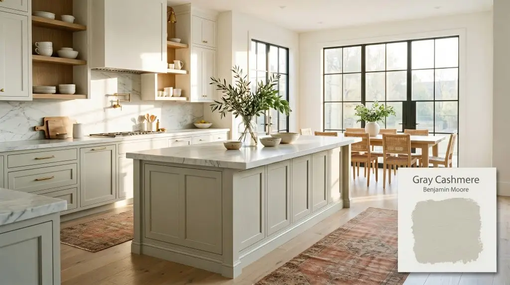
Gray Cashmere 2138-60
Benjamin MooreBenjamin Moore Gray Cashmere (2138-60) is a soft, misty green-gray paint color with subtle blue undertones. With an LRV of 64.53, it acts as a soothing chameleon, shifting between a crisp blue-gray in cool light and a warm, earthy green in sunny exposures.
Paint Technical Profile
| Color ID / SKU | 2138-60 |
| HEX Code | #CFD5CD |
| Light Reflectance (LRV) | 64.53 |
| Use | Interior |
| Best Exposures | South, East, West |
| Best For | Kitchen cabinets, spa bathrooms, tranquil bedrooms |
Designing with Benjamin Moore Gray Cashmere: A Misty Green-Gray for Tactile Environments
Most neutral paints sit passively on the wall, but Gray Cashmere 2138-60 actively shapes the energy of a room. This muted, misty green-gray behaves less like a standard backdrop and more like a dynamic architectural finish. It shifts, adapts, and occasionally surprises you with its complex chromatic profile.
If you are tired of sterile grays that leave a space feeling cold, this Benjamin Moore classic offers a sophisticated alternative. Its underlying color structure brings a quiet, spa-like atmosphere to both sprawling living rooms and compact mudrooms. The secret to mastering this color lies in its ability to interact with the physical materials around it.
We are going to break down exactly how this chameleon color behaves under different lighting scenarios. You will learn how to pair its hidden nuances with the right textiles, hard finishes, and curated styling to build a truly intentional home.
Benjamin Moore Gray Cashmere: Undertones & LRV
Homeowners constantly ask if this specific paint leans warm or cool. The definitive answer is that it is a cool color, but it possesses a highly reactive, situational warmth depending on your environment.
With a light reflectance value of 64.53, this shade absorbs just enough light to maintain its rich chromatic profile without washing out in bright sun. It reflects enough illumination to keep standard-sized rooms feeling expansive, airy, and effortlessly welcoming.
Manipulating Light: The Chameleon Color Effect
This specific paint is notoriously responsive to shifting sunlight and artificial fixtures. Its complex color structure means it will never look the same at 8:00 AM as it does at 8:00 PM.
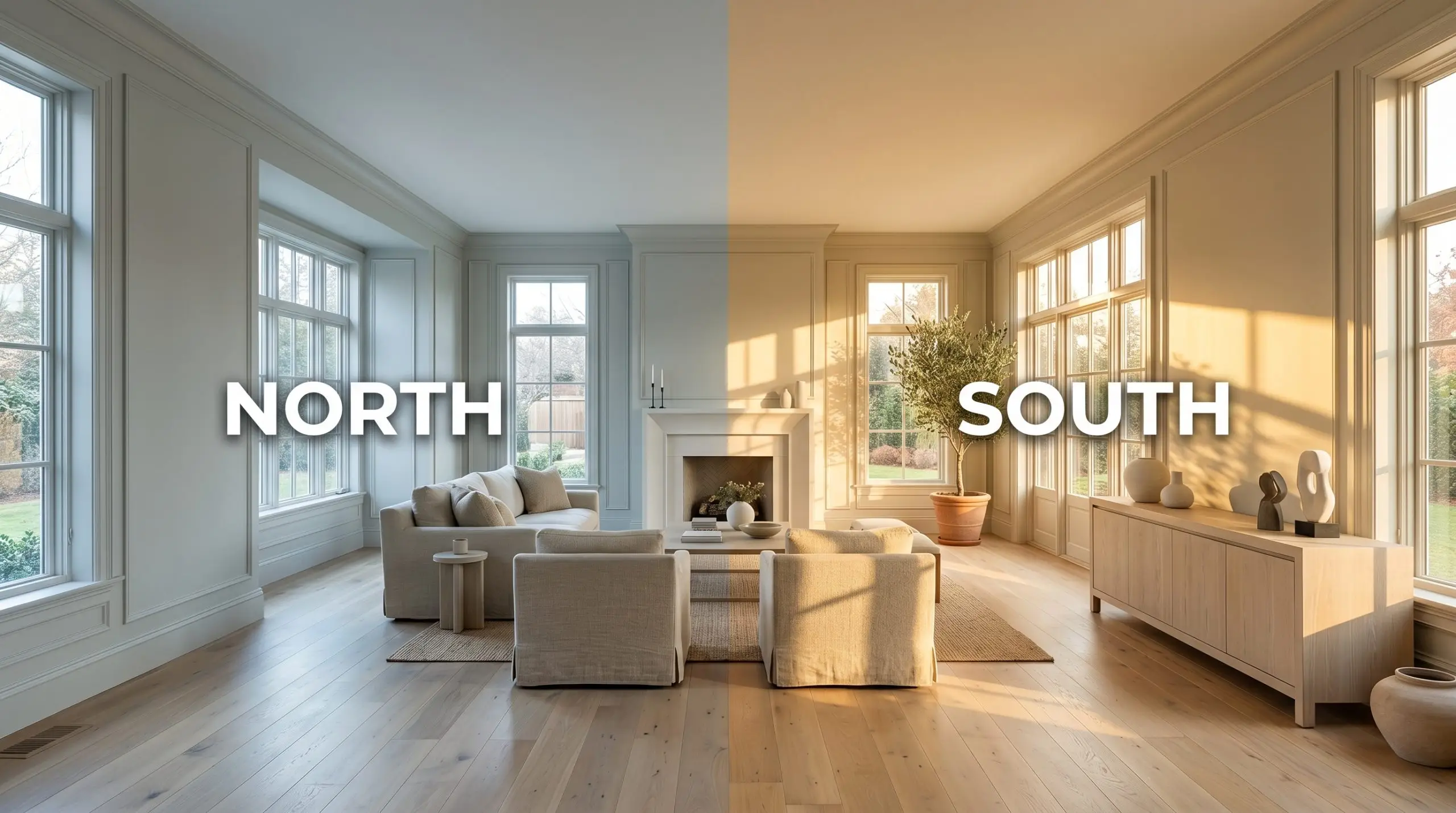
If you are using this on an exterior facade, prepare for direct, midday sunlight to significantly wash out the green pigment. It will read as a much lighter, silvery gray outdoors, so always test a large swatch on both the shaded and sunny sides of your home before committing.
Hackrea Lighting Secret
Popular Architectural Applications
Applying this misty green-gray successfully requires thinking beyond standard drywall. Because it is such a reactive chameleon color, it thrives in tactile environments where it can play against varied textures and materials. Here is how to maximize its potential across different functional zones in your home.
Kitchen Cabinetry & Islands
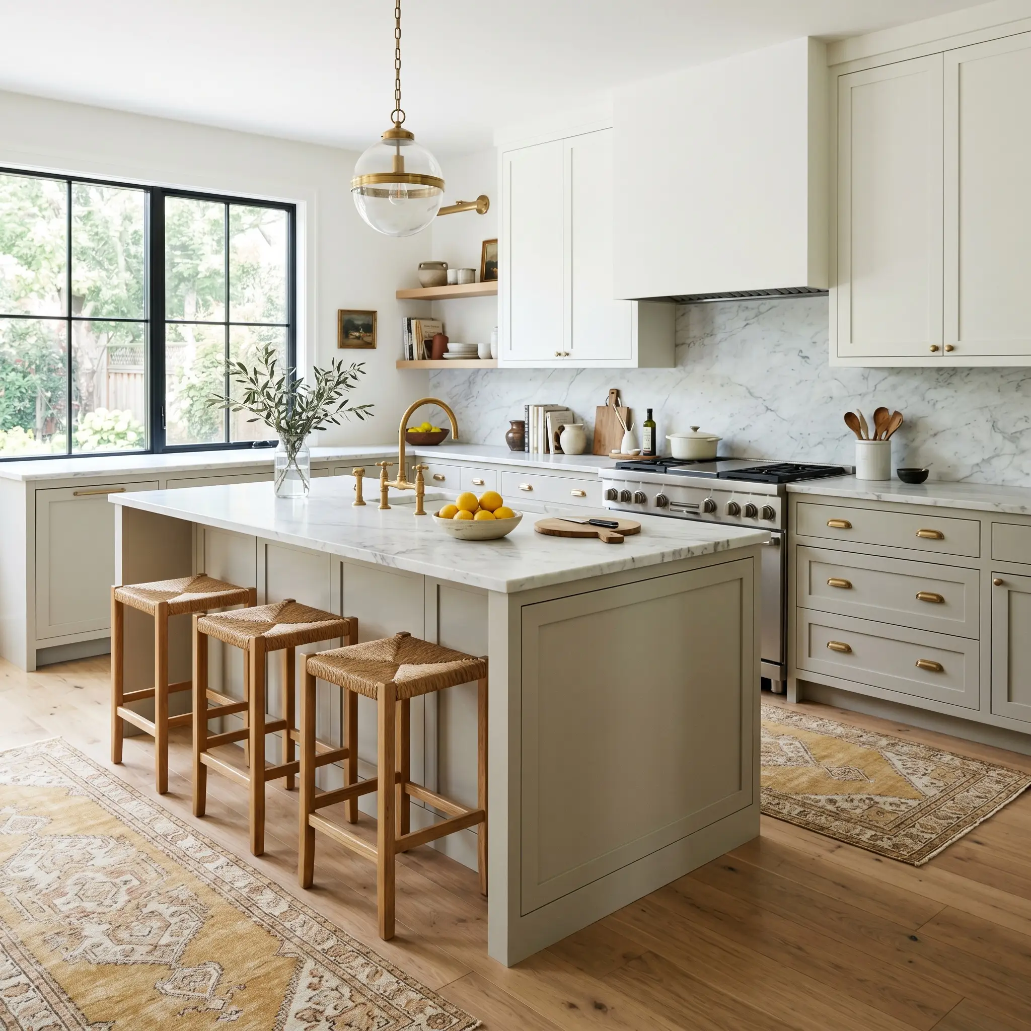
Let’s avoid the standard farmhouse trap often associated with green-gray kitchens. When applied to cabinetry, this shade acts as a sophisticated, soft modern foundation that beautifully offsets the visual weight of heavy stainless appliances. For a truly custom look, consider painting both the lower cabinets and the island, leaving the uppers a crisp white to maximize the room’s light reflectance value.
Pair the misty green-gray with honed marble countertops and unlacquered brass hardware to create a stunning tactile collision. The warmth of the brass directly contrasts with the cool cyan micro-nuance, bringing a balanced, curated energy to the heart of the home.
If you are an avid home chef who spends hours in the kitchen, stabilize the space with a vintage runner in faded terracotta or mustard tones. This mix of premium finishes and accessible styling keeps the room feeling approachable yet highly intentional.
Spa-Inspired Bathrooms
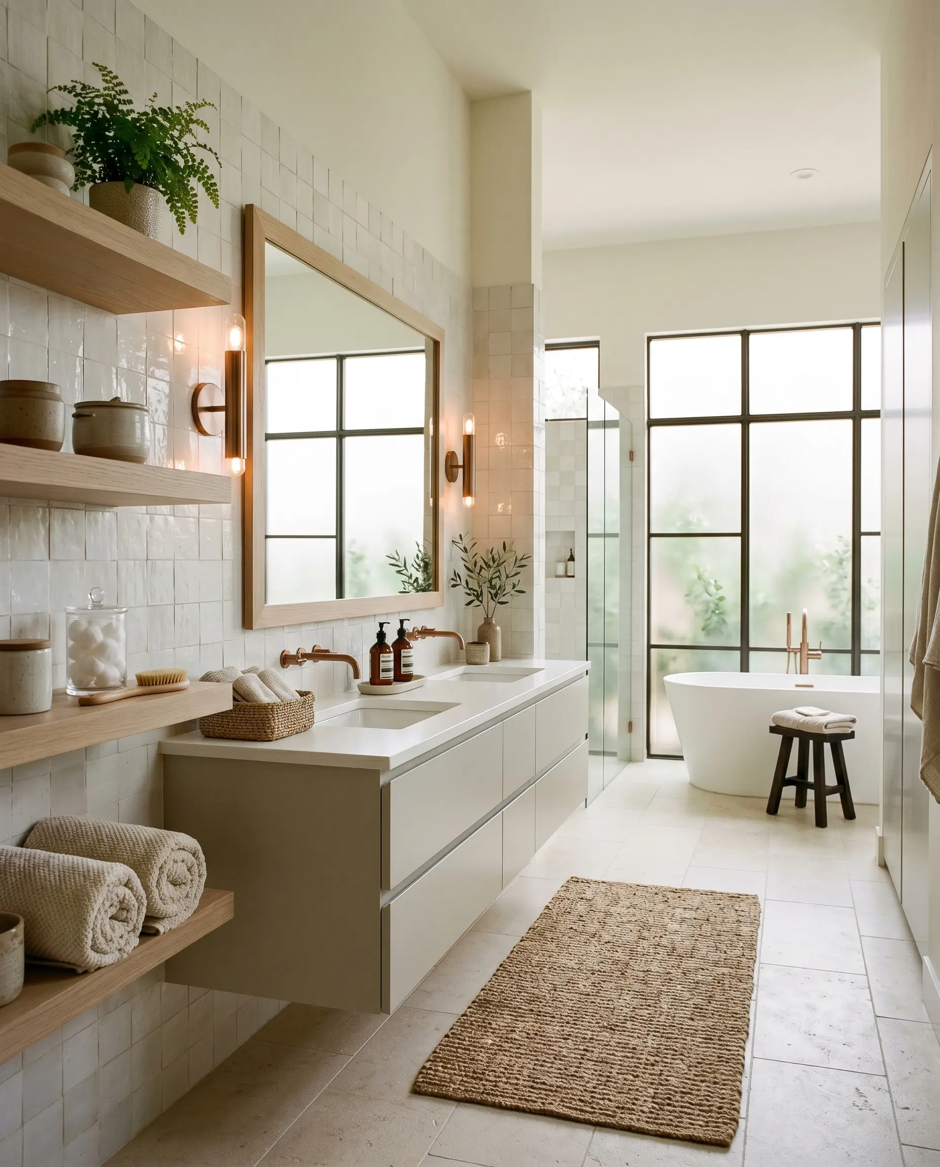
While the color’s name suggests a breezy coastal theme, you can push this paint into a stunning organic modern aesthetic for your primary bath. Painting a floating double vanity in this shade instantly establishes a restorative, spa-like atmosphere without relying on predictable nautical decor.
To prevent the room from feeling too icy under cool bathroom lighting, pair the painted vanity with warm, textural wall materials like handmade zellige tile or Roman clay.
Hackrea Pro-Tip (The Tile Pairing)
Layer the space with bleached oak shelving and brushed copper sconces to intentionally pull forward the earthy green base of the paint. Finish the styling with luxurious, nubby cotton towels and a woven jute bath mat to enhance the room’s sensory experience.
Tranquil Primary Bedrooms
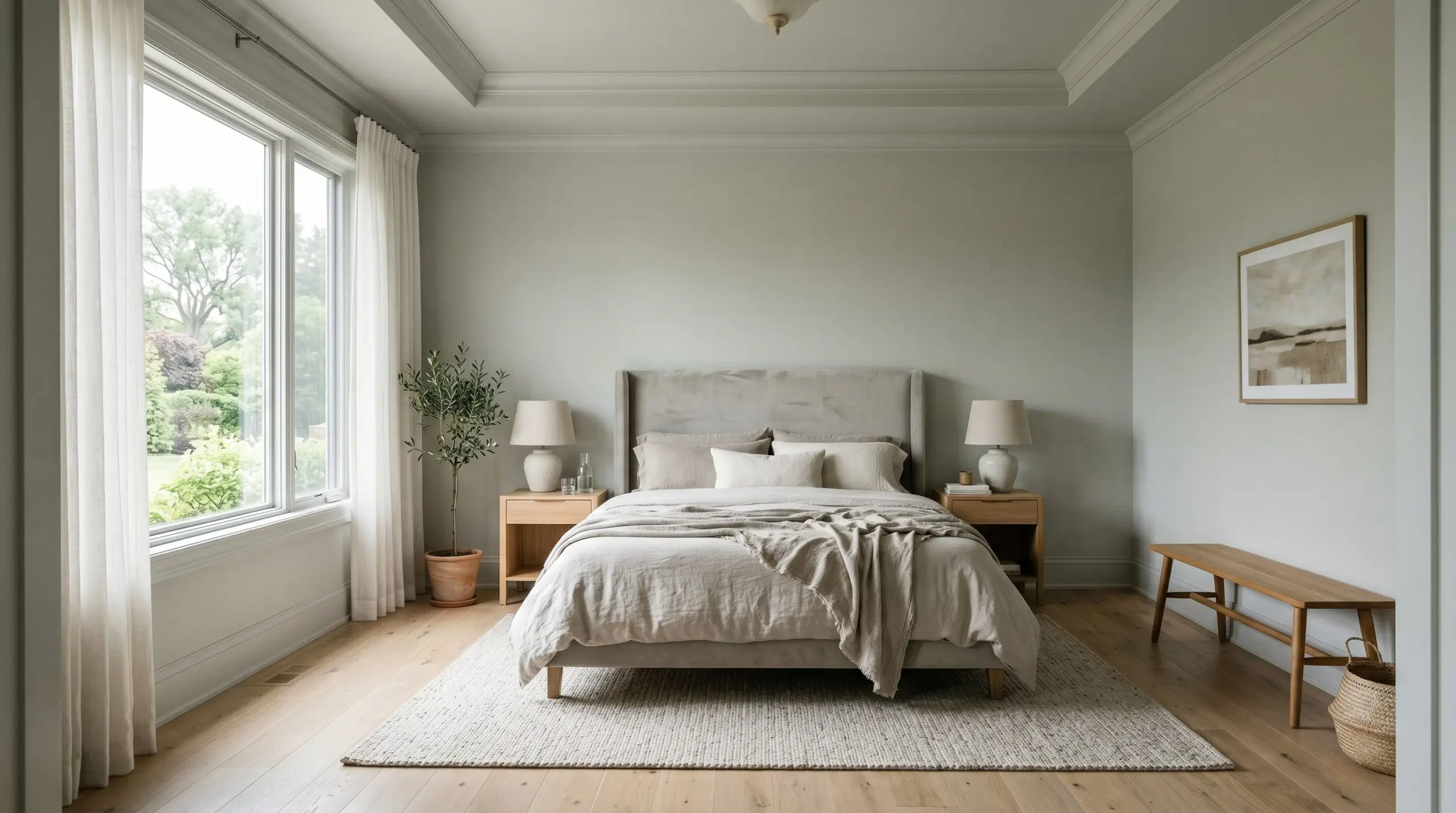
For professionals seeking a visual detox at the end of the day, this paint offers a brilliant foundation for restorative design. Instead of just rolling it onto the walls, execute a full color-drenching technique by wrapping the walls, baseboards, and crown molding in the exact same hue.
This continuous application blurs the sharp architectural lines of the room, creating an immersive, cocoon-like environment. The color temperature shift is especially beautiful in a bedroom, transitioning from a crisp gray in the morning light to a cozy, muted olive-gray under your 2700K bedside lamps.
Contrast the smooth painted millwork with highly textured textiles like a washed linen duvet, a velvet upholstered headboard, and sheer cotton drapery. By keeping the furniture lines clean and modern, the bedroom feels curated and expansive rather than cluttered.
Laundry Rooms & Mudrooms
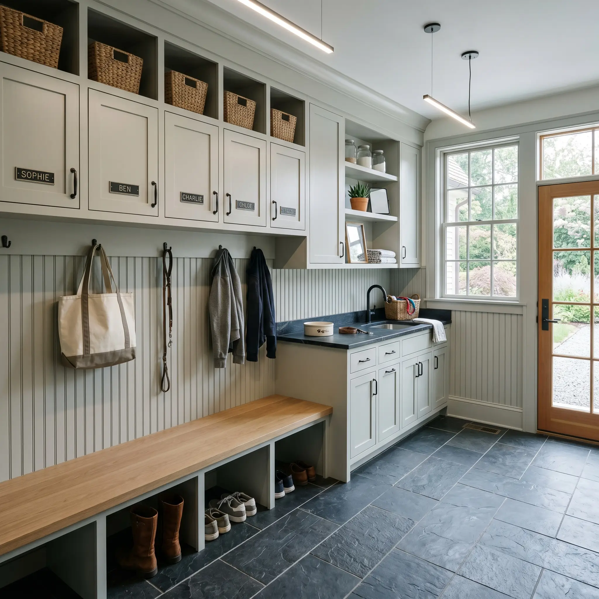
Utilitarian spaces often suffer from sterile, builder-grade finishes, but a strategic coat of paint can completely redefine their purpose. Applying Gray Cashmere to beadboard wainscoting or built-in mudroom lockers instantly upgrades the daily routine of managing household chaos.
Because these rooms often lack abundant natural light, the paint will likely read as a crisper, more structured gray. Embrace this cooler tone by pairing it with highly durable, earthy materials like slate or terracotta floor tiles and resilient soapstone counters.
Be cautious when pairing this specific green-gray with red-toned woods like cherry or mahogany. The cool cyan micro-nuance can aggressively clash with red undertones, making the wood look dated and visually jarring. Stick to white oak, walnut, or painted finishes instead.
Clash Warning (Wood Tones)
Coordinating Colors & Best Pairings for Gray Cashmere 2138-60
The specific pigment of this misty green-gray relies entirely on its neighboring elements to define its boundaries. When placed next to muddy or overly saturated tones, its delicate cyan micro-nuance can easily wash out and lose its structure. To keep the color feeling intentional and vibrant, it requires crisp contrasts and carefully calibrated tactile pairings.
Perfecting the Architectural Trim
Selecting the right white trim dictates how the underlying color structure of the wall paint is perceived. You are essentially choosing between a sharp, modern boundary or a soft, atmospheric bleed.
Tactile Materials and Hardware Selections
To elevate this Benjamin Moore classic, you must introduce materials that physically interact with its shifting light reflectance value. The goal is to balance its cool, misty nature with grounding textures.
Building a Cohesive Color Palette
When building a whole-home palette around Gray Cashmere 2138-60, you need secondary colors that either ground its lightness or pull out its hidden warmth.
Curated Styling and Design Mood Boards
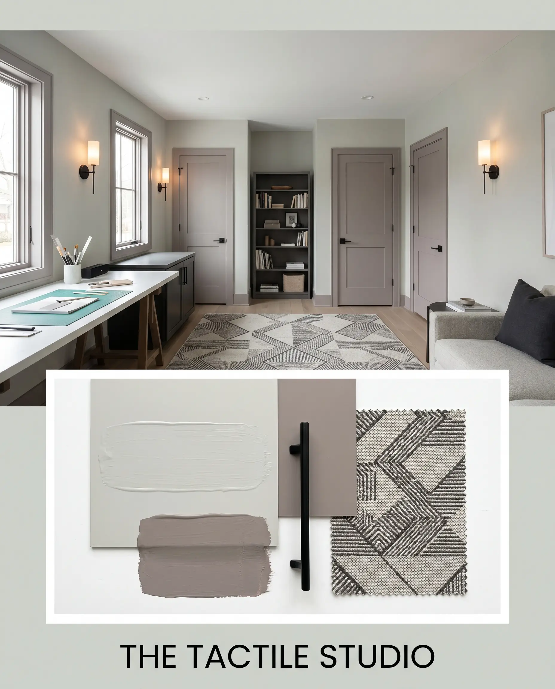
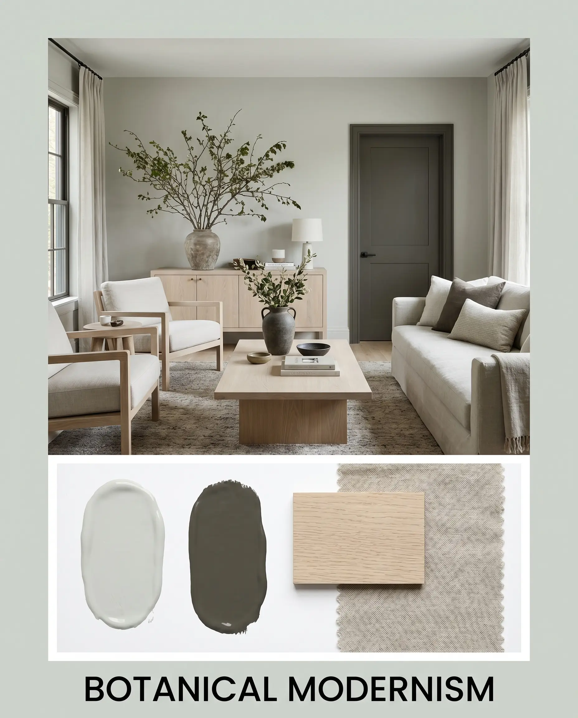
Understanding the individual ingredients is only half the process; seeing how they physically interact changes everything. These curated aesthetics demonstrate how flexible this chameleon color can be when styled with intention.
The Tactile Studio This aesthetic leans into the architectural finish of the paint by pairing it with sharp, intentional contrasts. We anchor the misty green-gray walls with blackened steel hardware and minimalist sconce lighting to create a grounded, slightly industrial edge. By introducing Benjamin Moore Wet Concrete on the trim and styling with geometric patterned rugs, the room transforms into a highly focused, modern environment.
Botanical Modernism If you prefer a softer, more restorative energy, this approach pulls forward the earthy green base of the paint. We layer bleached white oak furniture and washed linen textiles to absorb the natural light and create a serene, tactile experience. Introducing Sherwin-Williams Urbane Bronze on the interior doors, paired with oversized foraged branches, grounds the airy palette in nature.
Benjamin Moore Gray Cashmere vs. The Competition
Choosing the right neutral often comes down to the specific lighting conditions and architectural exposures of your home. While our primary color is incredibly versatile, there are specific scenarios where its cyan micro-nuance might pull too cool, making a rival paint the more successful candidate.
Benjamin Moore Gray Cashmere vs. Sherwin-Williams Sea Salt
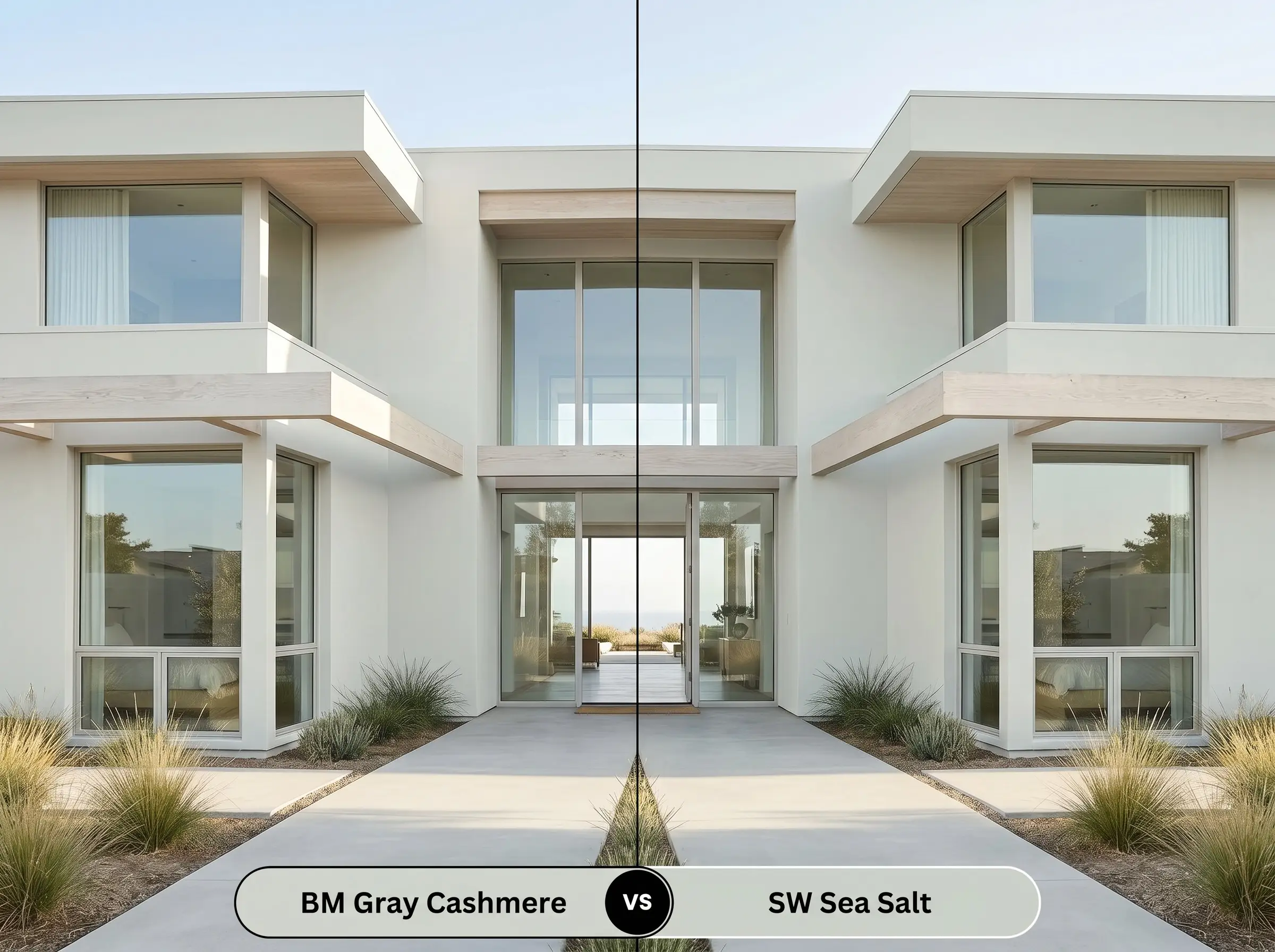
Sherwin-Williams Sea Salt SW 6204 has a slightly lower LRV and leans much more heavily into a true green-blue pigment. If your room receives intense, direct western sunlight, Gray Cashmere 2138-60 might fade into a standard gray. In that specific high-exposure scenario, Sea Salt will confidently hold onto its colorful pigment and maintain its shape.
Benjamin Moore Gray Cashmere vs. Benjamin Moore Wickham Gray
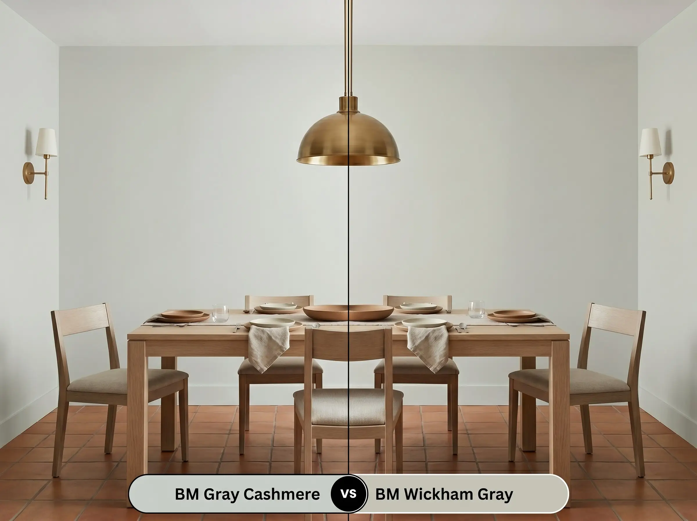
Benjamin Moore Wickham Gray HC-171 is noticeably cooler and lacks the earthy green foundation found in our primary color. If you are working with warm terracotta floors or heavily saturated red brick, Wickham Gray will likely clash and feel icy. Gray Cashmere remains the far superior choice for bridging the gap between cool walls and warm hard finishes.
Benjamin Moore Gray Cashmere vs. Benjamin Moore Quiet Moments
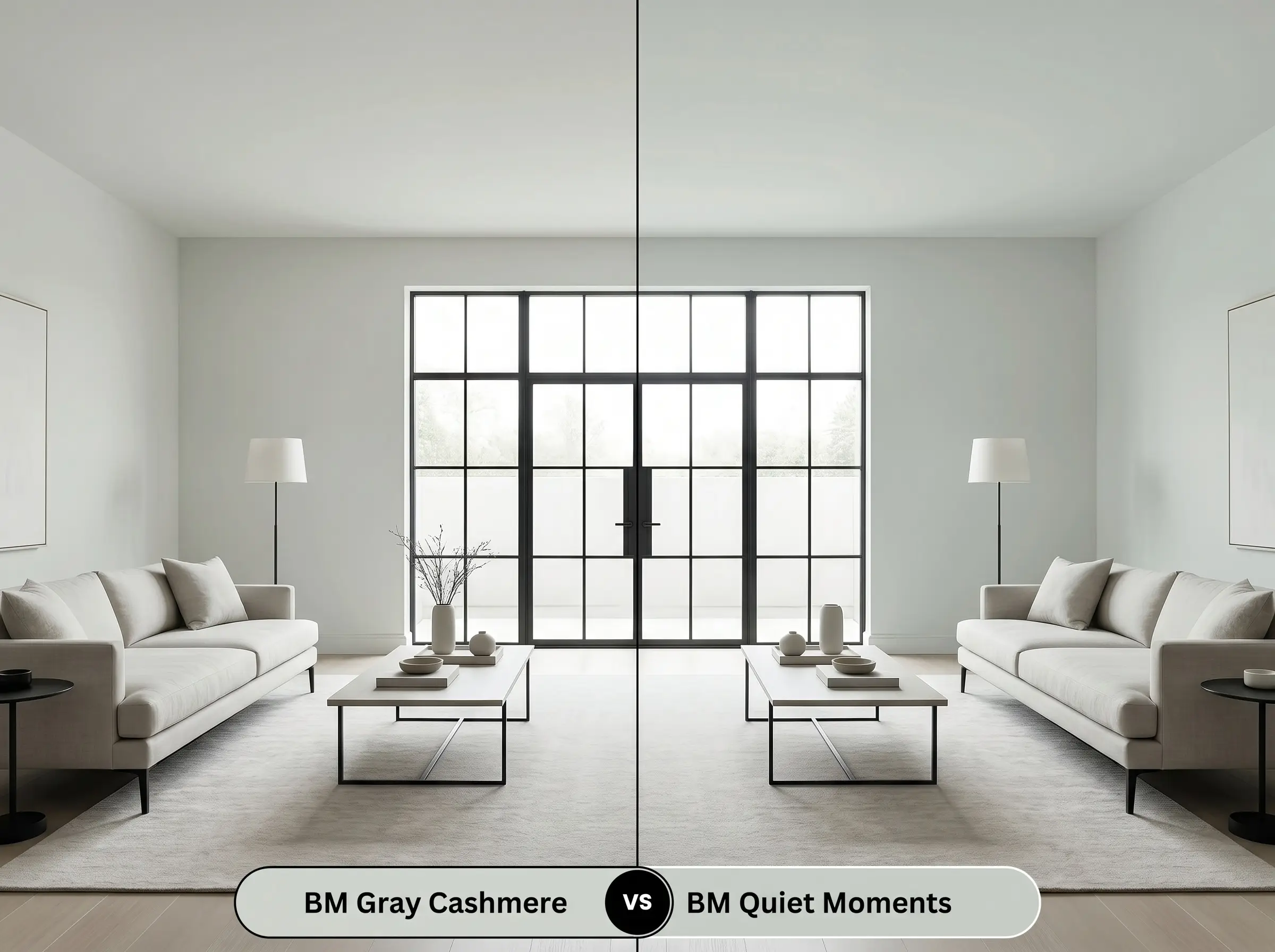
These two shades sit right next to each other in the brand’s fan deck, but Benjamin Moore Quiet Moments 1563 carries a slightly more pronounced blue undertone. Choose Quiet Moments if you want to lean into a distinctly coastal or traditional aesthetic. Stick with Gray Cashmere 2138-60 if you need a more versatile, neutral foundation for a modern space.
Exploring Similar Misty Green-Grays
Sometimes a color is almost perfect, but your specific lighting demands a slight adjustment in depth or warmth. If you need an alternative that behaves similarly but solves a specific spatial challenge, these options are worth testing.
Benjamin Moore Alternatives
Color Matches Across Other Brands
Painting with Gray Cashmere: Practical Application
Transitioning from design theory to the physical reality of rolling paint onto drywall requires a shift in strategy. The way this color cures and reflects light is heavily dependent on your preparation and your chosen finish.
Selecting the Right Finish
Proper Preparation and Priming
Because this shade has a very comfortable, mid-tone LRV, it does not require a specialized tinted primer to achieve its true color. A high-quality, standard white interior primer is perfectly sufficient to seal the drywall and create a neutral base.
If you are painting over heavy knockdown texture or older plaster, the physical shadows created by the wall will make this paint appear at least one shade darker. Always prime these textured surfaces thoroughly to ensure the most accurate color payoff.
Hackrea Pro-Tip (The Texture Variable)
Achieving a Flawless Coat
For a truly professional architectural finish, plan for two full coats over your primed surface. The muted nature of this pigment can occasionally be prone to “flashing”—visible, uneven streaks where the roller overlapped or the paint dried too quickly. To avoid this, maintain a wet edge as you roll and avoid over-working the paint once it begins to set.
Frequently Asked Questions
Because of its reactive green base, abundant green foliage right outside your window will indeed amplify the paint’s natural undertones. To counteract this effect and prevent the room from feeling overly minty, introduce warm, grounding materials like bleached oak or unlacquered brass to balance the reflected light.
Smooth drywall allows light to bounce evenly, highlighting the crisp, modern cyan micro-nuance of the paint. On textured plaster, the tiny physical shadows cast by the uneven surface will absorb more light, causing the color to read slightly darker, warmer, and more muted.
This specific shade actually handles warm flooring beautifully because its earthy green base acts as a natural complement to red and orange tones. The key is to avoid introducing any additional cool, icy blues into your decor, which would highlight the contrast too aggressively.
Direct, unfiltered UV sunlight aggressively washes out the delicate green and cyan pigments in this mid-tone color. On an exterior facade, it will lose its complex chromatic profile entirely and cure as a stark, somewhat lifeless silvery gray.
The Final Verdict on Gray Cashmere
Benjamin Moore Gray Cashmere 2138-60 is a brilliant, highly adaptable neutral for homeowners who want a restorative atmosphere without sacrificing modern sophistication. It performs best in spaces that receive shifting natural light, allowing its complex color structure to transition from a crisp morning gray to a cozy, muted olive by evening. This paint is the perfect foundational layer for organic modern, transitional, and softly tailored interiors where tactile materials take center stage.
However, its highly reactive nature means it demands careful styling. If your home features predominantly cherry wood cabinets, extensive mahogany trim, or bright, warm-toned yellow lighting, this misty green-gray will actively fight against your architecture. The cool cyan micro-nuance will clash with those strong red and yellow undertones, making the wood appear dated and the paint feel uncomfortably icy. For this color to truly succeed, you must commit to balancing its cool structure with neutral woods, intentional metals, and highly textured, restorative fabrics.
Closest Cross-Brand Equivalents
The absolute closest scientific color matches for Gray Cashmere across top paint brands.