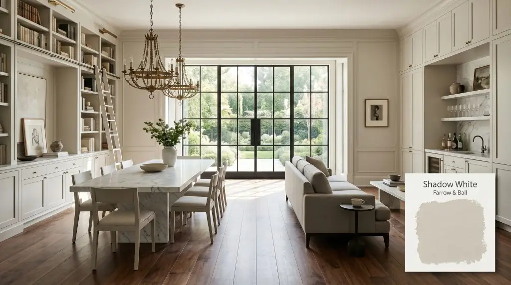
Shadow White 282
Farrow & BallFarrow & Ball Shadow White (No. 282) is a soft, shaded off-white with a warm greige base and subtle stone undertones. Lacking the starkness of pure white, it provides a relaxed, historical depth, adapting beautifully to shifting light without leaning too yellow or overly gray.
Paint Technical Profile
| Color ID / SKU | 282 |
| HEX Code | #dcd7c8 |
| Light Reflectance (LRV) | 68 |
| Use | Interior, Exterior |
| Best Exposures | South-Facing, East-Facing |
| Best For | Heritage properties, limewash-effect walls, transitional living spaces, kitchen cabinetry |
Farrow & Ball Shadow White: The Stone-Cast Neutral Redefining Architectural Warmth
Some neutral paints simply sit on the surface of your drywall, fading quietly into the background. Farrow & Ball Shadow White No. 282 behaves entirely differently, acting more like a tactile, architectural material than a standard can of paint. It establishes a room’s foundation with a quiet, undeniable visual weight.
This bespoke off-white hue rejects the stark, sterile qualities of modern builder-grade whites. Instead, it offers a beautifully muted putty tint that feels as though it has been gracefully aging on the walls of a countryside estate for decades. It is the perfect canvas for homeowners who want their spaces to feel layered, curated, and inherently warm.
By completely omitting the harsh, reflective qualities of pure white, this color fundamentally changes how a room is perceived. It wraps your interior architecture in a soft, velvety finish that elevates everything placed within the space.
Farrow & Ball Shadow White: Undertones & LRV
Is Farrow & Ball Shadow White warm or cool? This color is definitively warm. However, it achieves this temperature without ever slipping into the overly yellow, buttery territory of standard creams.
Fundamentally rooted in a yellow-orange base, this hue exhibits a highly complex greige chromatic profile. It bypasses conventional warmth by incorporating a subtle stone and khaki cast, rendering it a sophisticated, shaded neutral.
Understanding its internal structure is the key to manipulating it successfully in your home:
At a Light Reflectance Value (LRV) of 68, Shadow White No. 282 sits perfectly in the mid-tone neutral category. This specific LRV light absorption means the paint retains its character even in brightly lit spaces. While lighter tints often wash out and lose their personality in direct sunlight, this stone-cast neutral maintains a velvety, substantial depth on your walls or exterior facade.
Lighting Effects & The Ambient Light Chameleon
Because of its complex, multi-layered pigment structure, this F&B neutral is highly reactive to its environment. It acts as an ambient light chameleon, shifting its personality dramatically depending on the specific light source hitting your walls.
Here is exactly how you can expect the color to behave throughout your home:
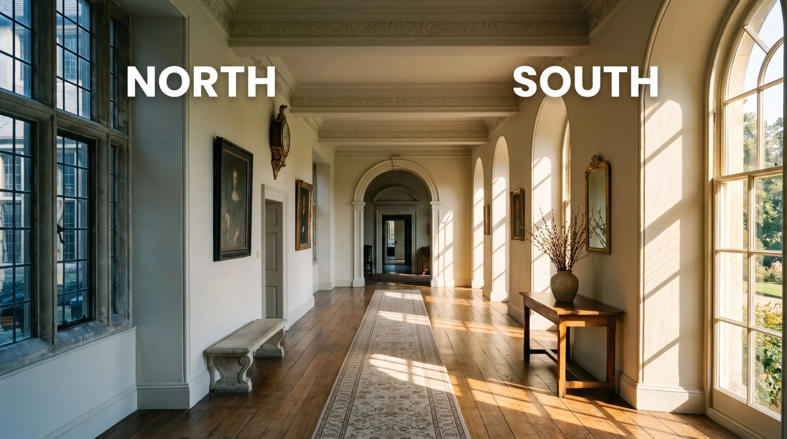
If you are considering F&B No. 282 for an exterior application, remember that full, direct sunlight strips away perceived darkness. On a sun-drenched facade, this color will read significantly lighter and creamier than it does on an interior color card, losing some of its defining khaki shadows.
Hackrea Pro-Tip (The Facade Washout)
Designing with a Stone-Cast Neutral: Popular Applications
Treating this color as a mere afterthought is a missed opportunity. Because of its substantial visual presence, this muted greige should be used strategically to dictate the architectural narrative of your home.
Whether you are an empty nester curating a collection of vintage antiques or a young professional warming up an urban townhouse, this color adapts beautifully. Here is how to maximize its potential across various spaces.
Heritage Living Rooms with Substantial Millwork
When dealing with intricate wainscoting, tall baseboards, and prominent crown molding, standard white paint often creates a jarring, high-contrast outline. Using Shadow White No. 282 across all these architectural features softens the transition, creating a cohesive, immersive environment. We highly recommend color drenching—painting the walls, trim, and molding in the exact same hue—to modernize traditional architecture.
This approach allows the intricate details of the woodwork to be highlighted by natural shadows rather than a stark color difference. To balance the historical feel of the paint, introduce modern, tactile furnishings.
Pair the painted millwork with a low-profile boucle sofa, a sleek burl wood credenza, and minimalist iron light fixtures. The tension between the classic, putty-toned walls and the contemporary furniture creates a beautifully curated, high-end aesthetic.
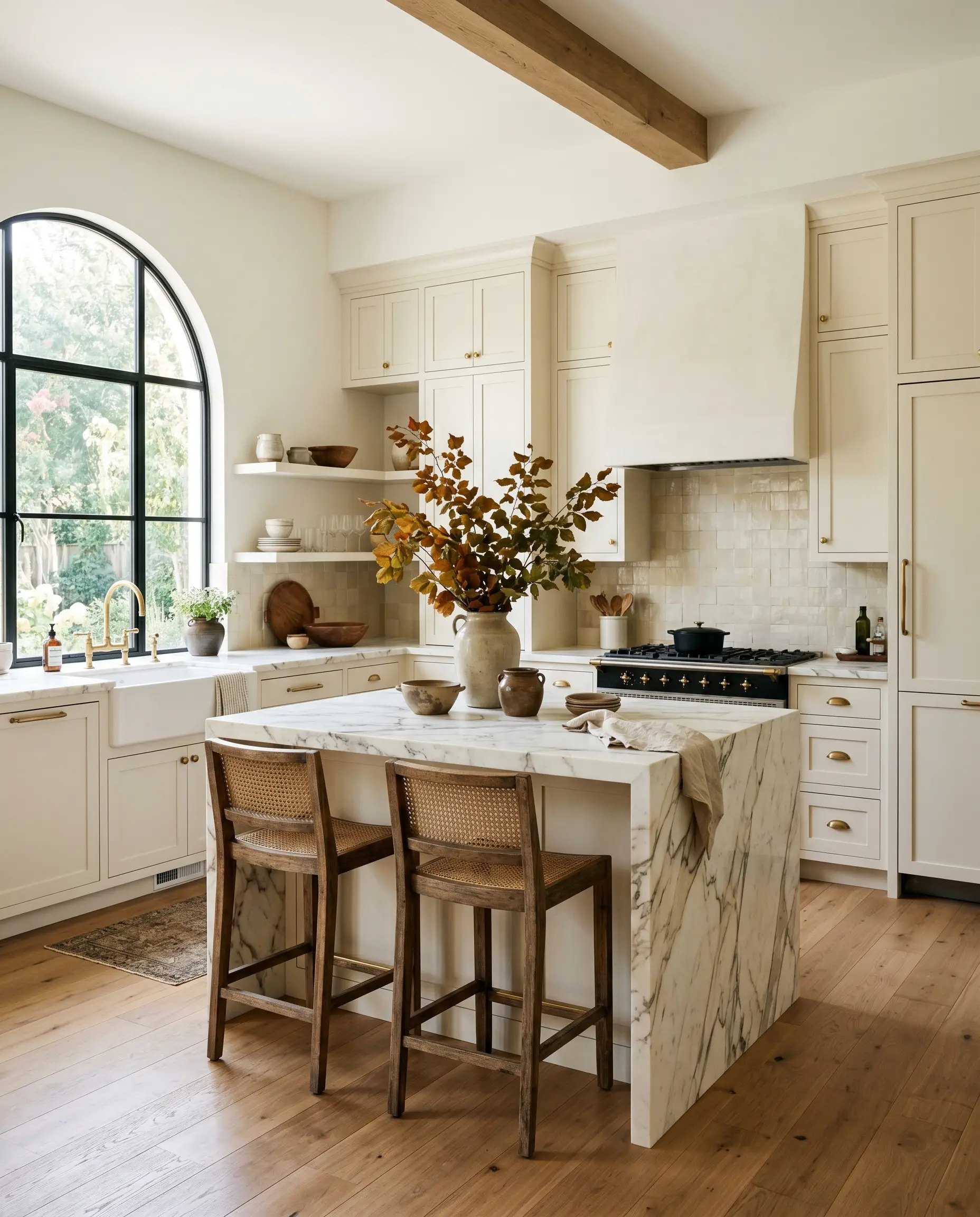
Transitional Kitchen Cabinetry
If you find pure white kitchens too sterile but aren’t ready to commit to a dark, moody palette, this hue is the ultimate cabinet solution. It provides enough saturation to stand out against a lighter backsplash while maintaining an airy, open atmosphere for culinary enthusiasts.
To elevate the transitional design, pair these greige cabinets with heavily veined honed marble countertops and unlacquered brass hardware. The living finish of the brass will naturally patina over time, perfectly complementing the khaki undertones of the cabinetry.
Ground the space with a warm white oak floor and style the counters with vintage ceramics and oversized branches. This combination effortlessly bridges the gap between European farmhouse charm and sleek, modern sophistication.
When using this color on kitchen cabinets, you must carefully evaluate your backsplash. Avoid pairing it with stark, cool-toned Carrara marble or brilliant white subway tiles, as the crisp whites will make the cabinetry look dingy and yellowed by comparison. Always opt for warmer stones like Calacatta or a handmade, creamy zellige tile.
Hackrea Design Secret (The Backsplash Clash)
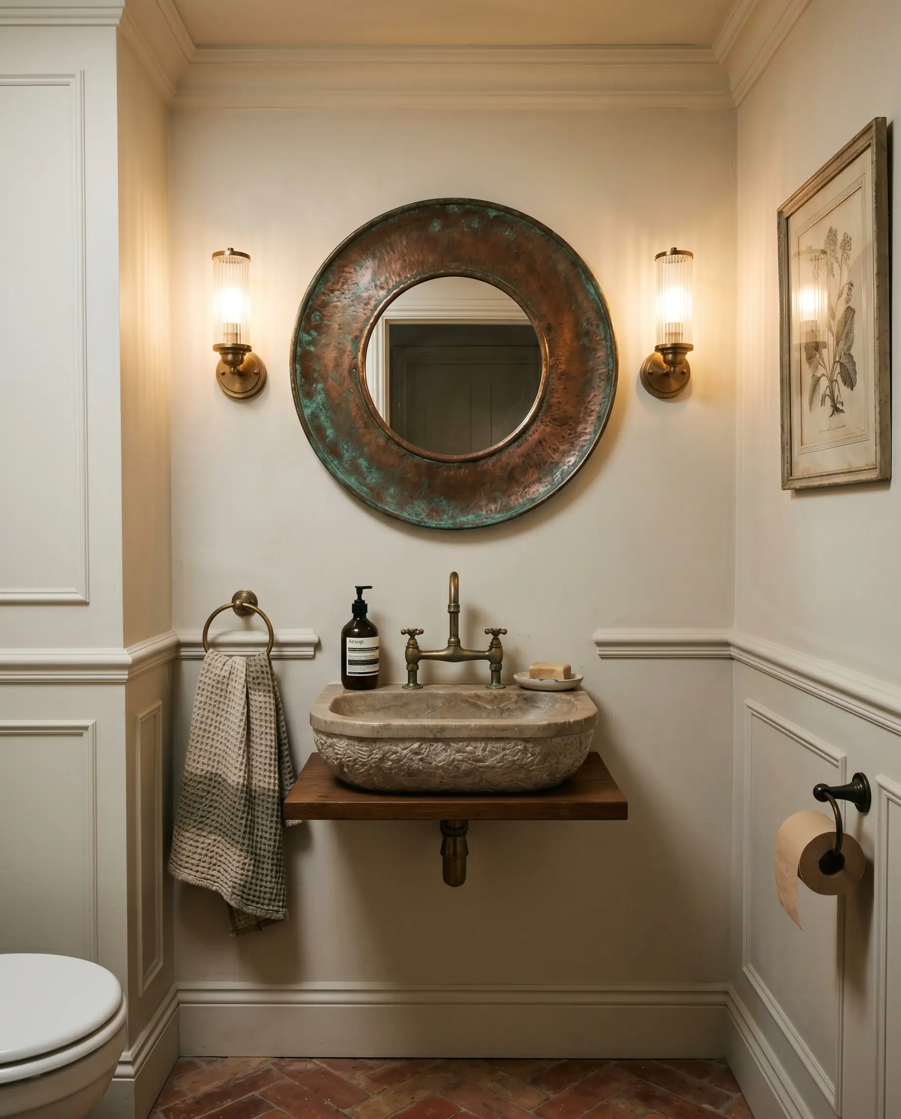
Windowless Powder Rooms
Windowless spaces naturally lack the dynamic light shifts required to bring complex neutrals to life, often making lighter colors feel flat and lifeless. However, because this specific F&B color carries a substantial LRV and a built-in khaki shadow, it thrives in controlled, artificial lighting.
Instead of fighting the lack of natural light, lean into it by wrapping the entire powder room—walls, ceiling, and trim—in this velvety hue. Install warm, ambient sconces (around 2700K) to pull forward the yellow-orange base, creating a glowing, intimate atmosphere.
Enhance the tactile experience by incorporating an oxidized copper mirror, a soapstone vanity basin, and richly textured hand towels. The result is a space that feels intentionally designed and incredibly luxurious, despite its lack of square footage.
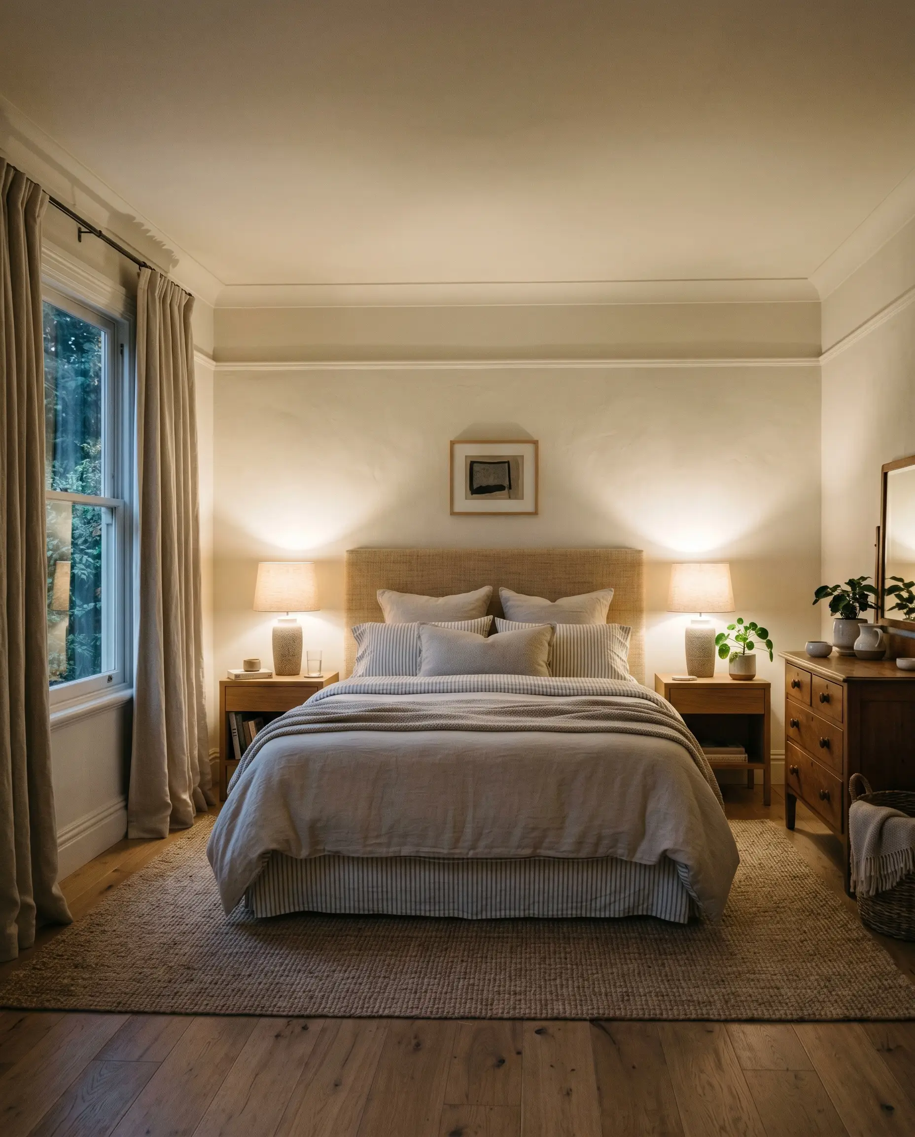
Bedroom Ceilings
The default practice of painting bedroom ceilings a flat, brilliant white often creates a harsh visual boundary that truncates the height of the room. By extending this warm putty tone onto the ceiling, you erase that stark dividing line and create a continuous, soothing canopy.
This technique is especially effective in bedrooms designed for rest and sensory relaxation, as it reduces visual contrast and softens the entire room. When the ceiling matches the warmth of the walls, the space feels taller, softer, and far more intentional.
To complete the sanctuary aesthetic, layer the room with heavy linen drapery, a textured grasscloth headboard, and subtle ticking stripe bedding. The ambient light from bedside lamps will wash over the ceiling, highlighting the paint’s chalky, historical finish and wrapping the room in absolute comfort.
Curating a Farrow & Ball Shadow White Palette
This specific pigment thrives on subtle, relational harmony rather than sharp, jarring contrasts. It requires soft tonal bleeds to feel serene and cohesive, acting as a gentle bridge between other elements in the room. When you place it next to natural textures or coordinating shades, the khaki undertones physically shift to either recede into the background or step forward as a defining feature.
Architectural Trim & Baseboards
Selecting the right trim dictates how your walls will ultimately be perceived. Because this color carries a distinct yellow-gray color structure, you must carefully control the transition from the wall to the baseboard.
Hardware & Tactile Pairings
To truly elevate this finish, you must introduce materials that communicate with its shaded, historical profile. The right tactile elements will bounce light into the room or absorb it to deepen the mood.
Coordinating Color Palettes
Designer Mood Boards
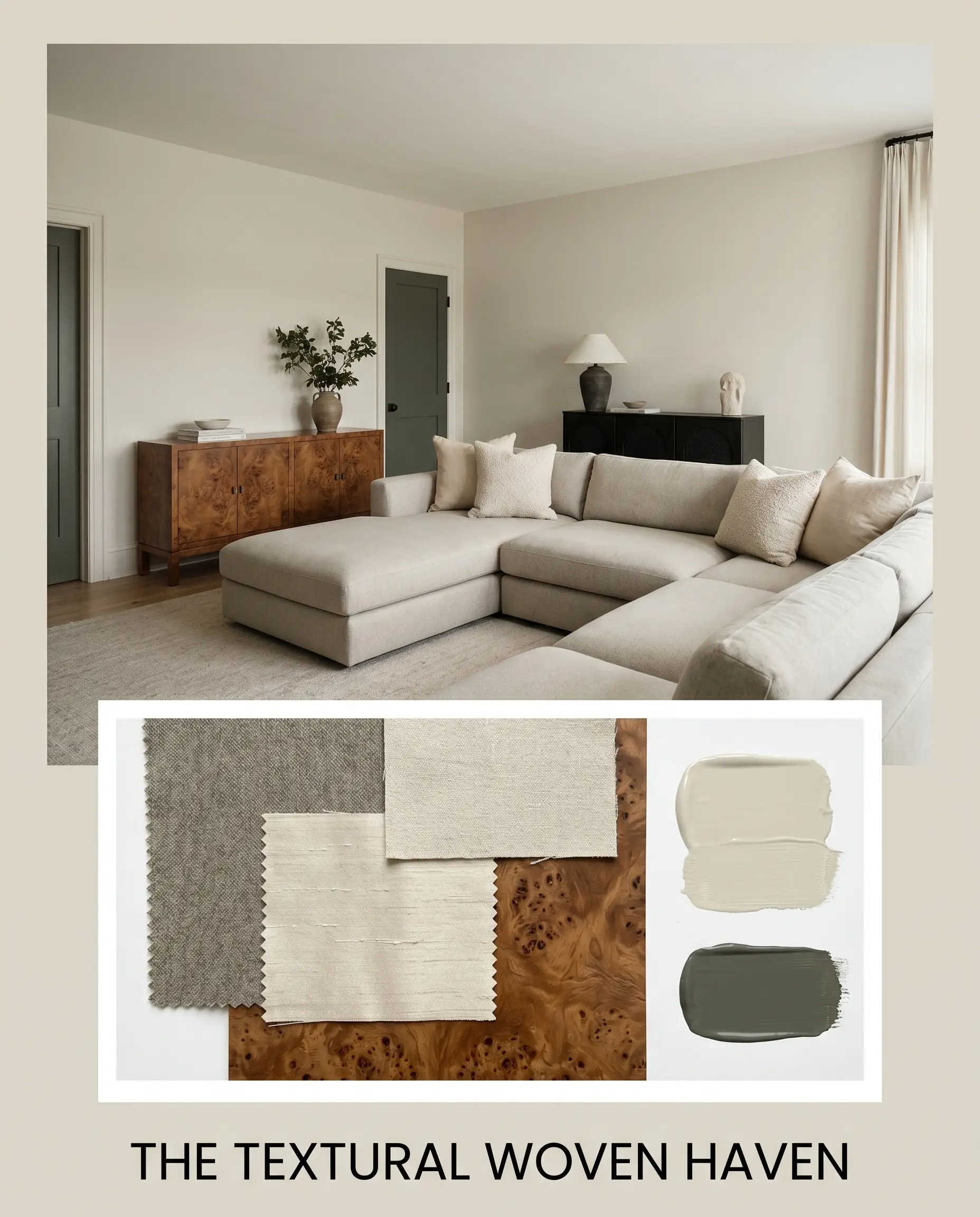
The Textural Woven Haven This aesthetic leans entirely into sensory relaxation, utilizing the paint’s chalky light absorption to create a sanctuary of calm. We anchor the room with an oversized, low-profile sectional upholstered in worsted wool, layered generously with nubby cotton and raw silk throw pillows. The walls provide a soft, sun-baked backdrop that beautifully highlights a vintage burl wood credenza. By painting the interior doors in Benjamin Moore Vintage Vogue, we introduce an organic, earthy contrast that completes this deeply grounding, transitional atmosphere.
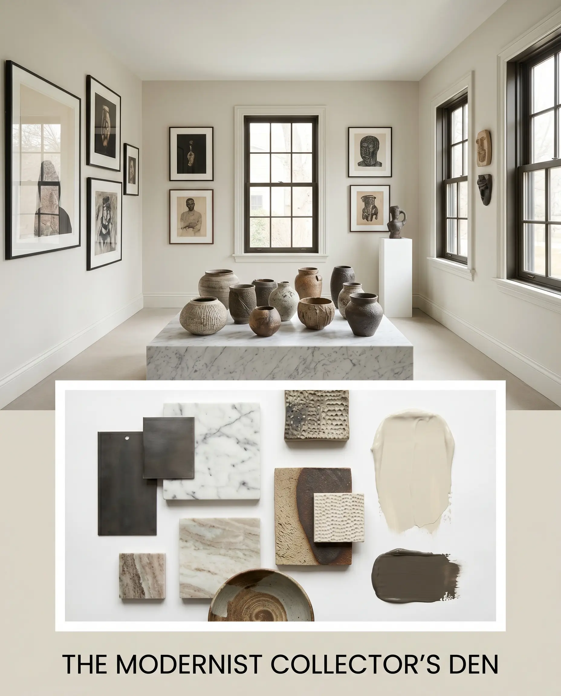
The Modernist Collector’s Den Here, the putty-toned walls serve as a gallery-like foundation for a highly curated, eclectic aesthetic. We pair the warm walls with sleek, minimalist iron frames and a striking marble plinth displaying artisanal pottery. The introduction of Sherwin-Williams Urbane Bronze on the window sashes creates a sharp, graphic boundary that modernizes the historical feel of the paint. Stacked coffee table books and abstract watercolor canvases inject personality, allowing the neutral backdrop to quietly unify the disparate, modern elements.
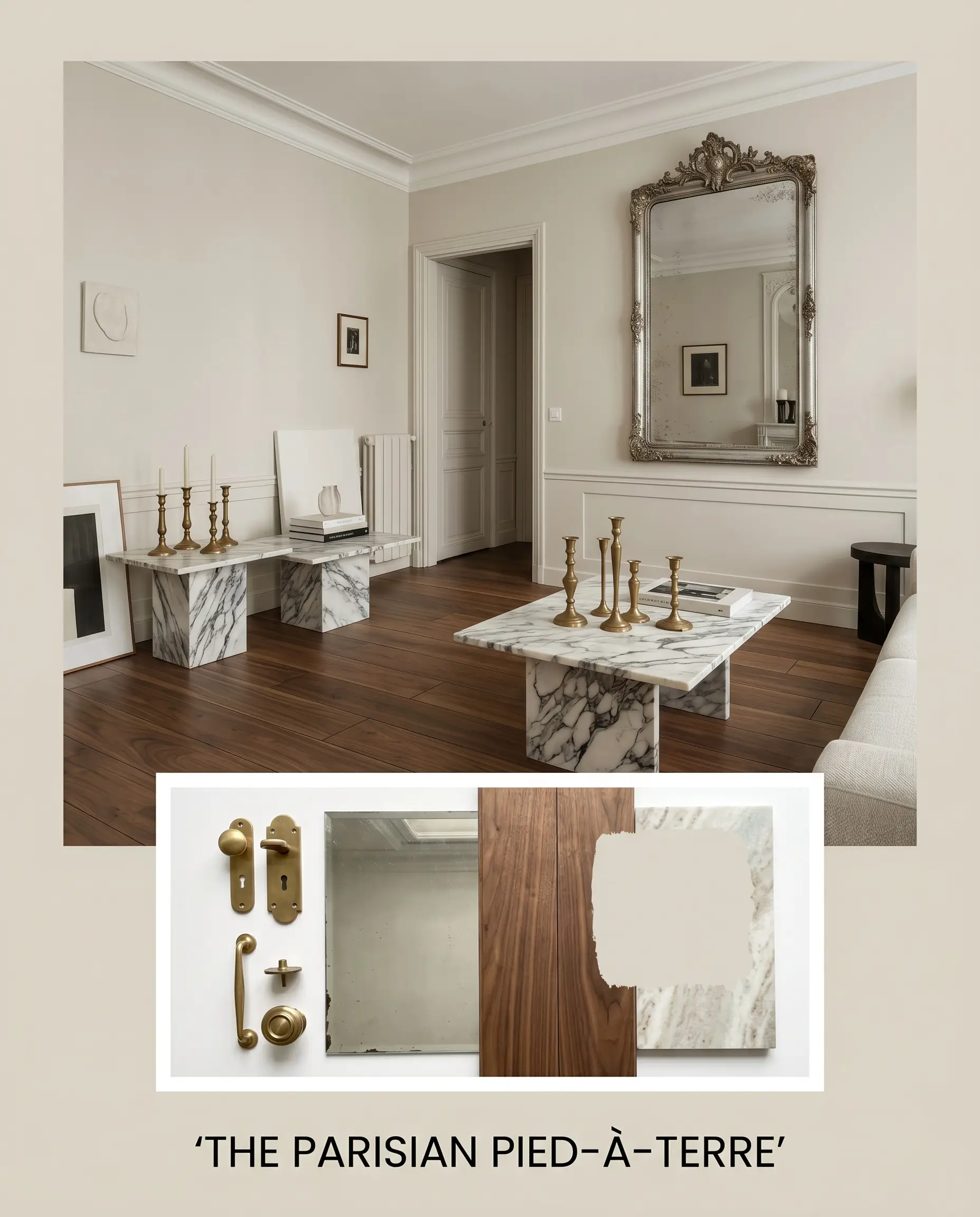
The Parisian Pied-à-Terre This board channels effortless European elegance, focusing on uncompromising material quality and classic silhouettes. The chalky walls interact magnificently with unlacquered brass candlesticks and ornate, antique mirrors that bounce ambient light around the room. We ground the airy palette with rich walnut flooring and introduce heavily veined honed marble on accent tables. The resulting vibe is sophisticated, layered, and steeped in quiet luxury, perfectly balancing heritage details with livable comfort.
Head-to-Head Neutral Color Comparisons
When selecting the perfect foundation for your home, subtle shifts in light reflection and hidden color casts make an enormous difference. If your room faces north, or if your existing furnishings demand a different undertone, this specific F&B neutral might not be the ideal candidate. Here is how it stacks up against its closest rivals to help you make an informed decision.
Farrow & Ball Shadow White vs. Farrow & Ball Shaded White
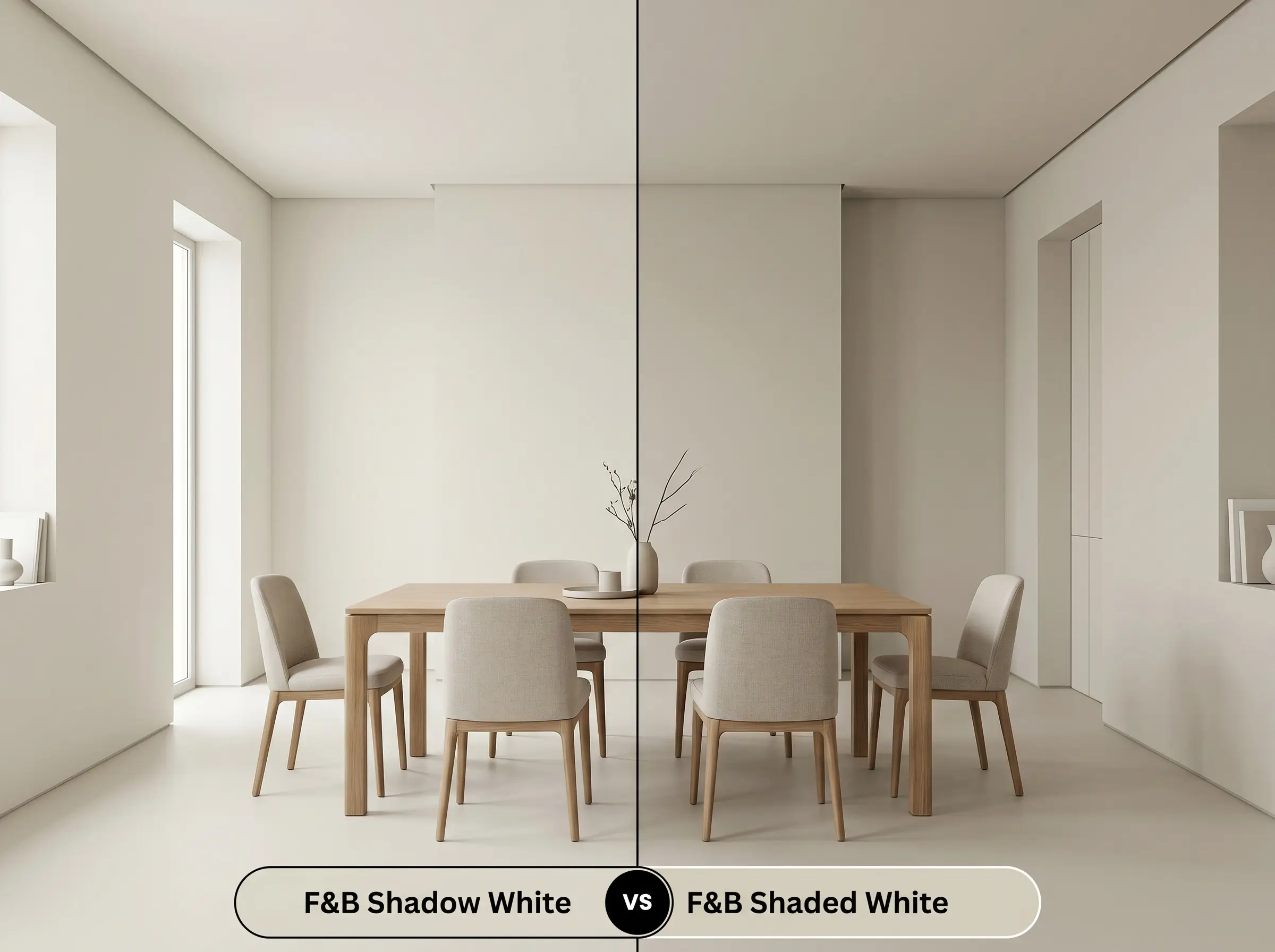
If you are dealing with a room flooded by intense, direct southern light, Shadow White 282 might actually read slightly too bright and lose its signature depth. Shaded White 201 is the immediate solution, offering a deeper, more pronounced gray-khaki presence that holds its ground in brilliant sunshine. Conversely, if you are painting a dimly lit hallway, Shaded White will feel too intense, making the lighter, more luminous 282 the clear winner.
Farrow & Ball Shadow White vs. Farrow & Ball Skimming Stone
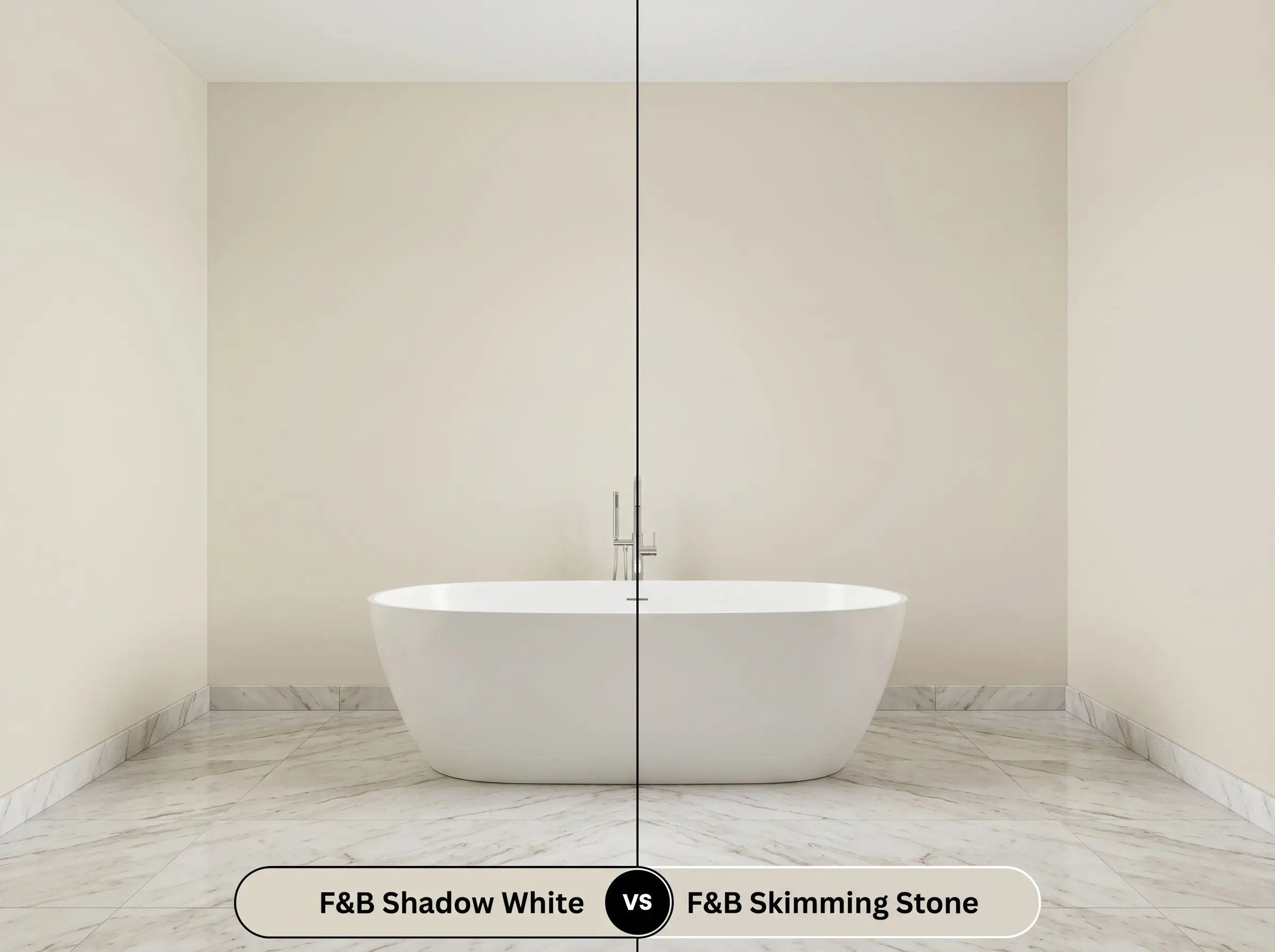
This comparison comes entirely down to the hidden undertones interacting with your fixed finishes. If you have cool-toned, pinkish-beige travertine floors, the green-khaki shadows in 282 will clash, making the paint look slightly sickly. Skimming Stone 241 is the perfect pivot, as it features a warmer, taupe-lilac undertone that harmonizes beautifully with pink-leaning stones and warmer textiles.
Farrow & Ball Shadow White vs. Benjamin Moore Pale Oak
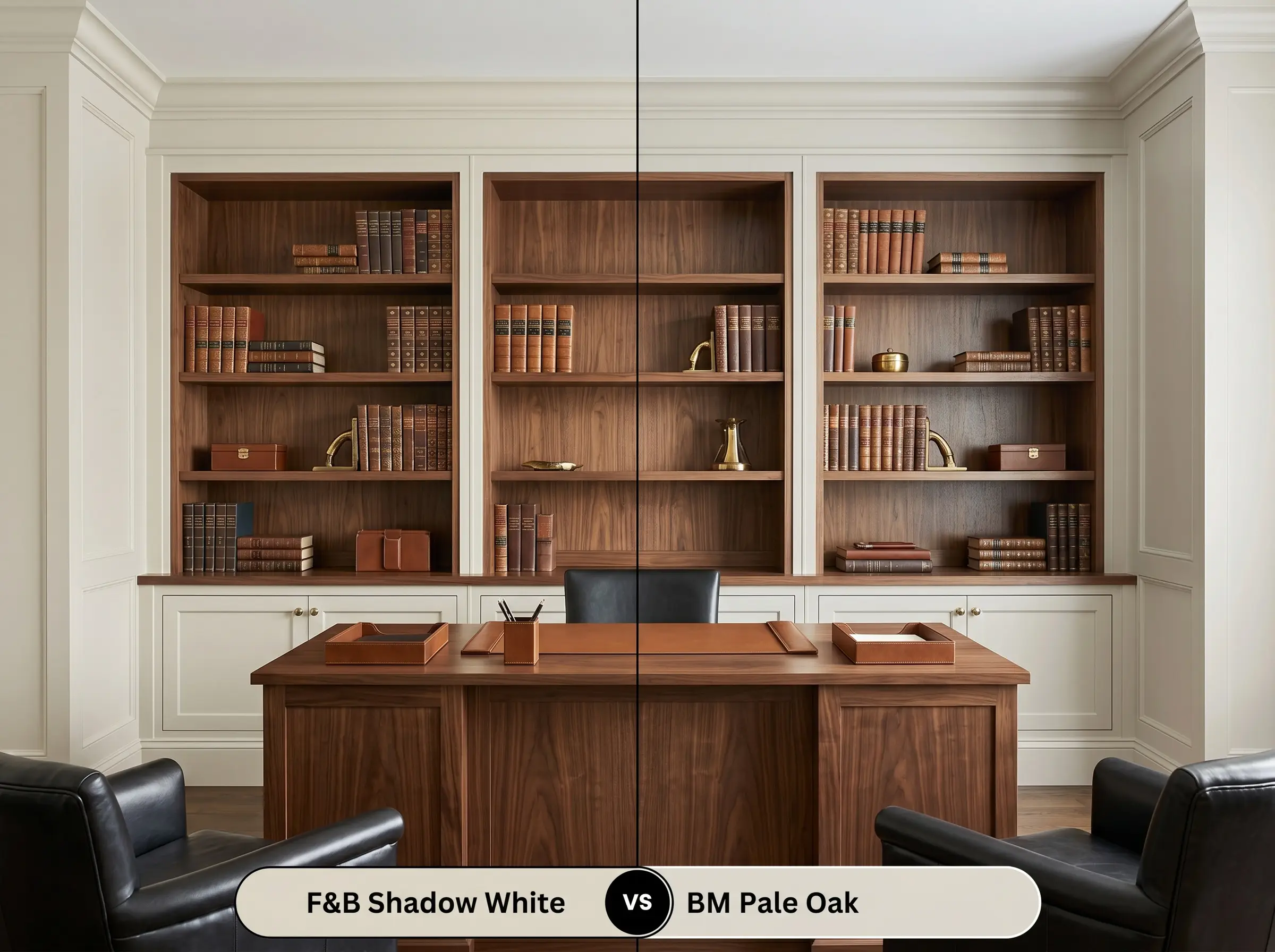
Pale Oak OC-20 is a highly popular, traditional greige that offers a much cleaner, more straightforward finish. If you want a soft, warm neutral but are terrified of the paint shifting green or khaki in the shadows, Pale Oak is the safer, more predictable choice. However, if you are intentionally seeking a color that feels like a complex, historical architectural finish with profound depth, the Benjamin Moore alternative will feel slightly too flat by comparison.
Exploring Alternatives to This Stone-Cast Neutral
Sometimes a color captures your imagination, but the practical realities of your specific lighting or brand availability require a slight pivot. Whether you need a touch more luminosity or a precise cross-brand match, these alternatives offer similar aesthetic value.
Same-Brand Alternatives
Cross-Brand Matches
Achieving the Perfect Shadow White Finish
Transitioning this complex hue from a color card to your actual walls requires a strategic approach to application. The physical finish you choose will dramatically alter how the pigment absorbs light and interacts with your room.
The Dynamic Sheen Guide
Primer Strategy
To ensure the true depth of this color is realized, you must use the Farrow & Ball Mid Tones Primer & Undercoat. Applying this specific greige over a standard white primer will result in a washed-out, chalky finish that lacks the necessary khaki shadows. The tinted undercoat provides a crucial, rich foundation that allows the final color to achieve its full saturation.
Coverage & Success Tips
Due to its nuanced pigment structure, this specific paint absolutely requires two full coats for a professional, flawless result. The highly matte Estate Emulsion finish is notoriously prone to “flashing,” meaning uneven roller marks will be highly visible if the paint is stretched too thin.
Never attempt to spot-touch a scuff mark with a brush if the original wall was rolled. The difference in texture will catch the light and highlight the repair; instead, always feather the touch-up gently with a small foam roller to mimic the original stipple.
Hackrea Pro-Tip (The Touch-Up Warning)
Frequently Asked Questions
Because of its healthy LRV of 68, this color actually performs beautifully in controlled lighting without turning muddy. To prevent it from falling flat, you must use warm artificial lighting (around 2700K) to pull its yellow-orange base forward, creating a glowing, intimate atmosphere.
The ultra-matte Estate Emulsion absorbs ambient light, making the walls feel soft, velvety, and slightly lighter. In contrast, the subtle sheen of Modern Eggshell reflects light, which visually deepens the pigment and makes the cabinetry appear slightly richer and more saturated.
While it pairs magnificently with warm oak, placing this khaki-leaning putty directly against stark, cool-toned Carrara marble is highly risky. The crisp gray and bright white of the Carrara will instantly make the paint’s yellow-gray structure look dingy and aged by comparison.
Direct, intense sunlight acts as a visual bleaching agent, stripping away the perceived darkness and subtle khaki shadows of the paint. On a sun-drenched exterior facade, the color will read significantly brighter and lean much closer to a warm, creamy off-white.
The Final Verdict & Design Warnings
Farrow & Ball Shadow White No. 282 is a masterfully crafted, stone-cast neutral designed for homeowners who view paint as a foundational architectural material. It is absolutely perfect for spaces that require visual warmth without the predictable, buttery yellow undertones of standard creams. This color excels in transitional kitchens, heritage living rooms with extensive millwork, and serene, texture-rich bedrooms. By acting as an ambient light chameleon, it wraps your home in a quiet, sophisticated energy that elevates natural woods, raw metals, and premium textiles.
However, its complex undertones demand highly intentional pairings to succeed. You must exercise extreme caution when introducing brilliant, stark whites or cool-toned, icy grays into the same sightline. Placing this beautiful, muted putty tint directly next to a crisp white ceiling, a cool Carrara marble backsplash, or vivid, primary-colored decor forces a harsh visual clash. The starkness of those elements will instantly strip away the paint’s historical charm, causing the yellow-gray base to look unintentionally dirty or nicotine-stained. To maintain its high-end, curated appeal, you must surround it with equally nuanced, warm, and earthy tones that support its shaded profile.
Closest Cross-Brand Equivalents
The absolute closest scientific color matches for Shadow White across top paint brands.