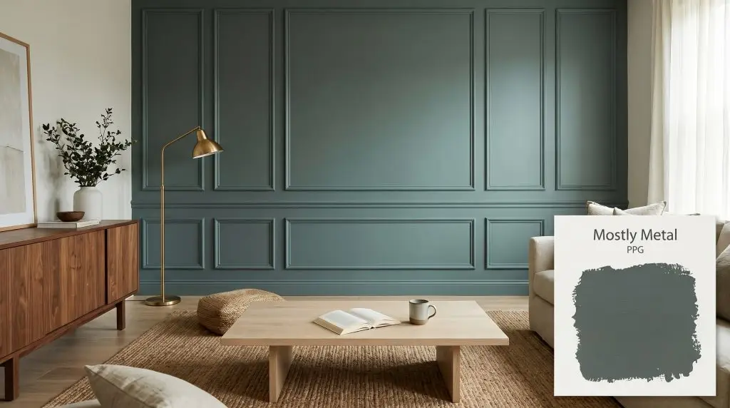
Mostly Metal PPG1036-7
PPGPPG Mostly Metal (PPG1036-7) is a dark, cool, menacing black or deep charcoal gray with a subtle, dark green undertone. With an LRV of 11, it absorbs significant light, making it a dramatic choice for exteriors, cabinetry, and striking accent walls.
Paint Technical Profile
| Color ID / SKU | PPG1036-7 |
| HEX Code | #575e5f |
| Light Reflectance (LRV) | 11 |
| Use | Interior, Exterior |
| Best Exposures | South-Facing, West-Facing |
| Best For | Exteriors, Accent Walls, Cabinetry, Monochromatic schemes |
Shaping Shadows: How PPG Mostly Metal Redefines the Modern Charcoal
Some paint colors sit passively on a wall, while others actively reshape the architecture of your home. When you introduce a profound, saturated charcoal into a space, you are fundamentally changing how light moves through the room. The boundaries blur, the corners recede, and the entire atmosphere instantly feels more intentional.
PPG Mostly Metal completely masters this visual trick. It acts as a stunning architectural finish that absorbs excess light and gives standard drywall or basic exterior siding a weighted, custom appearance. This isn’t just another flat, predictable dark gray.
By hiding a highly specific color structure beneath its dark surface, this shade adapts to its surroundings with surprising agility. Whether you are wrapping a cozy media room or modernizing a suburban facade, understanding how this specific pigment behaves is the key to a flawless execution.
The Color DNA: Undertones & LRV of PPG Mostly Metal
When homeowners ask if a specific charcoal is warm or cool, the answer usually dictates the entire design direction. PPG Mostly Metal is definitively cool. It establishes a crisp, tailored foundation that completely avoids the muddy, brown-leaning tendencies found in warmer grays.
To understand why this shade feels so sophisticated, we have to look closely at how it is built:
This deep charcoal base carries a Light Reflectance Value (LRV) of 11. In the design world, an LRV this low means the paint is highly light-absorbent, bouncing almost zero illumination back into the room. Because of this dense structure, it reads as a soft, velvety black in heavily shaded environments, while revealing its true identity as a stormy, complex gray when hit by direct sunlight.
Ambient Light Manipulation: How This Cool Color Structure Shifts
Because of its low LRV and complex green-cyan undertones, this paint is highly reactive to the shifting temperature of your lighting. You must plan your lighting strategy before you ever pick up a brush.
Here is exactly how this cyan-leaning charcoal behaves across different lighting scenarios:
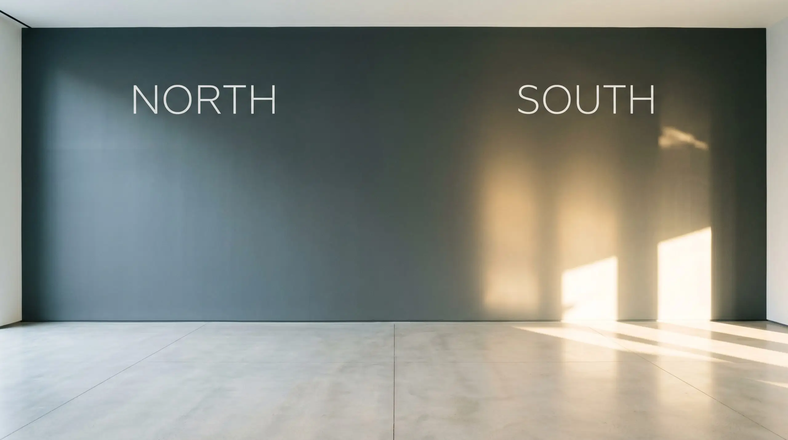
If you are using this shade on kitchen cabinetry, strictly control your overhead lighting temperature. Mixing a warm 2700K pendant with a cool 4000K recessed light will cause the cabinets to look green in one zone and flat gray in another. Stick to a uniform 3000K across the entire room for a balanced, consistent read.
Hackrea Pro-Tip (The Bulb Strategy)
Popular Applications
The beauty of a saturated, low-LRV shade is its ability to act as a definitive architectural tool. Instead of merely coloring a room, this deep charcoal base redefines the structural weight of everything it touches. Here is how to successfully deploy it across your home’s most impactful spaces.
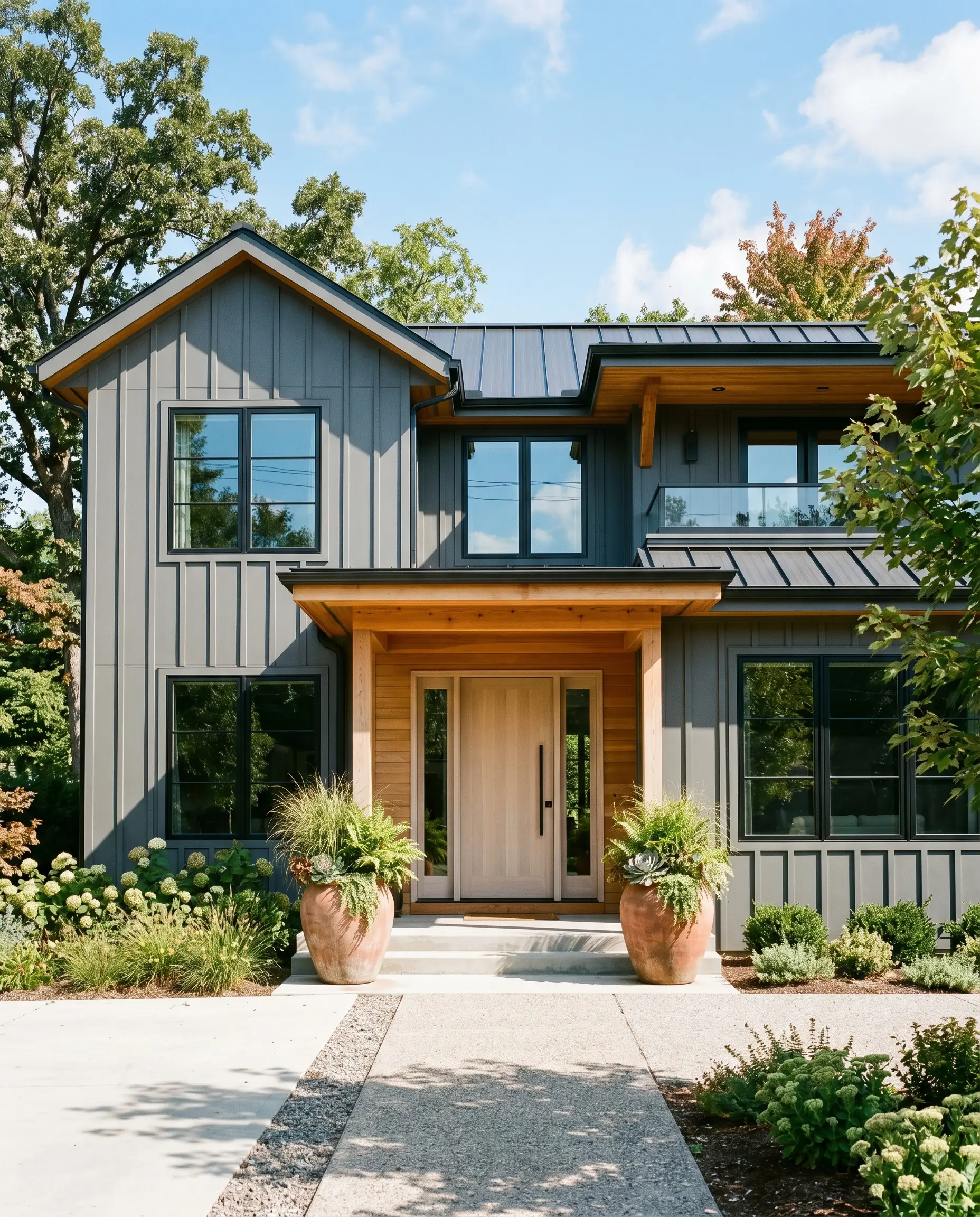
Exterior Siding & Trim
The monochromatic exterior trend is dominating residential design, and this shade is a brilliant candidate for a full-body application. When applied to contemporary stucco, vertical board-and-batten, or classic clapboard, it instantly modernizes the facade. Keep in mind that direct exterior sunlight will wash out the color slightly, turning it from a soft black into a stunning, stormy gray.
To keep the house from looking like a featureless shadow, you must introduce warm, organic contrast. Pair the dark siding with natural cedar soffits, a bleached white oak front door, or oversized terracotta planters framing the entryway. If you are using it strictly as a trim color against a creamy white brick, it provides a crisp, tailored outline that beautifully highlights the home’s roofline and architectural features.
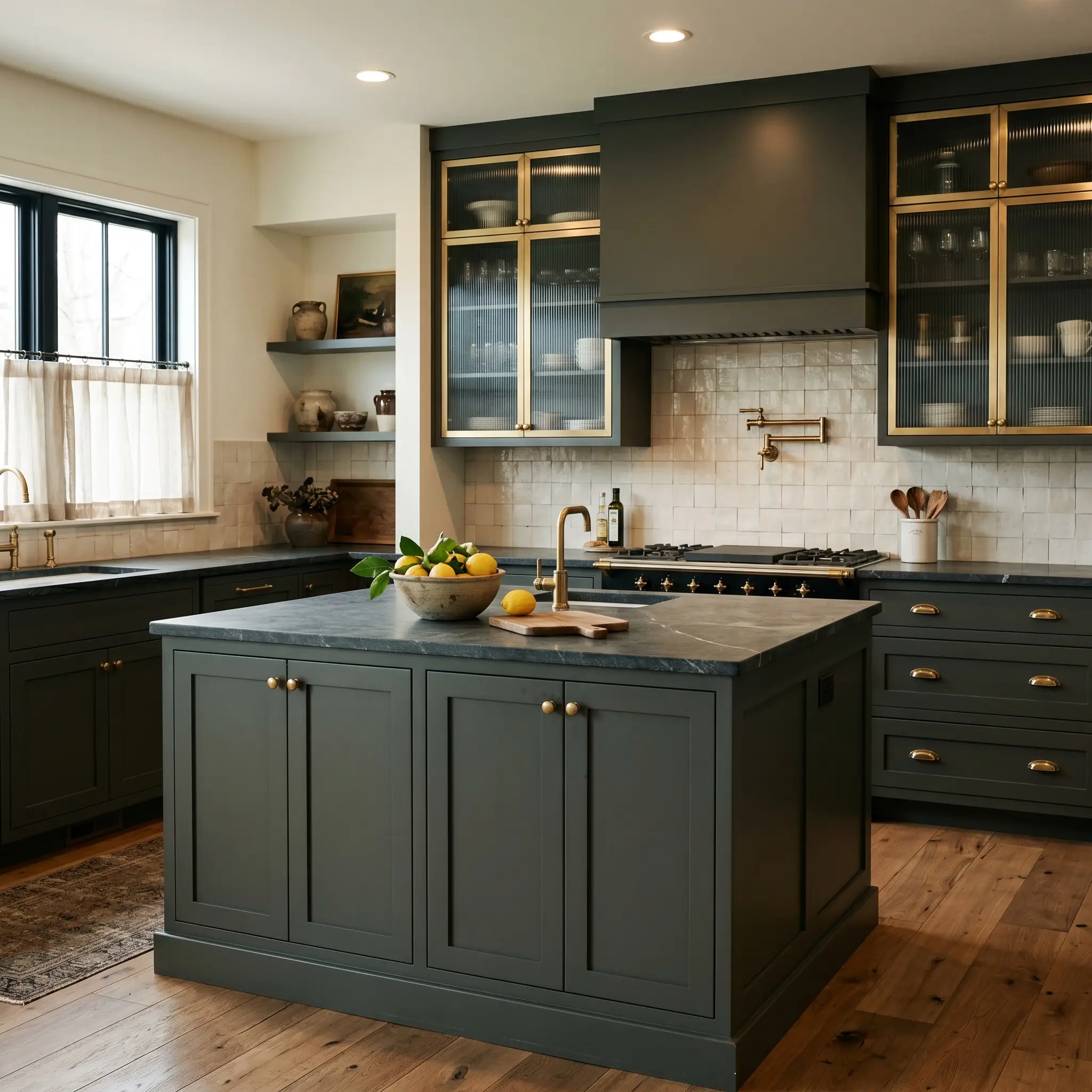
Kitchen Cabinetry & Islands
Using a dark, cyan-leaning charcoal on cabinetry is one of the most effective ways to make a standard kitchen feel entirely custom-built. It establishes a stabilizing presence, particularly on lower cabinets or an expansive center island. Because the color is so dense, it pairs effortlessly with both accessible butcher block counters and aspirational, honed soapstone slabs.
To execute a moody transitional aesthetic, lean into the subtle green cast by pairing the cabinets with unlacquered brass hardware. The living finish of the brass warms up the cool color structure, creating a sophisticated, lived-in tension. Balance the heavy lower half of the room with creamy white upper walls, fluted glass cabinet doors, and textured zellige backsplash tiles to reflect ambient light around the space.
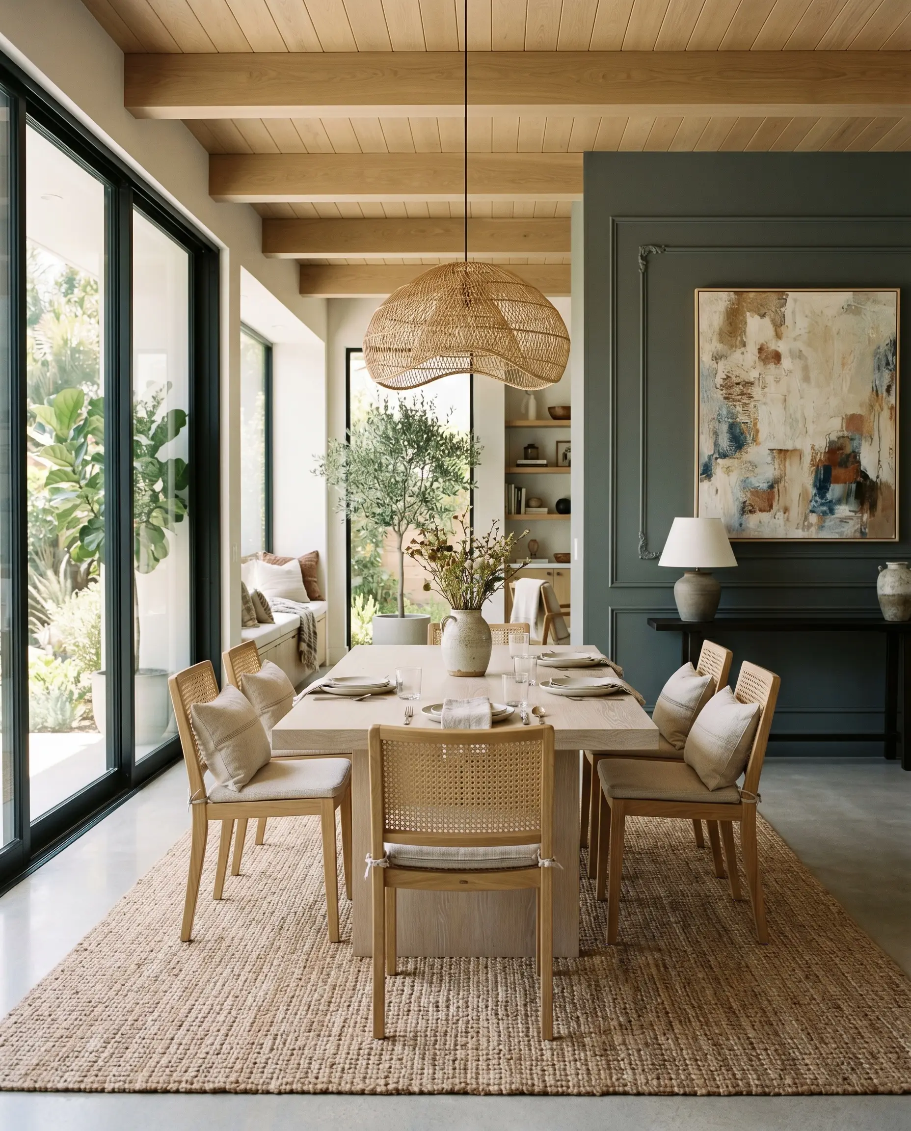
Dining Room Accent Walls
Instead of defaulting to a stiff, formal dining room, use this intense shade to craft a relaxed, modern organic gathering space. Applying it to a single accent wall—or better yet, a wall featuring classic wainscoting or picture molding—creates a dramatic focal point without suffocating the room. The dark backdrop instantly makes everything placed in front of it look more sculptural and intentional.
Style the room with highly tactile, light-toned materials to offset the dark wall. Think of a bleached white oak pedestal table, cane-back dining chairs, and a massive, textured woven jute rug. Hang an oversized, abstract canvas directly on the dark wall to break up the dense block of color and introduce lighter, airy tones back into the visual field.
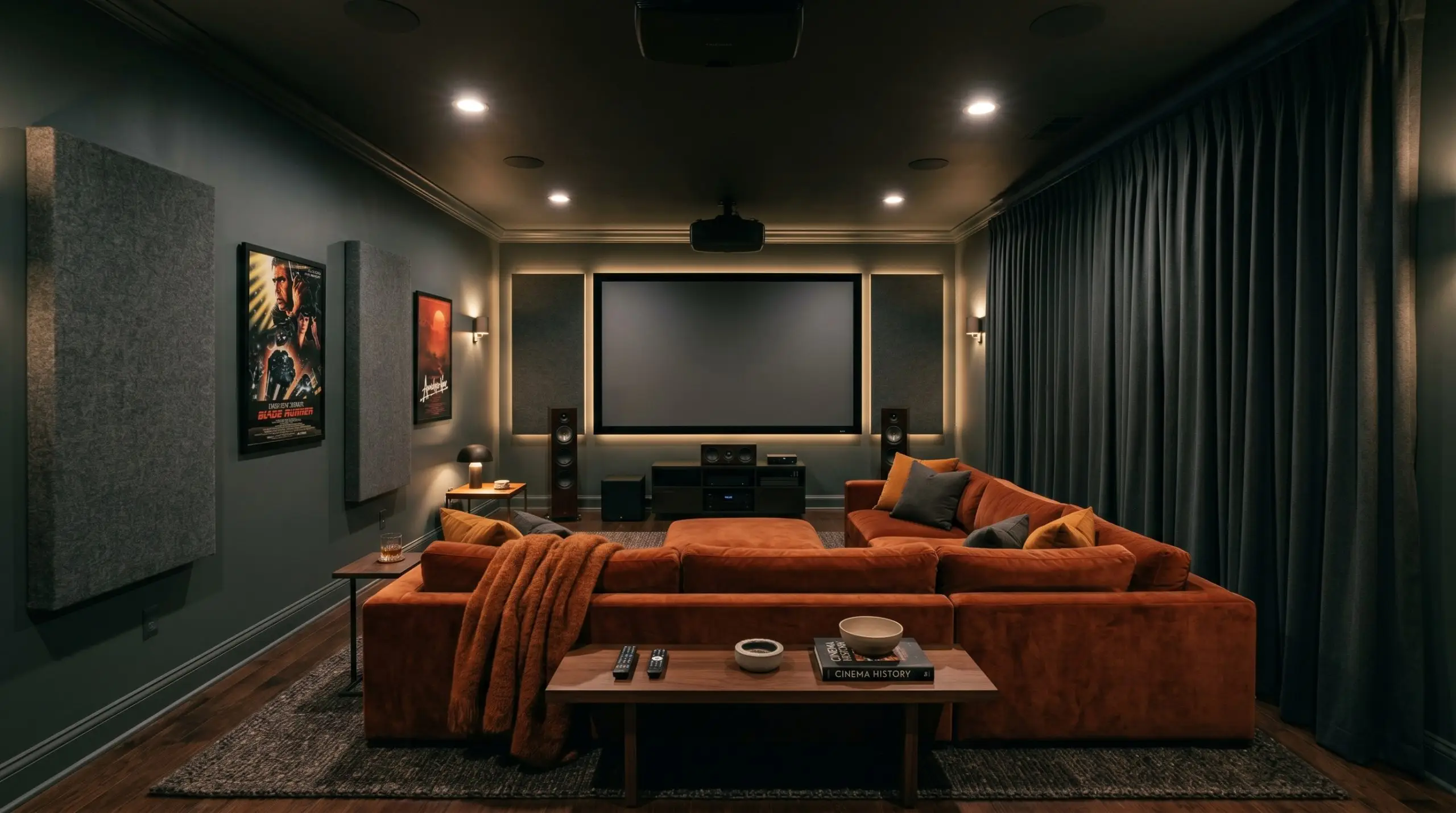
Home Theaters & Media Rooms
For film enthusiasts building a dedicated media room, light absorption is the ultimate goal. Color drenching the entire space—walls, ceiling, and baseboards—in this velvety charcoal completely erases the boundaries of the room. When the lights go down, the architecture simply vanishes, allowing the screen to become the sole focus.
To prevent the room from feeling like a cold, utilitarian black box, you must layer in aggressive textures. Introduce a massive, track-arm sectional upholstered in rust-colored velvet crush, layer thick acoustic felt panels on the walls, and use heavy, light-blocking wool drapery. These soft, tactile elements absorb sound while providing a crucial visual contrast to the flat, painted surfaces.
If you are color drenching a media room or a home office, do not leave the trim bright white. A stark white baseboard running around the bottom of a deeply saturated room creates a harsh, distracting racing stripe that completely ruins the immersive, seamless atmosphere you are trying to build.
Clash Warning (The Trim Trap)
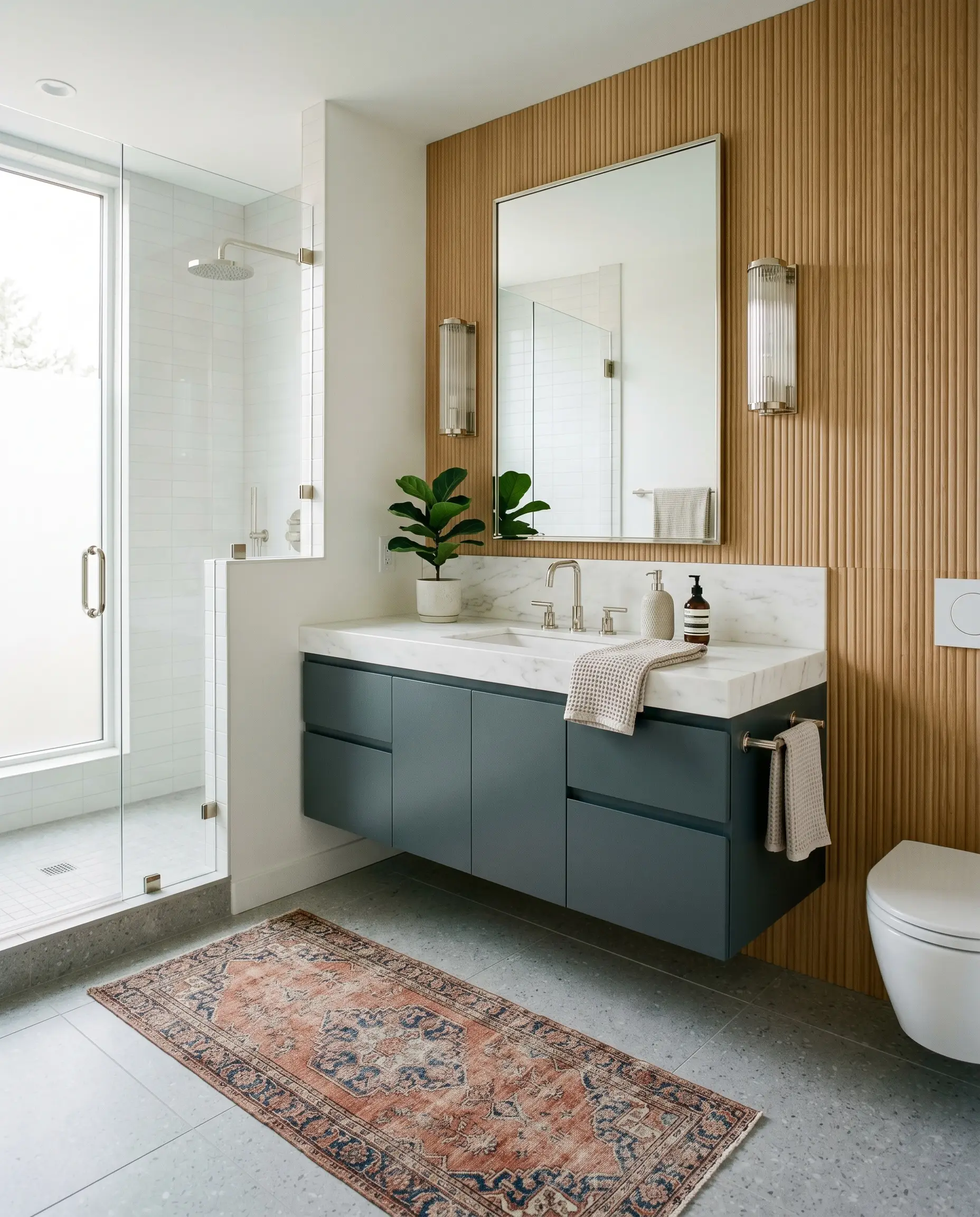
Modern Bathroom Vanities
If you are refreshing a guest bathroom but aren’t ready for a full renovation, painting an existing vanity is a high-impact, accessible update. This dark gray instantly conceals the dated look of builder-grade oak, turning a basic cabinet into a sleek, tailored focal point. It works incredibly well when paired with modern, ribbed wood wall panels or a simple, soft white backdrop.
To complete the transformation, swap out basic hardware for polished nickel fixtures. The cool, silvery tones of the nickel harmonize beautifully with the paint’s cyan undertones, creating a crisp, high-end hotel aesthetic. Finish the space with a vintage-inspired runner rug in faded terracotta and navy to ground the vanity and add a layer of unexpected warmth.
Crafting a Cohesive Palette Around PPG Mostly Metal
Because this moody pigment absorbs so much ambient light, it requires deliberate textural contrast to keep the room from feeling flat. It thrives when placed next to materials that either sharply define its edges or gently coax out its hidden green warmth.
Architectural Borders and Trim
When framing such an intense charcoal, you need a trim color that provides an absolute, crisp boundary. Benjamin Moore Chantilly Lace OC-65 and Sherwin-Williams High Reflective White SW 7757 are the ultimate candidates for this job.
Both of these whites carry virtually zero underlying bias, meaning they will not pull yellow or pink when placed next to the dark gray. This stark, highly reflective contrast cuts through the dark base, creating a tailored outline that forces the deep wall color to proudly hold its shape.
Tactile Finishes and Metals
To build a room that feels intentionally curated, you must introduce physical textures that interact directly with the paint’s cool profile. Pair this charcoal with these specific elements:
Complementary Color Relationships
When building out the rest of your home’s color story, choose shades that either lean into the stormy atmosphere or offer a refreshing, airy counterpoint.
Styled Environments and Vibe
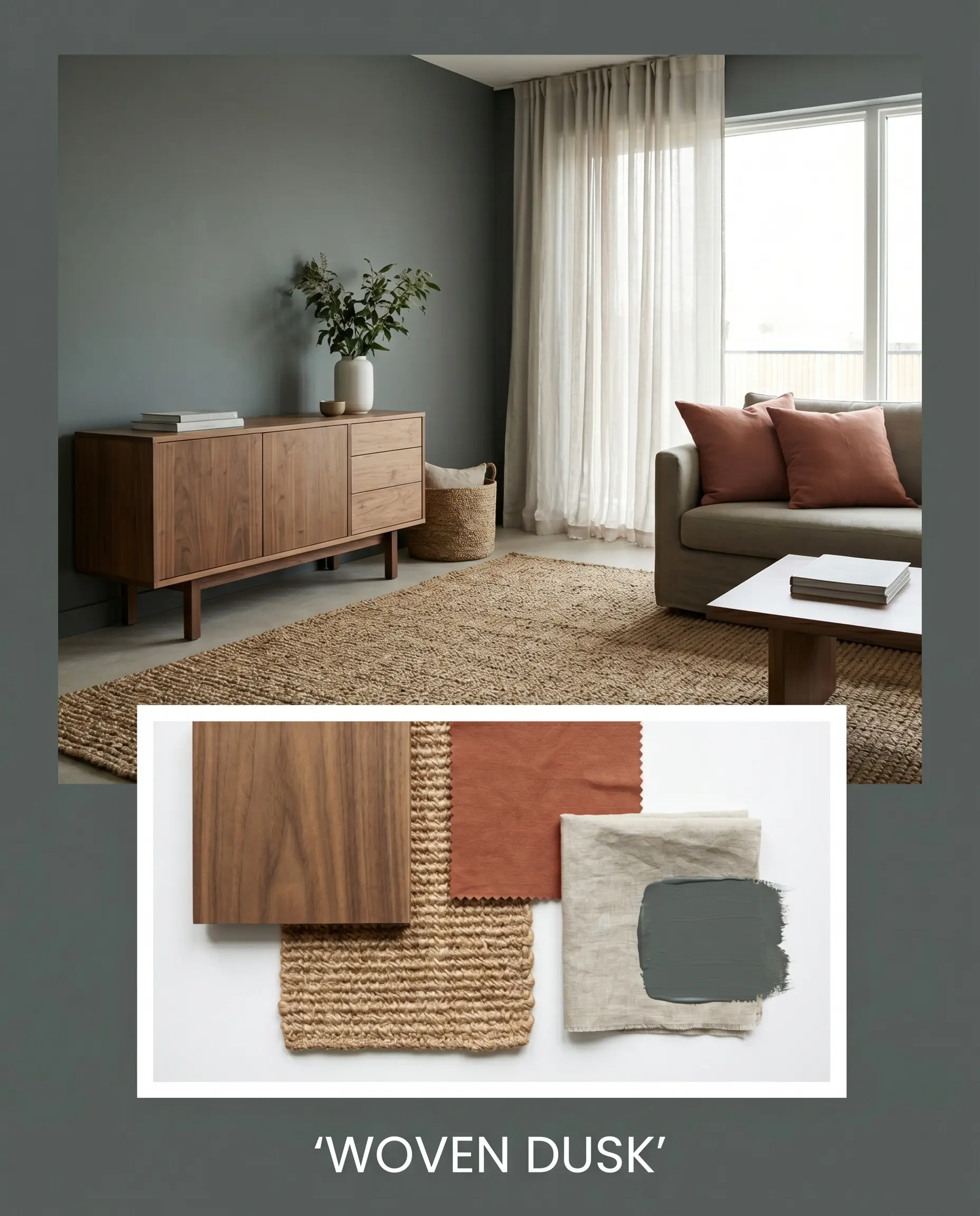
Woven Dusk This aesthetic relies on tactile warmth to soften the imposing nature of the dark walls. Imagine natural walnut credenzas and thick, woven jute rugs resting against the deep charcoal backdrop. By layering in muted, terracotta throw pillows and sheer washed linen drapery, the environment feels incredibly relaxed, earthy, and inviting. The dark paint simply acts as a quiet shadow that allows the organic textures to shine.
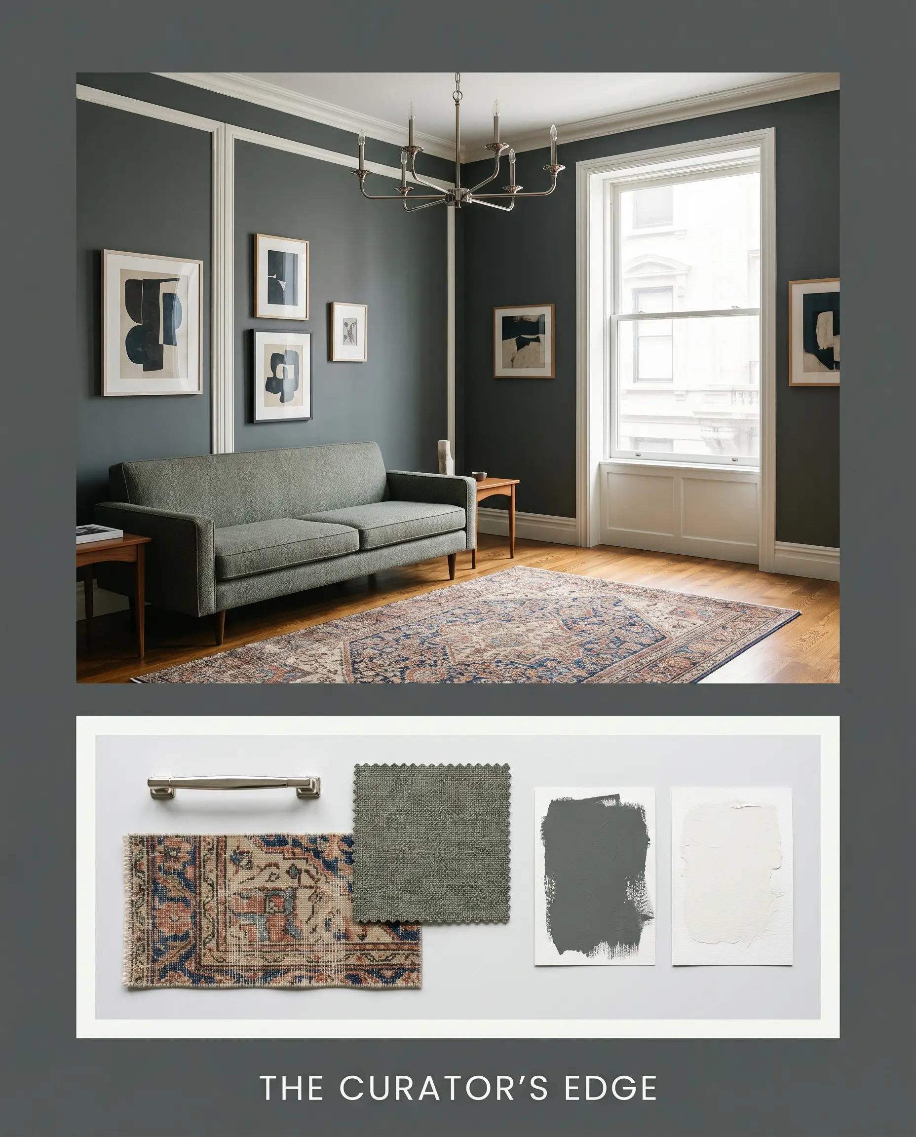
The Curator’s Edge For a highly tailored, sophisticated energy, we lean into sharp contrasts and reflective surfaces. Crisp white trim frames the charcoal, while a striking polished nickel chandelier serves as the room’s jewelry. A sleek, mid-century track arm sofa sits gracefully on a low-pile vintage rug, creating an atmosphere that feels like a private, modern art gallery.
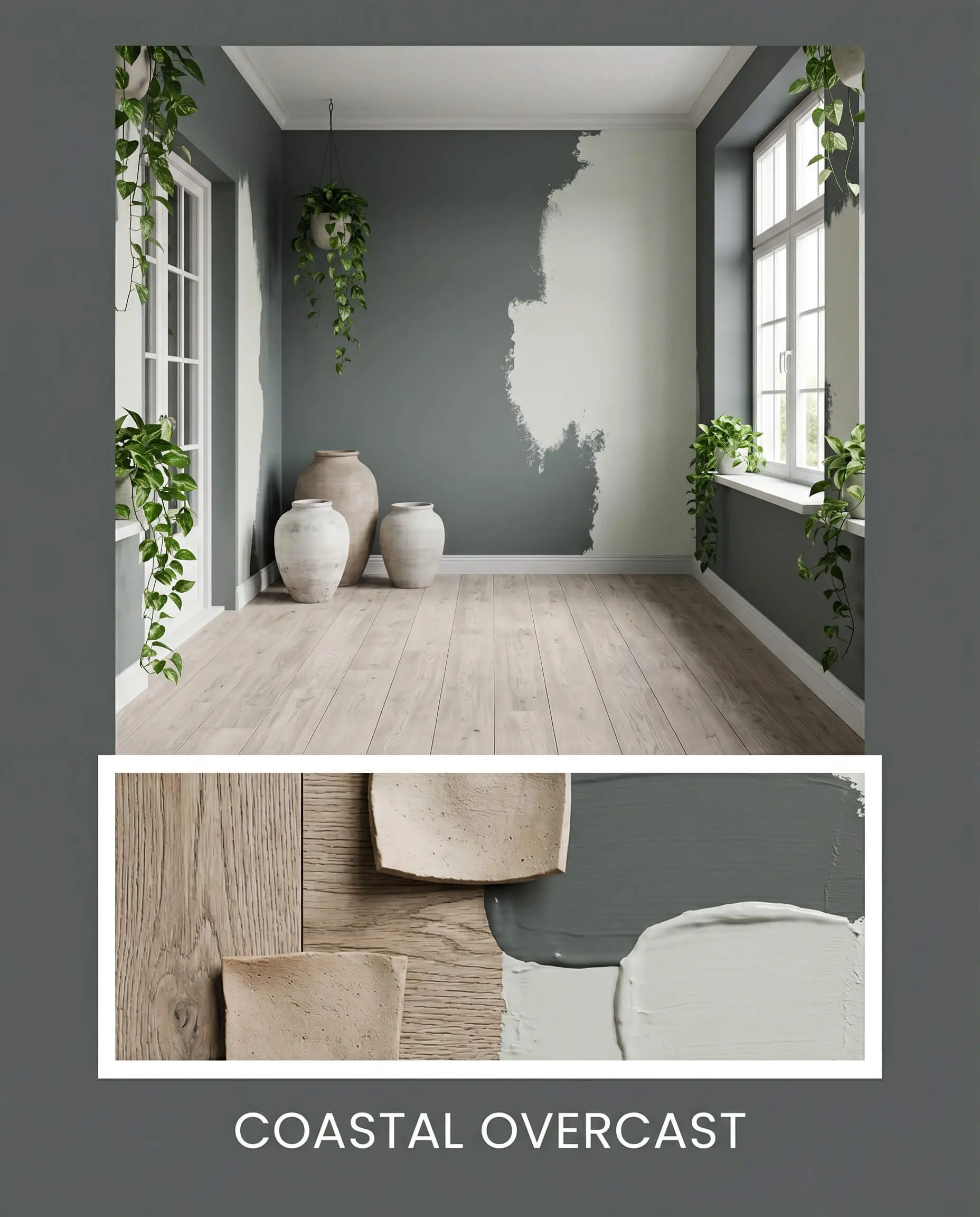
Coastal Overcast This palette captures the serene, misty feeling of a stormy beach day. The charcoal walls are balanced by expansive splashes of Sherwin-Williams Sea Salt and light, weathered oak flooring. By introducing oversized ceramic vessels, trailing pothos plants, and soft, natural light, the space feels incredibly calm, breezy, and restorative rather than dark or enclosed.
Head-to-Head: Comparing Dark Charcoals
Deciding between intense dark grays often comes down to the specific lighting exposure of your home and how much warmth you actually want to pull forward. If this cyan-leaning shade feels too cool for your specific architecture, you might need a rival color with a different structural base.
PPG Mostly Metal vs. Benjamin Moore Wrought Iron 2124-10
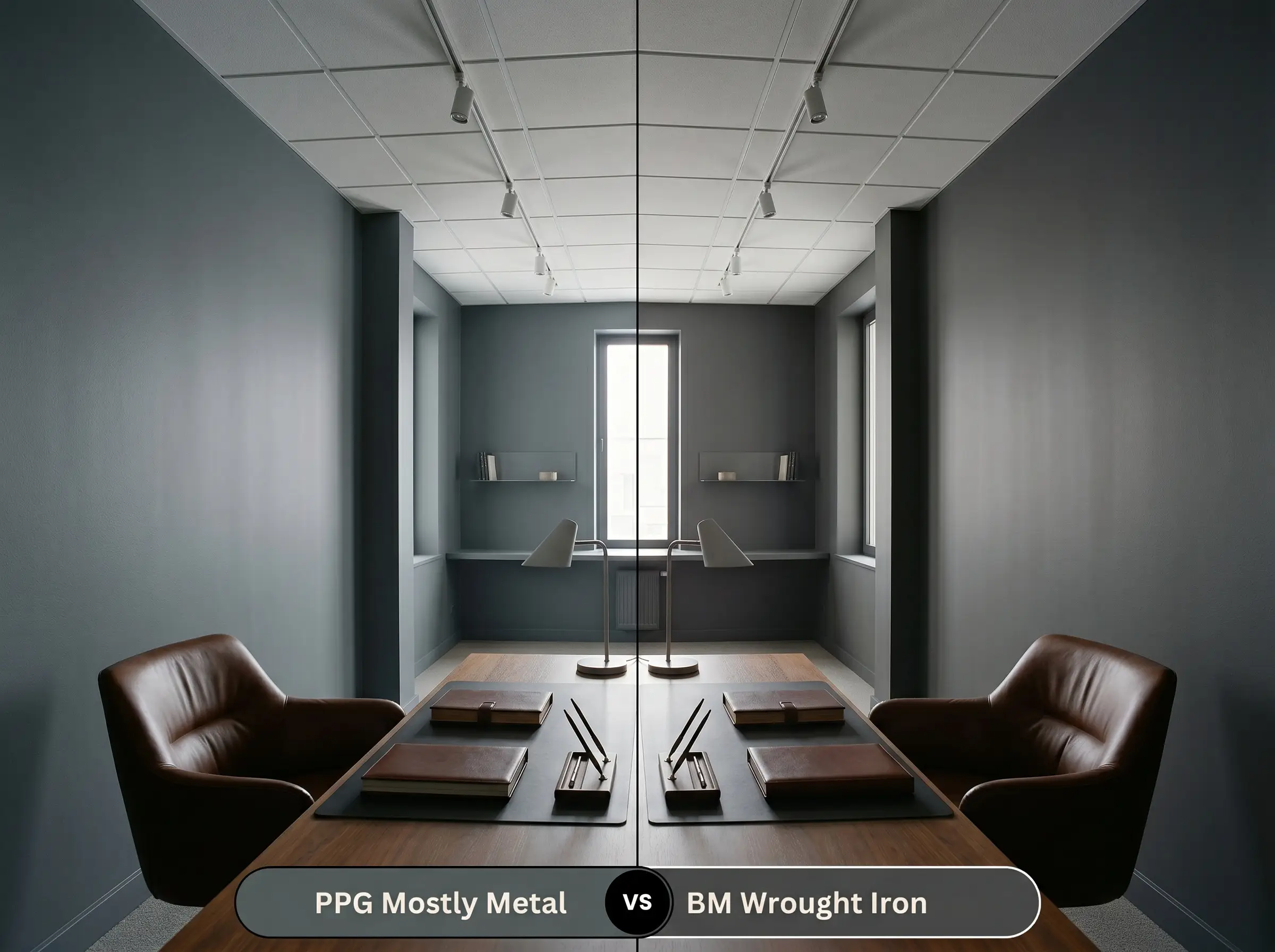
If you are worried about your walls pulling a subtle teal or green in cool lighting, Wrought Iron is your safest pivot. While both are profound, saturated dark grays, the Benjamin Moore option is built with a significantly warmer, almost brown-leaning base. Wrought Iron feels slightly softer and more traditional, whereas the PPG option retains a crisper, more contemporary edge.
PPG Mostly Metal vs. Sherwin-Williams Peppercorn SW 7674
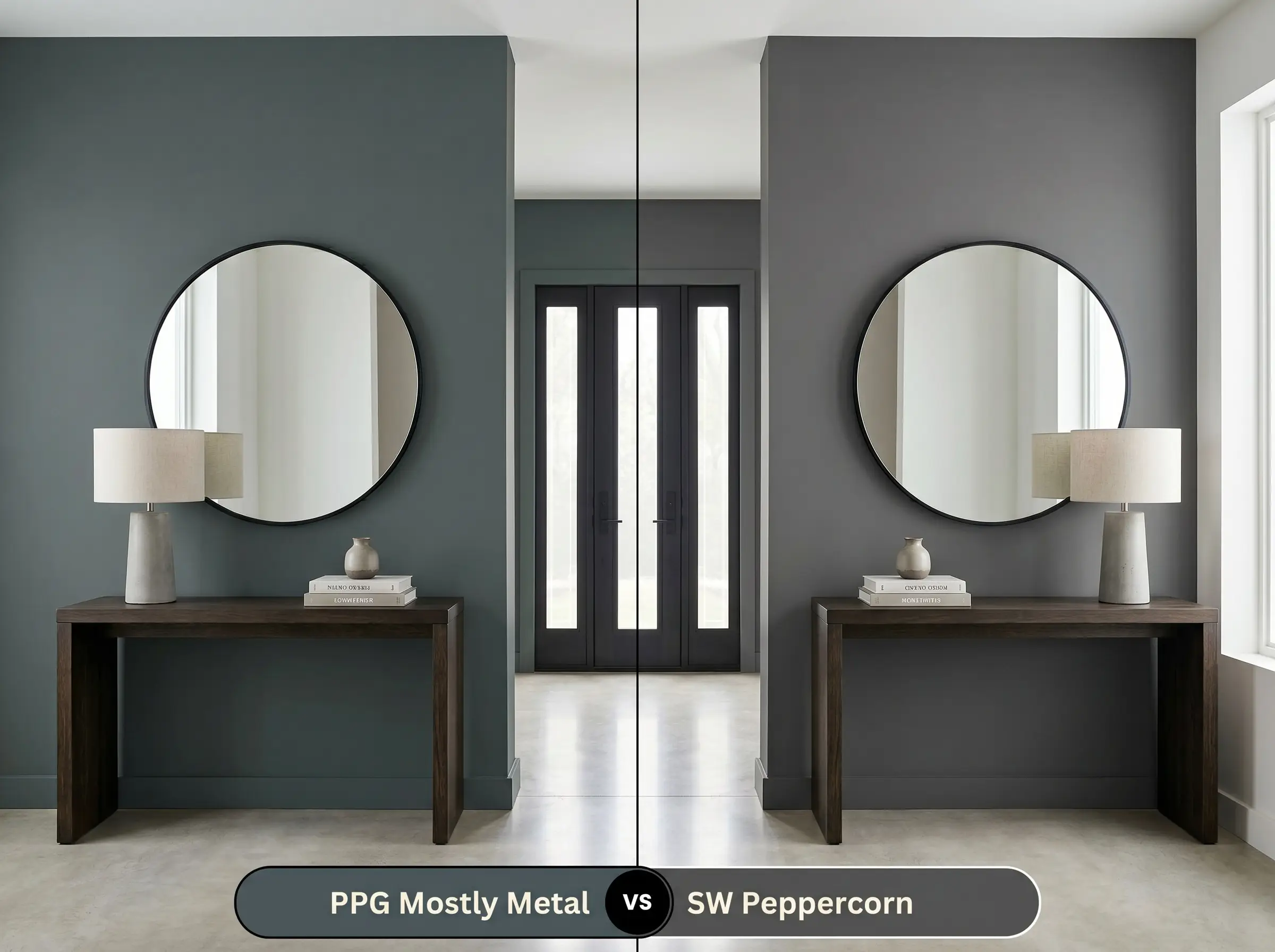
Peppercorn is one of the most popular true grays on the market because it strikes a near-perfect balance between warm and cool. If you place them side-by-side, the Sherwin-Williams shade reads as a much more neutral, straightforward charcoal. Choose Peppercorn if you want a reliable, unchanging gray, but stick with the PPG shade if you prefer a color that shifts and reacts dynamically to sunlight.
PPG Mostly Metal vs. Farrow & Ball Down Pipe No. 26
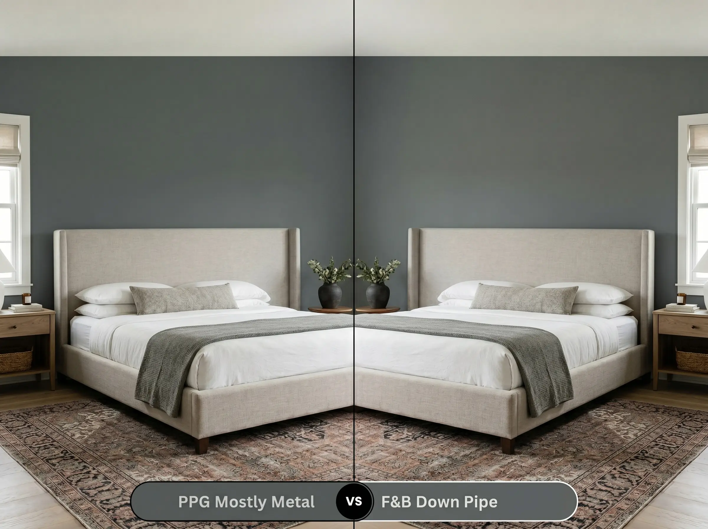
Down Pipe is famous for its complex, lead-like finish that carries a very distinct, earthy green-blue undertone. While both colors share a similar moody profile, the Farrow & Ball pigment feels noticeably more aged and historical on the wall. If you are styling a sleek, modern environment, the PPG shade provides a cleaner finish, whereas Down Pipe excels in spaces filled with vintage rugs and antique brass.
Exploring Alternative Options and Matches
Sometimes you love the initial concept of a color, but once you put a sample on the wall, it feels just a fraction too dark or slightly too cool for the room’s natural light.
Same-Brand Alternatives
Cross-Brand Matches
Professional Application and DIY Tips
Transitioning this intense pigment from a tiny swatch to a massive wall requires a flawless execution strategy. Dark colors are notoriously unforgiving when rolled incorrectly, so your prep work will dictate the final aesthetic.
The Ideal Sheen Strategy
Priming and Coverage
You cannot apply a color this saturated over a standard white wall without a tinted primer. Ask your paint counter for a deep gray primer base, which bridges the gap between the bare drywall and the final dark coat. Without it, the bright white underneath will constantly fight through the charcoal, requiring endless layers to achieve true opacity.
Dark paints are highly susceptible to “flashing,” which occurs when you touch up a dry wall with wet paint, leaving a permanent, shiny streak. Always keep a wet edge while rolling, and if you find a mistake after the wall dries, you will likely need to repaint that entire section corner-to-corner to ensure a seamless finish.
Hackrea Design Secret (The Flashing Phenomenon)
Common Questions About This Deep Gray
Because it is an incredibly dark pigment, it will naturally absorb more heat and UV radiation than a lighter tone, which can lead to slightly faster fading over a decade. To combat this, always invest in a premium exterior paint line with built-in UV protectants to lock the color in place.
Absolutely. By wrapping the ceiling in this dark, light-absorbing tone, you actually blur the physical boundaries of the room. Instead of feeling oppressive, the ceiling visually disappears into the shadows, creating a vast, cinematic atmosphere.
The green cast actually works to your advantage here. On the color wheel, green and red are complementary, meaning this cool charcoal will beautifully balance the fiery warmth of traditional red brick, making both surfaces look richer.
A matte finish will make the cabinets look like soft, velvety slate, absorbing light and hiding fingerprints. A semi-gloss will bounce light sharply off the surface, which deepens the perceived color but also highlights every single imperfection in the wood grain.
The Final Word on PPG Mostly Metal
This shade is a brilliant, transformative tool for homeowners who want to inject serious architectural presence into their spaces. PPG Mostly Metal is perfect for those who embrace the high-contrast, modern organic movement, as it provides a stunning, stormy backdrop that makes natural woods and tactile fabrics sing. It thrives as a full-body exterior wrap, a dramatic kitchen island, or an immersive media room, proving that dark paint can feel incredibly inviting when executed with intention.
However, this specific charcoal is not a universal fix for every dark room. If your home features predominantly warm, Tuscan-style finishes—think yellow-beige travertine, honey-oak floors, and oil-rubbed bronze fixtures—this cool, cyan-leaning gray will actively fight those elements. The crispness of the paint will make the warm woods look dated, while the yellow tones in the flooring will pull an unwanted, icy blue out of the wall color. Always ensure your fixed materials share a relationship with the paint’s underlying structure before making a commitment.
Closest Cross-Brand Equivalents
The absolute closest scientific color matches for Mostly Metal across top paint brands.