Lovely Lilac PPG1167-4
PPGPPG Lovely Lilac (PPG1167-4) is a cool, mid-tone periwinkle blue with distinct violet undertones and a muted gray base. With an LRV of 44, it provides a soft, atmospheric presence that shifts beautifully between soft blue and dusty purple depending on the lighting.
Paint Technical Profile
| Color ID / SKU | PPG1167-4 |
| HEX Code | #a7b0cc |
| Light Reflectance (LRV) | 44 |
| Use | Interior, Exterior |
| Best Exposures | South, West |
| Best For | Bedrooms, Bathrooms, Accent Walls, Nurseries |
PPG Lovely Lilac: A Velvety Periwinkle Built for Sophisticated Interiors
Purple often carries a polarizing reputation in residential design, frequently relegated to children’s playrooms or overly eccentric accent walls. But when a pigment is formulated with a highly precise dose of gray, it instantly sheds that juvenile stereotype. PPG Lovely Lilac is the perfect example of this sophisticated evolution.
This cool-toned paint operates as a tailored, muted periwinkle blue rather than a standard pastel. It brings a quiet, intentional elegance to a room, offering enough saturation to make a distinct visual statement without overwhelming the surrounding architecture.
By balancing soft color with a substantial, velvety finish, this specific shade allows homeowners to embrace dynamic interior palettes while maintaining a highly curated, premium atmosphere.
Decoding the Chromatic Profile: Undertones & LRV of Lovely Lilac
When our readers first consider this color, the immediate question is always: “Is this going to make my room feel chilly?” The definitive answer is that Lovely Lilac is a decidedly cool hue, but its unique color structure prevents it from feeling stark or uninviting.
Instead of a sharp, icy chill, it provides a restorative, calming temperature that visually expands tighter spaces.
To truly understand how this paint behaves on your walls, we have to look closely at its underlying DNA:
The Light Reflectance Value (LRV) Sitting at an LRV 44, this shade rests right in the middle of the light reflectance spectrum.
This specific light reflectance value means the paint absorbs a fair amount of incoming light, resulting in a saturated, velvety depth. It possesses enough visual density that it will not wash out entirely in brightly lit, sun-drenched rooms. However, because it lacks the high reflectivity of a true neutral, it requires thoughtful lighting plans to avoid feeling too enclosed in windowless areas.
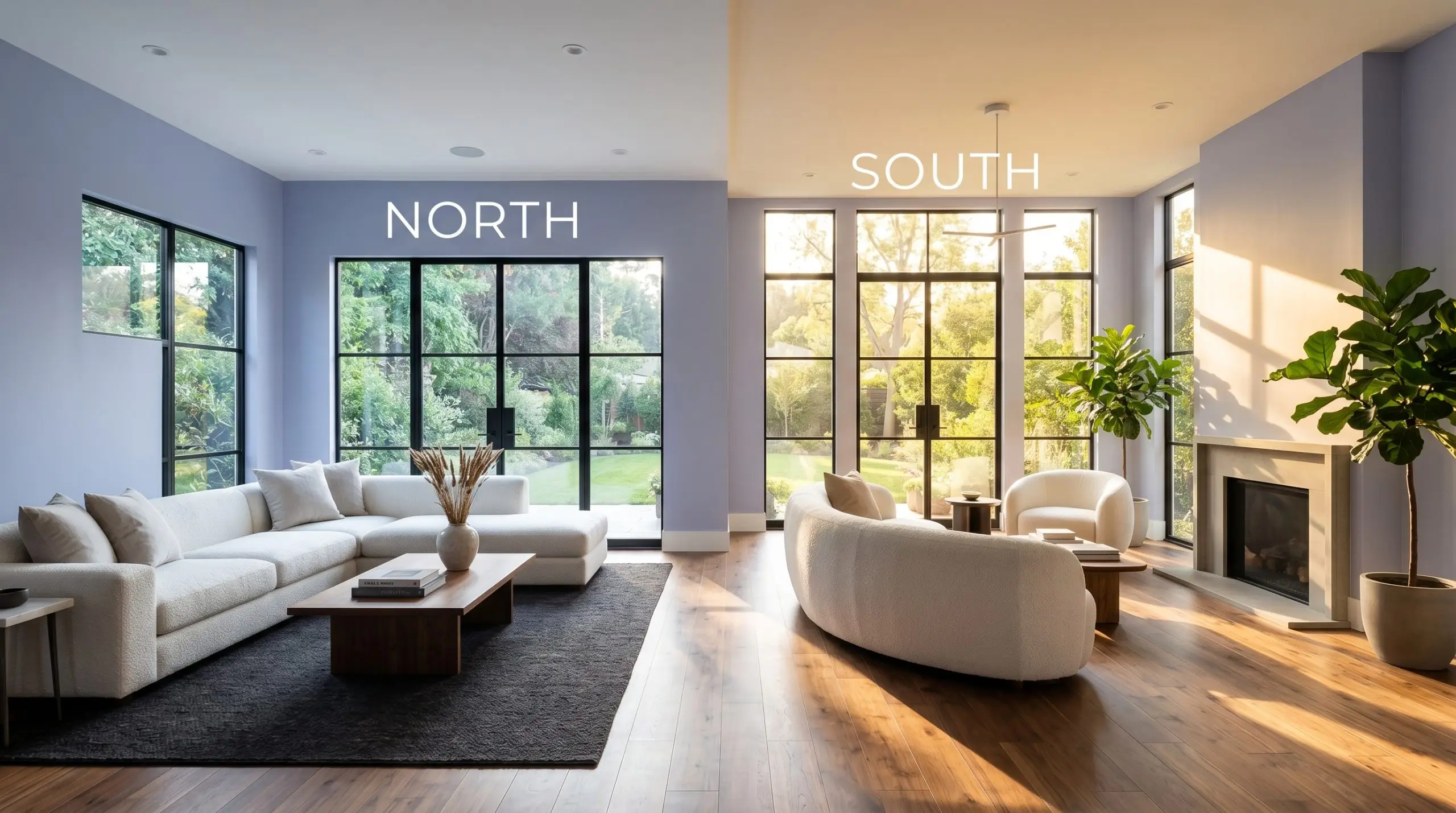
Navigating the Chameleon Factor: How Light Alters the Mood
Because PPG1167-4 relies on a complex tension between its blue base, its violet undertones, and its gray modifier, it reacts dynamically to the sun’s daily trajectory. You must anticipate how your room’s specific exposure will pull different characteristics forward.
Here is exactly how the shifting light will manipulate this dusty lilac throughout your home:
If you want to highlight the elegant gray-blue notes of this paint in the evening, stick to bulbs around 3500K to 4000K. If you use overly warm, amber-toned bulbs (2700K or lower), the yellow light will clash with the cool violet base, often muddying the finish and creating a dull, brownish-gray shadow in the corners of the room.
Hackrea Pro-Tip (The Bulb Temperature Rule)
Designing with PPG Lovely Lilac: Popular Applications
Because this muted periwinkle carries a mid-tone saturation, it acts as a remarkably versatile architectural material. The key to successfully deploying this shade is pairing it with the right tactile textures and contrasting materials to elevate its natural sophistication.
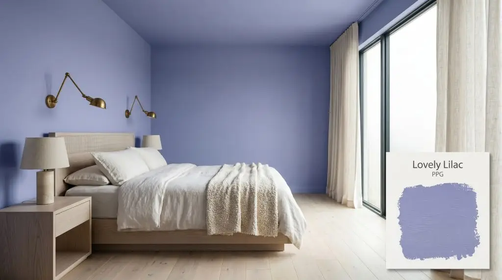
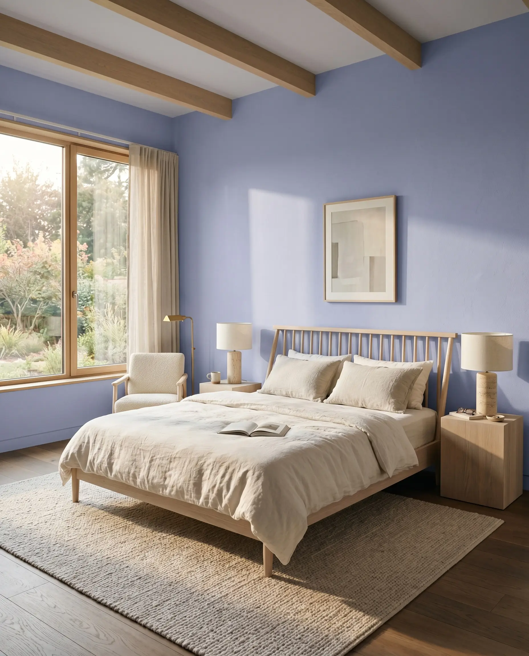
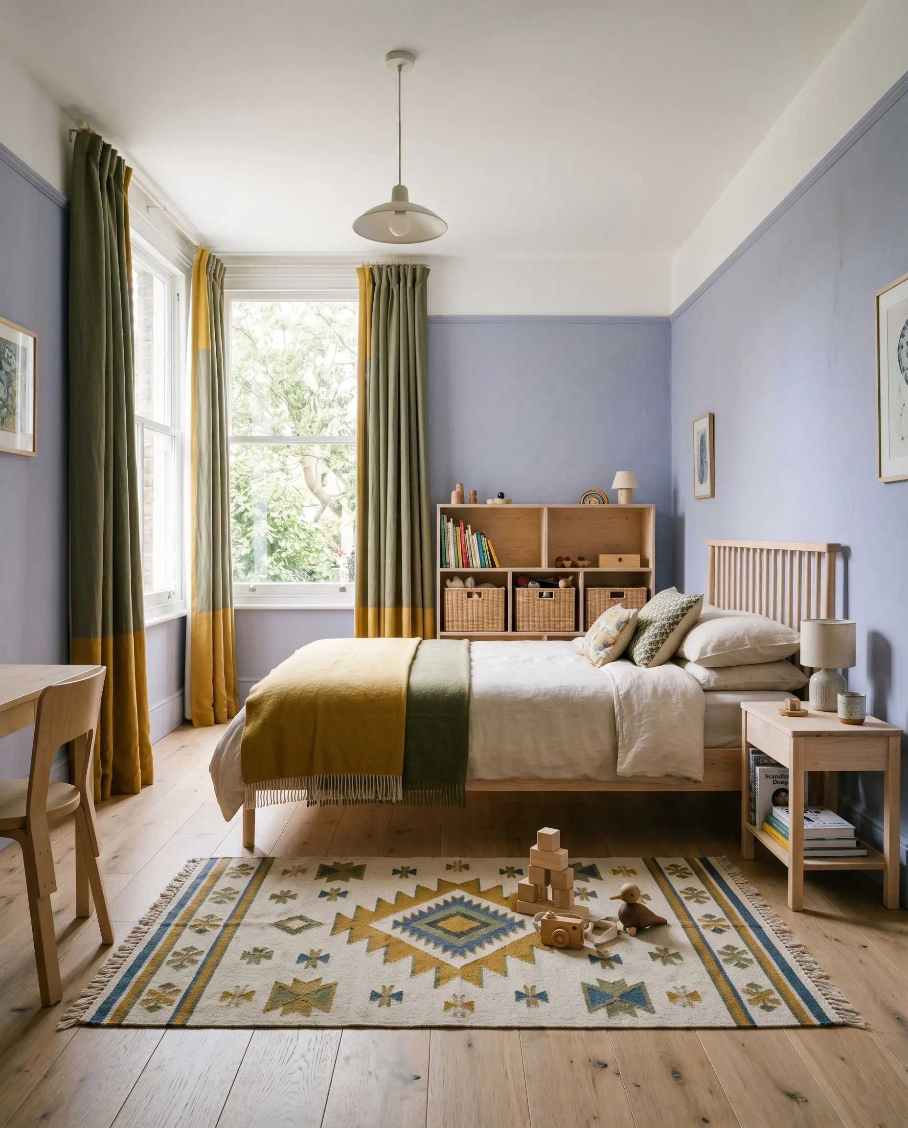
Restful Retreats and Main Bedrooms
While purple is historically associated with heavy, traditional romanticism, this specific shade excels when pushed into modern, minimalist territories. Using this color across all four walls of a primary bedroom establishes a deeply calming, restorative environment for busy professionals seeking a true visual escape at the end of the day.
To keep the aesthetic crisp and current, pair the walls with low-profile, bleached oak furniture and minimal plinth tables. Introduce tactile warmth through layered bedding—think washed linen sheets in warm off-white and a nubby bouclé throw draped across the end of a spindle bed.
To offset the cool temperature of the walls, introduce small moments of earthy contrast. A pair of travertine table lamps or unlacquered brass sconces will provide the perfect amount of organic warmth without disrupting the room’s serene atmosphere.
Hackrea Design Secret (Material Pairing)
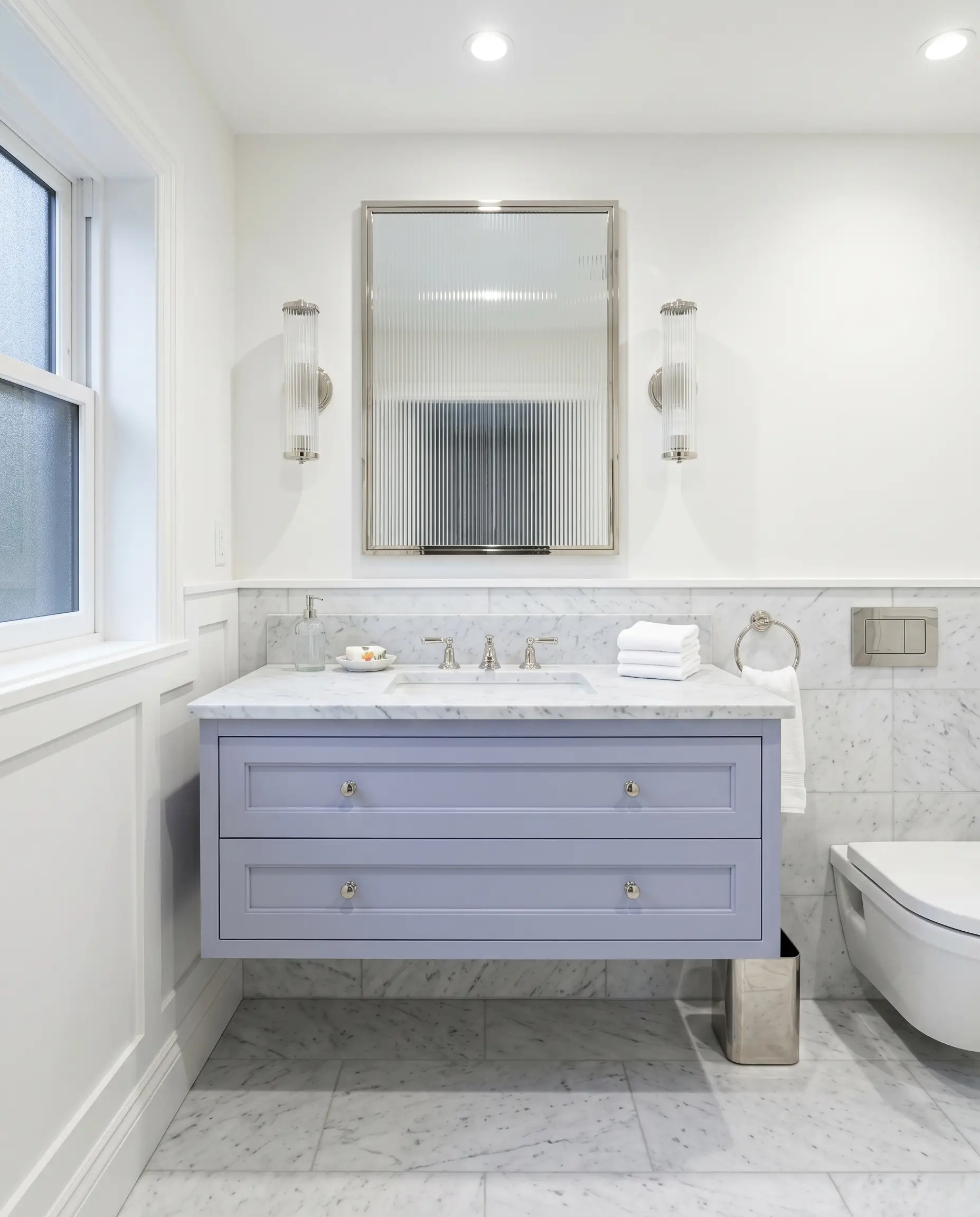
Vanities, Washrooms, and Powder Baths
Bathrooms offer a brilliant canvas for this chromatic profile, transforming standard utilitarian spaces into refreshing, spa-like environments. Instead of defaulting to the expected “vintage jewel box” trope often seen in powder rooms, use this color to create a sleek, transitional washroom.
Consider painting a floating vanity or shaker-style cabinets in this velvety hue against crisp, bright white walls. Elevate the installation by pairing the painted millwork with a honed Carrara marble countertop and polished nickel plumbing fixtures. The highly reflective metallic finishes will bounce light around the room, contrasting beautifully with the paint’s light-absorbing finish.
For a truly custom look, incorporate fluted glass sconces or a reeded mirror frame to add subtle architectural texture above the sink.
Sophisticated Youth Spaces
When designing a nursery or a child’s bedroom, the goal is often to create a space that feels playful but can easily transition as the child grows. This distant mountain hue completely bypasses the overly saccharine, “princess” pastel tropes, offering a gender-neutral foundation that feels both youthful and highly curated.
Lean into a Scandinavian-inspired aesthetic by pairing the painted walls with raw birch wood furniture and natural rattan storage baskets.
To inject energy into the room, use a contrasting color palette for the textiles and art. Accents of mustard yellow, burnt sienna, or even a soft olive green in the window treatments or a geometric vintage rug will make the room feel vibrant and intentional.
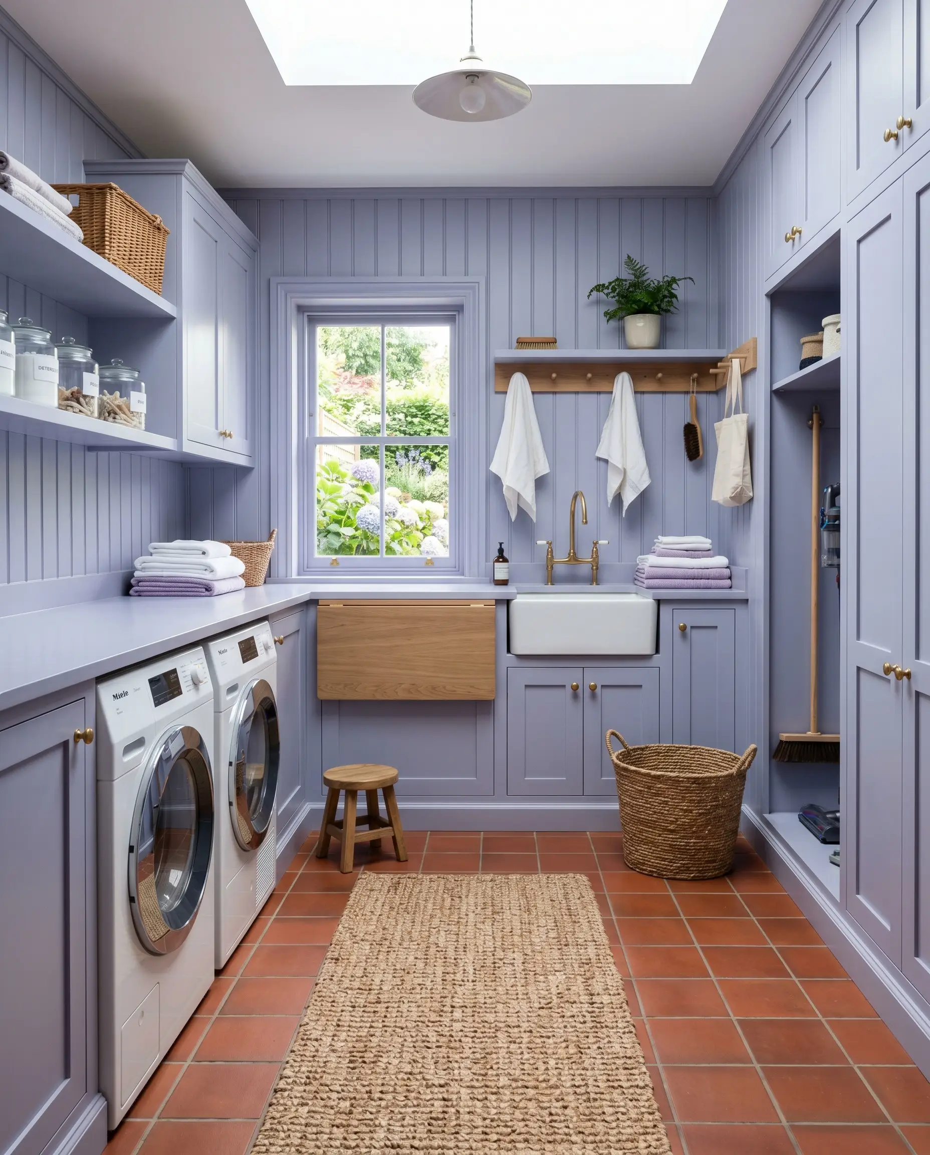
Utilitarian Workspaces
Laundry rooms are frequently overlooked, but they present an incredible opportunity for high-impact color transformations. Because we spend so much time doing chores in these spaces, injecting a saturated, tailored color can entirely change the daily experience.
Try a color-drenching approach by painting both the standard cabinetry and the beadboard paneling in this exact shade.
To balance the cool tones of the cabinetry, anchor the floor with rich, warm terracotta tiles or a durable basketweave runner. The juxtaposition between the earthy floor and the cool, tailored cabinets creates a highly bespoke, designer-grade workspace out of everyday materials.
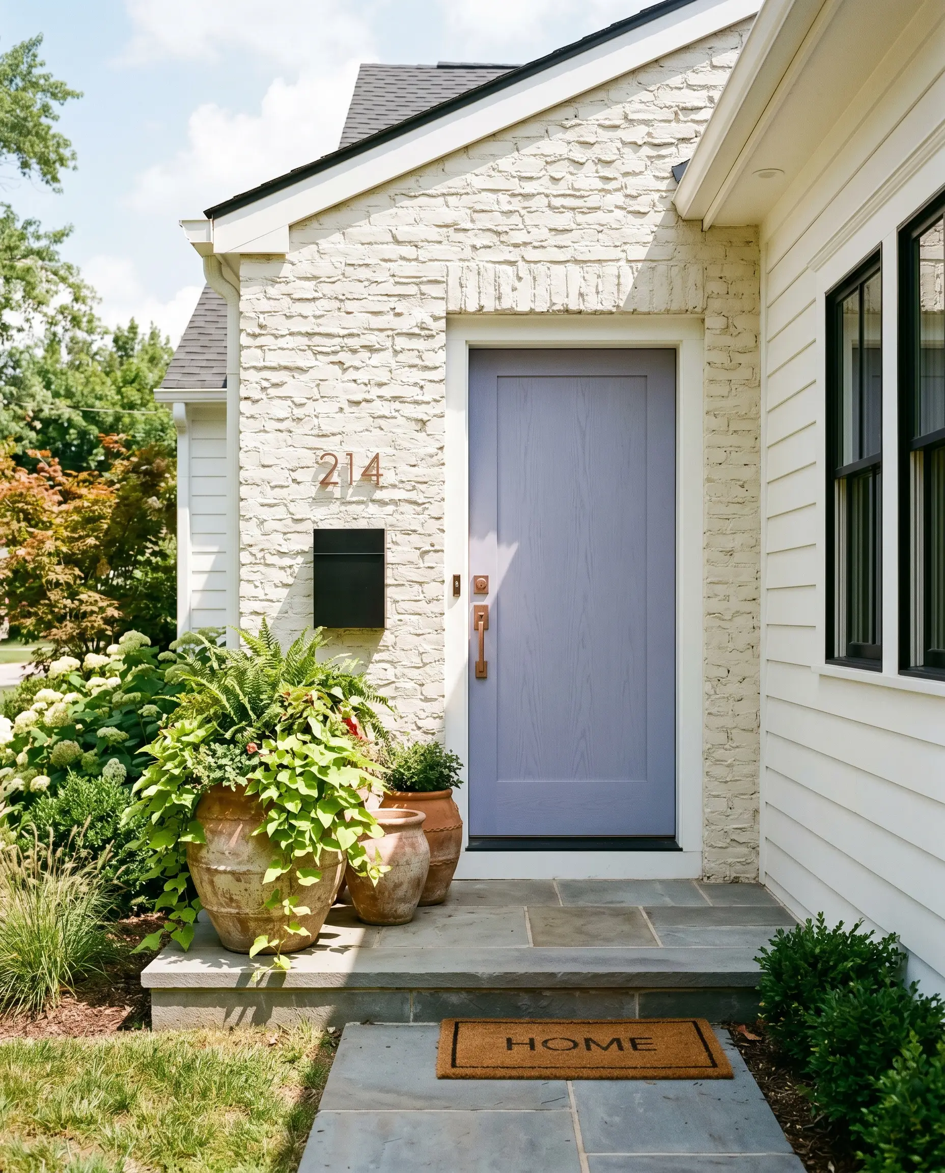
Facade Accents and Entryways
On an exterior facade, natural sunlight will significantly wash out the nuances of any mid-tone paint. When applied to a front door, this shade will likely read a touch lighter and slightly more gray than it does indoors, making it a fantastic, understated accent for the front of your home.
It pairs exceptionally well with classic white siding or highly textured, lime-washed brick.
Finish the entryway styling with brushed copper house numbers, a sleek blackened steel mailbox, and oversized terracotta planters filled with trailing pothos or structural greenery to create a welcoming, memorable first impression.
Curating a Palette with PPG Lovely Lilac
This specific muted purple thrives on intentional contrast, requiring crisp boundaries to hold its refined shape rather than bleeding softly into surrounding mid-tones. When placed next to the right finishes, its violet undertones step back, allowing the tailored blue notes to command the aesthetic and dictate the room’s energy.
Architectural Trim & Baseboards
To keep this color feeling current and intentional, frame it with highly reflective, stark whites that offer zero creamy undertones. Benjamin Moore Chantilly Lace OC-65 provides a razor-sharp boundary that instantly modernizes the soft periwinkle base.
For a similarly crisp effect, Sherwin-Williams High Reflective White SW 7757 or Farrow & Ball All White No. 2005 will bounce ample light back into the room. This stark contrast prevents the mid-tone walls from feeling visually dense, ensuring the room remains uplifting.
Hardware, Wood & Material Pairings
The secret to elevating this cool-toned paint lies in introducing materials that offer distinct tactile warmth and organic texture. Rich walnut furniture is an exceptional pairing, as the natural brown grain neutralizes the cool periwinkle cast without creating a jarring visual clash.
To break up the velvety, light-absorbing nature of the painted walls, introduce a glossy, undulating surface like white zellige tile in adjoining spaces or as a backsplash. The artisanal glaze reflects light beautifully, providing a dynamic counterpoint to the matte walls.
Finally, anchor the room with one aspirational metallic finish, such as unlacquered brass hardware or lighting fixtures. As the brass naturally patinas over time, its earthy, golden warmth engages in a stunning visual dialogue with the cool violet undertones.
Coordinating Color Harmonies
Designer Mood Boards
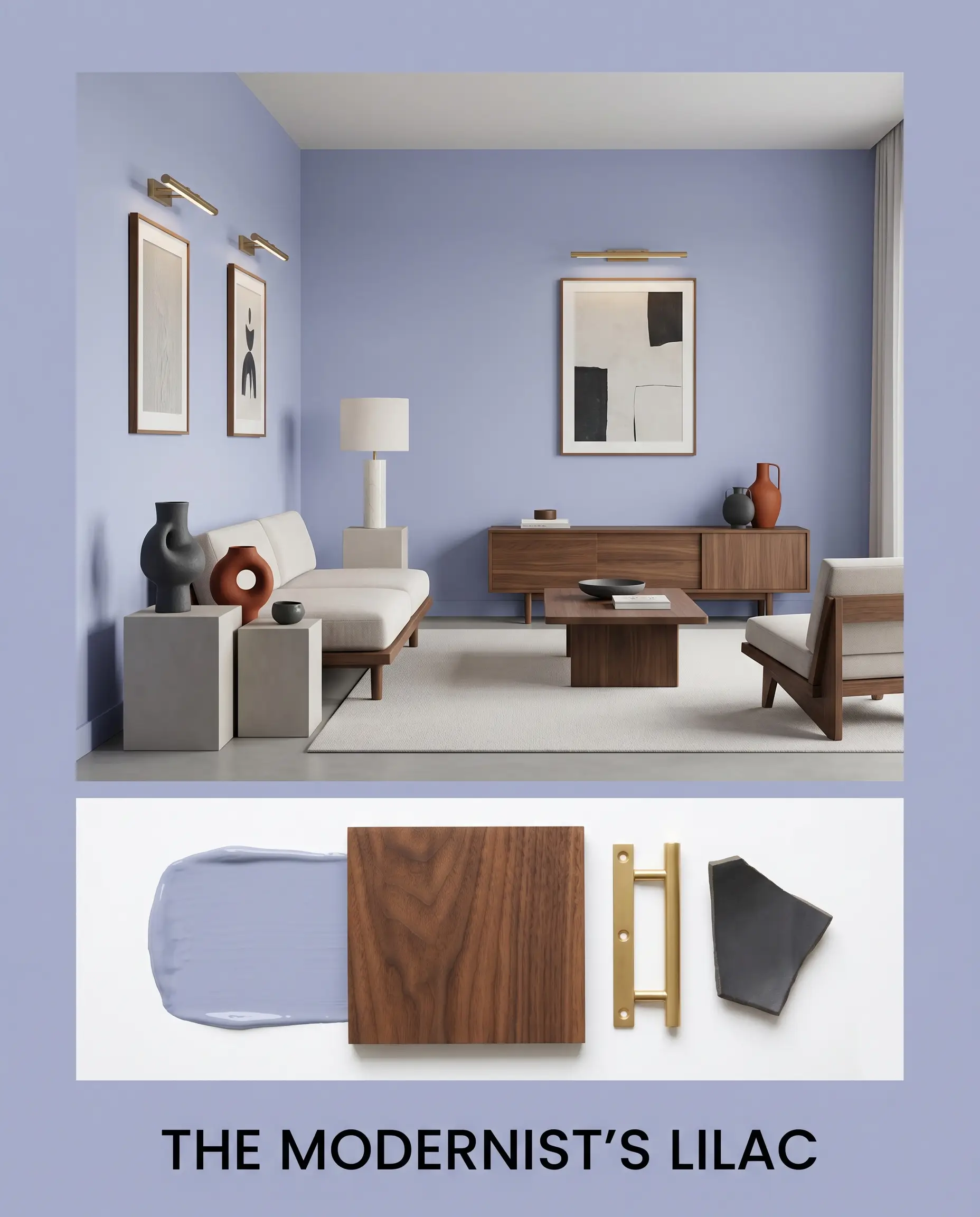
The Modernist’s Lilac This aesthetic uses the muted purple as a quiet, tailored backdrop for sleek, contemporary silhouettes. Imagine low-profile walnut furniture resting against the velvety walls, illuminated by the soft glow of unlacquered brass picture lights. Abstract ceramics in shades of charcoal and burnt sienna rest on minimal plinth tables, creating a highly intentional, gallery-like energy that feels both stimulating and deeply restorative.
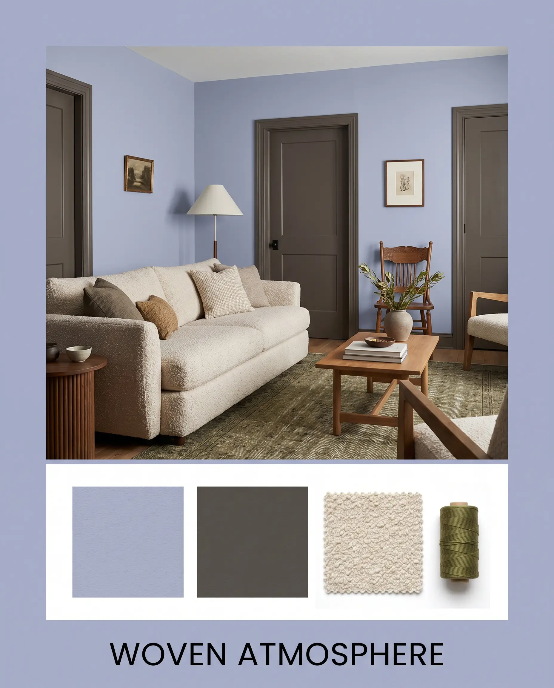
Woven Atmosphere Focusing entirely on tactile comfort, this palette softens the architectural presence of the paint through layered textiles. A nubby bouclé sofa or accent chair in warm off-white provides a cloud-like contrast to the structured walls. By painting the interior doors in Sherwin-Williams Urbane Bronze and introducing a vintage rug with subtle olive green threads, the space transforms into a grounded, intimately layered retreat.
PPG Lovely Lilac vs. The Competition
Sometimes a room’s specific lighting exposure demands a subtle shift in undertone or light reflectance value to achieve your desired aesthetic. If your space receives overwhelmingly cool northern light, or if your existing fixed finishes lean distinctly warm, you may need to pivot to a rival hue to ensure the design remains cohesive.
PPG Lovely Lilac PPG1167-4 vs. Sherwin-Williams Let it Rain SW 9152
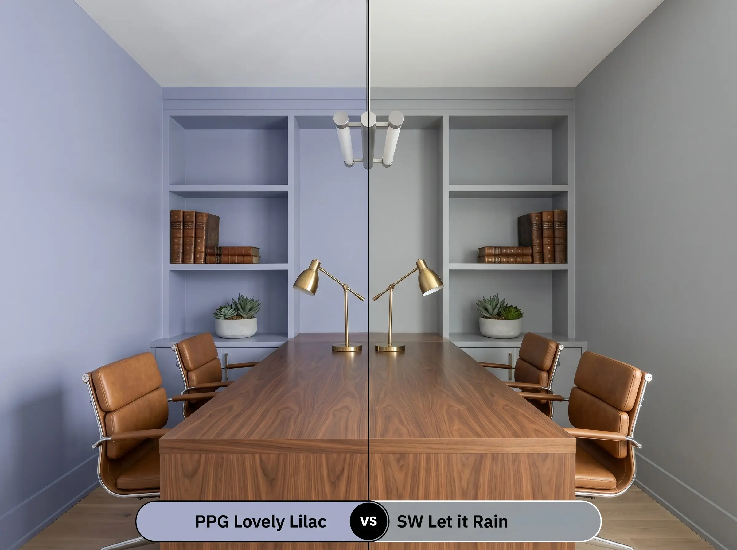
Let it Rain sits slightly lighter and leans much further into a traditional slate blue, stripping away the distinct violet influence. If you are worried about the walls reading too purple in a brightly lit southern exposure, SW 9152 offers a highly predictable, classic gray-blue aesthetic. However, it lacks the unique, atmospheric warmth that makes the PPG formulation so memorable.
PPG Lovely Lilac PPG1167-4 vs. Farrow & Ball Lulworth Blue No. 89
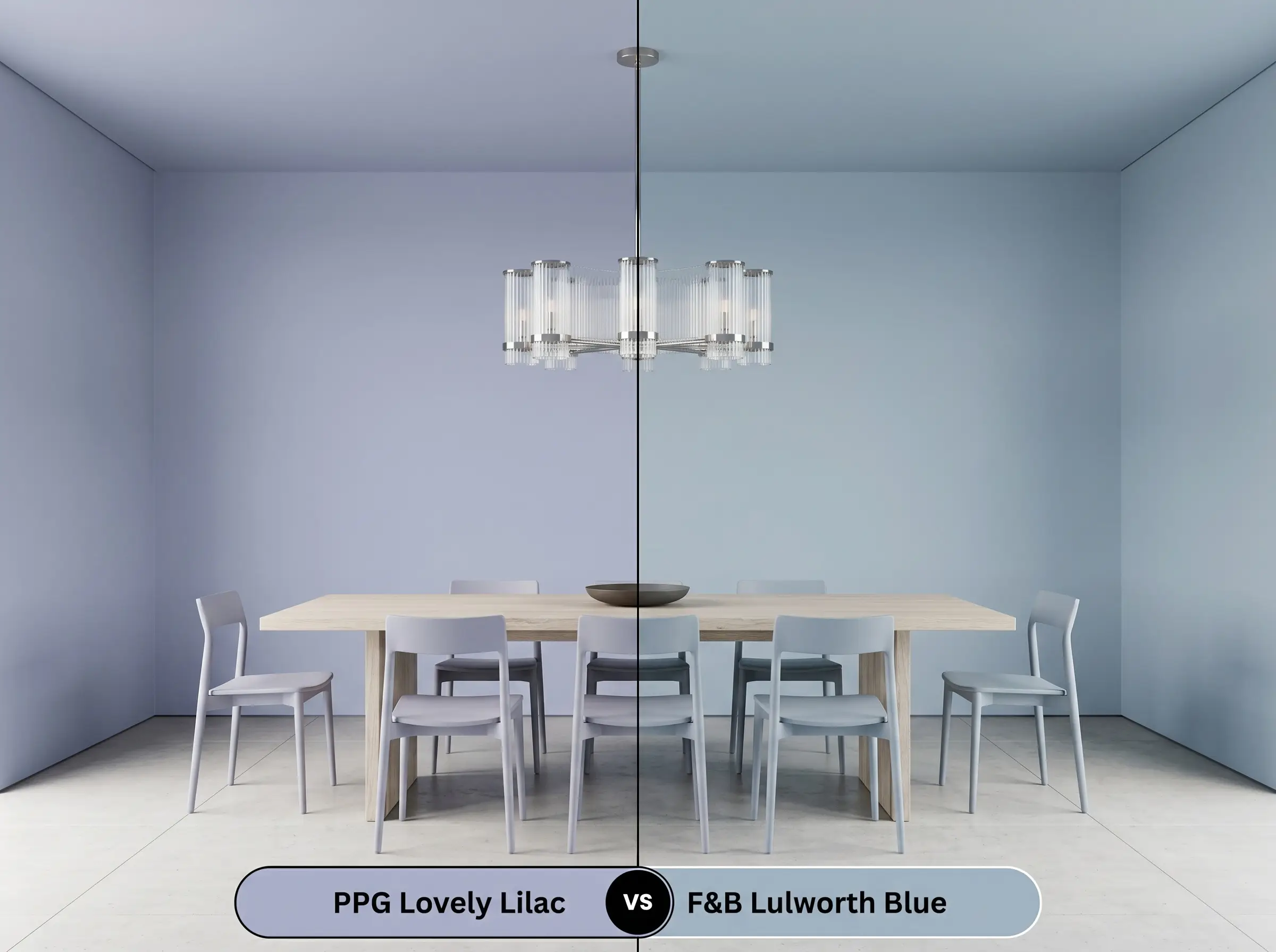
Lulworth Blue is a highly luminous, mid-tone blue that lacks the “distant mountain hue” muddiness of our primary color. It feels distinctly more coastal and fresh, bouncing significantly more light around the room. If your room is chronically starved for natural light, the Farrow & Ball shade will feel more uplifting, whereas the PPG shade will embrace a moodier, shadowed elegance.
Alternative Options for This Dusty Lilac
If you love the foundational color structure of this paint but need a slightly different light reflectance value for a shadowed hallway, exploring same-brand alternatives is a brilliant strategy.
Similar Colors in the PPG Catalog
Cross-Brand Matches
Executing Your PPG1167-4 Paint Project
Transitioning from curatorial theory to the physical reality of rolling paint onto a surface requires careful planning. The final aesthetic of this color is entirely dependent on selecting the correct sheen and application method for your specific architecture.
The Dynamic Sheen Guide
Primer Strategy & Coverage Tips
Because this shade sits comfortably at an LRV 44, a standard high-quality white or lightly tinted gray primer is required to ensure the violet undertones develop accurately. Skipping primer over previously dark or warm-toned walls will cause the new color to pull unexpectedly muddy.
Plan for two full coats applied with a high-density microfiber roller to achieve a truly professional, opaque finish. To avoid flashing—those visible, uneven roller marks that ruin a smooth wall—maintain a wet edge and avoid over-working the paint once it begins to dry.
Mid-tone colors with complex gray modifiers are notoriously difficult to touch up seamlessly months after the initial application. Always save a small amount of the original, well-mixed paint in an airtight container, and use the exact same application tool (a mini-roller, not a brush) to dab the repair, ensuring the texture matches the surrounding wall.
Hackrea Pro-Tip (The Touch-Up Warning)
Expert Answers to Common Color Questions
Under crisp 3000K LED lighting, the subtle gray modifiers in the paint recede, allowing the clean periwinkle notes to step forward. To maximize this refreshing energy in a windowless space, pair the walls with highly reflective surfaces like polished nickel fixtures and bright white countertops to bounce the artificial light effectively.
Because shaded exteriors lack the direct sunlight needed to activate the violet and blue nuances, the gray base will dominate the visual profile. To prevent the siding from looking dull or muddy, contrast the paint with ultra-crisp white trim and vibrant landscaping to keep the exterior feeling intentional and sharp.
Mid-tone brown woods like natural walnut or ash are the perfect neutralizers for this cool-toned paint. They introduce enough organic warmth to balance the room’s temperature without introducing the aggressive yellow or orange undertones found in oak or cherry, which would clash directly with the violet base.
With an LRV of 44, this shade has enough visual density that it will lower the perceived height of the ceiling if the room lacks natural light. However, if the nursery has tall ceilings and ample windows, painting the ceiling this muted purple creates a beautiful, canopy-like effect, especially when paired with crisp white walls.
The Final Verdict on PPG Lovely Lilac
PPG Lovely Lilac is a remarkably sophisticated architectural color that entirely redefines how we use purple in residential design. Its absolute best application is in spaces designed for decompression and quiet focus, such as primary bedrooms, tailored washrooms, or highly curated home offices. By leaning on its gray-modified periwinkle base, it effortlessly bridges the gap between modern minimalism and transitional elegance, providing a velvety, restorative backdrop that elevates the entire home.
However, this specific chromatic profile requires strict intentionality to succeed. This paint will actively clash with heavily yellow-toned beiges, overly warm amber lighting, and red-leaning woods like traditional cherry or mahogany. When placed next to these intensely warm elements, the violet undertones fight against the orange-reds, causing the paint to lose its tailored crispness and instead read as a bruised, muddy gray. To ensure this color remains the sophisticated focal point you desire, surround it with clean whites, earthy greens, or crisp, cool-toned neutrals that respect its complex DNA.