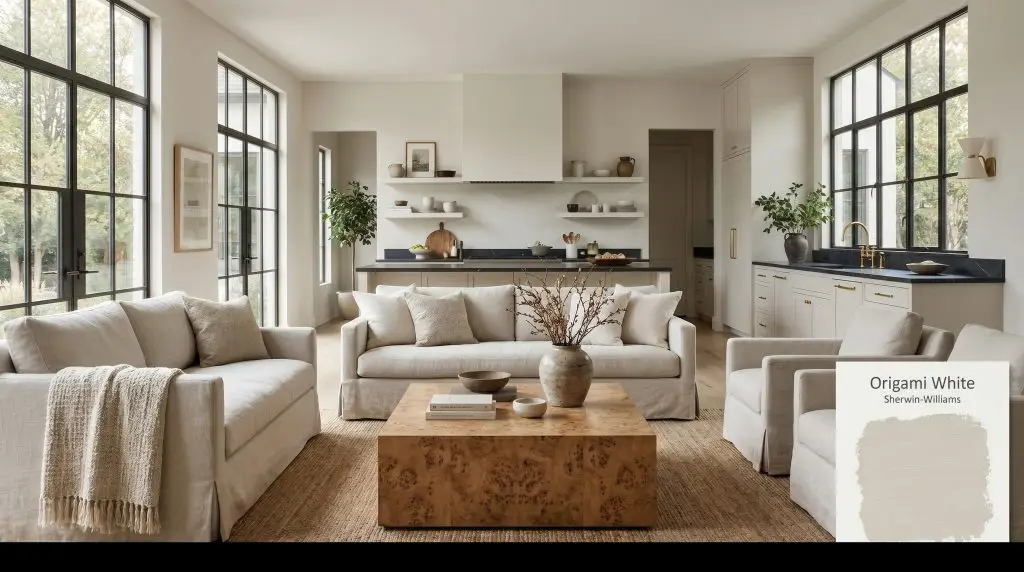
Origami White SW 7636
Sherwin-WilliamsSherwin-Williams Origami White (SW 7636) is a delicate, neutral off-white with an LRV of 76. Known for its subtle cool violet undertones, it behaves as a sophisticated greige that resists turning overly yellow, making it highly versatile for both bright and shaded spaces.
Paint Technical Profile
| Color ID / SKU | SW 7636 |
| HEX Code | #E5E2DA |
| Light Reflectance (LRV) | 76 |
| Use | Interior, Exterior |
| Best Exposures | South-Facing, West-Facing |
| Best For | Living Rooms, Exteriors, Kitchen Cabinets |
Sherwin-Williams Origami White SW 7636: Unlocking the Soft Elegance of a Violet-Tinged Neutral
Finding the right neutral often feels like an endless cycle of painting swatches, only to watch them turn unexpectedly yellow in the morning or sterile by dusk. Homeowners frequently want a soft, inviting backdrop that retains a crisp, modern edge without feeling like a clinical hospital corridor. This is exactly where a highly nuanced shade like Sherwin-Williams Origami White SW 7636 proves its worth.
Just as a piece of folded paper creates subtle, shifting shadows, this complex off-white neutral plays beautifully with the light in your home. It offers a gentle, welcoming foundation that effortlessly adapts to changing sunbursts and evening shadows. By sitting firmly in the greige spectrum, it bridges the difficult gap between warm comfort and cool sophistication.
Whether you are updating a mid-century fixer-upper or softening a new suburban build, this color provides a highly intentional layer of design. It allows your curated furnishings and natural materials to take center stage. Let’s break down the hidden pigments and lighting behaviors that make SW 7636 such a reliable architectural finish.
The Core DNA: Undertones & LRV
The most common question homeowners ask before committing to a main-level neutral is straightforward: Is this paint warm or cool? Origami White is a remarkably balanced neutral, but it ultimately leans just slightly cool due to its hidden pigment structure. It provides a soft, welcoming atmosphere without ever tipping into a traditional, golden warmth.
To truly understand how this color will behave on your walls, we have to look at how its chromatic profile is built:
With a light reflectance value (LRV) of 76, this shade absorbs just enough ambient lighting to register as a distinct color against pure white trim. It bounces plenty of light around the room to keep the environment feeling expansive and airy. However, it retains enough pigment to create beautiful, soft shadows in the corners of your room, completely avoiding the harsh, washed-out effect of brighter whites.
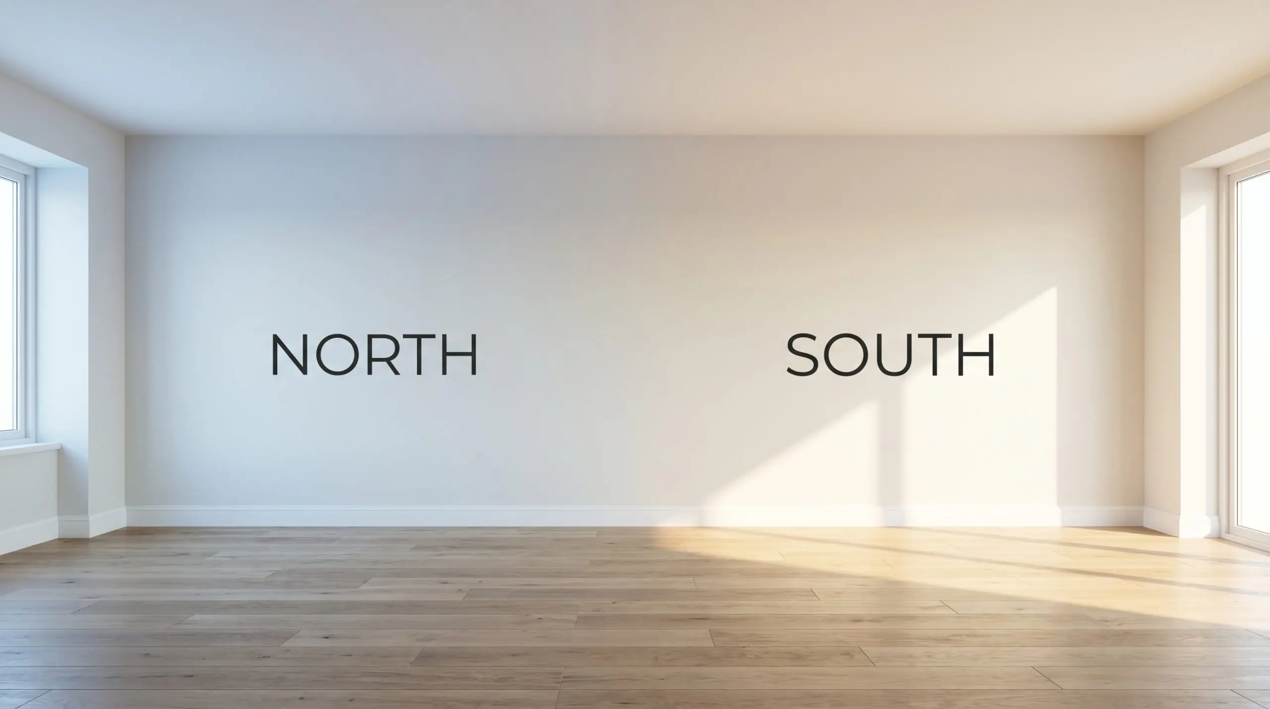
How Lighting Alters the Origami White Experience
Because of its delicate balance between beige, gray, and violet, this paint is highly reactive to the specific light filtering through your windows. Its color temperature shift is noticeable throughout the day, requiring you to plan your furnishings accordingly.
Here is exactly how you can expect the color to shift in your home:
If you are using this color in a room with limited natural windows, pay close attention to your lightbulbs. Upgrading standard builder-grade bulbs to a tailored 3000K LED provides a beautiful, neutral wash of light that keeps the violet undertones from feeling too icy while preventing the beige from turning muddy.
Hackrea Pro-Tip (The Bulb Rule)
Translating the Color: Popular Applications
Understanding the underlying pigments is only half the battle; the real magic happens when you apply those insights to your actual living spaces. Because this shade strikes such a delicate balance between warm and cool, it serves as an incredibly versatile foundation for a wide variety of materials and textures.
Below, we explore how to utilize this complex neutral across different areas of your home, ensuring the final result feels intentional, curated, and effortlessly stylish.
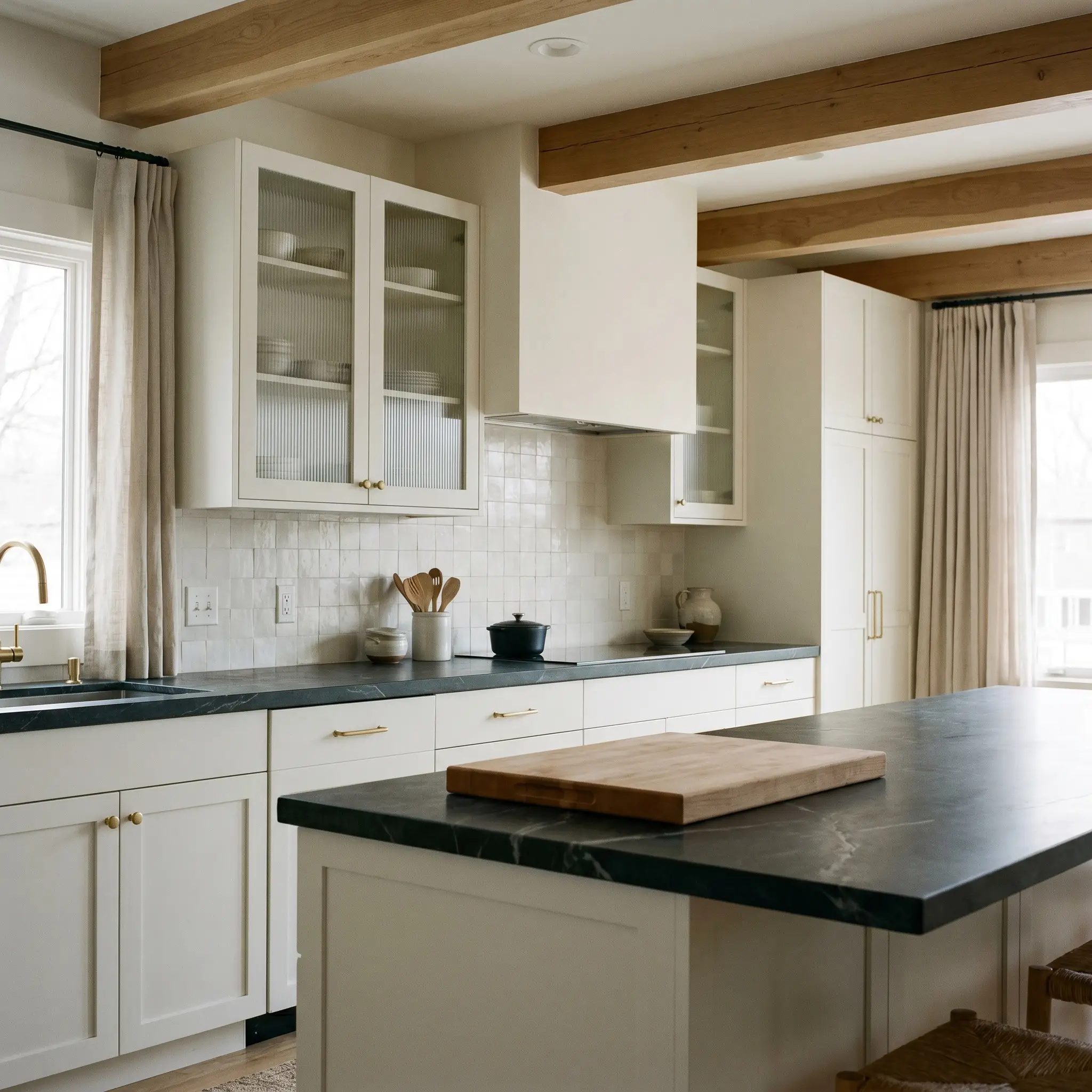
Custom Kitchen Cabinetry & Millwork
When applied to kitchen cabinets, Origami White offers a brilliant alternative to stark white or predictable gray. It pairs beautifully with an Organic Modern or Japandi aesthetic, where the goal is to create a serene, uncluttered environment for a busy household. To maximize the impact of this subtle greige, pair it with matte, tactile surfaces.
Consider topping your lower cabinets with honed soapstone counters; the dark, organic veining provides a stunning contrast that makes the violet-tinged cabinets feel incredibly high-end. Introduce warmth through unlacquered brass hardware, which will naturally patina over time and beautifully offset the cooler gray notes in the paint. If you have upper cabinets, swapping standard doors for fluted glass can break up the visual weight and bounce more light across the muted finish.
For the backsplash, a tumbled limestone or a subtle zellige tile will root the space in natural texture. The slight color variation in handmade tiles harmonizes perfectly with the shifting nature of the cabinet color throughout the day.
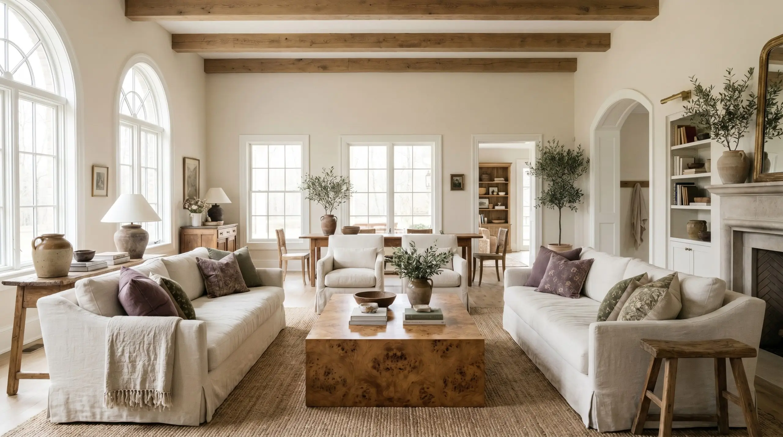
Flowing Open-Concept Living Spaces
In expansive, open-concept living areas, a color with an LRV of 76 is ideal because it carries enough pigment to unify large stretches of drywall without feeling cavernous. This is the perfect environment to execute a Belgian Farmhouse or Transitional style. The key is to layer varying shades of neutrals and rich textures to keep the room from falling flat.
Anchor the center of the room with a large, monolithic burled wood coffee table; the rich, swirling wood tones will instantly warm up the cooler gray base of the walls. Surround it with slipcovered sofas in washed linen, adding layers of slub cotton throws and vintage patterned pillows in muted terracotta or dusty plum. These subtle, earthy red and purple accents will beautifully acknowledge the hidden violet undertone in the paint.
In large open spaces, contrast is your best friend. Pairing these walls with a crisp, highly reflective white trim (like Benjamin Moore Chantilly Lace) will frame the room beautifully, forcing the subtle greige of the walls to step forward and display its true depth.
Hackrea Design Secret (The Trim Strategy)
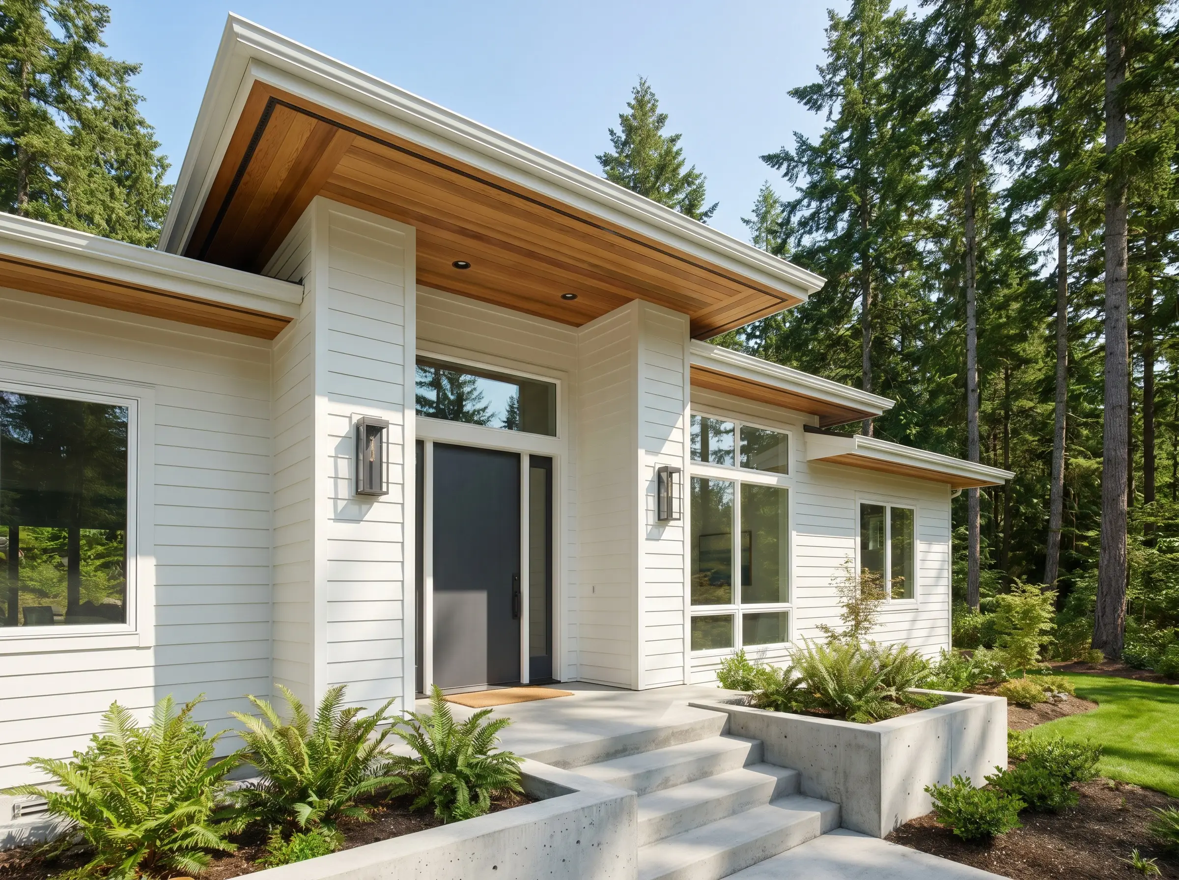
Refreshing Exterior Cladding and Brickwork
Using this shade as an exterior cladding color is a fantastic way to modernize a suburban facade or highlight the clean lines of a Pacific Northwest Contemporary home. However, you must account for the power of direct sunlight. Full exterior sun will easily wash out an LRV of 76, making the paint appear significantly lighter and closer to a true white than it does on an interior swatch.
To secure a sophisticated exterior palette, you need to introduce strong, architectural contrasts. Pair the soft, off-white siding with rich, natural cedar accents around the entryway or under the eaves to inject organic warmth. For your fixtures, opt for oversized, blackened steel sconces and a bold charcoal front door. This sharp, dark contrast prevents the exterior from looking washed out and highlights the crisp, modern edge of the siding.
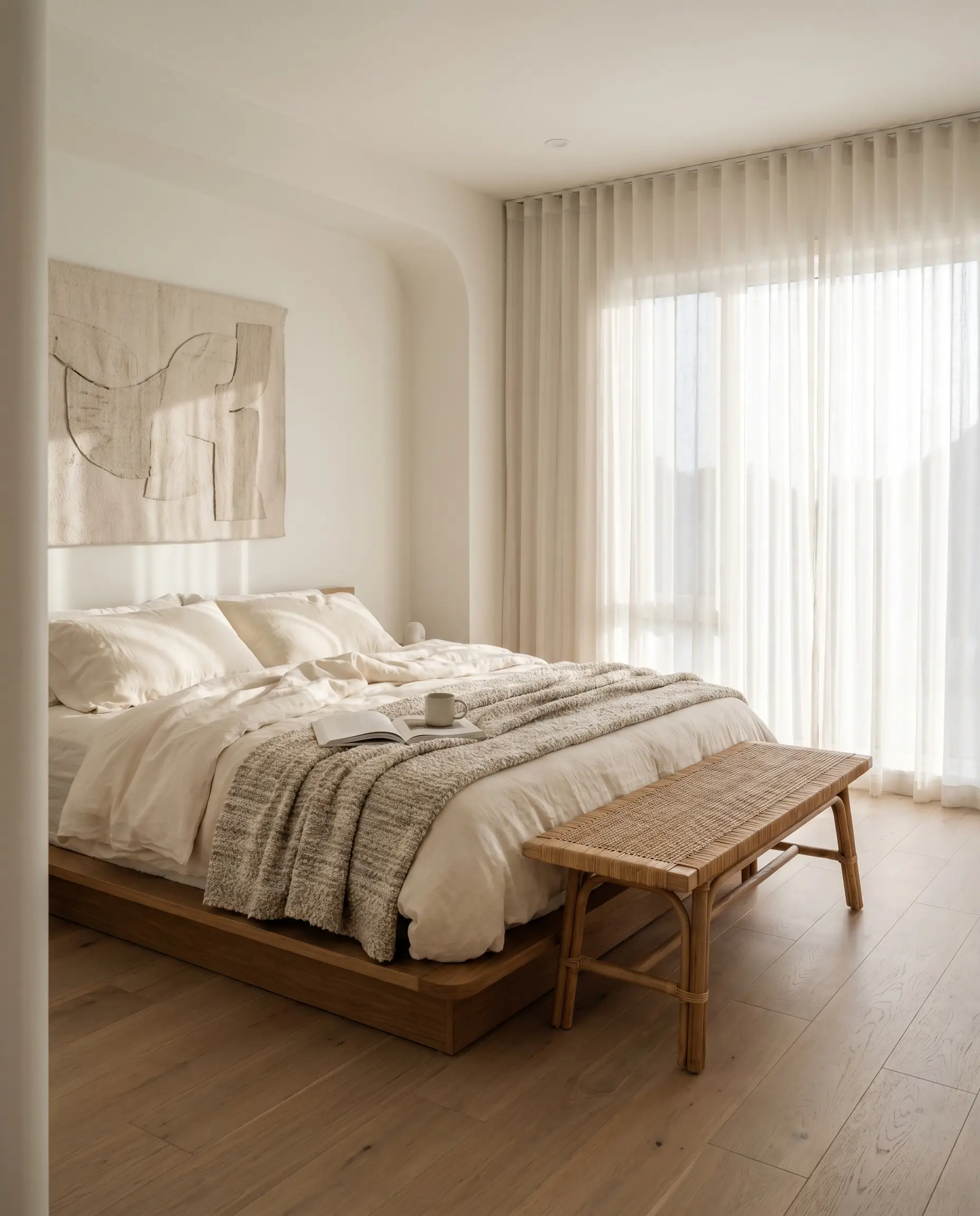
Restful Primary Bedroom Retreats
A primary bedroom should be a restorative sanctuary, and the soft, muted quality of this paint makes it an exceptional choice for Soft Minimalism. Because the cool violet undertones naturally recede, the walls will feel expansive and calming, especially in the gentle morning light.
Focus on low-profile furniture, such as a platform bed dressed in layers of raw silk and heavy bouclé. If your bedroom features large windows, be mindful of the glass type; low-E window coatings often cast a slightly green or blue tint into the room. This artificial tint can clash with the violet base of the paint, creating a muddy shadow. To counteract this, frame the windows with sheer voile curtains that diffuse the incoming light, and incorporate warm, woven accents like a vintage rug or a rattan bench at the foot of the bed to maintain a cozy balance.
Styling Sherwin-Williams Origami White: Pairings & Palettes
Understanding how this pigment behaves in relation to other materials is the key to a cohesive room. Because of its subtle violet undertone, it thrives when placed next to richer, more saturated elements that draw out its soft gray qualities. It requires intentional contrast to hold its shape, otherwise, it risks washing out and losing its sophisticated edge.
Crisp Boundaries: Selecting the Right Trim
This off-white neutral requires a stark, clean edge to prevent the walls from looking like unfinished drywall. Pairing it with Sherwin-Williams High Reflective White SW 7757 strips away all creamy interference, creating a sharp boundary that forces the greige to reveal its true depth.
Benjamin Moore Chantilly Lace OC-65 performs similarly, offering an icy, crisp contrast that elevates the entire room’s color structure. By utilizing these brilliant whites on your baseboards and crown molding, you establish a tailored, high-end architectural finish.
Tactile Elements: Hardware and Finishes
Polished nickel hardware acts as a brilliant mirror, bouncing ambient lighting around the room while seamlessly echoing the cooler gray notes of the paint. It provides a crisp, metallic flash that instantly elevates cabinetry or interior doors.
To introduce essential warmth without triggering an unwanted yellow clash, integrate wide-plank riven oak flooring or floating shelves. The natural, muted grain of the wood softens the room and harmonizes perfectly with the beige elements hidden in the paint.
For your hard surfaces, honed travertine adds a beautiful, porous texture that absorbs light, grounding the airy lightness of the walls. Finally, drape your upholstery in heavy canvas to provide a rugged, matte counterpoint that makes the smooth painted surfaces feel highly intentional and refined.
Building the Palette: Secondary Shades
Curated Aesthetics: Bringing the Palette to Life
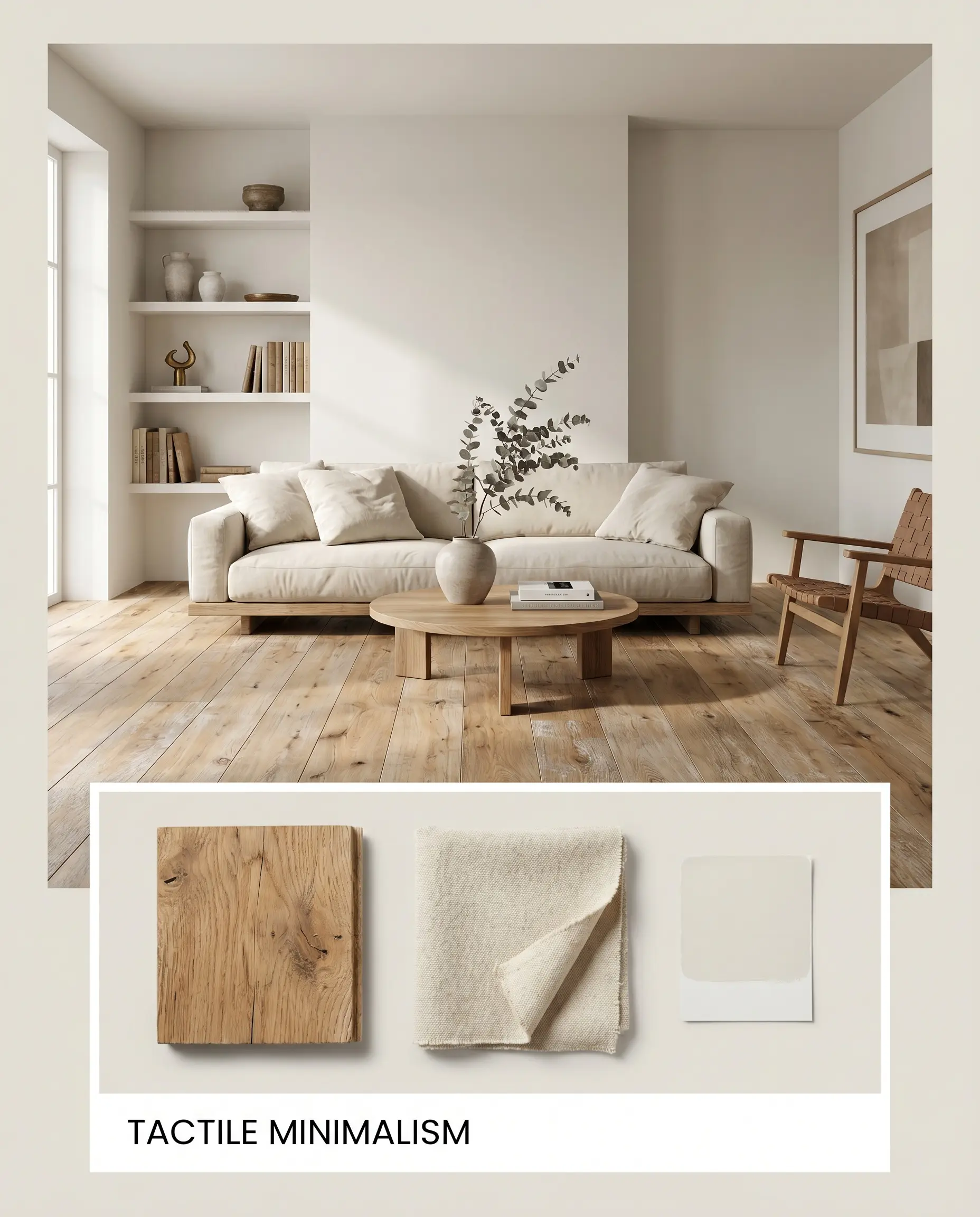
Tactile Minimalism This aesthetic uses the paint as a quiet, unassuming backdrop for raw, textural elements. By layering wide-plank riven oak and unbleached heavy canvas textiles, the environment feels deeply organic and grounded. The soft greige walls absorb the natural light beautifully, softening the transition between the warm wood grains and the cool, minimalist architecture.
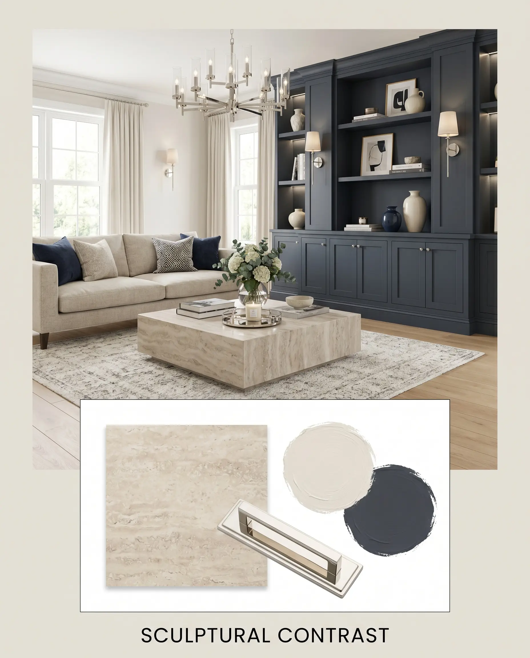
Sculptural Contrast For a more dramatic, Transitional approach, we use Benjamin Moore Hale Navy HC-154 on custom built-ins or interior doors to create a striking focal point. This sharp, dark contrast immediately lifts the perceived brightness of the main walls. Pair these tones with gleaming polished nickel light fixtures and a honed travertine coffee table to establish a highly sophisticated, curated energy.
Evaluating the Alternatives: Comparative Color Theory
Sometimes, the specific lighting in your home or the direction of your windows demands a slight pivot. If your space faces north and the violet undertone feels too chilly, or if your exterior landscaping washes out an LRV of 76, you will need to adjust your strategy. Let’s look at how this shade holds up against its closest competitors.
Sherwin-Williams Origami White vs. Sherwin-Williams Pearly White
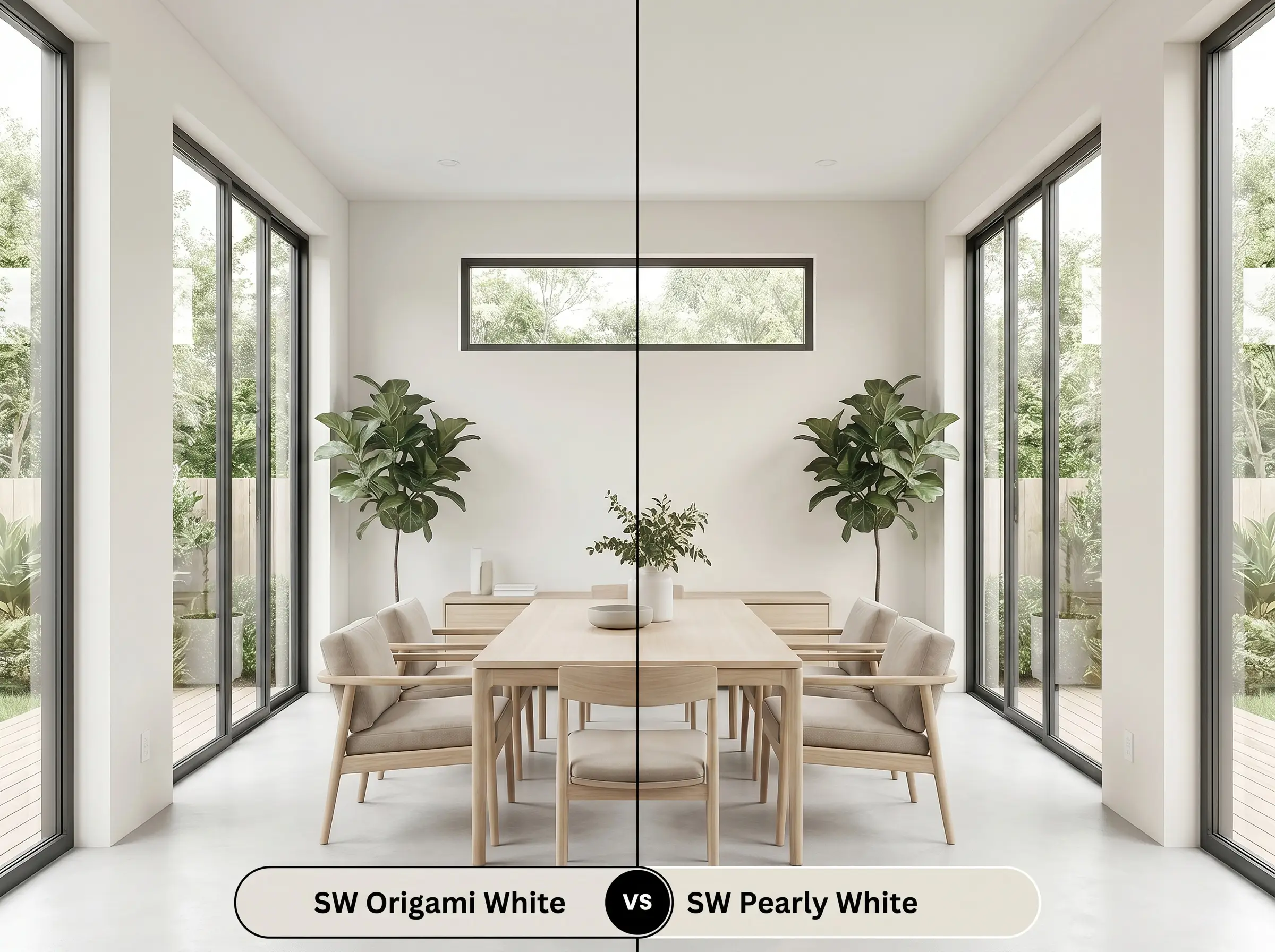
Pearly White SW 7009 drops the violet in favor of a subtle green-gray undertone. If your room is surrounded by lush outdoor foliage, Pearly White will harmonize with that green light, whereas our primary greige might clash and feel slightly purple. Choose Pearly White when you need a crisper, more traditional off-white that resists turning icy in the shadows.
Sherwin-Williams Origami White vs. Sherwin-Williams Shoji White
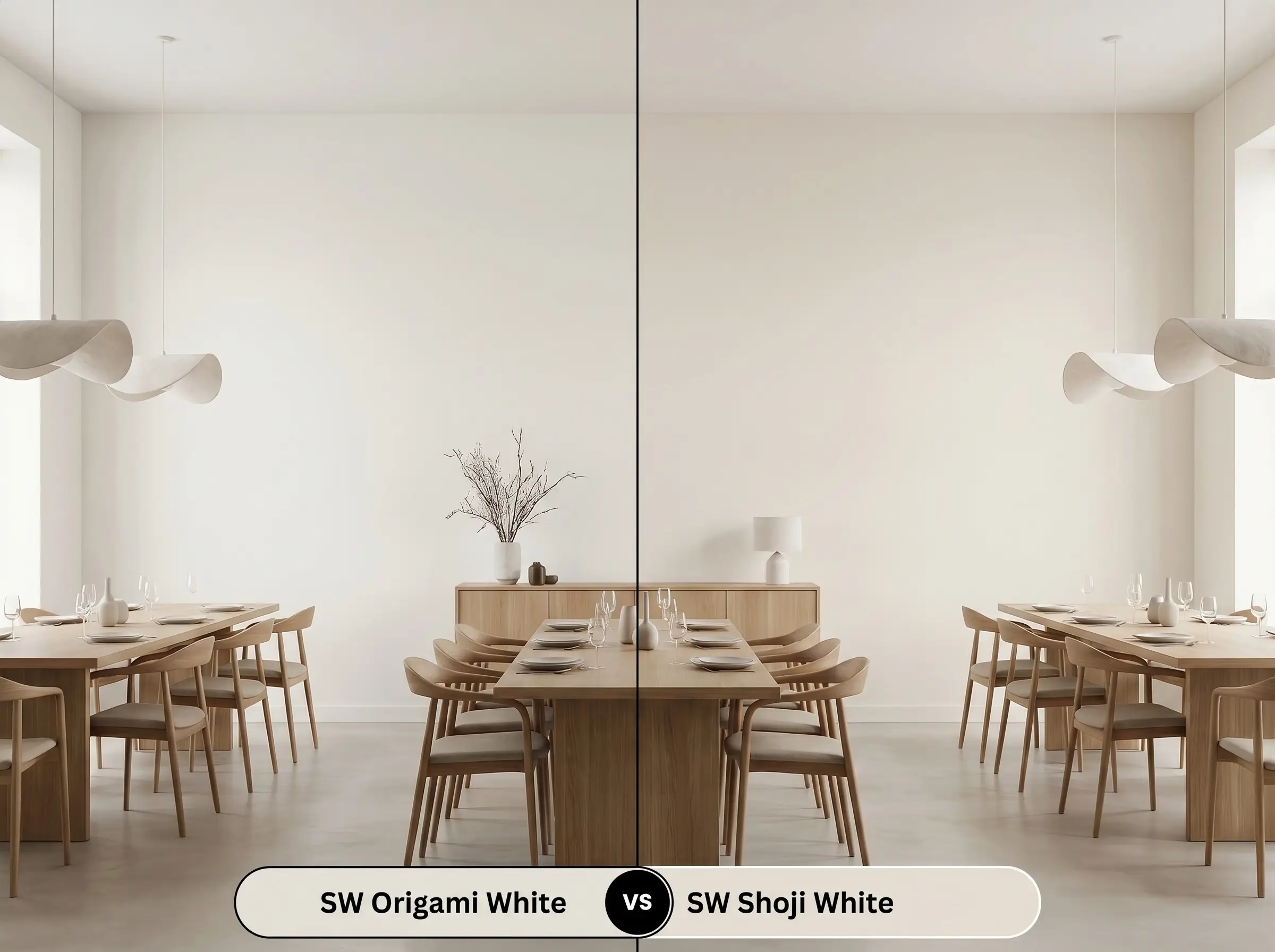
Shoji White SW 7042 is noticeably warmer and creamier, leaning closer to a true beige. If your space lacks natural light and feels overly stark, Shoji White injects immediate warmth into the shadows. However, if you want a modern, tailored look, the cooler color structure of Origami White remains the superior choice.
Sherwin-Williams Origami White vs. Benjamin Moore White Dove
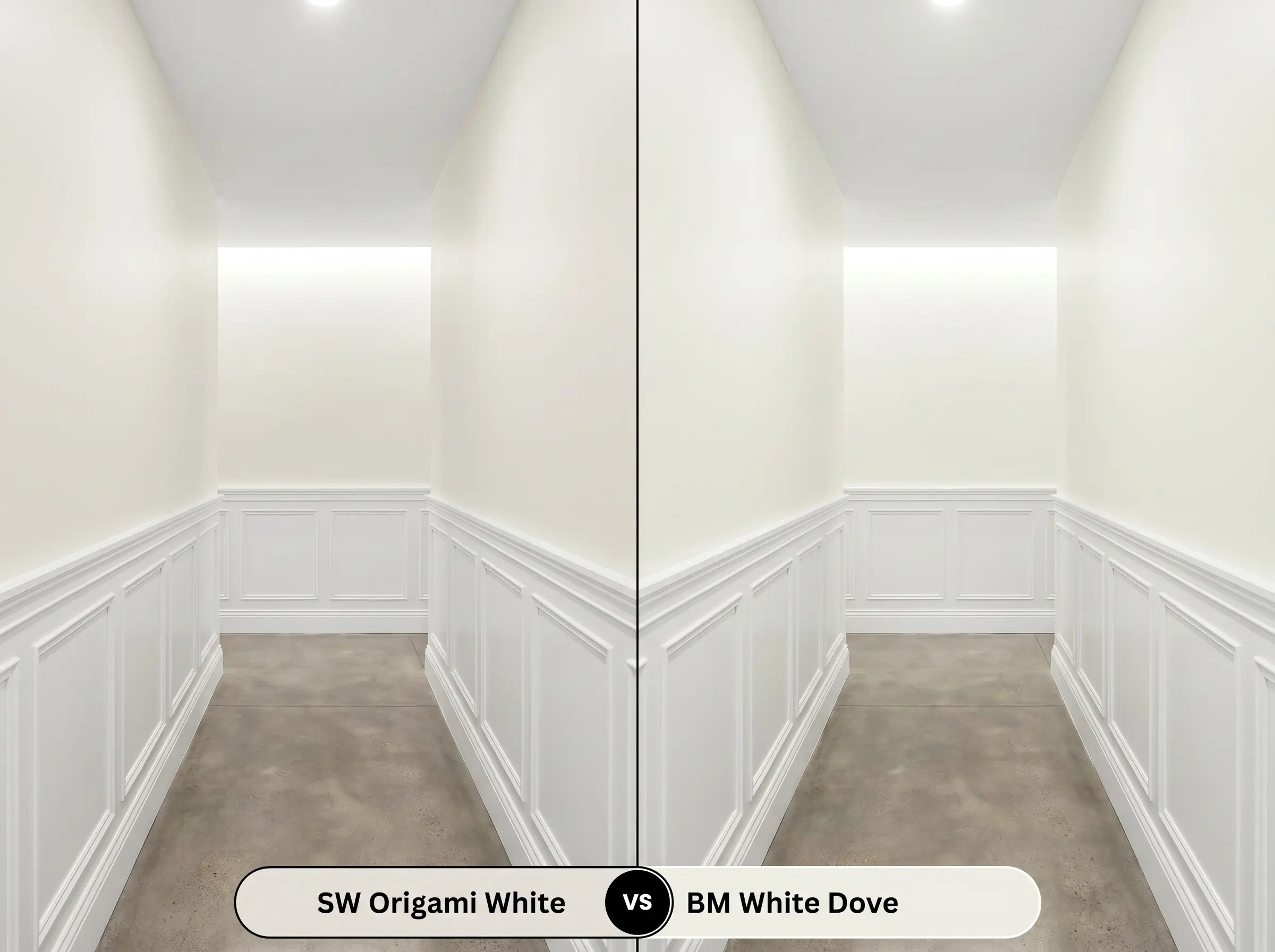
White Dove OC-17 is a legendary, luminous white with a touch of yellow-gray, boasting a significantly higher light reflectance value. If you are painting a dark, narrow hallway, White Dove will bounce far more light and feel considerably brighter. Conversely, if you want your walls to have a distinct, pigmented identity against your trim, stick with the deeper greige.
Exploring Sherwin-Williams Origami White Alternatives
If you love the general profile of this shade but need a minor tweak in depth or brand availability, these matches provide excellent starting points.
Staying Within the Brand
Color Matching Across Manufacturers
Application Guide: Sheens, Primers, and Coverage
Moving from design theory to the practical reality of painting requires careful planning. The way this pigment cures on the wall depends entirely on your preparation and sheen selection.
The Dynamic Sheen Strategy
Priming and Professional Coverage
Because this shade sits in the mid-70s for its LRV, it lacks the deep opacity needed to cover dark, existing wall colors in a single pass. You must start with a high-quality, pure white acrylic primer to block any old warmth from bleeding through and altering the final tint. Plan for two full coats applied with a high-quality microfiber roller to ensure an even, professional finish.
When touching up this specific off-white neutral, always use the original application method. If you roll the walls but try to touch up a scuff with a brush, the differing textures will catch the light differently, creating a visible, shiny patch known as “flashing.”
Hackrea Pro-Tip (The Flashing Warning)
Common Queries and Troubleshooting
Understanding how this specific color reacts to unique architectural challenges will save you time and frustration.
Because heavily textured stucco creates deep, natural shadows, this paint will appear significantly darker and grayer than it does on a smooth HardiePlank board. The smooth surface of HardiePlank allows the sun to wash out the color evenly, making it read much closer to a true white.
Rather than a direct clash, the orange tones in honey oak will actually amplify the cool violet notes in this paint through the rules of complementary colors. If your hallway lacks natural light to balance this interaction, the walls may unexpectedly lean slightly purple.
Yes, low-E glass often carries a faint green or blue tint that physically alters the light entering your room. When this tinted afternoon sun hits the paint, it highlights the cool gray and violet base, making the room feel noticeably crisper and less beige.
Using this shade on the ceiling is a brilliant strategy for rooms flooded with harsh 4000K+ LED lighting. The subtle beige warmth in the paint’s DNA absorbs and softens the icy glare of the bulbs, creating a much more inviting overhead glow.
The Final Verdict on Sherwin-Williams Origami White
Sherwin-Williams Origami White SW 7636 is a highly sophisticated, chameleon-like neutral that thrives in spaces designed for layered textures and intentional contrast. It is the perfect choice for homeowners who want to move away from sterile, bright whites but are not quite ready to commit to a dark, moody palette. Its delicate balance of beige, gray, and violet creates a calming, expansive energy that beautifully elevates Organic Modern, Wabi-Sabi, and Transitional design styles.
While this paint is incredibly versatile, it is not the right choice for homes dominated by Tuscan-style finishes, heavily yellowed cherry cabinets, or rich terracotta tile floors. When placed directly against dominant orange or yellow-red hard finishes, the cool violet undertone in the paint will visually separate from the room, making the walls look uncomfortably icy and disconnected from your architecture. If your home features these very warm, traditional elements, you will find much more success pivoting to a creamier, beige-driven neutral that can harmonize with your existing materials.
Clash Warning (The Undertone Trap)
Closest Cross-Brand Equivalents
The absolute closest scientific color matches for Origami White across top paint brands.