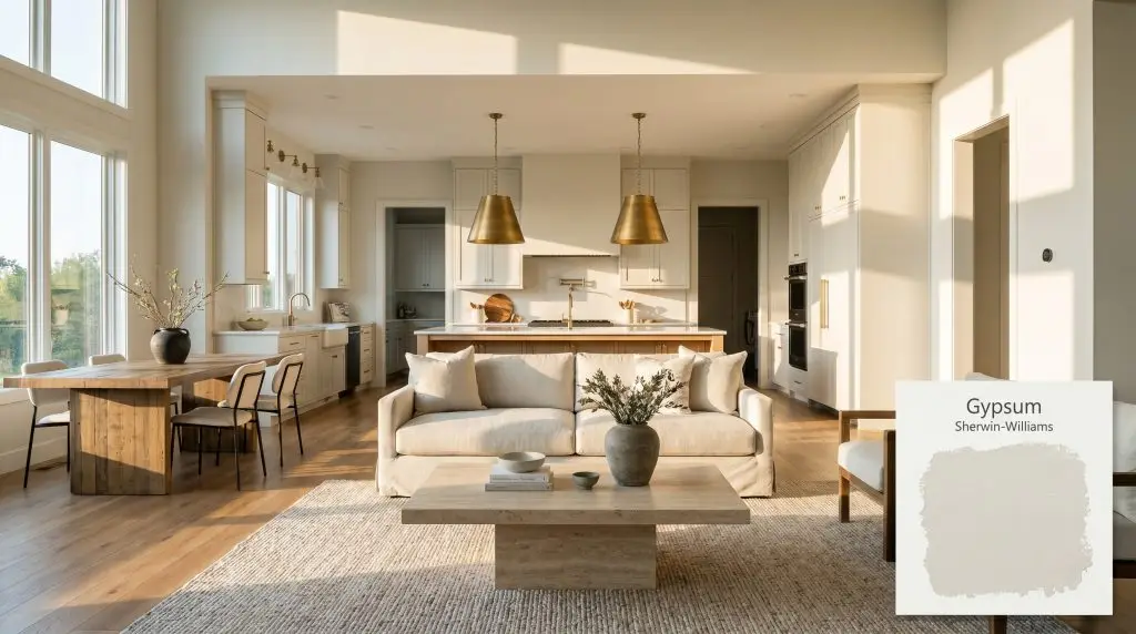
Gypsum SW 9543
Sherwin-WilliamsSherwin-Williams Gypsum (SW 9543) is a soft, warm off-white paint color with an LRV of 82. Featuring subtle creamy and faint green-yellow undertones, it provides a tranquil, sophisticated backdrop that feels bright without being stark, making it highly versatile for both interior walls and exterior trim.
Paint Technical Profile
| Color ID / SKU | SW 9543 |
| HEX Code | #EAEBE7 |
| Light Reflectance (LRV) | 82 |
| Use | Interior, Exterior |
| Best Exposures | North-Facing, South-Facing |
| Best For | Primary Bedrooms, Open-Concept Living Areas, Kitchen Cabinets, Hallways |
Sherwin-Williams Gypsum SW 9543: Crafting a Sunlit, Organic Foundation in Any Room
There is a remarkably fine line between a crisp, modern gallery white and a dated, dingy cream. Cross too far in one direction, and your living room feels like a sterile waiting area. Tip too far in the other, and your freshly painted walls suddenly look like they haven’t been updated since the late nineties.
Sherwin-Williams Gypsum steps effortlessly into this notoriously difficult middle ground.
This specific off-white color structure offers a soft, highly livable warmth without sacrificing its clean, contemporary edge. It establishes a luminous foundation that allows your furniture, textiles, and architectural details to truly shine. Whether you are refreshing a sun-drenched coastal cottage or softening a minimalist urban loft, Gypsum SW 9543 adapts beautifully to its surroundings.
Sherwin-Williams Gypsum: Undertones & LRV Explained
When testing this color, the very first question homeowners ask is: Is Sherwin-Williams Gypsum warm or cool?
Gypsum is definitively a warm off-white. However, its warmth is incredibly nuanced, built upon a carefully balanced pigment structure that prevents it from ever reading as overly yellow or peach in a standard room. Understanding its core DNA is the secret to making it work flawlessly alongside your existing finishes.
Understanding the Light Reflectance Value (LRV) Gypsum sits at an LRV of 82. This means it acts as a high-reflectance canvas, bouncing a significant amount of light back into your room. It allows smaller, enclosed spaces to feel expansive and airy, but it intentionally stops short of the 90+ LRV range, protecting your walls from that blinding, uncomfortable glare during peak afternoon sunlight.
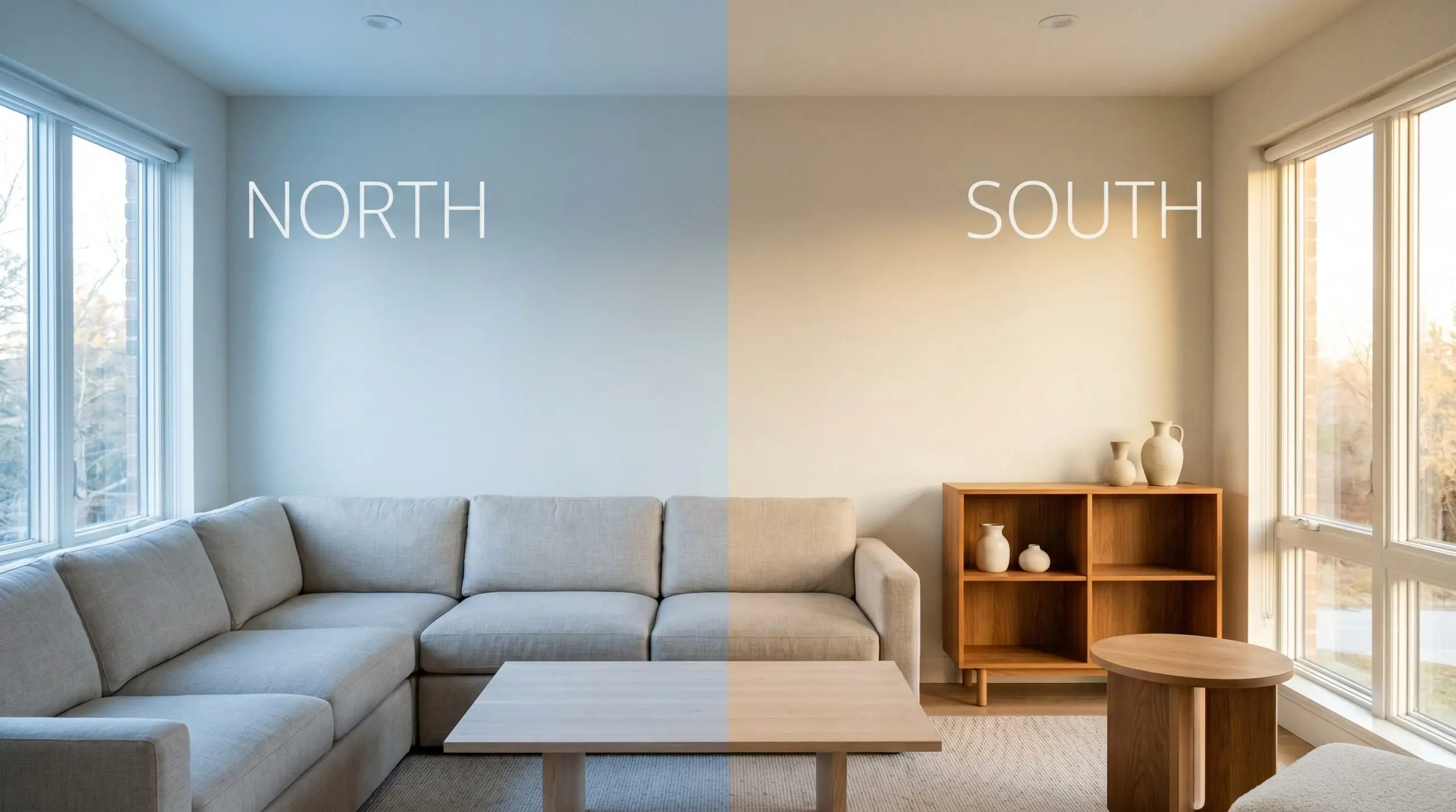
Ambient Lighting Shifts: The Chameleon Factor
A paint’s true personality is entirely dictated by the lighting in your home. Because of its complex chromatic profile, Gypsum reacts dramatically to the natural and artificial light sources bouncing around your room.
Here is exactly how this warm off-white shifts throughout the day:
If you want to maintain Gypsum’s modern, organic feel after the sun goes down, aim for 3000K to 3500K LED bulbs. This specific temperature range highlights the warmth without turning the room overly yellow.
Hackrea Pro-Tip (The Bulb Rule)
Transforming Your Home with SW Gypsum
Understanding the raw data behind a paint color is only half the battle. The real magic happens when you pair that creamy off-white with the right materials, fabrics, and daily lighting scenarios.
Because of its adaptable nature, this shade works as a brilliant backdrop for a massive variety of lifestyles and design aesthetics. Here is how to maximize its potential across your home.
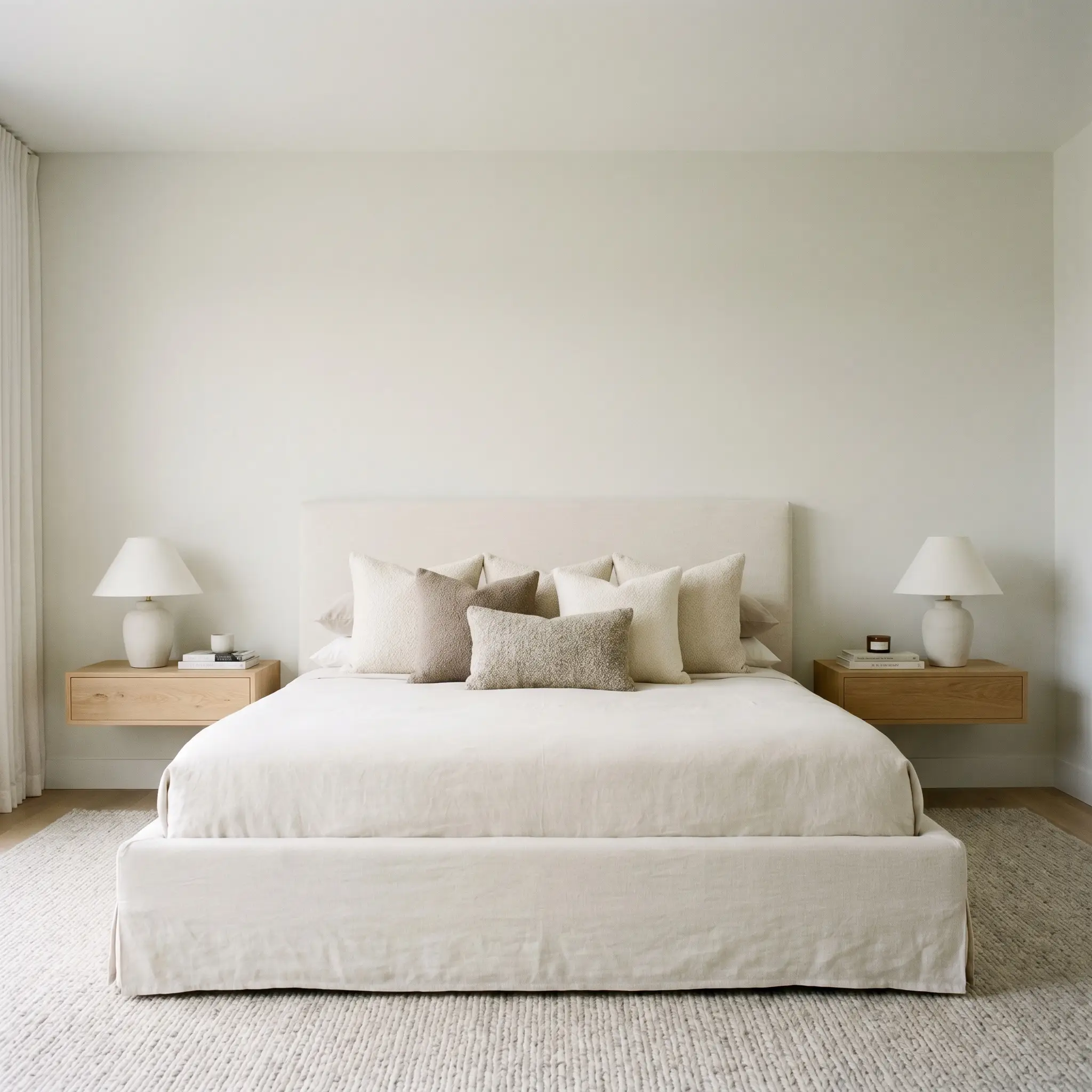
Primary Bedrooms
In a primary bedroom, Gypsum SW 9543 excels at creating a serene, Soft Minimalist retreat. The high light reflectance value captures the early morning light beautifully, giving the room a gentle, waking glow without feeling harsh on tired eyes.
To capitalize on this softness, pair the painted walls with highly tactile, natural materials. Think slipcovered washed linen bed frames, raw white oak floating nightstands, and layered bouclé throw pillows. The subtle warmth of the paint effortlessly bridges the gap between these organic textures, making a sparsely decorated room feel intentional and luxurious rather than unfinished.
If you prefer a slightly moodier aesthetic, use Gypsum on the walls and introduce a dusty terracotta or muted sage green on your trim and doors. This unexpected color-blocking technique adds immediate architectural interest to a standard, boxy bedroom.
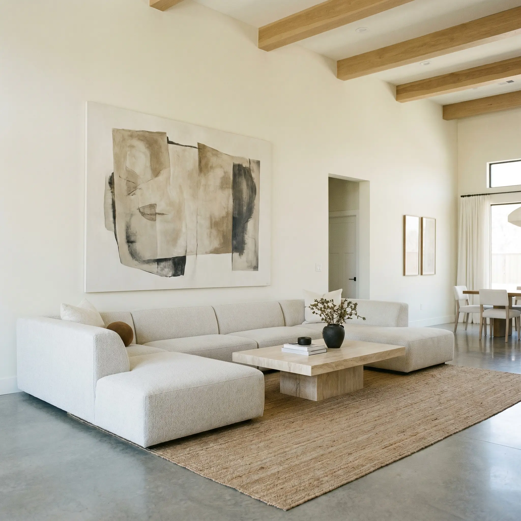
Open-Concept Living Areas
Large, open-concept living spaces often suffer from unpredictable ambient lighting shifts as the sun moves from one side of the house to the other. Gypsum is an incredibly stable choice for these sprawling areas because its green-yellow undertone prevents the shadows from turning purple or icy gray in the afternoon.
For a sophisticated Transitional aesthetic, lean into the “High/Low Mix.” Anchor the room with an accessible, low-profile performance fabric sectional, but elevate the entire space by placing a premium honed travertine plinth coffee table in the center. The creamy undertones of the paint will beautifully echo the natural warmth of the stone.
To keep the expansive walls from feeling empty, introduce oversized, asymmetrical canvas art or a curated grid of framed intaglios. The off-white backdrop acts as a gallery wall, allowing the artwork to command attention while still warming up the peripheral vision of the room.
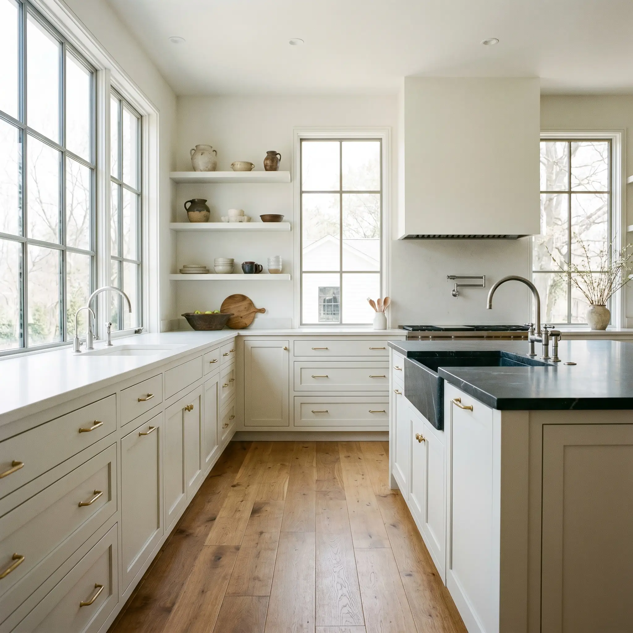
Kitchen Cabinets
A cabinetry application is one of the most transformative ways to utilize this color. If stark white kitchens feel too clinical for your taste, Gypsum provides that coveted bright, clean look while retaining a welcoming, lived-in charm.
It pairs magnificently with unlacquered brass hardware, which naturally patinas over time, and warm wood flooring. For a truly elevated culinary space, contrast the creamy upper cabinets with a rich, dark soapstone countertop or a heavily veined warm marble.
Be incredibly careful when pairing this paint with cool, icy gray countertops (like standard Carrara marble or gray-flecked quartz). The cool gray will violently clash with Gypsum’s yellow-green micro-nuance, making the cabinets look unexpectedly dirty or dingy by comparison. Always opt for warmer stones or solid, earthy tones.
Clash Warning (The Countertop Rule)
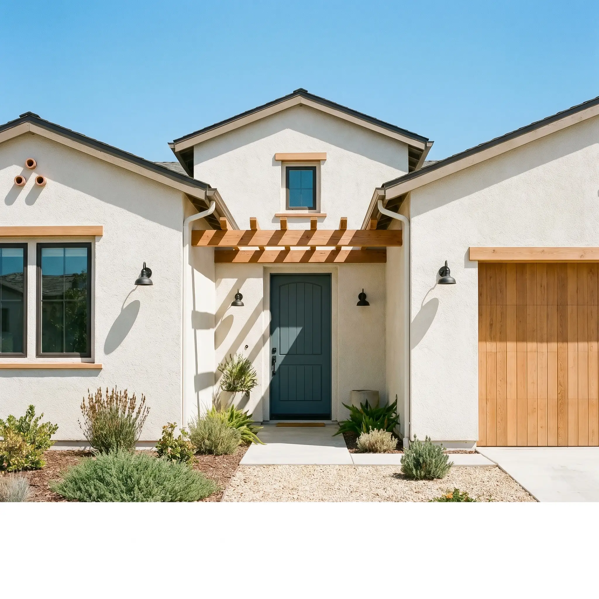
Exterior Facades & Stucco
Taking this color outdoors requires a slight shift in expectations. Direct, unfiltered sunlight washes out a significant amount of pigment, meaning Gypsum will read much brighter and whiter on an exterior than it does inside your hallway.
Its stucco exterior performance is particularly strong for New Mediterranean or California Casual homes. The textured surface of the stucco creates micro-shadows that catch the paint’s hidden green undertone, giving the facade an earthy, organic depth that flat siding simply cannot replicate.
Frame the creamy exterior with natural cedar accents, matte black sconces, and a muted slate blue front door to create a welcoming, highly curated curb appeal.
Harmonizing with Sherwin-Williams Gypsum
When you place this soft off-white against a highly saturated hue, it requires a crisp architectural boundary to hold its shape. Conversely, pairing it with muted, earthy tones allows for a gentle tonal bleed that feels incredibly serene. Understanding how this specific pigment behaves next to other elements is the key to a cohesive design.
Framing the Edges: Trim and Baseboards
Choosing the right trim dictates how modern or traditional your walls will ultimately feel. You are essentially deciding whether to frame the color or let it melt into the architecture.
Tactile Materials and Hardware Pairings
Paint is simply the first layer of a room’s material palette. To bring out the absolute best in this nuanced off-white, you must surround it with textures that engage in a deliberate visual dialogue with its creamy base.
Curated Coordinating Paint Colors
Designer Mood Boards
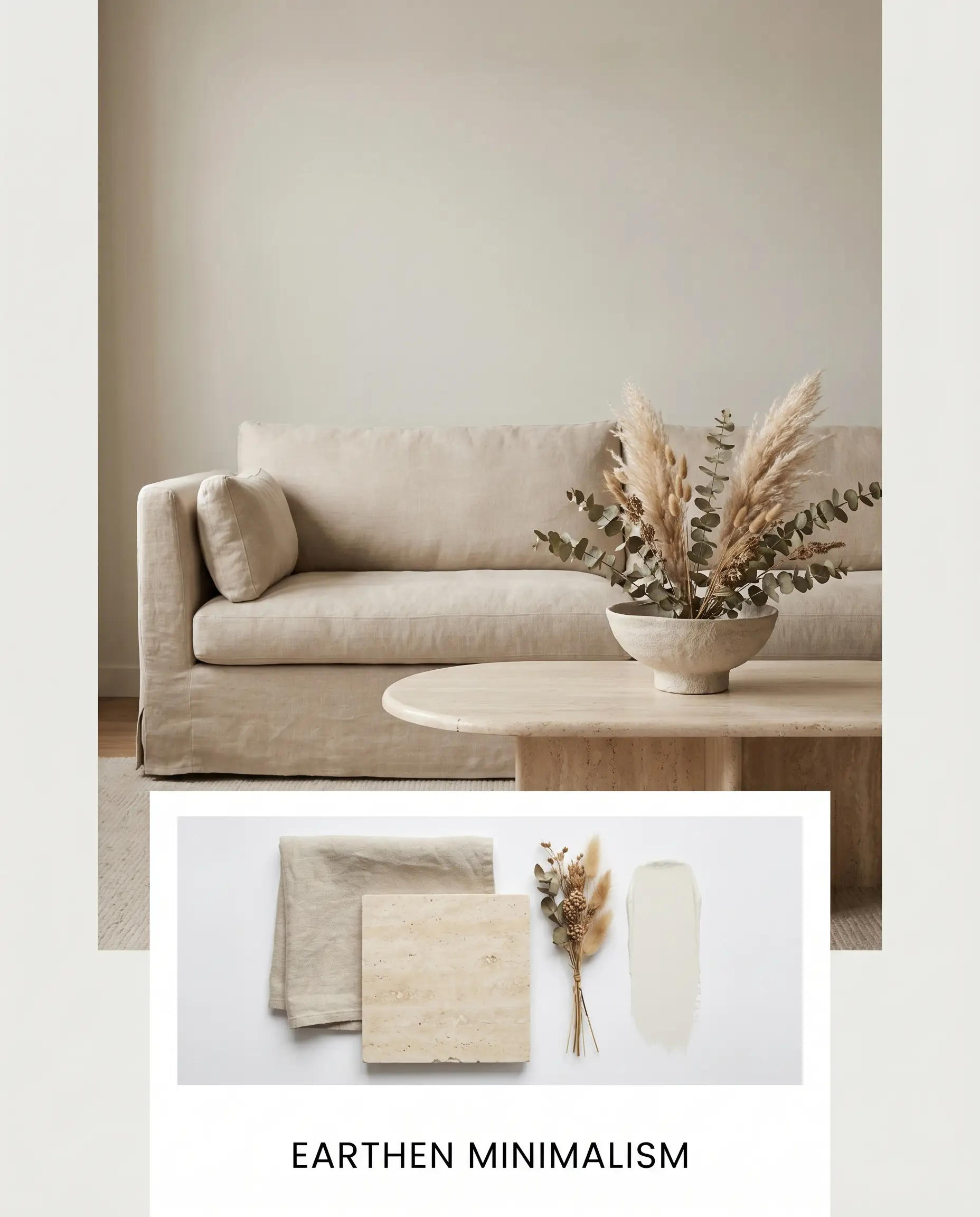
Earthen Minimalism
This palette thrives on raw textures and quiet, intentional restraint. Imagine the creamy walls serving as a luminous backdrop for a low-profile, slipcovered sofa in natural washed linen. We layer in the warmth of a honed travertine coffee table and complete the vignette with a single, oversized branch of dried botanicals in a hand-thrown ceramic bowl. The energy here is incredibly grounded, pulling from Japandi influences to create a sanctuary of calm.
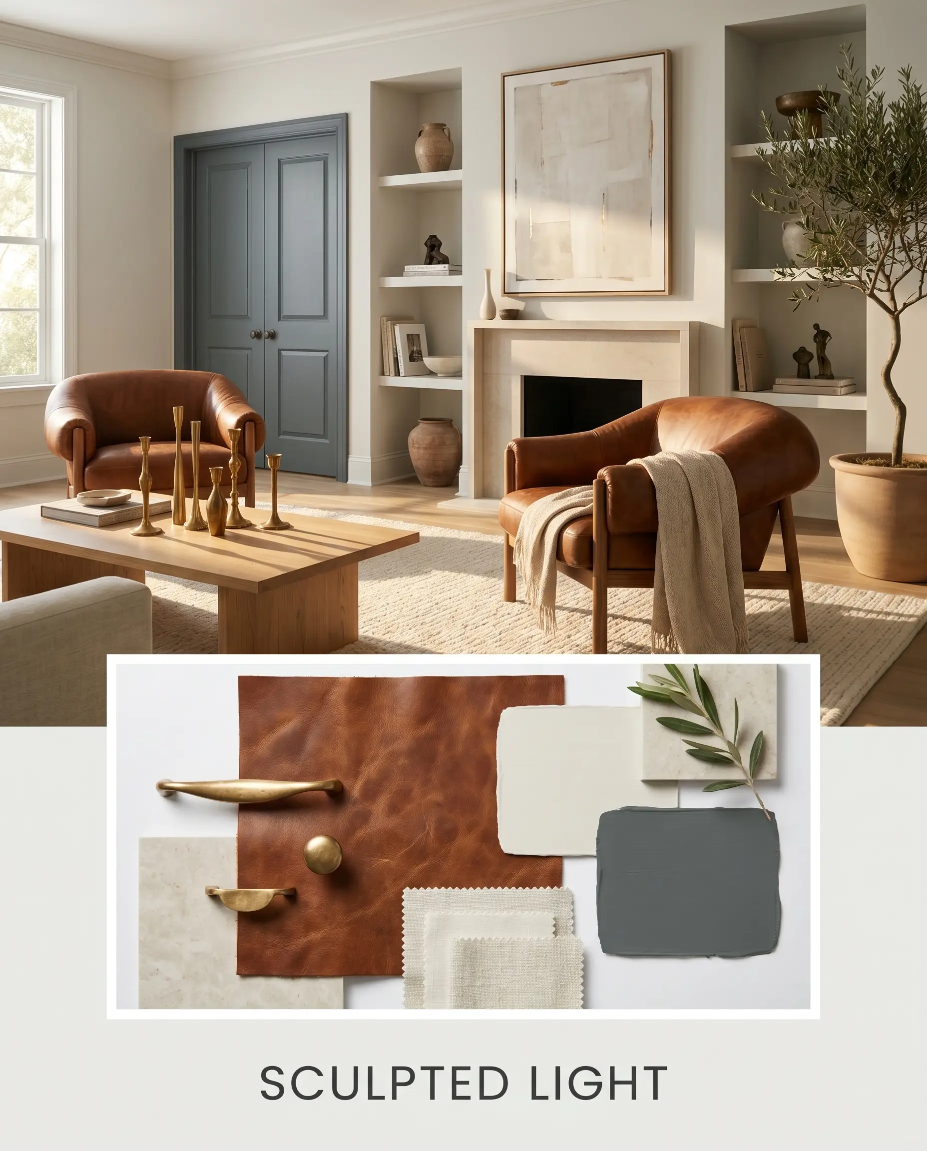
Sculpted Light
Here, we lean into a more refined, Transitional aesthetic that plays beautifully with shifting shadows. The walls provide a soft canvas for rich, saddle leather accent chairs and the striking contrast of interior doors painted in Sherwin-Williams Slate Tile. Unlacquered brass candlesticks and minimalist hardware catch the afternoon sun, bouncing golden light back onto the walls to amplify their inherent warmth. It feels curated, confident, and effortlessly elegant.
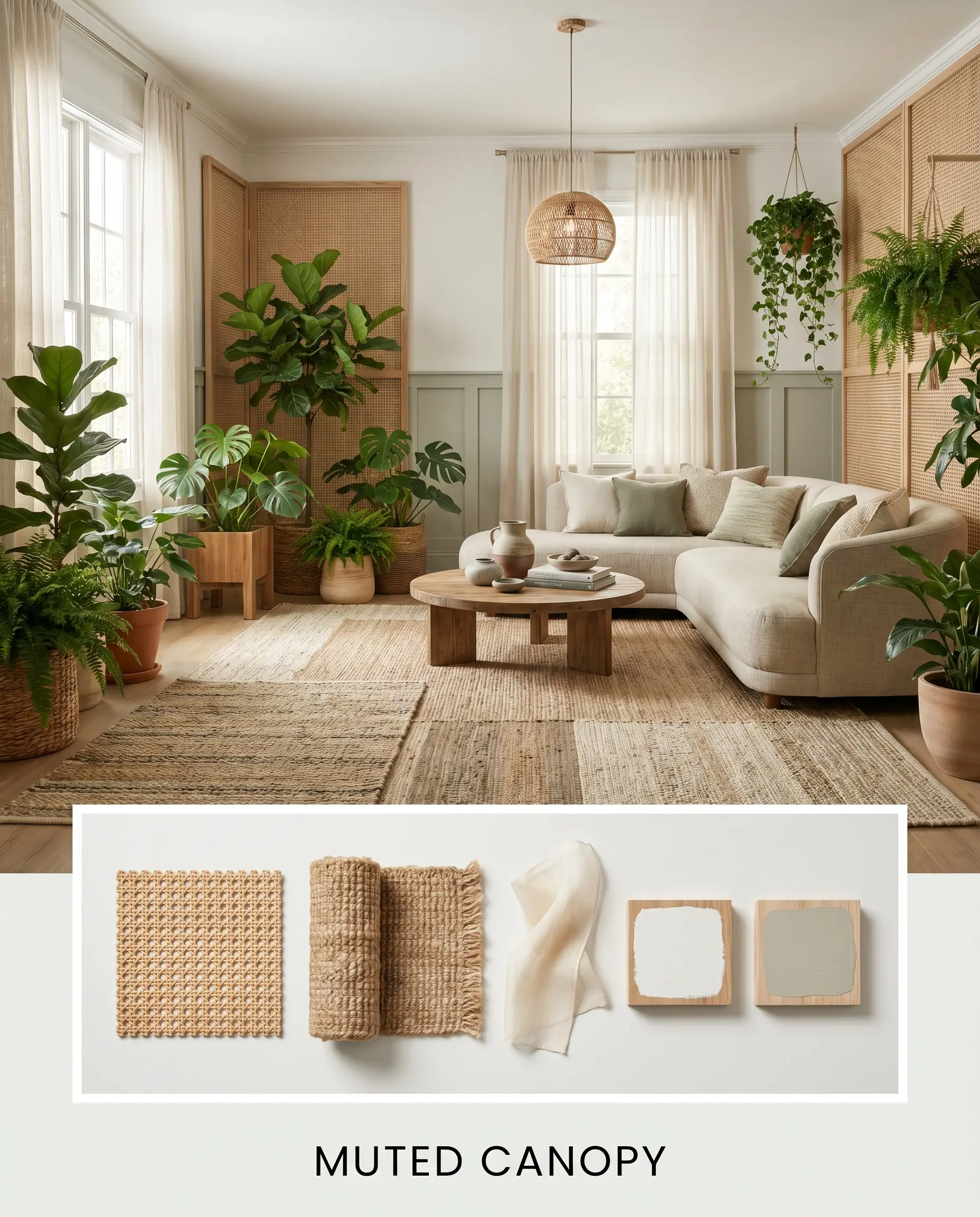
Muted Canopy
This styling approach embraces a lush, biophilic atmosphere by drawing out the paint’s yellow-green micro-nuance. We pair the walls with adjacent trim or wainscoting dipped in Benjamin Moore October Mist to blur the lines between the indoors and the natural world outside. Layered jute rugs, woven cane panels, and sheer drapery filter the light, resulting in a space that feels like a breathable, organic retreat.
Sherwin-Williams Gypsum vs. Industry Rivals
While this warm off-white is incredibly versatile, certain lighting conditions or specific architectural styles might demand a slightly different undertone. Comparing it directly against its closest competitors reveals exactly where it succeeds and where you might need to pivot.
Sherwin-Williams Gypsum SW 9543 vs. Sherwin-Williams Alabaster SW 7008
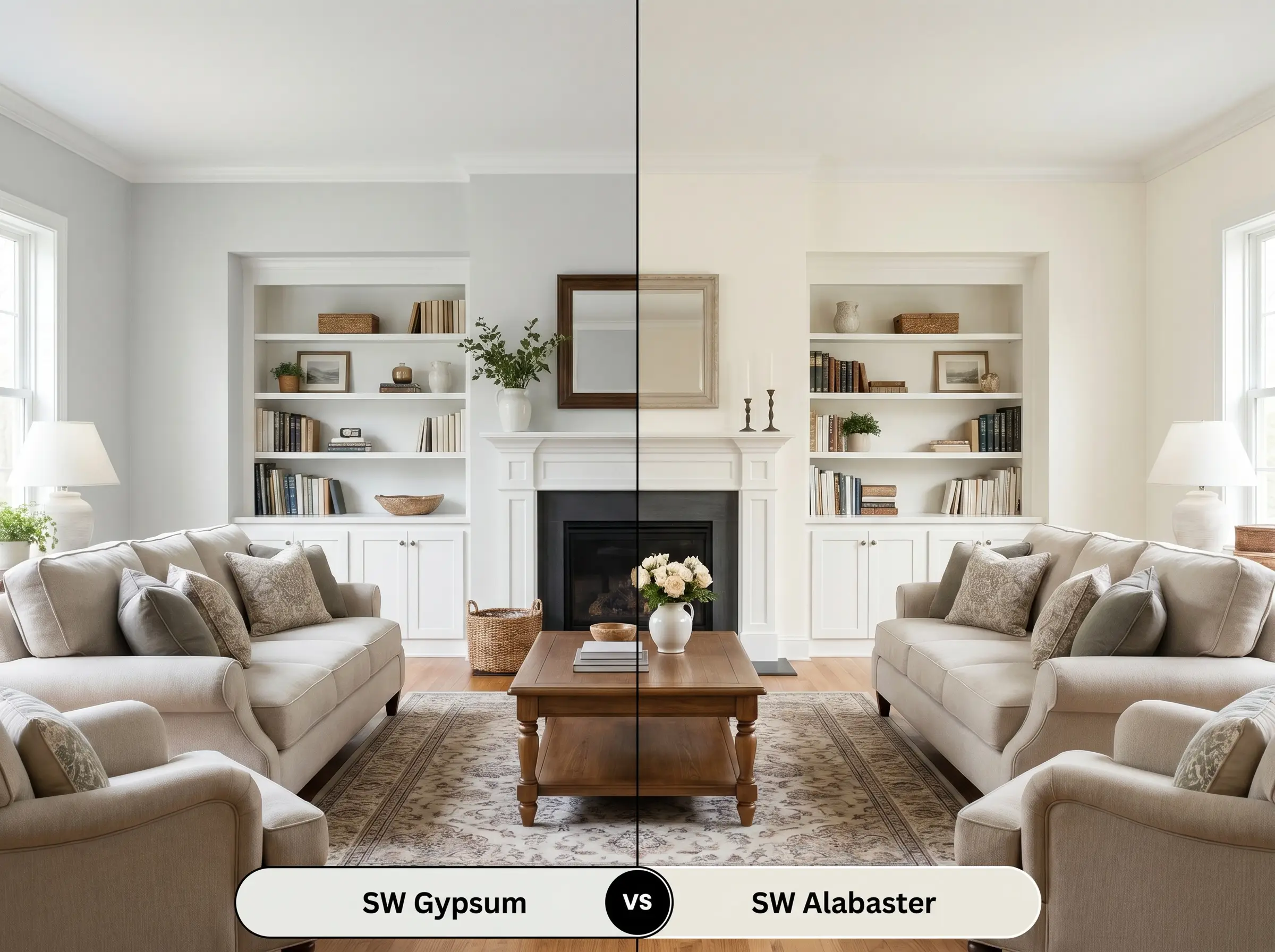
If your room lacks natural sunlight and you need a guaranteed, cozy glow, then Alabaster is often the safer choice. Alabaster carries a more pronounced beige-yellow undertone, making it feel slightly creamier and more traditional right out of the can. Gypsum, with its green micro-nuance, stays crisper and more modern, but it can occasionally feel a bit too neutral in shadowy, north-facing spaces.
Sherwin-Williams Gypsum SW 9543 vs. Benjamin Moore White Dove OC-17
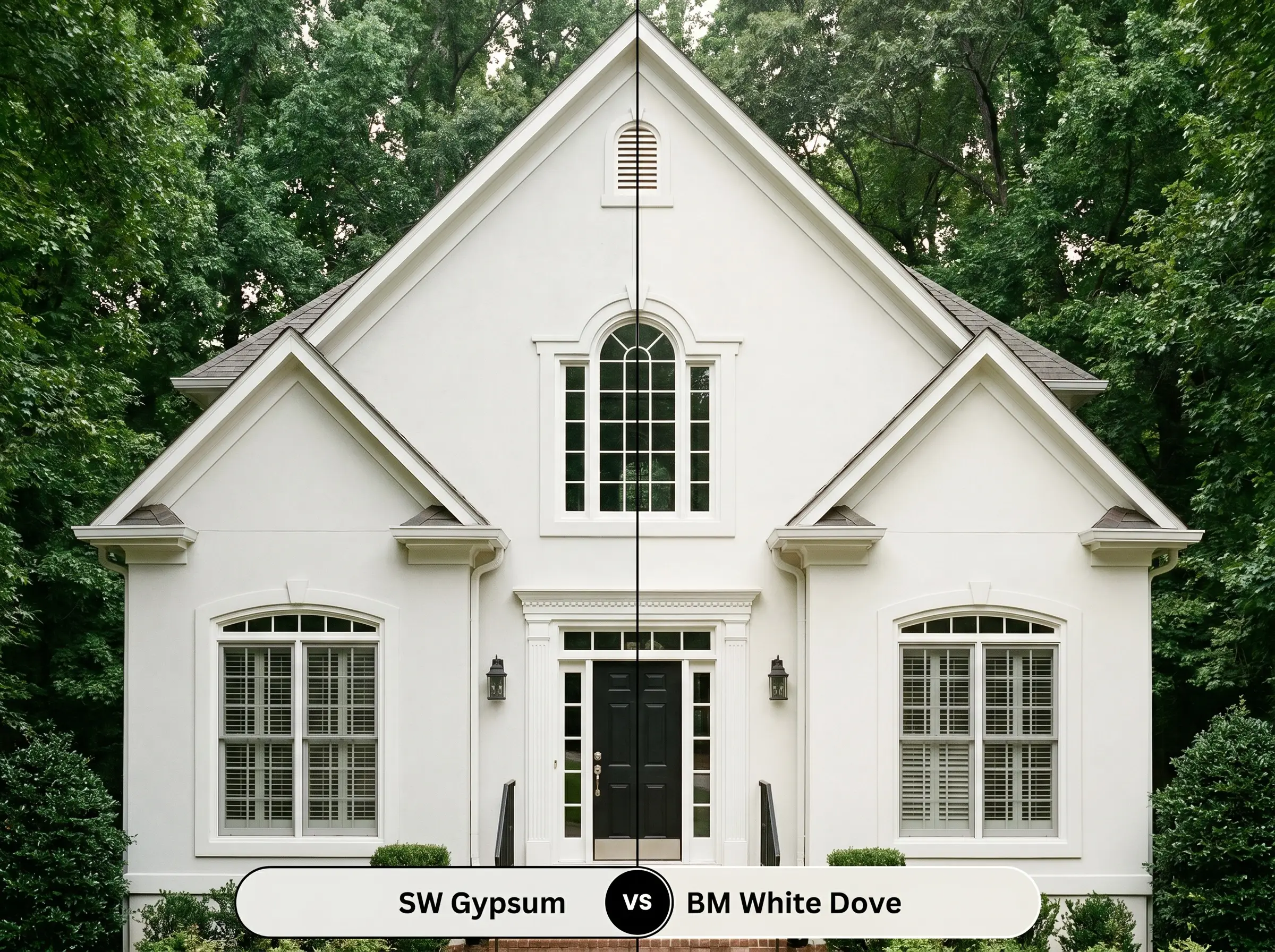
If you are working with heavily shaded exterior facades or rooms with significant tree cover outside the windows, then White Dove might be the better candidate. White Dove is famous for its almost imperceptible gray undertone, which helps it maintain a clean, bright appearance without absorbing too much of the surrounding green foliage. Gypsum’s inherent yellow-green base will actively harmonize with outdoor greenery, which can sometimes amplify its green cast more than a homeowner might expect.
Alternative Off-Whites and Brand Matches
Sometimes, a color is almost perfect, but you need just a fraction more depth or a slightly different base to make it work with your existing floors. Here are the closest alternatives to consider.
Exploring the Sherwin-Williams Archives
Matching Across Major Paint Brands
Painting with SW 9543: Execution and Finishes
Transitioning from design theory to the physical reality of rolling paint onto drywall requires a solid execution strategy. The sheen you choose will fundamentally alter how your eye perceives this creamy off-white.
The Sheen Strategy
Primer Requirements and Coverage Expectations
To ensure the nuanced yellow-green base develops correctly, you must start with a high-quality, bright white tintable primer. Skipping the primer over darker walls will cause the old color to pull through, muddying Gypsum’s clean, modern edge.
Because it sits at an LRV of 82, this color typically requires two full, even coats for a completely opaque, professional finish.
When touching up this specific off-white after the initial coats have dried, always use the exact same roller nap you used originally. Using a brush for quick touch-ups on a rolled wall will cause “flashing”—visible, uneven streaks where the light catches the different paint textures, ruining that seamless, velvety look.
Hackrea Pro-Tip (Avoiding The Flashing Trap)
Frequently Asked Questions About SW Gypsum
Because of its complex yellow-green base, it relies on lighting to maintain its balance. In a windowless bathroom with warm 2700K bulbs, it will absolutely lean into a stronger yellow-cream. To keep it looking crisp and modern without natural light, use 3500K LED bulbs.
It performs remarkably well on stucco because the rough texture creates tiny micro-shadows that catch the hidden green undertone, giving the facade a beautiful, earthy depth. On smooth siding, the direct sun flattens the color, making it read much brighter and closer to a stark white.
This is a highly risky pairing. The creamy, warm nature of this paint actively fights against icy or cool gray tones, which can cause the cabinets to look dingy or aged. It pairs much more successfully with warm marble, soapstone, or earthy quartz.
The paint acts as a subtle mirror to its environment. If you place a large collection of indoor plants near the walls, the natural light bouncing off the leaves will amplify the paint’s hidden yellow-green micro-nuance, making the room feel noticeably more botanical and earthy.
The Final Verdict on Sherwin-Williams Gypsum
Sherwin-Williams Gypsum is a masterfully balanced off-white designed for homeowners who crave a luminous, airy environment but refuse to live in a sterile box. Its absolute best application is in open-concept living areas and sun-drenched primary bedrooms where its creamy, yellow-green micro-nuance can gently shift with the changing daylight. It perfectly elevates Organic Modern, Transitional, and Soft Minimalist aesthetics, providing a sophisticated canvas that allows natural woods, tactile fabrics, and aspirational metals to take center stage.
However, this paint is not a universal solution for every home. If your design plan relies on crisp, cool-toned finishes, you must look elsewhere. Placing this warm, creamy off-white next to icy gray luxury vinyl plank flooring, cool blue-toned glass tiles, or stark Carrara marble countertops creates an immediate visual conflict. The cool tones will pull the yellow out of the paint in the worst possible way, leaving your walls looking unintentionally aged or dirty. To succeed with Gypsum, you must commit to an earthy, warm-leaning material palette that respects and enhances its sunlit DNA.
Closest Cross-Brand Equivalents
The absolute closest scientific color matches for Gypsum across top paint brands.