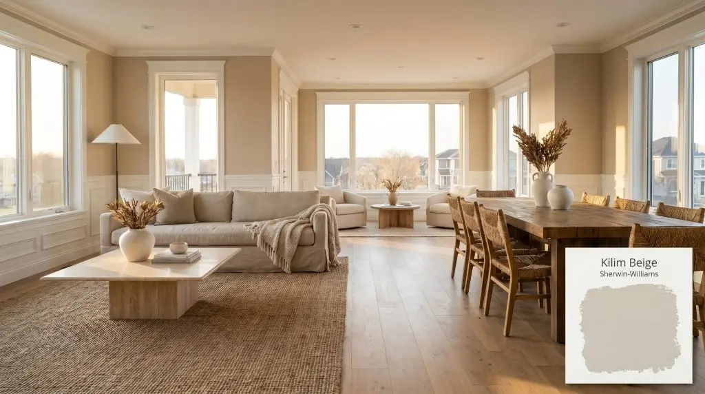
Kilim Beige SW 6106
Sherwin-WilliamsSherwin-Williams Kilim Beige (SW 6106) is a warm, mid-tone beige with an LRV of 57. Rooted in the orange hue family, it provides a grounded, earthy neutral backdrop with subtle peach undertones that bring warmth to any architectural space.
Paint Technical Profile
| Color ID / SKU | SW 6106 |
| HEX Code | #D7C5AE |
| Light Reflectance (LRV) | 57 |
| Use | Interior, Exterior |
| Best Exposures | North, East |
| Best For | Living Rooms, Hallways, Bedrooms, Exteriors |
Sherwin-Williams Kilim Beige: Cultivating a Sun-Basked, Earthy Aesthetic
For years, the design world chased stark, icy neutrals, leaving many homes feeling like sterile art galleries rather than lived-in sanctuaries. Today, we are seeing a massive shift back toward tactile, sun-basked warmth. Sherwin-Williams Kilim Beige steps into this space not as a fleeting trend, but as a robust architectural finish that instantly changes the energy of a room.
This is not the flat, predictable tan of decades past. When applied thoughtfully, SW 6106 acts as a rich, earthy canvas that elevates everything placed against it. It wraps a space in a welcoming glow, providing a sophisticated backdrop for highly curated interiors.
Whether you are restoring a mid-century property or adding character to a new build, this shade establishes a beautiful sense of permanence. The secret to mastering this color lies in understanding its underlying chromatic profile. Once you know how it interacts with natural light and surrounding materials, you can use it to craft incredibly intentional, high-end environments.
Sherwin-Williams Kilim Beige: Decoding the Undertones & LRV
When evaluating a new foundation color, the most urgent question is always: Is this paint warm or cool? Sherwin-Williams Kilim Beige is undeniably, definitively warm. It sits firmly on the warmer side of the spectrum, utilizing its unique color structure to radiate an inviting, earthy energy throughout the home.
To truly harness this warmth, we have to look past the initial impression and examine the specific tint that gives this color its life.
With a Light Reflectance Value (LRV) of 57, this shade sits perfectly in the mid-light range. This specific light reflectance means the paint absorbs enough illumination to provide significant visual weight. It creates a striking, crisp contrast against pure white trim, yet it bounces enough ambient lighting around the room to ensure the space never feels enclosed or dark.
Lighting Effects & The Chameleon Factor
Because of that subtle peach-orange cast, this paint is highly responsive to its environment. The temperature of your lighting will physically shift how the color is perceived on your walls, pulling different characteristics forward throughout the day.
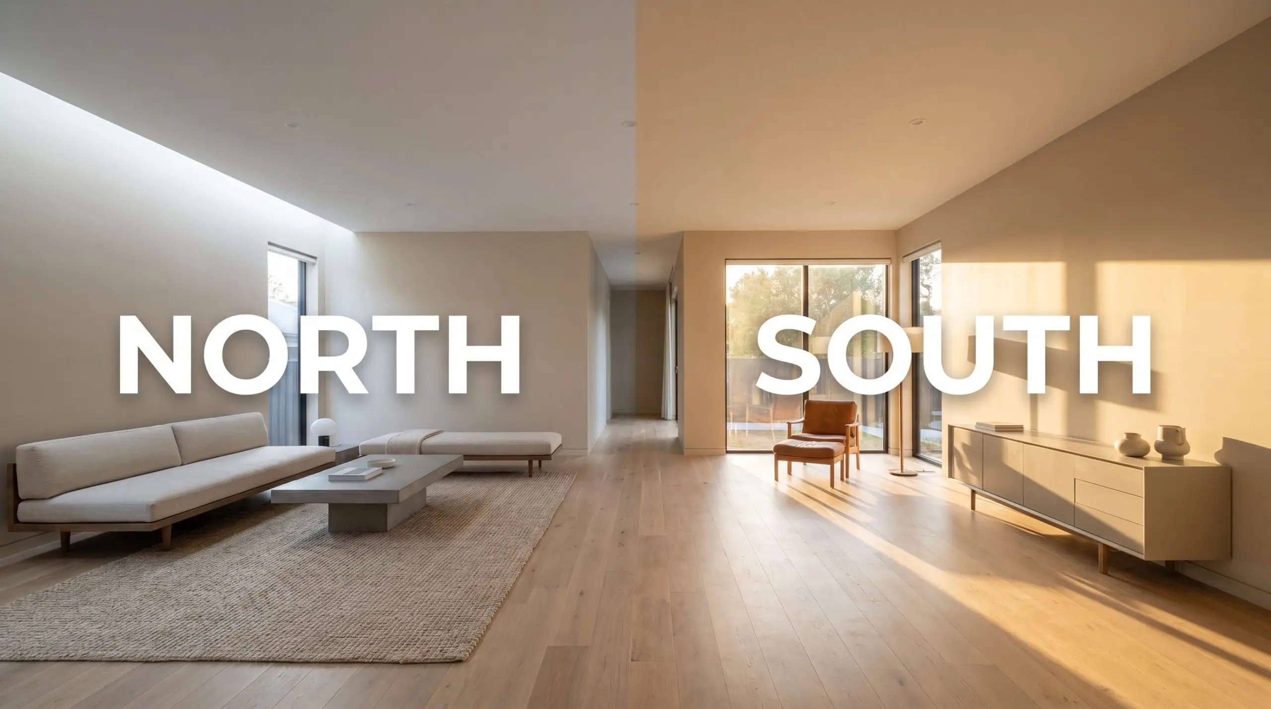
If you are using this earthy neutral in a windowless basement or a room heavily reliant on recessed lighting, be incredibly mindful of your LEDs. While it can help neutralize the harsh blue glare of 4000K+ bulbs, those cool lights will strip away the rich, sun-baked character of the paint. Aim for 3000K bulbs to maintain a balanced, sophisticated warmth without turning the room overly peach.
Hackrea Pro-Tip (The Basement Bulb Rule)
Architectural Placements & Styling
Understanding the undertones is only half the process; the real design work begins when you apply that theory to your actual home. Because this shade possesses such a balanced visual weight, it transitions beautifully across entirely different architectural features and design aesthetics.
Here is how to manipulate this warm neutral to create highly intentional, curated spaces.
Open-Concept Living Areas
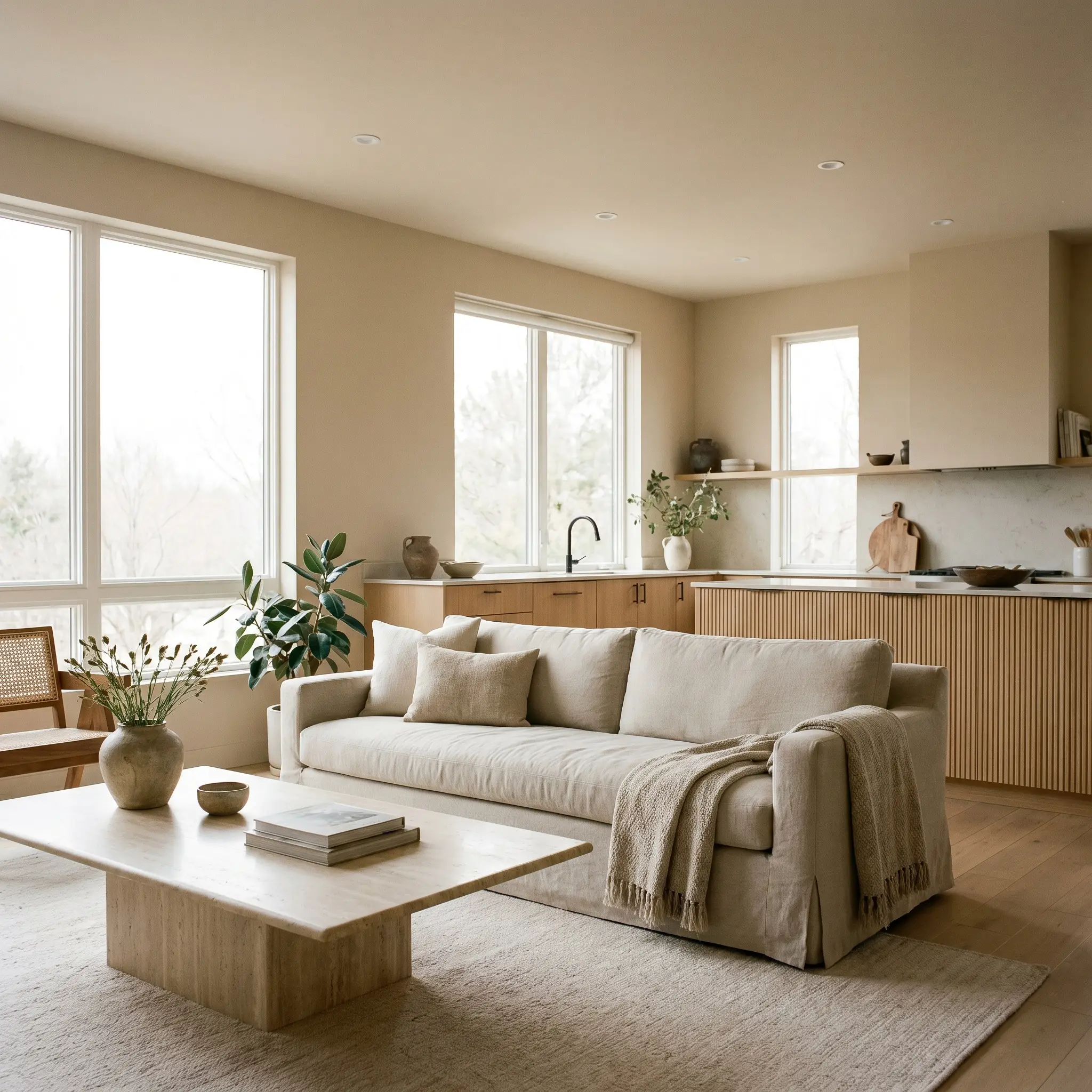
In expansive, open-concept living rooms, stark white walls can often feel overly vast and unwelcoming. Kilim Beige solves this by wrapping the large footprint in a subtle, unifying warmth. To modernize this color, lean heavily into an Organic Modern aesthetic.
Pair the painted walls with highly tactile, natural materials to elevate the overall design. Think honed travertine coffee tables, slipcovered sofas in heavy washed linen, and accents of blackened steel to provide necessary contrast. The earthy base of the paint beautifully complements fluted oak cabinetry or floating shelves, creating a seamless flow from the living area into the kitchen.
Be cautious when pairing this specific shade with red-toned cherry wood cabinets or flooring. The peach-orange micro-nuance in the paint can clash with the strong red undertones in the wood, making both surfaces feel overly saturated and dated. Instead, opt for white oak, walnut, or espresso black finishes to create a sophisticated, intentional contrast.
Clash Warning (The Wood Tone Conflict)
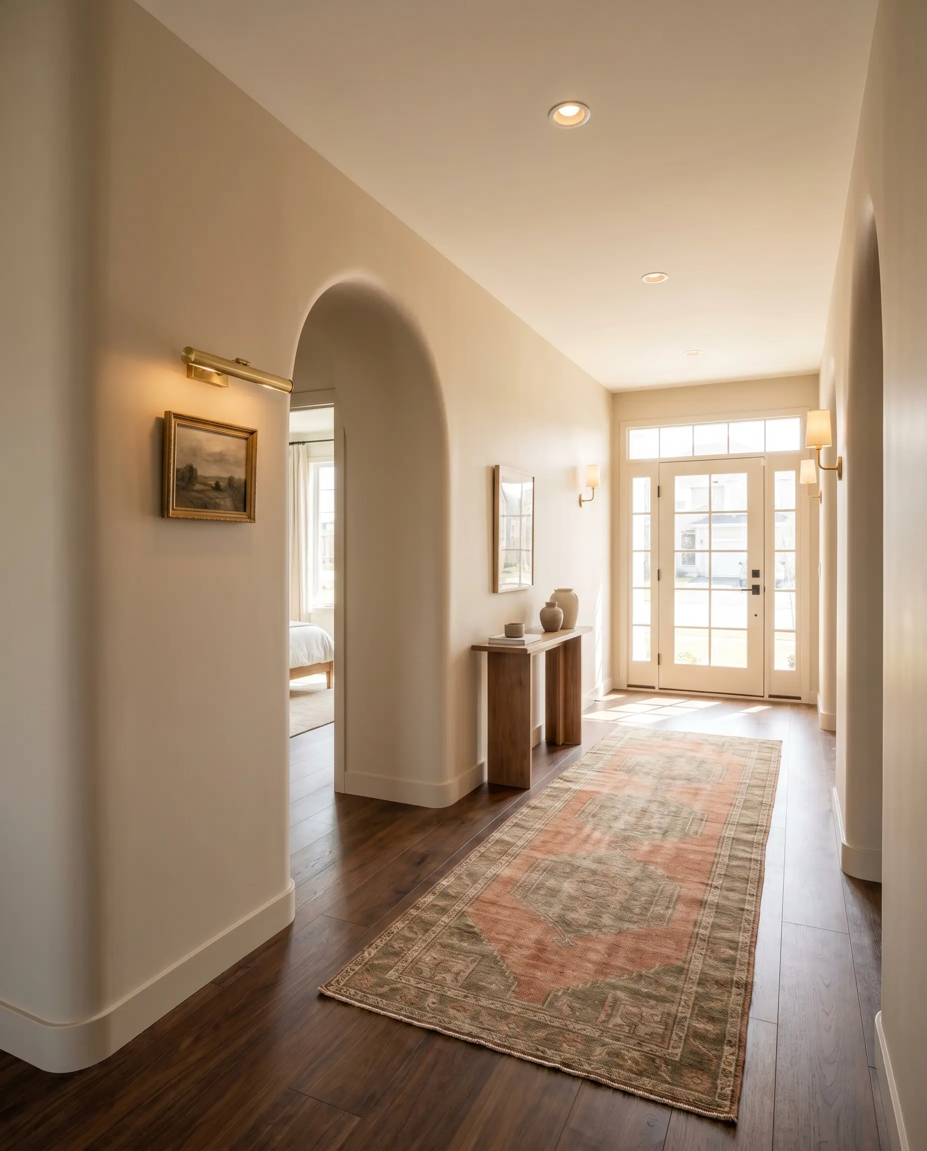
Transitional Hallways and Foyers
Hallways and entryways are the connective tissue of a home, and they require a color that bridges different rooms without demanding too much attention. This mid-light shade is brilliant for these transitional zones. It establishes a welcoming, sun-baked atmosphere the moment you walk through the front door.
To create a New Mediterranean vibe, apply this color to walls featuring arched doorways or subtle bullnose corners. Elevate the standard application by pairing it with unlacquered brass picture lights and vintage runner rugs. The warmth of the paint perfectly highlights the metallic sheen of the brass, while the earthy undertones pull out the rich terracotta or olive greens found in vintage textiles.
Restful Retreats
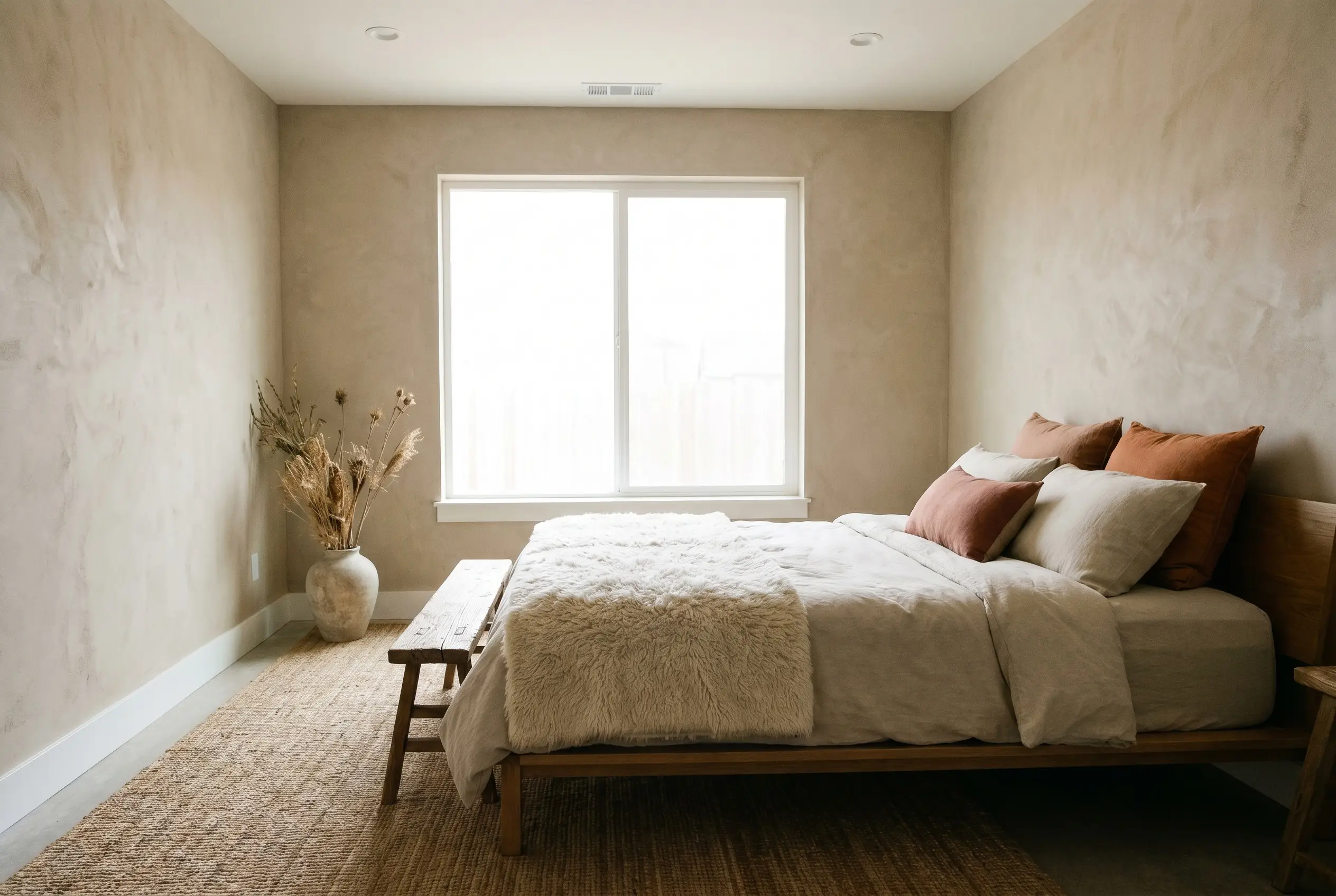
While often stereotyped for traditional styling, this versatile neutral is an incredible foundation for a Desert Minimalism or Wabi-Sabi inspired bedroom. The goal here is to create a restorative sanctuary that feels intentionally pared down but deeply textured.
Instead of standard drywall, consider applying this color over a Roman clay or limewash treatment to maximize its tactile qualities. Frame the room with crisp white baseboards (like Benjamin Moore White Dove) to keep the boundaries sharp. Layer the bed with raw canvas, alpaca wool throws, and muted terracotta accent pillows to pull out the subtle warmth of the walls.
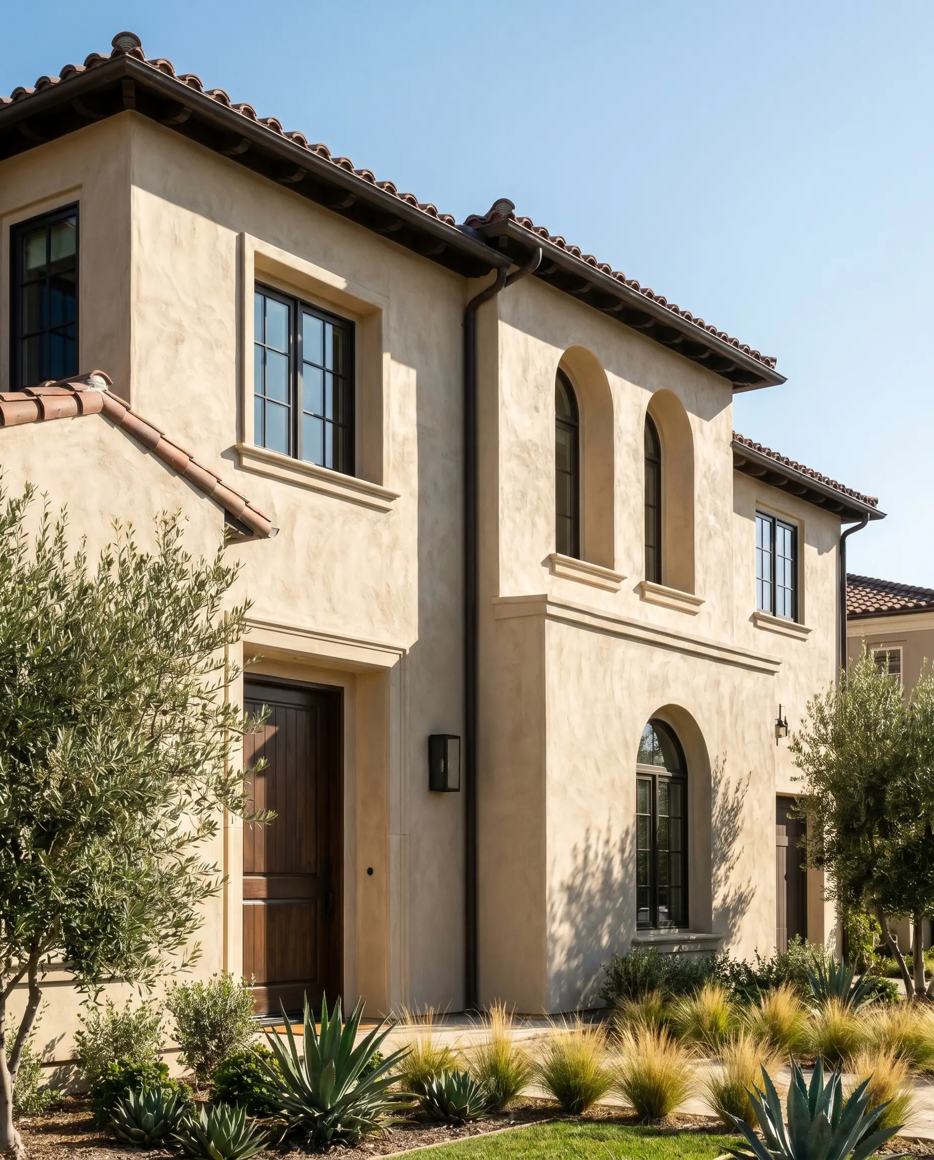
Textured Exterior Stucco
Taking this color outdoors requires a firm understanding of how direct sunlight impacts light reflectance. On textured exterior stucco, the natural shadows created by the rough surface will deepen the perception of the color, adding beautiful architectural dimension.
However, in direct Southern climates with intense, unrelenting sunlight, the color will wash out slightly, reading closer to an off-white cream than a mid-tone beige. To maintain a premium, high-contrast facade, pair the stucco with dramatic trim. Using a deep, complex shade like Sherwin-Williams Rookwood Dark Bronze on the window sashes, fascia, and front door provides a stunning, modern counterpoint to the warm, earthy exterior walls.
If your home’s exterior is surrounded by heavy, dense green foliage, be aware of color casting. The bright green light filtering through the trees can occasionally bounce onto the warm exterior walls, interacting with the peach undertone. To test this, always paint a large swatch on the side of the house that faces the landscaping and observe it during peak afternoon hours.
Hackrea Design Secret (The Foliage Effect)
Pairing Sherwin-Williams Kilim Beige: Materials & Palettes
Rather than fighting against its environment, this earthy neutral acts as a responsive canvas that absorbs and reflects the textures placed around it. Its specific pigment requires thoughtful pairings to truly shine, demanding elements that either pull out its sun-baked warmth or provide a sharp, grounding contrast. When surrounded by the right finishes, this hue transforms from a simple backdrop into a highly intentional architectural layer.
The Ideal Trim Combinations
Selecting the right trim dictates how this color visually behaves on the wall. If you want a seamless, atmospheric glow that blurs the lines of the room, pair it with Benjamin Moore White Dove. This warm, creamy white shares a similar underlying softness, creating a tonal bleed that feels incredibly serene and sophisticated.
For a more tailored, traditional boundary, Farrow & Ball Pointing is an exceptional choice. This crisp, classic white provides just enough contrast to frame the earthy walls without feeling stark or hospital-like. The sharp juxtaposition highlights the depth of the beige, giving the room a highly deliberate, finished look.
Tactile Finishes and Hardware
To elevate this foundation, you must introduce materials that communicate with its warm base. Honed travertine is an incredible companion for this paint. The matte, porous nature of the stone absorbs light similarly to the walls, establishing a beautifully grounded, organic foundation for living spaces or entryways.
To lift the palette and introduce a premium focal point, incorporate unlacquered brass hardware on doors or cabinetry. The living finish of the brass develops a subtle patina over time, echoing the rich yellow-orange tint hidden within the paint. This metallic sheen bounces light around the room, preventing the earthy walls from feeling too muted.
Finally, soften the overall visual weight with generous layers of washed linen. Whether used in slipcovered seating or drapery, the relaxed texture of the fabric enhances the welcoming, lived-in energy of the color structure without requiring a massive investment.
Complementary Paint Selections
Curated Aesthetic Concepts
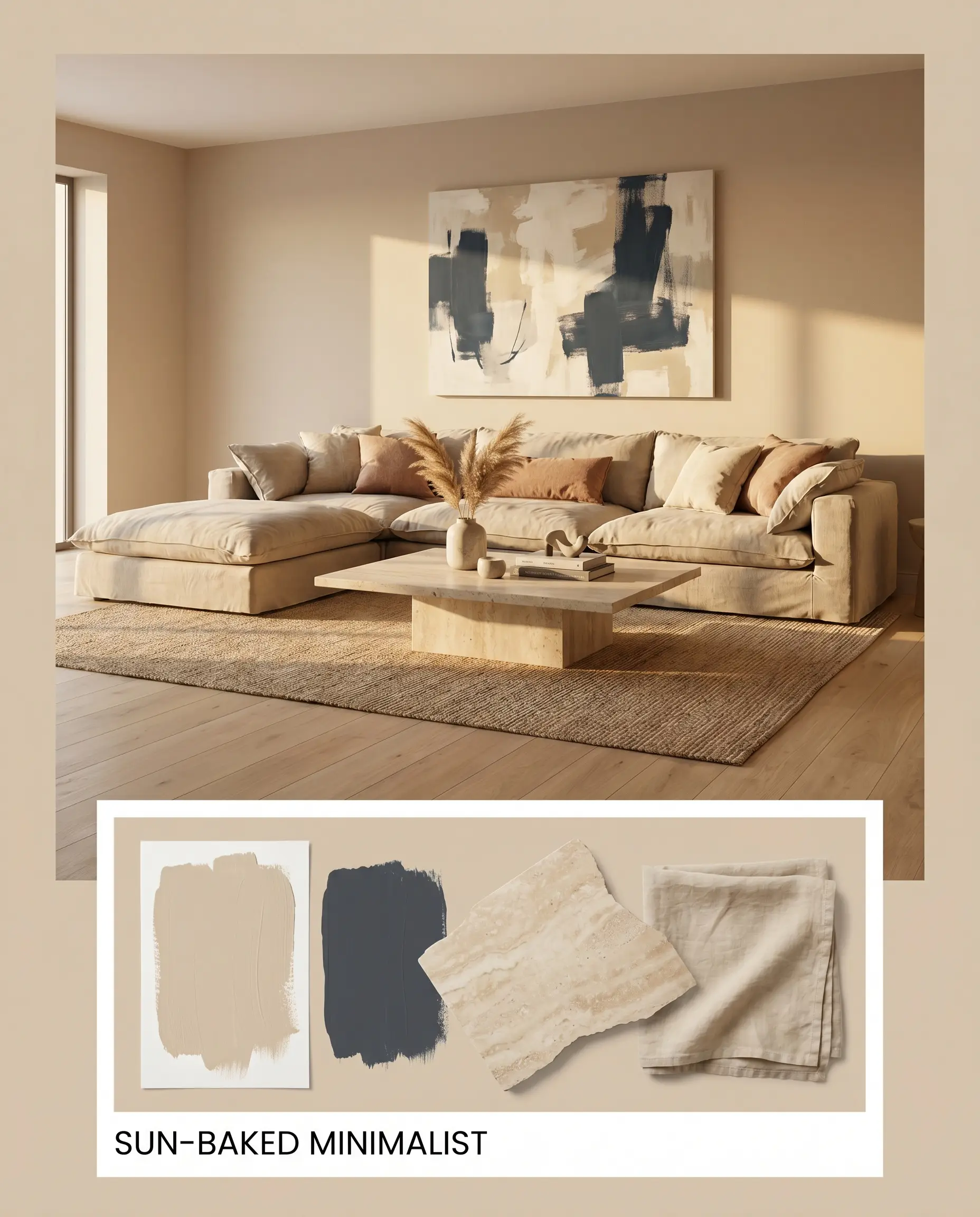
Sun-Baked Minimalist This palette strips away excess to focus entirely on texture and light, creating a restorative sanctuary that feels both raw and refined. The walls provide a warm, enveloping base that pairs effortlessly with sprawling washed linen upholstery and low-profile honed travertine tables. Accents of Benjamin Moore Hale Navy in abstract canvas art introduce just enough sharp contrast to keep the energy dynamic. The resulting vibe is exceptionally calm, intentional, and bathed in a constant, golden-hour glow.
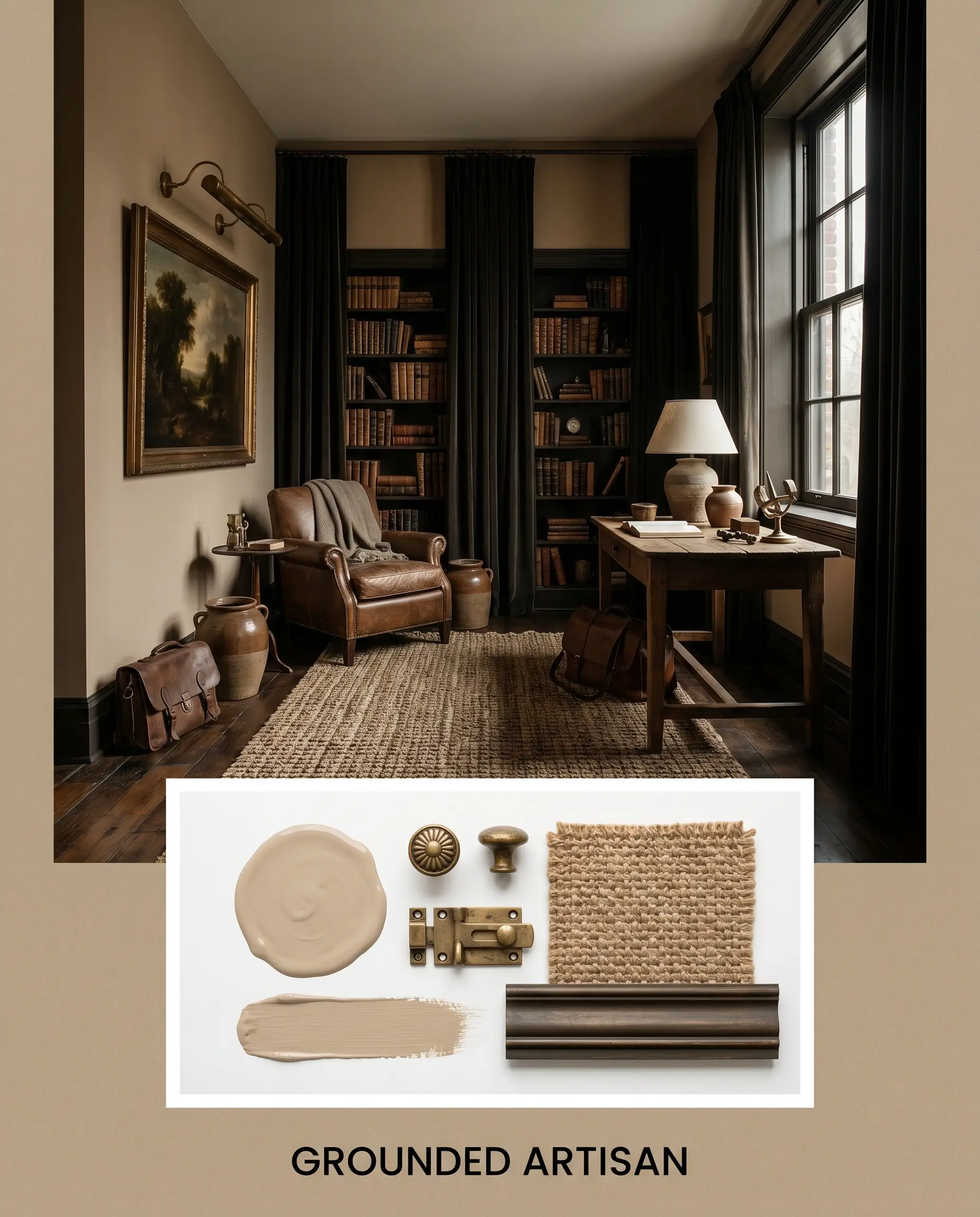
Grounded Artisan Rooted in deep, moody contrast, this concept is designed for those who crave a more collected, historic atmosphere. The earthy walls are framed by dramatic window sashes painted in Sherwin-Williams Rookwood Dark Bronze, immediately drawing the eye outward. Unlacquered brass picture lights illuminate curated vintage pottery, while heavily textured jute rugs anchor the floor. It feels incredibly soulful, layering rich, dark elements against a welcoming, sun-kissed backdrop.
Comparative Color Theory: Testing the Chromatic Profile
Even the most beautiful shade can fail if it is placed in the wrong lighting environment or paired with clashing architectural elements. If your room receives entirely cool, northern light, or if your existing flooring leans heavily gray, this specific beige might lose its depth and read too flat. In these scenarios, pivoting to a rival neutral with a different underlying structure is the safest path forward.
Sherwin-Williams Kilim Beige vs. Sherwin-Williams Accessible Beige
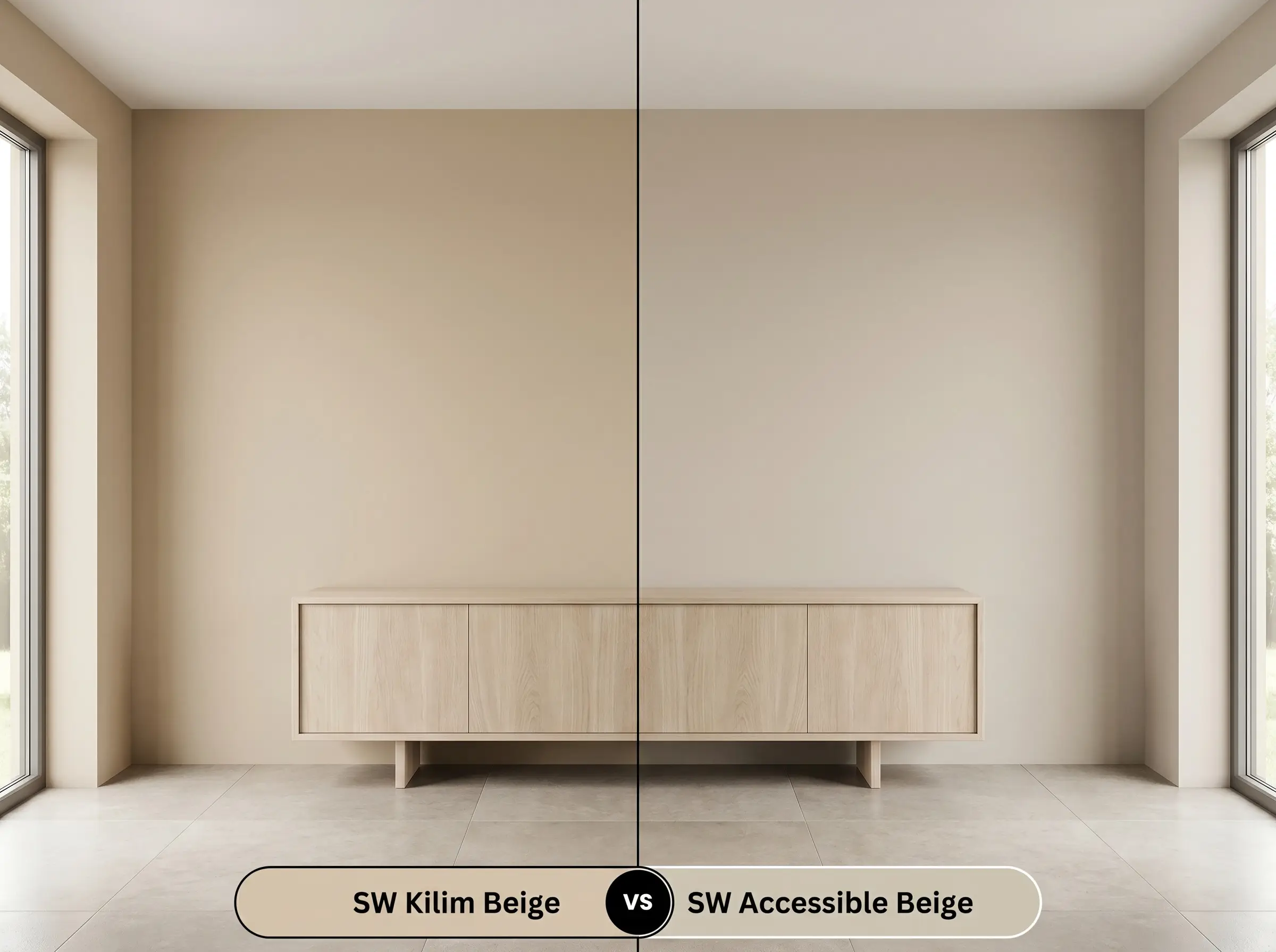
While both are incredibly popular neutrals, their base structures dictate entirely different aesthetics. Accessible Beige carries a distinct gray undertone, making it a true “greige” that performs beautifully in cooler lighting or alongside cooler stone finishes. If your home features cool gray veined marble or stark white artificial lighting, Accessible Beige will harmonize much better. However, if you want to cultivate genuine, sun-baked warmth and eliminate any trace of chill, SW 6106 remains the superior choice.
Sherwin-Williams Kilim Beige vs. Benjamin Moore Shaker Beige
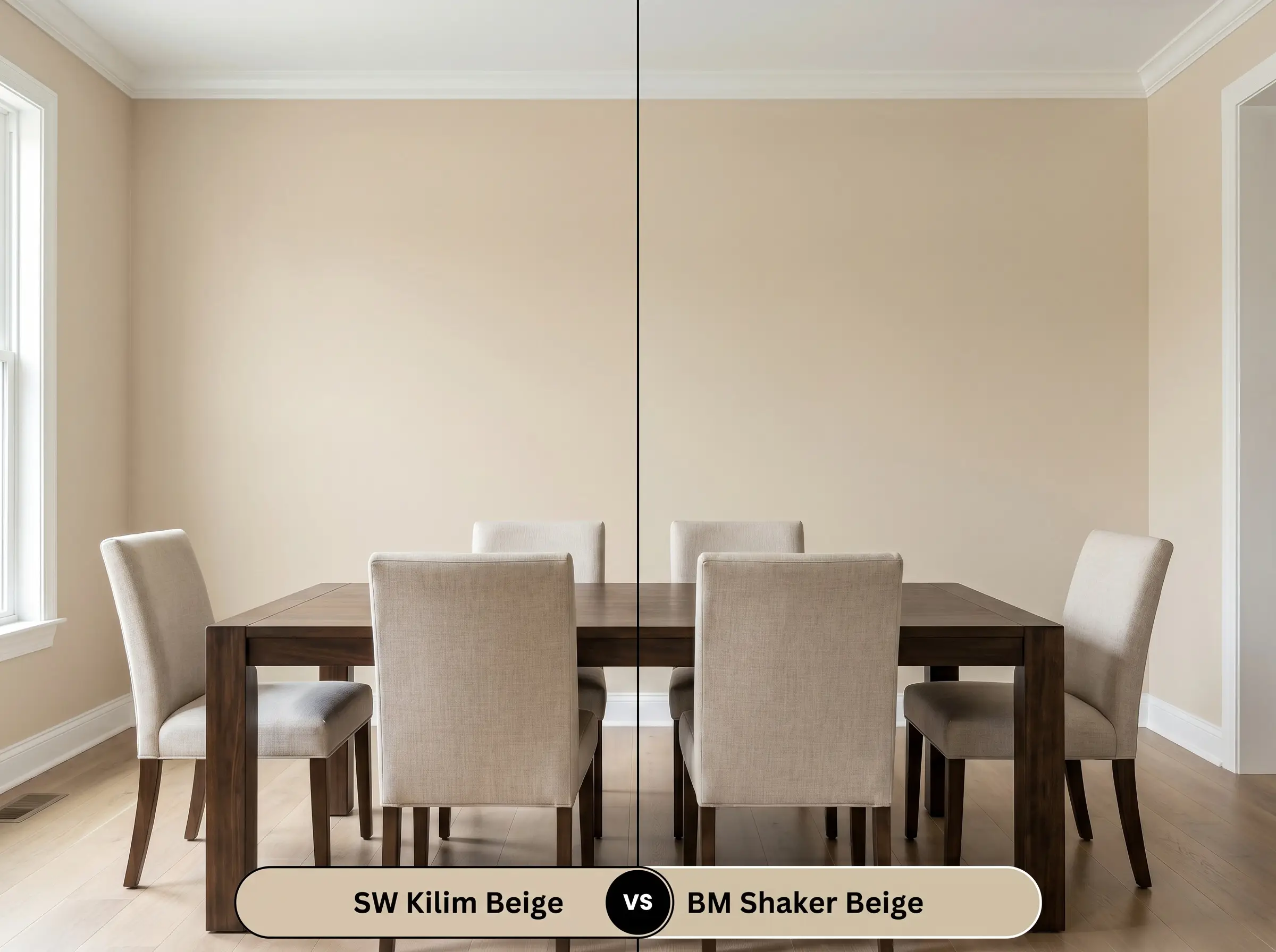
These two colors often compete for the same earthy, mid-tone applications, but they differ significantly in their visual weight. Benjamin Moore Shaker Beige is noticeably deeper and carries a slightly more prominent orange cast. If you are designing a large, well-lit room and need a color that will aggressively command attention, Shaker Beige delivers that strength. Conversely, SW 6106 offers a slightly softer, more versatile approach that wraps a space without dominating the surrounding decor.
Alternative Shades and Brand Matches
Sometimes a color is almost perfect, but your specific room requires just a fraction more light reflectance or a slightly deeper tone to balance the surrounding architecture. Adjusting your selection by a single shade can dramatically shift the final result.
Next-Step Shade Variations
Cross-Brand Equivalents
Executing Sherwin-Williams Kilim Beige on the Wall
Transitioning from design theory to the actual application requires a strategic approach to finishes and preparation. The sheen you select will physically alter how the pigment interacts with the light in your home, either softening the color or intensifying its underlying warmth.
The Dynamic Sheen Guide
Because this shade sits comfortably in the mid-light range, a standard high-quality white primer is usually sufficient. However, if you are painting over a dark, highly saturated color like navy or forest green, use a tinted gray primer first. This prevents the old color from altering the delicate peach-orange base of your new finish.
Hackrea Pro-Tip (The Primer Protocol)
Priming and Coverage Strategy
Achieving a flawless, professional result with SW 6106 typically requires two full coats over a properly primed surface. The pigment is robust, but stretching the paint too thin will result in a patchy finish that fails to deliver its signature warmth.
When rolling this color, maintain a wet edge to prevent flashing—those frustrating, visible roller marks that appear when the paint dries unevenly. If you need to touch up a scuff later, always use the exact same applicator (brush or roller) to match the original texture. Touching up a rolled wall with a brush will change how the light reflects off that specific spot, creating a glaring mismatch.
Frequently Asked Questions
Because green and red/pink are complementary colors, bright green light bouncing off exterior foliage can occasionally amplify the subtle peach base of this paint. To counteract this, rely on warm 3000K interior lighting and incorporate grounding, dark contrast elements like navy or bronze to pull the eye away from any fleshy tones.
Intense, direct southern sunlight will significantly wash out the color’s depth, making it read much closer to a warm, off-white cream than a true mid-tone beige. It performs beautifully in this application, but you must pair it with dark, high-contrast trim to ensure the exterior retains a premium, architectural presence.
While its warm structure will certainly help combat the icy chill of 4000K bulbs, those cool lights will flatten the paint’s complex earthy glow, leaving it looking like a generic tan. For the best aesthetic result, swap your basement bulbs to 3000K to let the color’s natural warmth thrive.
Pairing this specific shade with red-toned wood often creates an uncomfortable visual clash, as the orange micro-nuance in the paint competes directly with the red in the wood. This combination tends to make both surfaces feel overly saturated and dated, so it is best to pair this paint with cooler or more neutral woods like white oak or walnut.
The Final Verdict on SW 6106
Sherwin-Williams Kilim Beige is an exceptional, highly versatile foundation for homeowners who want to cultivate a deeply welcoming, sun-basked atmosphere. Its supreme strength lies in its ability to wrap a room in tactile warmth without ever crossing into muddy or overly yellow territory. It is the perfect architectural finish for Organic Modern living spaces, textural Wabi-Sabi bedrooms, and expansive transitional hallways that require a sophisticated, earthy glow. When paired with natural stone, unlacquered metals, and crisp white trim, it elevates standard rooms into beautifully curated, high-end environments.
However, this paint requires strict adherence to intentional color theory to succeed. While this shade is incredibly adaptable, it immediately loses its sophisticated edge when forced into rooms dominated by cool, blue-toned gray flooring or stark, icy finishes. Placing this warm, earthy neutral next to modern, cool-toned grays creates a jarring disconnect that makes the beige look dingy and the gray look clinical. If your home’s fixed elements lean heavily cool, you must pivot to a true greige to maintain harmony, reserving this rich, tactile shade for spaces that can fully embrace its sun-drenched character.
Closest Cross-Brand Equivalents
The absolute closest scientific color matches for Kilim Beige across top paint brands.