Master Blue SB8E9
DuluxDulux Master Blue is a deep, vibrant, and highly saturated true blue with an LRV of 6. Characterized by a subtle cyan-leaning micro-nuance, this bold chromatic profile anchors open spaces and serves as a striking focal point for both interior and exterior architectural elements.
Paint Technical Profile
| Color ID / SKU | SB8E9 |
| HEX Code | #27365f |
| Light Reflectance (LRV) | 6 |
| Use | Interior, Exterior |
| Best Exposures | South-Facing, Well-Lit Spaces |
| Best For | Accent Walls, Custom Cabinetry, Exterior Trim, Dining Rooms |
Dulux Master Blue: How a Hidden Cyan Nuance Transforms the Classic Navy
Finding a rich, dark blue that actually stays blue when the sun goes down is one of the most persistent challenges in residential design. Too often, a promising navy turns into a flat, lifeless charcoal the moment you turn on a lamp. Dulux Master Blue completely bypasses this frustrating color trap.
This specific architectural finish is built differently than your standard dark blue. It possesses an intense, vibrant core that refuses to fade into the shadows, making it an incredibly reliable choice for both sun-drenched rooms and cozy, windowless spaces.
Whether you are brushing it onto a vintage campaign dresser for a weekend refresh or wrapping an entire room in custom millwork, this oceanic hue instantly elevates the atmosphere. It brings a profound sense of sophistication to the home without ever feeling cold or unapproachable.
Decoding the Undertones & LRV of Dulux Master Blue
When evaluating this shade for your home, you need to know exactly how it behaves on the wall. Dulux Master Blue is a definitively cool color. However, its underlying color structure prevents it from feeling chilly, offering a vibrant, welcoming temperature that works beautifully across various interior styles.
To understand why this paint feels so alive, we have to look at its chromatic profile:
When we talk about light reflectance value (LRV), we are measuring how much light a color bounces back into the room. With an LRV of exactly 6, this shade absorbs a massive 94% of all light.
In the design world, an LRV this low means the paint carries immense visual weight. It creates a stabilizing, immersive atmosphere that wraps around the room, but it absolutely requires strategic lighting to keep the space from feeling too enclosed.
Ambient Luminosity: The Chameleon Factor
Because this color absorbs so much light, its tonal depth is highly sensitive to the surrounding environment. The way you light this paint will dramatically alter how you experience it throughout the day.
Here is exactly how the spectral absorption shifts depending on your light source:
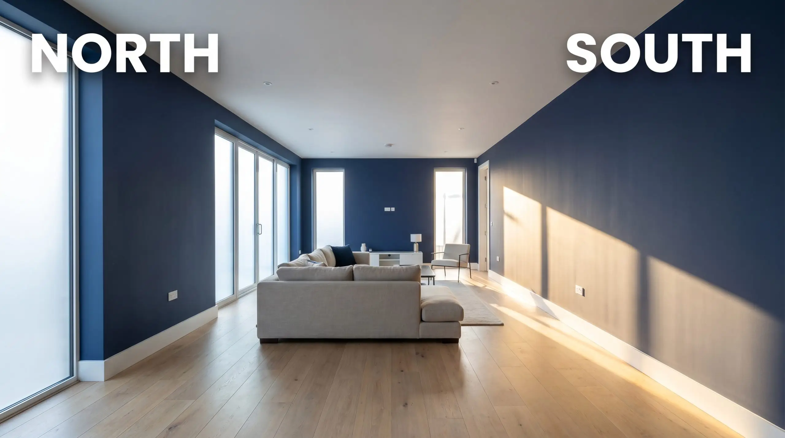
If you want to maintain the vibrant, true-blue nature of this paint in the evening, avoid amber-tinted vintage bulbs. Stick to LED bulbs in the 3000K to 3500K range to provide enough crisp ambient luminosity without turning the room into a sterile laboratory.
Hackrea Pro-Tip (The Bulb Rule)
Where to Use Master Blue in Your Home
Understanding the technical data is only half the battle; the real magic happens when you apply it to your architecture. This saturated blue is incredibly versatile, adapting seamlessly to different textures, materials, and daily routines. Here is how to maximize its potential across your most important spaces.
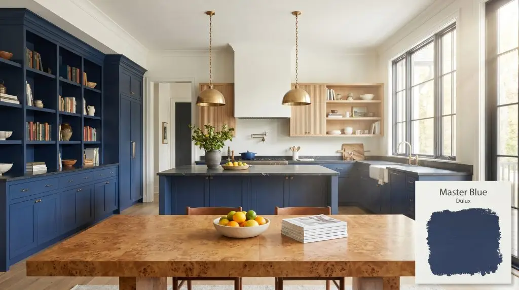
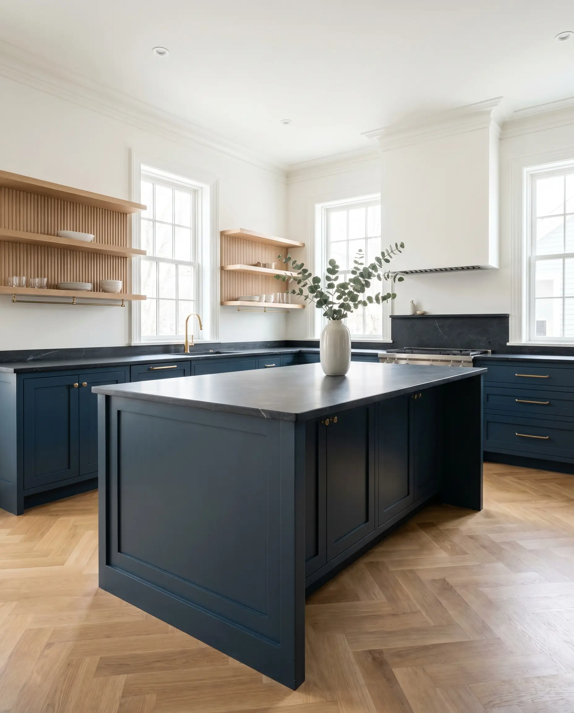
Custom Kitchen Cabinetry & Islands
Using a dark blue in the kitchen is a timeless choice, but you can easily push this shade into a more contemporary, Transitional aesthetic. Instead of defaulting to standard white subway tile, pair your Master Blue lower cabinets with honed soapstone countertops and fluted white oak upper shelving. The organic warmth of the wood beautifully balances the intense saturation of the paint.
For the hardware, unlacquered brass pulls are a flawless companion. As the brass patinas over time, its earthy warmth will contrast perfectly with the cool, oceanic tones of the cabinetry. If your kitchen lacks natural light, keep the upper walls crisp and bright using a clean white like Benjamin Moore Chantilly Lace to maintain a fresh, airy workflow for busy family mornings.
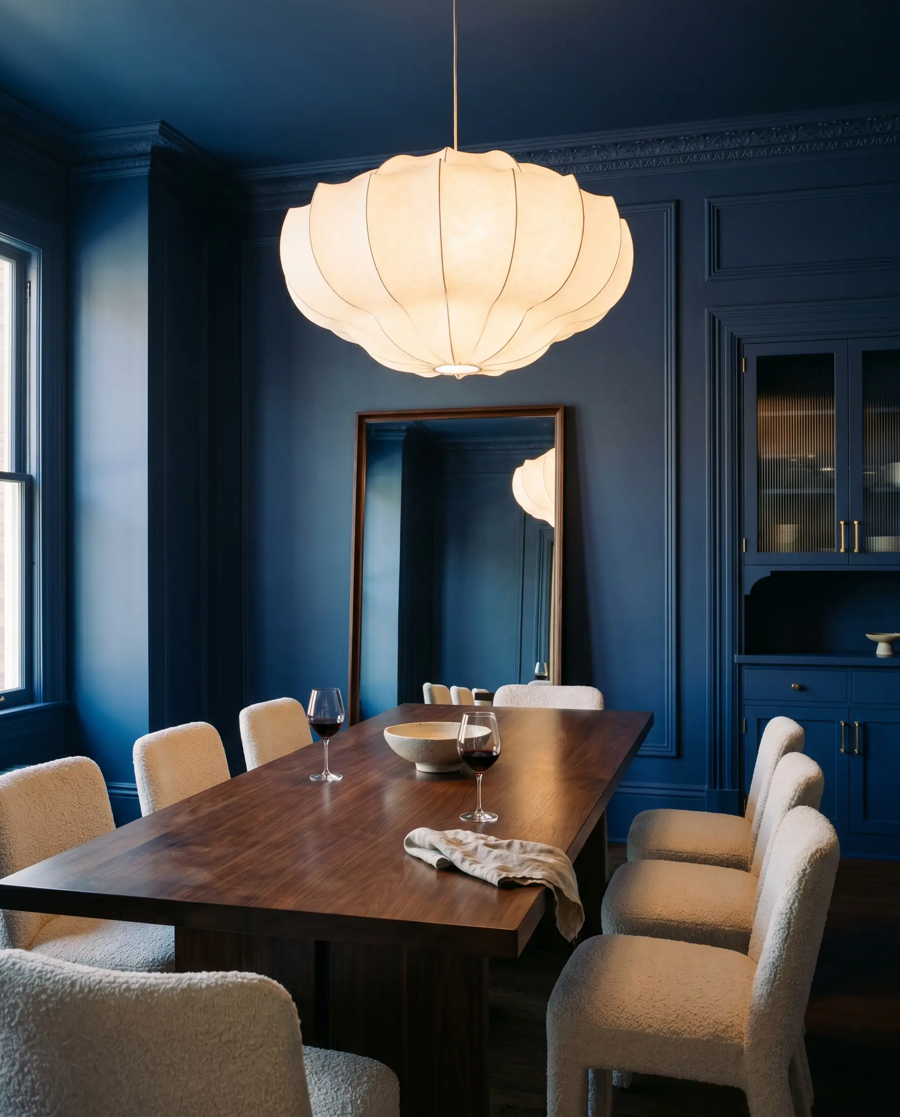
Formal Dining Rooms
A dining room is the perfect place to experiment with a more immersive, Postmodern Revival vibe. Consider color-drenching the space by taking this rich blue across the walls, the baseboards, and the picture molding. To keep the room from feeling too enclosed, introduce contrasting textures like a set of nubby bouclé dining chairs and an oversized, sculptural paper chandelier.
Because this paint has an LRV of 6, painting a dimly lit dining room completely blue without adding reflective surfaces can make the space feel restrictive. Always introduce elements that bounce light, such as a leaning floor mirror, polished nickel fixtures, or reeded glass cabinet doors, to keep the energy moving.
Clash Warning (The Cave Effect)
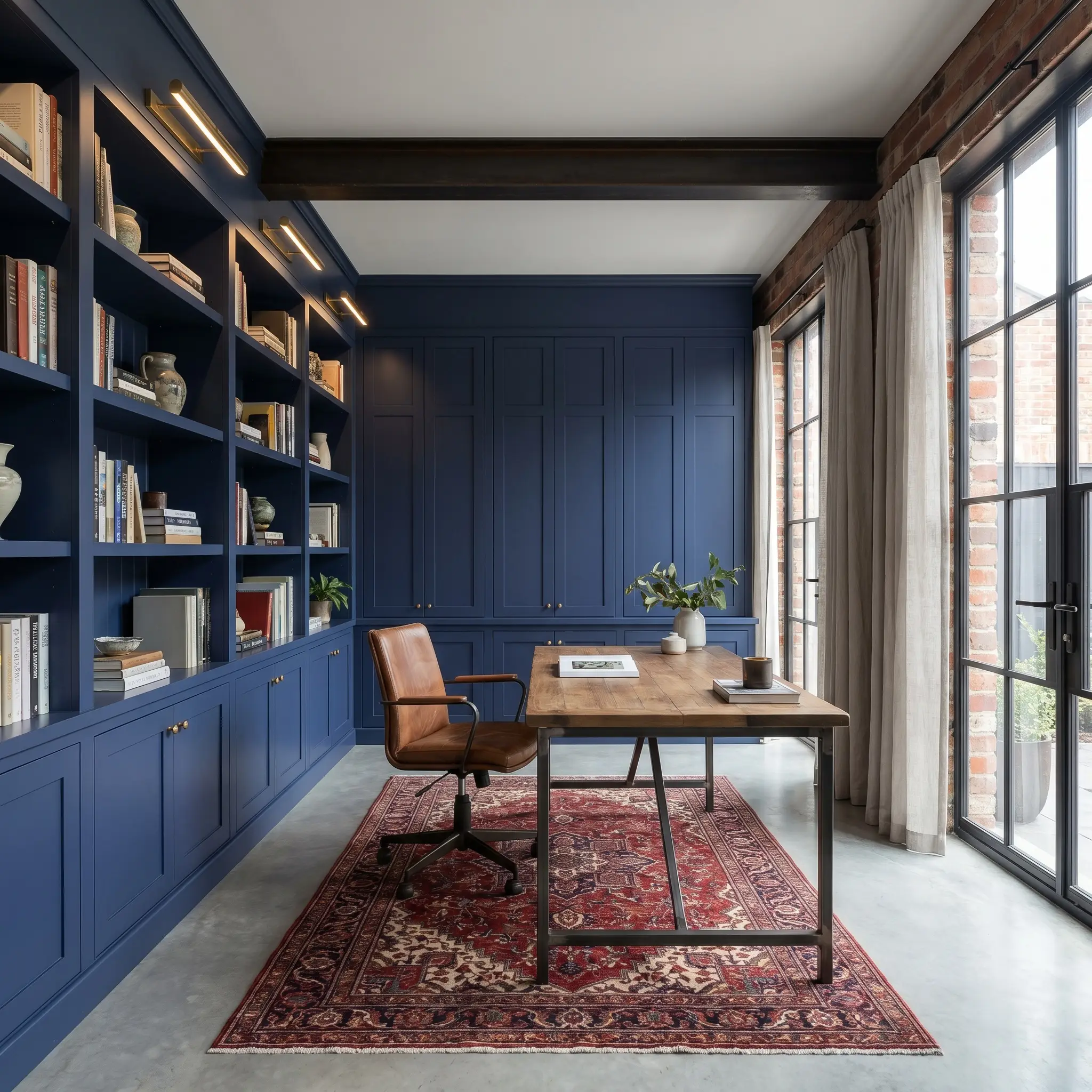
Home Libraries & Remote Studies
For those working from home, a study should feel focused, sophisticated, and entirely separate from the rest of the house. This shade provides incredible spatial anchoring when applied to built-in bookcases and paneled walls. The blue recedes visually, allowing your curated art books, vintage ceramics, and brass picture lights to pop brilliantly against the dark background.
Lean into an Urban Industrial or tailored aesthetic by introducing rich, tactile materials. A saddle leather desk chair, a vintage Persian rug with hints of oxblood red, and subtle strie linen curtains will soften the crispness of the blue. The result is a quiet, highly intentional workspace that looks fantastic on a video call.
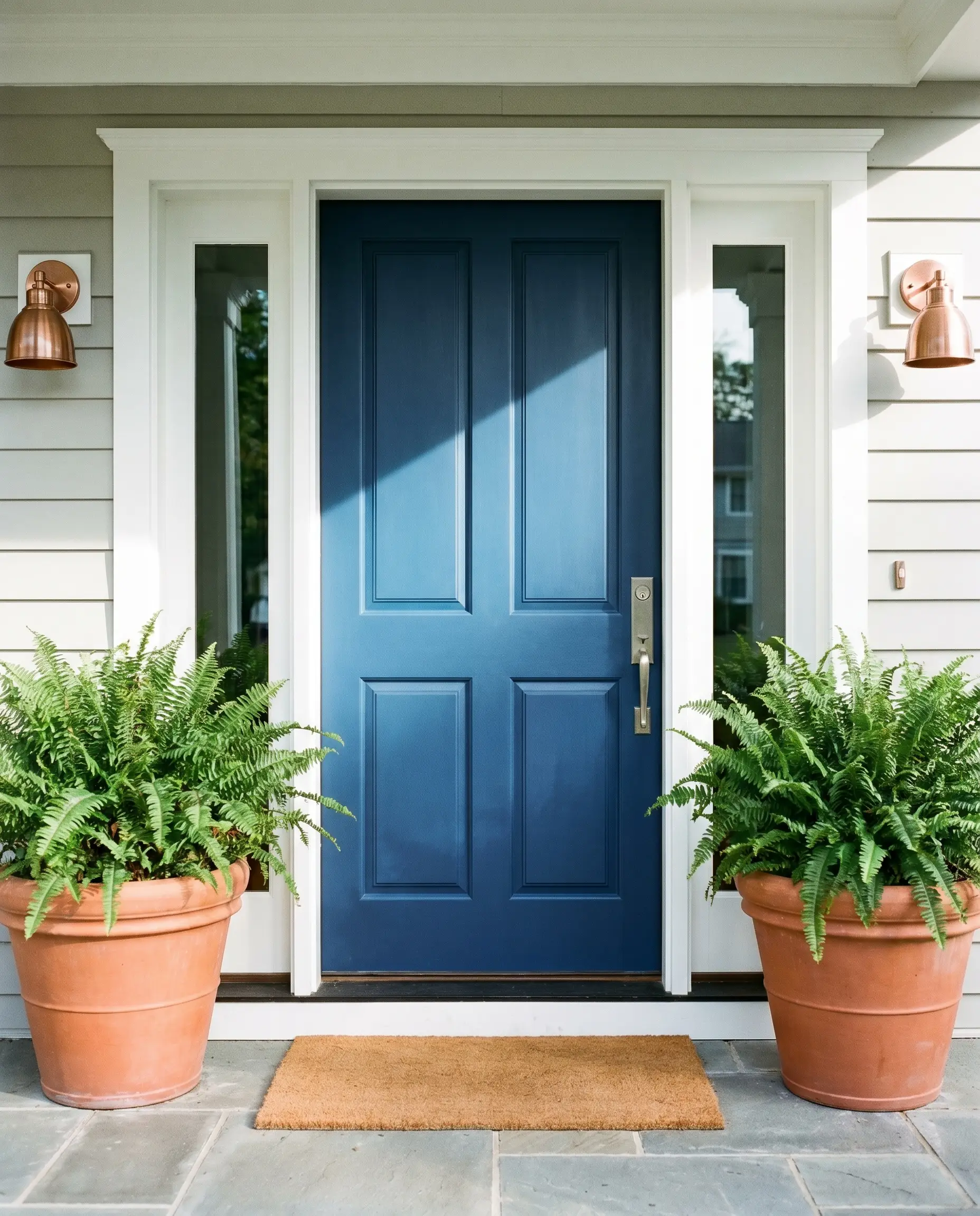
Exterior Front Doors & Shutters
On the exterior, direct sunlight will wash out dark colors, making them appear slightly lighter and less intense than they do indoors. This makes Master Blue an exceptional choice for a front door, as the sun will highlight its vibrant cyan micro-nuance rather than letting it read as a flat black.
To boost your curb appeal, pair the freshly painted door with oversized terracotta planters and brushed copper exterior sconces. The warm, earthy tones of the fired clay and metal will create a striking, welcoming contrast against the cool blue architecture.
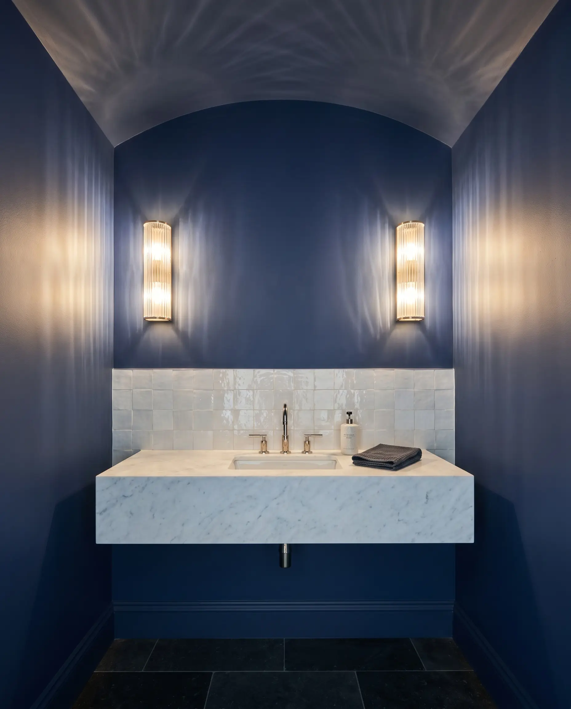
Windowless Powder Rooms
Powder rooms are the ultimate architectural blank slate for dramatic design choices. Instead of fighting the lack of natural light, lean into it by wrapping the walls and ceiling in this profound blue. It creates a jewel-box effect that feels incredibly high-end and intentional for guests.
To elevate the small footprint, pair the dark walls with a floating marble vanity and a backsplash of glossy, handmade zellige tile. The subtle imperfections in the tile will catch the glow of your vanity sconces, reflecting beautiful, watery light around the room and perfectly complementing the oceanic nature of the paint.
Material Pairings & Coordinating Colors for Master Blue
This intense oceanic pigment requires thoughtful companions to establish a cohesive room. Rather than demanding rigid boundaries, its saturated core thrives when allowed to softly bleed into organic textures and complementary tones.
Framing the Room with Crisp White Trim
To establish a clean architectural boundary, this intense pigment requires crisp, highly reflective whites. Benjamin Moore Chantilly Lace OC-65 offers a stark, luminous edge that forces the blue to hold its sharp shape without bleeding into the ceiling. If you prefer a slightly softer transition, Sherwin-Williams Extra White SW 7006 and Farrow & Ball All White No.2005 provide beautifully tailored borders that still offer enough contrast to make the dark walls pop.
Tactile Finishes That Elevate Dark Blue
Harmonious Accent Tones
Curated Aesthetic Blueprints
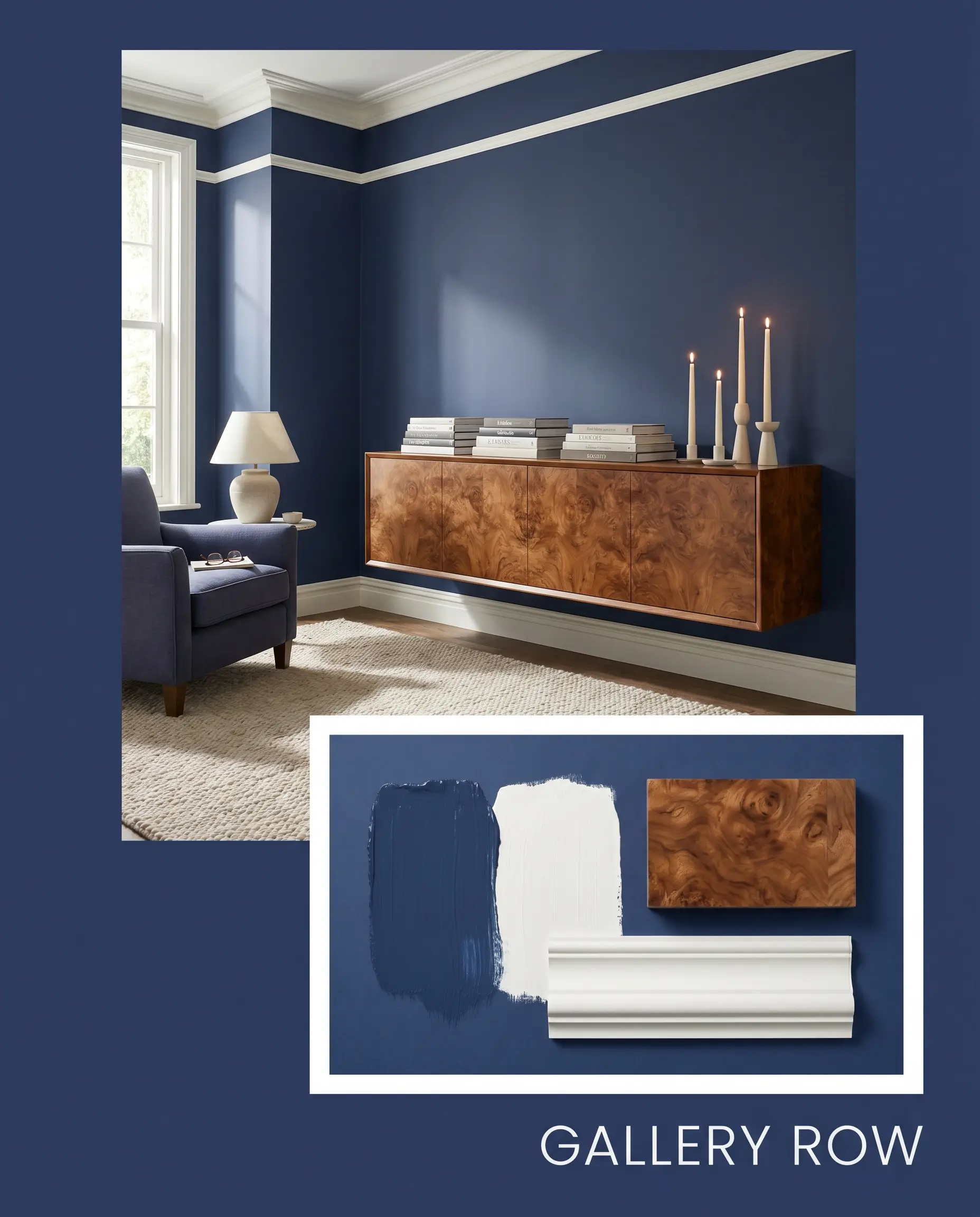
Gallery Row: This aesthetic relies on high-contrast sophistication, pairing the immersive walls with the crisp boundary of Farrow & Ball All White No.200 on the trim. Introduce a floating credenza crafted from rich burl wood to warm up the cool tones, and style it with stacked art books and sculptural taper candles. The energy is curated, quiet, and deeply intellectual.
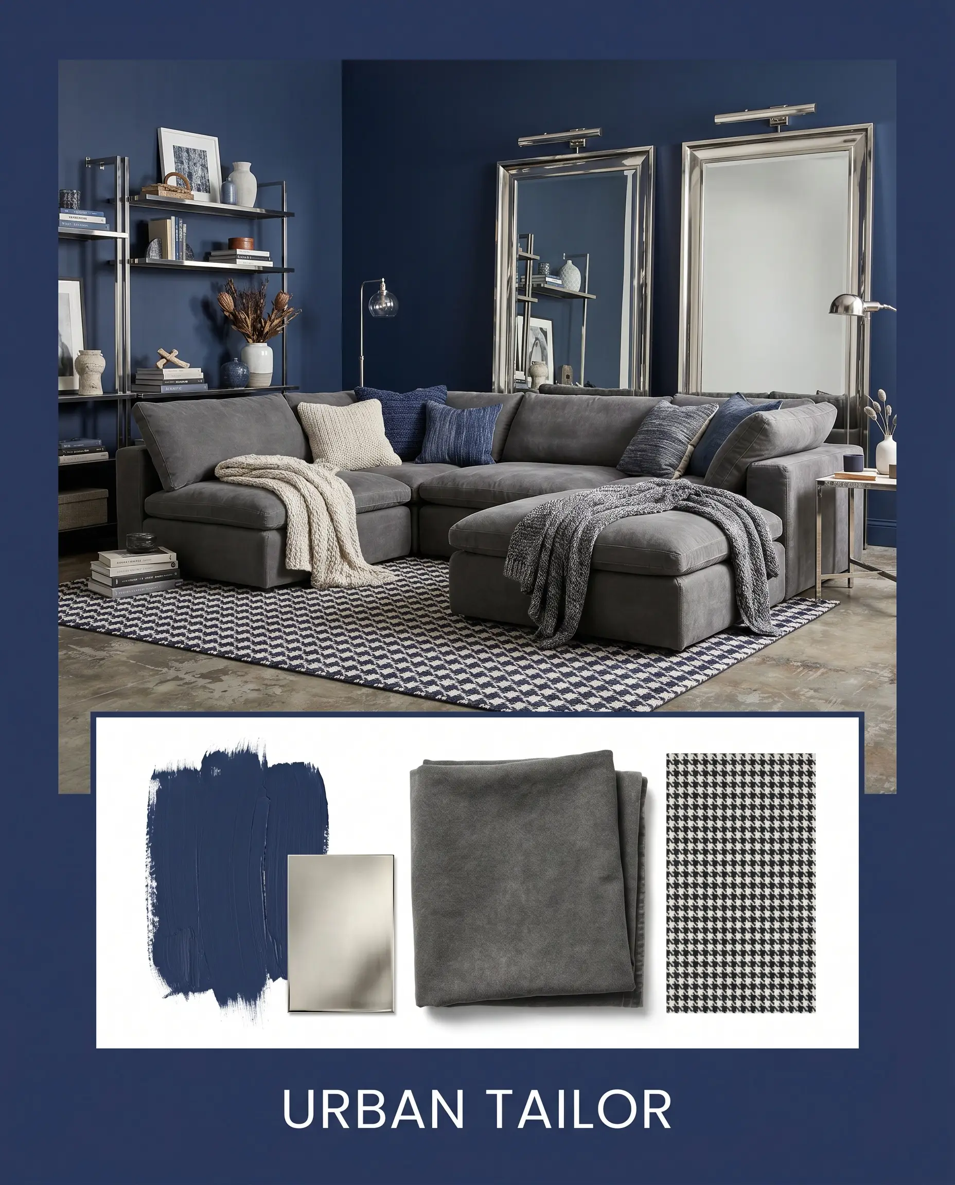
Urban Tailor: Channeling a tailored, industrial vibe, this palette uses the stabilizing nature of the dark paint as a backdrop for sleek, polished nickel hardware. Soften the hard metallic edges with an oversized modular sectional draped in thick stonewashed cotton. A vintage houndstooth rug and leaning floor mirrors complete the look, creating an atmosphere that feels decisively modern yet approachable.
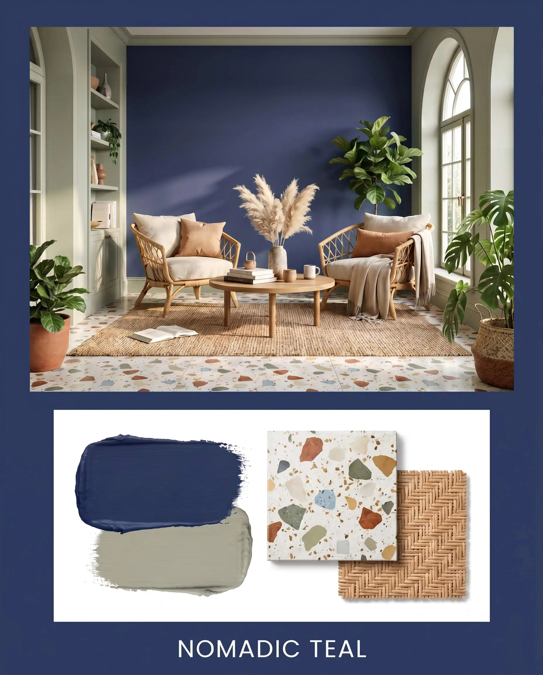
Nomadic Teal: This vibe activates the hidden cyan micro-nuance by pairing the paint with earthy, botanical elements like Benjamin Moore October Mist 1495 on adjacent architectural features. Root the vibrant walls with playful terrazzo flooring and layer in natural textures like dried pampas grass and rattan accent chairs. The resulting mood is relaxed, organic, and effortlessly collected.
Dulux Master Blue vs. The Industry Heavyweights
Deciding between deep navies often comes down to the specific lighting conditions and architectural exposures of your home. A color that looks brilliant in a sun-drenched space might completely lose its vitality in a shaded corridor, making a side-by-side comparison essential.
Dulux Master Blue vs. Benjamin Moore Hale Navy HC-154
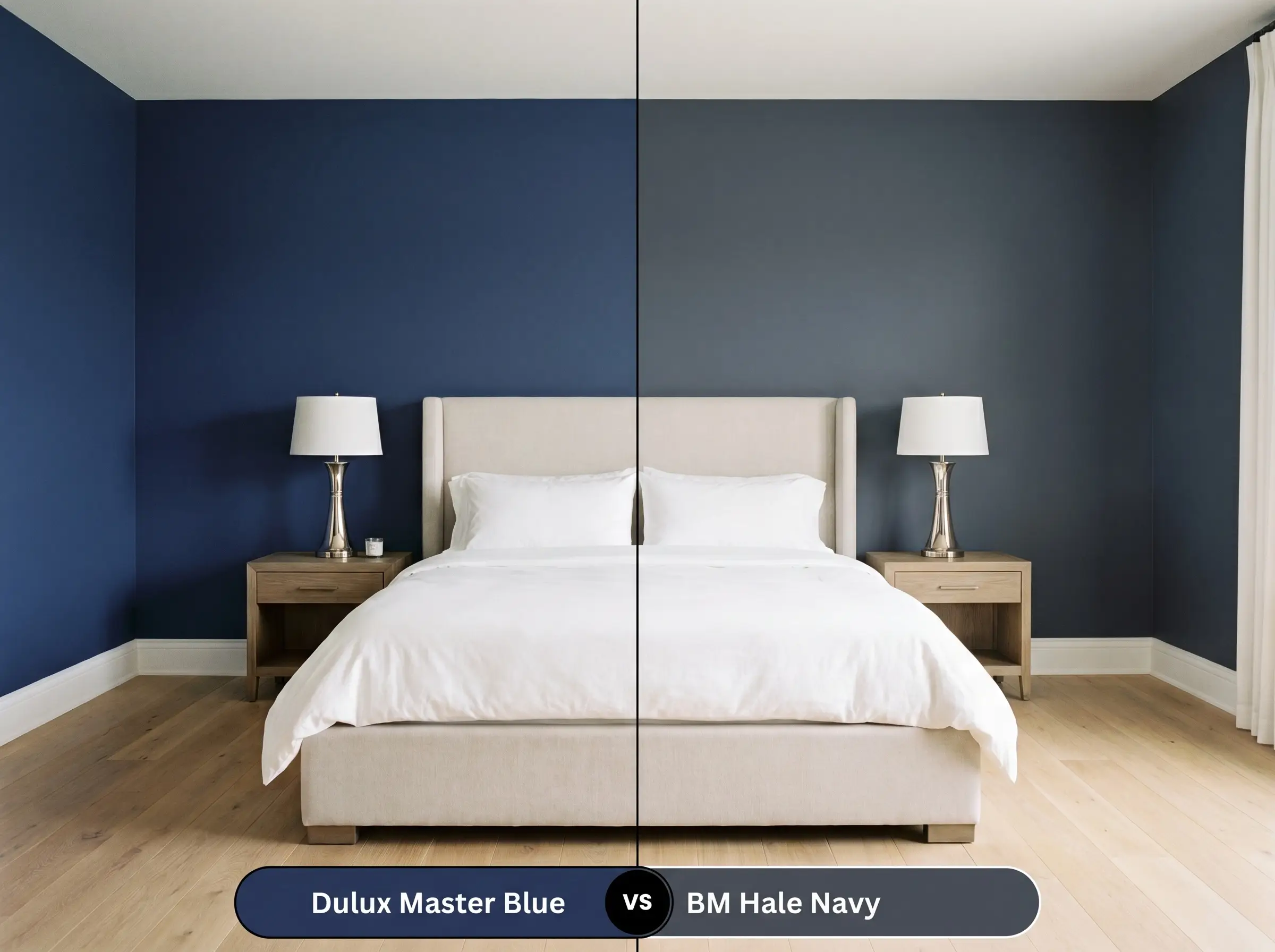
If your room receives ample southern light, Hale Navy HC-154 will read as a beautifully muted, classic maritime shade. However, if you are painting a north-facing space, Hale Navy often pulls a distinct charcoal gray undertone that can feel slightly somber. In those cooler lighting scenarios, the Dulux option retains its true oceanic vibrancy thanks to its hidden green influence.
Dulux Master Blue vs. Sherwin-Williams Naval SW 6244
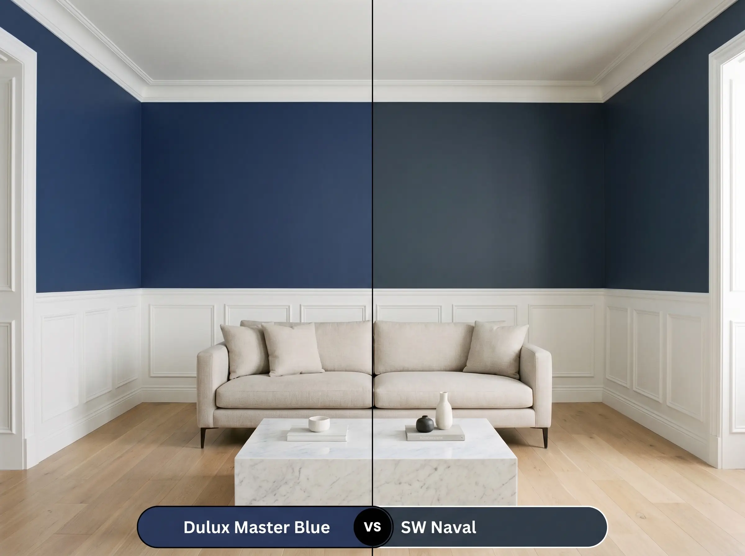
Sherwin-Williams Naval SW 6244 is an incredibly pure, traditional navy that lacks the subtle teal shift found in the Dulux formulation. If you want a strictly historic, crisp aesthetic that pairs perfectly with bright reds and crisp whites, Naval SW 6244 is the superior choice. If you prefer a more contemporary, chameleon-like color that shifts dynamically throughout the day, stick with the Dulux shade.
Dulux Master Blue vs. Farrow & Ball Hague Blue No.30
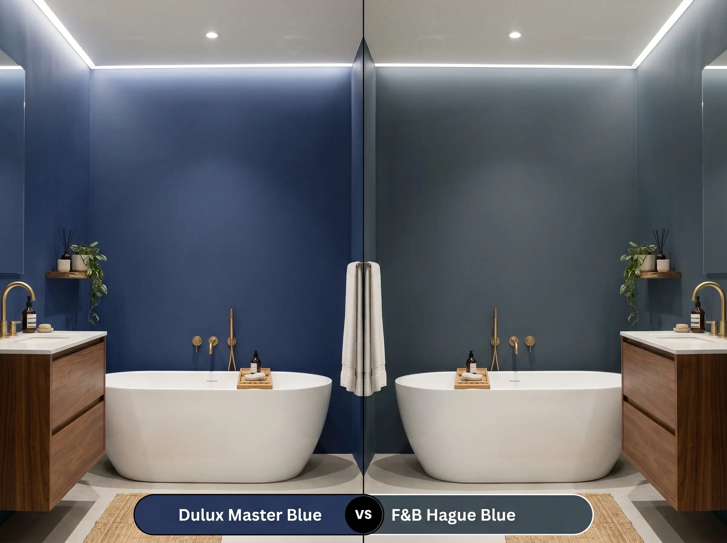
Farrow & Ball Hague Blue No.30 leans much further into green territory, often reading as a deep, moody teal rather than a true blue. If your goal is to highlight warm wood tones and brass fixtures, the pronounced green presence in Hague Blue No.30 creates a spectacular, earthy backdrop. Conversely, the Dulux paint remains firmly rooted in the blue family, offering a cleaner, more tailored visual structure.
Exploring Alternative Shades
Sometimes a room demands a slight pivot in saturation or warmth to perfectly align with your existing hard finishes. If this specific hue feels just a fraction too intense for your lighting, these alternatives provide excellent fallback options.
Within the Dulux Portfolio
Cross-Brand Matches
Flawless Application Strategies
Moving from aesthetic theory to the physical reality of rolling paint onto drywall requires a shift in strategy. Dark, saturated pigments demand precise preparation to achieve that flawless, high-end finish you expect.
The Dynamic Sheen Guide
Primer Requirements
Because this color sits so low on the reflectance scale, a standard white primer will aggressively fight against the topcoat. You must use a deeply tinted gray primer to establish a proper base. This crucial step prevents the white from glaring through the blue, ensuring the final finish looks deep and thoroughly saturated.
Coverage & Success Tips
Even with a premium tinted primer, expect to roll at least two generous coats to achieve full, opaque coverage. Dark paints are notoriously prone to “flashing,” which occurs when uneven roller pressure creates subtle, shiny streaks across the wall once dry.
To avoid flashing, always keep a “wet edge” by rolling continuously from ceiling to floor without stopping in the middle of a wall. Never go back to touch up a semi-dry spot, as this will permanently alter the sheen in that specific area.
Hackrea Pro-Tip (The Wet Edge Rule)
Frequently Asked Questions
Because it absorbs nearly 70% of solar radiation, this paint will cause exterior timber to heat up significantly during the day. You must ensure your cladding is properly acclimated and sealed to prevent warping or resin bleed before applying this dark finish.
Yes, the cool, greenish-blue base sits directly opposite the warm orange tones of red oak on the color wheel. In a poorly lit hallway, this high-contrast pairing can make the floors look aggressively orange and dated.
Using a 6 LRV paint in a windowless room creates a highly immersive, cinematic experience that blurs the boundaries of the walls and ceiling. It centers the room’s energy, making the space feel incredibly cozy and purposefully designed for focused viewing.
Absolutely. Transitioning from a bright white to a dark navy without a tinted gray primer will result in a streaky, uneven finish that requires four or more coats to fix.
The Final Verdict on Dulux Master Blue
This paint is an exceptional tool for homeowners who want the stabilizing comfort of a classic navy but crave a more dynamic, contemporary edge. Its absolute best application is in spaces designed for evening unwinding or focused work, where its rich depth can truly center the room’s energy. It flawlessly elevates Transitional and Urban Industrial design styles, providing a highly sophisticated backdrop that makes warm metals and organic woods sing.
While its versatility is impressive, this intense pigment is not a universal solution for every architectural challenge. If you are working with strongly yellowed, unlit red-oak hardwood floors, the cool blue base will aggressively highlight the orange tones in the wood, creating a jarring contrast rather than a cohesive flow. Furthermore, pairing this shade with bulky, dark espresso furniture in a room lacking natural light will quickly turn the space into a visually restrictive cave. To succeed with this color, you must balance its profound depth with highly reflective accents, crisp white boundaries, or warm, varied textures that keep the eye moving gracefully around the room.