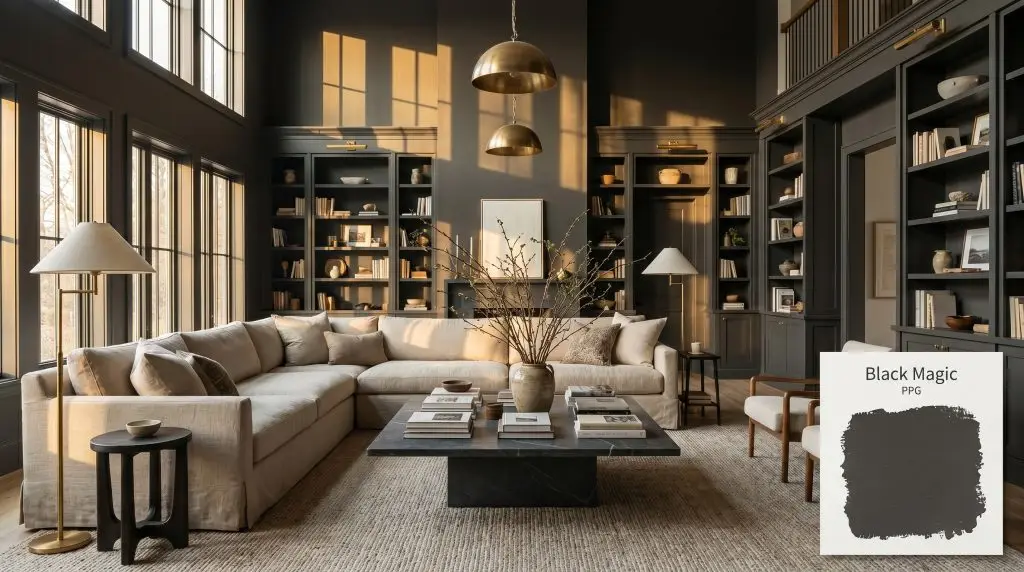
Black Magic PPG1001-7
PPGPPG Black Magic (PPG1001-7) is a deeply saturated, warm black paint color that functions as an exceptionally dark charcoal. With a Light Reflectance Value of 4, it absorbs significant light, creating a sophisticated, grounding presence perfect for dramatic accents and media rooms.
Paint Technical Profile
| Color ID / SKU | PPG1001-7 |
| HEX Code | #414040 |
| Light Reflectance (LRV) | 4 |
| Use | Interior, Exterior |
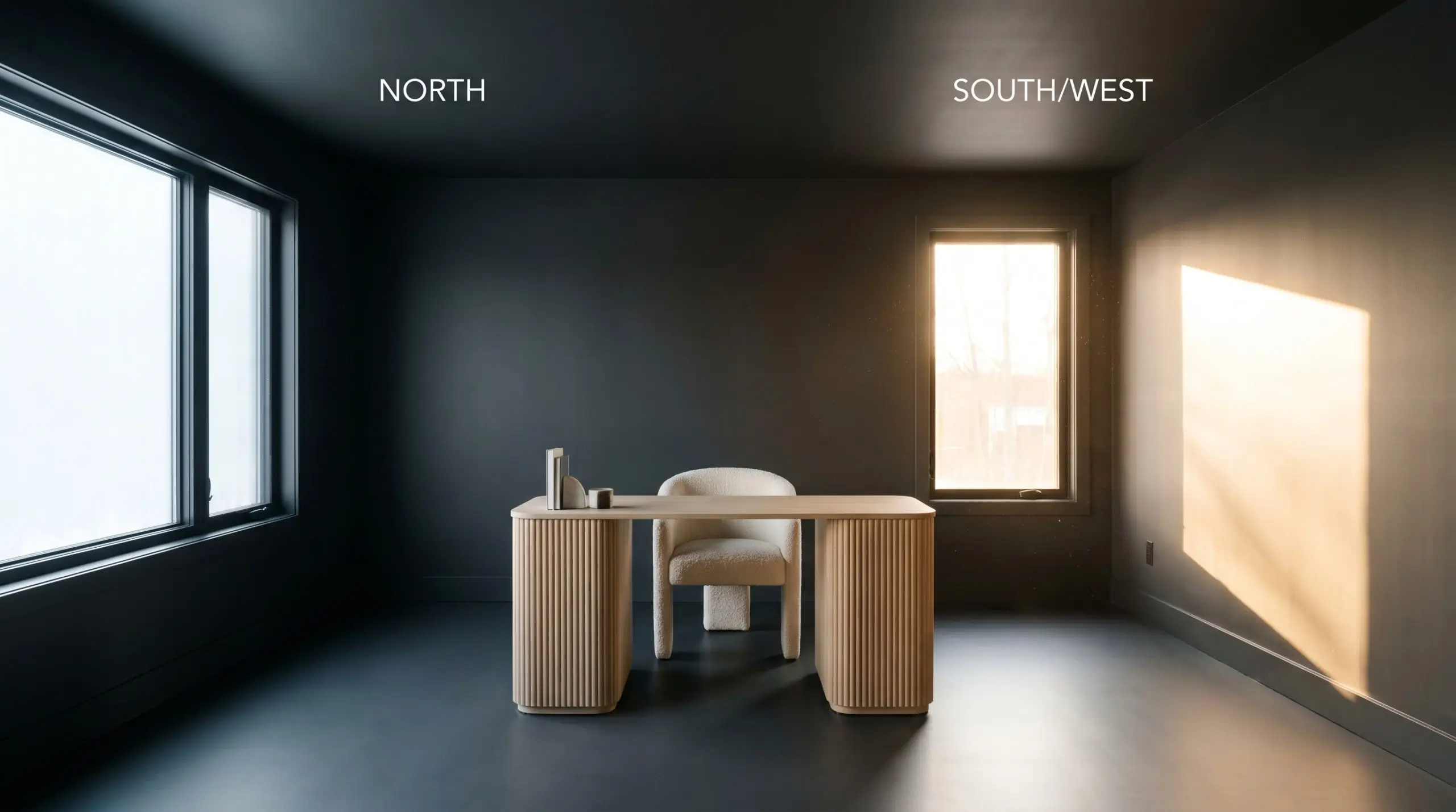
| Best Exposures | South-Facing, West-Facing, Rooms with Controlled Artificial Lighting |
| Best For | Media Rooms, Cabinetry, Accent Walls, Interior Doors, Exterior Trim |
PPG Black Magic: The Enveloping Warm Black for Tailored Interiors
Selecting a black paint often feels like navigating a tightrope between striking elegance and a stark, industrial chill. The secret to mastering this intense shade lies entirely in its hidden pigment structure, which dictates whether a room feels like a sophisticated retreat or a cold cavern. PPG Black Magic offers a masterfully balanced solution, delivering an intensely saturated presence that wraps a space in warmth rather than absorbing its energy.
This specific formulation proves that dark colors can feel incredibly inviting when applied with intention. By acting as a highly tailored architectural finish, it redefines the perimeters of a room, allowing your curated furnishings and tactile materials to take center stage. Let us explore exactly how this dynamic shade manipulates light and transforms ordinary interiors.
The Chromatic Profile of PPG Black Magic
When evaluating its core temperature, PPG Black Magic is definitively warm. Unlike flat, true blacks that can quickly render a space sterile, this sophisticated dark charcoal relies on a complex blend of pigments to maintain a softer, more approachable energy on the wall. This subtle warmth is the crucial element that prevents the color from feeling harsh against natural materials.
With a light reflectance value (LRV) of 4, this paint absorbs a staggering 96% of all ambient light. In practical design terms, this extreme ambient light absorption means the color will not bounce illumination around the room, creating a commanding, enveloping atmosphere. It visually blurs architectural boundaries, making sharp corners recede and allowing the space to feel remarkably cohesive and intimate.
How Lighting Shapes This Dark Charcoal
Because of its specific pigment blend, this color rarely remains entirely static throughout the day. The shifting temperature of the sun continuously interacts with the brown and red micro-nuances, altering how the paint behaves across different exposures.
Transforming Spaces with PPG1001-7
Understanding how this shade absorbs light is only the first step; the real magic happens when you apply it strategically to your architecture. Because it visually recedes, this paint provides an incredible opportunity to manipulate the perceived proportions of your home. Here is how to leverage its unique characteristics across various applications.
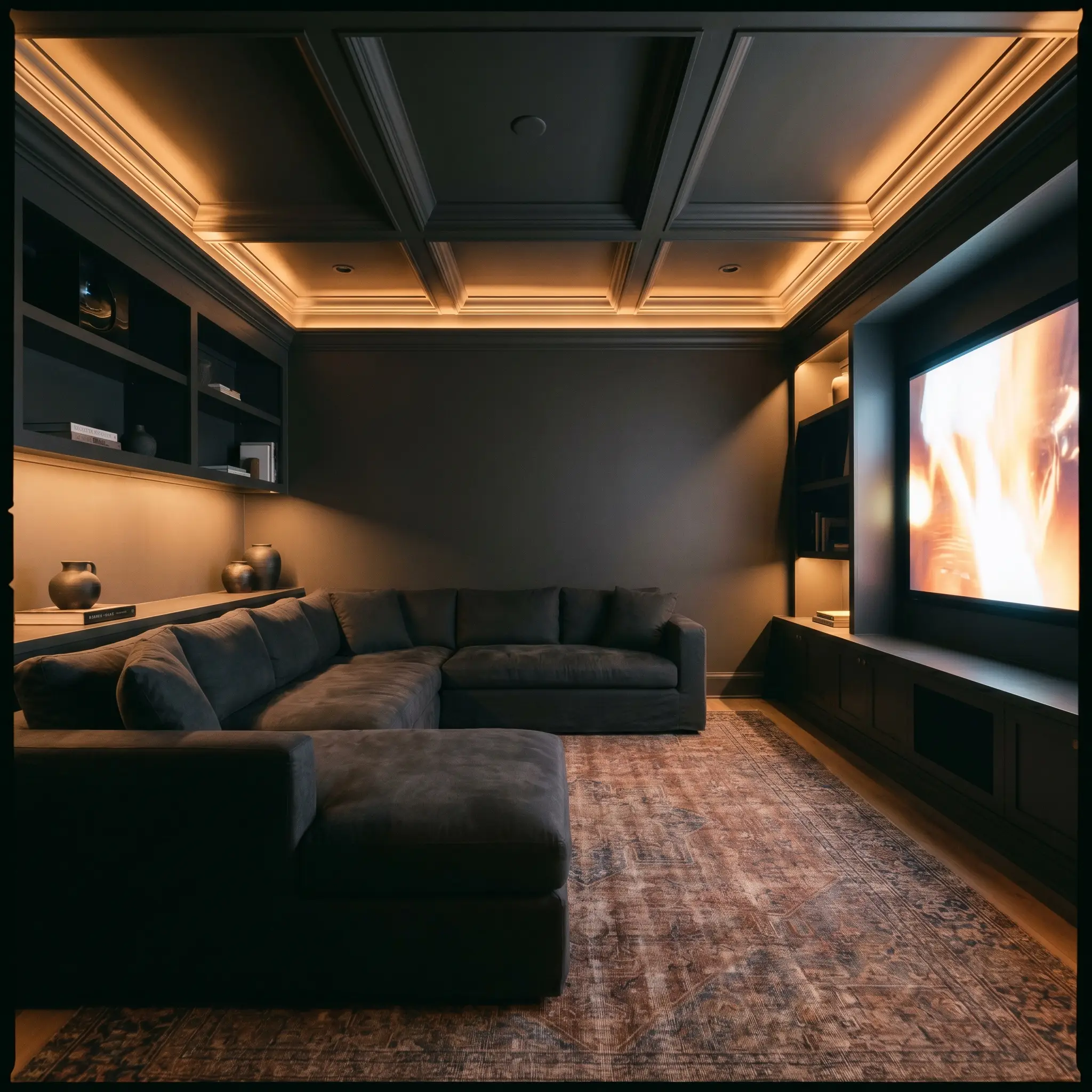
Media Rooms & Lounges
Instead of defaulting to a predictable cinematic cave, treat a media room as an immersive, sensory lounge. Color-drenching the entire space—walls, ceiling, and trim—in this warm black erases the sharp corners of the room, creating an enveloping, borderless retreat. Pair this seamless application with low-profile, washed linen sectionals and a richly textured vintage rug to introduce softness against the dark perimeter.
If painting the entire ceiling feels too intense, carry the black paint just up to the picture molding and finish the ceiling in a warm, violet-leaning greige. This maintains the intimate vibe while offering a subtle visual release overhead.
Hackrea Pro-Tip (The Ceiling Strategy)
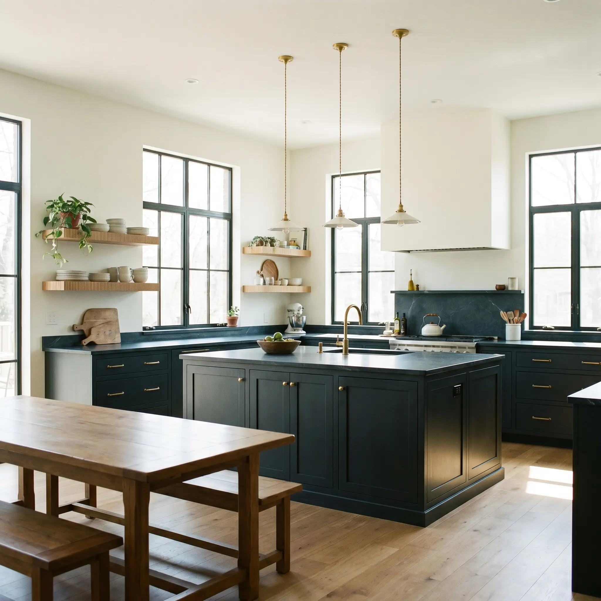
Kitchen Cabinetry & Islands
This shade is a brilliant candidate for modernizing kitchen millwork, offering a softer alternative to stark, glossy blacks. Apply it to lower cabinetry or a central island to establish a stabilizing foundation, especially when paired with honed soapstone countertops and unlacquered brass hardware. To keep the kitchen feeling Organic Modern rather than industrial, balance the dark base with floating fluted white oak shelves and handmade Wabi-sabi pottery.
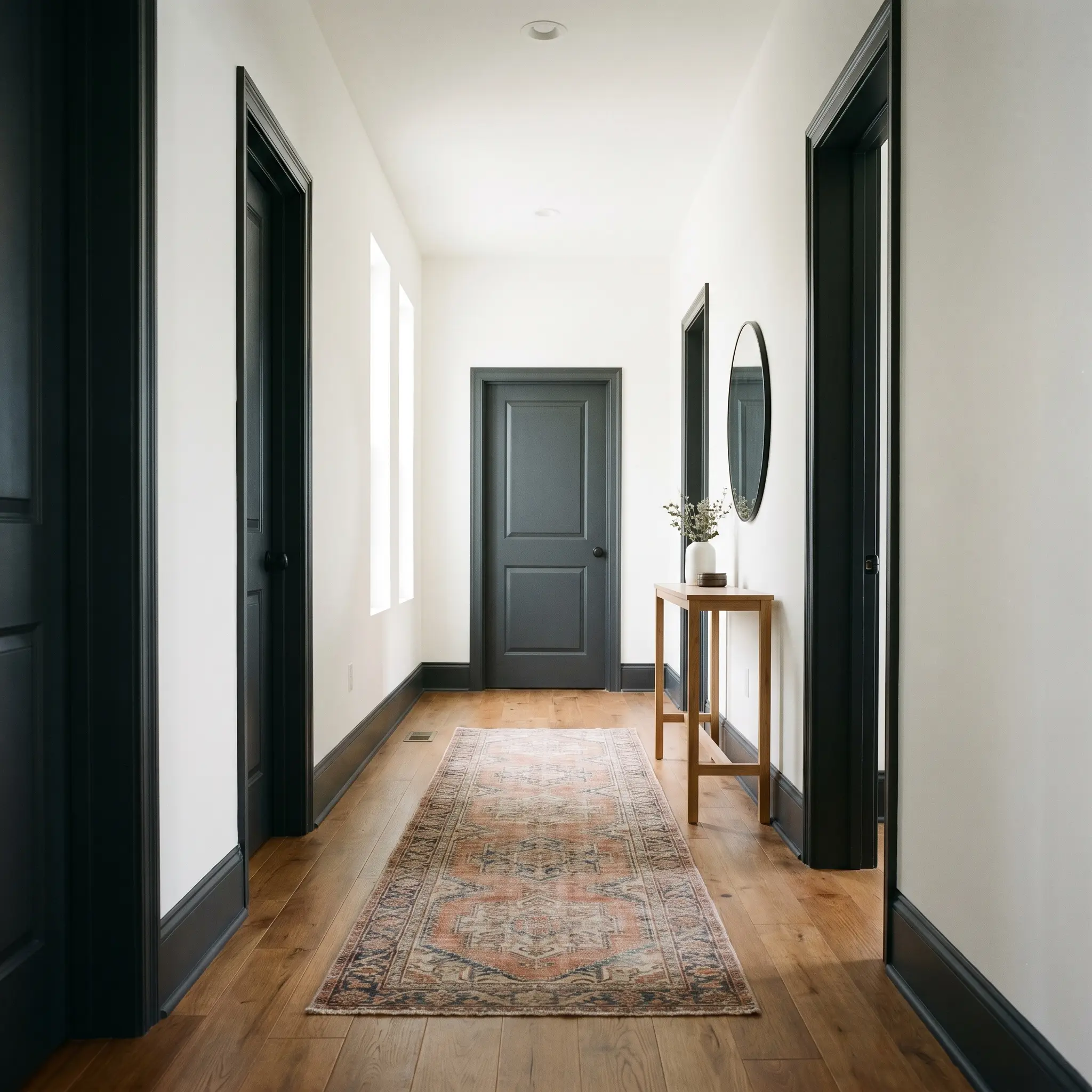
Interior Doors & Millwork
Painting interior doors and skirting boards in a dark charcoal instantly elevates standard builder-grade architecture. This approach frames your sightlines, turning every doorway into a tailored, high-contrast transition between lighter rooms. For a truly cohesive Transitional look, ensure your door hardware—such as knurled brass levers or matte patinated copper knobs—provides a tactile, luminous contrast against the dark finish.
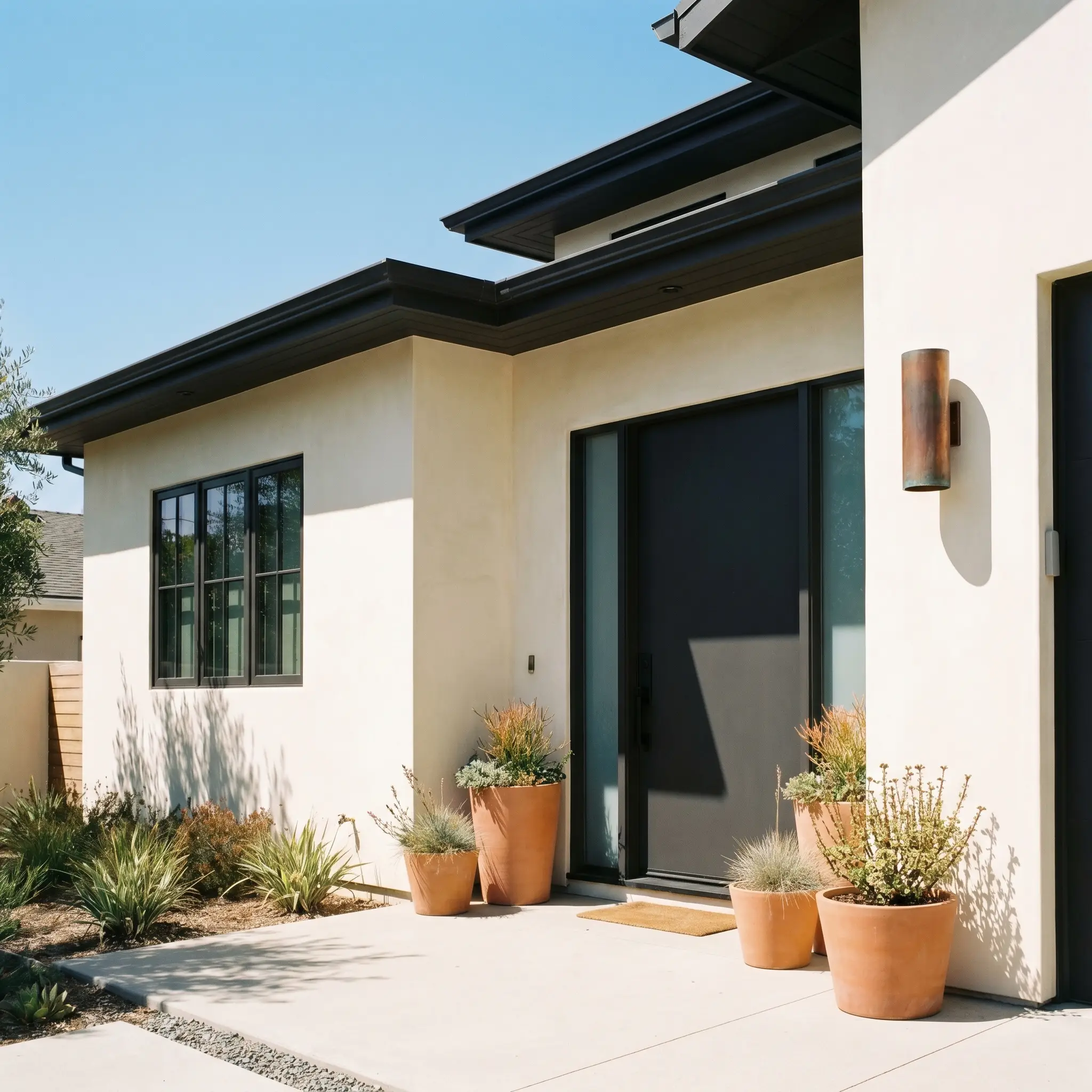
Exterior Trim & Facades
On an exterior, the intense natural sunlight will wash out dark colors, making this shade read as a surprisingly soft, warm charcoal rather than a harsh black. It excels as a crisp accent on window sashes, fascia boards, or a statement front door, beautifully framing lighter stucco or brick facades.
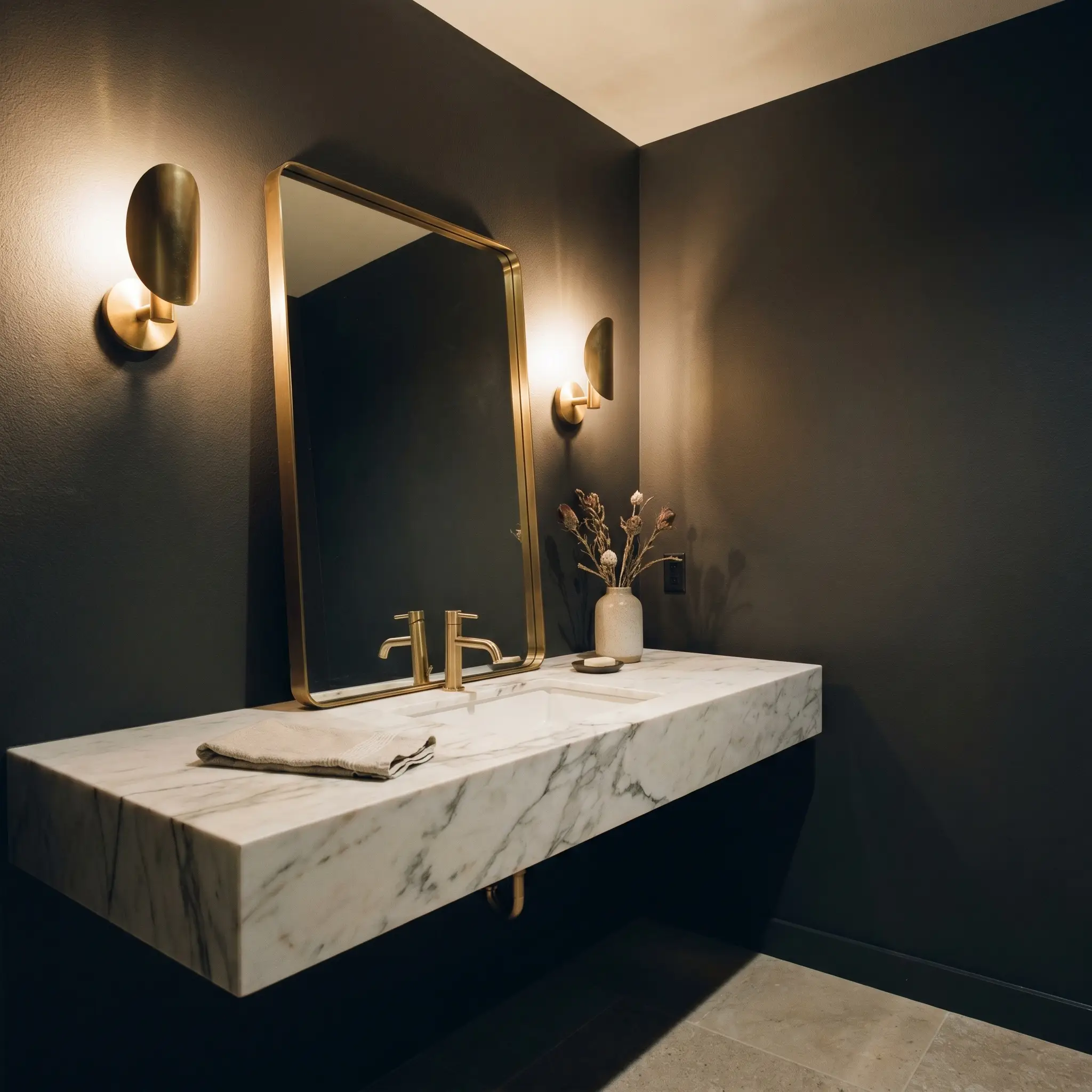
Powder Rooms
A small, windowless powder room is the perfect canvas to embrace intensely saturated color. Because there is little natural light to absorb, the paint creates a jewel-box effect that feels incredibly intentional. Enhance this moody, Soft Contemporary atmosphere by installing a floating marble vanity, an oversized leaning mirror, and subtle, sculptural sconce lighting that grazes the dark walls.
Curating the Palette: Pairings for Black Magic
The secret to styling this intense pigment is understanding its relational behavior. Because it absorbs so much light, it requires surrounding elements that either reflect illumination to create crisp boundaries or share its warm undertones to build a seamless, tonal glow.
Defining Boundaries with Trim
Your choice of trim color dictates whether the room feels sharply tailored or softly blended. Because of its microscopic red/brown nuances, this black requires a carefully selected white to ensure the contrast remains elegant rather than jarring.
Tactile Materials & Wood Finishes
When working with a matte black finish, the surrounding textures must work twice as hard to bring life to the space. You must introduce tactile materials that actively converse with the dark walls, either by catching the light or adding organic warmth.
The Coordinating Palette
Instead of defaulting to generic cool grays, we must analyze the slight elevation in the red channel of this paint. To exploit this micro-nuance, this palette pairs the dark charcoal with saturated spiced reds and earthy taupes, preventing the black from feeling flat.
Inspiring Aesthetics and Vibe
To truly understand how this color structure behaves, we must visualize it alongside specific textiles and coordinating paints. These mood boards illustrate how shifting your accent materials completely alters the emotional resonance of the space.
Midnight Spice
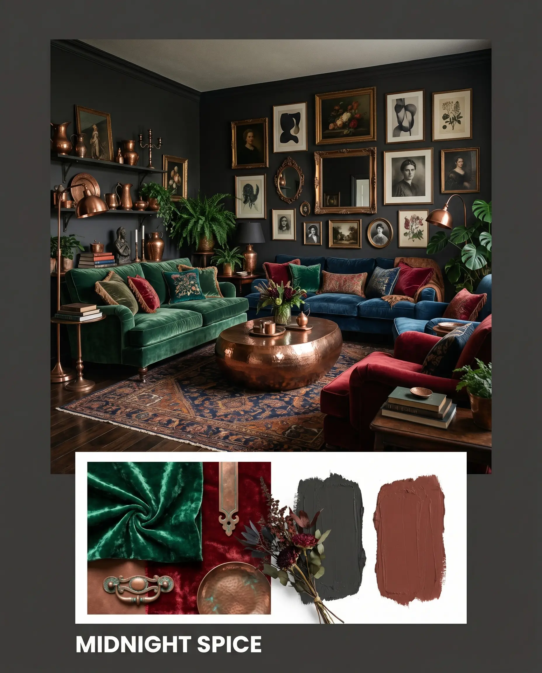
This aesthetic leans heavily into Moody Maximalism, utilizing the warmth of the paint to create an intensely enveloping atmosphere. By pairing the dark walls with accents of PPG Sweet Spiceberry, the room pulses with a rich, spiced energy that feels incredibly curated. Weave in crushed velvet textiles, patinated copper accents, and asymmetrical gallery walls filled with vintage portraits to complete this deeply sensory, layered experience.
The Tailored Silhouette
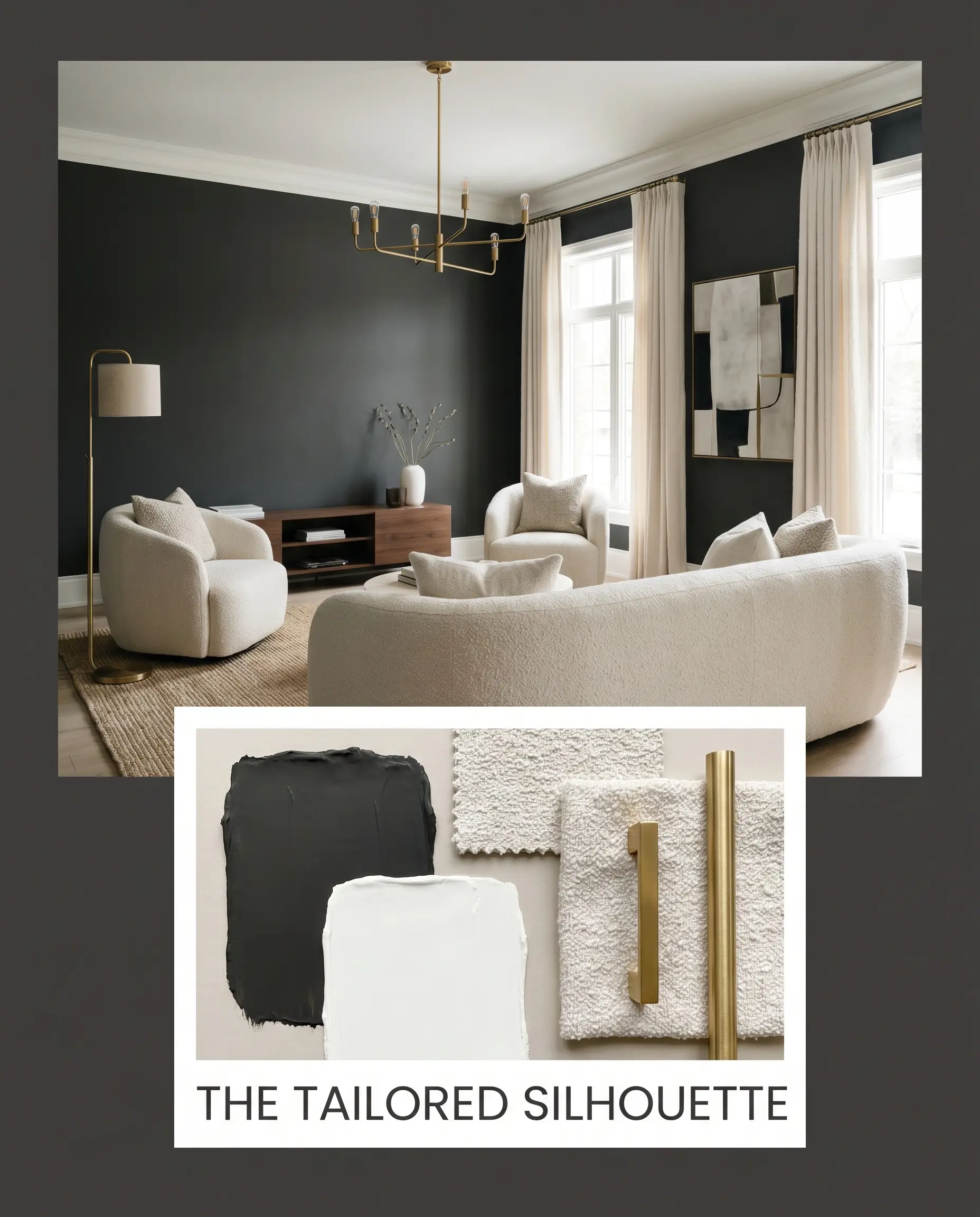
Rooted in Soft Contemporary design, this palette uses the dark charcoal to establish sharp, clean lines against softer transitional colors. The walls are framed by crisp Chantilly Lace trim, while the furnishings rely heavily on pale, nubby boucle and sleek, unlacquered brass lighting fixtures. The resulting vibe is highly structured yet inviting, balancing the commanding dark perimeter with luminous, tactile touchpoints.
Earthbound Contrast
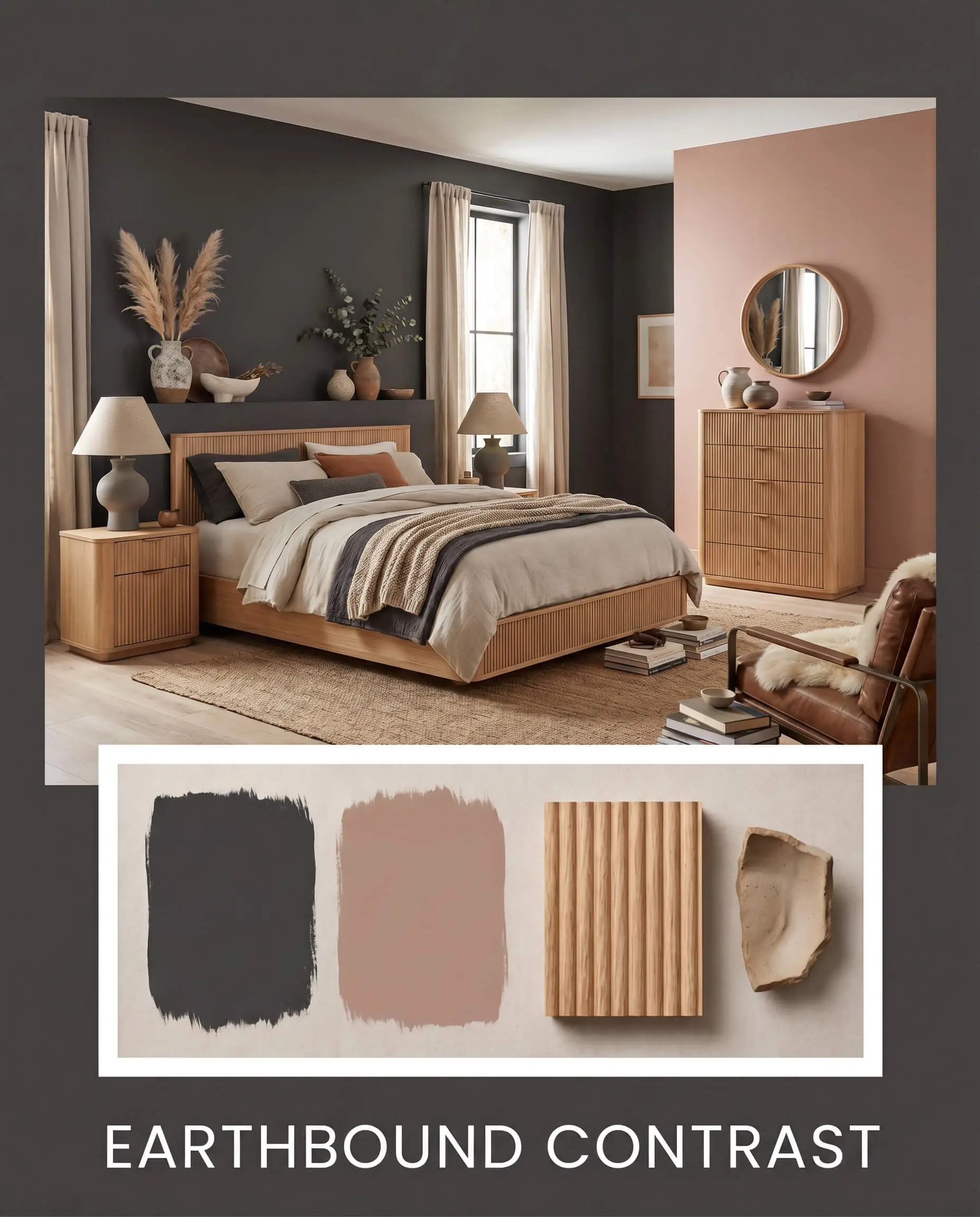
Drawing inspiration from Organic Modern and Japandi principles, this approach softens the black paint by immersing it in natural, earthy textures. Sherwin-Williams Redend Point is used on adjacent walls or ceilings to introduce a blush-taupe warmth, while fluted white oak and matte Wabi-sabi pottery ground the visual field. This combination creates a serene, grounded energy that feels both minimalist and profoundly warm.
PPG Black Magic vs. The Competition
Sometimes, the specific lighting conditions of your home demand a slight pivot in your color strategy. Comparing this paint against its closest rivals clarifies exactly which undertone will perform best in your unique environment.
PPG Black Magic PPG1001-7 vs. Sherwin-Williams Iron Ore SW 7069
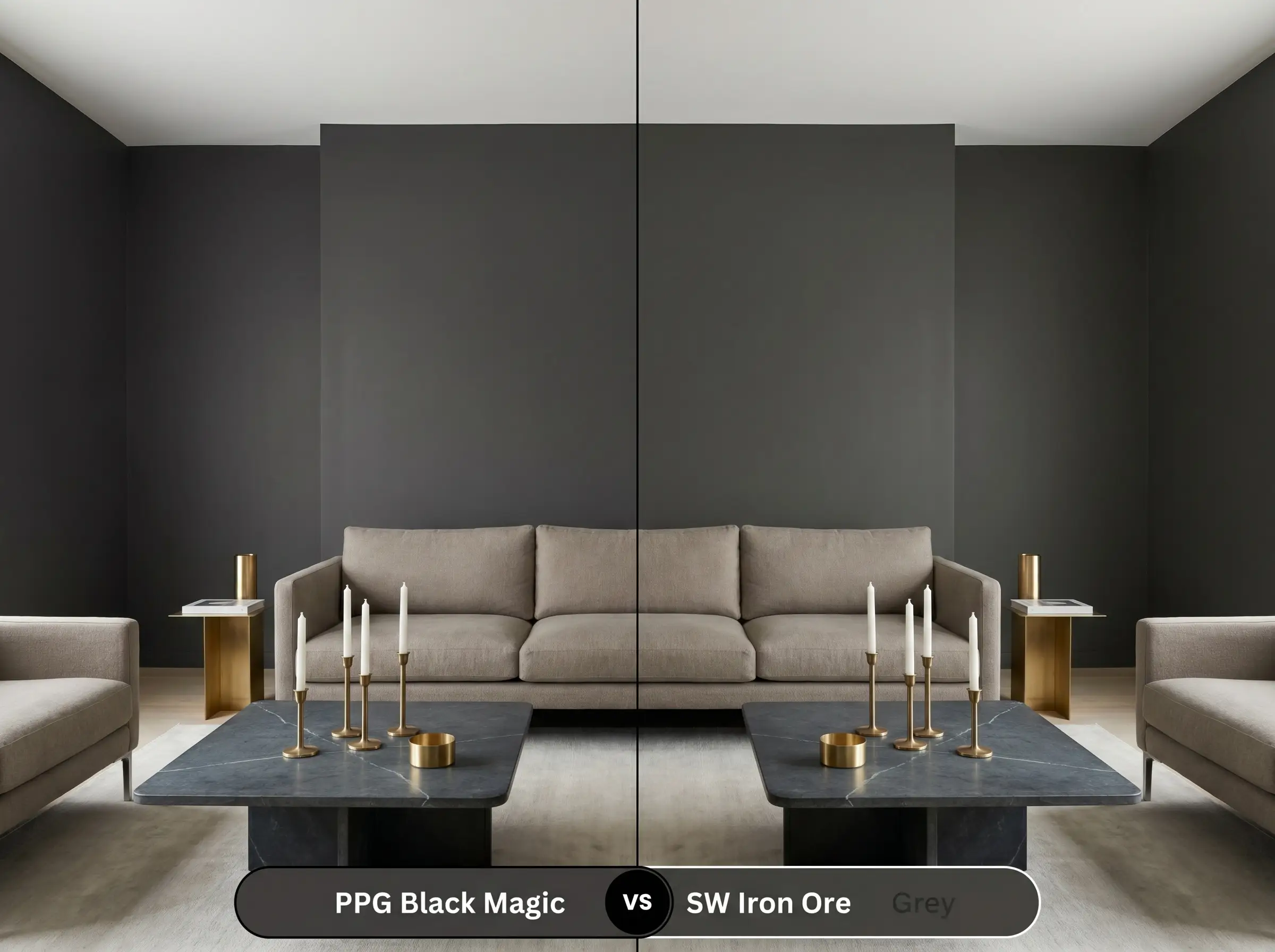
Iron Ore is noticeably lighter and leans much further into a true, soft charcoal gray rather than a saturated black. If your room lacks natural light and you fear Black Magic will feel too intense, Iron Ore offers a highly accessible, weathered alternative. However, if you want a striking, high-contrast background that truly makes your brass hardware pop, the PPG option delivers a much richer depth.
PPG Black Magic PPG1001-7 vs. Benjamin Moore Wrought Iron 2124-10
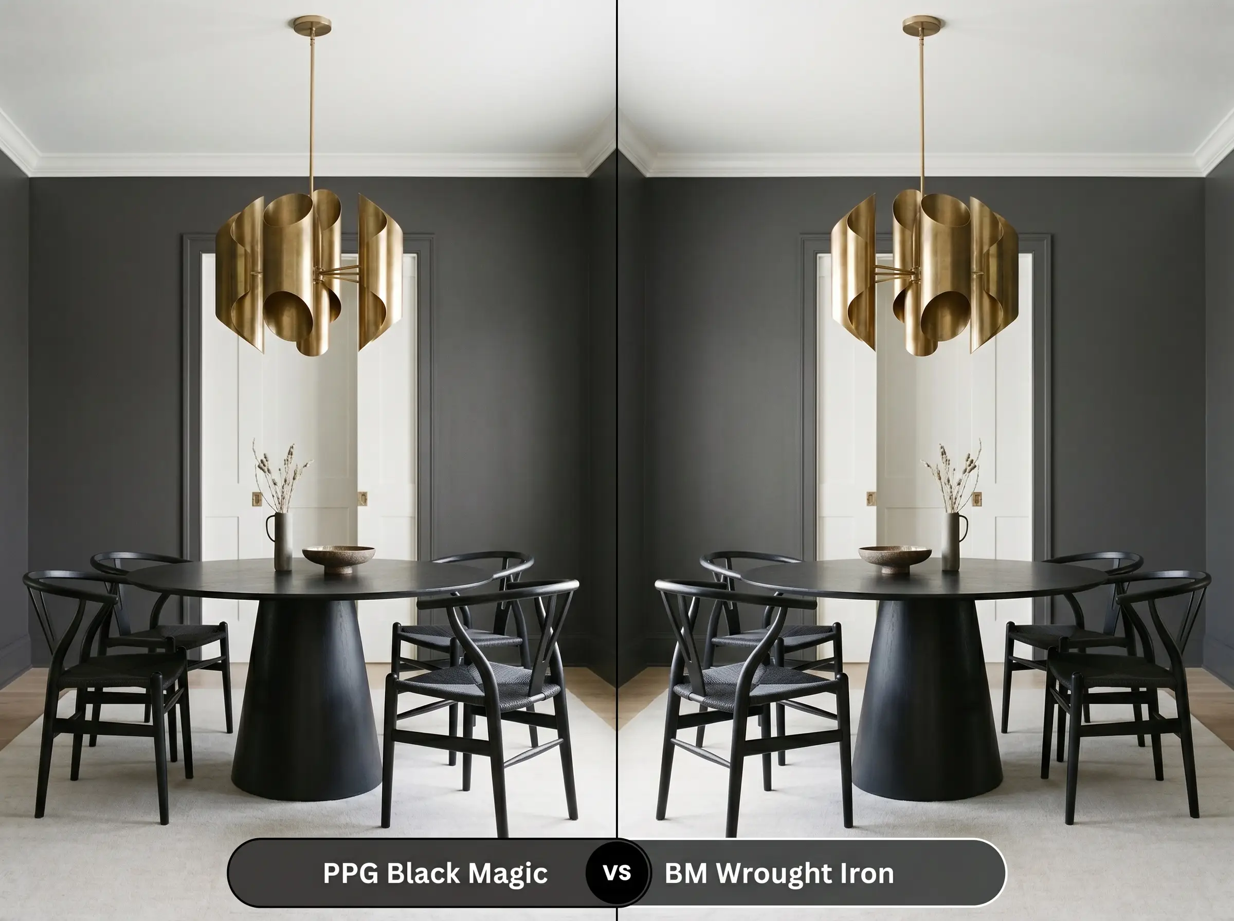
Wrought Iron carries distinct navy and cool gray undertones, making it feel slightly more industrial and crisp. If your space features predominantly cool light (North-facing) or icy marble finishes, Wrought Iron will harmonize beautifully. Conversely, if your home is filled with warm woods, terracotta, and southern sunlight, the red/brown micro-nuances of Black Magic will provide a much more cohesive, inviting result.
PPG Black Magic PPG1001-7 vs. Valspar Dark Kettle Black 4011-2
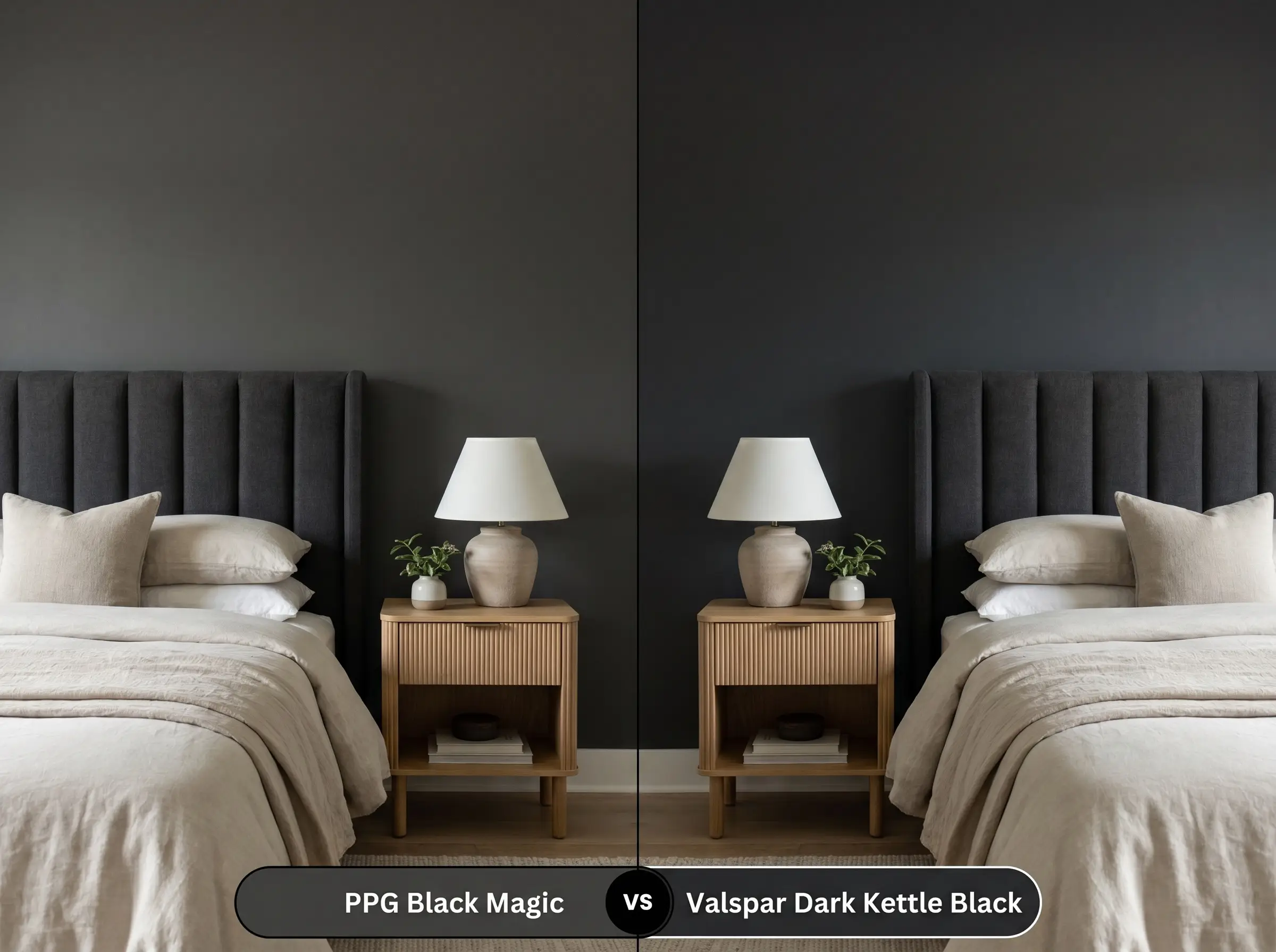
Dark Kettle Black is a notably cooler, slightly more muted black with subtle green/gray undertones. It performs exceptionally well in rustic or modern farmhouse settings where a slightly aged, softer black is desired. If you are aiming for a highly tailored, sleek aesthetic that leans warm and sophisticated, the PPG formulation remains the superior choice.
Exploring Alternatives to This Warm Black
If the primary color profile is close to your vision but requires a minor adjustment in depth or brand availability, these alternatives offer excellent pathways.
Similar Colors from the Same Brand
Cross-Brand Equivalents
Execution and Finish Guide
Transitioning a color this intense from a swatch to your walls requires careful planning. Dark paints are notoriously unforgiving of application errors, making your choice of sheen and primer absolutely critical to the final aesthetic.
The Primer Strategy: You must use a high-quality, deep-tinted gray primer before applying this topcoat. Applying dark charcoal over a standard white primer will result in a streaky finish and require excessive coats to achieve true opacity.
Coverage Warning: Even with a tinted primer, anticipate applying a minimum of two generous coats. Be highly mindful of “flashing”—visible roller marks caused by uneven pressure or painting over partially dried sections. Always maintain a wet edge and roll from ceiling to floor in one smooth motion.
FAQs
Because of its extremely low LRV of 4, this paint absorbs a massive amount of solar heat. If applied to standard vinyl shutters in direct southern exposure, it can indeed cause warping; it is highly recommended to use vinyl-safe formulations or reserve this color for wood and fiberglass exterior elements.
It excels in this exact scenario. The intense light absorption completely obscures shadows and structural details, effectively blurring the complex ductwork and making the textured ceiling recede into a cohesive, unobtrusive void.
While the paint is warm, the micro-nuance is subtle enough that it rarely clashes violently with Carrara marble. However, the warm black will actually emphasize the cool, icy blue tones in the marble, creating a very stark, high-contrast dynamic rather than a seamless blend.
For horizontal surfaces that endure foot traffic, you must step up to a specialized floor or porch enamel in a satin finish. A standard wall matte will immediately show chalky white scuffs, whereas a durable satin protects the pigment while keeping the glare reasonably low.
The Final Verdict
PPG Black Magic is a brilliantly formulated architectural tool for those who want the commanding drama of a dark perimeter without sacrificing the inviting warmth of a home. It performs exceptionally well in spaces designed for relaxation and focus, such as sensory media rooms, tailored powder baths, and sophisticated kitchen cabinetry. By leaning on its microscopic brown and red undertones, this paint establishes a beautifully stabilizing foundation that elevates organic materials like white oak, unlacquered brass, and nubby textiles. It is the perfect choice for the homeowner who understands that true elegance often requires stepping away from safe, builder-grade neutrals.
However, this enveloping shade requires a highly intentional surrounding palette to succeed. If you pair this intensely saturated charcoal with stark, icy blue-grays, cool-toned synthetic flooring, or harsh daylight LED bulbs, the subtle warmth of the paint will immediately fight against its environment. This friction causes the black to look muddy and the cool tones to appear cheap and sterile. To avoid this visual disconnect, you must commit to a cohesive, warm-leaning palette, ensuring every tactile finish and secondary color shares the same subtle, earthy temperature.