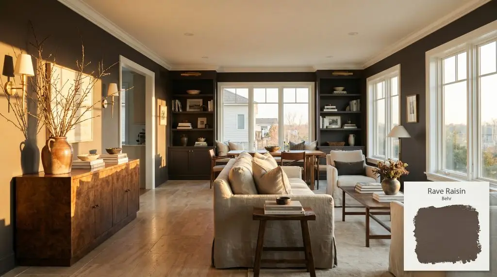
Rave Raisin HDC-MD-13
BehrBehr Rave Raisin (HDC-MD-13) is a dark, spicy brown with distinct warm red and subtle plum undertones. With an LRV of 7, it absorbs significant light, creating a moody, sophisticated, and earthy atmosphere perfect for intimate spaces or striking exterior accents.
Paint Technical Profile
| Color ID / SKU | HDC-MD-13 |
| HEX Code | #54463F |
| Light Reflectance (LRV) | 7 |
| Use | Interior, Exterior |
| Best Exposures | North, East |
| Best For | Cabinetry, Accent Walls, Exterior Doors, Cozy Studies |
Behr Rave Raisin: Crafting Velvet-Like Shadows With a Spicy Brown
Selecting the perfect dark brown often feels like navigating a minefield of muddy, uninspired neutrals. Far too many dark shades fall flat on the wall, draining the energy from a room rather than elevating it. Behr Rave Raisin HDC-MD-13 completely shatters that expectation.
This is not your standard, run-of-the-mill espresso paint. It is a highly saturated, low-chroma pigment that fundamentally changes how a room feels. Instead of simply coating a wall, it acts as an architectural finish, pulling the walls inward to create a sophisticated, tailored atmosphere.
If you are tired of stark, echoing rooms and want to introduce profound warmth, this spicy brown is your solution. It requires intentional styling, but when executed correctly, it delivers an incredibly high-end, custom-built aesthetic.
Undertones & LRV of Behr Rave Raisin
When evaluating the definitive temperature of Behr Rave Raisin, the verdict is undeniably warm. However, this is not a fiery, overwhelming warmth. Resting at a specific hue angle on the color wheel, this color structure is fundamentally a dark red-brown.
What prevents this shade from reading as a flat, predictable chocolate brown is its complex chromatic profile. Beneath the surface, it holds distinct, sophisticated micro-nuances that reveal themselves as the light shifts throughout the day.
With a Light Reflectance Value (LRV) of 7, this paint sits firmly at the darkest end of the spectrum. At this LRV, the paint operates through extreme light absorption. It will not bounce illumination around the room; instead, it establishes shadow-heavy spaces that feel intimate and incredibly secure.
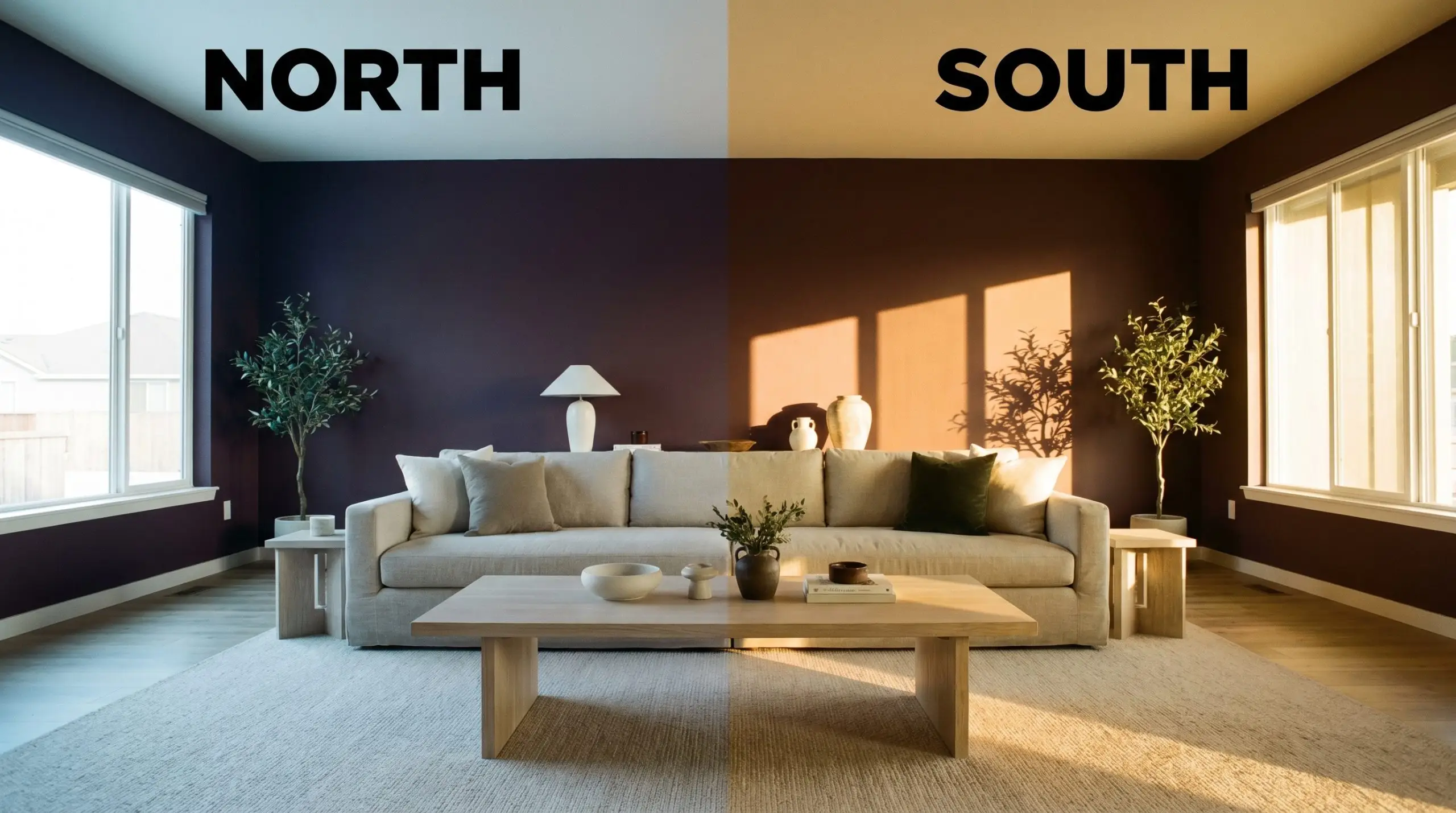
The Chameleon Factor: How Lighting Shifts This Spicy Brown
A paint with this level of subdued depth is highly reactive to its environment. Because it absorbs so much light, the specific temperature of your light source will dramatically dictate which undertones step forward.
Transforming Spaces: Everyday Architectural Applications
This rich pigment thrives when used to intentionally manipulate the visual boundaries of everyday spaces. Because it absorbs light so effectively, it can turn standard rooms into striking, custom-feeling environments.
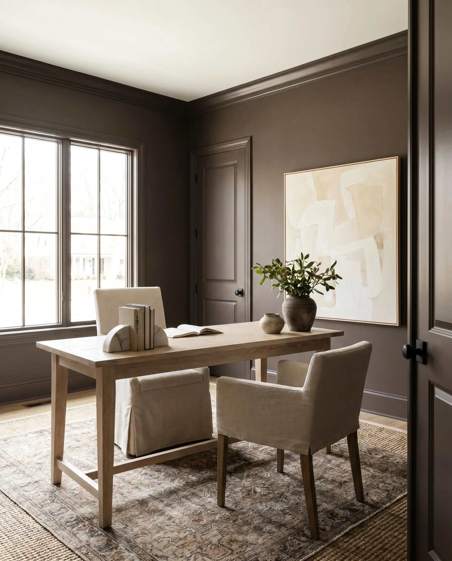
Moody Home Offices & Studies
Forget the predictable, traditional mahogany-paneled study; this color excels in a Modern Organic or Wabi-Sabi inspired workspace. By color-drenching the entire room—painting the walls, trim, and doors in the same rich plum-brown—you blur the hard architectural lines. This technique creates a seamless, distraction-free zone that feels incredibly focused.
To prevent the room from feeling like a cave, introduce highly textural, light-bouncing elements. Think about pairing the dark walls with a bleached oak desk, a slipcovered linen chair, and oversized abstract art featuring warm ivory tones. Layering a vintage rug over a natural sisal foundation adds an earthy, tactile contrast that balances the intense saturation of the walls.
If your office has low ceilings, do not paint the ceiling in this dark shade. Leave it a crisp white to maintain a sense of vertical lift, allowing the dark walls to act as a stabilizing perimeter.
Hackrea Pro-Tip (The Ceiling Strategy)
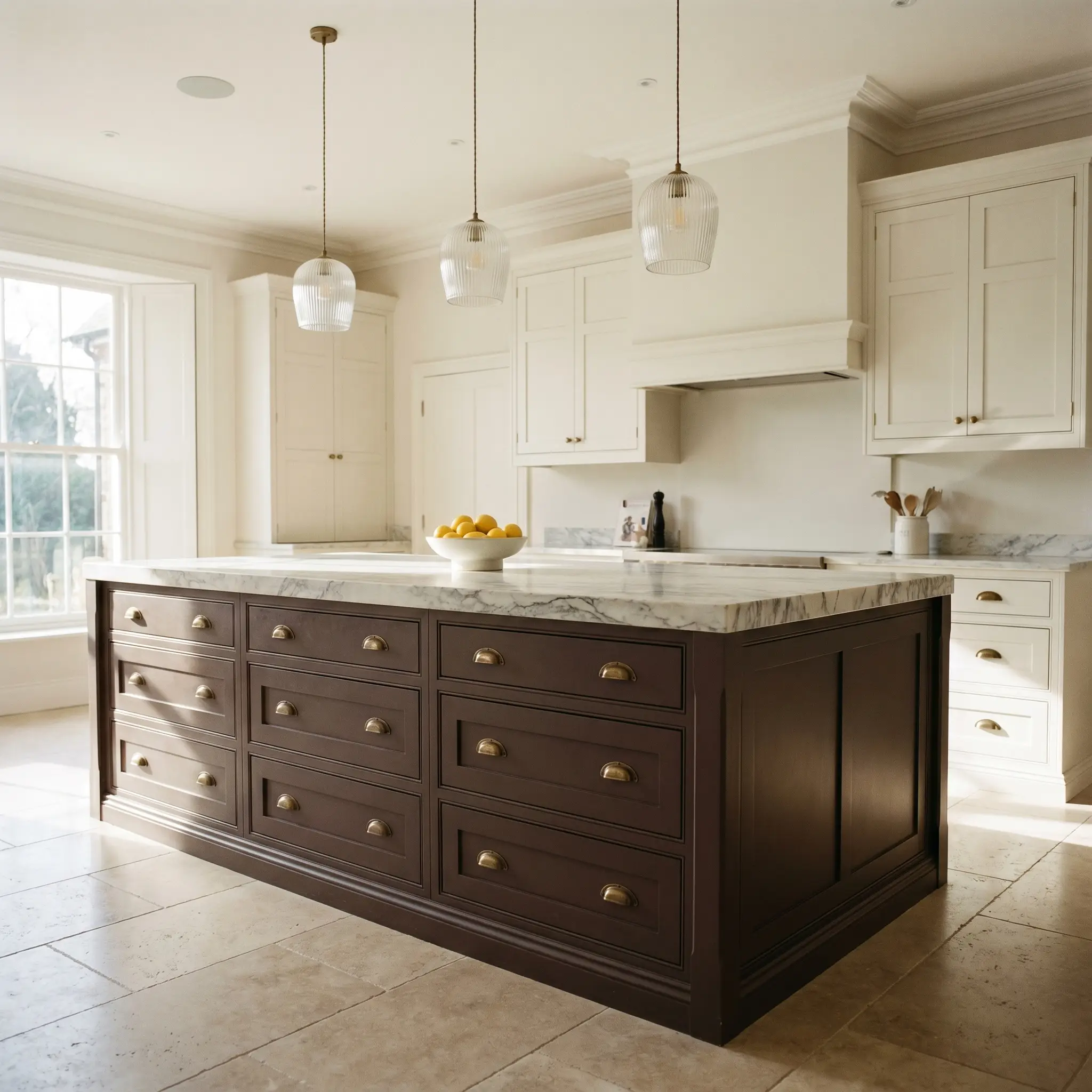
Kitchen Island Cabinetry
Using this spicy brown on lower cabinetry or a central kitchen island is a brilliant way to introduce color without overwhelming the room. It establishes a solid visual foundation, allowing lighter upper cabinets or open shelving to feel airy and expansive. This application is perfect for Transitional kitchens that blend modern lines with classic warmth.
The burgundy micro-nuance plays beautifully against natural stone. Pair this island color with a heavily veined marble remnant countertop or honed travertine floors. Finish the look with unlacquered brass hardware and ribbed glass pendant lights to introduce a subtle, reflective gleam against the matte, shadow-heavy base.
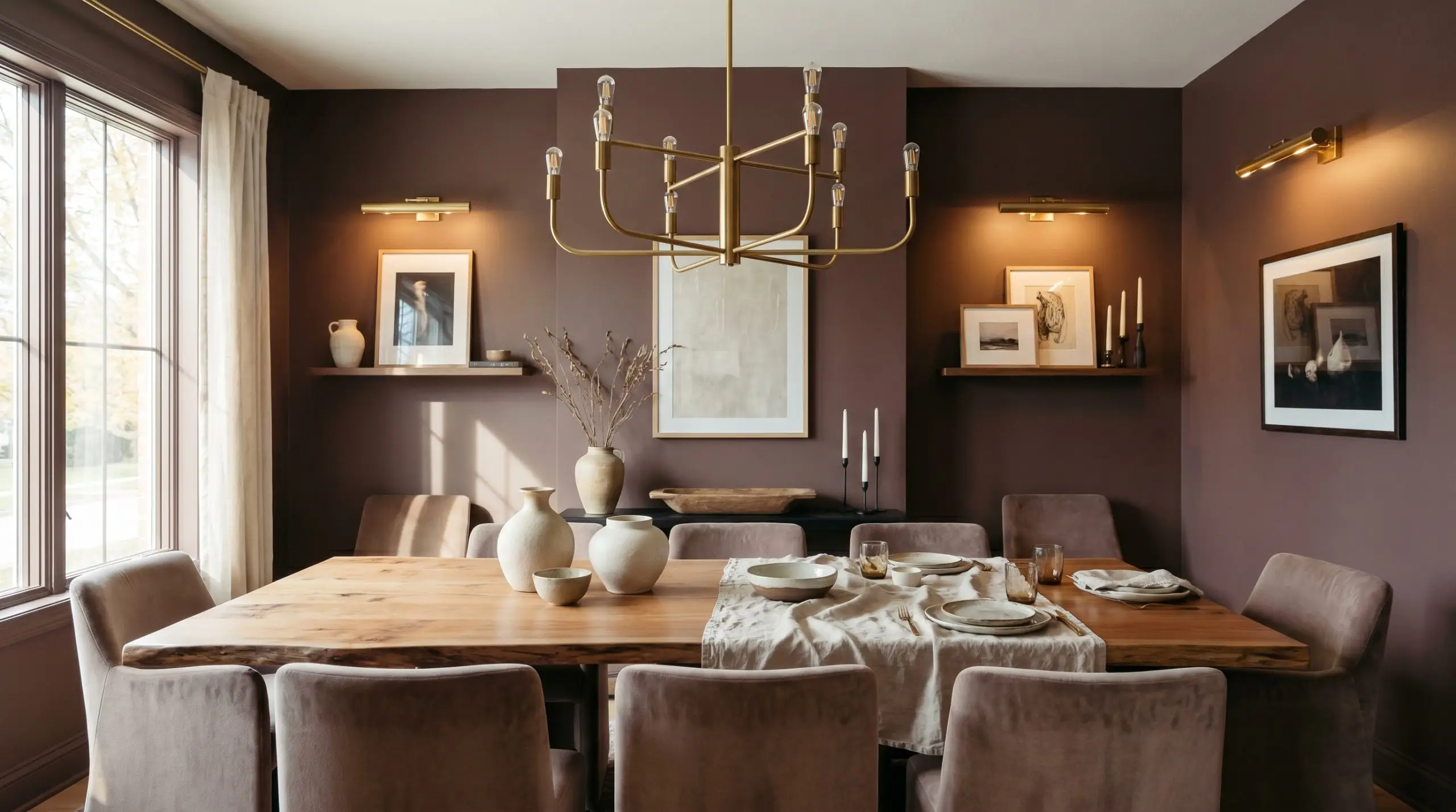
Formal Dining Rooms
A dining room is the perfect laboratory for high-contrast, dramatic design. Instead of standard white wainscoting, consider painting the lower half of the walls in this dark red-brown, leaving the upper half for a textural grasscloth wallpaper or a limewash finish. This instantly elevates the architecture of a standard builder-grade room.
If you prefer a Contemporary Rustic vibe, paint the entire room and center the space around a raw, live-edge dining table. Upholster the dining chairs in a soft taupe mohair or bouclé to soften the room’s intense energy. Warm, layered lighting is non-negotiable here; use brass picture lights and a sculptural chandelier to create a flattering, intimate glow.
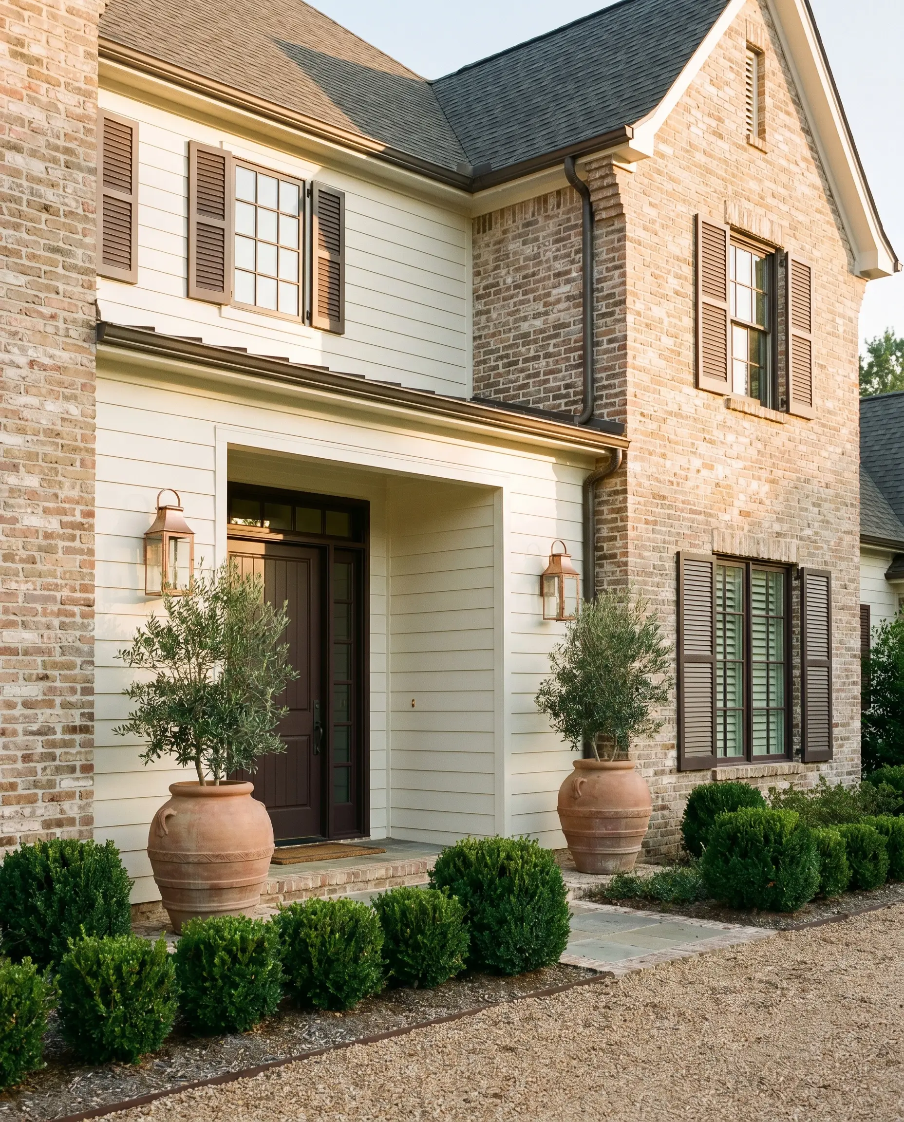
Exterior Front Doors & Shutters
On an exterior facade, direct sunlight will significantly wash out dark colors, pulling their hidden undertones to the surface. When applied to a front door or shutters, the warm afternoon sun will highlight the plum cast, preventing the home from looking severe or uninviting. It offers a sophisticated alternative to standard black or navy.
This color pairs exceptionally well with natural brick, creamy white siding, or muted sage green exteriors. To complete the entryway, flank the door with oversized terracotta planters and install brushed copper lighting fixtures. The metallic accents will slowly oxidize over time, perfectly complementing the earthy character of the paint.
Curating the Palette: Behr Rave Raisin Best Pairings
The key to styling this intense red-brown lies in understanding its relational behavior. Because it acts as a visual vacuum, absorbing light and energy, it requires strategic companions—either crisp, high-reflectance neutrals to define its edges, or tonal, muted shades to soften its impact.
Framing the Depth: Trim Pairings
Your trim color dictates how this dark pigment behaves in the room. You can choose to create a sharp, tailored boundary or a softer, more atmospheric transition.
Tactile Elements: Hardware & Wood Pairings
The materials you place against this paint will either amplify its warmth or cool down its intensity.
The Custom Color Palette
Designer Mood Boards
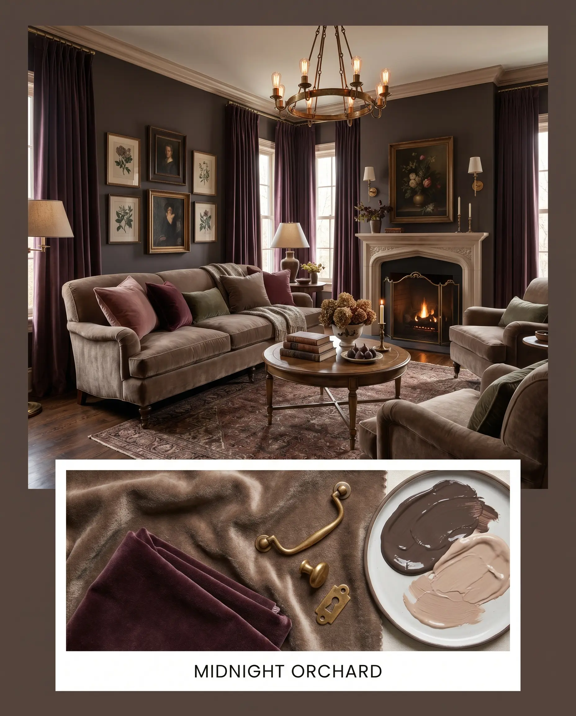
Midnight Orchard This palette leans into the sophisticated, moody elegance of the plum cast. It pairs the dark red-brown walls with luxurious, tactile fabrics like soft taupe mohair and heavy, floor-to-ceiling velvet drapery. Accentuated by unlacquered brass hardware and a splash of Farrow & Ball Setting Plaster on the trim, the energy here is intimate, hushed, and undeniably romantic.
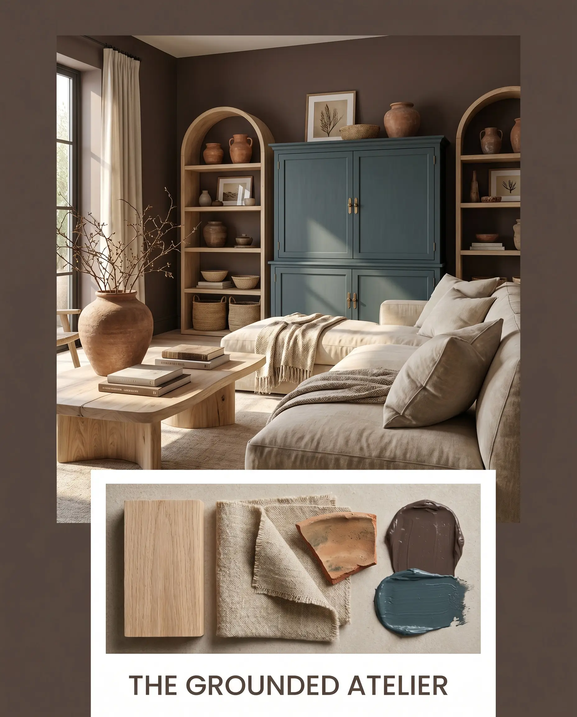
The Grounded Atelier Focusing on the earthy character of the paint, this mood board embraces a Modern Organic aesthetic. The intense walls are stabilized by raw, bleached oak furniture and highly textural stonewashed linen upholstery. By incorporating Sherwin-Williams Riverway on a focal piece of furniture and adding oversized terracotta ceramics, the vibe becomes incredibly calm, rooted, and effortlessly collected.
Head-to-Head Paint Comparisons
Sometimes, the specific lighting in your home demands a slight pivot. If your room receives intense afternoon sun, or if you lack natural light entirely, understanding how this color stacks up against its rivals will help you make a confident final decision.
Behr Rave Raisin vs. Sherwin-Williams Urbane Bronze (SW 7048)
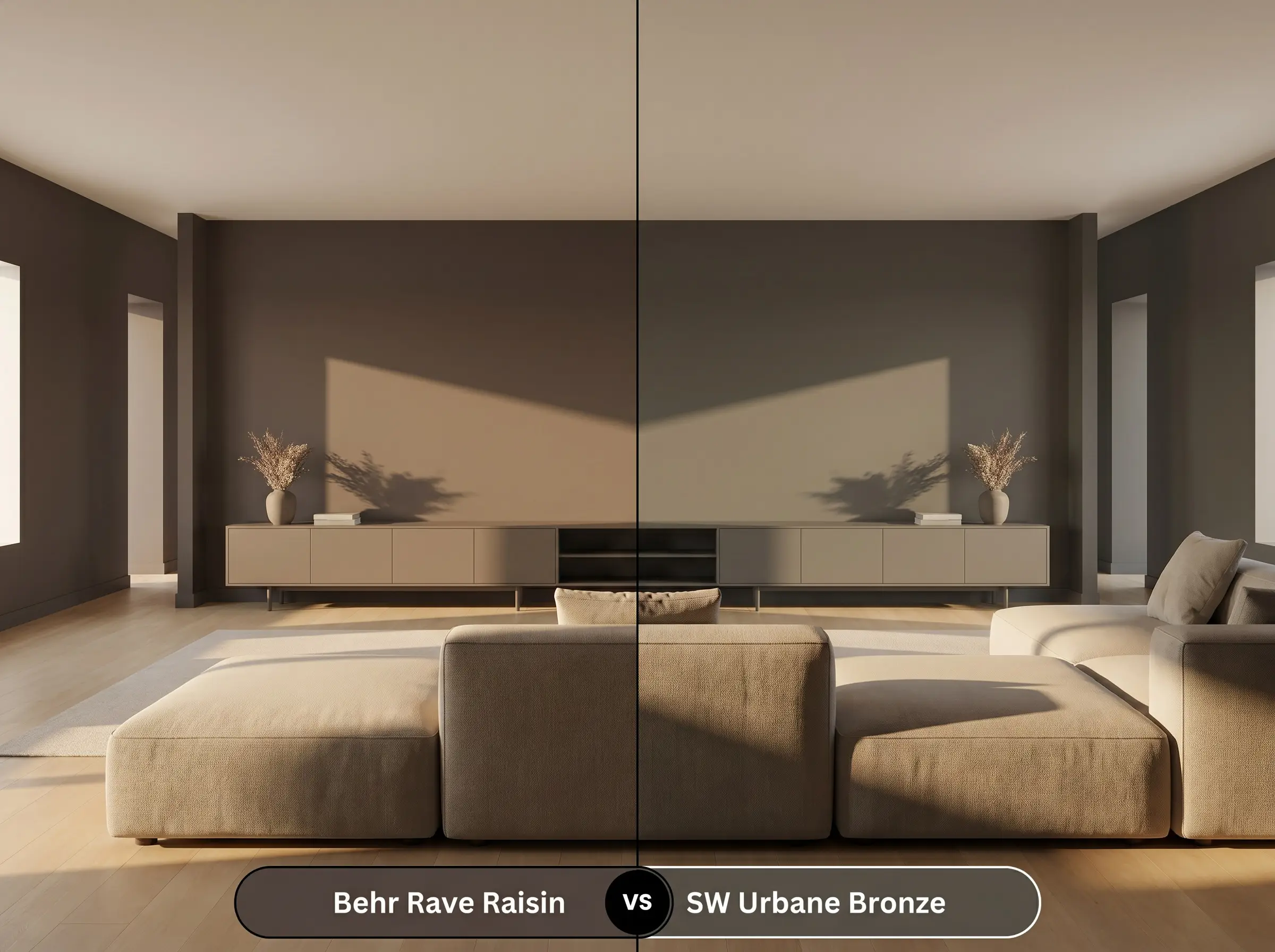
Urbane Bronze is an iconic, deeply saturated neutral, but its foundational structure is entirely different. While the Behr option leans heavily into its spicy red and plum cast, Urbane Bronze is rooted in a green-gray undertone. If your room already has too much red or orange light (like a strong western exposure), Urbane Bronze will feel more balanced, whereas the Behr paint might pull aggressively burgundy.
Behr Rave Raisin vs. Benjamin Moore Tarpley Brown (CW-170)
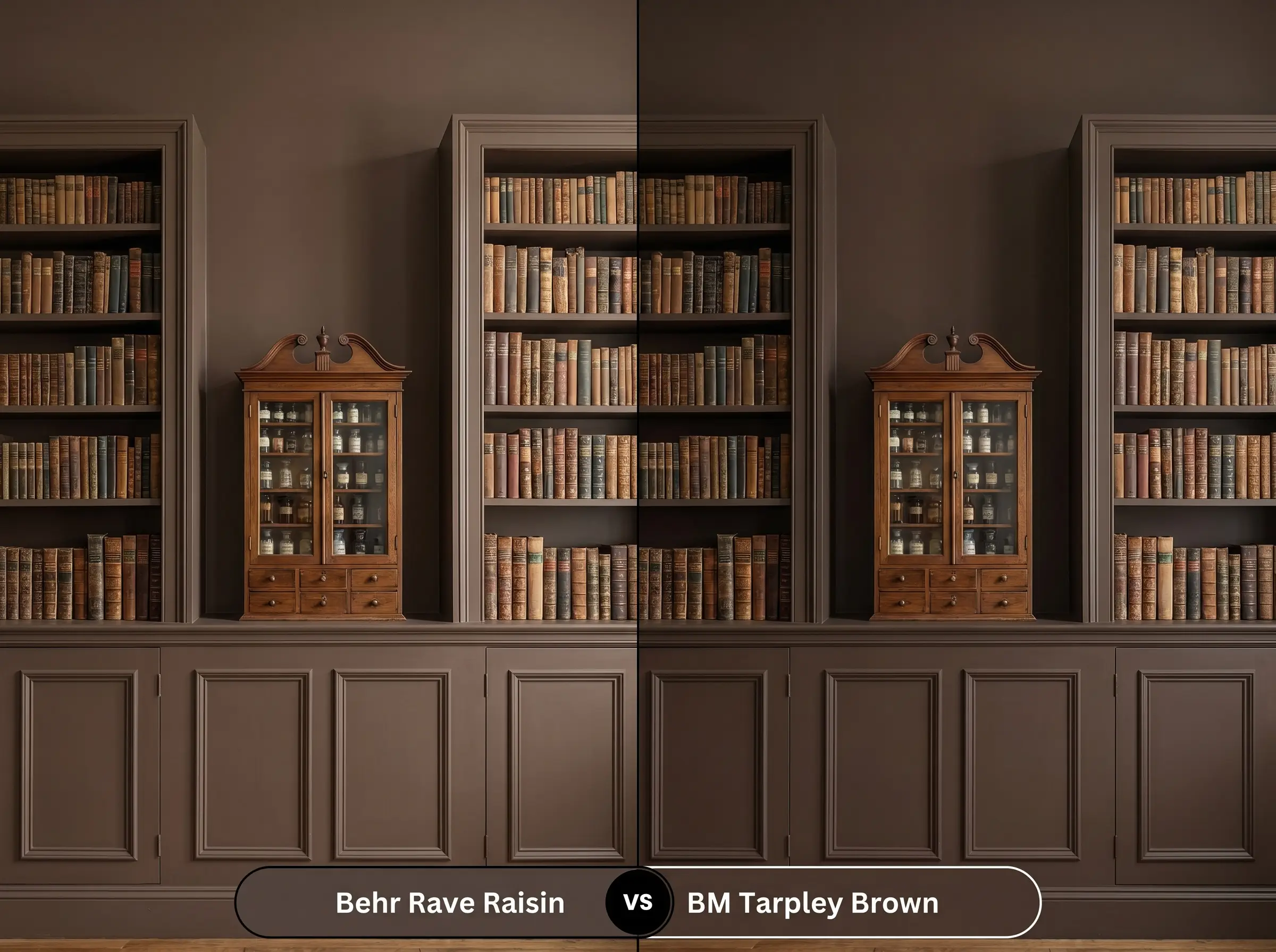
Tarpley Brown is a classic, historic brown with a much more traditional, golden-yellow undertone. It lacks the subtle purple micro-nuance found in the Behr shade. If you are designing a strict, historically accurate space and want a straightforward chocolate brown, Tarpley Brown is the safer choice. However, if you want a more complex, modern edge, stick with the Behr option.
Behr Rave Raisin vs. Behr Espresso Beans (PPU5-01)
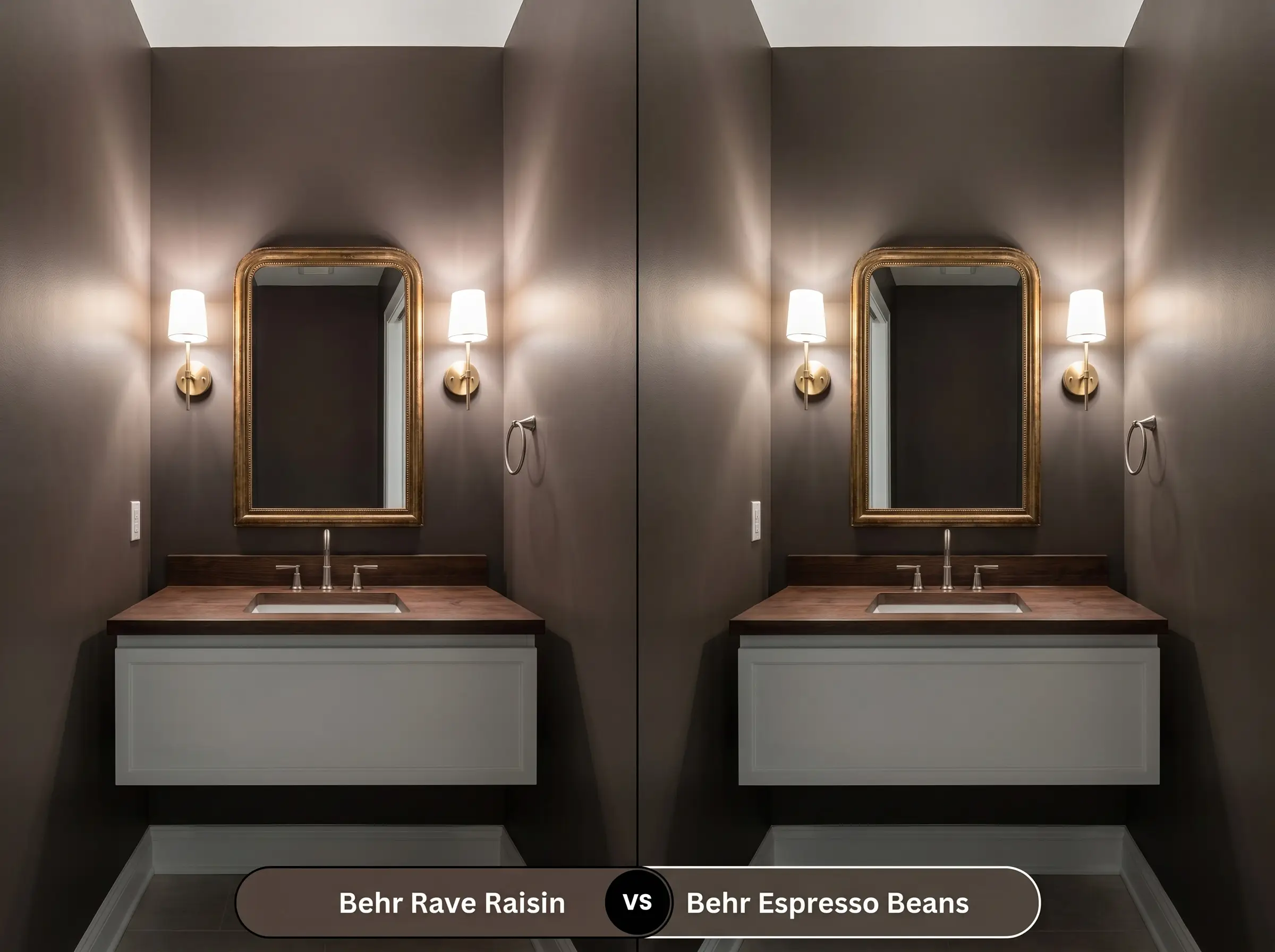
Espresso Beans is significantly darker and reads much closer to a true, blackened coffee bean. It lacks the vibrant, spicy warmth of its sibling. If you are painting a room with zero natural light and want the walls to recede entirely into shadow, Espresso Beans will achieve that stark, minimalist look, whereas Rave Raisin will still retain a hint of earthy warmth.
Finding the Perfect Match: Similar Colors to HDC-MD-13
If you love the general vibe of this dark plum-brown but need a slight adjustment in depth or availability, there are excellent alternatives on the market.
Same-Brand Alternatives
Cross-Brand Matches
Execution Strategy: Painting with Rave Raisin
Moving from design theory to practical execution requires understanding how this specific pigment behaves on a roller. Dark, low-chroma colors require strict attention to detail during the application process.
To achieve true color accuracy, a high-quality, tinted primer is absolutely mandatory. Do not attempt to apply this dark shade over a white or light-colored wall without a deep gray primer base. Because of its extreme depth, expect to apply at least two, and possibly three, meticulous coats to prevent “flashing”—those visible, uneven roller marks that become glaringly obvious when light hits the wall at an angle.
Frequently Asked Questions
Low-E glass often casts a subtle green or blue tint into a room to block UV rays. Because green and red are complementary colors, the green-tinted light will actively neutralize the red-purple micro-nuance in the paint. Instead of appearing vibrant and spicy in the afternoon sun, the color will read as a flatter, more muted charcoal-brown.
It performs beautifully against most historic brick, provided the brick features warm, orange-red or terracotta tones. The plum cast in the paint creates a harmonious, tonal relationship with the masonry. However, if the historic brick is heavily whitewashed or features cool, gray-blue clinker bricks, the earthy character of the paint may clash and appear visually muddy.
Under the crisp, neutral light of 3000K LEDs without any natural daylight to interfere, the paint will lock into its truest form. The light will suppress the aggressive burgundy tones, allowing the color to read as an incredibly tailored, sophisticated dark brown with just a hint of ambient warmth.
Because it absorbs an immense amount of solar radiation (heat and UV rays) due to its LRV of 7, the pigment is highly vulnerable to thermal degradation over time. To prevent premature fading or a chalky residue, it requires a premium, UV-resistant exterior enamel and strict adherence to a dedicated maintenance schedule.
The Final Verdict & Design Warnings
Behr Rave Raisin HDC-MD-13 is a masterful, highly saturated architectural finish designed for homeowners who want to completely transform the energy of a room. It is the perfect choice for creating intimate, sophisticated spaces—like a color-drenched Modern Organic home office or a dramatic Transitional dining room. When paired with everyday tactile materials like burled walnut and elevated by unlacquered brass, it delivers a custom-built, premium aesthetic that punches far above its weight class.
While this spicy brown is incredibly versatile, it fiercely rejects cool, sterile environments. If your home features predominantly cool gray luxury vinyl plank flooring, icy blue-white quartz countertops, or extensive chrome fixtures, this paint will actively fight the architecture. The warm red-brown undertones will make the cool grays look dingy and artificial, while the cool elements will force the paint to look muddy and bruised. To successfully integrate this color, you must commit to a palette rooted in foundational warmth and organic textures.
Clash Warning (The Cool-Toned Conflict)
Closest Cross-Brand Equivalents
The absolute closest scientific color matches for Rave Raisin across top paint brands.