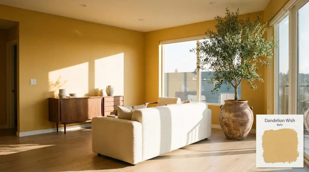
Dandelion Wish MQ4-12
BehrBehr Dandelion Wish (MQ4-12) is a warm, medium-light golden yellow with earthy, ochre undertones. Boasting an LRV of 53, it reflects a moderate amount of light, making it a cheerful yet grounded architectural finish that avoids looking overly neon or pastel.
Paint Technical Profile
| Color ID / SKU | MQ4-12 |
| HEX Code | #e3bb65 |
| Light Reflectance (LRV) | 53 |
| Use | Interior, Exterior |
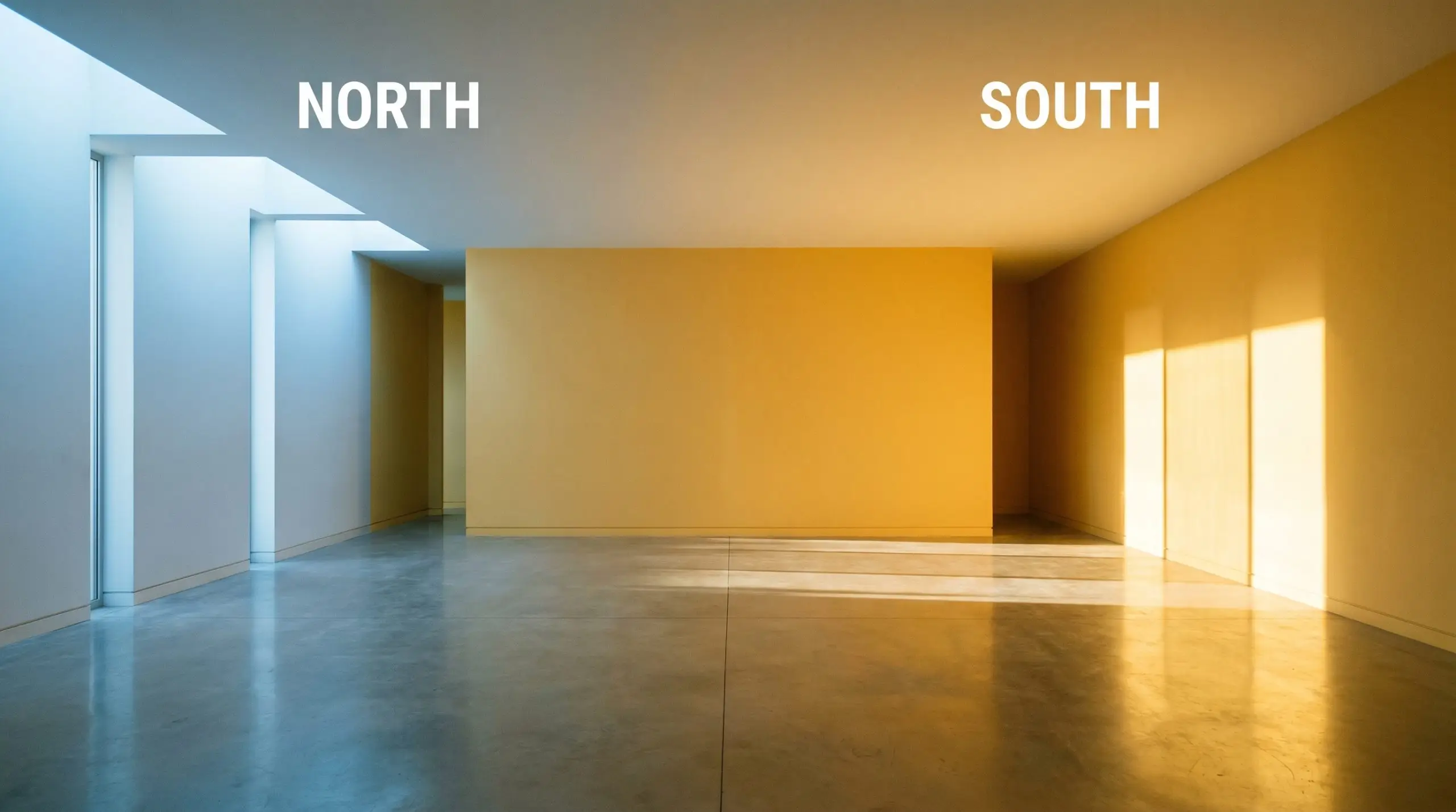
| Best Exposures | South, East |
| Best For | Kitchens, Sunrooms, Nurseries, Accent Walls, Front Doors |
The Golden Hour Glow: Mastering Behr Dandelion Wish in Modern Interiors
Yellow paint is notoriously intimidating for even the most experienced design enthusiasts. When you select a shade that lacks the proper structural complexity, your living room can quickly resemble a brightly lit kindergarten classroom. Behr Dandelion Wish offers a brilliant solution to this common design dilemma.
This specific golden yellow hue carries a hidden, sophisticated weight that completely transforms how the color behaves on your walls. Instead of feeling stark or overly energized, it wraps the room in a comforting, sun-drenched warmth. By understanding exactly how this earthy color is built, you can use it to craft incredibly intentional, beautifully curated spaces.
The Core DNA of Behr Dandelion Wish: Undertones & LRV
If you are trying to determine the temperature of this paint, Behr Dandelion Wish is a definitively warm color. It entirely bypasses the sharp, acidic tones found in purely lemon yellows. Instead, it relies on a much softer, more complex foundation to create its inviting atmosphere.
To truly understand how this color will perform in your home, we have to look at its structural makeup:
With a Light Reflectance Value (LRV) of 53, this shade sits right in the comfortable mid-tone range. It is dark enough to maintain its rich chromatic profile without washing out into a vague pastel. At the same time, it reflects just enough ambient light to keep your ceiling feeling high and the overall space feeling delightfully buoyant.
Chasing the Light: How This Golden Yellow Hue Shifts
Because of those complex ochre undertones, this paint is highly reactive to the changing light throughout the day. It rarely looks exactly the same at noon as it does at dusk.
Always match your light bulbs to the mood you want the paint to project. If you are using this yellow in a cozy evening space, immediately swap out any daylight bulbs for 2700K or 3000K LEDs to preserve the paint’s natural warmth.
Hackrea Pro-Tip (The Bulb Swap)
Styling the Warm Color Structure: Room by Room
Understanding the light is only the first step in the design process. The true magic happens when you apply this architectural finish to specific rooms, allowing its earthy warmth to dictate the surrounding decor.
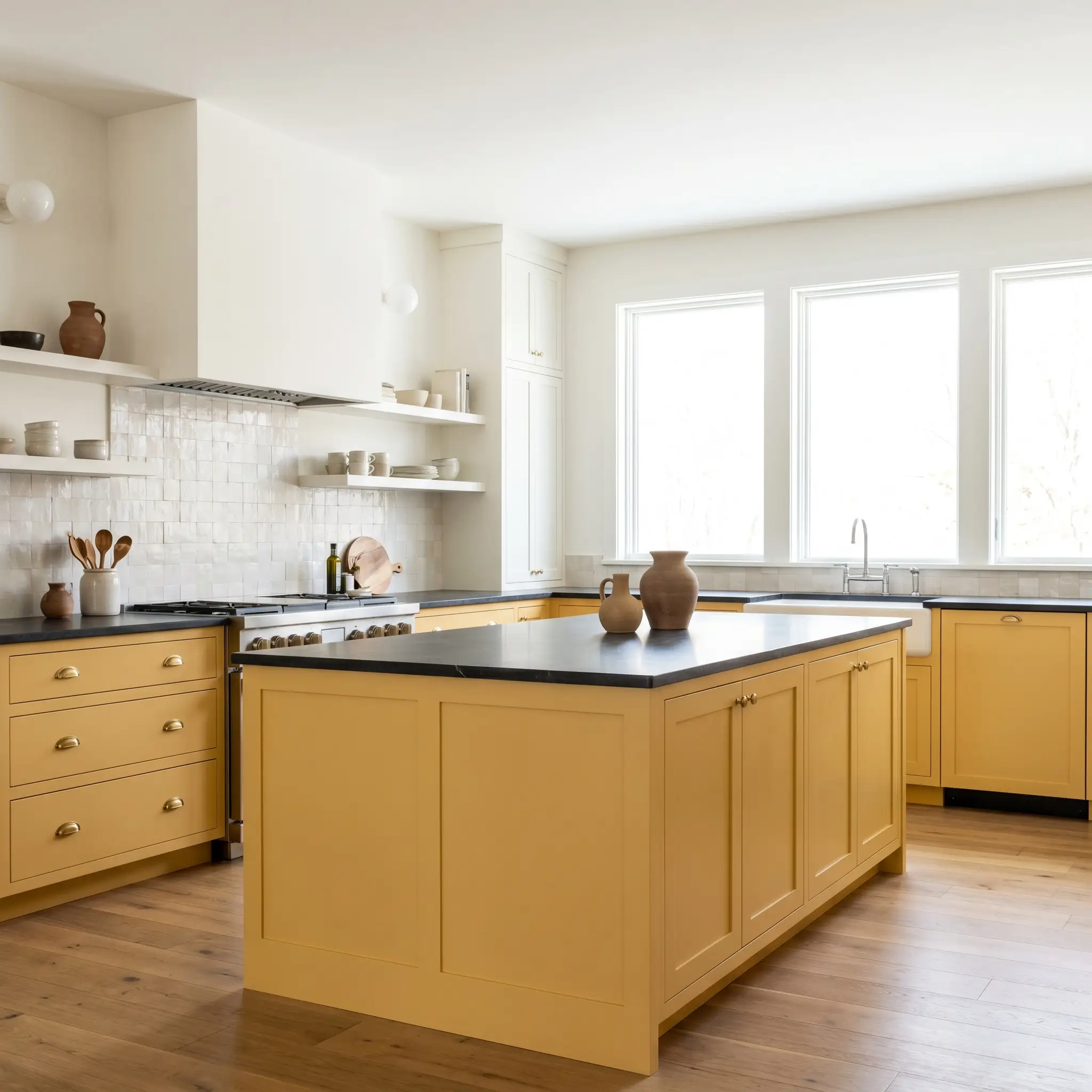
Kitchens
Instead of defaulting to standard white shaker cabinets, consider using this rich yellow on your lower cabinetry or a central island. When grounded below the sightline, the color adds immense personality without overwhelming the practical workspace. Pair it with honed soapstone countertops to provide a stabilizing, dark contrast against the vibrant base.
To elevate the aesthetic, introduce unlacquered brass hardware and a textured zellige tile backsplash. The organic imperfections in the tile will catch the light, echoing the earthy undertones of the paint. This approach effortlessly bridges the gap between classic warmth and modern sophistication.
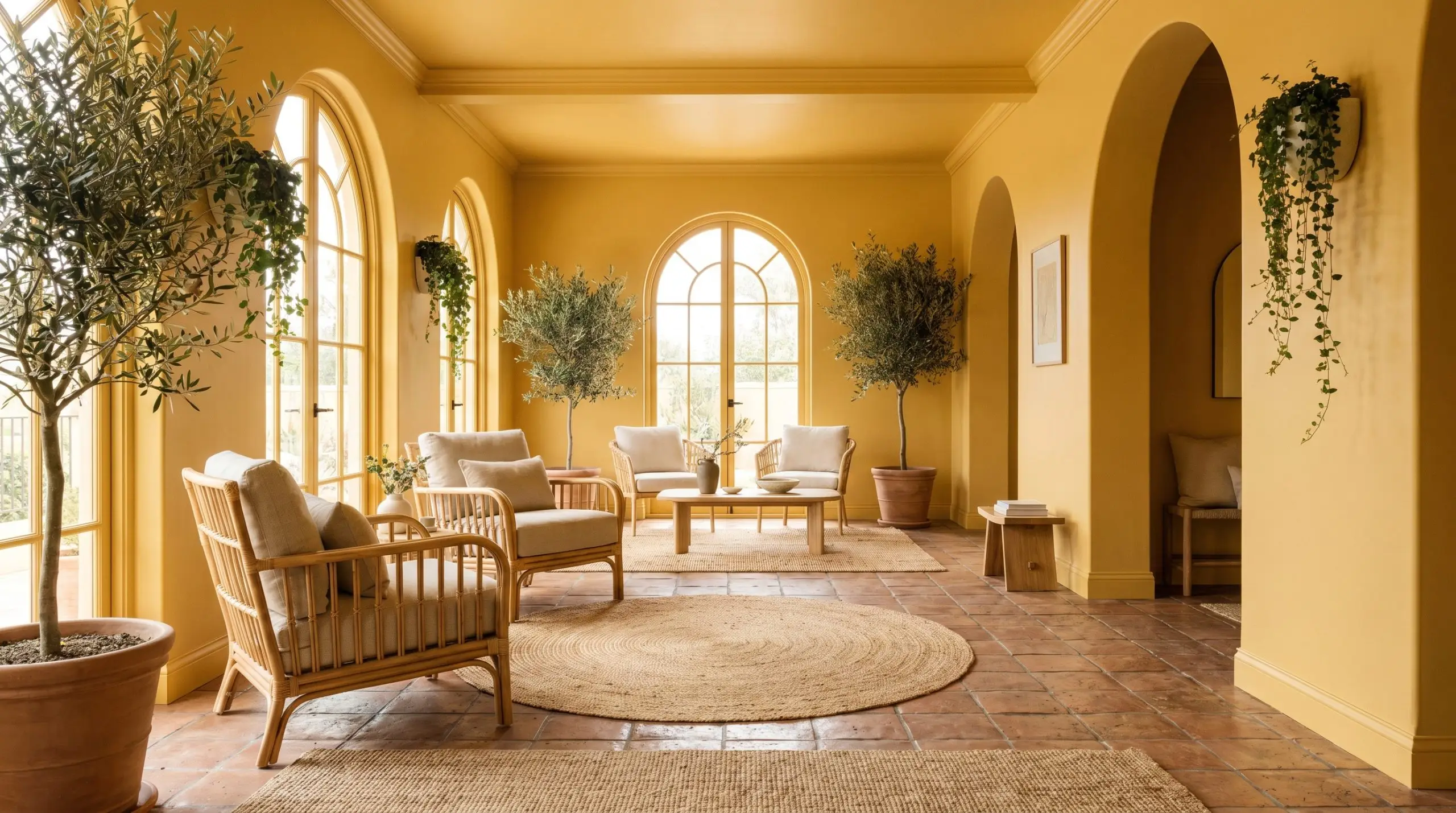
Sunrooms and Conservatories
A sunroom chromatic profile begs for colors that blur the line between the indoors and the exterior landscape. By color-drenching the entire space—painting the walls, trim, and even the ceiling in MQ4-12—you create a seamless, immersive environment. The abundant natural light will make the room glow from within.
Style this sun-drenched space with natural, tactile materials to enhance the organic vibe. Think oversized rattan chairs, layered jute rugs, and heavily textured terracotta floor tiles. The result is a relaxed, Mediterranean Revival energy that feels like a permanent vacation.
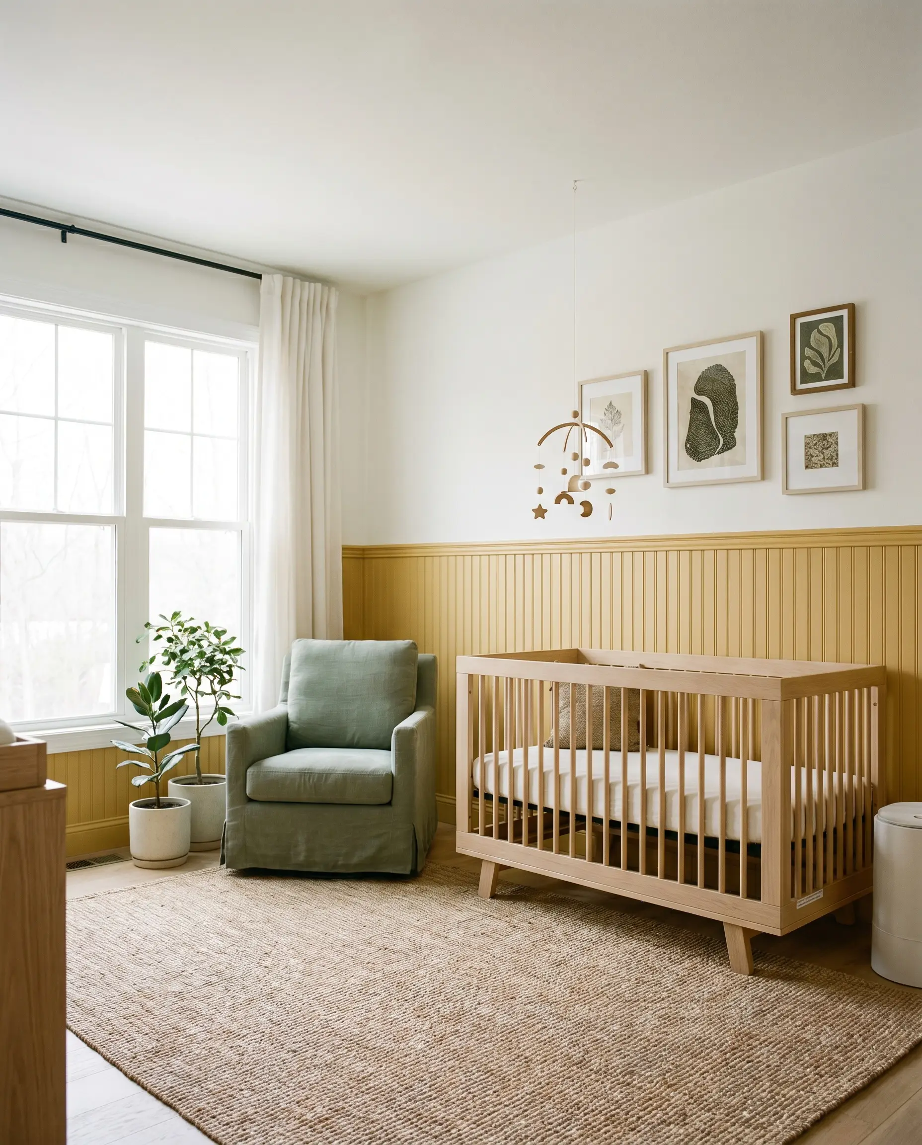
Nurseries and Playrooms
It is incredibly common to default to pastel, baby-centric themes in a nursery, but this complex yellow allows for a much more sophisticated approach. Apply the color to classic beadboard wainscoting on the lower half of the wall, leaving the upper half a crisp, warm white. This application method secures the vibrant color while keeping the room feeling airy and calm.
By treating the nursery with an elevated, earthy color palette, you eliminate the need to repaint in three years. The room will naturally mature alongside your child.
Hackrea Design Secret (The Longevity Play)
Furnish the space with natural white oak spindle cribs and soft, washed linen textiles in muted sage greens. This creates a calming, Organic Modern retreat that adults will enjoy sitting in just as much as the children.
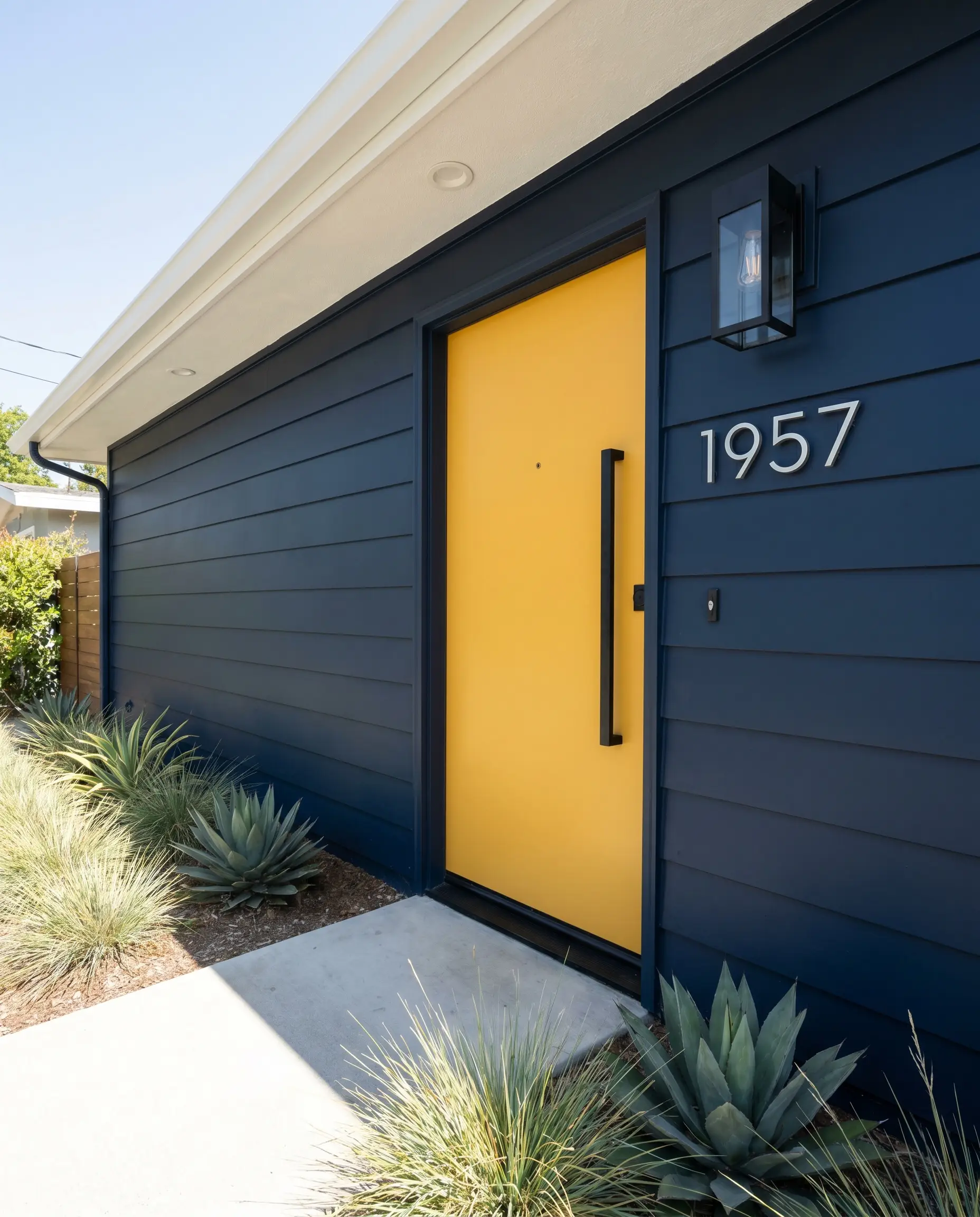
Exterior Front Doors
If you have a home with a relatively neutral or dark exterior facade, a bright front door creates an incredibly welcoming focal point. This specific shade provides a cheerful mid-century pop of color against dark charcoal brick or classic navy siding. It instantly boosts curb appeal by drawing the eye directly to the entryway.
To keep the look tailored and intentional, use heavy, blackened steel hardware and sleek, modern house numbers. The stark, dark metal provides the necessary visual weight to balance the buoyant yellow.
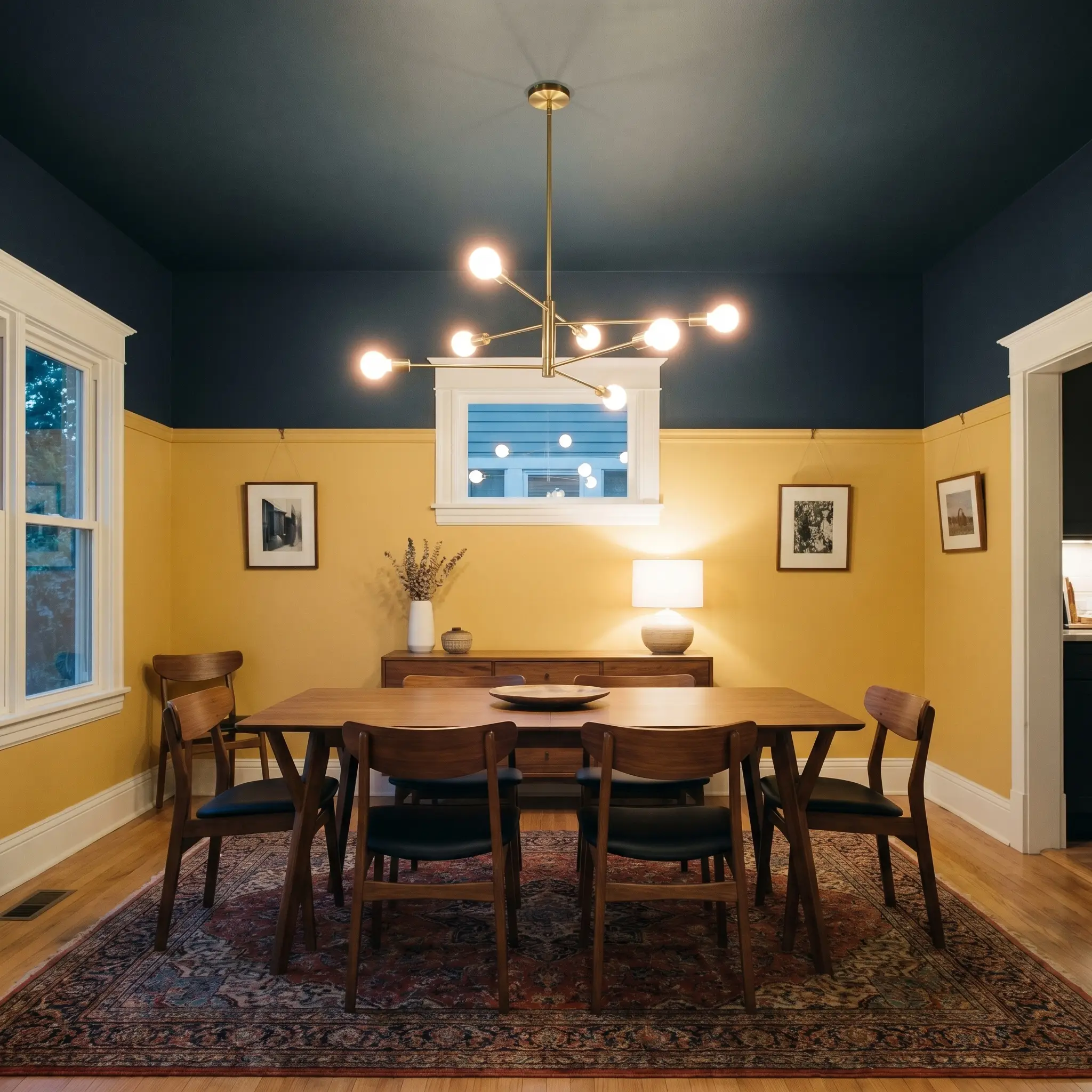
Dining Rooms
Dining rooms are the perfect canvas for exploring intentional design tension and rich color blocking. Install a picture rail molding about three-quarters of the way up the wall. Paint the lower section in this saturated yellow, and apply a profound, moody navy blue above the rail and across the ceiling.
This unexpected combination creates an intimate, highly curated atmosphere perfect for evening entertaining. Add a sculptural brass chandelier and a vintage Persian rug to pull the contrasting tones together. The yellow acts as a warm, inviting foundation, while the dark ceiling adds an element of dramatic dining elegance.
Curating the Residential Interior Palette for Dandelion Wish
This color thrives when it is placed in direct conversation with contrasting tones and rich textures. It requires thoughtful pairings to prevent the yellow from taking over the entire visual landscape.
Perfecting the Trim
The undertone of your trim paint will dictate whether your yellow walls feel crisp and modern or soft and traditional.
Tactile Materials & Wood Tones
The physical materials you bring into the room will either amplify the paint’s warmth or provide a necessary visual break.
The Paint Palette Companions
Building a cohesive palette means utilizing secondary colors that either cool down the room’s temperature or enhance its earthy nature.
Designer Mood Boards
To help you visualize how these elements come together, here are three distinct aesthetic pathways for this versatile color.
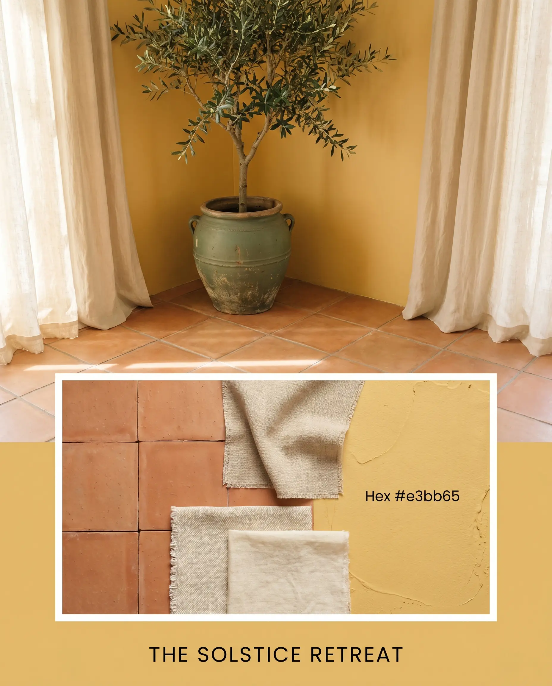
The Solstice Retreat This palette captures the relaxed, sun-baked energy of a coastal Mediterranean villa. The golden walls are paired with expansive terracotta floor tiles and soft, washed linen drapery that catches the breeze. Accents of Caldwell Green are introduced through large indoor olive trees and vintage pottery, creating an atmosphere that feels effortlessly warm and restorative.
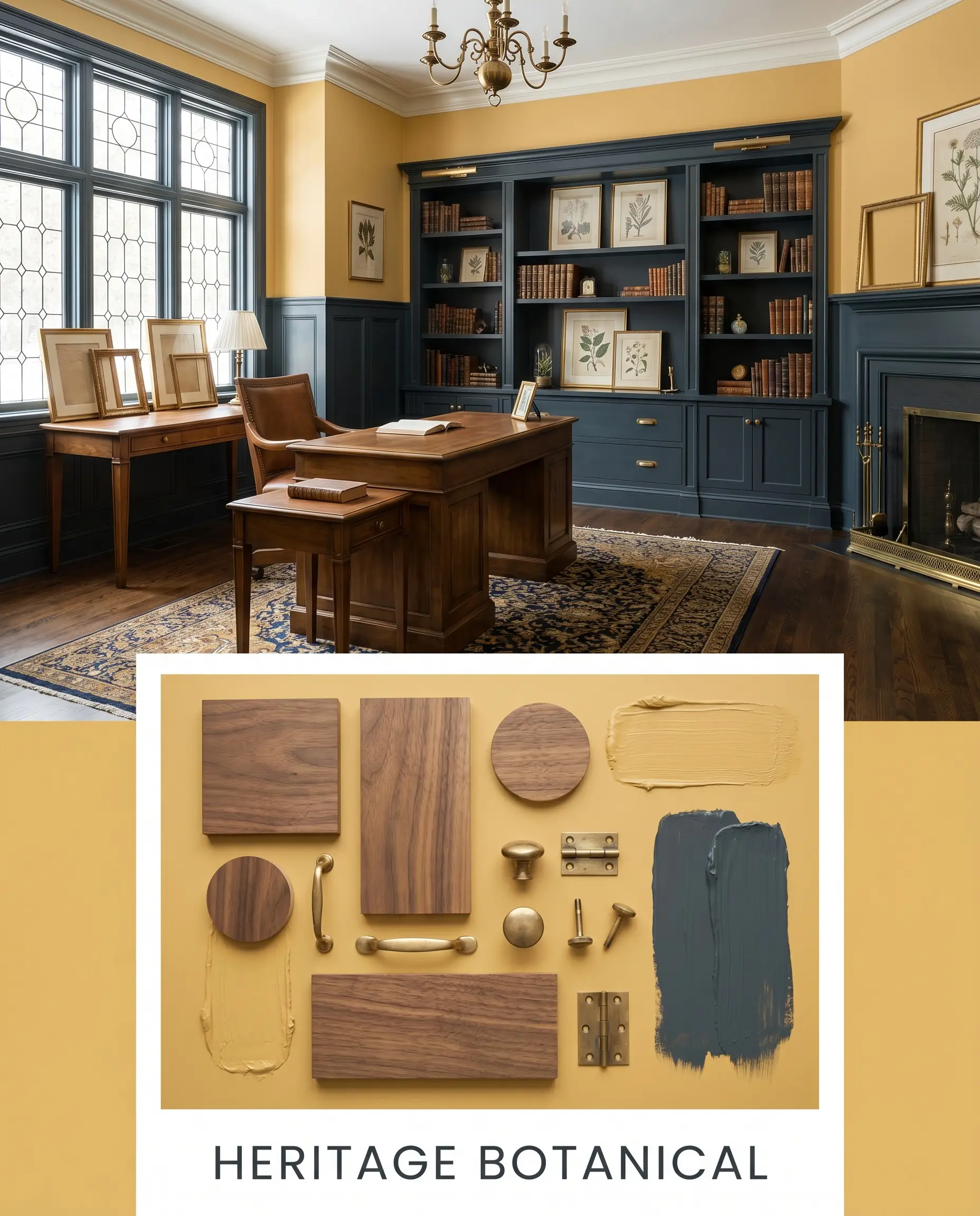
Heritage Botanical A mood board dedicated to rich, historic contrast and cozy intimacy. The vibrant yellow is heavily grounded by deep, saturated accents of Hague Blue on surrounding wainscoting or built-in shelving. Mid-tone walnut furniture and unlacquered brass picture frames add layers of traditional warmth, resulting in a space that feels collected, thoughtful, and deeply inviting.
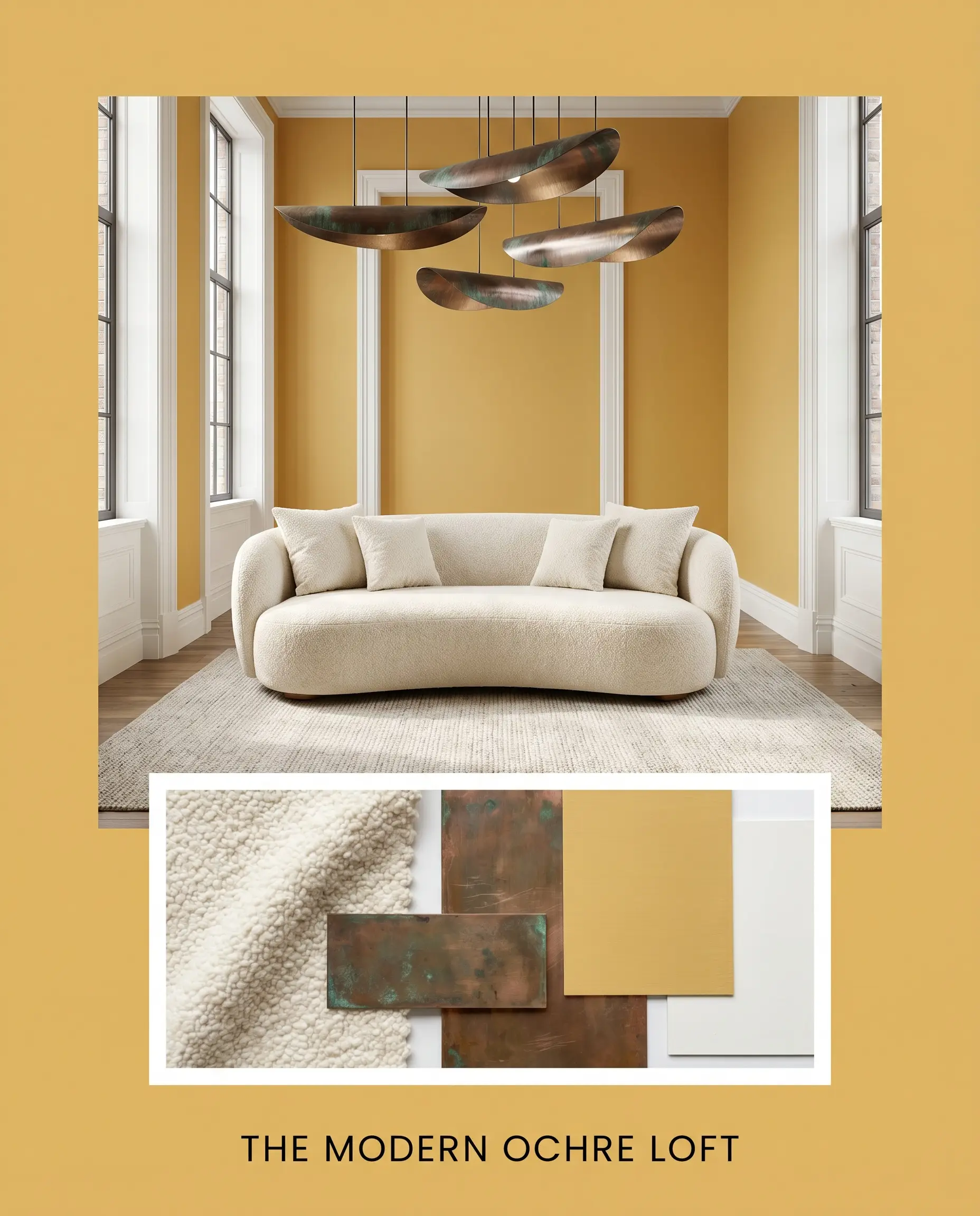
The Modern Ochre Loft This aesthetic uses the paint as a bold, contemporary statement within a minimalist framework. The walls are framed by the stark, crisp boundaries of High Reflective White trim. Cream boucle textiles and sleek, oxidized copper lighting fixtures provide necessary texture without cluttering the visual field, creating an energy that is vibrant yet incredibly tailored.
The Ochre Showdown: Behr Dandelion Wish vs. Rival Yellows
When selecting a yellow, subtle shifts in saturation and light reflectance change everything. If you are debating between similar shades, understanding their specific behaviors in different lighting scenarios is crucial.
Behr Dandelion Wish MQ4-12 vs. Benjamin Moore Hawthorne Yellow HC-4
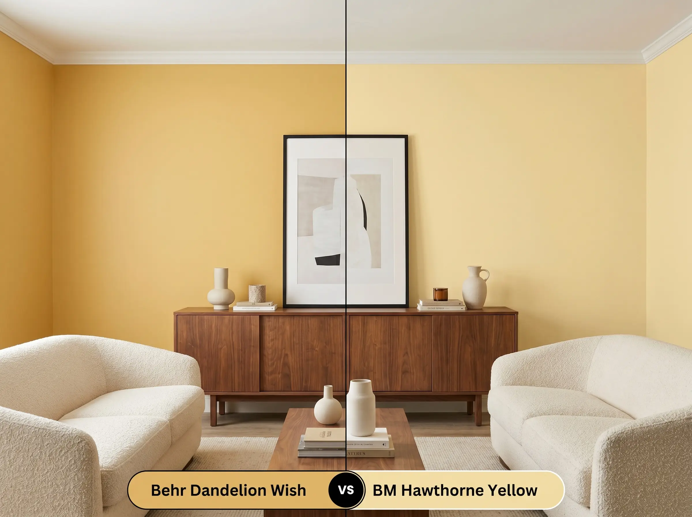
Hawthorne Yellow is a beloved, classic shade, but it carries a slightly more traditional, historic vibe compared to the Behr option. If your home features a lot of cool, North-facing light, Hawthorne Yellow might hold its warmth a bit more stubbornly. However, if you want a color with a deeper, earthier ochre base that feels slightly more modern, Dandelion Wish is the stronger candidate.
Behr Dandelion Wish MQ4-12 vs. Sherwin-Williams Bakelite Gold SW 6368
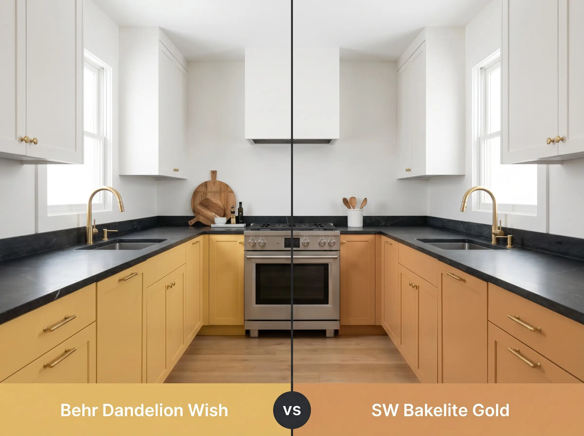
Bakelite Gold pushes much further into the territory of deep, retro mustard. It is significantly heavier and absorbs more light, making it a bold choice for dramatic, moody spaces. If you want a color that still feels buoyant and reflects enough light to keep a standard-sized room feeling open, stick with the higher LRV of the Behr paint.
Behr Dandelion Wish MQ4-12 vs. Behr Charismatic PPU6-14
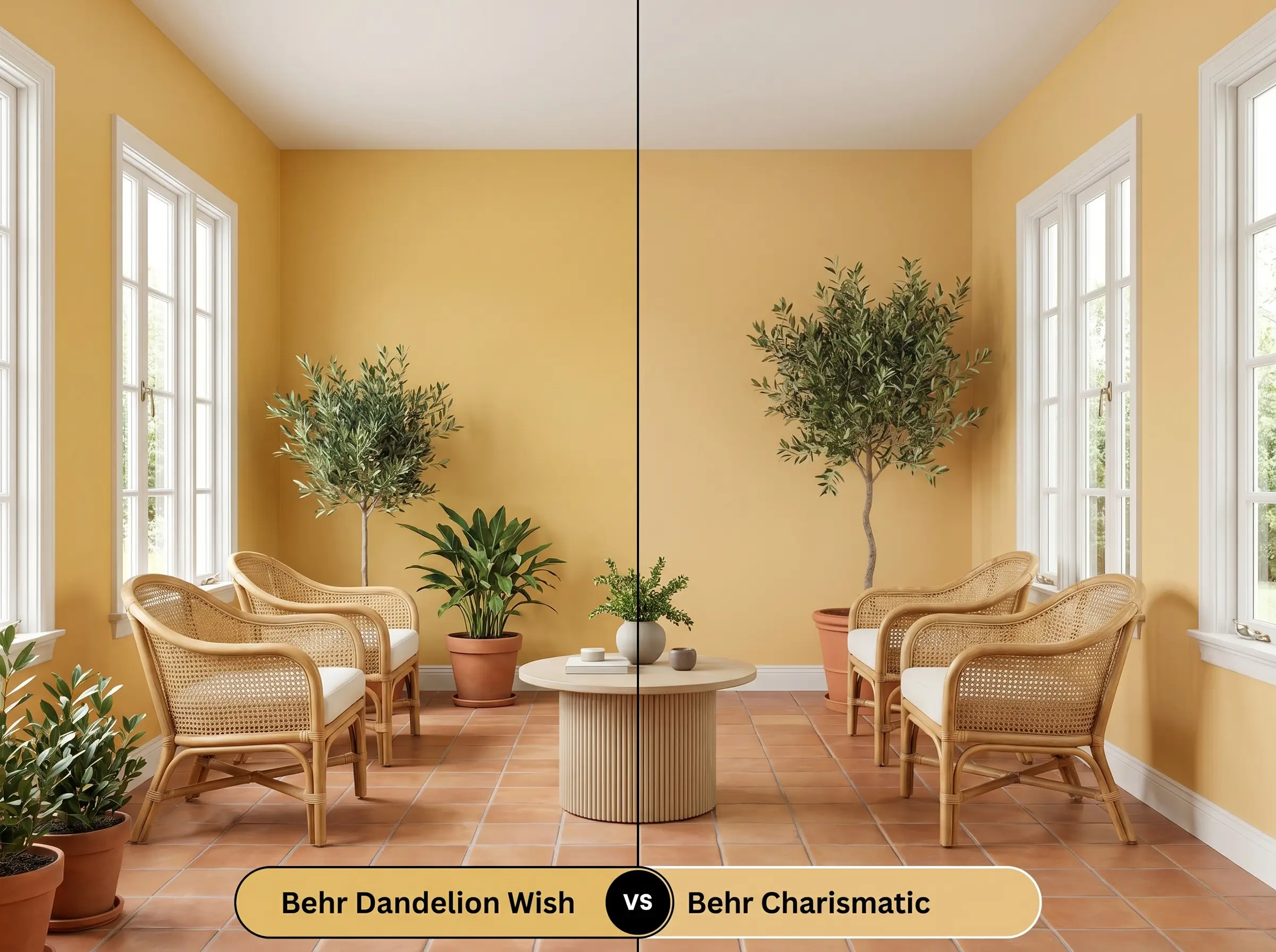
Charismatic is a slightly brighter, more energetic yellow that lacks the subdued, earthy undertones found in MQ4-12. If you are painting a windowless hallway and desperately need to inject pure, sunny energy, Charismatic will do the job. But if you are designing a primary living space where you need the color to feel sophisticated and relaxing, the ochre complexity of Dandelion Wish makes it the clear winner.
Color Matching the Earthy Gold Cast
Sometimes a color is almost perfect, but you need a slight adjustment in depth, or you simply need to purchase a different brand based on what your local hardware store carries.
Sibling Shades from Behr
If you want to stay within the same brand but need a slight variation in tone, consider these alternatives:
Cross-Brand Equivalents
If you need to color-match this specific vibe using a different manufacturer, these are your closest architectural equivalents:
Execution Secrets for a Flawless Architectural Finish
Transitioning from design theory to actually putting paint on the wall requires a strategic approach. Yellow paint saturation is notoriously tricky to get right, and proper preparation is essential.
When dealing with this specific pigment profile, a high-quality tinted primer is absolutely non-negotiable. Standard white primer will often cause the yellow to look streaky or uneven, forcing you to apply three or four coats of topcoat. Ask your paint counter to tint your primer slightly toward the golden hue to ensure a solid, opaque foundation.
Because mid-tone yellows are highly susceptible to “flashing” (visible roller marks where the paint dried unevenly), you must maintain a wet edge while painting. Work in small, manageable sections and avoid the temptation to constantly touch up half-dried spots, which will ruin the smooth finish.
Clash Warning (The Roller Mark Risk)
Frequently Asked Questions
Because of its earthy ochre foundation, it rarely reads as neon. However, heavy green foliage outside a North-facing window will filter the incoming light, potentially pulling out a very faint, cool greenish-gold micro-nuance. To counteract this, rely on warm interior lighting and warm wood tones.
Cool 4000K lighting tends to flatten the complex warmth of this paint, making the ochre undertone feel a bit sterile and washed out. For windowless spaces, it is highly recommended to switch to 3000K LEDs to artificially recreate the missing golden hour glow.
Yes, its LRV of 53 gives it enough depth to hold its shape in direct sunlight without immediately washing out. However, all yellows are prone to UV fading over the years, so ensure you use a premium exterior formula with high-quality UV protectants.
Heavy textures, like popcorn or thick swirl patterns, cast thousands of tiny micro-shadows across the surface. This actually makes the paint appear slightly darker and more saturated than it looks on a smooth color swatch, so plan your lighting accordingly.
The Final Verdict on Behr MQ4-12
Behr Dandelion Wish is a masterclass in accessible, architectural color design. It is the perfect choice for homeowners who crave the cheerful energy of a yellow room but want to avoid the juvenile, primary-color pitfalls. By leveraging its earthy ochre undertones, this paint effortlessly elevates everyday spaces into warm, sophisticated retreats.
However, this color requires a thoughtful, warm-leaning environment to truly succeed. If your home is heavily decorated with cool, blue-toned grays, stark stainless steel, and sterile, icy white decor, this yellow will visually clash, appearing muddy and out of place. It thrives when surrounded by natural textures, rich wood tones, and complementary deep blues or greens that respect its organic, sun-drenched DNA.