Upbeat P300-5
BehrWhat color is Behr Upbeat? Behr Upbeat (P300-5) is a bright, optimistic light-to-mid yellow with a warm golden cast. Boasting an LRV of 80, this sunny hue reflects massive amounts of light, making it the perfect architectural finish for awakening dark, north-facing rooms or energizing kitchens and laundry spaces.
Paint Technical Profile
| Color ID / SKU | P300-5 |
| HEX Code | #ffe487 |
| Light Reflectance (LRV) | 80 |
| Use | Interior, Exterior |
| Best Exposures | North, East |
| Best For | Kitchens, Playrooms, Laundry Rooms, Breakfast Nooks |
Behr Upbeat P300-5: Bottling the Morning Sun for High-Energy Interiors
Some colors gently whisper in the background, while others pull the curtains back and force the morning into the room. Behr Upbeat P300-5 falls firmly into the latter category, delivering an instant dose of visual caffeine to tired architecture. This sun-drenched yellow is an exercise in intentional optimism, designed to flood interior and exterior spaces with an undeniable, radiant energy.
Behr Upbeat P300-5: Undertones & LRV Unpacked
If you are searching for a definitively warm, unapologetically cheerful paint, your hunt ends here. Upbeat leans entirely into its sunny disposition, radiating a steady, comforting heat that instantly warms up chilly spaces.
With an official light reflectance value (LRV) of 80, this chromatic profile acts as a massive spatial amplifier. It aggressively bounces visible light from corner to corner, ensuring the room feels expansive and awake rather than shadowed. This high level of reflectance means the color actively participates in the room’s illumination, making it a powerful tool for darker floor plans.
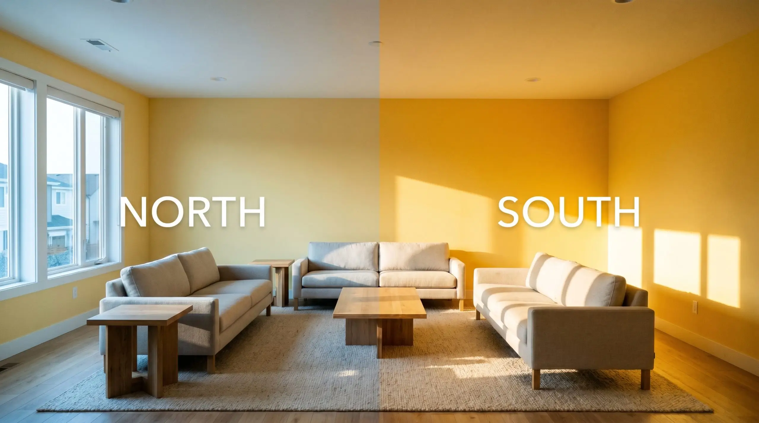
How Shifting Light Alters Behr Upbeat
Yellows are notoriously reactive, absorbing and reflecting the ambient temperature of their environment with intense precision. If you place this luminous base in a room with harsh, uninterrupted southern exposure, you risk turning a cheerful glow into a blinding glare. Testing this shade across different walls throughout the day is non-negotiable to ensure the intensity remains comfortable.
Where to Apply Behr Upbeat in the Home
Certain shades don’t just coat a wall; they actively rewrite the daily rhythm of the household. This optimistic yellow cast thrives in spaces dedicated to morning routines, creative energy, and lively conversation.
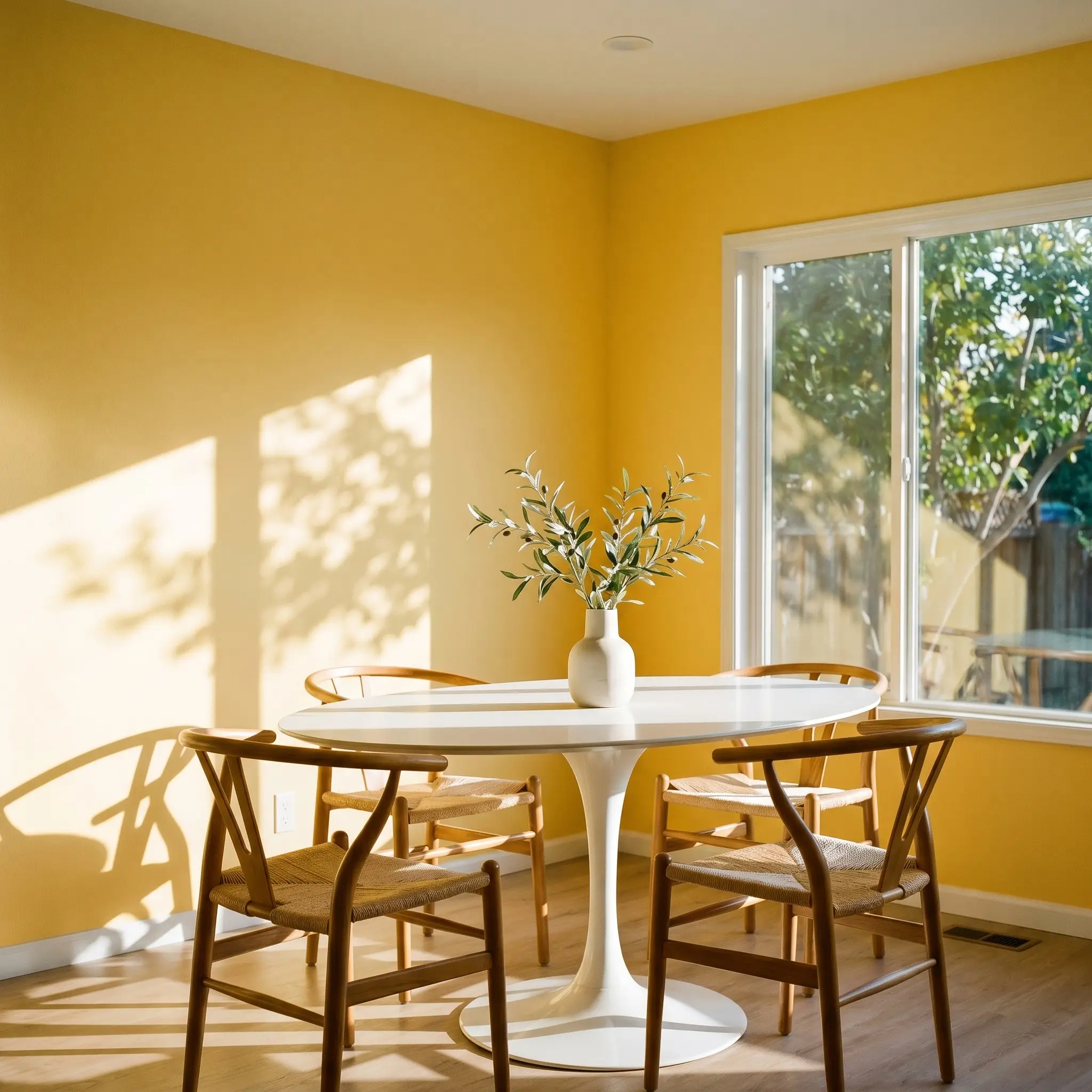
Breakfast Nooks
There is no better canvas for this color than the space where you drink your first cup of coffee. Pair it with a white Mid-Century tulip table and woven rattan wishbone chairs to create a crisp, diner-inspired aesthetic. The morning light will catch the warm hue angle, creating an energizing, cafe-like atmosphere that makes waking up significantly easier.
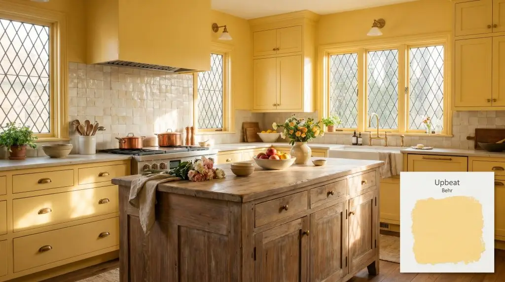
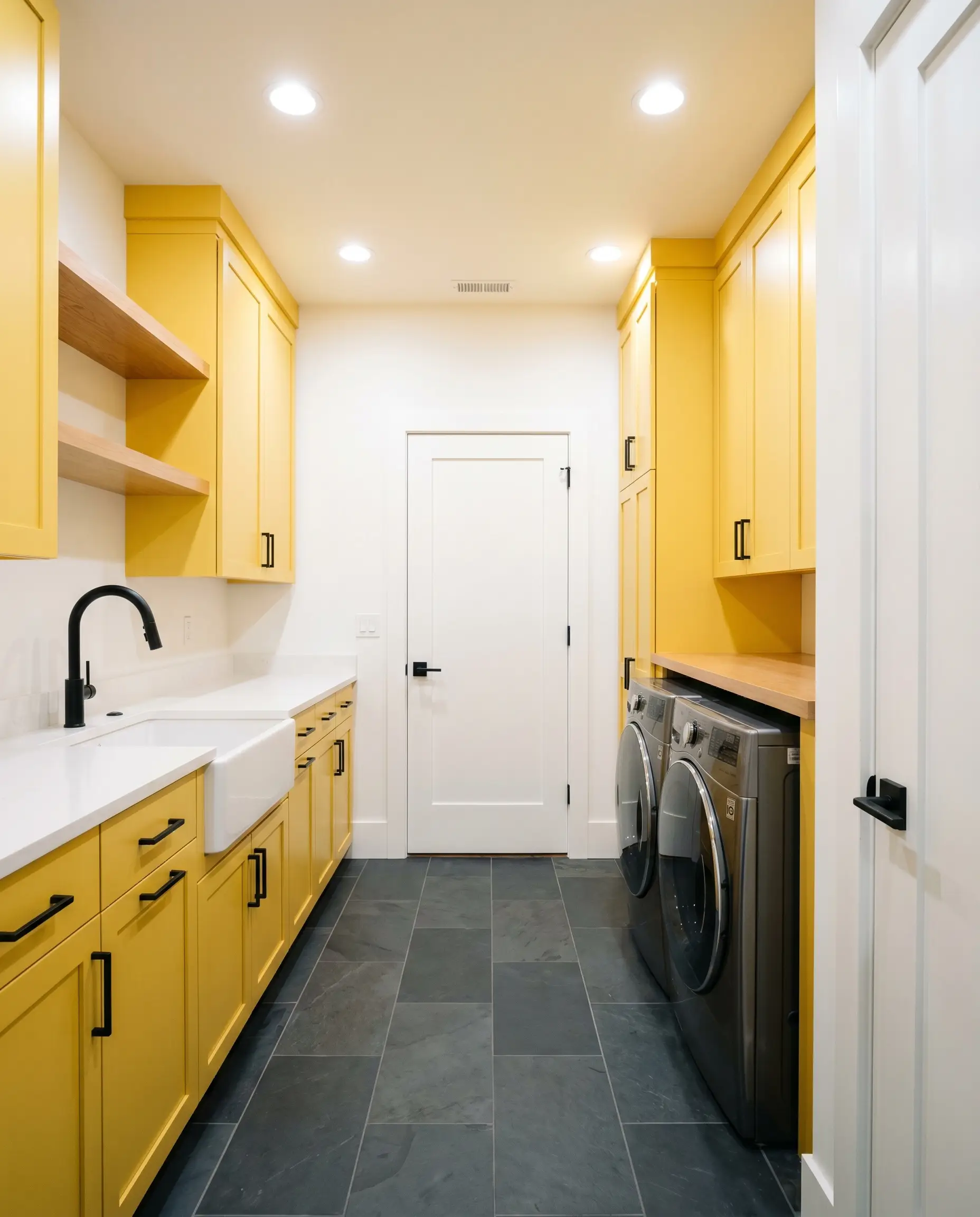
Laundry Rooms
Utility spaces often suffer from sterile, forgotten palettes, making them prime candidates for a high-impact color injection. Using this bright yellow on the cabinetry or walls instantly flips the chore of laundry into a more cheerful experience. Balance the vibrancy with honed slate floors and matte black steel hardware to keep the room feeling tailored and intentional.
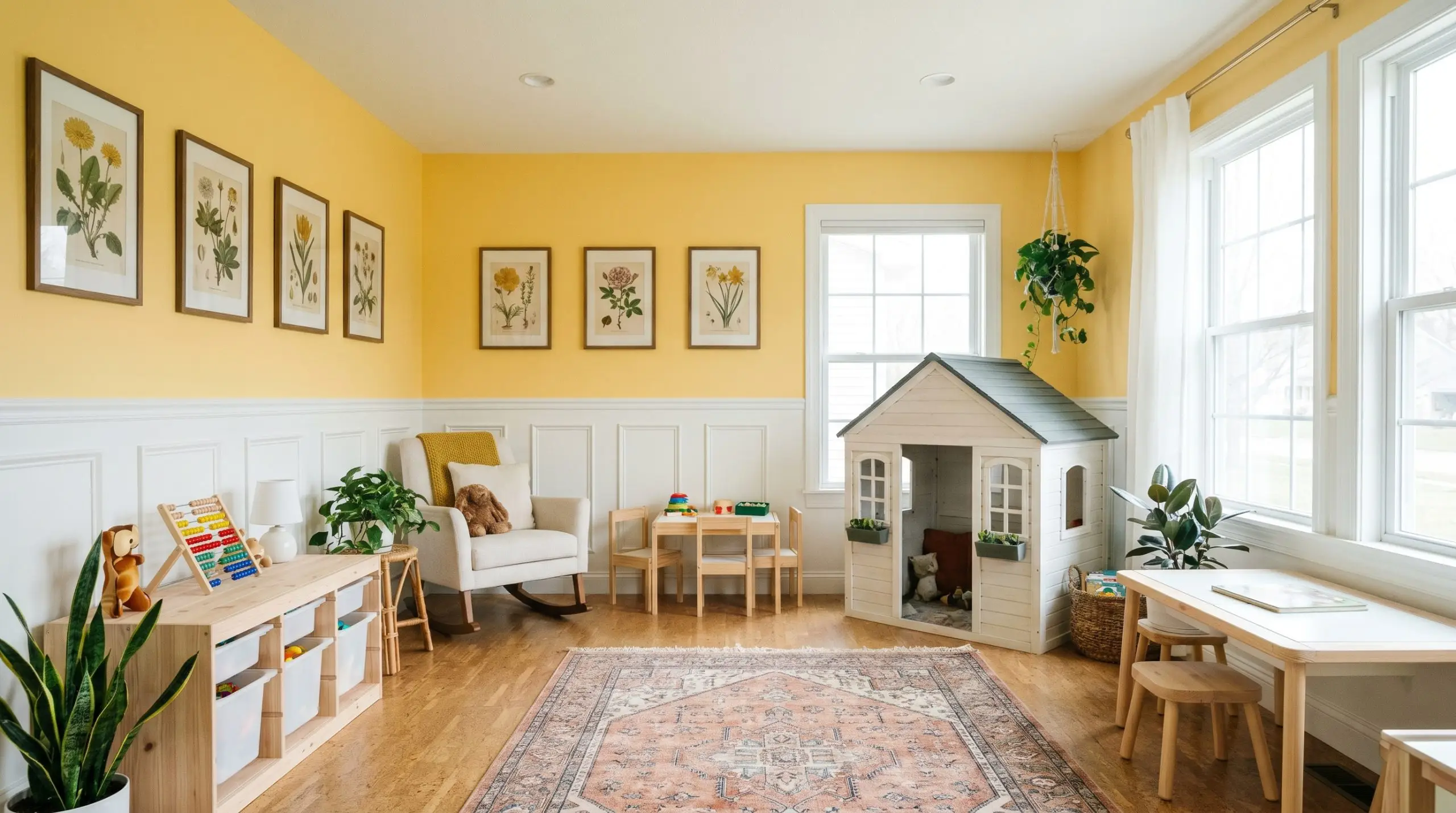
Children’s Playrooms
This shade naturally fosters a sense of play and boundless energy. Instead of painting all four walls, consider using it above a crisp white picture rail or wainscoting to keep the room from feeling visually overwhelming. Layer in primary-colored vintage botanical prints and natural cork flooring for a classic, storybook aesthetic.
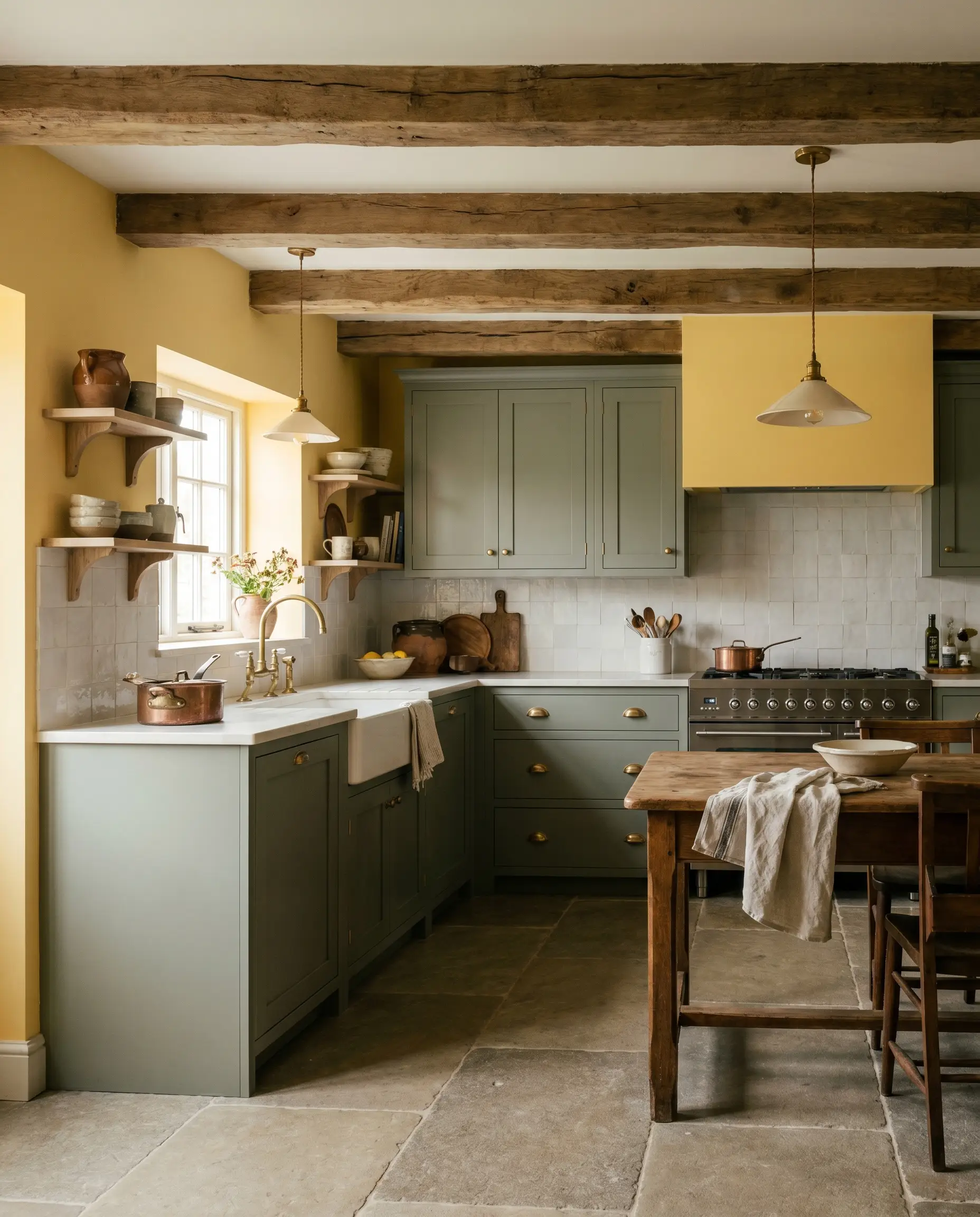
Cottage Kitchens
In an English Cottage-inspired kitchen, this yellow acts as the ultimate heritage backdrop. It pairs beautifully with unlacquered brass hardware, shaker cabinets painted in a soft sage, and heavily textured zellige tile. The golden undertones harmonize seamlessly with the rustic charm of exposed wooden beams and stacked ironstone plates.
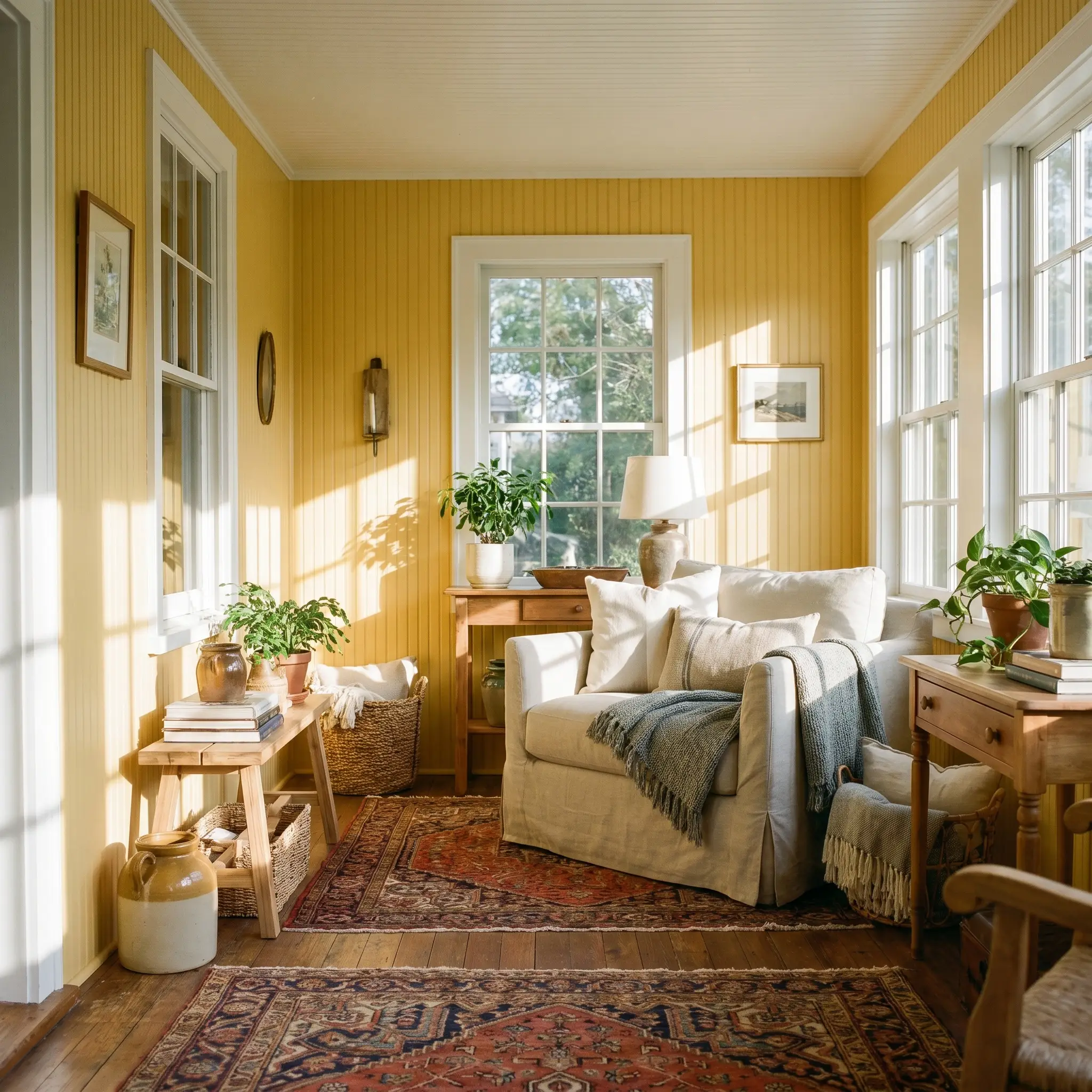
Enclosed Sunporches
If you want to blur the line between indoors and outdoors, this color thrives in a sun-drenched transitional space. Coat the interior siding or beadboard in this luminous shade and furnish the room with layered Persian rugs and an oversized slipcovered armchair. The yellow will catch the dappled sunlight filtering through the windows, amplifying the natural warmth of the space.
Creative Architectural Moments with Upbeat
When a pigment carries this much inherent energy, treating it strictly as a passive backdrop feels like a missed opportunity. Utilizing this color on highly specific architectural features creates moments of brilliant, unexpected contrast that elevate the entire home.
Painting a ceiling in a high-LRV yellow draws the eye upward, faking architectural height while showering the room in a warm, ambient glow. It is the ultimate trick for rooms with low, oppressive sightlines.
Hackrea Design Secret (The Strategic Saturated Ceiling)
The Permanent Sun-Source Ceiling
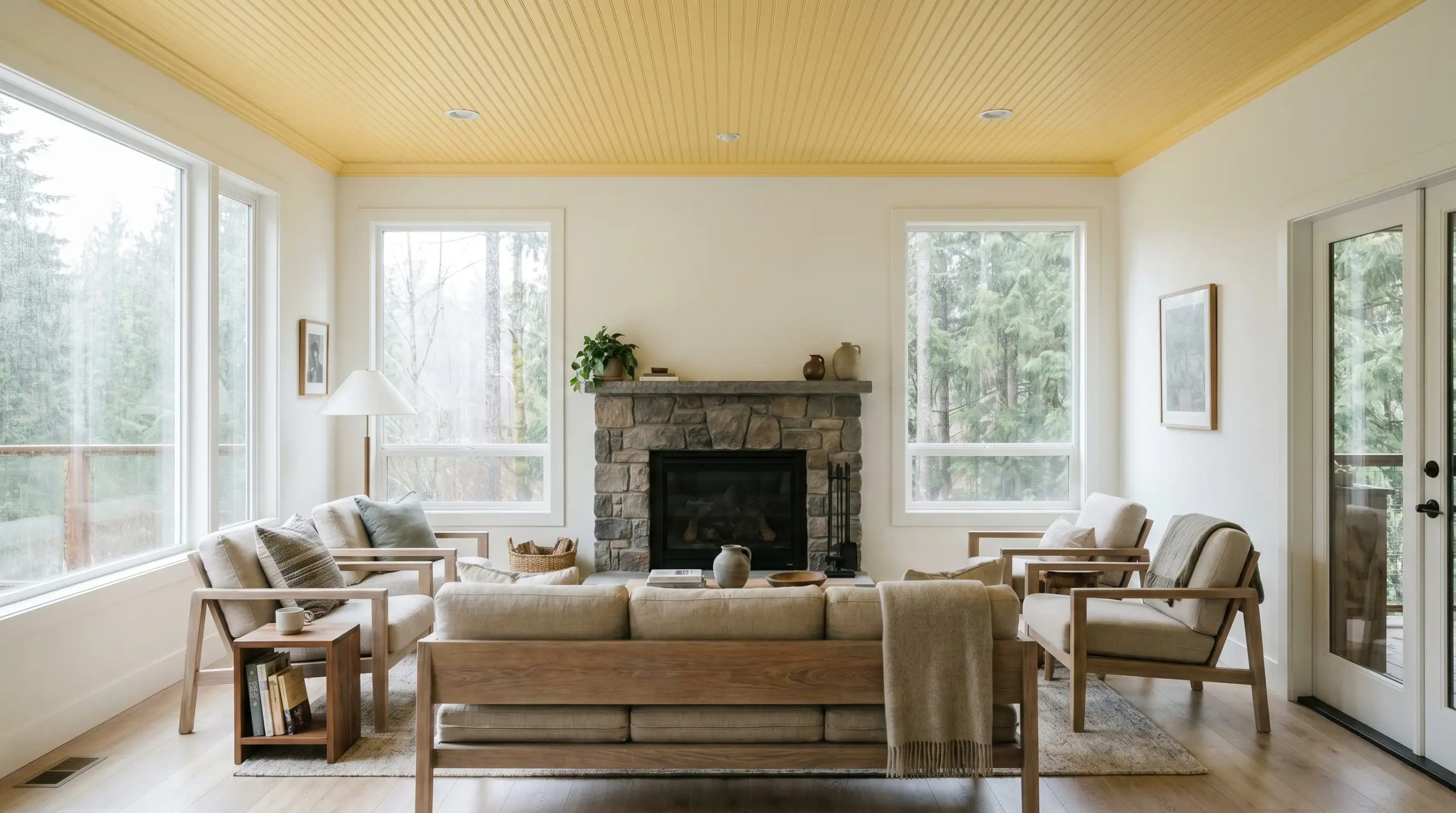
In regions plagued by rainy climates or heavily shaded lots, a room can quickly feel cavernous. Coating a beadboard ceiling in this high-reflectance yellow maximizes the available light, acting as a permanent, glowing sun-source. It provides a constant, cheerful canopy that entirely shifts the mood of a weather-beaten Pacific Northwest home.
The Vintage Tub Soak
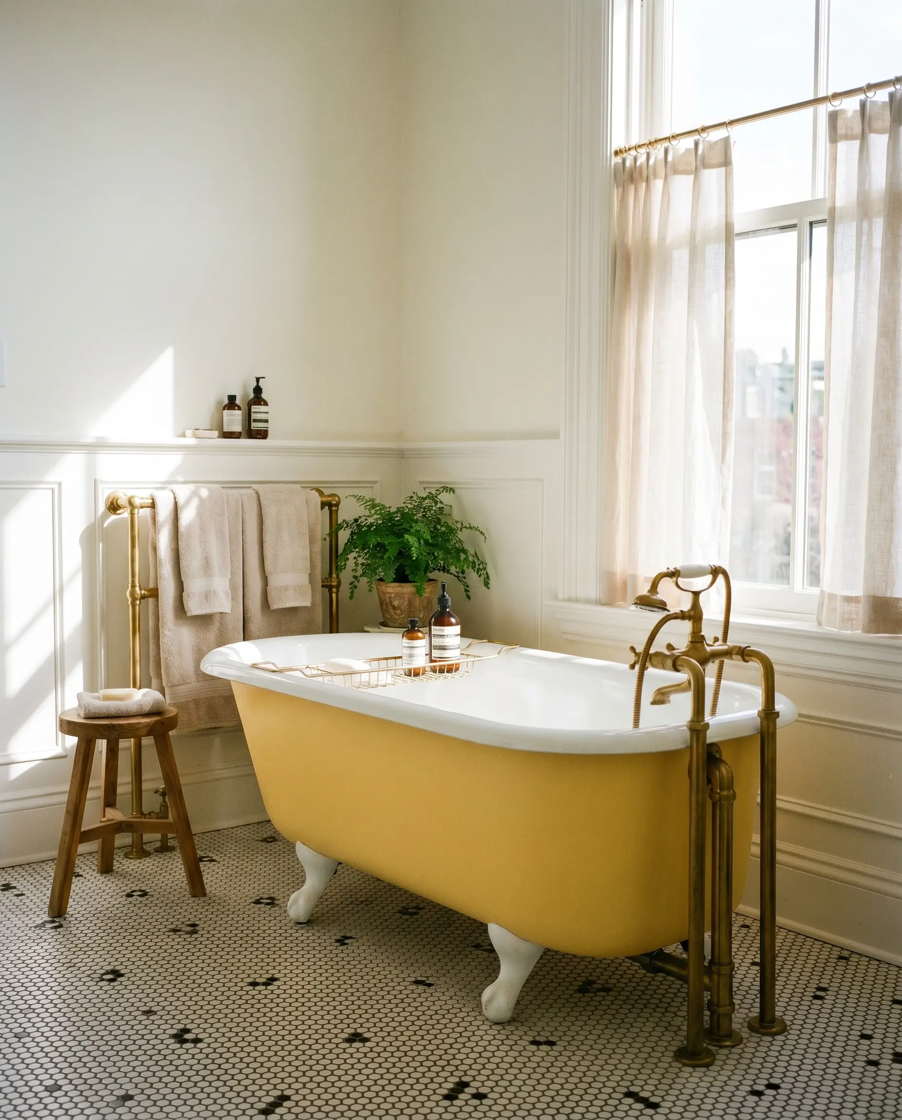
For a boutique hotel-inspired bathroom, a freestanding clawfoot tub requires a striking focal point. Painting the tub’s exterior in this vibrant hue creates a brilliant sensory contrast against classic black-and-white hex tiles. It turns a standard plumbing fixture into a highly curated piece of furniture, offering a joyful surprise every time you enter the room.
The Botanical Window Frame
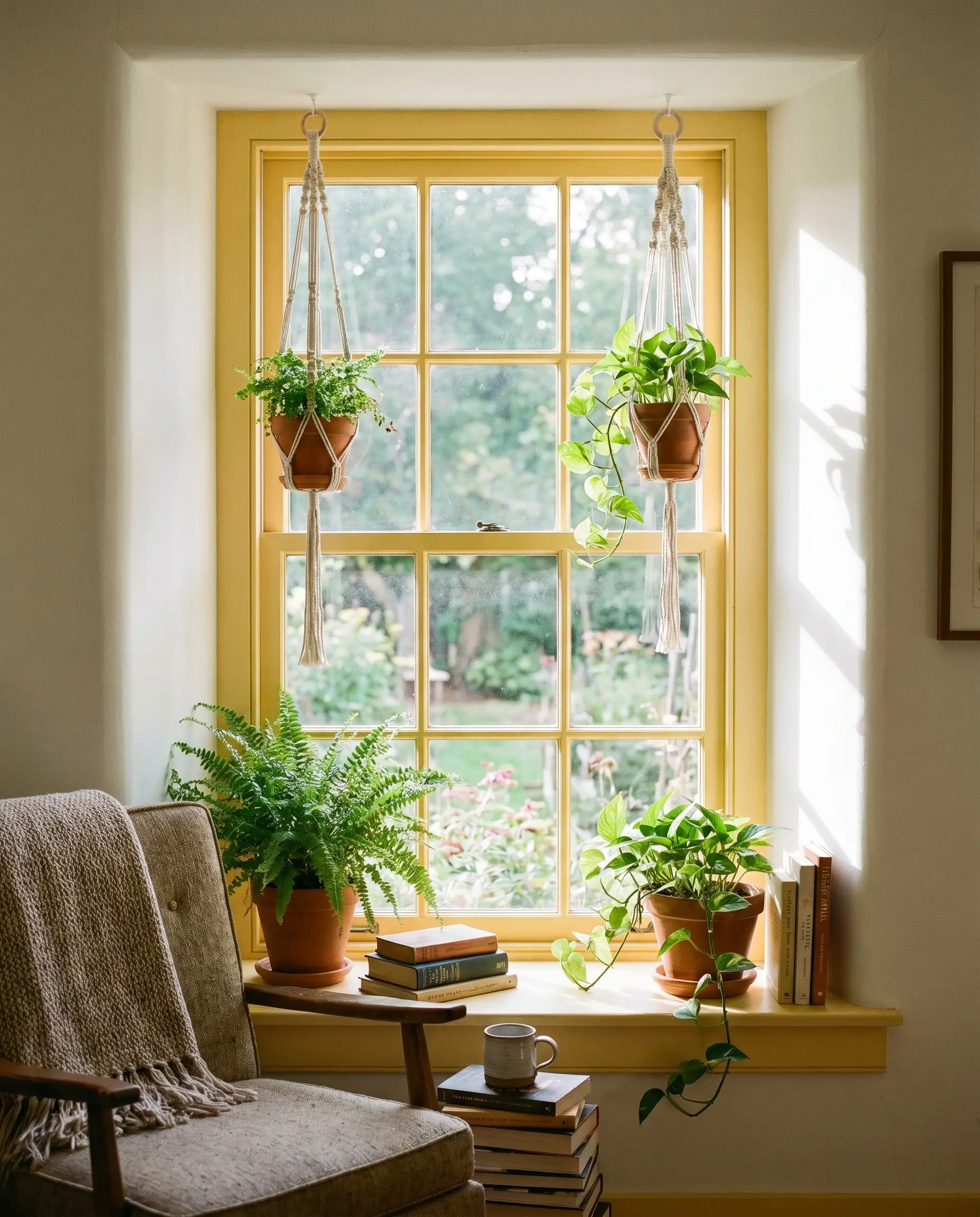
Interior window mullions are often painted a default white, but coating them in this sunny cast turns the window itself into a piece of art. The yellow frame catches the dappled morning sunlight, perfectly highlighting the lush greenery outside. For an avid indoor plant collector, this micro-architectural detail acts like a beautiful botanical greenhouse, framing nature with a complementary burst of warmth.
The Morning Cafe Banquette
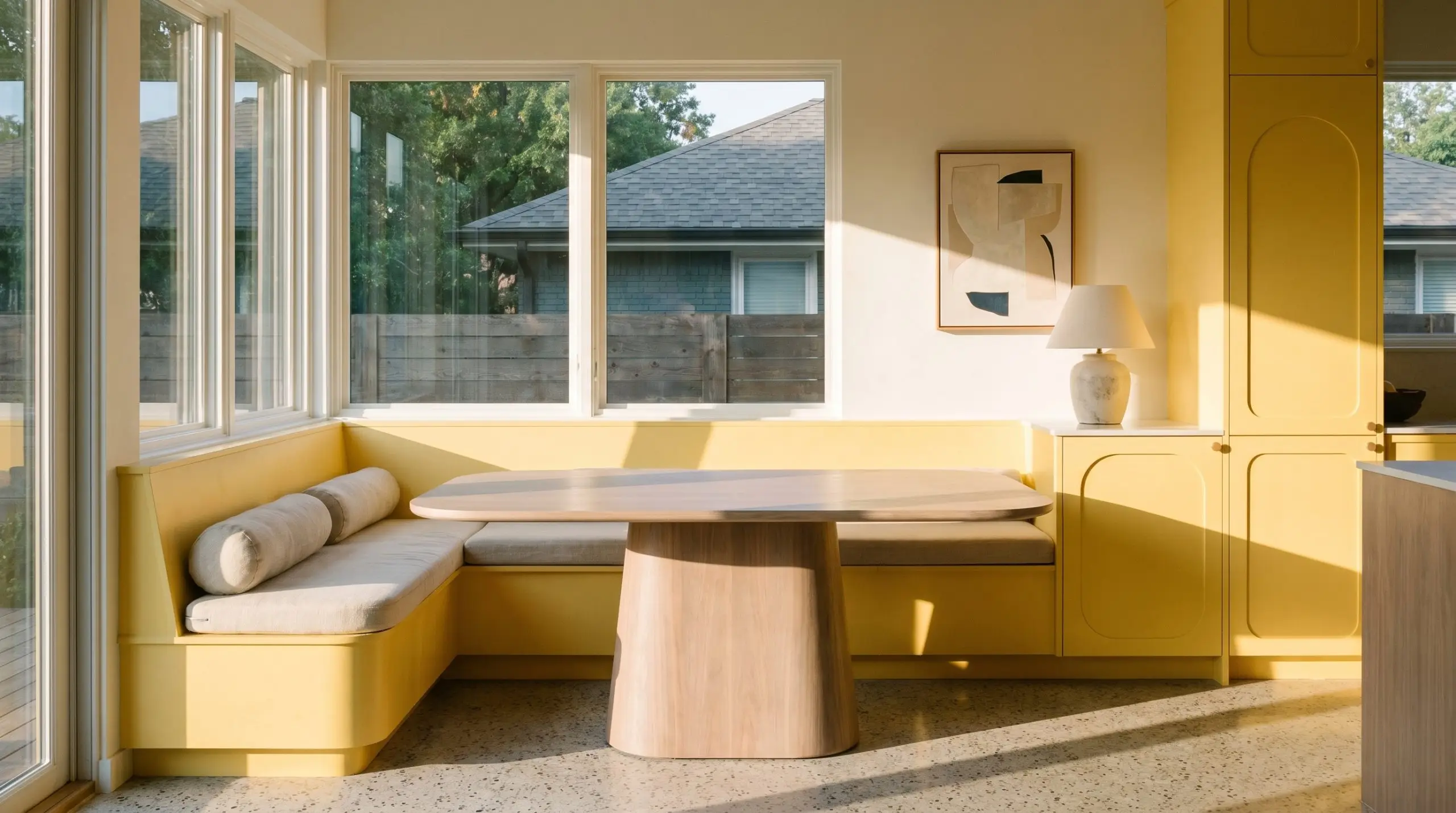
A built-in banquette is the perfect threshold zone to experiment with saturated color. Drenching the bench seating and surrounding millwork in this golden shade amplifies the early morning light. It establishes a highly intentional, energizing zone dedicated entirely to a daily coffee ritual, making a standard kitchen corner feel like a private cafe.
Material Pairings & Coordinating Colors for Upbeat
The trick to styling a highly saturated yellow is giving it strict physical boundaries. It requires tactile, grounded materials to prevent the room from floating away in a cloud of pastel sweetness.
Trim & Baseboards
To maintain the crisp, optimistic energy of the walls, your trim must be equally bright but entirely devoid of competing yellow undertones.
Hardware, Wood & Material Pairings
Coordinating Colors
Designer Mood Boards
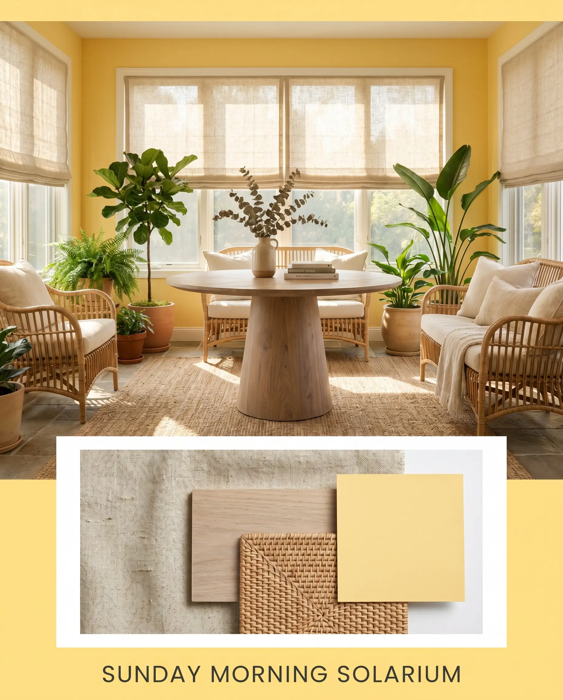
Sunday Morning Solarium This palette captures the quiet energy of a slow weekend morning. The walls radiate in Behr Upbeat, while the windows are dressed in raw linen roman shades to filter the light softly. A bleached walnut pedestal table sits at the center, surrounded by woven rattan seating, creating a space that feels incredibly organic and sun-drenched.
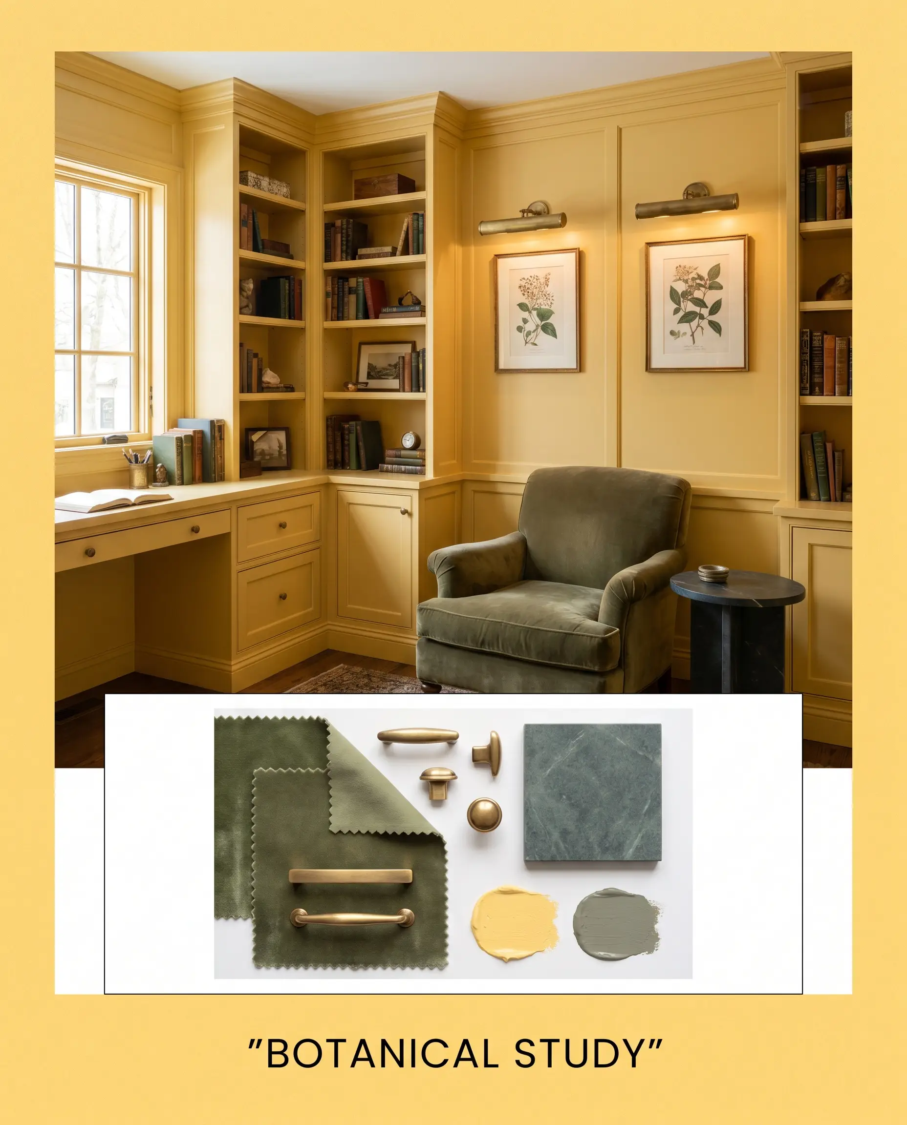
Botanical Study A highly curated, English Cottage-inspired aesthetic that plays with organic contrast. The bright yellow millwork accentuation is balanced by a plush velvet armchair in Card Room Green. Tumbled brass picture lights illuminate vintage botanical prints, while a honed soapstone side table provides a necessary touch of dark, stabilizing visual weight.
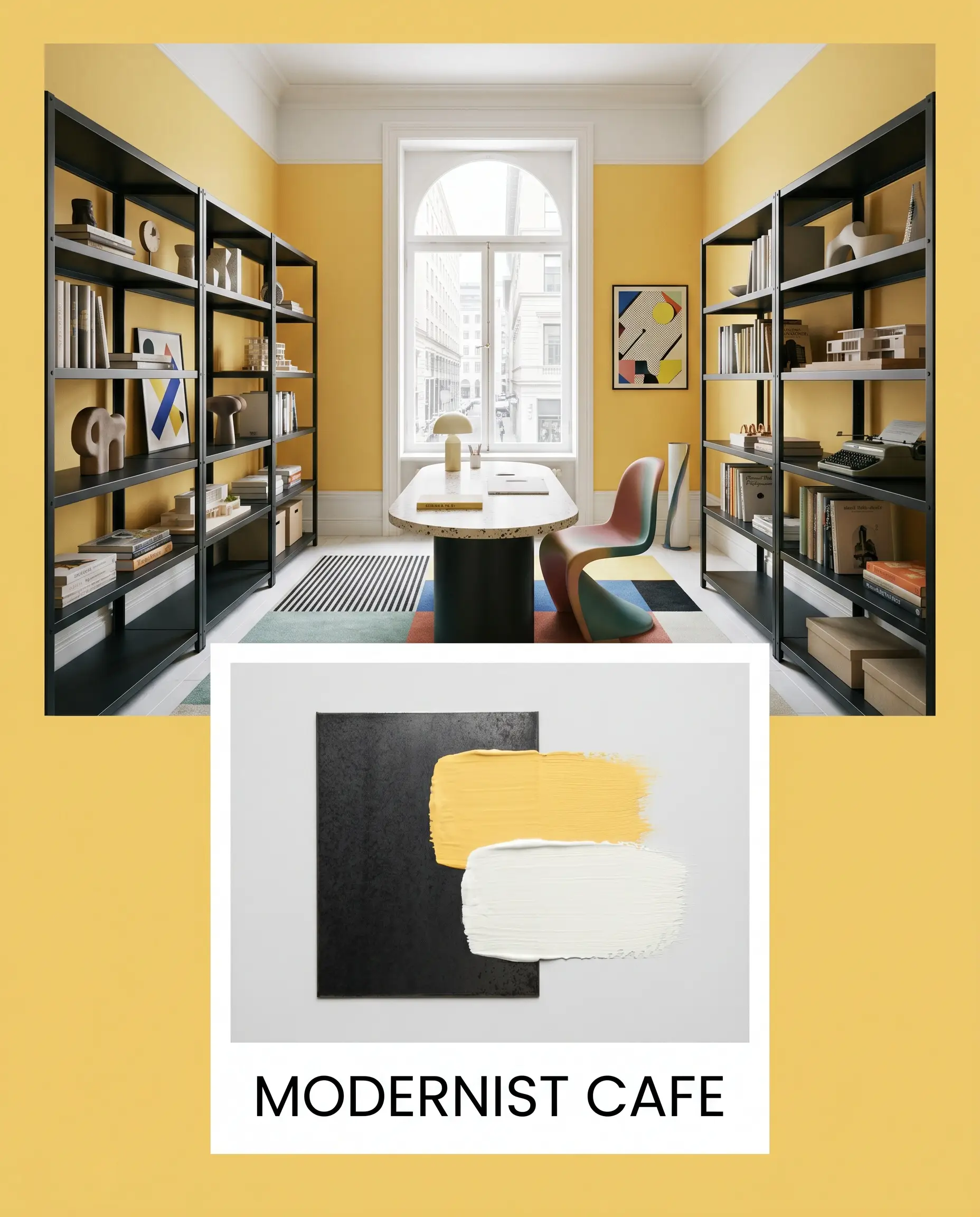
Modernist Cafe This palette leans into sharp, Postmodern graphic contrast. The optimistic yellow cast of the walls is sharply outlined by Chantilly Lace trim. Matte black steel shelving and stark, minimalist line art pop aggressively against the warm background, creating a tailored, high-energy environment perfect for a creative workspace or kitchen.
Behr Upbeat vs. Rival Yellows
Sometimes a specific room’s exposure demands a slight pivot in saturation or temperature. Understanding how this color stacks up against its closest competitors ensures you secure the exact level of warmth your architecture requires.
Behr Upbeat P300-5 vs. Benjamin Moore Hawthorne Yellow HC-4
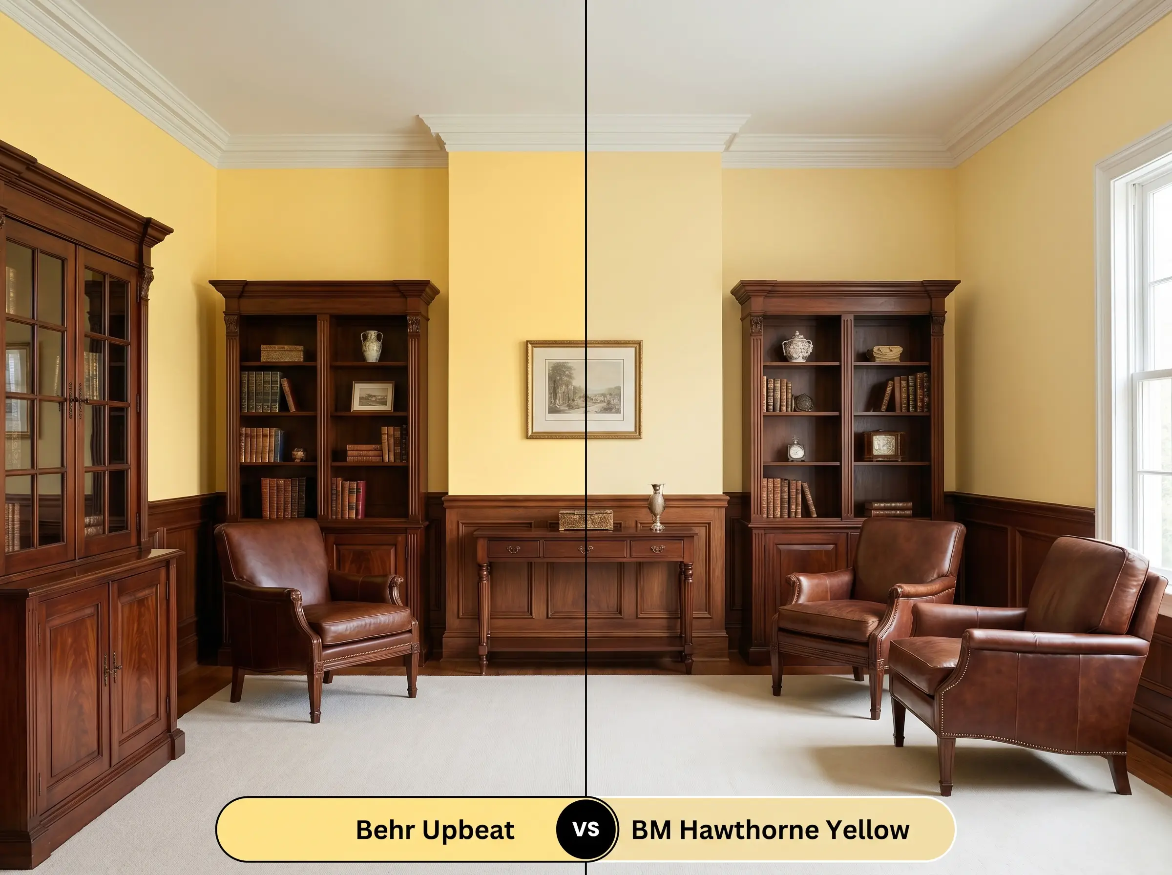
Hawthorne Yellow is a historic, slightly more muted hue with a distinctly traditional pedigree. If your room features heavy antique furniture and you want a yellow that feels aged and subdued, the Benjamin Moore option is superior. However, if you crave a cleaner, more vibrant dopamine hit that feels fresh and modern, Behr Upbeat is the clear winner.
Behr Upbeat P300-5 vs. Sherwin-Williams Cheerful SW 6903
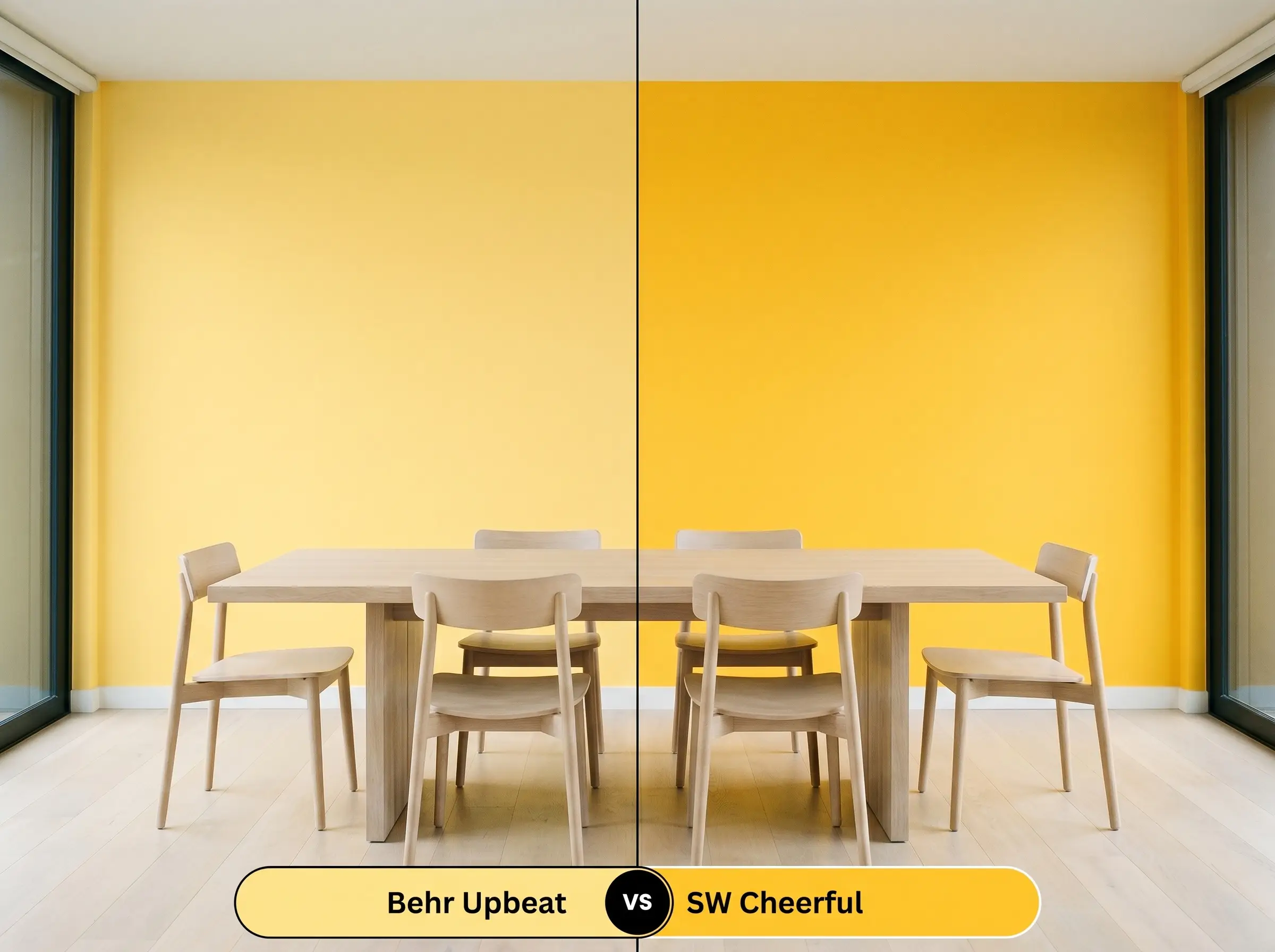
Both of these colors pack a significant visual punch, but they handle light differently. Cheerful leans slightly more into a pure, primary yellow, which can sometimes read as acidic in cool northern light. Upbeat’s golden-peach micro-nuance gives it a softer, more organic glow, making it significantly more forgiving in rooms with varied lighting conditions.
Similar Colors & Brand Matches for Behr P300-5
If your local hardware store is out of stock, or if you need to dial the intensity up or down by just a fraction, these alternatives deliver a nearly identical atmospheric shift.
Same-Brand Alternatives
Cross-Brand Equivalents
Professional Application Strategies for Upbeat
Translating this radiant color from the swatch to your actual walls requires a strategic approach to finishes and prep work. High-reflectance yellows can be notoriously unforgiving if applied haphazardly over dark existing colors.
The Dynamic Sheen Guide
Primer Strategy
Do not attempt to paint this high-LRV yellow over a dark or saturated wall without serious preparation. You must use a high-quality, stain-blocking white primer to completely neutralize the previous color. If you skip this step, the old color will bleed through the luminous base, muddying the yellow and completely ruining its optimistic cast.
Coverage & Success Tips
Even with a premium primer, expect to apply a minimum of two generous coats to achieve full, even opacity. Because yellow pigments are notoriously sheer, you must maintain a wet edge while rolling to prevent “flashing”—those frustrating, visible roller streaks that appear when the paint dries unevenly. Work in small sections and resist the urge to stretch the paint too thin across the drywall.
Frequently Asked Questions
Because of its high LRV, this color performs beautifully under intense coastal sun, though it will read significantly brighter outdoors than on an interior swatch. To ensure longevity in high humidity, you must use a premium exterior masonry primer and a 100% acrylic exterior paint formulated specifically to resist mildew and fading.
It actually creates a very harmonious, warm palette. The golden-peach undertone in the paint speaks directly to the warm, reddish-orange tones inherent in red oak, allowing the floor and the walls to share a similar color temperature without clashing.
While it will certainly inject energy into a windowless space, using a high-LRV yellow in a room dedicated to screen-viewing can be visually distracting and counterproductive. The bright walls will reflect the light from the television or projector, washing out the screen and making the room feel overly stimulating rather than relaxing.
Yes, absolutely. To achieve the true, luminous yellow without the dark jewel tone muddying the final result, you must apply a high-hiding white primer first. A tinted gray primer is typically used for dark topcoats, but for a bright yellow, a pure white primer ensures the most vibrant finish.
The crisp white background of Calacatta marble provides a beautiful, tailored contrast that makes the yellow feel highly intentional and clean. However, the cool gray veining in the marble will slightly emphasize the warmth of the paint, making the yellow appear even sunnier by comparison.
The Final Verdict on Behr Upbeat
Behr Upbeat P300-5 is an architectural caffeine shot, perfect for homeowners who want to actively manipulate the energy and light within their spaces. It is the ultimate choice for breakfast nooks, laundry rooms, and creative spaces where a sense of optimism and daily momentum is required. When paired with tactile materials and crisp white trim, it transforms standard rooms into highly curated, sun-drenched environments.
However, this paint is not a universal crowd-pleaser and requires careful curation to succeed. If your home is heavily outfitted with cool-toned gray luxury vinyl plank flooring, icy blue glass tiles, or large expanses of brushed stainless steel, this color will aggressively fight those elements. The warm, golden-peach micro-nuance will make cool, synthetic gray floors look dingy and purple by comparison, while the stark metals will strip the yellow of its organic charm, resulting in a disjointed, chaotic aesthetic.