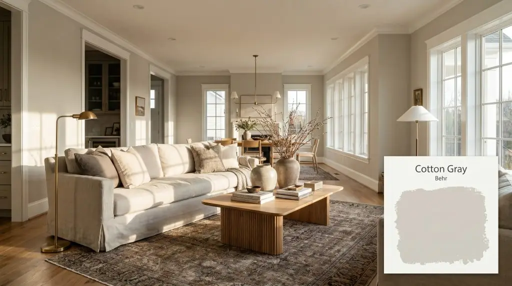
Cotton Gray HDC-NT-20
BehrBehr Cotton Gray (HDC-NT-20) is a warm, inviting greige with an LRV of 61. Walking the line between gray and beige, it features subtle earthy undertones that prevent it from feeling cold, making it a highly versatile neutral for both interiors and exteriors.
Paint Technical Profile
| Color ID / SKU | HDC-NT-20 |
| HEX Code | #D1CCC3 |
| Light Reflectance (LRV) | 61 |
| Use | Interior, Exterior |
| Best Exposures | North-Facing, East-Facing |
| Best For | Living rooms, transitional spaces, kitchen cabinetry, and cozy bedrooms. |
The Tactile Warmth of Behr Cotton Gray: A Complete Design Guide
Paint is rarely just a background color; it is the connective tissue that holds a room’s materials together. When you roll Behr Cotton Gray onto a wall, you introduce a highly adaptable, earthy neutral that immediately softens the hard edges of a space. This specific greige paint thrives in the spaces between crisp modernism and relaxed, lived-in warmth, establishing a quiet energy that allows your furniture and textiles to shine.
Undertones & LRV of Behr Cotton Gray
Is Behr Cotton Gray warm or cool? It is a definitively warm neutral that leans naturally into its earthy character. This color temperature provides a beautiful, stabilizing baseline for both north-facing living rooms and sun-drenched kitchens.
With a light reflectance value of 61, this architectural finish sits comfortably in the light-to-medium range. It absorbs enough light to provide a striking, tailored contrast against crisp white trim, yet reflects sufficient ambient lighting to keep enclosed hallways feeling open and airy. This specific LRV placement makes it an incredibly forgiving choice for whole-house palettes.
Lighting Effects & The Chameleon Factor
A paint’s chromatic profile is never static; it stretches and bends depending on the sun’s trajectory. If your room lacks natural light entirely, this hue can occasionally lose its signature warmth, which is why testing swatches on multiple walls is essential. Observing how the color shifts from morning to evening will help you dial in the perfect artificial lighting plan.
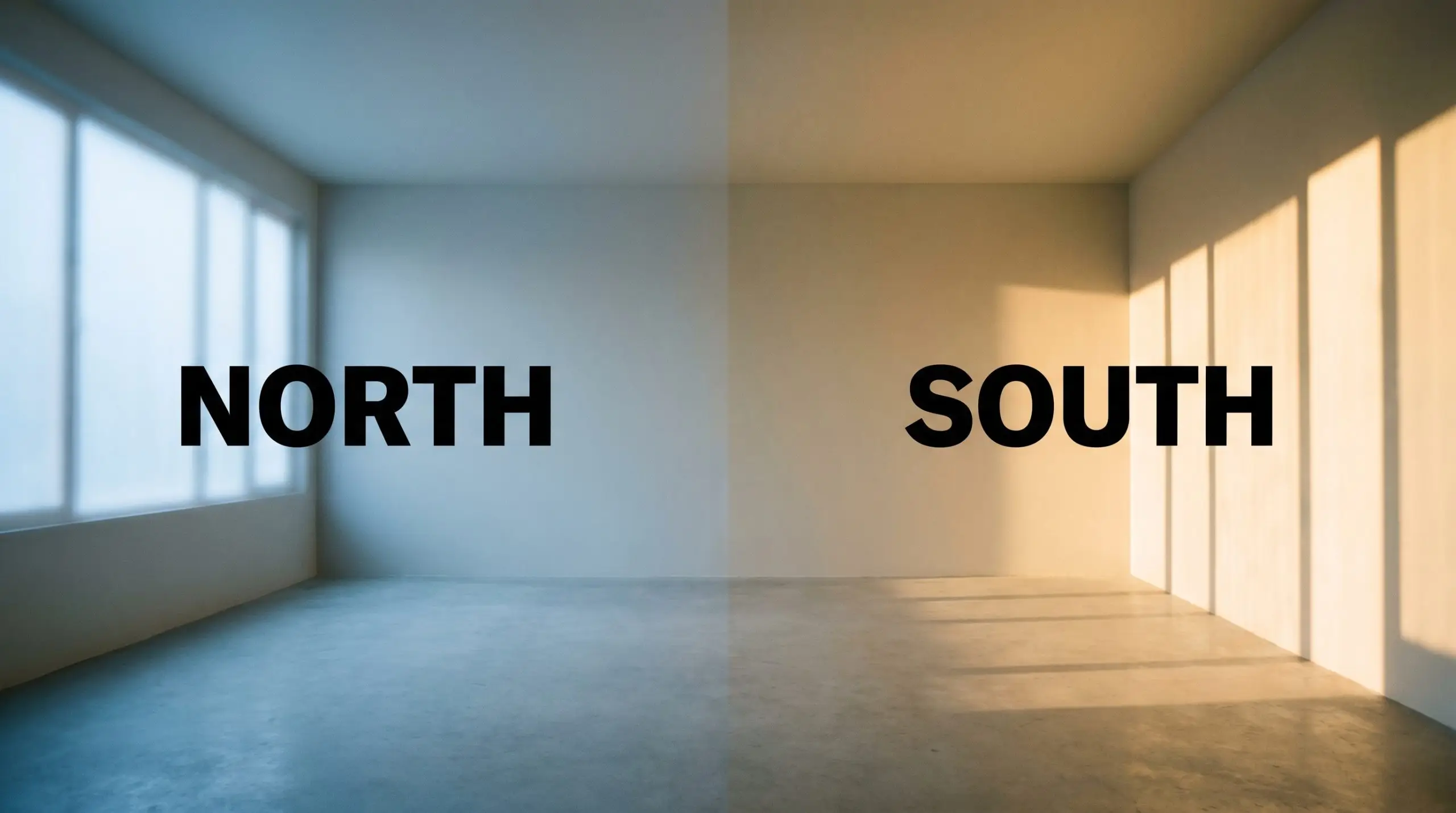
If you notice the color pulling a bit too cool in a north-facing room, swap your standard lightbulbs for warmer 3000K LEDs. This simple tweak artificially injects the warmth that the natural sunlight is failing to provide.
Hackrea Pro-Tip (Managing the Shift)
Popular Room Applications
A well-formulated neutral operates like a quiet architectural finish, establishing a continuous visual flow from the front door to the back bedrooms. By softening the boundaries between different living zones, it creates a cohesive environment that feels intentionally designed rather than pieced together.
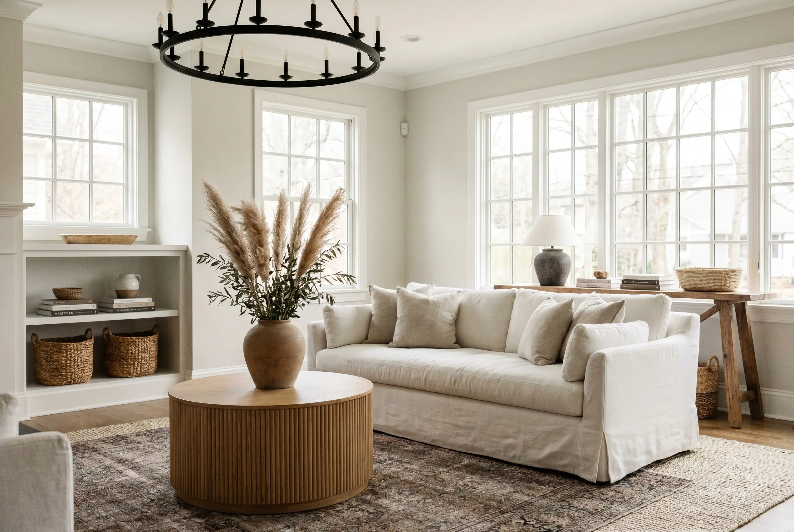
Living Rooms
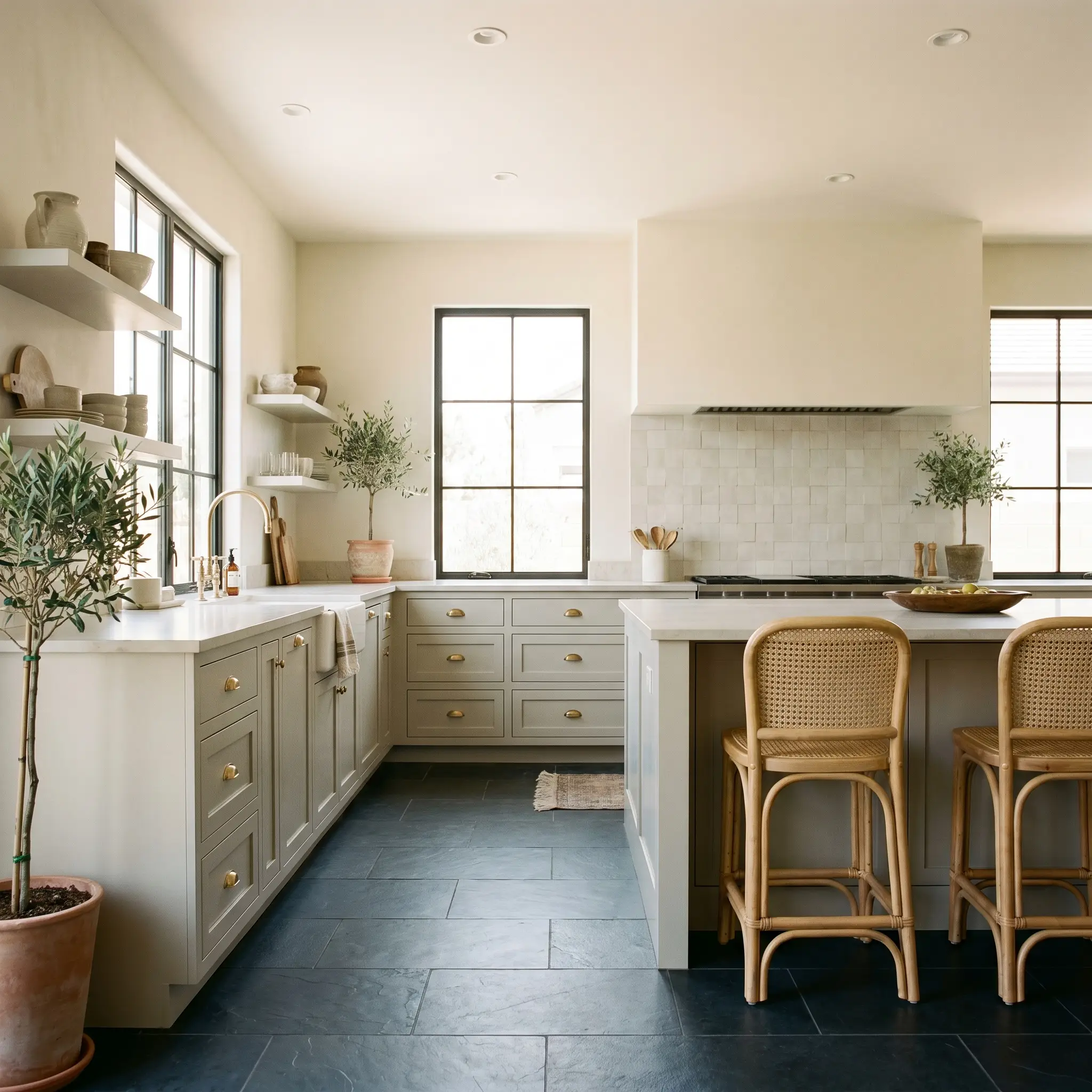
In a main gathering space, this shade provides a beautiful backdrop for Transitional or Organic Modern styling. Pair the walls with slipcovered linen sofas, layered vintage rugs, and oversized ceramic vases filled with dried branches. The soft gray-beige base allows you to introduce contrasting textures—like a fluted oak coffee table or matte black iron lighting fixtures—without the room feeling visually chaotic.
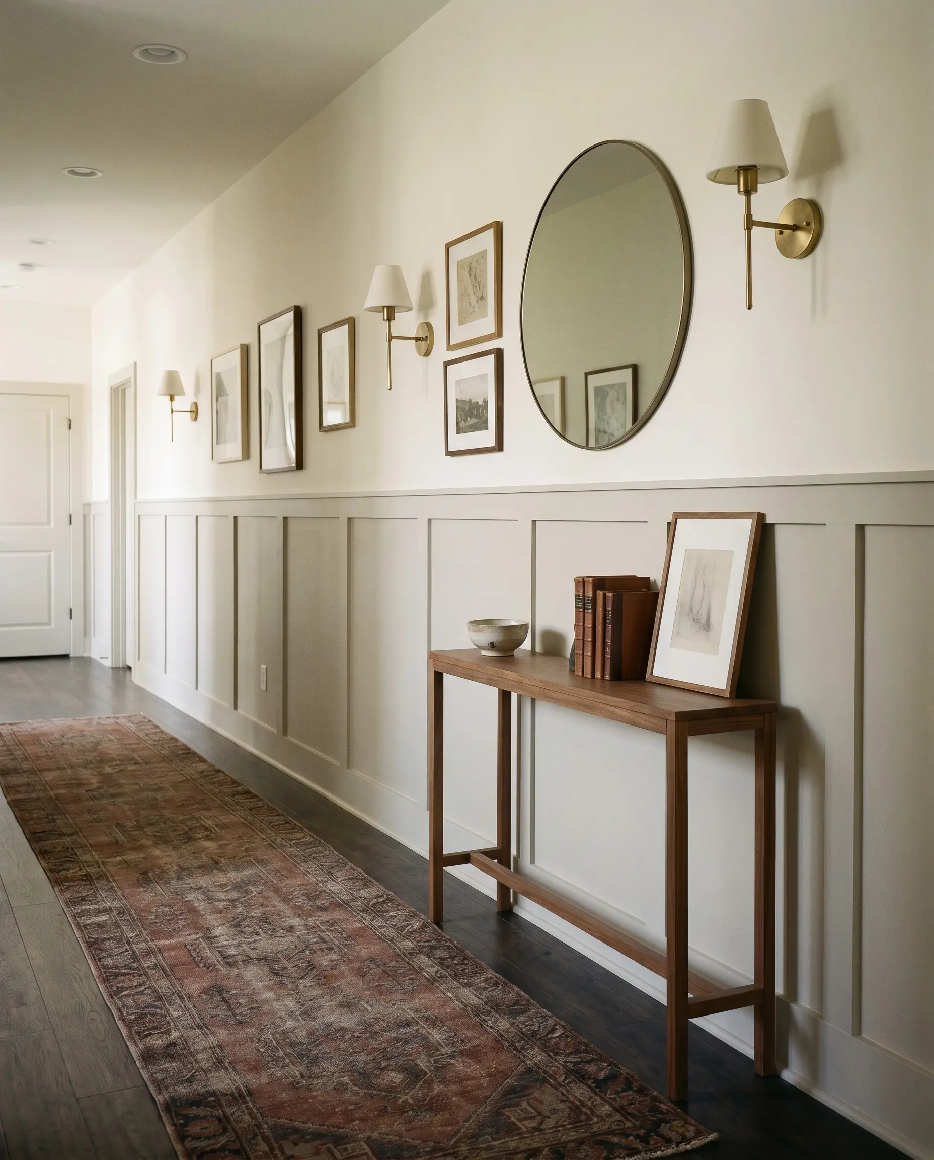
Hallways and Entryways
Transitional spaces benefit immensely from a color that feels welcoming but not overwhelming. Applying this tone to wainscoting or board-and-batten paneling instantly elevates a standard hallway into a curated corridor. Add a vintage runner, a minimal console table, and unlacquered brass wall sconces to bounce warm light against the earthy undertones.
Kitchen Cabinetry
Painting lower cabinets or a central island in this hue introduces a subtle, earthy sophistication to the kitchen. It pairs exceptionally well with honed slate floors, natural cane counter stools, and zellige tile backsplashes. To maximize the visual impact, use polished nickel or unlacquered brass cup pulls, which will beautifully reflect against the yellow-taupe cast of the wood finish.
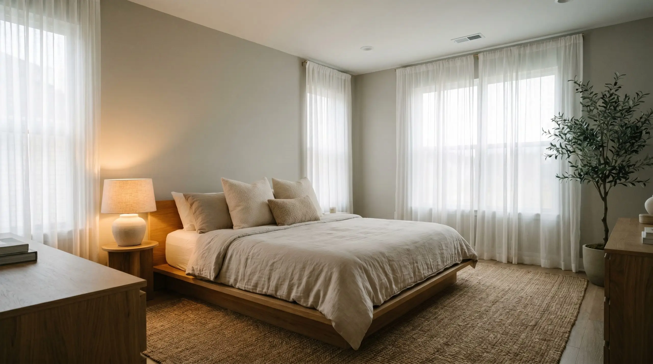
Cozy Bedrooms
This color inherently promotes rest and relaxation, making it a brilliant choice for bedroom walls. Lean into a Soft Minimalism aesthetic by incorporating low-profile platform beds, sheer drapery, and textured bouclé accent pillows. The ambient lighting from a warm bedside lamp will pull out the mushroom tones, creating a highly restorative environment at the end of the day.
Creative Ways to Use Behr Cotton Gray
Sometimes a shade possesses exactly the right visual weight to highlight unconventional architectural details. Instead of treating it purely as a background layer, you can manipulate this color to build highly intentional, custom focal points throughout the home.
Serene Japandi Dormer Nooks
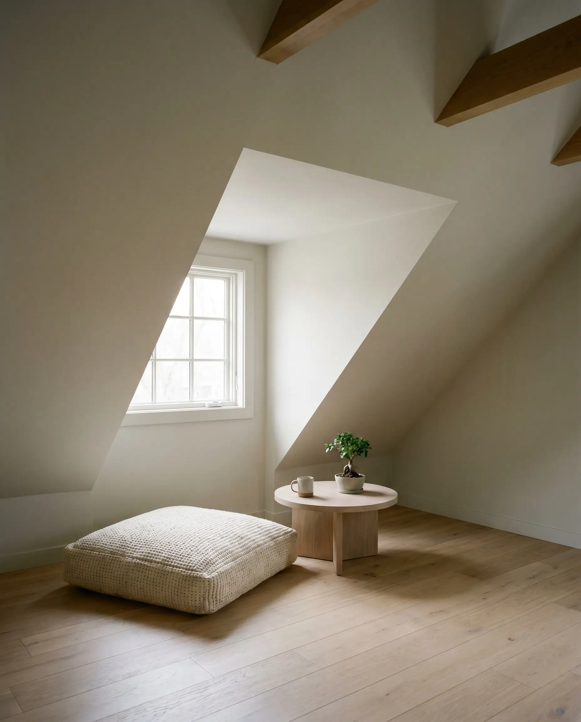
Attic dormer nooks often feature tricky, angled ceilings that can feel disjointed if painted a stark white. Wrapping the entire alcove in this soothing, low-stimulation warmth creates a calming, minimalist retreat. This seamless application is specifically beneficial for individuals seeking a quiet, grounding pause away from the high-traffic areas of the house.
Earthy Archway Thresholds
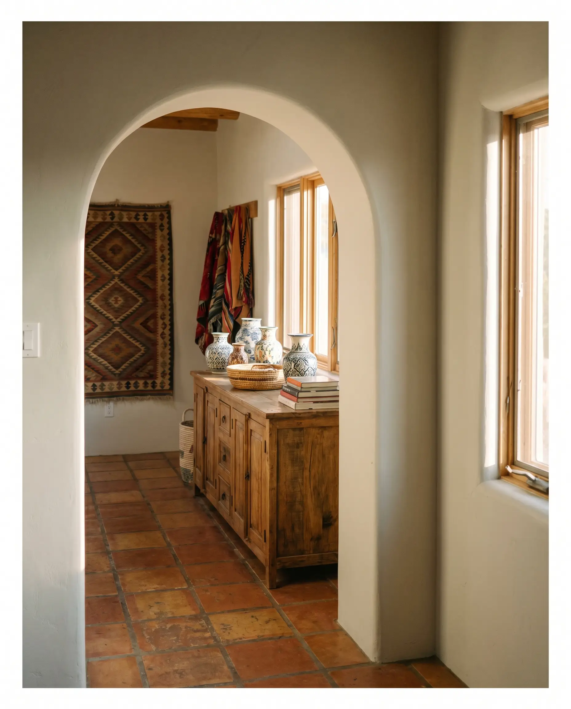
Painting the interior thresholds of arched doorways is a brilliant way to define a transition between two distinct rooms. This application bridges the gap beautifully between earthy terracotta flooring and global-inspired, curated artifacts. The soft gray acts as a visual palette cleanser for nomadic professionals displaying vibrant textiles or vintage pottery in the adjoining rooms.
Sunroom Beadboard Canopies
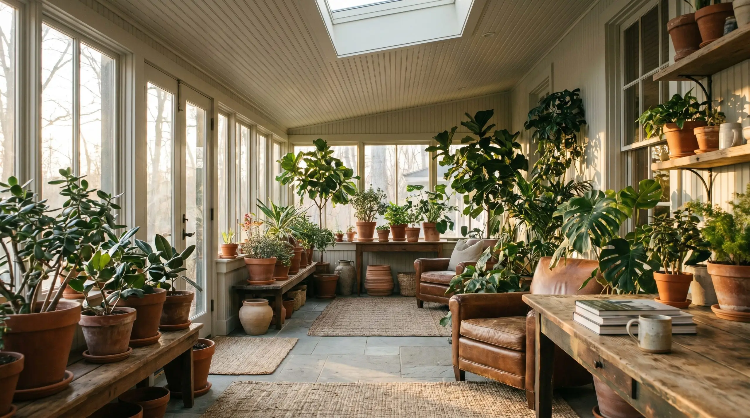
Applying this shade overhead on a sunroom beadboard ceiling mimics the feeling of a soft, overcast sky. During the late afternoon, the golden hour light dramatically enhances the paint’s warmth, making vibrant green foliage pop with incredible intensity. For avid indoor plant collectors, this creates a lush, conservatory-like atmosphere that feels incredibly curated.
Curated Antique Clawfoot Tubs
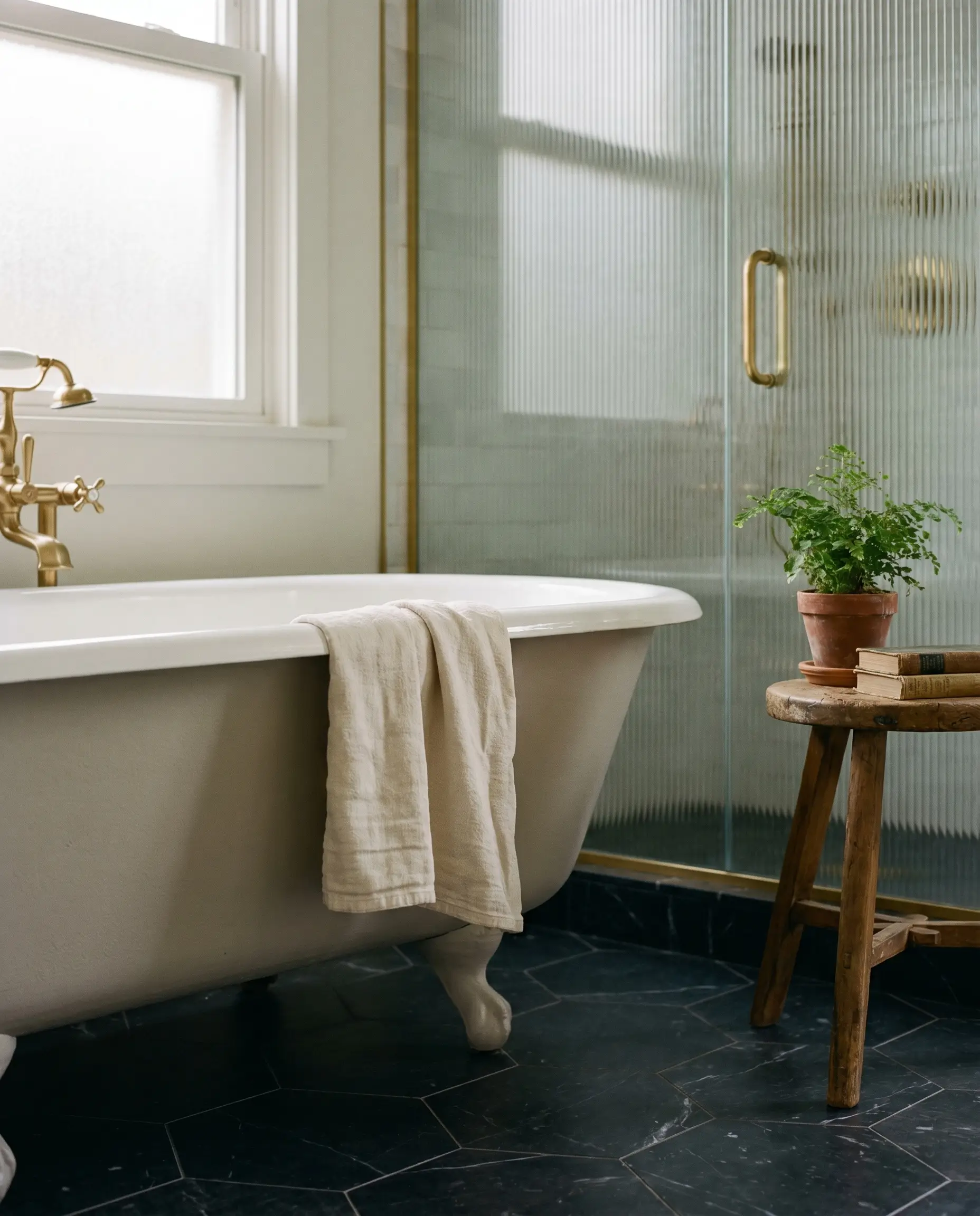
Refinishing the exterior of a salvaged clawfoot tub in a flat cast of this greige grounds a highly curated, historically rich bathroom space. The matte texture contrasts beautifully against polished floor tiles or reeded glass shower enclosures. It is a brilliant strategy to give vintage fixtures a fresh, relevant perspective without erasing their original charm.
Coordinating Colors & Best Pairings
This specific pigment profile requires surrounding materials that respect its subtle earthy undertones rather than fighting them. It beautifully tolerates high-contrast metals and deeply saturated secondary tones without losing its inherent softness.
Trim & Baseboards
For a crisp, tailored boundary that highlights the paint’s depth, pair it with Benjamin Moore Chantilly Lace (OC-65). If you prefer a slightly softer transition that still reads as a clean white, Sherwin-Williams High Reflective White (SW 7757) provides a brilliant, luminous frame. Both options prevent the greige from looking muddy by offering a sharp, bright contrast.
Hardware, Wood & Material Pairings
Coordinating Colors
Designer Mood Boards
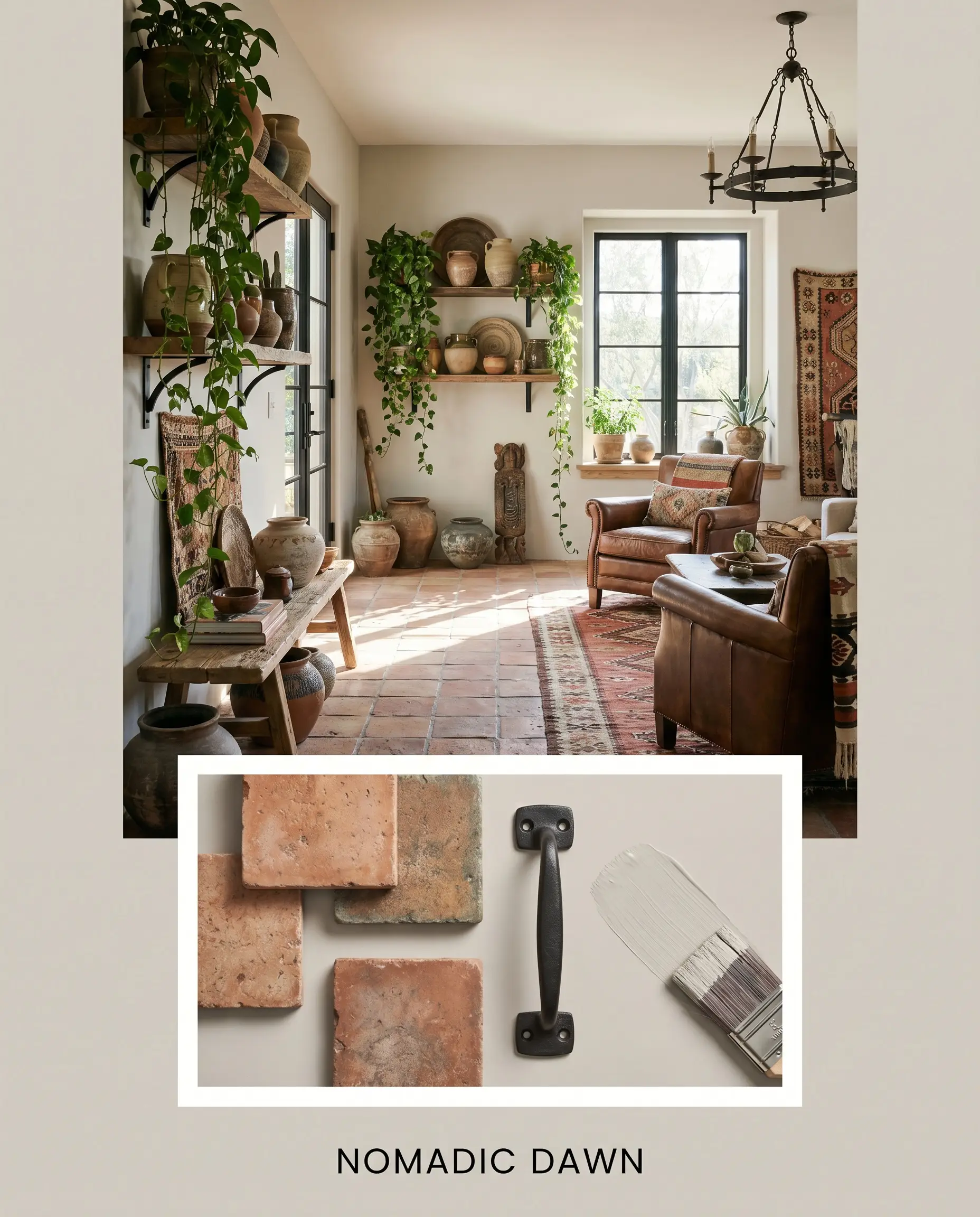
Nomadic Dawn
This palette centers around the interplay between the warm greige and rich, earthy textures. Imagine the paint paired with tumbled terracotta tiles, trailing ivy in clustered ceramic pots, and matte black iron hardware. The energy is relaxed, well-traveled, and highly tactile, making the space feel like a curated collection of global finds.
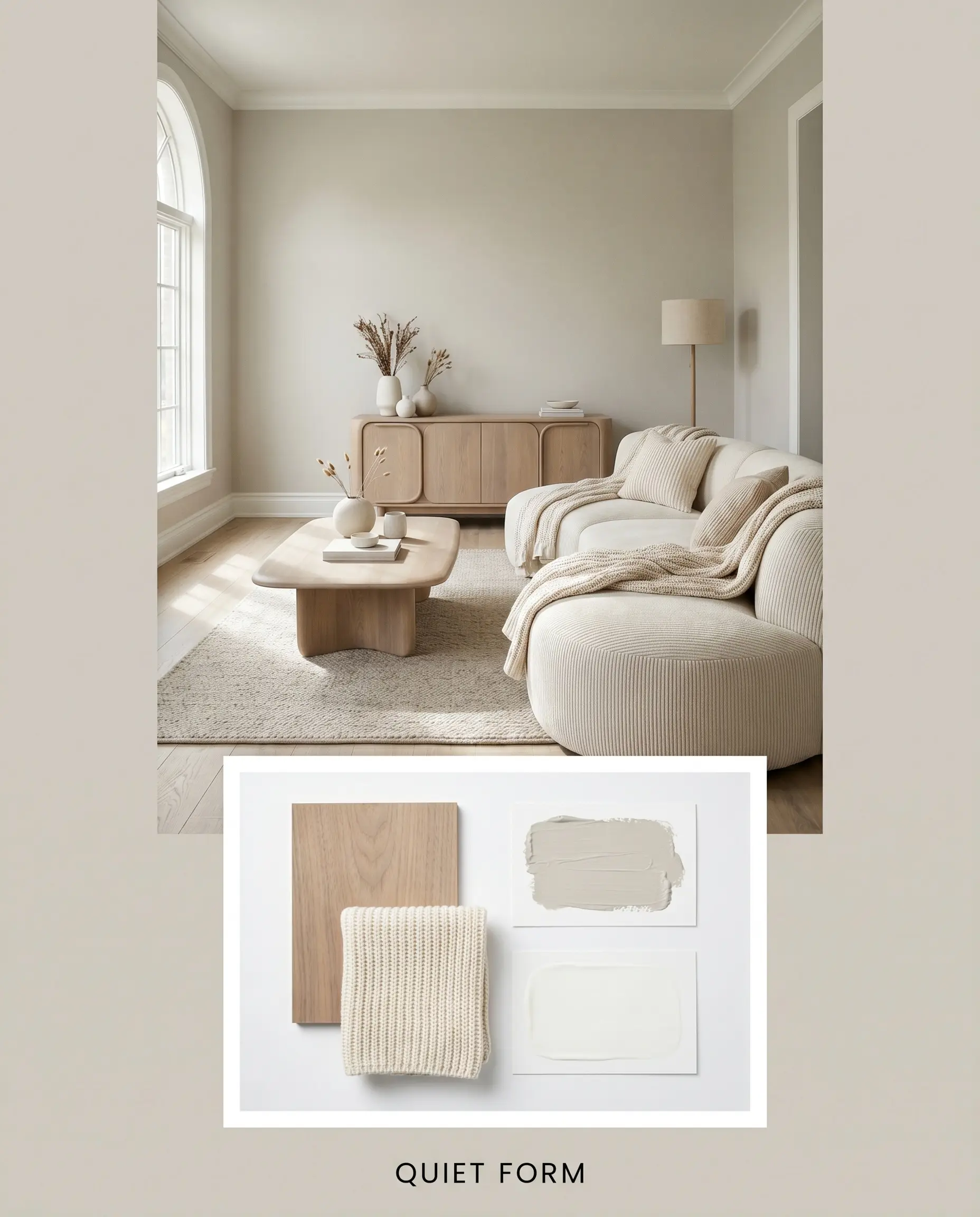
Quiet Form
Focusing on Soft Minimalism, this combination uses the greige to support clean lines and understated elegance. Weave in bleached walnut furniture, ribbed knit throws, and the crisp contrast of Chantilly Lace trim. The resulting atmosphere is incredibly serene, relying on subtle textural shifts rather than loud colors to create visual interest.
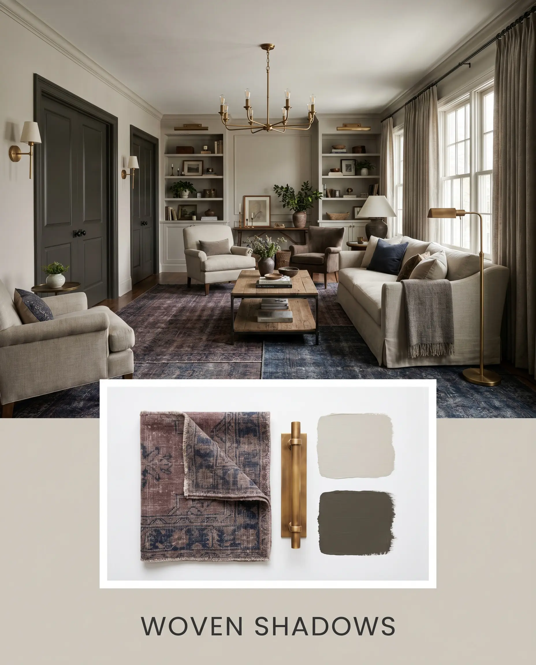
Woven Shadows
This mood board embraces a slightly moodier, Transitional approach. Pair the greige walls with accents of Urbane Bronze, layered vintage rugs in muted plum and navy, and unlacquered brass lighting fixtures. The vibe is sophisticated and enveloping, perfect for spaces meant for evening relaxation and quiet conversation.
Head-to-Head Comparisons
Selecting the perfect neutral often comes down to analyzing how two seemingly identical shades react to identical lighting conditions. Understanding these subtle shifts ensures you choose the right foundation for your specific millwork and exterior exposures.
Behr Cotton Gray vs. Benjamin Moore Revere Pewter (HC-172)
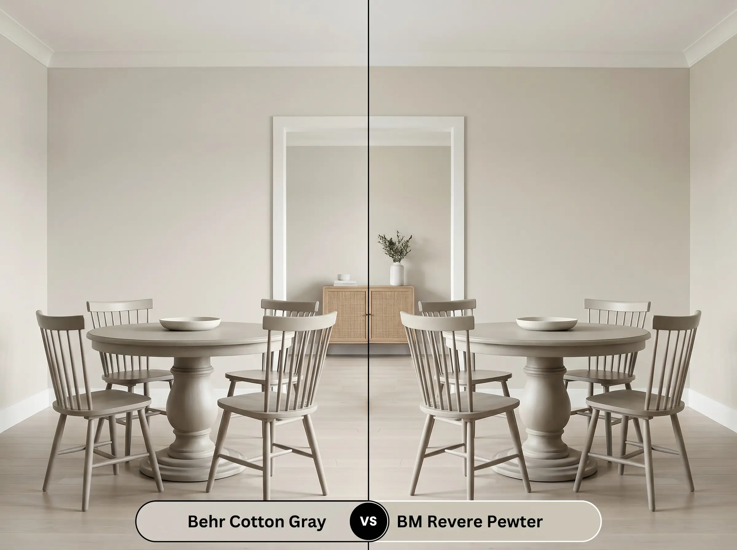
If you are deciding between these two, the choice comes down to visual weight. Revere Pewter is noticeably darker and carries a stronger, more traditional muddy-green undertone. If your room lacks abundant natural light, Revere Pewter might feel too heavy, making the slightly lighter Behr option the safer, more modern choice.
Behr Cotton Gray vs. Sherwin-Williams Agreeable Gray (SW 7029)
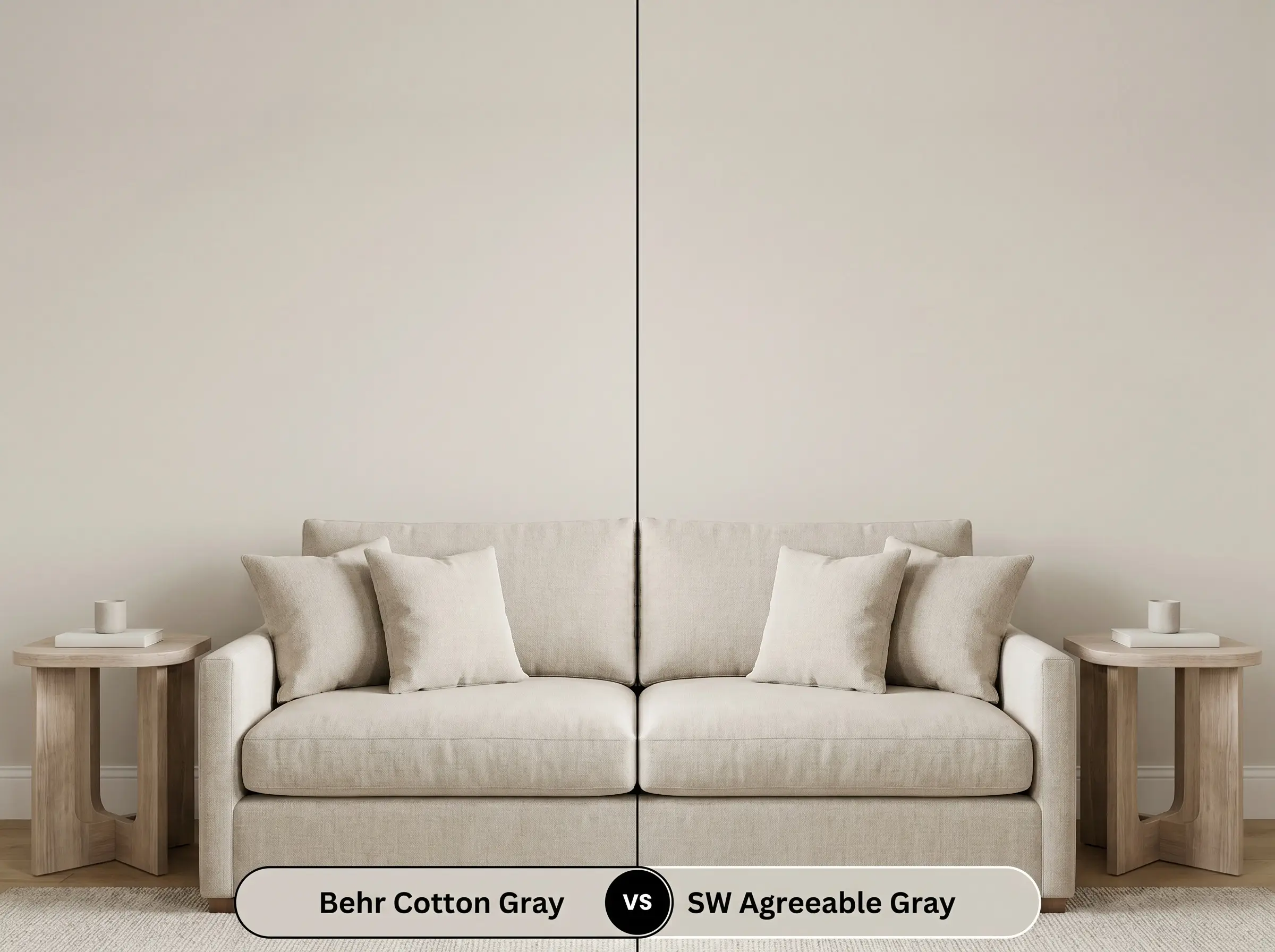
Agreeable Gray is widely loved for its incredibly balanced warmth, but it leans slightly more towards a true beige than the Behr shade. If your existing furniture features a lot of cool-toned fabrics or crisp white marble, the Behr option’s stronger gray base will integrate more seamlessly than the warmer Sherwin-Williams alternative.
Similar Colors & Brand Equivalents
If you love the general direction of this hue but need a slight adjustment in light reflectance or warmth, exploring adjacent options is a smart strategy.
Similar Colors (Same Brand)
Cross-Brand Equivalents
Practical Application & DIY Advice
Transitioning a color from a swatch to a fully finished wall requires strategic planning regarding finish and preparation.
The Dynamic Sheen Guide
Primer Strategy
Because this is a light-to-medium neutral, a standard high-quality white primer is usually sufficient. However, if you are painting over a deeply saturated red or navy wall, you must use a high-hiding, stain-blocking primer to prevent the old color from altering the new greige’s delicate yellow-taupe cast.
Coverage & Success Tips
Expect to apply two full coats for true color accuracy, even if you are using a premium paint-and-primer-in-one product. Be incredibly mindful of “flashing” (uneven, visible roller marks) when applying this color. To avoid this, maintain a wet edge while rolling and resist the urge to touch up semi-dry patches, allowing the paint to level itself naturally.
Frequently Asked Questions
Because of its balanced LRV of 61, it generally retains its soft brightness, but it requires proper artificial lighting. Use 3000K to 3500K LED bulbs to ensure the earthy undertones stay warm and inviting rather than falling flat or muddy.
On highly textured stucco, the shadows will amplify the gray base, making it appear slightly darker and cooler. On smooth vinyl siding, direct exterior sunlight will wash out some of the depth, causing it to read as a much lighter, creamier off-white.
Yes, applying this mid-tone greige to a ceiling creates a subtle, enveloping canopy effect. It brings the ceiling down visually just enough to make a large, echoing room feel instantly cozier and more intimate.
Not at all; the micro-drop of yellow-taupe actually harmonizes beautifully with the warmth of red oak. The gray base in the paint provides enough contrast to cool down the intense orange/red tones of the wood, creating a beautifully balanced foundation.
Final Verdict & Expert Warnings
Behr Cotton Gray (HDC-NT-20) is an incredibly reliable, sophisticated neutral designed for the homeowner who wants the elegance of gray without the sterile chill. It performs brilliantly in open-concept spaces, seamlessly tying together mixed metals, natural woods, and varied textiles. This paint is the perfect foundational layer for Transitional, Organic Modern, and Soft Minimalist interiors where the goal is to create a serene, tactile environment.
While this greige is highly adaptable, you must be careful when pairing it with extremely cool, blue-toned elements. If your room features icy Carrara marble countertops, cool blue-gray carpeting, or stark, blue-tinted LED lighting, the earthy yellow-taupe cast in this paint will suddenly look dirty or dingy by comparison. Always ensure your fixed finishes lean slightly warm or strictly neutral to allow this beautiful hue to perform at its best.
Clash Warning (Undertone Conflicts)
Closest Cross-Brand Equivalents
The absolute closest scientific color matches for Cotton Gray across top paint brands.