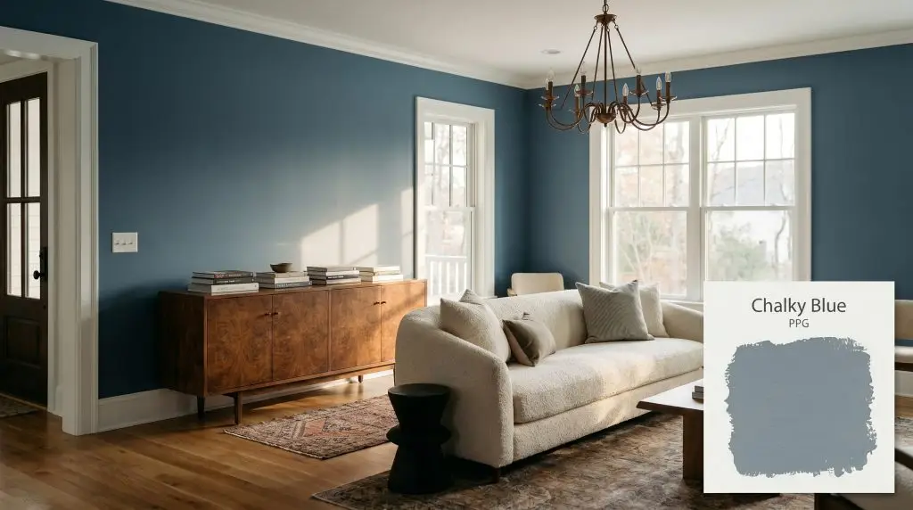
Chalky Blue PPG1153-5
PPGPPG Chalky Blue (PPG1153-5) is a saturated, mid-tone stormy blue-gray with a distinct navy undertone. With an LRV of 27, it absorbs ambient light, creating a moody, sophisticated atmosphere perfect for cabinetry, dramatic bedrooms, or striking exterior accents.
Paint Technical Profile
| Color ID / SKU | PPG1153-5 |
| HEX Code | #7b8f99 |
| Light Reflectance (LRV) | 27 |
| Use | Interior, Exterior |
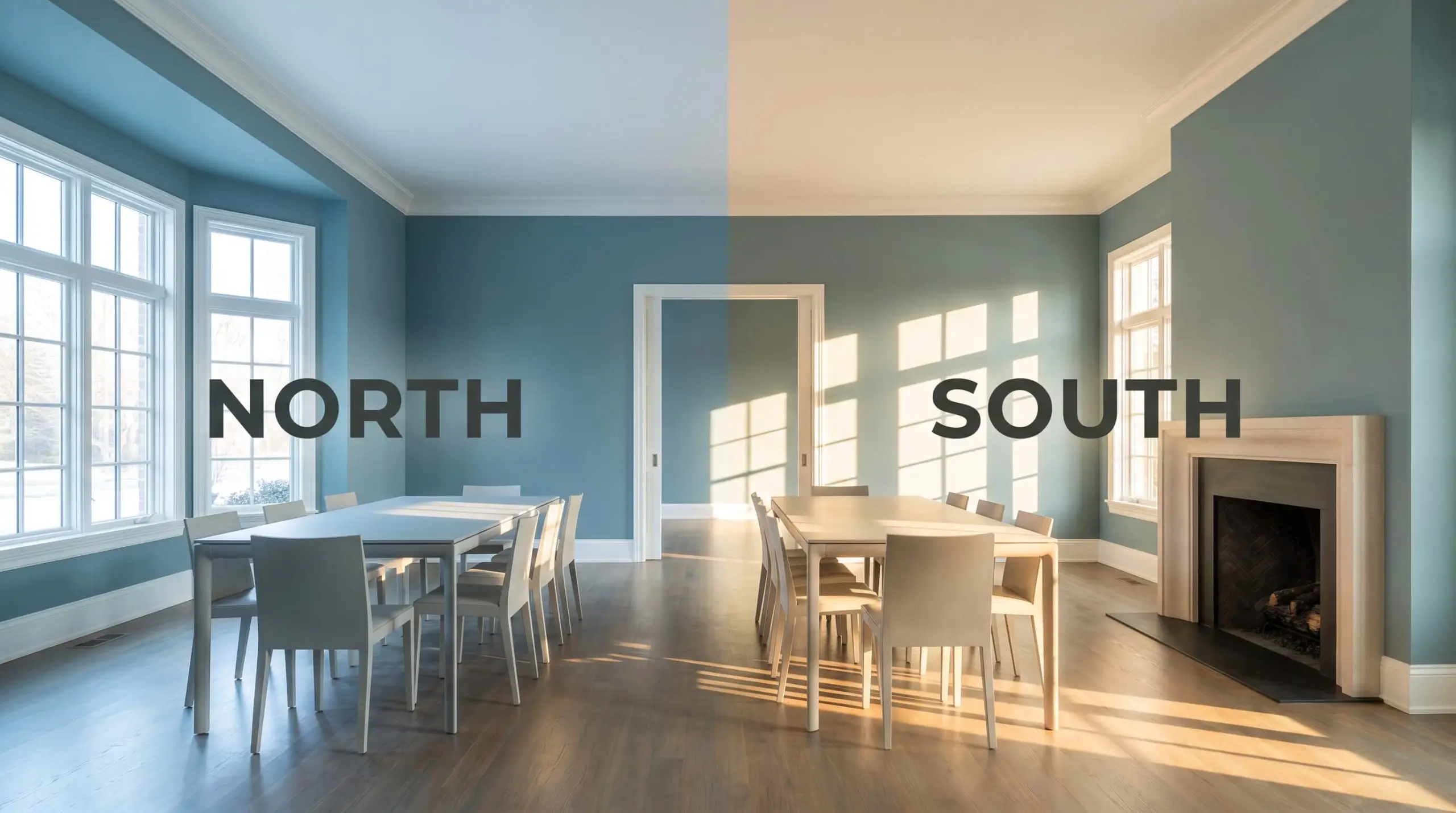
| Best Exposures | South, West |
| Best For | Cabinetry, Accent Walls, Bedrooms, Exterior Doors |
PPG Chalky Blue: The Stormy Slate That Redefines Moody Interiors
There is a distinct quietness that settles into a room when you coat the walls in a truly saturated, stormy blue-gray. PPG Chalky Blue is not just another standard coastal tone; it acts as a visual shadow, absorbing excess light and wrapping the space in a sophisticated, enveloping embrace. This color thrives on tension, coming alive when placed against the raw warmth of natural woods or the crisp snap of bright white architectural trim.
Undertones & LRV of PPG Chalky Blue
If you are wondering whether this shade leans warm or cool, PPG Chalky Blue is definitively cool. It carries a crisp, refreshing temperature that instantly modernizes a floor plan.
To understand how this color behaves on the wall, we have to look at its underlying structure:
With a light reflectance value (LRV) of 27, this hue sits firmly in the medium-dark category. It absorbs ambient light rather than bouncing it around the room, establishing a stable, saturated presence. This mid-tone depth makes it incredibly versatile, allowing it to feel substantial without turning completely black in the shadows.
How Lighting Shifts the Color Profile
The biggest risk when working with this specific slate tone is assuming it will look identical on every wall. If you apply this color in a dim room with zero warm textures, the charcoal base can suddenly pull flat and chilly.
Testing this stormy blue-gray in your specific lighting conditions is non-negotiable.
To keep this moody slate feeling welcoming rather than austere after the sun goes down, stick to soft white bulbs (3000K). This temperature perfectly balances the cool navy undertones without turning them muddy.
Hackrea Pro-Tip (The Bulb Rule)
Bringing PPG Chalky Blue into Your Home
This slate tone instantly quiets visual noise, turning standard rooms into intentional, focused retreats.
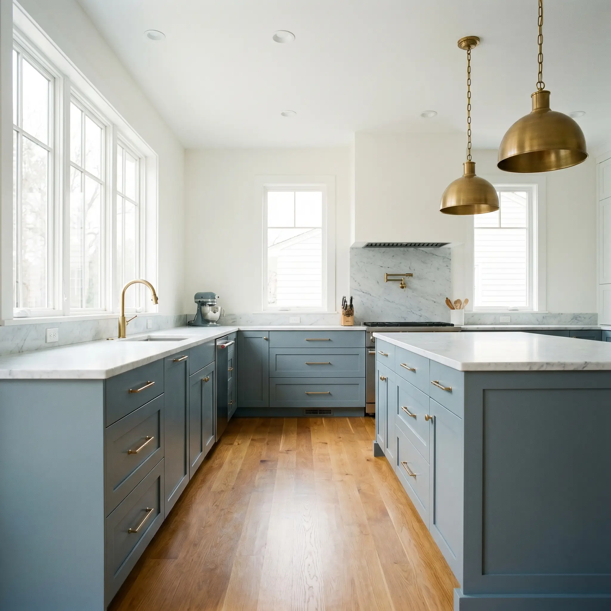
Kitchen Islands and Lower Cabinetry
Using this cool chromatic profile on lower cabinets roots the kitchen, providing a gorgeous contrast against lighter upper walls or open shelving. Pair it with honed Carrara marble countertops and brushed brass pendant lights for a classic Transitional aesthetic. If you prefer a more Rustic Industrial vibe, this color looks incredible against raw terracotta floor tiles and floating shelves made from reclaimed timber.
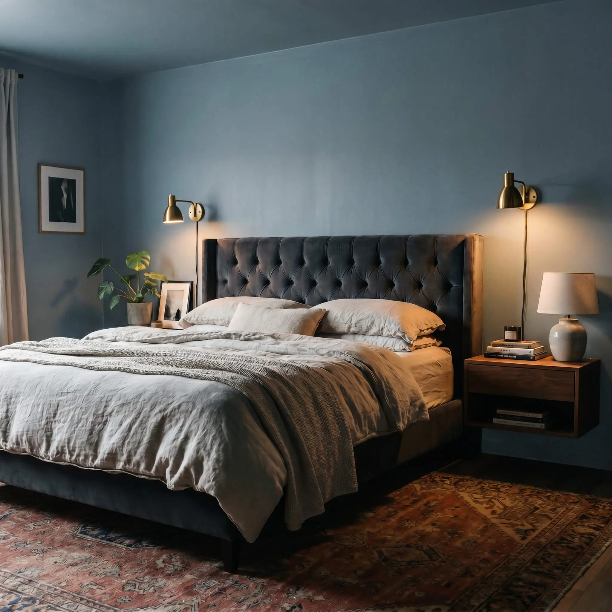
Moody Primary Bedrooms
When applied to all four walls, this shadowy tone creates an incredibly restful, cave-like atmosphere ideal for sleeping. Soften the crisp temperature by layering the bed with nubby linen duvets, a tufted velvet headboard, and a vintage woven rug. Always incorporate warm metallic accents, like aged copper reading sconces, to bounce a little light around the room and break up the dark expanse.
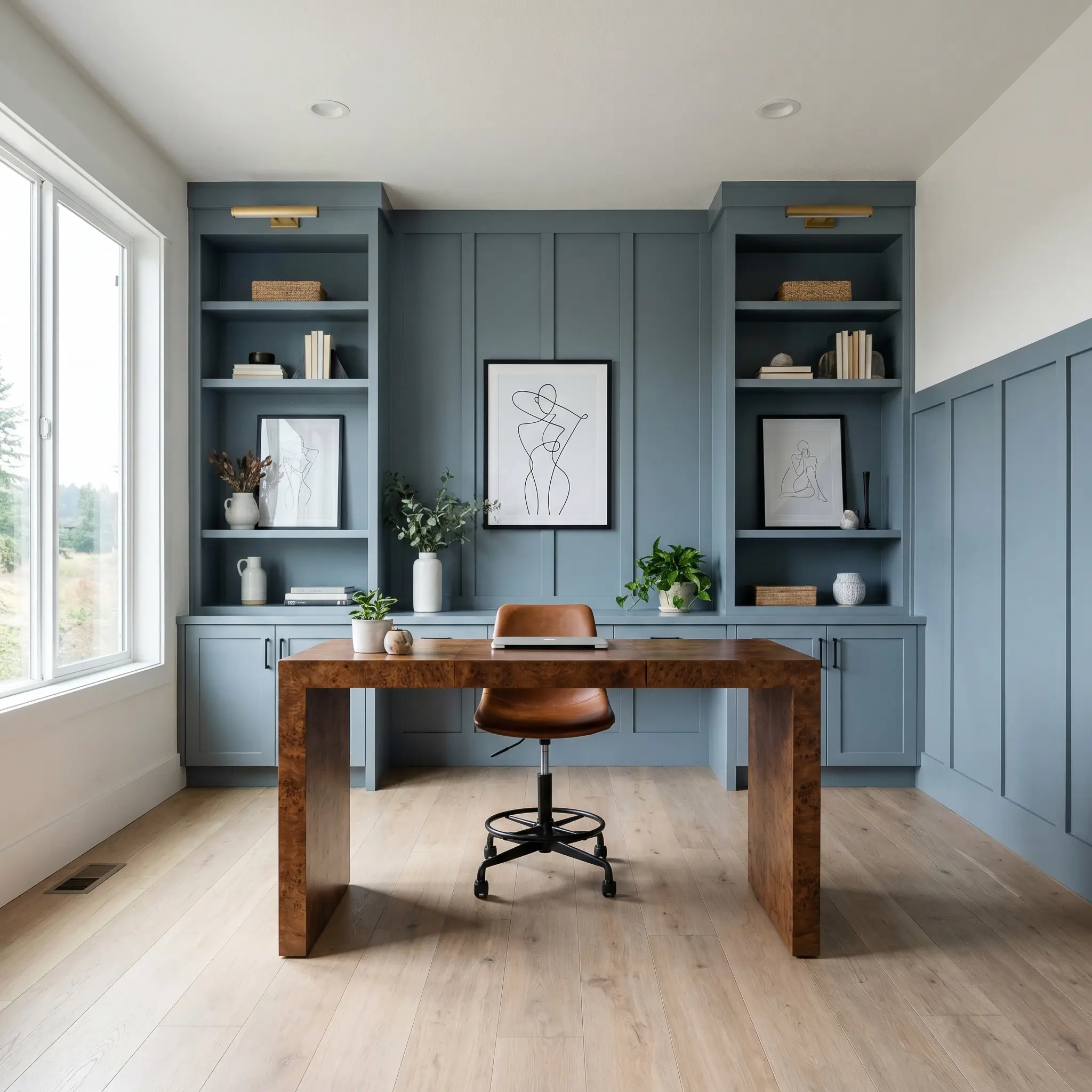
Home Offices and Studies
This color fosters a sense of serious, distraction-free focus. Coat built-in bookcases or a board-and-batten accent wall in this slate blue to establish a handsome, tailored backdrop for video calls. Warm up the cool base by introducing a burled walnut desk, a saddle leather drafting stool, and framed minimalist line art.
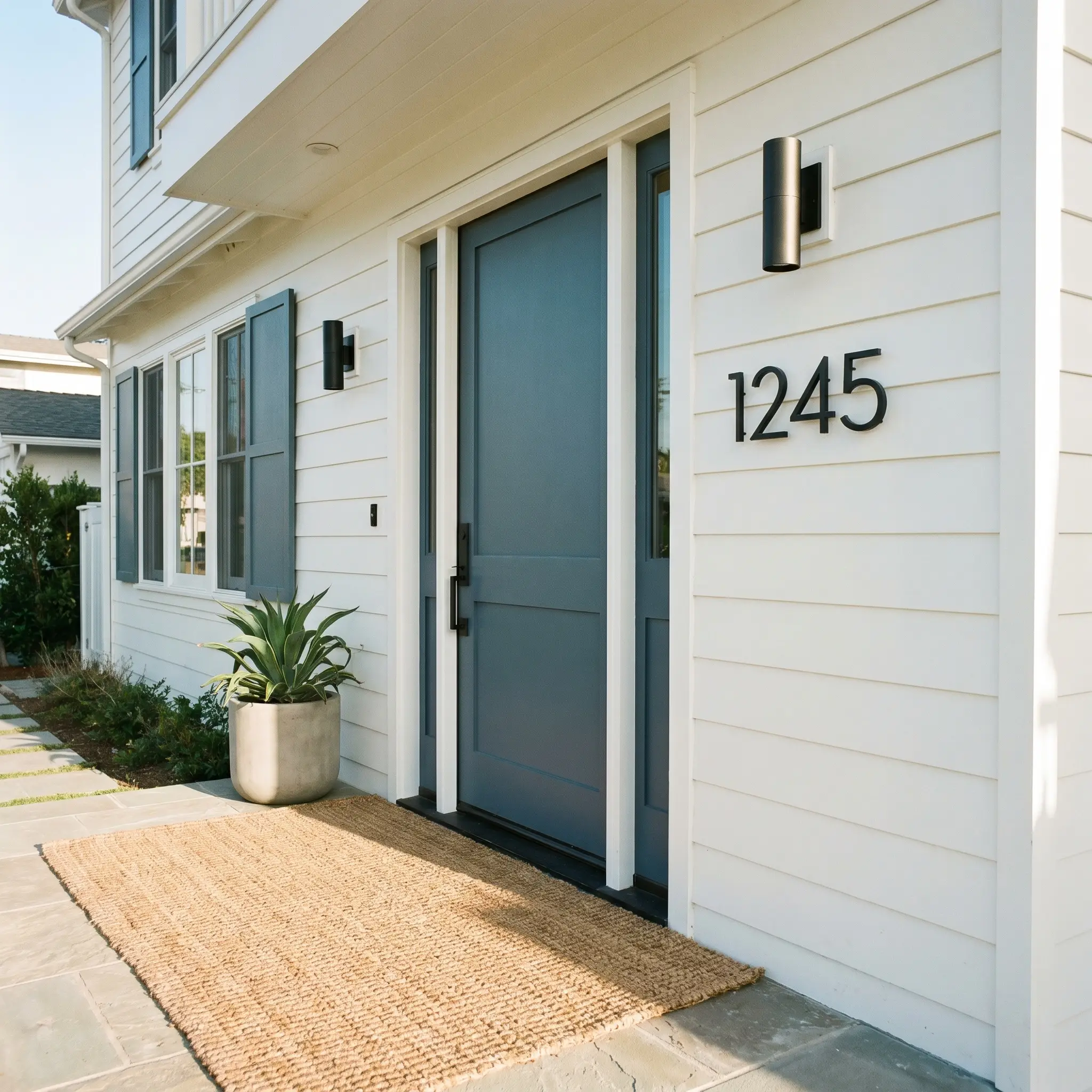
Exterior Front Doors and Shutters
On an exterior facade, direct sunlight will wash out a significant portion of the color’s depth, making it read slightly lighter and bluer than it does indoors. It provides a crisp, nautical contrast against crisp white siding or pale gray shingles. For a truly welcoming entry, pair a freshly painted door with oversized, matte black modern house numbers and a woven seagrass welcome mat.
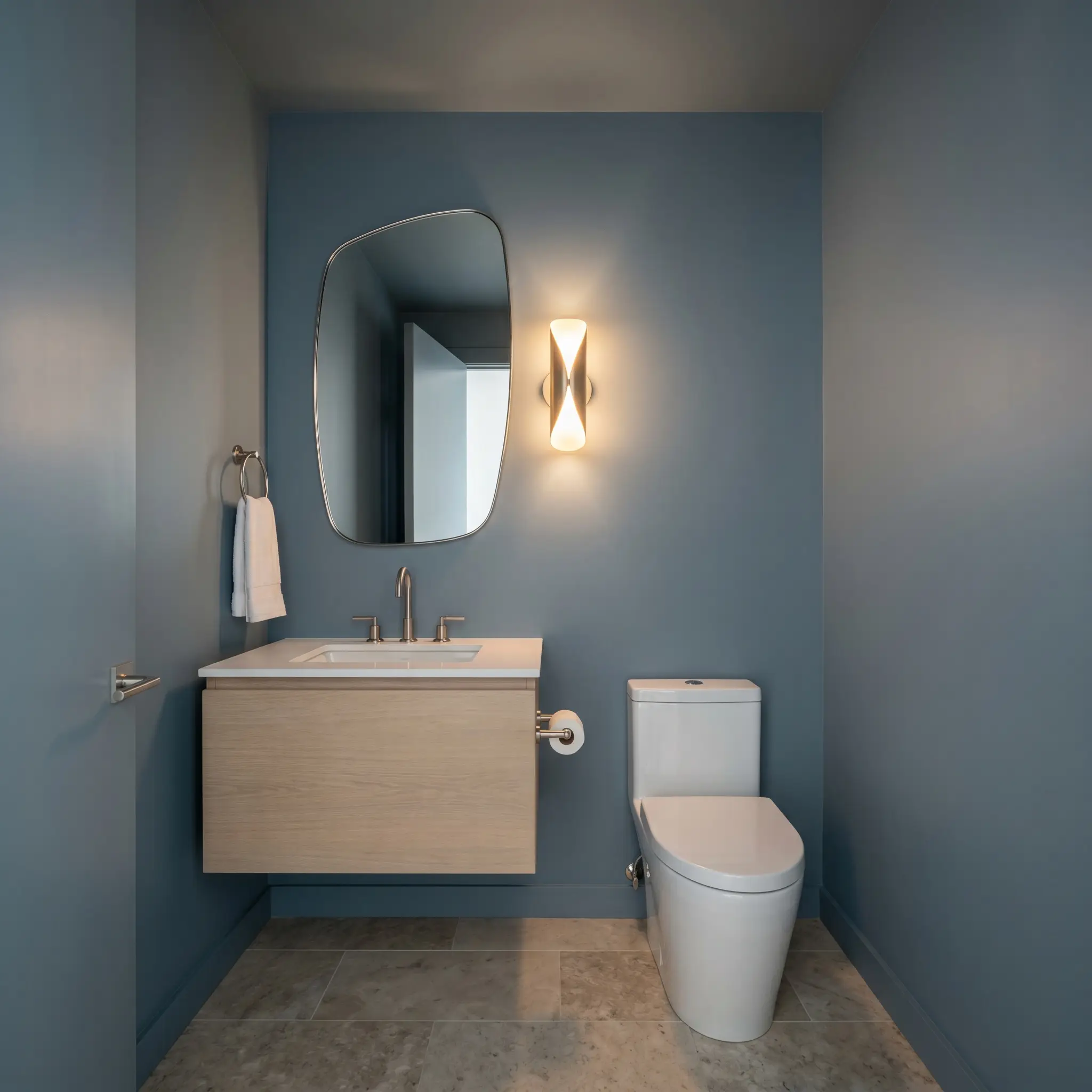
Powder Rooms
Small, windowless spaces are the perfect canvas for dark, saturated tones. Paint the walls and the ceiling in this stormy blue-gray to blur the room’s boundaries and create a jewel-box effect. Elevate the small footprint with a floating bleached oak vanity, an asymmetric mirror, and polished nickel plumbing fixtures.
Curatorial Concepts & Architectural Applications
This pigment profile invites highly intentional, custom applications that push far beyond basic wall coverage.
The Coastal Gothic Bar
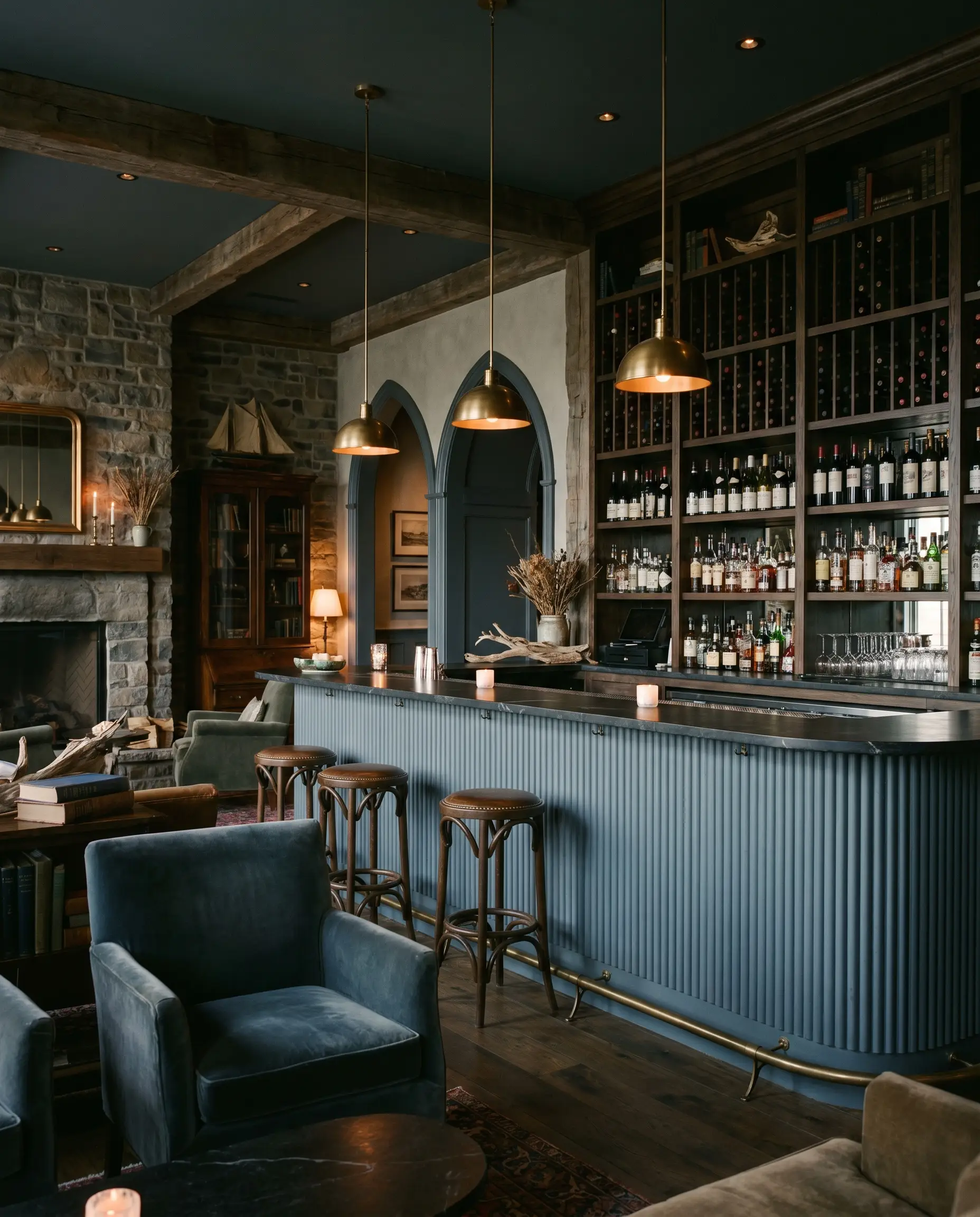
Transforming a standard boutique hotel bar front into a dramatic focal point requires a color with inherent tension. By applying this stormy slate to a fluted bar front, you establish a dark, moody tasting room that leans heavily into a Coastal Gothic aesthetic. The ribbed texture captures the shadowy navy cast in its crevices, creating a sophisticated backdrop perfect for a sommelier’s curated wine displays.
The Culinary Contrast
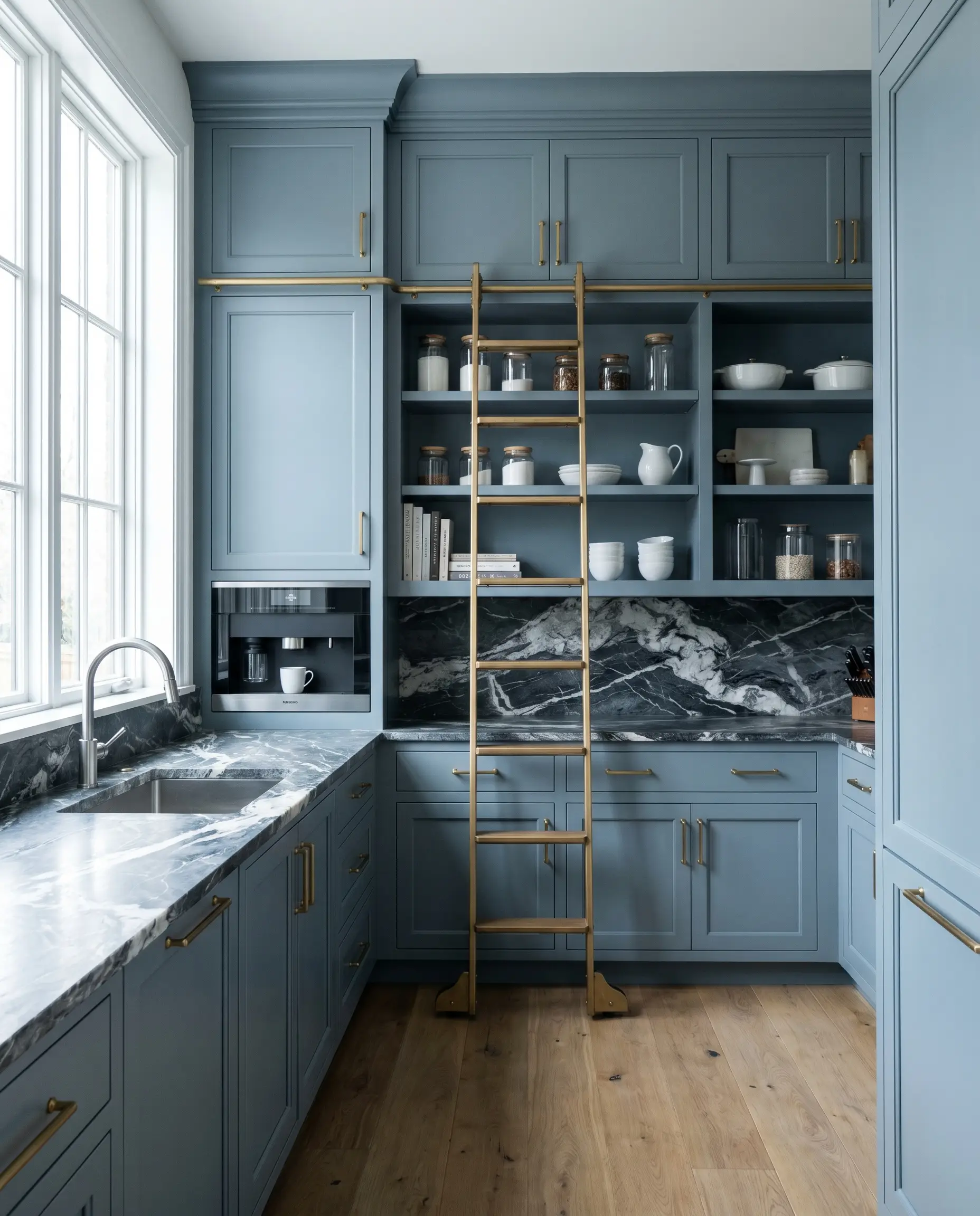
For the culinary enthusiast who wants an unforgettable prep space, wrapping floor-to-ceiling butler’s pantry cabinetry in this tone creates a stunning visual boundary. The cool slate base contrasts dramatically against the organic, intense veining of a soapstone countertop. This pairing feels incredibly bespoke, turning a utilitarian storage zone into the most striking room in the house.
The Brownstone Drench
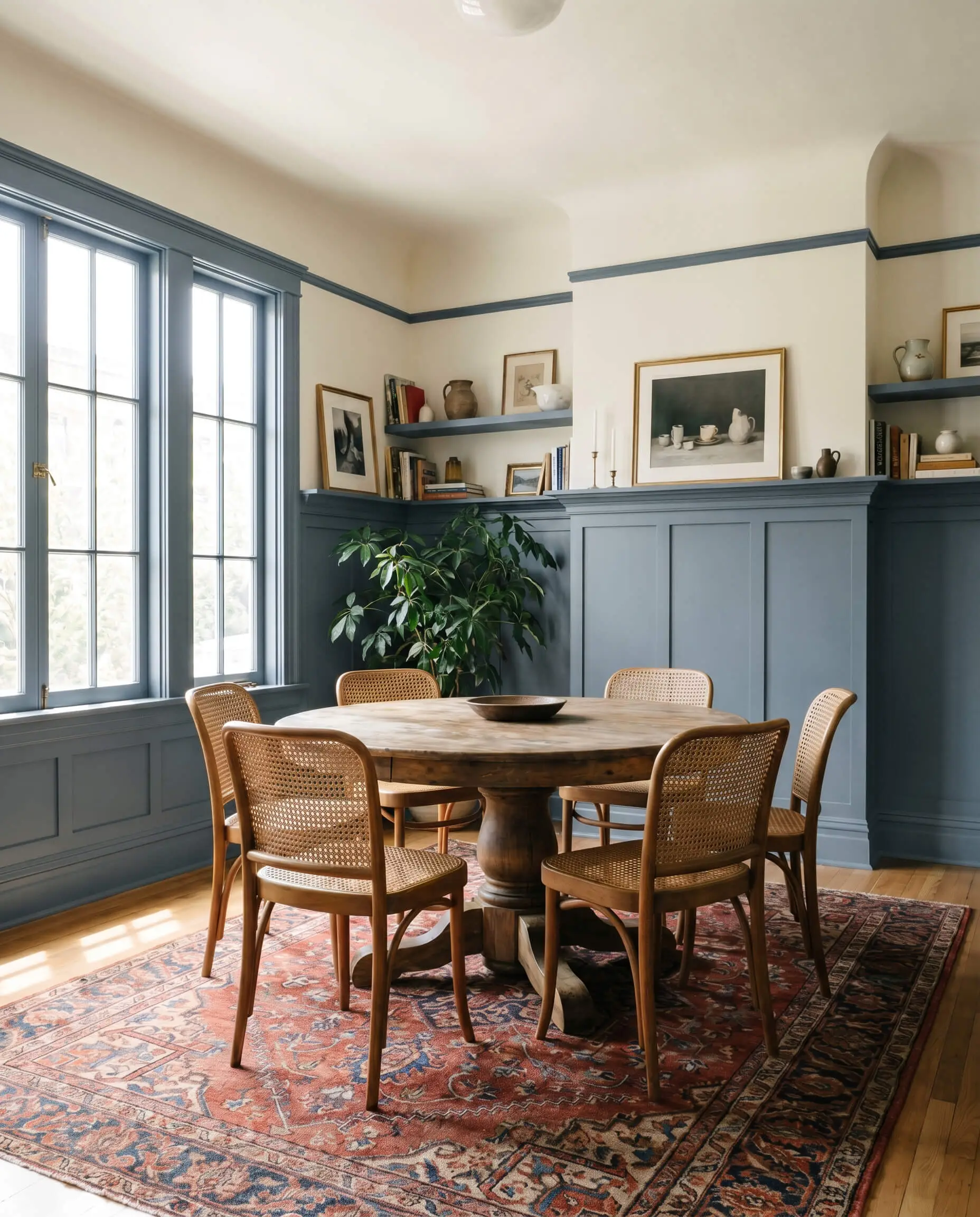
Modernizing historic urban architecture often requires a bold commitment to color. Applying this hue from the dining room picture rail all the way down to the floor—including the trim and baseboards—creates a substantial, rooted wainscoting effect. This color-drenching technique honors the traditional bones of the brownstone while injecting a crisp, contemporary energy into the dining space.
The Hyper-Focus Nook
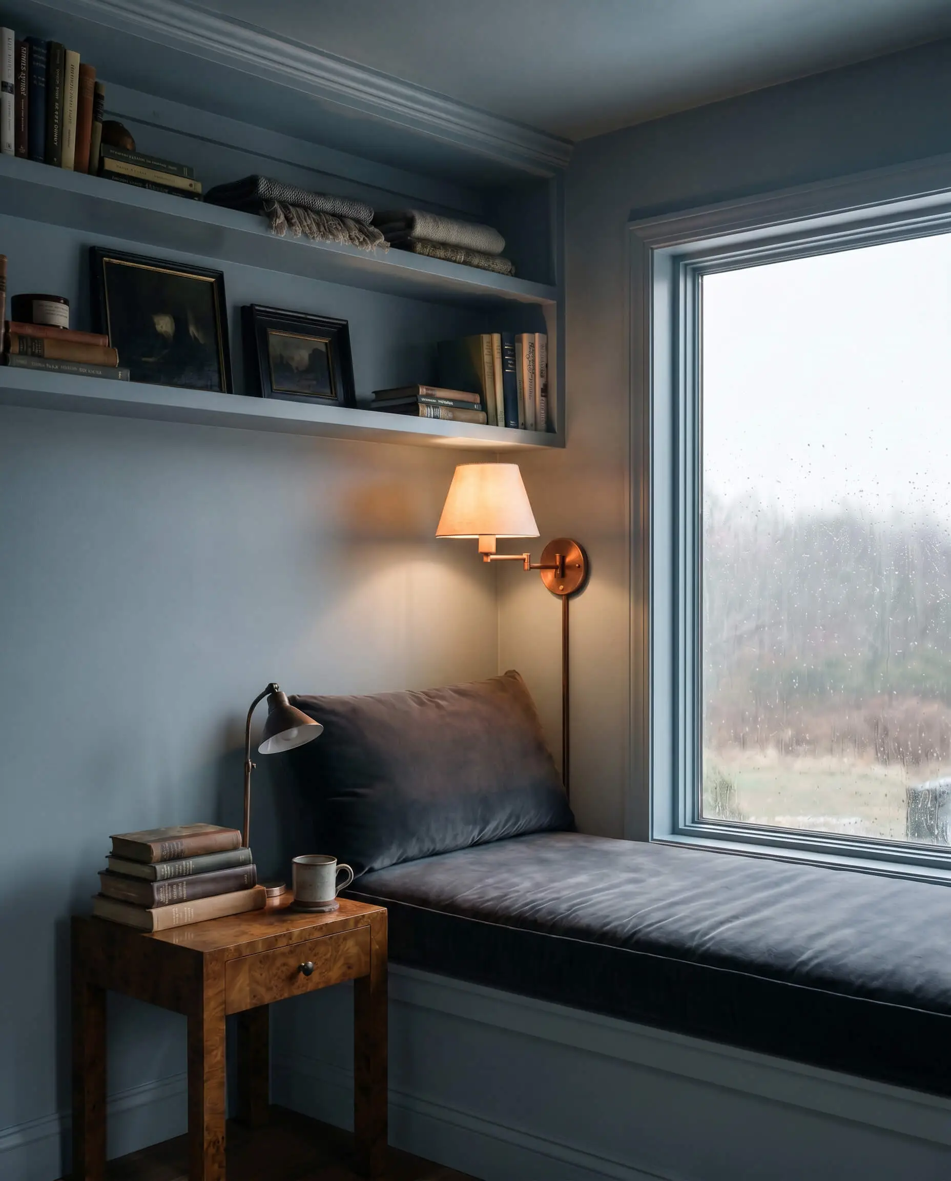
Sometimes a floor plan needs a dedicated zone designed entirely for deep focus and calm. Utilizing the light-absorbing qualities of this shade to color-block a small reading nook carves out a visually quiet, distraction-free architectural pocket. This targeted application is brilliant for an ADHD hyper-focus zone, providing a sensory retreat that feels completely separated from the chaos of the main house.
The Novelist’s Library
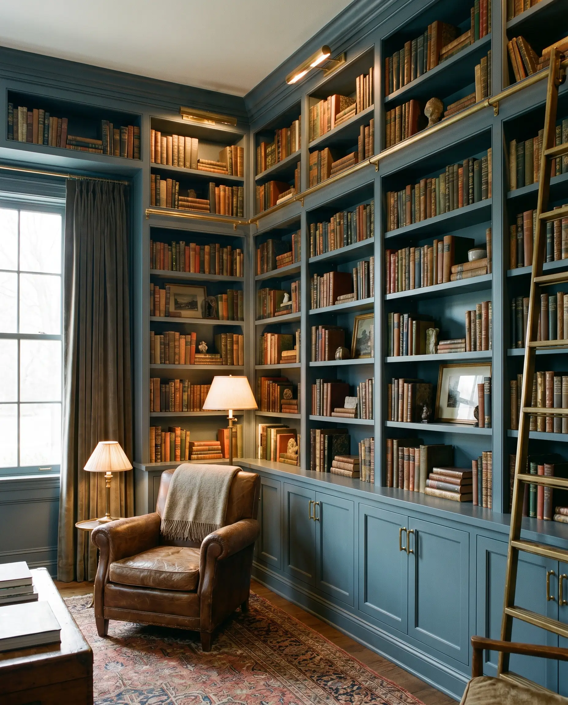
Expansive built-in library shelving demands a color that allows the books and decor to take center stage. Coating the woodwork in this deep tone provides a cool, shadowed canvas that makes the warm, living finish of unlacquered brass hardware absolutely sing. It is the perfect atmospheric backdrop for a novelist seeking a handsome, inspiring environment to write.
Hardware, Woods, and PPG Chalky Blue Pairings
This slate hue requires deliberate textural partners to prevent it from feeling overly stark.
Trim & Baseboards
To maintain the crisp, tailored boundaries of this cool chromatic profile, you need a clean, bright white trim.
Hardware, Wood & Material Pairings
The secret to elevating this paint is introducing materials that offer a sensory counterpoint to its cool, matte nature.
Coordinating Colors
Designer Mood Boards
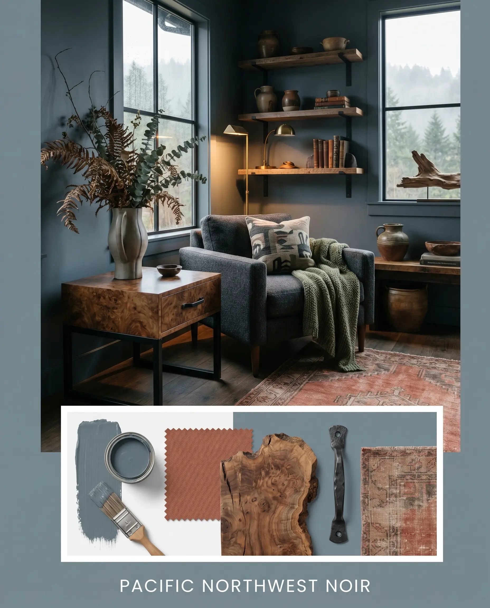
Pacific Northwest Noir This palette captures the moody, organic essence of a coastal storm. The stormy blue-gray walls act as the foundation, paired with sleek blackened steel hardware and natural burled walnut side tables. Layer in a vintage, faded terracotta rug and oversized botanical branches to bring a sense of wild, untamed nature indoors.
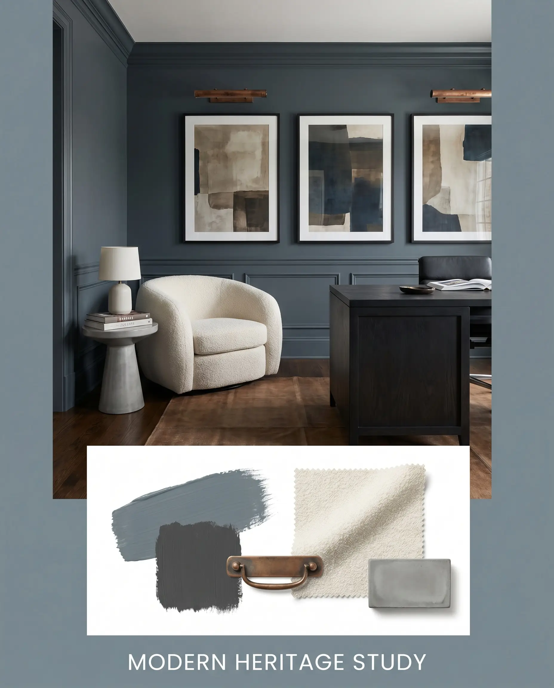
Modern Heritage Study Designed for a space that values tradition with a contemporary edge. The dark slate tone covers the walls and trim, while aged copper picture lights highlight curated, abstract art. A cream bouclé reading chair and a polished concrete side table complete the look, offering a striking balance of soft textures and hard architectural lines.
PPG Chalky Blue vs. Rival Slate Tones
When finalizing a dark, moody hue, you must evaluate how it shifts under different lighting scenarios compared to its closest rivals.
PPG Chalky Blue vs. Sherwin-Williams Slate Tile
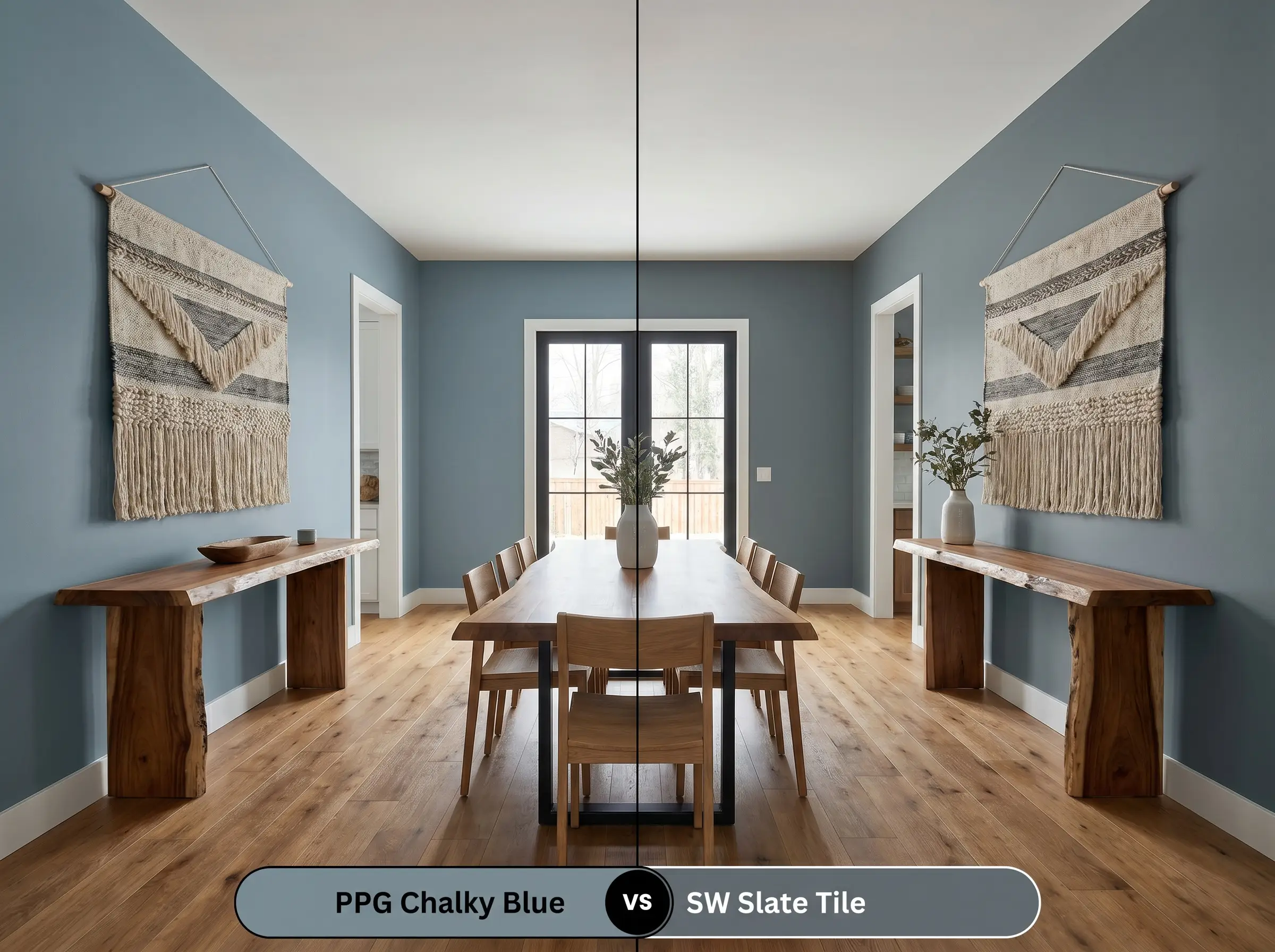
Sherwin-Williams Slate Tile (SW 7624) is a highly popular alternative, but it behaves quite differently on the wall. Slate Tile has a significantly more pronounced green undertone, which makes it feel slightly warmer and more earthy. If your room features a lot of warm wood tones and you want a crisp, true nautical contrast, the PPG option is the superior choice, as it stays firmly in the blue-charcoal family.
PPG Chalky Blue vs. Benjamin Moore Providence Blue
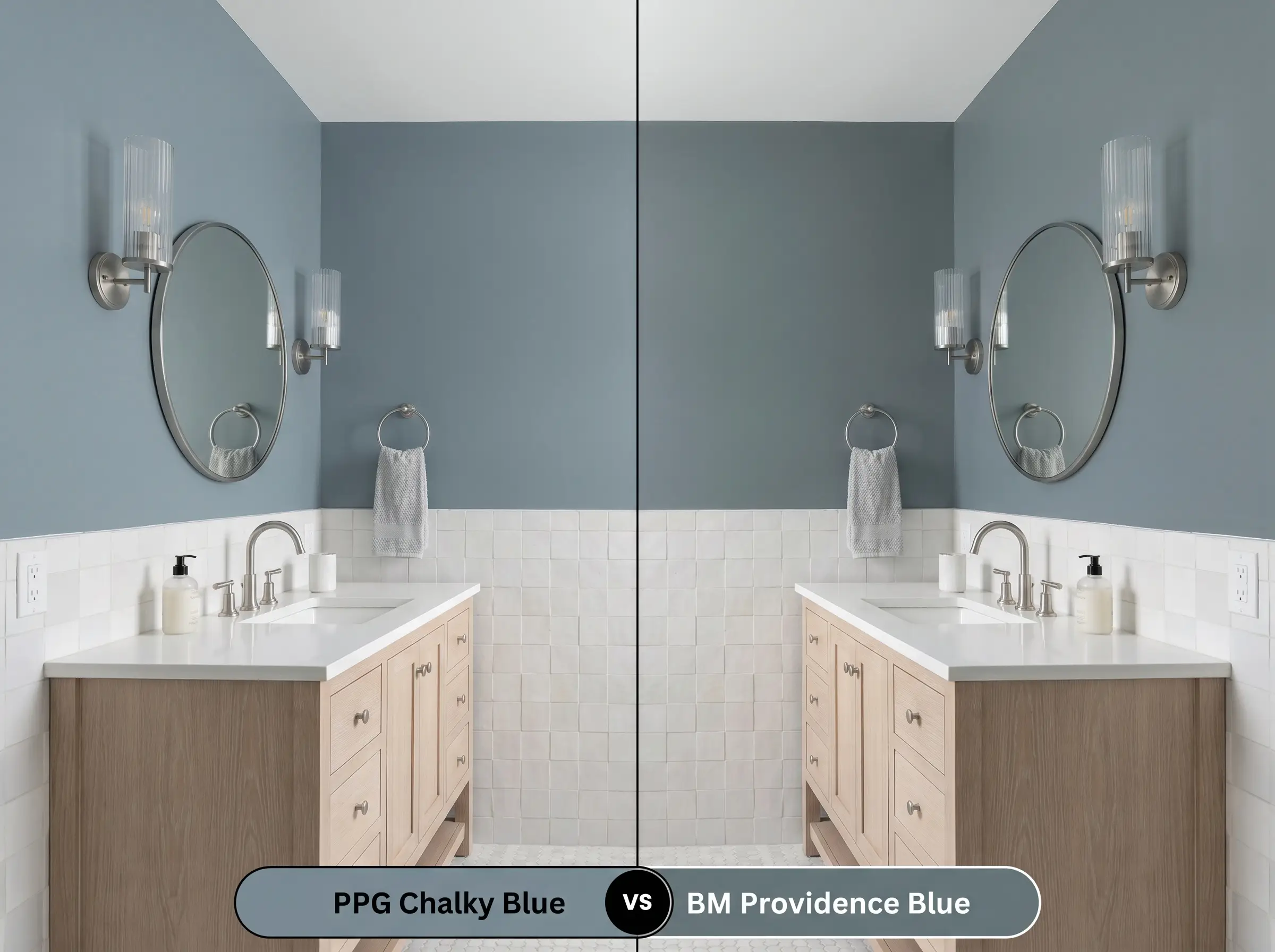
Benjamin Moore Providence Blue (1636) shares a similar depth but leans much further into a traditional teal territory. The Benjamin Moore hue has a higher dose of color saturation, making it feel slightly more vibrant and energetic. If you are looking for a true, shadowed neutral that absorbs light and feels incredibly muted, the PPG paint will provide that quieter, more sophisticated finish.
Exploring Similar Cool Chromatic Profiles
If the lighting in your home is altering the color in unexpected ways, you may need to pivot to a slightly different formulation.
Same-Brand Alternatives
Cross-Brand Matches
Executing a Flawless Finish
Transitioning from the initial design concept to the physical application requires an understanding of how this specific pigment profile interacts with different surfaces.
The Dynamic Sheen Guide
Primer Strategy
Deep, saturated colors require a specific foundation to achieve their true depth. You must use a high-quality primer tinted to a medium gray before applying this paint. A standard white primer will force you to apply three or four coats of the blue to stop the bright white from glowing through the finish.
Coverage & Success Tips
Even with a tinted primer, expect to apply a minimum of two generous coats to achieve a solid, professional finish.
Dark, matte paints are notorious for “flashing”—visible, shiny roller marks that appear when you touch up a dry wall. To avoid this entirely, always keep a wet edge while rolling, and if you find a mistake after the wall has dried, you must repaint the entire wall corner-to-corner rather than just dabbing the single spot.
Clash Warning (The Flashing Effect)
Frequently Asked Questions
Because of its light-absorbing qualities, it will certainly look dark, but that is actually a design advantage. Embracing the lack of natural light by wrapping the entire room in this tone creates a striking, jewel-box effect that feels highly intentional.
The crisp, cool navy base provides a stunning, high-contrast complement to the warm, earthy tones of red brick. It makes the brick look richer while the blue appears sharper and more tailored.
Absolutely. The tension between the cool slate cabinets and the warm, amber tones of the oak flooring creates a beautifully balanced, dynamic kitchen that avoids feeling too sterile or too rustic.
Yes, dark, flat finishes are prone to showing white scuff marks from shoes or bags. For a high-traffic mudroom, always upgrade the sheen to a Satin or Semi-Gloss to ensure the walls remain durable and easy to clean.
Unlacquered brass provides a fiery, warm contrast that pops brilliantly against the cool walls, creating a classic, heritage look. Brushed nickel, on the other hand, blends into the cool tones, resulting in a much more subdued, monochromatic, and modern aesthetic.
Final Verdict & Expert Warnings
PPG Chalky Blue is a phenomenally versatile, stormy slate that excels at turning standard, overlooked spaces into deeply intentional design features. It is the perfect choice for homeowners who want to introduce a sophisticated, moody atmosphere into their homes without committing to the starkness of a pure black. Whether applied to lower kitchen cabinetry, a dedicated home office, or a striking exterior front door, its cool chromatic profile establishes a beautifully tailored, calming energy.
However, this color requires careful curation to succeed. You must avoid pairing this shadowy slate with overly cool, gray-toned luxury vinyl plank flooring or vast expanses of stark, cool-toned marble without any warming elements. When surrounded entirely by other cool, gray finishes, the color loses its sophisticated tension and can quickly make a room feel icy, commercial, and unwelcoming.
Always ensure you are introducing natural woods, warm textiles, or living metals into the space to bring out the absolute best in this striking hue.
Closest Cross-Brand Equivalents
The absolute closest scientific color matches for Chalky Blue across top paint brands.