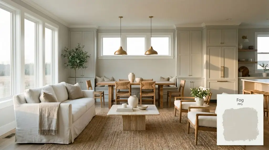
Fog PPG1010-2
PPGPPG Fog (PPG1010-2) is a light, warm, cloudy gray with a subtle pearly undertone. With an LRV of 67, it acts as a highly versatile, expansive neutral that beautifully bridges the gap between traditional greiges and modern soft grays.
Paint Technical Profile
| Color ID / SKU | PPG1010-2 |
| HEX Code | #d6d7d2 |
| Light Reflectance (LRV) | 67 |
| Use | Interior, Exterior |
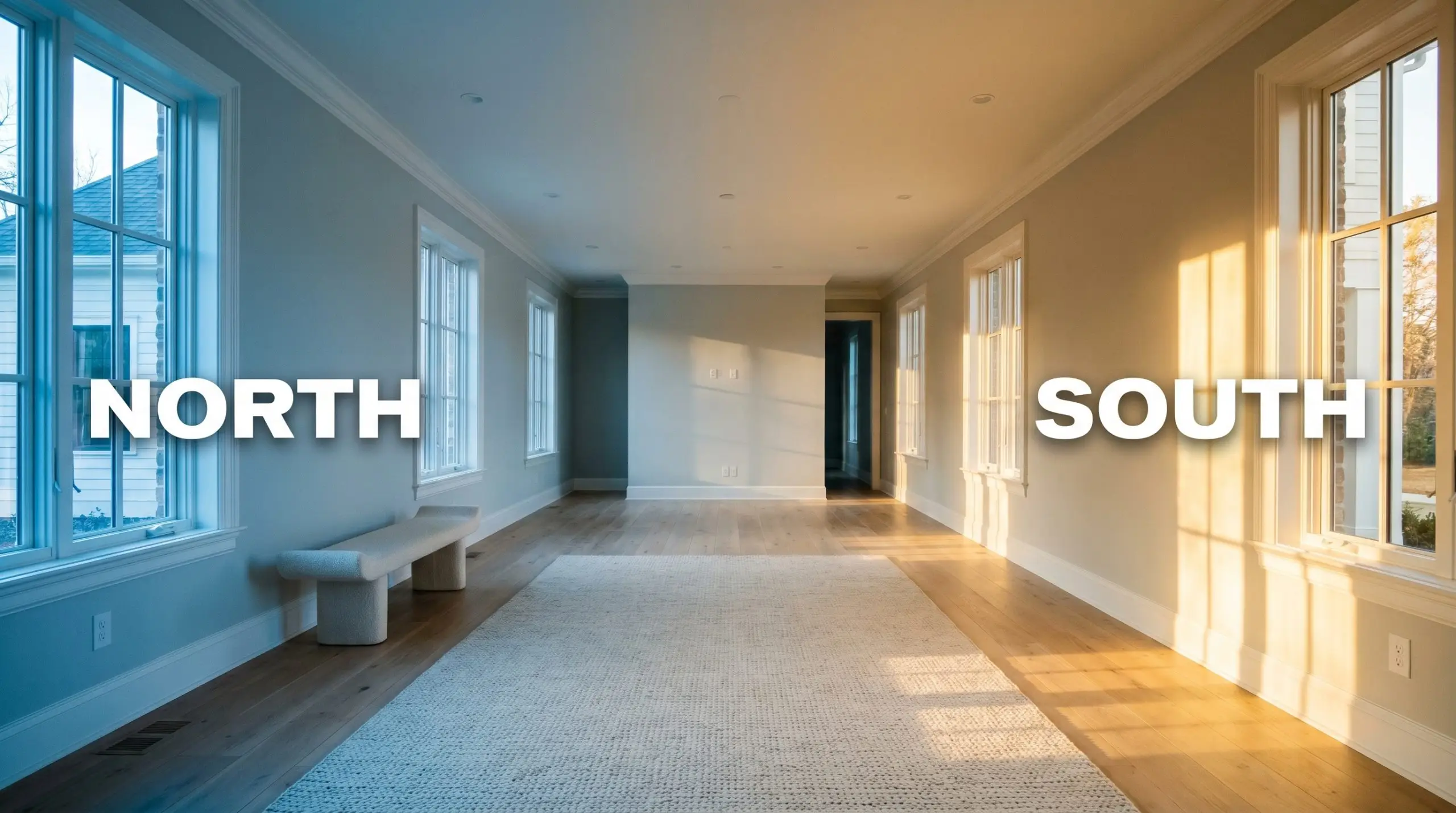
| Best Exposures | South, West, East |
| Best For | Main walls, ceilings, open-concept spaces, modern traditional interiors |
The Luminous Anchor: Unlocking the Potential of PPG Fog
A truly exceptional neutral doesn’t just sit on the wall; it actively interacts with the architecture of your home. PPG Fog PPG1010-2 is a masterclass in subtlety, operating as a cloudy gray that brings a quiet, pearly luminescence to both interiors and exteriors. By manipulating ambient lighting and casting a soft, grounding glow, this chromatic profile elevates everyday finishes into highly intentional design features.
Decoding the Undertones & LRV of PPG Fog
When evaluating this specific shade, the immediate question is always about its temperature: PPG Fog is a neutral leaning slightly warm. This subtle warmth is the secret to its versatility, allowing it to soften harsh angles without ever reading as a dated beige.
With a light reflectance value (LRV) of exactly 67, this shade reflects a significant amount of light back into the room. This specific depth prevents enclosed areas from feeling dark while retaining enough pigment to contrast beautifully against pure white millwork. It sits right in that sweet spot where it feels noticeably intentional on the wall, rather than just a builder-grade primer.
Ambient Lighting and the Chameleon Factor
Because of its specific color structure, this pearly gray is highly reactive to its environment. The biggest risk with PPG1010-2 is heavy exterior greenery; if you have large windows facing a dense, lush lawn, the natural light will bounce that green directly onto your walls, amplifying the hidden yellow-green undertones. Always test a large swatch to ensure the color remains grounded in your specific environment.
If your room feels slightly too cool in the evening, swap your standard lightbulbs for 3000K LEDs. This specific temperature perfectly balances the gray base without pushing the yellow-green undertones too far forward.
Hackrea Pro-Tip (Controlling the Glow)
Where to Apply PPG1010-2 in Your Home
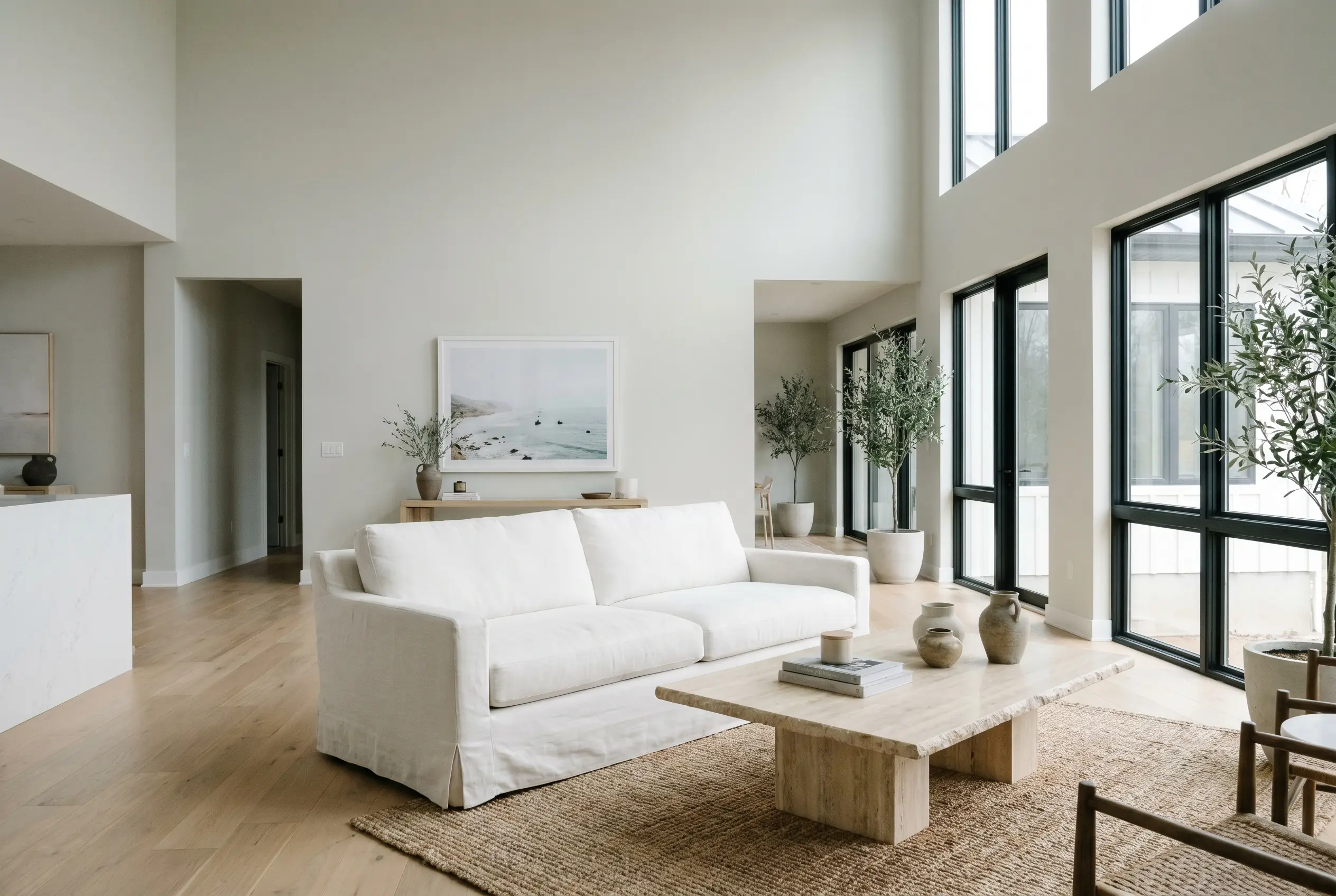
This cloudy gray excels at establishing a calm, cohesive baseline across a variety of architectural layouts. Instead of dominating a space, it acts as a stabilizing force that allows your carefully chosen furniture and textiles to take center stage.
Open-Concept Living Areas
In expansive, multi-use spaces, you need a color that can handle shifting light from morning to evening. Apply this warm neutral to the main walls to unify the living and dining zones, pairing it with slipcovered linen sofas and an oversized, tumbled travertine coffee table. To keep the room from feeling flat, introduce high-contrast accents like matte black window frames or blackened steel lighting fixtures. The resulting aesthetic is incredibly grounded, allowing for seamless transitional styling.
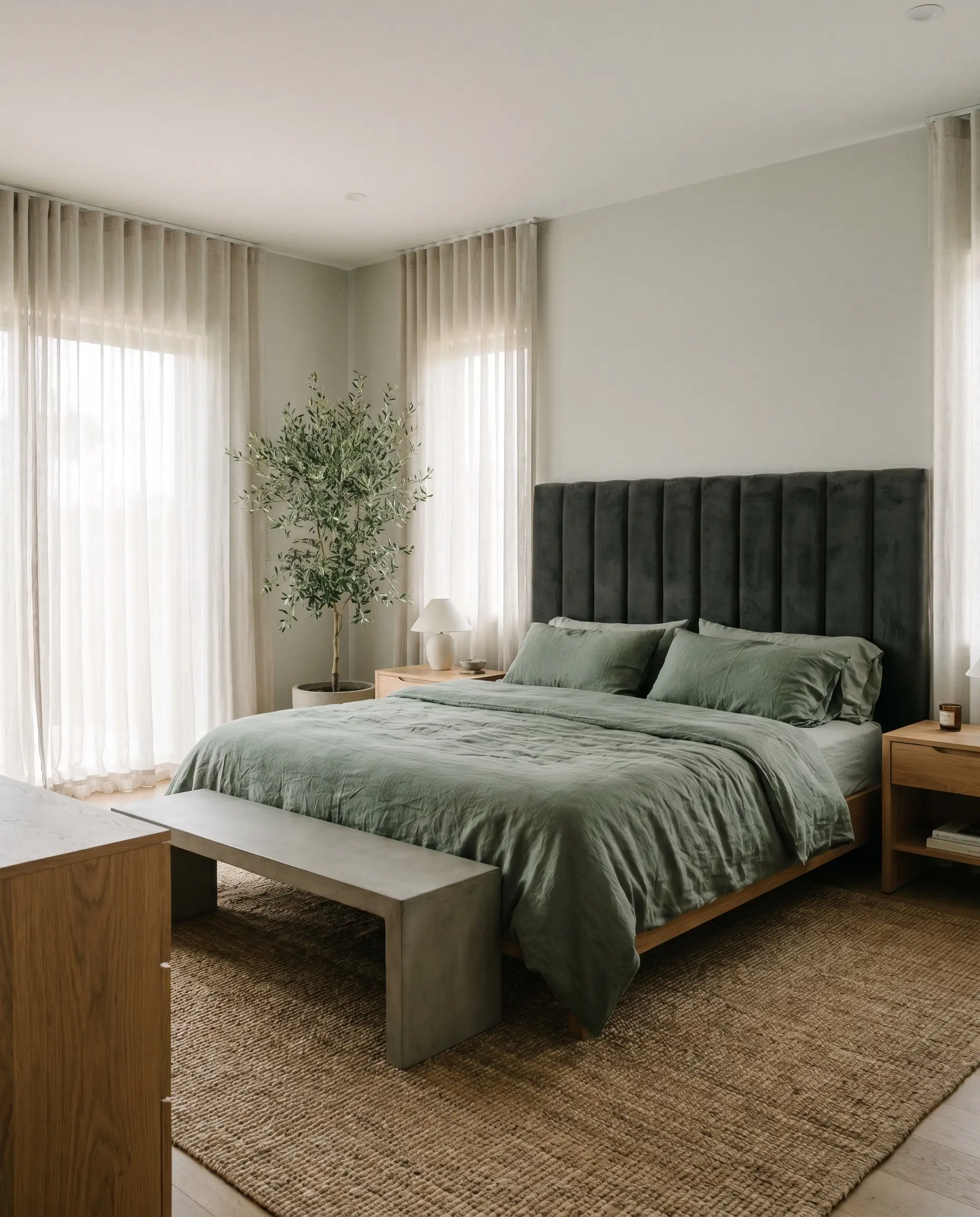
Primary Bedrooms
This shade is brilliant for creating a serene, low-tension environment perfectly suited for rest. Pair the painted walls with a channel-tufted headboard in a deep charcoal velvet to anchor the bed against the softer perimeter. Layering washed linen bedding in muted botanical greens will naturally highlight the pearly undertone of the paint, creating a restful, organic modern retreat.
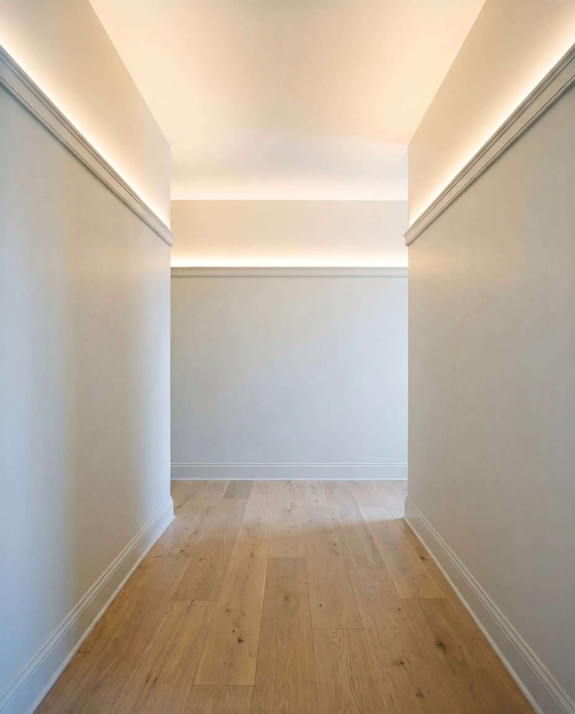
Hallways and Transitional Spaces
Windowless corridors often suffer from a lack of natural light, but an LRV of 67 provides just enough bounce to keep these areas feeling open. Use a slightly higher sheen, like an eggshell finish, to maximize the light reflection along the walls. Elevate the visual interest by installing a simple picture rail molding painted in the same color, drawing the eye upward and giving standard hallways a custom, architectural finish.
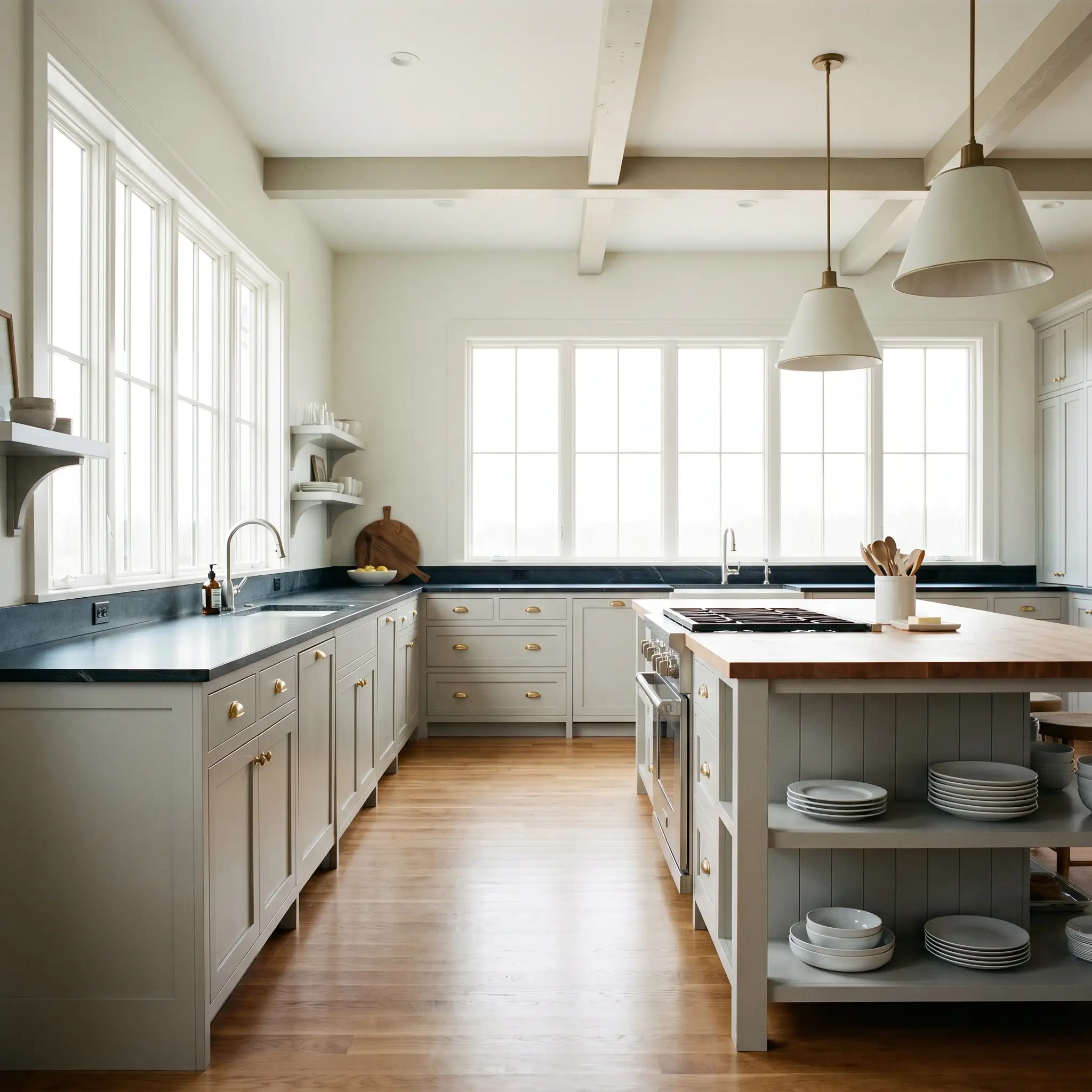
Farmhouse or Modern Traditional Kitchens
If you are moving away from stark white kitchens, this cloudy gray offers a softer, more forgiving alternative for cabinetry. Paint the lower cabinets in this shade and pair them with honed soapstone countertops and unlacquered brass cup pulls. The subtle warmth of the paint beautifully bridges the gap between the dark, moody stone and the gleaming, living finish of the hardware.
Curating with PPG Fog: Distinctive Design Concepts
When you treat paint as a foundational material rather than just a backdrop, it opens the door for highly customized, atmospheric environments.
The Brutalist Art Gallery
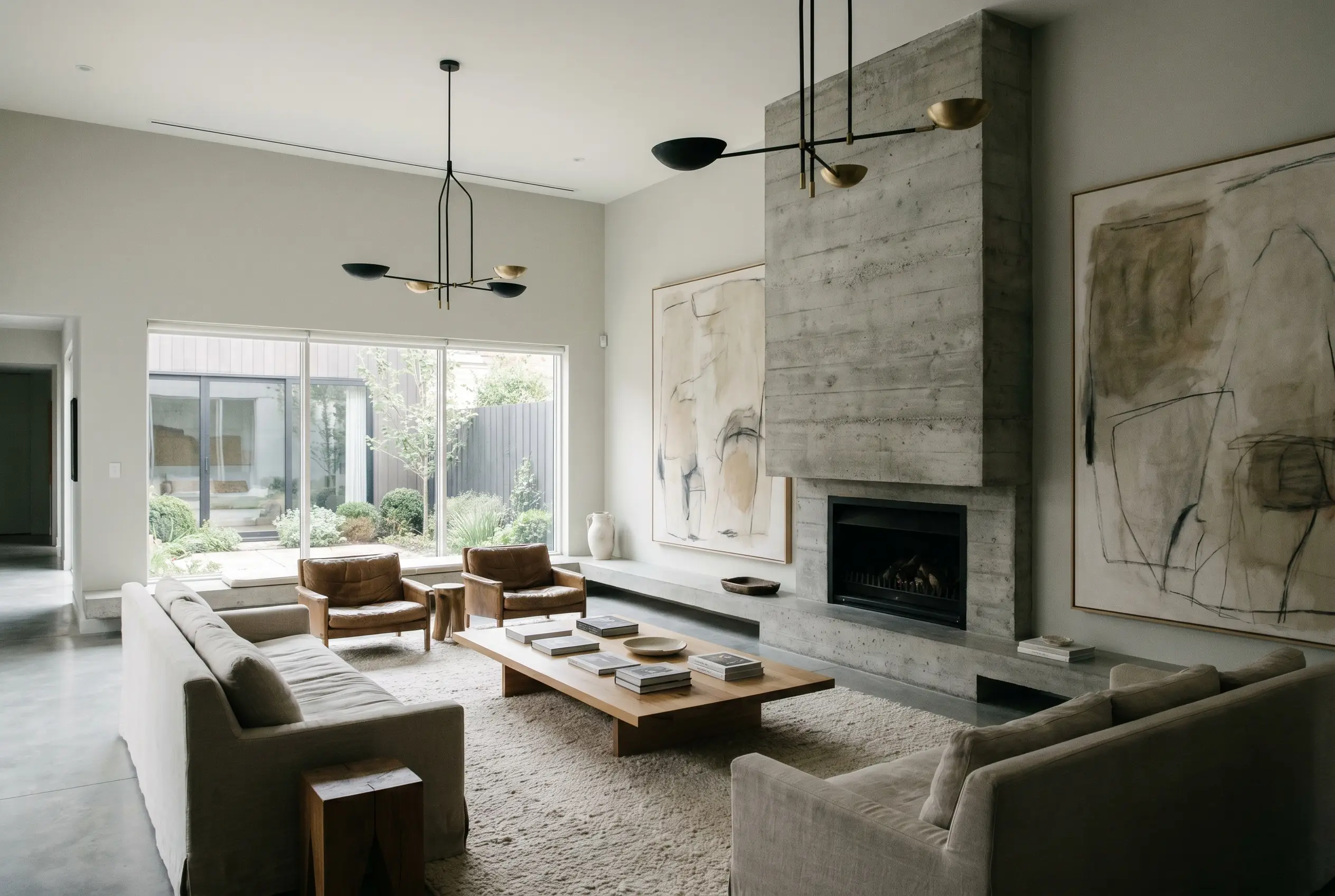
For couples curating a quiet, adult-centric space focused on fine art, this paint serves as the perfect monochromatic canvas. Apply it across the walls to soften the harsh edges of a brutalist concrete fireplace, creating a deeply textural dialogue between the raw stone and the pearly paint. The subtle warmth prevents the concrete from feeling cold, allowing oversized abstract canvases and sculptural metal lighting to command attention.
The Neuro-Inclusive Retreat
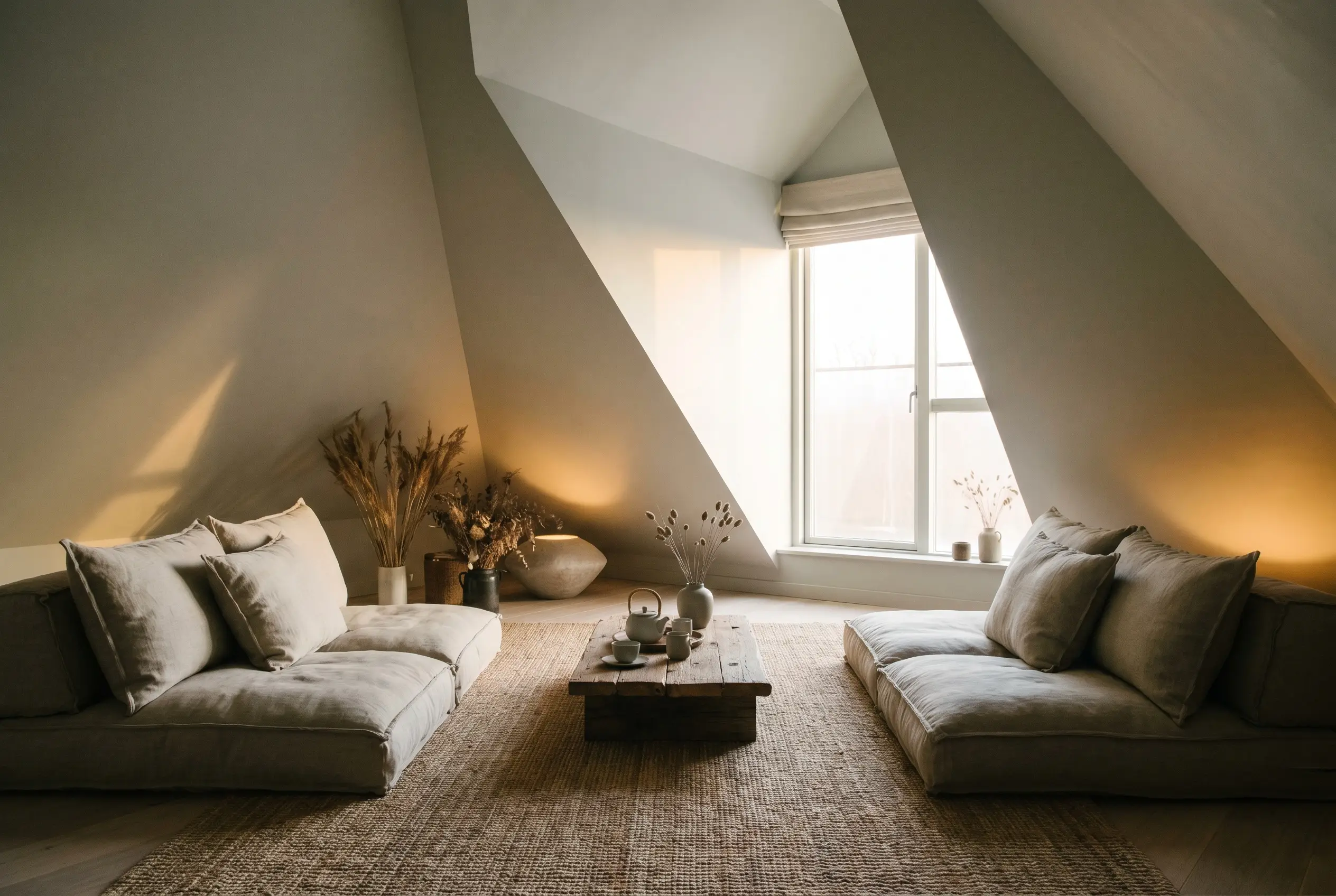
When designing a low-stimulus environment meant for a calming sensory reset, the subtle yellow-green undertones of this gray are incredibly grounding. Wrap the color entirely around slanted attic walls and the ceiling to eliminate visual boundaries and create a soft, enveloping envelope. Pair this continuous color application with deep, weighted floor cushions and natural jute rugs to foster a deeply restorative atmosphere.
The Japandi Facade
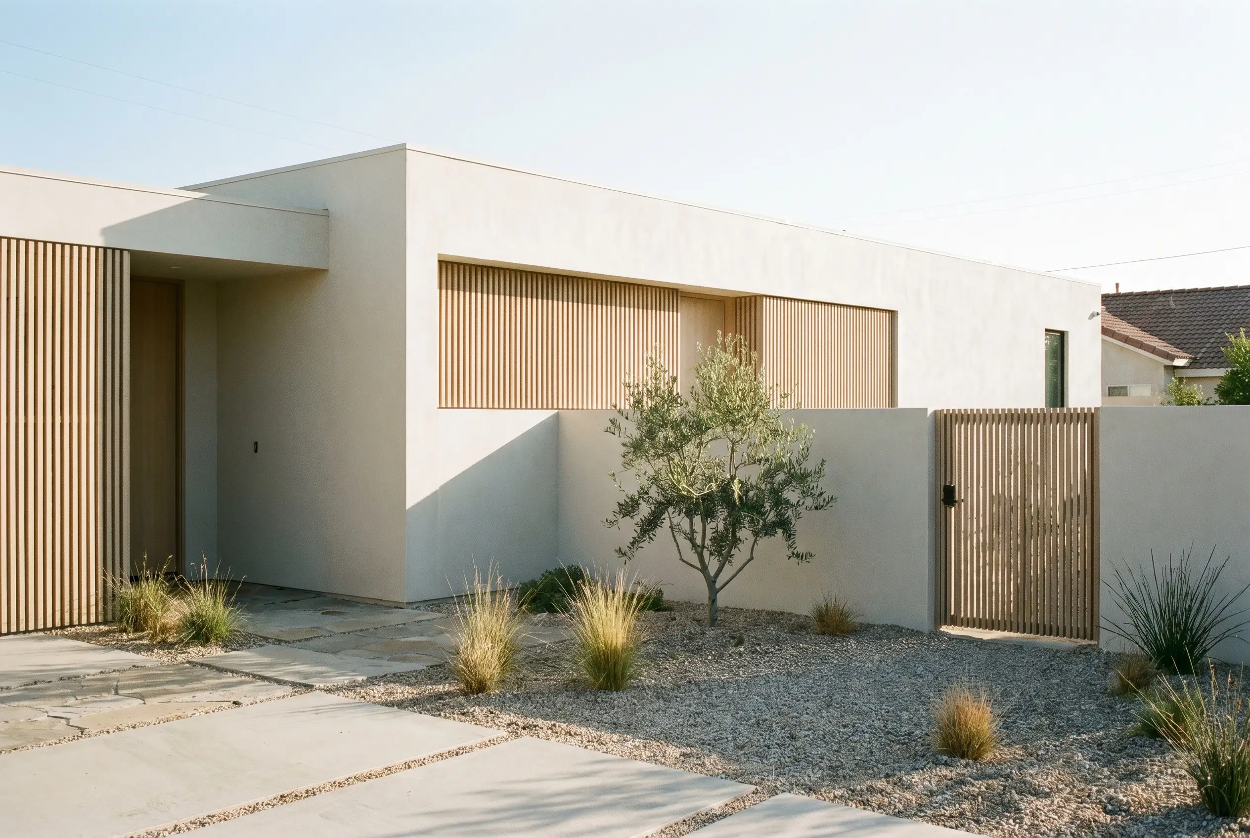
On a home’s exterior, this shade beautifully supports the slow living movement and minimalist architecture. Apply it to a smooth stucco facade where the natural sunlight will wash it into a bright, inviting greige. Contrast the soft exterior walls with slatted white oak privacy screens and minimal, asymmetrical landscaping to achieve a perfectly balanced Japandi aesthetic.
The Textural Studio Nook
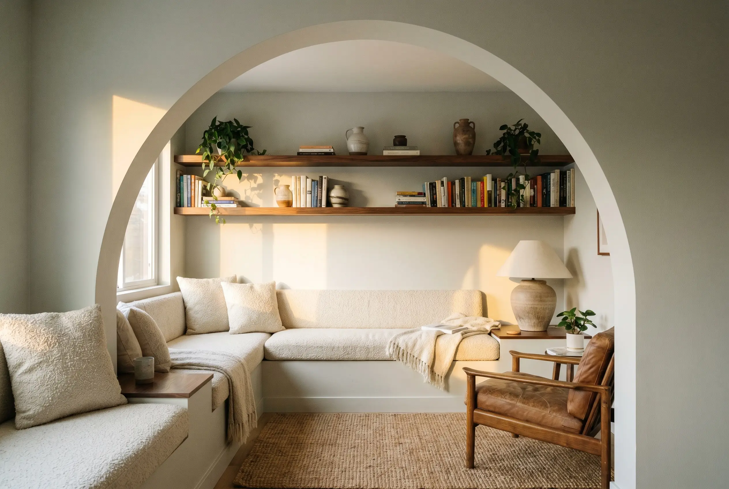
For a ceramicist’s home studio or a dedicated reading corner, use color-blocking to define the zone. Paint a crisp, geometric archway or a dedicated corner in this cloudy gray to separate it from the rest of the room. Fill the nook with nubby bouclé fabrics, floating walnut shelves, and hand-thrown pottery, letting the paint act as a quiet backdrop that highlights the rich, tactile materials.
Material Pairings and Coordinating Colors for This Cloudy Gray
The true success of this neutral lies in its relational dynamic; it requires intentional, high-contrast pairings to keep its soft undertones from washing out.
Trim & Baseboards
To maintain a crisp, tailored boundary, you must pair this gray with a clean, un-tinted white. Benjamin Moore Chantilly Lace OC-65 offers a brilliantly sharp, neutral contrast that frames the gray without introducing conflicting undertones. For an equally stunning result, Sherwin-Williams High Reflective White SW 7757 provides a highly luminous, modern edge that makes the wall color feel incredibly intentional.
Hardware, Wood & Material Pairings
Coordinating Colors
Designer Mood Boards
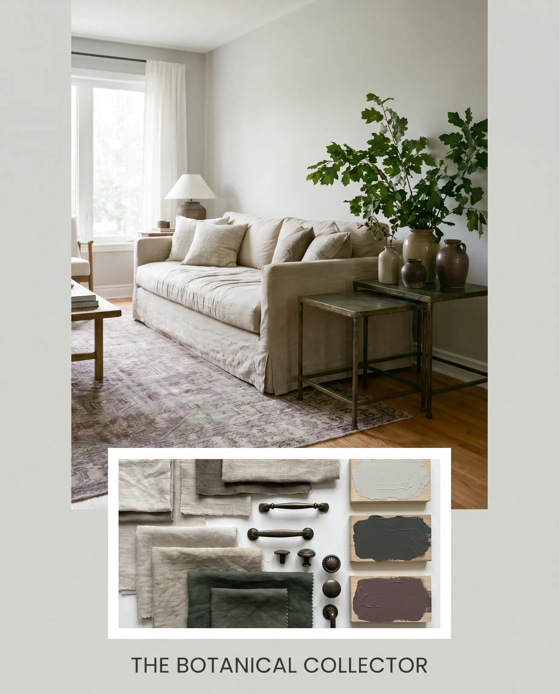
The Botanical Collector Anchor the room with walls painted in this cloudy gray, laying down a vintage rug featuring deep, muted plums and faded greens. Introduce a slipcovered sofa in washed linen, flanked by aged bronze side tables. Layer in oversized botanical branches in hand-thrown ceramics to pull the organic green undertones out of the wall color, creating a space that feels collected and deeply rooted in nature.
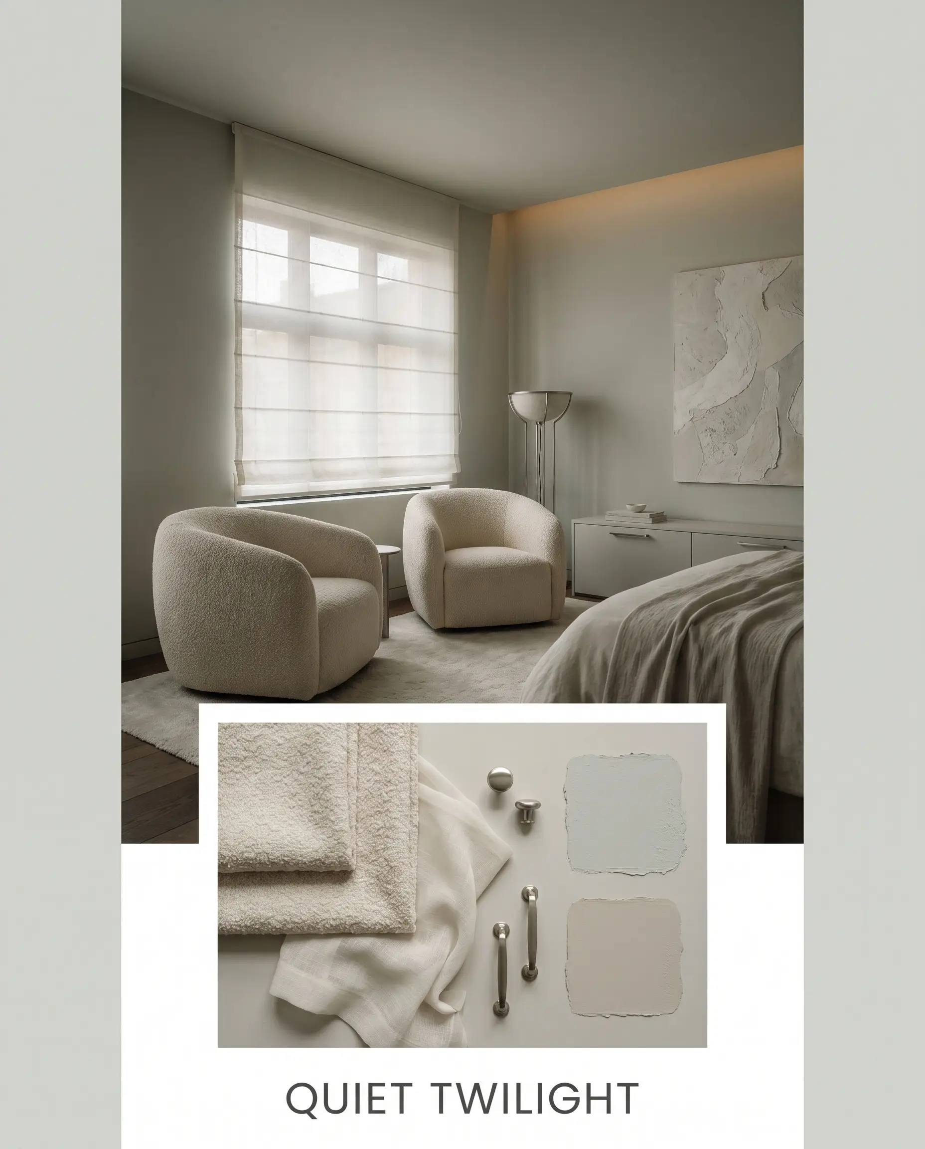
Quiet Twilight For a deeply calming, low-contrast environment, use the gray on the walls and introduce heavily textured, tone-on-tone elements. Think nubby bouclé chairs, sheer roman shades, and a large, textural plaster art piece on the wall. The introduction of brushed nickel hardware adds just a touch of cool, metallic reflection, keeping the warm neutral from feeling heavy or dated.
PPG Fog vs. Industry Rivals
Understanding how this shade behaves under pressure requires comparing it directly to other popular neutrals. If your room’s lighting conditions are challenging, a pivot might be necessary.
PPG Fog vs. Sherwin-Williams Repose Gray SW 7015
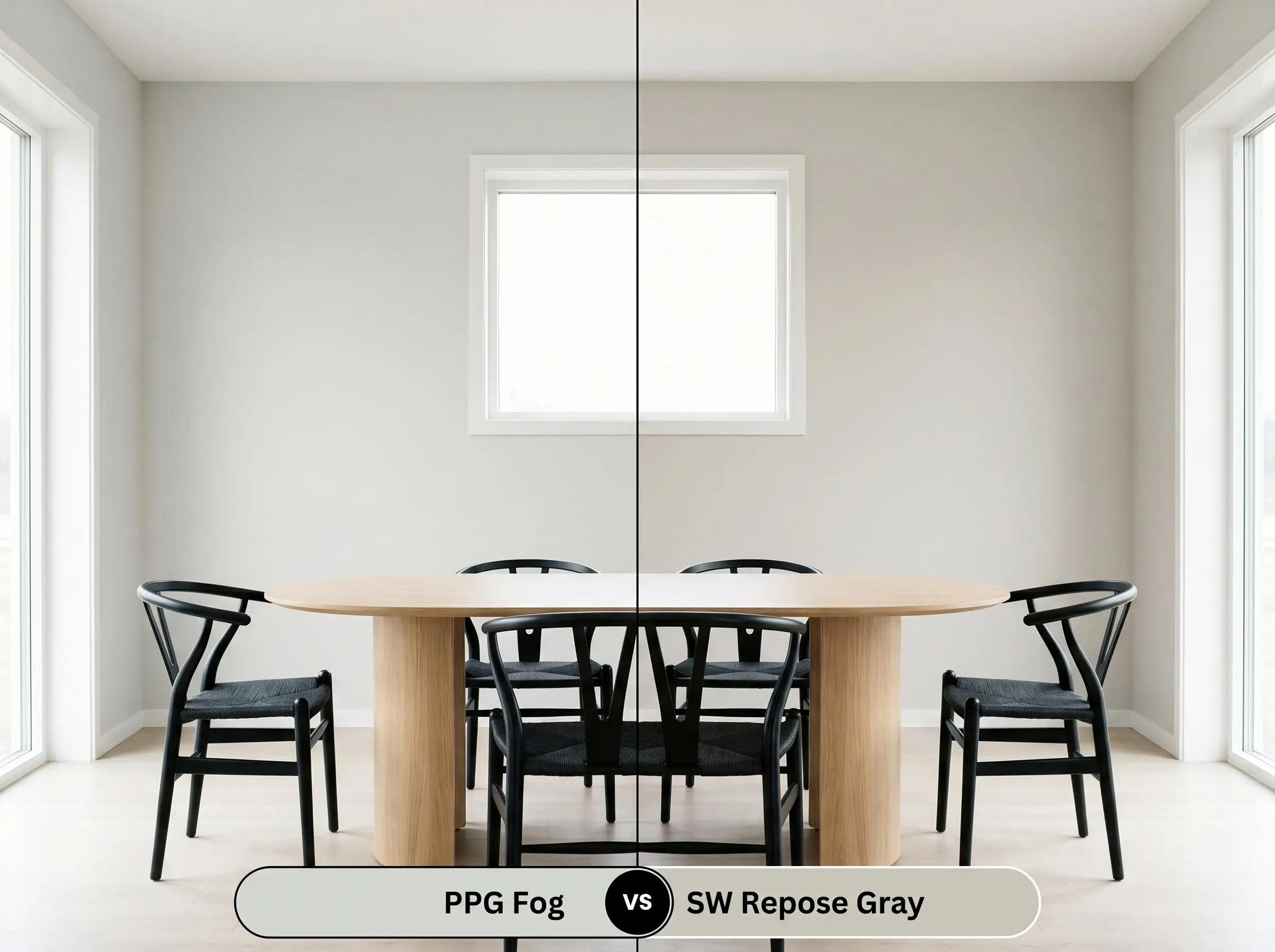
While both are incredibly popular, Repose Gray carries slightly more depth and leans a bit cooler, with subtle brown and taupe undertones. If your room receives heavy, warm southern light, Repose Gray might hold its shape better, whereas the PPG option will actively lean into that warmth, feeling much softer and more pearly.
PPG Fog vs. Benjamin Moore Classic Gray OC-23
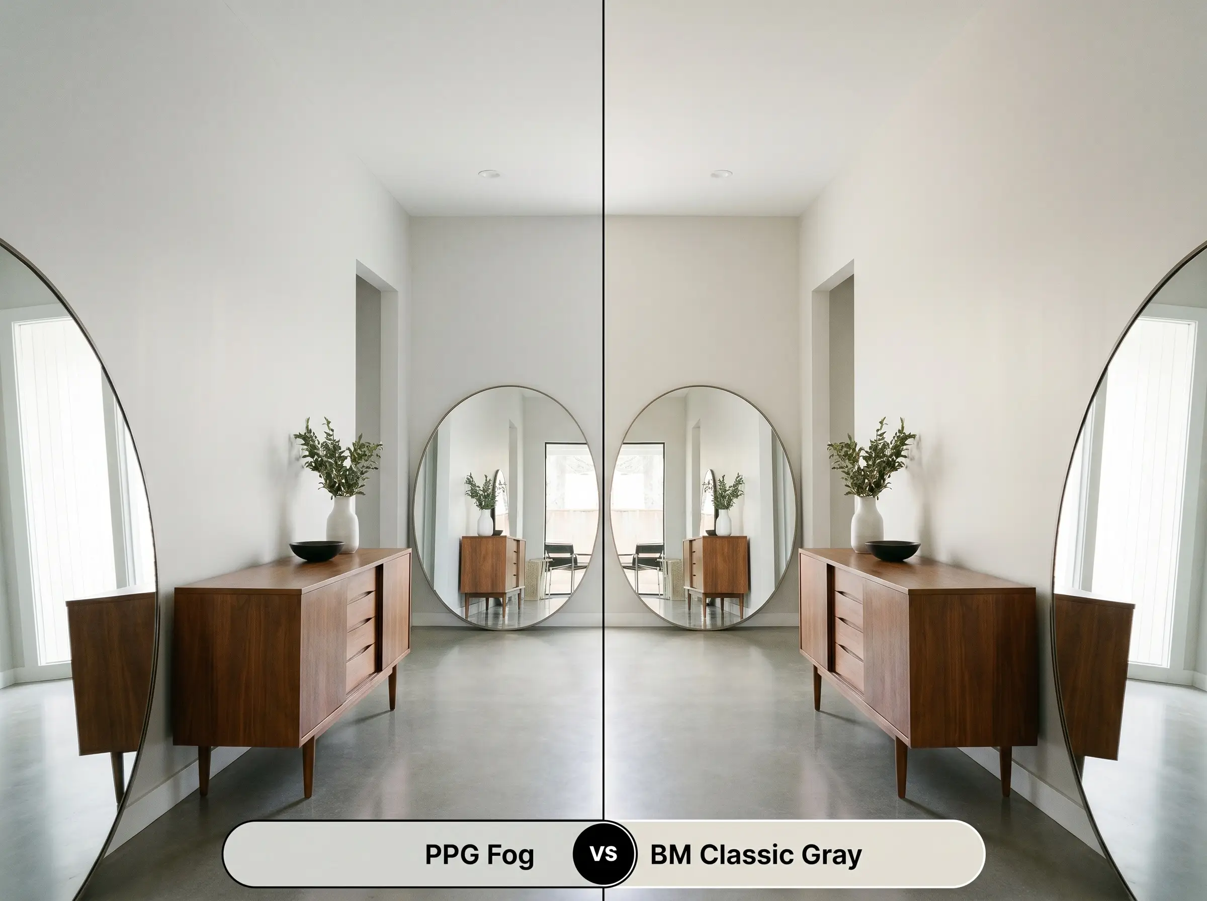
Classic Gray is significantly lighter, with an LRV of 74.78, and functions almost as an off-white in bright rooms. If you are dealing with a very dark, north-facing room and need maximum light reflection, Classic Gray is the safer choice. However, if you want a true, definitive gray that provides high contrast against white millwork, the PPG alternative offers the necessary pigment and color structure.
Alternative Options in the Greige Spectrum
If you love the general vibe but need a slight adjustment in depth or undertone, these alternatives offer subtle, yet impactful, shifts.
Similar Colors from PPG
Cross-Brand Equivalents
Achieving a Flawless Architectural Finish
Translating a paint chip into a beautiful, lasting reality requires a strategic approach to application and material selection.
The Dynamic Sheen Guide
Primer Strategy
Because this is a light-to-medium neutral, a standard high-quality white primer is usually sufficient over new drywall or light colors. However, if you are painting over a dark, saturated red or navy, you must use a high-hiding, stain-blocking primer to prevent those aggressive tones from altering the final pearly cast of the gray.
Coverage & Success Tips
Expect to apply two full coats to achieve the true depth and undertone accuracy of this color. Be incredibly mindful of “flashing”—visible roller marks or uneven sheen—which can occur if you press too hard or stretch the paint too thin. Maintain a wet edge while rolling, and allow the first coat to dry completely before applying the second to ensure a beautifully even, professional-looking surface.
Frequently Asked Questions
Because of its LRV of 67, this shade performs beautifully on stucco, reflecting enough harsh sunlight to prevent the house from looking overly dark. However, the high UV exposure will wash the color out slightly, making it appear closer to a soft, warm off-white rather than a definitive gray.
The subtle yellow-green undertones in this paint actually work to gently balance the aggressive orange and red tones found in older oak floors. It provides a cool, cloudy contrast that modernizes the space without completely clashing with the existing wood.
Not at all; in fact, it is an ideal pairing. As the brass patinas and darkens into a rich, earthy gold, it beautifully complements the subtle warmth of the gray, creating an elegant, time-worn aesthetic.
In a space with zero natural light, this color creates a highly controlled, enveloping atmosphere. When lit exclusively with warm, dimmable LEDs, the gray feels incredibly grounding and cozy, providing a soft backdrop that won’t distract from the screen.
The Final Verdict on PPG1010-2
PPG Fog is an incredibly sophisticated, highly adaptable neutral that strikes the perfect balance between warmth and structure. Its absolute best application is in open-concept living spaces and transitional areas where its pearly, luminous cast can actively bounce light and unify disparate architectural elements. It is the perfect choice for homeowners who want to move away from clinical whites and heavy, dated beiges, offering a soft, cloudy gray that effortlessly elevates both modern traditional and minimalist interiors.
However, you must be incredibly careful when pairing this specific shade with stark, icy blue furnishings or highly polished chrome hardware. Because of the subtle yellow-green warmth in its DNA, placing it directly next to aggressively cool, blue-toned elements will cause the paint to look muddy and visually confused. Always anchor this gray with rich, organic materials and warm metallic finishes to ensure its pearly undertone remains an intentional, beautiful feature of your home.
Closest Cross-Brand Equivalents
The absolute closest scientific color matches for Fog across top paint brands.