Inchyra Blue No. 289
Farrow & BallFarrow & Ball Inchyra Blue No. 289 is a dark, moody architectural blue-grey with a strong, hidden green undertone. Inspired by dramatic Scottish skies, this complex shade shifts between slate, aged teal, and charcoal depending on the light exposure.
Paint Technical Profile
| Color ID / SKU | No. 289 |
| HEX Code | #58686a |
| Light Reflectance (LRV) | 12.5 |
| Use | Interior, Exterior |
| Best Exposures | South-Facing, West-Facing |
| Best For | Cabinetry, Exterior Doors, Moody Dining Rooms |
Farrow & Ball Inchyra Blue No. 289: The Architectural Weight of a Shape-Shifting Slate
Most dark paints simply absorb light and lay flat on the drywall, but Farrow & Ball Inchyra Blue No. 289 operates entirely differently. This highly reactive chromatic profile acts as a living shadow, shifting its tangible presence depending on the time of day and the raw materials placed beside it. It is a deeply grounding color structure that demands to be paired with intentional, tactile environments to reach its full potential.
Undertones & LRV of Inchyra Blue
When evaluating the core temperature of Farrow & Ball Inchyra Blue, the verdict is a beautifully conflicted cool foundation heavily anchored by an organic, earthy warmth. This tension is exactly what makes this historic teal feel so complex and lived-in. Rather than projecting a chilly, sterile atmosphere, it wraps a room in a grounded, natural energy.
To understand how this shade behaves on the wall, you have to look at its foundational layers:
With a Light Reflectance Value (LRV) of 12.5, this shade absorbs a massive amount of light. It acts as a visual anchor, pulling walls inward to create a sense of compression and intimacy rather than bouncing ambient light around the room. You must intentionally plan your lighting scheme, as this low reflectance means the color relies heavily on exterior windows and layered fixtures to maintain its depth.
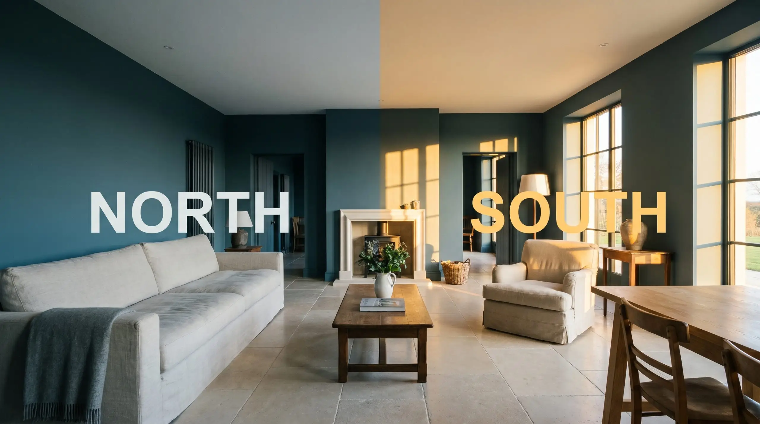
Lighting Effects & The Chameleon Factor
Because this pigment is so dense, it is highly reactive to the specific angle and temperature of the light hitting it. You must test this color on multiple walls because it will physically change its identity from morning to evening.
In poorly lit, north-facing rooms with heavy exterior foliage, No. 289 can lose its green and blue nuances entirely, dropping into a murky, bruised charcoal. Always ensure you have adequate layered lighting to keep the pigment alive.
Hackrea Pro-Tip (The Shadow Trap)
Here is exactly how shifting light manipulates the finish:
Establishing Atmosphere in the Home
Applying this dense pigment across a floor plan instantly manipulates the perceived boundaries of the architecture. Instead of retreating into the background, it pulls the walls inward, establishing a highly intentional, enveloping atmosphere that anchors the entire house.
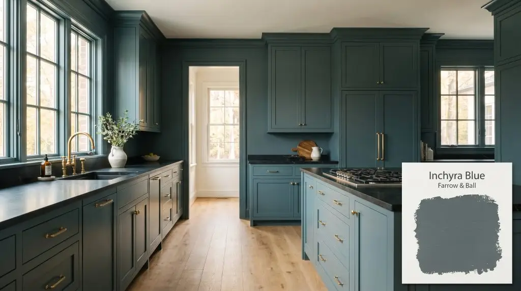
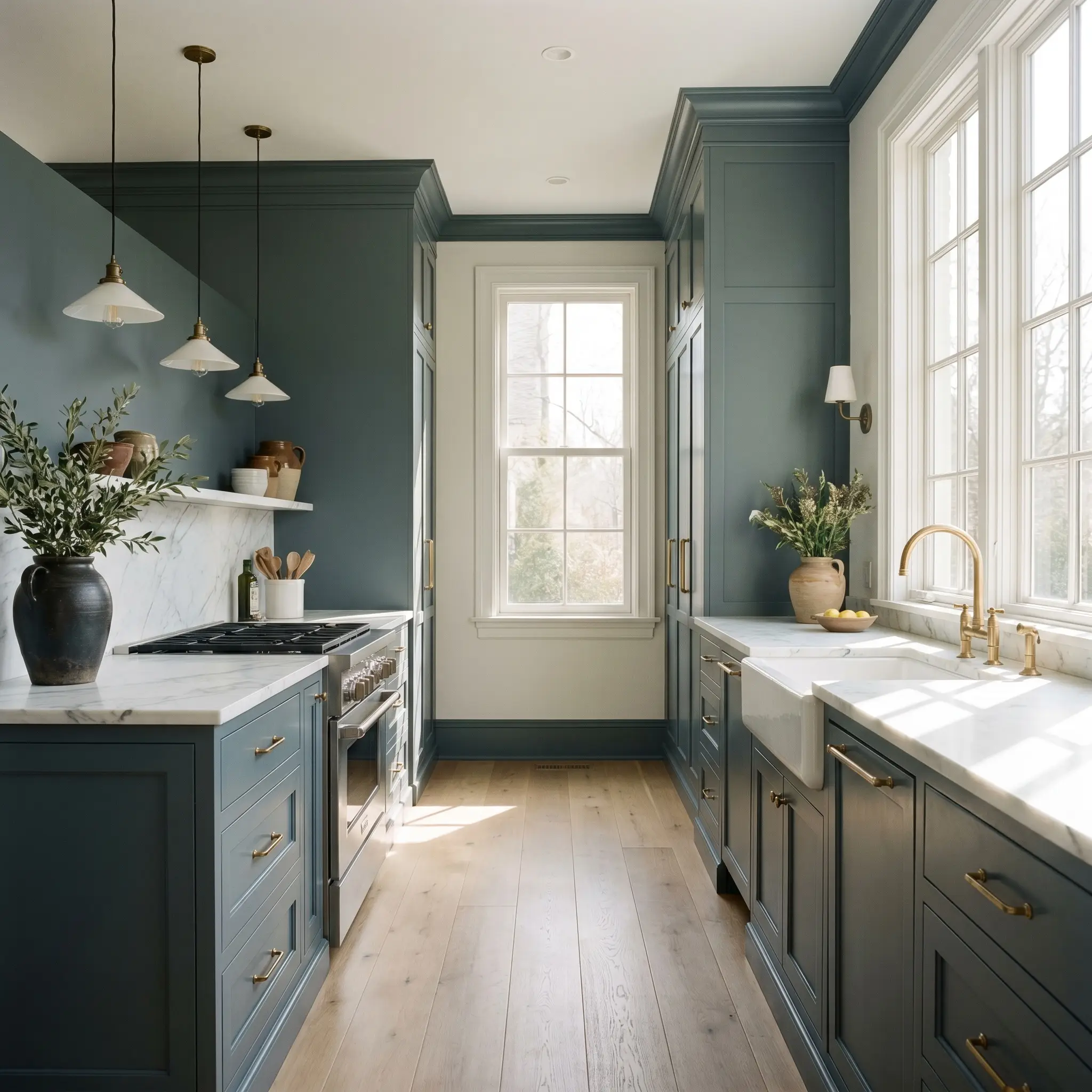
Kitchen Cabinetry & Islands
Painting custom millwork in this shade instantly grounds a kitchen, providing a visual base that pairs immaculately with honed stone countertops. The shifting undertones allow the cabinetry to read as a sophisticated grey in the morning and a rich teal under evening pendants. To maximize the impact, carry the color down to the baseboards to create a seamless, tailored foundation.
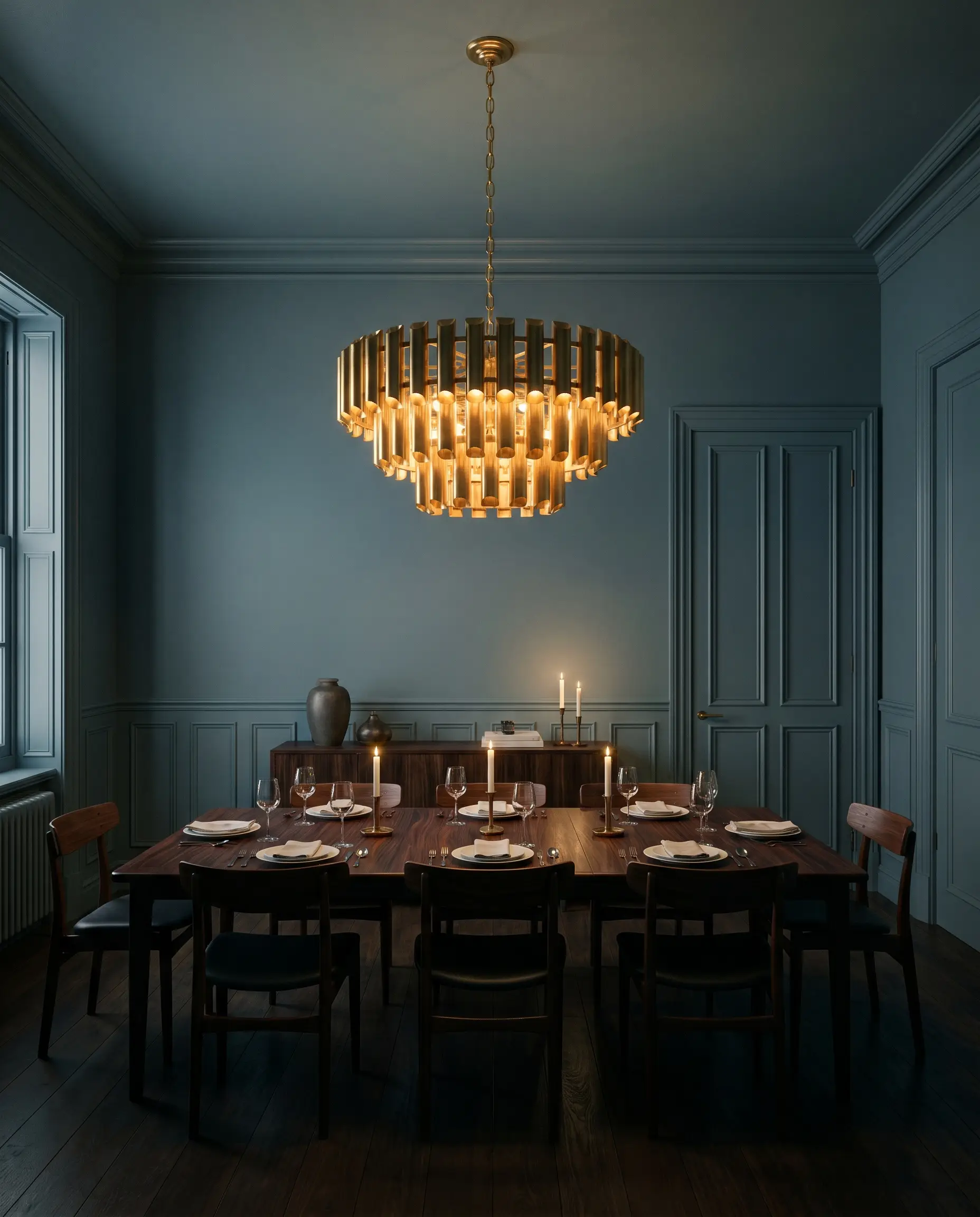
Formal Dining Rooms
This shade was engineered for evening entertainment spaces where you want to foster intimacy and focus. Applying it above traditional wainscoting creates a sharp, tailored contrast, while full color drenching—wrapping the walls, trim, and doors—erases the hard corners of the room. Pair this application with oversized, warm-glowing chandeliers to pull the hidden green to the surface during dinner parties.
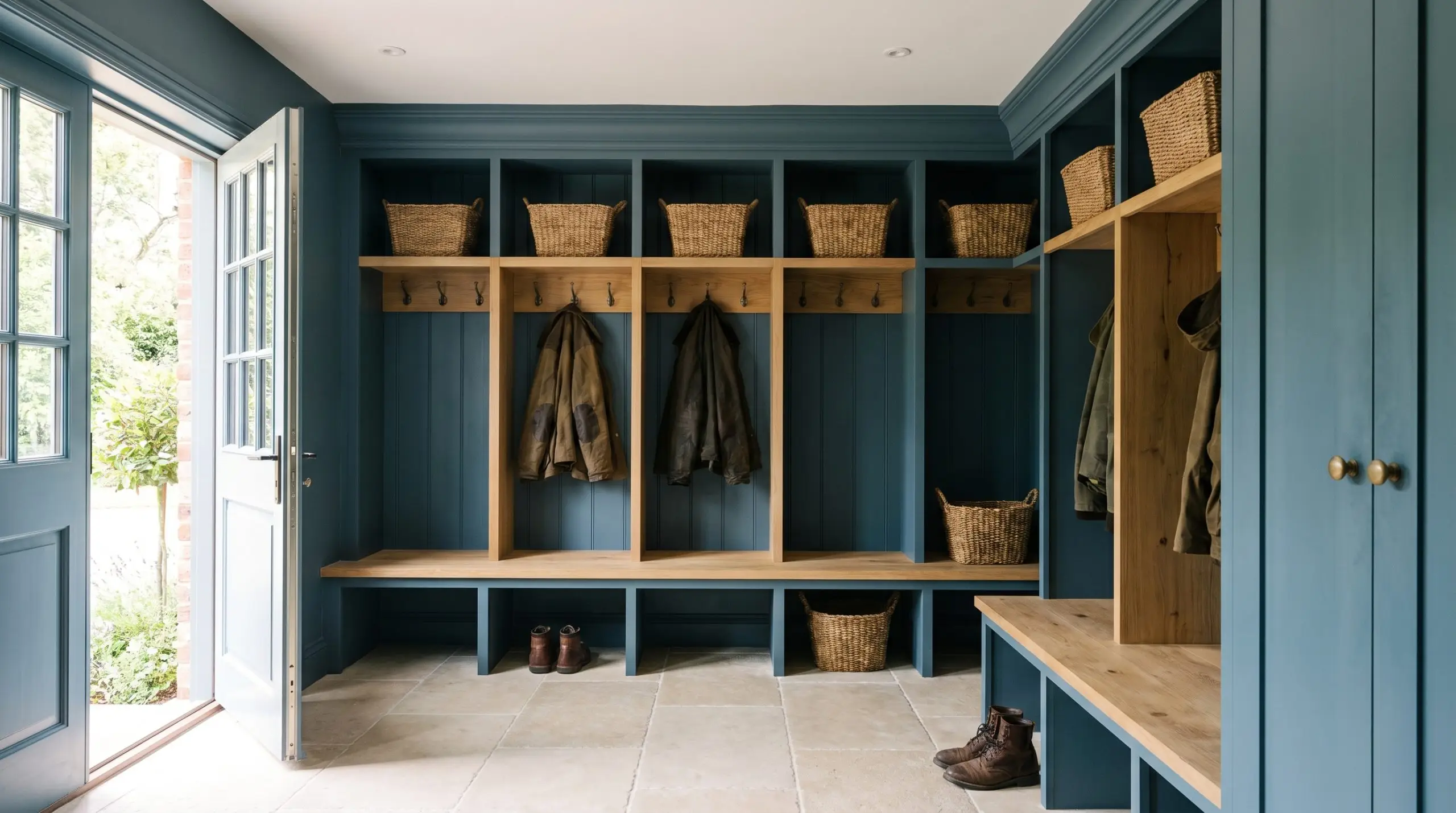
Mudrooms & Entryways
In high-traffic transition zones, the charcoal binder works incredibly well to mask scuffs and daily wear. When paired with tumbled limestone floors or dark herringbone brick, the slate-blue base feels rugged and utilitarian. Using the Dead Flat finish here provides a beautifully chalky, modern texture that absorbs glare from open exterior doors.
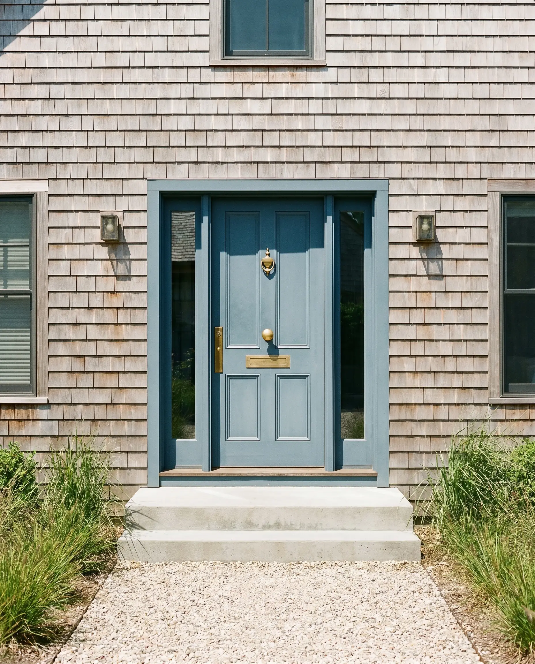
Exterior Front Doors & Shutters
When exposed to direct, full-sun environments, the intensity of the light will wash out the darkest charcoal notes, pulling the slate-blue forward. It creates a stunning, historically rooted contrast against natural cedar shingles or creamy stucco facades. Be mindful of high-gloss finishes outside, as the extreme reflection can sometimes obscure the nuanced kelp-green cast.
Libraries & Studies
Wrapping a study in No. 289 instantly lowers the visual heart rate of the room, creating a quiet, focused retreat. It serves as a brilliant backdrop for towering built-in shelving, allowing the spines of books and metallic library sconces to pop against the dark canvas. Soften the hard architectural lines by introducing textured window treatments that diffuse the afternoon light.

Localized Architectural Focus
When you stop treating this shade as just a wall color and start viewing it as a localized architectural finish, its true versatility emerges. It excels when applied to highly specific focal points that require a sudden, deliberate shift in visual weight.
The Pacific Northwest Mullion
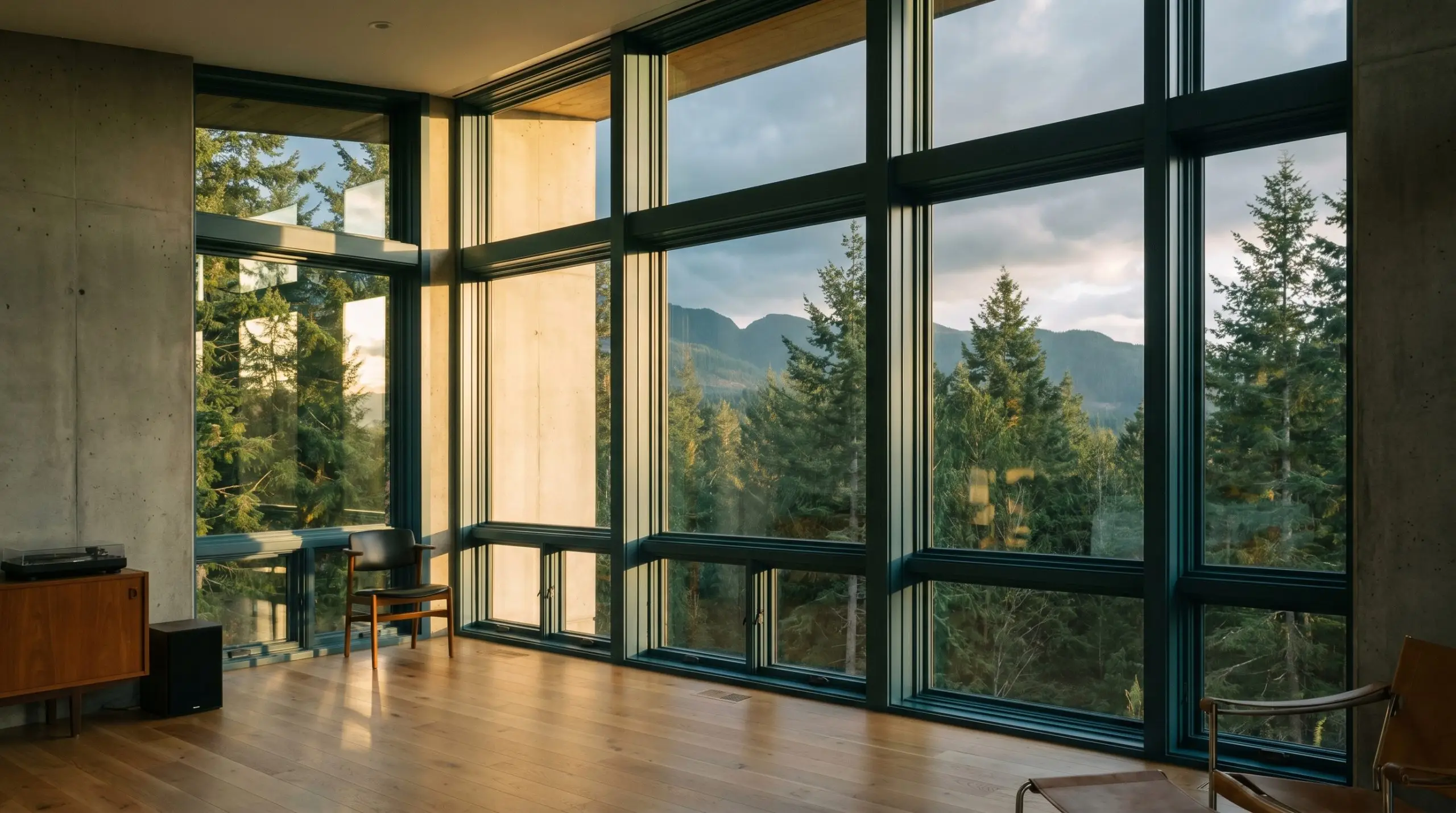
Painting interior window mullions and sashes in this deep slate frames the evergreen exterior landscape, blurring the boundary between the moody climate outside and the interior envelope. As the south-facing golden hour hits the glass, the historic teal undertones illuminate, turning a standard window into a highly custom architectural feature. It creates a seamless visual bridge that honors the natural surroundings.
The Botanist’s Apothecary
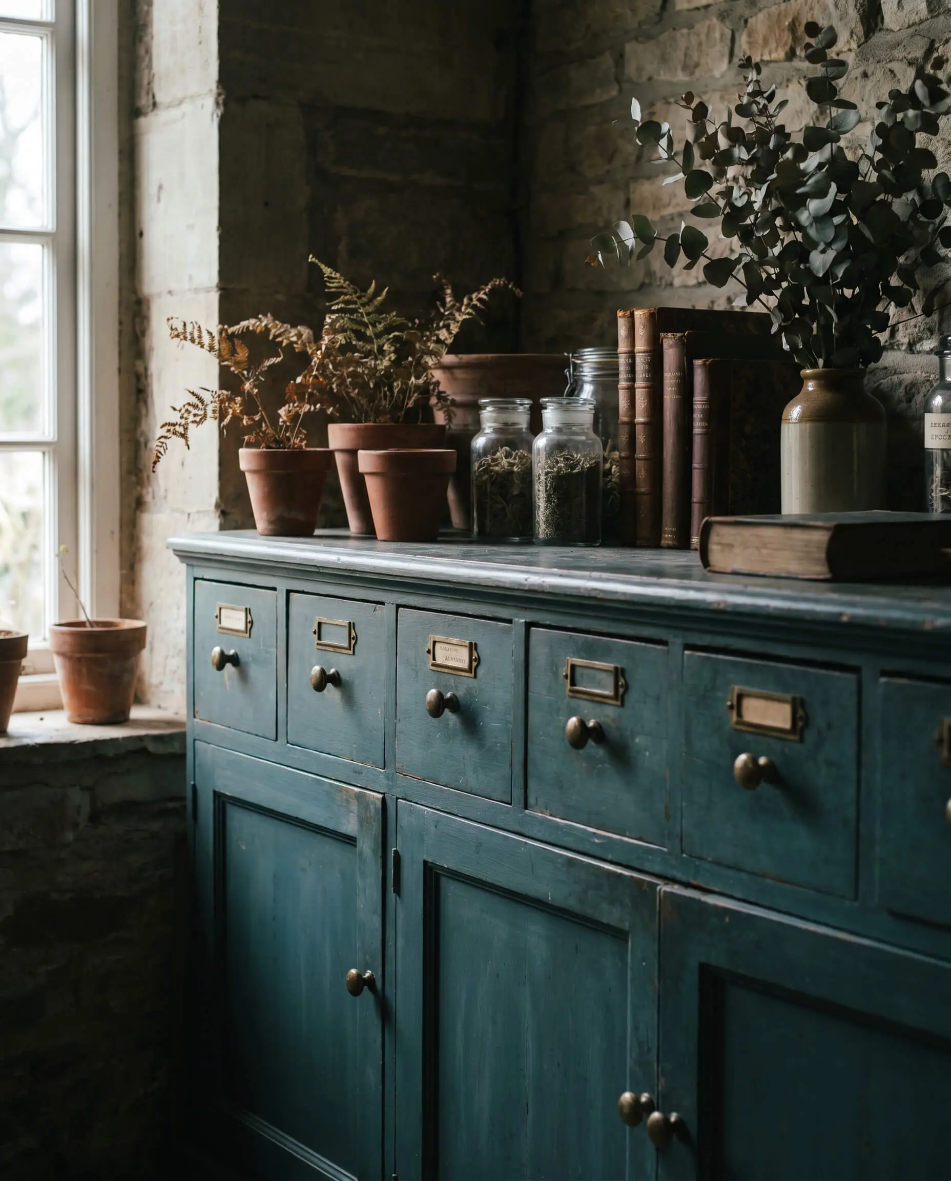
Applying this shade to a salvaged, multi-drawer apothecary cabinet grounds the piece, allowing the organic green undertones to harmonize effortlessly with dried botanicals, terracotta pots, and raw brass label holders. The dark, chalky finish of the paint transforms a heavy, imposing silhouette into a grounded, intentional anchor for a Dark Academia-inspired study. It feels like a piece of history preserved in shadow.
The High-Gloss Butler’s Pantry
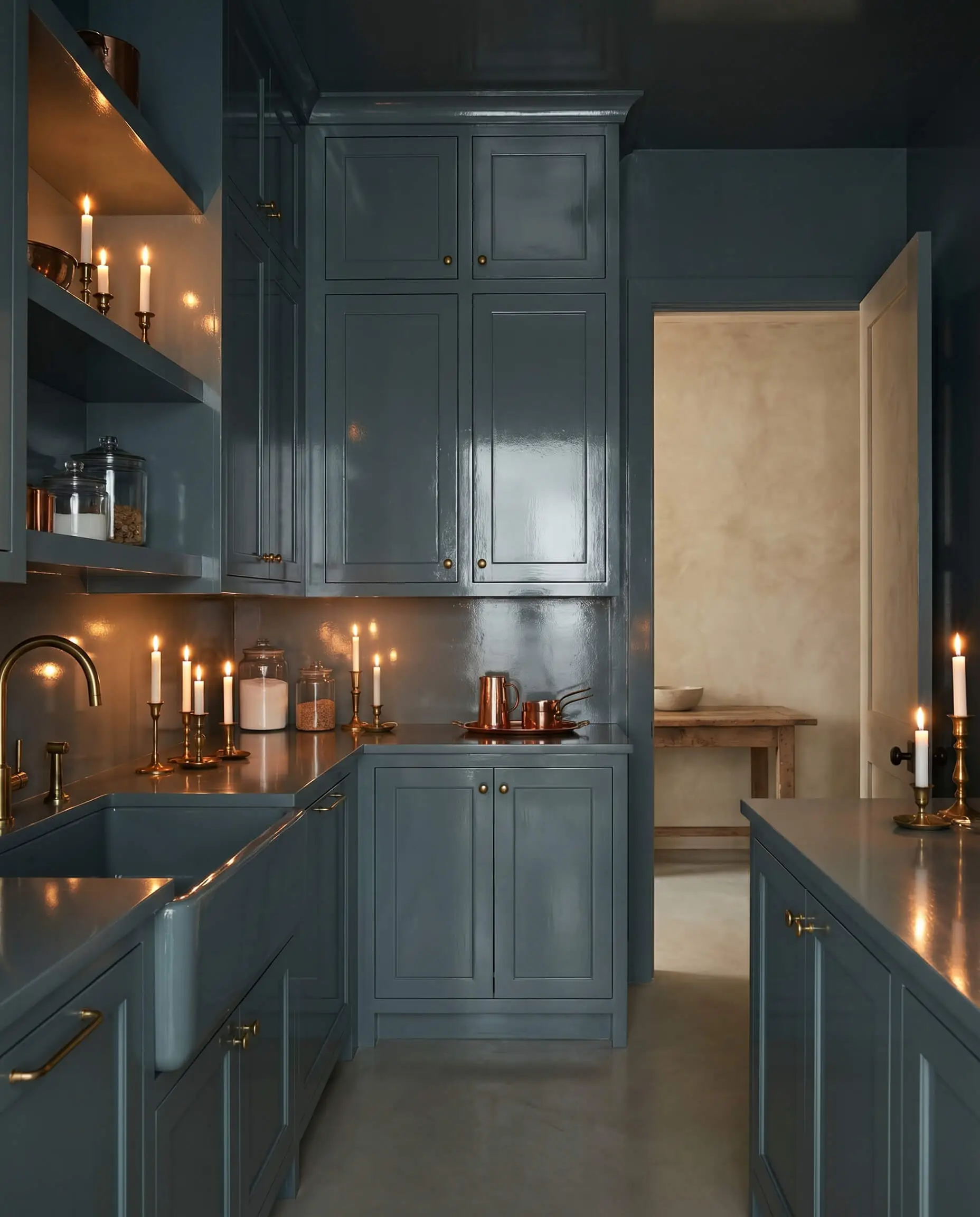
Drenching a windowless utilitarian space in a full-gloss finish of this hue creates an immediate jewel-box effect. The highly reflective lacquer bounces ambient candlelight around the tight quarters, contrasting sharply with the dry, matte plaster of the adjacent rooms. This sudden shift in texture and depth rewards the maximalist entertainer with a surprising, immersive transition space.
The Sensory Cocoon
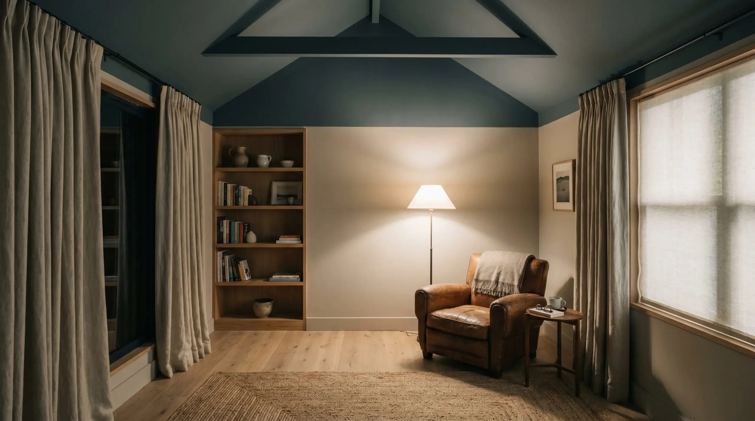
Dropping the ceiling height visually by painting the macro interior plane in this dark teal provides a grounding, low-stimulation canopy. In a bedroom or dedicated reading nook, this ceiling application reduces visual noise and creates a quiet, grounding pause for anyone seeking deep rest. The light absorption overhead mimics the feeling of a protective, shadowed tree canopy.
Relational Boundaries & Material Interplay
The sheer density of this historic teal requires deliberate relational boundaries to keep it from feeling overwhelming. It thrives when placed next to crisp architectural lines or highly textured organic materials that can stand up to its visual gravity.
Tailored Trim & Baseboards
Hardware, Wood & Material Pairings
The Secondary Palette
Designer Mood Boards
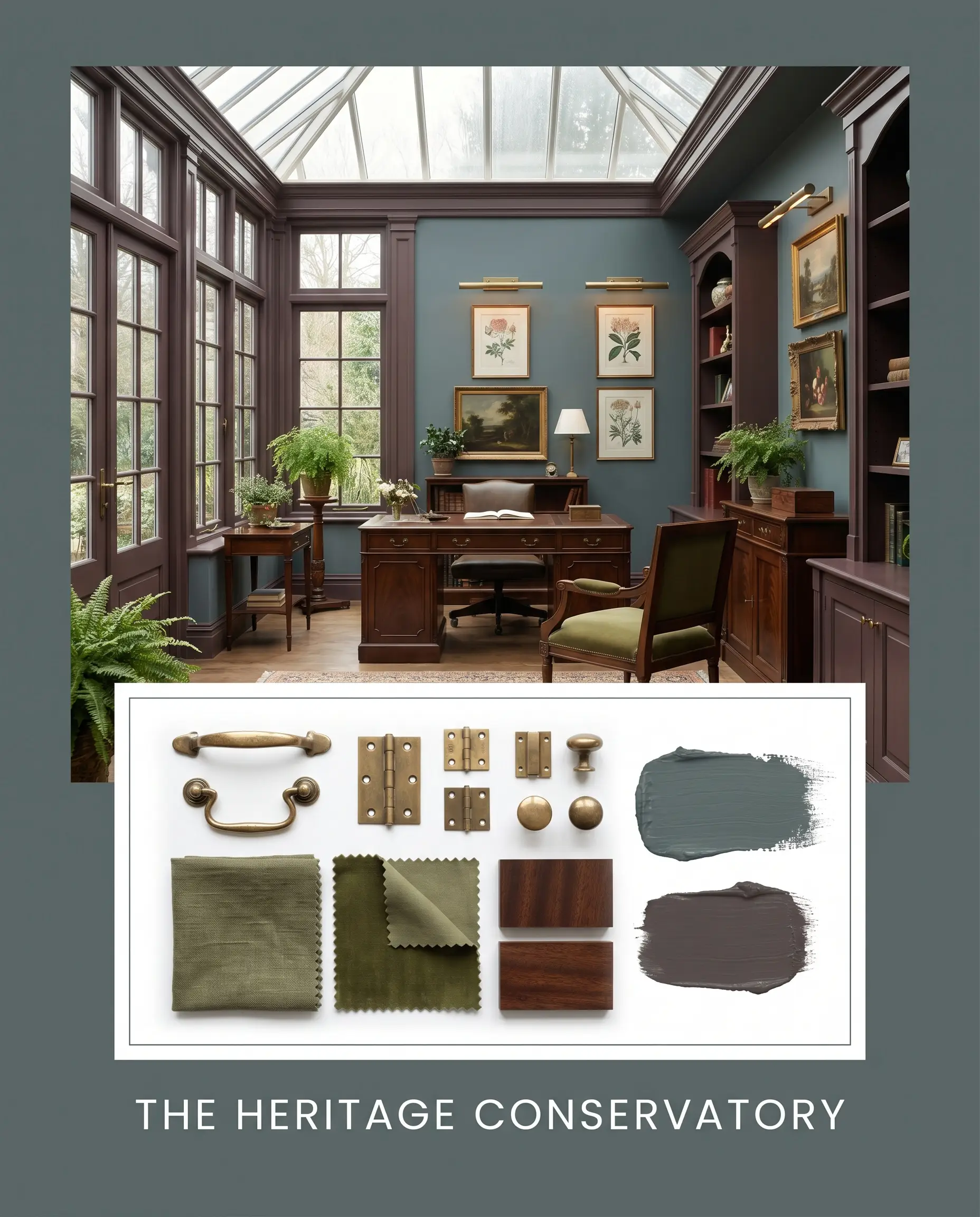
The Heritage Conservatory This palette leans heavily into the historic, moody roots of the paint. By pairing the dark slate walls with the bruised plum of Vintage Wine on the trim, you create an enveloping, shadowed environment. Ground the room with unlacquered brass picture lights, heavily slubbed olive textiles, and dark, close-grained mahogany furniture for a deeply curated, collected energy.
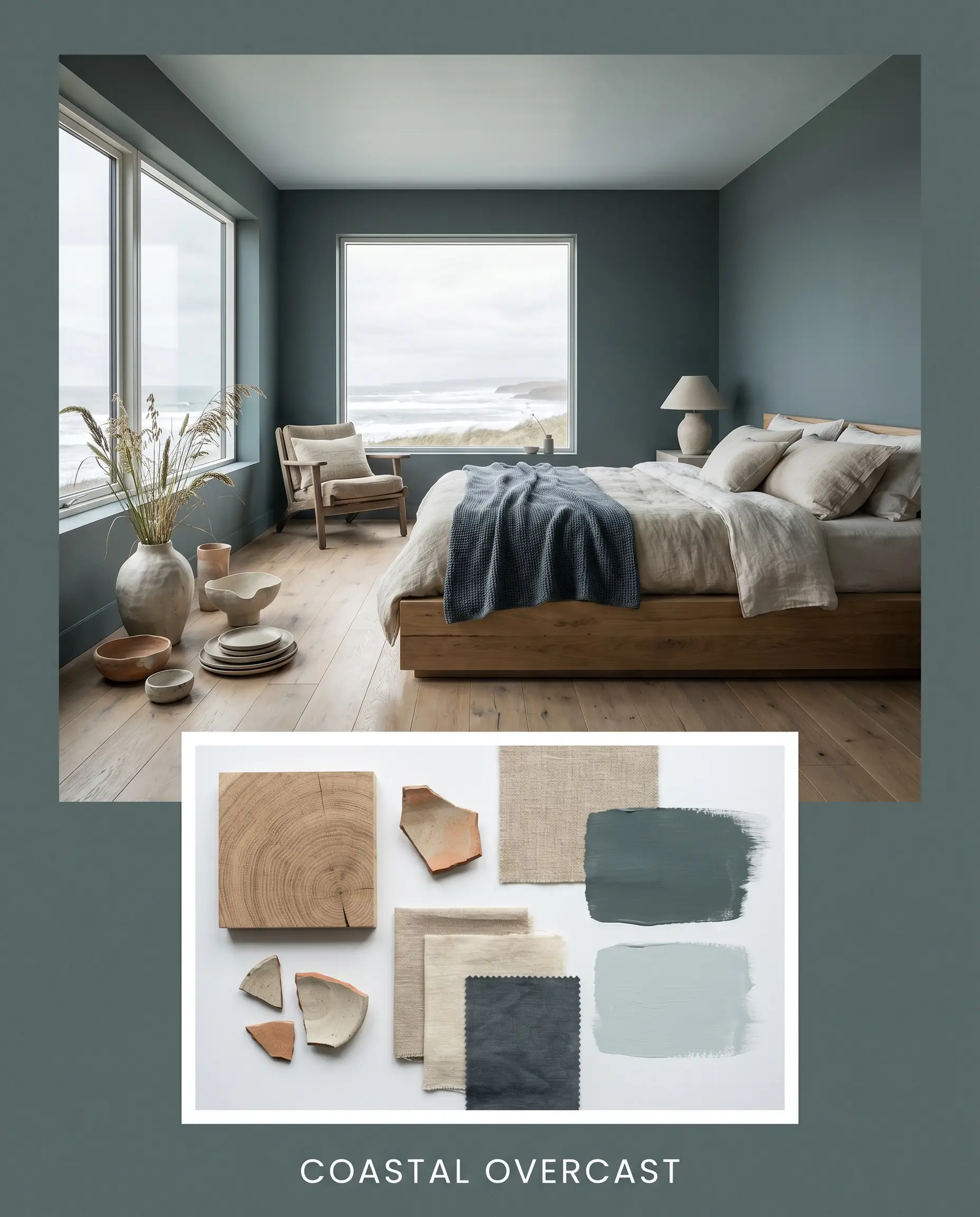
Coastal Overcast For a softer, more atmospheric approach, balance the heavy teal with the airy, silvery tones of Light Blue on the ceiling. Introduce wide-plank, wire-brushed white oak flooring and raw, unglazed ceramics to keep the textures matte and natural. This combination mimics the exact feeling of a stormy coastline, feeling both dramatic and incredibly serene.
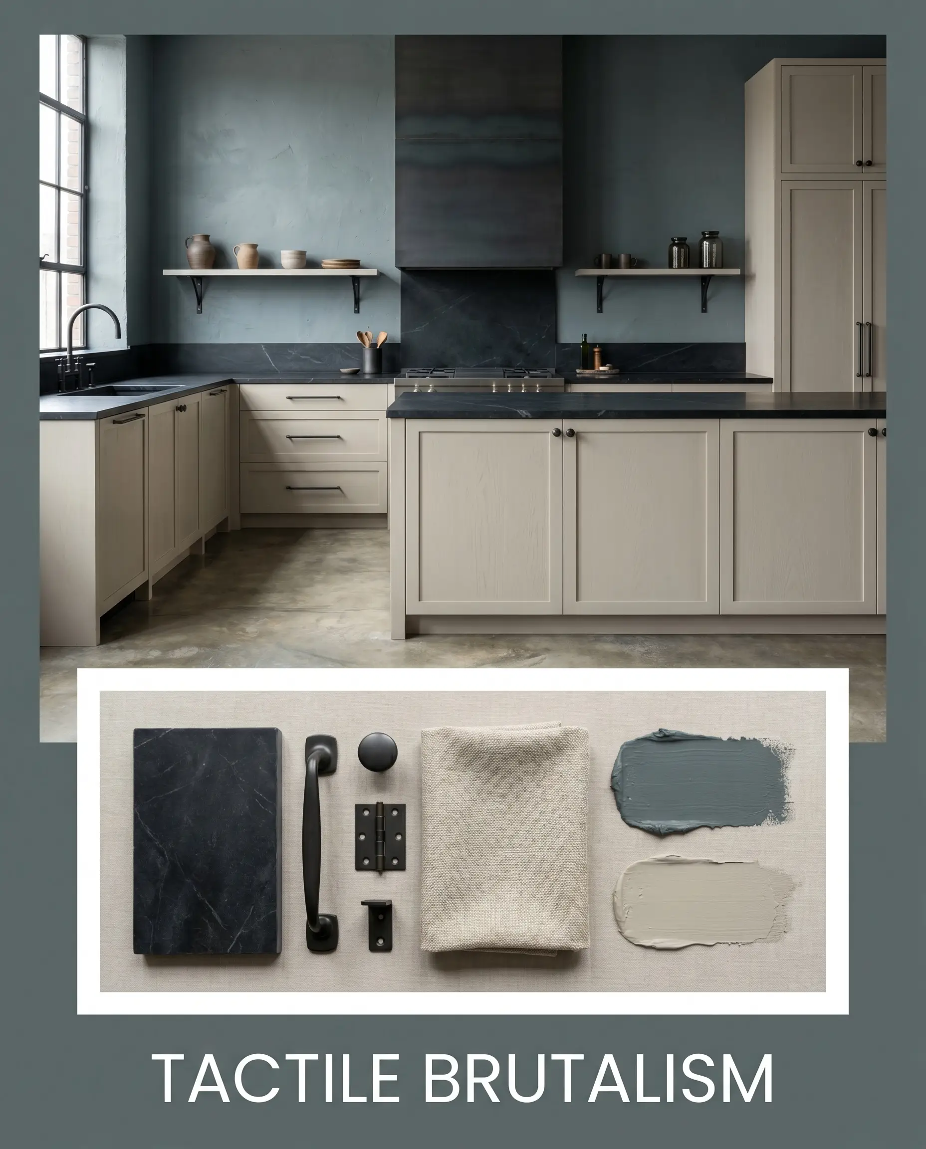
Tactile Brutalism This concept focuses entirely on raw, uncompromising textures. Pair the chalky Dead Flat finish of the walls with thick, honed black soapstone countertops and the soft, putty-like warmth of Drop Cloth on the surrounding millwork. Keep the styling minimal, relying on the physical weight of the materials—like blackened steel hardware and structural linen drapery—to carry the design.
Head-to-Head Paint Comparisons
Choosing between deeply saturated hues often comes down to the specific environmental exposure of your property. If your space lacks the right natural light, you might need to pivot to a shade with a slightly different foundational binder to achieve your desired outcome.
Farrow & Ball Inchyra Blue vs. Farrow & Ball Hague Blue No. 30
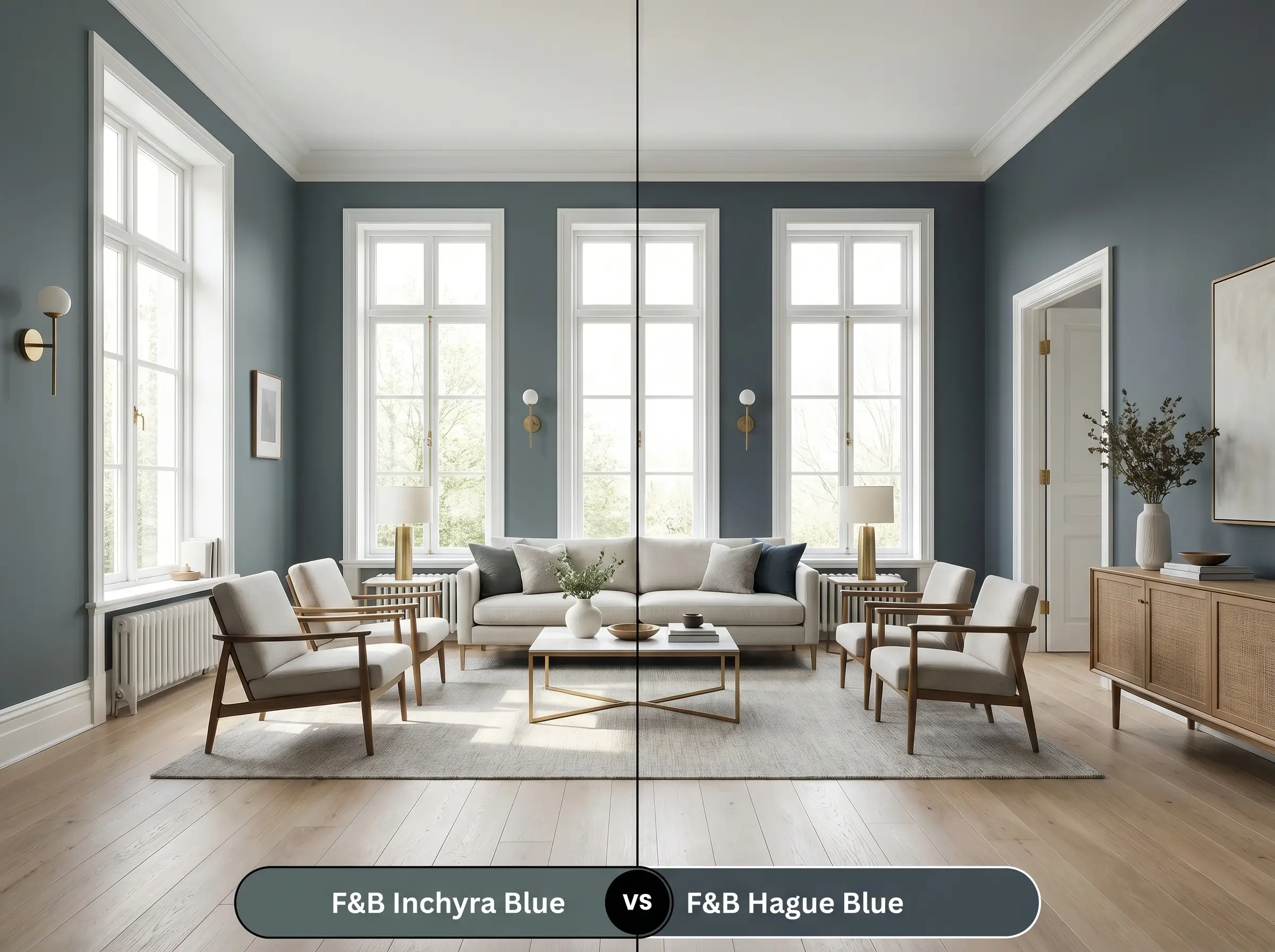
While both are dramatic and dark, Hague Blue is a much truer, deeper navy with a distinct green undertone that reads far more saturated on the wall. Inchyra Blue has a significantly heavier charcoal and slate base, making it feel more muted, aged, and earthy. If your room gets flooded with bright sunlight, Hague Blue will turn into a brilliant sapphire, whereas No. 289 will maintain its stormy, grey-green composure.
Farrow & Ball Inchyra Blue vs. Benjamin Moore Knoxville Gray HC-160
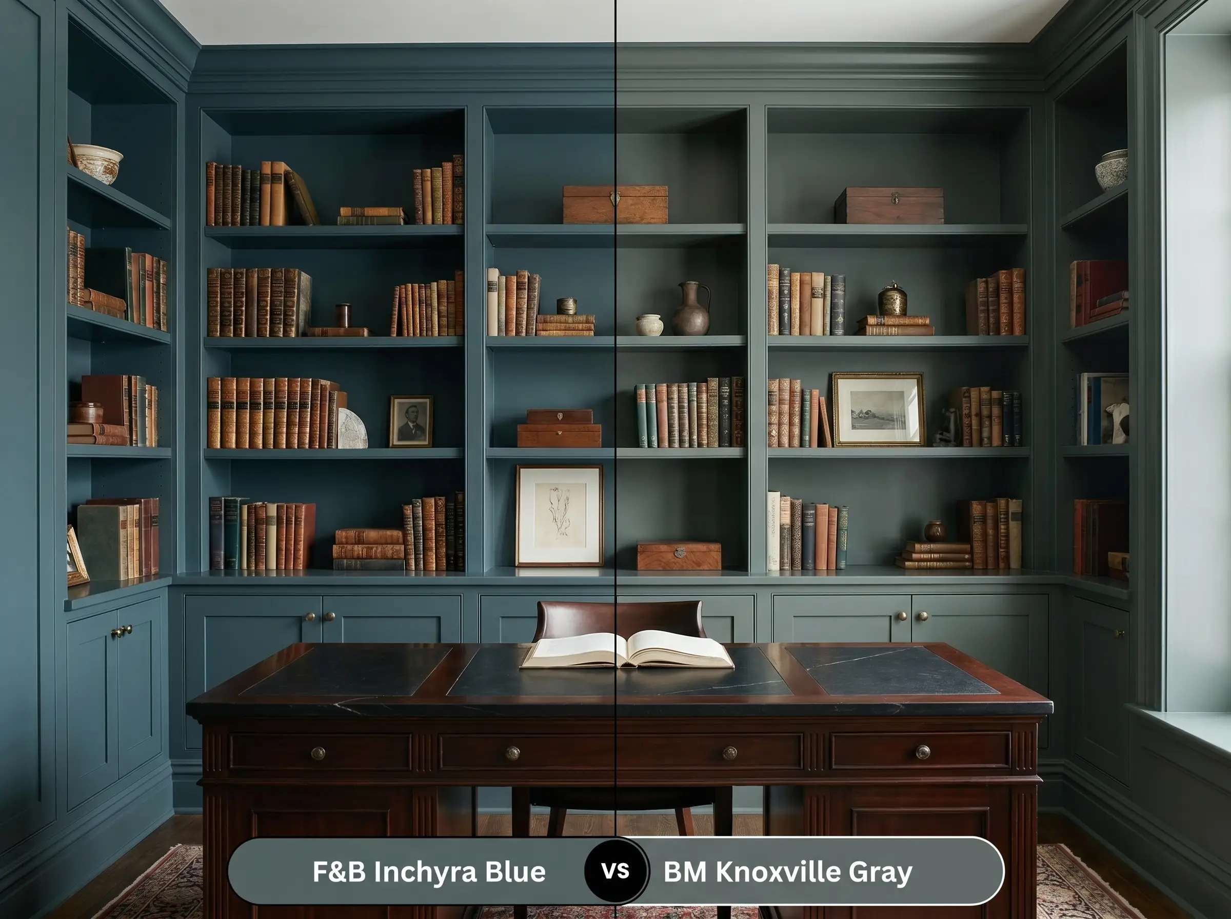
Knoxville Gray is an excellent alternative if you want to lean harder into the green-grey spectrum without as much blue influence. It operates beautifully in historic homes but lacks the shape-shifting, chameleon-like quality of the Farrow & Ball pigment. If you want a static, reliable grey-green, choose Knoxville Gray; if you want a color that actively changes with the weather, stick with the former.
Farrow & Ball Inchyra Blue vs. Sherwin-Williams Riverway SW 6222
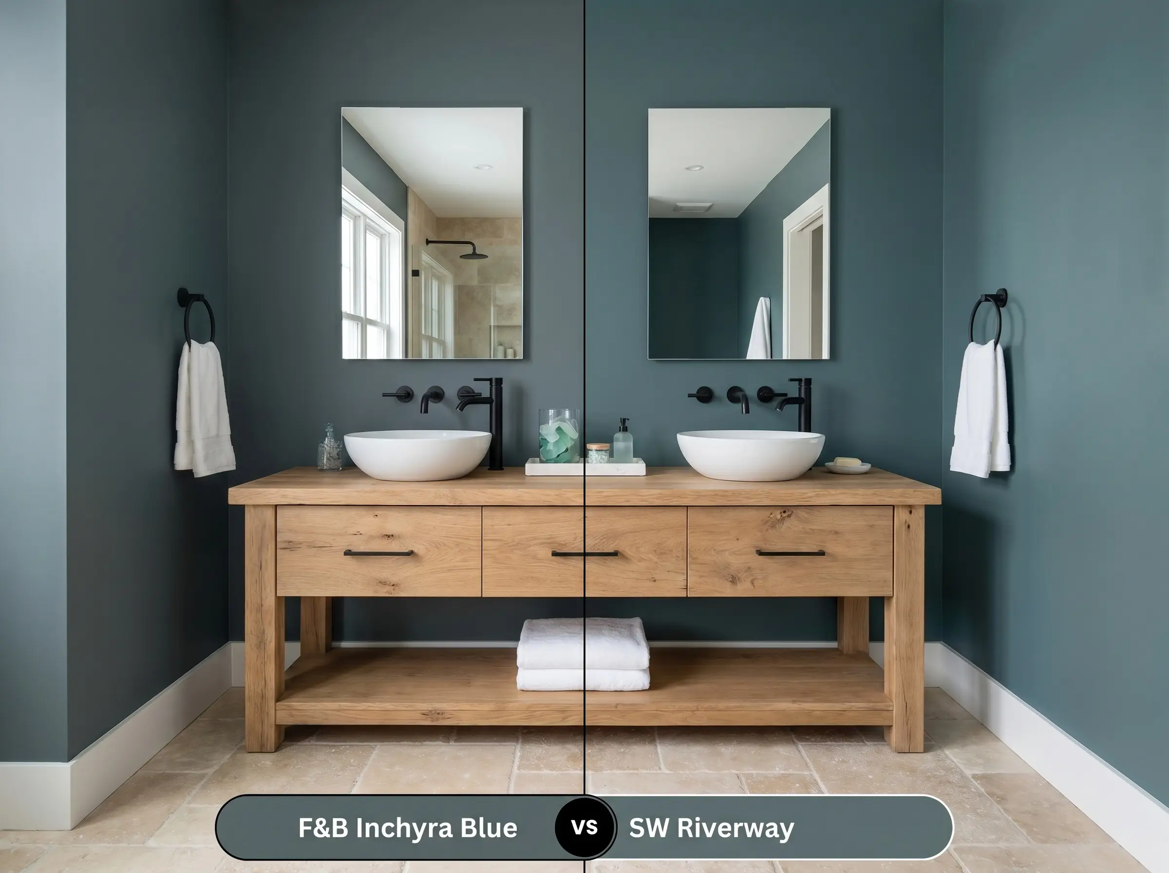
Riverway shares a similar LRV and blue-green intent, but it presents with a much clearer, more aquatic teal presence. It lacks the heavy, muddy charcoal binder that gives the Farrow & Ball shade its signature moodiness. Riverway will feel a bit more modern and crisp, making it better suited for coastal properties, while the heavy slate base of No. 289 demands a more grounded, architectural setting.
Similar Colors & Brand Equivalents
Sometimes a space requires just a fractional shift in saturation or a slightly different reflectance to perfectly balance the existing architecture.
Farrow & Ball Alternatives
Cross-Brand Matches
Structural Composition & Application
Moving from curatorial planning to physical execution requires strict attention to the paint’s structural composition. Dark, highly pigmented finishes demand flawless surface preparation to prevent the color from reading flat, streaky, or uneven.
The Dynamic Sheen Guide
Primer Strategy
You cannot apply a color this dense over standard white drywall or light builder-grade paint without a tinted foundation. You must use Farrow & Ball’s Dark Tones Primer & Undercoat (or a high-quality, deep grey tinted primer) to establish a heavy base layer. Failing to do so will result in a translucent, uneven finish that requires four coats to achieve true opacity.
Coverage & Success Tips
Because of the heavy charcoal and slate pigments, this color is highly susceptible to “flashing”—visible, uneven roller marks that catch the light at different angles. To avoid this, you must maintain a wet edge while rolling and avoid pressing too hard on the final passes. Always plan for two full, generous coats over the dark primer to ensure the kelp-green undertones fully develop and lock into place.
Frequently Asked Questions
Direct southern sunlight will absolutely pull the hidden kelp-green cast to the surface, making it read more like a historic teal than a dark grey. If you want it to remain strictly slate-blue outside, you may need to choose a color with a cooler, truer navy foundation.
The ultra-matte Dead Flat finish absorbs ambient light, making the color appear deeper, chalkier, and slightly more muted. Estate Eggshell reflects a small amount of light, which actually highlights the shifting blue and green nuances, making the color feel a bit more active and vibrant.
Yes, but it requires highly intentional lighting. By painting a low basement ceiling in this dark, light-absorbing shade, you actually blur the hard corners of the room, creating an infinite, shadow-like canopy that can make the space feel intentionally cozy rather than cramped.
To modernize the heavy, historic feel of the paint, pair it with living finishes like raw, unlacquered brass or blackened steel. These tactile, unrefined metals provide a slightly industrial, rugged edge that cuts through the traditional heritage vibe of the teal.
The hidden green undertone actually works beautifully as a complementary color to the red and orange tones found in traditional brick. The heavy charcoal binder tempers the contrast, ensuring the pairing feels grounded and historic rather than loud or jarring.
Final Verdict
Farrow & Ball Inchyra Blue No. 289 is the ultimate architectural tool for homeowners seeking to create deeply intentional, enveloping spaces that shift in mood throughout the day. It is perfectly suited for custom kitchen cabinetry, immersive dining rooms, and tailored studies where the goal is to anchor the architecture and lower the visual heart rate of the home. Its greatest strength is its chameleon-like ability to bridge the gap between a stormy slate-grey and a rich, historic teal, rewarding those who invest in layered lighting and highly tactile material pairings.
However, this dense pigment will struggle immensely if forced into the wrong environment. You must avoid pairing this color with highly polished, synthetic finishes like bright chrome hardware, glossy white subway tile, or cool-toned luxury vinyl plank flooring, as these sterile materials will instantly make the earthy, aged teal look muddy and out of place. Furthermore, if you apply this shade in a room entirely devoid of natural light and rely solely on stark, cool LED overheads, the color will flatten out, losing all of its beautiful green nuances and leaving you with a heavy, lifeless grey box. Treat this paint as a living material, surround it with raw, organic textures, and it will completely transform the energy of your home.