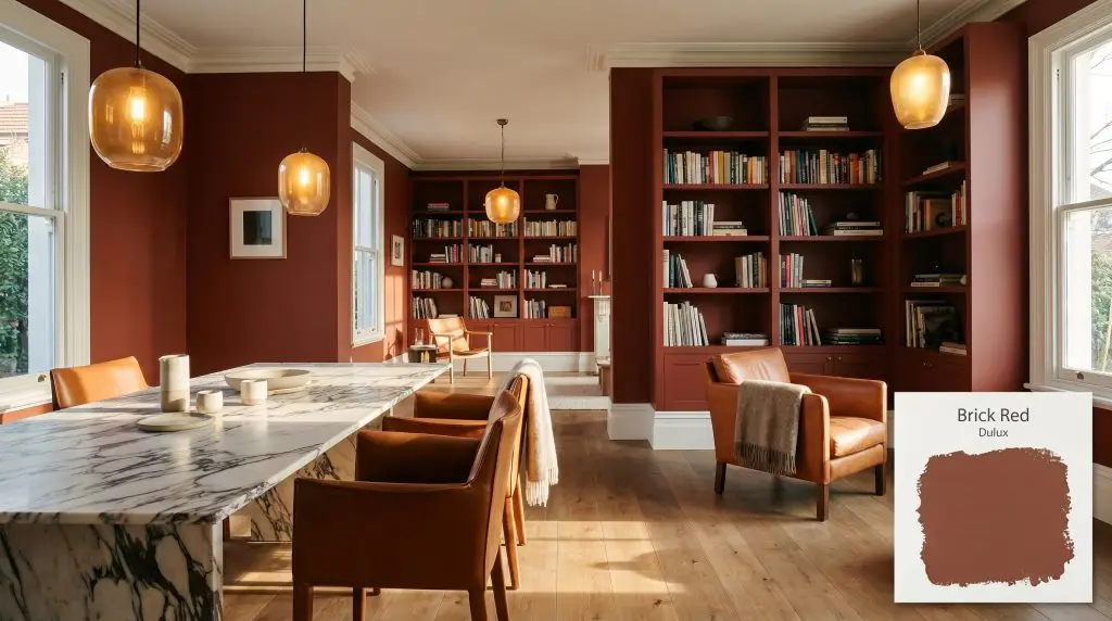
Brick Red
DuluxDulux Brick Red is a deep, earthy terracotta red with warm brown and subtle orange undertones. With an LRV of 10, it is a dark, grounding hue that brings rich architectural depth to both interior accent walls and exterior facades.
Paint Technical Profile
| HEX Code | #8B4633 |
| Light Reflectance (LRV) | 10 |
| Use | Interior, Exterior |
| Best Exposures | South, West, East |
| Best For | Accent walls, exterior trim, dining rooms, libraries, cabinetry |
Grounding the Space: Why Dulux Brick Red is the Ultimate Architectural Anchor
When a color possesses a truly earthy chromatic profile, it stops acting like mere paint and begins functioning as a structural material. Dulux Brick Red captures the raw, unrefined essence of fired earth, shifting dramatically as sunlight moves across its surface. We rely on this baked clay hue to anchor flighty, overly bright rooms, bringing a profound sense of permanence and tactile warmth to the modern home.
The Core DNA: Undertones & LRV of Dulux Brick Red
Dulux Brick Red is definitively warm.
To successfully harness this color, you must understand the dense structural layers hiding beneath its surface.
With a Light Reflectance Value (LRV) of 10, this warm architectural finish is highly light-absorbing. It does not bounce illumination around the room to create an airy feeling. Instead, it acts as a substantial, grounding anchor, pulling the visual weight inward to create a profound sense of enclosure and intimacy.
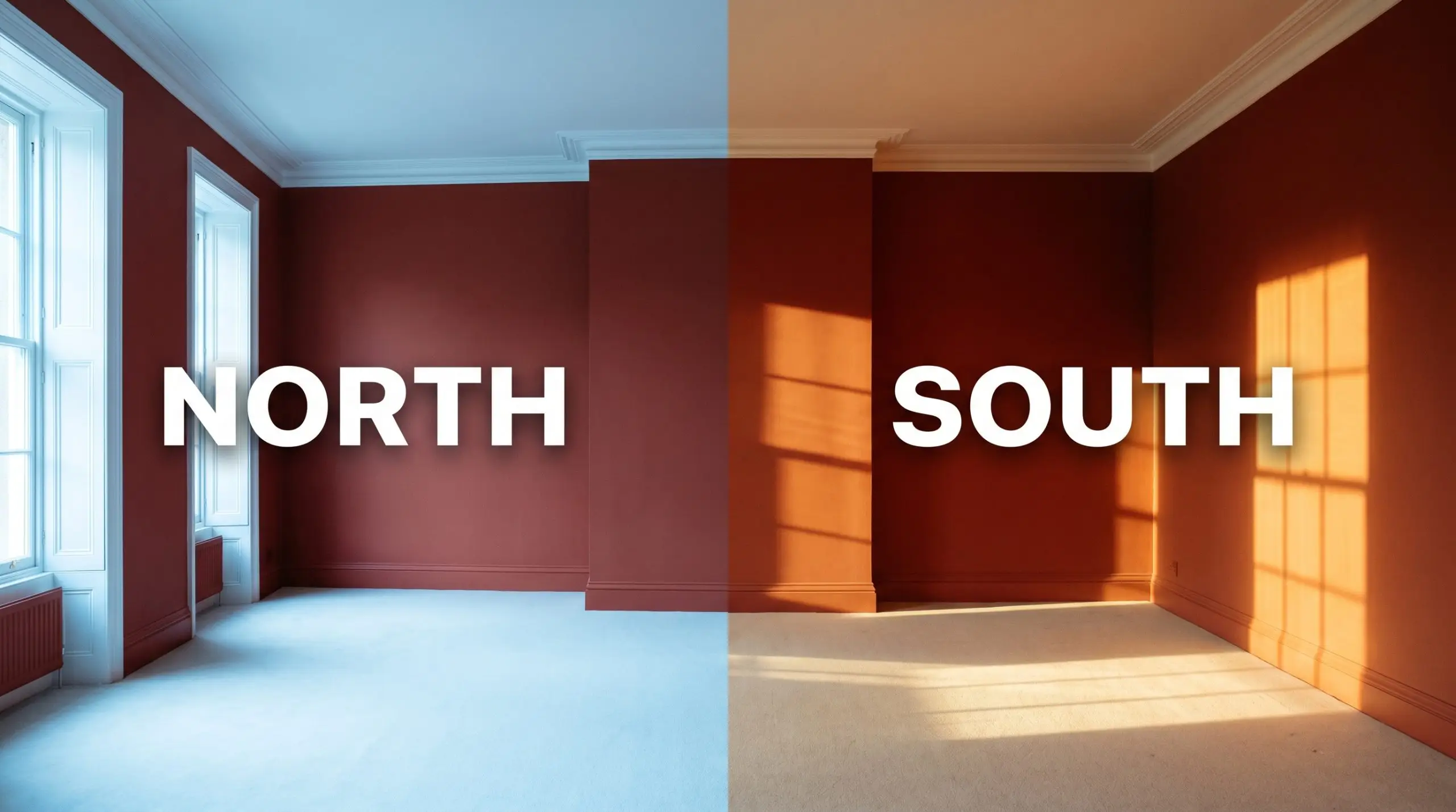
Shaping the Shadows: Lighting Effects & The Chameleon Factor
The greatest risk when using this deep russet shade is placing it in a poorly lit, cool-toned room where it can easily flatten into a muted, lifeless brown.
Because it absorbs so much light, you must be highly intentional about the environmental exposures interacting with your walls. Always test large swatches on multiple walls to track how the shifting sun manipulates its hidden orange flash.
Architectural Placement: Popular Room Applications
This color fundamentally alters the perceived boundaries of a home, pulling walls closer to create highly intentional, intimate atmospheres.
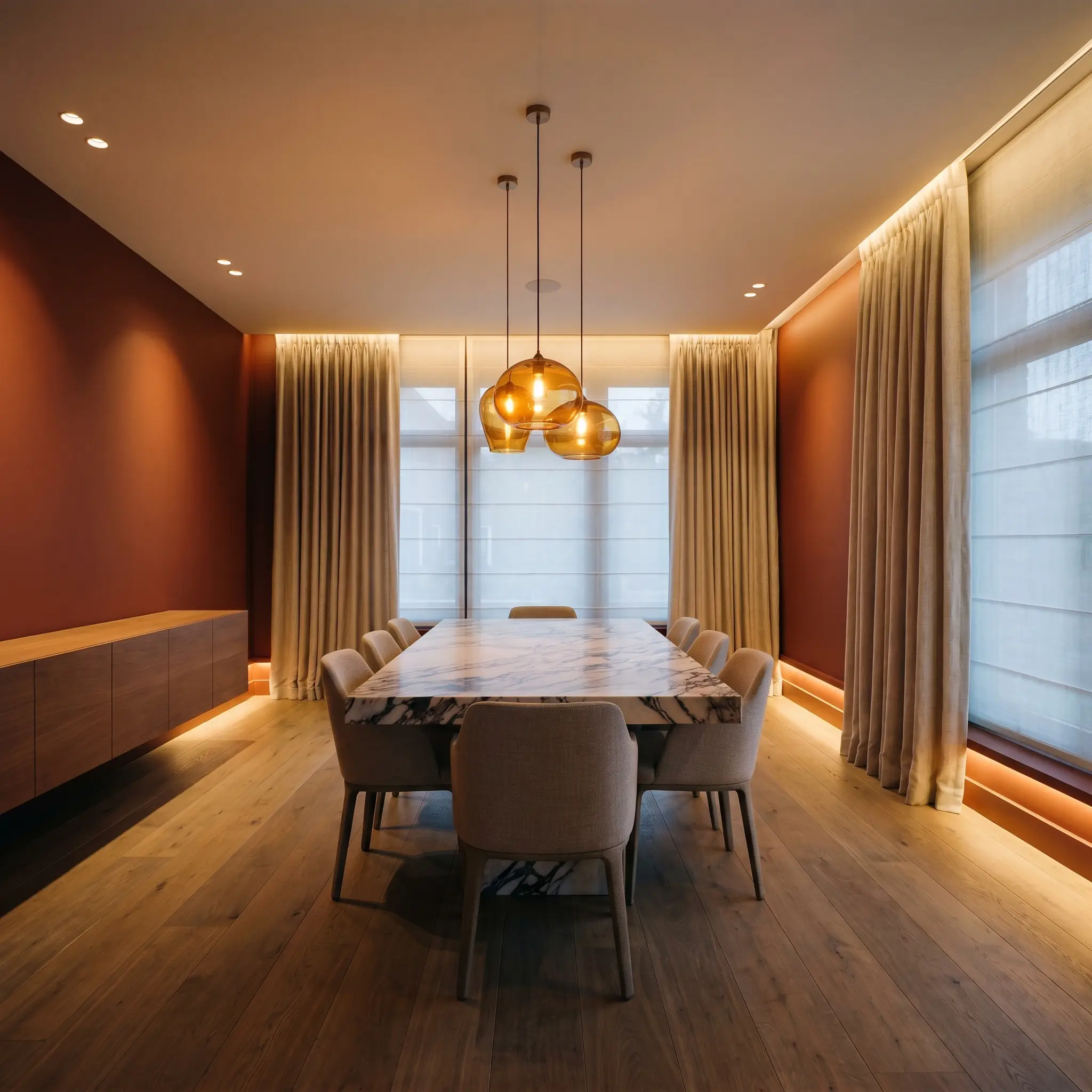
Formal Dining Rooms
In a formal dining space, this baked clay hue creates an immediate sense of evening intimacy. Pair it with soft, low-hanging amber glass pendants and deeply veined marble dining tables to elevate the tactile experience. To prevent the room from feeling overly enclosed, balance the dark walls with light, textural linen drapery and wide-plank, wire-brushed oak flooring.
When using an LRV of 10 in a dining room, rely entirely on wall sconces and candlelight rather than overhead recessed lighting. The lateral light will catch the burnt orange micro-nuance, making the walls appear to glow from within.
Hackrea Design Secret (The Dining Glow)
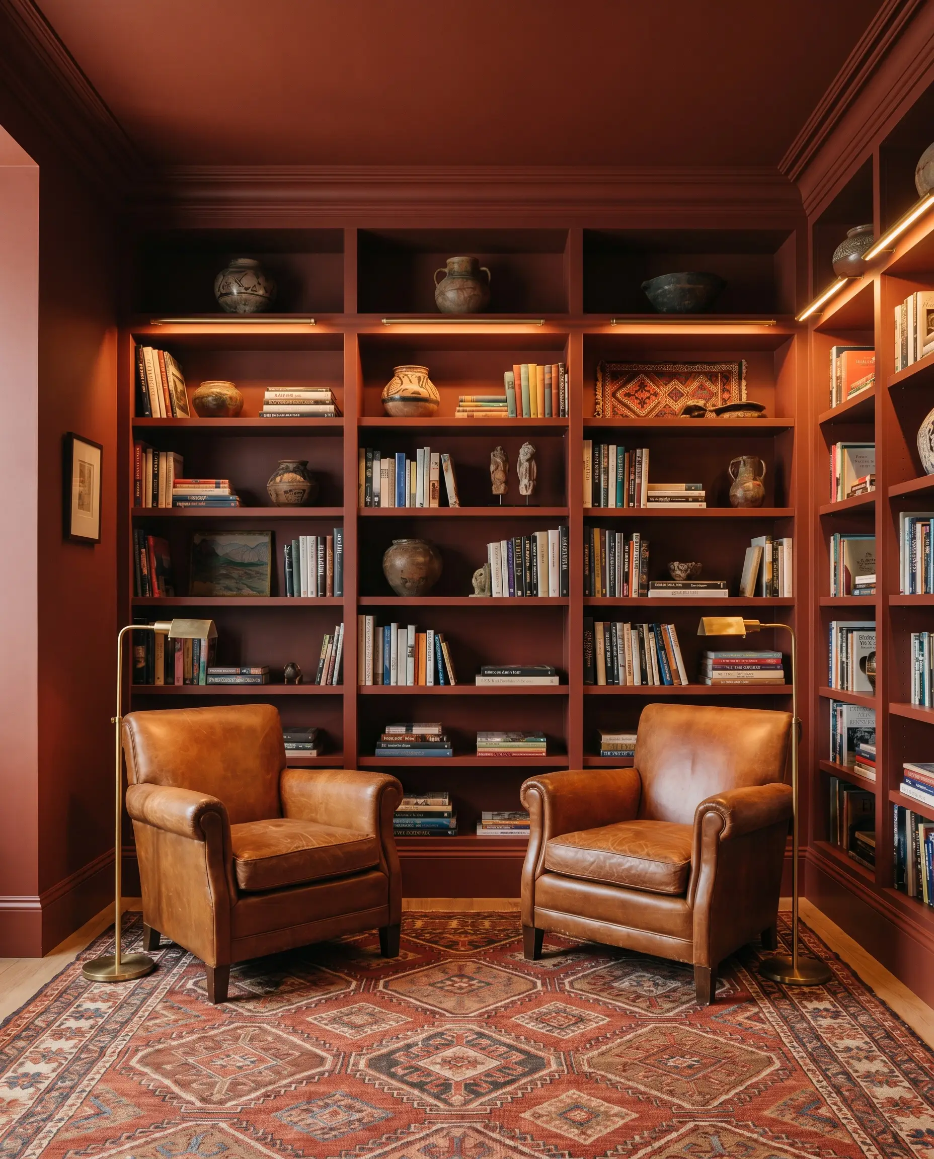
Home Libraries / Studies
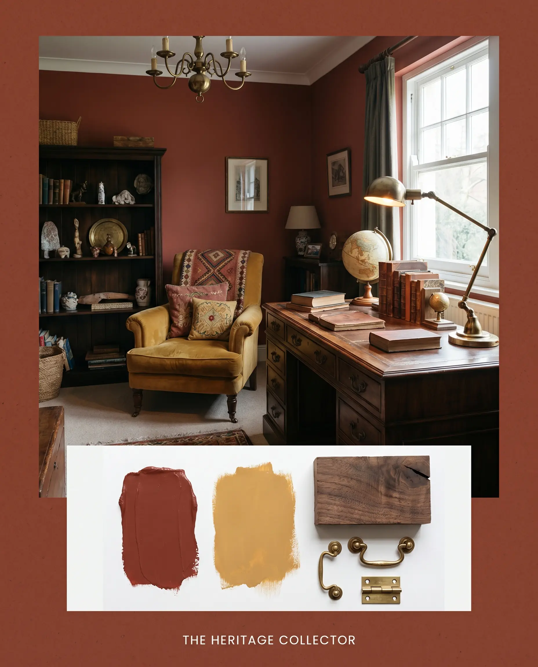
This shade was virtually engineered for quiet, reflective spaces. Wrap the entire room—including the baseboards and crown molding—in this earthy chromatic profile to blur the architectural lines and reduce visual noise. Introduce rich, cognac-toned leather armchairs and unlacquered brass reading lamps to lean into a globally inspired, collected aesthetic.
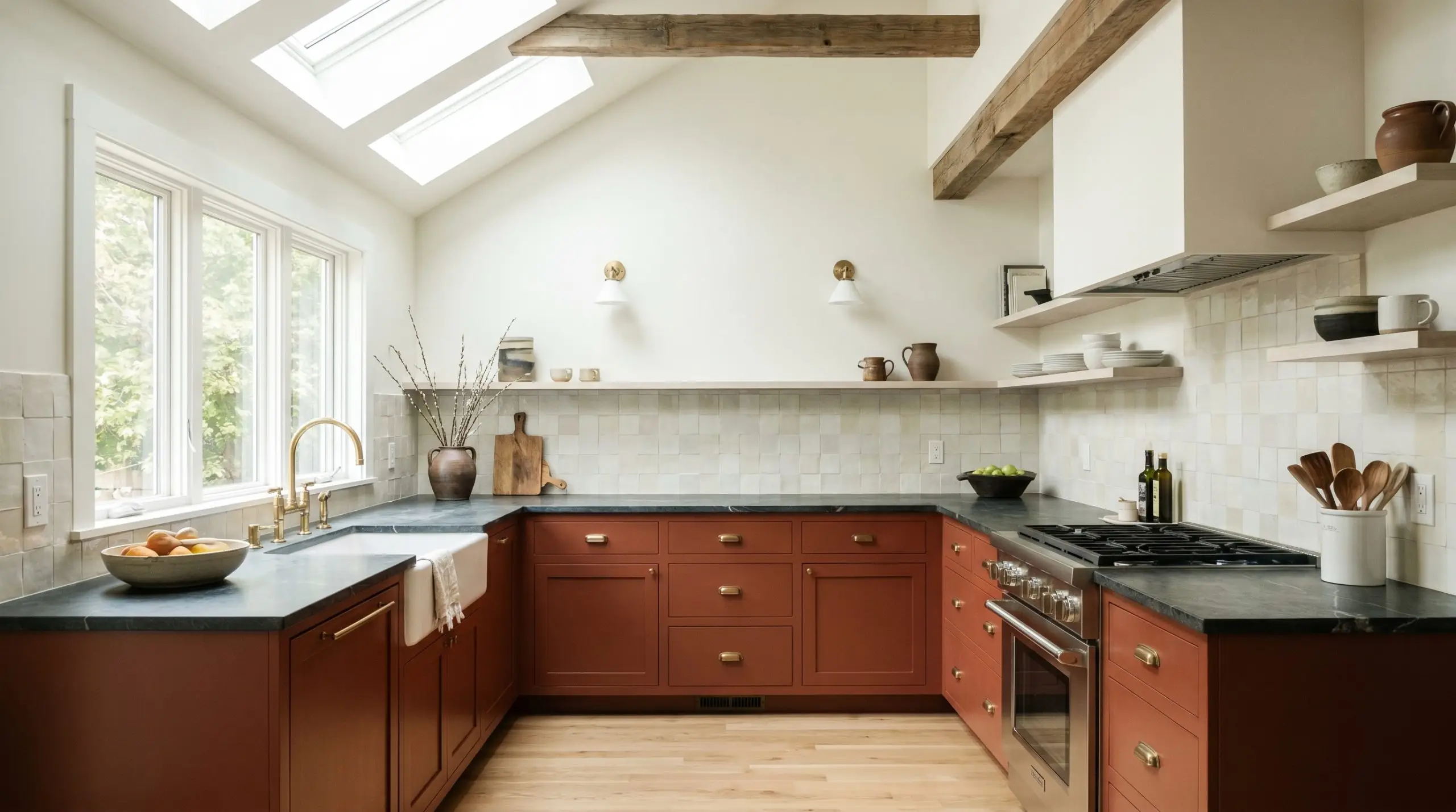
Kitchen Cabinetry (Lower)
Using this color on lower cabinetry grounds a kitchen with immense warmth while allowing the upper half of the room to breathe. It pairs exceptionally well with honed soapstone countertops and handmade zellige tile backsplashes in creamy, varied whites. Keep your upper walls light and bright to ensure the kitchen maintains a fresh, functional energy during daylight hours.
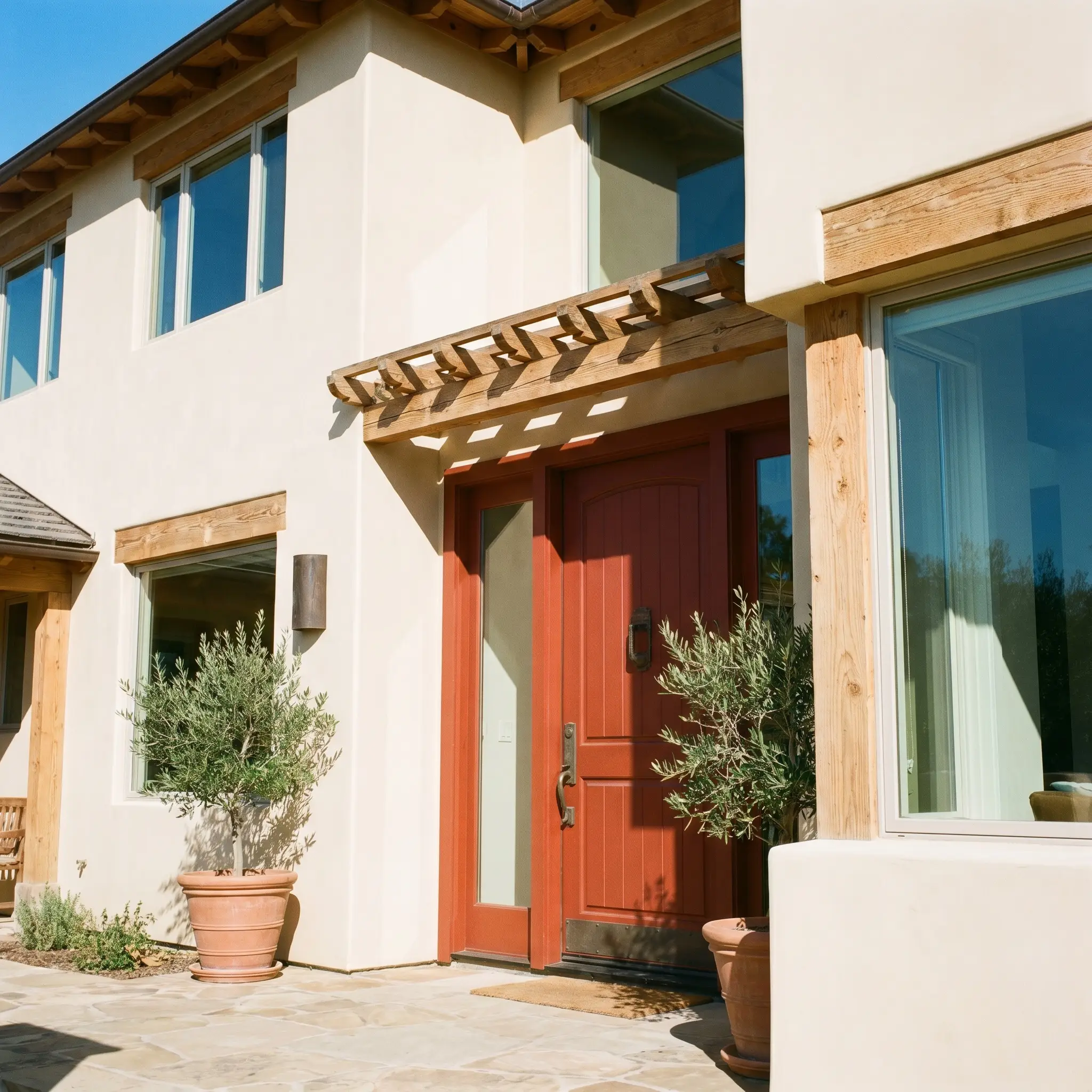
Exterior Front Doors & Trim
On an exterior facade, direct sunlight will wash out a significant portion of this color’s depth, pulling the red forward. It serves as a brilliant, welcoming focal point against creamy stucco or natural cedar siding. Finish the door with substantial, aged bronze hardware to reinforce the heritage feel of the pigment.
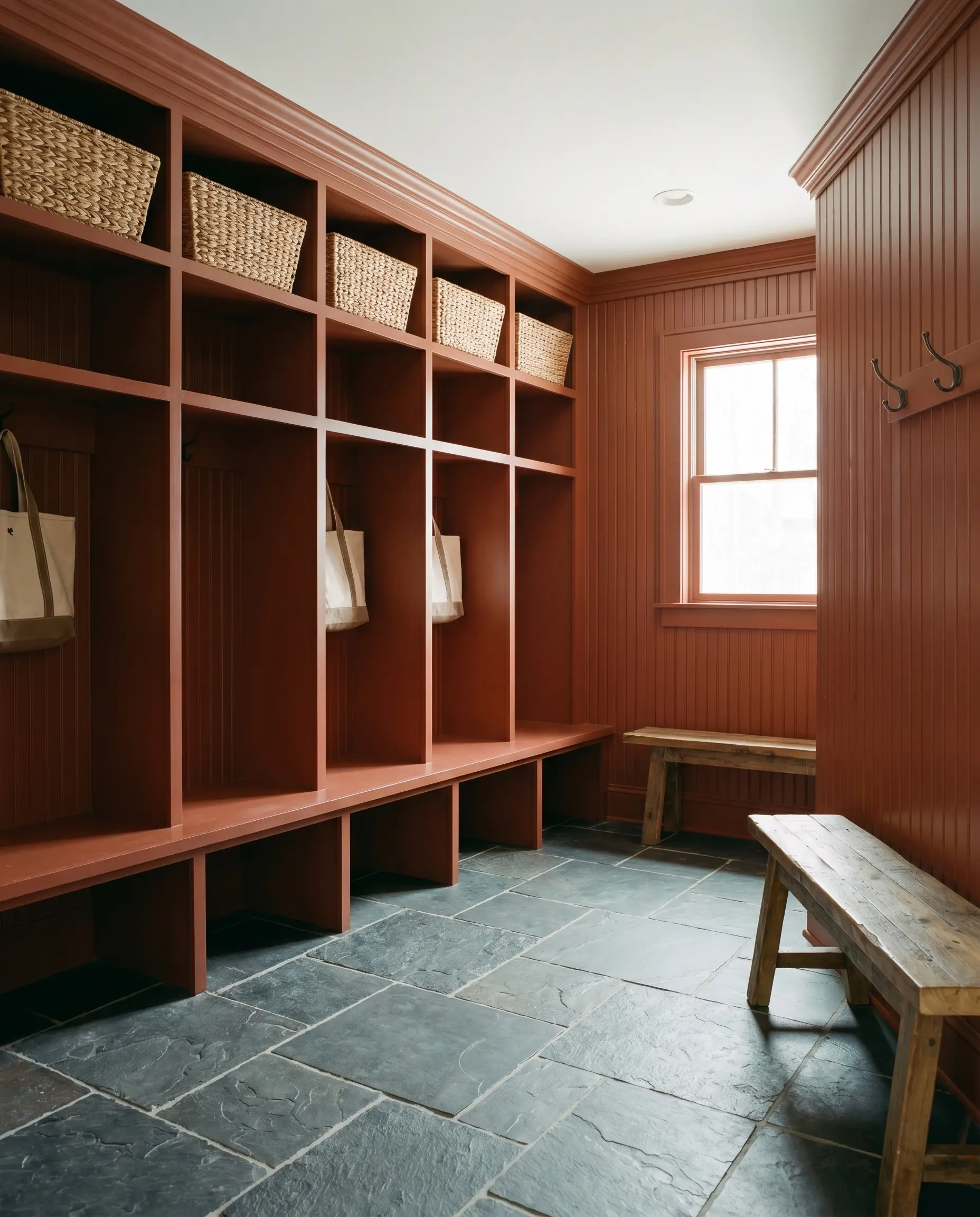
Mudrooms
Transform a purely utilitarian drop zone into a striking architectural moment. The grounding color structure hides everyday scuffs beautifully while providing a warm welcome from the garage or outdoors. Pair it with highly durable, tumbled slate floor tiles and natural woven storage baskets for a seamless, earthy transition into the main house.
Curated Concepts: Creative Ways to Use This Deep Russet Shade
This grounding pigment invites highly intentional, custom architectural moments that redefine how we experience a space.
The Biophilic Frame
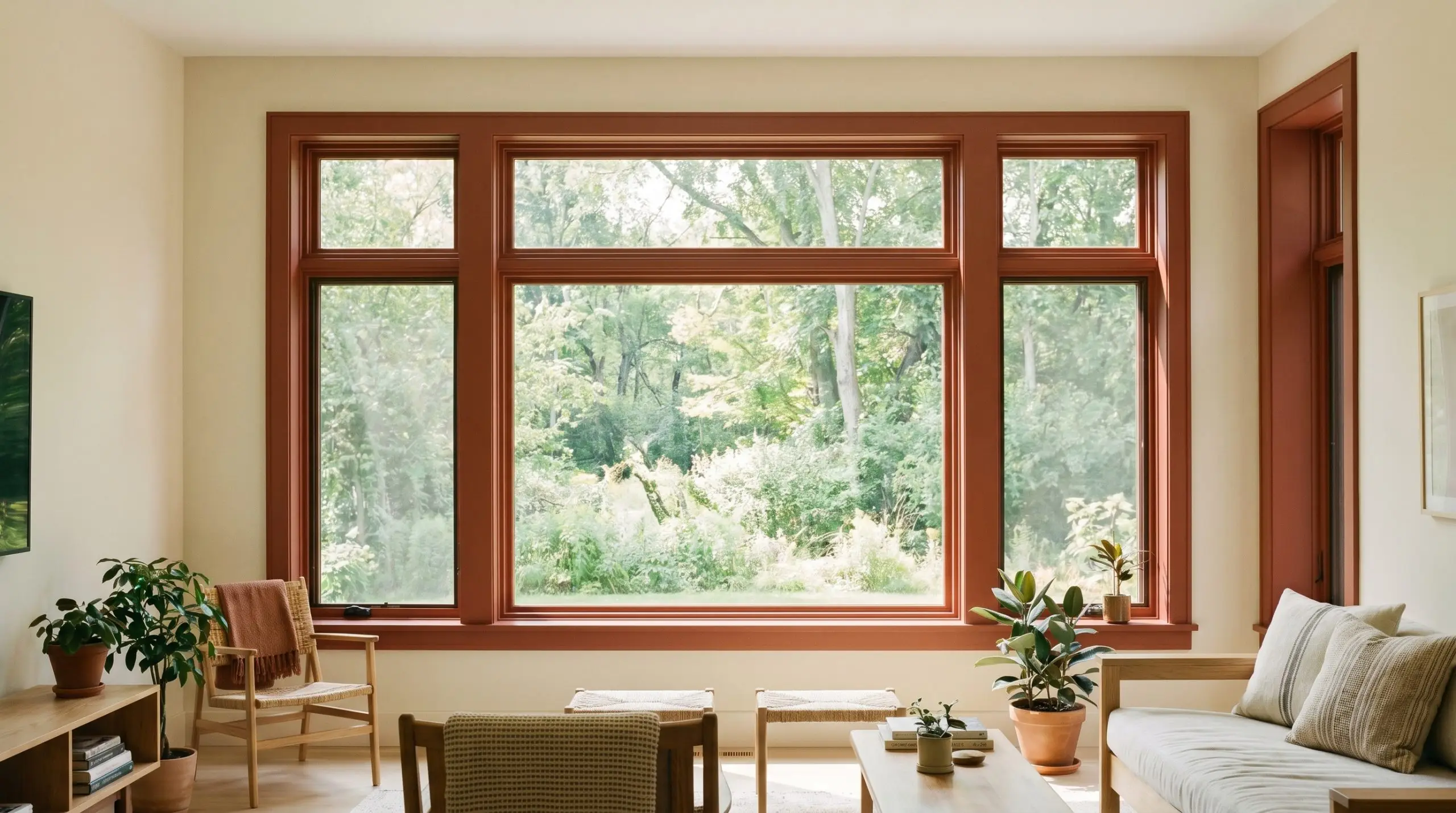
For those seeking a quiet, grounding pause, applying this shade to interior window mullions creates a brilliant transition between the interior and the outdoors. The deep russet shade acts as a natural, earthy boundary that beautifully frames a lush green landscape. This tactile, biophilic approach turns standard windows into living artwork, blurring the line between the built environment and nature.
The Tactile Soak
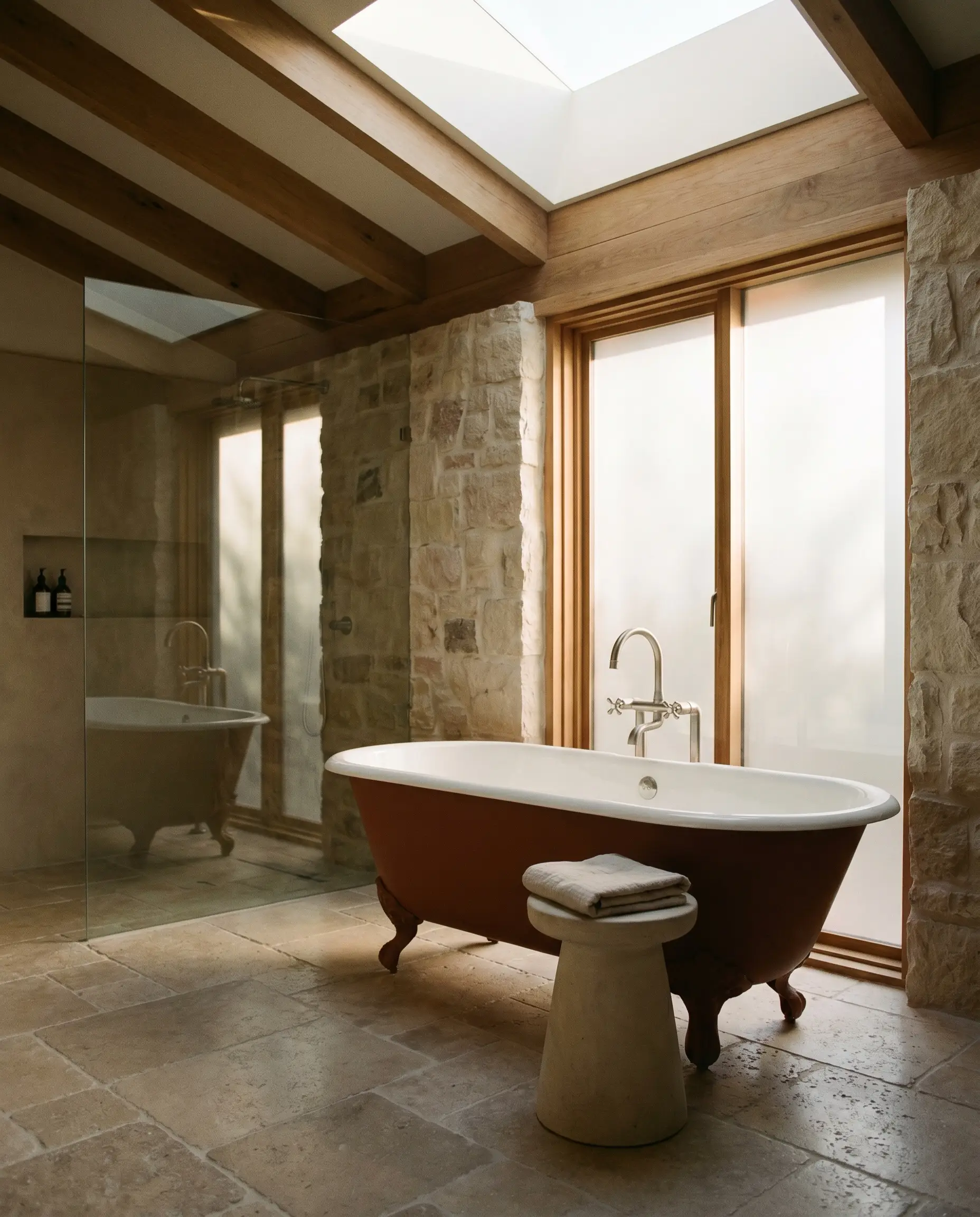
Transform a standard bathroom into a restorative retreat by painting the exterior of a freestanding clawfoot tub in this warm architectural finish. The baked clay hue collides perfectly with raw, tactile materials like tumbled limestone floors and unglazed ceramic stools. This boutique hotelier approach creates a rich, sensory soaking experience anchored by deep, enveloping warmth.
The Hidden Threshold
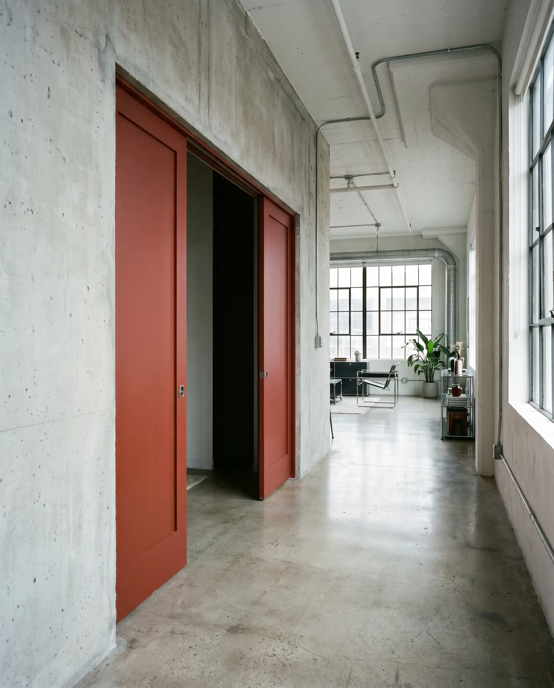
Create an unexpected architectural surprise by coating standard pocket doors in this vibrant, earthy pigment. For the urban loft dweller, sliding these doors open reveals a sudden, fiery flash of color against otherwise neutral, industrial walls. It is a brilliant way to inject personality and warmth into a functional transition without committing to an entire room of color.
The Cinematic Void
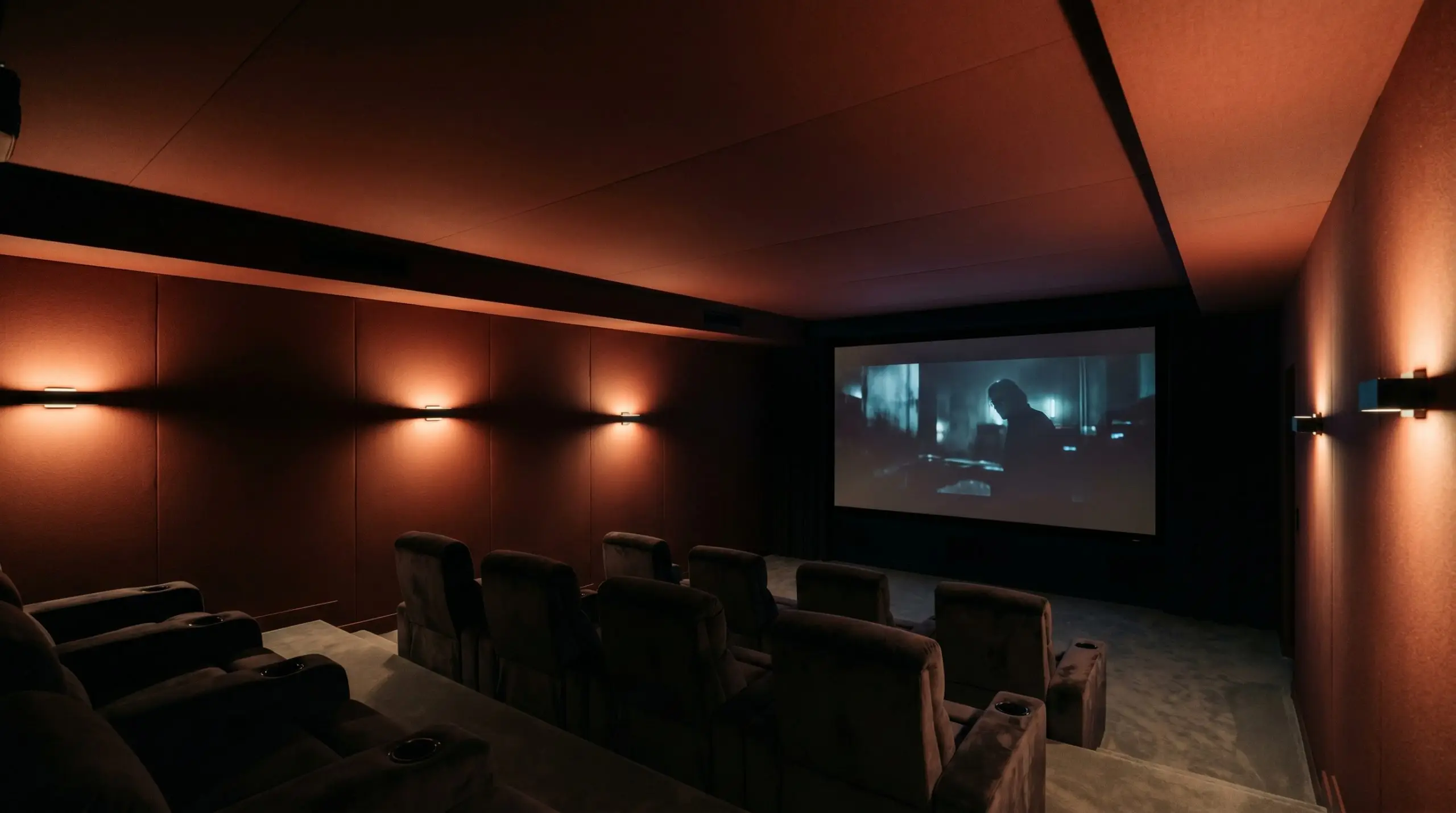
In a dedicated home theater, the ceiling is often the most neglected surface. By wrapping the ceiling in this specific LRV 10 shade, the cinephile achieves exceptional light absorption, eliminating screen glare entirely. The color structure recedes into the shadows when the lights go down, yet provides a rich, enveloping warmth when the room is illuminated.
Relational Harmony: Coordinating Colors & Best Pairings
This baked clay hue requires intentional companions; it thrives when placed next to materials and colors that share its unrefined, earthy origins.
Trim & Baseboards
Hardware, Wood & Material Pairings
Coordinating Colors
Designer Mood Boards
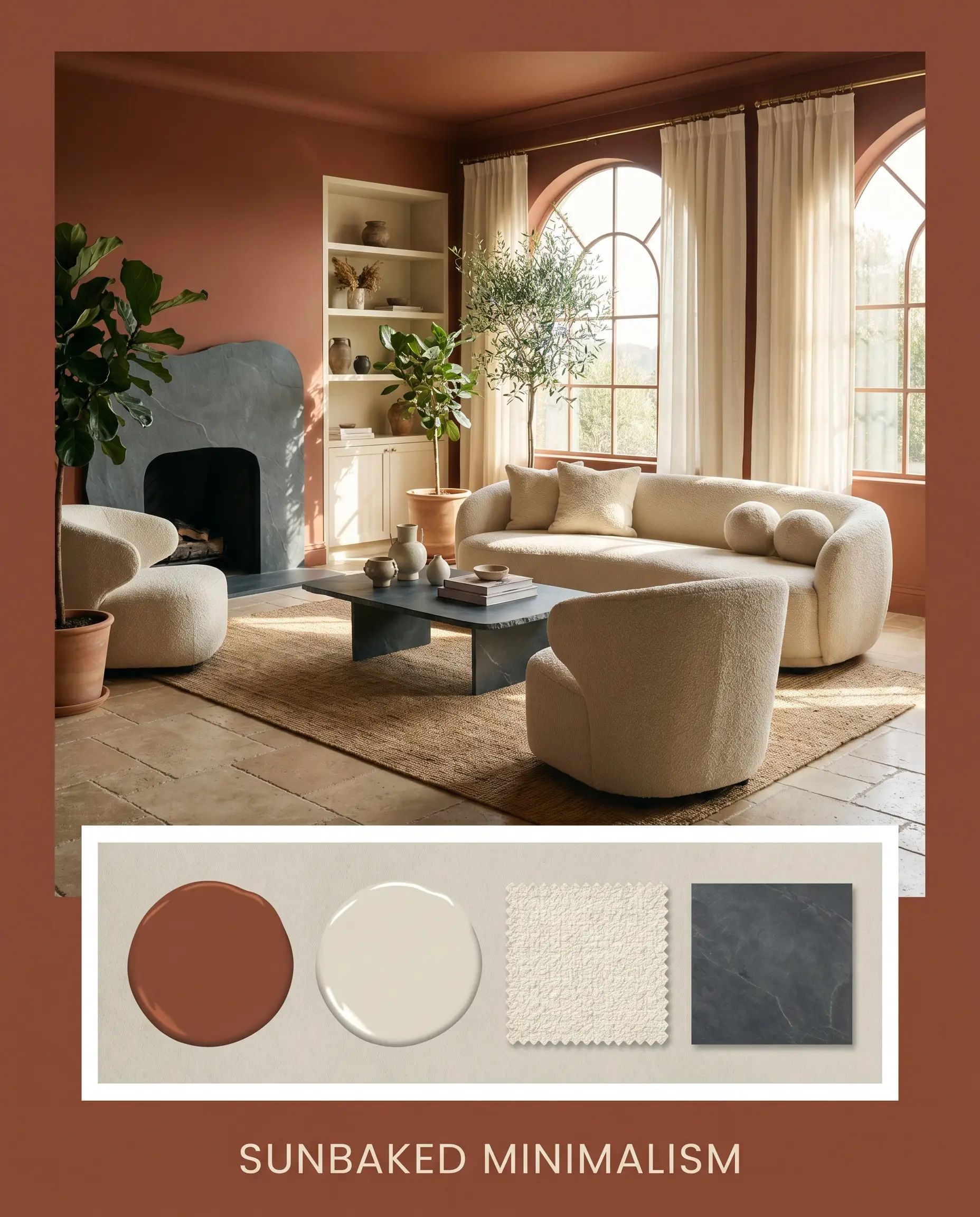
Sunbaked Minimalism This palette strips away excess, focusing entirely on the raw interplay of natural textures and warm, directional sunlight. By pairing the deep russet walls with raw bouclé seating, honed slate accents, and a wash of Benjamin Moore Natural Cream, the mood becomes incredibly serene and grounded. The energy is quiet, intentional, and deeply connected to the earth.
The Heritage Collector A rich, narrative-driven aesthetic that feels assembled over decades of global travel. The baked clay hue serves as the backdrop for smoked walnut antiques, unlacquered brass lighting, and accents of Farrow & Ball India Yellow. The resulting atmosphere is enveloping, warm, and highly curated, inviting lingering conversations and slow evenings.
Color Showdowns: Head-to-Head Comparisons
When selecting a foundational color, understanding how it behaves against its closest rivals is the only way to ensure a successful application.
Dulux Brick Red vs. Sherwin-Williams Cajun Red SW 0008
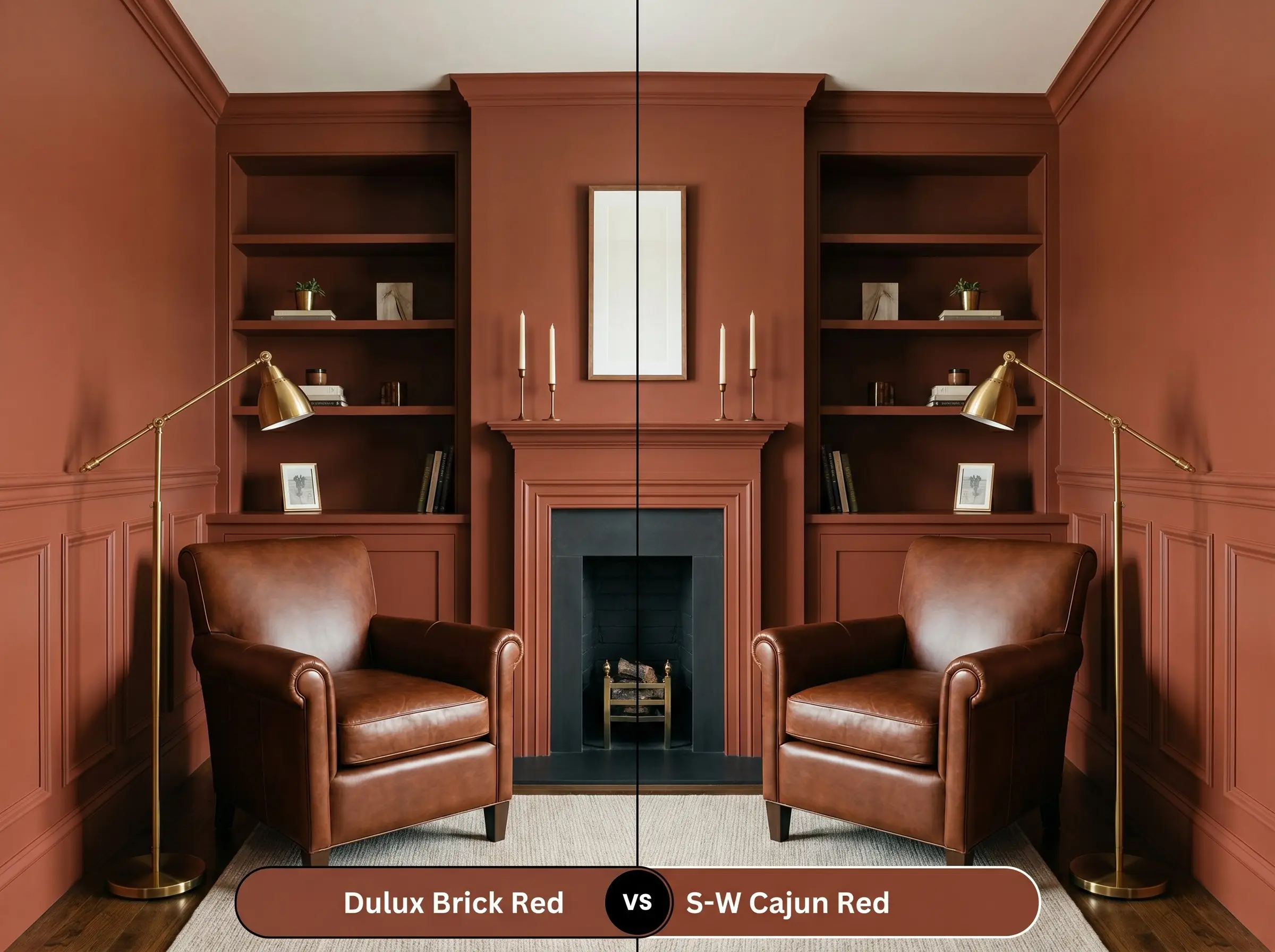
Cajun Red pushes much further into the orange spectrum, offering a significantly brighter, more energetic presence on the wall. If your room lacks natural light and you fear a muddy finish, the Sherwin-Williams option will retain its vibrancy in the shadows. However, if you are seeking a deeply grounded, historic mood, the Dulux option provides the necessary brown undertones to anchor the space.
Dulux Brick Red vs. Benjamin Moore Georgian Brick HC-50
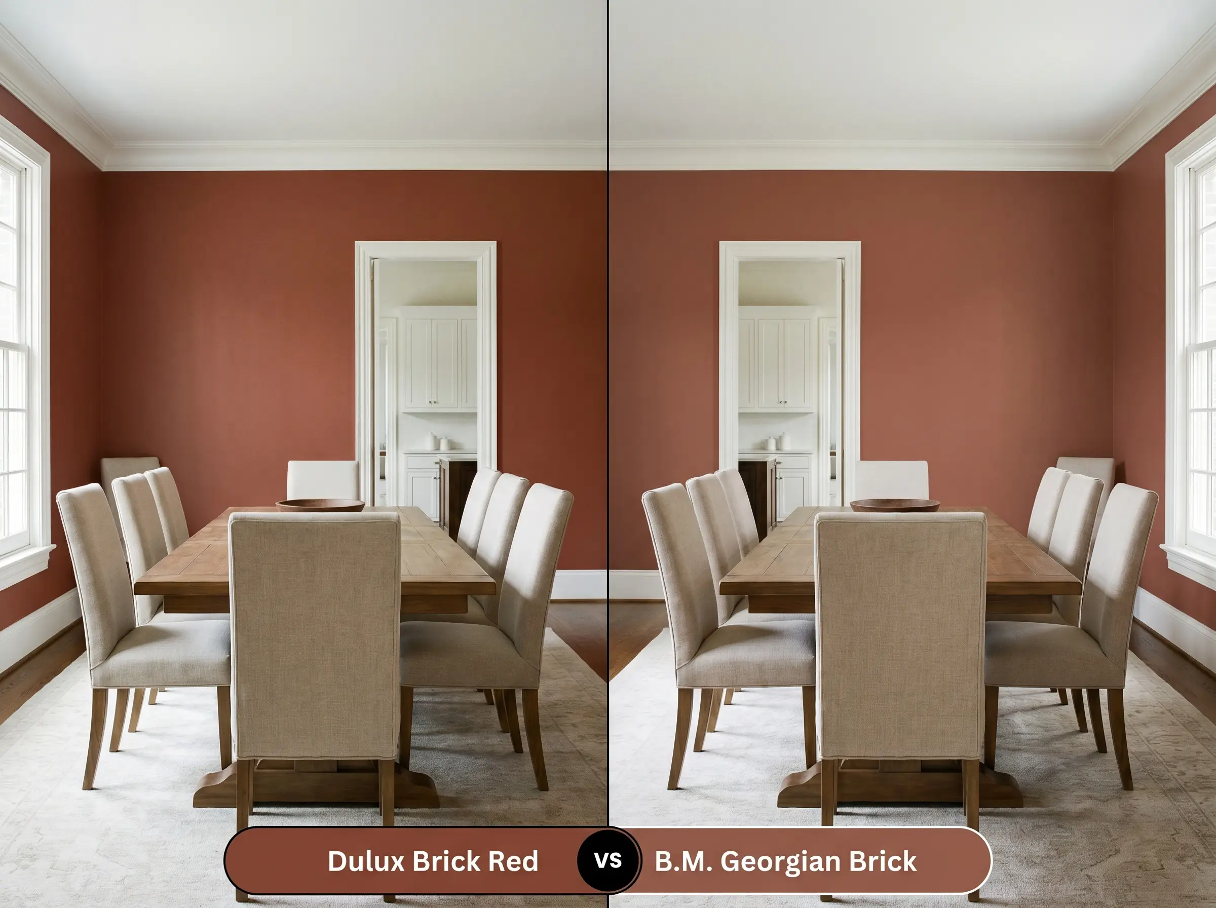
Georgian Brick is a significantly softer, more muted iteration of terracotta with a higher LRV, making it slightly more forgiving in small spaces. If you want a subtle, faded wash of earthy color, Benjamin Moore is the safer choice. Conversely, if you want a bold, definitive architectural statement that absorbs light and pulls the walls inward, Dulux Brick Red is the superior option.
Navigating Alternatives: Similar Colors & Brand Equivalents
Whether you need a slight shift in undertone or are shopping across different manufacturers, these alternatives provide excellent starting points.
Similar Colors (Same Brand)
Cross-Brand Equivalents
Executing the Finish: Practical Application & DIY Advice
Translating a deeply saturated color from a swatch to a finished wall requires strict attention to your materials and application methods.
The Dynamic Sheen Guide
Primer Strategy
You cannot skip primer with a shade this dark. You must use a high-quality primer tinted to a medium gray. A standard white primer will require four or more coats of the red paint to achieve true depth, whereas a gray base allows the dense brown undertones to settle perfectly in just two coats.
Deep, light-absorbing colors like this are highly susceptible to “flashing”—visible, uneven roller marks that appear when the paint dries at different rates. To avoid this, maintain a wet edge while rolling, work in small sections, and never go back over semi-dry paint with a loaded roller.
Hackrea Pro-Tip (The Flashing Risk)
Coverage & Success Tips
Expect to apply two full, generous coats over your tinted primer for a professional, opaque finish. Touch-ups on flat, dark paints are notoriously difficult and often leave visible rings. If a wall gets damaged down the line, it is usually better to repaint the entire wall corner-to-corner rather than attempting a spot fix.
Frequently Asked Questions
Because both the paint and the wood share deep, grounding brown undertones, they create a beautifully cohesive, low-contrast pairing. The deep russet shade acts as an enveloping backdrop, allowing the rich grain of the walnut to feel integrated rather than starkly outlined.
While the color itself creates a brilliant, warm, hammam-like atmosphere, the lack of natural light will emphasize its dark brown base. You must ensure excellent, warm 2700K artificial lighting to keep the color from feeling muddy, and always use a specialized, moisture-resistant bathroom paint formula to prevent peeling.
Deep reds and terracottas are notoriously prone to fading under harsh, direct UV exposure. If applying this to exterior masonry, you must invest in an ultra-premium, UV-resistant exterior formula and expect to perform maintenance coats more frequently than you would with a lighter neutral.
A high-gloss finish entirely changes the structural behavior of this color. Instead of absorbing light and receding, the glossy sheen bounces light aggressively, amplifying the hidden burnt orange micro-nuance and making the surface feel incredibly vibrant, energetic, and glamorous.
The Final Verdict: Mastering This Baked Clay Hue
Dulux Brick Red is the ultimate architectural anchor for homeowners seeking to inject profound warmth and permanence into their spaces. It performs exceptionally well in intimate, enclosed environments like dining rooms and studies, where its light-absorbing LRV of 10 creates a cocooning, deeply saturated mood. This shade is perfect for those who appreciate globally inspired, tactile design and want a color that feels fired from the earth rather than mixed in a factory.
However, this color requires a strict curatorial hand to succeed. You will encounter immediate visual friction if you attempt to pair this rich terracotta with cool-toned, icy gray luxury vinyl flooring, which will make the paint look dirty and the floors look sterile. Similarly, highly polished chrome hardware and stark, cool white leathers will violently disrupt the organic, earthy warmth this color works so hard to establish.
To unlock its full potential, you must surround this shade with equally warm, unrefined materials that honor its deeply grounding nature.