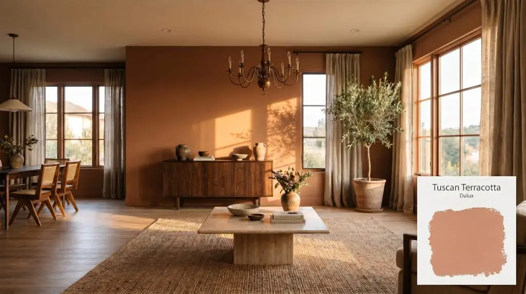
Dulux Tuscan Terracotta (60YR 40/297) is a muted, brownish-orange earth tone with an LRV of 40. Reminiscent of baked clay, it carries subtle red and dusty peach undertones, making it a highly versatile, cocooning color perfect for warming up cool rooms or adding Mediterranean charm to exteriors.
Will Tuscan Terracotta clash with your room?
Paint Technical Profile
| Color ID / SKU | 60YR 40/297 |
| HEX Code | #D8967B |
| Light Reflectance (LRV) | 40 |
| Use | Interior, Exterior |
| Best Exposures | North-Facing, East-Facing |
| Best For | Living Rooms, Dining Rooms, Kitchens, Exterior Accents |
Dulux Tuscan Terracotta: Sculpting Atmosphere with Baked Clay Pigments
When natural light hits a stark, drywall-heavy open floor plan, the architecture often feels cold and undefined. Wrapping those walls in a deeply pigmented, autumnal hue changes the entire atmospheric weight of the home, pulling the boundaries inward to create an immediate sense of intimacy.
Dulux Tuscan Terracotta achieves exactly this, shifting the energy of a room from sterile to incredibly soulful. It softens the harsh angles of modern construction while providing a rich, grounded foundation for a variety of design styles.
Rather than relying on intense, primary reds, this color leverages a complex blend of earthy pigments to establish a sophisticated presence. It acts as a heavy anchor, allowing you to layer natural textures and warm metals against it for a highly curated, lived-in aesthetic.
The Color DNA of Dulux Tuscan Terracotta
Is Dulux Tuscan Terracotta warm or cool? It is definitively warm, radiating a deep, Mediterranean warmth that wraps a room in an inviting, sunlit embrace.
To truly understand how this color behaves, we have to look at its underlying pigment structure:
With an LRV (Light Reflectance Value) of 40, this shade absorbs a significant 60% of the light that hits it. This mid-tone depth gives it substantial architectural weight, allowing it to hold its rich character in bright spaces without washing out into a pale pastel.
Chasing the Light: How This Pigment Shifts
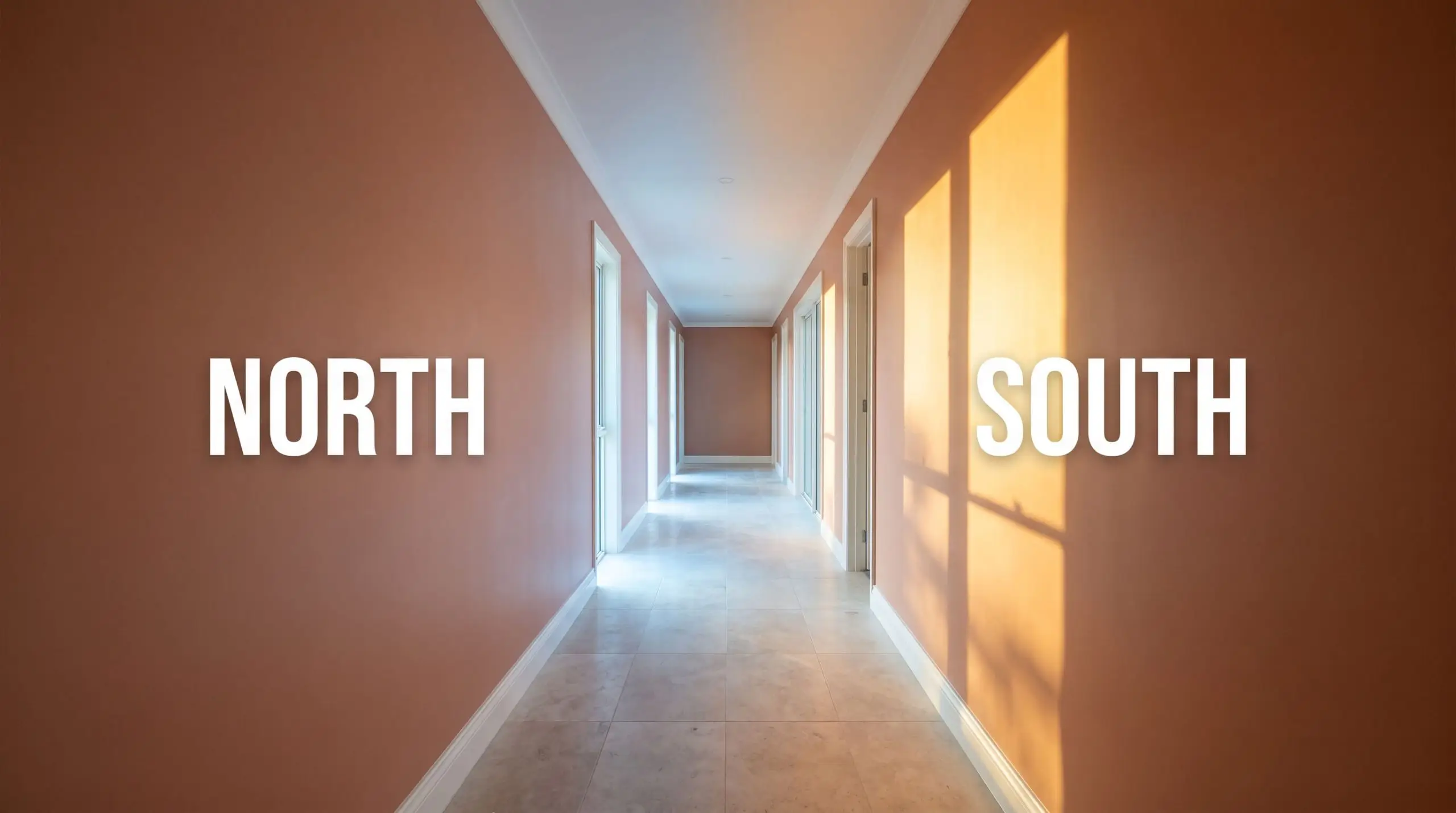
Because this paint relies on a complex mix of brown, red, and peach, it is highly reactive to the temperature of the light in your home.
If you place this earthy terracotta in a light-starved corridor under sterile, high-kelvin bulbs, it will lose its vibrant charm. The cool light strips away the red and peach, flattening the color into a heavy, muddy shadow.
Hackrea Pro-Tip (The Shadow Risk)
Here is exactly how the color behaves across different exposures:
Will Tuscan Terracotta work with your specific lighting, floor, or furniture?
Shaping Everyday Architecture
The true strength of this muted brownish-orange is its ability to bring custom warmth to ordinary residential spaces. It interacts beautifully with everyday materials, adding instant character to standard rooms.
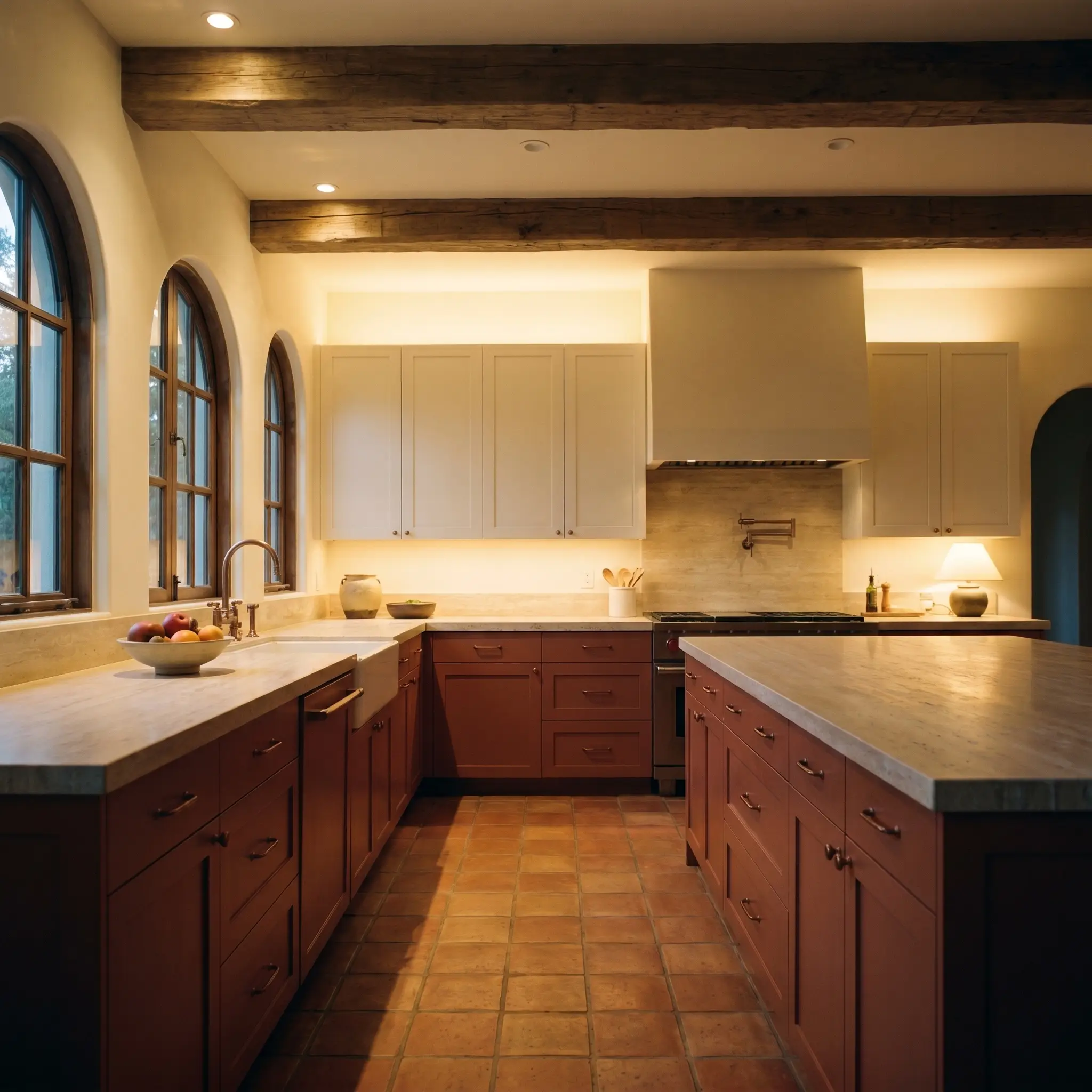
Kitchens
This pigment brings an incredible sense of rustic charm to the kitchen, acting as a brilliant counterpoint to the hard, reflective surfaces of appliances and countertops. Pair it with simple, flat-panel stock cabinetry in a warm off-white to create a relaxed, Mediterranean Revival aesthetic. For a more grounded look, use it on the lower cabinets to anchor the room, keeping the upper walls light and airy.
Dining Rooms
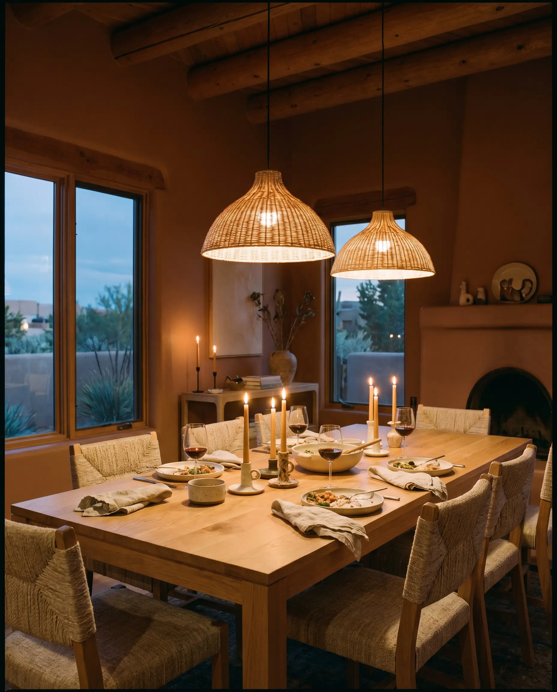
A dining space thrives on intimacy, and this color effortlessly fosters a cocooning atmosphere perfect for long evening meals. It serves as a stunning backdrop for a simple oak dining table and woven linen chairs. The deep pigment absorbs the ambient evening light, making candlelight and warm pendants glow intensely against the walls.
North-Facing Bedrooms
Cool natural light can make sleeping quarters feel chilly and uninviting, but this heavy pigment acts as a visual heat source. It warms up the shadows, creating a restful, deeply insulated vibe. If you are struggling with a particularly chilly exposure, exploring the best terracotta paint colors for north-facing rooms can provide additional strategies for balancing the light.
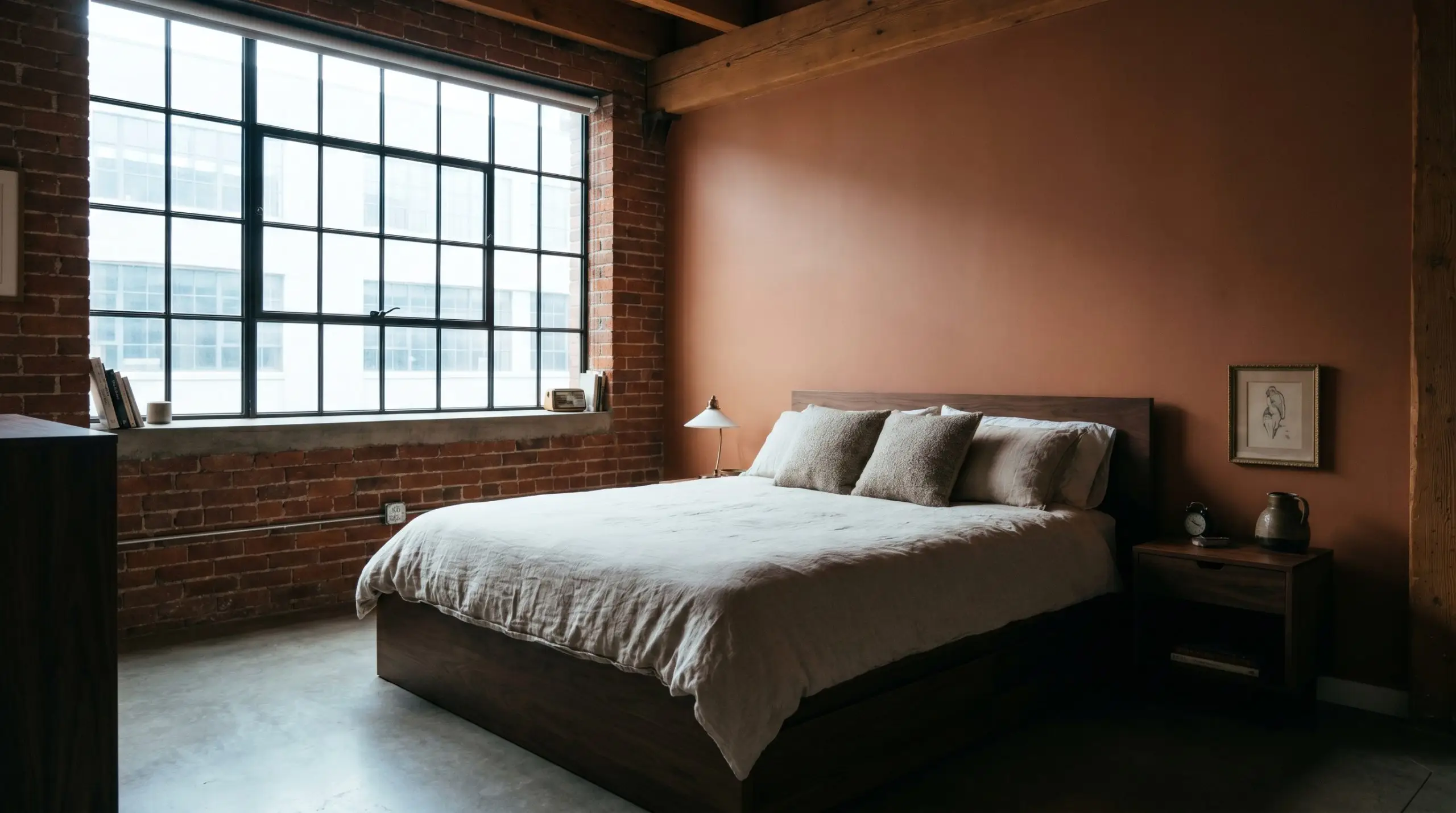
Living Rooms
In a main gathering space, this autumnal hue softens the harsh lines of modern furniture and media consoles. It leans beautifully into biophilic design, serving as the perfect backdrop for large indoor plants and natural wood tones. Let the paint carry the visual weight of the room, allowing you to use simple, streamlined sofas and textured throw pillows.
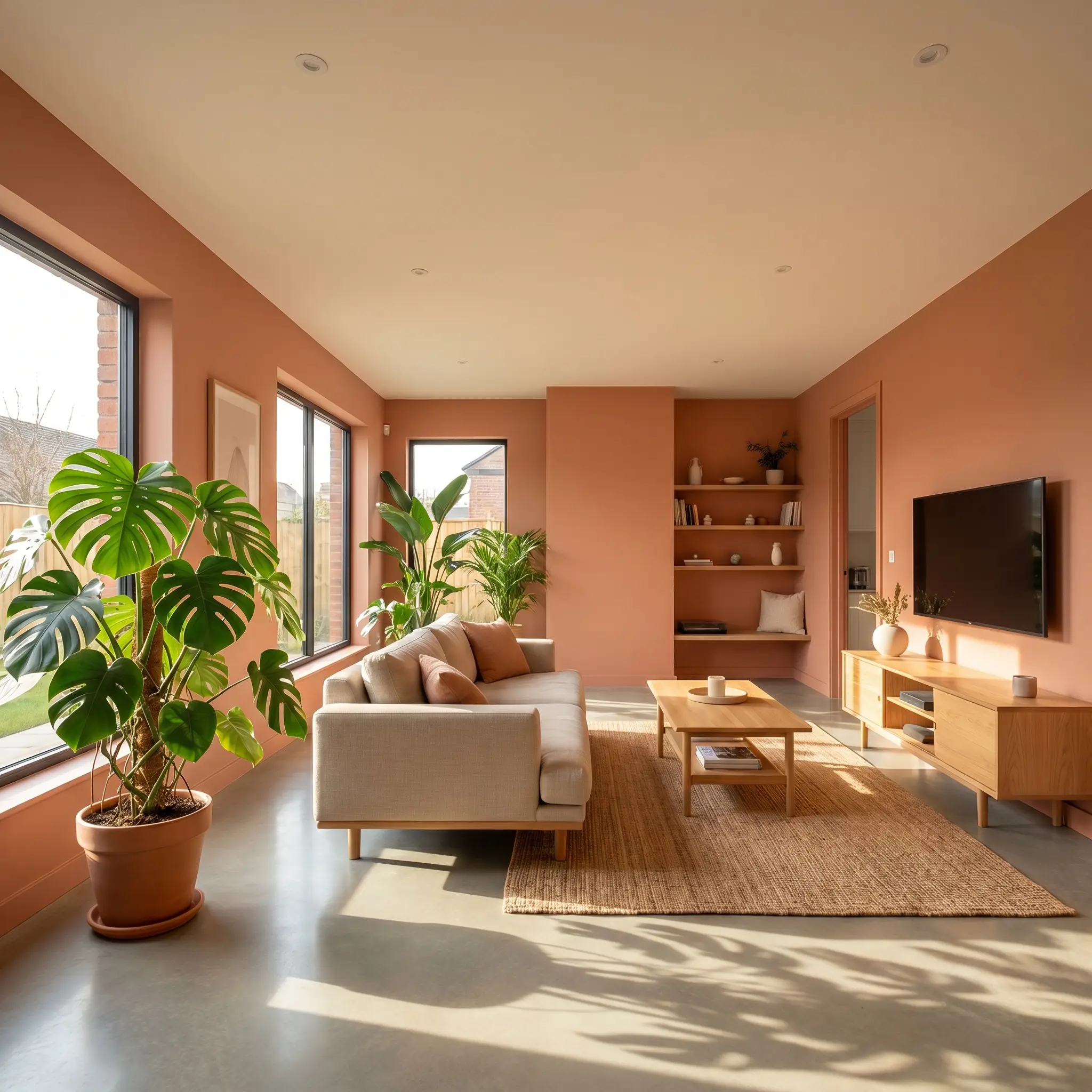
Exterior Accents
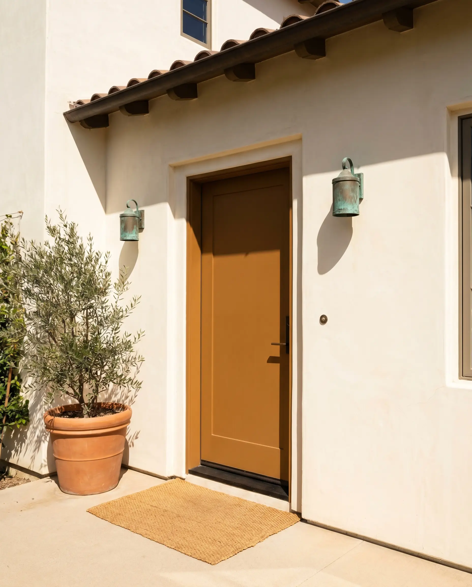
When brought outside, the direct sunlight will wash out a portion of the color’s depth, making it read slightly lighter and more orange. It is a brilliant choice for a front door or exterior window trims, instantly adding a touch of sun-baked warmth to a neutral stucco or white siding facade.
Will Tuscan Terracotta work with your specific lighting, floor, or furniture?
Unlocking Dulux Tuscan Terracotta: Custom Design Concepts
When you stop treating paint as a mere backdrop and start using it as an architectural tool, this pigment opens up entirely new design pathways.
The Sun-Drenched Archway
Will Tuscan Terracotta work with your specific lighting, floor, or furniture?
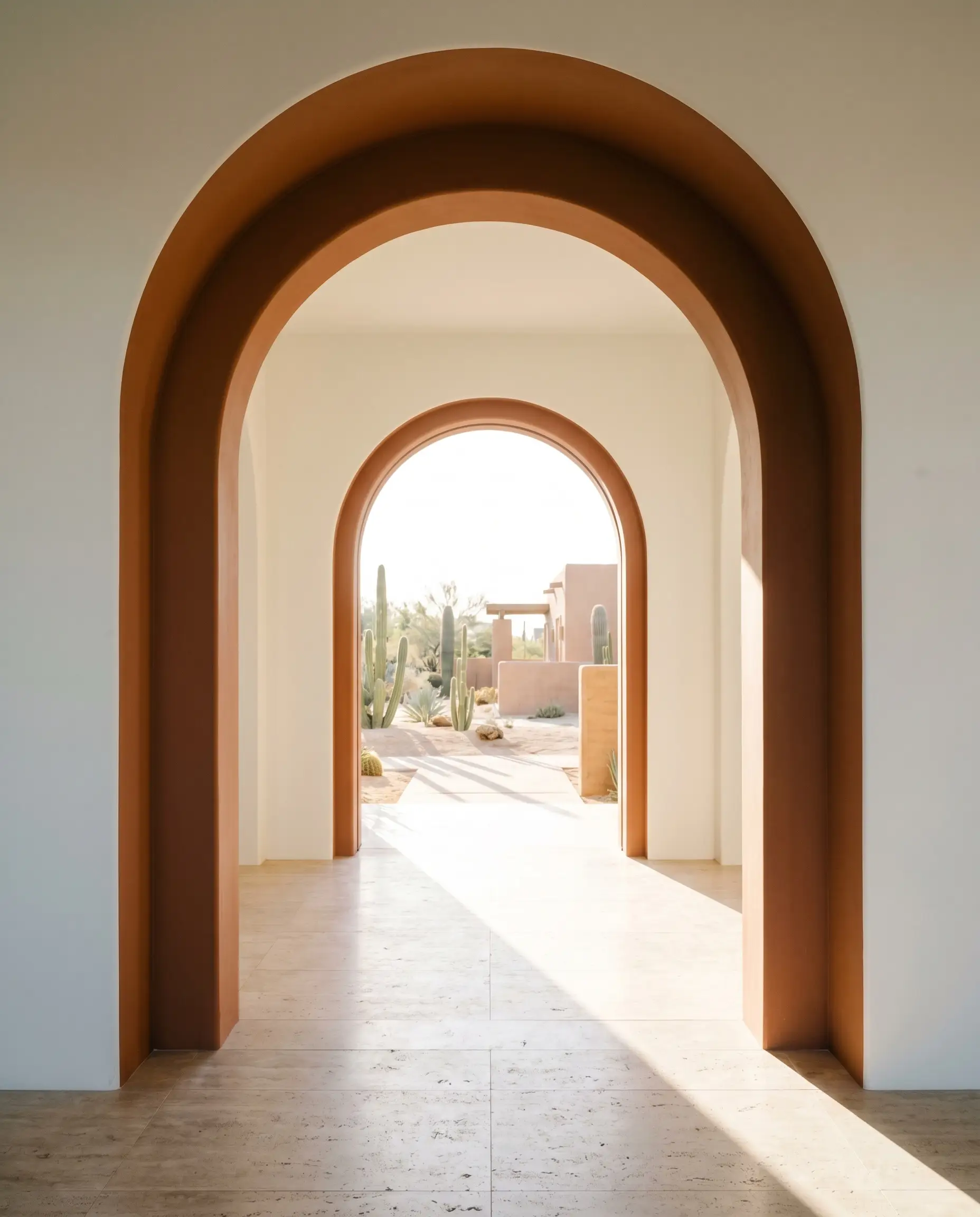
Transition zones like interior archways or wide thresholds often lack intentional design. By coating the inner rim and surrounding casing of an archway in this earthy terracotta, you create a distinct, Desert Modernism moment. The color physically separates two rooms, acting as a warm, heavy portal that draws the eye and defines the flow of the home.
The Enveloping Canopy
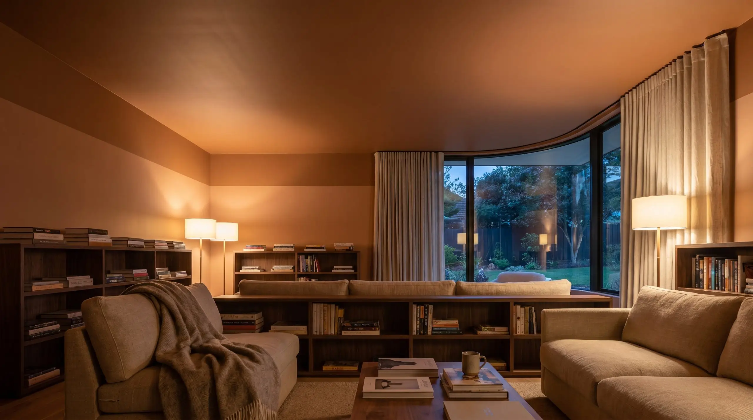
Standard white ceilings can sometimes make a room feel unfinished or disconnected from the walls. Wrapping the ceiling and the top quarter of the walls in this autumnal hue creates an incredibly intimate, tented effect. Paired with a low-slung, textured sofa and soft, indirect floor lighting, the ceiling recedes into a warm, protective shadow, perfect for a media room or a cozy reading lounge.
The Grounded Loft
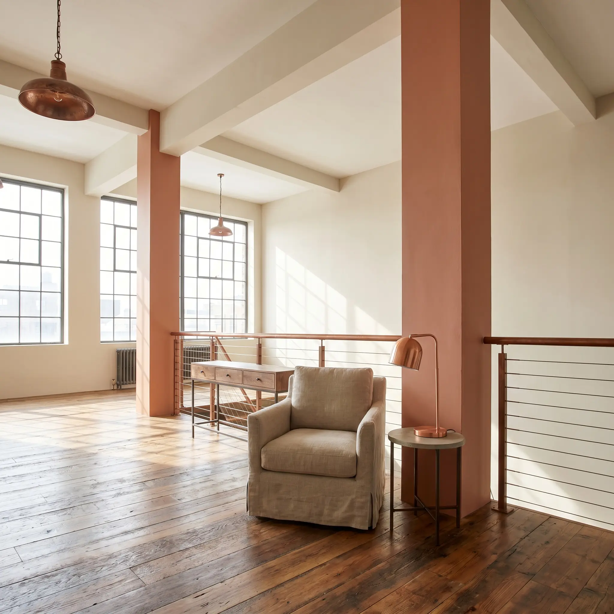
In spaces with exposed structural pillars or awkward drywall bump-outs, standard practice is to paint them white to make them disappear. Instead, coating these architectural oddities in this deep pigment turns them into deliberate, grounding features. It brings an Urban Rustic energy to the space, especially when the surrounding walls are kept a soft, warm white, allowing the terracotta pillars to anchor the room’s visual balance.
Material Pairings & Relational Colors
This paint requires thoughtful companions to truly shine. Its rich base interacts dynamically with the undertones of your trim, hardware, and secondary colors.
Trim & Baseboards
Crisp, stark white trim will create a jarring, highly graphic contrast that detracts from the paint’s organic feel.
Hardware, Wood & Material Pairings
To elevate this color, focus on introducing tactile finishes that speak to its earthy origins.
Coordinating Colors
Building a cohesive palette requires colors that respect the warmth of the terracotta without competing for dominance.
Designer Mood Boards
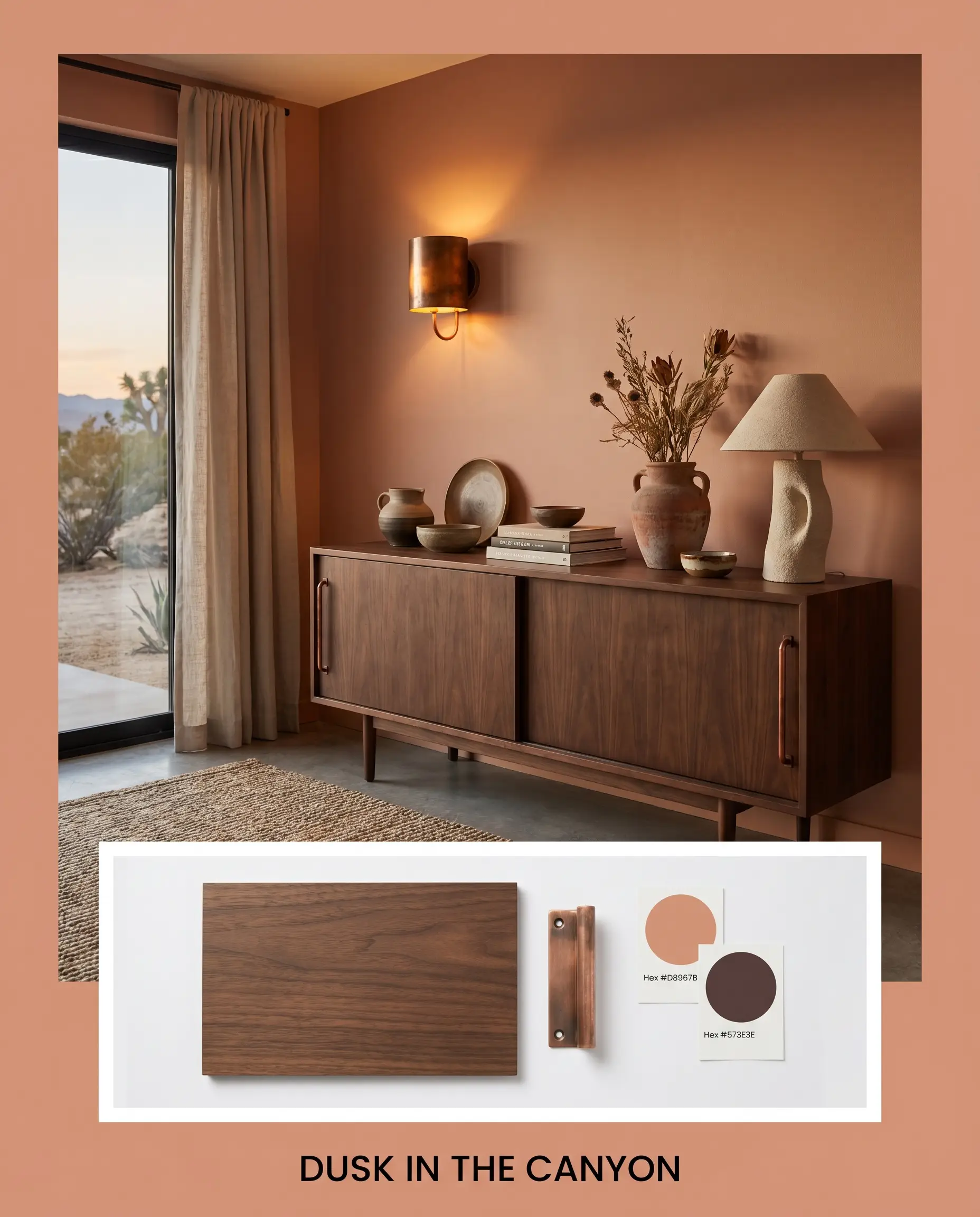
Dusk in the Canyon This palette captures the fading light of a desert evening, prioritizing deep contrast and rich textures. The walls are anchored by the earthy terracotta, while a sleek walnut veneer credenza provides a dark, grounding element. Aged copper wall sconces cast a warm glow, and accents of Sherwin-Williams Carnelian SW 7580 add a layer of sophisticated moodiness.
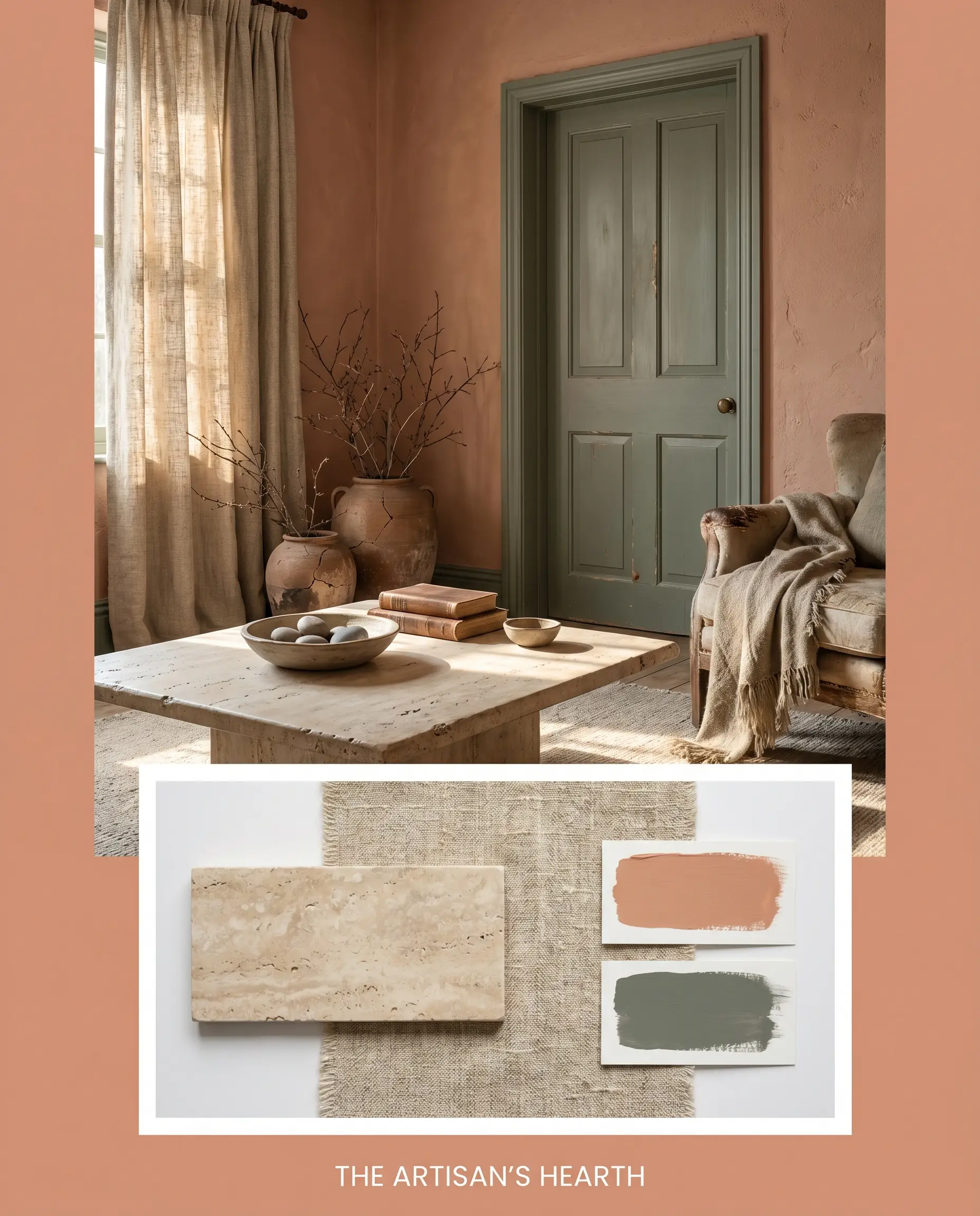
The Artisan’s Hearth Rooted in Wabi-Sabi principles, this board focuses entirely on raw, unrefined beauty. The terracotta walls set a warm foundation, complemented by a large honed travertine coffee table. Heavy, slubby oatmeal linen curtains filter the natural light, while subtle accents of Farrow & Ball Green Smoke No. 47 on the interior doors bring a quiet, organic balance to the space.
Will Tuscan Terracotta work with your specific lighting, floor, or furniture?
Head-to-Head Comparisons
If you are unsure if this specific shade is right for your home’s lighting, comparing it to its closest rivals reveals its true character.
Dulux Tuscan Terracotta vs. Dulux Sunbaked Terracotta 90YR 53/238
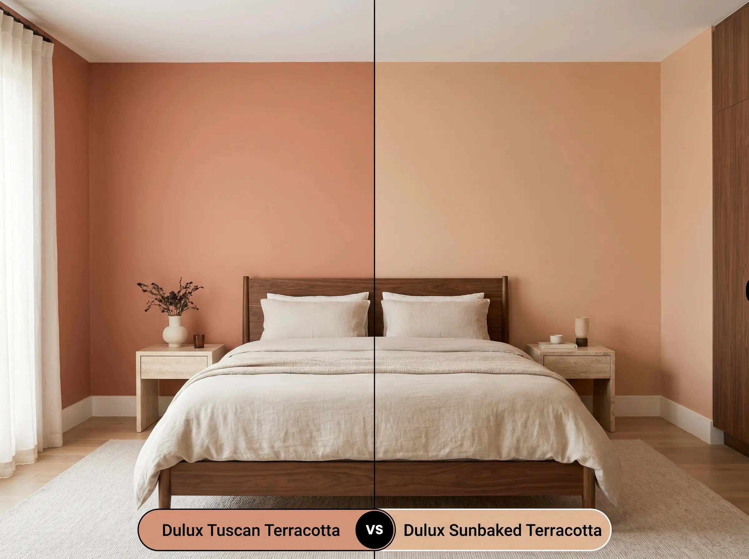
If your room lacks natural light, the original Tuscan Terracotta might feel a bit too heavy. Dulux Sunbaked Terracotta has a noticeably higher LRV (53), meaning it reflects significantly more light. It pulls brighter and slightly more orange on the wall. If you want a vibrant, airy Mediterranean feel in a darker room, Sunbaked Terracotta is the safer choice; if you want deep, architectural weight, stick with Tuscan Terracotta.
Dulux Tuscan Terracotta vs. Farrow & Ball Red Earth No. 64
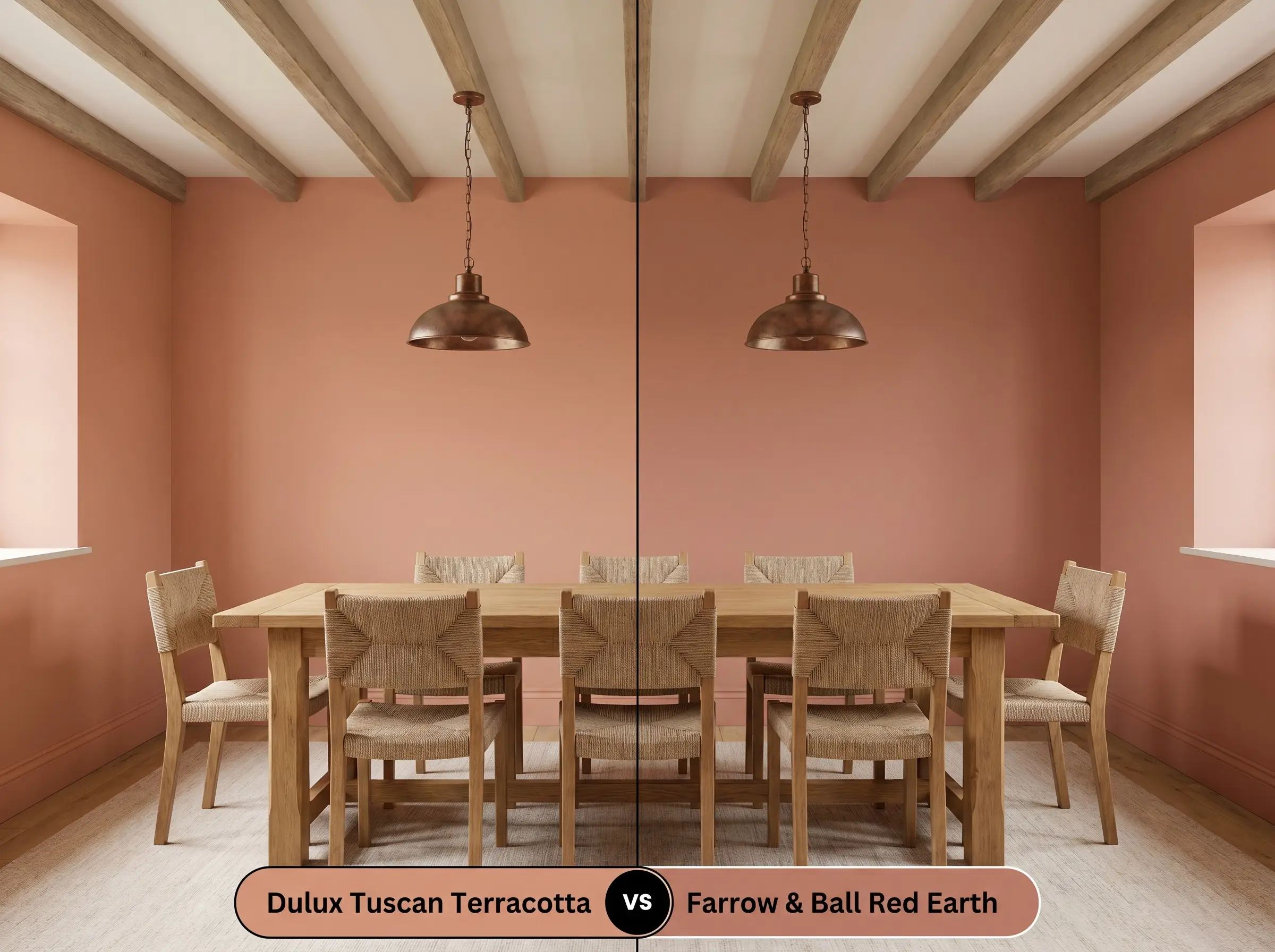
Will Tuscan Terracotta work with your specific lighting, floor, or furniture?
Red Earth leans heavily into its pink and red pigments, offering a softer, more delicate blush undertone. It lacks the heavier brownish-orange base of the Dulux shade. If you are aiming for a soft, historic English cottage aesthetic, Red Earth provides that gentle, faded elegance. However, if you want a robust, earthy anchor for modern or rustic spaces, Dulux Tuscan Terracotta provides much stronger visual grounding.
Brand Equivalents & Sibling Shades
Sometimes a slight tweak in depth or a switch in manufacturers is necessary for your specific project.
Similar Colors (Same Brand)
Cross-Brand Matches
Application Strategy for Dulux Tuscan Terracotta
Achieving a flawless, premium finish with mid-tone colors requires specific practical preparation.
The Ideal Sheen Profile
Primer & Base Coats
Because this color absorbs 60% of light and relies on deep red and brown pigments, a standard white primer will struggle to support it. You must use a high-quality primer tinted to a light gray. This prevents the white base from glowing through and washing out the richness of the terracotta, ensuring the color reaches its true depth.
Coverage Expectations
Mid-tone oranges and reds are notorious for “flashing”—showing uneven, shiny roller marks where the paint overlaps. To avoid this, maintain a wet edge while rolling and commit to two full, even coats. Never attempt to stretch the paint, and avoid aggressive touch-ups in the middle of the wall once it begins to dry.
Hackrea Pro-Tip (The Flashing Risk)
Frequently Asked Questions
Direct, relentless UV exposure will eventually accelerate the fading of red and orange pigments. To protect the rich depth of this color on a front door or exterior masonry, it is critical to use a premium, UV-resistant exterior enamel and apply a high-quality bonding primer first.
Because it possesses a deep brownish-orange base, it excels at creating a cozy, insulated feeling in subterranean spaces. However, without natural light to ignite the brighter peach undertones, you must rely heavily on warm ambient lighting (2700K) to keep the walls from feeling like a heavy, muddy brown enclosure.
Painting a high ceiling in this mid-tone shade is an excellent architectural trick. The dark, warm pigment absorbs light and visually advances, pulling the ceiling downward to make an overly tall, echoing space feel significantly more grounded and intimate.
A matte emulsion enhances the powdery, natural baked-clay aesthetic, making the color feel organic and soft. Applying it in a high-gloss or lacquer finish entirely changes its personality, reflecting light sharply and turning the earthy hue into a highly dramatic, jewel-box statement.
The Final Verdict & Pairing Warnings
Dulux Tuscan Terracotta is a masterful architectural tool for homeowners looking to inject instant character and soulful warmth into their spaces. It is the perfect choice for light-filled living rooms, intimate dining spaces, and rustic kitchens, thriving alongside natural textures and warm, ambient lighting. It beautifully grounds modern aesthetics while honoring classic, Mediterranean-inspired roots.
However, this deeply pigmented hue will clash aggressively with the wrong environmental elements. You must avoid pairing this earthy terracotta with stark, cool-toned grays or icy blue textiles, as the conflicting color temperatures will create a visually jarring, uncomfortable vibration in the room. Furthermore, highly polished chrome hardware or stark, blue-toned LED lighting will instantly strip away its organic charm, making the walls look artificial and muddy. Stick to warm, natural companions, and this baked clay pigment will reward you with a deeply inviting, beautifully curated home.
Room Compatibility & Clashes Diagnoses
Hackrea's reports evaluating the compatibility of Tuscan Terracotta in real rooms.No compatibility tests for Tuscan Terracotta yet.
Be the first to see how this color reacts to your space. Run a free architectural diagnostic now.