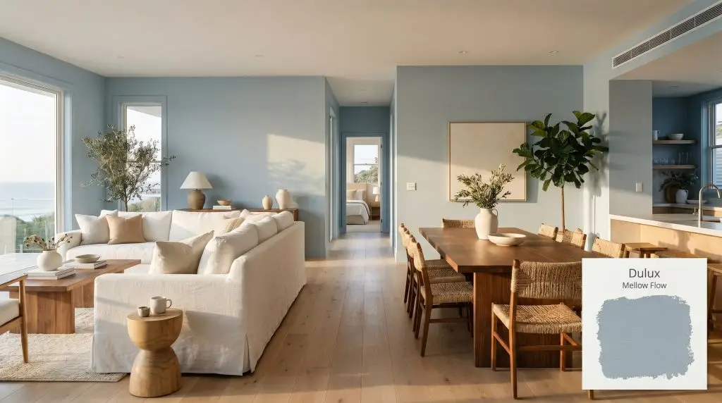
Dulux Mellow Flow (10BB 39/100) is a soft, powdery mid-tone blue with an LRV of 37. Part of the 2026 Rhythm of Blues palette, this serene shade features subtle cyan-gray undertones, making it an ideal choice for creating calm, airy spaces that adapt beautifully to shifting natural light.
Will Mellow Flow clash with your room?
Paint Technical Profile
| Color ID / SKU | 10BB 39/100 |
| HEX Code | #95A7B4 |
| Light Reflectance (LRV) | 37 |
| Use | Interior, Exterior |
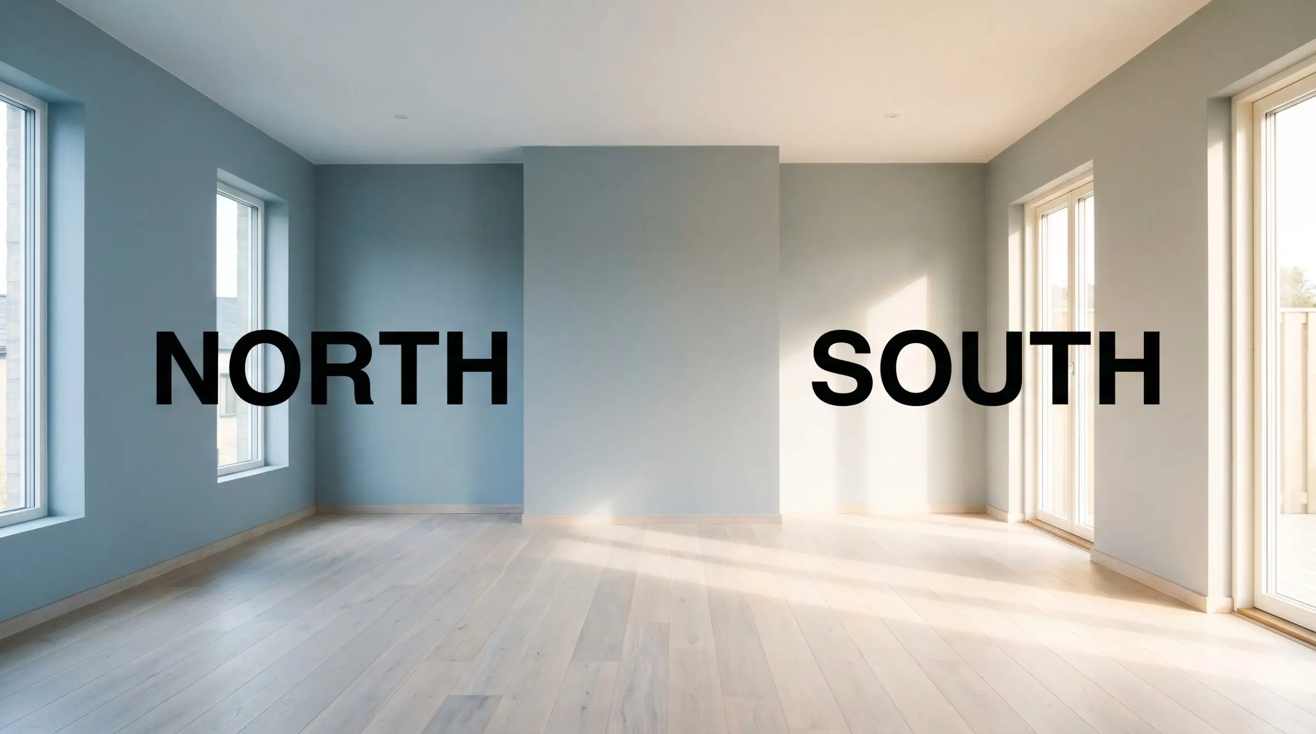
| Best Exposures | South-Facing, West-Facing |
| Best For | Living Rooms, Bedrooms, Home Offices, Cabinetry |
Dulux Mellow Flow Review: Mastering the Art of the Grounded Blue Canvas
Many open residential layouts suffer from a lack of visual gravity, floating aimlessly under vast expanses of white drywall. Finding a pigment that establishes clear boundaries without shrinking the room is a delicate balancing act. As a standout hue in the Dulux 2026 Rhythm of Blues collection, this powdery mid-tone blue offers a brilliant solution for undefined architecture.
Dulux Mellow Flow brings an immediate sense of tailored calm to chaotic environments. It wraps a space in quiet confidence, shifting effortlessly from a crisp morning backdrop to a moody evening sanctuary. By utilizing its unique pigment structure, you can physically alter the perceived temperature of your home.
The Anatomy of Dulux Mellow Flow
Is Mellow Flow warm or cool? It is undeniably a cool-toned paint, but it carries enough inherent complexity to avoid feeling icy or unapproachable. This cooling nature is exactly why it excels at calming down rooms that receive aggressive afternoon sun.
With a light reflectance value 37, this shade sits firmly in the mid-range spectrum, meaning its ambient light absorption is noticeable but not overwhelming. It possesses enough body to anchor a featureless wall, yet it remains reflective enough to keep the room feeling expansive and breathable.
Harnessing the Chromatic Shift: Lighting & Exposure
Because of its intricate undertones, this paint is highly reactive to its environment. If you apply it in a heavily shaded space with zero natural illumination, the gray will rapidly overtake the blue, creating a heavy, overcast atmosphere. Testing large swatches against your specific window exposures is the only way to predict this chromatic shift accurately.
Functional Applications for Mellow Flow 10BB 39/100
This sophisticated blue brings a stabilizing energy to residential architecture, offering a quiet counterpoint to the hustle of daily life. Rather than forcing a single aesthetic, it adapts gracefully to the materials and light you place around it.
Open-Concept Living Zones
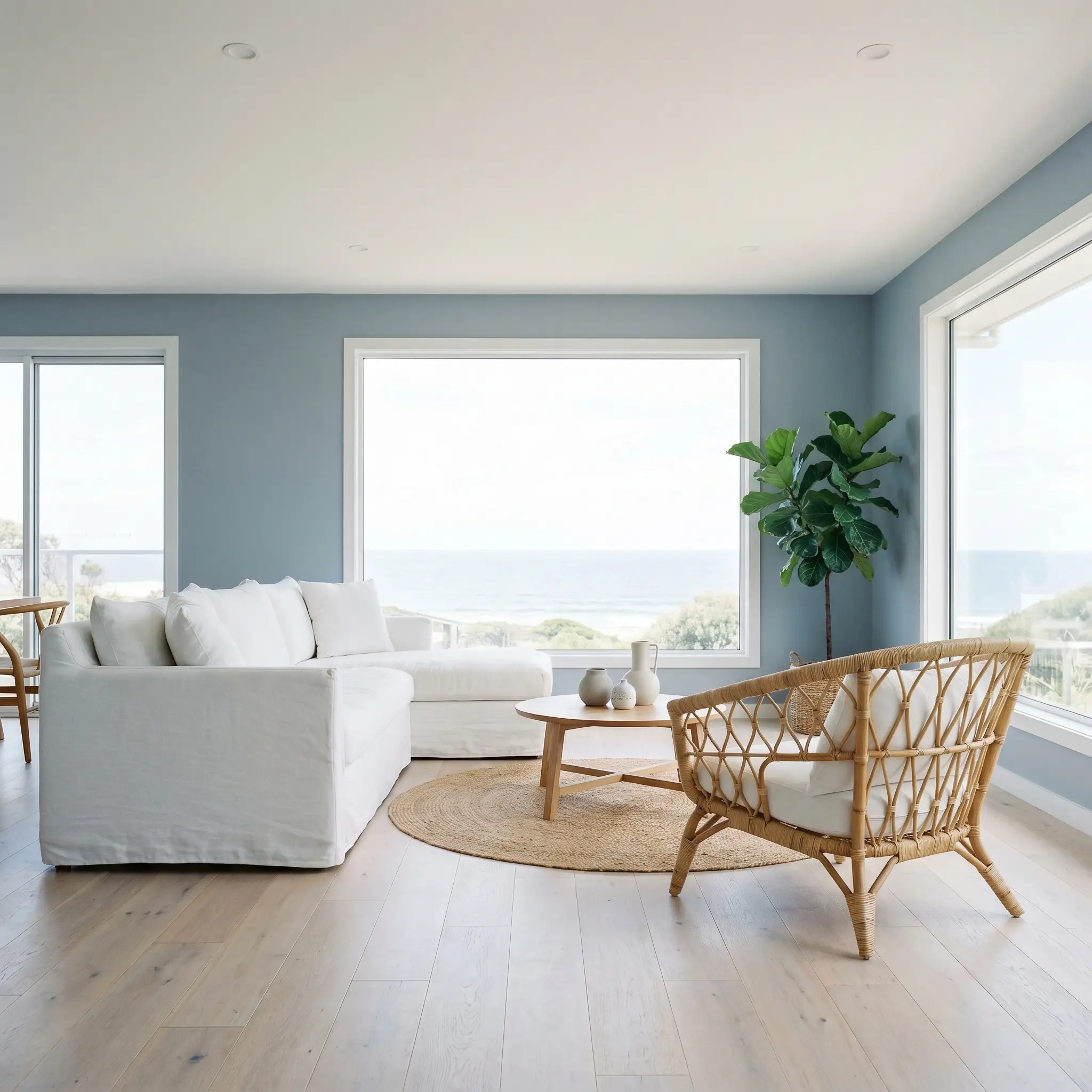
In sprawling, undefined floor plans, this color acts as a structural anchor. You can use it to wrap a central living area, separating the lounge from the dining space without relying on heavy furniture partitions. It pairs beautifully with a coastal contemporary interior, especially when layered with bleached oak floors and slipcovered linen sofas.
Restorative Sleeping Quarters
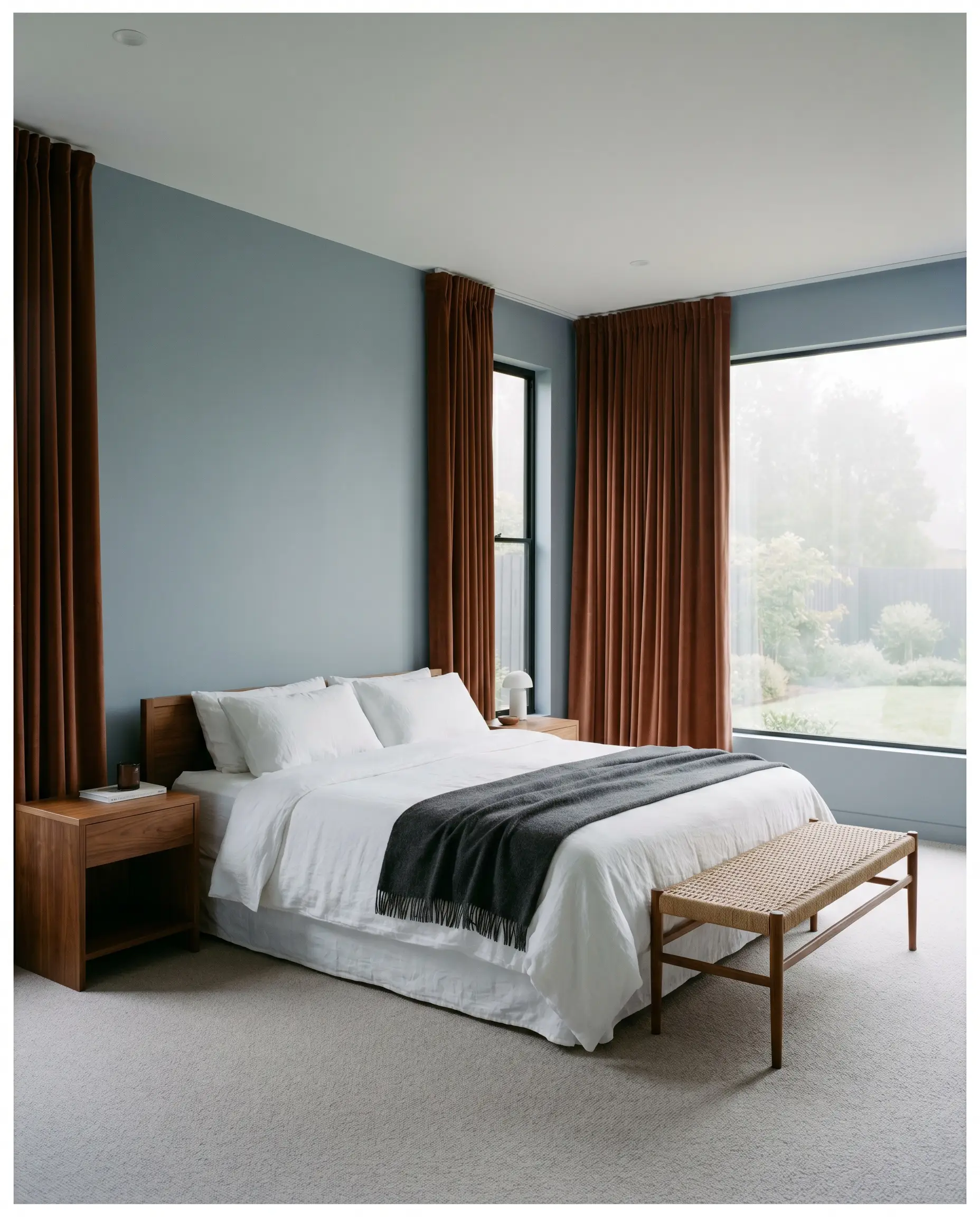
Bedrooms crave visual serenity, and this muted tone delivers a deeply calming atmosphere. By applying it to all four walls, you create a seamless, enveloping backdrop that encourages rest. Contrast the cool walls with warm walnut nightstands and heavy, rust-colored velvet drapery for a luxurious, layered retreat.
Millwork & Culinary Spaces
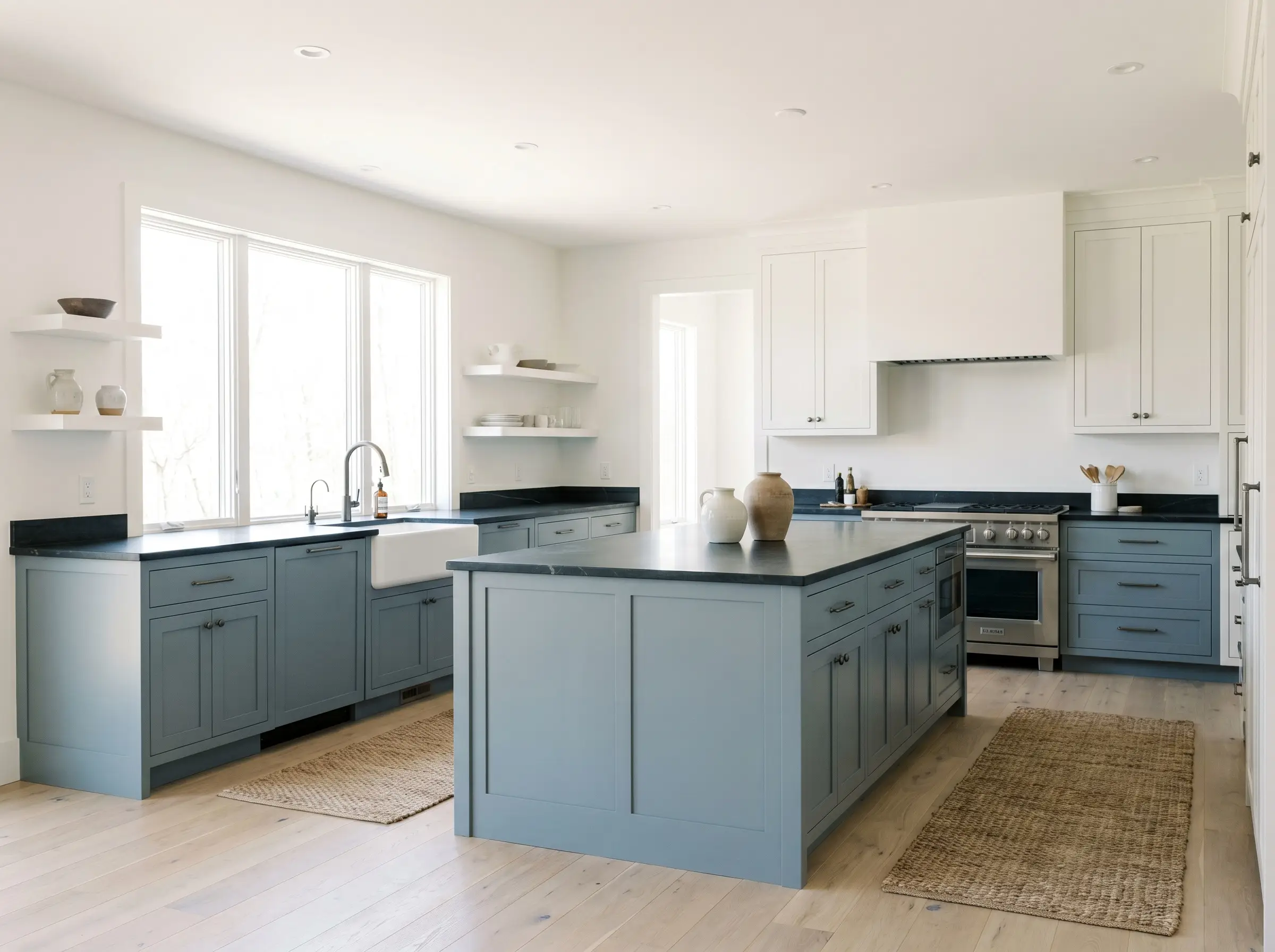
Stock kitchen cabinetry takes on a highly bespoke, premium identity when coated in this rich mid-tone. Using it on a central island or lower base cabinets grounds the kitchen, allowing upper open shelving to feel light and airy. It is a brilliant companion to deeply honed soapstone countertops and brushed gunmetal fixtures.
Out-of-the-Box Architectural Concepts
Looking past standard drywall applications reveals the true versatility of this pigment. When you treat this blue as an architectural tool rather than just a wall color, it inspires highly intentional, custom-feeling moments throughout the home.
Saturating the Transition Hallway
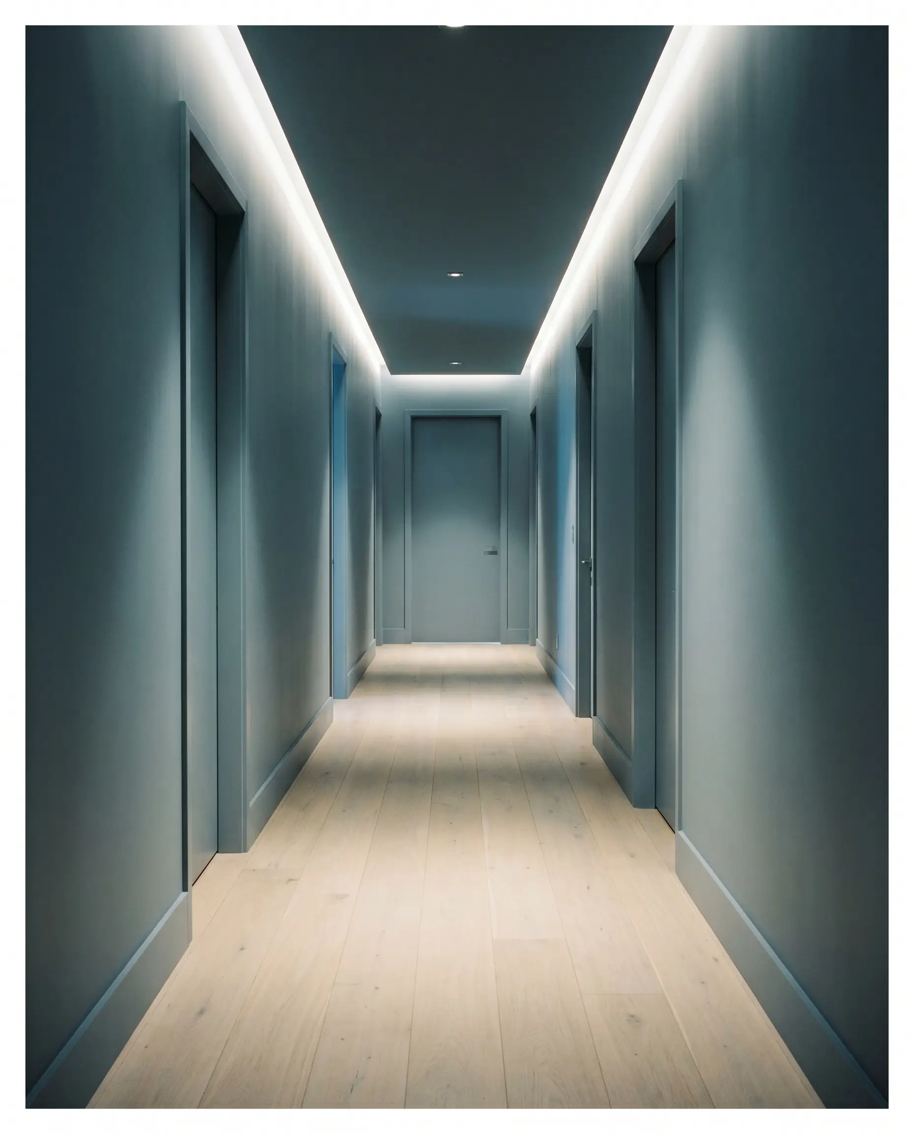
Long, light-starved residential corridors are often ignored, but they offer an incredible opportunity for complete color drenching. By painting the walls, trim, and interior doors in this identical powdery blue, you blur the sharp structural boundaries. This continuous application turns a forgotten walkway into a moody, cinematic tunnel that makes the adjoining, lighter rooms feel massive by comparison.
Anchoring the Sloped Attic Studio
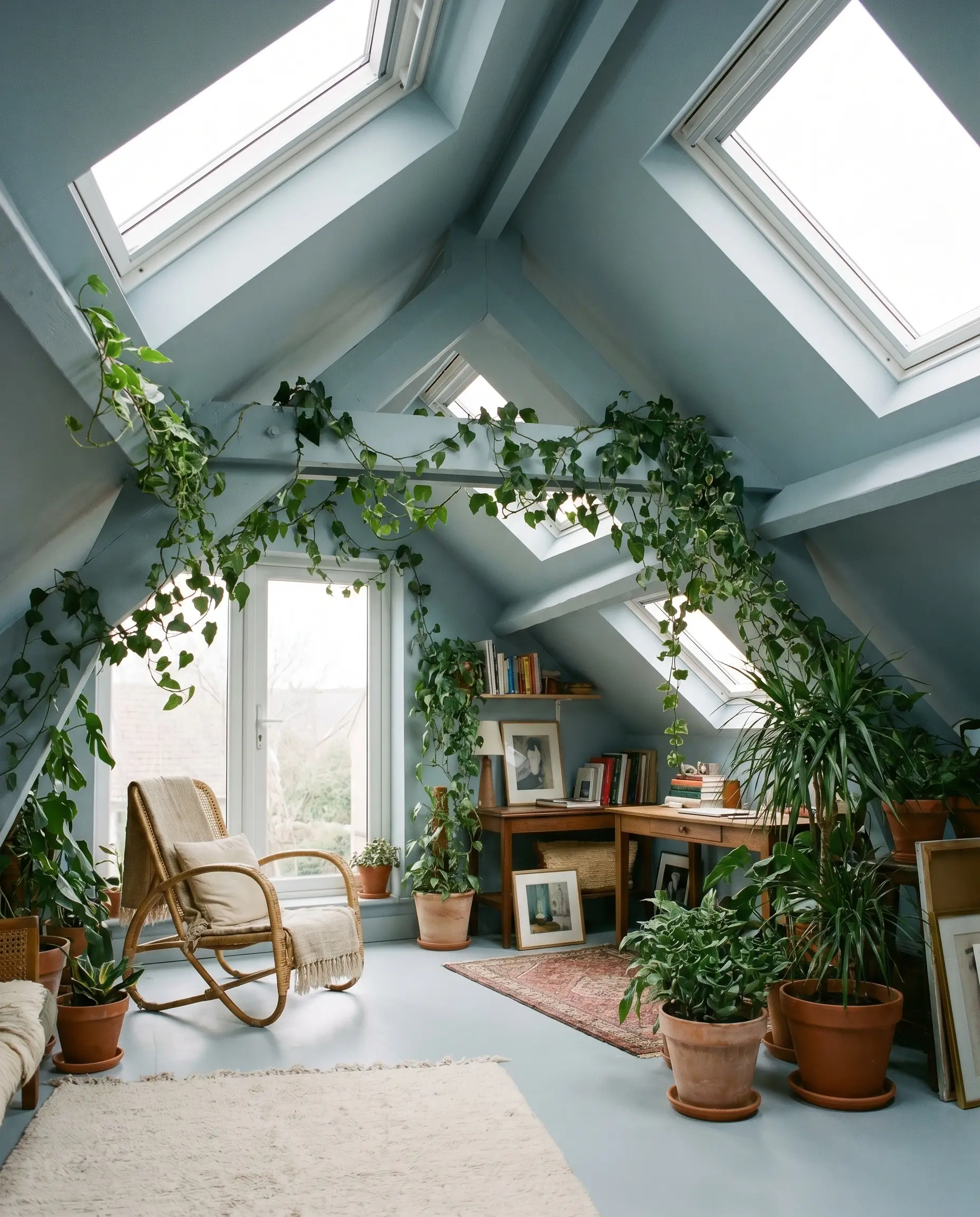
Awkward attic spaces with sharp, sloped ceilings can feel disjointed if the angles are painted contrasting colors. Coating the entire angled geometry in a strict matte finish application softens the harsh intersections. Introduce trailing ivy and raw terracotta planters to lean into biophilic design, creating a secluded, organic hideaway.
The Monochromatic Pantry Vault
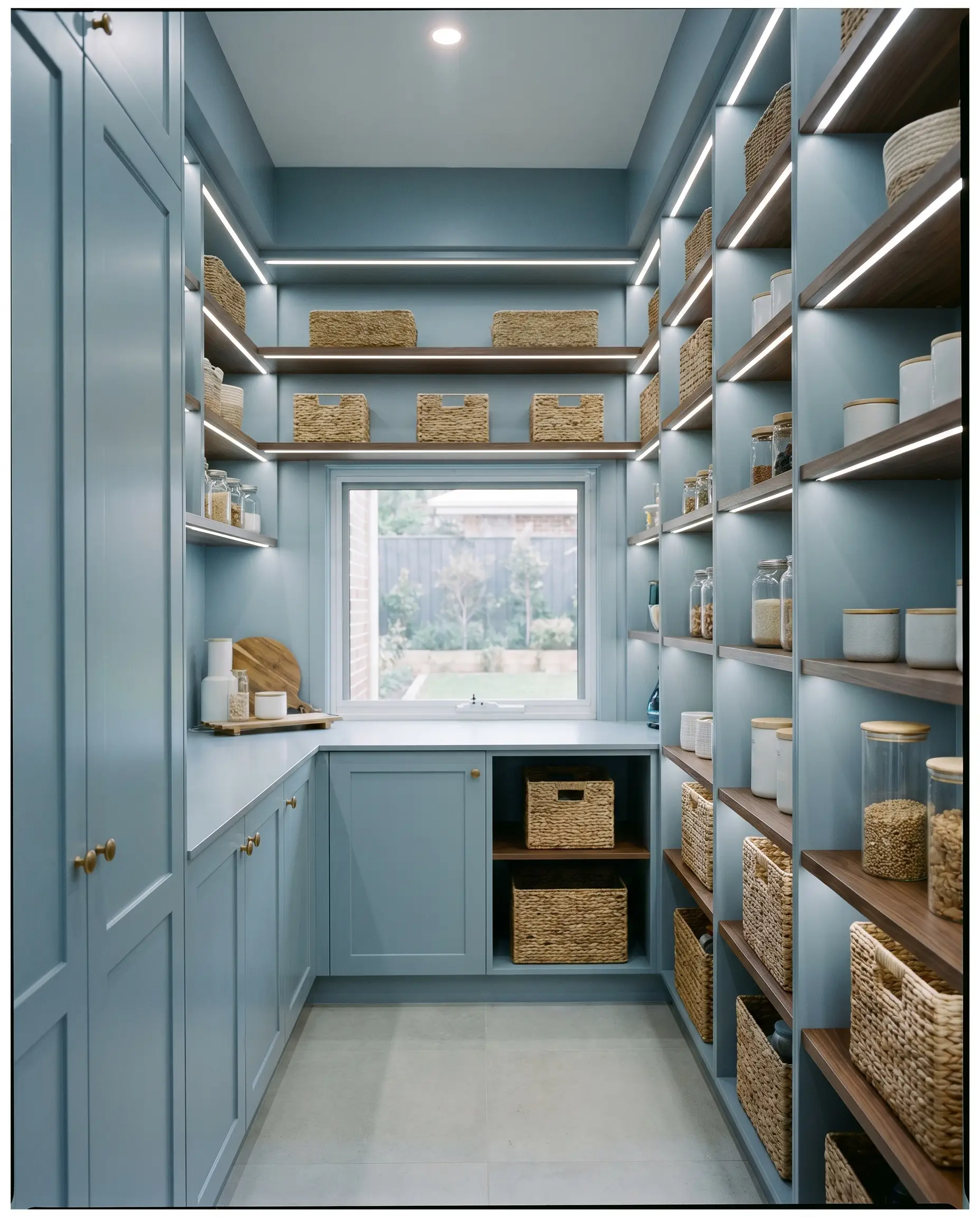
Utilitarian zones like a walk-in pantry benefit immensely from a heavy dose of personality. In a windowless space lit entirely by 4000K LEDs, this blue remains incredibly crisp and tailored. Pair it with open walnut shelving and woven storage baskets to turn a purely functional closet into a highly curated jewel box.
Strategic Pairings for Dulux Mellow Flow
The true character of this blue is defined by the company it keeps. Whether you want to sharpen its edges or soften its presence, the right tactile and tonal companions dictate the final atmosphere.
Tailoring the Millwork and Baseboards
To establish a crisp, tailored boundary, Benjamin Moore Chantilly Lace (OC-65) is a flawless trim choice. Its brilliant, clean profile highlights the blue’s depth without injecting unwanted yellow warmth. For a slightly softer, more atmospheric transition, Sherwin-Williams High Reflective White (SW 7757) offers a highly luminous edge that keeps the room feeling buoyant.
Tactile Hardware & Organic Textures
The Curated Color Palette
Designer Mood Boards
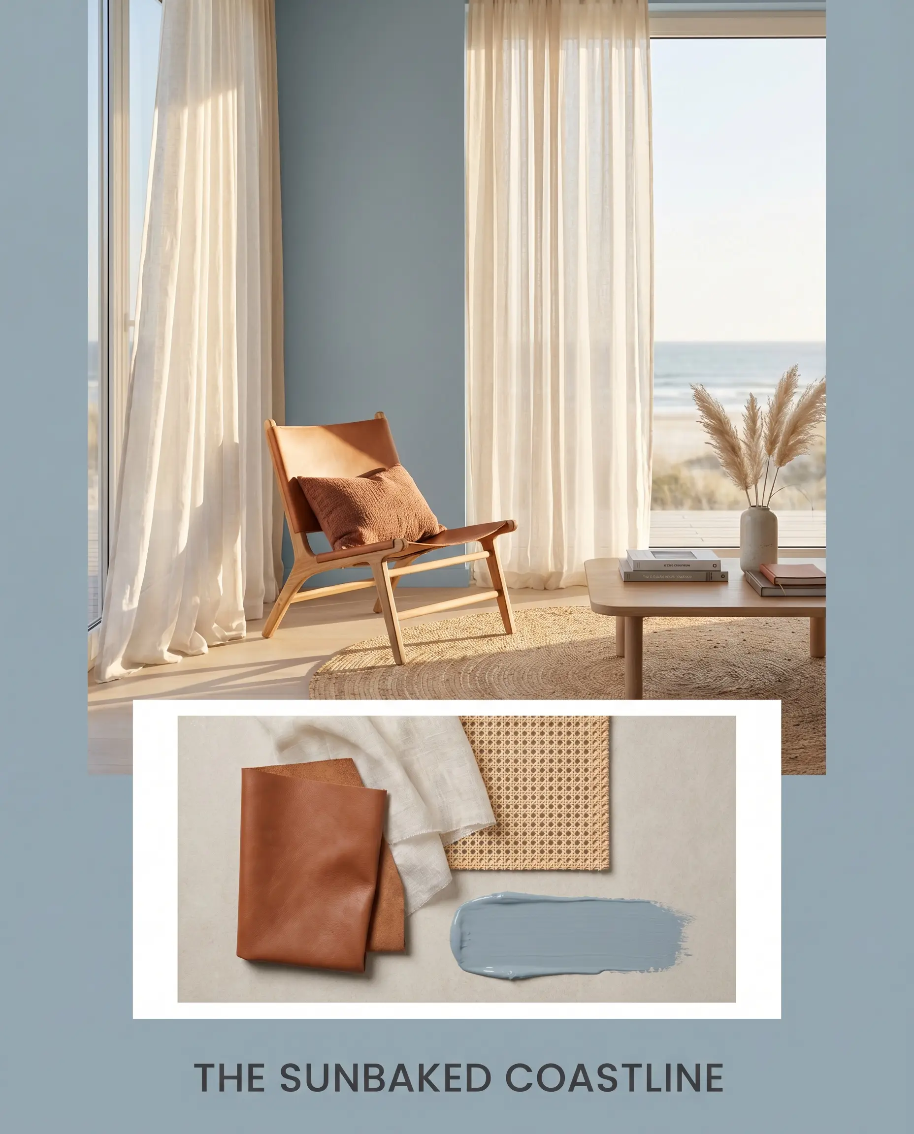
The Sunbaked Coastline This palette captures the effortless energy of a breezy, sun-drenched retreat. The powdery blue walls are warmed up by the presence of a cognac leather sling chair and the earthy punch of Sherwin-Williams Cavern Clay (SW 7701) in the throw pillows. Natural rattan accents and sheer linen drapery complete the relaxed, organic vibe.
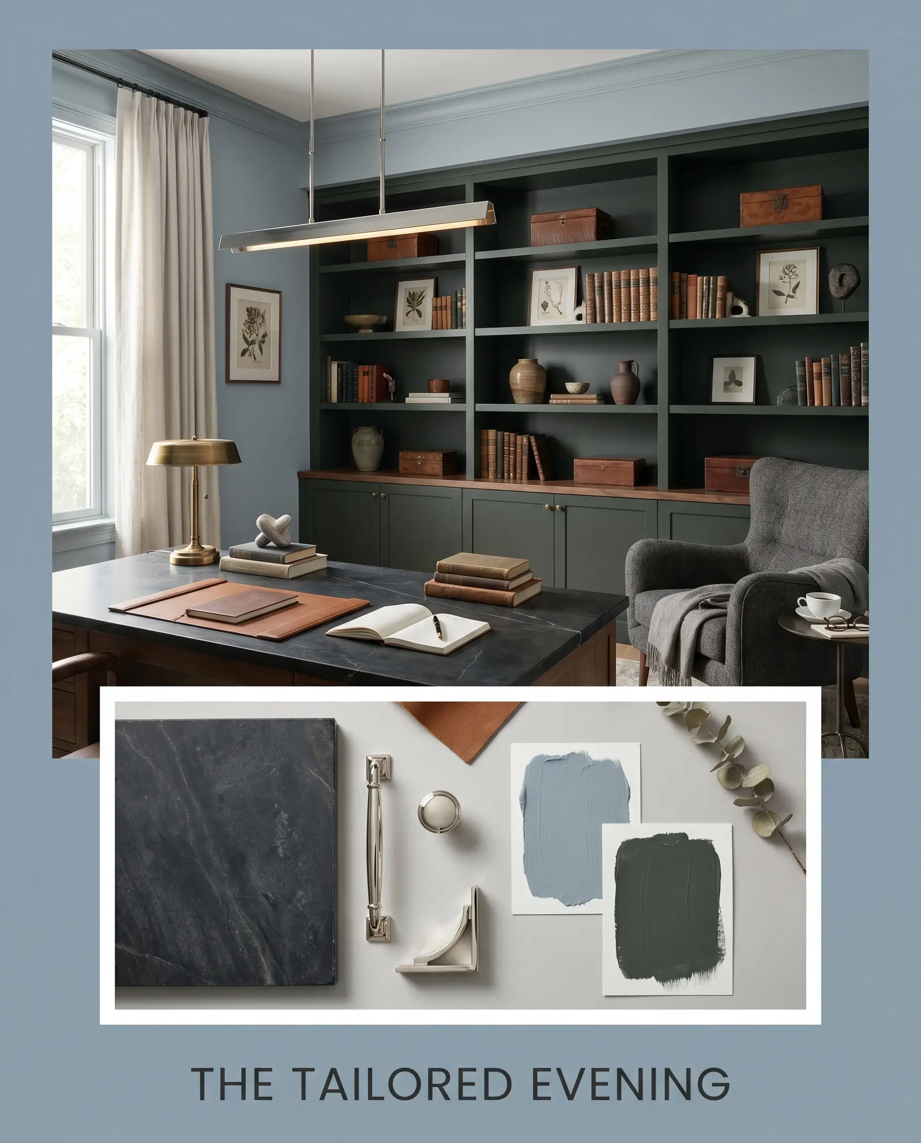
The Tailored Evening A study in refined, moody contrast. The walls provide a serene backdrop for the heavy, dramatic anchor of Farrow & Ball Studio Green (No. 93) applied to built-in shelving. A polished nickel linear pendant and a dark oiled soapstone surface elevate the space, creating an atmosphere that feels intentionally shadowed and deeply relaxing.
Head-to-Head: Mellow Flow vs. Leading Blues
Selecting the perfect mid-tone blue often comes down to analyzing the specific lighting conditions of your home. If your space lacks natural light or features competing architectural elements, a rival paint might offer a more forgiving profile.
Dulux Mellow Flow vs. Farrow & Ball Parma Gray No. 27
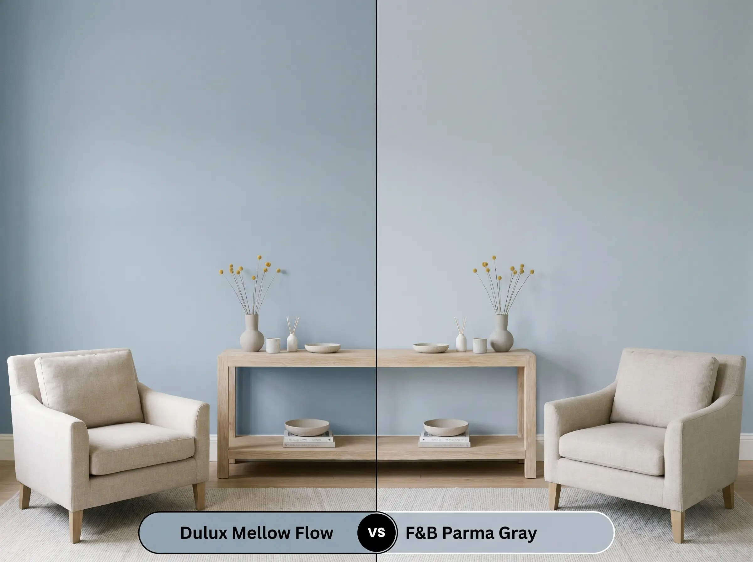
Farrow & Ball Parma Gray (No. 27) leans slightly crisper and reads as a more traditional, cleaner blue compared to the Dulux offering. If your room receives heavy, warm southern light, Parma Gray will hold its blue integrity beautifully. However, if you want a more muted, denim-like finish that embraces a touch of gray shadow, the Dulux option is the superior choice.
Dulux Mellow Flow vs. Behr Watery HDC-CT-26
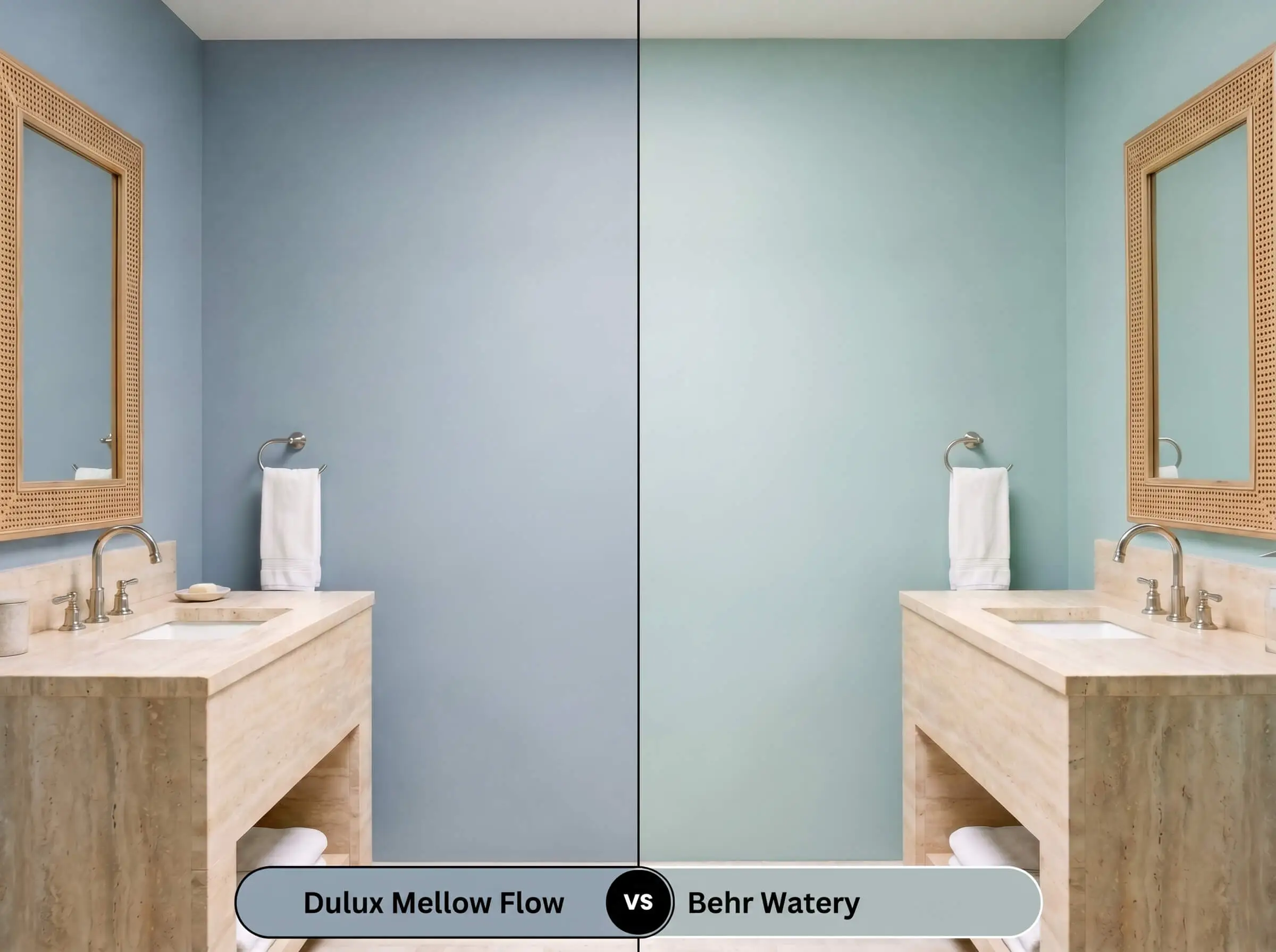
Behr Watery (HDC-CT-26) carries noticeably more green in its DNA, pushing it closer to a soft aqua. If you are designing a bathroom and want a highly aquatic, spa-like energy, the Behr paint will deliver that vibrancy. If you prefer a more restrained, sophisticated slate-blue that pairs effortlessly with earthy tones, stick with Mellow Flow.
Formulating the Perfect Match: Alternatives
Sometimes a design requires a slight pivot in depth or a brand switch due to local availability. Here are the most reliable tonal shifts and cross-brand matches to keep your project moving.
Exploring the Dulux Archives
Cross-Brand Color Matches
Execution & Trade Secrets for Dulux Mellow Flow
Moving from color theory to the physical application requires an understanding of how this specific pigment behaves on the roller. Proper preparation and sheen selection will dictate the final success of the room.
Dialing in the Right Sheen
Prepping the Canvas
Because this is a mid-tone shade, achieving true color depth requires a completely neutral base. If you are painting over a deep red or a dark charcoal, a high-quality, lightly tinted gray primer is mandatory to prevent the old color from bleeding through and altering the blue’s temperature. For raw wood applications, always use a stain-blocking primer to stop tannins from ruining the finish.
Achieving the Flawless Finish
Expect to apply two generous coats to reach the full LRV potential of this pigment.
Mid-tone blues are notorious for “flashing”—those visible, uneven roller marks that appear when you touch up a dry wall. Always maintain a wet edge while rolling, and if you find a missed spot after the wall has dried, you must repaint the entire wall from corner to corner to ensure a seamless, professional finish.
Hackrea Pro-Tip (The Roller Warning)
Frequently Asked Questions
Because of its powdery finish and mid-tone depth, this blue actually softens harsh architectural elements beautifully. Coating exposed ductwork or textured ceilings in a strict flat finish minimizes the industrial feel and turns the ceiling into a cohesive, calming canopy.
Low-E glass often casts a subtle green or blue tint into the room, which will amplify the cool cyan undertones of this paint. To prevent the space from feeling too chilly, introduce plenty of warm, tactile elements like woven cane, terracotta, or rich leather to balance the light.
Not at all; in fact, they are highly complementary. The cool cyan-gray acts as a perfect tonal foil to the earthy warmth of red brick or terracotta, allowing the architectural feature to stand out while the blue walls gently recede.
Under 3000K lighting, this blue will read as a very balanced, tailored slate. The slightly warm artificial light prevents the gray undertones from feeling too stormy, maintaining a crisp, clean aesthetic perfect for a spa-like retreat.
The Final Verdict on Mellow Flow
Dulux Mellow Flow is an incredibly sophisticated, grounding pigment perfect for homeowners who want the serenity of blue without the juvenile brightness of a pastel. It excels in open-concept living spaces, tranquil bedrooms, and on custom cabinetry, bringing a tailored, relaxed elegance to any architectural style. Its ability to absorb light while maintaining its airy cyan-gray structure makes it a highly adaptable foundational color.
However, this muted blue requires careful curation to avoid looking muddy. You must be extremely cautious when pairing it with heavily yellow-toned woods, such as golden oak flooring or honey-pine trim, as the stark temperature contrast will make the wood look artificially orange and the paint look sickly and bruised. Additionally, avoid pairing it with bright, primary cherry-red decor, which creates a jarring, unrefined visual collision; instead, lean into burnt terracottas or deep rusts for a beautifully calibrated tonal balance.
Real-World Inspiration Be the first to upload a real photo of Mellow Flow!
No Photos Yet
Includes +20 First Upload Bonus!
Real Experiences
Insights from people who have used Mellow Flow.No reviews yet
Be the first to share your experience with Mellow Flow.
Earn 15 points instantly!
Closest Cross-Brand Equivalents
The absolute closest scientific color matches for Mellow Flow across top paint brands.