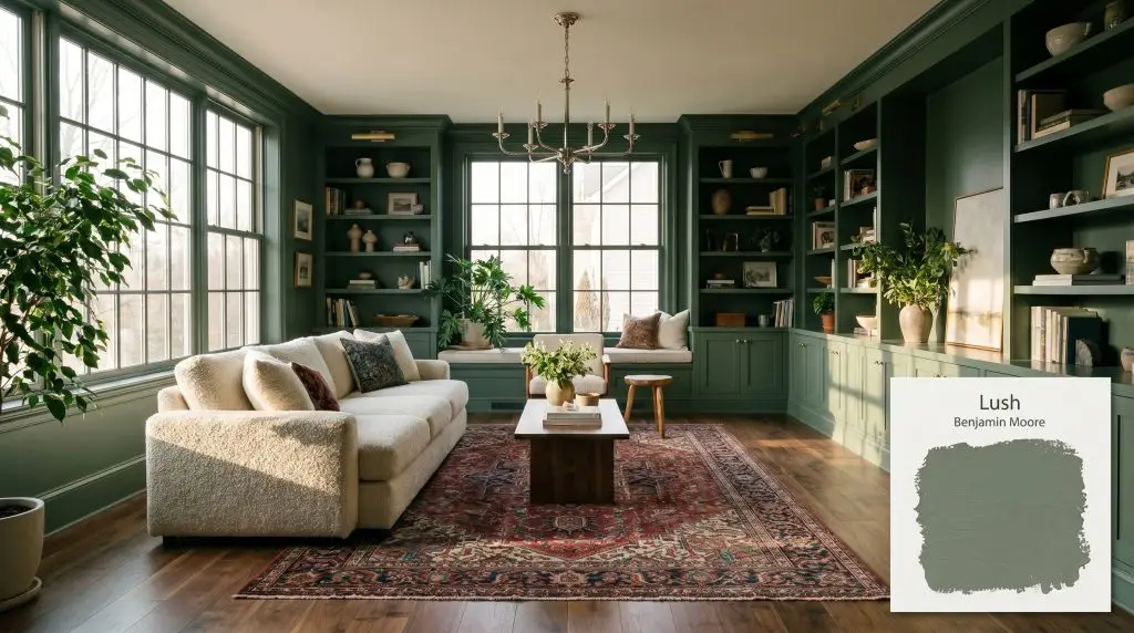
Benjamin Moore Lush (AF-475) is a rich, comforting mid-tone green with a Light Reflectance Value of 21.09. Featuring a perfect balance of warm and cool micro-undertones, it evokes the depth of a dense botanical rainforest, making it ideal for immersive, nature-inspired interior spaces.
Will Lush clash with your room?
Paint Technical Profile
| Color ID / SKU | AF-475 |
| HEX Code | #738071 |
| Light Reflectance (LRV) | 21.09 |
| Use | Interior |
| Best Exposures | South, West |
| Best For | Kitchen Cabinetry, Home Offices, Bedrooms, Accent Walls |
Benjamin Moore Lush AF-475: Grounding Light-Starved Architecture With Botanical Warmth
A sprawling, undefined suburban floor plan often struggles to find its grounding anchor. When walls feel too distant and the light diffuses into a hazy wash, a deeply saturated mid-tone sage can pull the boundaries inward, creating a sense of deliberate intimacy.
Benjamin Moore Lush AF-475 is exactly that kind of architectural tool. Part of the renowned Affinity Color Collection, this pigment doesn’t just coat a wall; it actively absorbs excess glare and wraps a room in an earthy, botanical green embrace. It offers the perfect balance of shadow and warmth to redefine how an everyday home feels.
Benjamin Moore Lush: Undertones & LRV
When evaluating if this shade leans warm or cool, the answer lies in its hidden earthy foundation. While it presents as a deeply grounded, warm-leaning neutral green, its complex pigment profile allows it to adapt beautifully to varying environments.
With an official light reflectance value of 21.09, this shade absorbs a significant amount of the energy in a room. It sits confidently in the mid-to-dark tier, meaning it requires intentional lighting strategies to keep it from feeling overly heavy in tight corridors.
Capturing Light: The Chameleon Factor
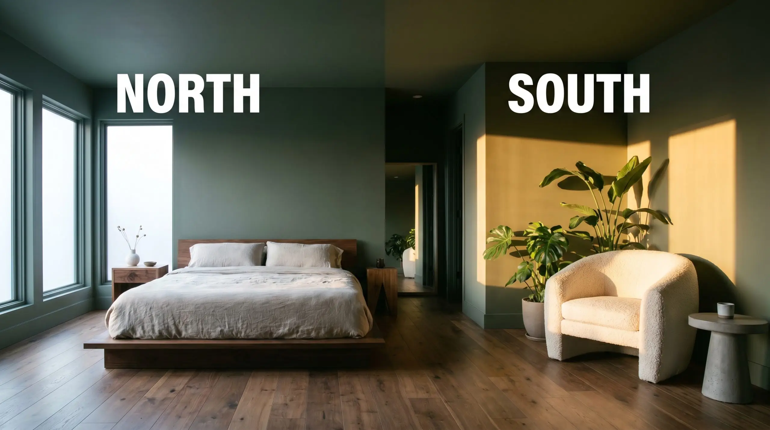
The biggest environmental risk for this specific shade is relying entirely on flat, overhead fluorescent lighting. Without the directional warmth of natural sun or carefully selected ambient bulbs, the color loses its rich earthiness and flattens into a dull, institutional gray-green.
Because of its nuanced hue angle 112, this pigment is highly reactive to the temperature of the light hitting it. Testing Lush AF-475 on multiple walls is non-negotiable to understand how its hidden blue and red notes will battle throughout the day.
Shaping the Home: Popular Room Applications
Rather than demanding a specific architectural era, this deeply saturated tone wraps around everyday materials to build a sense of quiet refuge. It brings a heavy, intentional weight to standard drywall, instantly giving basic residential layouts a custom, highly curated atmosphere.
Kitchens
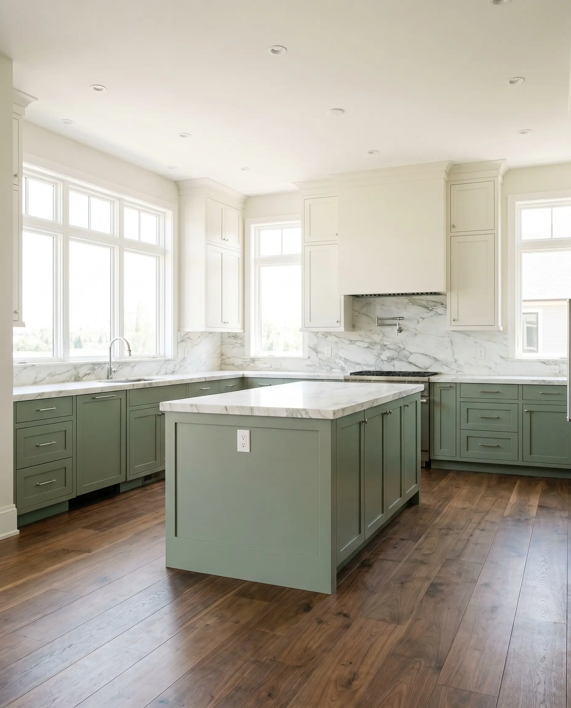
Applying this deep green to stock shaker base cabinets or a central island instantly anchors a light-filled cooking space. It pairs flawlessly with a transitional aesthetic, especially when contrasting against simple white upper cabinetry and heavily veined marble countertops. The dark lowers hide everyday scuffs while providing a sophisticated, grounded base for the room.
When applying deeply pigmented greens to high-traffic woodwork, opting for an advanced cabinetry lacquer rather than standard wall paint ensures the subtle blue-gray undertones aren’t distorted by everyday grease and cleaning friction.
Hackrea Pro-Tip (Cabinetry Finishes)
Home Offices
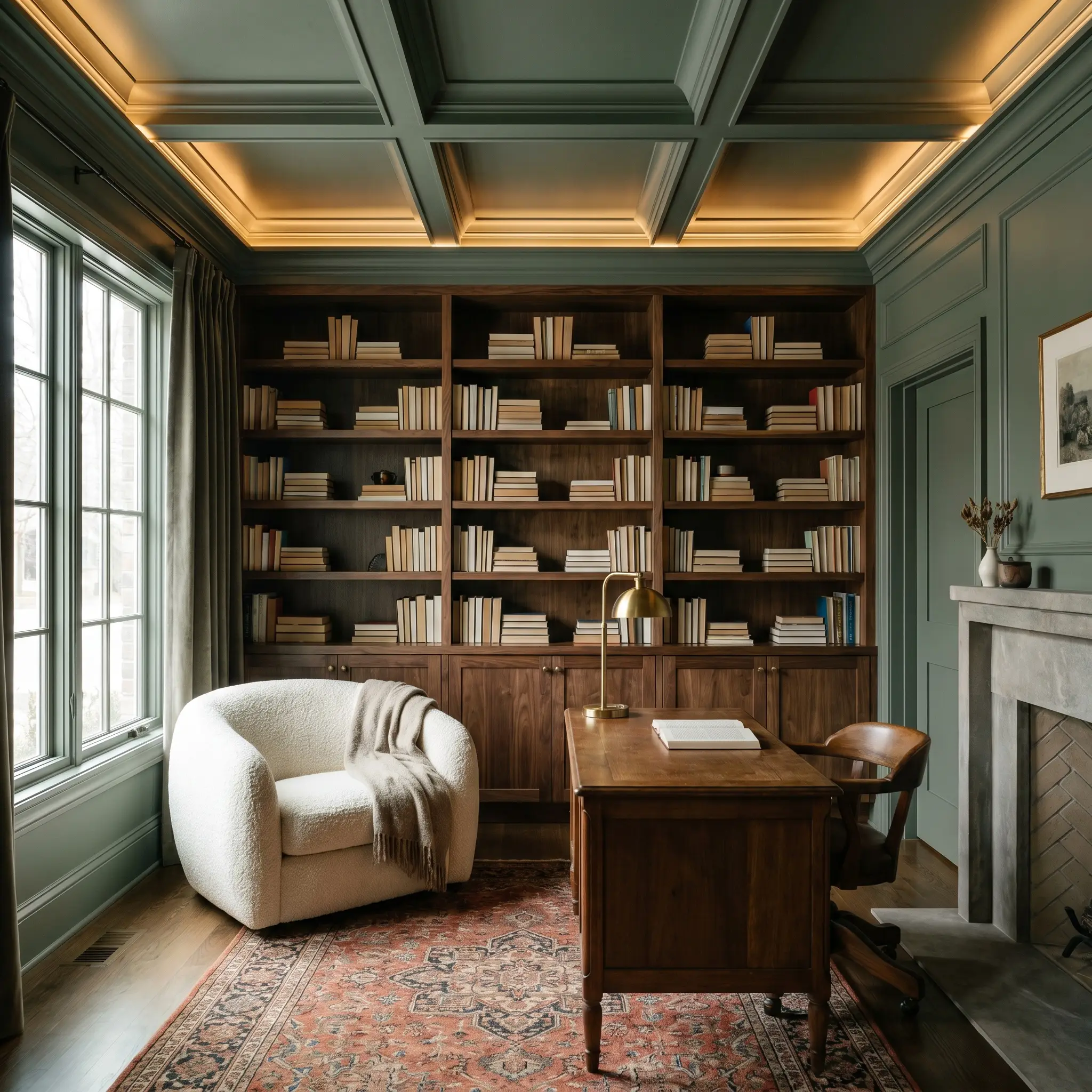
For a space that requires deep focus, wrap the walls, trim, and even the ceiling in this dense botanical shade. This immersive color drenching technique erases visual boundaries, making the room feel like a historic, moody library. The dark wrap absorbs distracting glares from computer screens and creates a remarkably calming environment.
Will Lush work with your specific lighting, floor, or furniture?
Bedrooms
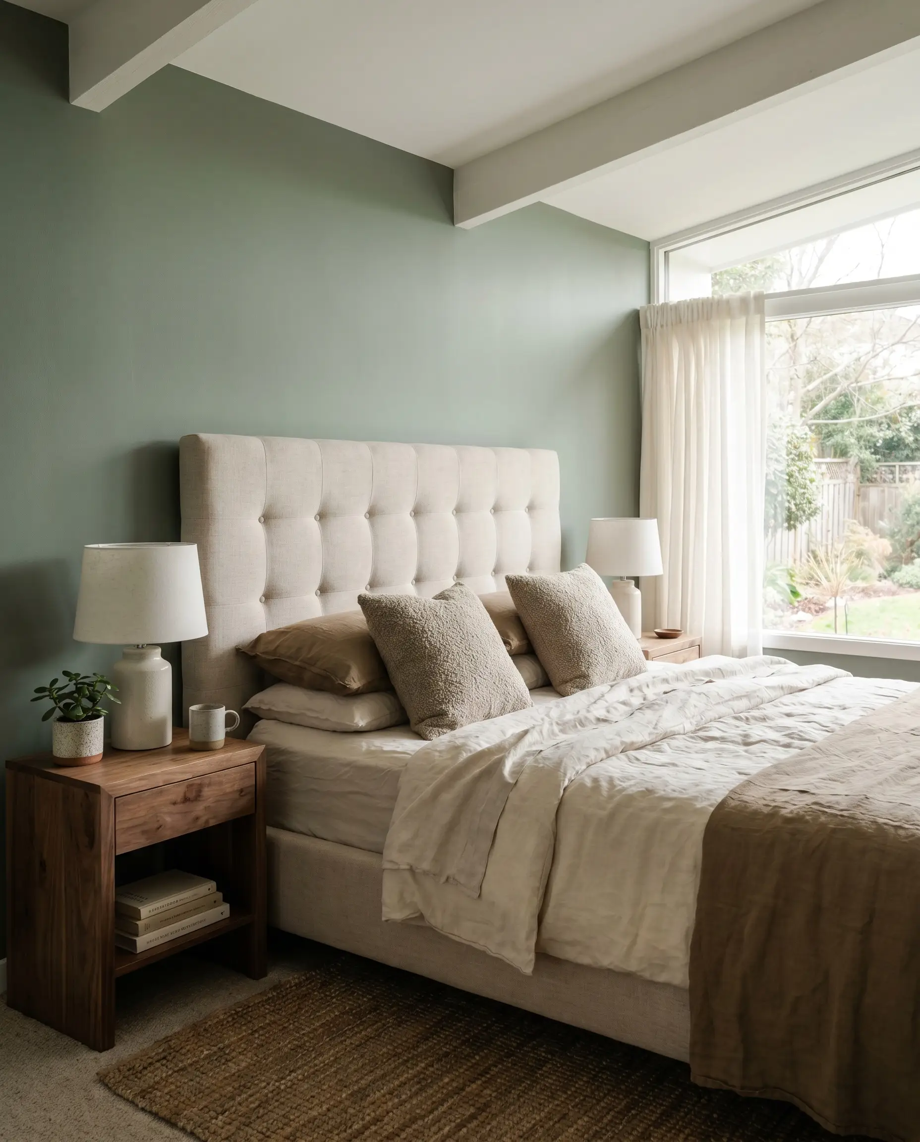
This shade is brilliant for building a cozy, enveloping sleep sanctuary. Utilizing a flat finish on the walls softens the heavy pigment, allowing the green to recede gently into the shadows at night. It works beautifully as a full-room wrap or as a heavy, grounding accent behind a tufted headboard.
Powder Rooms
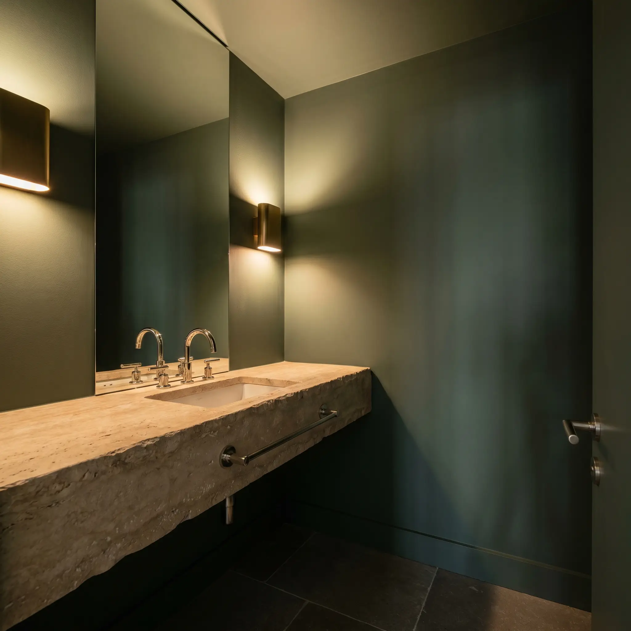
Windowless half-baths are the perfect canvas for dramatic color commitments. Instead of fighting the lack of natural light with sterile whites, lean into the shadows by saturating the small space in this rich green. Paired with warm ambient sconces, the tiny footprint transforms into a highly intentional, intimate retreat.
Will Lush work with your specific lighting, floor, or furniture?
Unlocking Benjamin Moore Lush: Unique Design Ideas
The true potential of this mid-tone sage reveals itself when you stop treating it merely as a background wall color. Its specific balance of shadow and earthy warmth makes it an incredible catalyst for highly custom, specialized architectural interventions.
The Maximalist Collector’s Beadboard Backdrop
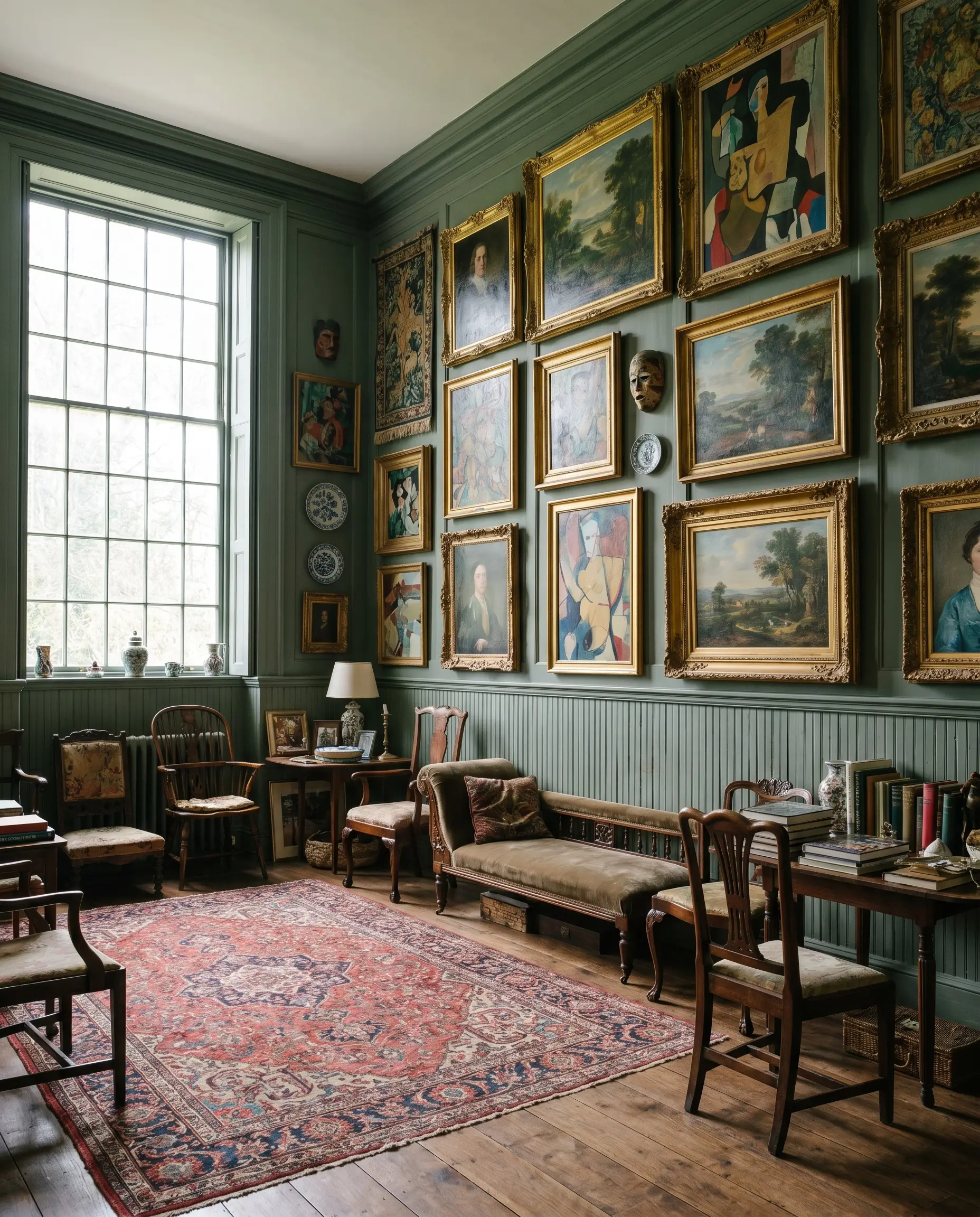
Applying this deep botanical green over salvaged wainscoting creates a rich, textured canvas for displaying eclectic art. The color’s low light reflectance anchors vibrant oil paintings and ornate gilded frames, preventing a maximalist gallery wall from feeling chaotic. The heavy green grounds the visual noise, allowing the artwork to become the true focal point.
The Jewel-Box Pantry
Will Lush work with your specific lighting, floor, or furniture?
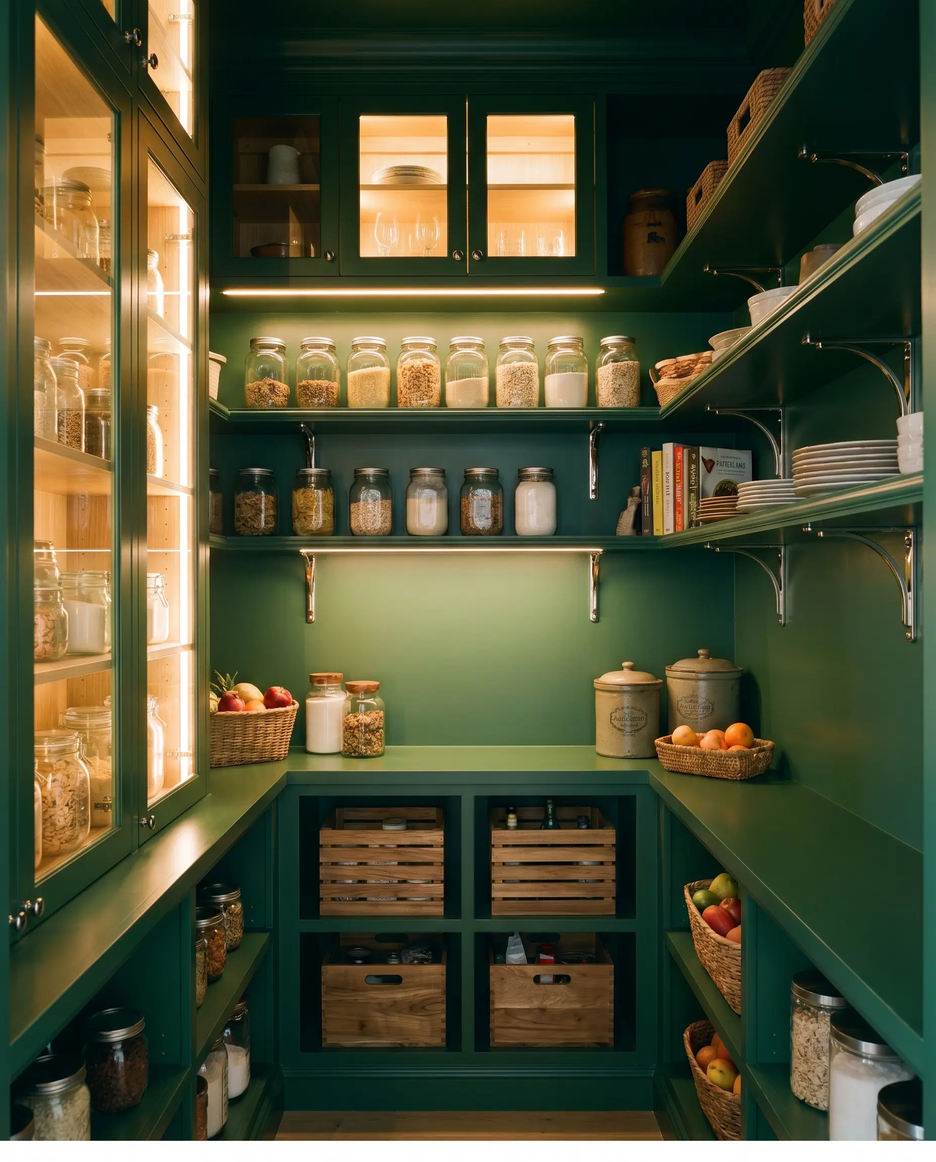
Standard walk-in pantries often suffer from harsh, windowless artificial light and endless rows of chaotic packaging. By completely saturating the shelving and walls in this dense shade, the utilitarian zone transforms into a sophisticated, moody jewel box. The color absorbs the visual clutter, making basic glass storage jars and simple wooden crates feel incredibly intentional.
Defining the Threshold
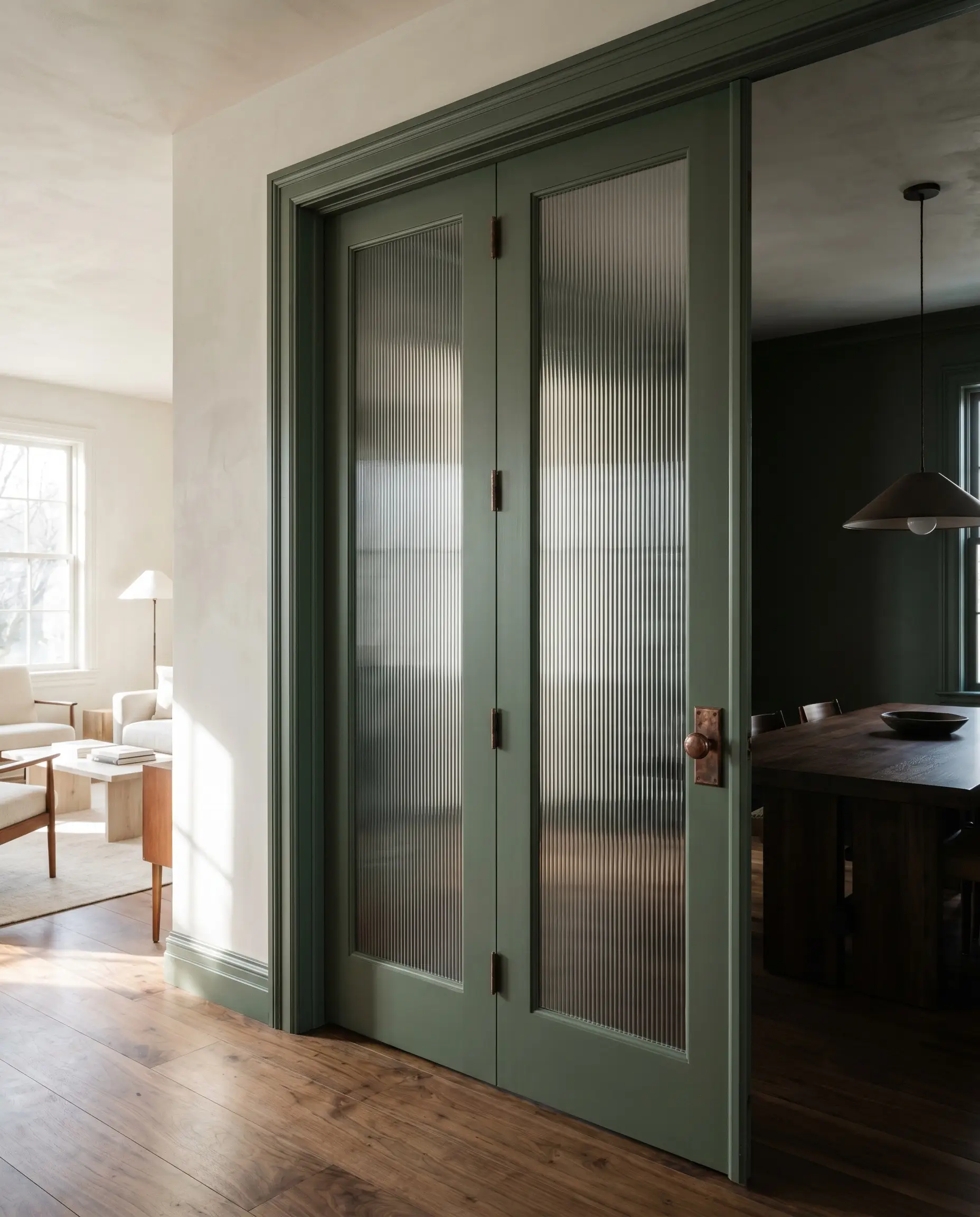
Painting interior French doors in this grounded hue creates a stunning architectural pause between a bright living room and a darker dining space. When paired with fluted privacy glass and heavy, aged copper hardware, the doors stop being a basic builder-grade transition. They become a premium focal point that dictates the flow of the entire floor plan.
Curating the Palette: Coordinating Colors & Best Pairings
To maximize the impact of this dense botanical shade, you must surround it with elements that either match its heavy, earthy energy or provide a crisp, illuminating contrast. The surrounding materials dictate whether the room feels like a vibrant conservatory or a shadowed, intimate retreat.
Trim & Baseboards
Crisp, warm-leaning whites are essential to keep the deep green from bleeding into the millwork.
Hardware & Tactile Pairings
The Coordinating Palette
Designer Mood Boards
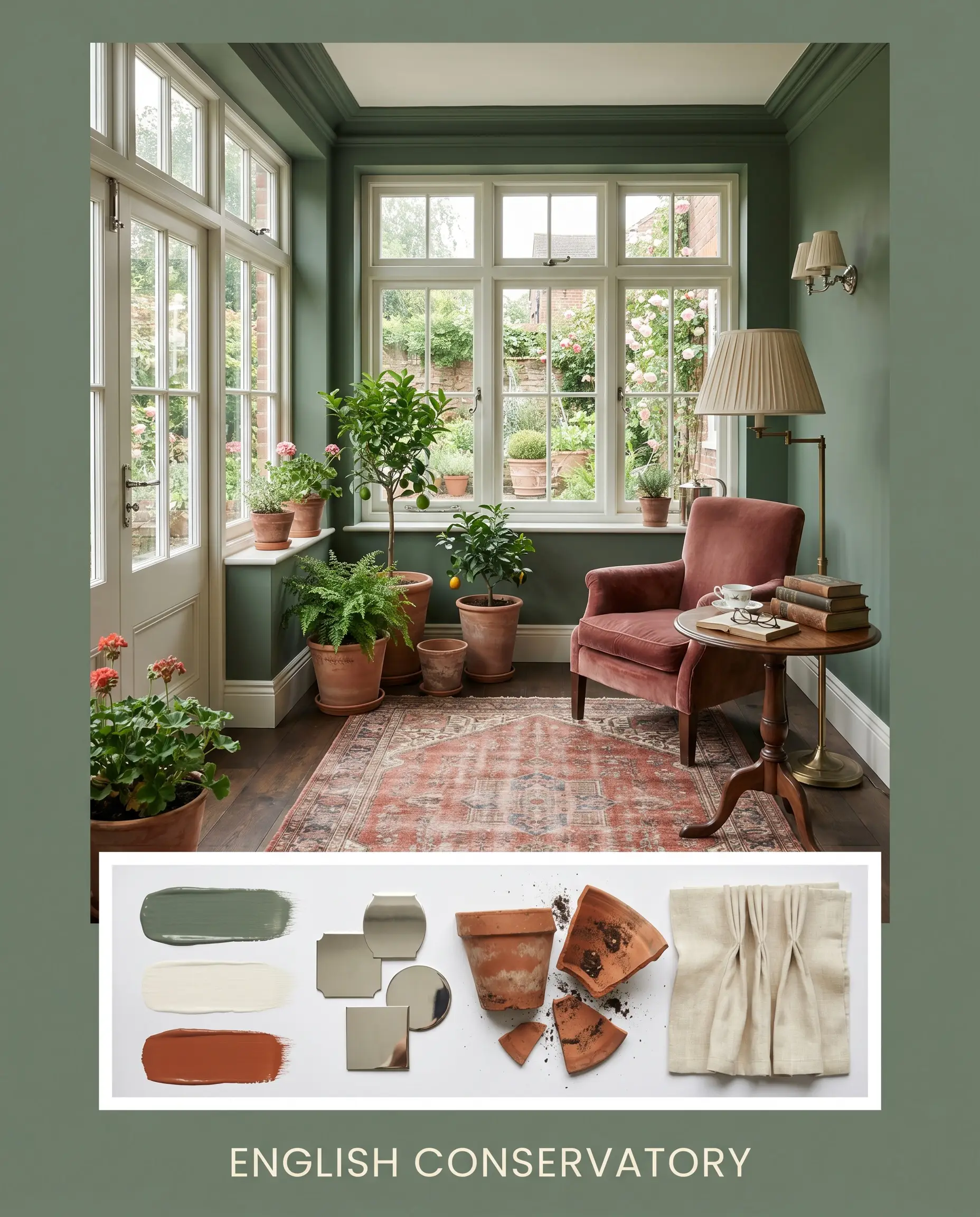
English Conservatory
Weaving the crisp boundary of Wimborne White No. 239 against the main green, this palette relies on the reflective spark of polished nickel hardware to keep the energy bright. A vintage Persian rug in faded brick tones echoes the Rookwood Terra Cotta SW 2803, while simple terracotta planters and a pleated linen lampshade complete the traditional, sun-drenched atmosphere.
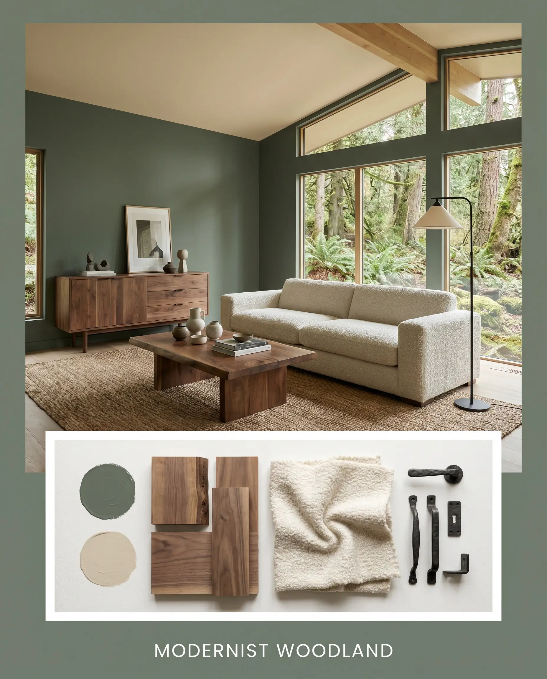
Modernist Woodland
Anchored by the seamless warmth of Jute AF-80 on the ceiling, this aesthetic leans heavily into the tactile richness of raw walnut furniture. The dark green walls serve as a moody backdrop for a heavy, low-profile bouclé sofa and a minimalist forged iron floor lamp. The resulting energy is incredibly grounded, quiet, and tailored.
Will Lush work with your specific lighting, floor, or furniture?
Benjamin Moore Lush: Head-to-Head Comparisons
Choosing the perfect deep green often comes down to analyzing how a specific pigment behaves under challenging exterior exposures or tricky interior shadows. If your space lacks the right natural light, a rival shade might offer the exact color temperature shift you need.
Benjamin Moore Lush vs. Sherwin-Williams Pewter Green SW 6208
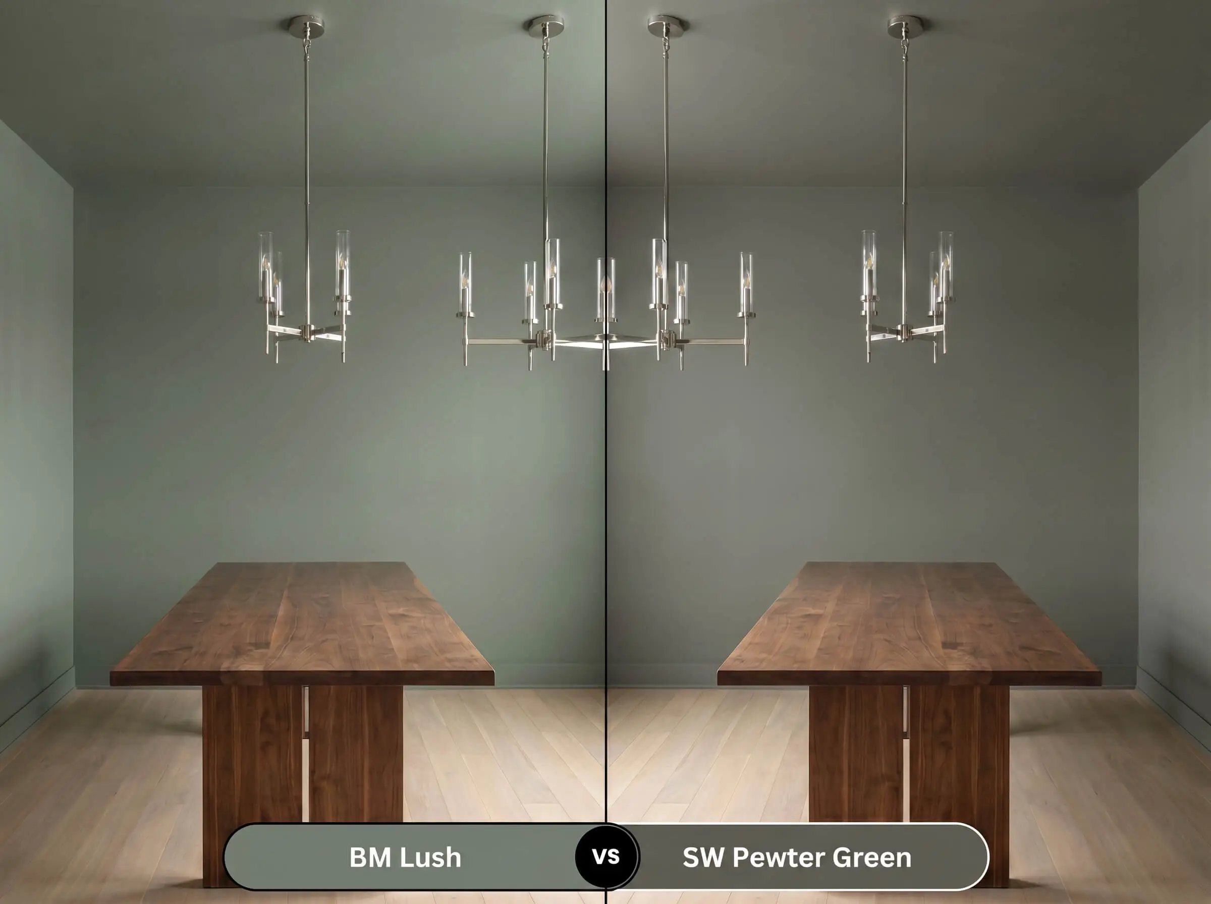
If your room faces north and you want to avoid any hint of yellow, Pewter Green is the superior choice. It carries a much heavier gray influence, making it read distinctly cooler and more industrial, whereas the BM alternative retains a warmer, more traditional botanical profile.
Benjamin Moore Lush vs. Farrow & Ball Green Smoke No. 47
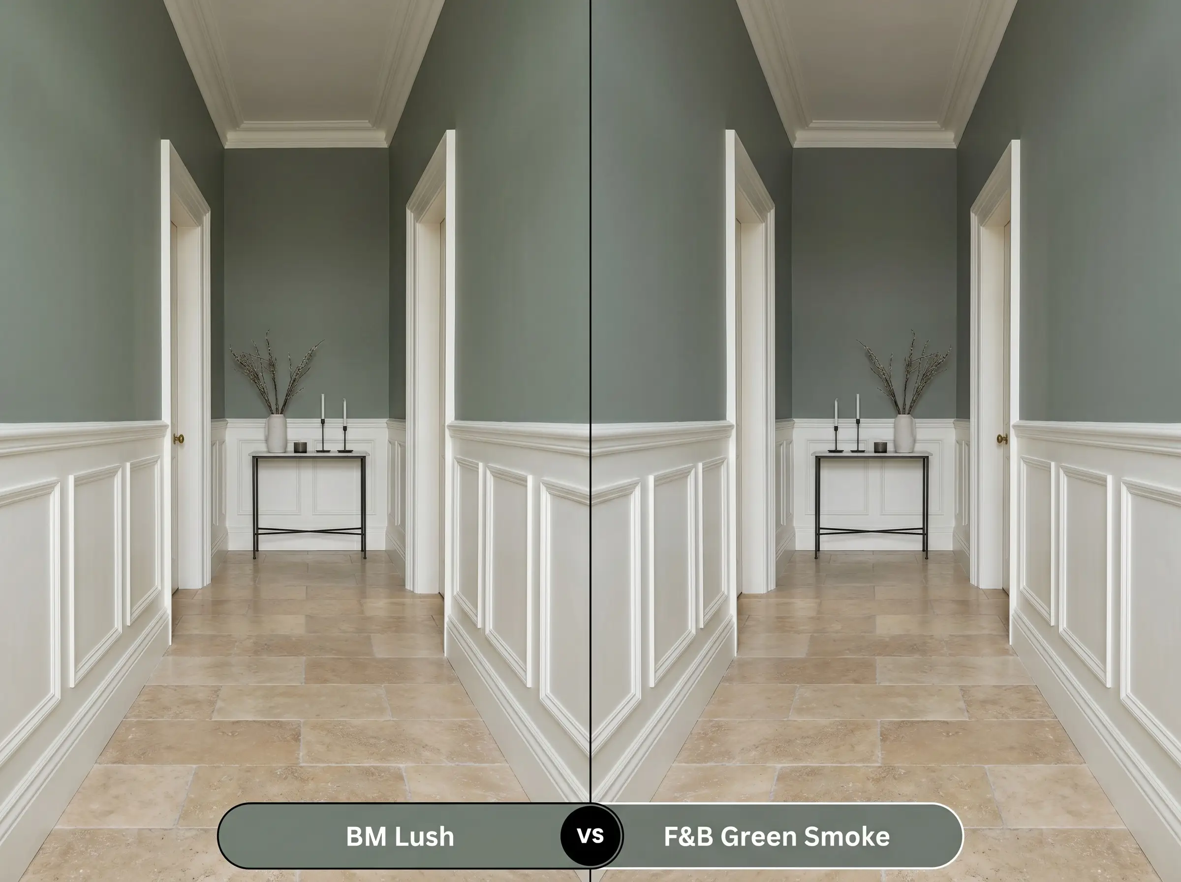
Green Smoke offers a slightly more weathered, historic blue-green wash that excels in older renovations. If you need a color that feels instantly aged and heavily muted, lean toward the Farrow & Ball option; if you prefer a richer, more saturated forest tone, stick with the Benjamin Moore formulation.
Exploring Alternatives: Similar Colors & Matches
Whether you need a slightly higher light reflectance for a dim corridor or you are shopping across different manufacturer lines, these closely related shades provide excellent flexibility.
Within the Brand
Cross-Brand Equivalents
Getting it on the Wall: Practical Application Guide
Transitioning this rich pigment from a small swatch to a massive architectural surface requires deliberate planning. The depth of this shade means your preparation and finish choices will dictate the final professional polish.
The Dynamic Sheen Guide
Primer Strategy
Because of its heavy pigment load, a high-quality tinted gray primer is mandatory. Applying this shade over stark white drywall without a tinted base will force you into painting three or four coats just to achieve true opacity.
Coverage & Success Tips
Expect to apply two generous coats over your tinted primer for a flawless finish. Be highly cautious of “flashing”—visible, shiny roller marks that occur when you touch up a partially dried wall. Always keep a wet edge and roll from ceiling to floor in one continuous motion to ensure the heavy green pigment dries uniformly.
Frequently Asked Questions
While it can lean heavy without natural sun, it actually thrives in windowless spaces when paired with warm 3000K sconces. The controlled lighting embraces its moody, intimate qualities rather than trying to force it to look bright.
The proprietary colorant is highly sensitive to bulb temperature. A 4000K LED will strip away the hidden earthy warmth, leaving a flat, rigid sage, whereas warm incandescent bulbs beautifully enhance its rich, botanical depth.
Absolutely. The inherent earthy undertones of this shade make it a brilliant candidate for textured applications, as the raw plaster highlights the subtle interplay between its warm and cool pigment channels.
The strong orange and red tones in the oak flooring will actively pull out the hidden red micro-undertones in the paint. This interaction warms up the entire room, making the green feel distinctly more olive than blue.
Final Verdict & Expert Warnings
Benjamin Moore Lush is a masterful architectural tool for those looking to inject grounded, biophilic warmth into sterile or overly vast spaces. It is the perfect candidate for immersive, color-drenched home offices, striking kitchen cabinetry, and any room that benefits from a quiet, enveloping atmosphere.
However, this dense botanical hue demands careful curation when it comes to your fixed material pairings. You must absolutely avoid pairing this shade with heavily yellowed, glossy 1990s honey oak trim or stark, icy blue glass tiles. The aggressive yellow in dated wood finishes will clash violently with the paint’s subtle blue-gray shadow, making the walls look sickly and bruised rather than earthy. Similarly, cool-toned gray luxury vinyl plank flooring will completely undermine the hidden warmth of the pigment, resulting in a disjointed, chaotic aesthetic. Stick to rich, raw woods and warm, creamy stones to let this gorgeous color truly thrive.
Room Compatibility & Clashes Diagnoses
Hackrea's reports evaluating the compatibility of Lush in real rooms.No compatibility tests for Lush yet.
Be the first to see how this color reacts to your space. Run a free architectural diagnostic now.
Closest Cross-Brand Equivalents
The absolute closest scientific color matches for Lush across top paint brands.