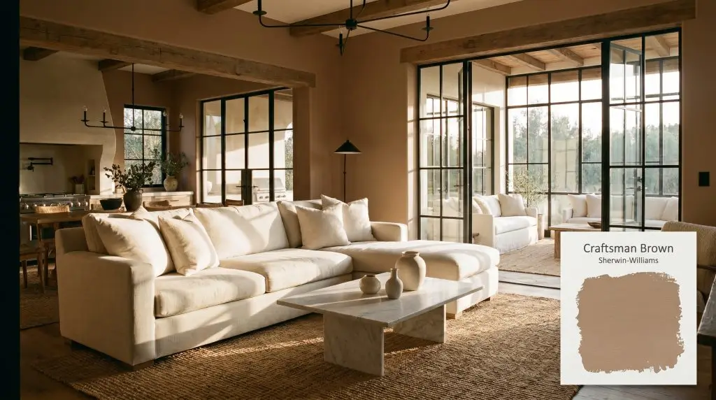
Craftsman Brown SW 2835
Sherwin-WilliamsSherwin-Williams Craftsman Brown (SW 2835) is a warm, mid-tone earthy brown with subtle red and orange undertones. Boasting an LRV of 31, it absorbs a significant amount of light, making it an ideal choice for cozy, grounded spaces or striking exterior architectural accents.
Paint Technical Profile
| Color ID / SKU | SW 2835 |
| HEX Code | #AE9278 |
| Light Reflectance (LRV) | 31 |
| Use | Interior, Exterior |
| Best Exposures | North, East, West |
| Best For | Living Rooms, Libraries, Exteriors, Cabinetry |
Sherwin-Williams Craftsman Brown: A Grounding Canvas for Rich, Tactile Interiors
There is a profound shift happening in modern interiors, moving away from stark clinical whites toward deeply rooted, earthy hues that instantly wrap a room in warmth. Sherwin-Williams Craftsman Brown (SW 2835) sits right at the forefront of this transition, offering a rich, baked clay energy that effortlessly bridges the gap between historic charm and contemporary styling.
At an LRV of 31, this mid-tone brown possesses the perfect visual weight to anchor everyday spaces, acting as a stunning, restorative backdrop for everything from standard linen sofas to premium vintage textiles. It is an incredibly adaptable foundational layer that brings an immediate sense of permanence and architectural character to your home.
The Color DNA of Craftsman Brown SW 2835
When homeowners ask if this earthy warm brown leans warm or cool, the answer is a definitive, unapologetic warm.
With a light reflectance value (LRV 31), this pigment falls squarely into the mid-to-dark category, meaning it absorbs much more light than it bounces. In a real-world living space, this density acts as a visual anchor, pulling the walls inward slightly to create a cozy, restorative atmosphere that requires intentional lighting to truly sing.
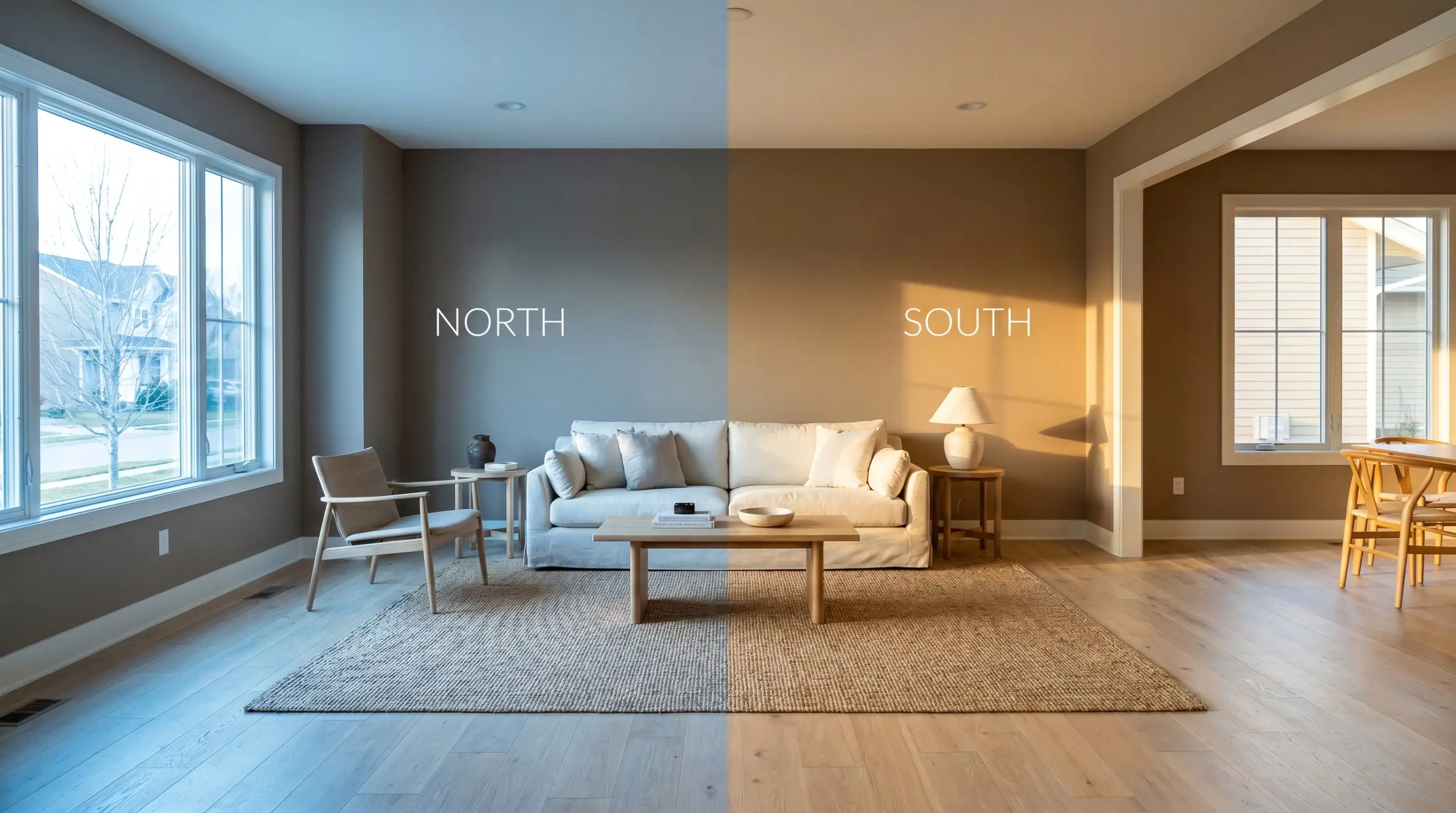
Ambient Lighting Impact & The Chameleon Factor
The biggest risk with this specific pigment is placing it in a heavily shaded, north-facing room with minimal artificial light, where its rich terracotta warmth will flatten out into a dull, heavy shadow. Because of its complex red-orange base, this color is highly reactive to its environment, shifting dramatically depending on the sun’s trajectory. You must evaluate your ambient lighting impact before committing to a full room or exterior facade.
Popular Room Applications for SW Craftsman Brown
This specific depth of color demands a certain level of architectural confidence, bringing a cohesive, grounded energy to both interiors and exteriors. It effortlessly adapts to a wide variety of design styles, shifting its personality based entirely on the materials and furnishings you place around it.
Living Spaces
In a central gathering space, this rich tone creates an immediate sense of intimacy without feeling overly dark. It serves as a brilliant backdrop for a standard light gray or cream linen sectional, allowing the pale upholstery to pop beautifully against the dark walls. To push a more contemporary rustic aesthetic, layer the room with woven jute rugs, matte black iron fixtures, and perhaps one premium focal piece like a honed marble coffee table.
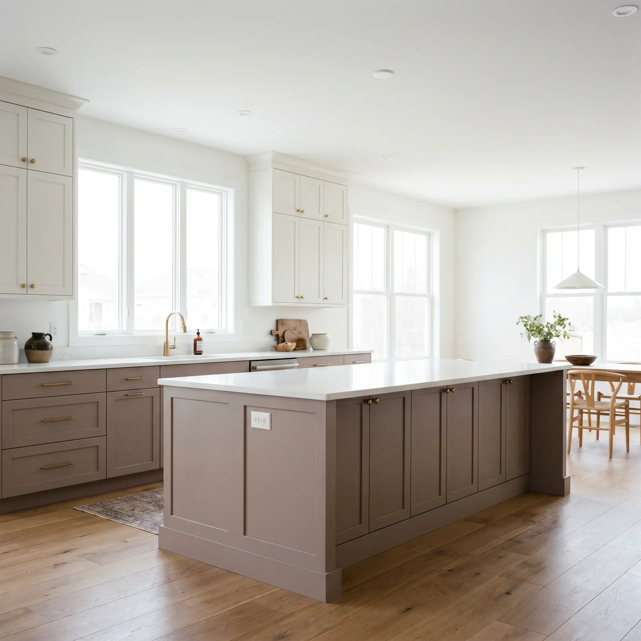
Kitchens & Cabinetry
Moving away from the ubiquitous all-white kitchen, utilizing this earthy hue on lower cabinets or an island introduces a massive dose of character. It anchors an open-concept layout effortlessly, especially when paired with crisp white upper cabinets and warm brass hardware.
When using this baked brown on cabinetry, opt for unlacquered brass or aged copper pulls; the metallic sheen bounces light and beautifully echoes the paint’s hidden warm undertones.
Hackrea Design Secret (The Hardware Glow)
Architectural Exteriors
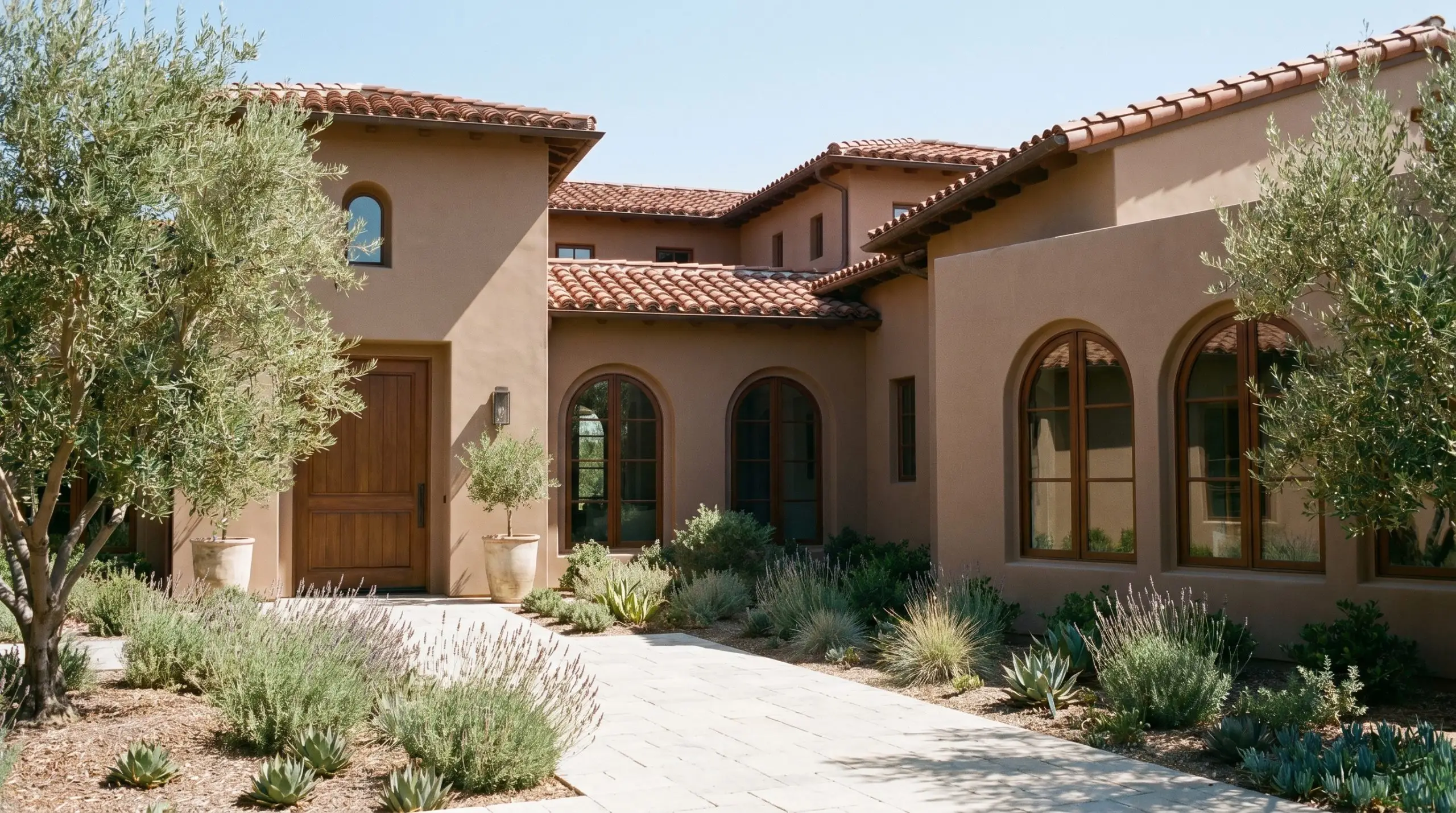
While it certainly honors its place in the Sherwin-Williams historic collection, this pigment is not limited to vintage bungalows. As a primary stucco exterior paint, it provides a stunning, sun-baked Mediterranean energy that feels incredibly high-end. If you are exploring a full facade renovation, this hue consistently ranks highly among the best brown paint colors for exteriors due to its resistance to looking muddy in the shade. Always remember that direct sunlight washes colors out, so this mid-tone brown will appear significantly lighter and warmer on a massive exterior facade than it does on a tiny paper swatch indoors.
Unique Design Ideas & Inspiration
Beyond standard four-wall applications, the dense, light-absorbing nature of this pigment makes it a brilliant tool for highly curated, intentional design moments.
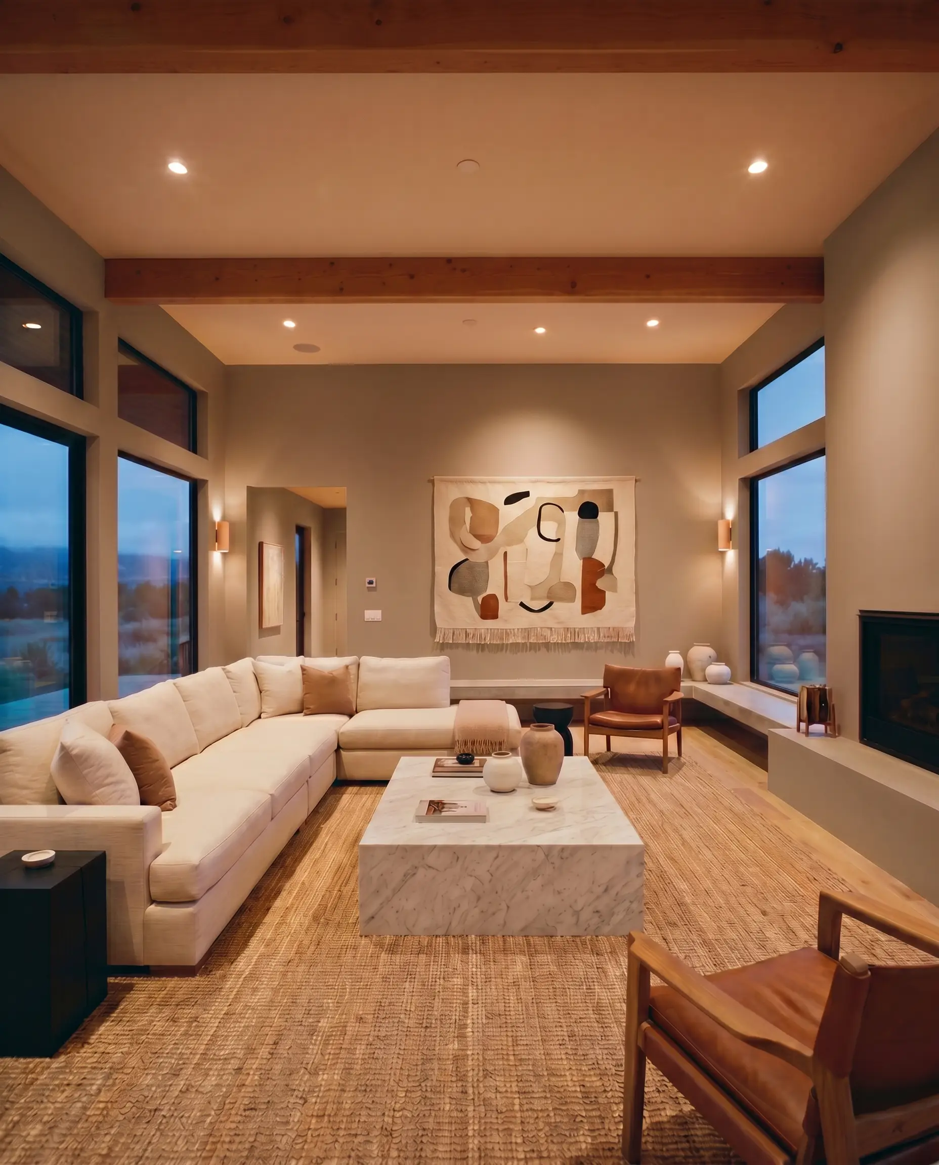
The Monochromatic WFH Studio
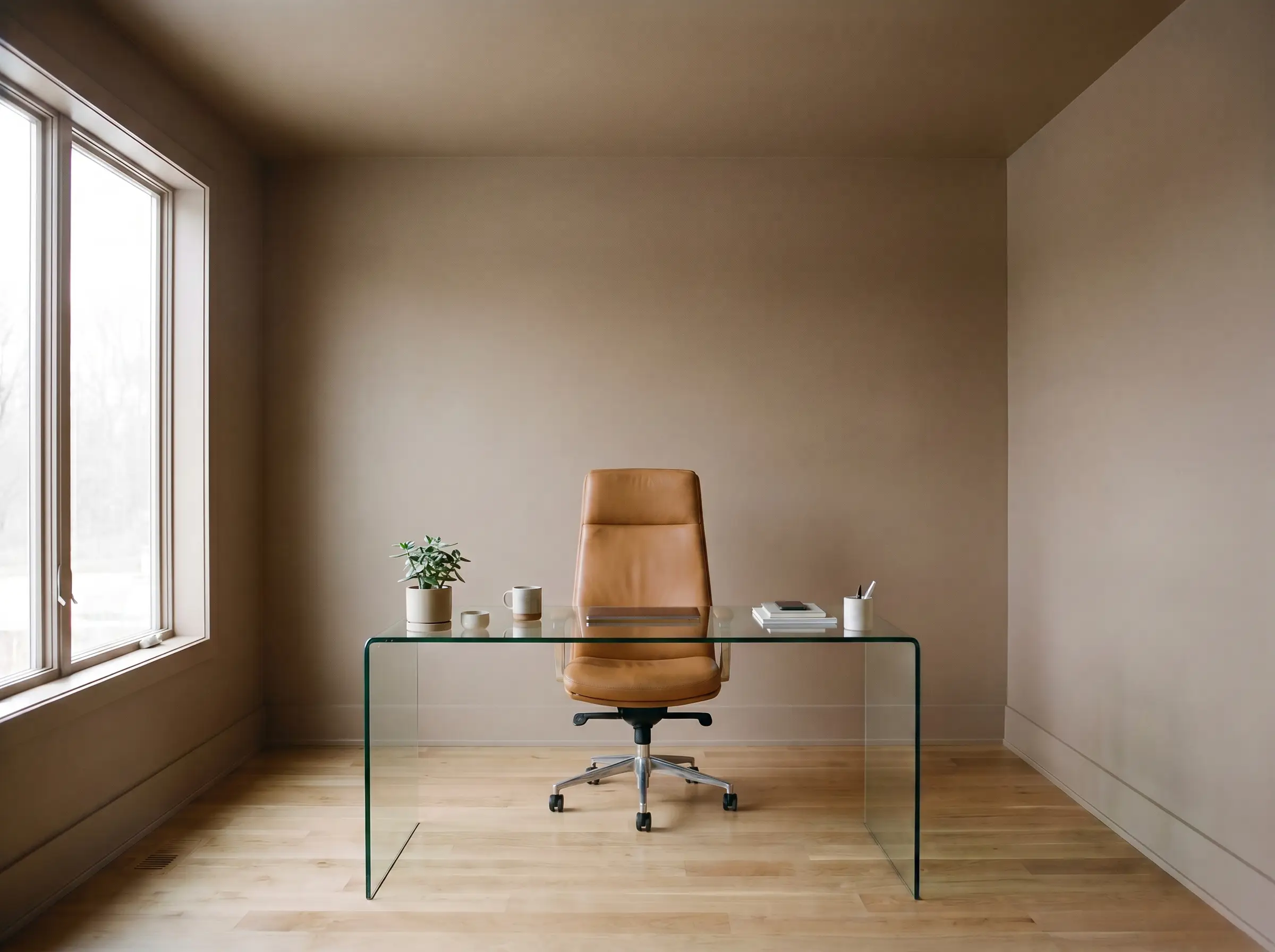
For a home office that requires deep focus, envelop the entire room—walls, baseboards, and ceiling—in this rich hue. This seamless, color-drenched approach blurs the hard lines of the architecture, creating a sophisticated, distraction-free environment. Pair it with a standard sleek glass desk and a premium, ergonomic leather chair for a modern, executive feel.
A Mediterranean-Inspired Sunroom
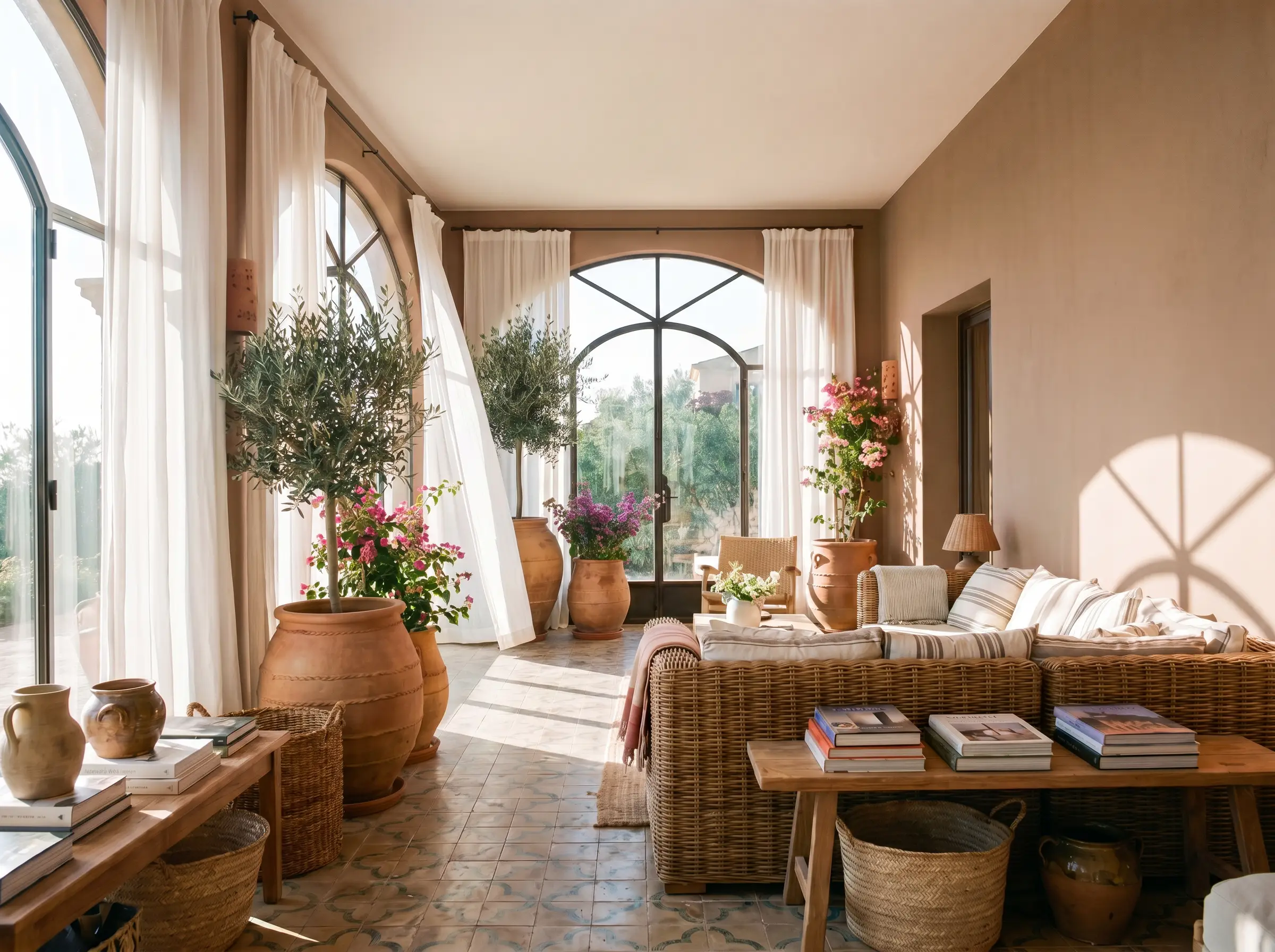
Capitalize on the color’s baked clay undertones by using it in a space flooded with southern light. The sun will pull out the terracotta warmth, instantly transforming a standard enclosed porch into a vibrant, resort-like retreat. Layer in everyday oversized terracotta planters, breezy white cotton drapery, and a statement rattan sofa to complete the aesthetic.
The Vintage-Modern Dining Nook
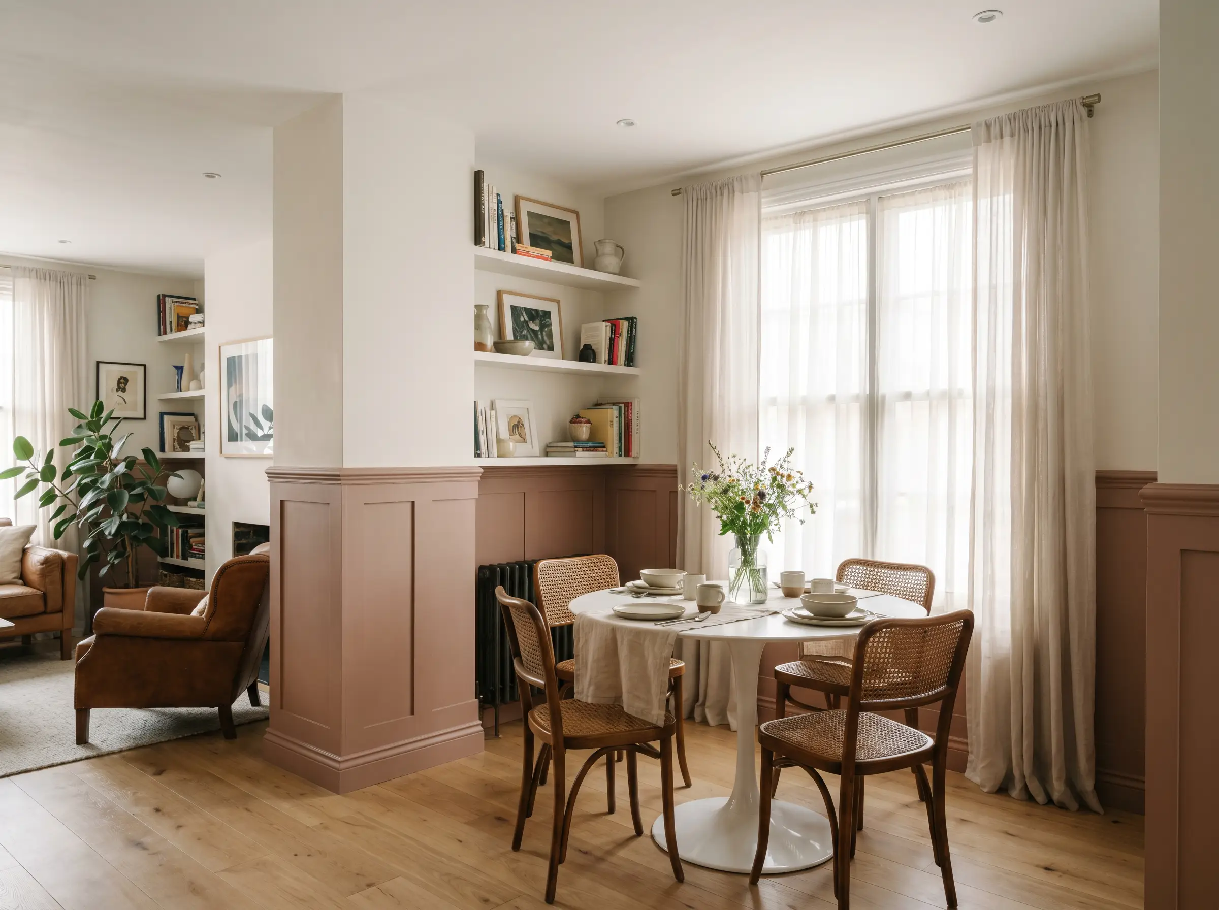
Carve out a distinct dining zone in an open-concept layout by painting a strategic color-blocked archway or wainscoting in this grounding shade. It provides a striking, tailored contrast against lighter main walls, beautifully framing an everyday round tulip table and a set of cane-backed dining chairs.
Coordinating Colors & Material Pairings
To make this earthy tone feel intentional rather than dated, it requires a thoughtful balance of crisp contrasts and tactile textures.
Trim & Baseboards
The right wood trim pairing or painted border dictates the entire mood of the room.
Hardware, Wood & Material Pairings
If you are navigating an older home, learning how to pair paint with amber wood floors is essential to avoid a clashing, overly orange room. When introducing new materials, focus on creating a visual dialogue with the paint’s DNA.
Coordinating Colors
Designer Mood Boards
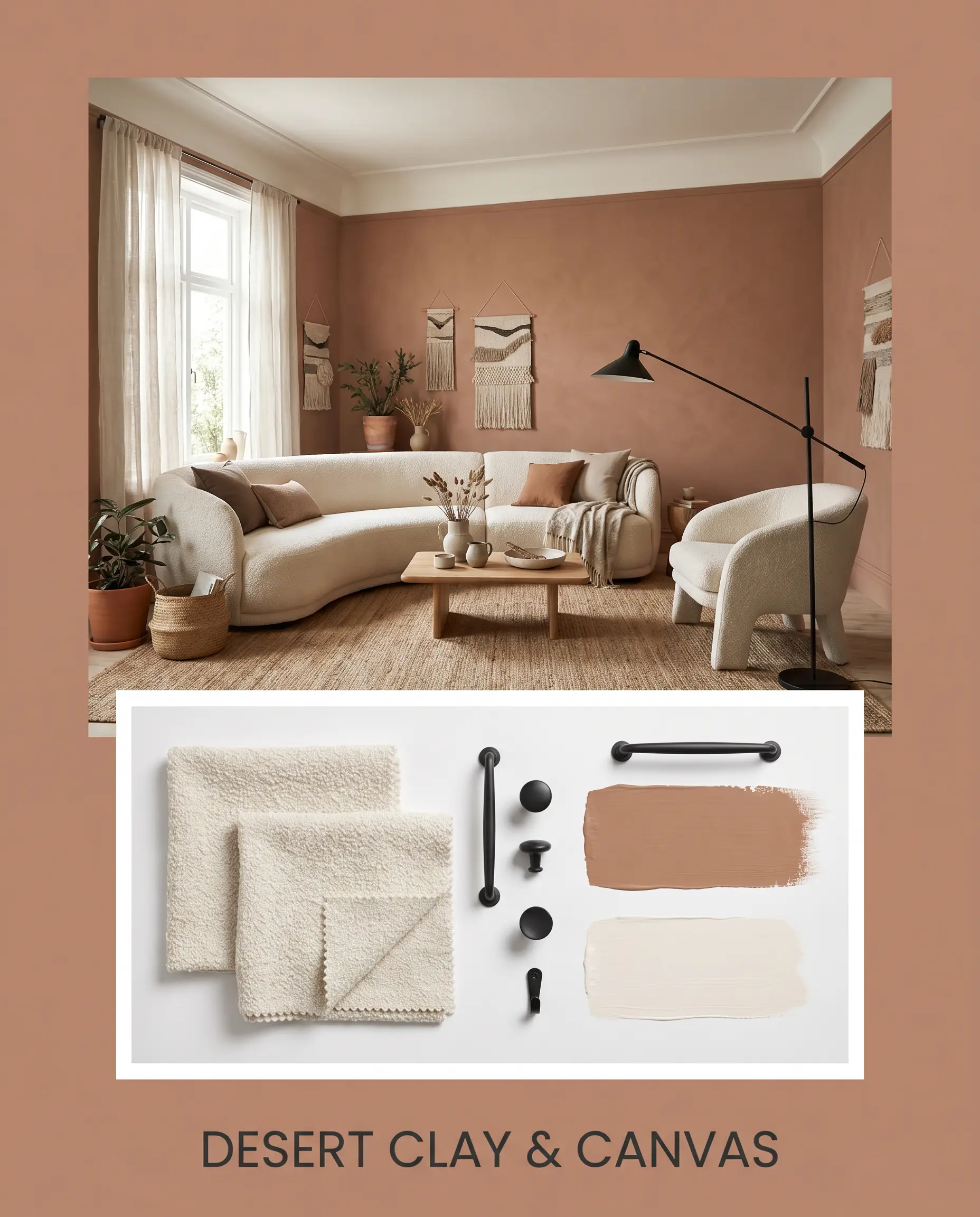
Desert Clay & Canvas: This palette leans into a relaxed, bohemian elegance by allowing the baked terracotta undertones to take center stage. Weave in the crisp brightness of Greek Villa SW 7551 on the ceiling, pair it with textured bouclé seating, and finish the styling with a matte black iron floor lamp to ground the airy textiles.
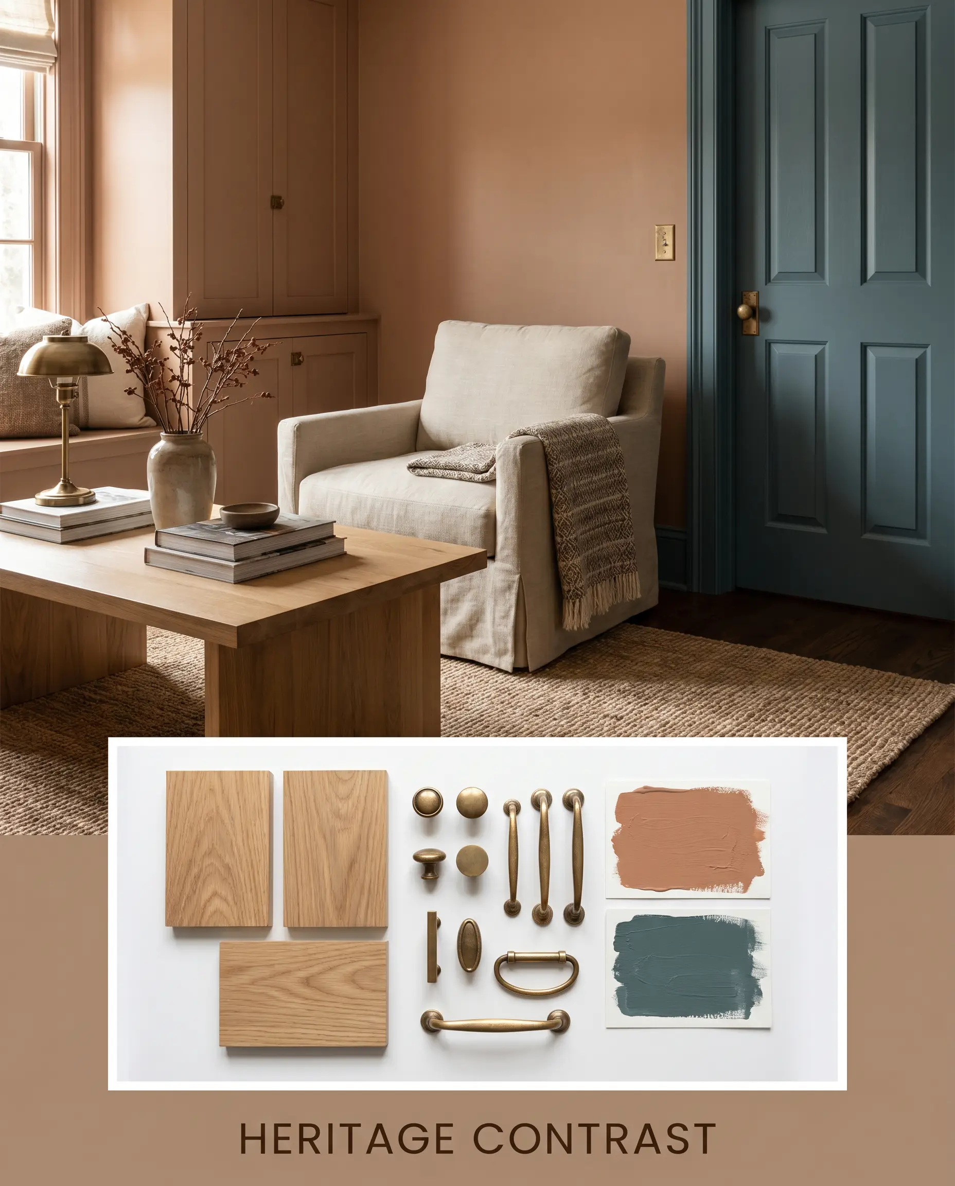
Heritage Contrast: For a more tailored, transitional energy, this combination relies on the dynamic tension between warm and cool. Use Aegean Teal 2136-40 on an adjoining accent wall or interior door, anchor the space with everyday white oak furniture, and elevate the entire look with premium aged unlacquered brass hardware.
Head-to-Head Paint Comparisons
When finalizing your color palette, it is crucial to understand how similar shades react under varying lighting conditions, as a slight shift in undertone can entirely alter the room’s energy.
Sherwin-Williams Craftsman Brown SW 2835 vs. Sherwin-Williams Dormer Brown SW 7521
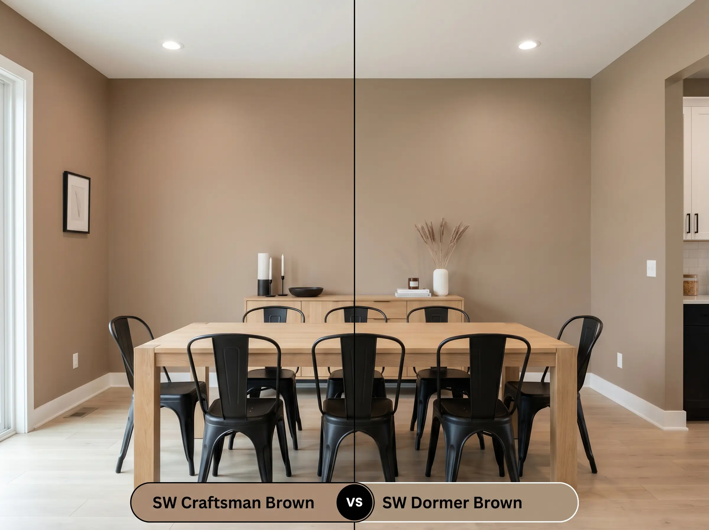
Dormer Brown is noticeably lighter and leans significantly more yellow-beige than the baked clay depth of our primary hue. If your room lacks abundant natural light and you fear a mid-tone will feel too heavy, Dormer Brown provides a safer, brighter alternative. However, if you want a rich, architectural statement that commands attention, SW 2835 is the superior choice.
Sherwin-Williams Craftsman Brown SW 2835 vs. Sherwin-Williams Canoe SW 7724
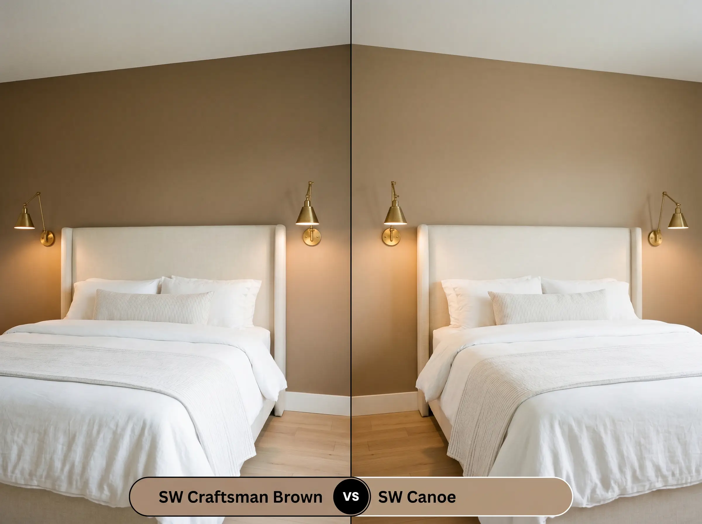
Canoe is a much softer, more muted tan with a prominent gray influence that cools its overall temperature. If your space features heavily shaded, north-facing windows, Canoe will maintain a neutral, sandy appearance. Conversely, if you want to actively embrace a vibrant, red-orange warmth, stick with the deeper, more complex Craftsman variant.
Similar Colors & Brand Equivalents for Craftsman Brown
Whether you are adjusting for a slightly different light reflectance value or simply need an alternative due to local paint availability, these closely related hues offer excellent secondary options.
Same-Brand Alternatives
Cross-Brand Matches
Practical Application & Painting Advice
Transitioning this rich pigment from a tiny swatch to a flawless wall requires a strategic approach to finishes and preparation.
The Dynamic Sheen Guide
Primer Strategy
Because this is a dense, light-absorbing hue, applying it directly over a stark white wall will result in an uneven, streaky finish. You must use a high-quality, gray-tinted primer to create a neutral base layer. This tinted foundation allows the rich red-orange undertones to develop their true depth immediately.
Coverage & Success Tips
Expect to apply a minimum of two generous coats to achieve a professional, opaque finish. Be highly cautious of “flashing”—visible roller marks that occur when you stretch the paint too thin or touch up a wall after it has dried. To avoid this frustrating DIY pitfall, maintain a wet edge as you roll and complete an entire wall before taking a break.
Frequently Asked Questions
Because of its rich red-orange base, this hue will definitely warm up significantly when exposed to direct, intense sunlight on an exterior facade. However, the heavy texture of stucco creates natural shadows that actually help ground the color, preventing it from reading like a bright, artificial orange.
This pairing requires caution, as the yellow-orange flash of Douglas Fir can aggressively compete with the paint’s hidden terracotta undertones. To make this combination work, you must introduce plenty of crisp white trim or large, neutral area rugs to create a visual break between the walls and the floor.
Absolutely, provided you lean into the moodiness rather than fighting it. By wrapping the entire roomu2014including the ceilingu2014in this rich hue and utilizing warm 2700K wall sconces, you transform a dark, windowless space into an intimate, jewel-box experience.
The dense green leaves will naturally bounce cool, verdant light onto the painted surface, which subtly neutralizes the paint’s red-orange warmth. This environmental reflection pulls forward the color’s structural brown base, making it appear slightly more muted and earthy.
Final Verdict & Stylistic Warnings
Sherwin-Williams Craftsman Brown is an exceptional, highly architectural pigment designed for homeowners who want to inject immediate warmth and character into their spaces. It performs brilliantly as a grounding foundation in transitional living rooms, sophisticated home studios, or sun-drenched Mediterranean exteriors where its baked clay energy can truly thrive.
However, this dense hue demands careful curation to avoid a heavy, overly intense atmosphere. You must actively avoid pairing this color with overly yellow, honey-toned pine furniture or aggressively red cherry wood floors, as these warm stains will brutally compete with the paint’s hidden terracotta base, resulting in a chaotic, clashing aesthetic. Furthermore, steer clear of cool, stark gray carpets or icy blue-toned LED lighting, which will instantly fight the paint’s earthy warmth and make the walls appear dull and neglected.