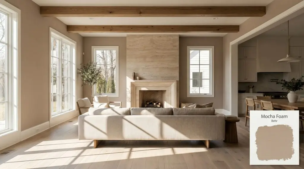
Mocha Foam T15-17
BehrBehr Mocha Foam (T15-17) is a warm, mid-tone earthy beige with an LRV of 39. It features subtle terracotta and mauve-taupe undertones, making it a grounded and cozy neutral. It pairs beautifully with crisp whites, deep plums, and rich bronzes.
Paint Technical Profile
| Color ID / SKU | T15-17 |
| HEX Code | #bba28e |
| Light Reflectance (LRV) | 39 |
| Use | Interior, Exterior |
| Best Exposures | North-Facing, South-Facing |
| Best For | Living Rooms, Bedrooms, Home Offices, Exteriors |
Behr Mocha Foam T15-17: The Terracotta-Laced Mid-Tone That Anchors a Room
There is a specific kind of design magic that happens when a wall color stops trying to fade into the background and instead acts as a heavy, grounding foundation. Behr Mocha Foam T15-17 does exactly that, trading the lightweight fluff of standard off-whites for a rich, deeply rooted pigment.
This is a color built for homes that feel untethered—think expansive open-concept layouts with too much drywall, or stark, light-starved corridors that need a dose of intentional warmth. By wrapping these structural voids in a complex, clay-like beige, you instantly give the architecture a sense of historical gravity and undeniable permanence.
The Color DNA: Undertones & LRV of Behr Mocha Foam
When evaluating its color temperature, this mid-tone leans definitively warm, offering a baked, sun-drenched energy. However, this is not a flat, predictable tan from the early 2000s, as its underlying pigment structure is highly nuanced.
With a light reflectance value (LRV) of 39, this shade absorbs a significant amount of ambient lighting, meaning it will not wash out even under intense afternoon glare. This depth allows it to create serious visual contrast against crisp white trim, pulling the walls inward to create a deeply enveloping atmosphere.
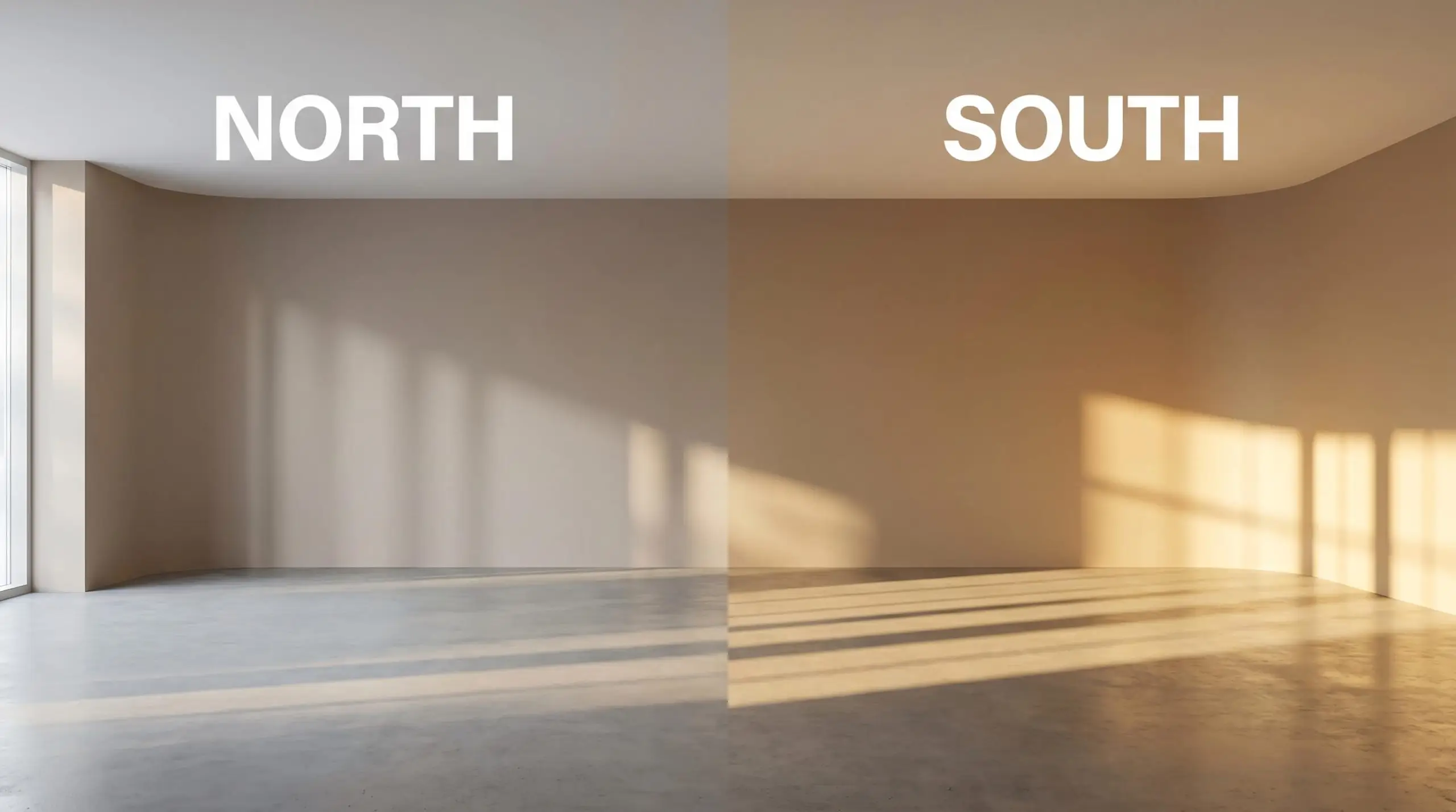
Shifting Shadows: Lighting Effects & The Chameleon Factor
Because of that complex mixture of warm taupe undertones and baked clay, this pigment is highly reactive to its environment. If you pair this earthy beige with the wrong lighting, the dusty shadows can unexpectedly dominate, turning a glowing space into a heavy, muted room.
Always view this mid-tone on different walls throughout the day. If your room relies heavily on cool, northern light, the baked terracotta notes will retreat, leaving you with a much cooler, greige-heavy finish, which is why testing paint samples in your specific space is mandatory.
Hackrea Design Secret (The Temperature Shift)
Popular Room Applications
This deeply rooted mid-tone brings a sense of quiet permanence to residential architecture, softening the harsh lines of modern builds while adding heavy architectural weight to otherwise unremarkable drywall.
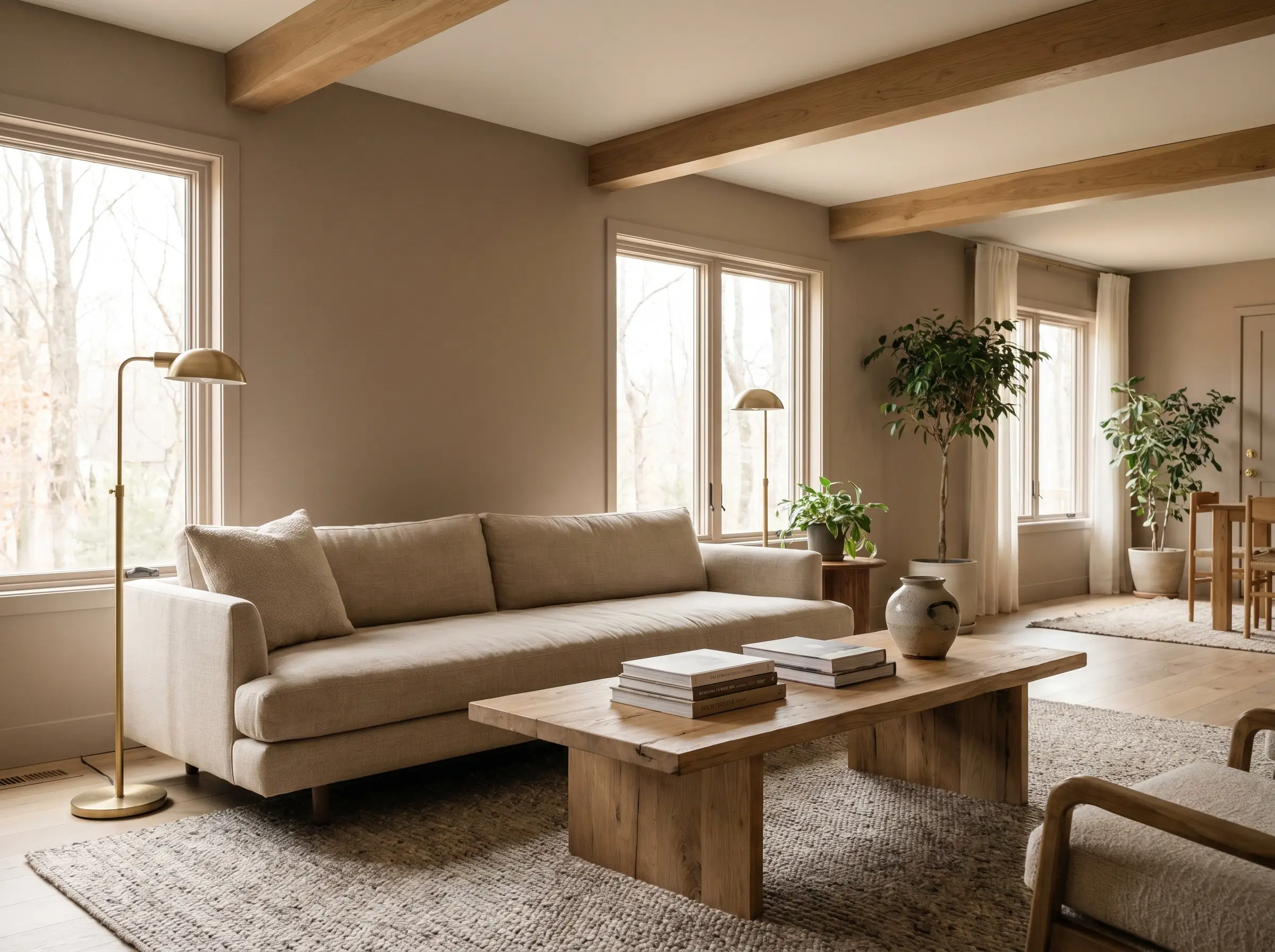
Living Rooms
Instead of defaulting to stark white, wrapping your main gathering space in this rich hue instantly creates a cozy, restorative environment. It serves as a brilliant foundation for an organic modern design, especially when paired with low-profile linen sofas and raw timber accents.
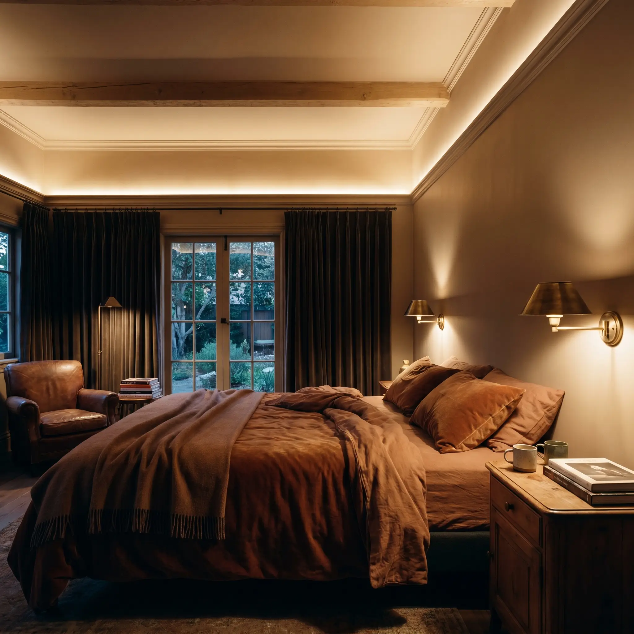
Cozy Bedrooms
The low LRV naturally absorbs excess light, making it a brilliant tool for spaces dedicated to rest. Use it to anchor transitional spaces, pairing the walls with heavy velvet drapery and brass bedside sconces for a grounded, boutique-hotel feel.
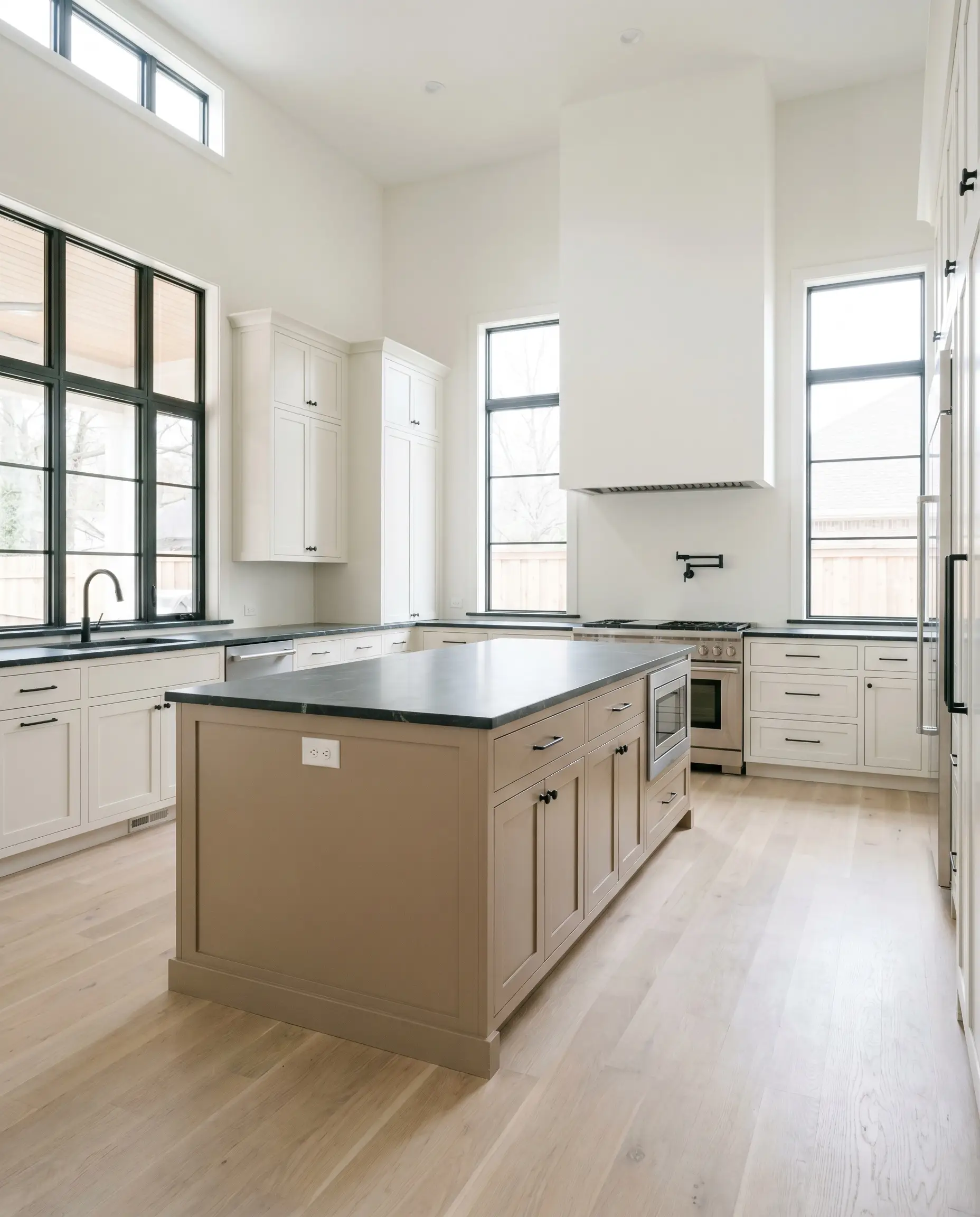
Kitchen Island Accents
If you are working with standard stock cabinetry, painting the central island in this dusty beige adds immediate custom flair. It grounds the center of the kitchen, beautifully complementing creamy perimeter cabinets and honed soapstone countertops.
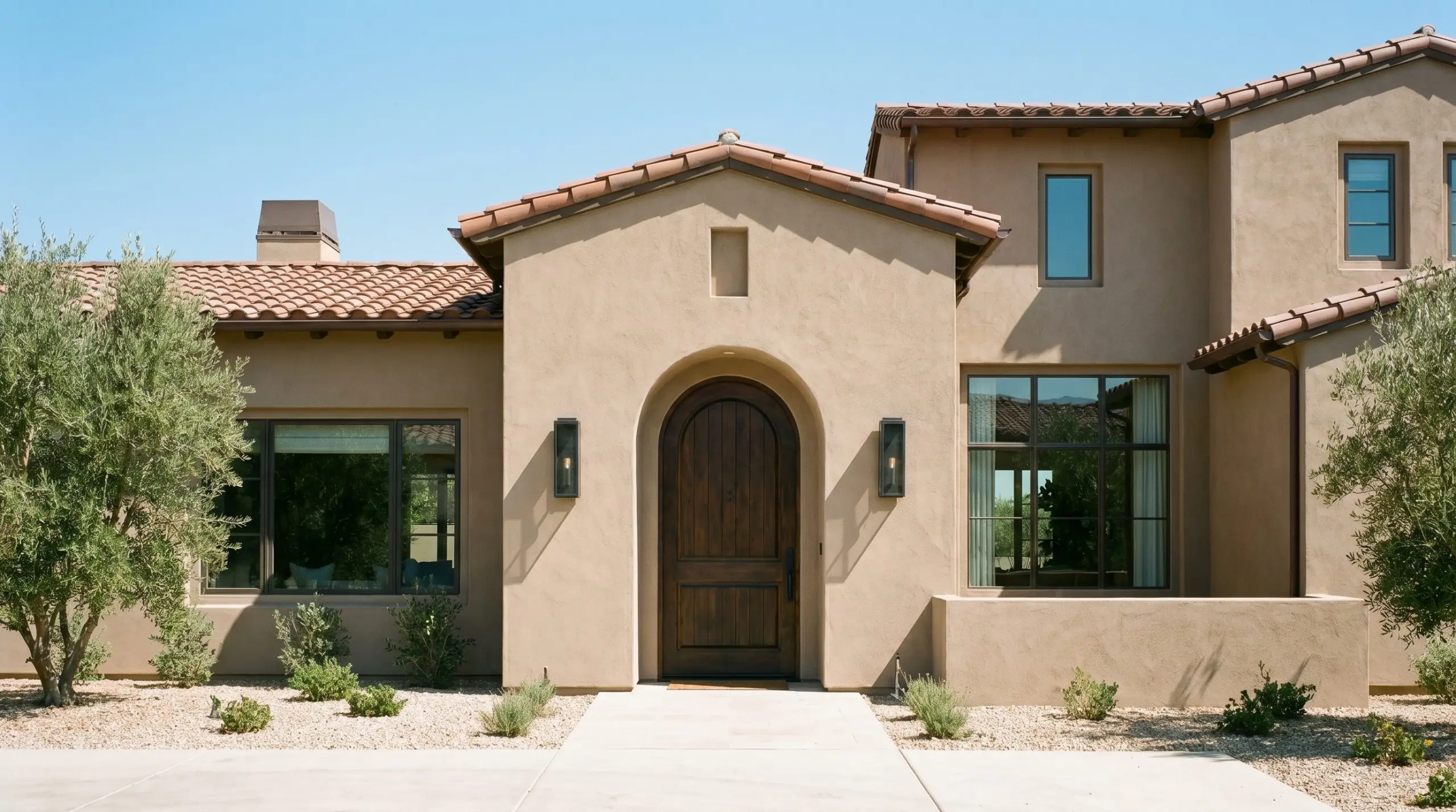
Exterior Stucco & Siding
Under the intense glare of full exterior sunlight, colors naturally wash out and lose their depth. Because this shade sits at a solid 39 LRV, it holds its shape beautifully on stucco or wood siding, offering a warm, welcoming facade that feels deeply connected to the surrounding landscape.
Unique Design Ideas & Creative Inspiration
Beyond the standard four walls, this terracotta-laced mid-tone inspires highly intentional, custom-feeling moments throughout the home. Its ability to shift between warm clay and dusty taupe makes it an incredible tool for clever, high-impact transformations.
The Grounded Dining Room Wainscoting
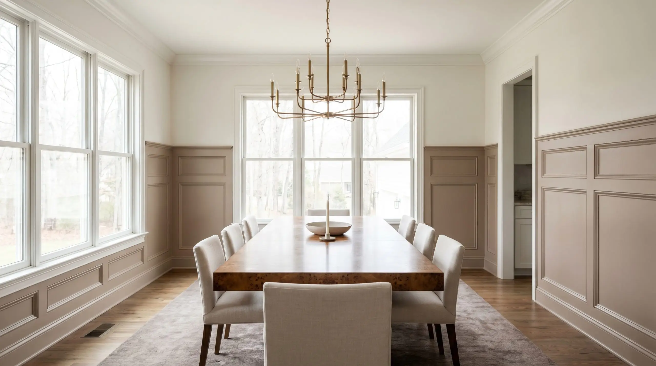
Applying this rich pigment to traditional wainscoting or picture-frame millwork instantly updates a formal dining space without requiring a massive renovation. The dusty mauve undertones interact beautifully with vintage burl wood dining tables, creating a tactile, collected atmosphere. The contrast against a creamy upper wall gives the room a tailored, highly curated finish.
The Enveloping Hidden Pantry
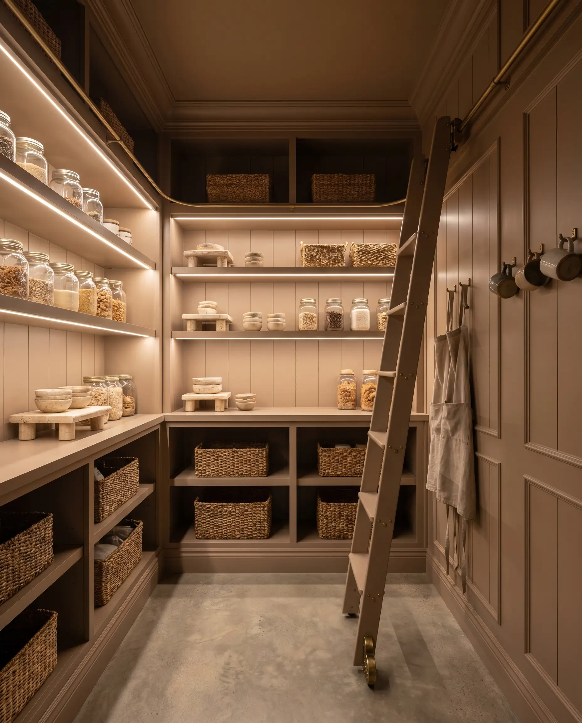
Utilitarian spaces like walk-in pantries often suffer from harsh, windowless artificial lighting. By drenching the shelving, trim, and walls in this mid-tone beige, you eliminate the sterile, unfinished look of basic MDF. The color absorbs the harsh light, turning a basic storage zone into a moody, sophisticated architectural feature.
The Scandinavian Attic Retreat
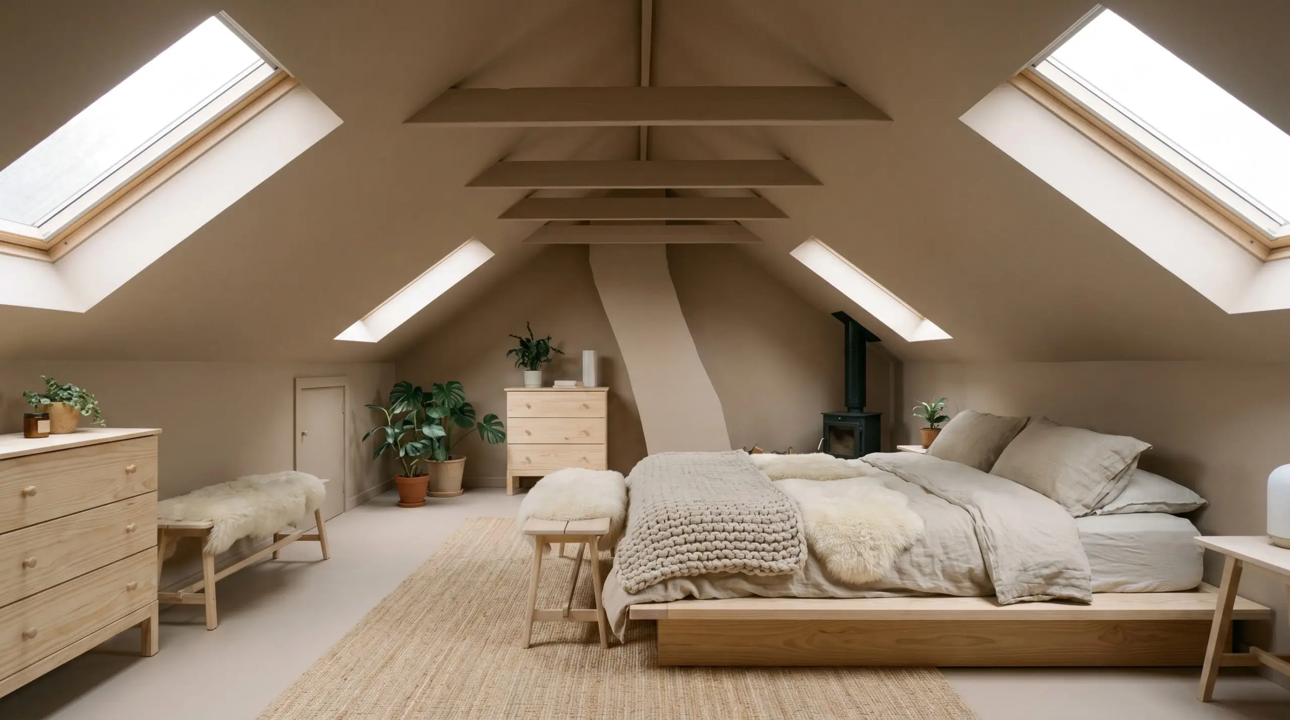
Sloped ceilings in converted attics can feel visually chaotic if painted crisp white. Sweeping this earthy beige across all the awkward angles and structural drywall blurs the sharp lines, wrapping the room in a continuous, soft glow. When styled with minimalist Scandinavian pine furniture and layered wool textiles, the space becomes a deeply restorative, sleep-inducing hideaway.
Coordinating Colors & Material Pairings for Behr Mocha Foam
The secret to making this baked mid-tone shine lies in how you manage its visual weight. It requires crisp, deliberate boundaries to hold its elegant shape, alongside tactile elements that draw out its hidden warmth.
Trim & Baseboards
To keep the room feeling fresh, you must frame this earthy hue with clean, highly reflective borders that dictate the color harmony of the space.
Hardware, Wood & Tactile Elements
Weave in a mix of everyday finishes and one aspirational focal point to elevate the entire palette.
The Coordinating Paint Palette
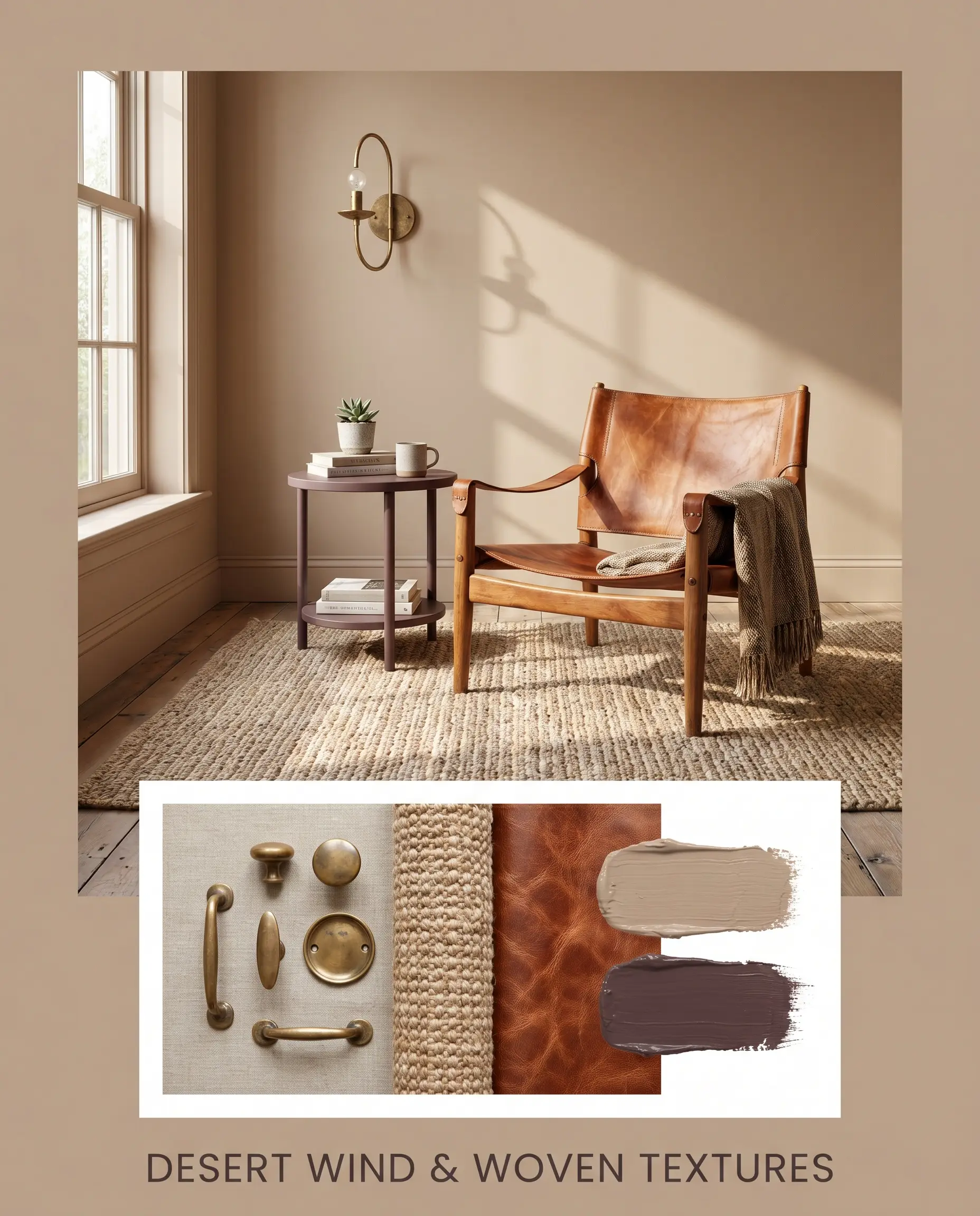
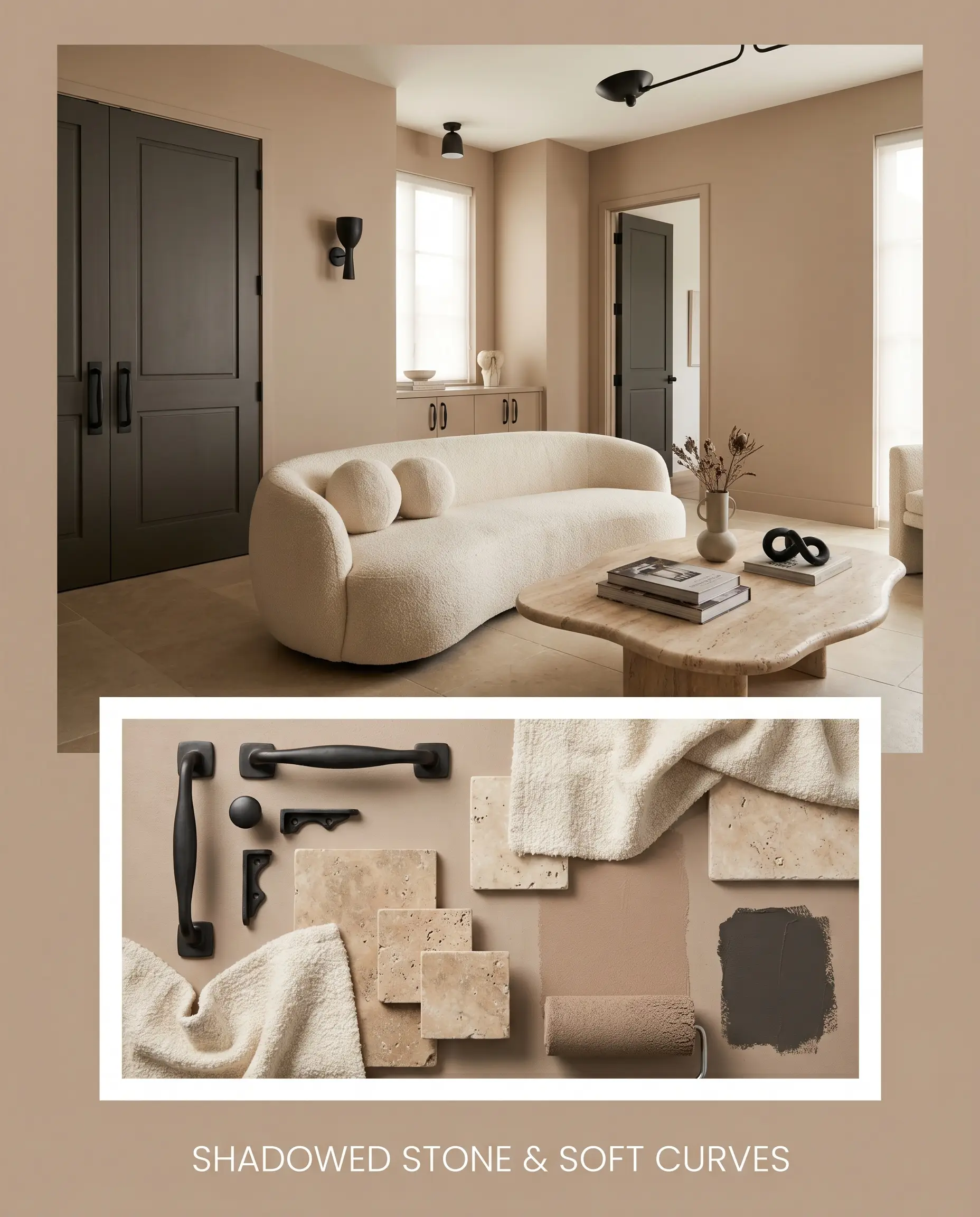
Designer Mood Boards
Desert Wind & Woven Textures: Anchored by the terracotta warmth of the main wall, this palette introduces unlacquered brass wall sconces and a heavy, textural jute rug. A vintage cognac leather sling chair sits in the corner, while accents of F&B Brinjal on a nearby side table add sophisticated tension. The energy is relaxed, sun-baked, and effortlessly collected.
Shadowed Stone & Soft Curves: Leaning into the cooler, taupe side of the paint, this scheme pairs the mid-tone walls with sleek matte black iron hardware and a tumbled travertine coffee table. A curved bouclé sofa softens the visual weight of the room, while accents of SW Urbane Bronze on the interior doors provide a crisp boundary. The mood is quiet, sculptural, and highly intentional.
Head-to-Head Paint Comparisons
Choosing the right earthy neutral often comes down to the specific natural light exposure in your home. If your room pulls heavily cool or you need a slightly different chroma, a rival shade might be the superior choice.
Behr Mocha Foam vs. Sherwin-Williams Trusty Tan SW 6087
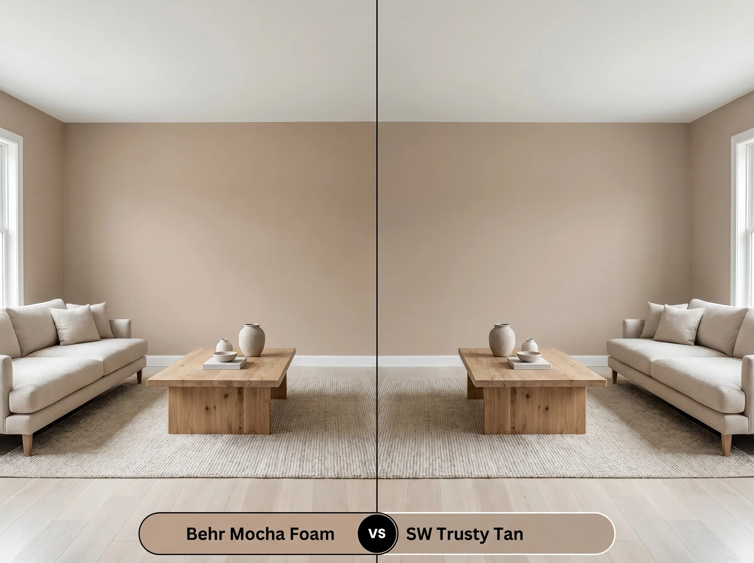
If you are dealing with a stark, north-facing room that desperately needs warmth, Trusty Tan SW 6087 brings a much stronger, undeniable yellow-orange base to the table. While the Behr option relies on its dusty mauve shadow to stay muted, the Sherwin-Williams alternative is significantly more vibrant and traditional. Choose Trusty Tan if you want a classic, sunlit glow, but stick with the Behr shade for a more muted, complex, and modern aesthetic.
Behr Mocha Foam vs. Benjamin Moore Pashmina AF-100
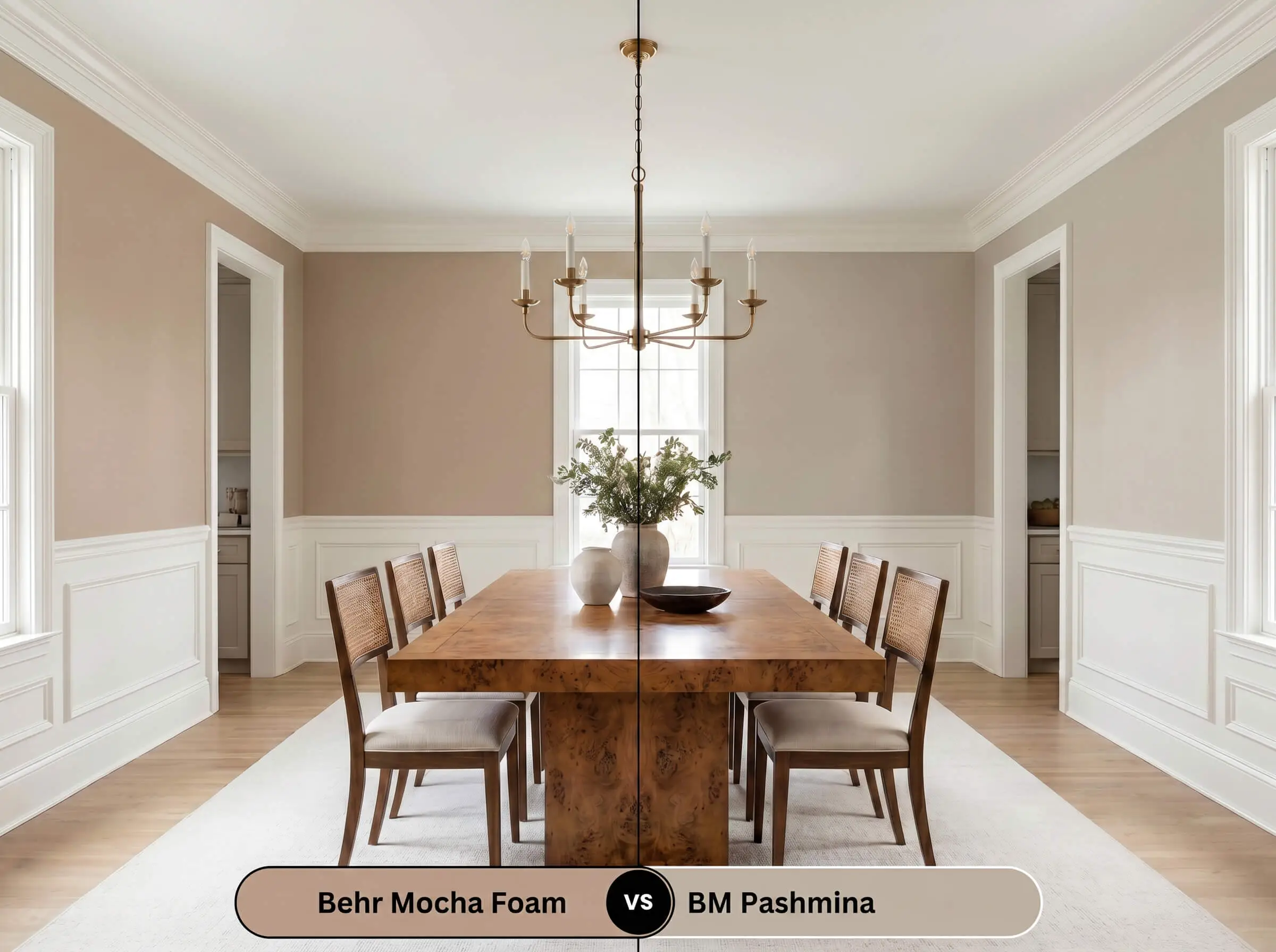
Pashmina AF-100 is a legendary, highly sophisticated greige that leans much further into the green/gray spectrum. If your home features a lot of cool-toned stone or you want a seamless monochromatic scheme without any orange pulling through, Pashmina is the safer bet. However, if you crave that baked, terracotta warmth to pair with warm woods, the Behr mid-tone will serve you much better.
Brand Equivalents & Similar Colors to Behr Mocha Foam
Whether you need a subtle shift in depth for a light-starved hallway or you are bound to a different manufacturer for your renovation, these alternatives keep you in the same earthy family.
Same-Brand Alternatives
Cross-Brand Matches
Practical Application & DIY Advice
Transitioning this rich pigment from the swatch to the actual drywall requires a strategic approach to finishes and preparation.
The Dynamic Sheen Guide
Primer Strategy
Because this shade sits at a 39 LRV, it carries enough pigment to cover lighter colors easily. However, if you are painting over raw wood or new drywall, a high-quality, lightly tinted primer is highly recommended to ensure the terracotta undertones develop their true, even depth.
Coverage & Success Tips
Expect to apply two full coats for a flawless, professional finish.
Mid-tone colors with a heavy matte finish are highly susceptible to “flashing”—those visible, uneven roller marks that catch the light. To avoid this, maintain a wet edge while rolling and never go back over half-dry paint; if you need to touch up a spot later, lightly stipple the paint on with a brush rather than rolling a heavy new patch.
Hackrea Pro-Tip (The Flashing Risk)
Frequently Asked Questions
Because of its 39 LRV, it holds its depth beautifully outdoors. On heavily textured stucco, the shadows will amplify its darker taupe notes, making it look richer and more rustic, whereas on smooth Hardie plank, the color will read slightly lighter, cleaner, and more uniform under the sun.
It requires careful handling. Because the paint contains hidden terracotta and orange notes, it can actually harmonize with red brick to create a warm, tonal look, but the strong red tones in cherry wood can sometimes pull the mauve undertones out of the paint in an awkward way.
It can work beautifully, provided you control the artificial lighting. If you use crisp 3000K to 3500K LED bulbs, the color will maintain its warm, earthy structure, but if the lighting is too dim or overly yellow, the low LRV will absorb the light, making the space feel heavy and enclosed.
While it has a solid mid-tone depth, trying to cover a very dark or highly saturated wall without a primer will alter the final color temperature. A gray-tinted primer is strongly recommended to block the old color and allow the earthy beige to cure accurately.
Final Verdict & Expert Warnings
Behr Mocha Foam T15-17 is a brilliant, deeply grounding neutral designed for homeowners who want to inject historical warmth and architectural weight into their spaces. It excels in transitional living rooms, cozy bedrooms, and organic modern designs where its baked, terracotta-laced beige can interact with raw woods and natural stone. This is not a color for those seeking a stark, airy minimalist vibe; it is built for spaces that demand comfort, shadow, and a sense of permanence.
However, this complex mid-tone requires a highly intentional curation of its surrounding fixed elements to avoid a muddy aesthetic. You must be incredibly cautious when pairing this paint with cool-toned, blue-gray flooring or stark, icy marble countertops, as the baked orange undertones will violently reject those chilly surfaces. To keep the space cohesive, avoid bright, primary-colored upholstery or high-gloss chrome fixtures, sticking instead to warm, tumbled stones and living metal finishes.