Shadow 2117-30
Benjamin MooreBenjamin Moore Shadow (2117-30) is a rich, royal amethyst and moody dark purple with an LRV of 9.3. Crowned as the 2017 Color of the Year, it shifts between a soft lilac-gray in bright light and a lustrous, deep charcoal in the shadows.
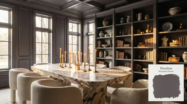
Benjamin Moore Shadow 2117-30: A Velvety Anchor for High-Contrast Interiors
| Best Exposures | South-Facing, East-Facing |
|---|---|
| Best For | Dining Rooms, Libraries, Accent Walls, Custom Cabinetry |
There is a distinct magic that happens when you introduce a deeply saturated, light-absorbing hue into a standard, builder-grade room lacking architectural character. Benjamin Moore Shadow (2117-30) acts as an instant remedy for flat interiors, bringing a profound sense of gravity and sophistication to everyday spaces.
This moody charcoal-meets-plum isn’t just a wall color; it is a structural element that completely redefines the boundaries of a room. Whether you are aiming for a Modern Gothic retreat or a richly layered transitional home, this former 2017 Color of the Year demands attention.
Benjamin Moore Shadow: Undertones & LRV
While it reads incredibly dark on a swatch, Shadow 2117-30 is fundamentally a cool color, anchored by a rich, velvety plum undertone that prevents it from ever feeling stark or cavernous.
Sitting at an LRV of 9.3, this shade is a heavy light-absorber. It drinks in the surrounding illumination, meaning it requires intentional design to pull those stunning purple notes forward rather than collapsing into a flat black void. Understanding how to light low-LRV paint colors is essential when working with this specific depth.
You can apply wallpapers, paints, etc. on walls and see how they look in various interiors.

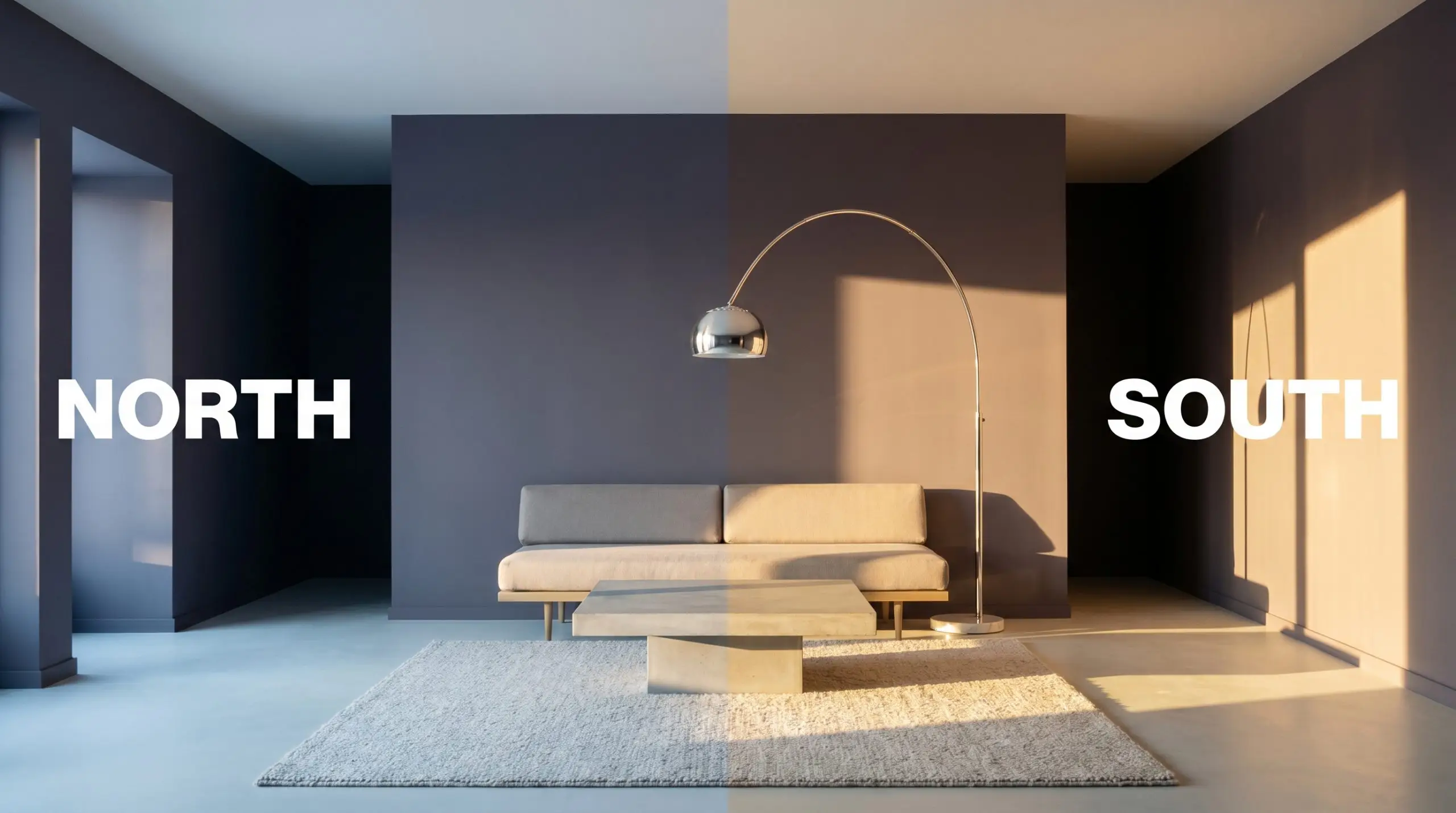
Lighting Effects & The Chameleon Factor
Shadow is a true chameleon, constantly shape-shifting as the sun moves across your home. The biggest risk with this specific pigment is placing it in a severely under-lit, north-facing room with heavy window treatments, where the lack of lumens will completely erase its beautiful amethyst soul, leaving you with a lifeless, bruised gray.
Popular Room Applications
The inherent gravity of this color makes it a brilliant architectural focal point, capable of wrapping a space in an enveloping atmosphere. It thrives when used to create intentional boundaries or to inject a color-confident statement into a home.
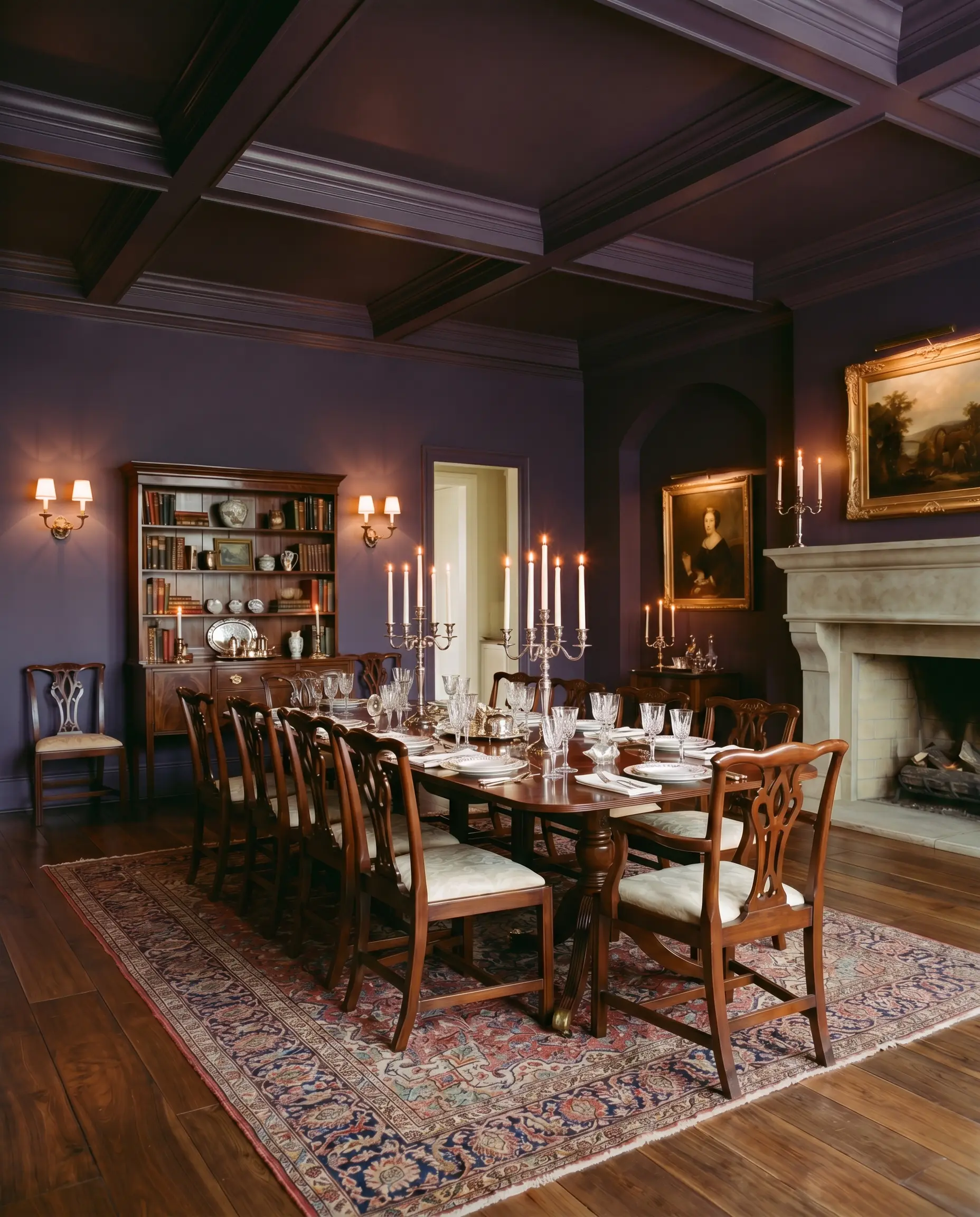
Formal Dining Rooms
This is where 2117-30 truly shines, offering a deeply sophisticated backdrop for evening entertaining. It pairs effortlessly with a traditional mahogany dining set for a classic, layered look, but easily pivots to a sleek Minimalist Luxe aesthetic when framing an angular marble table. Consider taking the color across the ceiling to create an intimate, jewel-box effect.
When using saturated deeps in a dining space, rely heavily on wall sconces and candlelight; the flickering warmth bounces off the subtle purple undertones, creating a mesmerizing glow that overhead lighting simply cannot achieve.
Hackrea Pro-Tip (The Candlelight Effect)
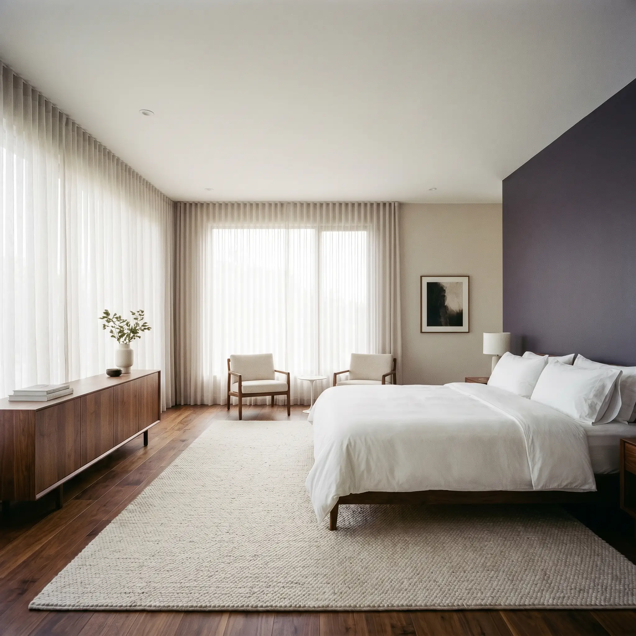
Primary Bedrooms
If you want a restful, cocooning retreat, this shade provides incredible visual weight behind a headboard. It serves as a striking contrast against crisp white hotel-style bedding or soft, rumpled linen sheets. To keep the room from feeling heavy, balance the dark walls with expansive, light-filtering sheer curtains and layered, textured rugs in soft cream or ivory.
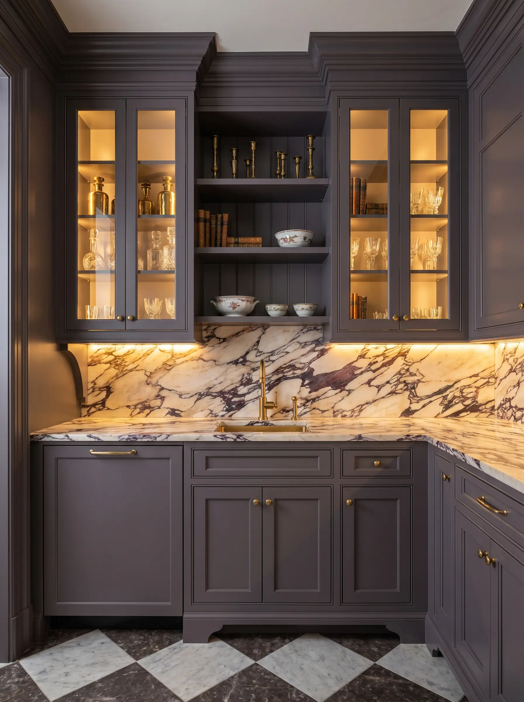
Custom Cabinetry & Built-Ins
Painting a wall of living room bookshelves or a butler’s pantry in this hue instantly elevates standard millwork to a premium level. It provides a stunning, high-contrast stage for displaying curated ceramics, vintage brass objects, and stacked art books. The rich, dark backdrop makes lighter decorative items visually pop off the shelves.
Creative Ways to Use Shadow 2117-30
Moving beyond standard four-wall applications, this dynamic pigment is a powerful tool for highly specific design interventions.
The Color-Drenched Entryway
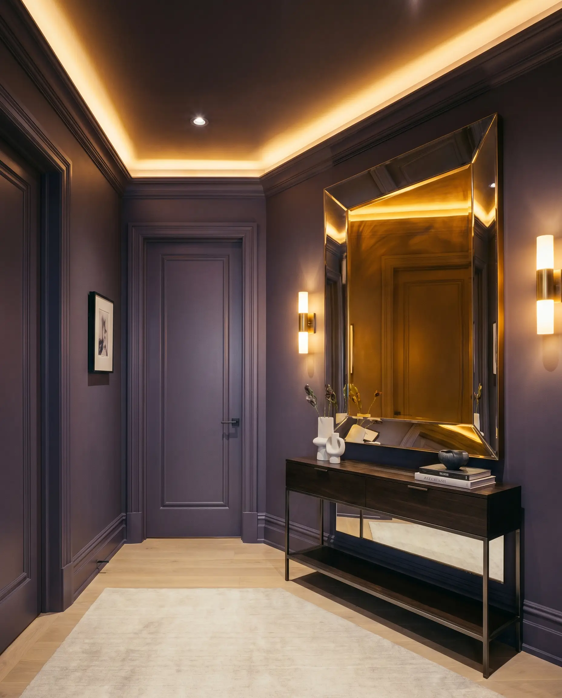
Transform a cramped, windowless foyer into a dramatic transition zone by color-drenching the walls, trim, and doors in this deep amethyst. This technique plays with visual perception, making the adjacent, lighter rooms feel twice as large and bright by comparison. Pair it with a simple, modern console table and a highly reflective oversized mirror to bounce available light.
The Upcycled Vintage Credenza
Breathe new life into a thrifted, mid-century modern credenza by coating it in this rich hue. The dark, plum-infused charcoal modernizes dated wood veneers while respecting the clean, architectural lines of the furniture piece. Update the hardware with antique copper pulls for a custom, high-end finish.
A Moody Home Library
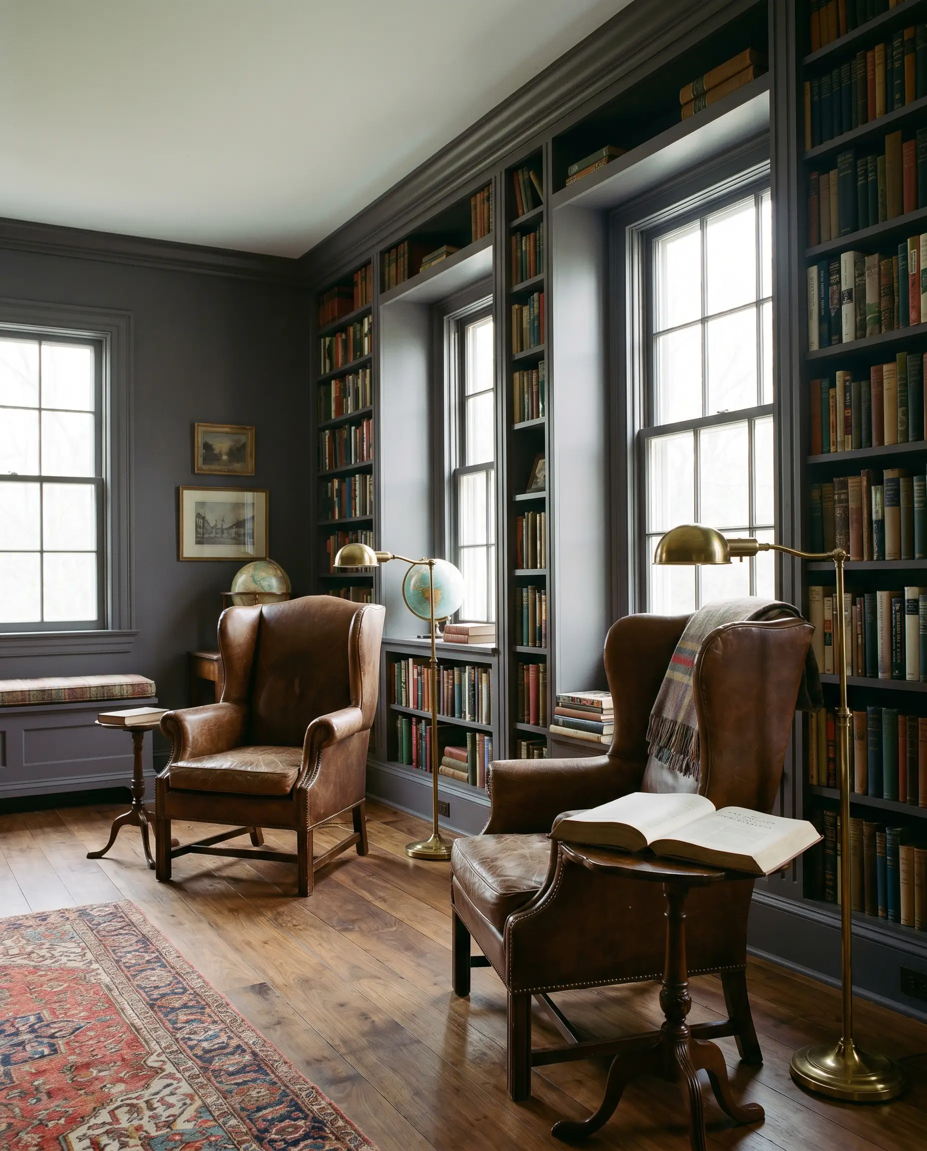
For those craving a quiet, intellectual retreat, this color is a brilliant choice for a dedicated reading room. It wraps the space in a quiet, studious energy that perfectly complements leather wingback chairs and heavily stocked bookshelves. When exploring best dark moody paint colors for libraries, this specific shade stands out because its subtle warmth prevents the room from feeling like a cold cave.
Coordinating Colors & Material Pairings
To truly honor this color’s complexity, you must surround it with elements that either provide crisp, tailored contrast or soft, textural warmth.
Hardware & Metal Pairings
Trim & Baseboards
A crisp, clean boundary is essential to keep this dark hue looking intentional rather than murky.
Coordinating Colors
Designer Mood Boards
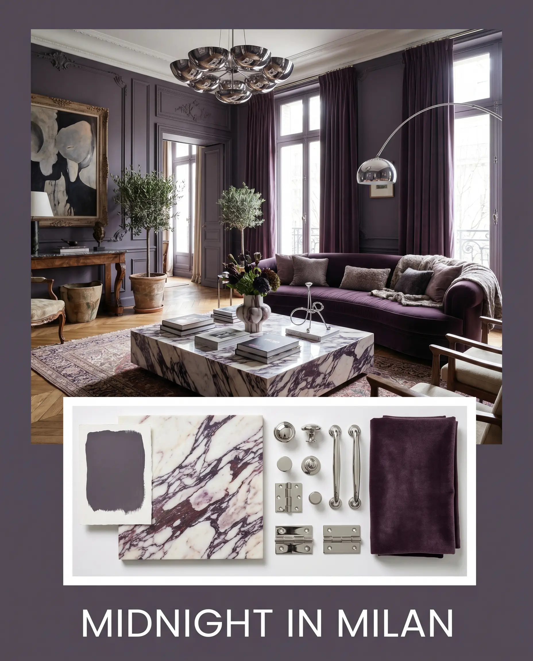
Midnight in Milan: This palette leans into Eclectic Parisian luxury, anchoring the space with Shadow 2117-30 walls. We pair it with a dramatic Calacatta Viola marble coffee table, polished chrome lighting fixtures, and a plush aubergine velvet sofa to amplify the regal, light-absorbing atmosphere.
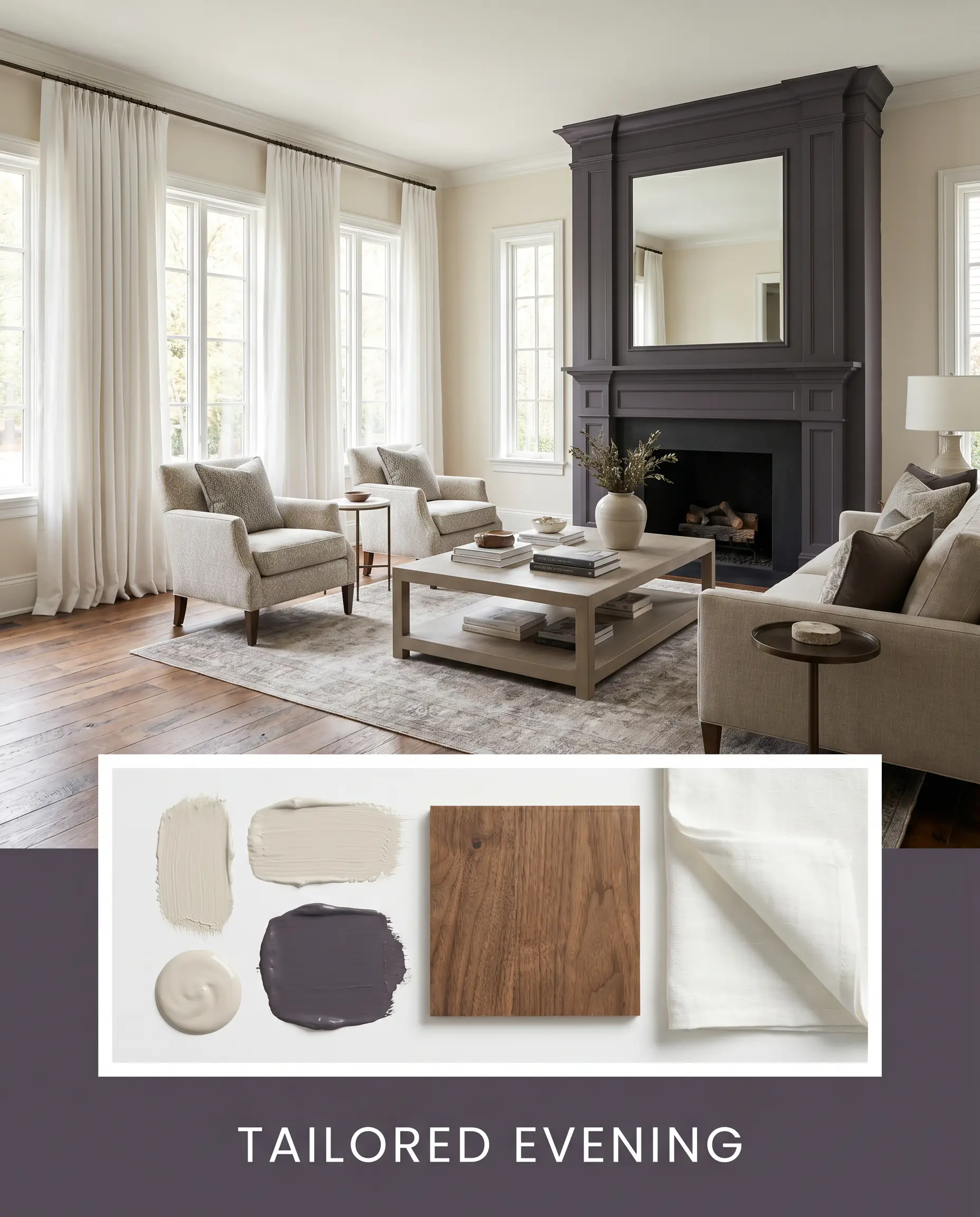
Tailored Evening: A highly structured, Transitional approach that uses Pale Oak OC-20 on the main living walls, reserving the deep amethyst for a striking fireplace focal point. Reclaimed walnut flooring and crisp white linen drapery keep the energy grounded, warm, and exceptionally inviting.
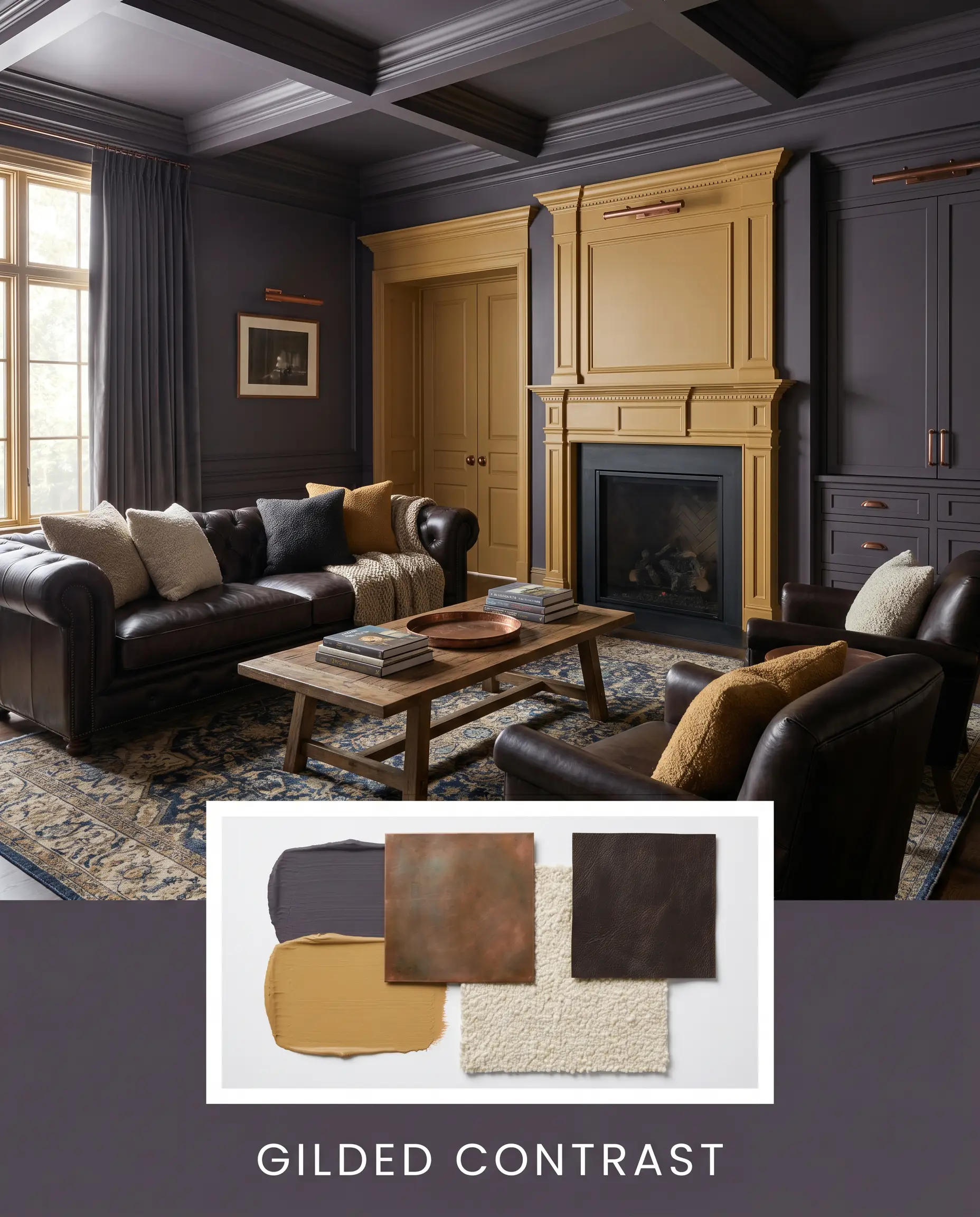
Gilded Contrast: Designed for maximum impact, this scheme layers the deep walls against sharp accents of India Yellow No. 66. We incorporate antique copper hardware, dark espresso leather seating, and heavily textured bouclé pillows to create a tactile, visually rich environment.
Head-to-Head Comparisons
When finalizing a dark, moody palette, the subtle nuances in undertone and light reflectance dictate whether a color succeeds or fails in your specific space.
Benjamin Moore Shadow 2117-30 vs. Sherwin-Williams Mature Grape SW 6286
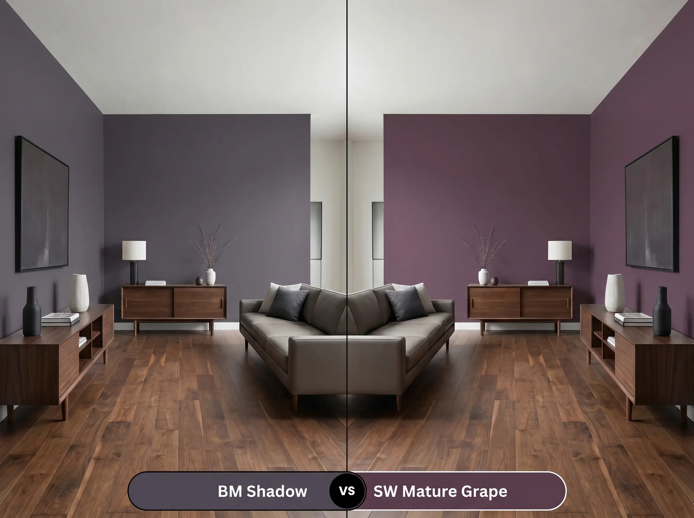
Mature Grape leans significantly further into a true, literal purple, lacking the heavy charcoal grounding of its rival. If your room receives intense southern light, 2117-30 maintains its sophisticated, blackened edge, whereas SW 6286 may pull too bright and vibrant for a subdued aesthetic.
Benjamin Moore Shadow 2117-30 vs. Benjamin Moore Black Raspberry 2072-20
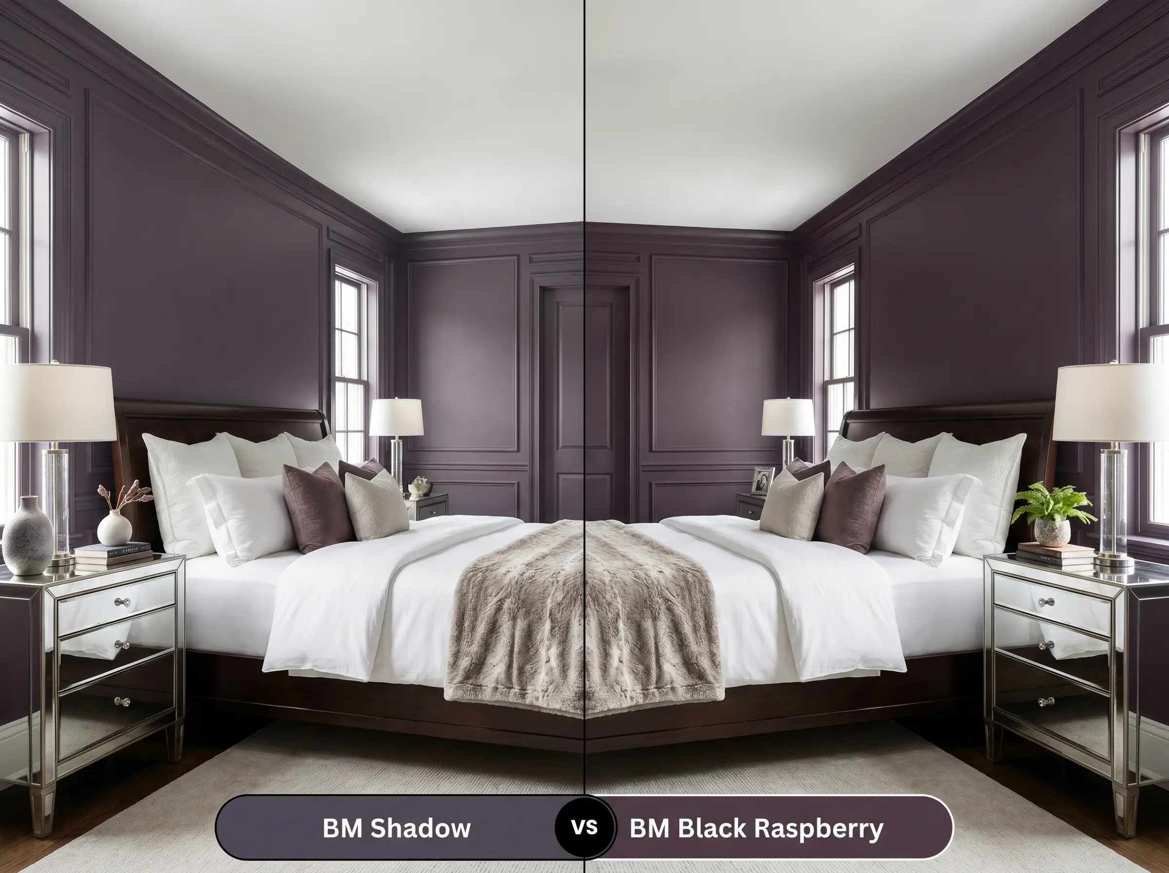
Black Raspberry carries a much stronger dose of red, pushing it closer to a deep burgundy or wine tone. If you are aiming for a cooler, more mysterious charcoal vibe, Shadow is the superior choice, while Black Raspberry is better suited for spaces craving overt, fiery warmth.
Benjamin Moore Shadow 2117-30 vs. Farrow & Ball Pelt No. 254
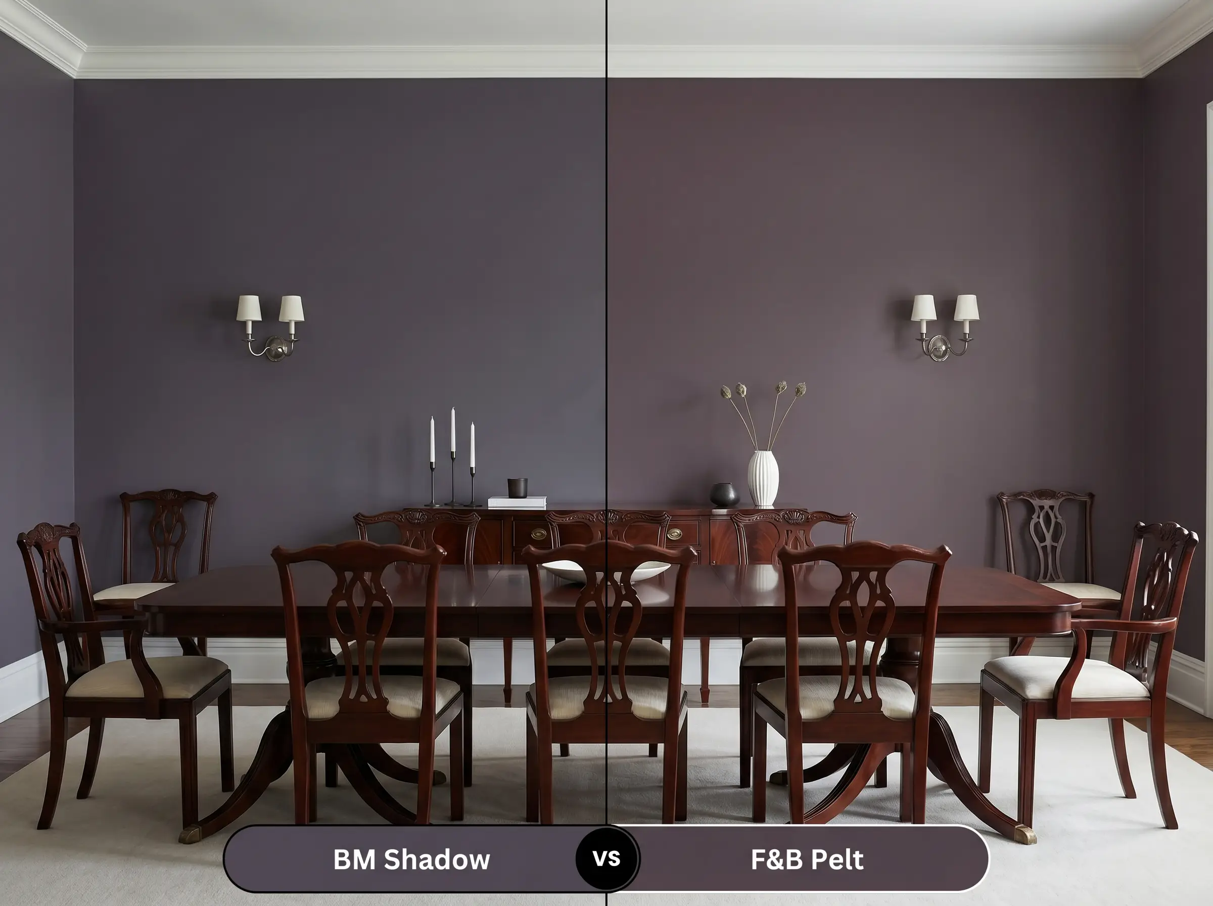
Pelt is an incredibly rich, aubergine-black with a slightly lower light reflectance. While both share a royal amethyst lineage, Pelt feels slightly more historic and dense; choose 2117-30 if you need the color to occasionally read as a modern, crisp gray under cool lighting.
Similar Colors & Cross-Brand Matches
If you love the concept of this deep, velvety hue but need slightly different undertones to accommodate your room’s specific lighting or your local paint supplier, consider these alternatives.
Same-Brand Alternatives
Rival Brand Equivalents
Practical Application & DIY Advice
Translating a deeply saturated color from a tiny swatch to a massive wall requires strategic planning, specific materials, and an understanding of how dark pigments behave during application.
The Dynamic Sheen Guide
Primer Strategy
You absolutely must use a deep-tinted gray primer before applying this color. Using a standard white primer under a dark, saturated hue will force you to apply three or four topcoats to achieve true opacity. A gray base coat ensures the rich, complex undertones develop properly and evenly.
Coverage & Success Tips
Thanks to Benjamin Moore’s Gennex Color Technology, this hue generally covers well in two coats over a proper primer.
Dark colors are notoriously unforgiving when it comes to “flashing”—those visible, shiny roller marks that appear when you touch up a dry wall. To avoid this, maintain a wet edge while rolling and never go back over semi-dry paint; if you need to fix a spot later, you will likely need to repaint the entire wall corner-to-corner.
Hackrea Design Secret (The Flashing Warning)
Frequently Asked Questions
Because of its heavy light-absorbing qualities, this color is a brilliant tool for camouflaging unsightly ceiling elements. Spraying exposed ductwork or textured popcorn ceilings in a flat finish makes those busy textures recede into the shadows, creating the illusion of a clean, endless void above.
Rather than making the space feel smaller, drenching a windowless hallway in this dark hue blurs the visual boundaries of the walls. It creates a deeply enveloping, tunnel-like effect that makes the bright, adjacent rooms feel incredibly expansive and welcoming as you transition through the home.
A high-quality satin or a specialized cabinet enamel is the ideal choice for shelving. This sheen level provides a hard, durable shell that resists the friction of sliding books and decorative objects, while still maintaining a sophisticated, low-glare appearance.
While traditional paint cannot replicate the literal mineral texture of plaster, you can achieve a similar mottled, organic look by using this color in a color-wash technique or a matte finish. However, its crisp charcoal undertones lean slightly more modern, so it pairs best with a refined, minimalist wabi-sabi approach rather than a heavily rustic one.
Final Verdict: Benjamin Moore Shadow 2117-30
Benjamin Moore Shadow 2117-30 is a sophisticated, highly intentional pigment designed for homeowners ready to make a color-confident statement. It excels as an architectural anchor, transforming flat, uninspired rooms into deeply atmospheric, curated spaces. This hue is perfect for those who appreciate a dynamic, shifting aesthetic, as its ability to pivot between a crisp, modern charcoal and a rich, regal plum makes it an incredibly versatile backdrop for both sleek, contemporary furnishings and layered, traditional decor.
However, this demanding color is not a universal solution, requiring extreme caution if your home features heavily yellowed oak flooring, dominant red-brick fireplaces, or extensive Tuscan-style beige tile. The cool, blackened purple DNA of this paint will heavily conflict with those warm, orange-heavy fixed elements, making the walls look bruised and the flooring appear dated. If you are unwilling to update competing warm-toned hard finishes, or if you are terrified of losing natural light, you should steer clear of this profound, light-absorbing hue.