Universal Khaki SW 6150
Sherwin-WilliamsSherwin-Williams Universal Khaki (SW 6150) is a warm, mid-tone beige with subtle olive and green-taupe undertones. With an LRV of 40, it provides grounded depth without feeling overly dark, making it an incredibly versatile, earthy neutral for both interior cabinetry and exterior siding.
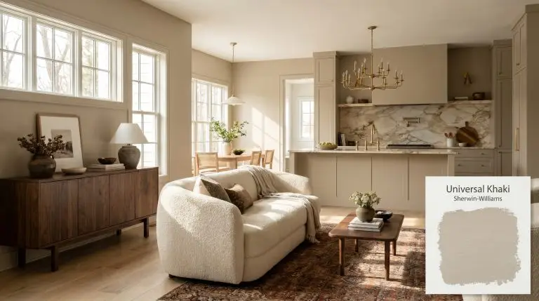
Sherwin-Williams Universal Khaki: A Grounding Anchor for Layered Interiors
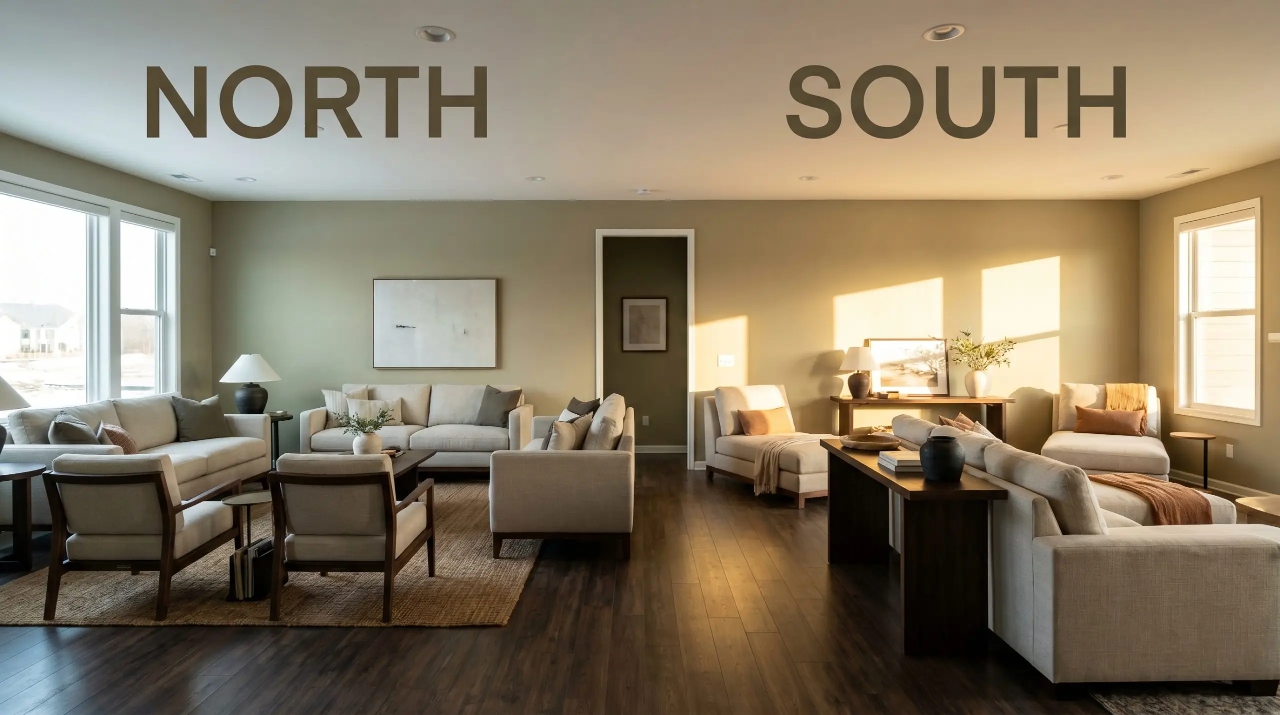
| Best Exposures | North, East |
|---|---|
| Best For | Kitchen Cabinetry, Living Rooms, Exteriors |
Sherwin-Williams Universal Khaki (SW 6150) bridges the gap between airy neutrals and heavy earth tones, offering a perfectly calibrated depth that instantly elevates everyday spaces. This mid-tone neutral carries enough visual weight to make standard linen upholstery look incredibly intentional, yet it remains quiet enough to let a premium Persian rug or a statement light fixture command the room.
By grounding a space with this earthy khaki, you create a sophisticated canvas that effortlessly supports transitional design and modern styling. As a standout in the 2026 Color Trends, it proves that a truly brilliant backdrop doesn’t need to shout to completely transform the energy of your home.
Undertones & LRV of Sherwin-Williams Universal Khaki
When homeowners ask if this shade is warm or cool, the answer is definitively warm, though it behaves with remarkable restraint. Rather than leaning into aggressive golds, this warm beige utilizes a highly structured pigment profile to maintain its sophisticated edge.
The Anatomy of the Color:
With an LRV 40, this shade sits squarely in the mid-tone category, meaning it possesses the perfect amount of visual density to anchor a room. This light reflectance value ensures the color will never wash out on a sun-drenched facade, while providing a cozy, enveloping embrace in dimly lit interior spaces.
You can apply wallpapers, paints, etc. on walls and see how they look in various interiors.

Lighting Effects & The Chameleon Factor
Because of its complex green-taupe shadows, this color shifts dramatically depending on the sun’s trajectory and your home’s exposure. If you pair this shade with stark, icy gray furnishings in a heavily shadowed room, those hidden olive notes can suddenly pull heavy and stagnant. Testing large swatches on multiple walls is the only way to ensure the color temperature aligns with your existing architecture.
Popular Room Applications for SW 6150
This shade demands an environment where its grounding energy can wrap around architectural details and everyday furnishings alike. It thrives when used to create cohesive flow, turning disjointed layouts into highly intentional, curated homes.
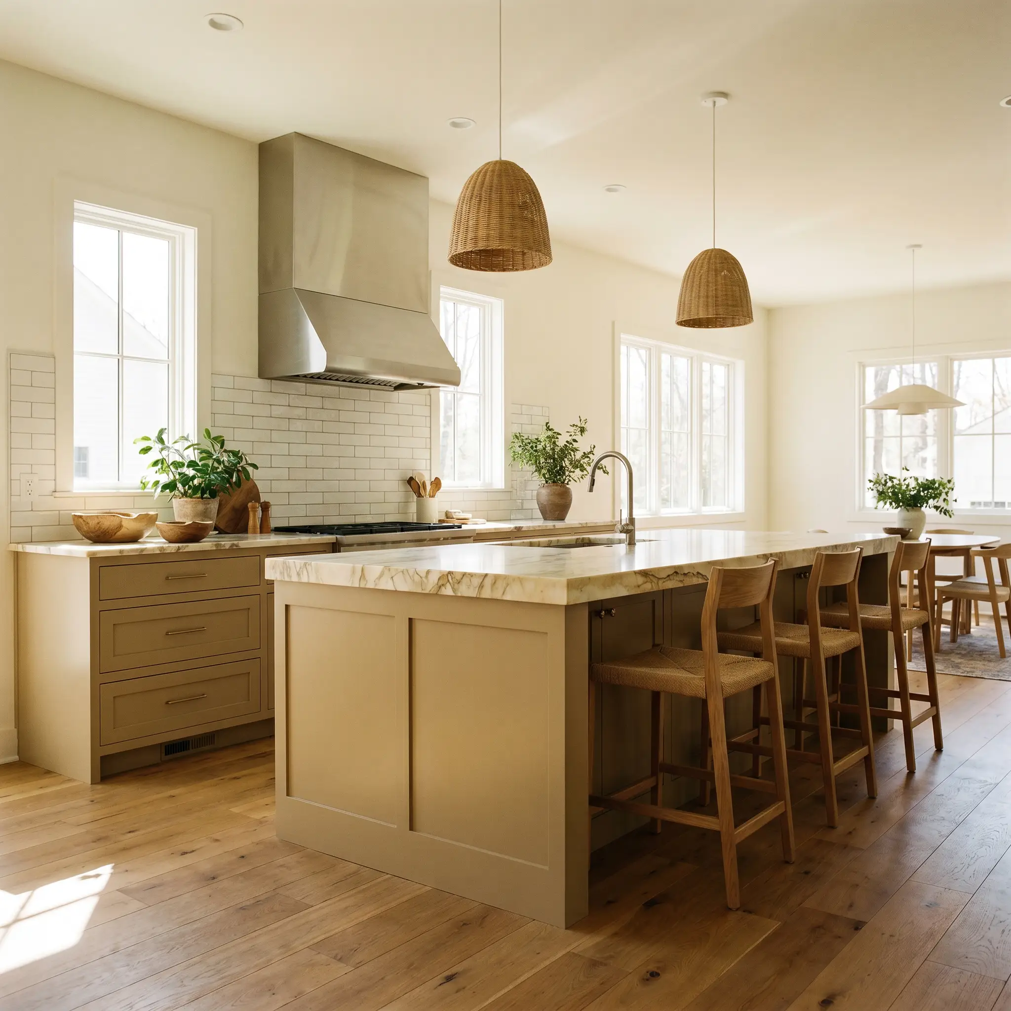
Kitchen Cabinetry
Applying this shade to lower cabinets or a central island instantly grounds a culinary space, offering a softer alternative to stark whites or heavy blacks. It pairs effortlessly with standard subway tile while simultaneously elevating the look of a premium, heavily veined marble slab. This versatility makes it an incredible candidate for earthy neutral kitchen cabinets.
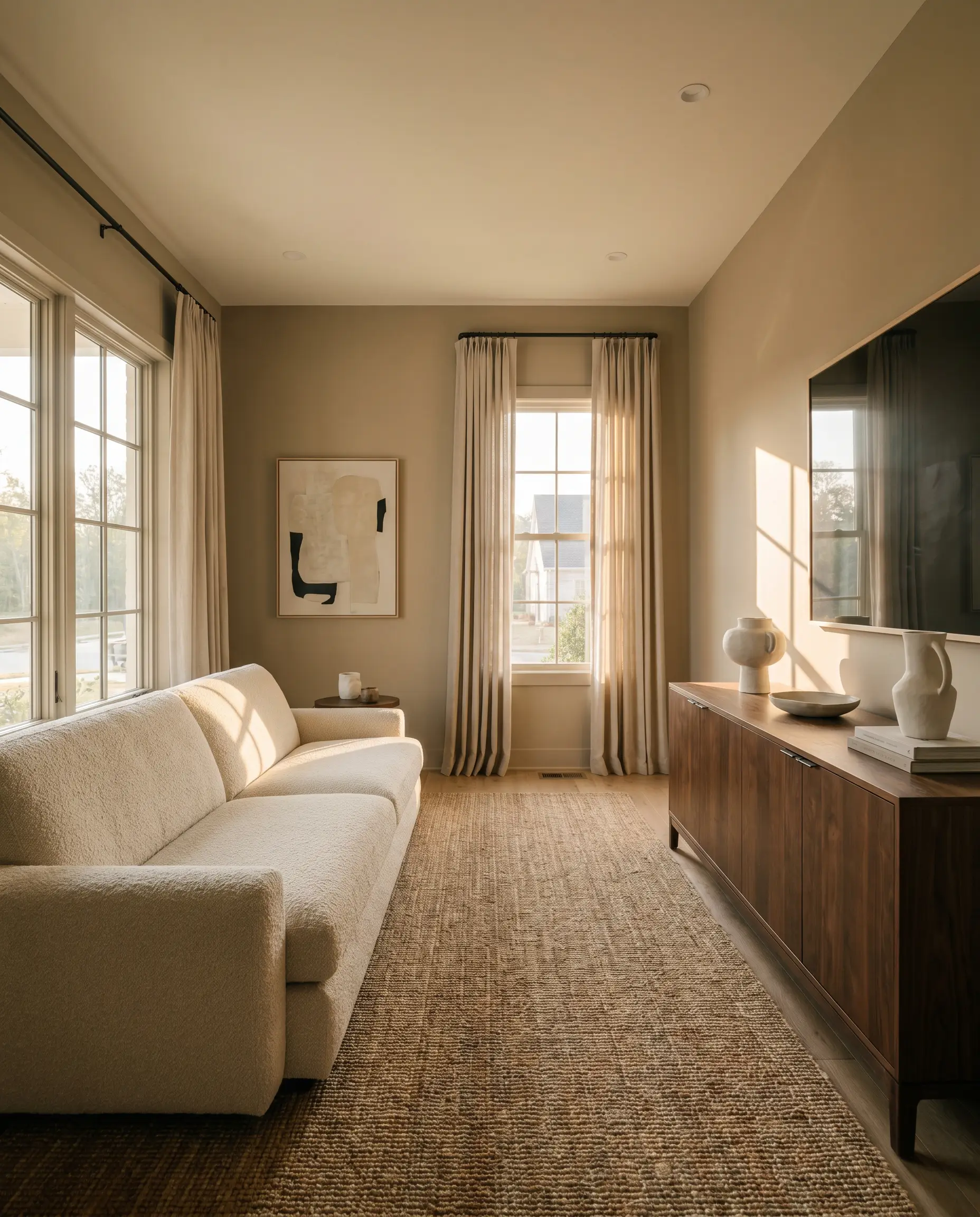
Living Rooms
In gathering spaces, this hue provides a deeply comforting perimeter that supports both casual, everyday living and elevated entertaining. It acts as a brilliant backdrop for a standard cream bouclé sofa, but possesses enough historic gravity to balance a high-end, dark walnut credenza.
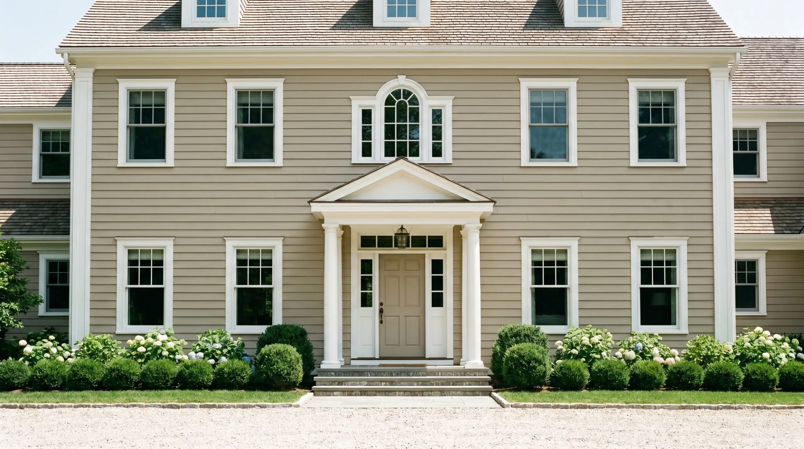
Exteriors
On an exterior facade, the mid-tone depth prevents the color from glaring under direct midday sunlight, maintaining a rich, welcoming presence. It wraps traditional siding in a timeless warmth, and when paired with crisp white trim, it delivers an incredibly tailored, high-curb-appeal finish.
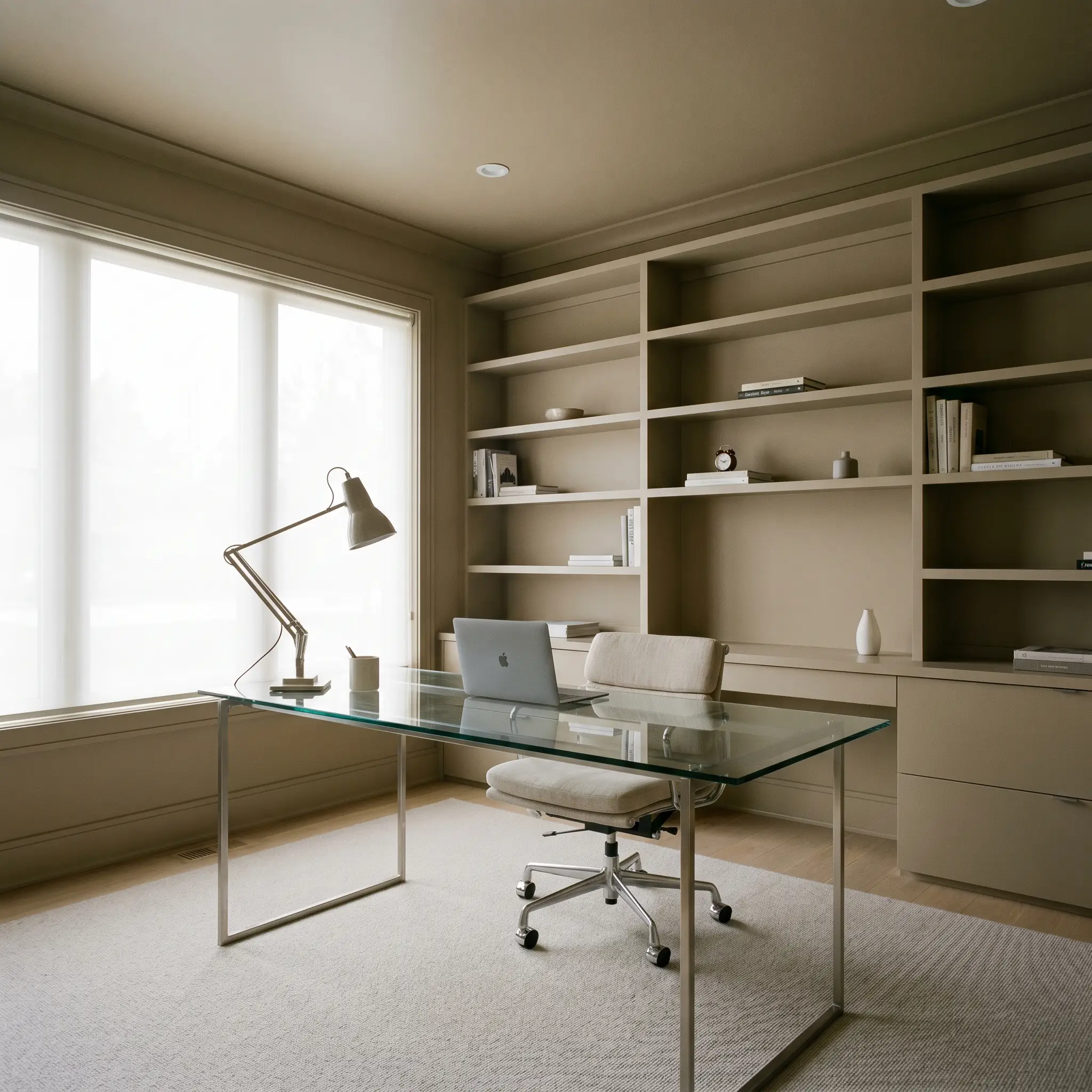
Home Offices
A dedicated workspace requires focus, and this grounded neutral delivers a calm, distraction-free environment without feeling cold or sterile. The olive nuances promote a sense of quiet concentration, perfectly complementing standard built-in shelving or a sleek glass-topped desk.
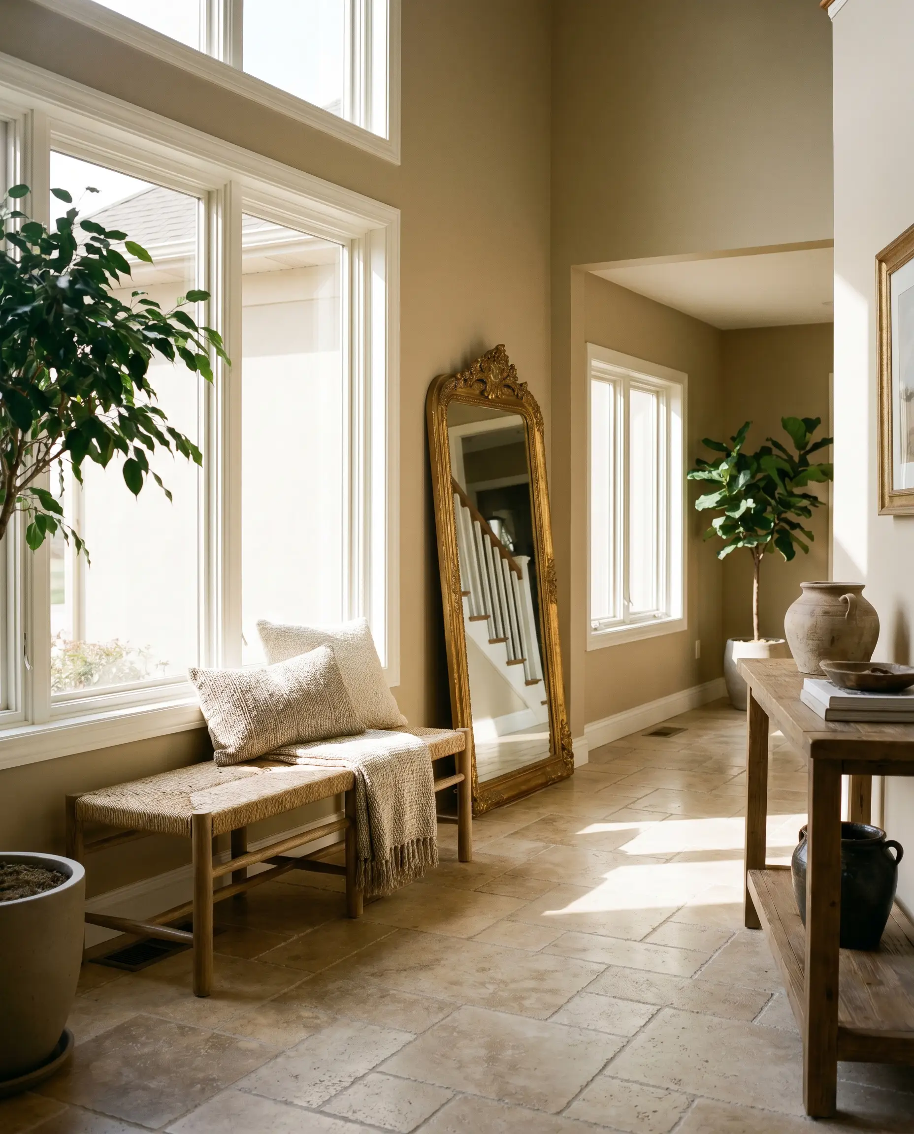
Entryways
First impressions matter, and wrapping a foyer in this welcoming shade instantly sets a sophisticated tone for the rest of the house. It absorbs the chaotic energy of a busy drop-zone, looking incredibly chic behind a simple woven bench and an oversized, gilded mirror.
Unique Design Ideas & Inspiration
Moving beyond standard four-wall applications, this chameleon-like neutral is a brilliant tool for highly specific, curated design moments. When applied thoughtfully, it can entirely redefine the architectural boundaries of a space.
The Monochromatic Library Retreat
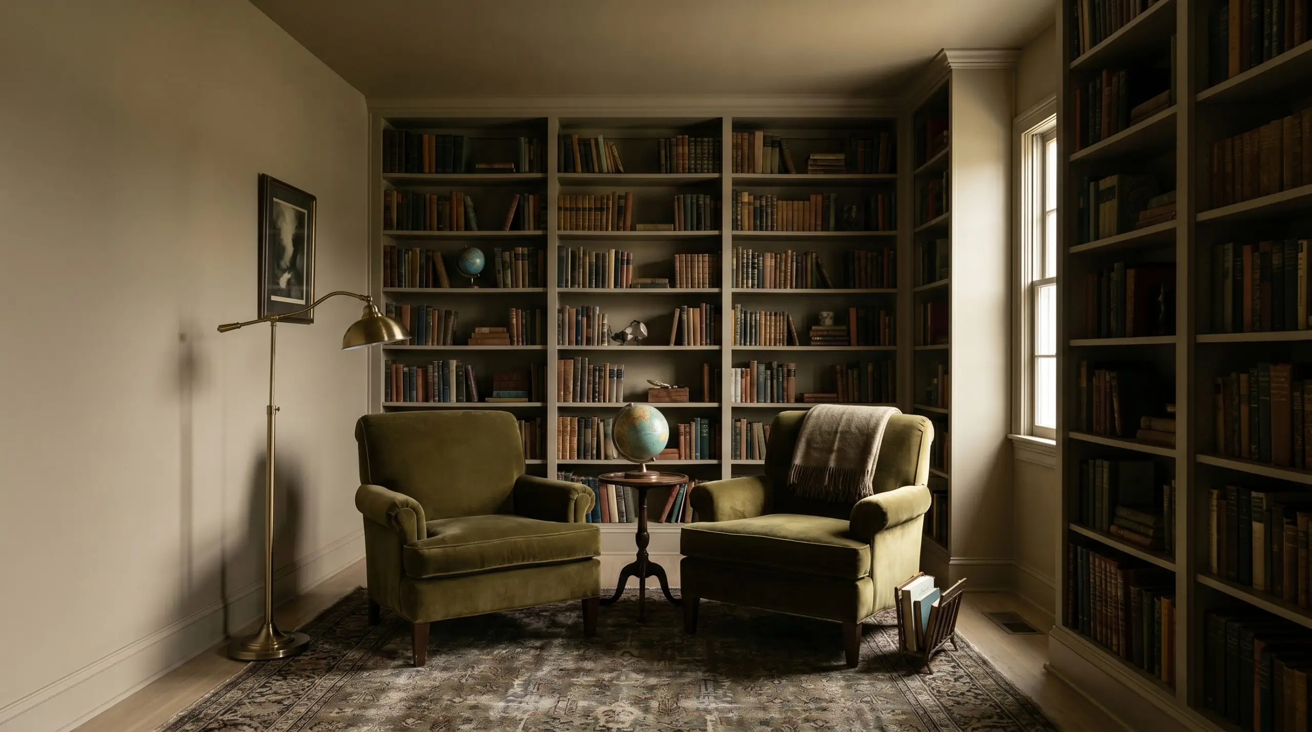
Transform a generic spare bedroom into an enveloping reading room by taking this color across the walls, baseboards, and ceiling. This color drenching technique erases visual boundaries, making standard ceiling heights feel endlessly tall. Pair it with rich velvet seating and a classic brass reading lamp for an effortlessly moody, academic vibe.
A Heritage-Inspired Mudroom Built-In
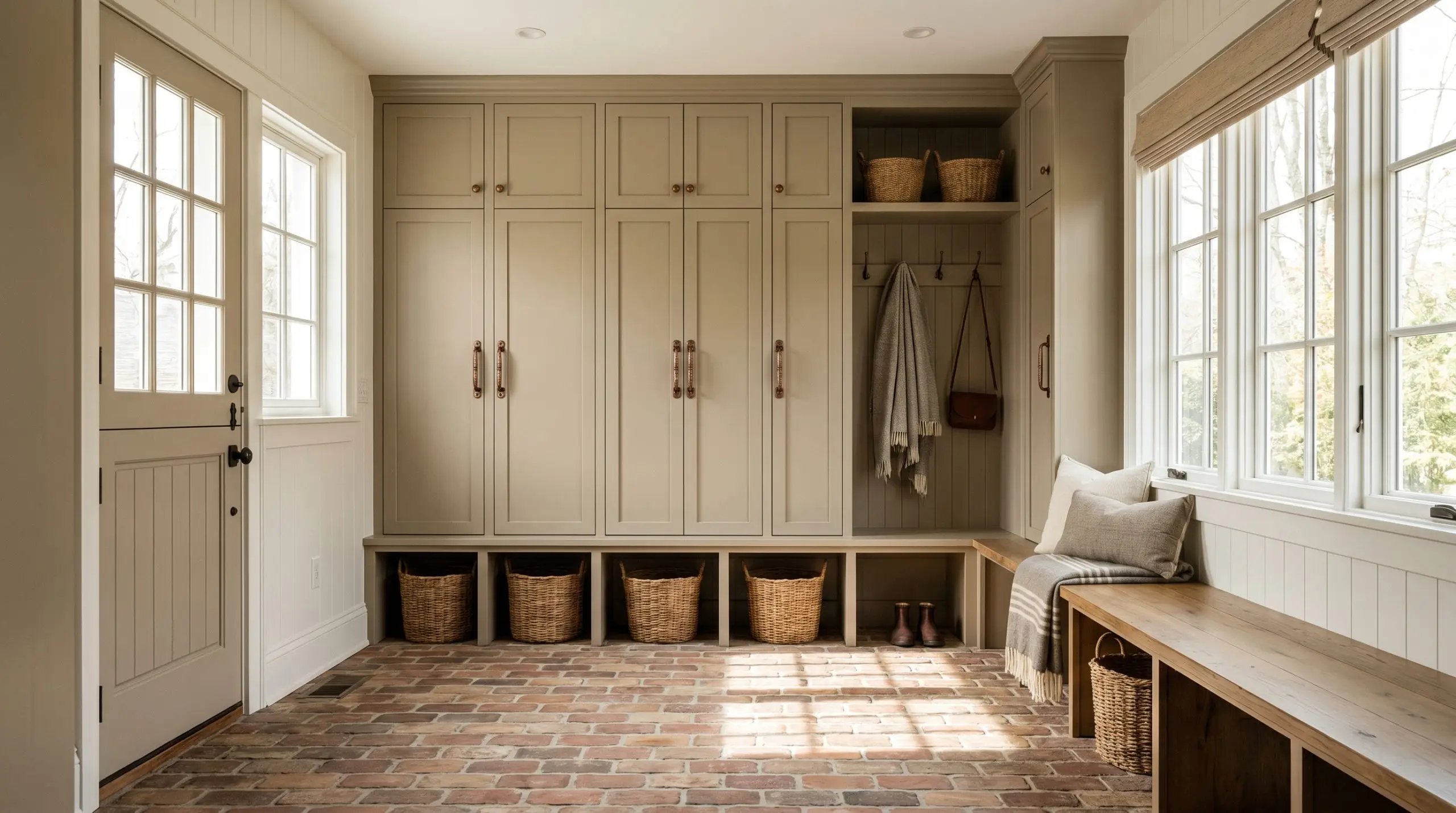
Elevate standard MDF mudroom lockers by coating them in a durable, satin finish of this deep khaki. The earthy undertones hide everyday scuffs brilliantly while making standard carpentry look like custom, historic millwork. Add heavy, aged copper hardware to instantly upgrade the entire drop-zone experience.
The Modern Rustic Dining Wainscoting
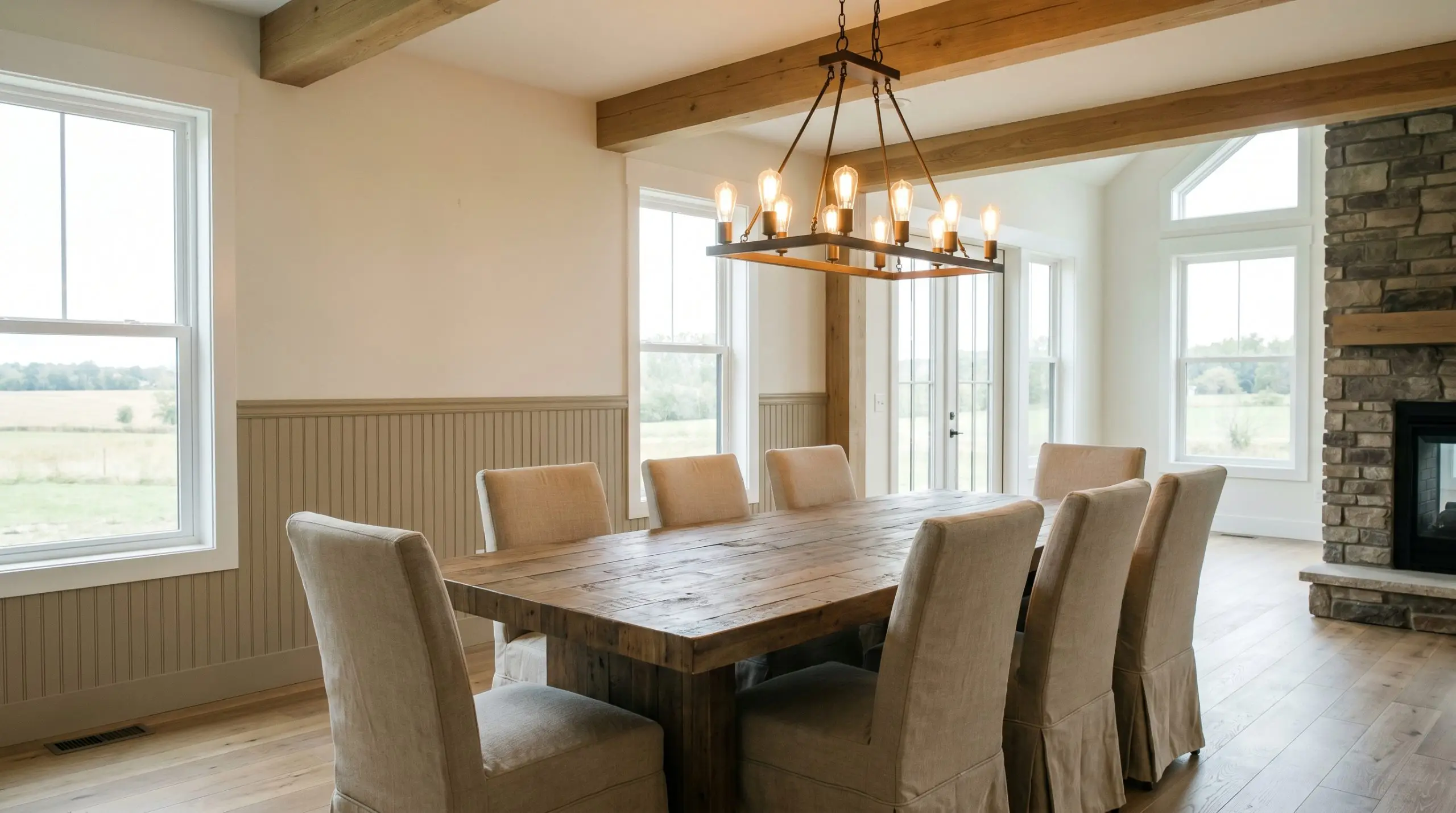
Apply this shade to classic beadboard or board-and-batten on the lower third of a dining room wall, leaving the upper portion a crisp, warm white. This application grounds the dining table and adds immense architectural interest to a builder-grade box. It creates a stunning foundation for a reclaimed timber table and slipcovered linen chairs.
Hardware, Wood & Material Pairings
To truly unlock the potential of this grounding neutral, you must surround it with tactile elements that engage in a deliberate visual dialogue. The right finishes will either pull out its inviting warmth or highlight its sophisticated, shaded nuances.
Trim & Baseboards
Clean, high-contrast boundaries are essential to keep this mid-tone from feeling heavy.
Tactile Elements & Metals
The Curated Palette
Designer Mood Boards
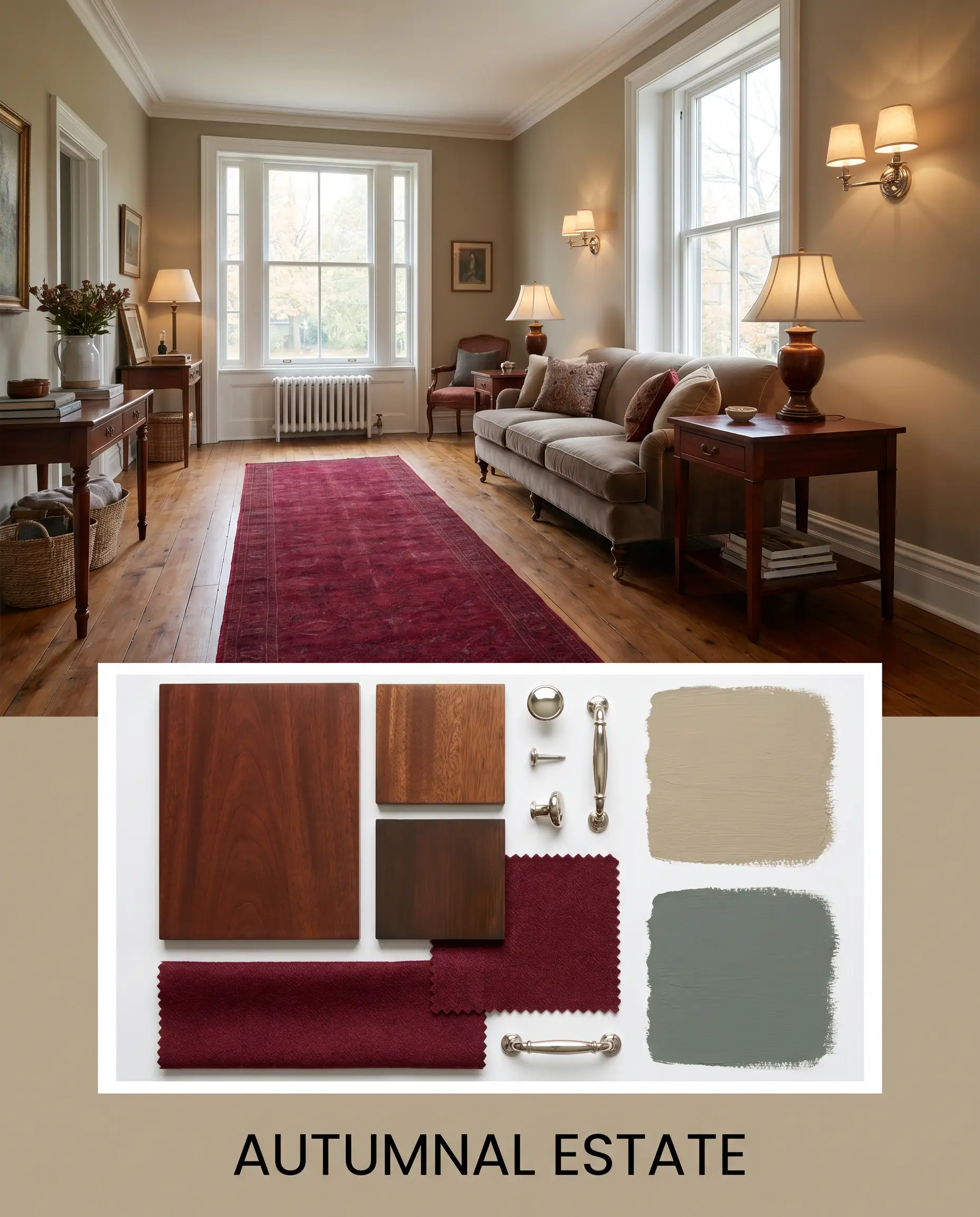
Autumnal Estate: A deeply comforting palette that marries the earthy khaki walls with Farrow & Ball Green Smoke No. 47 accents. Incorporate rich mahogany side tables, a vintage wool runner in deep crimson, and polished nickel wall sconces. This combination creates an incredibly grounded, heritage-rich atmosphere that feels collected over decades.
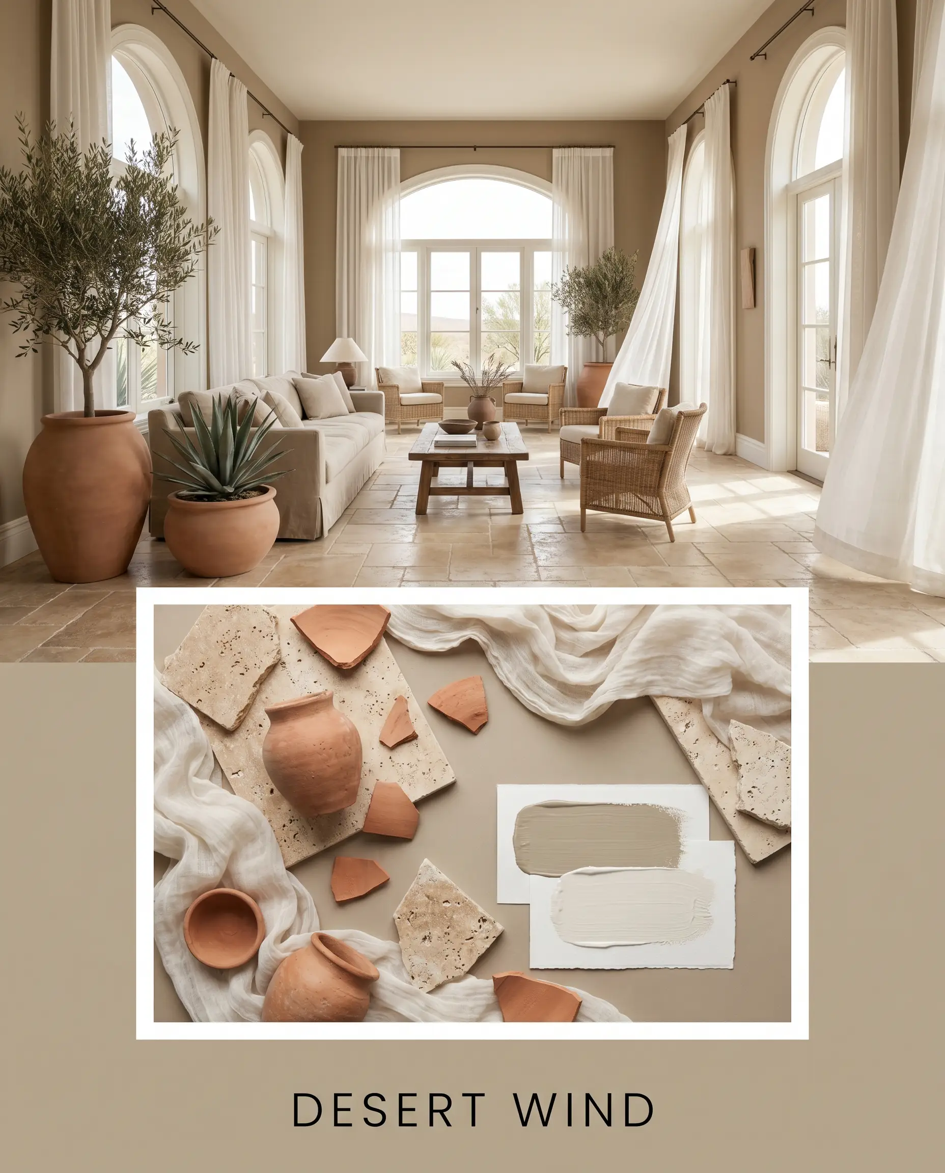
Desert Wind: A light-filtering, airy approach utilizing Sherwin-Williams Alabaster SW 7008 to create expansive, breathing room. Layer in matte terracotta planters, tumbled travertine flooring, and lightweight, gauzy cotton drapery. The resulting energy is restorative, sun-baked, and effortlessly serene.
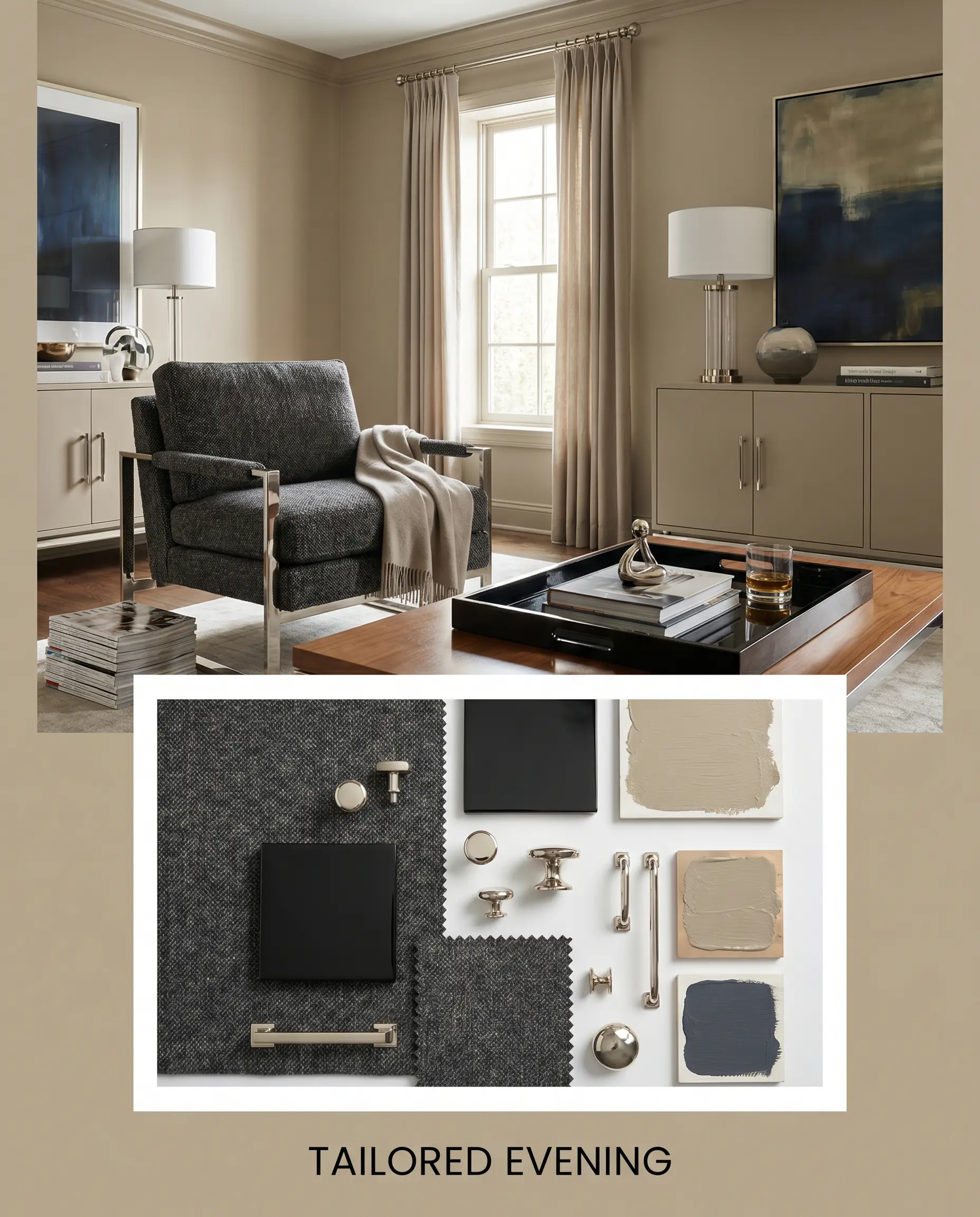
Tailored Evening: A sharp, high-contrast aesthetic anchoring the space with Benjamin Moore Hale Navy HC-154. Introduce sleek, polished nickel hardware, a structured charcoal tweed armchair, and a high-gloss black lacquered tray. This palette transforms the warm backdrop into a highly sophisticated, cosmopolitan retreat.
Sherwin-Williams Universal Khaki Head-to-Head Comparisons
Choosing the right mid-tone neutral often comes down to understanding how a color behaves under specific architectural constraints. If your room lacks natural light or features deeply red-toned flooring, understanding warm vs. cool beiges becomes critical, and a rival shade might be the superior choice.
Sherwin-Williams Universal Khaki SW 6150 vs. Sherwin-Williams Accessible Beige SW 7036
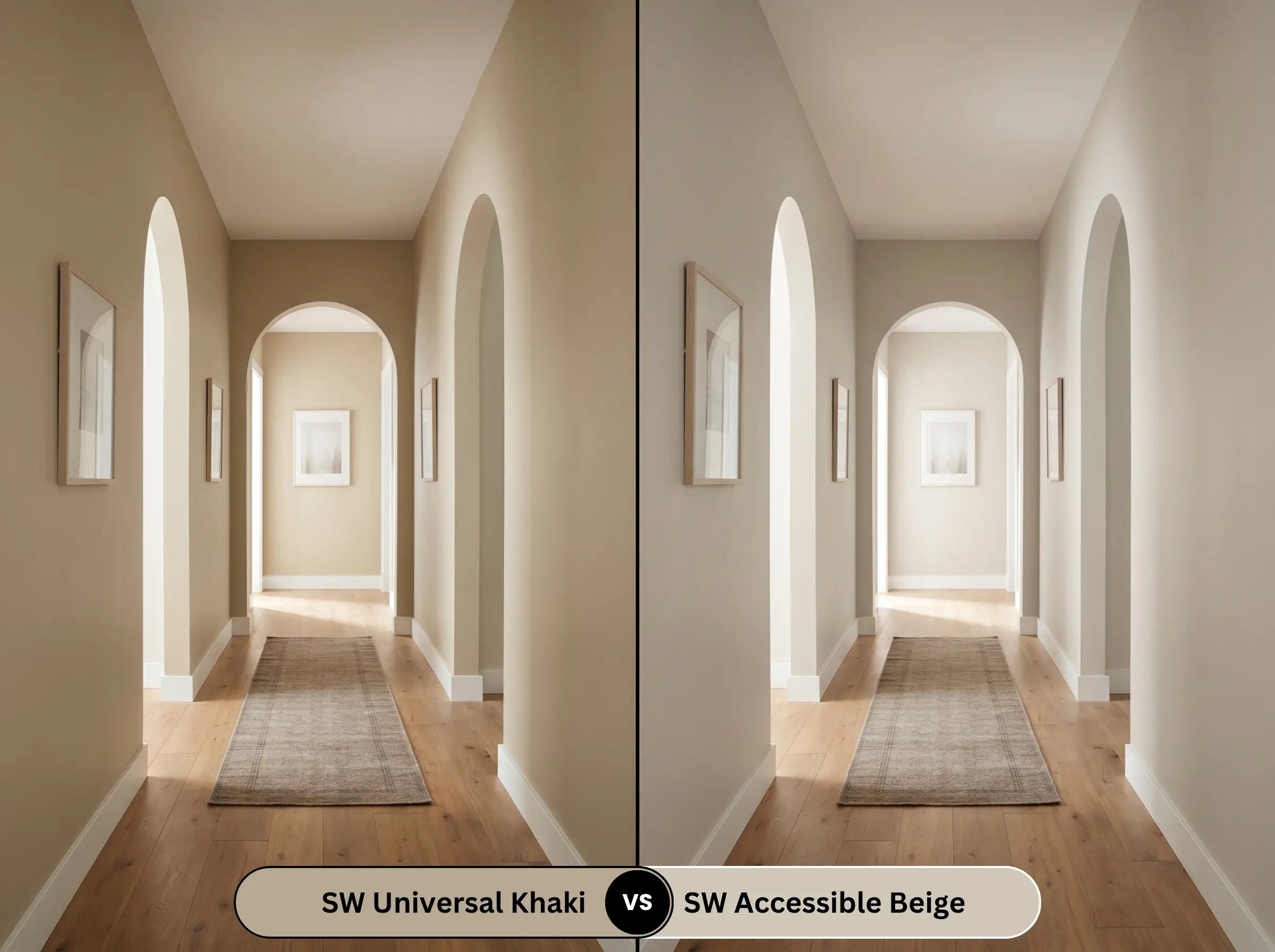
Accessible Beige SW 7036 sits significantly higher on the lightness scale, making it a much safer bet for dark, narrow hallways or rooms with minimal windows. If you want a breezy, light-reflecting backdrop, Accessible Beige is the clear winner. However, if your space is flooded with natural light and you crave a richer, more substantial anchor that won’t wash out, Universal Khaki provides the necessary depth.
Sherwin-Williams Universal Khaki SW 6150 vs. Sherwin-Williams Balanced Beige SW 7037
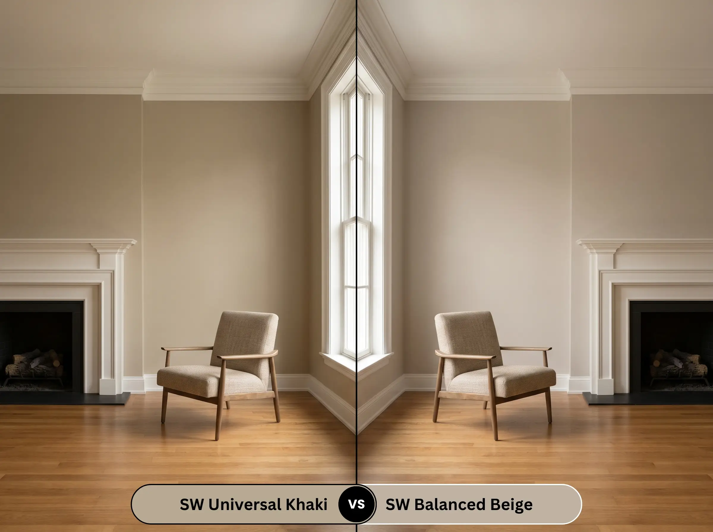
Balanced Beige SW 7037 shares a similar depth but carries a noticeably cooler, grayer undertone profile. If your home features cool-toned gray stone fireplaces or icy marble countertops, Balanced Beige will harmonize beautifully without clashing. Conversely, if you are working with warm wood floors and crave a cozier, earthier atmosphere, Universal Khaki is the undeniable champion.
Similar Colors & Cross-Brand Equivalents
Sometimes a space demands a slight pivot—perhaps a touch more lightness for a shadowed corridor, or a brand alternative due to local availability. These closely related shades offer excellent pathways to achieve a similar grounded aesthetic.
Same-Brand Alternatives
Rival Matches
Practical Application & DIY Advice
Moving from curatorial theory to the physical reality of a renovation requires a strategic approach to finishes and prep work. Executing this depth of color flawlessly demands attention to the nuances of application.
The Dynamic Sheen Guide
Primer Strategy
Because this shade absorbs a significant amount of light, applying it directly over a stark white wall or a dark, existing color can lead to a muddy finish. A high-quality, lightly tinted gray primer is highly recommended. This crucial base layer neutralizes the old wall color and allows the complex green-taupe nuances of the new paint to develop fully.
Coverage & Success Tips
Plan for a strict two-coat minimum to achieve the true, rich depth seen on the swatch. When applying this mid-tone, maintain a wet edge with your roller to prevent “flashing”—those visible, overlapping streaks that catch the light unevenly.
Always use a high-quality, 3/8-inch nap microfiber roller for this specific depth of color. Cheaper covers will leave a stippled texture that catches shadows, artificially darkening the wall and ruining the smooth, sophisticated finish.
Hackrea Pro-Tip (The Roller Rule)
Frequently Asked Questions
Because of its robust mid-tone depth, this shade performs exceptionally well on textured stucco under harsh sunlight. The heavy texture creates micro-shadows that emphasize the earthy, green-taupe nuances, preventing the color from glaring or looking washed out. It maintains a rich, grounded presence even at high noon.
Yes, but it requires highly strategic artificial lighting to succeed. By washing the walls, trim, and ceiling in this shade, you create a cozy, enveloping lounge atmosphere. However, you must layer ample warm-toned (2700K) ambient lighting—like wall sconces and table lamps—to keep the room feeling intentional and inviting rather than cavernous.
An eggshell finish creates a subtle, protective seal that bounces ambient bathroom light, making the color feel slightly crisper and more luminous. A matte finish absorbs that same light, creating a softer, more velvety appearance, but it is highly susceptible to moisture tracking and water stains in damp environments. Always prioritize the durability of eggshell in a full bath.
Final Verdict & Expert Warnings
Sherwin-Williams Universal Khaki (SW 6150) is a brilliant choice for homeowners seeking a sophisticated, grounding anchor that effortlessly bridges traditional warmth with modern restraint. It is the perfect foundational layer for living rooms, transitional kitchens, and welcoming exteriors, providing a rich, earthy backdrop that elevates both everyday materials and premium finishes. Its ability to shift between a cozy golden tan and a shaded olive makes it an endlessly versatile tool for creating curated, intentional spaces.
However, this complex shade is not universally forgiving, and you must exercise extreme caution if your home features prominent, cool-toned fixed elements. Pairing this earthy khaki with stark, blue-gray luxury vinyl plank flooring or icy Carrara marble countertops creates a jarring visual disconnect, making the paint look muddy and the finishes look sterile. Furthermore, avoid utilizing stark, blue-tinted daylight bulbs, as they will aggressively flatten the inherent warmth and expose a dull, lifeless undertone, entirely defeating the welcoming purpose of this beautiful color.
Expert Warnings