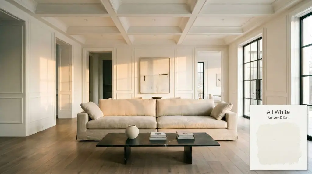
All White No. 2005
Farrow & BallFarrow & Ball All White (No. 2005) is a pure, crisp white paint color containing no other pigment except for white. With an LRV of 94.92, it provides a soft, sympathetic brightness without the stark, cold blue undertones typically found in brilliant whites.
Paint Technical Profile
| Color ID / SKU | No. 2005 |
| HEX Code | #f6f6f2 |
| Light Reflectance (LRV) | 94.92 |
| Use | Interior, Exterior |
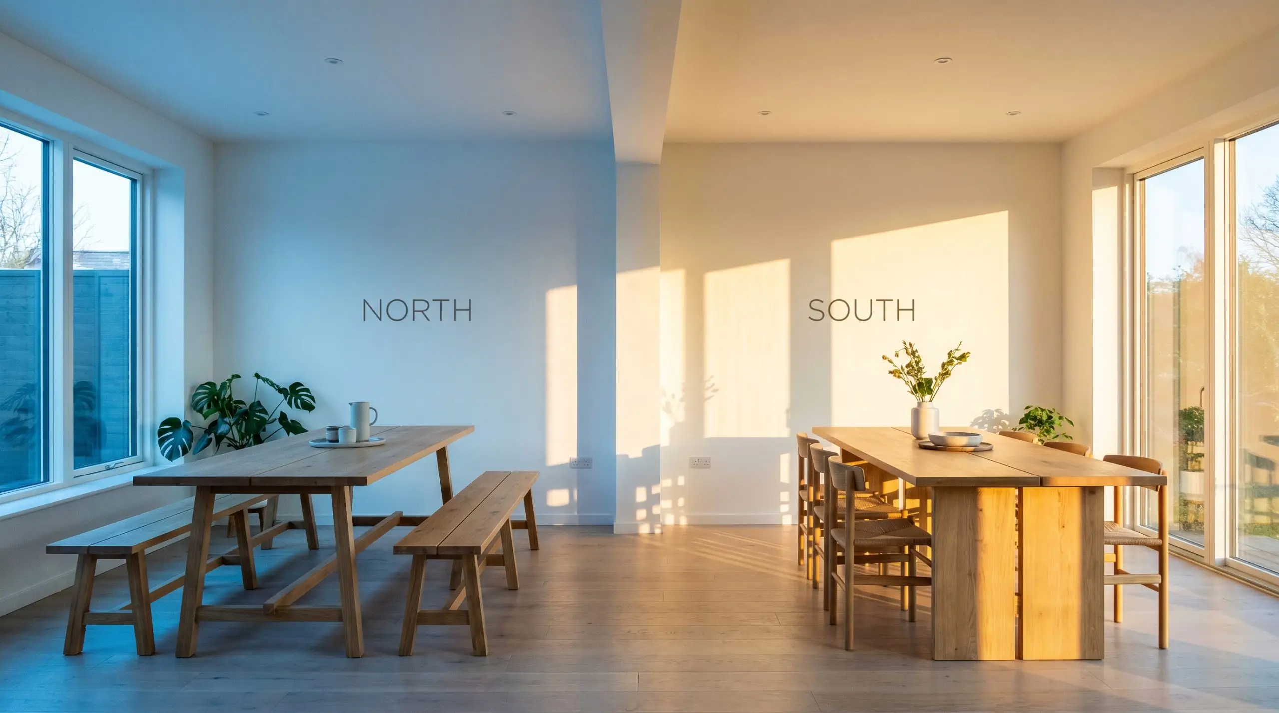
| Best Exposures | North, South, East, West |
| Best For | Ceilings, Trim, Cabinetry, Modern Minimalist Walls, Shiplap |
Farrow & Ball All White (No. 2005): A Luminous, Pigment-Free Architectural Foundation
When you are trying to lift the visual weight of a heavily paneled historic parlor or flood a narrow urban corridor with natural light, the right foundational color changes everything. Farrow & Ball All White (No. 2005) is uniquely equipped for these exact scenarios because of its incredibly rare structural makeup.
Unlike standard hardware store options that rely on harsh additives to achieve a crisp look, this pure white relies entirely on its own luminous depth. It provides a brilliant, highly reflective canvas that effortlessly modernizes traditional architecture while bringing a soft, organic glow to contemporary builds.
Farrow & Ball All White: Undertones & LRV
If you are searching for a shade that is undeniably crisp but never clinical, No. 2005 lands as a beautifully neutral-leaning-warm tone. Because it contains absolutely no added pigment other than white, it avoids the common pitfalls of looking overly yellow, pink, or gray.
With a Light Reflectance Value (LRV) of 94.92, this shade reflects an immense amount of light back into your environment. It acts as a powerful illuminator, expanding tight layouts and highlighting intricate millwork details without straining the eyes. If you are exploring how these highly reflective options behave across different environments, checking out the ultimate guide to high-LRV white paints will help you understand the broader category.
Lighting Effects & The Chameleon Factor
Because this shade is stripped of all competing pigments, its biggest environmental risk is taking on the exact color of whatever is placed next to it or outside the window. If you have a massive, vibrant red brick wall directly outside your window, this architectural neutral will inevitably pull a faint pink reflection from that exterior bounce.
Testing this color in your specific environment is mandatory to see how your unique natural light interacts with its pure base.
If you want to maintain the crispness of No. 2005 at night without it feeling overly yellow, aim for 3000K LED bulbs. This provides a clean, welcoming glow that highlights the color’s purity beautifully.
Hackrea Pro-Tip (Lighting Strategy)
Popular Room Applications for All White
This pigment-free shade brings a clarifying, restorative energy to any home, acting as the ultimate palate cleanser. It demands to be layered with rich textures and intentional silhouettes, serving as a quiet backdrop that lets your furnishings do the heavy lifting.
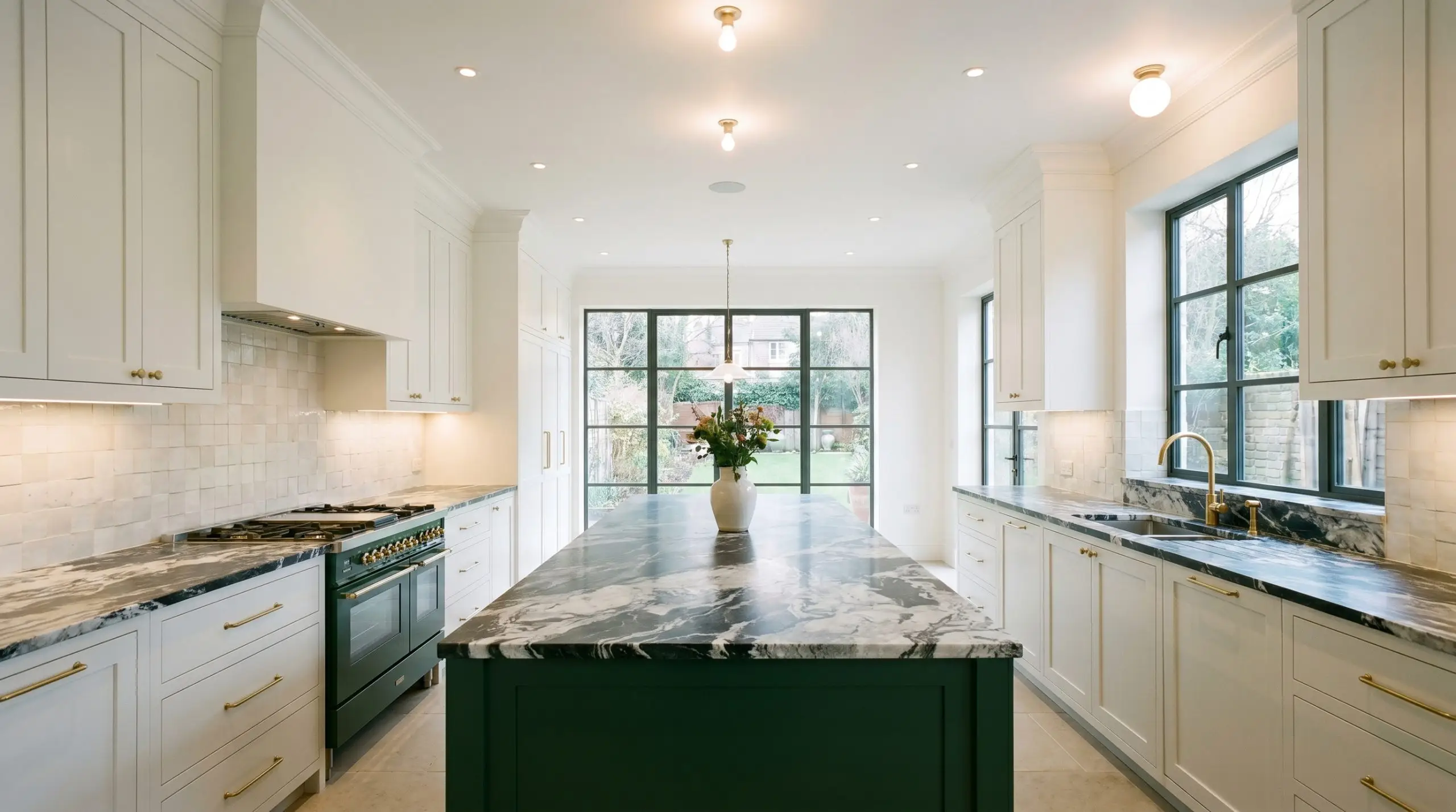
Kitchen Cabinetry & Islands
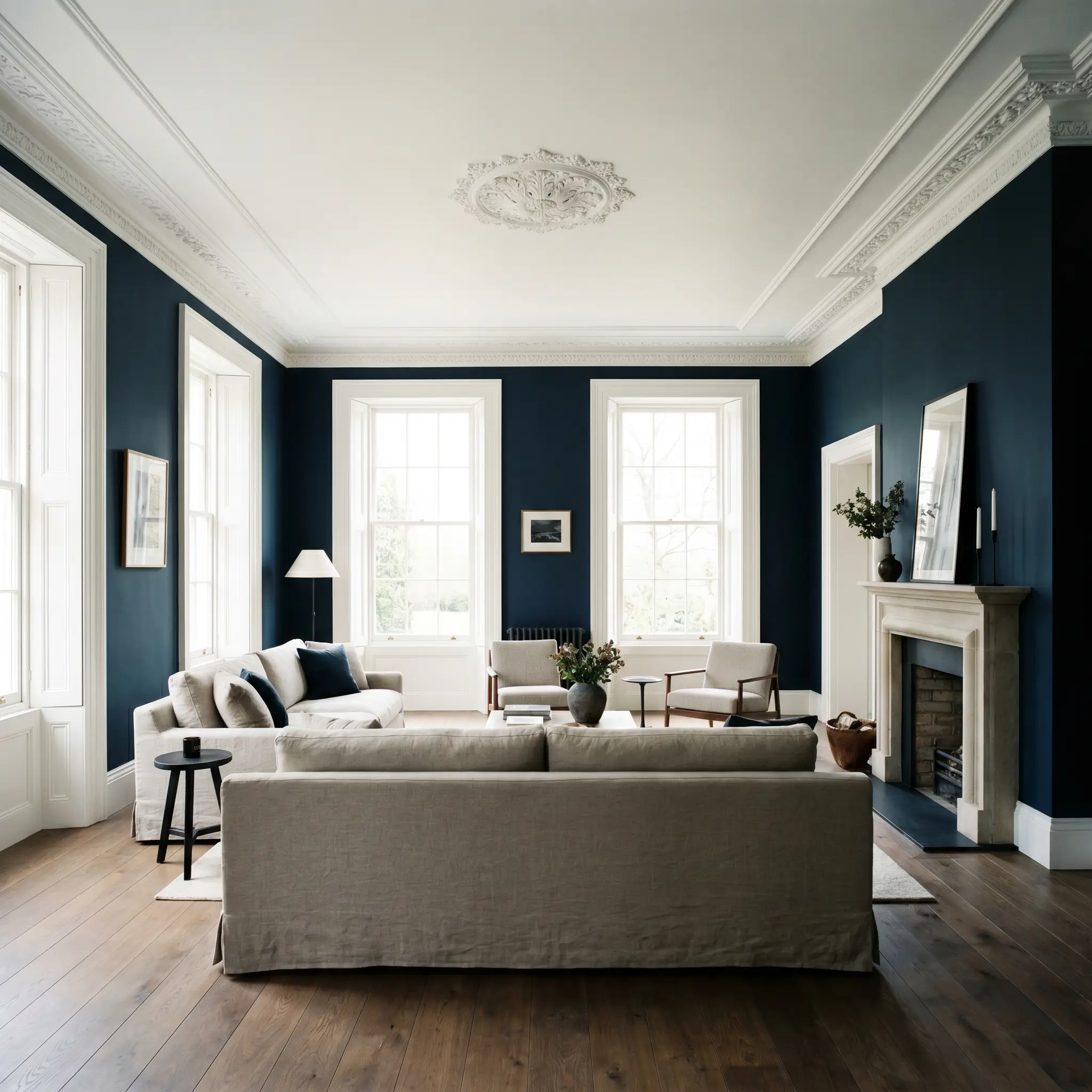
In culinary spaces, this brilliant white alternative excels at creating a sanitary, uplifting environment that still feels deeply inviting. It provides a stunning backdrop for rich, dark-veined marble countertops or heavily textured zellige tile backsplashes. You can ground the island with a deeply saturated navy or forest green, allowing the crisp upper cabinetry to visually recede and make the ceiling feel taller.
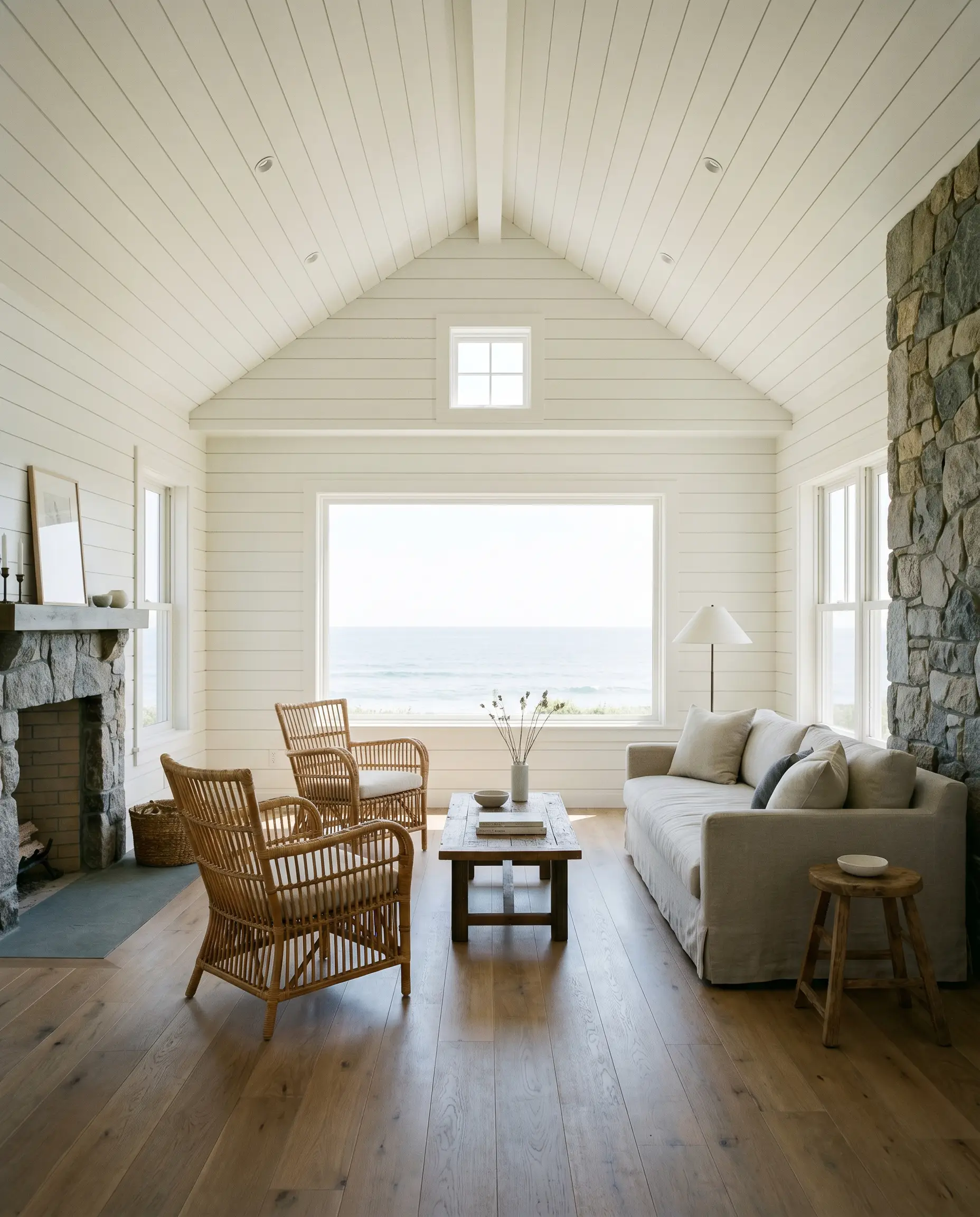
Shiplap & Millwork
When applied to extensive architectural paneling, the color highlights every subtle shadow line and carved detail without overwhelming the eye. It transforms heavy, dated wall treatments into fresh, textural elements that feel incredibly current. Whether you are leaning into a coastal cottage vibe or a refined transitional aesthetic, it keeps the focus entirely on the craftsmanship.
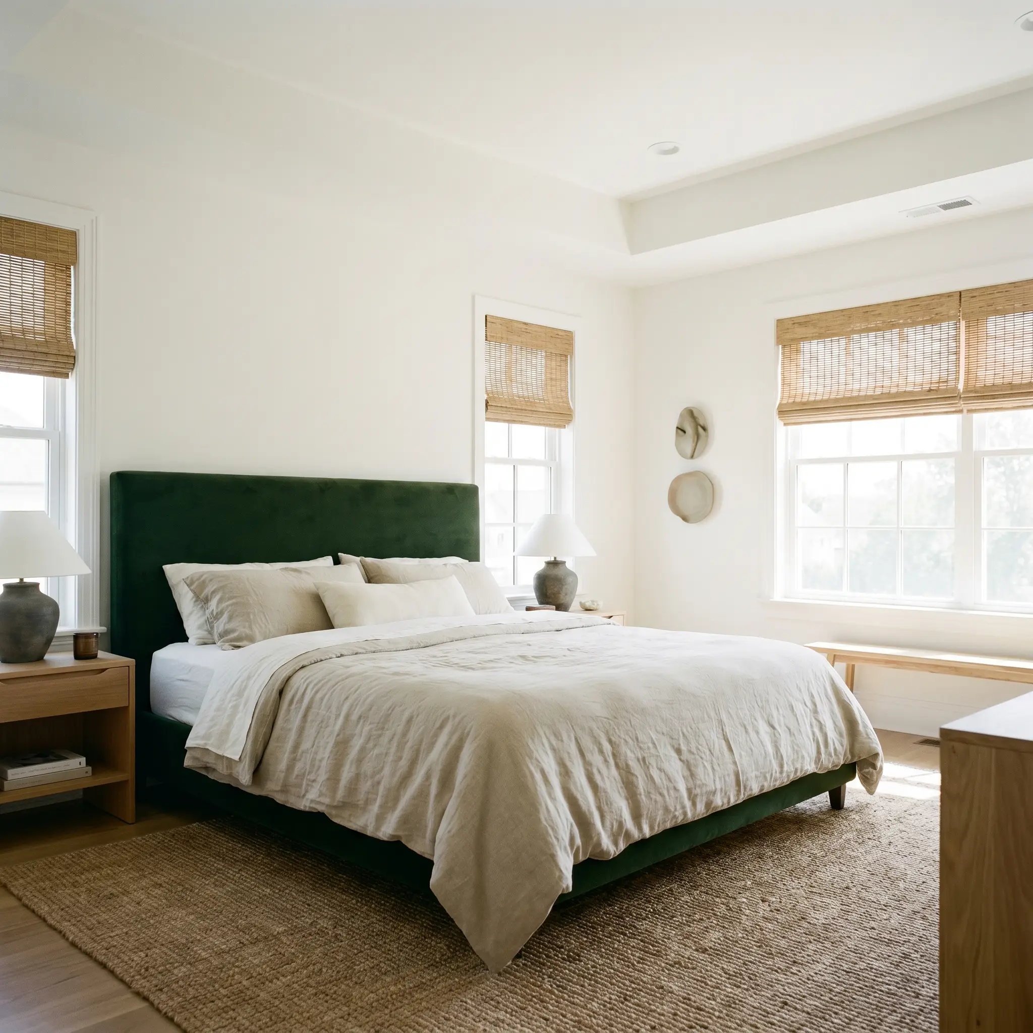
Primary Bedrooms
For sleeping quarters, this shade establishes a serene, cloud-like atmosphere that promotes immediate relaxation. It pairs effortlessly with heavyweight Belgian linen bedding, woven rattan window treatments, and deeply saturated velvet headboards. Because of its high light reflectance, it helps you wake up naturally with the morning sun, making the room feel expansive and airy.
Gallery Walls & Art Studios
If you have a curated collection of vibrant artwork or vintage photography, this is the ultimate structural canvas. The complete absence of competing undertones ensures that your art remains the focal point, while the lack of harsh blue additives prevents the room from feeling like a sterile commercial gallery. It beautifully balances the visual weight of heavy, ornate gold frames or sleek, minimalist black borders.

Ceilings & Trim
As a dedicated trim and ceiling color, No. 2005 acts as a crisp, defining boundary that elevates whatever wall color it touches. It creates a seamless, illuminating canopy overhead that bounces natural light deep into the center of the home. When paired with deeply moody wall colors, it provides the necessary high-contrast relief to keep the room from feeling cave-like.
Unique Design Ideas & Inspiration
While a pure white is often relegated to basic backdrops, treating it as a deliberate, premium design feature unlocks incredible architectural potential.
The High-Gloss Heritage Library
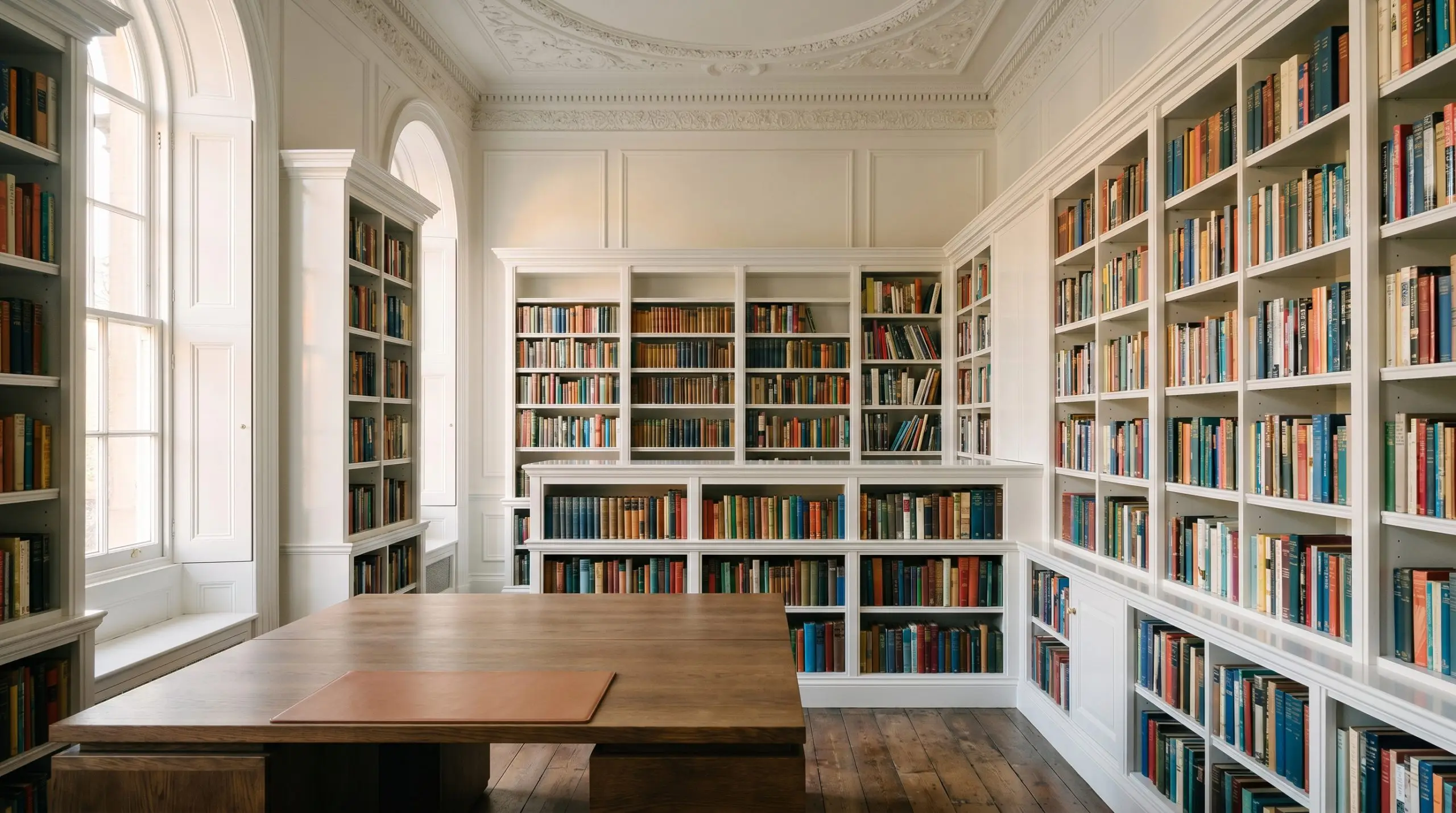
Transform a dark, heavy mahogany study by color drenching the entire room—bookshelves, walls, and trim—in this luminous shade. By using a high-gloss finish on the shelving and a matte finish on the walls, you create a subtle, tactile shift that feels incredibly sophisticated. The pure white base reflects the spines of your book collection, turning the literature itself into the primary color palette.
The Wabi-Sabi Bathhouse
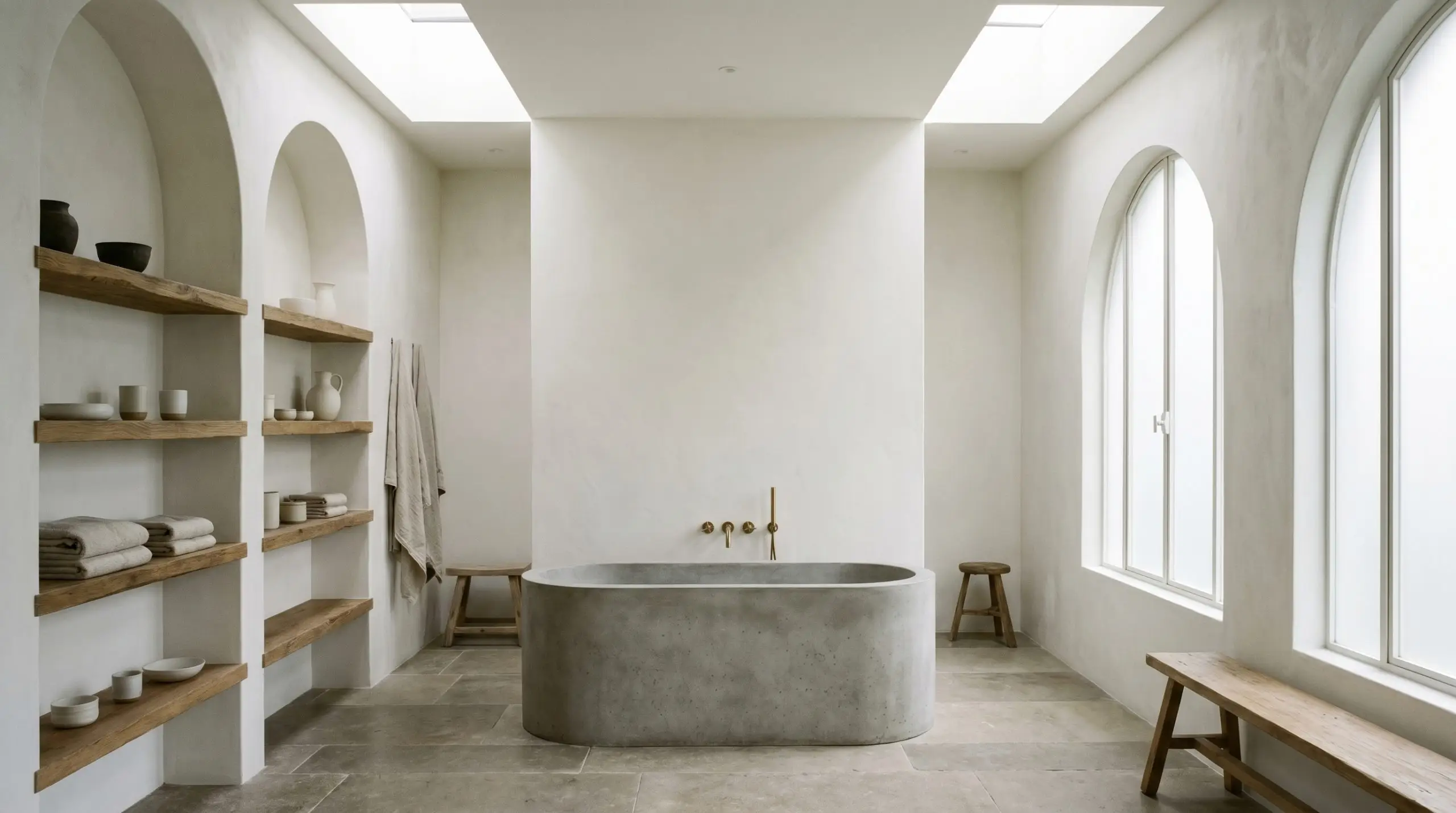
Create a deeply calming, organic retreat by pairing this crisp shade with heavily textured, raw materials. Apply the paint over a subtle Roman clay or limewash treatment to give the walls a soft, plaster-like movement. Layer the space with a freestanding concrete soaking tub, unlacquered brass fixtures, and raw, fumed European oak shelving for a minimalist design that feels incredibly warm and grounded.
A Color-Blocked Staircase
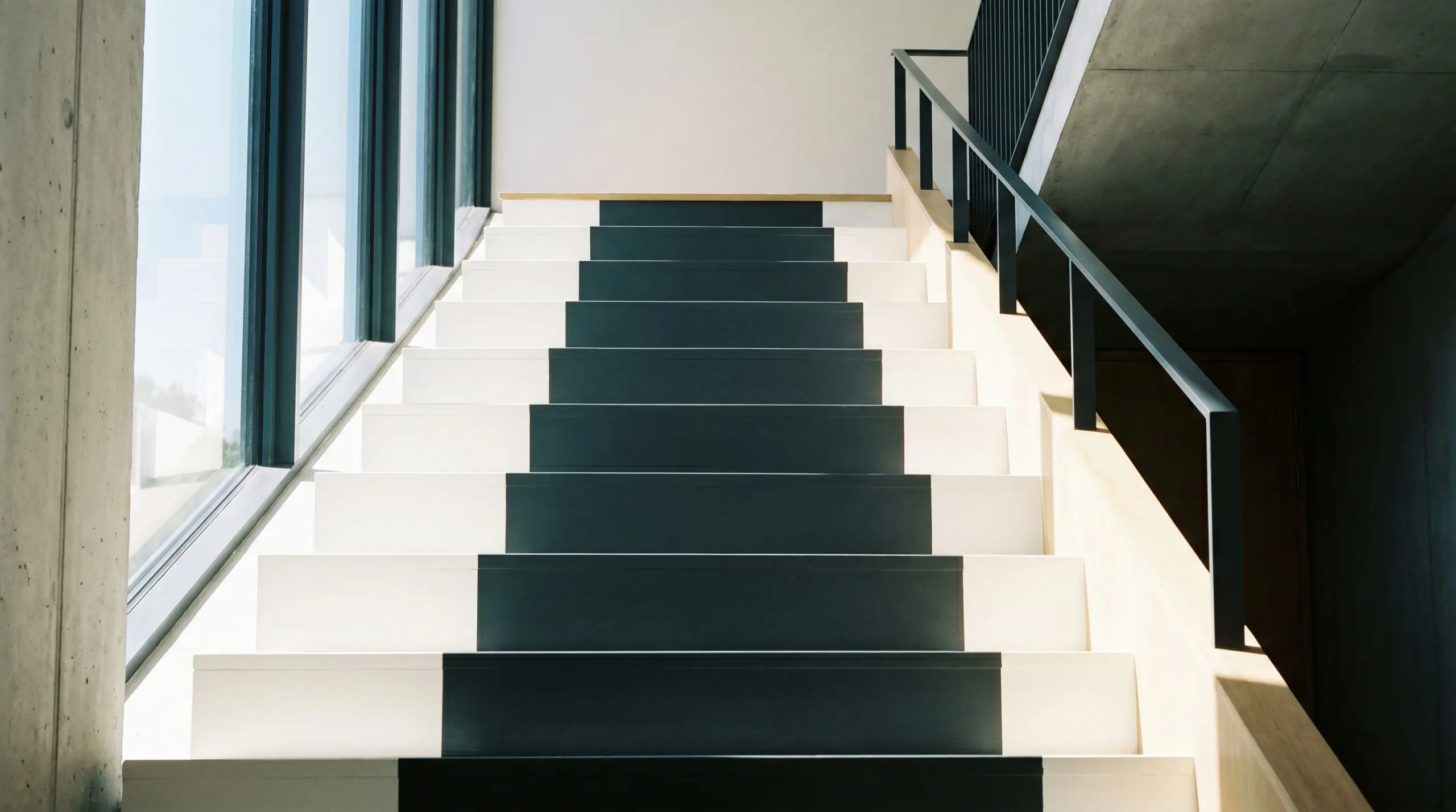
Instead of a standard runner, use this brilliant white on the outer edges of your staircase treads, painting a striking, deep charcoal stripe directly down the center. This creates a highly tailored, architectural optical illusion that draws the eye upward. The crispness of the outer edges ensures the dark center stripe feels intentional and sharply defined, adding massive visual interest to a transitional space.
Coordinating Colors & Best Pairings
The secret to styling a pigment-free shade is understanding that it thrives on deliberate, textural contrast. Because it lacks internal complexity, you must introduce warmth, depth, and character through your surrounding materials and secondary paint choices.
Trim & Baseboards
When using No. 2005 on the walls, you have two distinct pathways for your architectural borders. You can wrap the entire room in the exact same color, merely shifting the finish to a subtle sheen for a seamless, modern envelope. Alternatively, if you want a microscopic step-up in crispness, Benjamin Moore Chantilly Lace (OC-65) or Sherwin-Williams High Reflective White (SW 7757) will provide a razor-sharp, tailored boundary.
Hardware, Wood & Material Pairings
Coordinating Colors
Designer Mood Boards
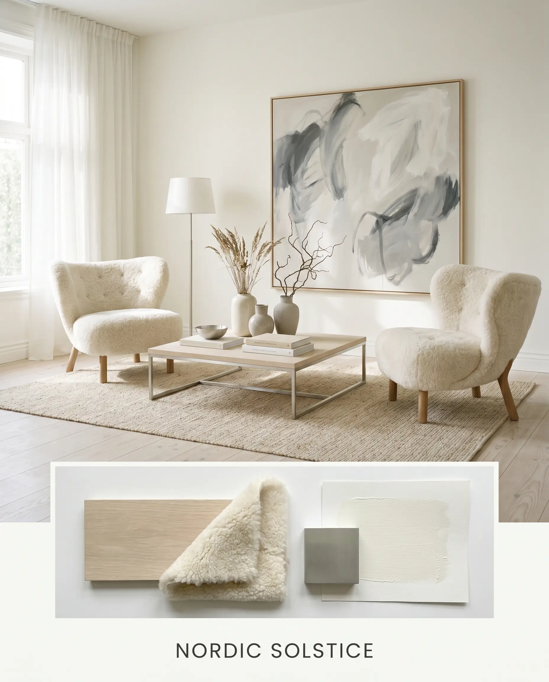
Nordic Solstice: This palette channels the bright, airy energy of Scandinavian winters, relying entirely on texture rather than heavy pigment. The luminous walls serve as a backdrop for pale, bleached ash flooring and sleek, polished unlacquered silver hardware. You can layer the room with plush, ivory shearling accent chairs and a large, abstract canvas in soft charcoal to ground the expansive brightness.
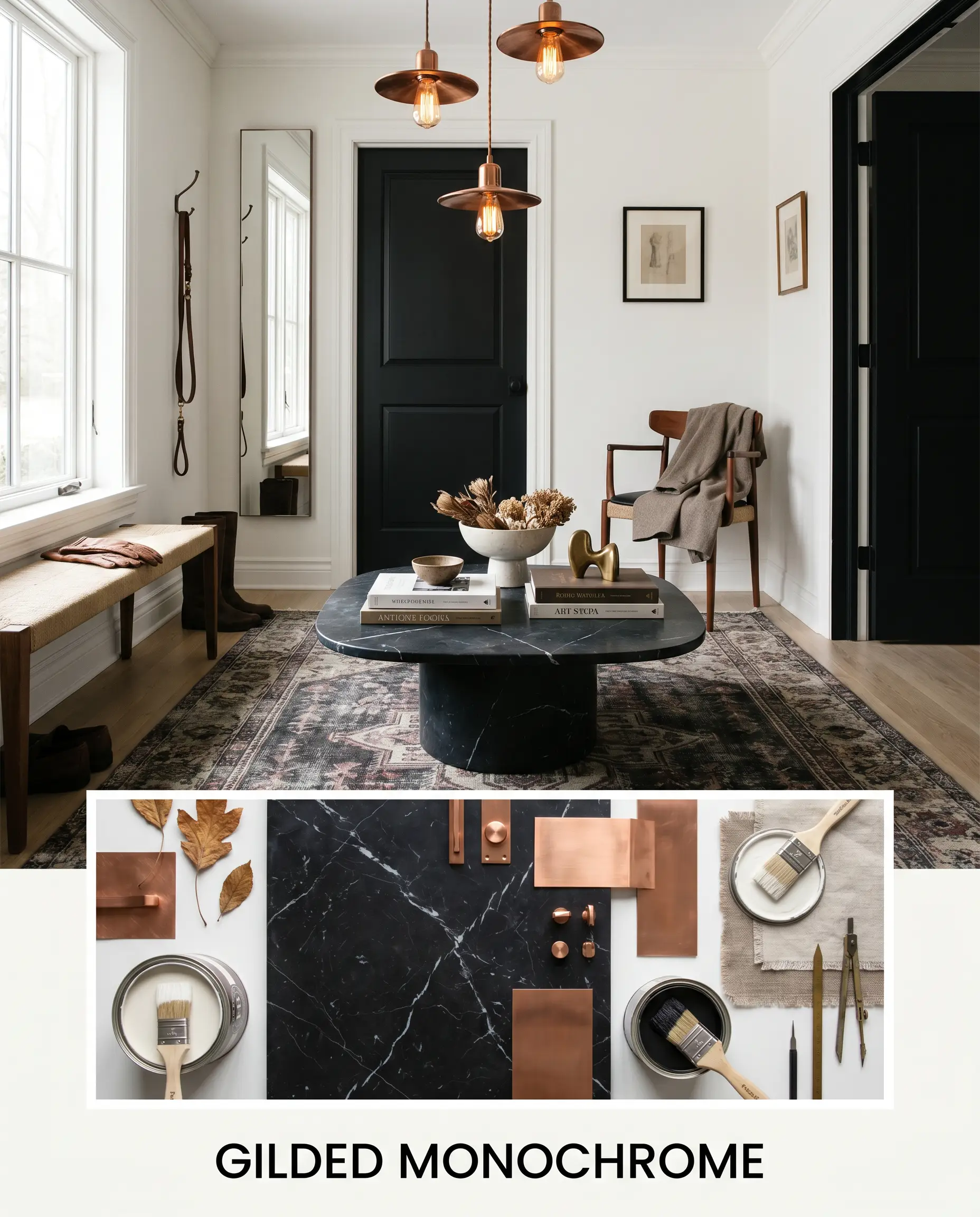
Gilded Monochrome: Designed for high-impact, tailored elegance, this scheme thrives on sharp boundaries and premium materials. The brilliant white walls are sharply contrasted by Farrow & Ball Pitch Black (No. 256) on the interior doors and window sashes. A heavy, leathered Nero Marquina marble coffee table and burnished copper light fixtures introduce a sophisticated, moody tension to the bright envelope.
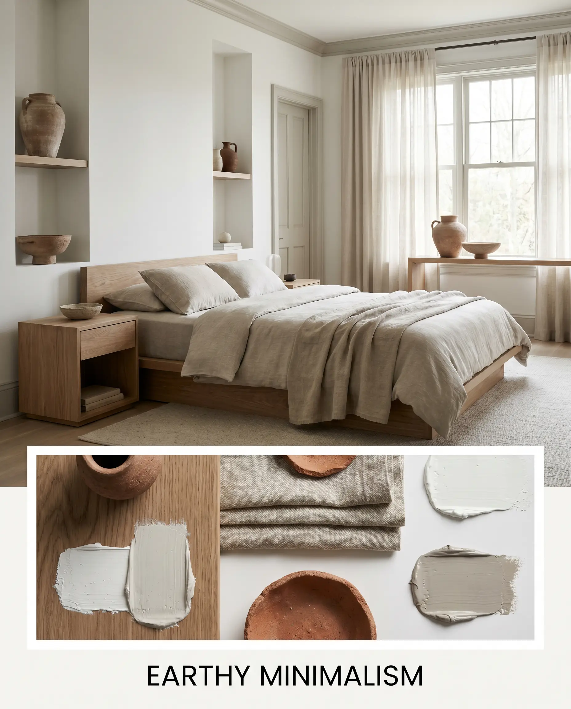
Earthy Minimalism: This combination softens the crispness of the paint by introducing rich, grounding organic elements. Benjamin Moore Edgecomb Gray (HC-173) is used on the trim and interior doors to create a gentle, warm border. The space is filled with raw, fumed European oak furniture, heavyweight Belgian linen drapery, and deeply textured terracotta ceramics to create a deeply restorative retreat.
Head-to-Head Comparisons
When selecting a foundational white, understanding the minute differences in hidden pigmentation is crucial to achieving your desired atmosphere.
Farrow & Ball All White vs. Benjamin Moore Simply White
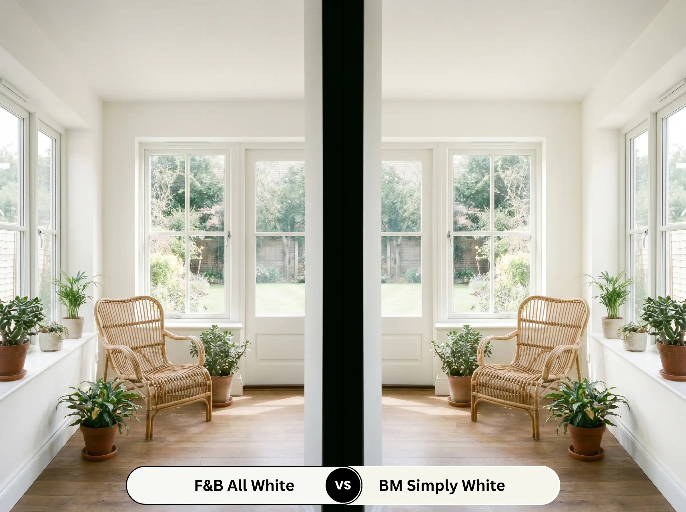
Simply White (OC-117) carries a very distinct, sunny yellow undertone that makes it undeniably warm and inviting. If your room is heavily shadowed or faces north, Simply White will inject a dose of artificial sunshine that No. 2005 cannot provide. However, if you want a truly neutral, crisp gallery aesthetic that won’t ever lean yellow in bright afternoon sunlight, the Farrow & Ball option is the superior choice.
Farrow & Ball All White vs. Sherwin-Williams Pure White
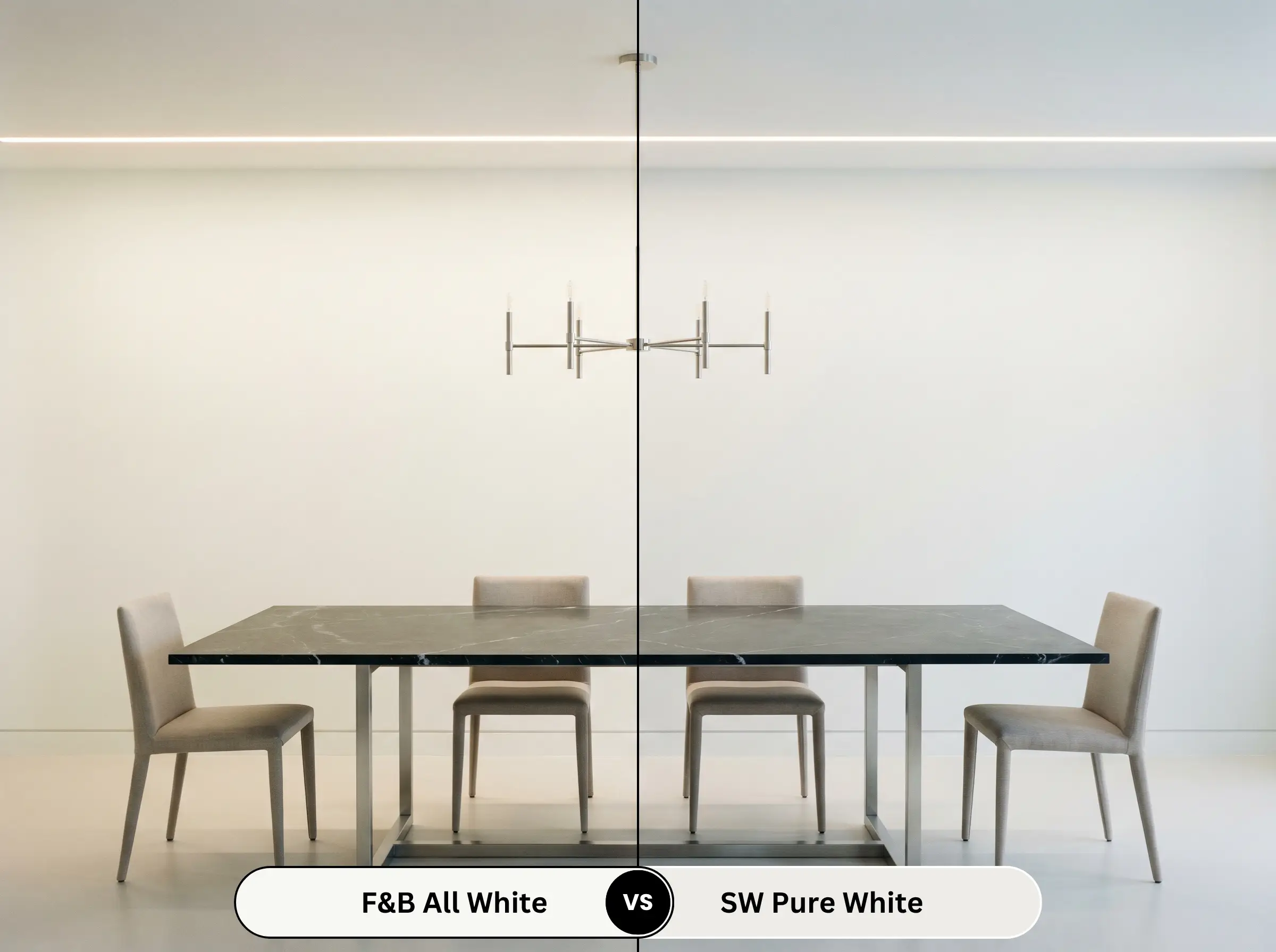
Pure White (SW 7005) is heavily formulated with a drop of black pigment, which slightly mutes its brightness and gives it a very soft, almost imperceptible gray undertone. This makes the Sherwin-Williams option incredibly forgiving and easy to use in standard builder-grade homes. If you want maximum light reflectance and a truly unadulterated, brilliant finish, No. 2005 delivers a much sharper, high-end result.
Farrow & Ball All White vs. Behr Ultra Pure White
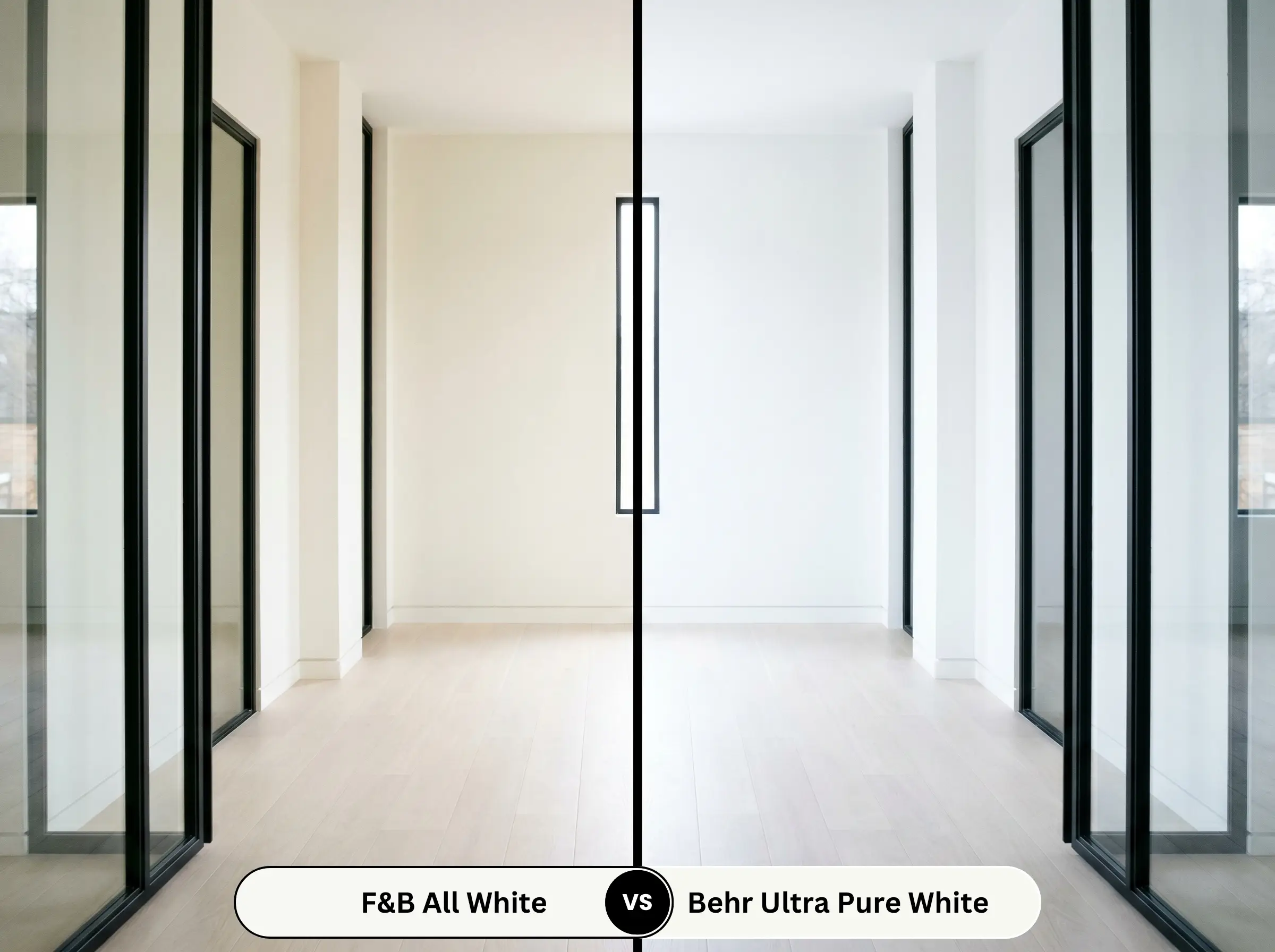
Behr Ultra Pure White (1850) is famous for its staggering brightness, but it utilizes heavy blue optical brighteners to achieve that stark, commercial-level crispness. This can occasionally make residential spaces feel chilly or sterile, especially in artificial lighting. No. 2005 achieves its beautiful luminosity organically, providing a sympathetic warmth that feels significantly more refined and comfortable to live with.
Similar Colors to Farrow & Ball All White
If the specific lighting in your home demands a slight shift in tone or depth, exploring adjacent options ensures you find the perfect match.
Farrow & Ball Alternatives
Cross-Brand Matches
Practical Application & DIY Advice
Executing a flawless, high-end finish requires understanding how this specific formulation behaves on the roller and on the wall.
The Dynamic Sheen Guide
Primer Strategy
Because this shade contains no added pigment to help block out underlying colors, a premium, high-hiding white primer is absolutely mandatory. If you are painting over raw wood or vintage cabinetry, you must use a dedicated stain-blocking primer to prevent tannins from bleeding through and ruining the pure white finish. Skipping this step will result in a patchy, uneven final product that lacks the signature Farrow & Ball depth.
Coverage & Success Tips
Achieving a solid, opaque finish with an ultra-high LRV paint over darker walls often requires three full coats, even with a high-quality primer. You must maintain a wet edge while rolling and avoid over-working the paint, as highly reflective whites will easily show “flashing” or visible roller marks if the sheen dries unevenly. Take your time, apply thin, even layers, and allow ample drying time between coats to ensure a flawless, professional-grade result.
Frequently Asked Questions
Because it completely lacks the blue optical brighteners found in standard commercial whites, it avoids the sterile, hospital-like feeling even in challenging spaces. However, in a windowless room, its success relies entirely on your artificial lighting; using warm 2700K to 3000K LED bulbs will pull out its sympathetic warmth and keep the powder room feeling inviting.
It actually makes the pairing significantly more sophisticated. While heavily brightened commercial whites can sometimes clash with the natural, earthy gray veining of Carrara, this pure, unadulterated base perfectly complements the organic nature of the stone without fighting it for dominance.
Yes, the deeply matte, chalky nature of Estate Emulsion is beautiful but inherently less resilient to scuffs, fingerprints, and friction. For a high-traffic corridor, upgrading to the washable Modern Emulsion ensures your brilliant white walls remain pristine without sacrificing that premium, low-sheen aesthetic.
Absolutely; this is one of its most powerful applications. Using this highly reflective shade on the ceiling and trim creates a crisp, defining architectural canopy that bounces light back down into the room, preventing deep, moody wall colors from feeling heavy or cave-like.
Final Verdict & Expert Warnings
Farrow & Ball All White (No. 2005) is the ultimate architectural tool for homeowners and designers who want a brilliant, clarifying foundation without the icy sterility of standard commercial paints. It is perfect for revitalizing heavy, dated millwork, expanding tight urban layouts, and serving as a quiet, highly reflective canvas for curated art collections. Because it relies entirely on its pure, unadulterated base rather than harsh chemical brighteners, it brings a serene, restorative energy to both historic renovations and sleek, contemporary builds.
While this shade is incredibly versatile, it will struggle immensely if paired with stark, blue-tinged fluorescent lighting or icy, cool-toned gray synthetic carpets. Because No. 2005 lacks artificial blue brighteners, placing it next to heavily cool-toned, synthetic elements will force the paint to look surprisingly dingy or flat by comparison. You must surround this pure white with warm, tactile materials and thoughtful, warm-leaning lighting to let its natural luminosity shine.
Clash Warning (The Lighting Conflict)
Closest Cross-Brand Equivalents
The absolute closest scientific color matches for All White across top paint brands.