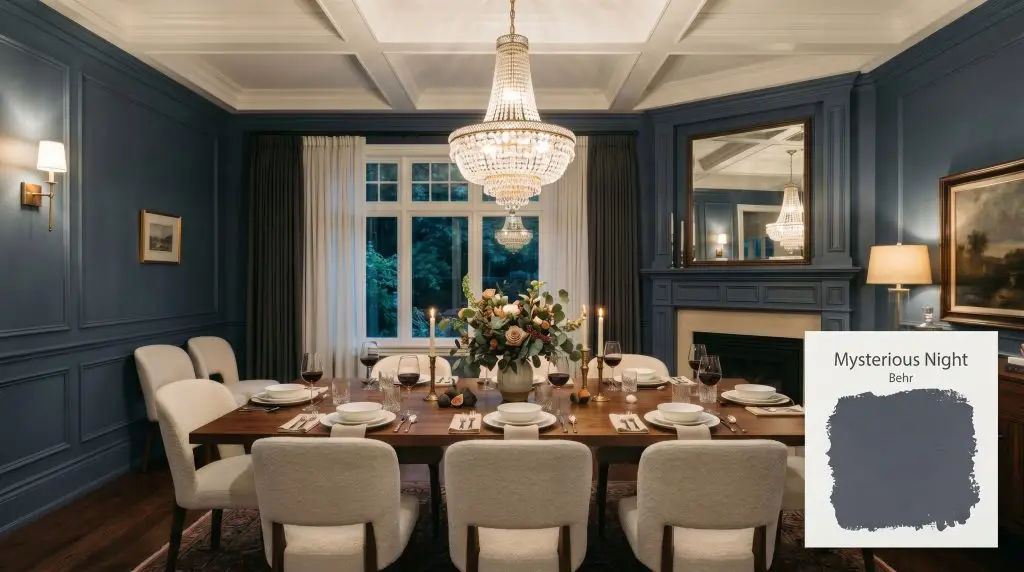
Mysterious Night S550-6
BehrBehr Mysterious Night (S550-6) is a dark, moody blend of navy blue and charcoal gray with an LRV of 12. Known for its subtle violet undertones, this sophisticated cool-toned paint shifts dynamically depending on lighting, making it perfect for dramatic accent walls and elegant cabinetry.
Paint Technical Profile
| Color ID / SKU | S550-6 |
| HEX Code | #5c6070 |
| Light Reflectance (LRV) | 12 |
| Use | Interior, Exterior |
| Best Exposures | South-facing, West-facing |
| Best For | Accent walls, cabinetry, moody bedrooms, dining rooms |
Behr Mysterious Night: The Ultimate Guide to a Sophisticated Charcoal Navy
There is a common misconception that achieving a deeply curated, magazine-quality home requires spending a fortune on imported heritage paints. Behr Mysterious Night shatters that myth completely.
This incredibly rich, moody charcoal blue brings instant architectural depth to everyday suburban homes and urban apartments alike, offering a premium aesthetic on a highly accessible budget. If you want to create a room that feels intentionally designed, wrapped in shadow, and undeniably sophisticated, this specific shade is your secret weapon.
Undertones & LRV of Behr Mysterious Night
When evaluating this deep shade, the first question is always about its temperature: is it warm or cool? Behr Mysterious Night is a decidedly cool-toned paint, yet it avoids feeling icy due to its complex pigment structure.
To fully grasp how this shade will behave in your home, we have to look at how the color is built:
If you are understanding cool undertones in navy, you know that these hidden purple notes are exactly what prevent the paint from looking like a flat, commercial gray.
With a light reflectance value (LRV) of 12, this color is a heavy light-absorber. It will not bounce illumination around your hallway or reflect sunshine back into a room. Instead, it creates a velvet-like shadow effect, requiring strategic ambient lighting to truly come alive and avoid feeling like a cavernous void.
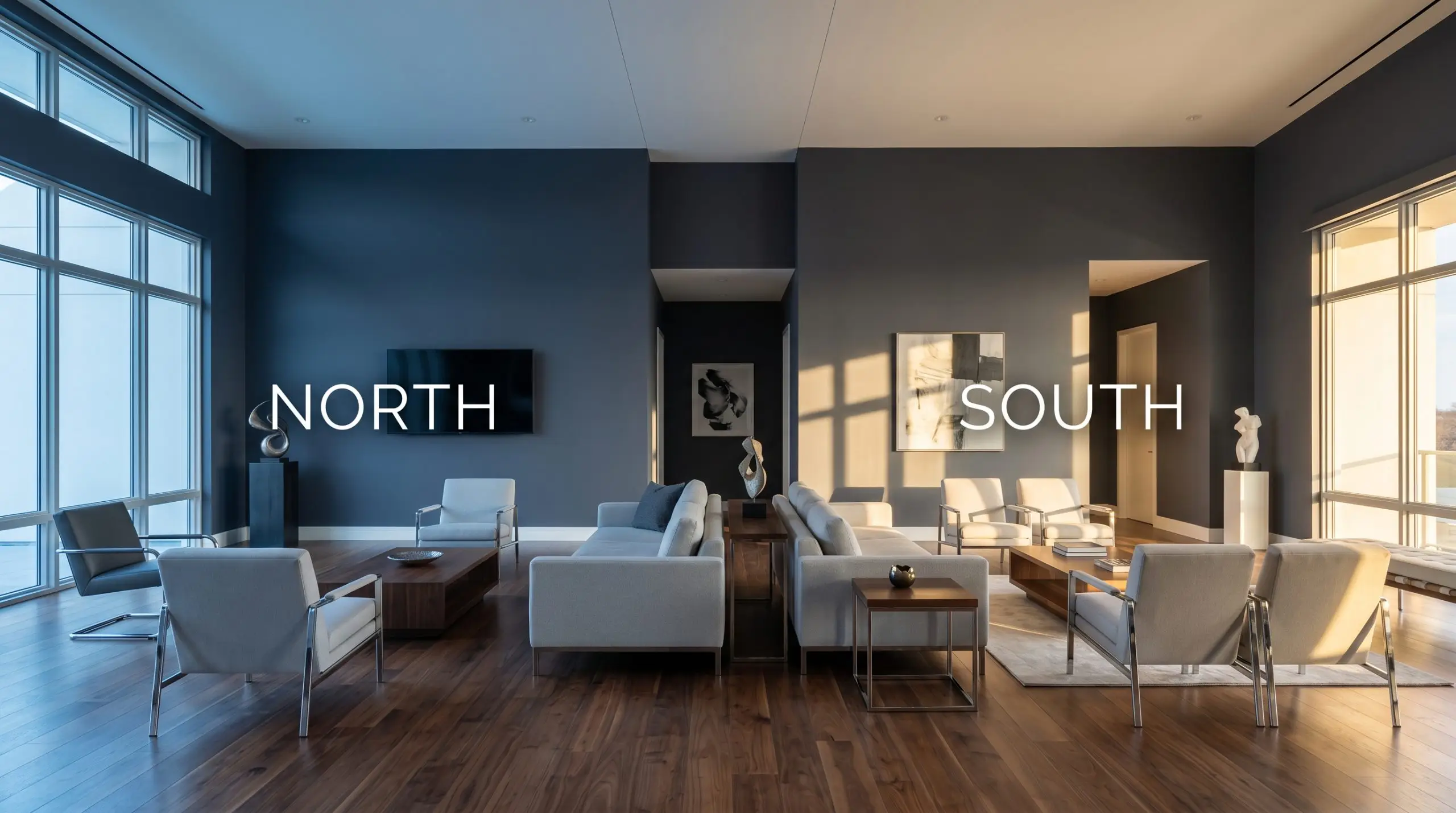
Lighting Effects & The Chameleon Factor
The biggest fear homeowners have with this specific shade is its unpredictability. You might be terrified that it will read as a harsh, sterile gray or unexpectedly flash a bright, overwhelming purple in the wrong light. These shifts are entirely dictated by your lighting environment.
Here is exactly how the color shifting behaves based on your light source:
If you want to maintain the crisp charcoal-navy look at night without leaning into the purple, swap your everyday room bulbs to a neutral 3000K to 3500K temperature. This provides a clean, white glow that keeps the slate tones perfectly balanced.
Hackrea Pro-Tip (The Bulb Strategy)
Popular Room Applications
This paint brings a deeply cohesive, grounding energy to a home. It is engineered to create boundaries, making sprawling spaces feel intimate and giving builder-grade rooms a sudden influx of character.
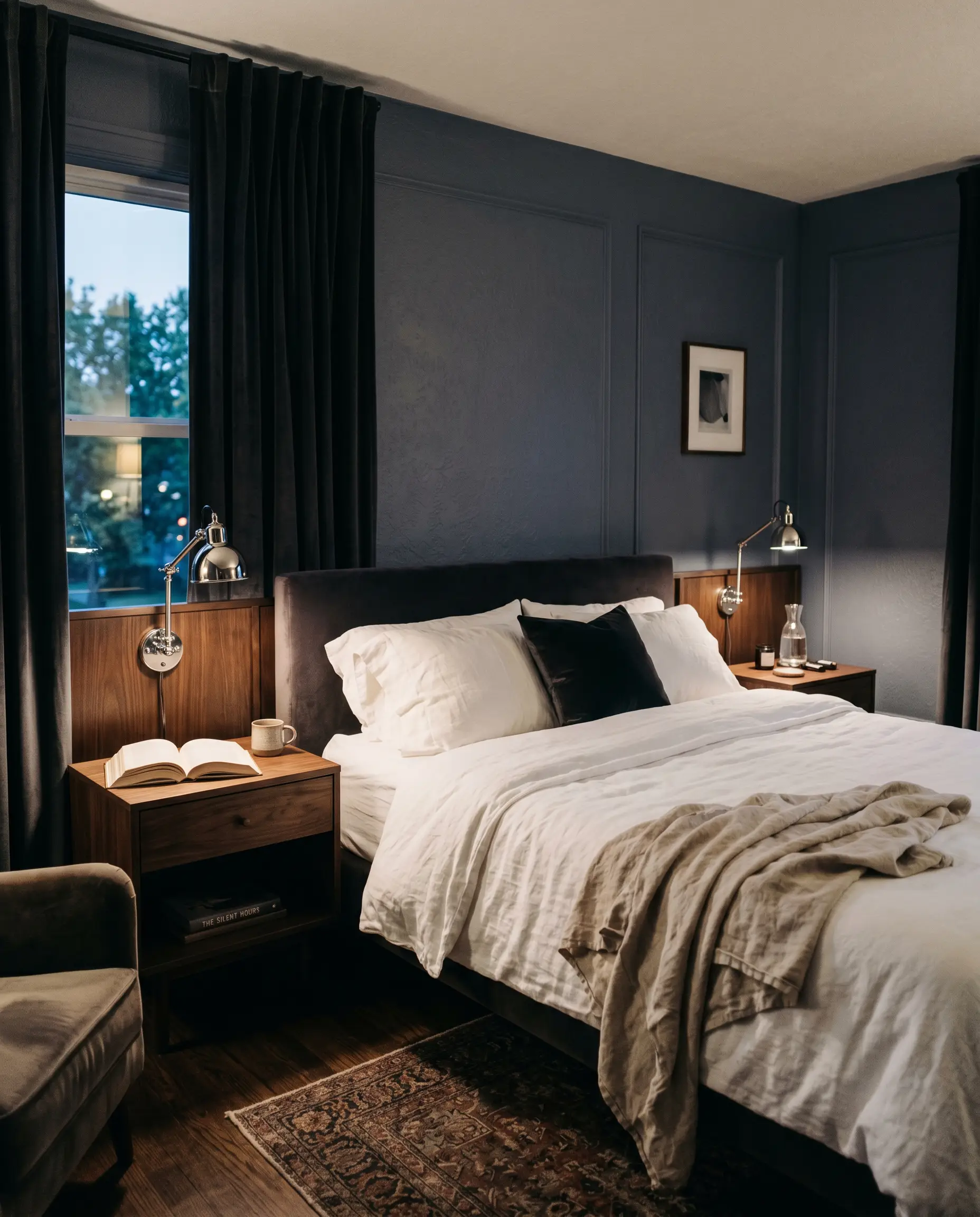
Bedrooms
This shade was practically made for resting spaces. It wraps the room in a serene, shadowy blanket that promotes relaxation. You can lean into a sleek, modern aesthetic by pairing it with crisp white bedding and polished chrome reading lamps. Alternatively, you can explore decorating with dark, moody paints by layering in heavy velvet curtains, dark woods, and ambient lighting to create a deeply romantic retreat.
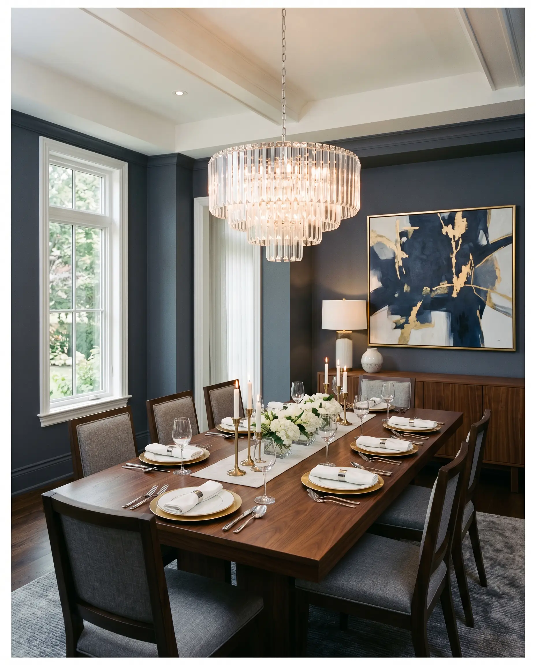
Formal Dining Rooms
A dining space thrives on atmosphere, and this deep slate delivers instant evening elegance. It provides a stunning backdrop for glittering glass chandeliers and metallic table settings. The trick here is contrast. Keep the ceiling bright and the table styling light so the walls act as a dramatic, tailored suit for the room rather than a heavy cave.
Kitchens
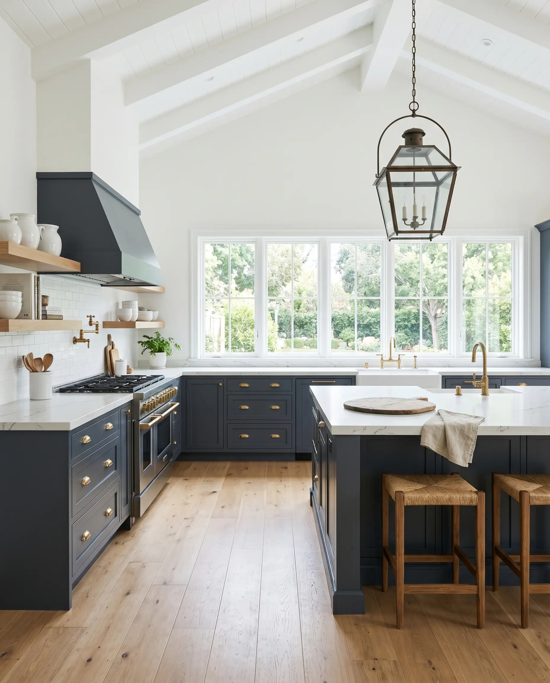
Using this rich tone on a kitchen island or lower cabinetry is a brilliant way to ground a bright, airy cooking space. It hides everyday scuffs beautifully while adding a massive dose of personality. If you are researching the best cabinet paint colors for kitchens, this Behr option is a fantastic, budget-friendly way to dupe the look of high-end custom millwork when paired with the right hardware.
Home Offices
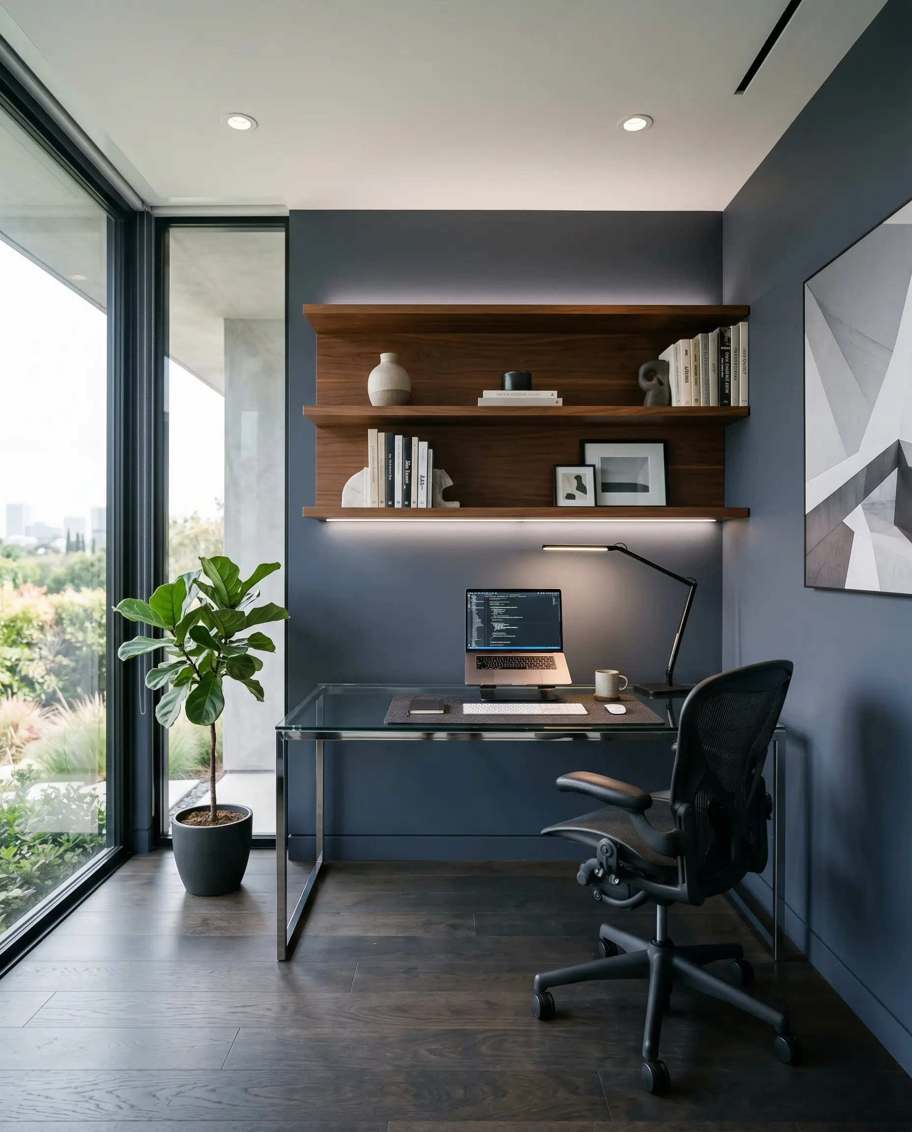
For a workspace that commands focus, this color is incredibly effective. It works brilliantly behind a sleek glass desk or as a backdrop for floating wood shelves. The dark walls allow computer screens and desk lamps to pop, while the subtle violet undertones keep the room feeling creative rather than strictly corporate.
Creative Ways to Elevate This Slate Navy
Taking this color beyond standard drywall applications allows you to truly maximize its premium feel. By rethinking where the paint goes, you can dramatically alter the visual boundaries of your home.
The “Fifth Wall” Canopy
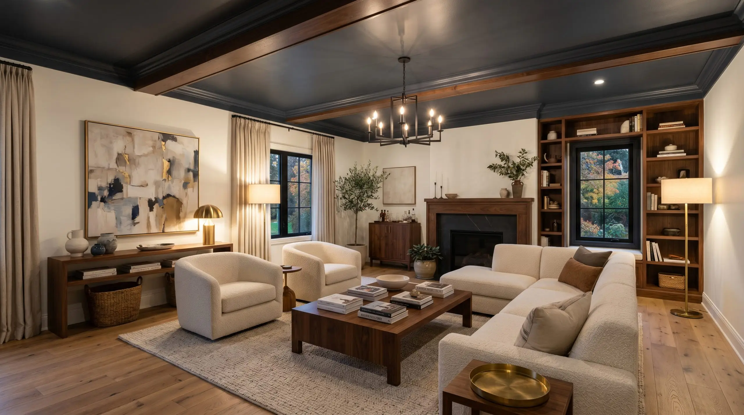
Instead of painting the walls, coat your entire ceiling in this deep shade while keeping the walls a crisp, warm white. This technique visually lowers a soaring ceiling, creating an intimate, tented canopy effect.
To elevate it further, use a satin or semi-gloss finish so the ceiling subtly reflects the glow of your floor lamps and table fixtures, adding a layer of sophisticated mystery to the living room.
Hackrea Design Tip (Elevating the Canopy)
Color-Blocked Gallery Corridors
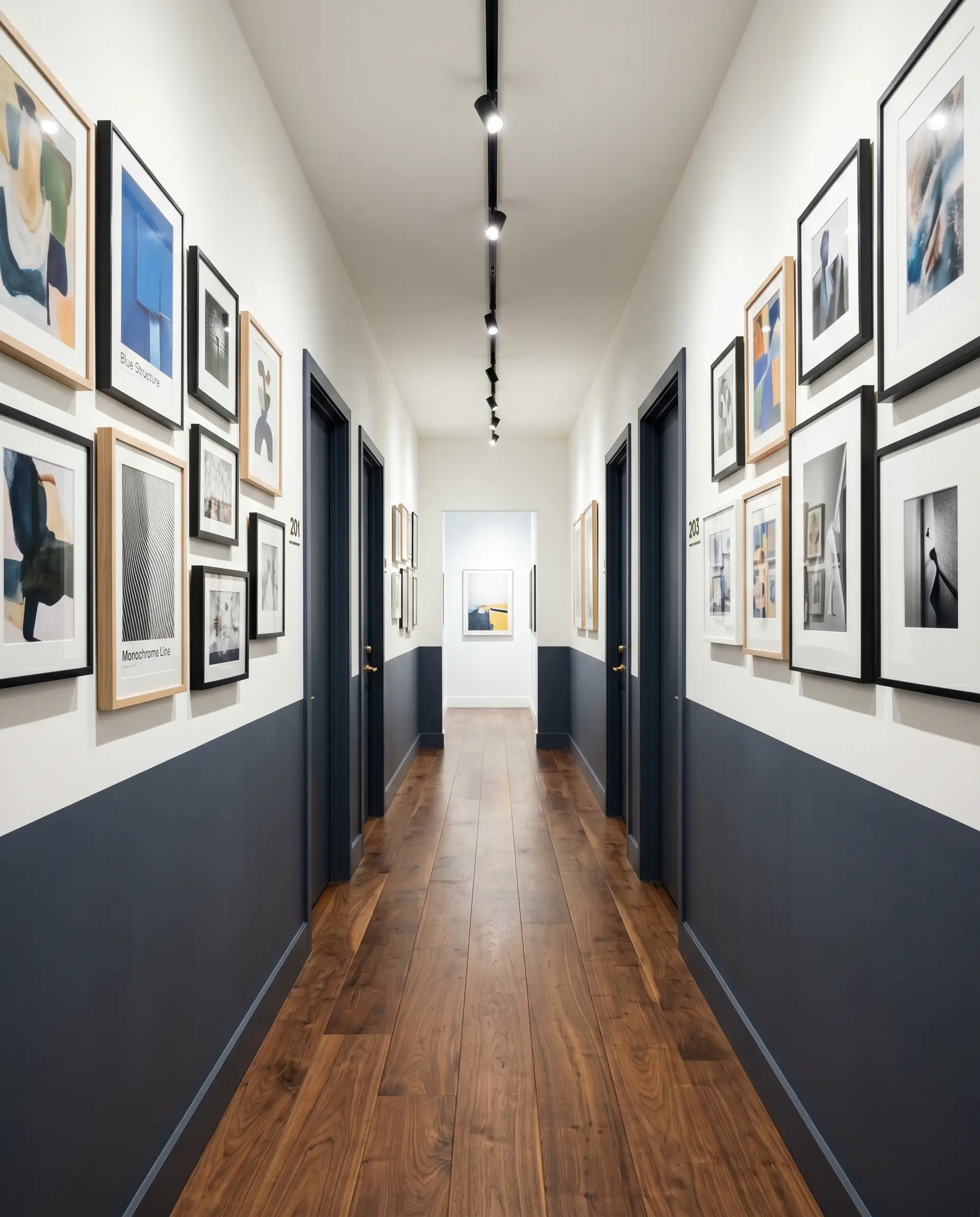
Transform a boring, narrow hallway by painting the bottom half of the walls, the baseboards, and all the interior doors in this rich charcoal blue. Leave the top half of the walls and the ceiling a brilliant white. This modern color-blocking technique grounds the corridor, hides everyday handprints on the doors, and creates a highly curated gallery feel for hanging artwork along the crisp white upper section.
The Modern Speakeasy Nook
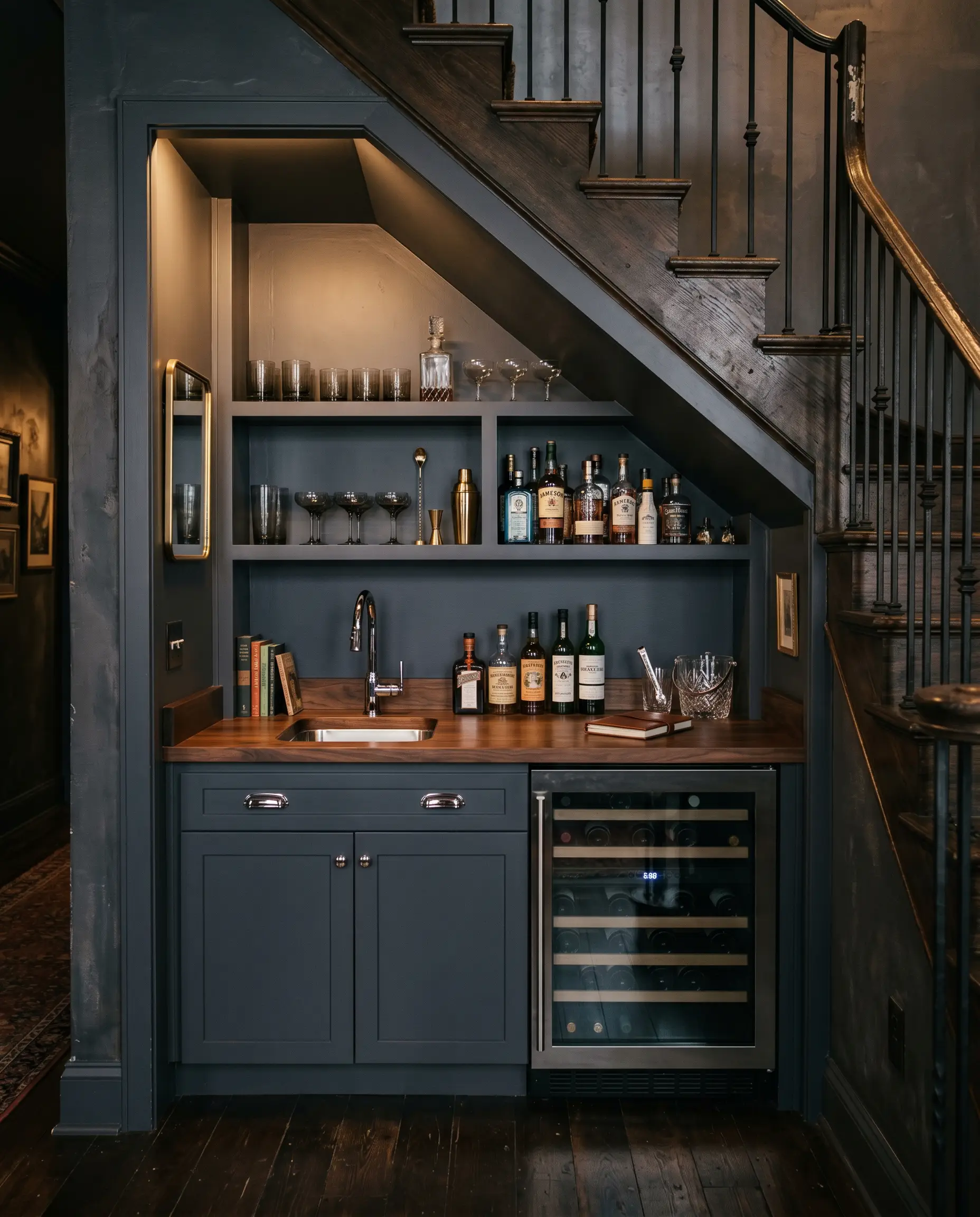
If you have an unused under-stair closet or a shallow living room alcove, drench the entire interior—walls, ceiling, and shelving—in this moody shade. Transform it into a dedicated wet bar or coffee station. The dark, monolithic color application turns a forgotten architectural quirk into a jewel-box destination, instantly making a standard suburban home feel like a boutique hotel.
Coordinating Colors & Best Pairings for Mysterious Night
This incredibly dark shade demands intentional styling. It thrives when bordered by crisp, high-contrast framing to feel tailored, or when paired with highly tactile materials that bounce light back into the room.
Trim & Baseboards
Your trim choice directly influences how clean this dark color looks.
Hardware, Wood & Material Pairings
To achieve an accessible luxury aesthetic, you must mix everyday materials with one or two aspirational textures.
Coordinating Colors
Designer Mood Boards
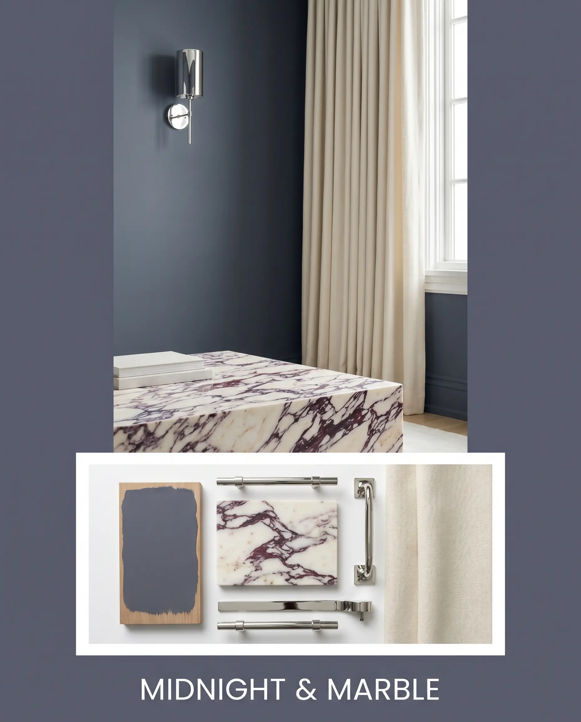
Midnight & Marble: This aesthetic relies on high-contrast glamour. The walls serve as a deep, velvet backdrop for a stunning piece of Calacatta Viola marble, whether as a coffee table or a small kitchen backsplash. Polished chrome wall sconces bounce light around the room, while heavy, cream-colored drapery softens the hard edges, creating an atmosphere of pure, tailored luxury.
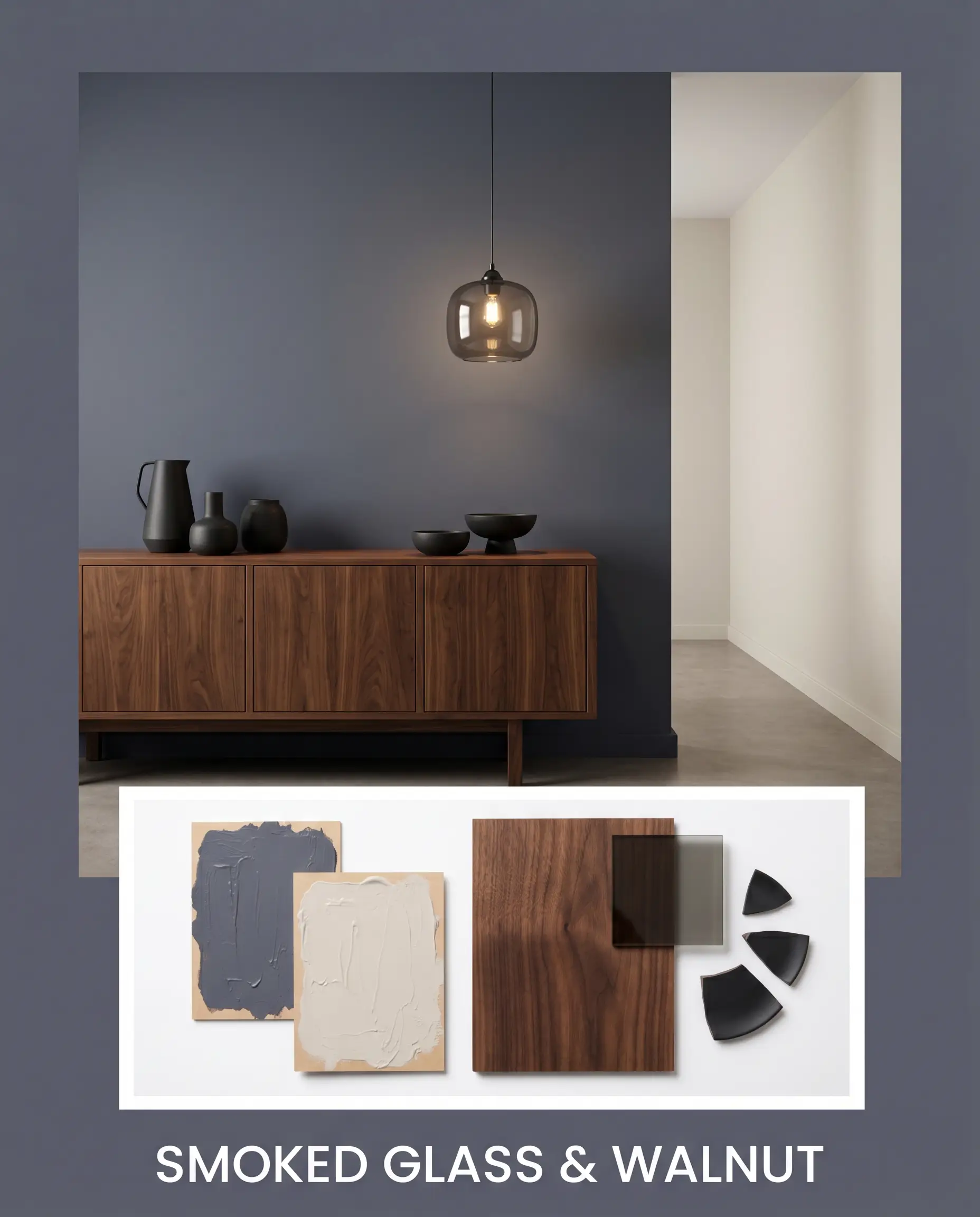
Smoked Glass & Walnut: A nod to moody, retro-modern styling. Rich walnut credenzas and side tables ground the room with organic warmth. Silver Drop 790C-2 is used in adjoining hallways to keep the home feeling open. The styling features smoked glass pendant lights and matte black ceramics, resulting in a deeply sophisticated, masculine energy.
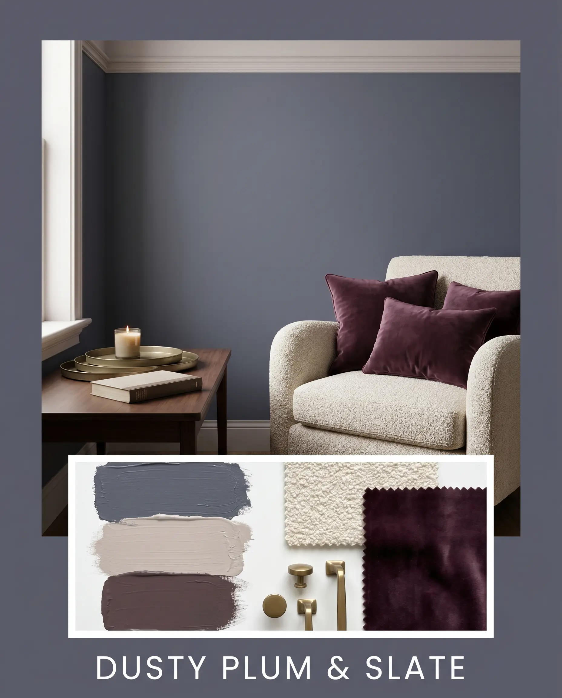
Dusty Plum & Slate: This palette leans entirely into the paint’s hidden violet undertones. By bringing in Peignoir 286 on the ceiling or adjoining trim, the room takes on a soft, twilight glow. Creamy boucle seating adds necessary softness, while jewel-toned accents like deep plum throw pillows and muted brass trays complete this romantic, highly curated vibe.
Head-to-Head Comparisons
Sometimes you need to see how a color stacks up against its biggest rivals to know if it is the right fit for your specific lighting environment.
Behr Mysterious Night vs. Sherwin-Williams Cyberspace SW 7076
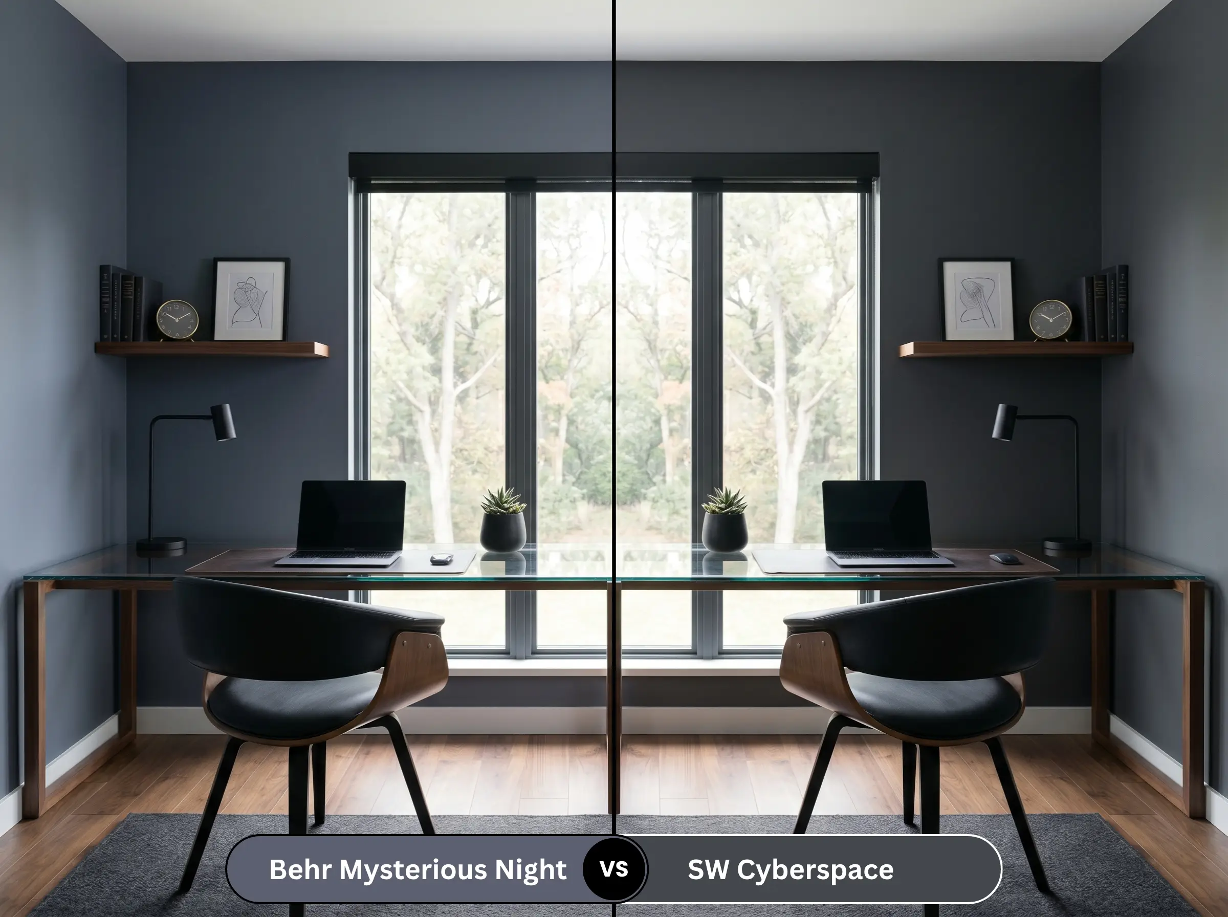
If your room faces north and you are terrified of the paint looking purple, Cyberspace SW 7076 is the safer route. It is a truer, colder charcoal-navy with significantly less red in its formula. However, if you want that subtle, dusty eggplant warmth to show up in the afternoon sun, the Behr option provides a much richer, more complex shadow.
Behr Mysterious Night vs. Benjamin Moore Hale Navy HC-154
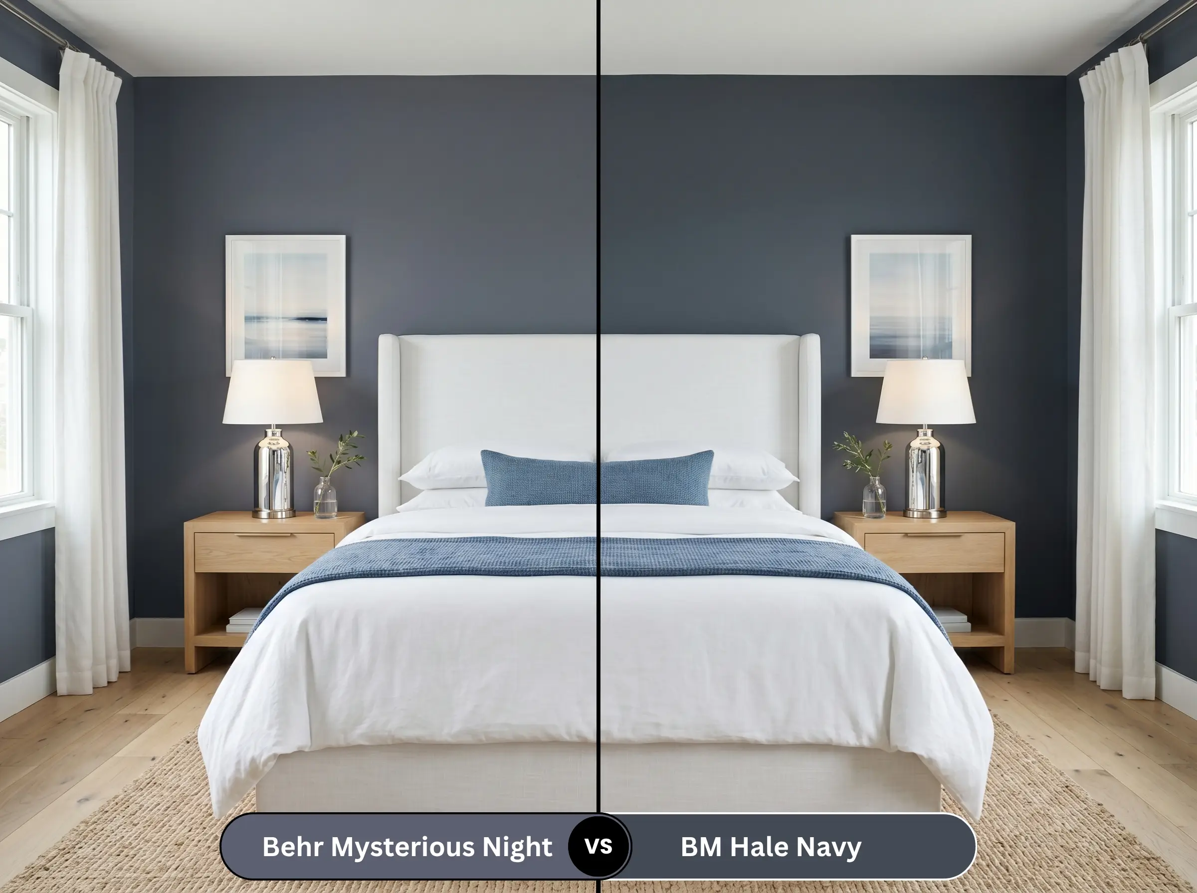
Hale Navy HC-154 is the undisputed king of classic, nautical navy blues. It is slightly lighter and reads much more traditionally blue on the wall. If your home has a transitional or coastal aesthetic, Hale Navy is the better choice. If you are aiming for a moodier, more contemporary charcoal look with a hint of mystery, stick with the Behr shade.
Similar Colors & Brand Equivalents
If you love the vibe but need a slight adjustment in depth or are shopping at a different hardware store, these alternatives deliver a very similar energy.
Similar Colors
Cross-Brand Matches
Practical Application & DIY Advice
Executing a dark, dramatic color requires a specific approach to the actual painting process to ensure a flawless, premium finish.
The Dynamic Sheen Guide
Primer Strategy
You cannot skip primer with a color this deep. You must use a high-quality, tinted gray primer. Applying this dark shade over a standard white primer will force you to paint four or five coats to achieve true opacity, and the color will still look washed out.
Coverage & Success Tips
Even with a tinted primer, expect to apply at least two generous coats. Dark colors are notoriously prone to “flashing”—those visible, uneven roller marks that show up when the light hits the wall.
To avoid flashing with heavy, dark paints, you must maintain a “wet edge” while rolling. Never stop halfway across a wall to take a break, and always roll from the ceiling straight down to the baseboard in one smooth motion to align the paint texture perfectly.
Hackrea Design Secret (The Wet Edge)
Frequently Asked Questions
Direct exterior sunlight is incredibly harsh and tends to wash out the gray/black pigments in paint. Because of the heavy natural light, the hidden violet undertones will absolutely surge forward, making your house look noticeably more purple-navy than it would in an interior hallway.
It performs brilliantly if you embrace the darkness. Instead of fighting the lack of natural light, use this heavy shade to create a moody, jewel-box effect. Just ensure you install high-quality, warm-toned wall sconces to illuminate the vanity area.
It can, but you can easily trick the eye. Paint your baseboards and crown molding the exact same dark color as the walls. By removing the contrasting white borders, you blur the visual lines of where the wall starts and stops, making the ceiling feel infinitely higher.
Absolutely. The warm, golden tones of living brass finishes create a stunning, high-end contrast against the cool charcoal-blue. The metallic hardware acts as a bright focal point, lifting the heavy color and preventing the cabinetry from looking like a dark void.
Final Verdict & Expert Warnings
Behr Mysterious Night is an absolute triumph for the budget-conscious homeowner who wants to inject high-end, architectural drama into their space. It is the perfect choice for creating deeply atmospheric bedrooms, grounding bright kitchens, and elevating standard builder-grade rooms into highly curated, moody environments. Its complex blend of slate navy and hidden violet gives it a premium look that far exceeds its price tag.
However, this rich shade demands careful styling to avoid a visual clash. You must keep it far away from red-toned cherry wood floors or heavily yellow-stained oak cabinets, as the cool violet notes will aggressively fight those warm orange and red wood grains, making the room feel chaotic and dated. It also struggles against muddy, yellow-beige carpets, which will drag the crisp charcoal down into a dingy territory. To succeed with this color, you must commit to crisp white contrasts, cool-toned or richly dark woods, and highly intentional lighting.
Expert Warning (Visual Clash)