Ammonite No. 274
Farrow & BallFarrow & Ball Ammonite (No. 274) is a perfectly balanced, understated warm grey. With an LRV of 67.99, it acts as a highly versatile neutral that avoids stark blue or cold undertones, making it ideal for creating hushed, calming spaces across both modern and traditional interiors.
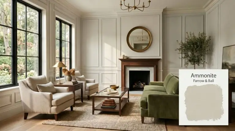
Farrow & Ball Ammonite Paint Review: The Ultimate Earthy Greige for Elevated Interiors
| Best Exposures | South-Facing, North-Facing |
|---|---|
| Best For | Living Rooms, Bedrooms, Kitchen Cabinets, Hallways |
Finding a neutral that feels sophisticated rather than sterile is one of the most common challenges in residential design. Farrow & Ball Ammonite steps into this void as a brilliantly calibrated stony grey that refuses to fall flat.
Inspired by the natural tones of Dorset coast fossils, this shade delivers an incredibly grounded, earthy energy that instantly elevates the structural elements of a home. It is the perfect foundational layer for homeowners who crave an inviting, luminous backdrop without leaning into overly warm creams or cold, industrial concrete tones.
Farrow & Ball Ammonite: Undertones & LRV
When evaluating this transitional neutral, the defining question is always whether it pulls warm or cool on the wall. Ammonite is a beautifully balanced neutral that definitively leans warm, avoiding the icy starkness of traditional greys. It sits firmly in the yellow-orange spectrum, anchoring the room with a subtle, stony warmth.
With a Light Reflectance Value of 67.99, this shade reflects a moderate-to-high amount of light back into the room. It is luminous enough to serve as a whole-house neutral, yet it retains enough inherent depth to provide a gorgeous, tailored contrast against crisp white trim.
You can apply wallpapers, paints, etc. on walls and see how they look in various interiors.

Lighting Effects & The Chameleon Factor
The greatest hesitation with grey-leaning neutrals is the fear that they will feel like a cold, uninviting concrete bunker in shadowed spaces, or completely wash out into a dingy white in glaring sunlight. Because of its stabilizing greige undertones, this color acts as a brilliant chameleon, shifting gracefully throughout the day while maintaining its structural integrity.
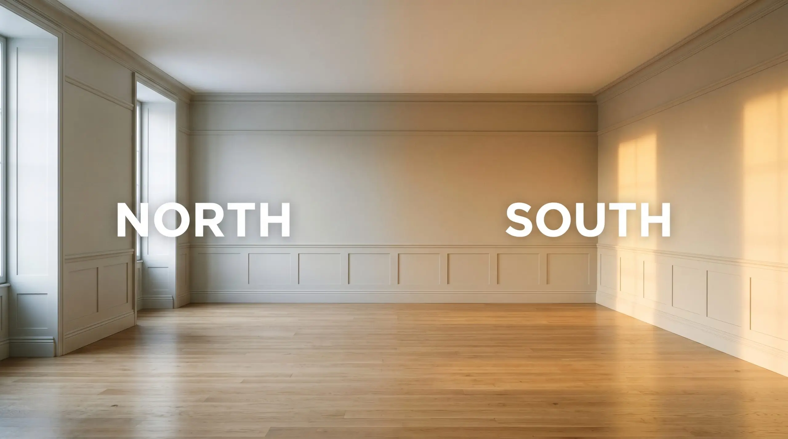
When taking this color outside, remember that direct, unfiltered sunlight will significantly blow out its depth. On a bright, unshaded facade, it will often read as an off-white rather than a distinct greige.
Hackrea Pro-Tip (Exterior Sun)
Popular Room Applications for Ammonite
This paint brings a cohesive, grounded energy that demands to be paired with intentional architecture. It acts as a serene, tailored canvas that allows both traditional and contemporary furnishings to shine.
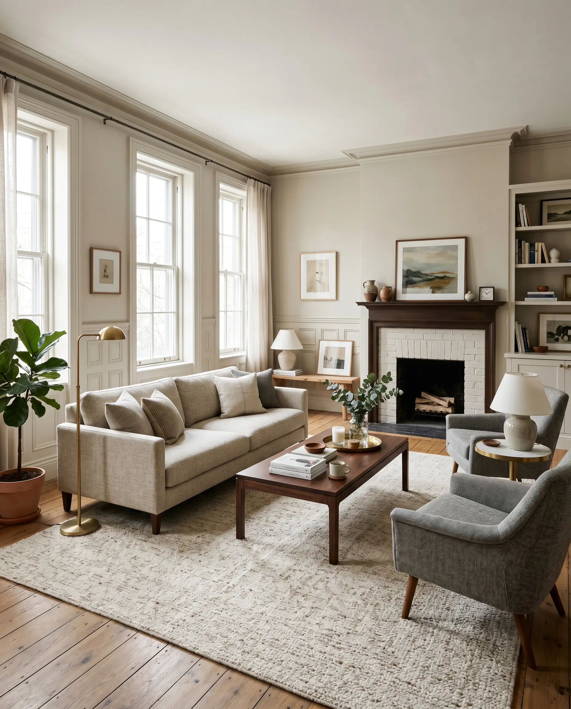
Living Rooms
This shade thrives in primary living spaces, especially those featuring extensive panel molding or traditional wainscoting. The chalky finish of Farrow & Ball’s signature Estate Emulsion highlights the shadows and ridges of intricate millwork, adding instant historical character to even a newly built home. You can lean into a rich, tonal look by pairing it with plush mohair sofas and dark walnut accents, or keep it crisp with tailored linen upholstery.
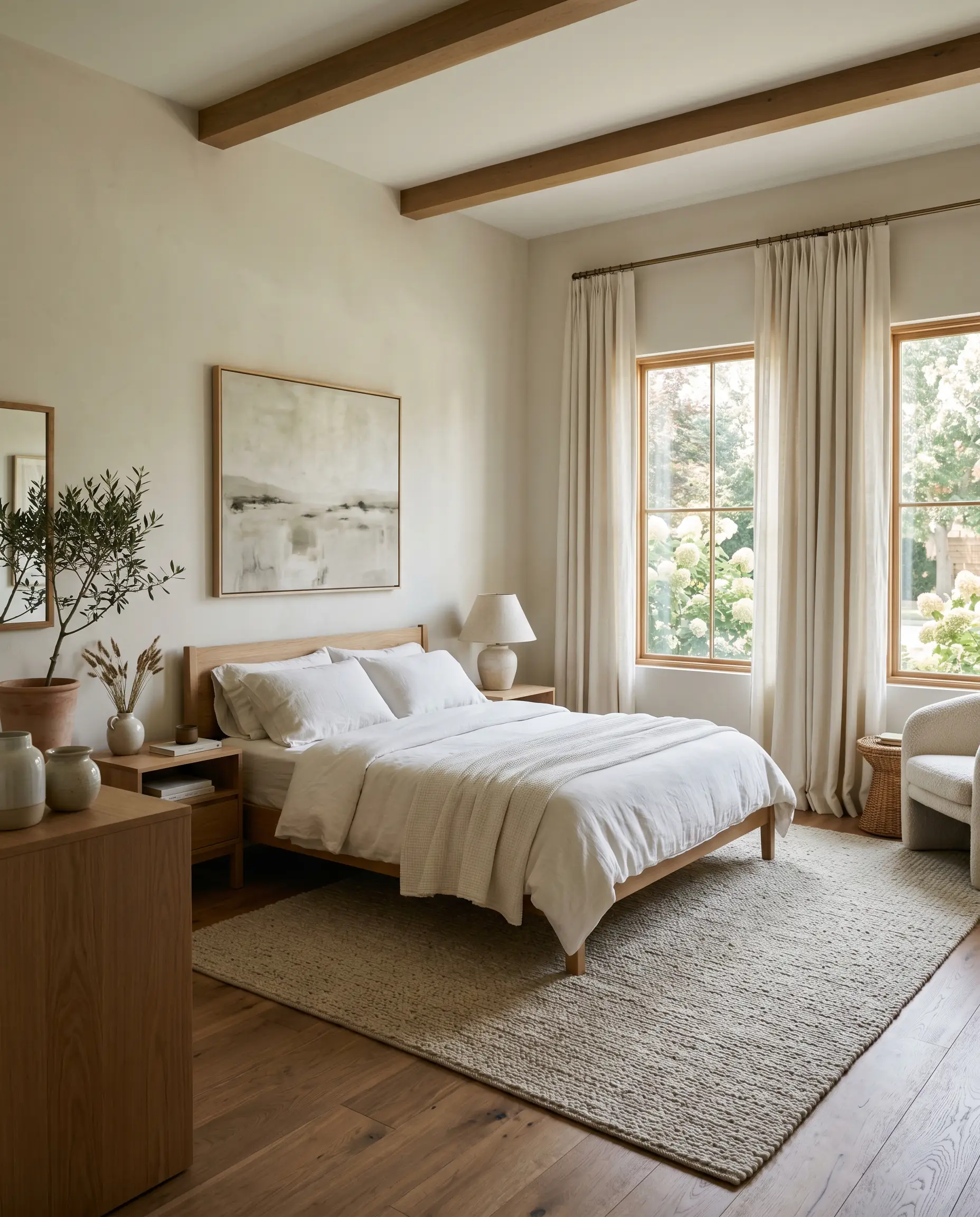
Primary Bedrooms
For a restorative retreat, this stony hue provides a deeply tranquil, layered foundation. It wraps the room in a hushed softness that feels incredibly restful at night. To maximize this serene energy, layer the space with textural elements like washed percale bedding, raw silk drapery, and woven wool rugs. This creates a rich, tactile environment that feels luxurious yet completely understated.
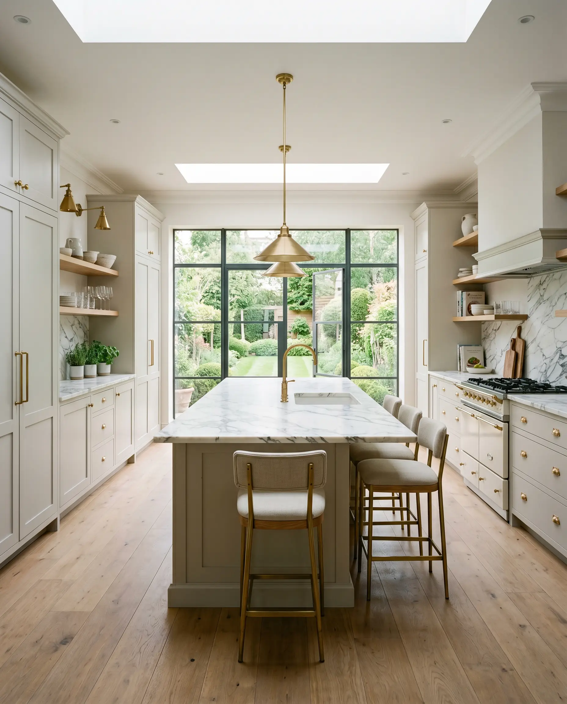
Kitchens
Moving away from stark white kitchens, applying this color to cabinetry offers a softer, more sophisticated culinary space. It pairs flawlessly with heavily veined Calcutta marble countertops and burnished brass hardware. The warmth of the metallic pulls brings out the earthy base of the paint, creating a high-end, timeless aesthetic.
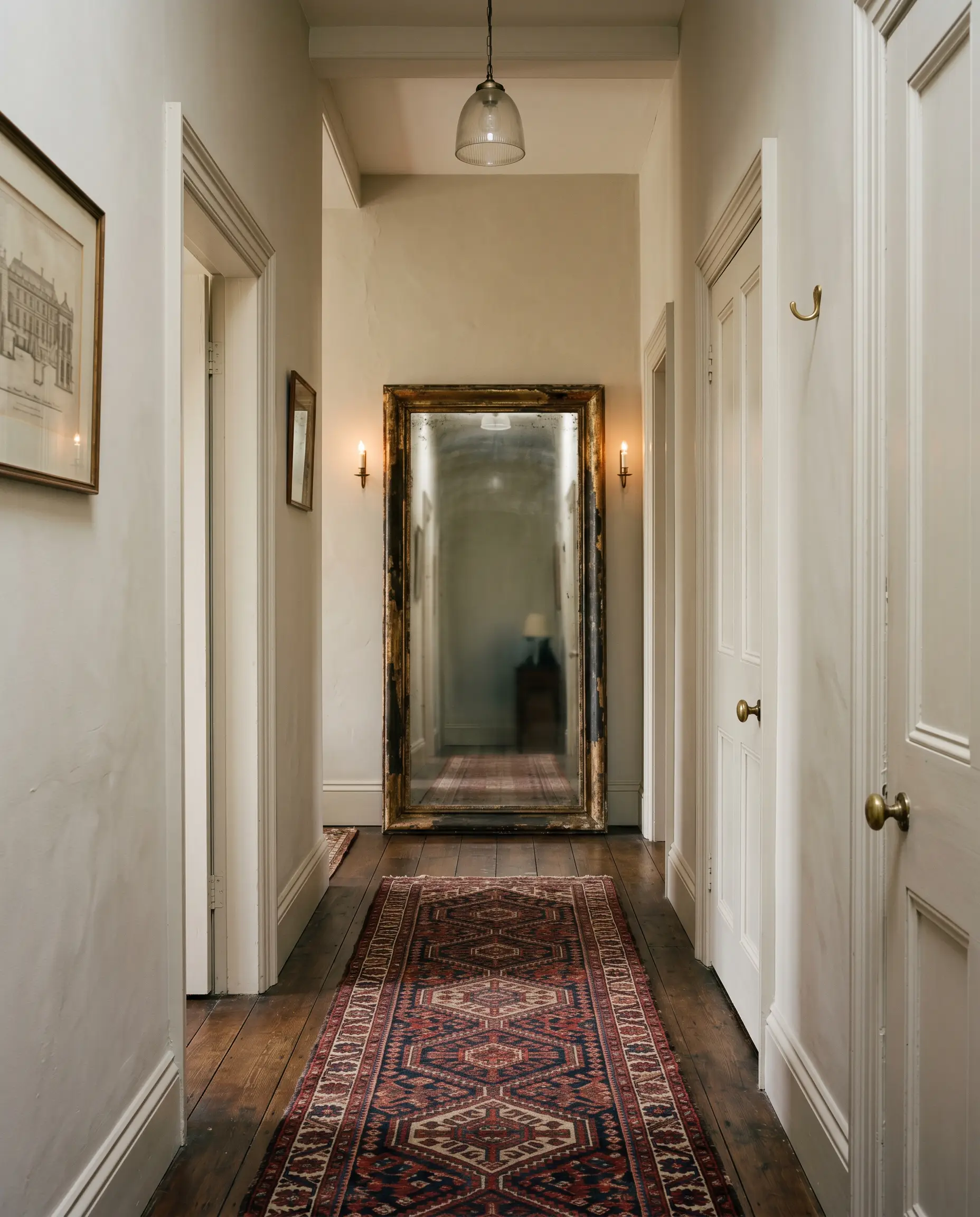
Hallways & Entryways
Narrow transitional spaces often suffer from a lack of natural light, making them feel cramped or entirely forgotten. Brushing this luminous shade across the walls provides a soft, expansive feel that gently guides you from one room to the next. Adding an oversized, antiqued floor mirror at the end of the hall will bounce light around and amplify the color’s inherent glow.
Creative Ways to Use The Paint
Elevating this color involves looking beyond standard drywall and considering how it can manipulate structural boundaries. Let the paint’s earthy DNA inspire unexpected focal points throughout the home.
The Monochromatic Heritage Library
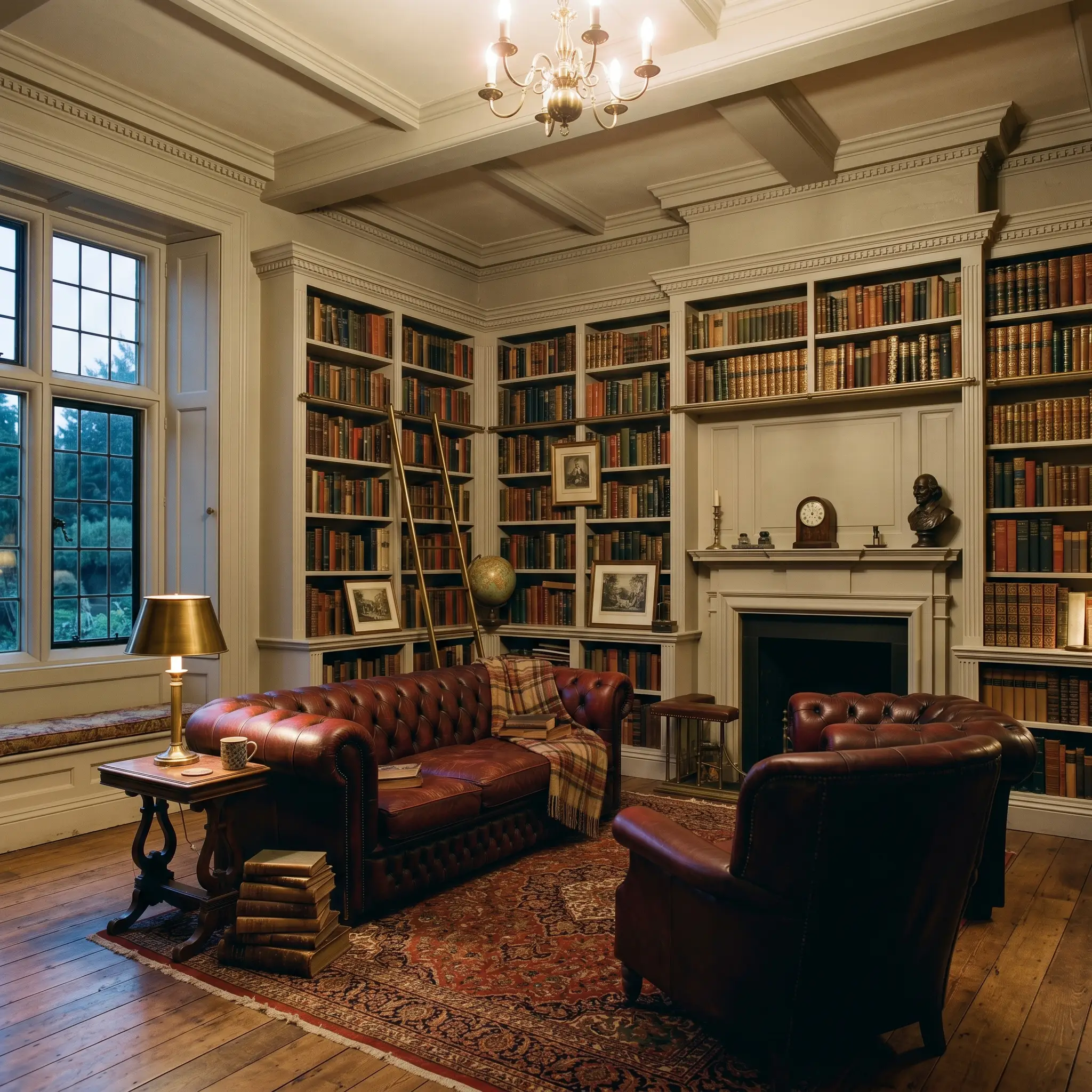
Transform a forgotten study or home office into a deeply atmospheric retreat by color-drenching the entire space. Painting the walls, ceiling, built-in shelving, and trim in a single, unified finish blurs the room’s hard edges. This wrap-around technique creates a cocooning effect, allowing curated collections of vintage literature and rich burgundy leather seating to take center stage against the muted greige background.
Elevated Modern Color-Blocking
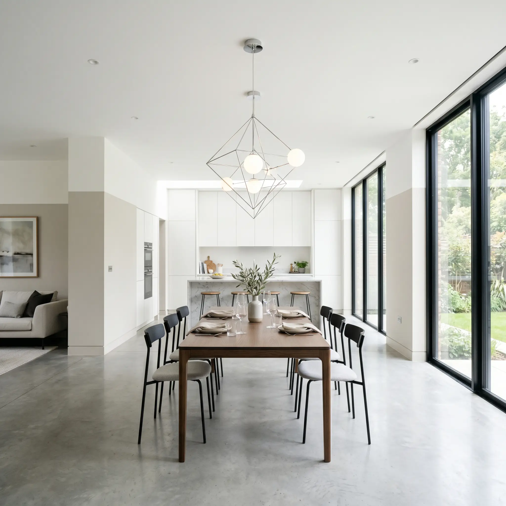
For a highly contemporary aesthetic, use this shade as the grounding base for a structural color-blocking application. Paint the lower two-thirds of an open-concept dining area in this earthy tone, leaving the top third and ceiling a crisp, brilliant white. This crisp visual boundary lowers the perceived ceiling height just enough to make a cavernous room feel intimately scaled, while highlighting striking sculptural lighting fixtures.
The Organic Spa Bathroom
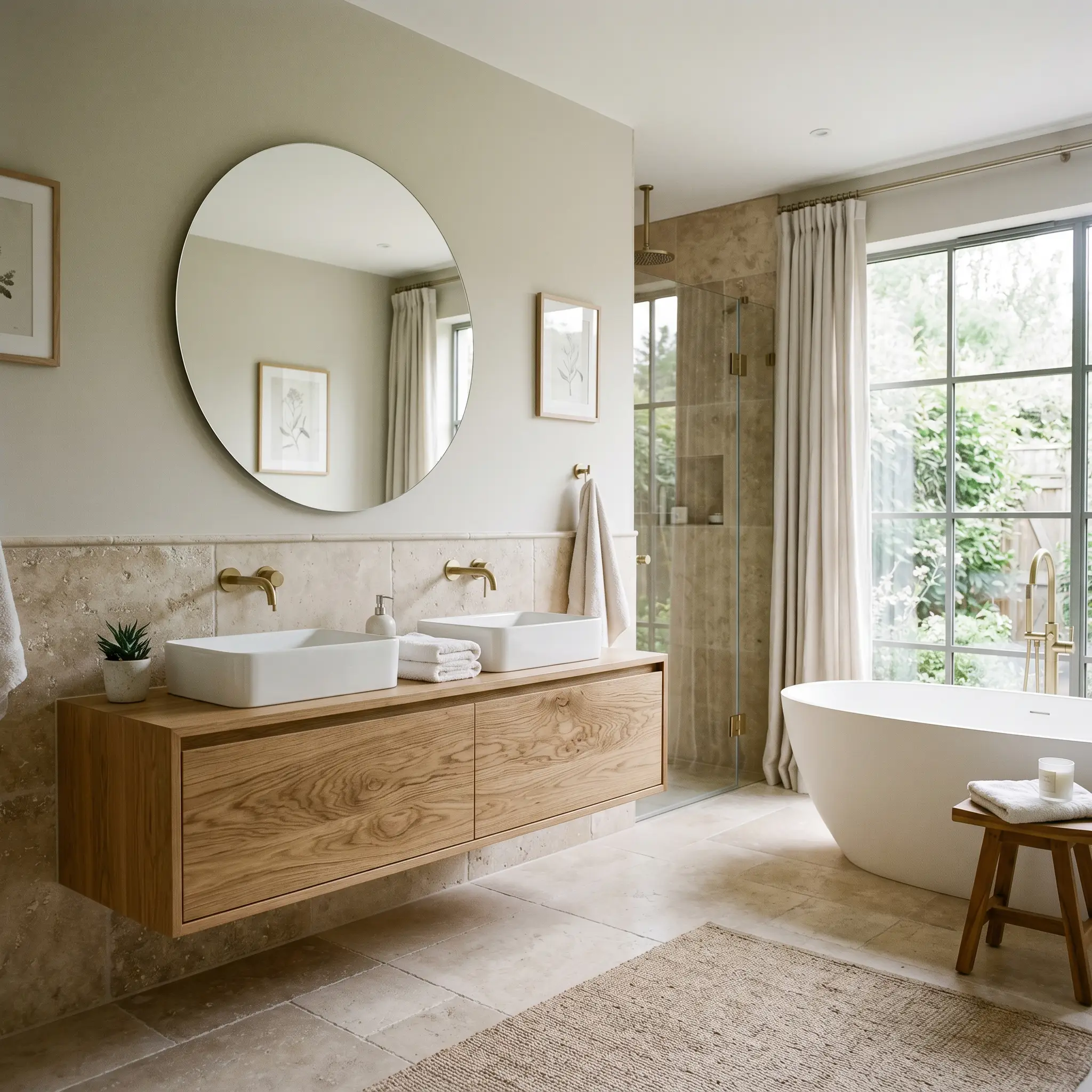
Bring a sense of natural luxury to a primary en-suite by utilizing this color above a tumbled travertine tile wainscot. The paint’s subtle green-yellow nuance connects beautifully with the raw, earthy textures of the stone. Add a floating vanity crafted from heavily grained white oak to complete a restorative, spa-like environment that feels entirely disconnected from the chaos of the outside world.
Coordinating Colors & Best Pairings
To make this stony neutral feel truly intentional, it requires surrounding elements that either pull out its warmth or provide a crisp, tailored boundary.
Trim & Baseboards
Establishing the right border is crucial for maximizing this color’s potential. If you want a highly tailored, traditional contrast, Farrow & Ball All White No. 2005 delivers a clean, brilliant edge that makes the wall color pop. Understanding how to choose white trim paint is essential for framing this nuanced greige correctly. For a slightly softer, yet still crisp transition, Benjamin Moore Chantilly Lace OC-65 provides a clean boundary without feeling stark. Alternatively, Sherwin-Williams High Reflective White SW 7757 offers an incredibly bright, modern contrast that instantly sharpens the room’s architectural details.
Hardware & Metal Pairings
The tactile elements you introduce will dramatically influence the final energy of the space.
Coordinating Colors
Designer Mood Boards
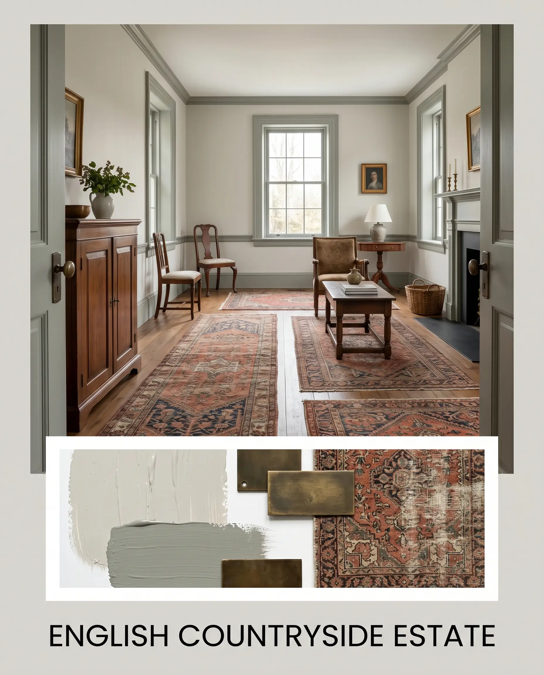
English Countryside Estate: This palette leans heavily into historical charm and layered comfort. By pairing the main wall color with Farrow & Ball Pigeon No. 25 on the millwork, the space instantly gains a grounded, heritage feel. Introduce aged bronze hardware and heavily distressed Persian runners to add visual weight and timeless character to the room.
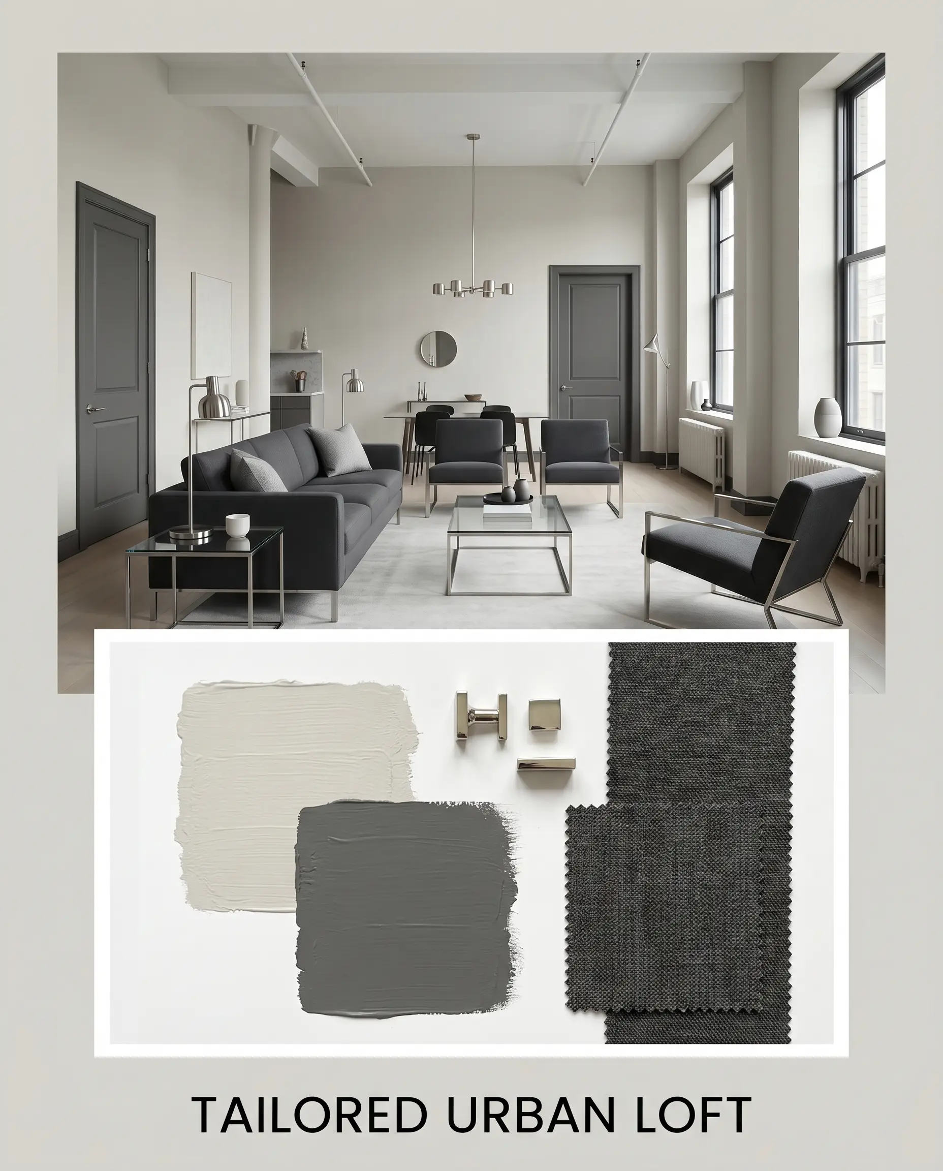
Tailored Urban Loft A crisp, highly sophisticated approach that focuses on striking contrast. Use Sherwin-Williams Peppercorn SW 7674 on interior doors to create a sharp, architectural boundary against the luminous greige walls. Finish the look with polished nickel lighting fixtures, sleek charcoal upholstery, and minimalistic glass tables for a refined, modern edge.
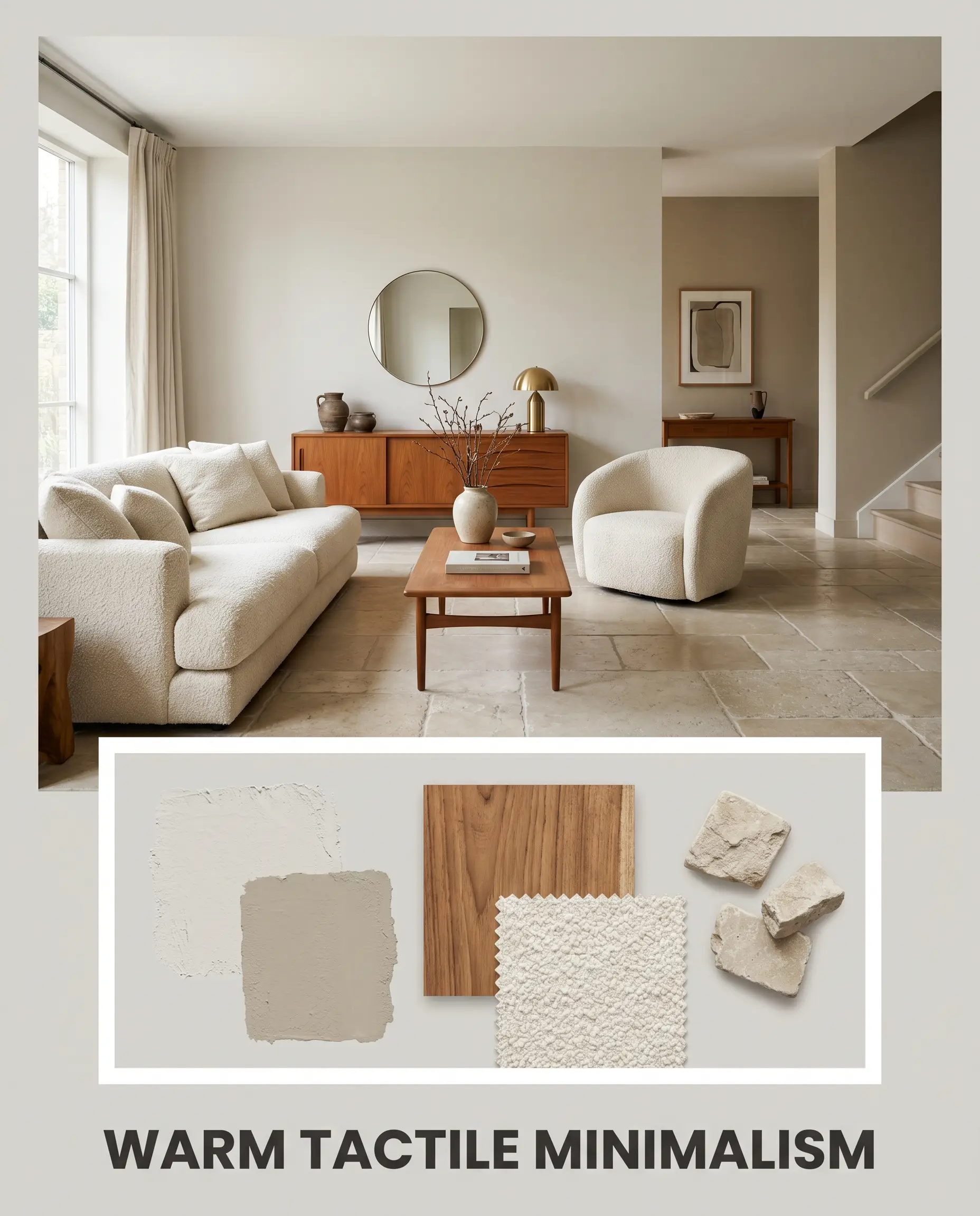
Warm Tactile Minimalism: This combination is all about soft, organic transitions and sensory richness. Layer the room with Benjamin Moore Pashmina AF-100 in adjacent hallways to create a seamless, flowing energy. Incorporate oiled teak furniture, oversized bouclé seating, and tumbled limestone accents to build an incredibly warm, inviting atmosphere.
Head-to-Head Comparisons
Choosing the perfect neutral often comes down to analyzing how a color behaves under highly specific lighting conditions. When this earthy greige isn’t quite right for your home’s exposure, these direct alternatives offer distinct tonal shifts.
Farrow & Ball Ammonite vs. Farrow & Ball Cornforth White No. 228
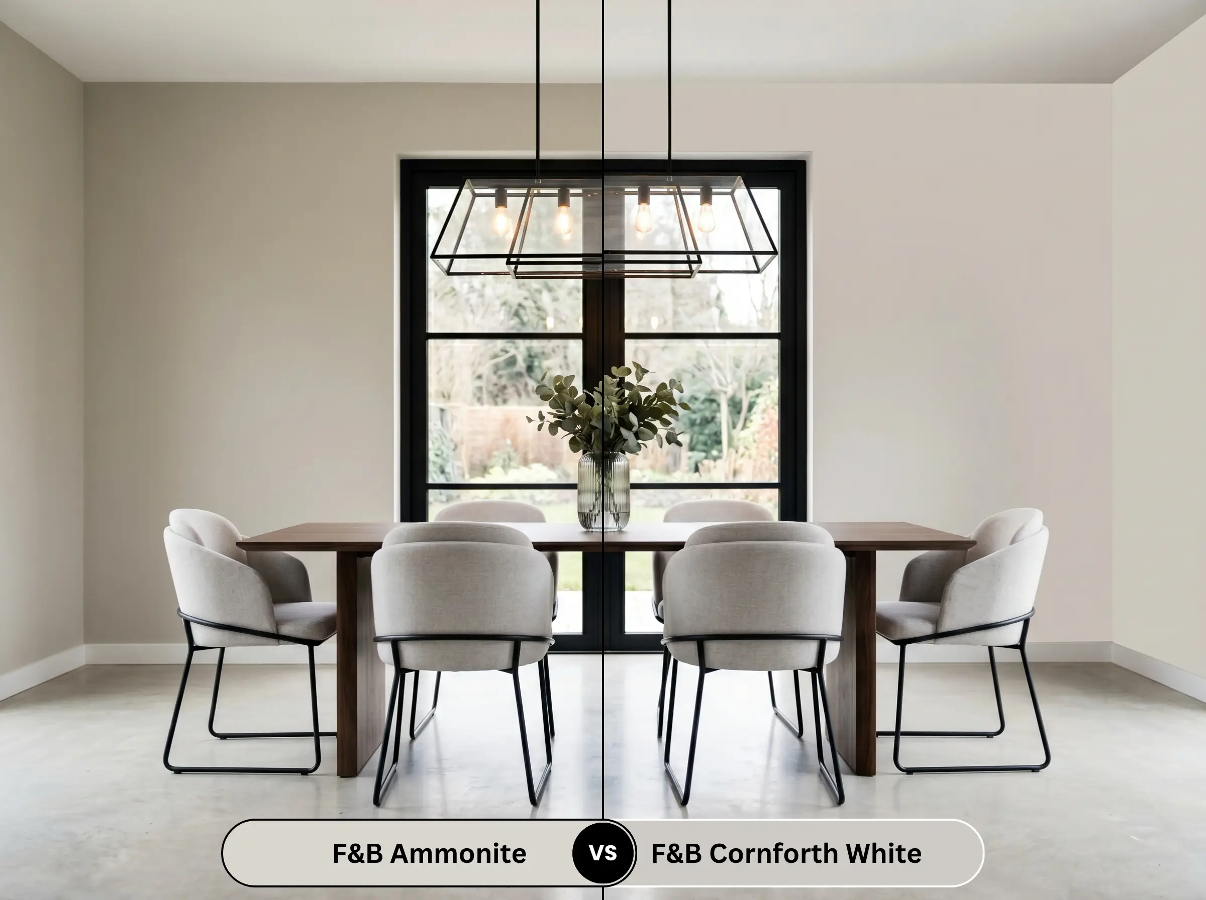
If you find that your room’s lighting pulls too much yellow out of the wall, Cornforth White is the logical pivot. Cornforth White is a cooler, more traditional grey that carries far less yellow-orange influence. It provides a slightly crisper, more modern aesthetic, whereas the original shade offers a softer, more historical warmth.
Farrow & Ball Ammonite vs. Farrow & Ball Purbeck Stone No. 275
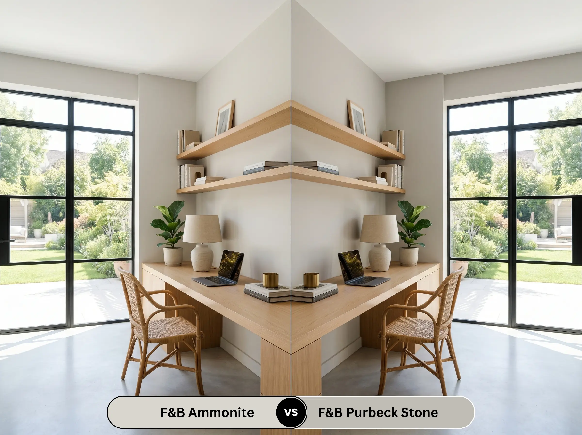
When a space receives overwhelming amounts of direct sunlight, a lighter neutral might wash out completely. Purbeck Stone shares the same earthy, stony DNA but drops significantly lower in light reflectance. If you need a color that can hold its visual weight and depth in a sun-drenched, south-facing room, Purbeck Stone is the stronger candidate.
Farrow & Ball Ammonite vs. Farrow & Ball Skimming Stone No. 241
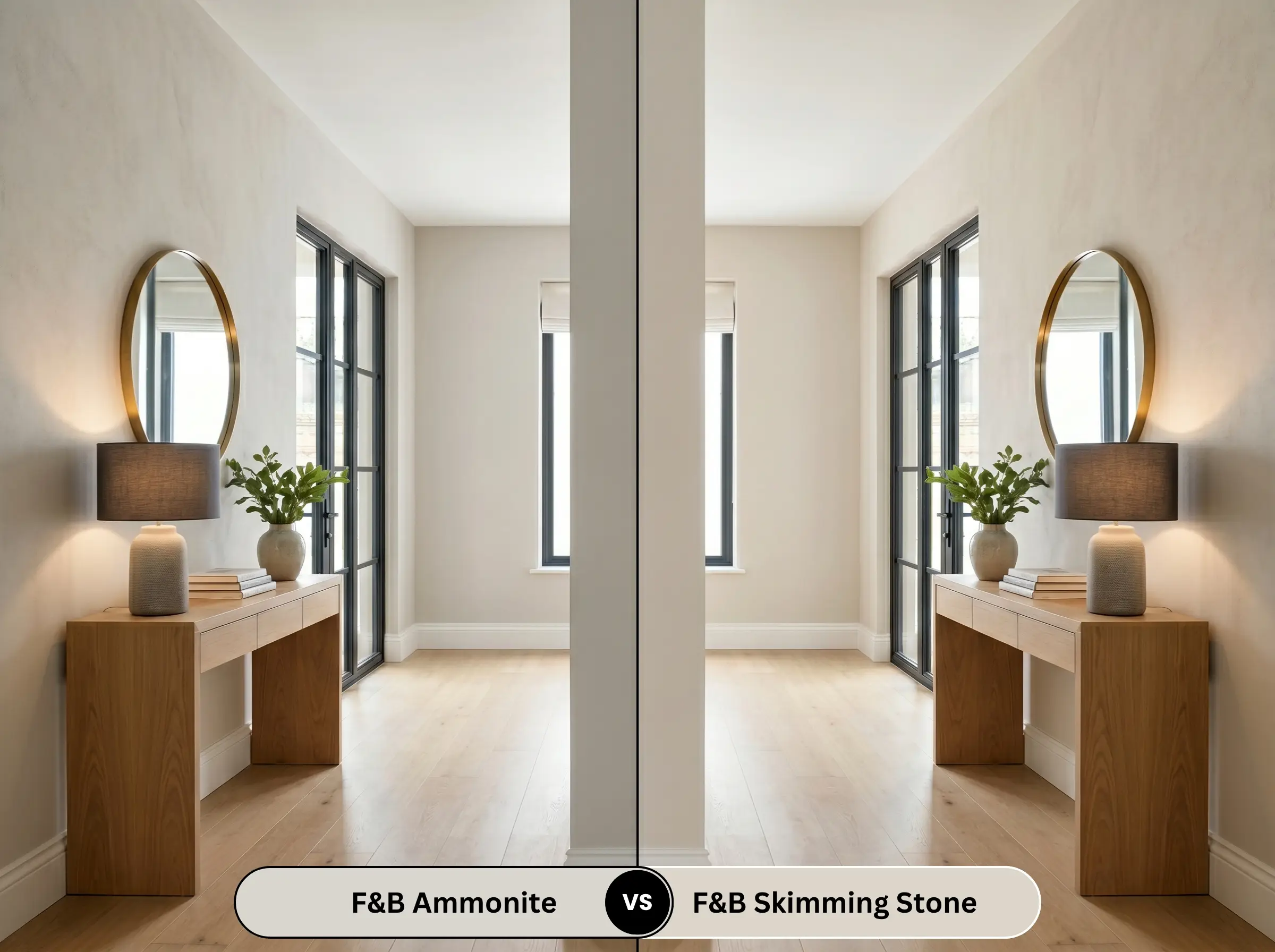
For homeowners seeking a much warmer, almost plaster-like glow, Skimming Stone is the superior choice. While both are beautiful transitional neutrals, Skimming Stone leans heavily into a warm, taupe-grey profile. It lacks the subtle green-yellow stabilizer, making it feel notably warmer and more romantic, especially under artificial evening lighting.
Similar Colors & Brand Equivalents
Whether you need a subtle shift in brightness for a shadowed hallway or require a match from a more widely available manufacturer, these alternatives provide excellent pathways.
Similar Colors
Cross-Brand Equivalents
Practical Application & DIY Advice
Transitioning this premium color from a sample pot to a flawless finish requires a strategic approach to preparation and sheen selection.
The Dynamic Sheen Guide
Primer Strategy
Because of its nuanced undertones, achieving true color saturation requires a high-quality primer. Farrow & Ball strongly recommends using their White & Light Tones Primer & Undercoat. This specific base layer ensures the subtle green-yellow notes develop correctly, preventing the old wall color from bleeding through and altering the final temperature.
Coverage & Success Tips
Expect to apply two full coats over the recommended primer for a truly professional result. When rolling this shade, maintain a wet edge to avoid flashing—those visible, uneven streaks that catch the light. Taking your time and avoiding over-working the paint will ensure a beautifully smooth, luminous finish.
Frequently Asked Questions
Because of its stabilizing green-yellow base, this color is highly resistant to unwanted pink or purple flashes. Even as the late afternoon sun warms up the room, it maintains its grounded, stony integrity rather than shifting into a fleshy tone.
In heavily shaded exterior environments, the lack of direct sunlight will amplify the grey characteristics of the paint. It performs beautifully on stucco, offering a hushed, historic elegance, but be prepared for it to read noticeably cooler and darker than it does on an interior swatch.
While it is a luminous neutral, applying it to a basement ceiling might actually lower the perceived height of the room. In spaces starved for natural light, it is generally better to use a true, reflective white on the ceiling to bounce as much light around as possible, reserving this greige for the walls.
Estate Eggshell is formulated to be highly durable and wipeable, making it an excellent choice for demanding environments. While the light color itself may show everyday dirt more readily than a dark charcoal, the finish provides a tough barrier that easily handles gentle cleaning without compromising its elegant sheen.
Final Verdict & Expert Warnings
Farrow & Ball Ammonite No. 274 is the ultimate foundational neutral for homeowners who want an elevated, sophisticated backdrop that feels both historic and remarkably fresh. It is absolutely perfect for traditional living spaces featuring extensive millwork, serene primary suites, and elegant kitchen cabinetry. By balancing a crisp grey base with a subtle, earthy warmth, it delivers a deeply inviting energy that allows high-end architectural details and curated furnishings to shine.
However, this nuanced greige requires careful coordination to succeed. You must avoid pairing it with highly saturated, yellow-heavy oak flooring or overly warm, Tuscan-style travertine tiles. These aggressively warm fixed elements will immediately clash with the paint’s subtle green-yellow stabilizer, making the walls look unpleasantly muddy and flat. Similarly, avoid pairing it with stark, blue-toned LED lighting or icy blue textiles, which will artificially strip away its inherent warmth and leave the room feeling disjointed and unresolved. Stick to organic, earthy textures and crisp white boundaries to let this stunning color reach its full potential.