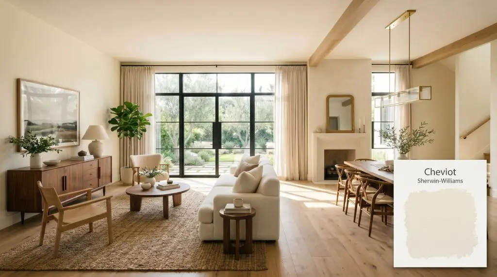
Cheviot SW 9503
Sherwin-WilliamsSherwin-Williams Cheviot (SW 9503) is a highly luminescent, warm white paint color with an LRV of 89. Part of the Emerald Designer Edition, it features soft, minimal yellow undertones that prevent it from feeling stark, making it a perfectly balanced, creamy off-white for walls and trim.
Paint Technical Profile
| Color ID / SKU | SW 9503 |
| HEX Code | #F6F2E8 |
| Light Reflectance (LRV) | 89 |
| Use | Interior, Exterior |
| Best Exposures | North-facing, East-facing |
| Best For | Living Rooms, Kitchen Cabinets, Trim, Bedrooms |
Sherwin-Williams Cheviot: Crafting the Perfect Warm White Home
Homeowners are constantly chasing the elusive “perfect white”—a shade that feels glowing and inviting without leaning into butter-stick territory. Sherwin-Williams Cheviot steps into this exact void. Formulated exclusively for the Emerald Designer Edition line, this shade is engineered to mimic the soft, filtering effect of morning sunlight. It wraps a room in an undeniable warmth while maintaining a crisp, tailored edge that feels entirely current.
Sherwin-Williams Cheviot: Undertones & LRV
Understanding the foundational color profile of this warm white is crucial before rolling it onto your walls.
With a light reflectance value (LRV) of 89, Cheviot is incredibly reflective and bounces a massive amount of light around the room. This high LRV means it will effortlessly expand your visual boundaries, making cramped spaces feel airy and open. However, this same expansiveness means it can easily wash out and lose its character if blasted by unmitigated, direct afternoon sun on an exterior facade.
Lighting Effects & The Chameleon Factor
The biggest fear homeowners have with a warm white is that it will suddenly look like a dated 1990s Tuscan kitchen when the lights turn on. Investing in a premium Emerald Designer Edition shade requires knowing exactly how directional lighting will manipulate its undertones. Fortunately, the hidden greige notes in this paint act as a stabilizing force.
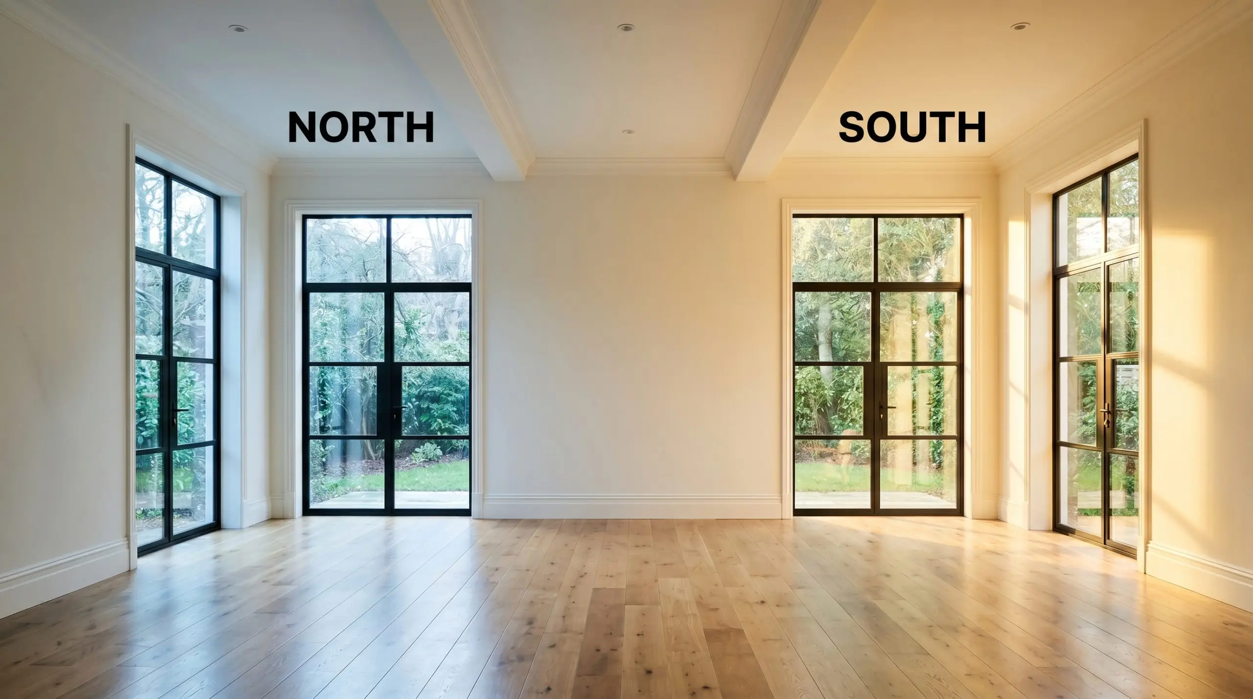
If your living room lacks natural sunlight entirely, don’t rely on a highly reflective shade to generate its own warmth. Instead, explore our guide to the best warm white paints for dark rooms to find a shade with enough depth to survive the shadows.
Hackrea Pro-Tip
Transforming Your Home with Sherwin-Williams Cheviot
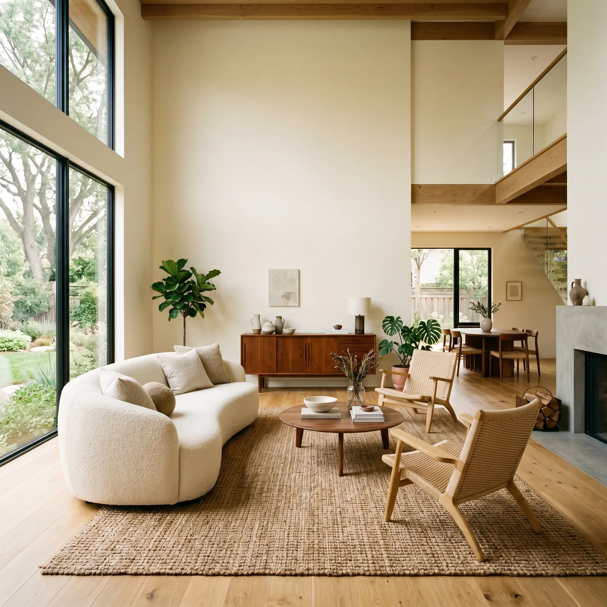
This low-chroma shade demands to be used as a foundational layer, providing a luminous backdrop that lets your furnishings and architectural details shine. Its specific energy is incredibly versatile, seamlessly shifting from relaxed elegance to tailored modernity depending on the space.
Open-Concept Living Areas
This paint excels in large, flowing floor plans where you need a unifying color that doesn’t feel sterile. It provides a stunning, glowing backdrop for plush ivory bouclé sofas, while simultaneously grounding rich walnut mid-century credenzas. Consider layering heavily textured jute rugs and breezy linen drapery to enhance the relaxed, organic energy. The high reflectivity ensures that even the deepest corners of an open layout feel intentionally illuminated.
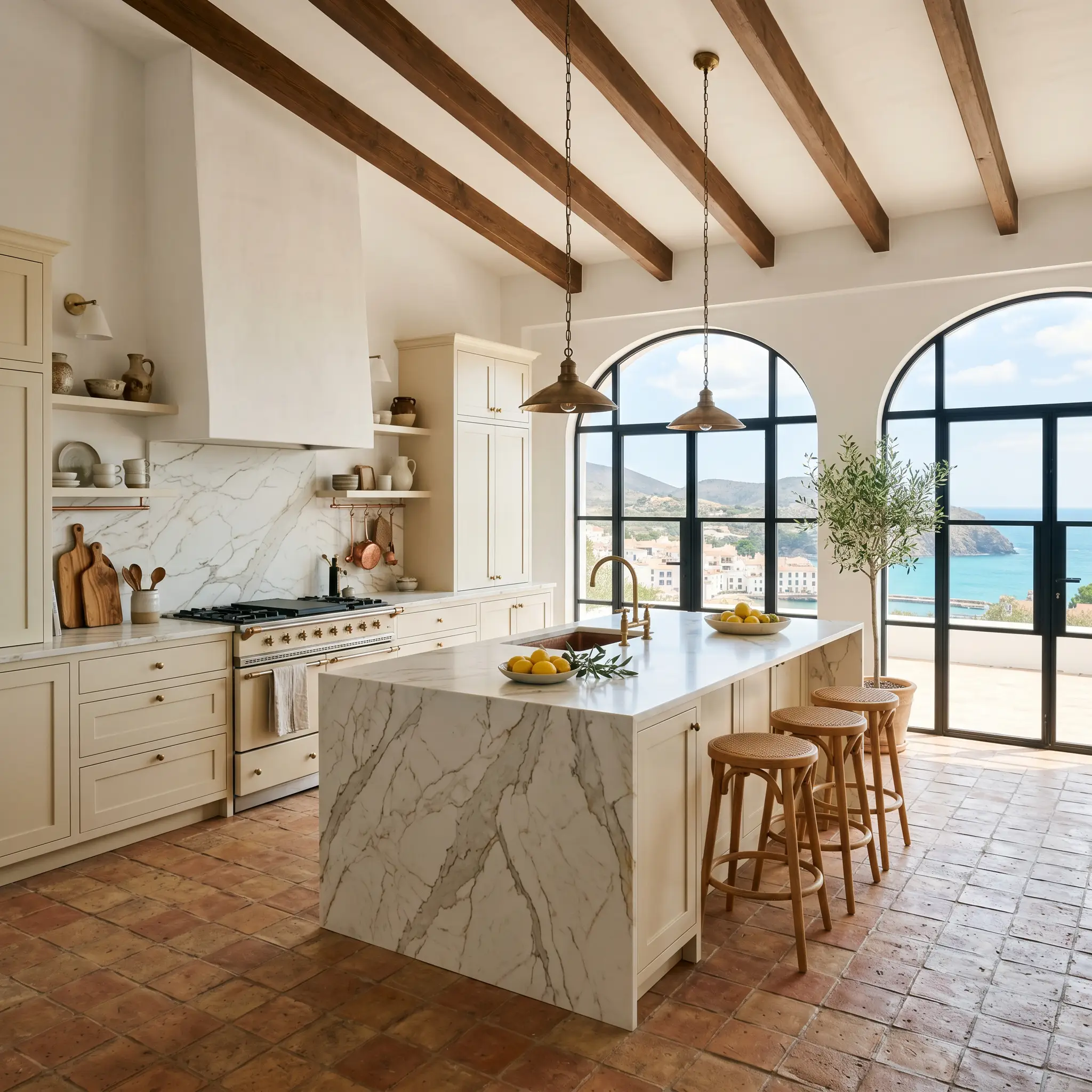
Kitchen Cabinets & Islands
A kitchen painted in this creamy tone feels instantly elevated and inviting. It pairs beautifully with heavily veined quartz countertops and warm terracotta floor tiles for a Mediterranean-inspired aesthetic. If you are tackling a renovation, understanding how to paint kitchen cabinets (prep & finish) is essential, as high-traffic areas require meticulous priming to ensure this light shade withstands daily wear.
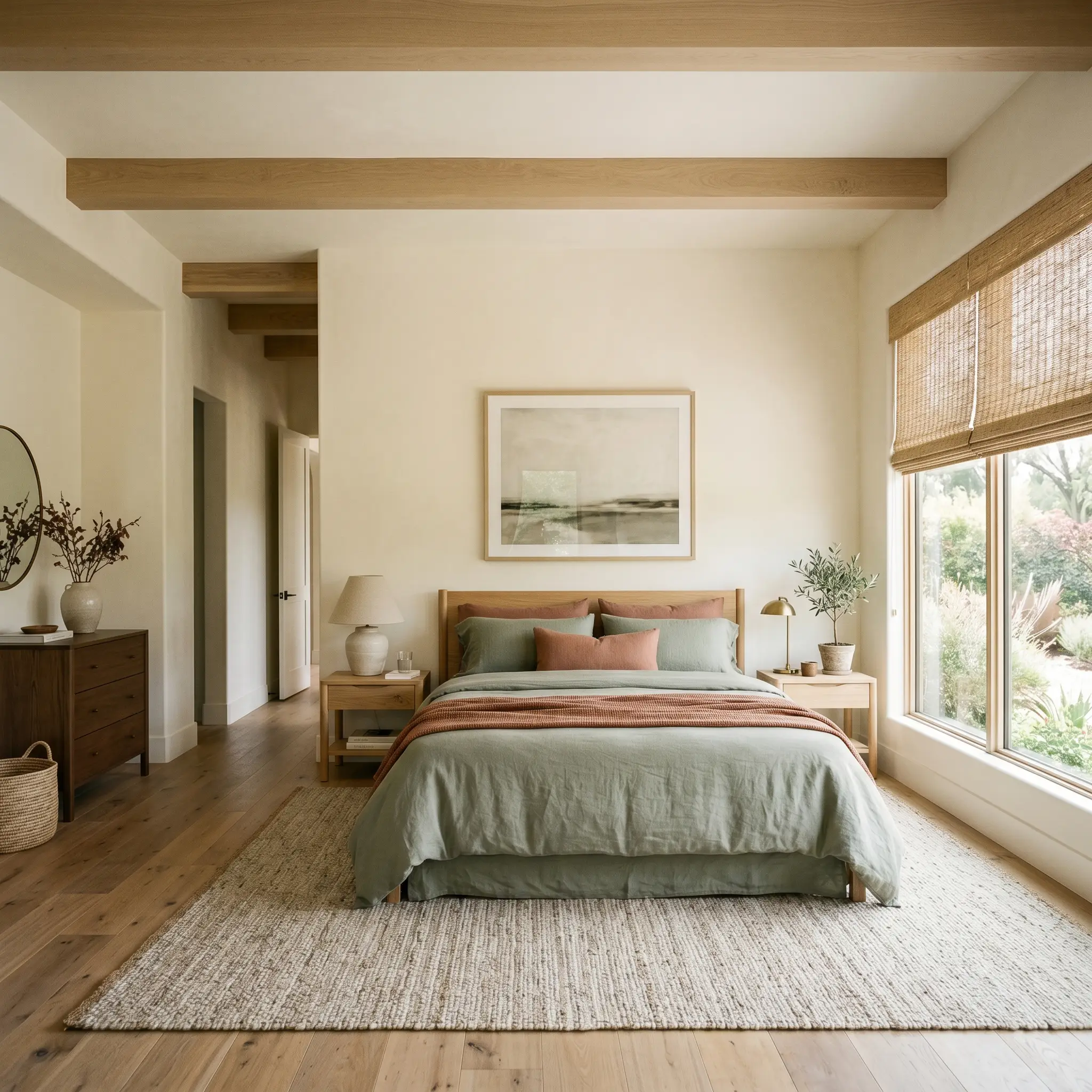
Primary Bedrooms
For a serene, retreat-like atmosphere, this shade wraps the walls in a gentle, soothing warmth. It serves as the ideal canvas for layered bedding in muted sage greens, dusty terracottas, or deep charcoal accents. Pair it with woven rattan window shades to filter the morning light, allowing the paint’s softest nuances to glow beautifully at dawn.
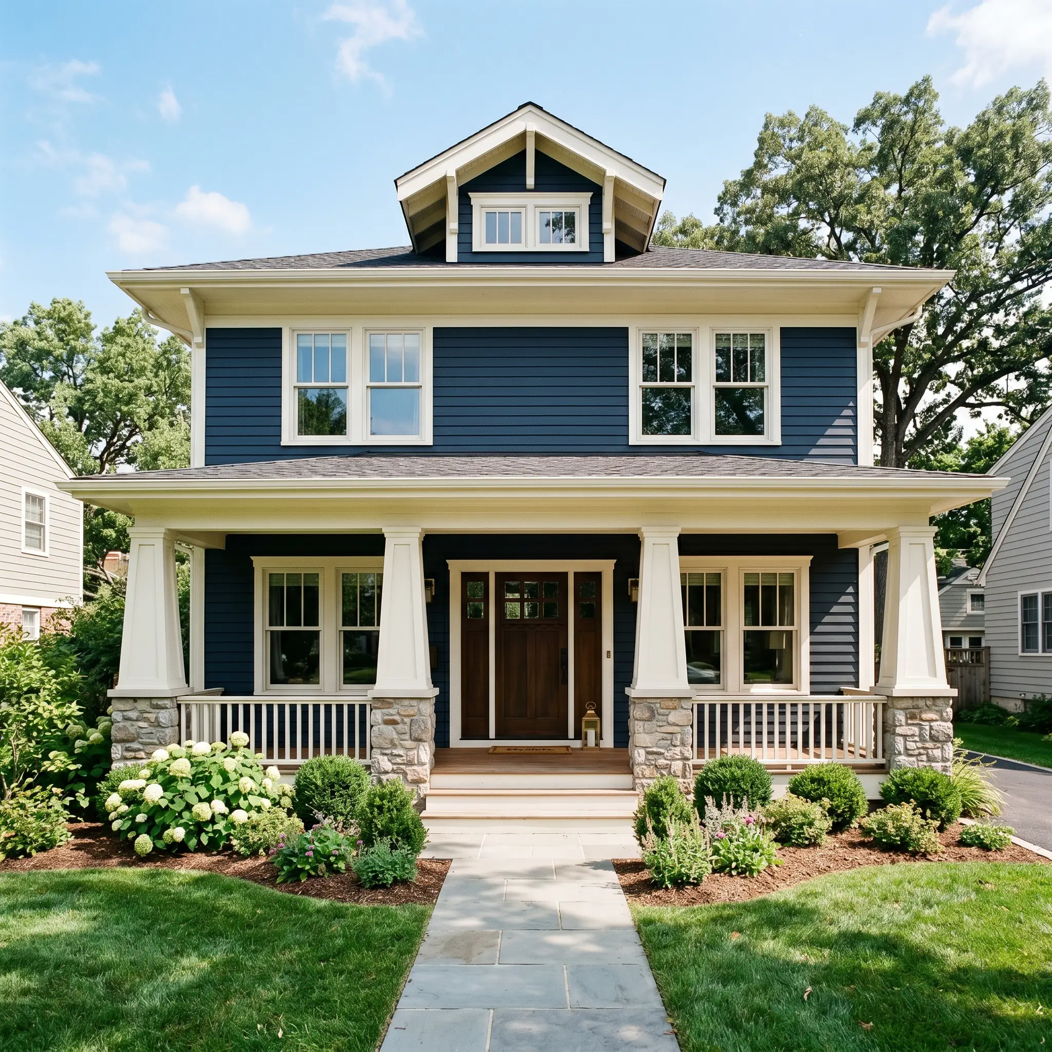
Exterior Trim & Fascia
On an exterior facade, brilliant sunlight will strip away much of the perceived color, making this shade read as a bright, clean white. It is an exceptional choice for trim, columns, and fascia boards when paired with deeper, moodier siding colors like navy or forest green. The subtle warmth prevents the exterior details from looking blindingly stark against natural landscaping.
Creative Architectural Uses for This Luminous Off-White
Beyond standard wall applications, this paint’s unique luminosity makes it an incredible tool for manipulating architectural boundaries. Let’s look at a few distinctive ways to leverage its glowing profile.
The Monochromatic Sunroom Wrap
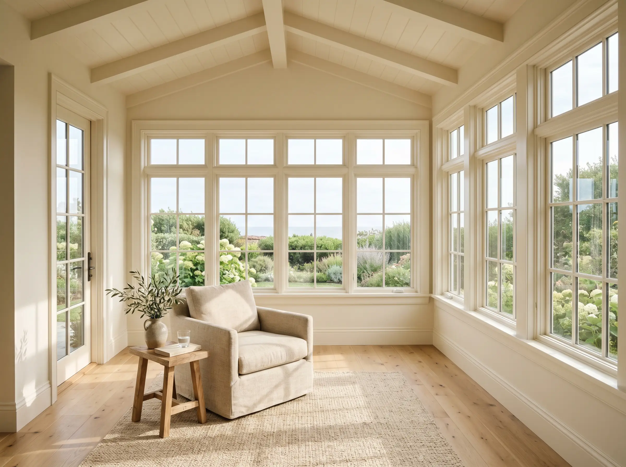
Instead of breaking up a sunroom with contrasting trim, drench the entire space—walls, trim, and ceiling—in this single shade. The high LRV will catch the shifting sunlight throughout the day, creating a seamless, glowing envelope. This technique blurs the hard architectural lines, making the room feel like a continuous, radiant extension of the outdoors.
The Modern Farmhouse Scullery
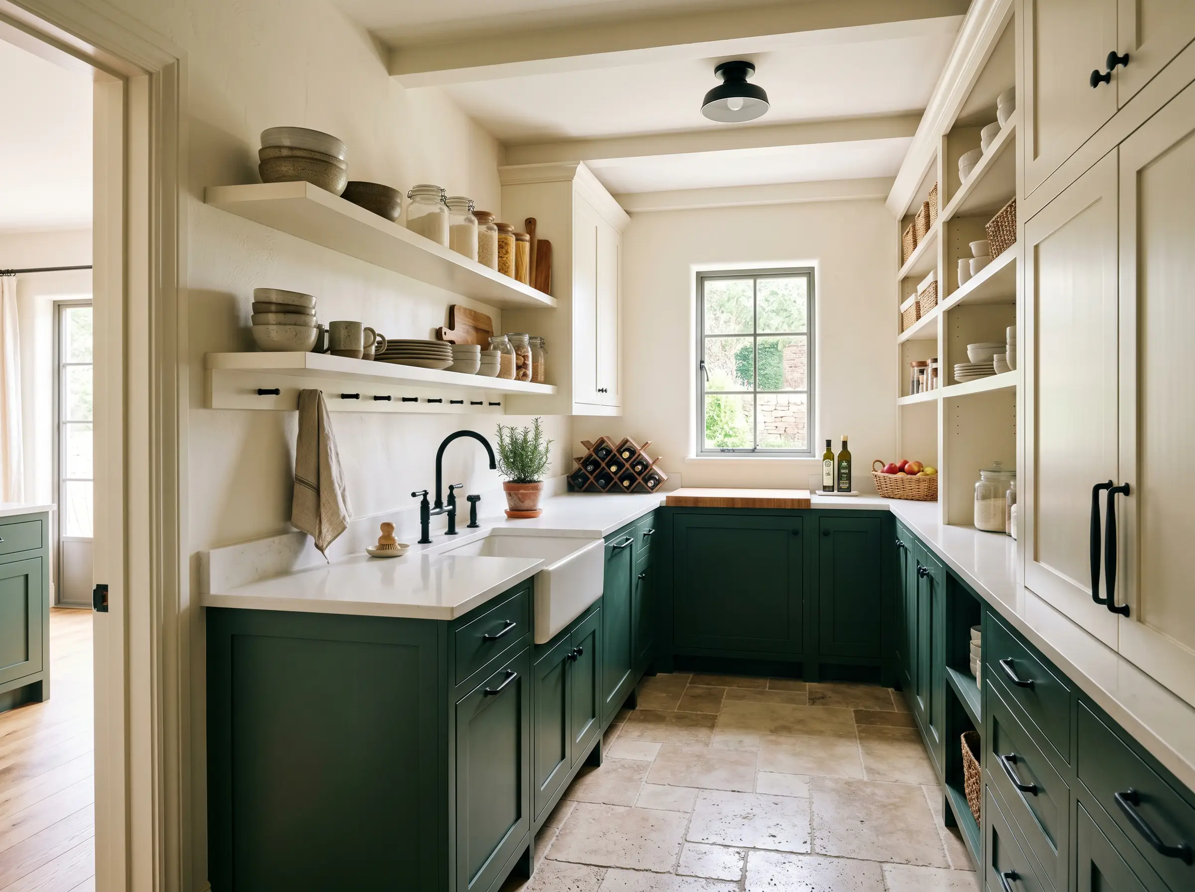
In a small, hardworking butler’s pantry or scullery, use this creamy white exclusively on the upper cabinetry and open shelving. Pair it with a deeply saturated, moody green on the lower cabinets. The stark contrast allows the upper half of the room to recede and feel airy, while the lower half grounds the workspace with rich, intentional drama.
The Minimalist Art Gallery Hallway
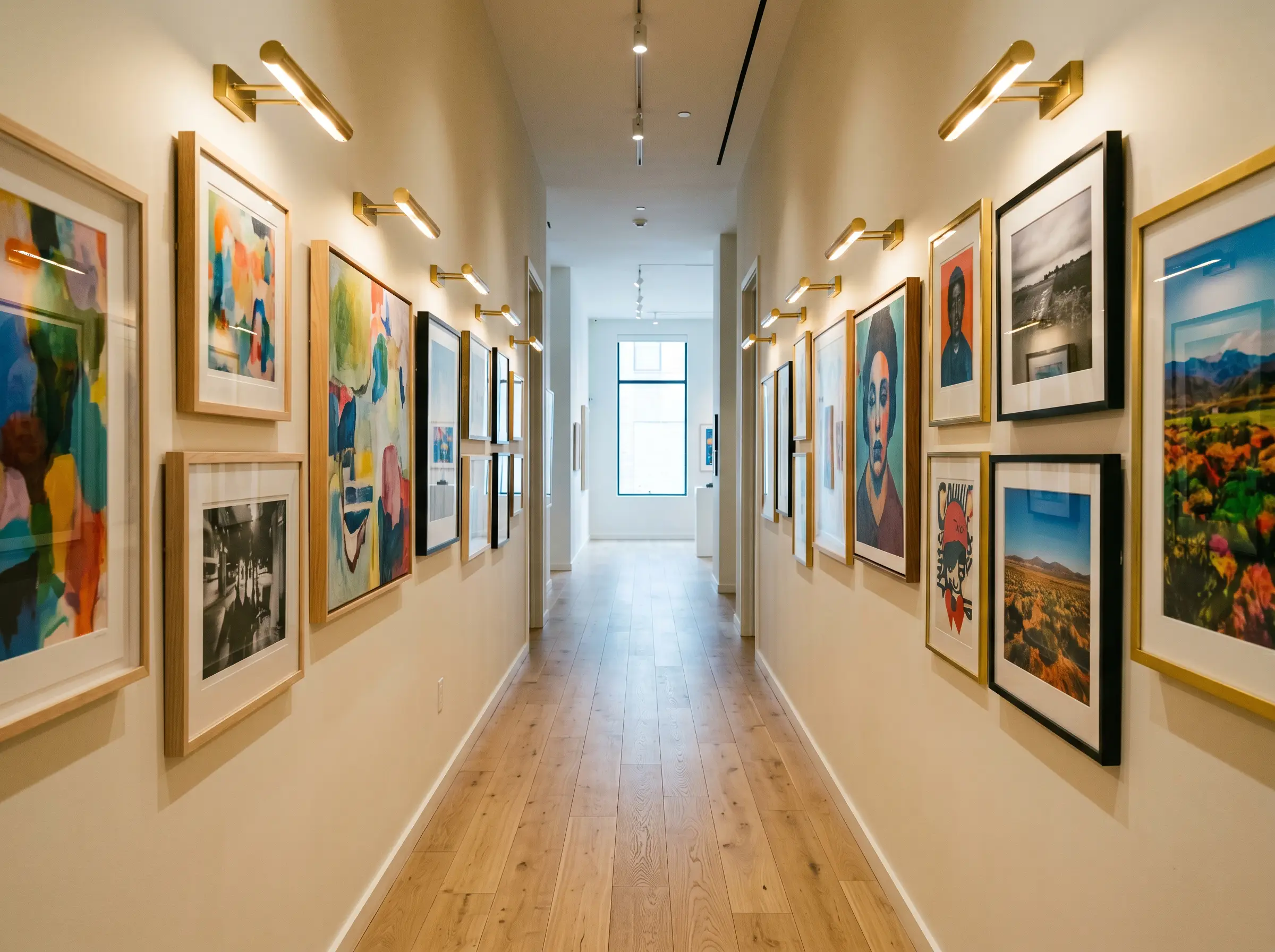
Transform a dark, narrow hallway into a curated exhibition space. By applying this highly reflective shade to the walls and pairing it with strategically placed, warm-toned picture lights, you create an intimate gallery feel. The paint’s subdued warmth ensures the background remains quiet and supportive, allowing colorful artwork and framed photography to command full attention.
Styling Cheviot: Coordinating Colors & Best Pairings
The secret to styling this luminescent shade lies in managing contrast. It requires intentional pairings to either highlight its crispness or enhance its cozy, enveloping nature.
Trim Boundaries
To create a clean, tailored boundary, you need a trim color that provides a subtle but distinct visual break.
Hardware, Wood & Material Pairings
The right tactile elements will dictate the final aesthetic of the room. Here are the best materials to dialogue with this glowing white:
Secondary Palette Selections
Building a cohesive palette requires secondary colors that respect the primary shade’s delicate balance.
Curated Aesthetic Concepts
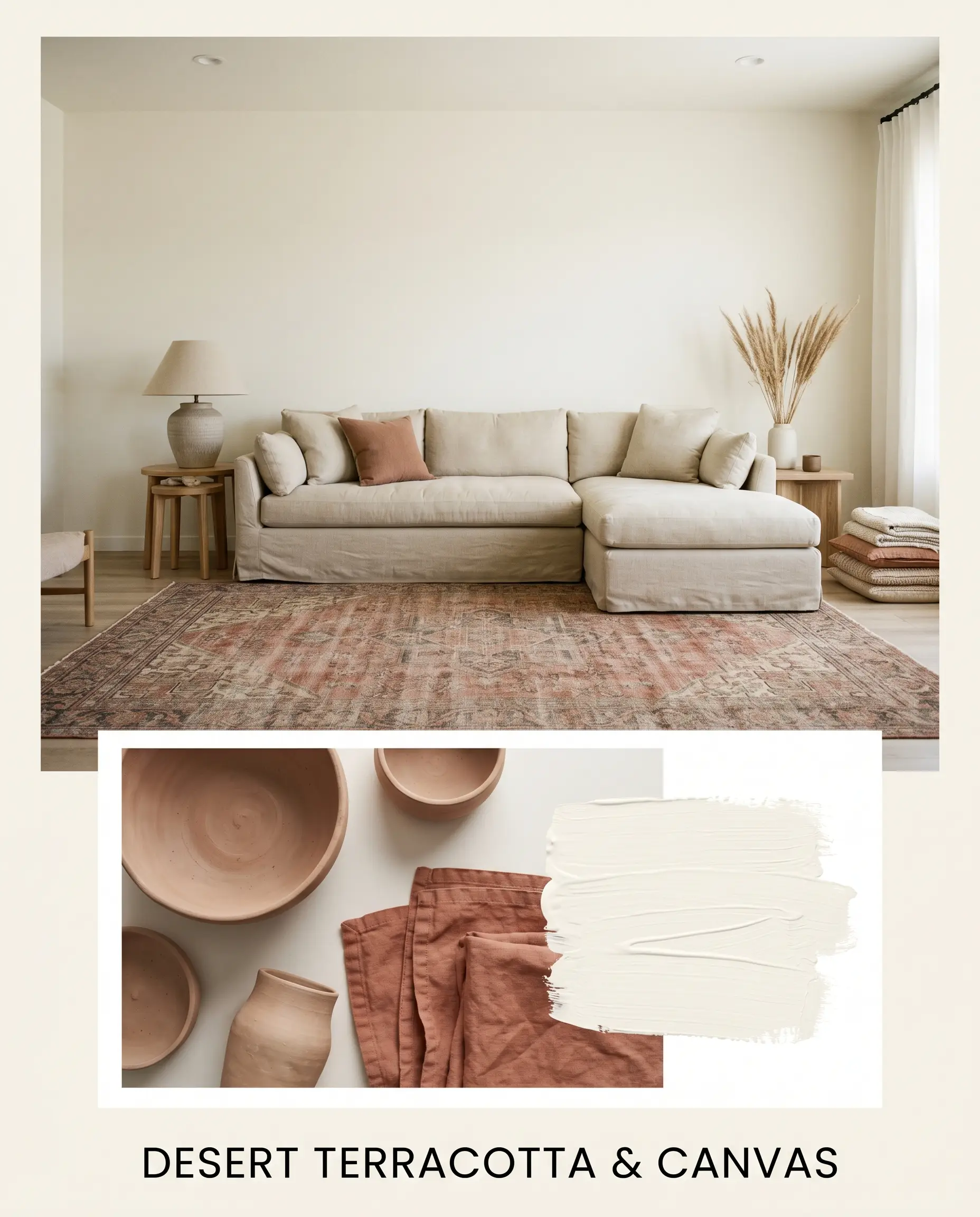
Desert Terracotta & Canvas: This palette relies on earthy warmth and relaxed textures. Think raw, unglazed clay pottery, an oversized slipcovered linen sectional, and a faded vintage Persian rug in muted rust tones. The wall color acts as the sun-bleached canvas that ties these organic, tactile elements together into a cohesive, relaxed retreat.
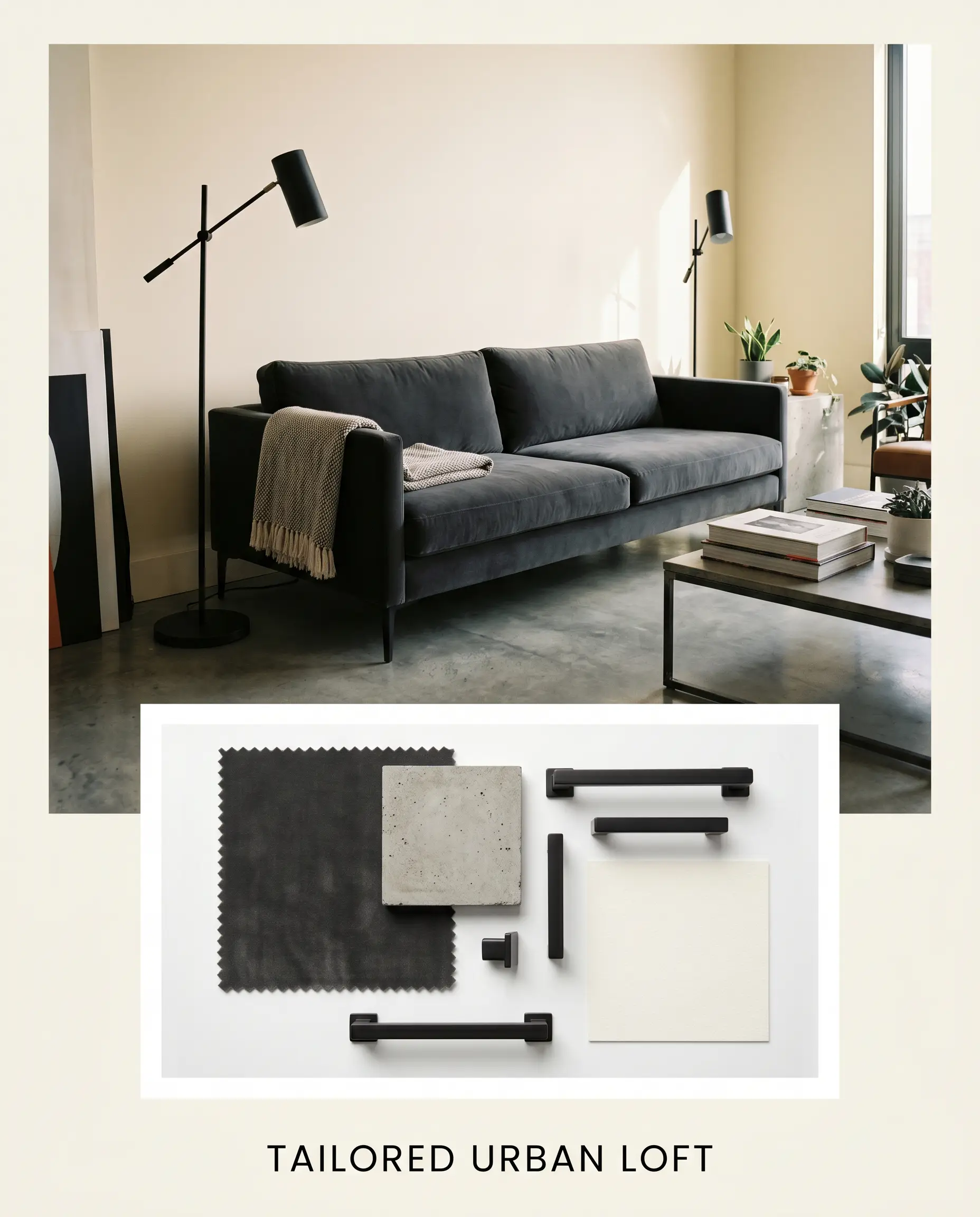
Tailored Urban Loft: A study in sharp, modern contrast. This aesthetic utilizes a sleek, low-profile charcoal velvet sofa, structural matte black floor lamps, and polished concrete flooring. The creamy wall color prevents the industrial elements from feeling cold or uninviting, injecting just enough warmth to make the modern styling feel livable.
Head-to-Head Paint Comparisons
Sometimes a color looks perfect on a swatch but fails in your specific lighting conditions. Here is how this shade stacks up against its closest rivals when the architectural environment demands a pivot.
Sherwin-Williams Cheviot vs. Benjamin Moore White Dove
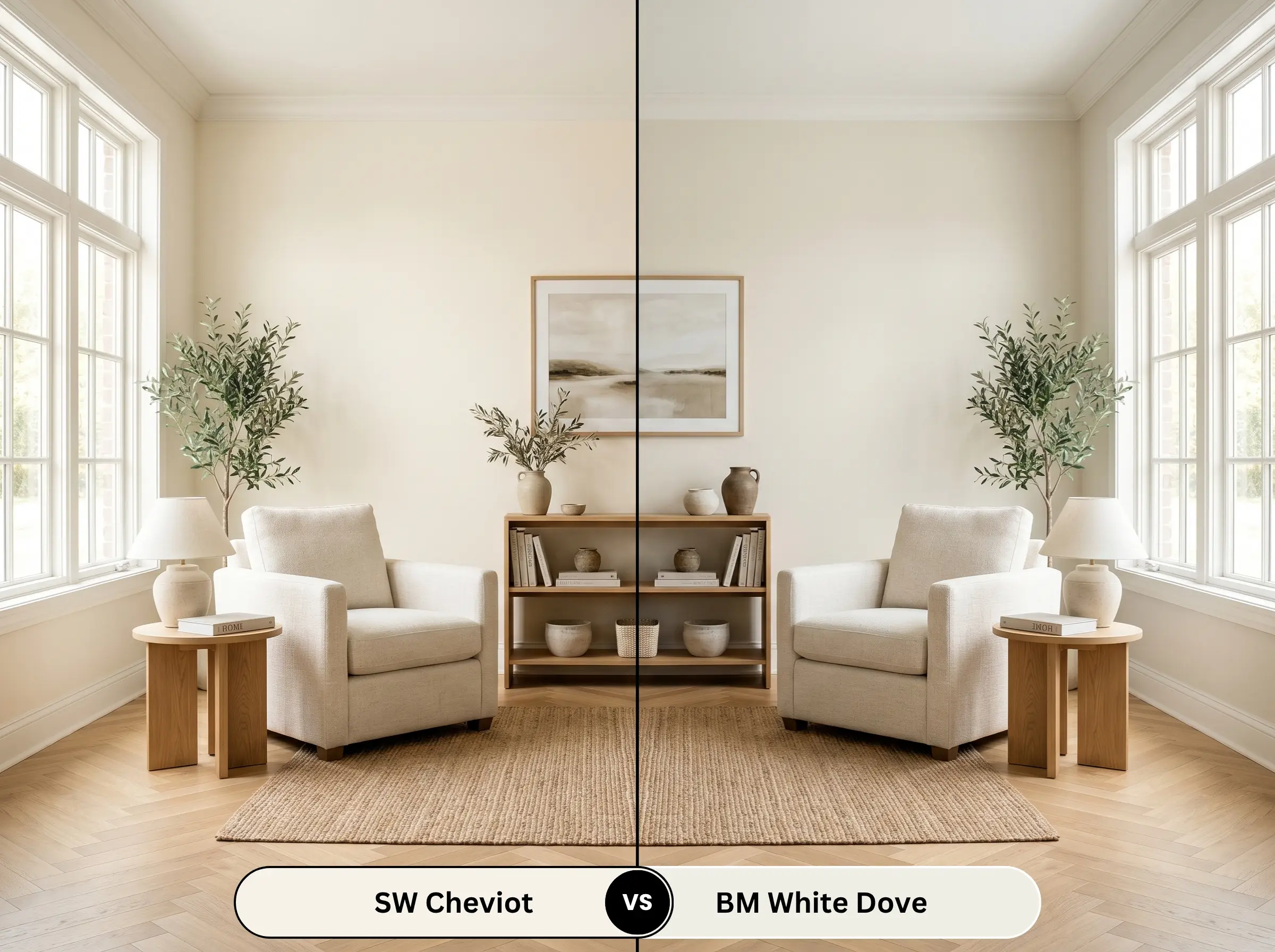
If your room receives heavy, warm southern light, White Dove (OC-17) might be the safer choice. While both are warm off-whites, White Dove carries a more pronounced gray base that actively neutralizes incoming yellow light. Cheviot is noticeably cleaner and more luminescent, but it will lean much warmer in direct sunlight than its Benjamin Moore counterpart.
Sherwin-Williams Cheviot vs. Sherwin-Williams Pure White
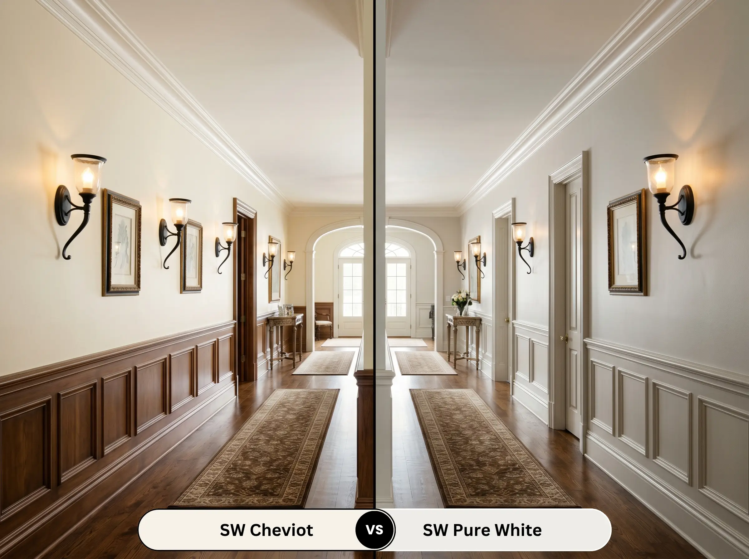
Pure White (SW 7005) is the ultimate safety net for indecisive homeowners. It has a drop of black pigment that grounds it, making it far less likely to shift in changing light. If you are terrified of your walls pulling yellow, pivot to Pure White. However, if you want a room that feels genuinely sunlit and glowing, Cheviot offers a richer, more complex depth.
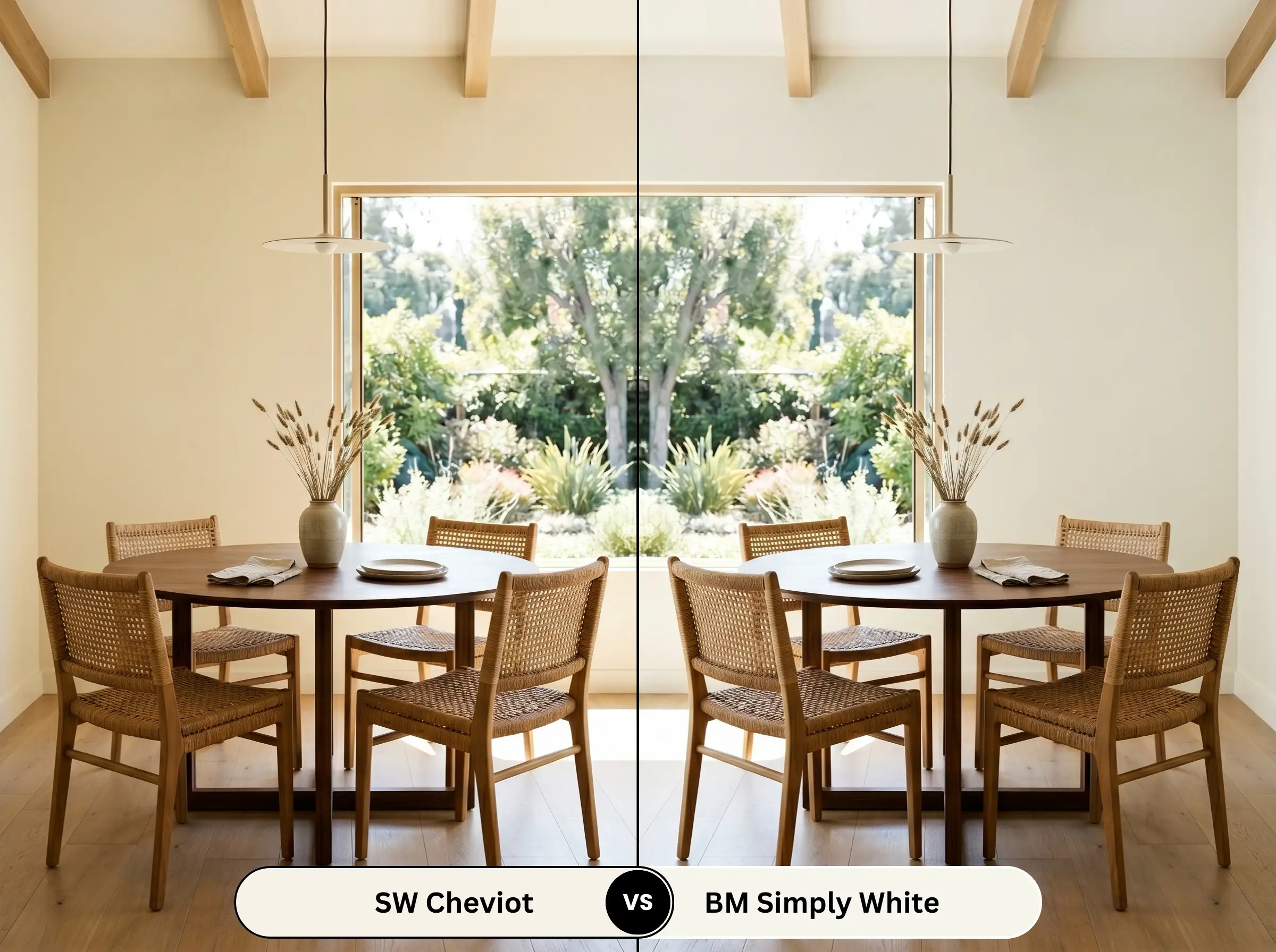
Sherwin-Williams Cheviot vs. Benjamin Moore Simply White
Simply White (OC-117) is famous for its distinct, sunny yellow undertone. When placed side-by-side, Simply White reads noticeably brighter and more energetic. If you want a softer, more subdued elegance that leans slightly toward greige rather than stark yellow, Cheviot is the more sophisticated, low-chroma option.
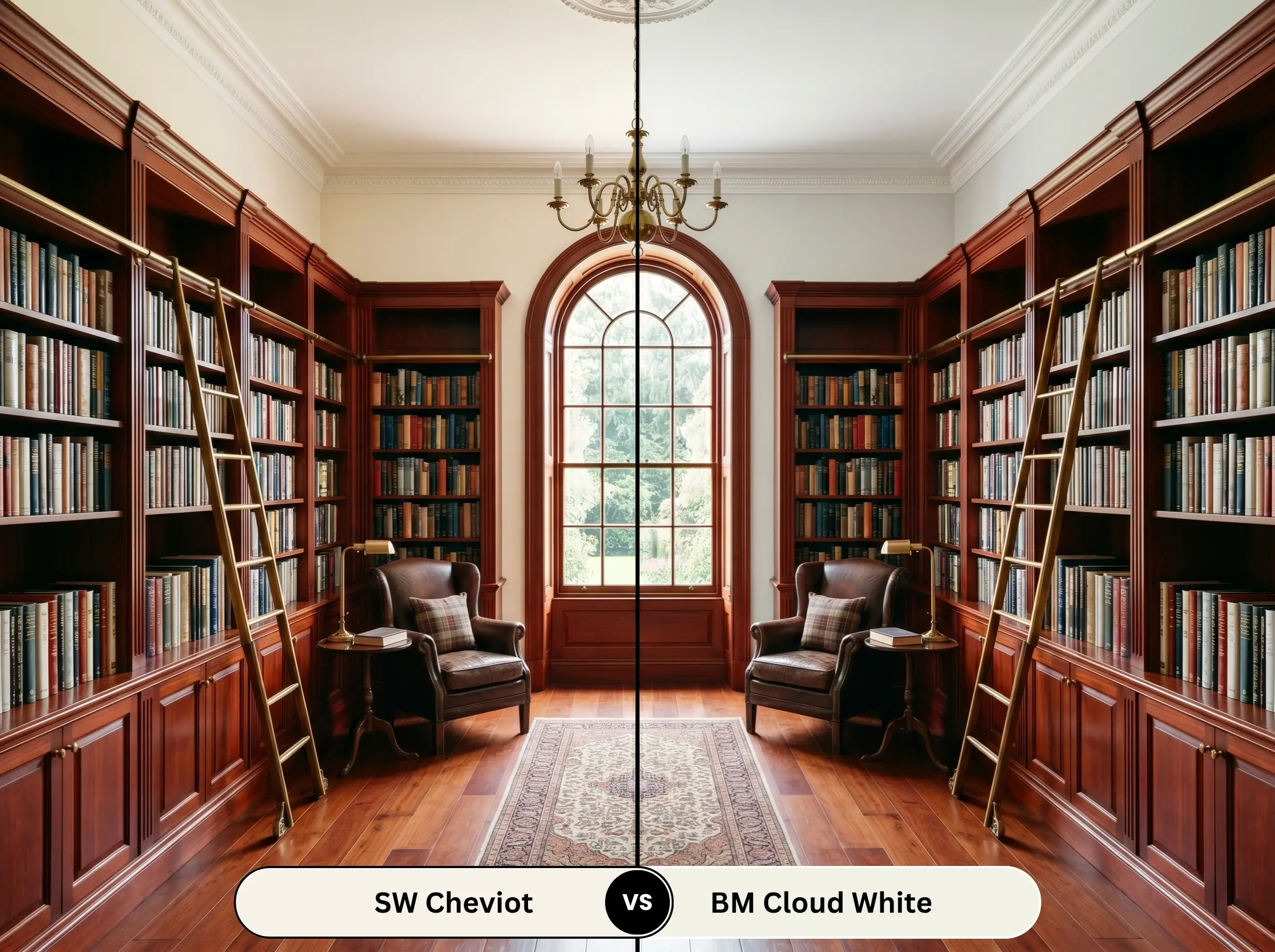
Sherwin-Williams Cheviot vs. Benjamin Moore Cloud White
Cloud White (OC-130) features a very subtle taupe undertone that makes it incredibly soft and forgiving. It is slightly more muted than Cheviot. If your home features a lot of red-toned cherry or mahogany wood floors, Cloud White often bridges those intense wood tones better, whereas Cheviot excels alongside lighter, modern oak finishes.
Alternatives to Sherwin-Williams Cheviot
If you need a slight adjustment in depth or are restricted by local brand availability, these alternatives offer a similar glowing aesthetic.
Same-Brand Alternatives
Cross-Brand Matches
Practical Application & DIY Advice
Transitioning from a paint chip to a beautifully finished wall requires understanding the physical behavior of this specific formula. Here is how to ensure a flawless execution.
The Ideal Sheen Strategy
Primer Requirements
Because this is a highly reflective, light shade, a high-quality white primer is absolutely non-negotiable. If you are painting over a dark or vibrant existing wall color, a dedicated stain-blocking primer ensures the old pigment doesn’t bleed through and alter the delicate yellow undertones of your new finish.
Coverage & Professional Finish
Light, low-chroma colors are notorious for showing roller marks if applied too thinly.
Hackrea Design Secret
Expect to apply a minimum of two generous coats for true opacity. Maintain a wet edge while rolling to prevent “flashing”—those frustrating, uneven streaks that catch the light and ruin a smooth, professional-looking wall.
Frequently Asked Questions
Because Carrara marble typically features cool, crisp gray and blue veining, pairing it directly with a warm white can sometimes emphasize the yellow undertones, making the paint look aged rather than intentional. To succeed here, ensure your lighting is balanced and introduce intermediate warm-gray tones to bridge the gap between the cool stone and the warm walls.
Textured stucco creates thousands of tiny micro-shadows that will slightly darken the perceived color, pulling forward the hidden greige notes. On smooth HardiePlank, the paint will reflect sunlight much more uniformly, appearing significantly brighter and cleaner.
Using a warm, creamy shade on the ceiling while the walls are stark white will visually lower the ceiling height and make the room feel disjointed. The ceiling will look like it has yellowed over time. Always match your ceiling white to the temperature of your walls, or simply use the same wall color in a flat finish.
The premium Emerald base utilizes an ultra-smooth, self-leveling formula that scatters light more evenly across the surface. This results in a richer, more luminous finish that enhances the subtle undertones far better than standard, builder-grade paint lines.
Final Verdict & Expert Warnings
Sherwin-Williams Cheviot is an exceptionally sophisticated, highly luminous shade that bridges the gap between stark modernity and cozy tradition. It is the definitive choice for homeowners who want their spaces to feel continuously sunlit, airy, and effortlessly welcoming. This paint shines brightest in open-concept living areas and north-facing rooms where its subtle greige nuance can balance the incoming cool light, resulting in a perfectly tailored off-white.
However, this glowing warmth means it requires careful curation to avoid visual friction. You must be incredibly cautious when pairing this shade with cool-toned fixed elements, such as icy blue glass backsplashes, stark gray luxury vinyl plank flooring, or heavily blue-toned slate fireplaces. When placed directly against these chilly, dominant features, the delicate yellow undertones in the paint will instantly sour, making the walls look dull and aged rather than intentionally creamy. Always ensure your foundational hard finishes share a similar, inviting warmth to let this beautiful color truly succeed.
Closest Cross-Brand Equivalents
The absolute closest scientific color matches for Cheviot across top paint brands.