The Stylist’s Guide to Mixing Wood Tones in a Living Room (Without Clashing)
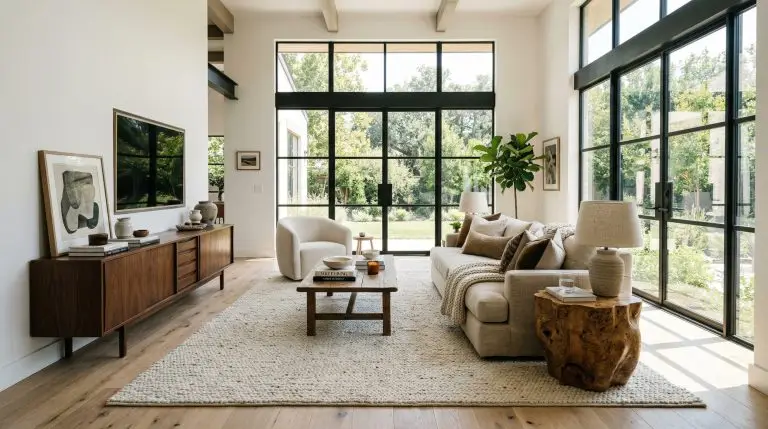
You finally sourced the perfect vintage walnut coffee table, but the moment it lands on your newly installed white oak floors, panic sets in. The finishes are fighting. The instinct is to retreat to the safety of showroom matching sets, but buying identical furniture out of a catalog guarantees a visually flat, uninspired room.
The most elevated, architecturally significant spaces feature two to three distinct wood tones that interact through deliberate tension.
Creating a curated, collected-over-time aesthetic is not a guessing game. It is a rigorous structural formula based on visual weight, chemical undertones, and strategic buffering. Throw out the outdated mandate that every leg and surface must perfectly align. Here is the exact methodology for layering wood finishes like a master stylist.
Establishing the Visual Hierarchy of Your Space
Before analyzing a single stain or grain pattern, you must establish spatial rank. Wood tones cannot fight for the same visual oxygen. If every piece demands equal attention, the room devolves into chaos. Successful styling requires a strict foundational geometry:
Locating the “Anchor” Wood
Every expertly styled room possesses an unchangeable baseline. This is your anchor wood. You cannot introduce a secondary finish until you have identified this foundational layer, as every subsequent furniture specification will be a direct reaction—either a deliberate match or a stark contrast—to this primary tone. Professional stylists never fight the anchor; they build around it.
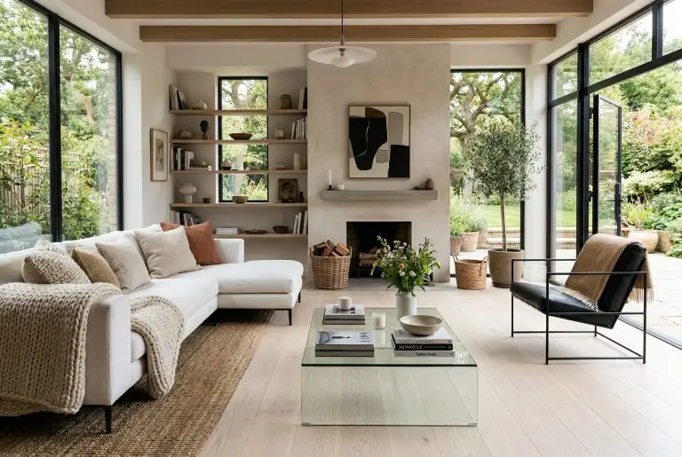
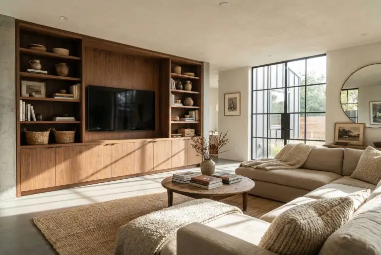
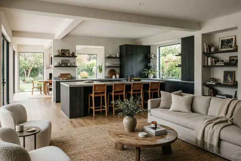
To identify your anchor wood, look for the material commanding the most square footage in your living room:
The 60/30/10 Wood Ratio Formula
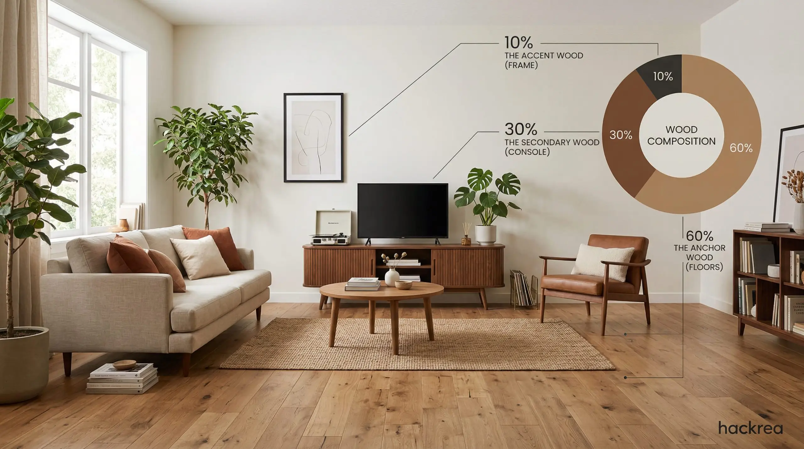
To prevent a room from feeling like a haphazard thrift store haul, Hackrea stylists rely on a mathematical blueprint to distribute visual weight. Adhering to this precise ratio ensures intentionality.
Decoding Grain Patterns and Chemical Undertones
Knowing where to place wood is only half the spatial equation. Knowing which finishes actually speak to each other requires a foundational grasp of color theory. You must learn to look past the superficial stain and identify the raw chemical color profile beneath.
Identifying Warm, Cool, and Neutral Tones
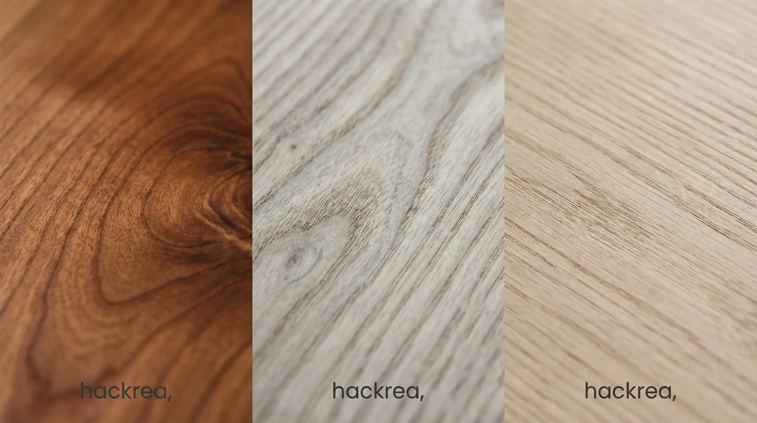
Every species of wood possesses an inherent undertone. Mixing woods successfully requires understanding these microscopic color temperatures. Warm woods, like mahogany and cedar, carry distinct red, yellow, or orange undertones. Cool woods, such as ash and pine, pull heavily toward gray or green. Neutral woods, like white oak and walnut, sit comfortably in the middle, making them the ultimate chameleons for layering.
To identify a mystery undertone, perform the paper test. Hold a piece of pure white printer paper directly against your furniture in harsh, natural daylight. The stark white instantly strips away optical illusions, forcing the wood’s true red, yellow, or gray base to reveal itself.
Hackrea Styling Tip
Use this matrix to categorize your existing pieces before sourcing new additions:
| Warm Undertones (Red/Orange) | Cool Undertones (Gray/Green) | Neutral Undertones (Brown/Beige) |
|---|---|---|
| Cherry | Ash | White Oak |
| Mahogany | Bleached Maple | Walnut |
| Teak | Weathered Pine | Birch |
| Red Oak | Whitewashed Hickory | Aged Teak |
The “High Contrast” Mandate
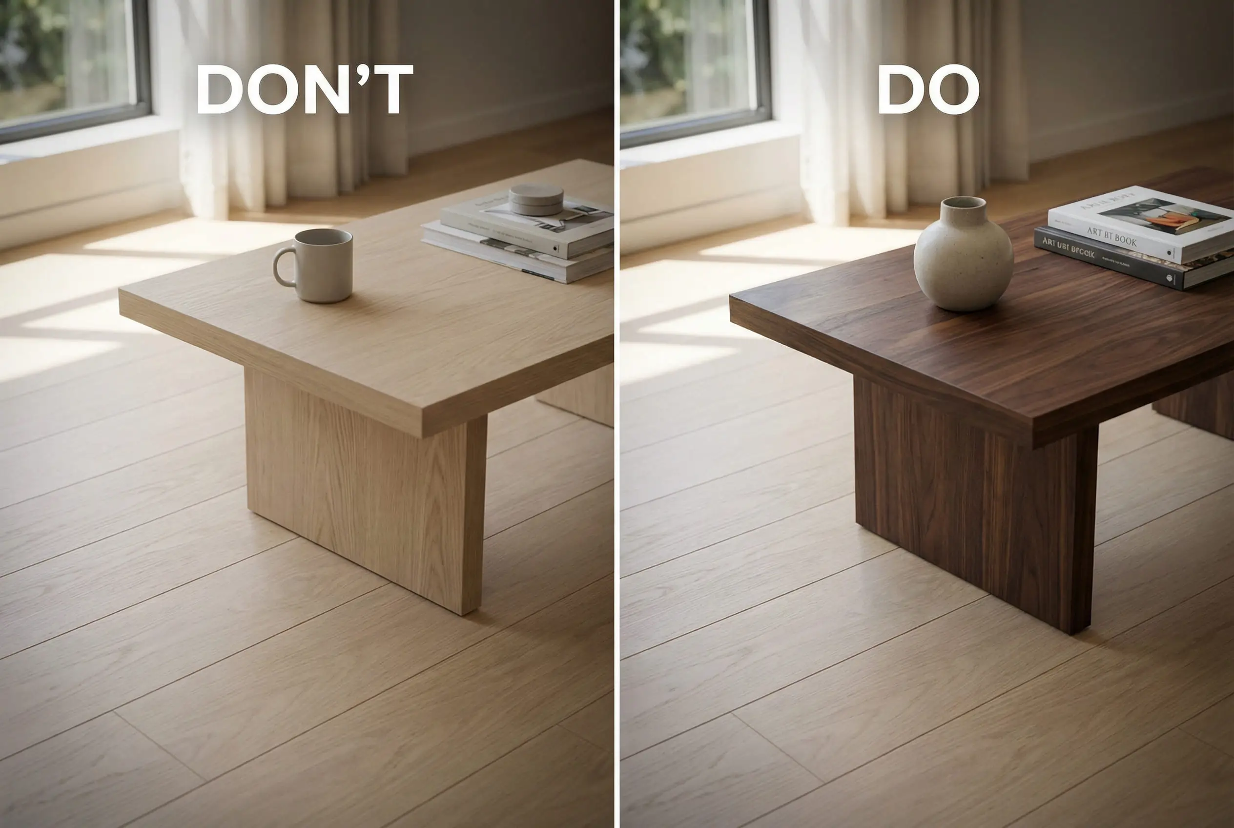
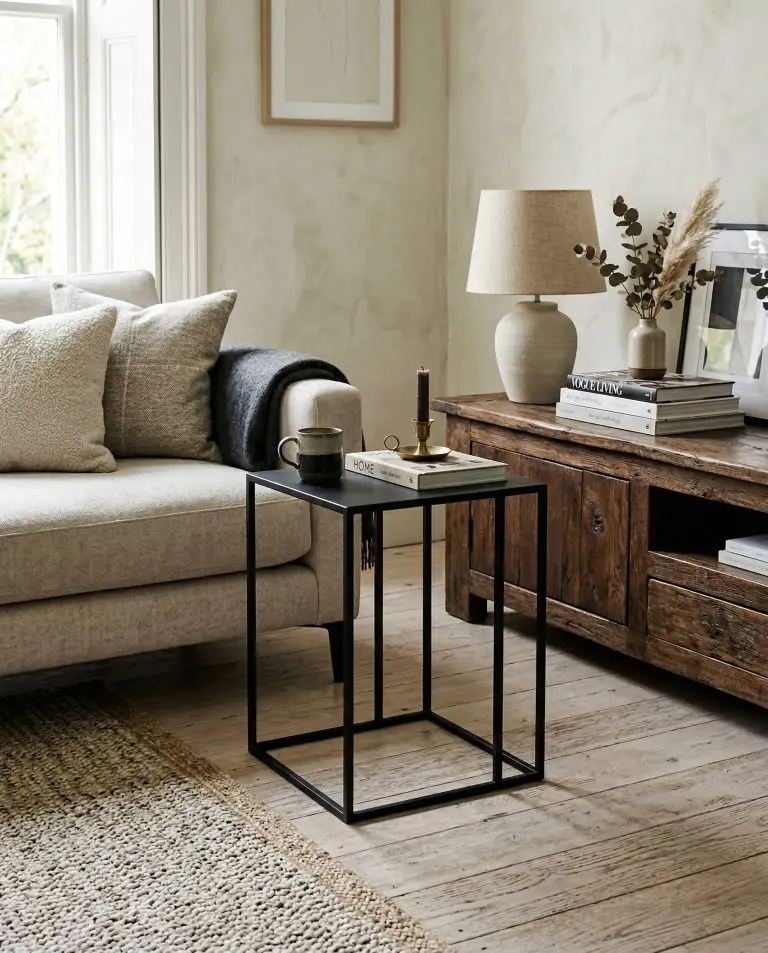
The most common DIY disaster occurs when attempting to match a new purchase to an existing anchor wood, only to miss by a fraction of a shade. A near-match looks like a glaring mistake. A stark contrast looks like a deliberate, high-end design choice. If your floors are a pale, airy oak, push your secondary wood to a deep, moody walnut.
3 Designer-Approved Wood Combinations for the Living Room
If the mathematical theory feels overwhelming, bypass the guesswork. The following combinations are foolproof, high-end styling recipes actively utilized by elite modern interior designers to achieve instant cohesion.
White Oak + Walnut + Matte Ebonized Ash
The Hackrea Stylist’s Cheat Sheet: The ultimate recipe for organic modern living room aesthetics.
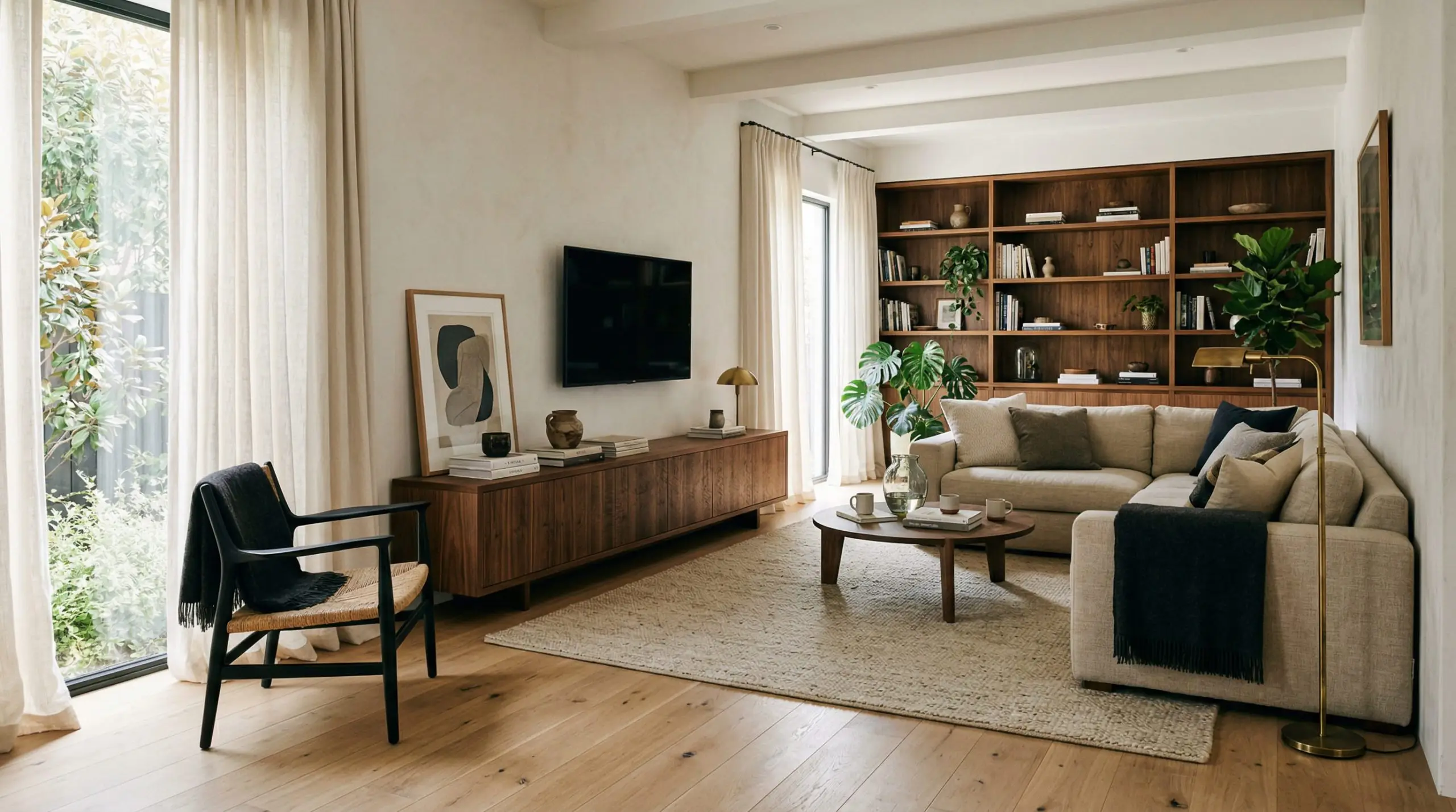
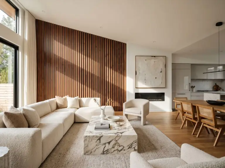
This trifecta is the backbone of the highly coveted Amber Interiors look. The White Oak acts as the airy, neutral anchor—usually applied to wide-plank flooring. It bounces light and keeps the room from feeling heavy. The Walnut introduces a rich, mid-century warmth, perfectly deployed on a low-profile media console or walnut coffee tables. Finally, the Matte Ebonized Ash acts as the grounding 10% accent. The deep, black-stained wood—used on structural accent chairs or gallery frames—absorbs light and sharpens the soft edges of the oak and walnut, giving the room a sophisticated, high-contrast bite.
Burl Wood + Teak + Bleached Maple
The Hackrea Stylist’s Cheat Sheet: A masterclass in manipulating grain scale for a curated, vintage energy.
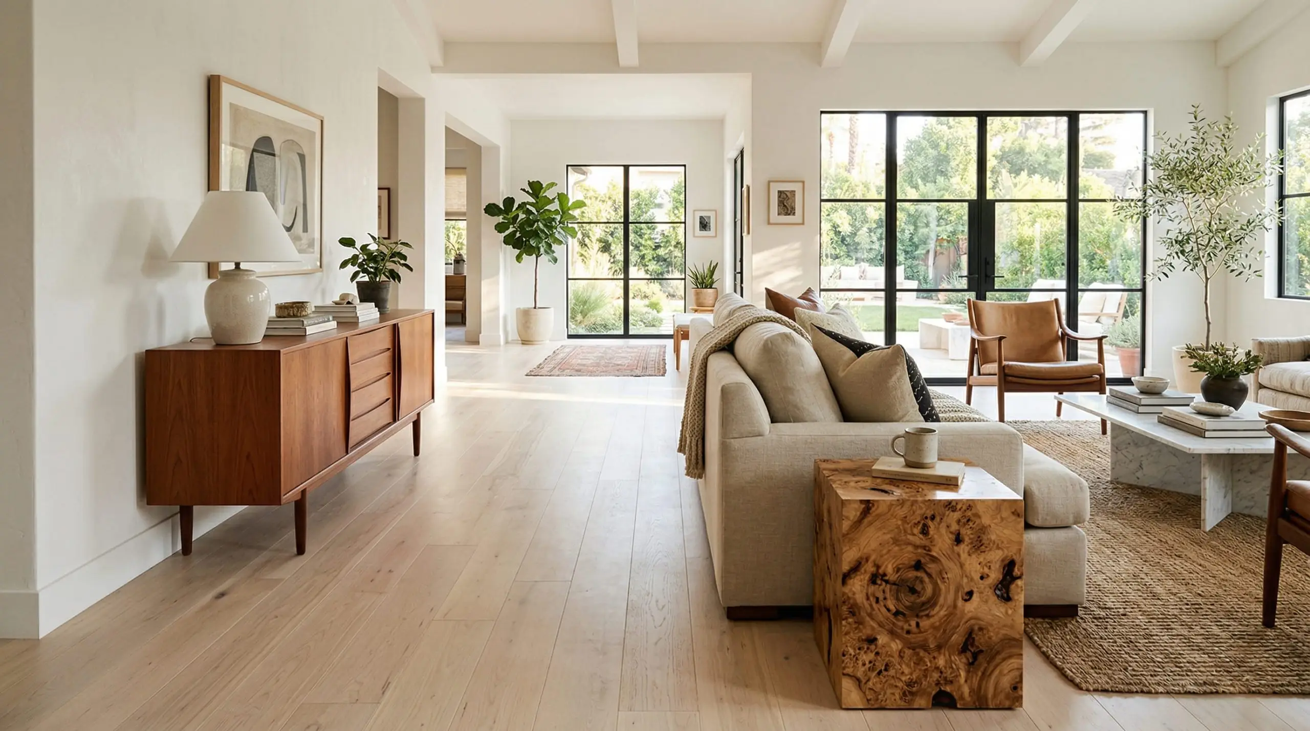
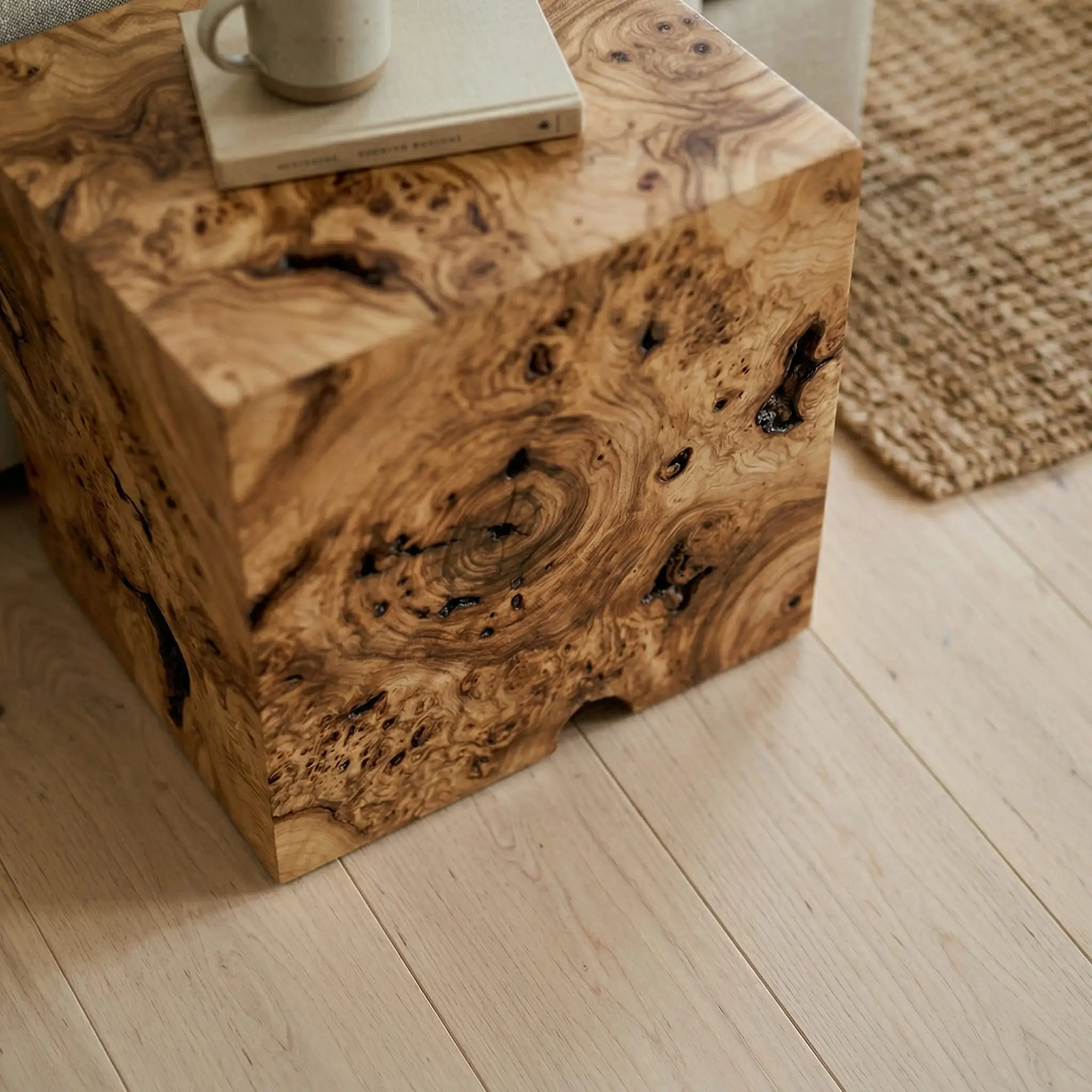
This combination relies heavily on texture rather than just tone. The Bleached Maple provides a gallery-like, cool anchor that visually recedes. Teak brings in a warm, undeniable 1970s energy, ideal for a credenza or lounge chair frame. The magic happens with the Burl Wood accent. Because maple and teak feature relatively straight, predictable grain patterns, introducing a burl wood side table or decorative box creates necessary friction. The wild, chaotic, circular grain scale of the burl acts as a show-stopping focal point, contrasting beautifully against the linear geometry of the other pieces.
Mahogany + White Pine + Brass
The Hackrea Stylist’s Cheat Sheet: The transitional savior for integrating heavy, inherited furniture into a modern space.
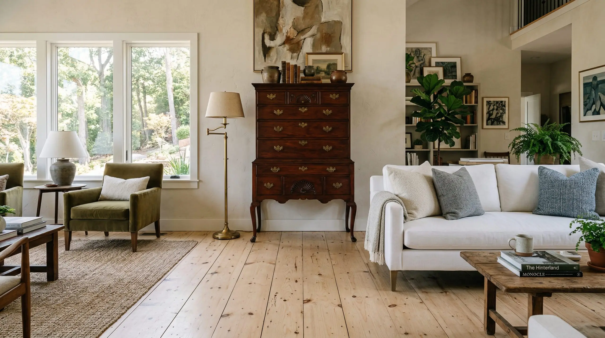
Many homeowners inherit formal, heavy Mahogany dining tables or living room highboys and struggle to make them feel current. The secret is stripping away the formality. Pair the dark, reddish warmth of mahogany with raw, unfinished White Pine. The stark, utilitarian nature of the pine acts as an immediate counterbalance to the mahogany’s antique seriousness and rich patina. To bridge the gap between this extreme warm-and-cool tension, introduce Brass as an honorary “wood tone.” The metallic warmth of a brass floor lamp or cabinet hardware harmonizes with the mahogany while elevating the humble pine.
The Stylist’s Troubleshooting Guide: Fixing Clashing Woods
Perhaps you have already purchased your primary pieces, and they are actively fighting each other. Before you surrender and list the offending furniture on a resale app, deploy these two spatial tricks to manipulate the eye and restore harmony.
The “Buffer Zone” Strategy
Never allow two drastically different wood tones to physically touch.
Hackrea Pro-Tip
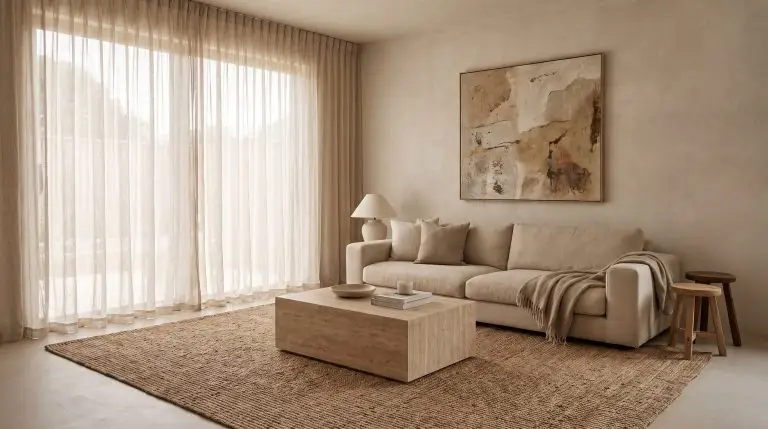
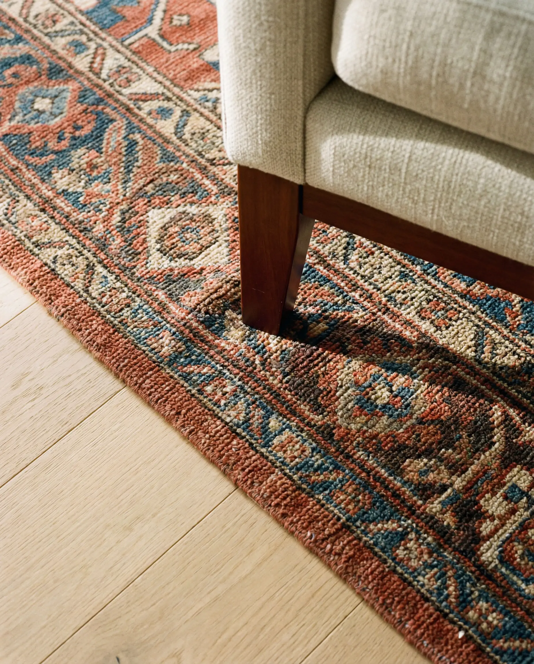
If you place a cherry wood sofa leg directly onto a blonde oak floor, the competing undertones will vibrate aggressively against one another. You must break the visual continuity by creating a buffer zone. Dropping a massive, heavily textured textile between the floor and the furniture creates physical and visual separation, allowing both woods to coexist peacefully in the same room.
To execute this flawlessly, consult our guide on sourcing the best living room area rugs. A thick, neutral wool or a vintage Oushak rug absorbs the visual friction, giving the eye a neutral resting place before it transitions from the anchor wood to the secondary wood.
Diluting with Stone, Metal, and Paint
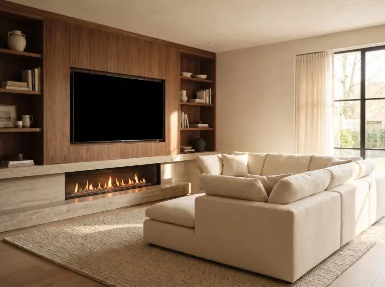
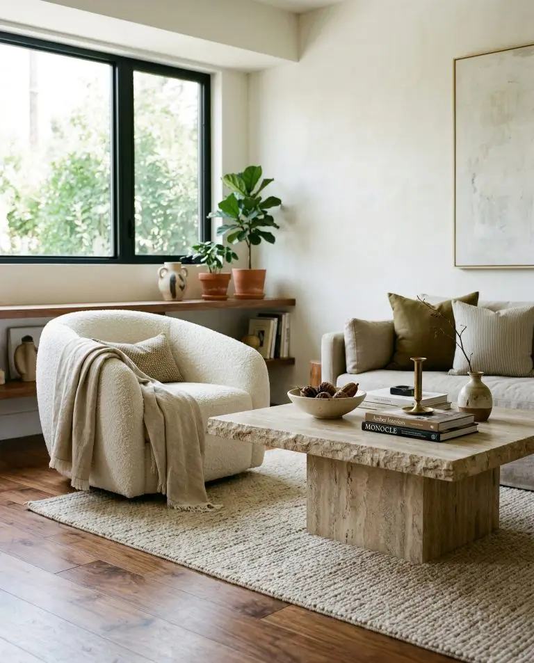
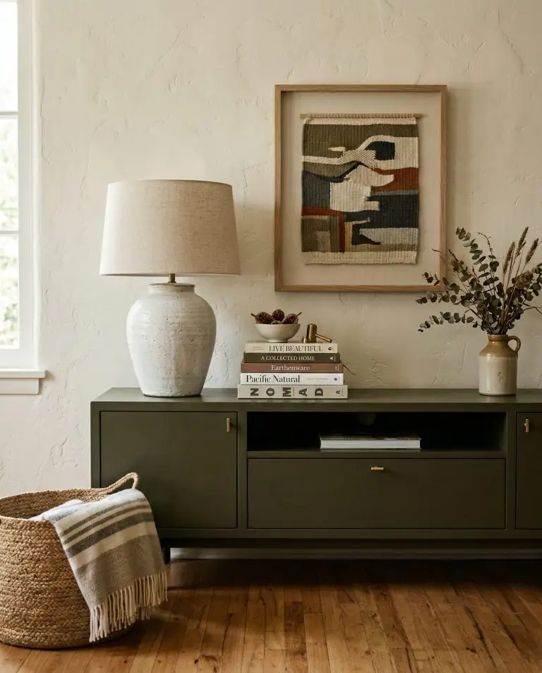
When a living room suffers from the “sauna effect”—an overwhelming, heavy expanse of uninterrupted timber—you must aggressively dilute the palette. Wood needs contrasting materials to highlight its organic beauty. If your space feels claustrophobic, use this quick-fix checklist to break up the monotony:
Curating the Final Mix
Mastering the art of mixing wood finishes requires bravery, an understanding of contrast, and strict adherence to mathematical ratios. By identifying your anchor wood first, you give the room a defined baseline. By applying the 60/30/10 rule, you ensure every piece of furniture carries the correct visual weight. And when undertones threaten to clash, a strategically placed buffer will always save the design. Embrace the friction, layer your finishes intentionally, and build a truly collected home. Once you have executed these formulas, tag Hackrea on social media to share your transformed living space.

The Hackrea Style Desk treats interior decoration as an exact visual science. Rather than focusing on demolition or floor plans, this desk masters the art of color theory, undertone matching, material pairings, and spatial proportion. From balancing the visual weight of mixed metals to finding the perfect bridging tone between disparate wood species, this desk provides the rigorous aesthetic rules needed to achieve high-end, editorial-quality harmony in any space.