15 Colors That Go With Black and Gold: The Ultimate Interior Design Guide (2026 Edition)
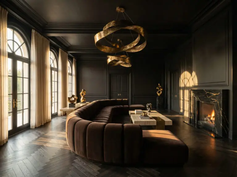
Let’s be honest: Black and Gold is the power couple of interior design. It is the tuxedo of color palettes—timeless, dramatic, and undeniably luxurious. But, like any power couple, it can sometimes feel a little intense to be around 24/7.
Without a third color to mediate, a black and gold room can risk looking too dark, too “nightclub,” or stuck in a Great Gatsby theme party from 2013.
The secret to mastering this look in 2026 isn’t about adding more bling. It’s about grounding the glamour. The latest trends are shifting away from the high-gloss, stark contrasts of the past decade toward “moody organic” atmospheres. We are seeing a move toward matte finishes, tactile fabrics, and colors that bring warmth and earthiness to the sharp edge of black and gold.
Whether you are designing a moody master bedroom or a high-contrast kitchen, we have curated the 15 best colors to pair with black and gold, ranked by their relevance to this year’s hottest design movements.
The Golden Rule of 3: How to Balance the Palette
Before we dive into the colors, we need to talk about ratios. If you simply throw black, gold, and a third color into a room in equal measure, it will look chaotic. To achieve that professional “architectural digest” look, you need the 60-30-10 Rule.
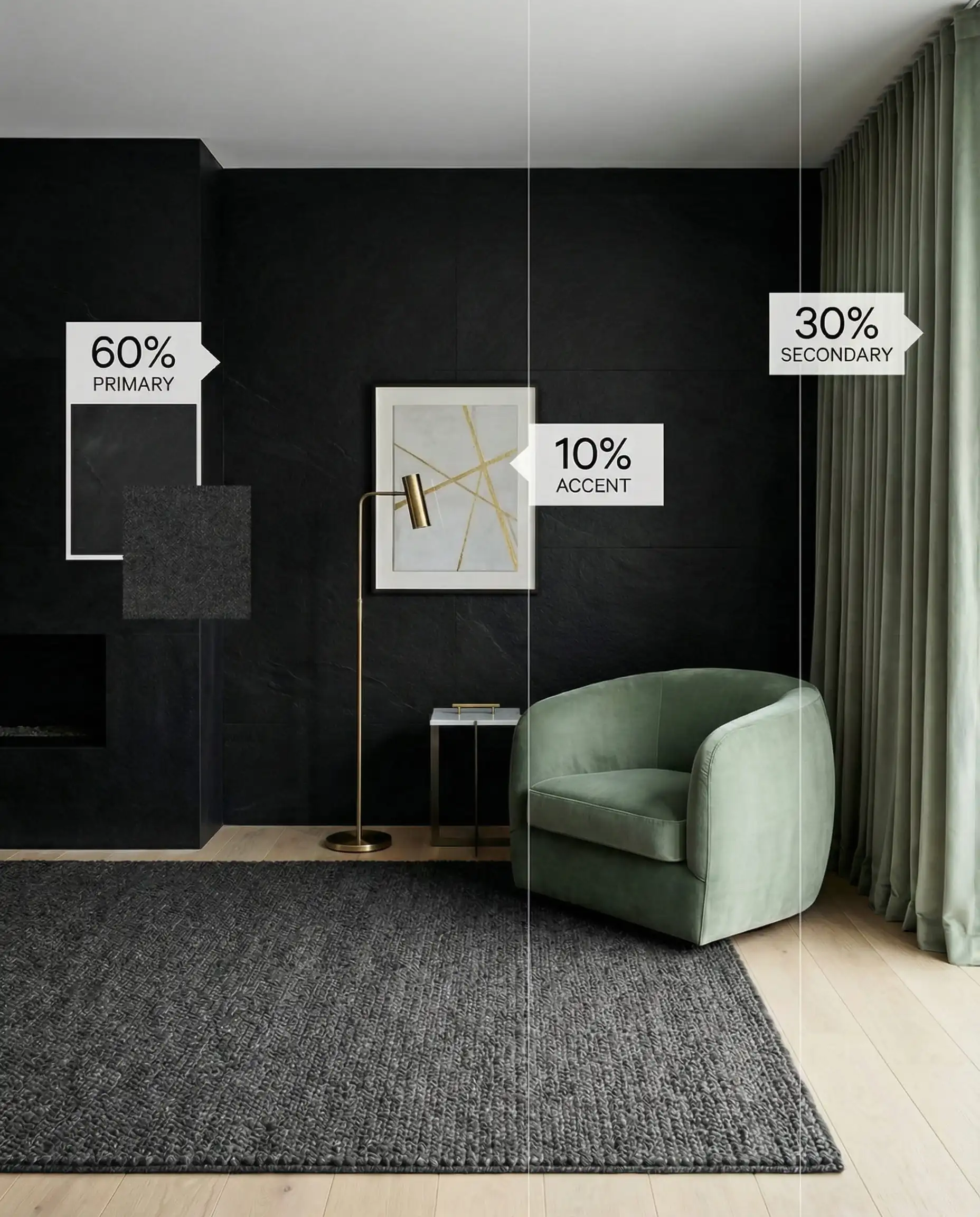
When working with black and gold, gold is almost always the 10%. A little gold goes a long way. If you make gold 30% or 60% of the room, it stops looking like an accent and starts looking like a glitter bomb. Keep the gold restricted to lighting, handles, and frames for maximum elegance.
🎨 Hackrea Designer Tip
The Top Trending Combinations for 2026
If you want your space to look current, these are the colors dominating the design fairs in Milan and Paris this year. We are seeing a massive shift toward “warm depth.”
1. Chocolate Brown & Mocha
The Vibe: Moody, Warm, Sophisticated.
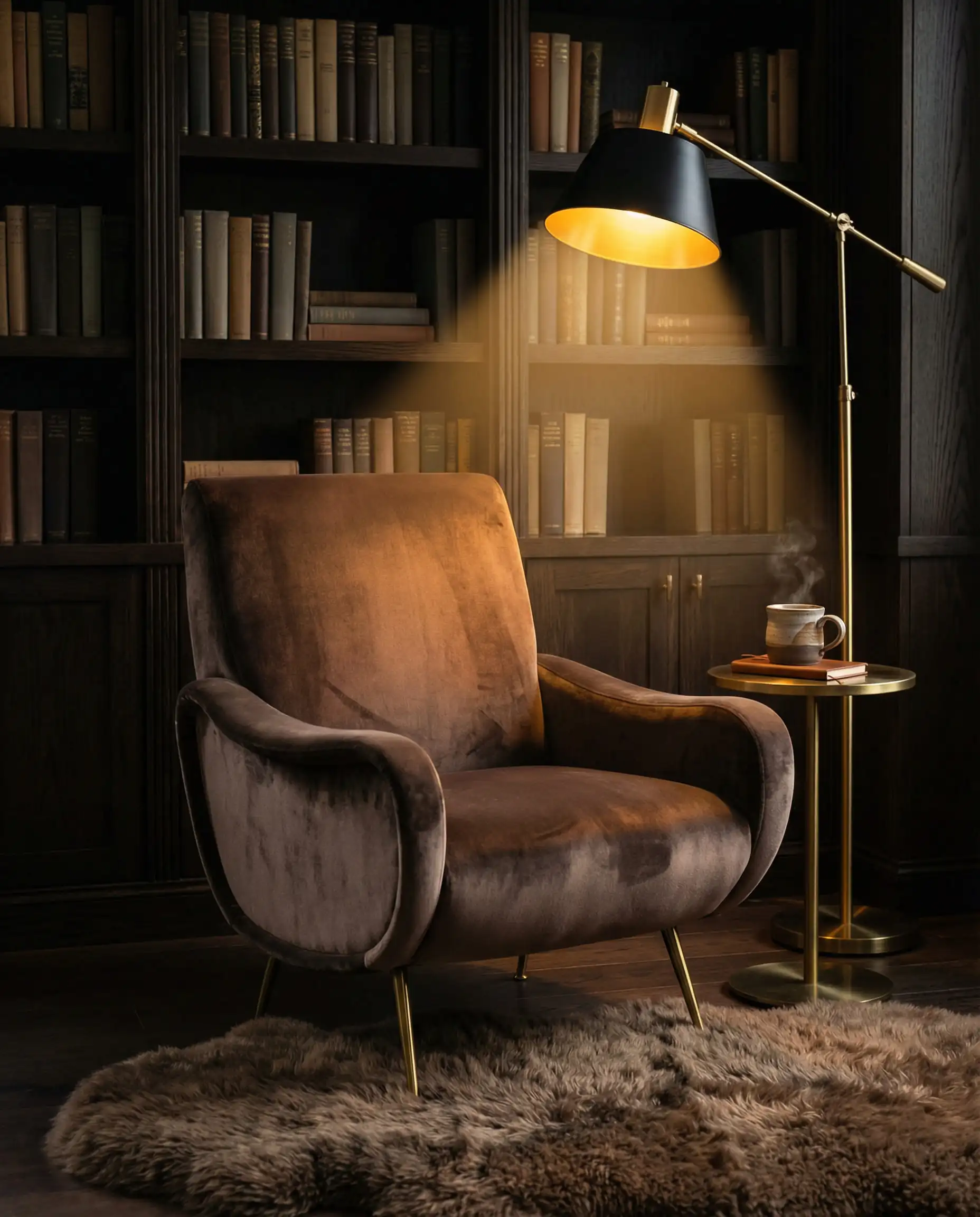
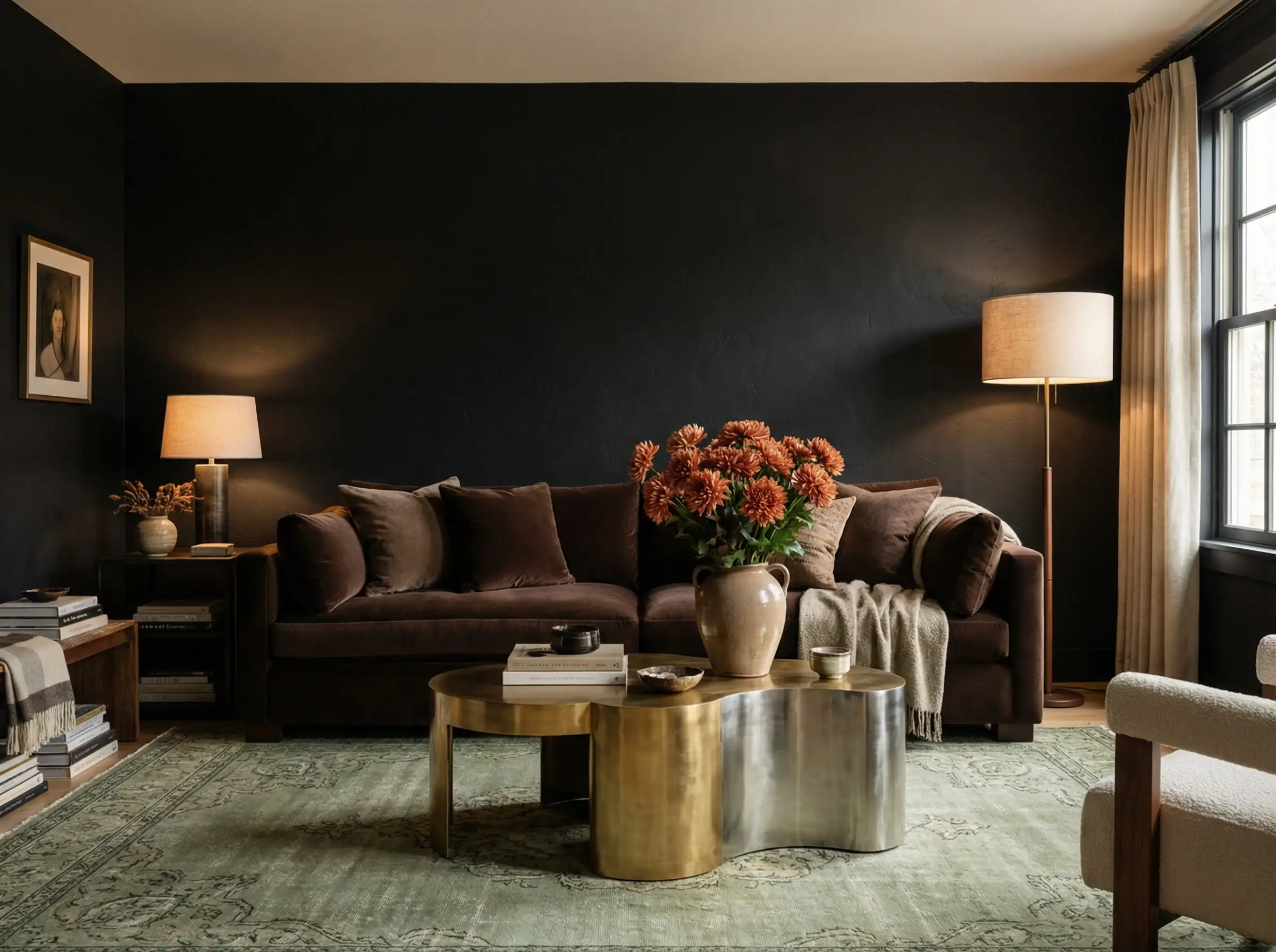
If there is one color defining 2026, it is Brown. For years, we were told to never mix black and brown. Those days are over. Deep, rich chocolate brown or a lighter warm mocha softens the harshness of black without losing that dark, moody aesthetic.
Why it works: Black absorbs light, while gold reflects it. Brown bridges the gap by adding warmth. It creates a “cocooning” effect that is perfect for spaces where you want to relax. Think of a black marble coffee table, a caramel leather sofa, and brushed gold lighting.
Styling Idea: Use a matte black wall paint, but layer it with a walnut wood console and chocolate velvet curtains. The wood tones act as the “brown” element here, grounding the gold accents naturally.
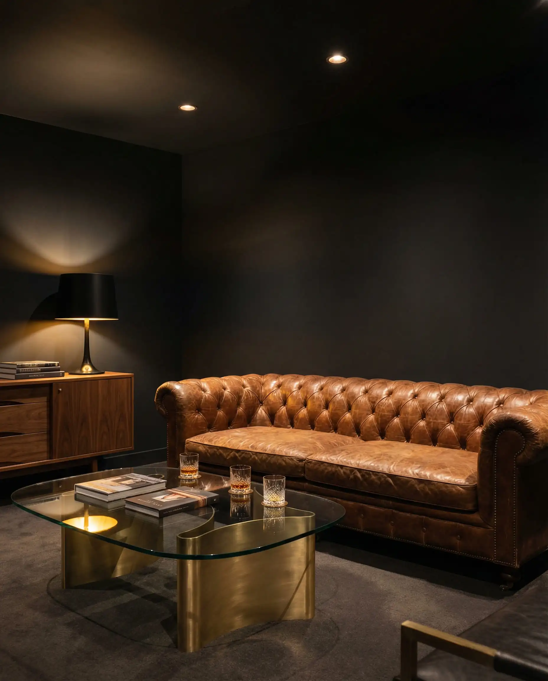
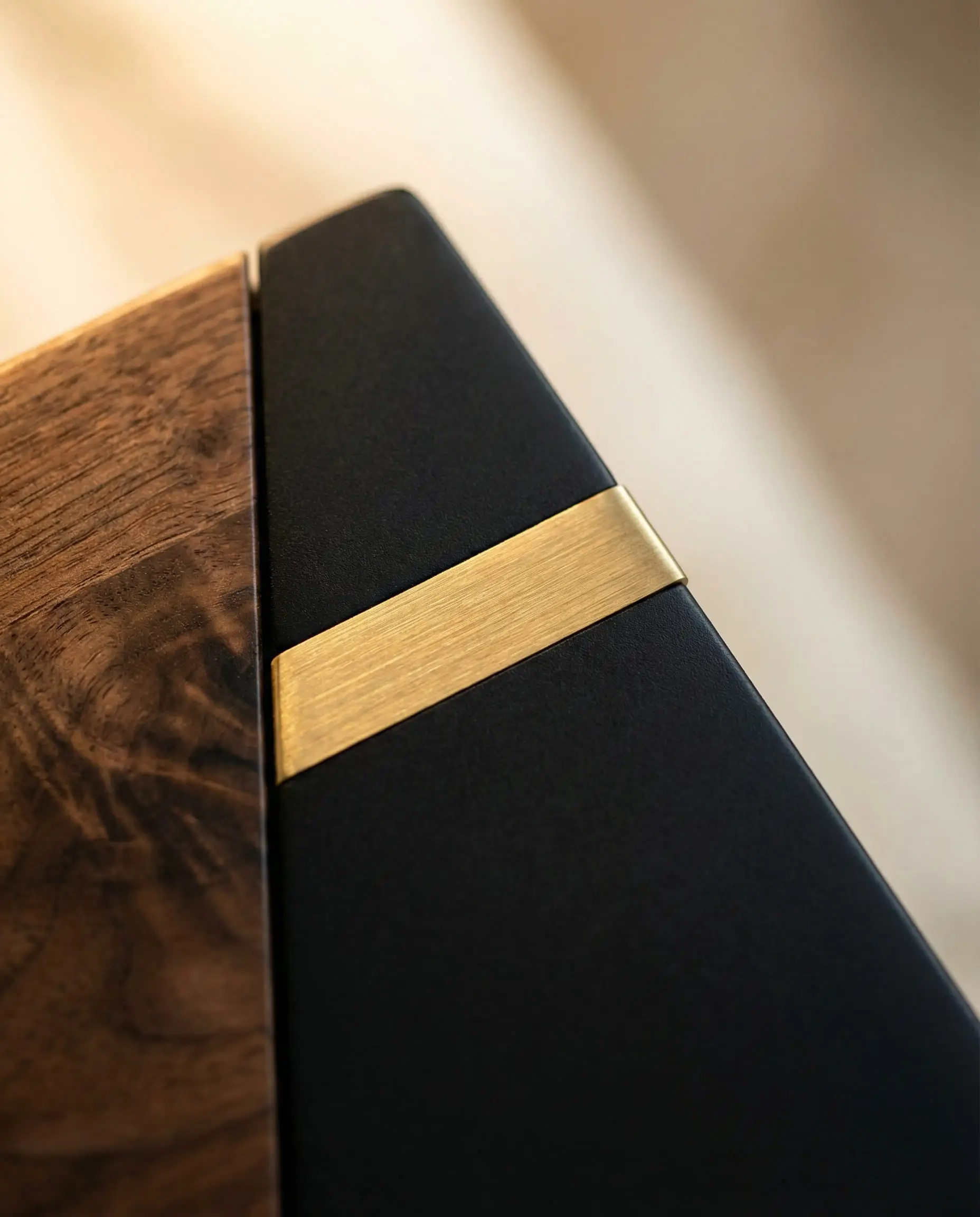
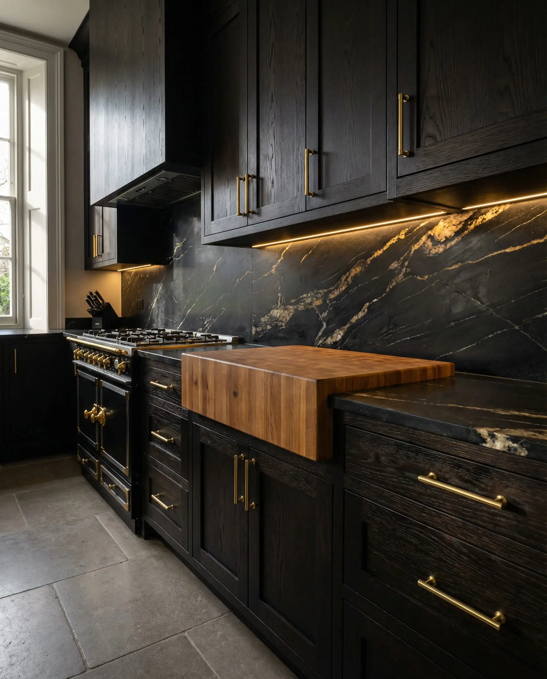
Texture is everything here. Mix leather (brown), metal (gold), and matte paint (black) to keep the room from looking flat.
🎨 Pro Tip
2. Sage & Olive Green
The Vibe: Organic Modern, Calming.
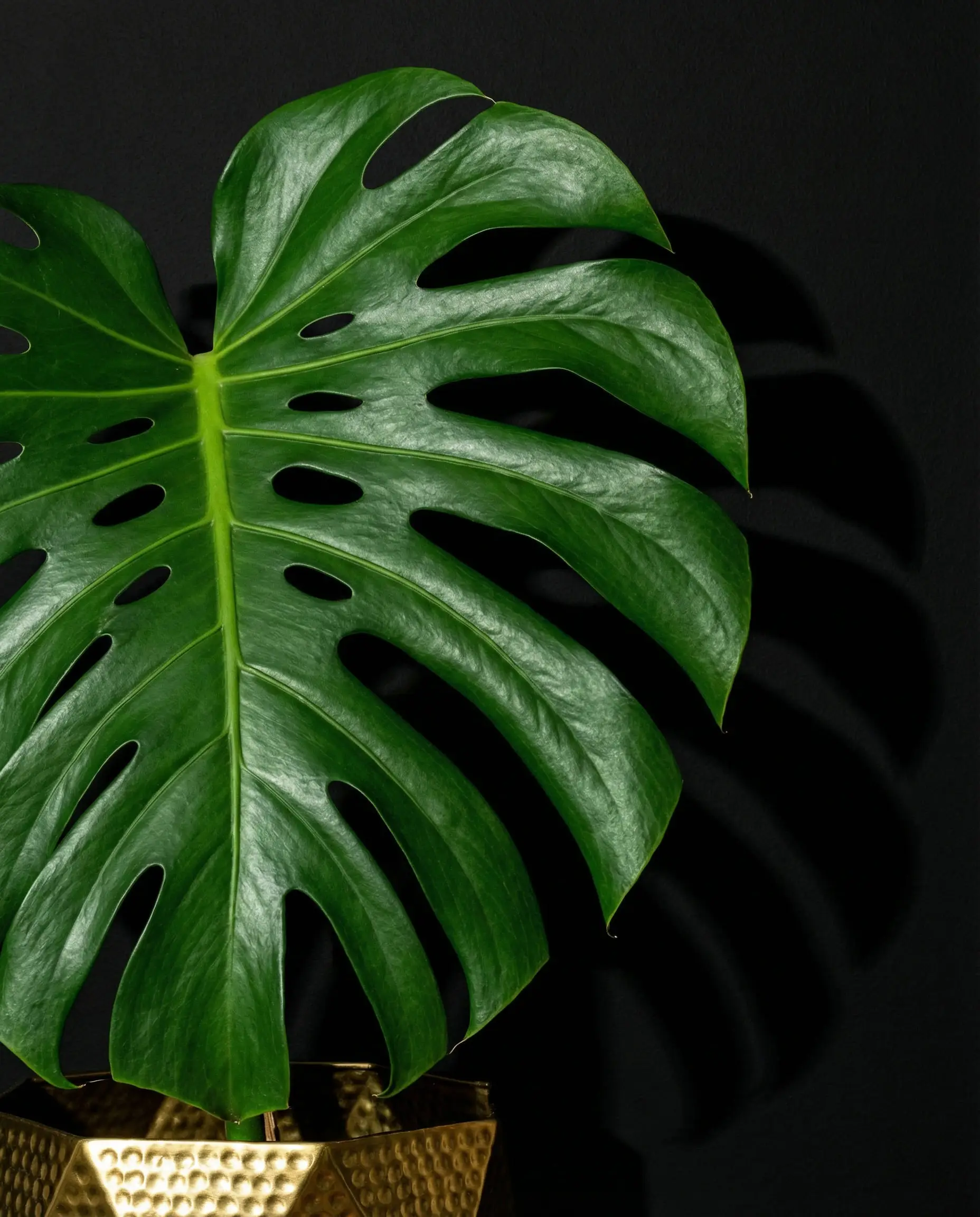
While emerald green has been the go-to for years, 2026 is favoring softer, earthier greens like Sage and Olive. This combination leans into the “Biophilic” design trend—bringing the outdoors in.
Why it works: Black is industrial; Sage is natural. When you combine them, you get a look that feels modern but not sterile. The gold adds a touch of sunlight to the earthy mix. This trio works exceptionally well in kitchens and bathrooms.
Styling Idea: Imagine matte black lower cabinets, a white countertop, and sage green tiles for the backsplash, finished with brushed gold faucets. It is fresh, organic, and incredibly chic.
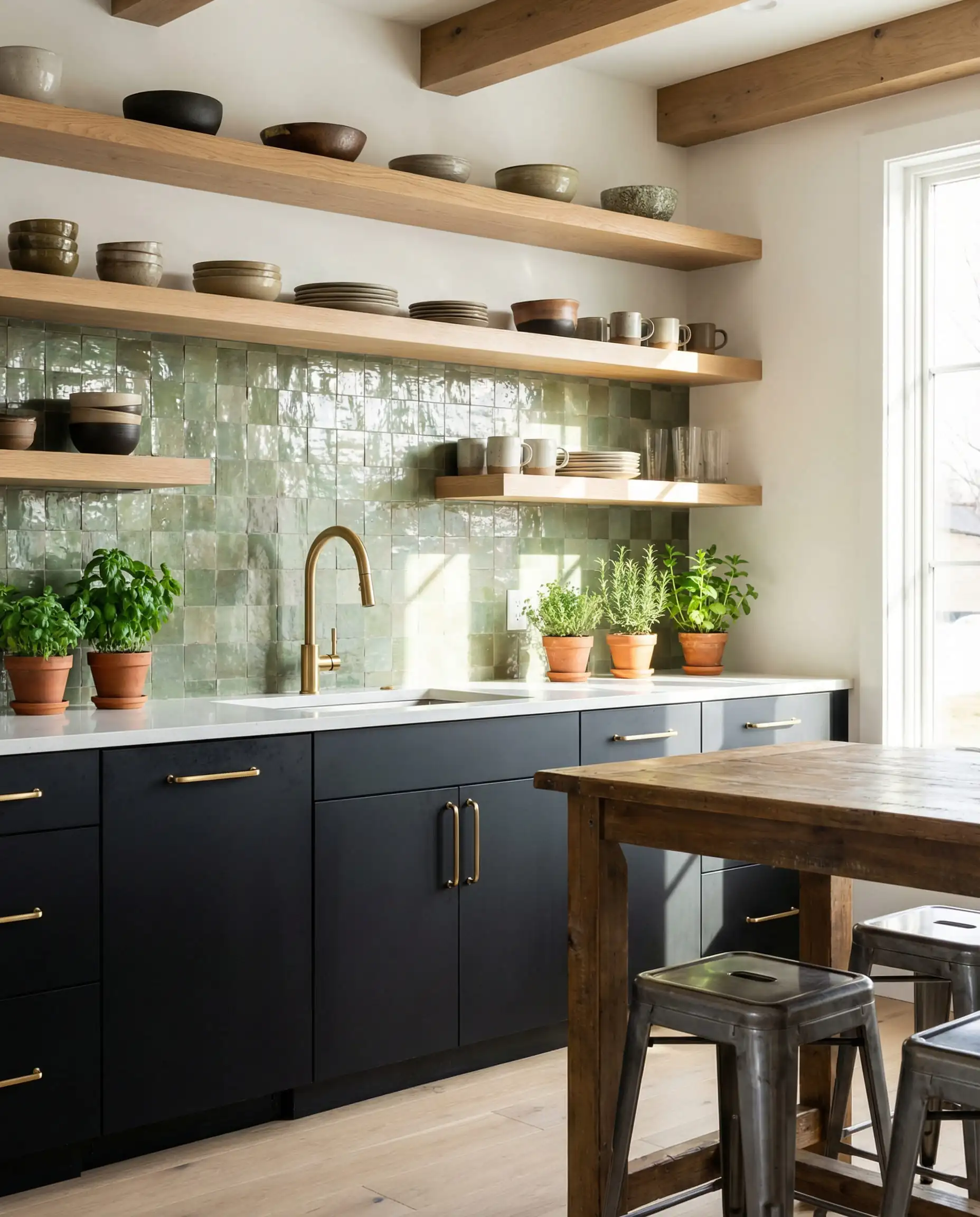
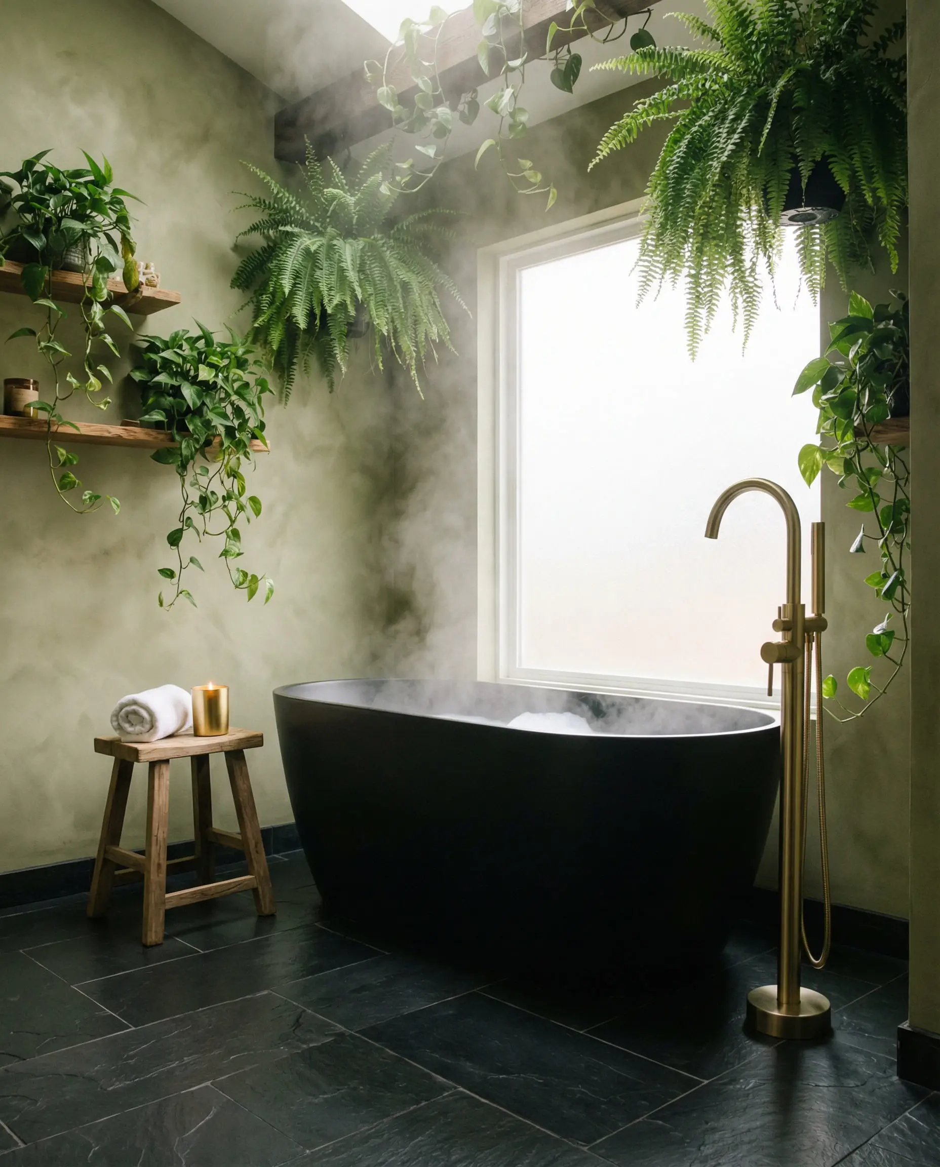
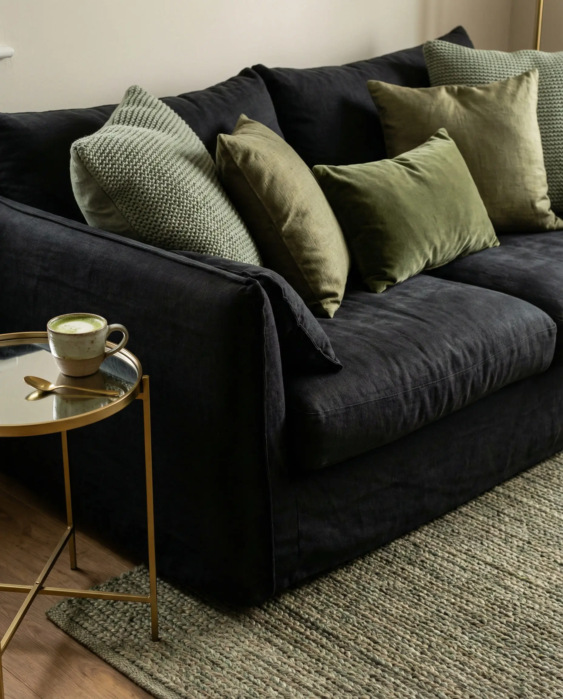
(If you are looking for more inspiration on modern styling that incorporates these natural vibes, check out our guide on contemporary style interior design).
3. Terracotta & Burnt Orange
The Vibe: Earthy, Mediterranean, Spicy.
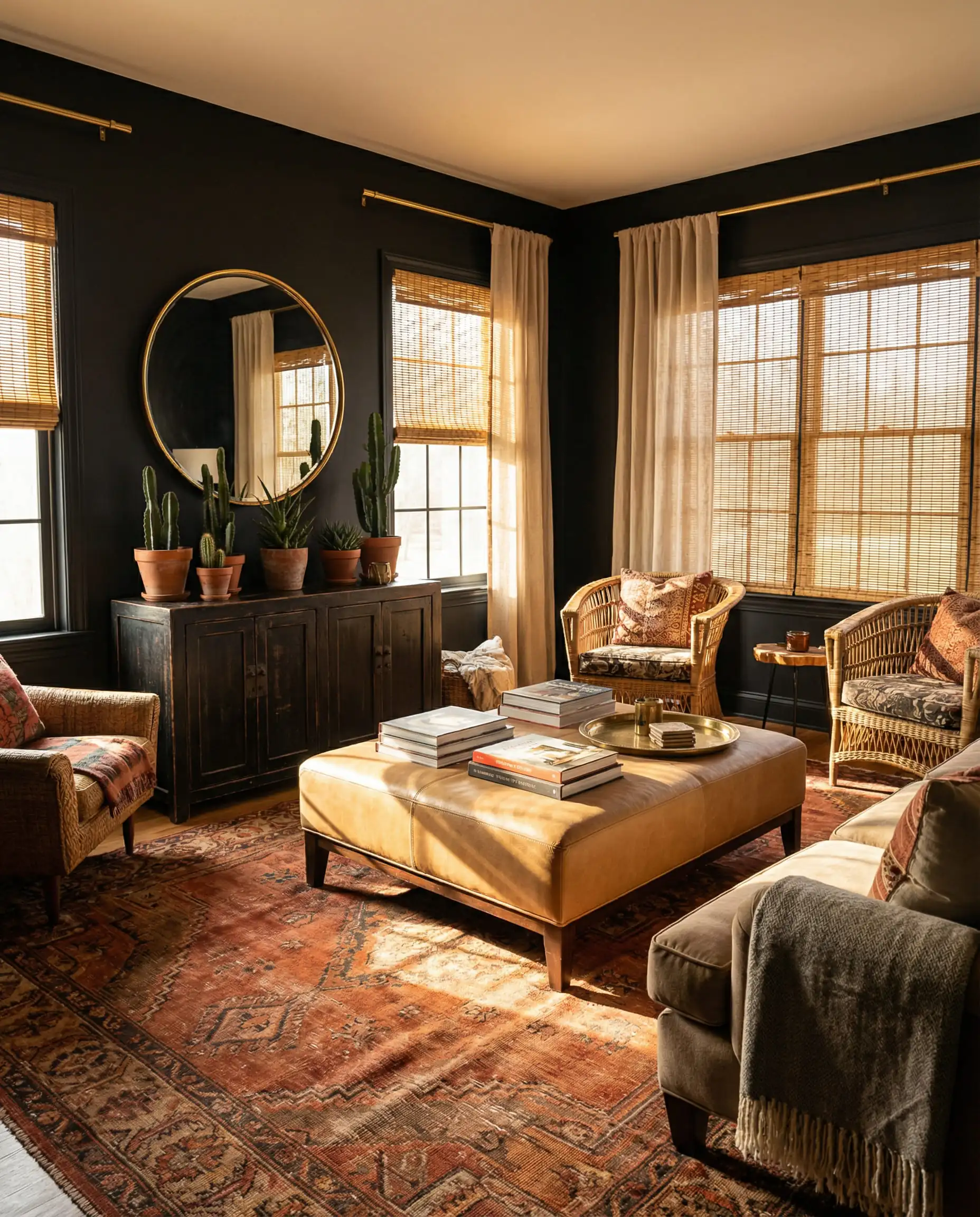
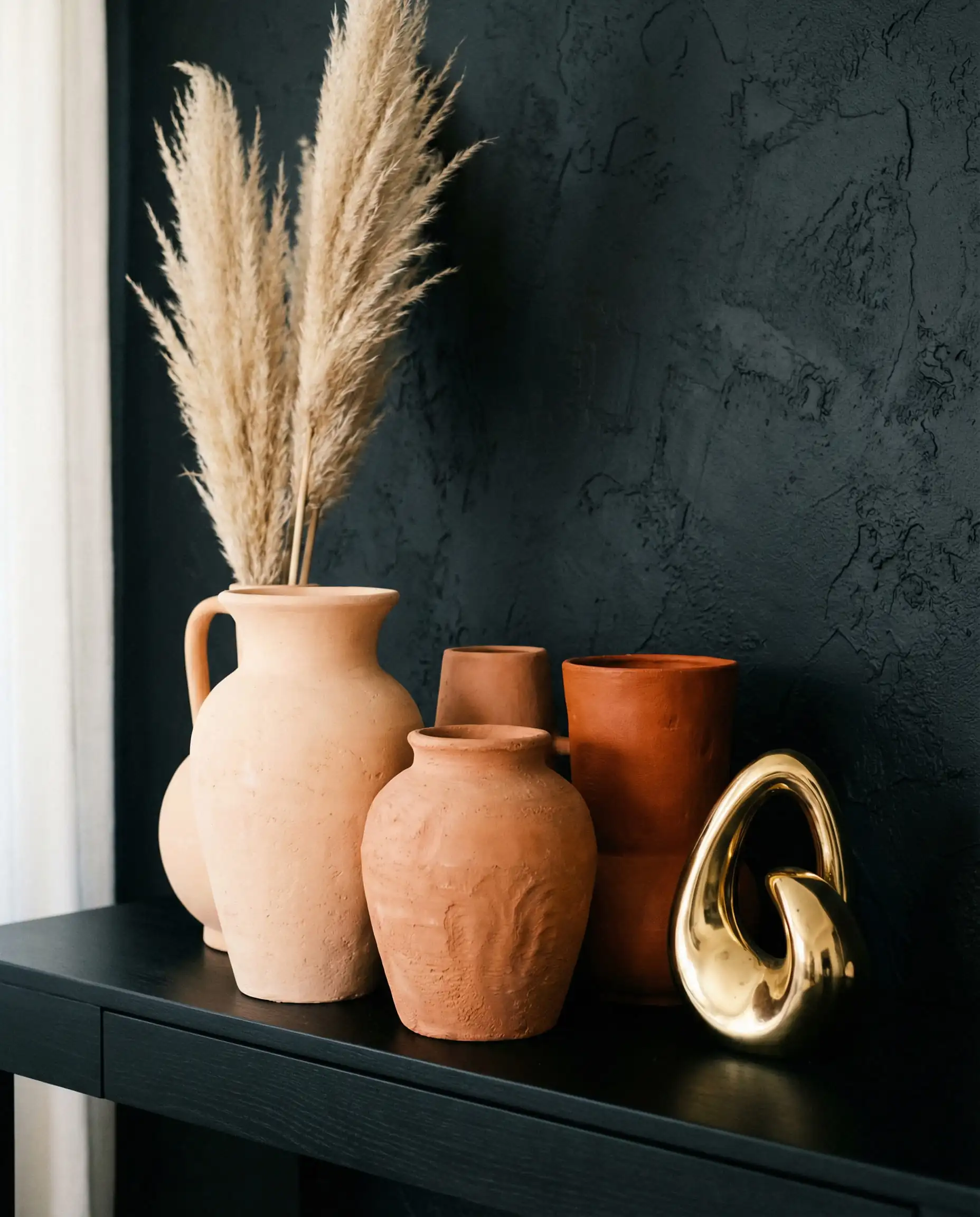
Terracotta brings a rustic, baked-earth feel that contrasts beautifully with the sleekness of black and the shine of gold. This is for the bold decorator who wants a space that feels traveled and cultured.
Why it works: Orange and blue are complementary colors, but Orange and Black is high contrast. By using a “burnt” orange or terracotta, you avoid the Halloween look and instead channel a sunset over a desert. The gold picks up the warm yellow undertones in the terracotta.
Best For: Textiles. A terracotta Persian rug or throw pillows on a black charcoal sofa looks stunning.
4. Silver & Chrome (Yes, Mixed Metals!)
The Vibe: Futuristic, Edgy, High-Fashion.
For decades, the rule was “pick one metal and stick to it.” In 2026, the “Mixed Metals” trend is exploding. Pairing silver or chrome with gold against a black backdrop creates a dazzling, multi-dimensional look.
Why it works: It adds visual friction. If everything is gold, it can look flat. Adding chrome cools down the palette.
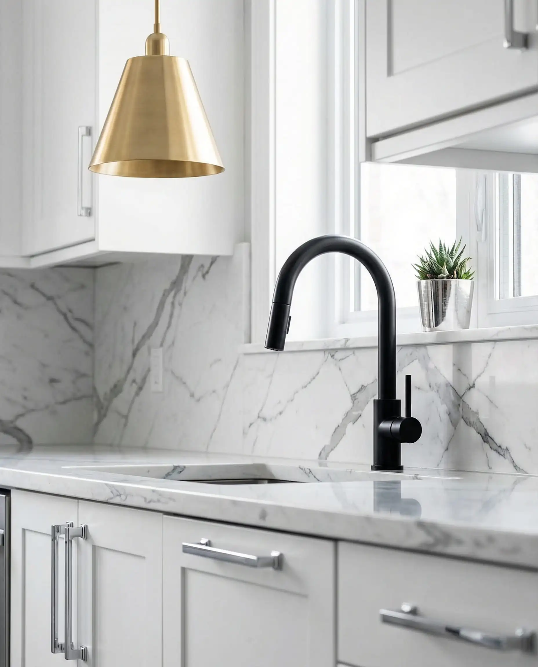
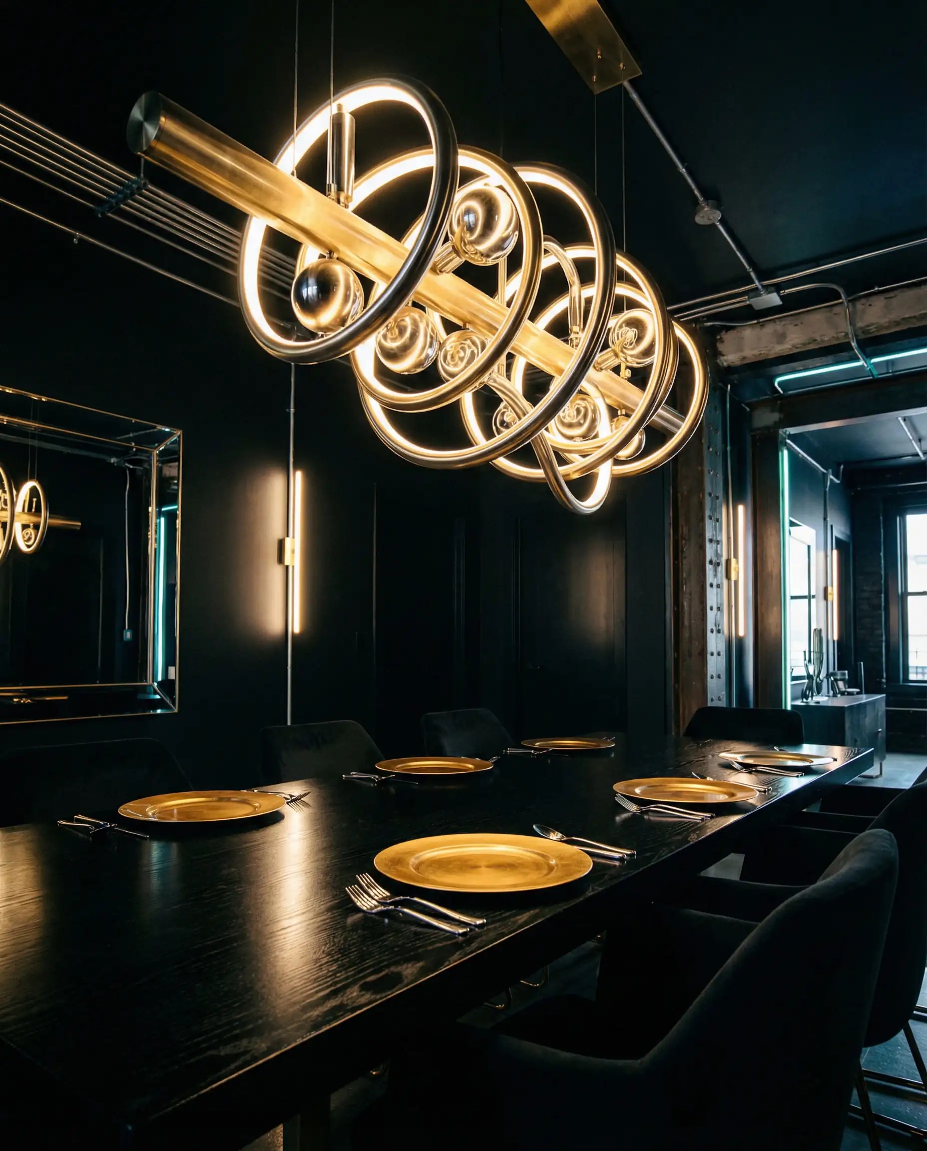
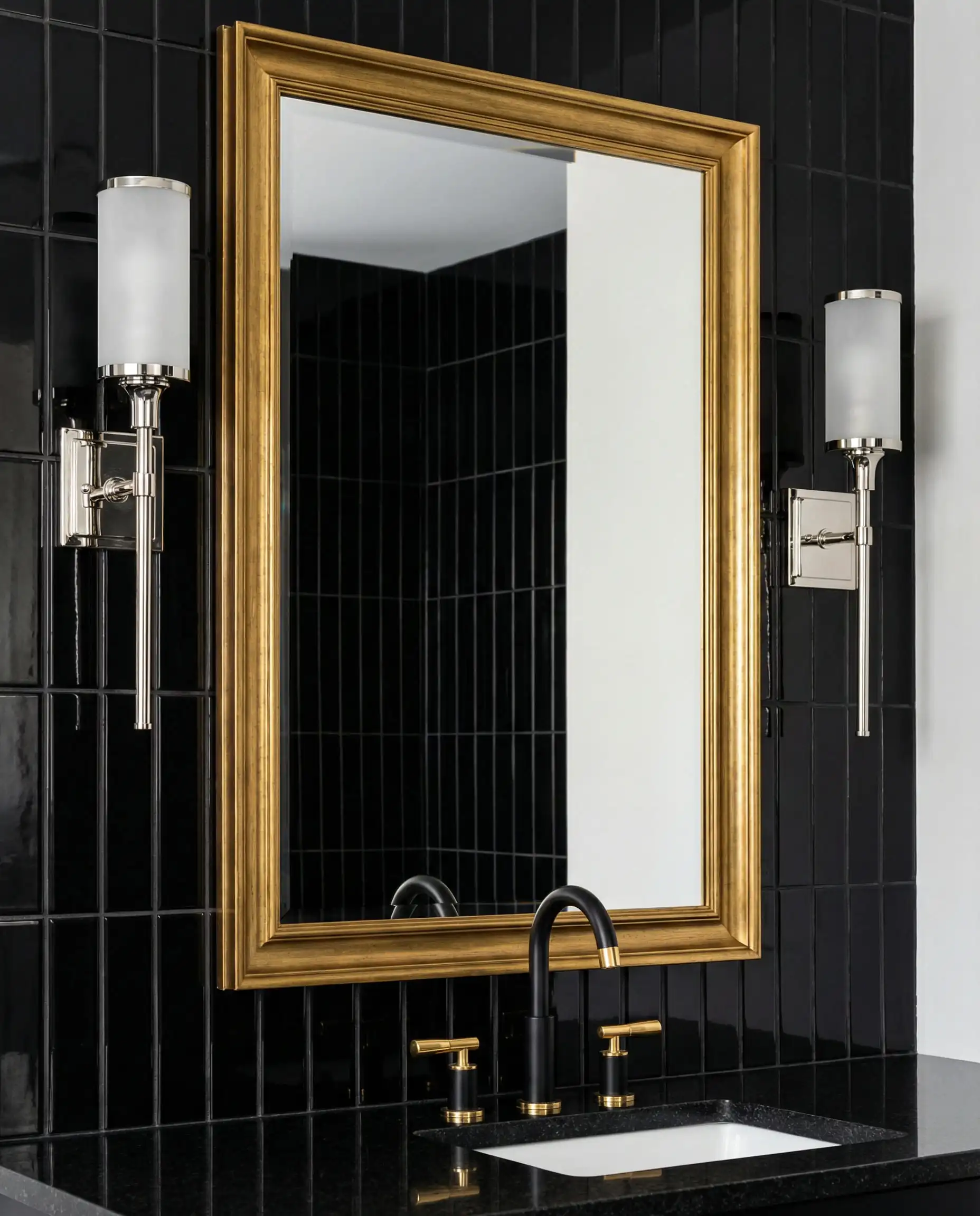
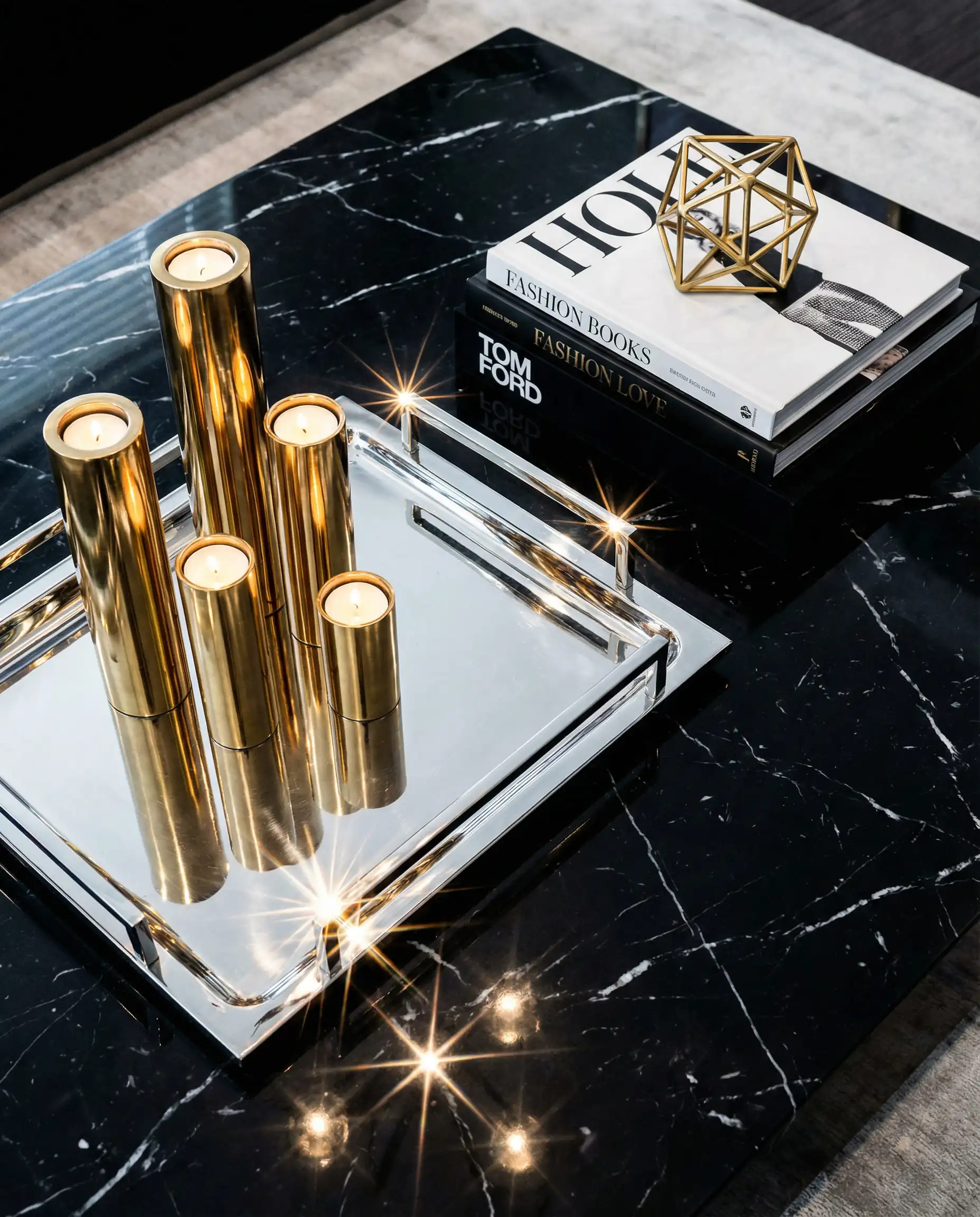
The key to mixing metals is to let one dominate. If your lighting is gold, make your cabinet pulls chrome (or vice versa). Do not do a 50/50 split. Let the black be the void that allows both metals to shine.
🎨 Hackrea Designer Tip
The “Jewel Tones” for High Glamour
If “Earthy” isn’t your thing and you want pure, unadulterated luxury, jewel tones are your best friends. These deep, saturated colors stand up to the strength of black.
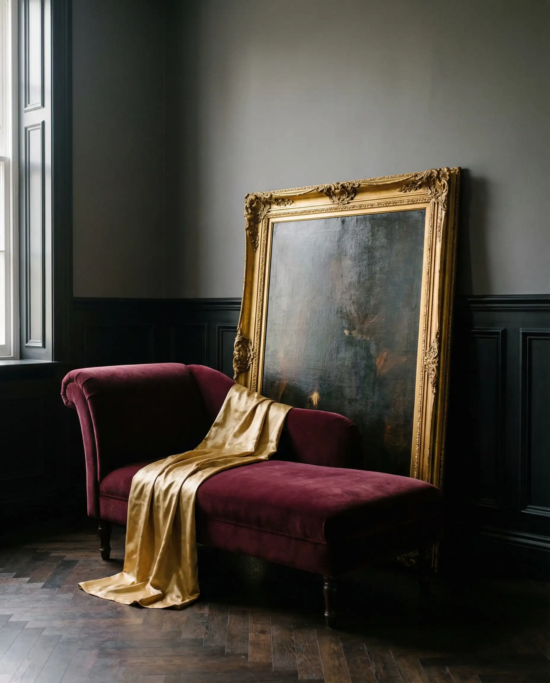
5. Burgundy & Merlot
The Vibe: Royal, Romantic, Moody.
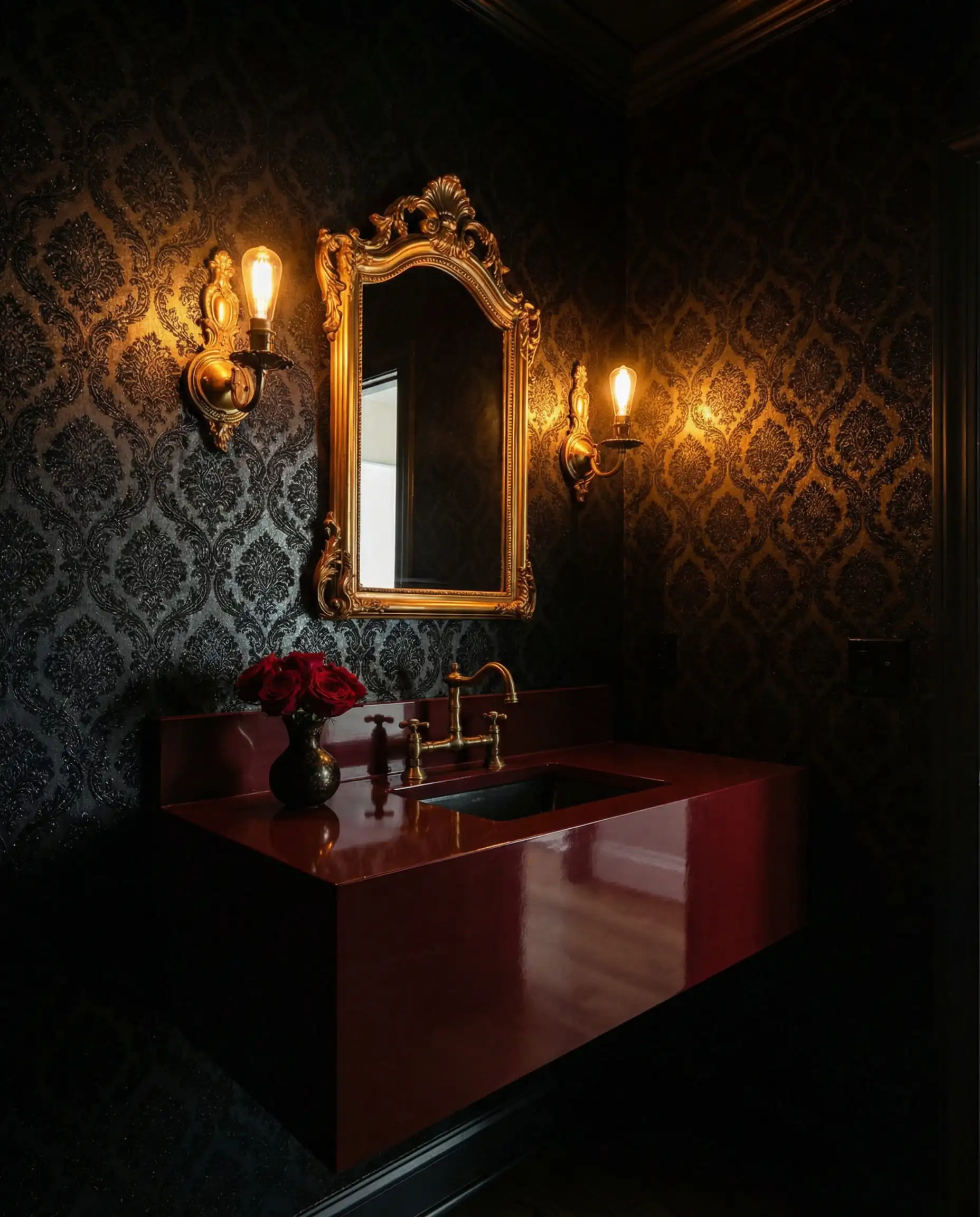
Red can be aggressive, but Burgundy is seductive. This deep wine shade is having a major moment as part of the “Old Money” aesthetic. It feels historic, like the library of an old manor house.
Styling Idea: A powder room with black wainscoting, gold wallpaper, and burgundy towels or accessories. It’s dramatic in a small space.
6. Teal & Peacock Blue
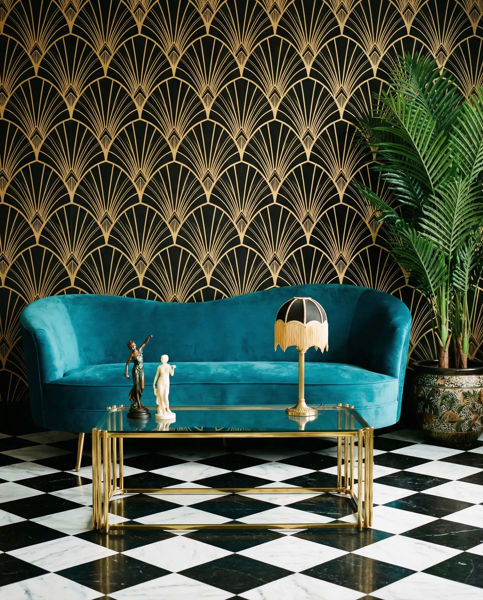
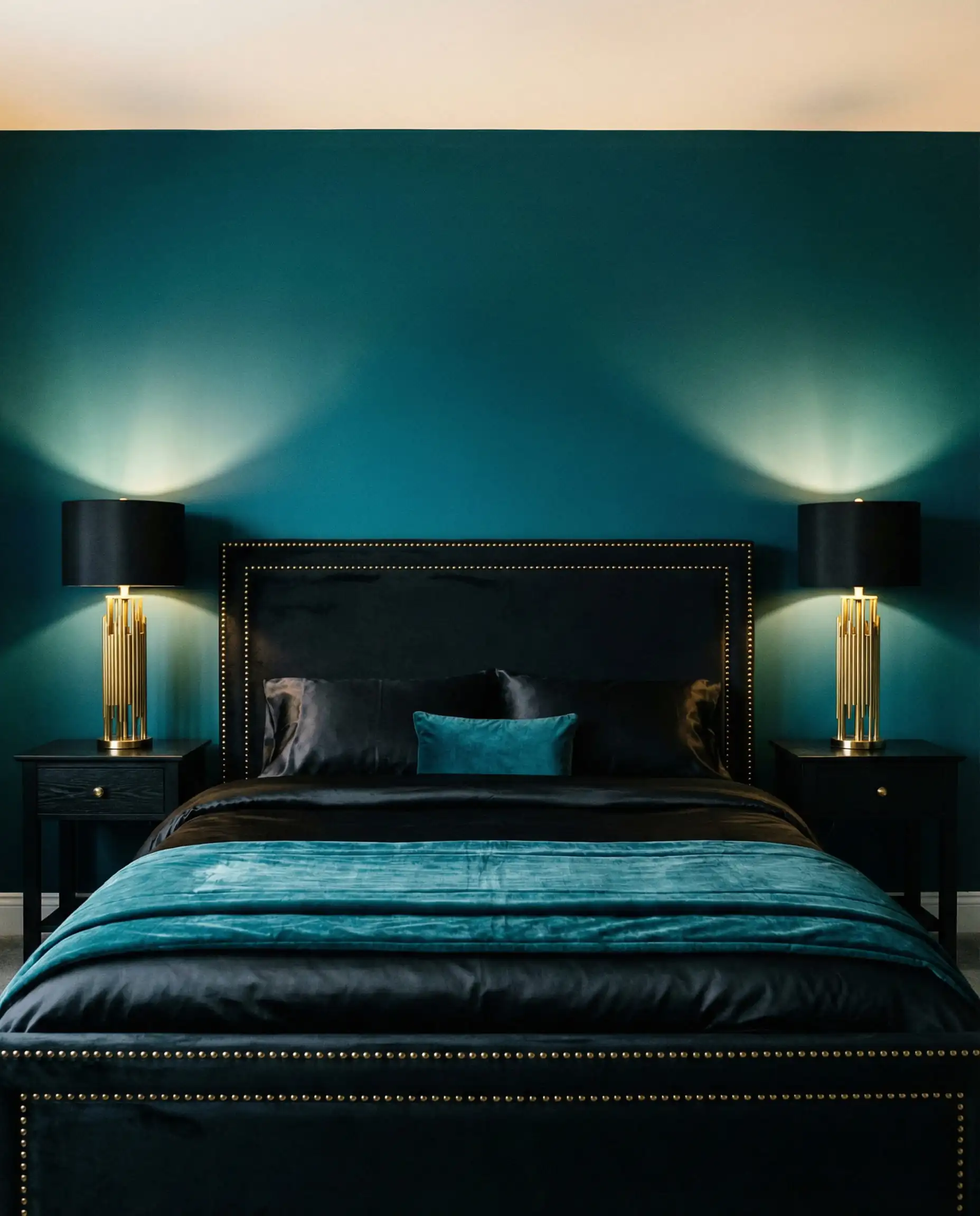
The Vibe: Art Deco, Vibrant.
Teal offers more complexity than a standard blue. It sits right on the border of green and blue, making it feel exotic. When paired with black and gold, it screams Art Deco 1920s glamour.
Why it works: Teal is a cool tone, which balances the warmth of the gold. The black acts as a frame, making the teal pop.
(Small accessories are a great way to introduce bold colors like Teal. Read our tips on interior decoration with vases to see how small touches make a big difference).
7. Emerald Green
The Vibe: Classic Glamour.
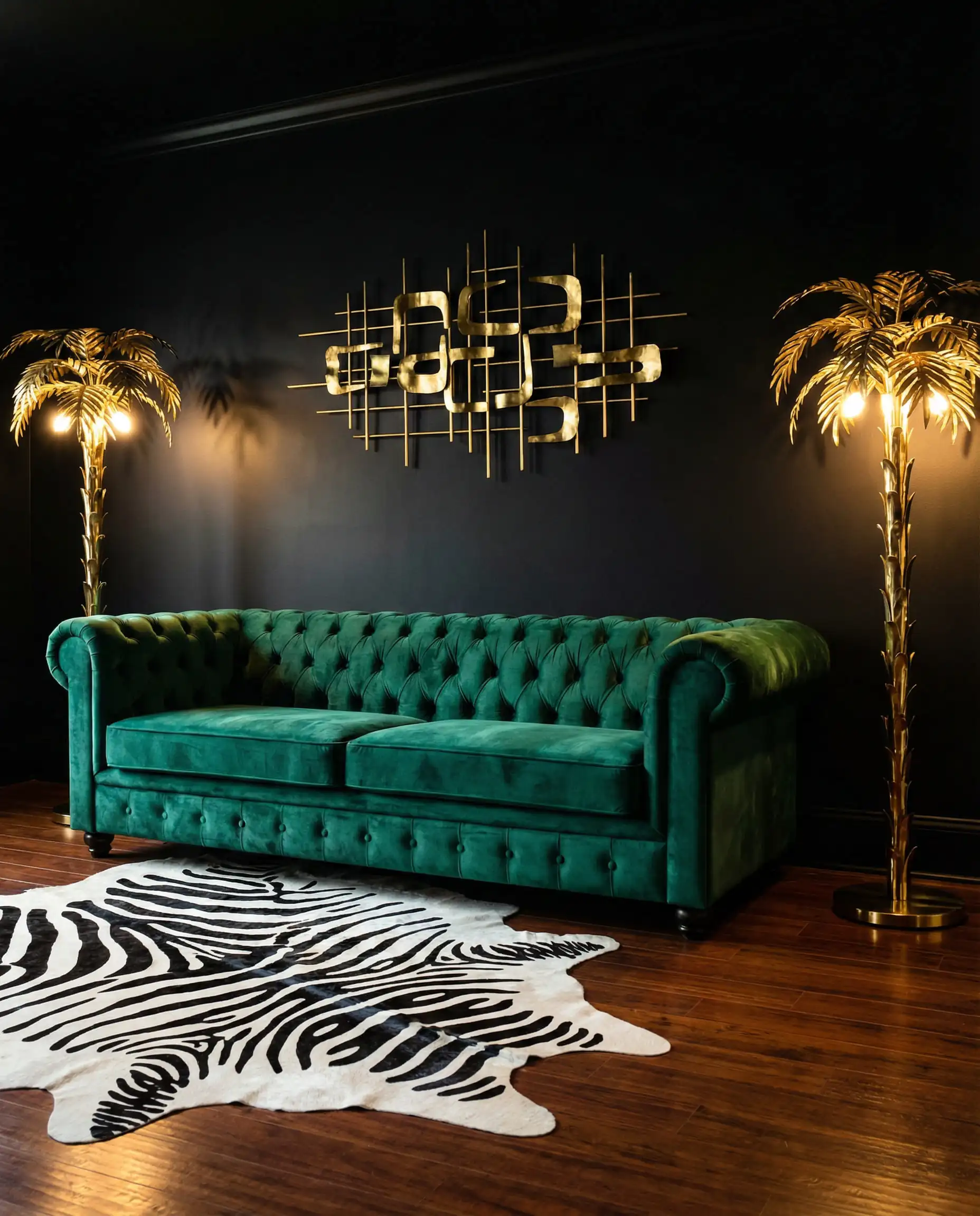
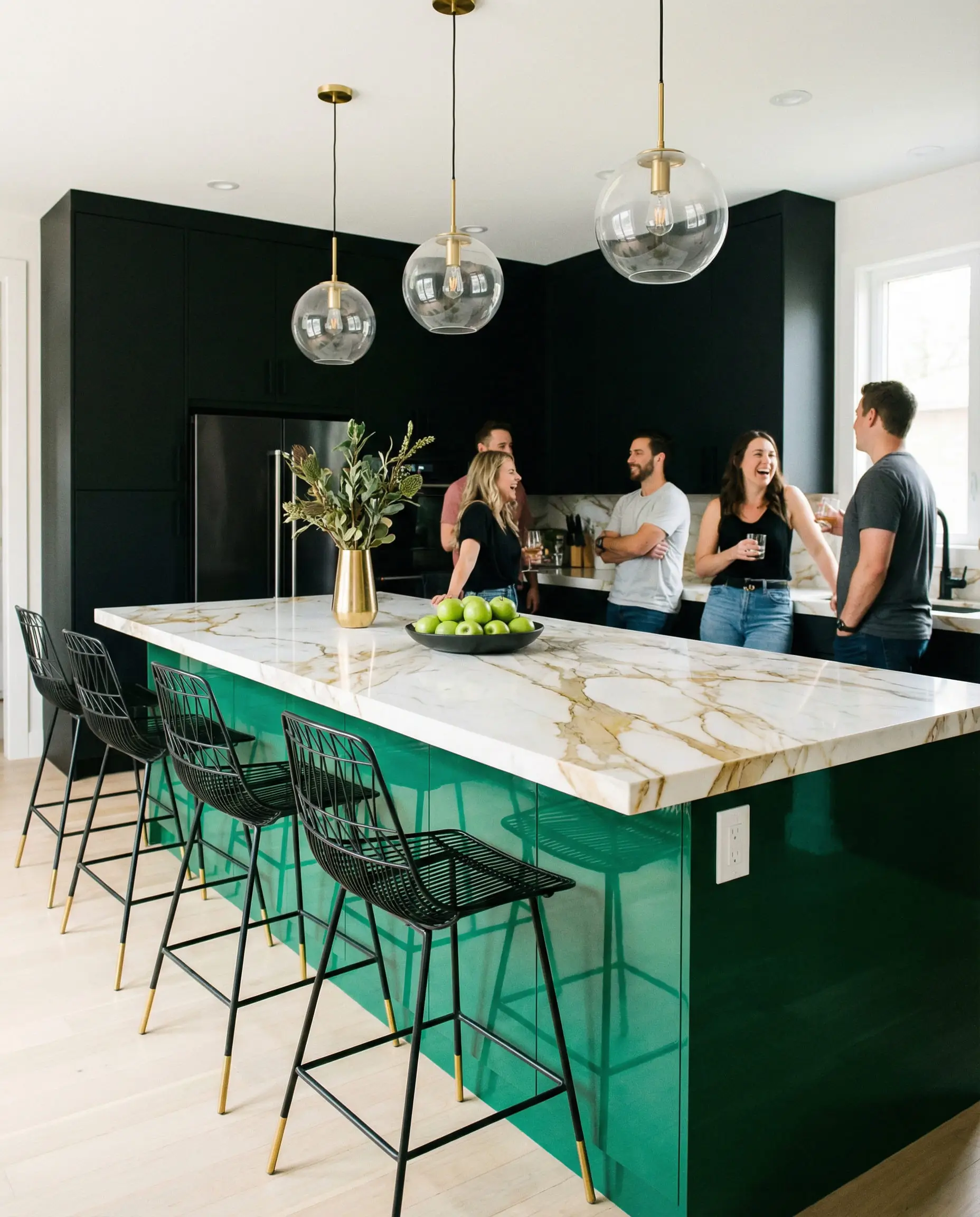
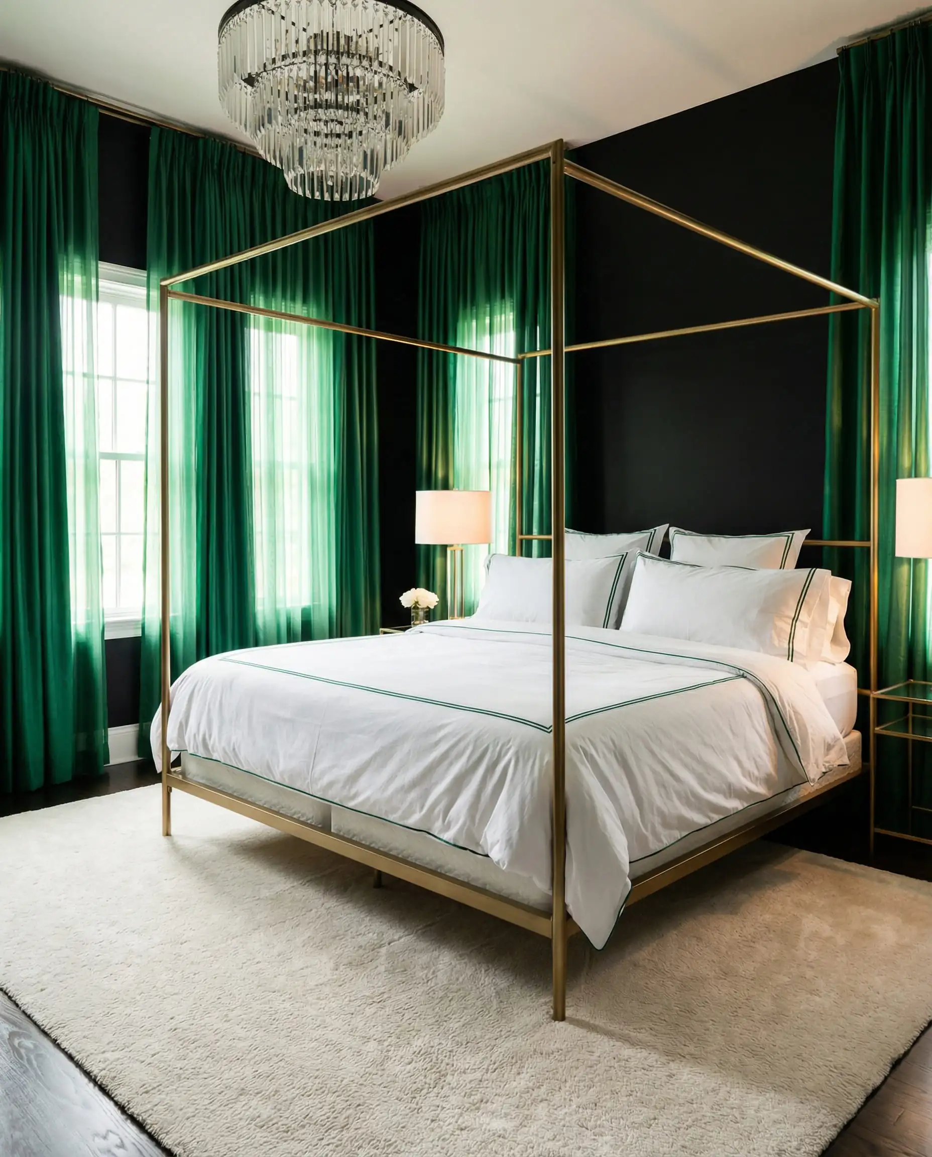
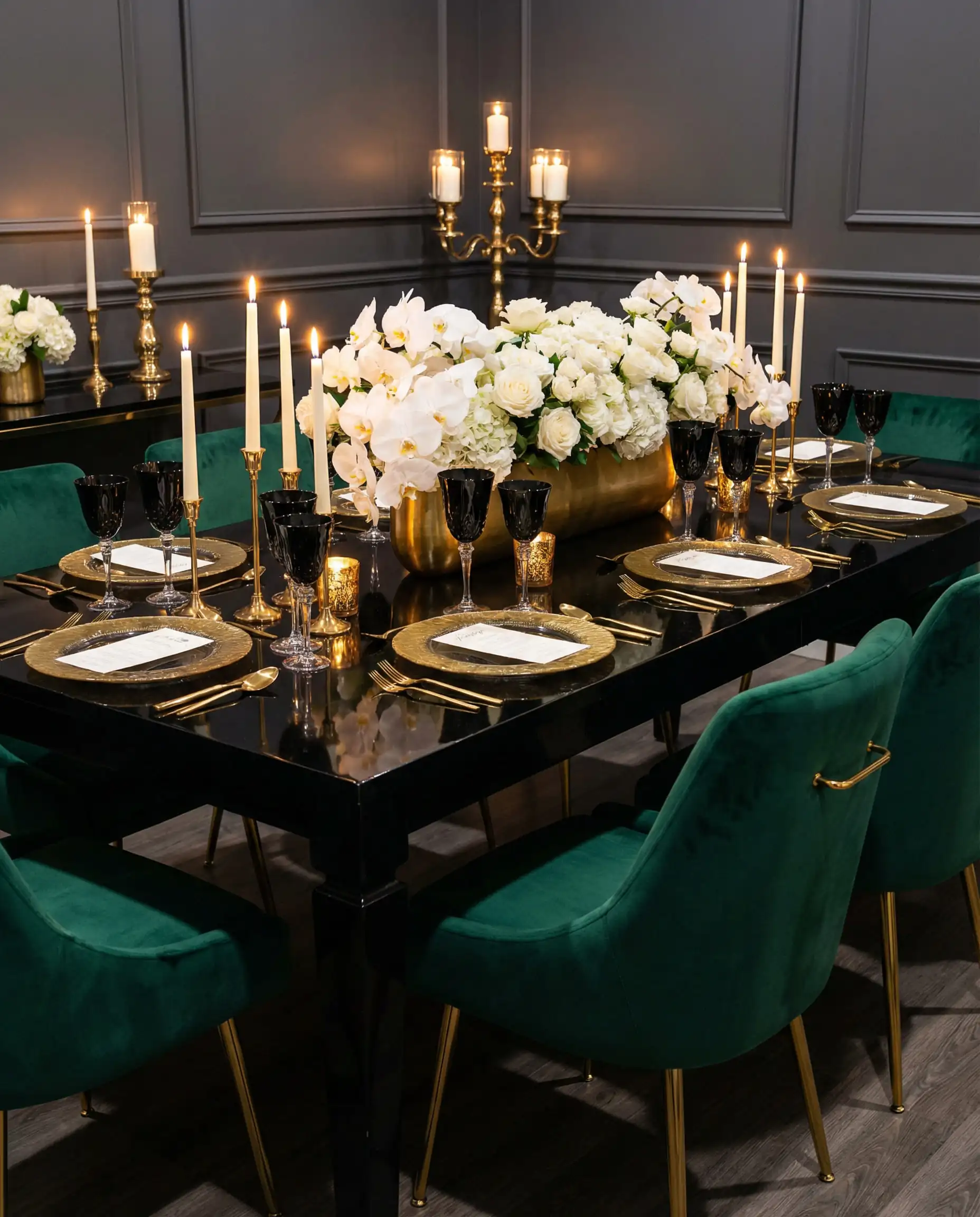
We couldn’t leave this off the list. Emerald Green, Black, and Gold is a triad that will likely never go out of style. It is the color of money, nature, and luxury all rolled into one.
Styling Idea: A green velvet sofa is the ultimate staple for this palette. Place it against a black accent wall and flank it with gold floor lamps.
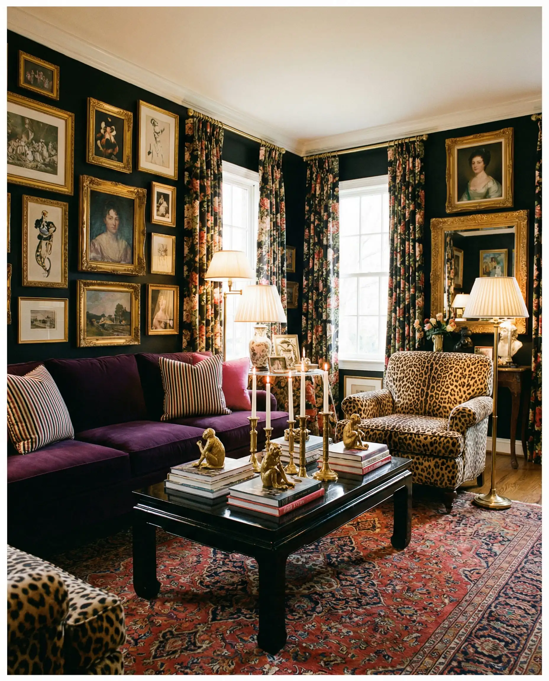
8. Deep Purple / Plum
The Vibe: Regal, Mysterious, Spiritual.
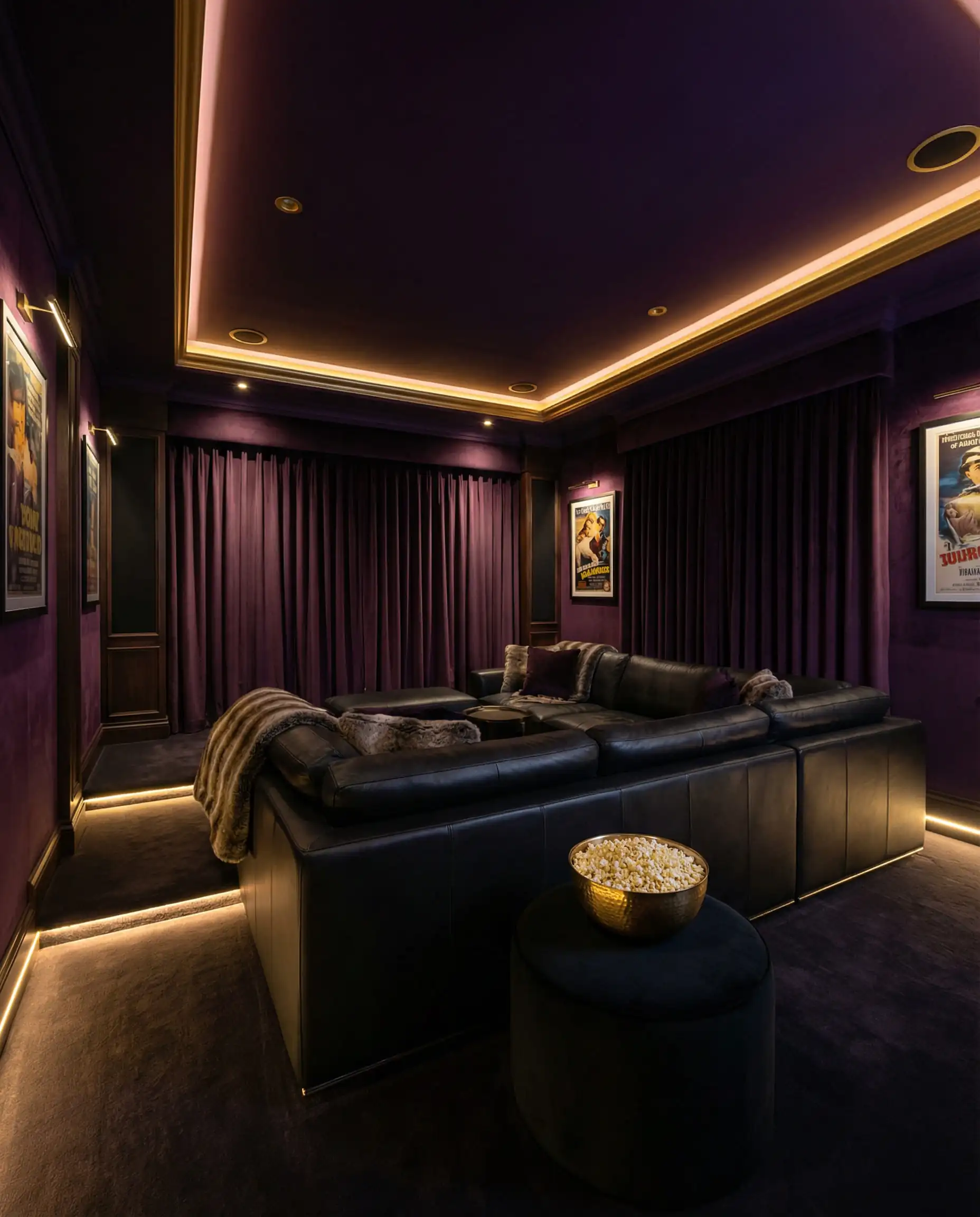
Purple is historically the color of royalty because the dye was so expensive. Today, deep Plum or Eggplant evokes a sense of mystery. It is a very heavy palette, so it requires good lighting.
Best For: A bedroom or a media room where you want total light absorption and a cozy, den-like feel.
The Modern Neutrals
Sometimes, the best color to pair with Black and Gold is a color that doesn’t fight for attention. Neutrals allow the architecture and the metallic accents to take center stage.
9. Warm Cream & Beige
The Vibe: “Soft Luxury.”
In 2026, we are choosing Cream over bright White. Bright white can feel too clinical or “hospital-like” when paired with black. Cream has yellow undertones that harmonize perfectly with gold.
Why it works: It softens the contrast. Black and White is sharp; Black and Cream is velvet.
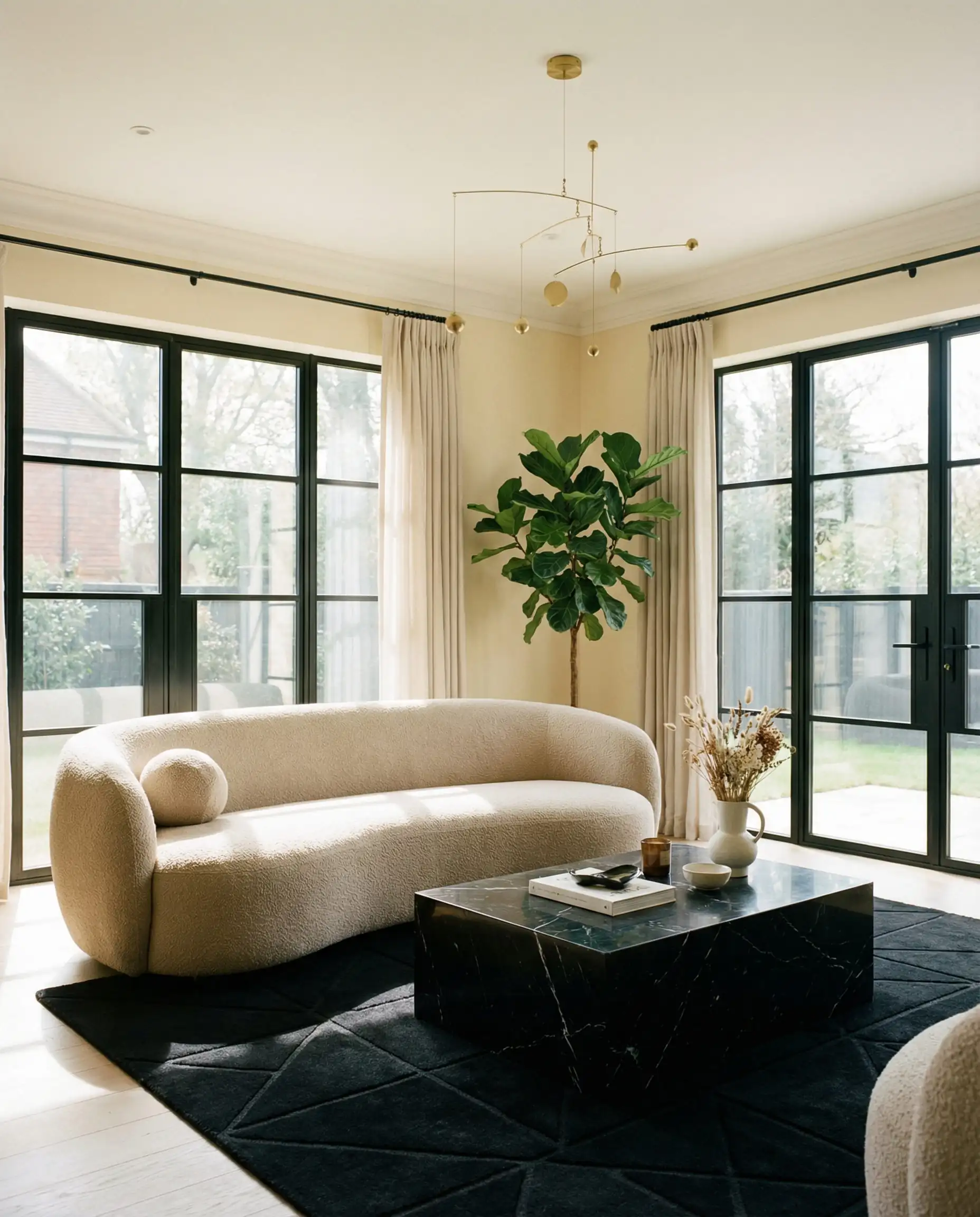
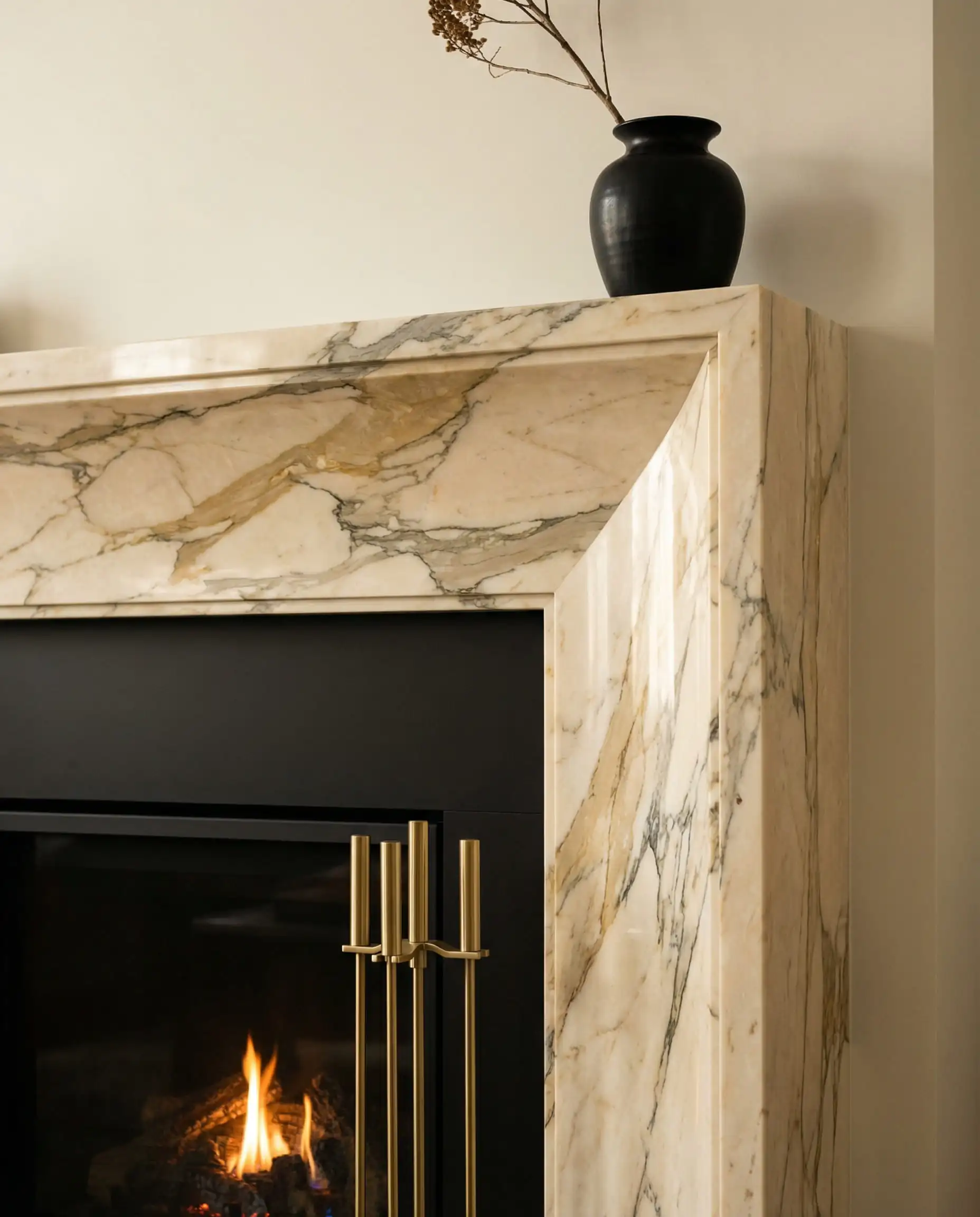
(If you are planning a kitchen renovation, this palette is a winner. See how to evolve the classic look in our article on modern white kitchen ideas).
10. Charcoal & Greige
The Vibe: Monochromatic, Masculine.
If you love the idea of an all-black room but are afraid to commit, Charcoal is your gateway drug. Mixing various shades of dark gray (Charcoal) and warm gray (Greige) adds depth to a black and gold room without introducing a “color.”
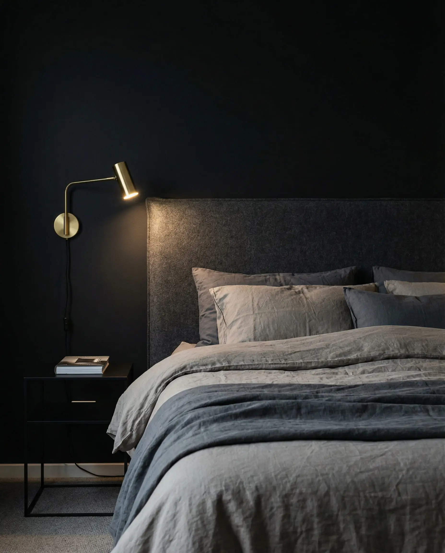
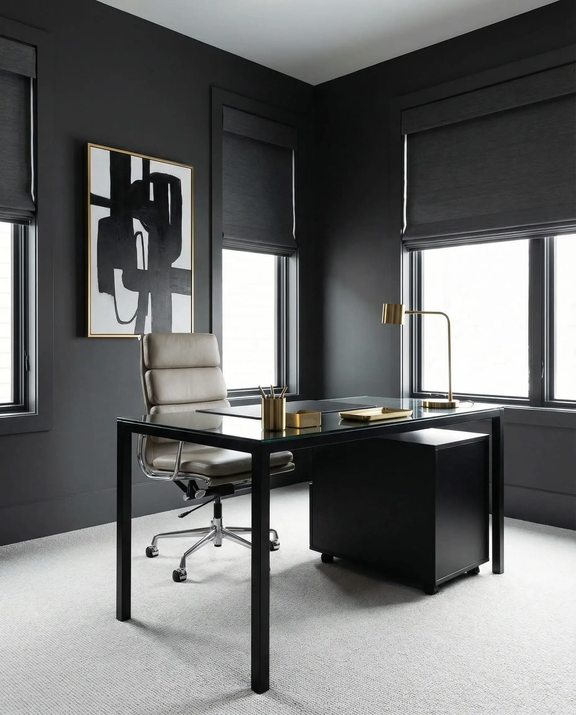
Layering is key here. A black wall, a charcoal sofa, and a light gray rug create a gradient effect that is very pleasing to the eye.
🎨 Hackrea Designer Tip
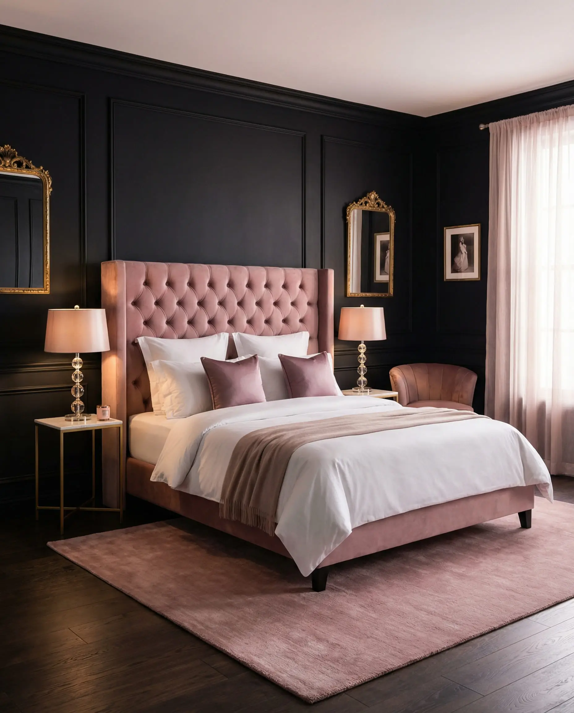
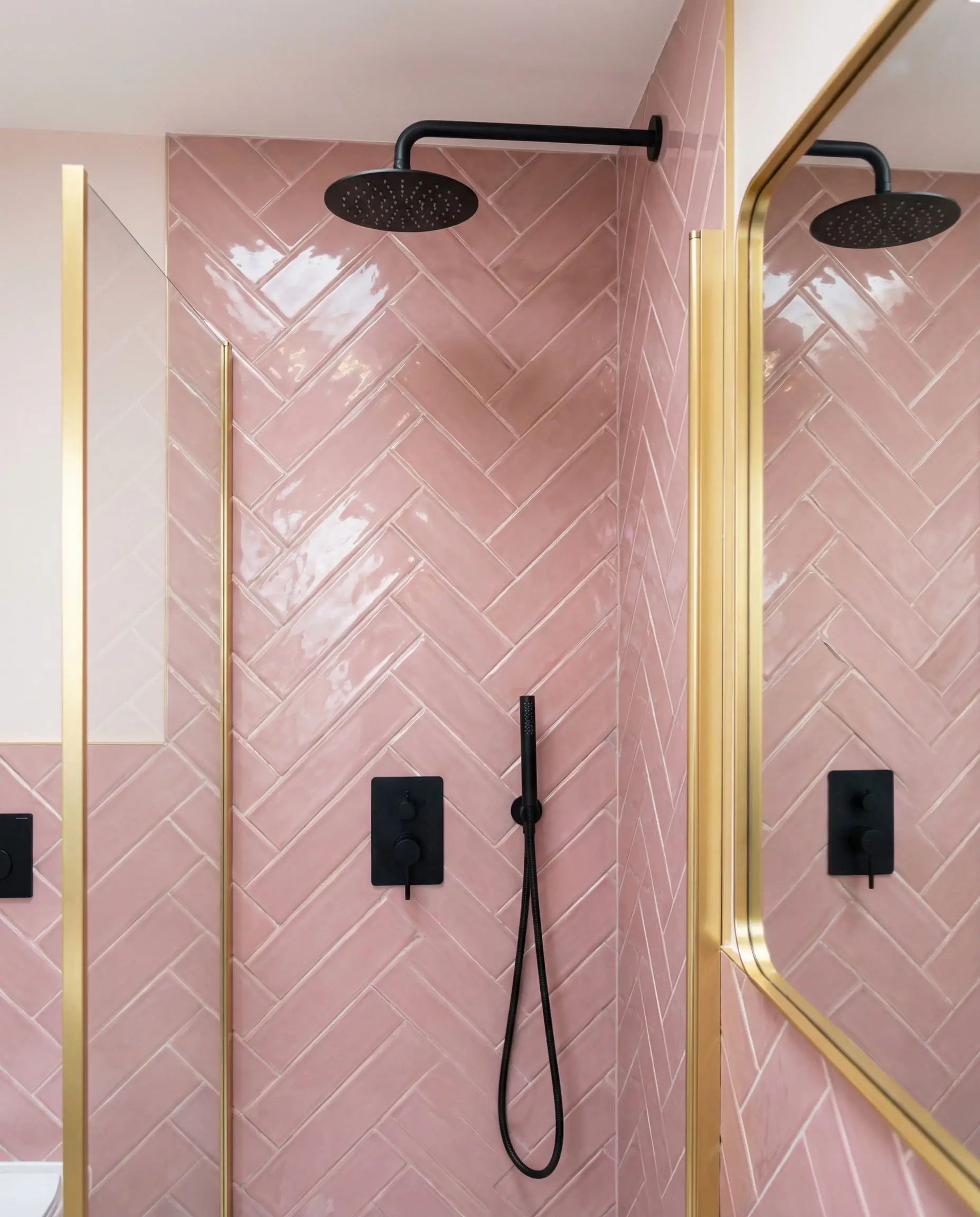
11. Dusty Pink & Mauve
The Vibe: Sophisticated Femininity.
Forget “Millennial Pink.” The grown-up version is Dusty Pink or Mauve. These shades are muted and grayed-out, which stops them from looking like a nursery.
Why it works: It creates a stunning gender contrast. The black and gold are hard and masculine; the dusty pink is soft and feminine. Together, they create a balanced, boutique-hotel vibe.
The Classics
These combinations are time-tested. They aren’t “trendy,” but they are safe bets if you want a look that won’t date quickly.
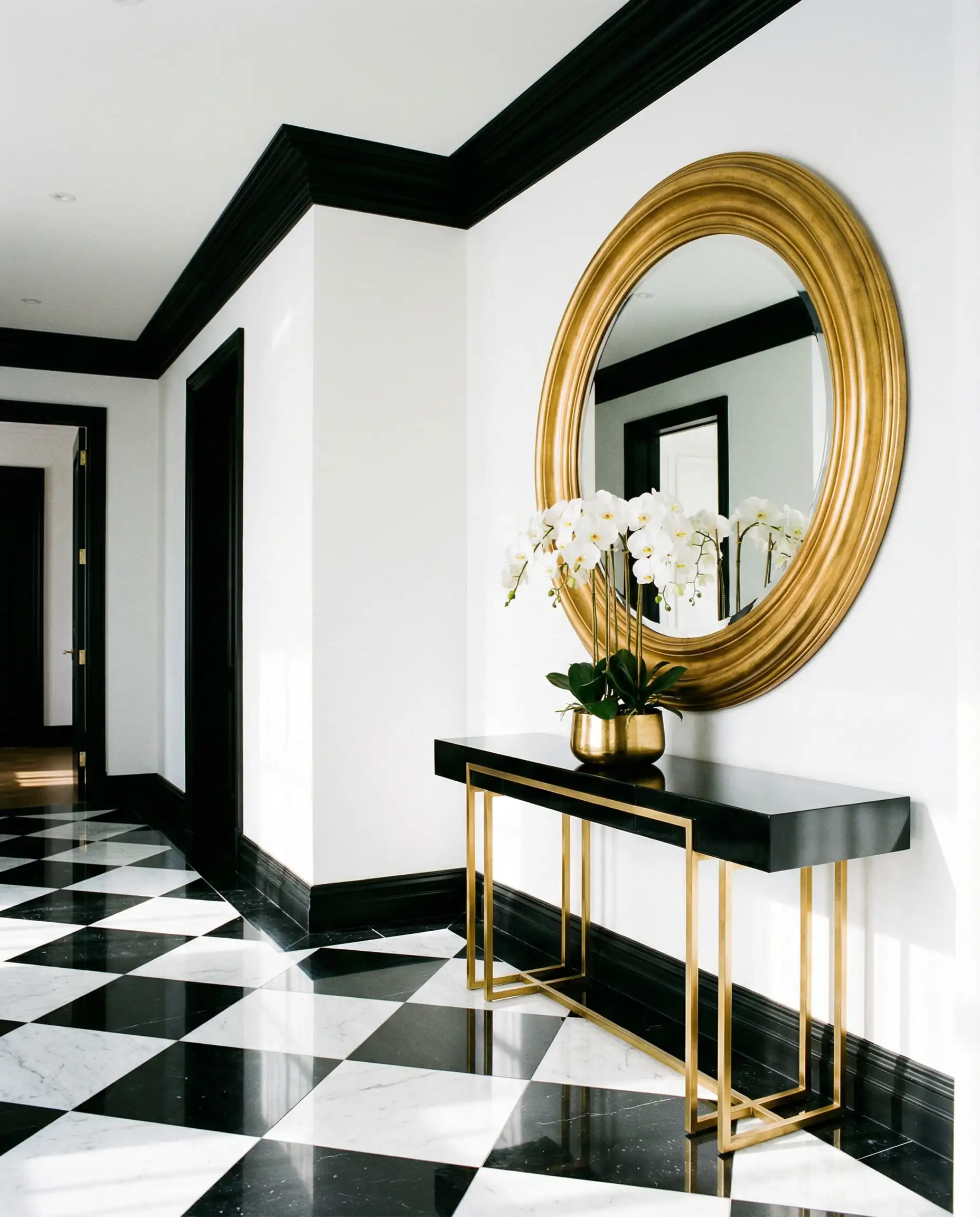
12. Crisp White
The Vibe: High Contrast, Graphic.
The classic “Chanel” suit of interiors. It is sharp, clean, and graphic. To keep it from looking boring in 2026, focus on shapes. Use geometric tiles or curved furniture to add interest.
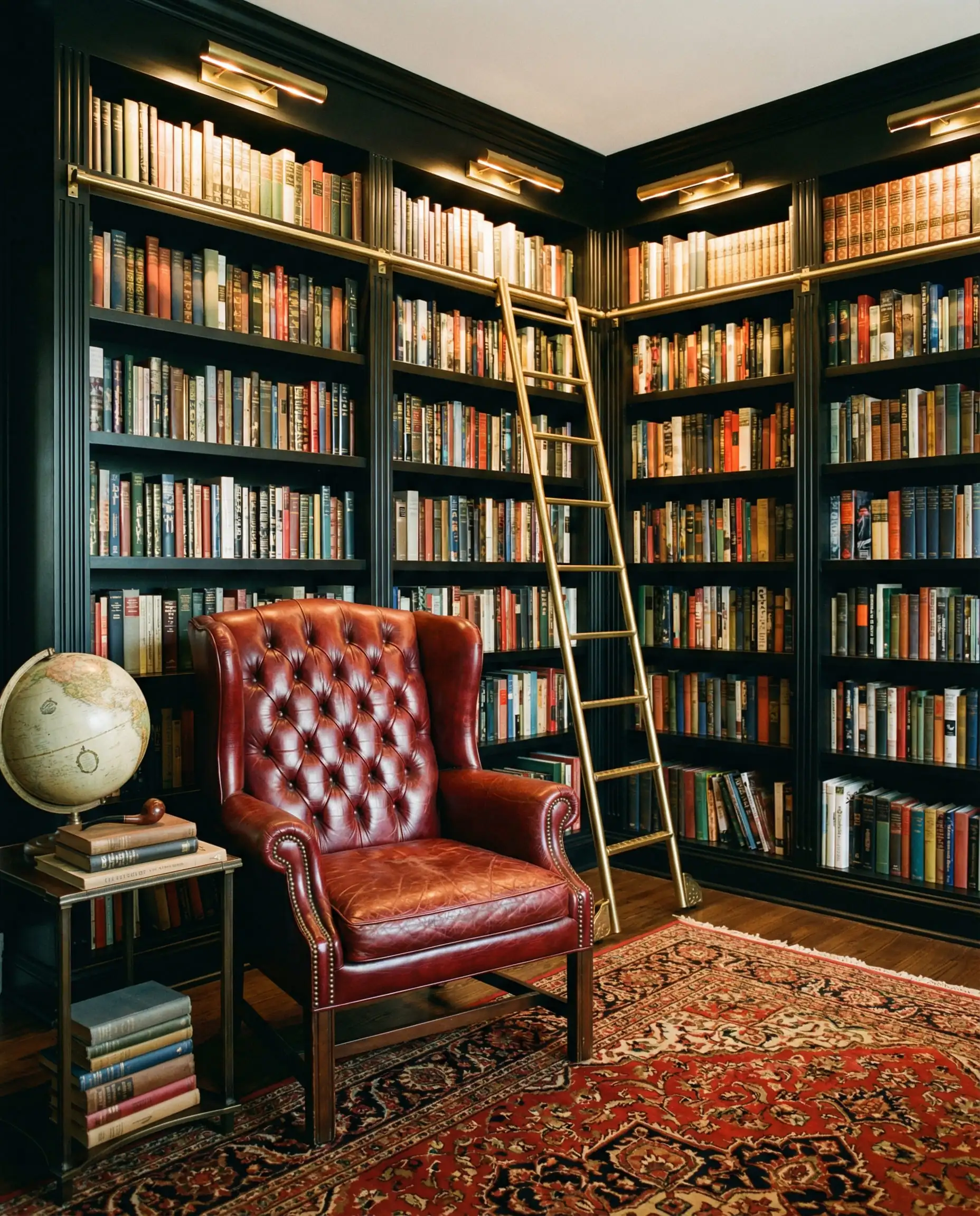
13. Classic Red
The Vibe: Traditional, Asian-Inspired.
Black, Gold, and Red is a staple in Asian design (representing luck and prosperity) and traditional Victorian interiors. Use red sparingly—perhaps in an oriental rug or a piece of statement art.
14. Navy Blue
The Vibe: Corporate, Preppy, Nautical.
Navy is the safe alternative to black. But when you use them together (yes, you can mix black and navy!), it creates a very deep, rich atmosphere. It’s perfect for a home office or a “gentleman’s lounge” aesthetic.
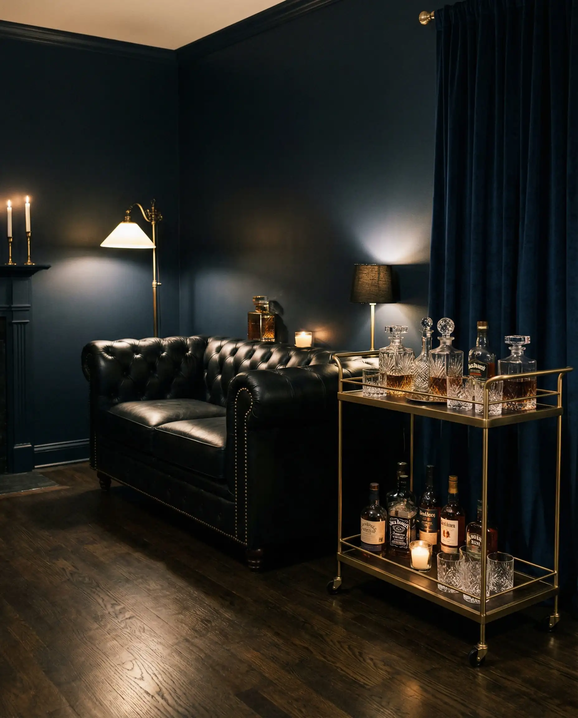
(For those designing masculine spaces, this combination is a top tier choice. You can find more specific layouts in our post on men’s bedroom ideas).
15. Mustard Yellow
The Vibe: Retro, Artsy.
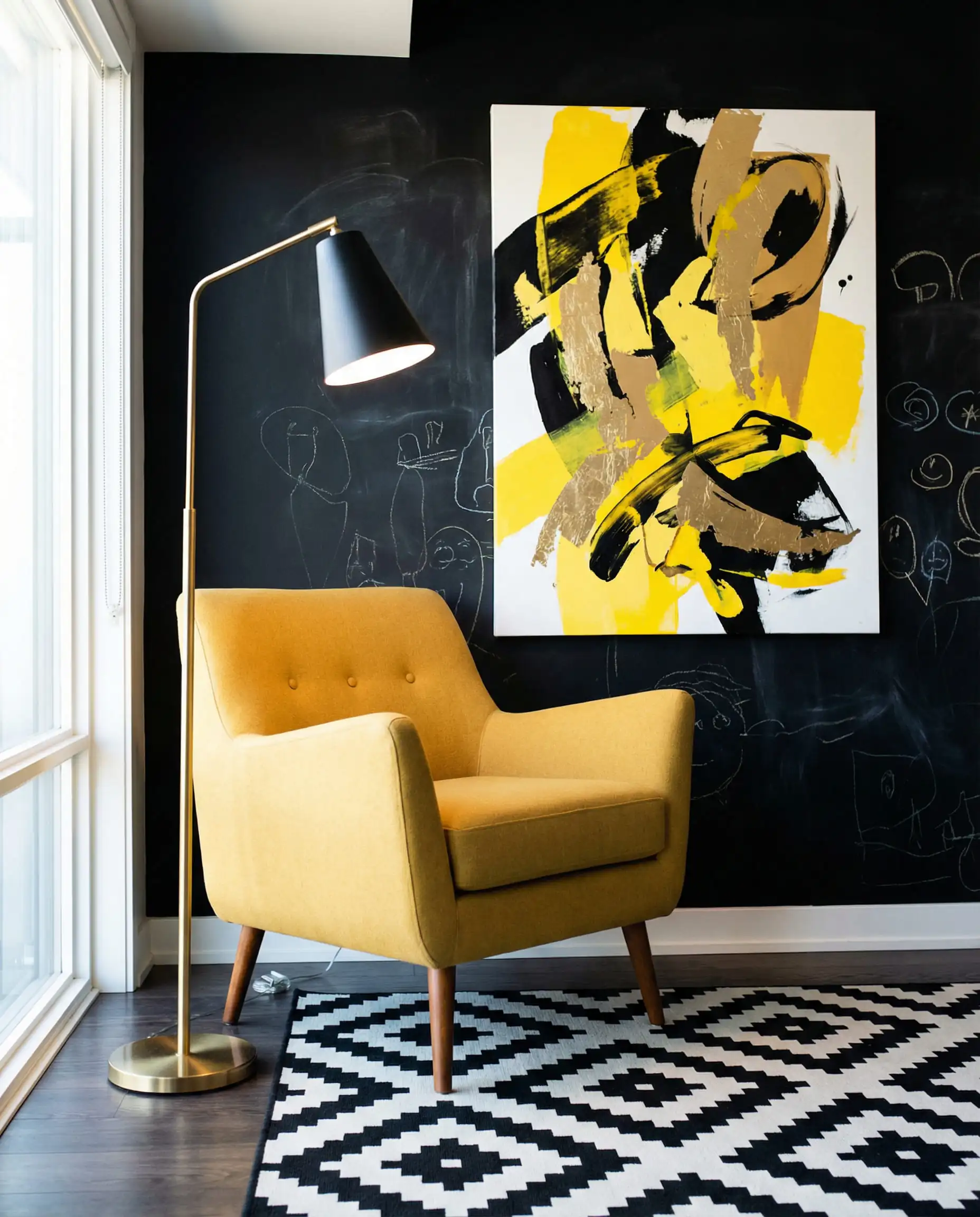
Mustard is essentially a darker, matte version of gold. Using mustard textiles (like a throw blanket) helps extend the gold accents throughout the room in a softer texture. It makes the gold feel less like “bling” and more like a color choice.
Room-by-Room Guide: Where to Use These Palettes
Knowing the colors is one thing; knowing where to put them is another. Here is how we recommend applying these trends across your home.
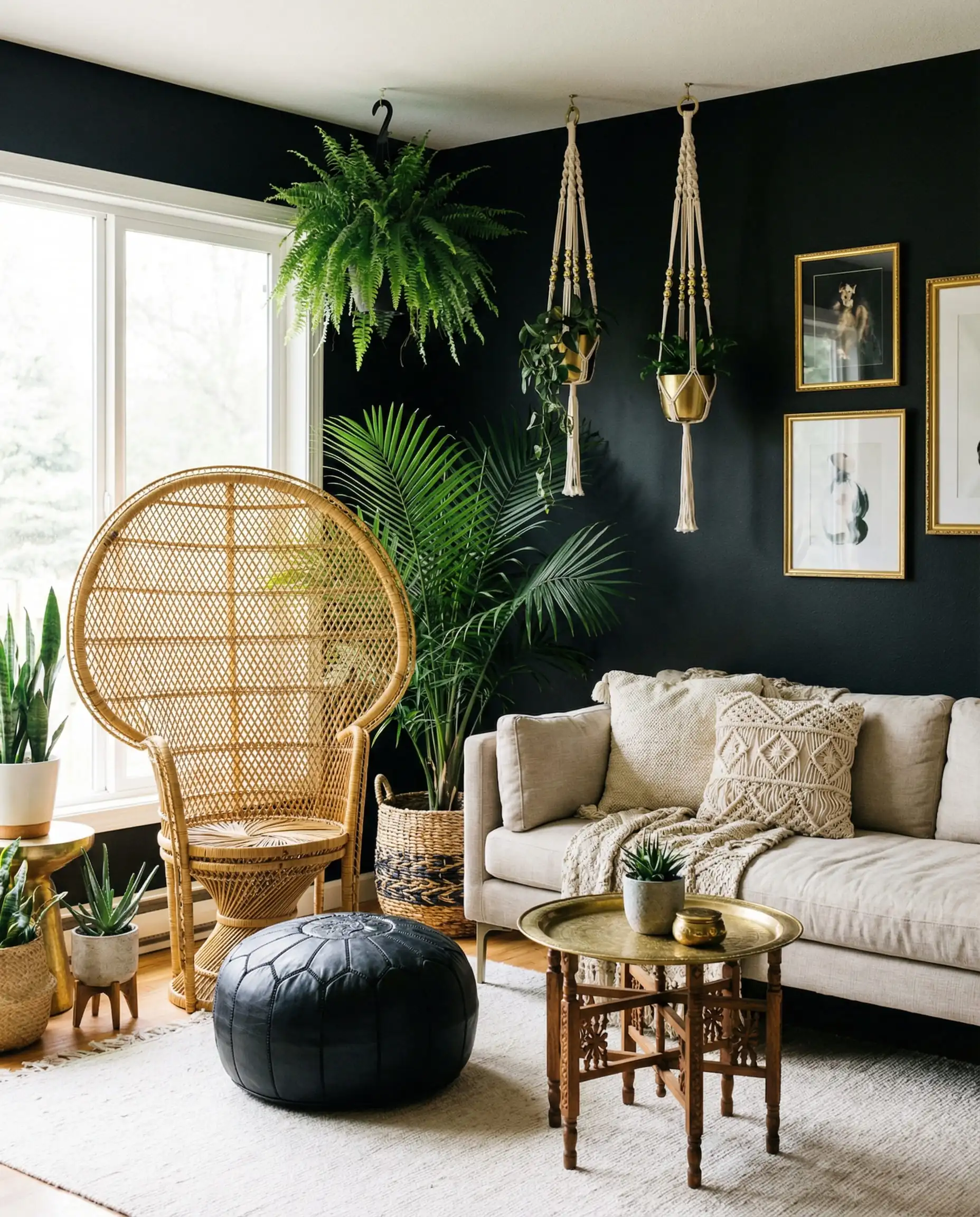
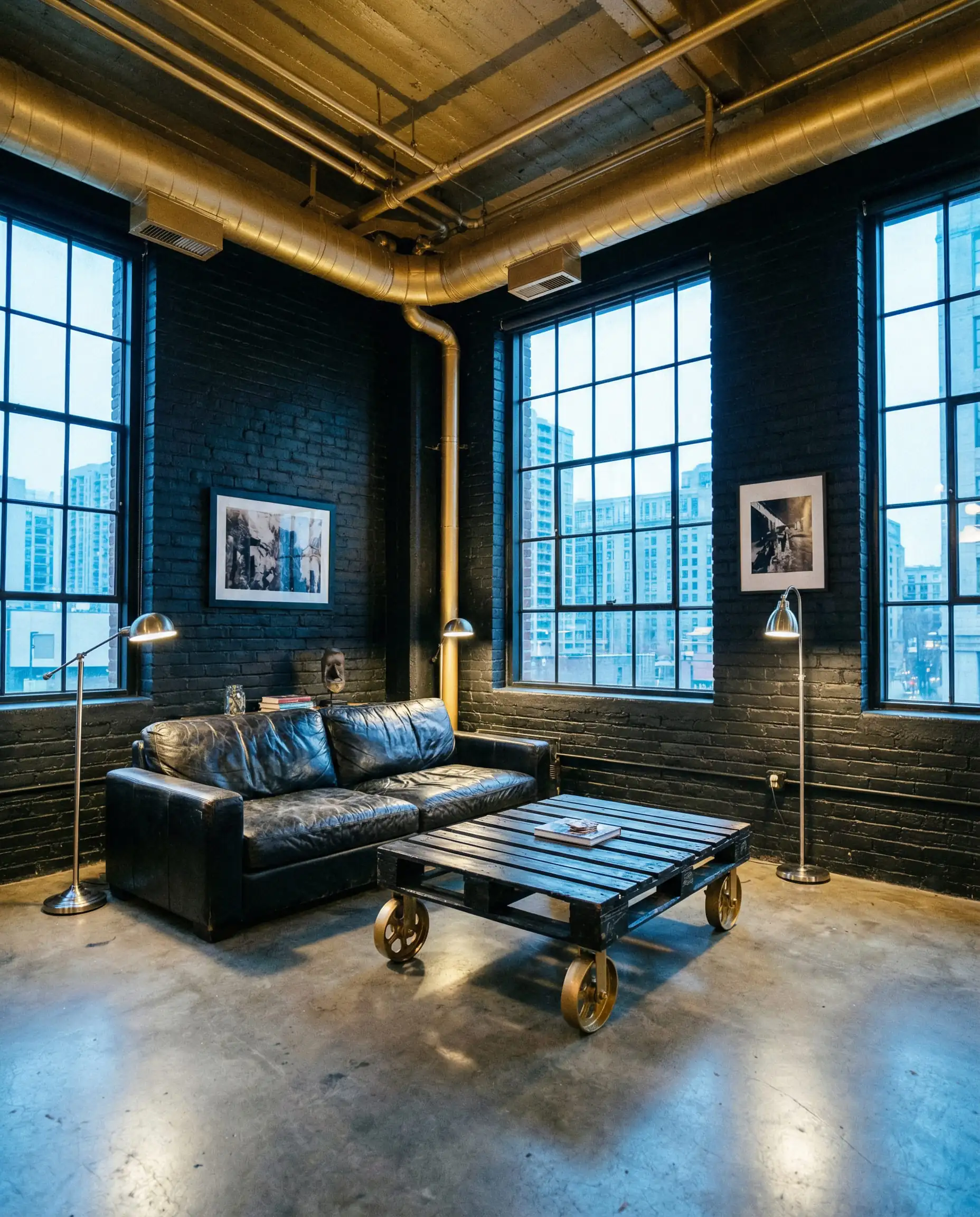
The Living Room: The “Luxe Lounge”
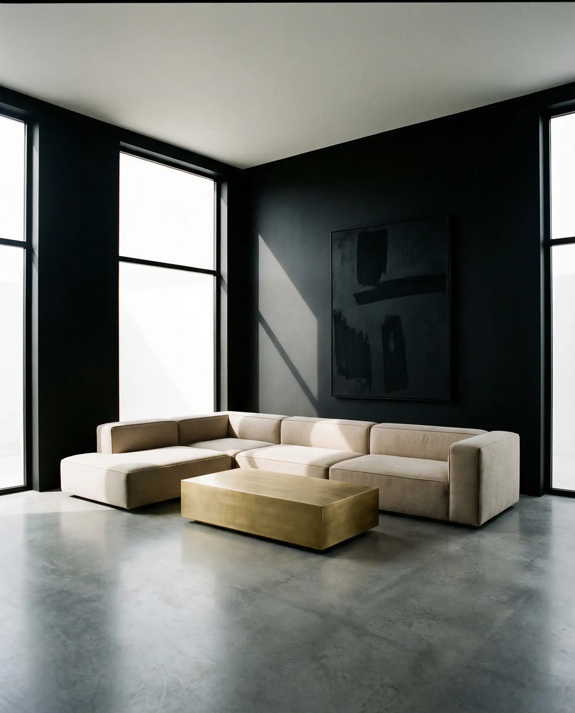
Recommended Palette: Black + Gold + Chocolate Brown.
Why: The living room is for gathering. You want it to feel warm, not like a museum. Use a large chocolate brown rug or leather seating to ground the space. Paint the walls black (or just one accent wall) and use gold for your coffee table frame and floor lamps.
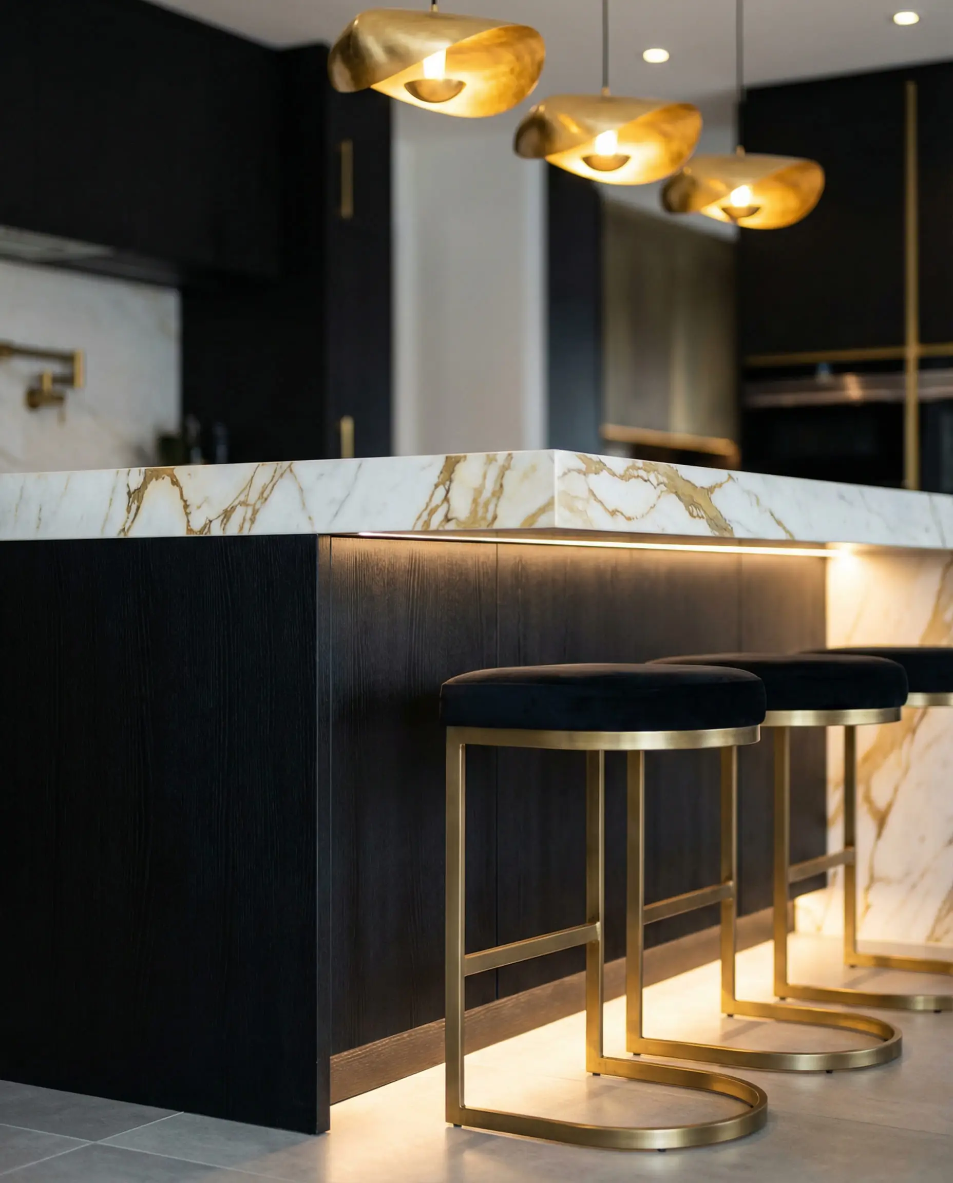
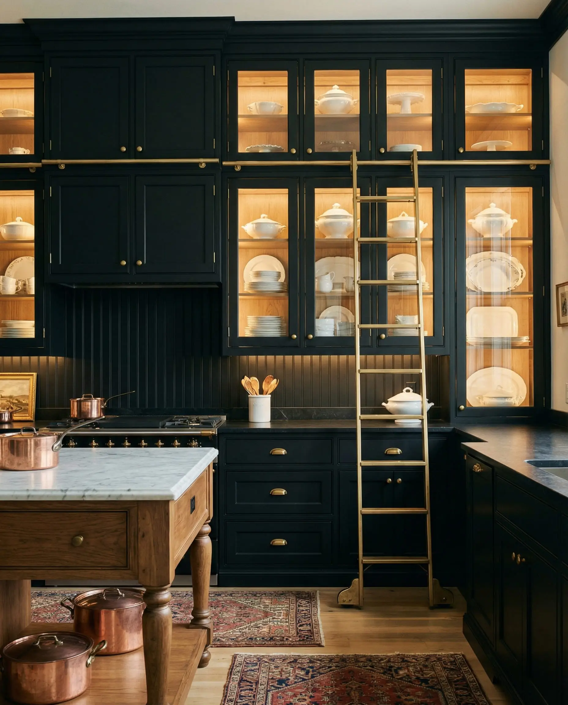
The Kitchen: The “Bistro Chic”
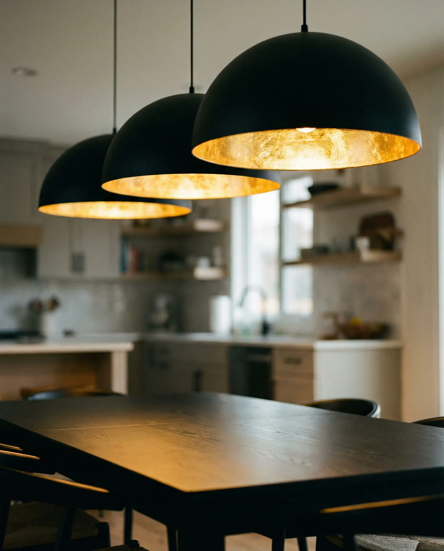
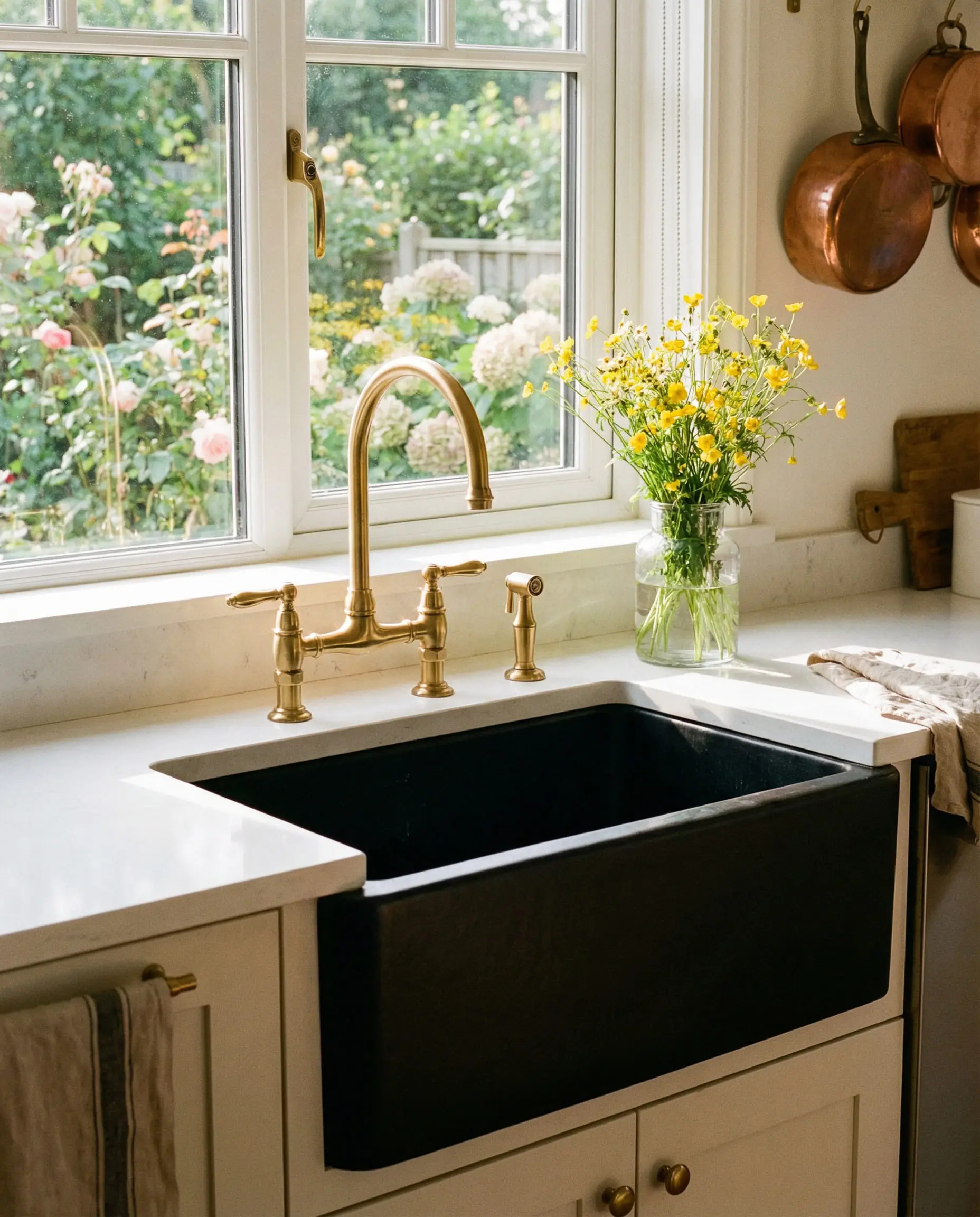
Recommended Palette: Black + Gold + Warm Cream.
Why: Kitchens need to feel clean but inviting. Black cabinets are incredibly popular right now. Pair them with Cream countertops (quartz or marble) and unlacquered brass (gold) hardware. The cream prevents the room from feeling like a cave, while the black hides scuffs and stains better than white cabinets.
The Bedroom: The “Sanctuary”
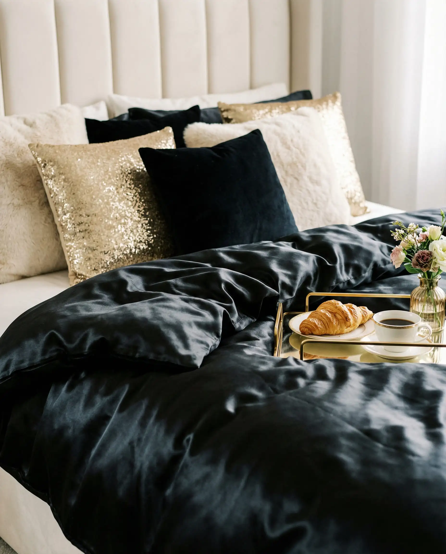
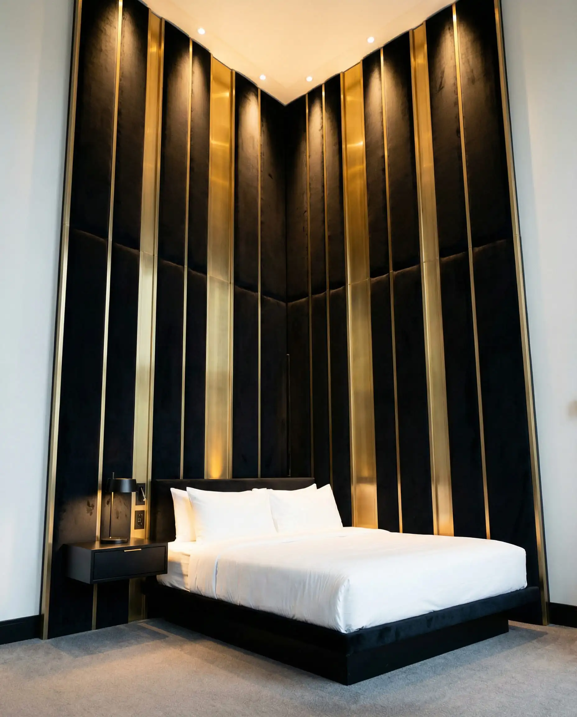
Recommended Palette: Black + Gold + Deep Purple or Sage Green.
Why: Bedrooms are for sleeping, so you want light absorption. Dark walls (Black or Deep Green) blur the boundaries of the room, making it feel infinite and cozy. Use gold for bedside lamps to create a warm glow for reading.
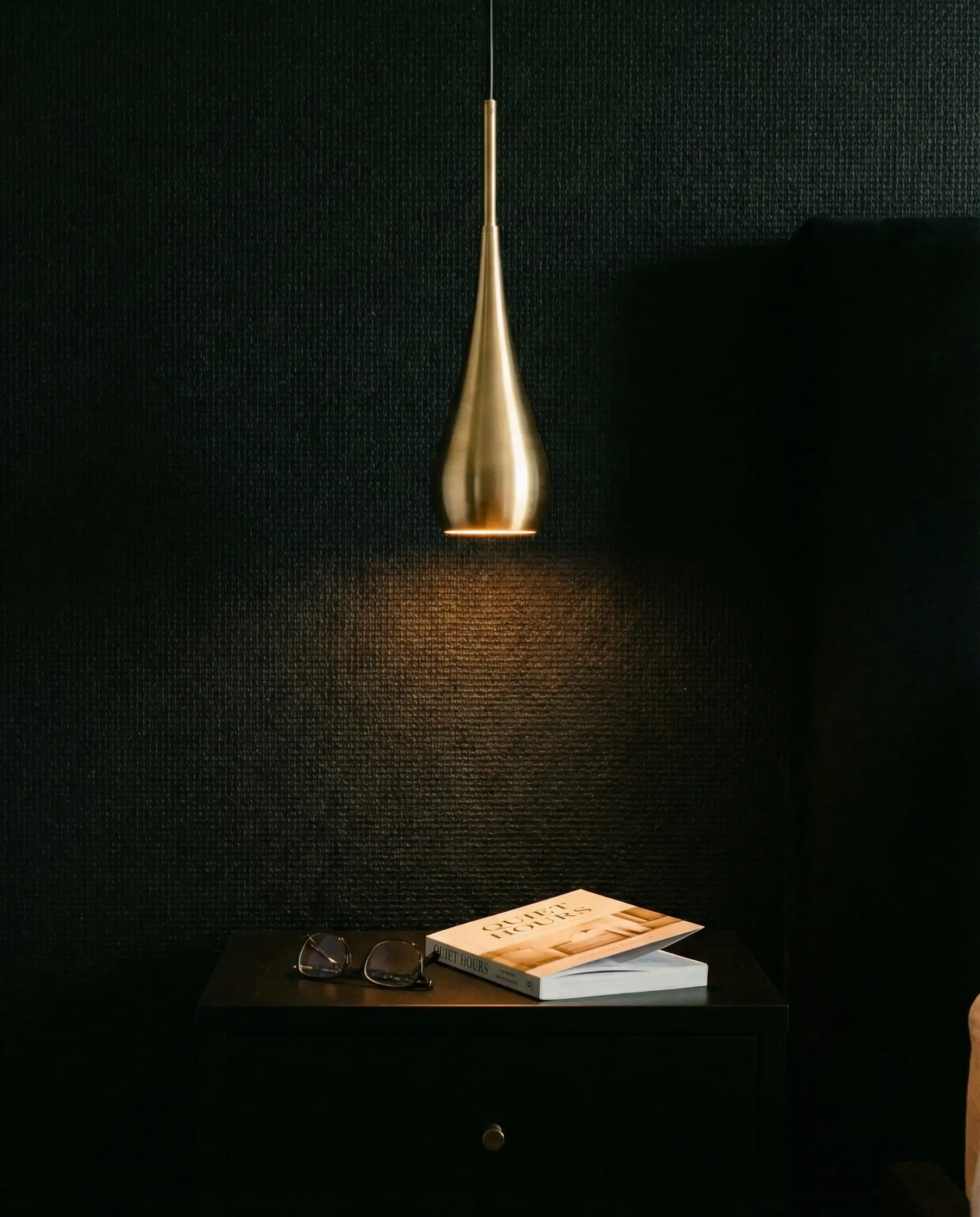
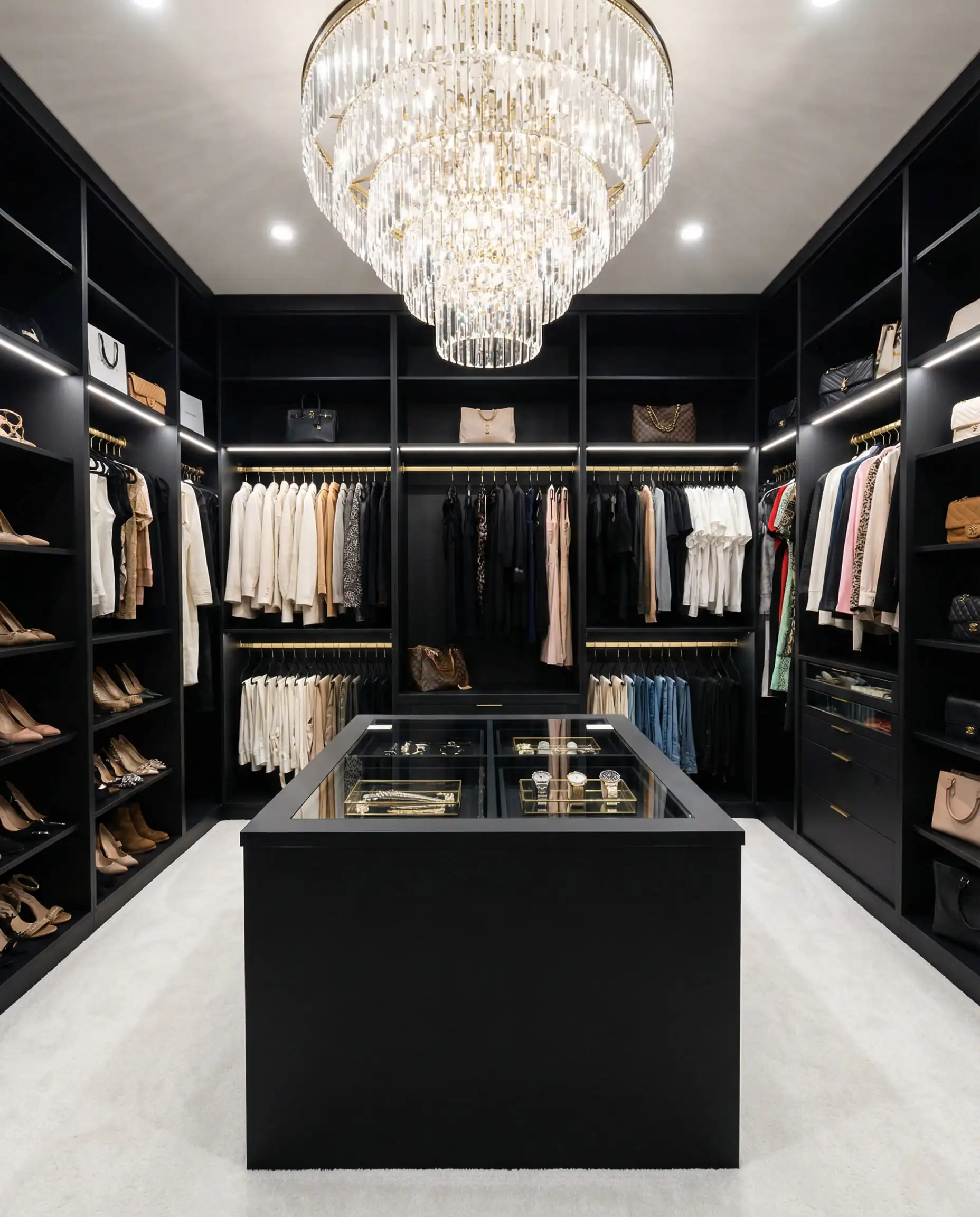
(Bedrooms require a delicate balance of light and dark. For a deep dive on how to style this personal space, check out our report on bedroom trends).
The Bathroom: The “Spa Retreat”
Recommended Palette: Black + Gold + Terracotta.
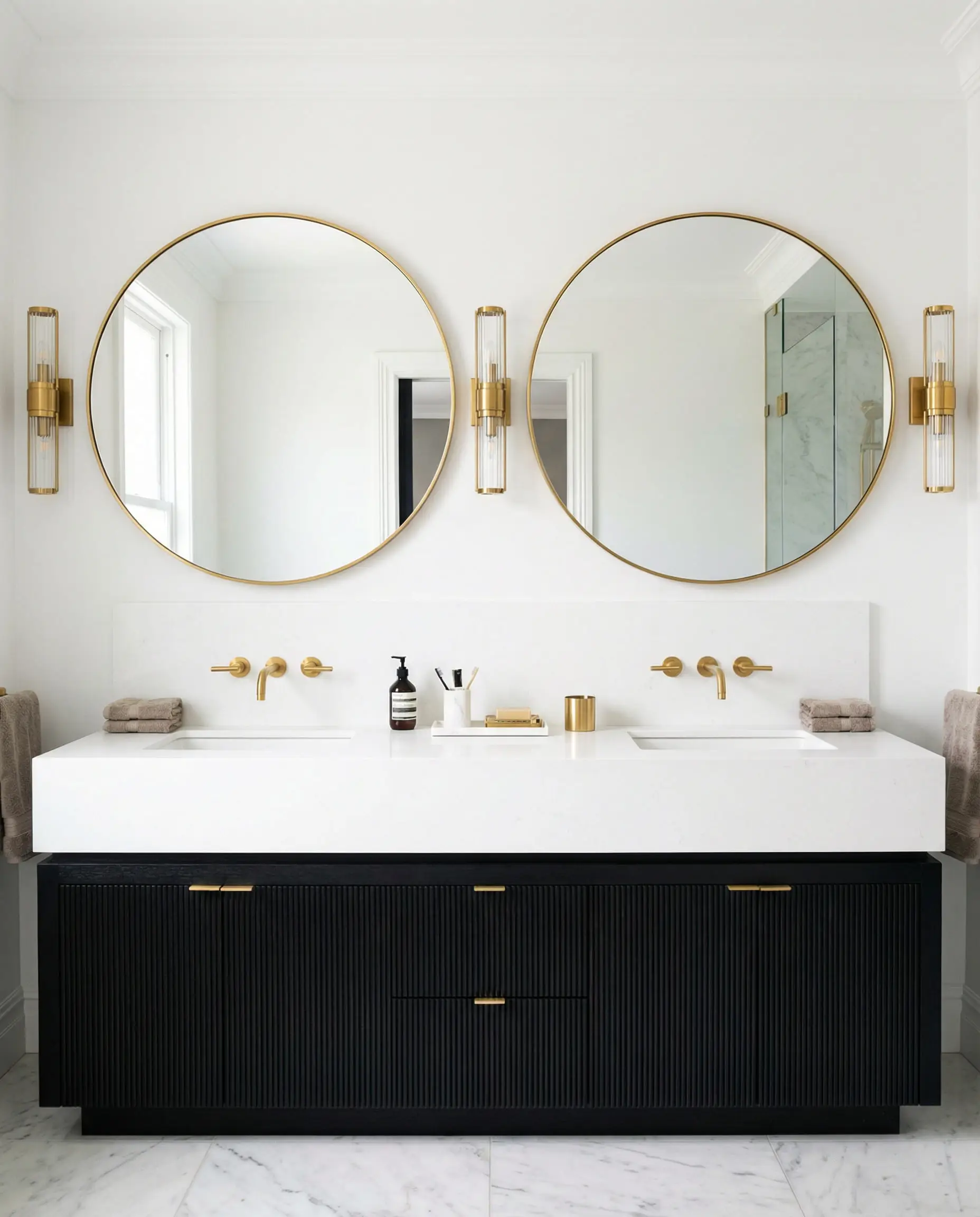
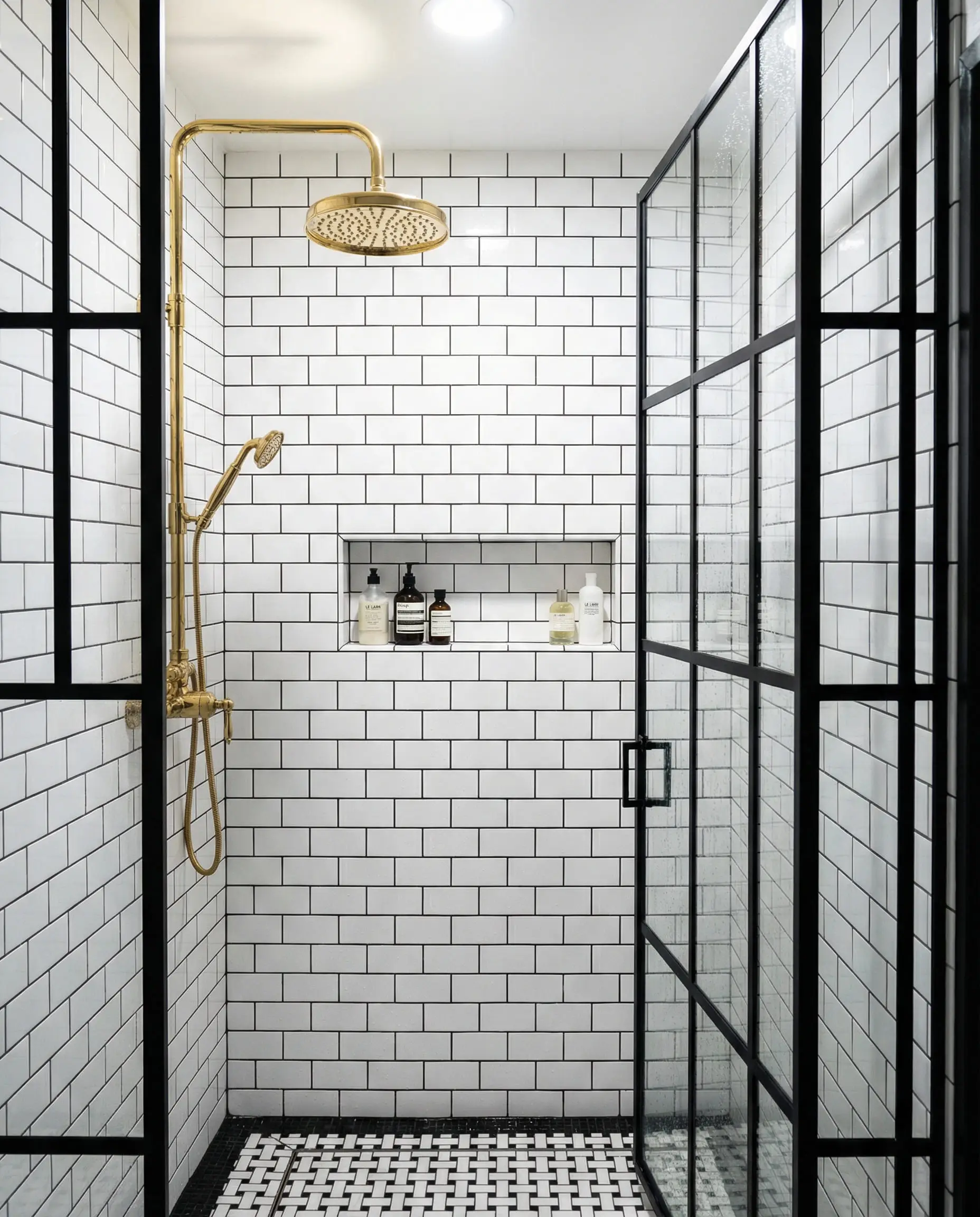
Why: Bathrooms can feel cold due to all the tile and porcelain. Introducing Terracotta (perhaps in floor tiles or towels) adds much-needed warmth. Gold plumbing fixtures on a black vanity unit look million-dollar luxurious.
Frequently Asked Questions (FAQ)
A: Yes! As mentioned in our “Trends” section, mixing metals is a massive trend for 2026. The trick is to ensure the finishes match in style (e.g., mix brushed gold with brushed nickel, rather than shiny gold with matte silver) and let one metal be dominant.
A: No, but the application has changed. The “shiny glam” look is out. The “moody, organic” look is in. Think matte black surfaces and brushed, antique gold rather than high-gloss lacquer and shiny brass.
A: Dark woods like Walnut, Mahogany, or Dark Oak are best. They blend with the black while adding grain texture. Avoid light yellow pines or farmhouse gray woods, as they can clash with the sophistication of gold.
A: Not all blacks are the same! Some have blue undertones (Cool Black) and some have brown undertones (Warm Black).
Cool Black (Blue-based): Pairs best with Silver, White, and Navy.
Warm Black (Brown-based): Pairs best with Gold, Cream, and Terracotta.
(Choosing paint can be tricky. We recommend testing samples first. See our review of best Behr paint colors to find a true black).
Conclusion
Updating a black and gold interior isn’t about throwing out everything you own. It’s about introducing a third player to the game.
Whether you choose the trending warmth of Chocolate Brown, the organic softness of Sage Green, or the bold edge of Mixed Metals, the goal is to create a space that feels layered and lived-in.
The era of the “Showroom” look is over. 2026 is about homes that feel as good as they look. So, grab that paint roller, swap out those cushion covers, and don’t be afraid of the dark side.
What is your favorite color to pair with black and gold? Are you Team Earthy (Green/Brown) or Team Glam (Purple/Red)? Let us know in the comments on @hackrea_en!