The Warm Greige Living Room: A Masterclass in Undertones and Quiet Luxury
Millennial gray is dead. It dominated the last decade, leaving behind a trail of cold, sterile spaces that felt more like waiting rooms than sanctuaries. But swinging wildly back to the heavy, yellow-tinged beige of the early 2000s is not the answer. The definitive neutral of 2026 is warm greige—a highly calibrated blend of gray and beige, anchored by sophisticated taupe or subtle red undertones rather than icy blues or violets.
Achieving the quiet luxury aesthetic requires more than just brushing a trendy paint color onto drywall. A successful greige living room demands absolute mastery over Light Reflectance Value (LRV), spatial geometry, and tactile friction. Without a deliberate strategy for textural layering and architectural contrast, this neutral palette quickly devolves into a flat, muddy box. To harness the true power of warm greige, you must treat it not as a static color, but as a living, breathing sensory mood that shifts beautifully with the afternoon sun.
The Architectural Canvas: Nailing the Greige Foundation
Before bringing a single piece of furniture into the space, we must address the structural envelope. Nailing the foundational wall color requires strict attention to Light Reflectance Value (LRV) and natural light interplay, ensuring the room feels expansive rather than cavernous.
Color-Drench the Baseboards and Crown Molding
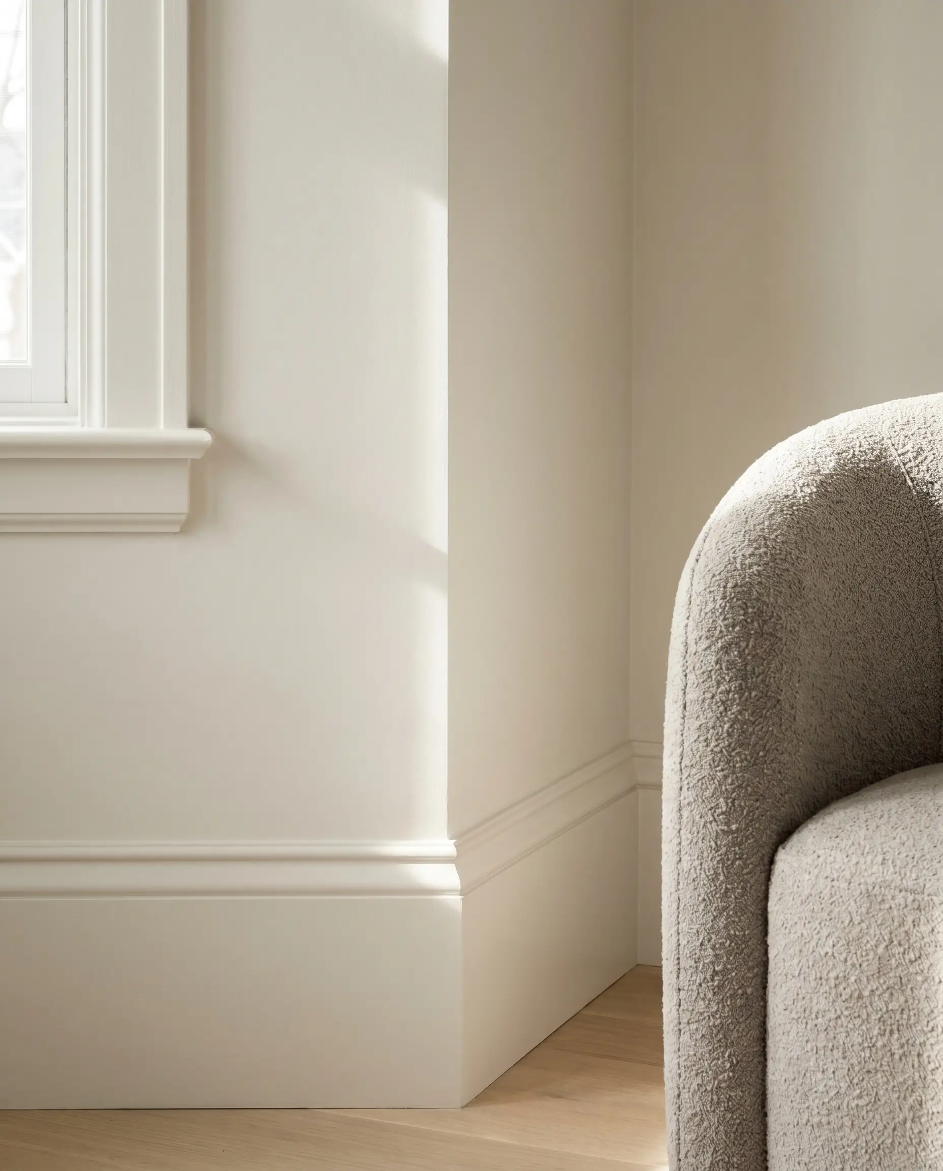
Stark white baseboards create a harsh, distracting visual break that instantly cheapens a neutral palette and risks making your greige walls appear muddy. Painting the walls, trim, and ceiling in the exact same hue erases these harsh boundary lines, creating a bespoke, seamless aesthetic.
- Vibe: Monolithic, bespoke, and architecturally seamless.
- Key Materials: Satin or semi-gloss finish for the trim to provide subtle friction against an eggshell wall.
- Paint Recommendation: Benjamin Moore Pale Oak.
To maintain tonal harmony without making the ceiling feel heavy, order your primary wall color at 50% strength for the ceiling application. This accounts for the natural shadows overhead while keeping the undertones perfectly synced.
Designer Secret
Elevate the Walls with Roman Clay or Limewash
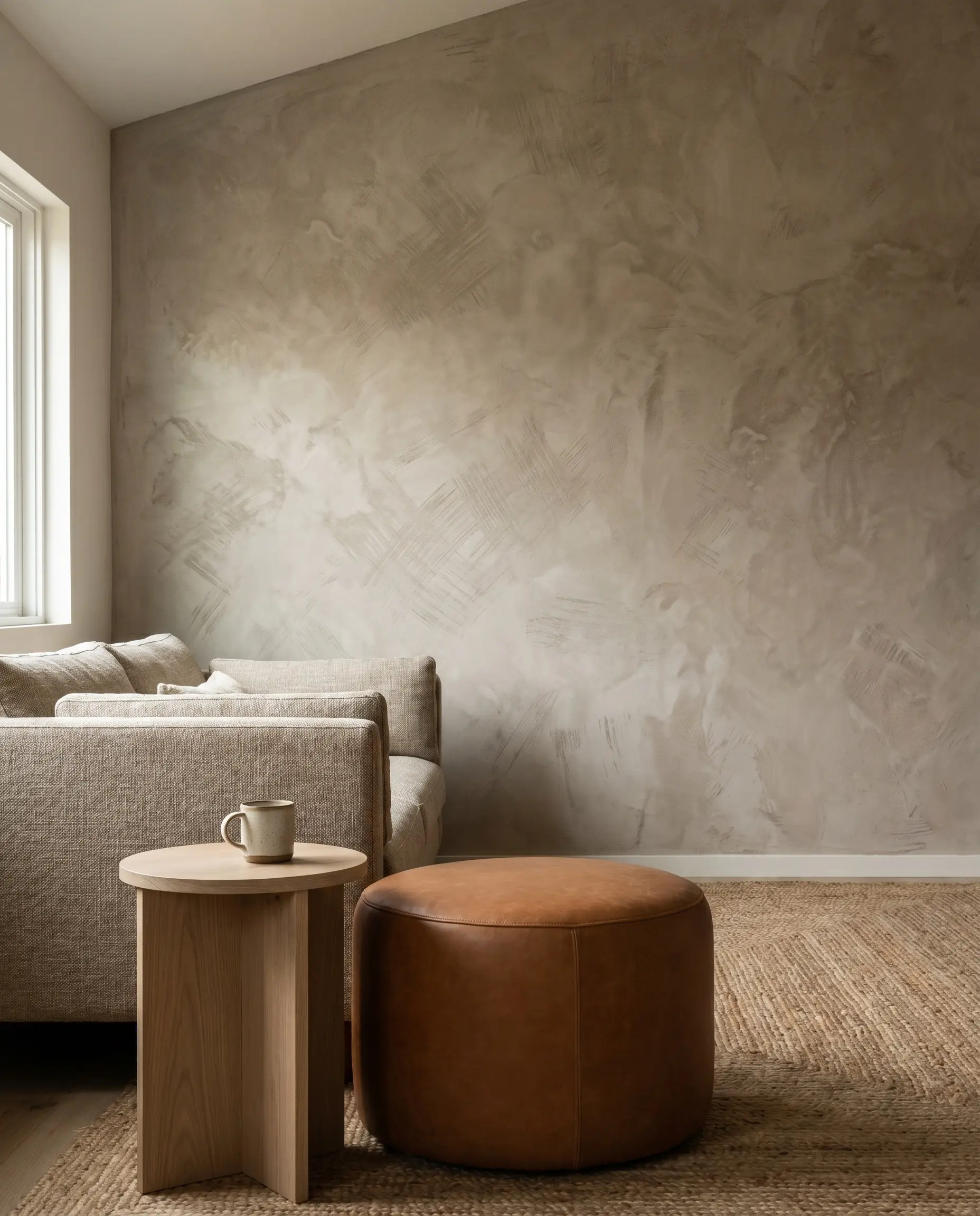
Flat latex paint strips neutral rooms of their vitality, leaving them visually dead. Applying a Roman clay or limewash finish introduces a subtle, plaster-like mottling that catches natural light, instantly rooting the room in an organic modern aesthetic.
- Vibe: Earthy, tactile, and deeply grounded.
- Key Materials: Mineral-based limewash or troweled Roman clay.
- Color Recommendation: Portola Paints Roman Clay in “El Mirage.”
- Styling Pro-Tip: Apply with a wide block brush in a cross-hatch pattern to maximize the cloudy, dimensional texture.
Match Your Greige to the Room’s Solar Exposure
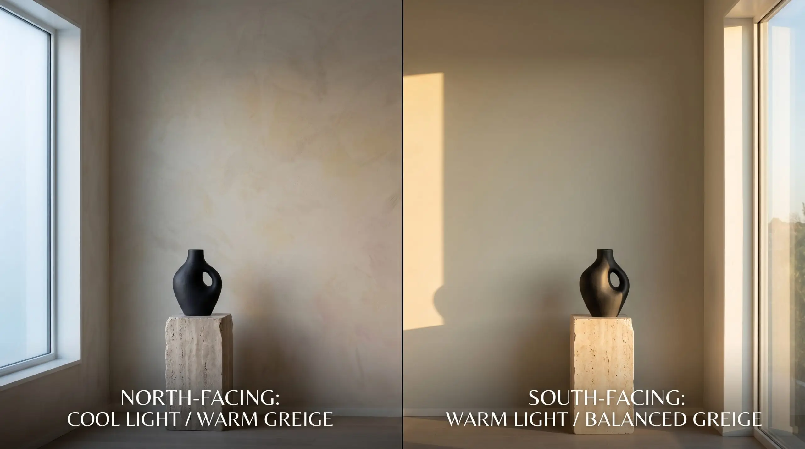
The exact same paint color will read flawlessly in one room and look like wet cement in another due to the physics of light exposure. Controlling your undertones based on the compass direction of your windows is the ultimate safeguard against a muddy palette.
- Exposure Match (North-Facing): Northern light casts a cool, bluish tint. Counteract this by selecting a greige heavily weighted toward beige with yellow or subtle red undertones to inject necessary warmth.
- Exposure Match (South-Facing): Southern light bathes a room in warm, golden rays. Select a perfectly balanced greige or one with a slight green/gray base so the room doesn’t bake into an overwhelming yellow.
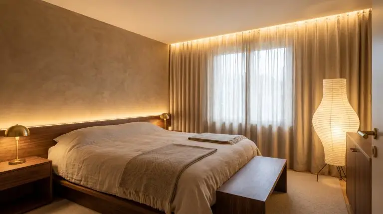
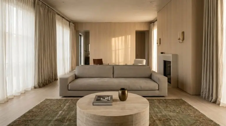
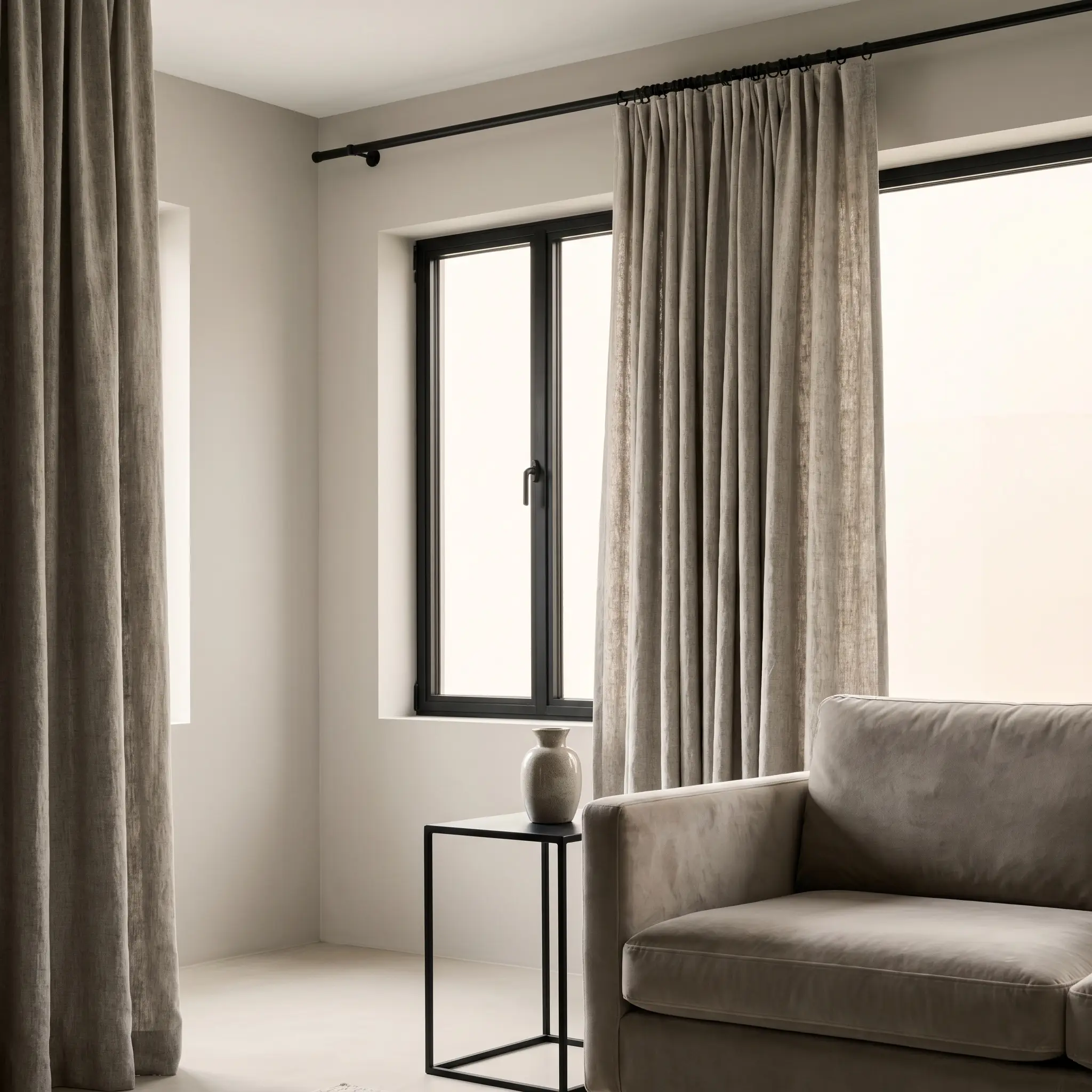
Anchor the Windows with S-Fold Linen Drapery
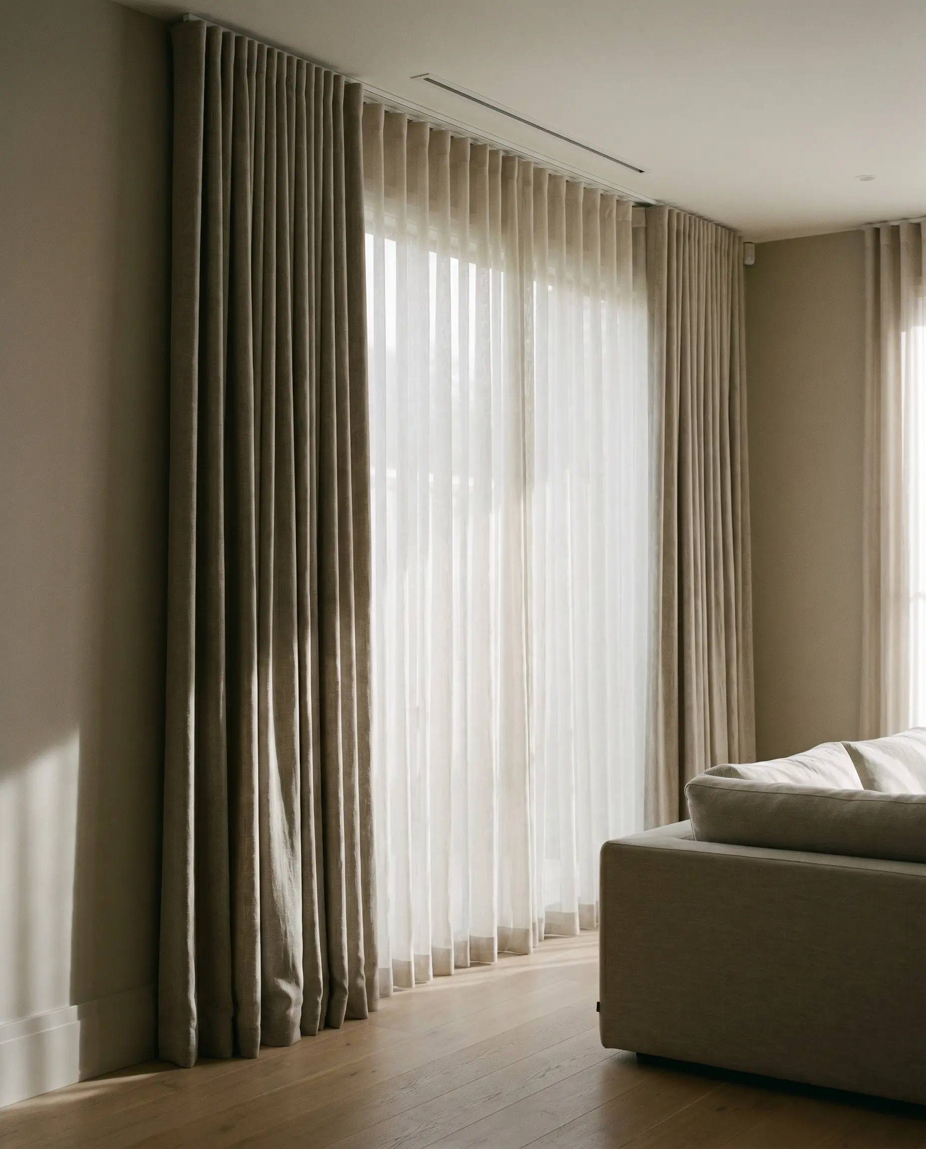
Window treatments must connect the architectural wall color to the room’s soft textiles through structured, luxurious layering. Pairing a bone-white sheer with a heavy, warm greige slub-linen blockout curtain creates rhythmic, architectural shadows that give the subtle wall color immense visual depth.
- Vibe: Tailored, heavy, and undeniably luxurious.
- Key Materials: Heavyweight slub linen, sheer wool blends, ceiling-mounted track.
- Hardware Match: Concealed architectural track systems.
- Styling Pro-Tip: The S-Fold (or Wave Fold) header is a non-negotiable luxury standard; it forces the fabric into deep, uniform ripples that catch the light beautifully.
You can apply wallpapers, paints, etc. on walls and see how they look in various interiors.

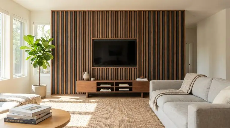
Furniture & Spatial Anchors: Building the Palette
Once the architectural envelope is sealed in greige, the furniture must act as the grounding elements of the room. In a strictly neutral space, tactile layering, shape, and raw material effectively become the color.
Ground the Space with Rift-Sawn White Oak
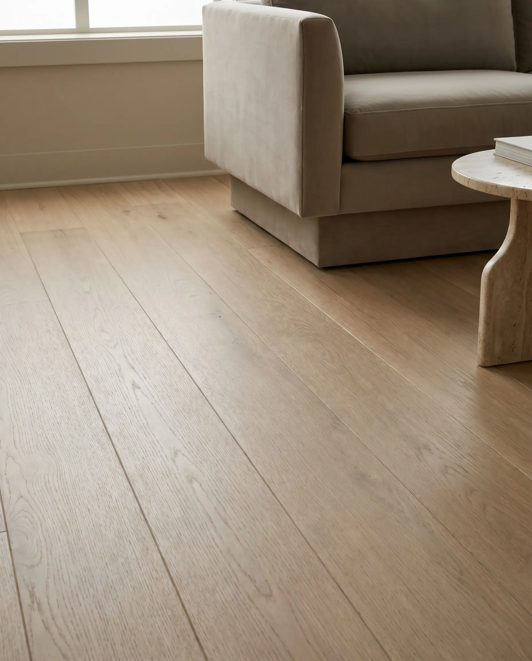
Red oaks, cherry woods, or cool-toned gray flooring will actively fight against your carefully selected wall color. Rift-sawn white oak features a straight, clean grain and muted warmth that acts as the ultimate foundational partner for a greige palette.
- Vibe: Organic, clean, and quietly sophisticated.
- Key Materials: Matte-finished rift-sawn white oak planks or custom millwork.
- Material Match: The subtle, wheat-toned warmth of white oak directly flatters the taupe undertones of warm greige without introducing clashing red or orange hues.
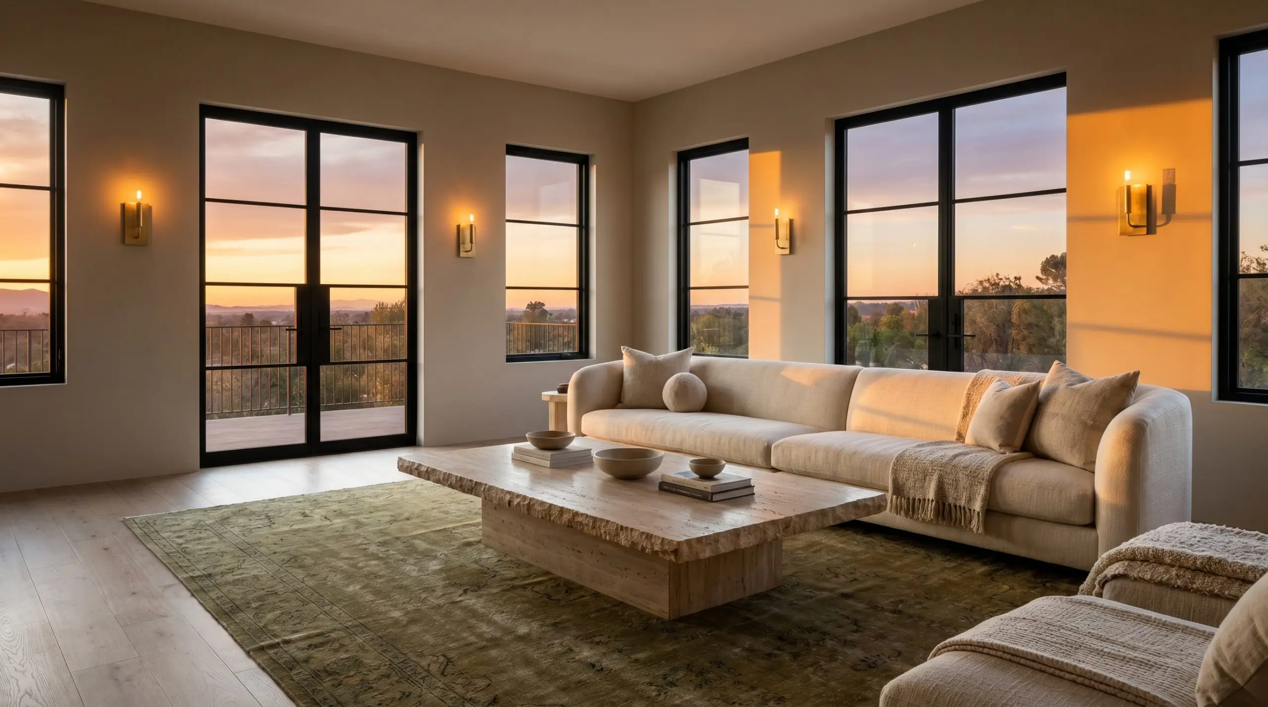
Introduce Monolithic, Low-Profile Seating
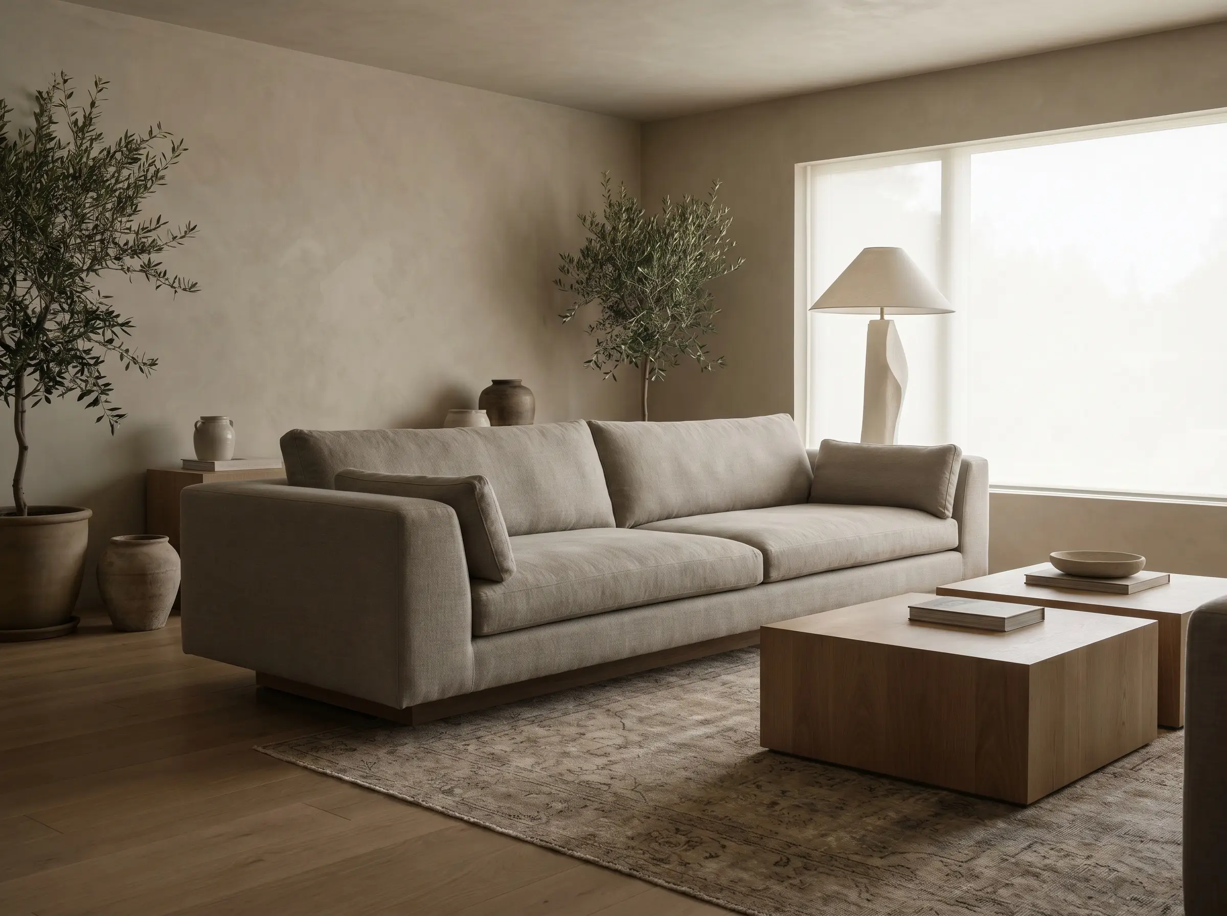
A warm minimalist layout demands furniture that feels deliberate and substantial, avoiding fussy or spindly legs. Low-profile, monolithic sofa shapes that sit heavy on the floor add necessary visual weight, grounding the airy, tonal palette above.
- Vibe: Substantial, relaxed, and structurally dominant.
- Key Elements: Plinth-base sofas, deep seats, wide track arms.
- Upholstery Match: Heavyweight Belgian linen or performance velvet in a tonal greige shade.
- Styling Pro-Tip: Float the sofa off the walls to emphasize its spatial volume and allow the room to breathe.
Float an Oversized Travertine Coffee Table
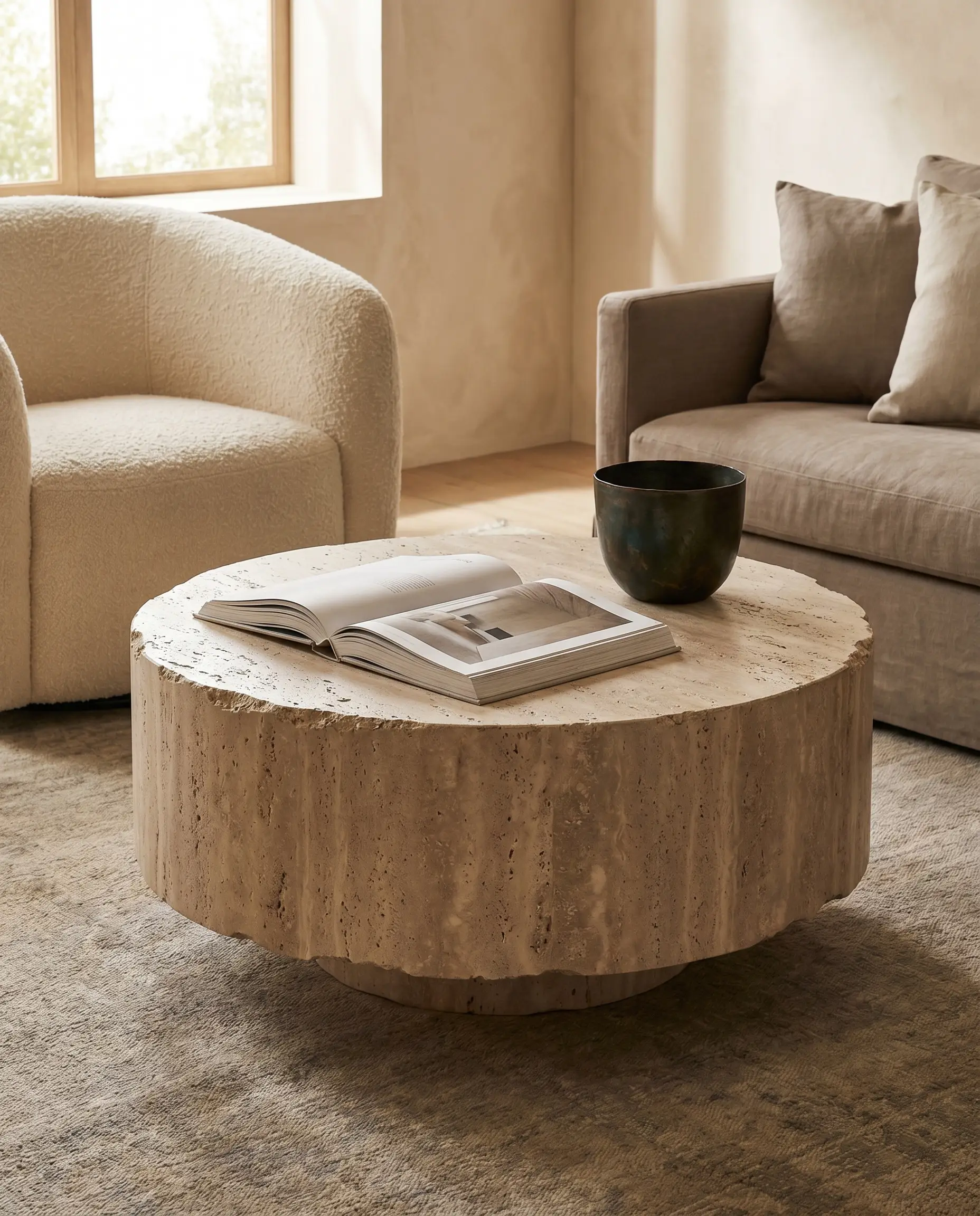
Natural stone introduces a rugged, earthy texture that prevents a soft room from feeling overly delicate. An oversized, plinth-style travertine coffee table naturally echoes the tones of warm greige while asserting itself as the undeniable centerpiece of the seating arrangement.
- Vibe: Sculptural, ancient, and highly textural.
- Key Materials: Honed or unfilled travertine stone.
- Form Recommendation: A solid block or drum silhouette.
- Styling Pro-Tip: Leave the porous surface mostly exposed; style minimally with a single bronze vessel or a heavy architectural design book.
Layer “Slubby” Fabrics and Bouclé Upholstery
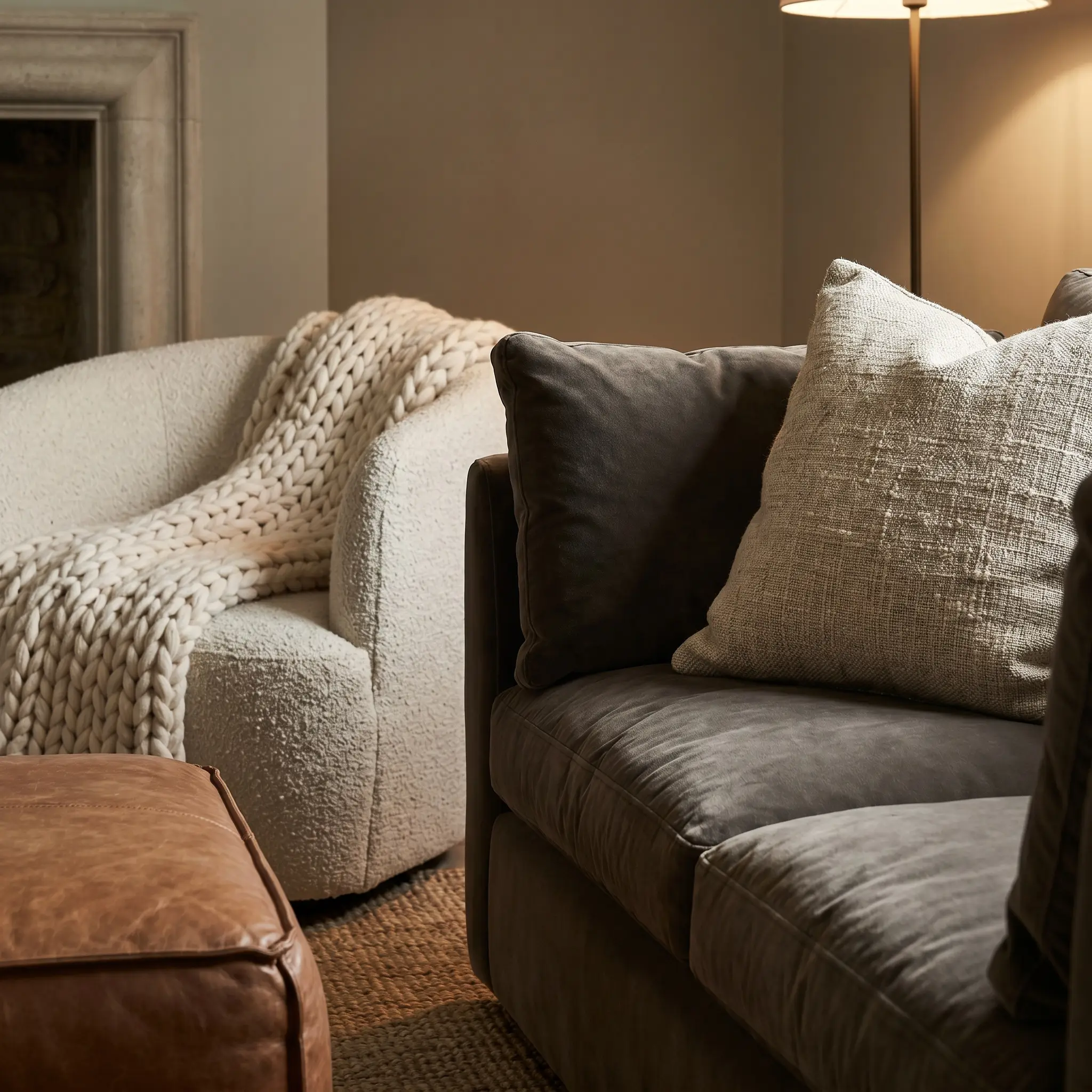
A monochromatic room dies instantly if every surface is wrapped in flat cotton. You must command the use of high-friction, deeply textured fabrics to create the tactile comfort that makes a neutral space feel inviting rather than sterile.
- Bouclé + Smooth Leather: Pair a nubby, looped bouclé accent chair against the sleek, cool finish of a saddle leather ottoman.
- Slub Linen + Velvet: Layer a heavy, uneven slub-linen throw pillow over a plush, light-absorbing velvet sofa cushion.
- Chunky Wool + Matte Wood: Drape a thick, woven wool blanket over the rigid arm of a white oak lounge chair.
Lighting & Decor: The High-Contrast Finishers
Greige needs visual tension to survive. Without the sharp interruption of high-contrast accents and the warm glow of layered lighting, the space will feel completely unresolved.
Cast a Glow with Unlacquered Brass Sconces
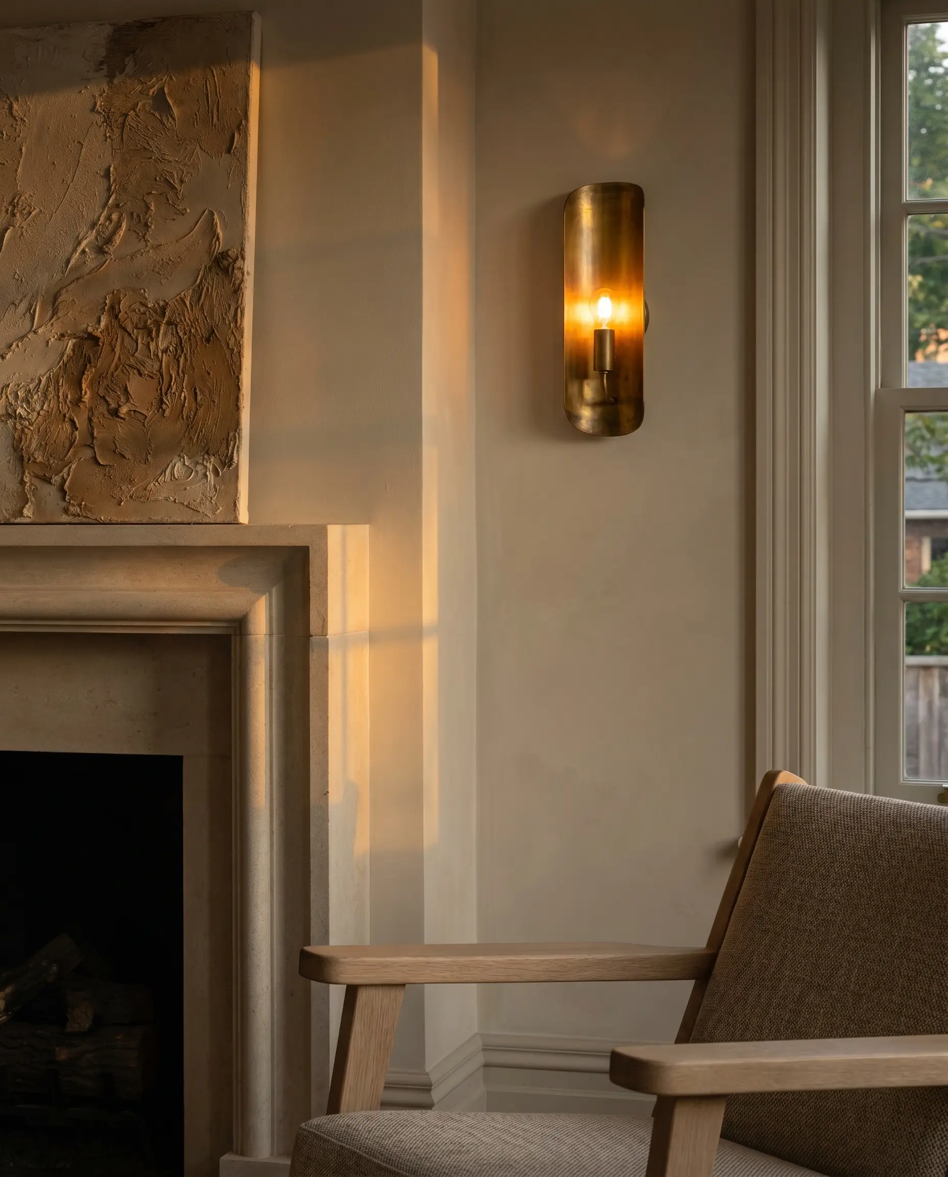
Polished chrome reads entirely too cold, and brushed nickel feels hopelessly dated against this modern palette. Unlacquered brass provides a living finish that patinas beautifully over time, bringing profound, metallic warmth to greige walls as the evening light shifts.
- Vibe: Historic, refined, and deeply warm.
- Key Materials: Solid, unlacquered brass hardware and fixtures.
- Placement Pro-Tip: Flank the primary focal point—such as a limestone fireplace or oversized art piece—with a pair of brass sconces.
- Bulb Recommendation: 2700K LED bulbs to enhance the amber tones of the brass.
Punctuate with Gunmetal or Matte Black Hardware
Soft, tonal rooms desperately require a touch of darkness to define the room’s geometry and guide the eye. Introducing matte black window frames, gunmetal curtain rods, or black iron fireplace surrounds provides sharp, modern contrast against the soft, airy greige.
Every single neutral room requires at least 5% black or charcoal contrast to anchor the visual weight and prevent the pastel-washing of the space.
Styling Rule
- Vibe: Graphic, sharp, and decisively modern.
- Key Materials: Forged iron, blackened steel, matte black powder-coated aluminum.
- Application Focus: Drapery hardware, door levers, and lighting armatures.
Style Built-Ins with Tonal Ceramics and Plaster Art
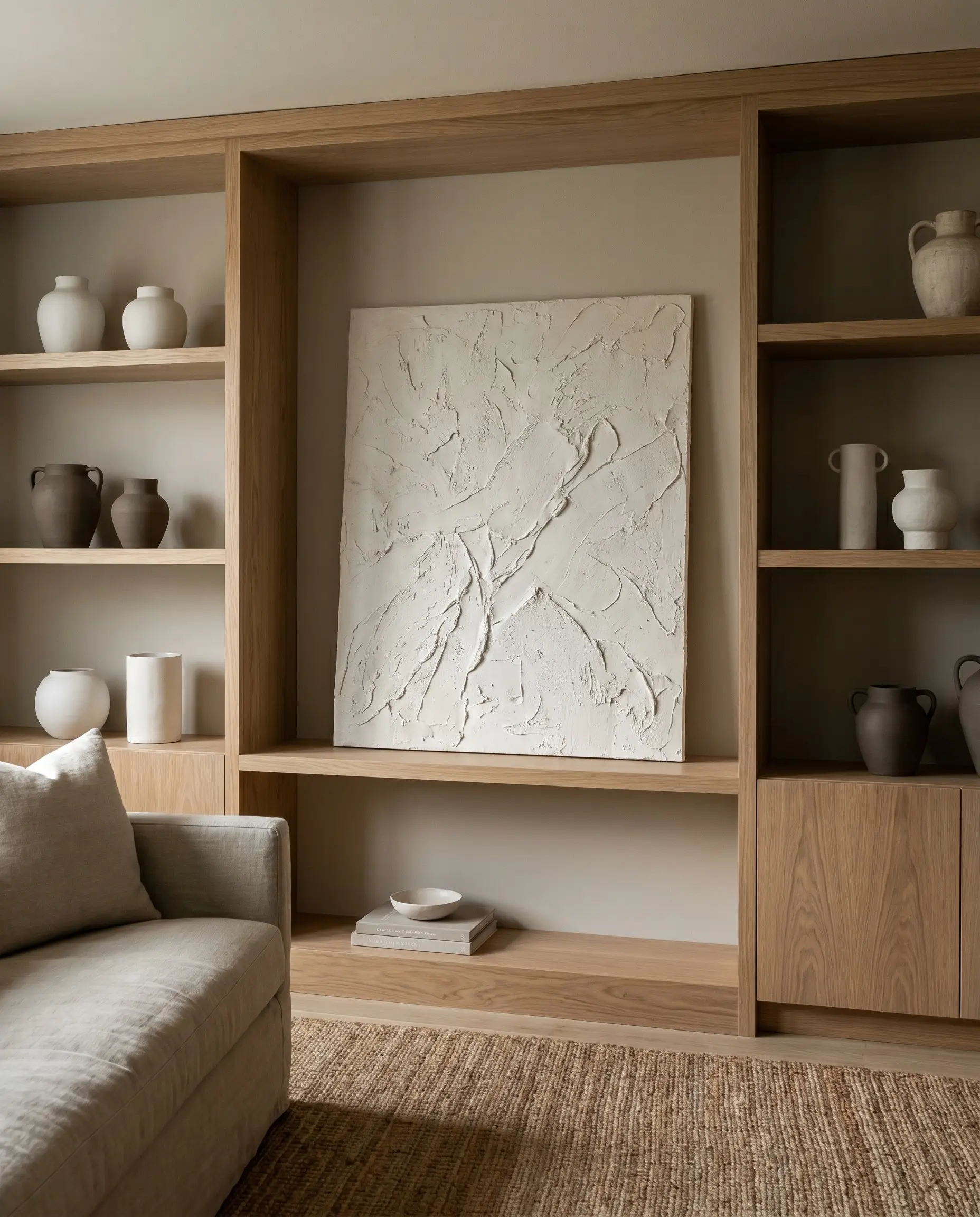
Cluttered, highly colorful bookshelves completely disrupt the serene continuity of a monochromatic layout. Styling built-ins with tonal, handmade ceramics and hanging large-scale, 3D plaster canvas art maintains the quiet luxury aesthetic while adding immense, shadow-driven depth.
- Vibe: Curated, gallery-esque, and deeply intentional.
- Key Materials: Matte white stoneware, deep taupe terracotta, raw plaster.
- Art Recommendation: Heavily textured, monochromatic impasto or troweled canvas art.
- Styling Pro-Tip: Group objects by varying heights in odd numbers, allowing plenty of negative space so the built-ins breathe.
Add History with a Vintage Olive or Rust Turkish Rug
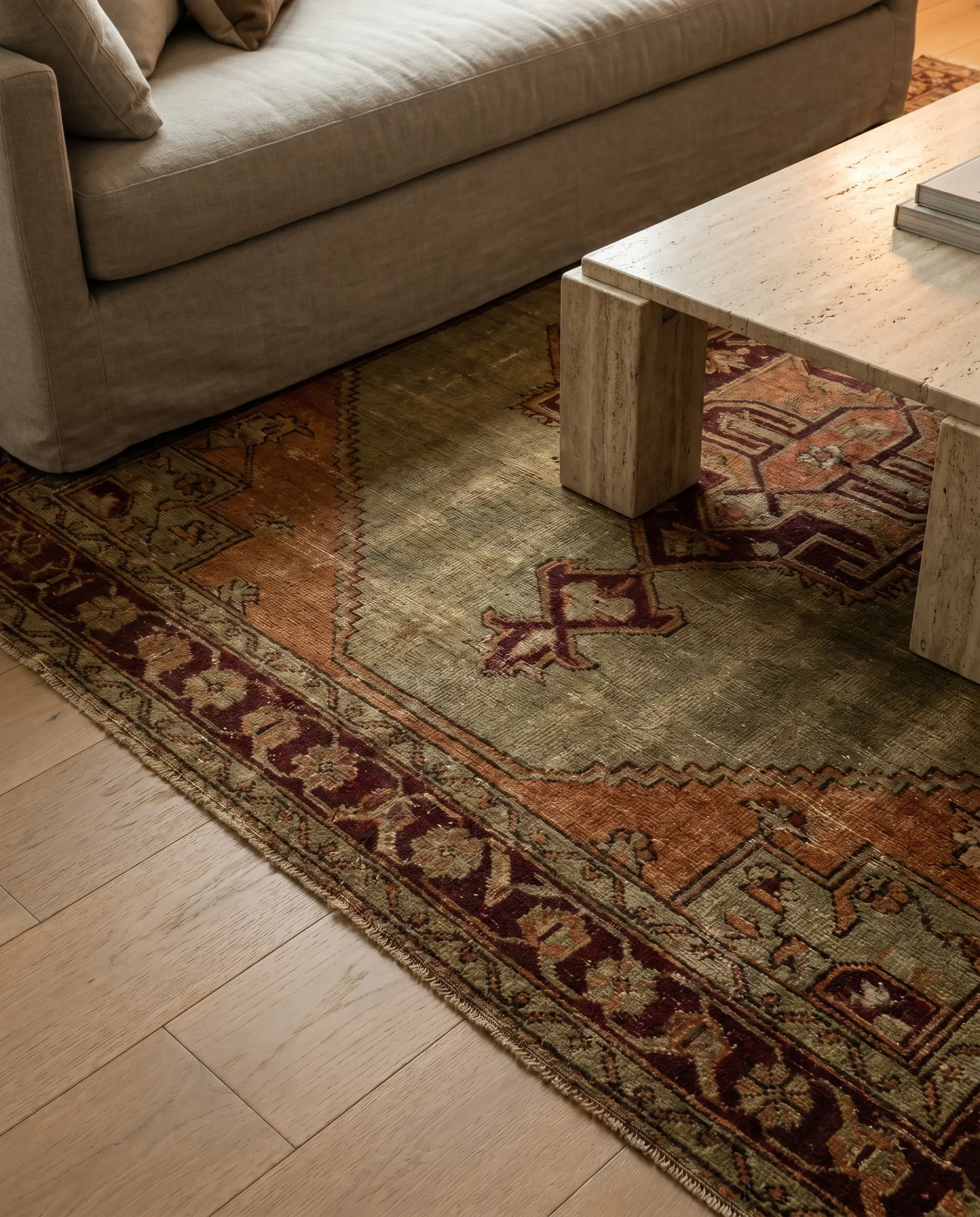
If you desire a break from strict neutrals, the introduction of organic earth tones must remain muted to preserve the sophisticated atmosphere. A vintage, faded Turkish rug featuring muted olive greens, rust oranges, or deep oxblood reds pulls out the warm undertones of greige without screaming for attention.
- Vibe: Storied, organic, and richly layered.
- Key Materials: Hand-knotted wool, naturally dyed fibers.
- Color Match: Faded olive green beautifully highlights the taupe/beige base of the wall color.
- Styling Pro-Tip: Ensure the rug is large enough that the front legs of all monolithic seating rest comfortably on top, anchoring the entire arrangement.
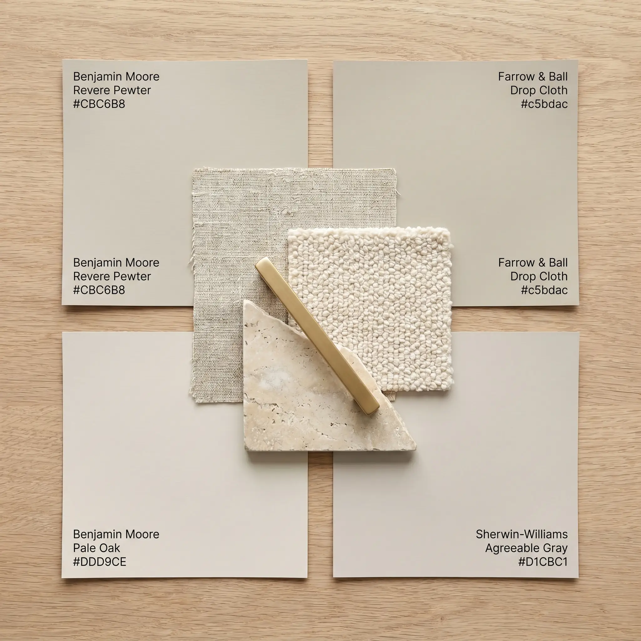
The Designer’s Cheat Code: Top Warm Greige Paint Colors for 2026
Selecting the exact paint formula is an exercise in precision. Here is the definitive cheat code of elite warm greige paint colors, complete with their Light Reflectance Values and undertone profiles, so you can execute this palette flawlessly.
| Paint Name / Brand | LRV | Dominant Undertone | Best Room Exposure |
|---|---|---|---|
| Benjamin Moore Revere Pewter | 55.05 | Warm muddy green/gray | South-Facing |
| Farrow & Ball Drop Cloth | 47.0 | Yellow/taupe | North-Facing |
| Sherwin-Williams Agreeable Gray | 60.0 | Taupe/brown | Balanced/Any |
| Benjamin Moore Pale Oak | 68.64 | Warm pink/taupe | North or East-Facing |
The Warm Minimalism Mandate
Warm greige is not merely a safe default; it is a highly deliberate, sophisticated design choice that hinges on the successful orchestration of texture, light, and architectural contrast. When executed with precision—honoring the friction between slub linen and unlacquered brass, or the seamless transition of color-drenching—it results in a space that feels endlessly rich and inviting. The journey to quiet luxury begins with understanding your specific environment. Do not buy a single gallon of paint today. Instead, order large peel-and-stick swatches of our recommended hues, place them on multiple walls, and observe how the undertones shift from the cool morning light to the golden hour. Your perfect greige is waiting to be found.
The Aesthetics Desk curates the visual direction for Hackrea. Specializing in design history, global architectural movements, and interior styling, this desk focuses on the psychology of space and how to translate high-end, magazine-quality aesthetics into approachable residential design without falling into fleeting micro-trends.