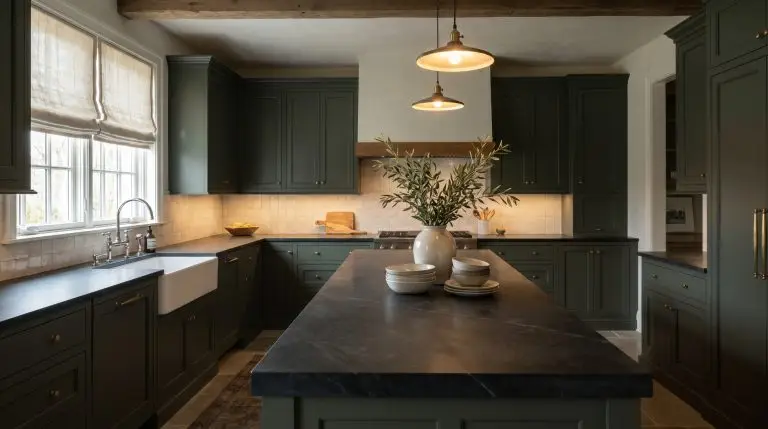
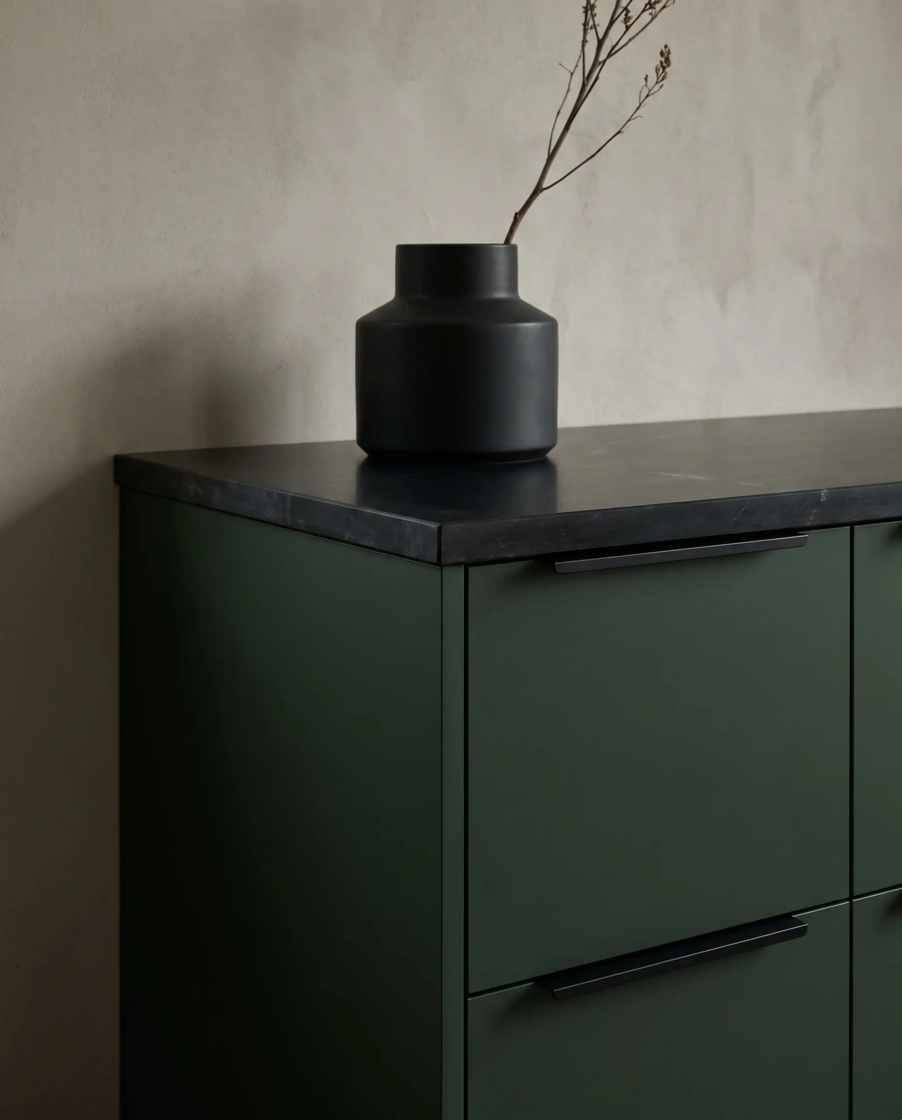
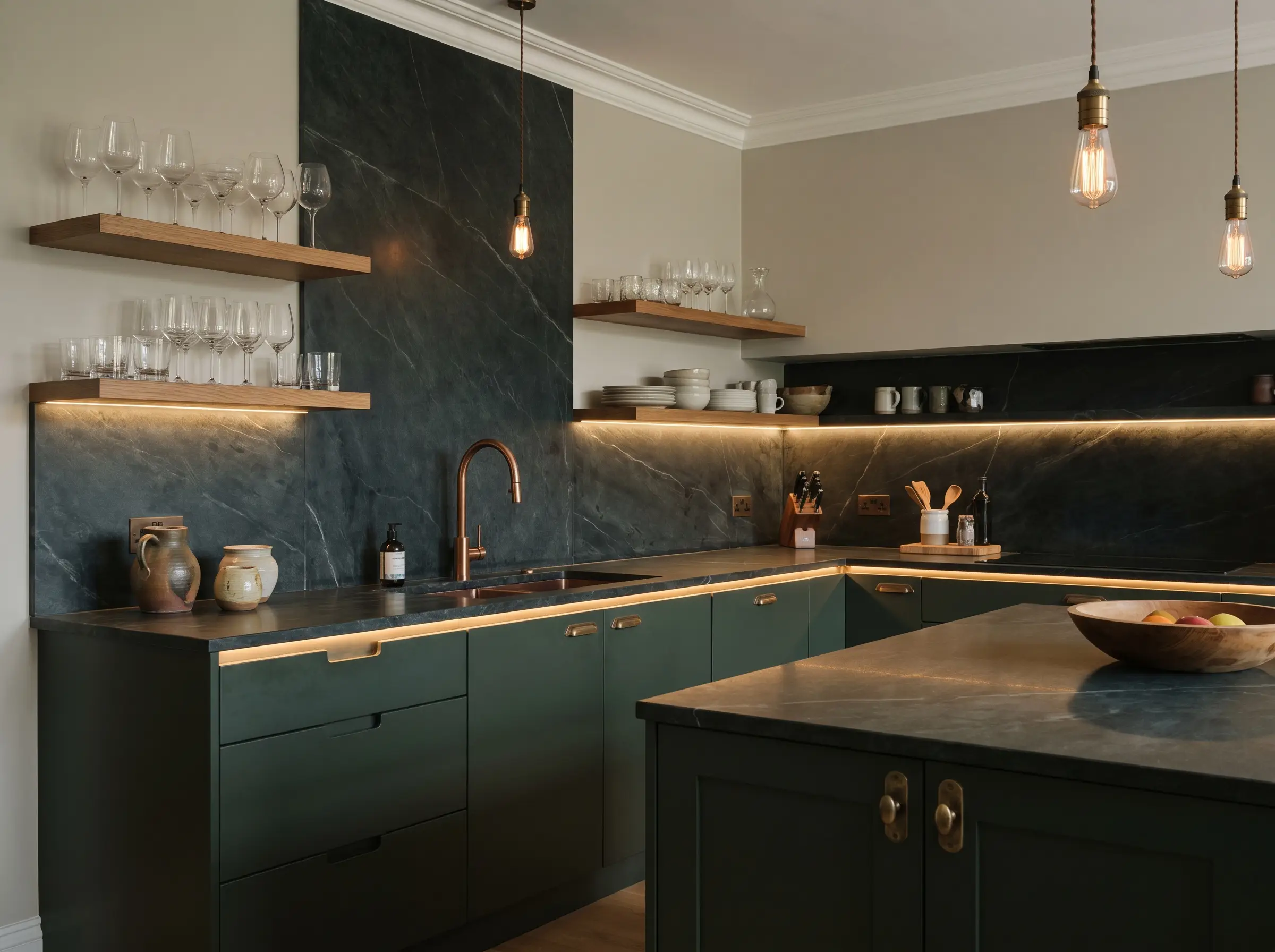
Soapstone countertops paired with dark green cabinetry represent the absolute antithesis of the sterile, all-white kitchen. This pairing is for those who crave warmth, historical character, and tactile surfaces that tell a story over time. Pulling off this bespoke look, however, requires much more than simply ordering dark stone and green paint. The success of this heritage aesthetic hinges entirely on balancing lighting temperatures, precise undertones, and the right structural hardware.
We are dealing with materials that breathe and shift. Steatite—the geological term for soapstone—is a living finish that transforms depending on how you treat it, while dark green paint absorbs light and changes dramatically from dawn to dusk. To master this moody kitchen, you must embrace the living finish, treating the stone, paint, and metals as a cohesive ecosystem that ages gracefully together.
The Undertone Equation: Pairing the Stone with the Paint
Neither soapstone nor green paint is a monolith. The specific treatment of your stone counters must directly dictate the shade and light reflectance value (LRV) of the cabinetry to maintain visual harmony.
Match Oiled, Charcoal Soapstone with Blackened Greens
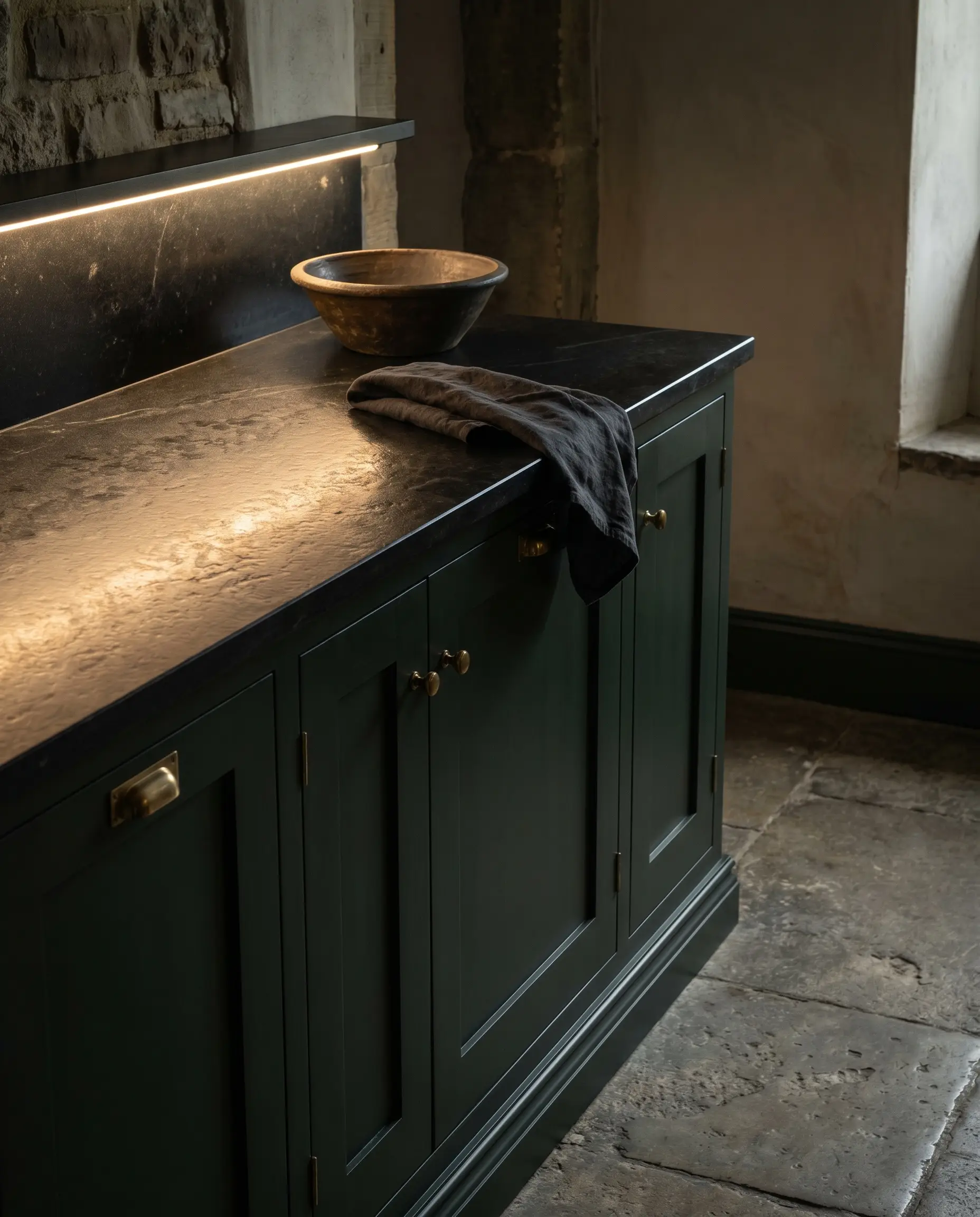
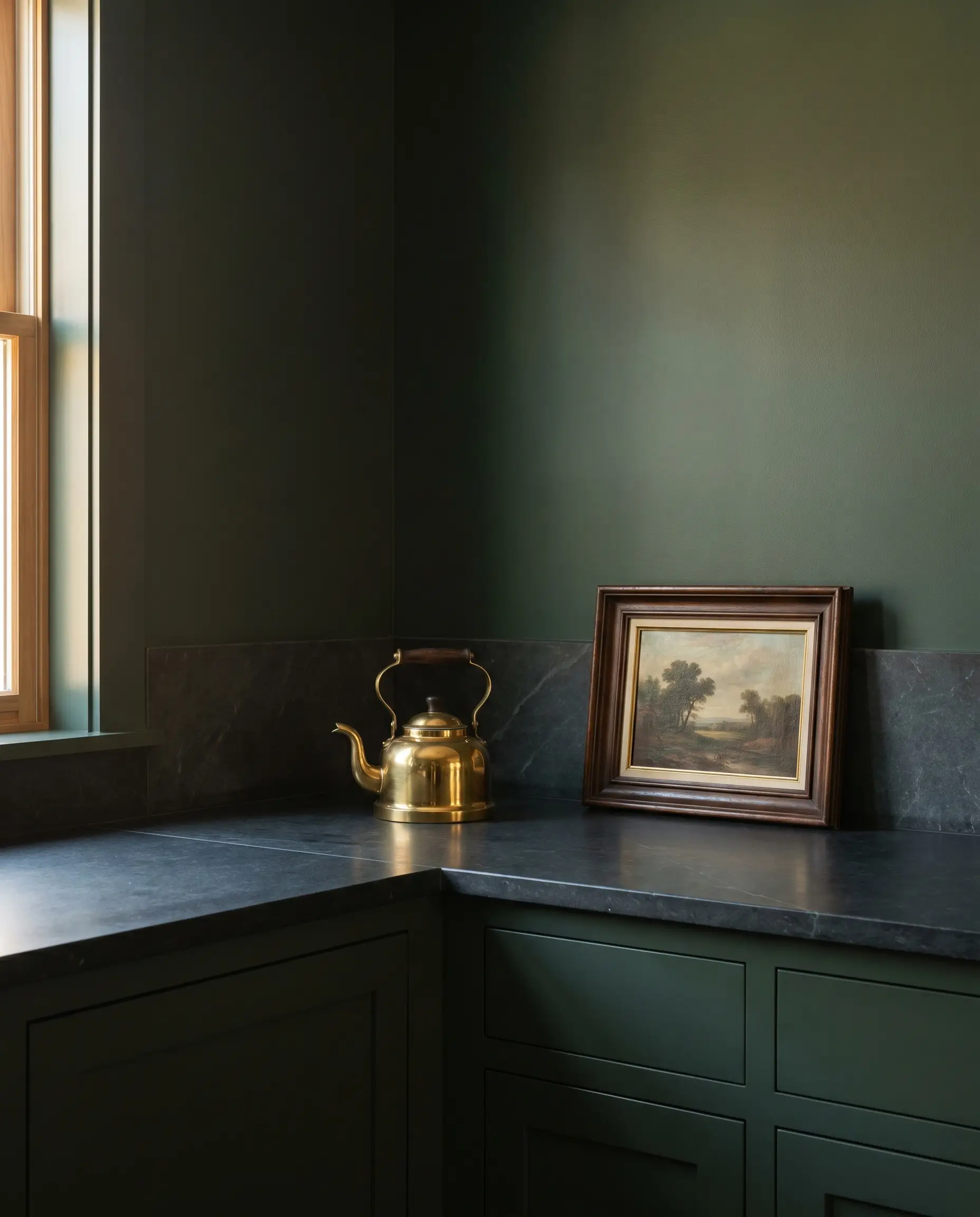
When you treat soapstone with mineral oil or carnauba wax, the surface immediately deepens into a rich, solid charcoal or pitch black. To create a seamless, dramatic, and monolithic environment, pair this darkened state with highly saturated greens that carry heavy black undertones.
- Vibe: Moody, historic, sophisticated scullery.
- Paint Match Blueprint: Farrow & Ball Studio Green or Benjamin Moore Essex Green.
- Styling Pro-Tip: Carry the dark paint onto the baseboards to ground the heavy visual weight of the oiled counters.
Pair Untreated, Chalky Gray Soapstone with Muted Sage
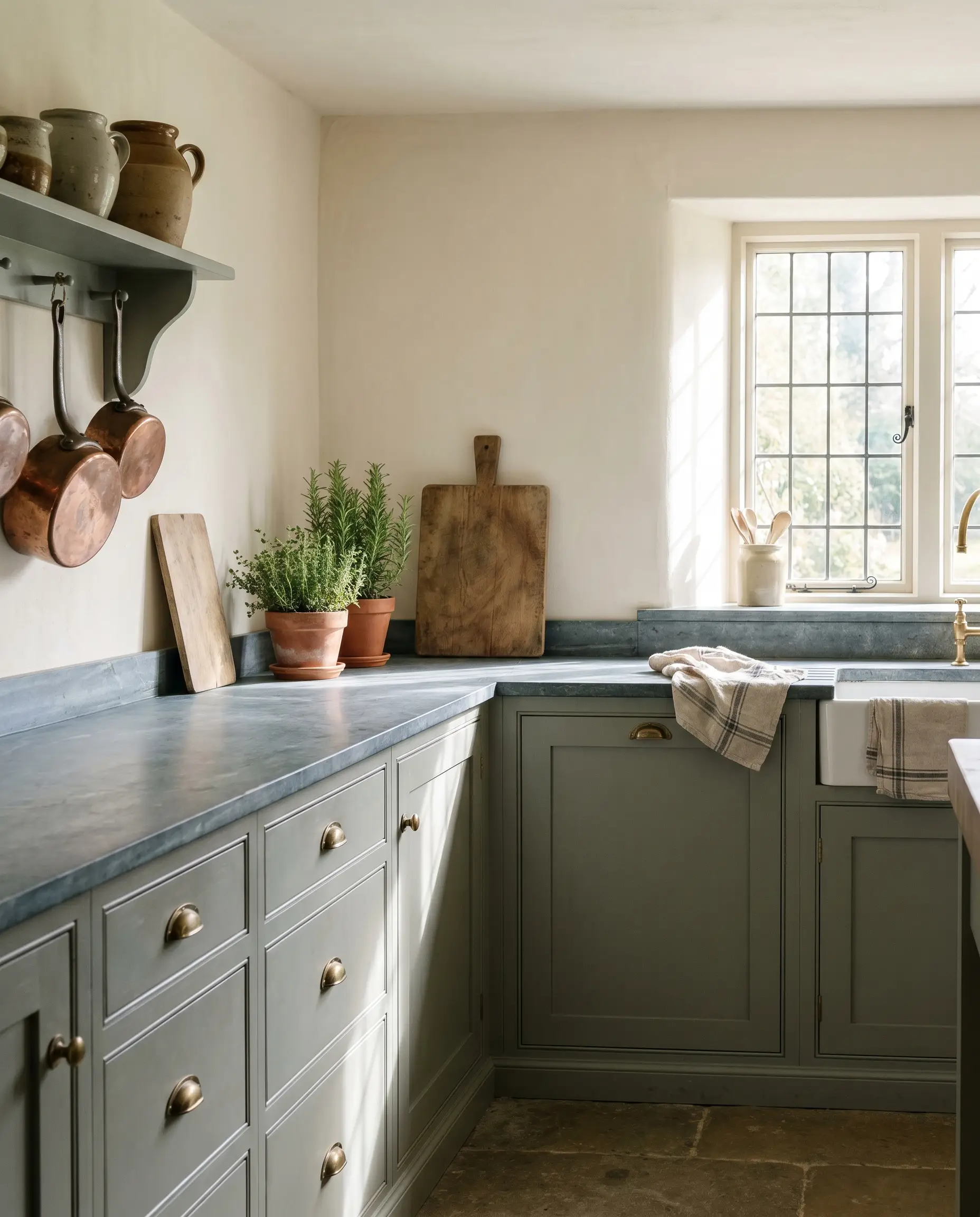
Left completely untreated, raw soapstone reads as a soft, matte, dusty blue-gray with a distinctly chalky, tactile surface. This lighter, more organic state pairs beautifully with muted, silvery greens, creating an approachable cottage or organic modern aesthetic.
- Vibe: Soft, organic, welcoming English cottage.
- Paint Match Blueprint: Farrow & Ball Green Smoke or Sherwin-Williams Pewter Green.
- Styling Pro-Tip: Keep the surrounding walls a warm, creamy off-white to complement the lighter LRV of these sage tones.
Use Heavy White Veining to Break Up Solid Emeralds
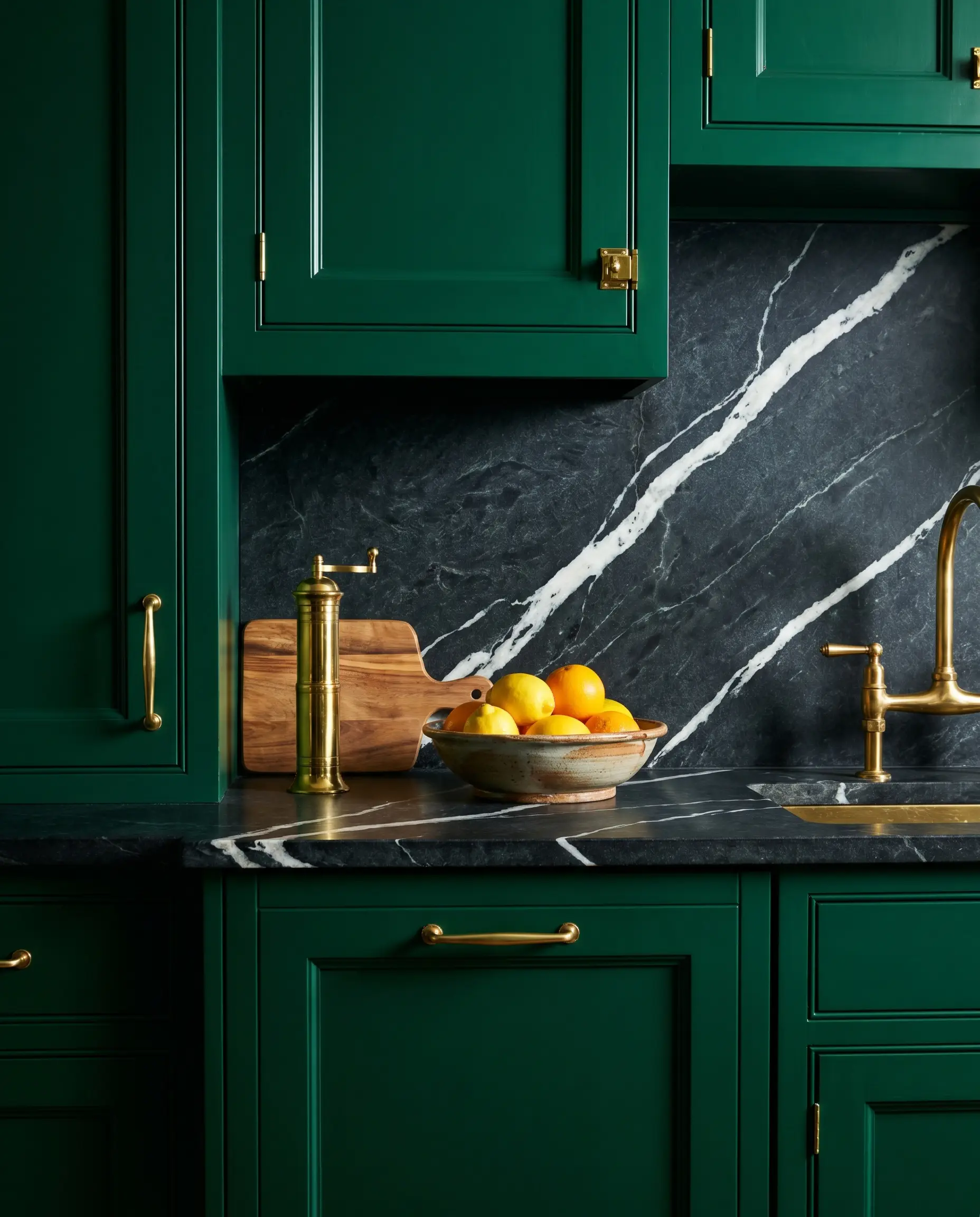
If your design calls for a vivid, saturated emerald or forest green, the surrounding architecture needs visual relief to prevent the space from feeling overly heavy. Source a soapstone slab featuring aggressive, striking white quartz veining, such as Stormy Black or Belvedere, to slice through the dark cabinetry.
- Vibe: Striking, luxurious, high-contrast.
- Key Material: Heavily veined steatite slabs.
- Styling Pro-Tip: Template the slab so the most dramatic white veins flow directly across the highest-traffic prep zones.
You can apply wallpapers, paints, etc. on walls and see how they look in various interiors.

The Hardware and Fixture Pairings
Hardware acts as the architectural jewelry that bridges the gap between deep green millwork and dark stone surfaces. Selecting the correct metal finish is critical to balancing the visual weight of the room.
Warm the Palette with Unlacquered Brass Cup Pulls
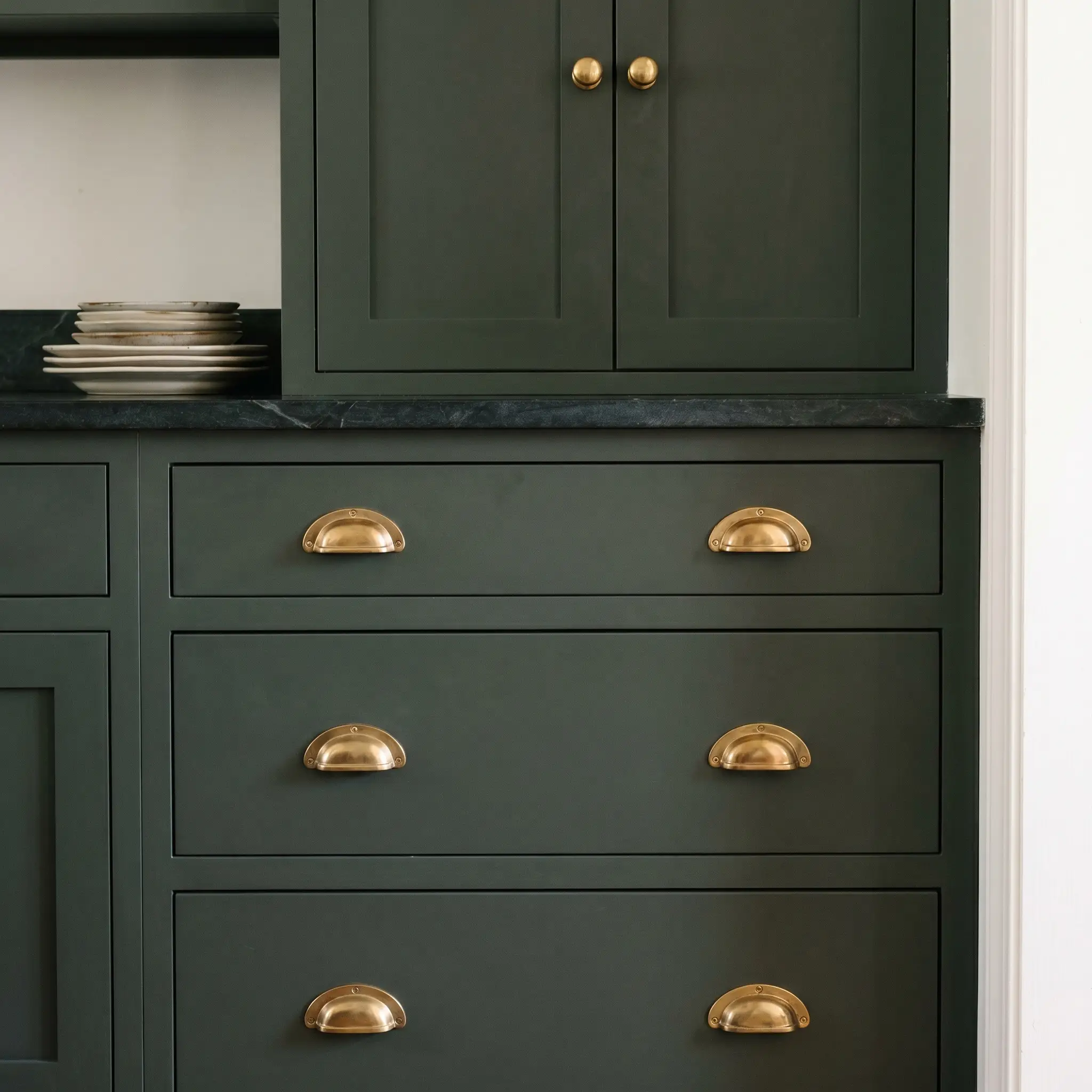
Unlacquered brass is the absolute gold standard for this heritage pairing, as the warm gold tones pierce brilliantly through cool, dark greens. Because brass is a living finish, it naturally tarnishes and ages right alongside the soapstone, creating a beautifully cohesive, lived-in narrative.
- Vibe: Classic, heirloom, authentic.
- Hardware Recommendation: Traditional cup pulls for heavy lower drawers, paired with classic round knobs for upper doors.
- Maintenance Note: Skip protective coatings and allow the brass to oxidize naturally from the oils on your hands.
Over the next five years, unlacquered brass will lose its shiny showroom finish, developing a rich, muted brown-gold tarnish that perfectly mimics the historical authenticity of a century-old scullery.
The Patina Factor
Lean into Heritage with Polished Nickel Bridge Faucets
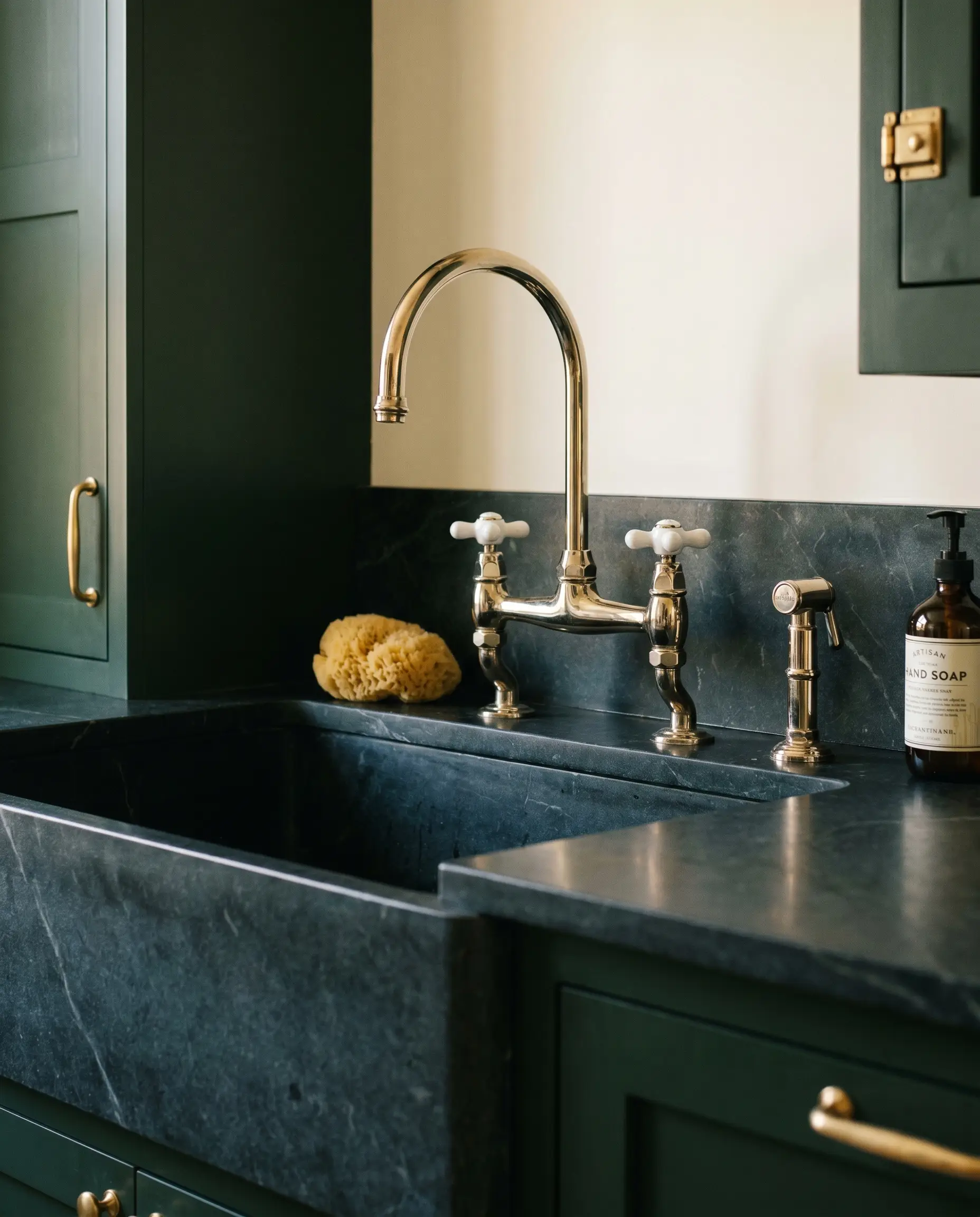
If brass feels too trend-forward for your aesthetic, polished nickel offers a historically accurate, warm silver tone that instantly grounds the space. Unlike the icy, sterile reflection of standard chrome, nickel casts a subtle yellow-brown undertone that feels remarkably rich against deep green.
- Vibe: Refined, traditional, understated luxury.
- Fixture Recommendation: A classic polished nickel bridge faucet with porcelain cross handles.
- Styling Pro-Tip: Mix polished nickel plumbing fixtures with unlacquered brass cabinet hardware for a highly curated, collected-over-time look.
Create Modern Contrast with Matte Black Minimalist Hardware
For an organic modern approach, strip away the ornamental details and match your hardware exactly to oiled soapstone. Installing sleek, matte black edge pulls on flat-panel green cabinetry creates a stealthy, highly architectural aesthetic.
- Vibe: Streamlined, contemporary, minimalist.
- Hardware Recommendation: Low-profile matte black edge pulls or recessed finger grooves.
- Styling Pro-Tip: Keep the countertop edges square and eased to maintain the modern structural lines.
Incorporate Aged Copper Accents for Secondary Patina
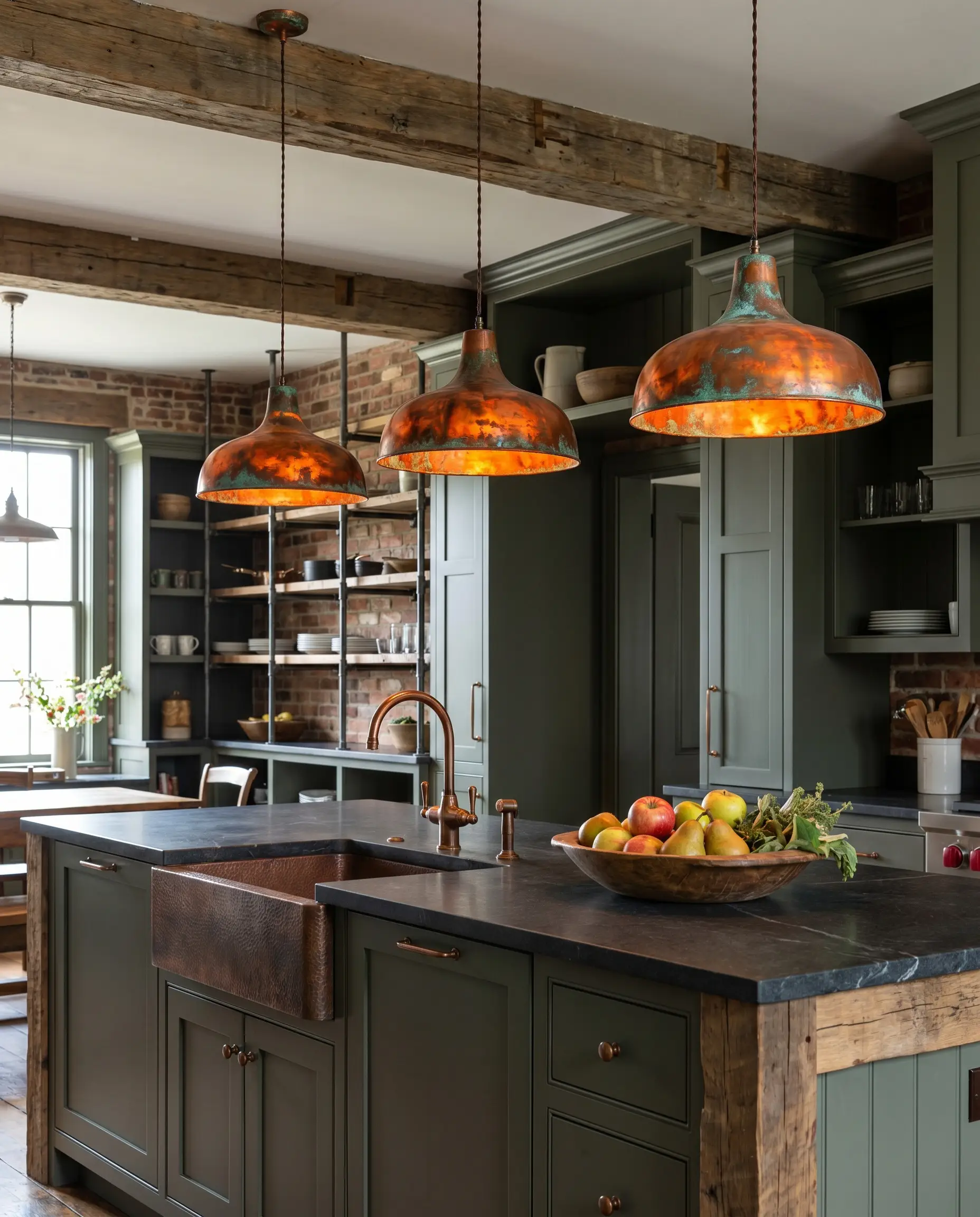
Introducing copper through lighting or plumbing fixtures injects a fiery warmth that beautifully disrupts the dark, cool tones of the room. This creates a necessary natural tension, drawing the eye upward and balancing the heavy base of the kitchen.
- Vibe: Rustic, artisanal, industrial-leaning.
- Key Materials: Spun copper lighting pendants or a hammered copper basin.
- Styling Pro-Tip: Allow the copper to develop a verdigris patina to subtly echo the green cabinetry.
Copper works so brilliantly here because of strict color wheel opposition. The red and orange undertones of aged copper sit directly opposite green, generating maximum visual impact without breaking the organic material palette.
Designer Secret
Backsplash Strategies to Prevent a “Black Hole” Effect
The primary fear with dark counters and dark lower cabinetry is creating an oppressive, cave-like environment. The backsplash serves as your primary structural tool to bounce light back into the room and provide necessary visual relief.
Reflect Light with Glossy, Irregular Off-White Zellige
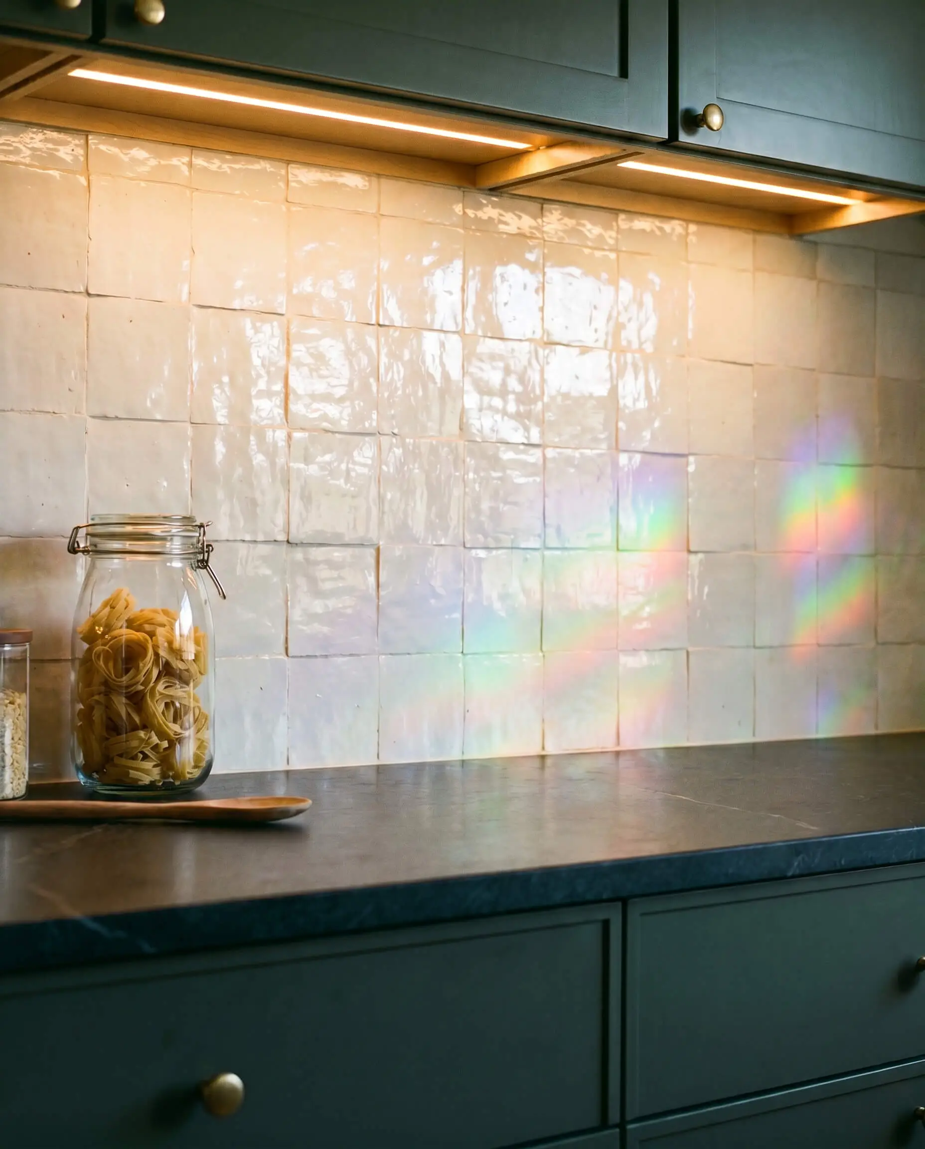
Soapstone is an inherently matte material that absorbs light, making it crucial to introduce a contrasting texture on the vertical plane. High-gloss, glazed Moroccan zellige tiles in off-white or parchment act like a prism, catching under-cabinet lighting and bouncing it across the room through their beautifully irregular surfaces.
- Vibe: Earthy, textured, luminous.
- Material Match: 4×4 glazed off-white zellige tile.
- Styling Pro-Tip: Request a butt-joint installation with minimal grout lines to emphasize the handmade variation of the clay.
Run a Seamless Soapstone Slab Up the Wall
Running the soapstone up the wall as a full slab backsplash creates an incredibly bespoke, high-end architectural statement. To prevent this vast expanse of dark stone from feeling oppressive, balance it by painting the upper walls a soft, contrasting neutral or replacing upper cabinets entirely with open shelving.
- Vibe: Luxurious, dramatic, monolithic.
- Key Material: Continuous, book-matched steatite slabs.
- Budget Note: Slab backsplashes significantly increase fabrication and material costs.
Soften the Transition with Tumbled Travertine Subways
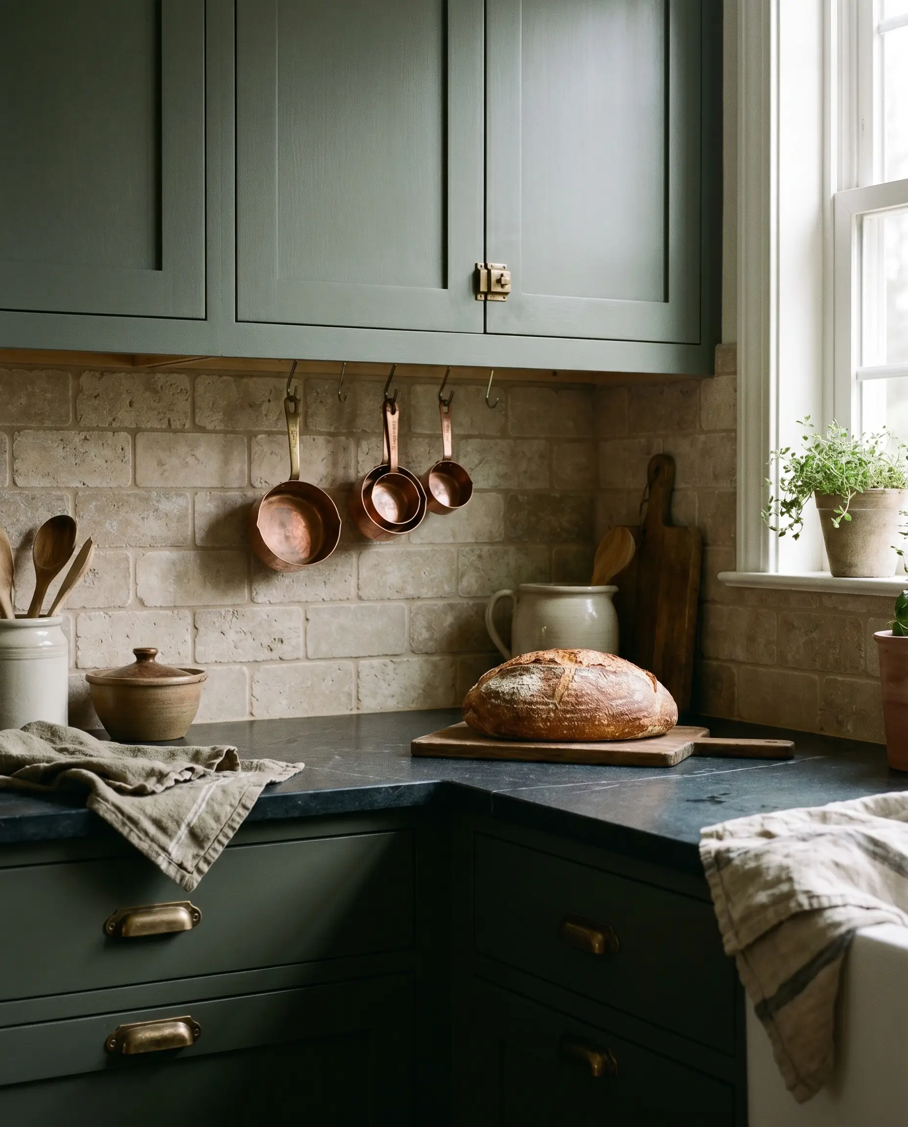
Travertine introduces a warm, beige-taupe earthiness that perfectly bridges the gap between cold green paint and dark stone. Using a tumbled finish ensures the edges look worn and historic, pushing the kitchen deeper into a cozy, English country aesthetic.
- Vibe: Rustic, warm, old-world.
- Material Match: 3×6 tumbled travertine subway tiles.
- Styling Pro-Tip: Use a warm, sand-colored grout to blend seamlessly with the stone rather than a stark white.
Use a 4-Inch Soapstone Splash with Washable Paint Above
A classic Shaker and Craftsman detail involves running a short, four-to-six-inch soapstone upstand along the back wall. You can then paint the drywall above it in a durable eggshell white for bright contrast, or continue the dark green up to the ceiling for a fully color-drenched, immersive space.
- Vibe: Traditional, practical, understated.
- Key Material: 4-inch steatite upstand matching the counter thickness.
- Styling Pro-Tip: Ensure the drywall is perfectly smooth (level 5 finish) if utilizing the color-drenched paint method above the splash.
Structural Balance and Wood Accents
Dark, saturated colors carry immense visual weight. To prevent the room from feeling bottom-heavy, you must introduce structural millwork and natural wood tones to ground the design.
Balance the Dark Base with Quarter-Sawn White Oak Shelving
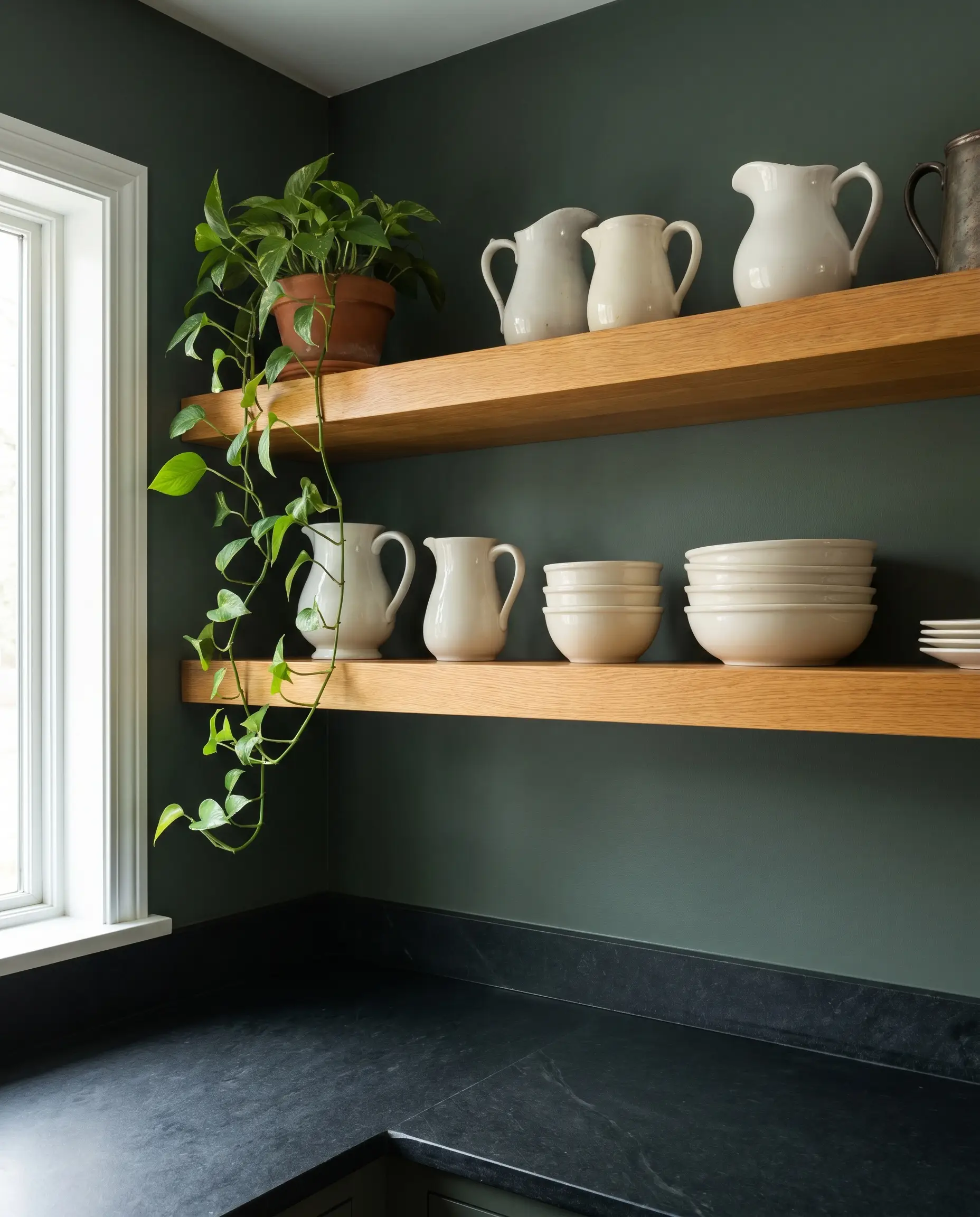
Break up the continuity of dark green walls and soapstone counters by installing thick, floating white oak shelves. The organic, warm wood tone immediately softens the space, providing a highly curated staging area for ironstone pitchers, stacked ceramics, or trailing plants.
- Vibe: Organic, collected, breathable.
- Material Match: 2-inch thick quarter-sawn or rift-sawn white oak.
- Styling Pro-Tip: Keep the shelf styling functional; display only items you use daily to maintain an authentic, working-kitchen aesthetic.
Frame a Classic White Fireclay Farmhouse Sink
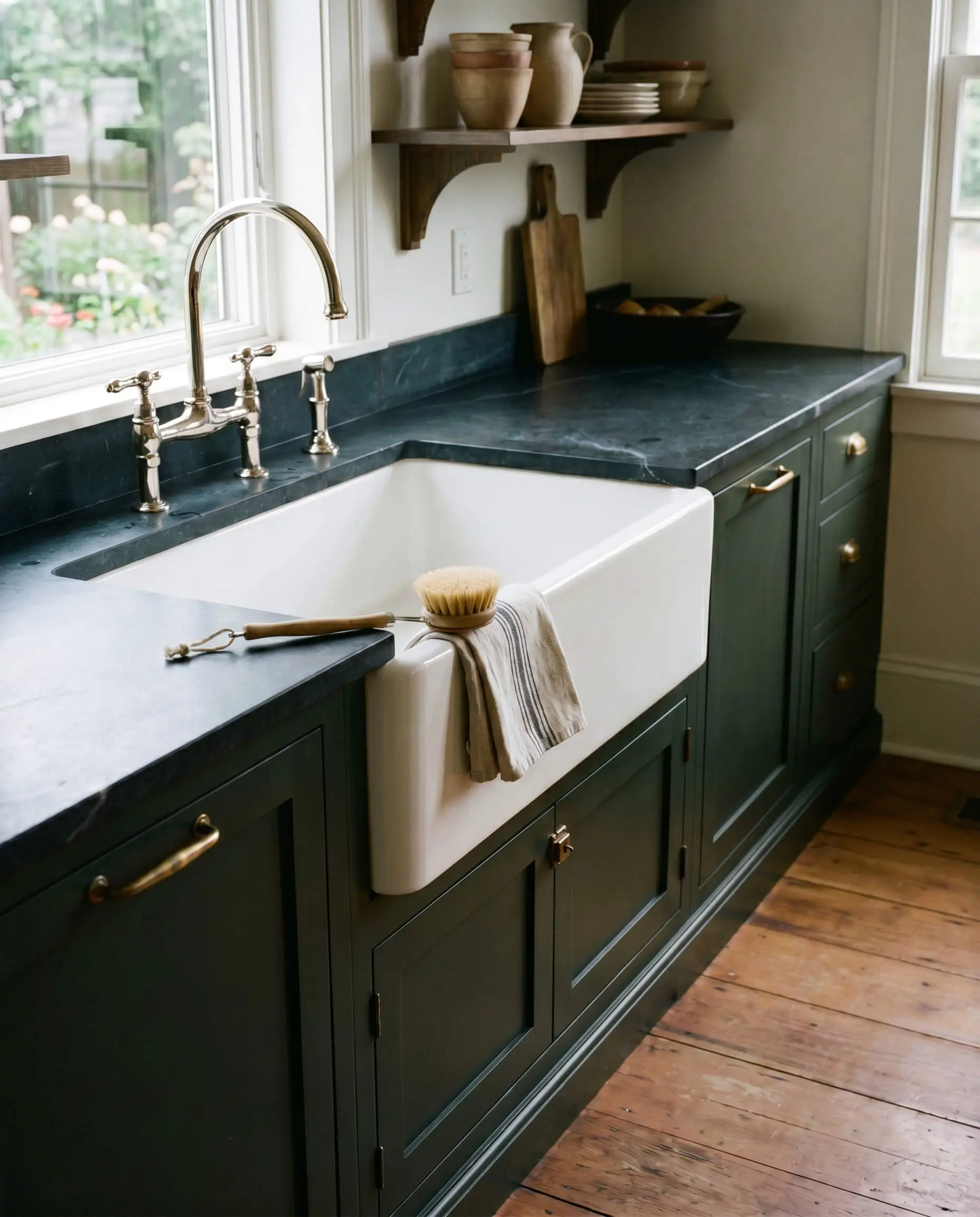
A massive, bright white apron-front sink breaks up the heavy horizontal run of dark cabinets and dark stone. This bright interruption creates necessary negative space, acting as a brilliant focal point against the moody perimeter.
- Vibe: Heritage, practical, grounded.
- Key Material: Heavy-duty fireclay farmhouse sink.
- Styling Pro-Tip: Undermount the sink so the soapstone counter slightly overhangs the bowl, allowing water to sweep cleanly off the stone.
Ground an Oversized Island with a Thick Mitered Edge
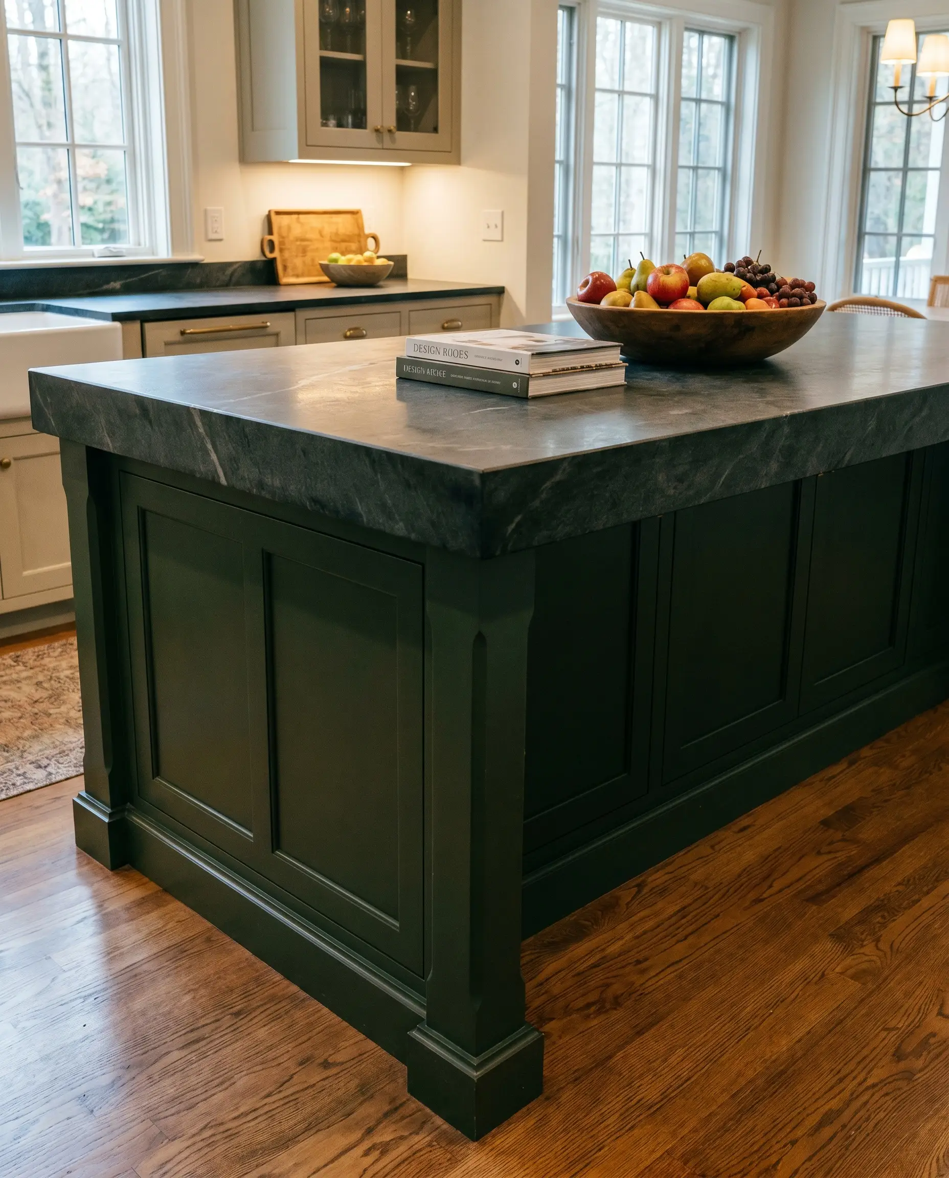
If your layout includes a dark green island, give the soapstone a thick mitered drop edge—a fabrication technique where the stone is cut and joined at an angle to appear much thicker than the standard slab. This structural permanence visually anchors the massive piece in the center of the room.
- Vibe: Substantial, bespoke, architectural.
- Fabrication Detail: 2-inch or 3-inch mitered drop edge.
- Styling Pro-Tip: Ensure the island base has heavy, structural legs or deep baseboards to support the visual weight of the thickened stone.
A standard soapstone slab is typically 3cm (1 1/4 inches) thick. A mitered edge creates the illusion of a massive block of stone without the extreme weight that would require structural floor reinforcement.
Architect’s Note
Elevate the Millwork with Beaded Inset Cabinetry
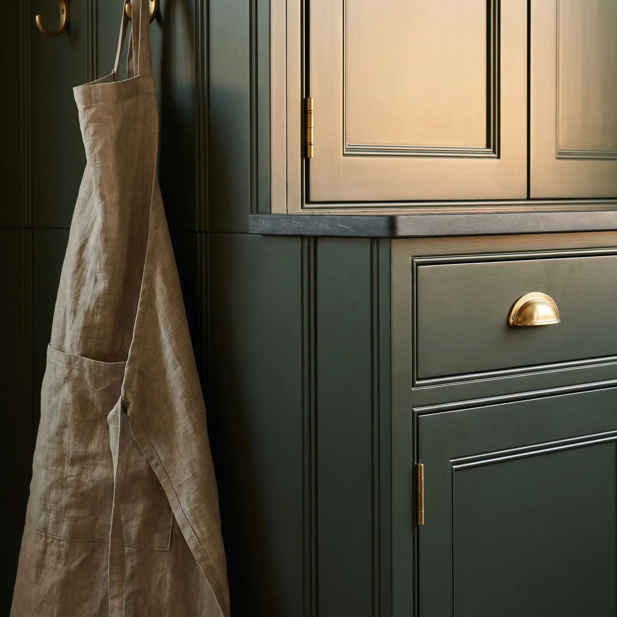
Dark green paint notoriously hides shadows and flattens details. To ensure the cabinetry reads as custom craftsmanship rather than a flat green box, mandate beaded inset doors, where the extra routed groove catches the light and highlights the structural depth.
- Vibe: High-end, tailored, historic.
- Key Material: Custom beaded inset face frames.
- Styling Pro-Tip: Use exposed barrel hinges in an unlacquered brass finish to further emphasize the traditional inset construction.
Lighting and Living with the Pairing
The final execution details determine how the kitchen functions after dusk and how the materials endure over decades of daily cooking.
Layer 2700K Warm Under-Cabinet Lighting
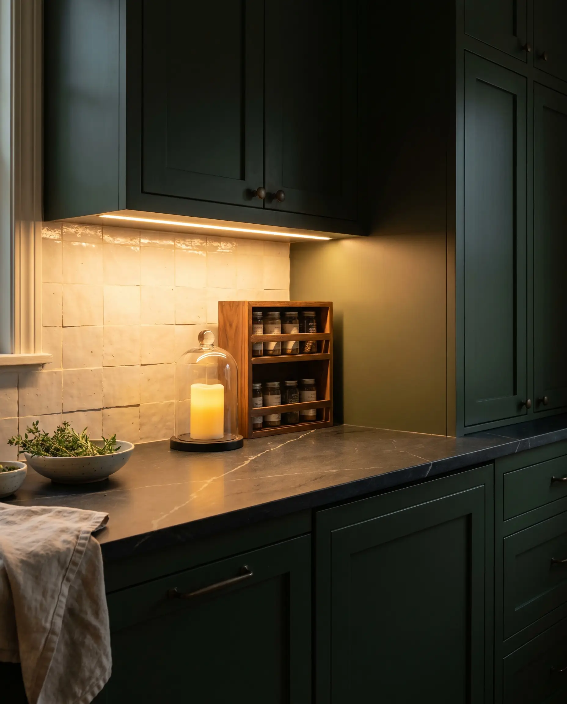
Lighting temperature is the make-or-break factor in this environment; cool lighting (4000K or higher) will instantly make rich greens look sickly and turn premium soapstone into cheap-looking plastic. You must utilize warm lighting to highlight the quartz veining in the stone and enrich the depth of the cabinet paint.
- Vibe: Warm, inviting, atmospheric.
- Lighting Rule: Strictly use 2700K warm LED strips.
- Styling Pro-Tip: Install the strips at the front edge of the upper cabinets, angling the light back toward the backsplash to eliminate harsh glare on the stone.
Always put under-cabinet and pendant lighting on separate dimmer switches. This allows you to completely control the mood of the dark materials, transitioning from bright prep-work lighting to a soft, ambient evening glow.
Architect’s Note
Soften Hard Lines with Linen Roman Shades
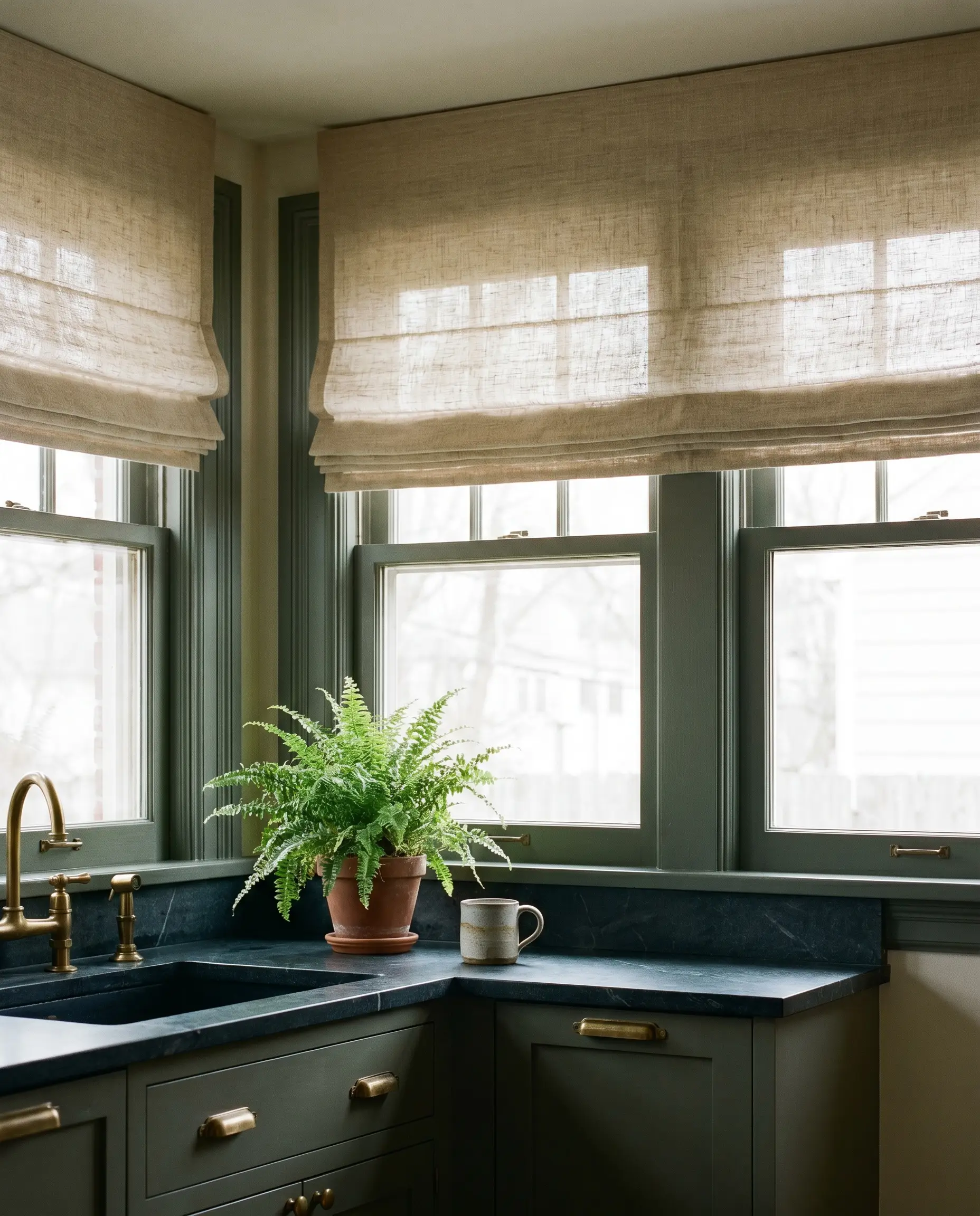
Soapstone, brass, and painted wood are inherently hard, rigid materials that can bounce sound and feel severe. Introduce soft, tailored linen or woven wood roman shades to the kitchen windows to absorb acoustics and add a crucial layer of soft textile against the dark architectural elements.
- Vibe: Tailored, soft, layered.
- Material Match: Natural unbleached linen or bamboo woven woods.
- Styling Pro-Tip: Mount the roman shades outside the window frame, close to the ceiling, to draw the eye up and make the room feel taller.
Embrace the Patina (Or Commit to the Wax)
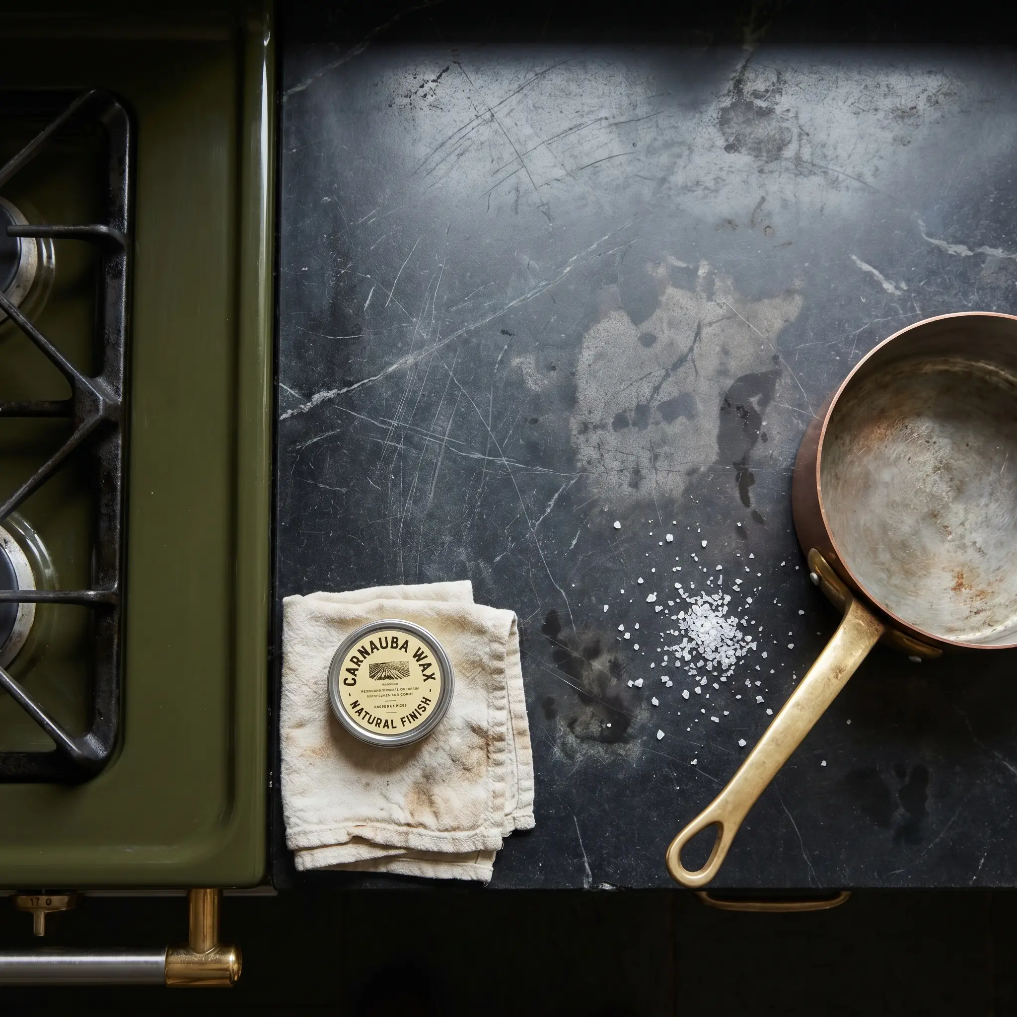
Soapstone is softer than granite and will inevitably scratch, nick, and darken around the stove from cooking oils. In a heritage kitchen, this is a beautiful feature of historic design, not a flaw to be feared.
- Vibe: Authentic, lived-in, practical.
- Maintenance Item: Food-safe mineral oil or natural carnauba wax.
- Styling Pro-Tip: If a scratch deeply bothers you, a light buffing with 400-grit sandpaper and a dab of oil will make it vanish instantly.
| Feature | Oiled / Waxed Soapstone | Untreated Soapstone |
|---|---|---|
| Color Depth | Deep charcoal to pitch black. | Soft, dusty, light blue-gray. |
| Maintenance | Requires re-oiling every few months to maintain even darkness. | Zero maintenance required; simply wash with mild soap. |
| Water Spots | Hides water rings well; oils blend into the dark finish. | Shows temporary dark spots when wet, which fade as it dries. |
| Scratch Visibility | Scratches show as light gray marks against the black stone. | Scratches blend seamlessly into the naturally gray surface. |
Designing for Longevity, Not Just the Trend
Dark green and soapstone is not a fleeting social media aesthetic; it is a pairing rooted deeply in centuries of authentic scullery and heritage design. When you commit to living finishes and high-quality, tactile materials, you are building a space that actually improves with age rather than degrading from its showroom state.
Before making your final selections, source a physical sample of steatite. Oil half of the stone, leave the other half raw, and test your paint swatches against both sides in your actual kitchen lighting. By respecting the natural undertones and honoring the patina, you will craft a kitchen that feels deeply grounded, incredibly sophisticated, and wonderfully lived-in for decades to come.
The Hackrea Style Desk treats interior decoration as an exact visual science. Rather than focusing on demolition or floor plans, this desk masters the art of color theory, undertone matching, material pairings, and spatial proportion. From balancing the visual weight of mixed metals to finding the perfect bridging tone between disparate wood species, this desk provides the rigorous aesthetic rules needed to achieve high-end, editorial-quality harmony in any space.