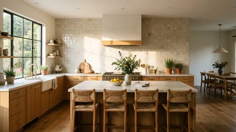
We inherently crave a restorative bedroom environment, and muted green often feels like the most natural answer. Yet, executing a sophisticated sage green bedroom involves far more than simply rolling a single coat of latex paint onto flat drywall. Without a strategic approach to lighting and material pairings, you risk selecting a shade that leans uncomfortably close to a minty 1990s hospital corridor or a muddy, yellow swamp.
A truly sanctuary-like space relies heavily on spatial context, architectural finishes, and an understanding of how directional light manipulates color. Sage is the ultimate chameleon hue, requiring the right Light Reflectance Value (LRV) to ensure it grounds the room without suffocating it. When treated as a highly tactile canvas rather than a flat surface, this desaturated green can bridge the gap between an accessible weekend update and high-end, bespoke luxury.
To help you navigate these nuances, our analysis moves past generic color wheel advice to focus on the exact material sciences and spatial illusions that top designers use. From navigating the complexities of color-drenching to sourcing the perfect rift-sawn oak and unlacquered brass pairings, here are 22 specific executions, tactile finishes, and exact paint shade recommendations to master the look.
The Science of Sage: Lighting and Undertones
Understanding how directional light interacts with color is the single most critical step before opening a paint can. Light Reflectance Value (LRV) dictates how much light a color absorbs or reflects—meaning a lower LRV creates a moodier, enveloping space, while a higher LRV feels airier. Because sage is a chameleon color, its undertones shift dramatically depending on the directional light of your specific room.
| Light Direction | Visual Effect on Sage Green | Recommended Undertone Strategy |
|---|---|---|
| North-Facing | Cool, indirect light amplifies silver and gray undertones, making the color appear cooler and slightly darker. | Opt for a sage with warmer yellow/olive undertones to prevent the room from feeling sterile. |
| South-Facing | Intense, warm light pulls out the yellow and golden undertones, making the green feel much more vibrant. | Select a highly desaturated, gray-leaning sage to balance the intense warmth. |
| East-Facing | Bright and warm in the morning, but casts cool shadows by the afternoon. | Test the color on multiple walls; a balanced, true sage works best to handle the shifting light. |
| West-Facing | Cool in the morning, but bathed in intense, warm golden-hour light in the late afternoon. | Lean toward cooler, gray-based greens that won’t overwhelm the space when the afternoon sun hits. |
You can apply wallpapers, paints, etc. on walls and see how they look in various interiors.

Architectural Texture & Millwork Formations
Flat drywall can inadvertently make muted colors feel dead, whereas physical texture brings them to life. Sage green thrives on shadows and depth, making architectural millwork and tactile surfaces its greatest allies.
1. Apply a Tactile Limewash or Roman Clay Finish
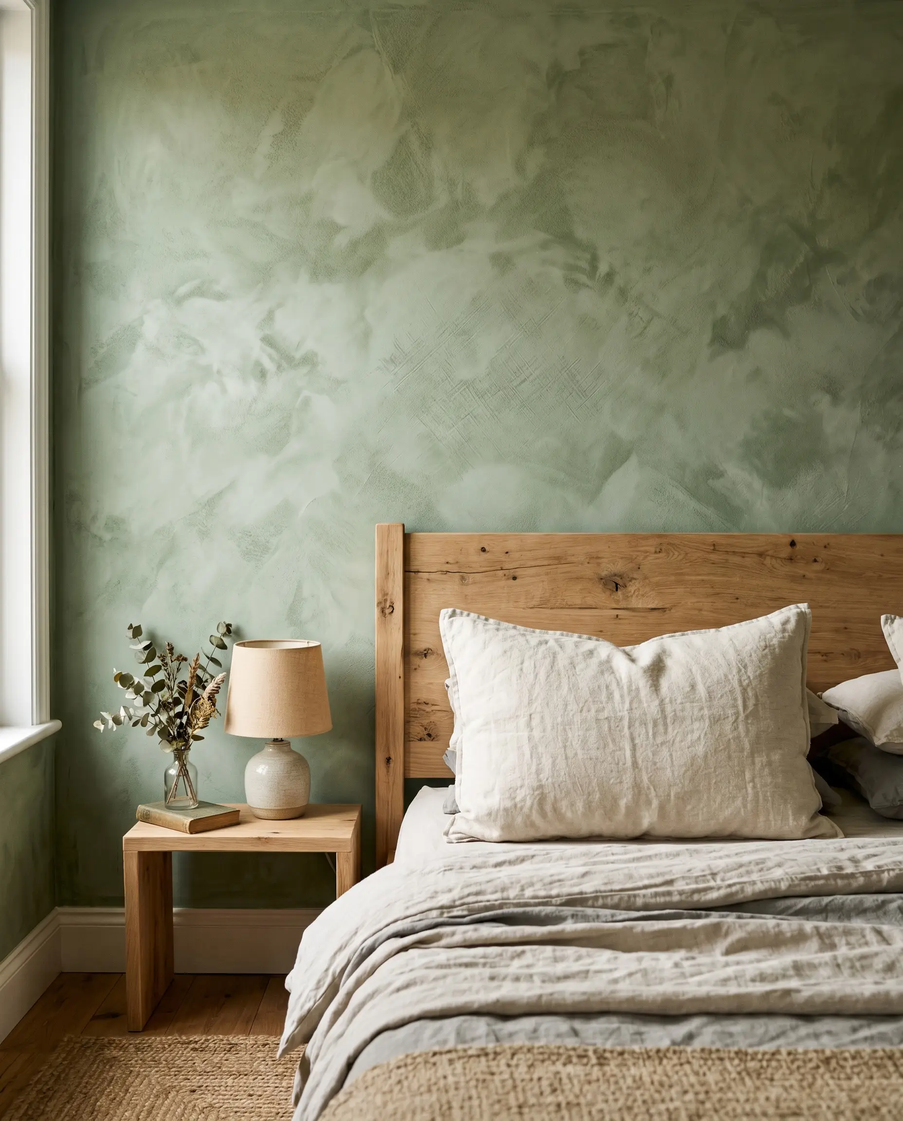
Ditching standard latex paint for a mottled, suede-like finish transforms a flat wall into a highly tactile canvas. By utilizing materials like limewash or Roman clay, the room gains a cloudy, organic movement that catches directional light beautifully.
- Key Material: Bauwerk Limewash or Portola Paints Roman Clay.
- Visual Effect: Creates a soft, plaster-like depth that breaks up solid color blocks.
- Execution Strategy: Apply with a masonry brush in a sweeping cross-hatch pattern.
Never attempt to patch a limewash wall with a standard roller; you must respect the organic, chalky nature of the application to maintain the illusion of historic plaster.
The Designer’s Rule
2. Install Floor-to-Ceiling Board and Batten
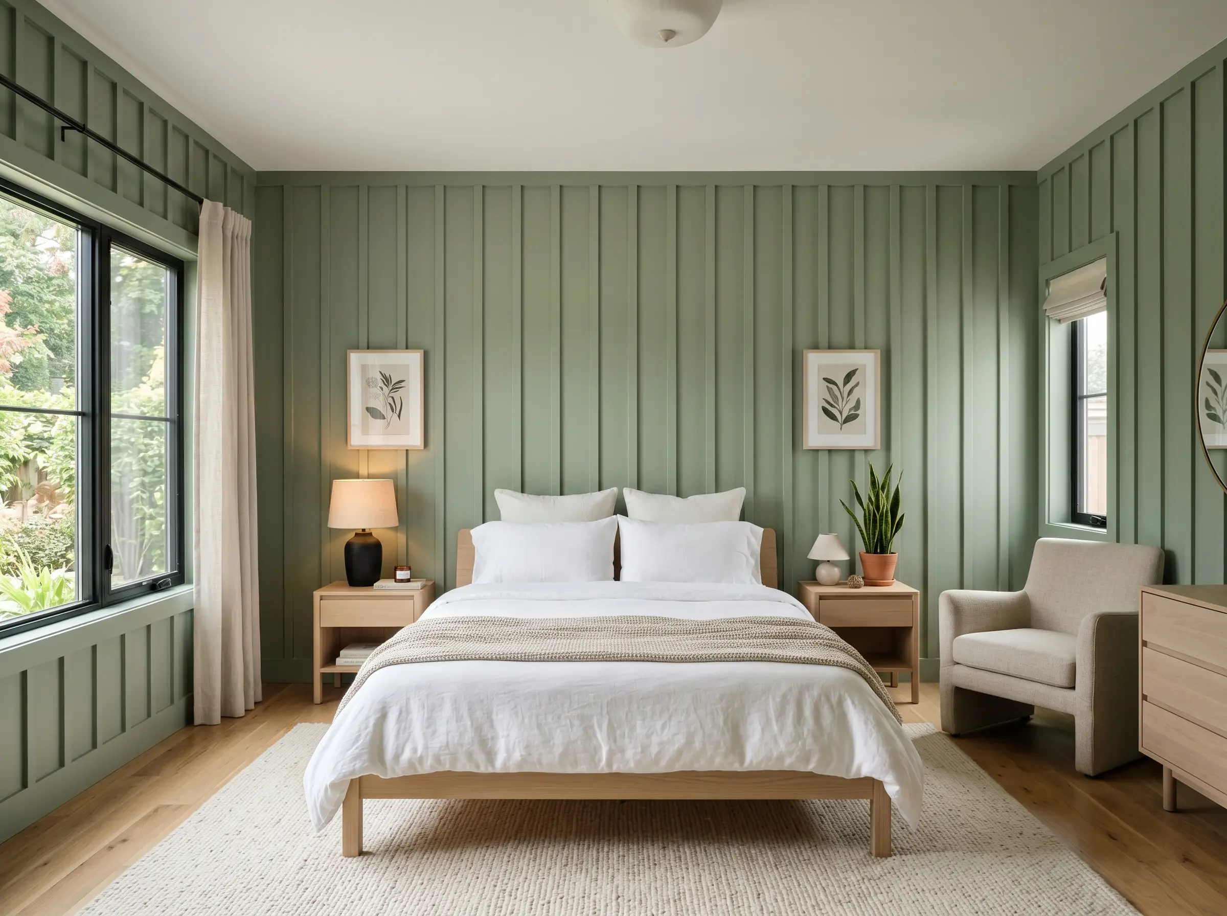
Installing vertical wooden strips across the entirety of the wall draws the eye upward, manipulating the spatial illusion of the room. When painted in a continuous, satin sage, this treatment makes standard eight-foot ceilings feel significantly taller.
- Vibe: Structured, architectural modernism.
- Paint Finish: Satin or eggshell to ensure the vertical relief catches the light.
- Spatial Trick: Elongates the wall height by emphasizing vertical lines.
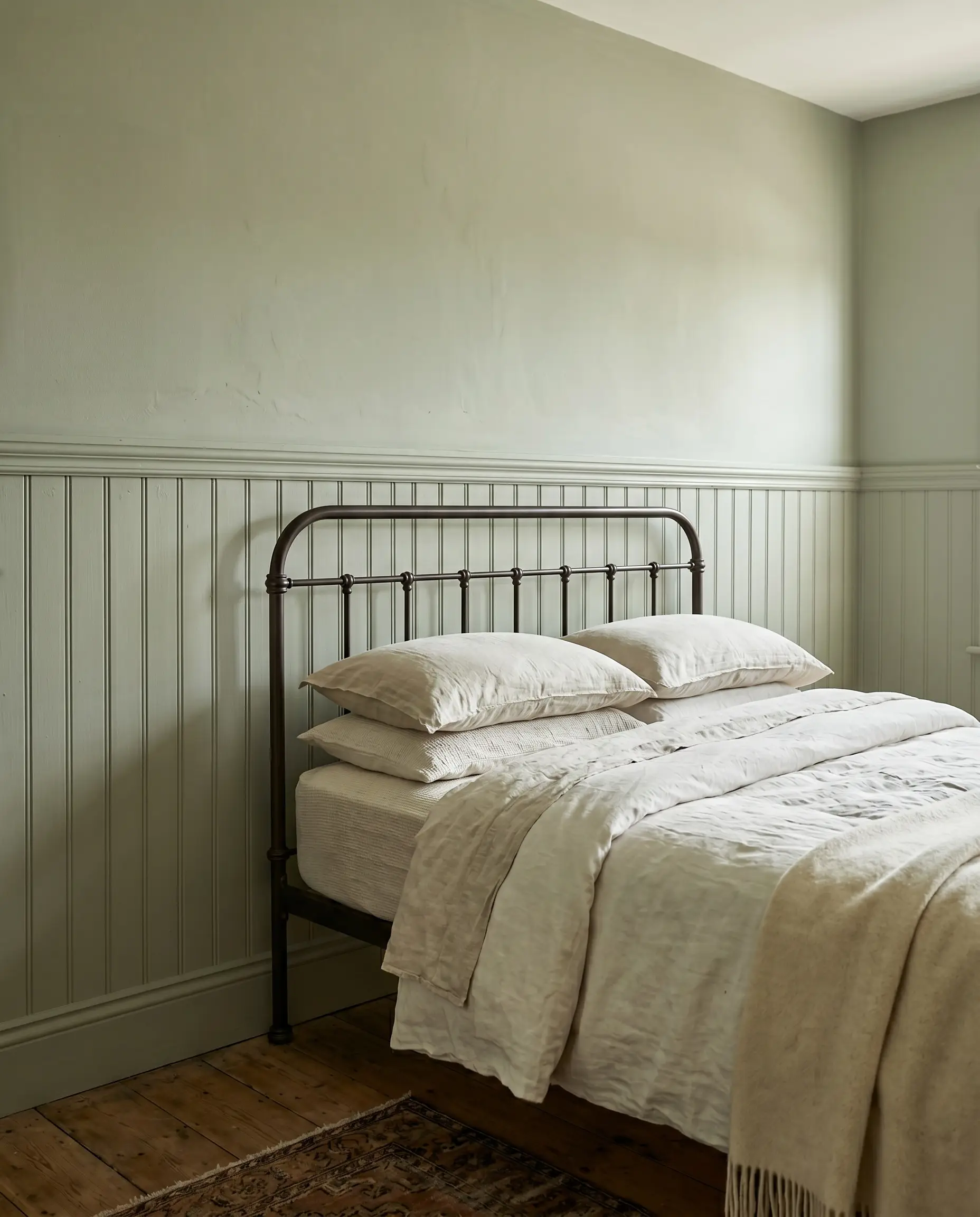
3. Ground the Room with a Beadboard Wainscoting
Applying traditional beadboard to the lower section of the room establishes immediate architectural grounding. Painting the beadboard a medium-depth sage while leaving the upper wall a creamy white creates a perfect foundation for an English Cottagecore aesthetic.
- Proportion Guide: Follow the two-thirds height rule—install the wainscoting exactly two-thirds up the wall.
- Color Pairing: Benjamin Moore Swiss Coffee on the upper third.
- Vibe: Historic, lived-in charm with an elevated edge.
4. Frame the Bed with Traditional Picture Molding
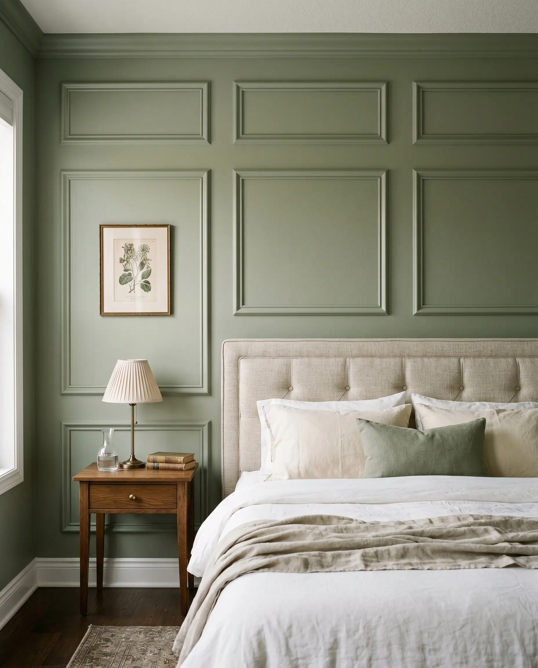
Applying box trim molding directly to the drywall and painting it the exact same shade of sage creates a sophisticated tonal shift. The subtle physical relief of the molding catches the light, providing rich shadow lines without the need for a secondary accent color.
- Application: Symmetrical boxes framing the headboard and nightstands.
- Sheen Contrast: Use a flat finish on the drywall and a satin finish on the molding for subtle reflection.
- Vibe: Classic, Parisian-inspired luxury.
5. Layer with a Tonal Sage Botanical Wallpaper
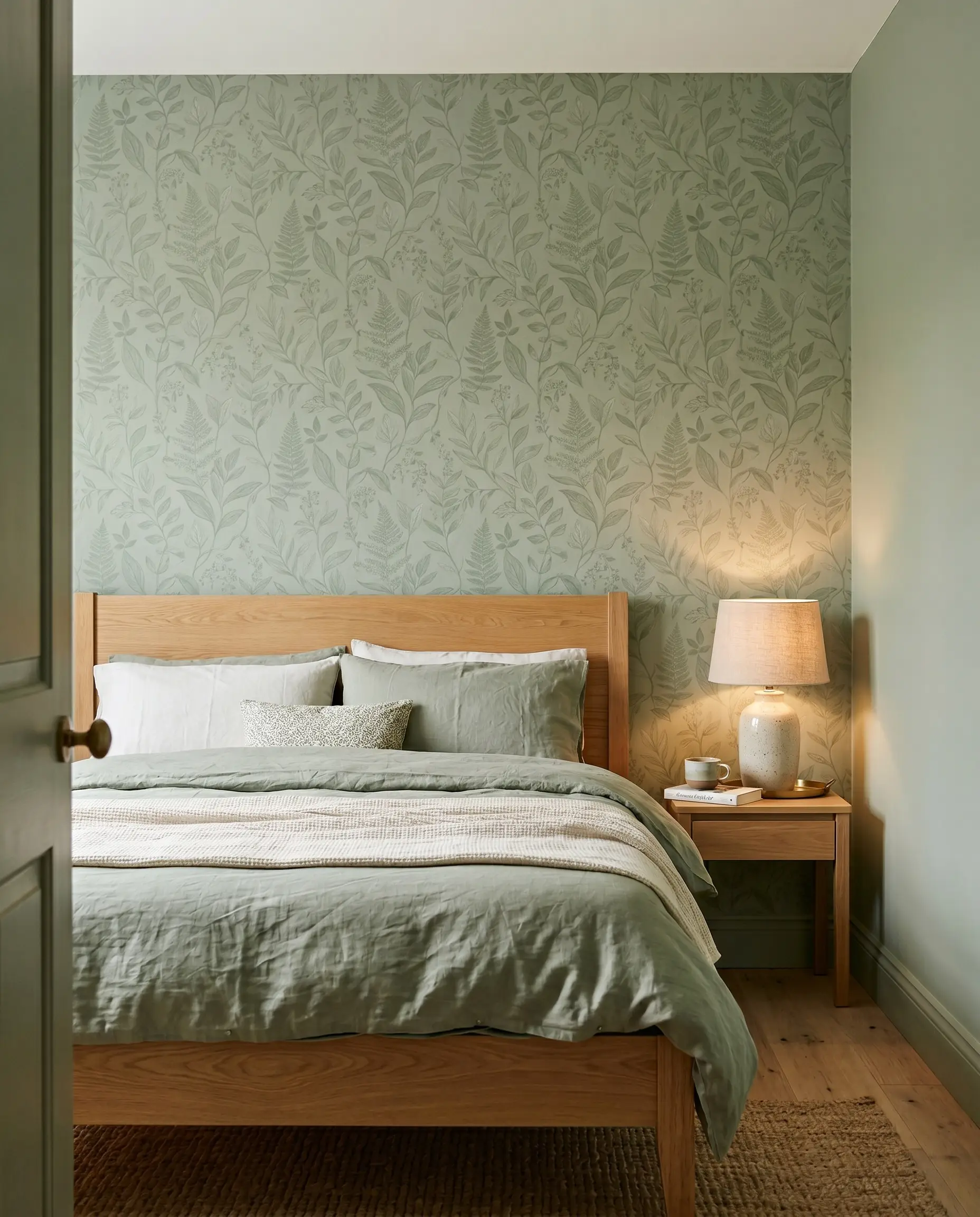
Instead of relying solely on paint, installing a subtle, tone-on-tone sage green wallpaper behind the headboard introduces highly controlled pattern. This approach provides an organic focal point while keeping the contrast intentionally low and sophisticated.
- Key Material: Tonal botanical prints (e.g., Morris & Co. or modern organic designs).
- Placement: Anchor it behind the bed to serve as a visual headboard.
- Styling Pro-Tip: Ensure the wallpaper’s background color matches the LRV of your adjacent painted walls.
Paint Applications & Spatial Illusions
Where you choose to apply your paint is just as impactful as the color formulation itself. Strategic paint placement can manipulate spatial boundaries, blur harsh corners, and completely alter the perceived scale of the bedroom.
6. Embrace the “Color Drenching” Technique
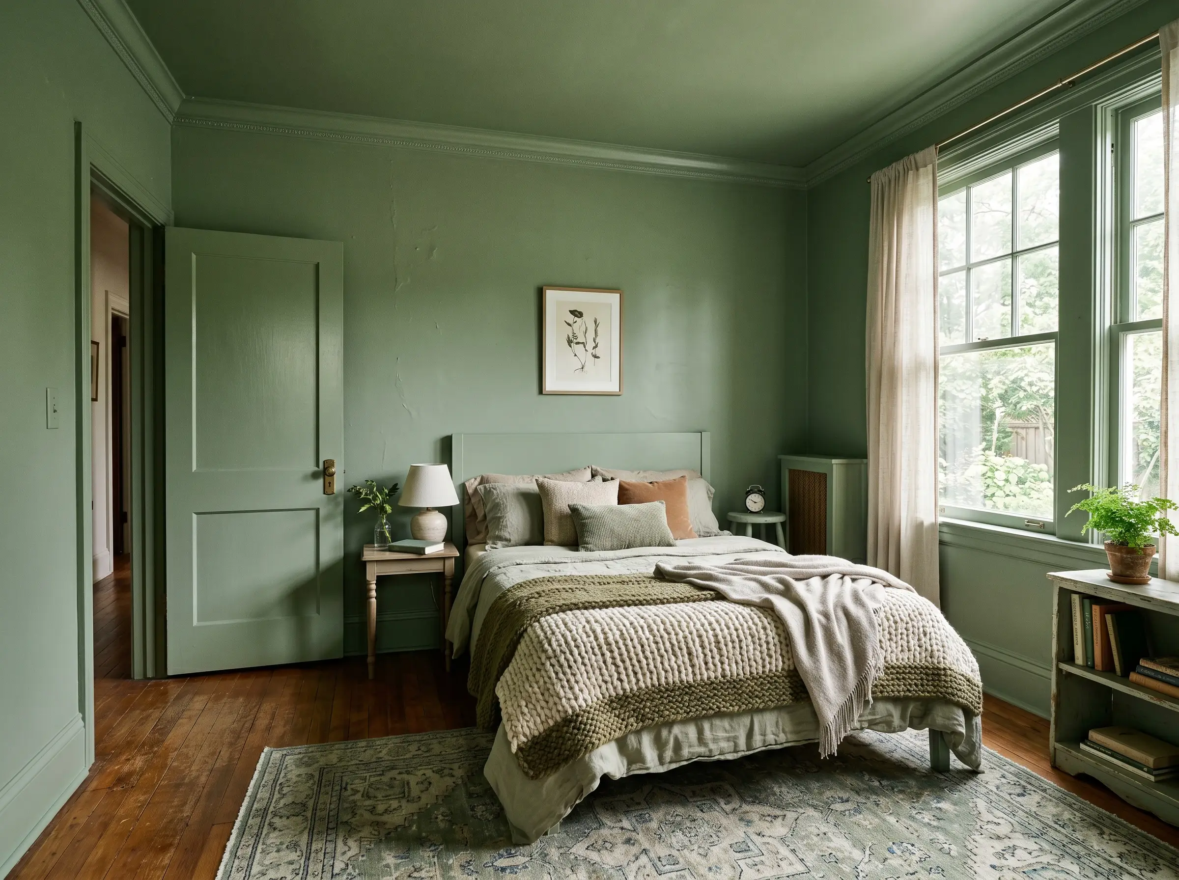
Painting the walls, baseboards, window trim, doors, and crown molding the exact same shade of sage green eliminates harsh visual breaks. This color-drenching approach blurs the room’s perimeters, making a small bedroom feel massive, cohesive, and deeply enveloping.
- Technique: Use the same color across all surfaces, varying only the sheen.
- Trim Finish: Satin or semi-gloss for durability on baseboards and doors.
- Wall Finish: Matte or flat to absorb light and create a velvety backdrop.
When color-drenching, never leave standard white plastic outlet covers on the wall; swap them for paintable covers and roll right over them to maintain the seamless architectural illusion.
The Designer’s Rule
7. Wrap the Ceiling for a Canopy Effect
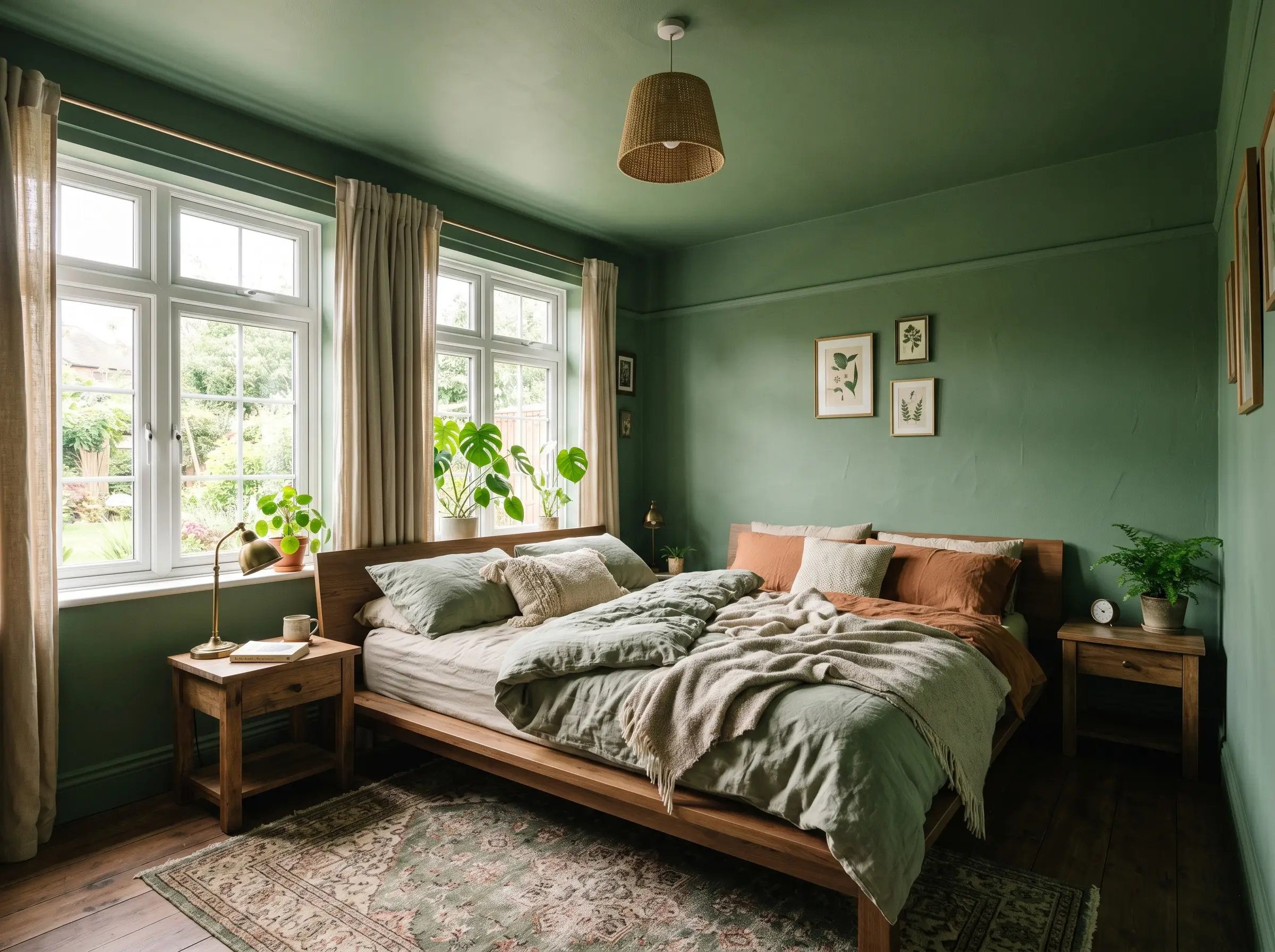
Taking the sage green off the walls and extending it entirely across the ceiling creates a striking “jewel box” aesthetic. This technique wraps the space in continuous color, ideal for bedrooms that receive ample natural light.
- Visual Effect: Creates a canopy-like sanctuary that blurs the ceiling line.
- Lighting Requirement: Best executed in rooms with large windows to balance the color weight.
- Ceiling Height Warning: This technique lowers the visual ceiling height slightly, making it best suited for cozy, moody spaces rather than low-ceilinged basements.
8. The Modern Half-Painted Wall
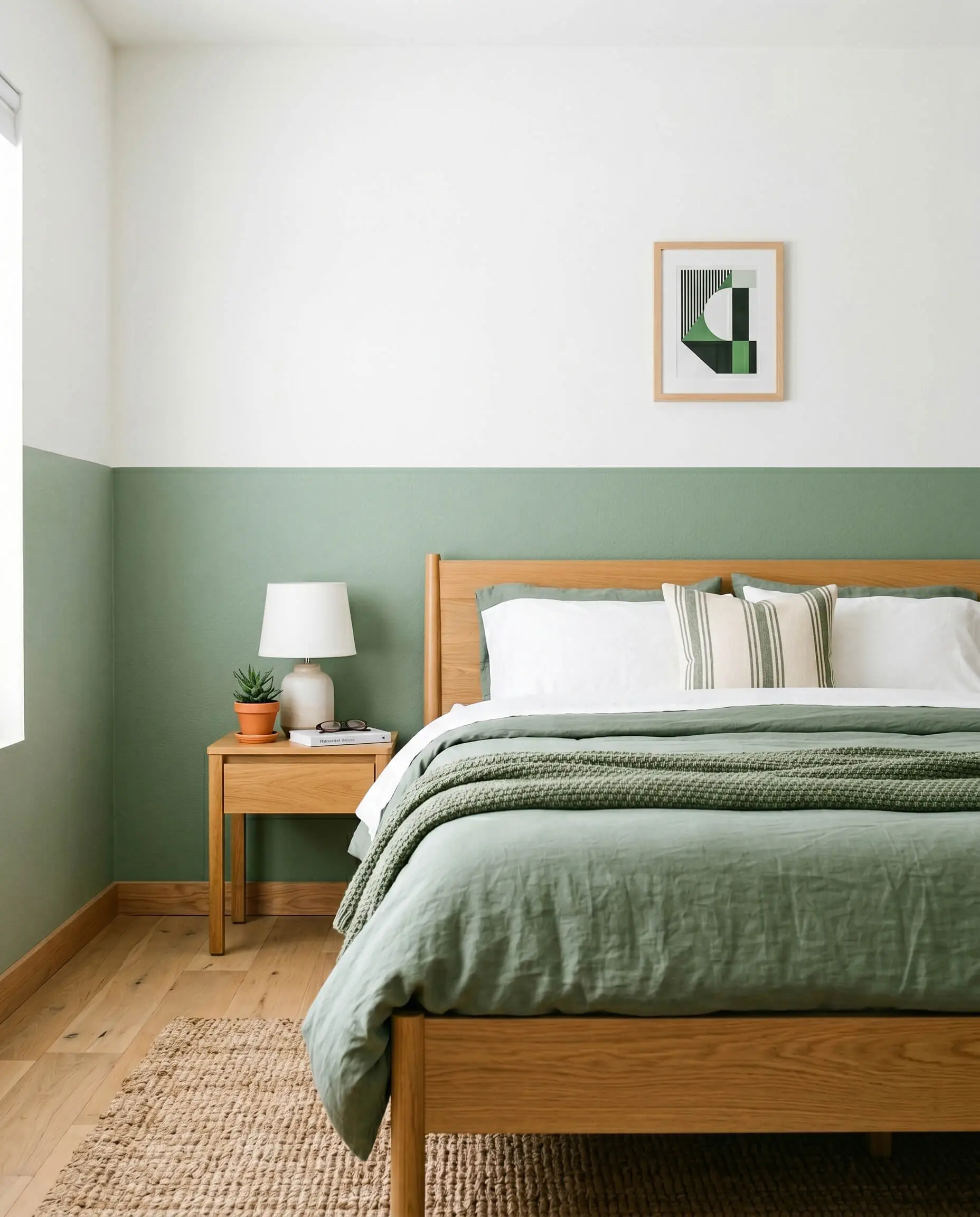
Instead of relying on a traditional chair rail, tape off a crisp horizontal line exactly four feet up the wall. Painting the bottom half sage and the top half a crisp white provides colorful grounding without overwhelming a smaller footprint.
- Execution Tool: A laser level is mandatory for a flawless, sharp line.
- Upper Wall Color: A clean, neutral white to maximize light reflection.
- Vibe: Playful, architectural, and highly contemporary.
9. The Asymmetrical Architectural Arch
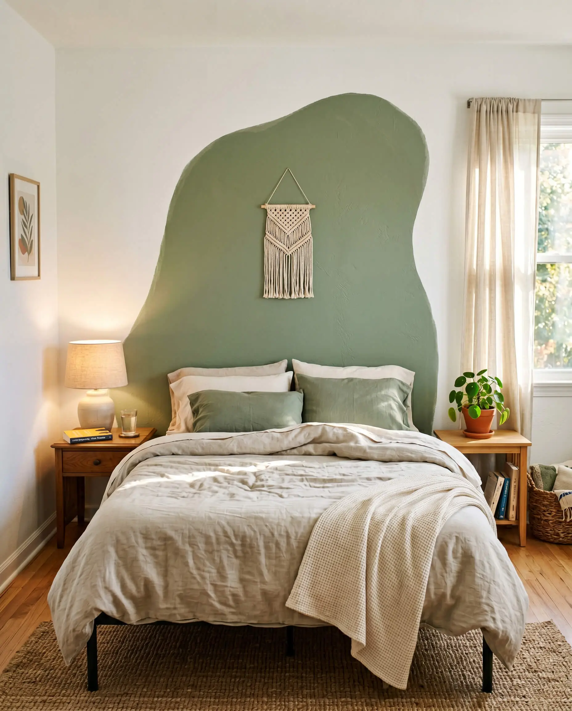
Painting a solid sage green arch directly onto the drywall acts as a highly effective, budget-friendly visual headboard. This localized application of color anchors the bed or a vanity mirror, introducing soft, organic curves into a rigid room.
- Application: Use a string and pencil to trace a perfect radius before cutting in with an angled brush.
- Placement: Centered directly behind the bed frame or an arched floor mirror.
- Vibe: The ultimate renter-friendly, high-impact weekend DIY.
Masterful Material and Furniture Pairings
Once your walls are enveloped in green, the surrounding materials dictate whether the room reads as high-end or disjointed. Sage is inherently cool-toned and requires specific, deliberate textures and wood grains to achieve visual balance.
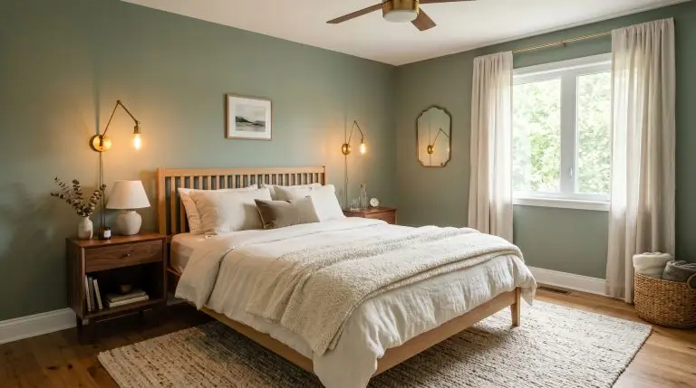
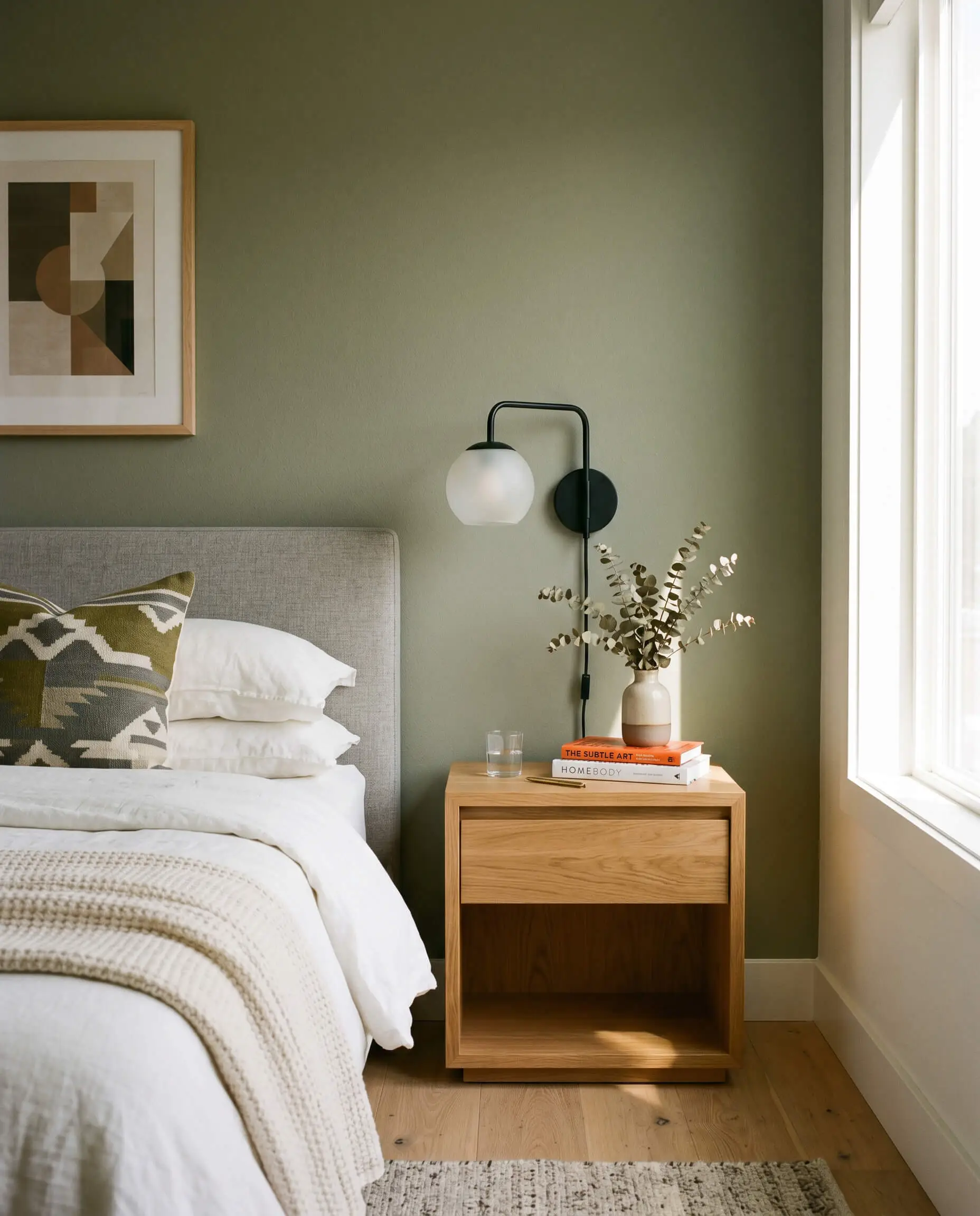
10. Contrast with Warm Walnut and Teak
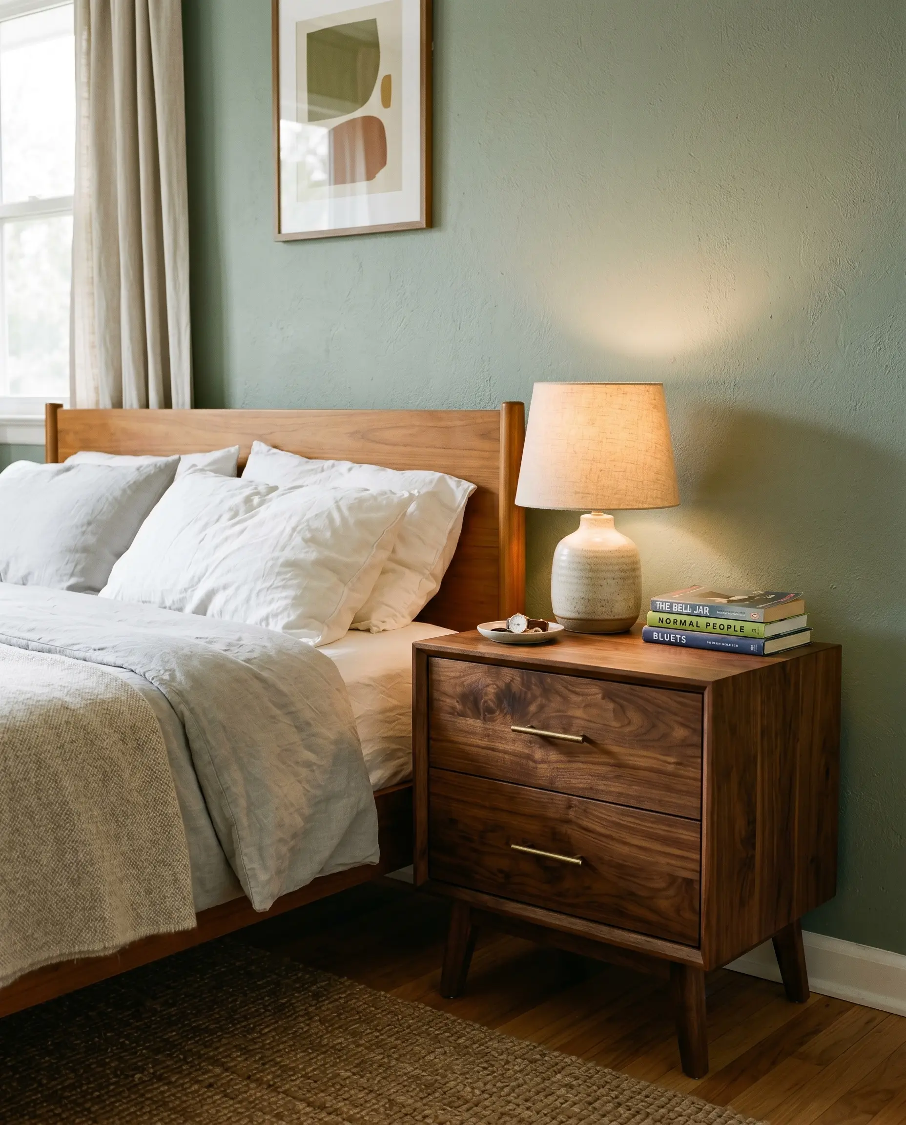
Because sage leans cool and desaturated, it desperately needs the visual warmth of rich, mid-century woods to ground the space. Heavy walnut or teak nightstands introduce an earthy counterweight that prevents the green from feeling sterile.
- Wood Species: Solid walnut, teak, or dark acorn finishes.
- Furniture Style: Mid-century modern or clean-lined contemporary.
- Styling Pro-Tip: Anchor the airy green with heavy, substantial wood pieces rather than delicate wire frames.
Never pair a cool-toned sage with gray-washed or weathered farmhouse woods; the competing cool undertones will immediately sterilize the room and look incredibly dated.
The Designer’s Rule
11. Soften with Rift-Sawn White Oak
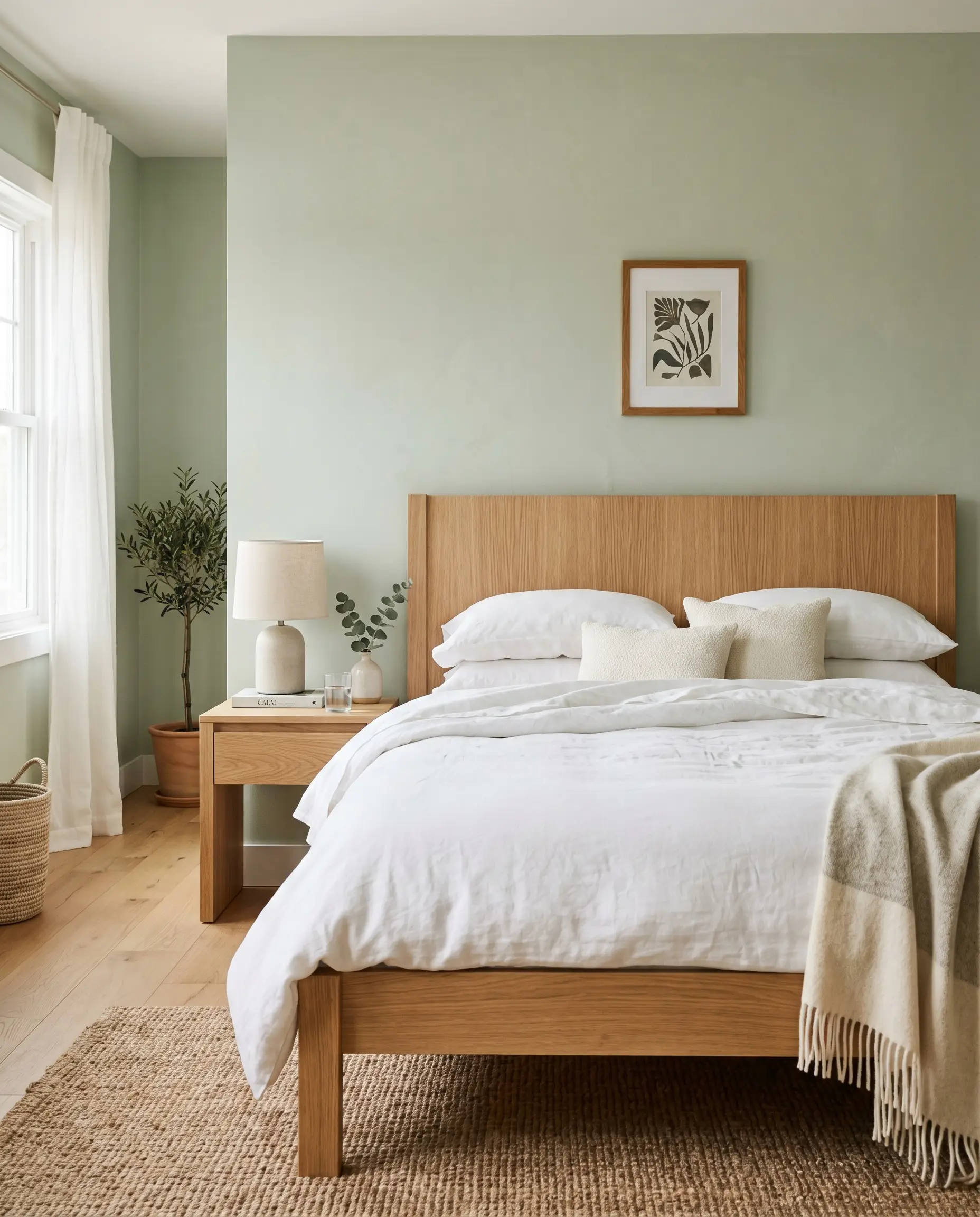
For a lighter, more ethereal aesthetic, pair your sage walls with pale, raw-looking wood tones. Rift-sawn white oak bed frames introduce a linear, clean grain that perfectly complements the organic nature of the green.
- Wood Species: Raw, matte-finished rift-sawn white oak.
- Vibe: Essential for achieving a Japandi or Organic Modern look.
- Textural Contrast: The pale wood grain highlights the depth of the sage rather than competing with it.
12. Illuminate with Unlacquered Brass Sconces
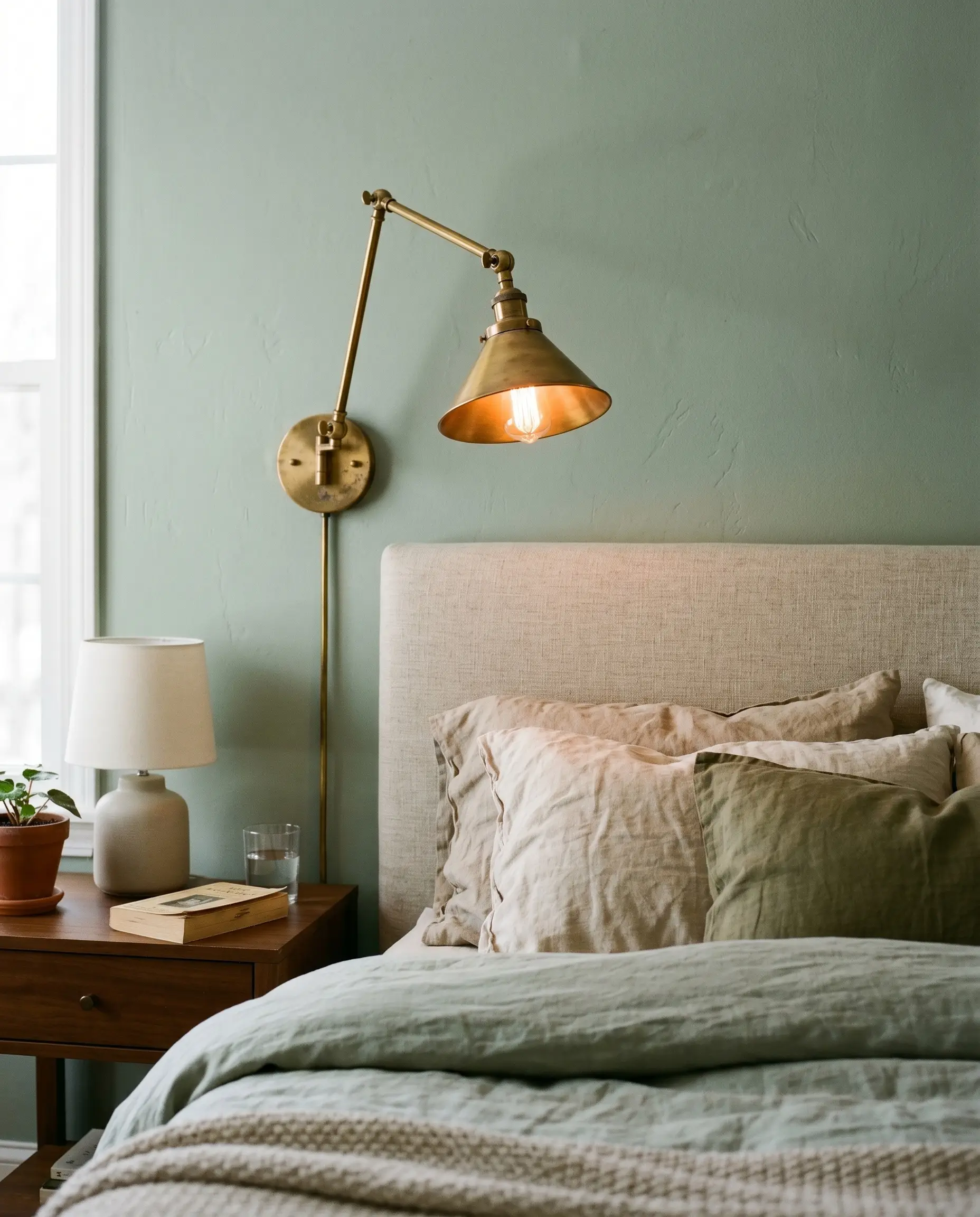
Matte black hardware can look far too harsh and industrial against a soft, desaturated green. Unlacquered or antique brass introduces a warm, living finish that patinas over time, perfectly complementing the color’s organic roots.
- Metal Finish: Unlacquered brass, aged brass, or burnished gold.
- Fixture Type: Articulating wall sconces flanking the bed.
- Avoid: Standard brushed nickel, which looks instantly dated when placed against sage walls.
13. Layer with European Flax Linen and Bouclé
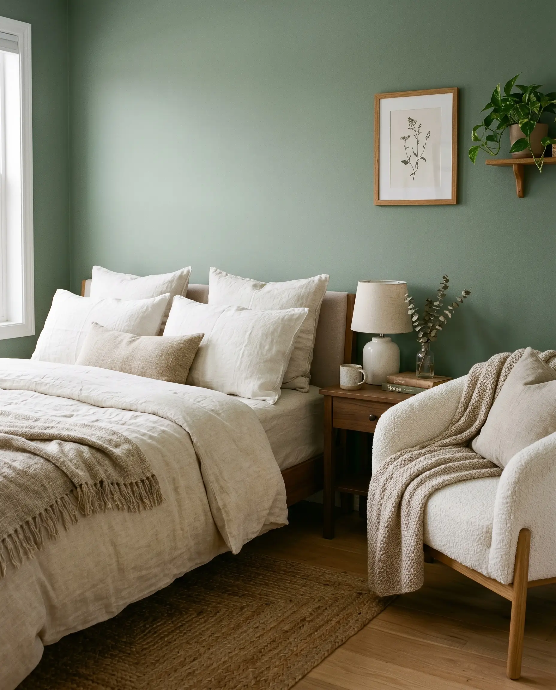
To stop the green walls from feeling flat, you must dress the bed in heavy, highly textured textiles. The contrast of a crisp, creamy white duvet against the painted wall relies entirely on the tactile quality of the fabric.
- Key Textiles: Creamy white European flax linen and chunky bouclé.
- Application: Layered linen shams and a textural bouclé accent chair in the corner.
- Sensory Focus: Emphasize slubby, heavy, and woven fabrics to enhance the room’s tactile sanctuary feel.
Specific Aesthetics & Styling Executions
Sage green is not tied to a single design era; it is a highly adaptable foundation. By shifting your material pairings and color saturation, this hue molds perfectly to the most sought-after interior design styles.
14. The Japandi Zen Retreat
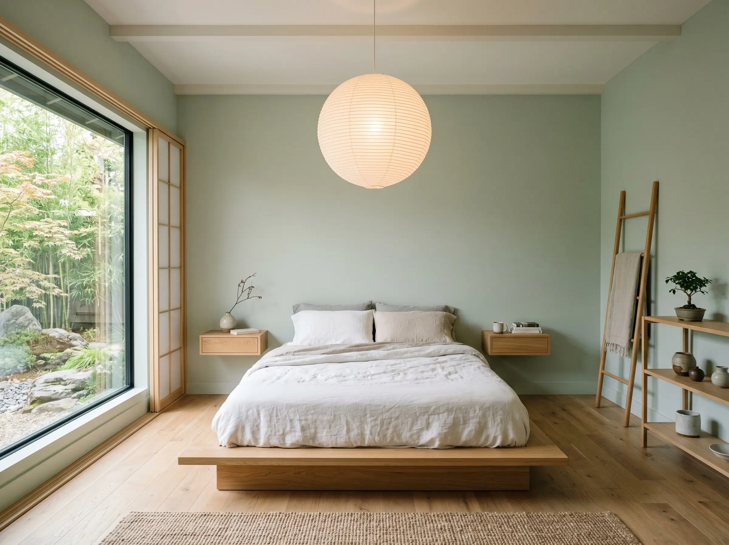
Combining a pale, highly desaturated sage with low-profile furniture creates an environment focused purely on minimalism and calm. This aesthetic relies on negative space, ensuring the green acts as a whisper rather than a shout.
- Furniture Profile: Low-slung platform beds and floating nightstands.
- Lighting: Noguchi-style paper lantern pendants.
- Styling Rule: Maintain strict minimal clutter to let the architectural elements breathe.
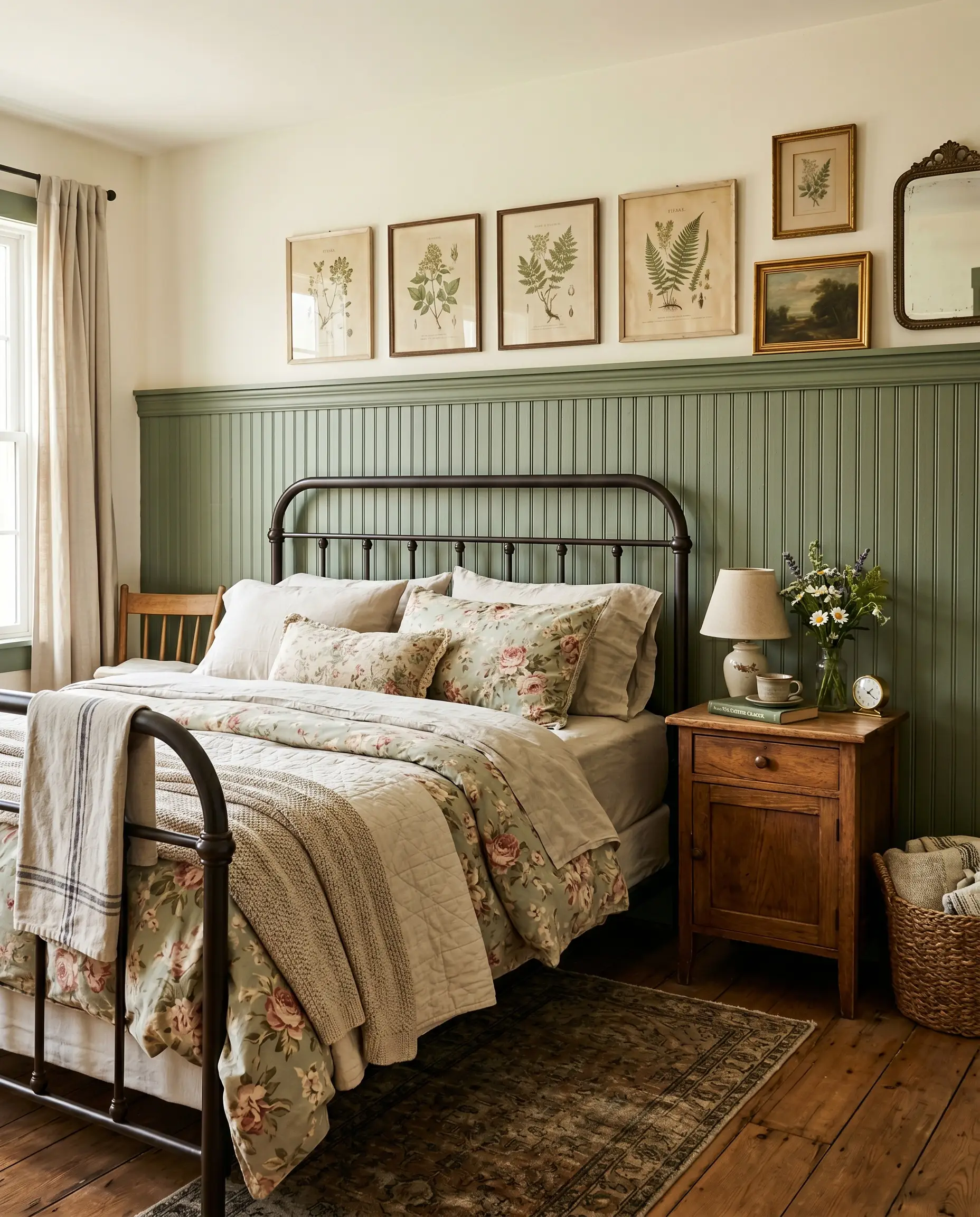
15. The English Cottagecore Guest Room
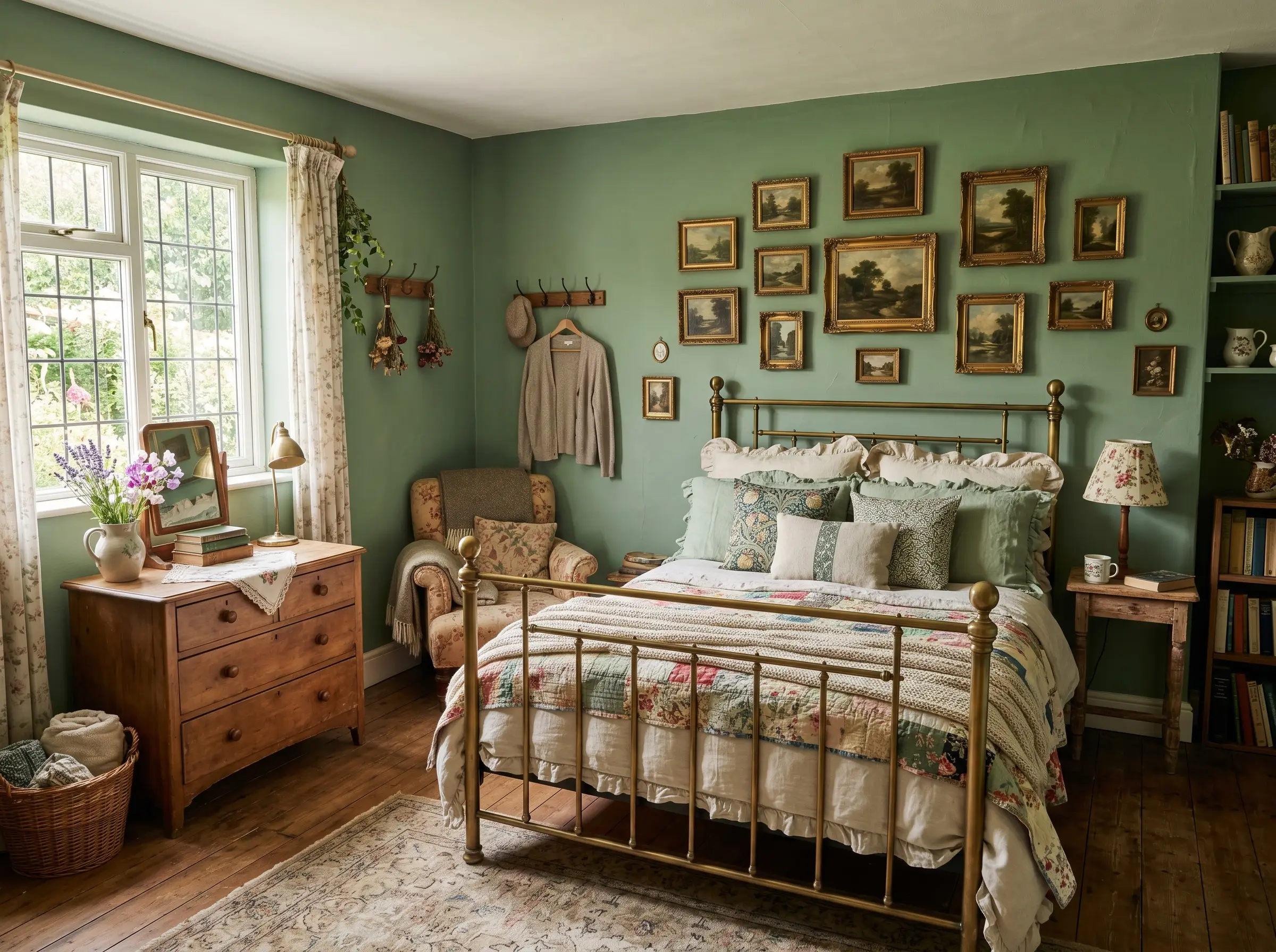
Pairing a medium-depth, slightly warmer sage with historic textures evokes a profound sense of lived-in charm. This execution leans into nostalgia, utilizing the green as a backdrop for collected, antique elements.
- Key Pairings: Vintage brass bed frames and ruffled linen shams.
- Art Selection: Antique oil landscape paintings with ornate, gilded frames.
- Vibe: Heritage-rich, layered, and deeply inviting.
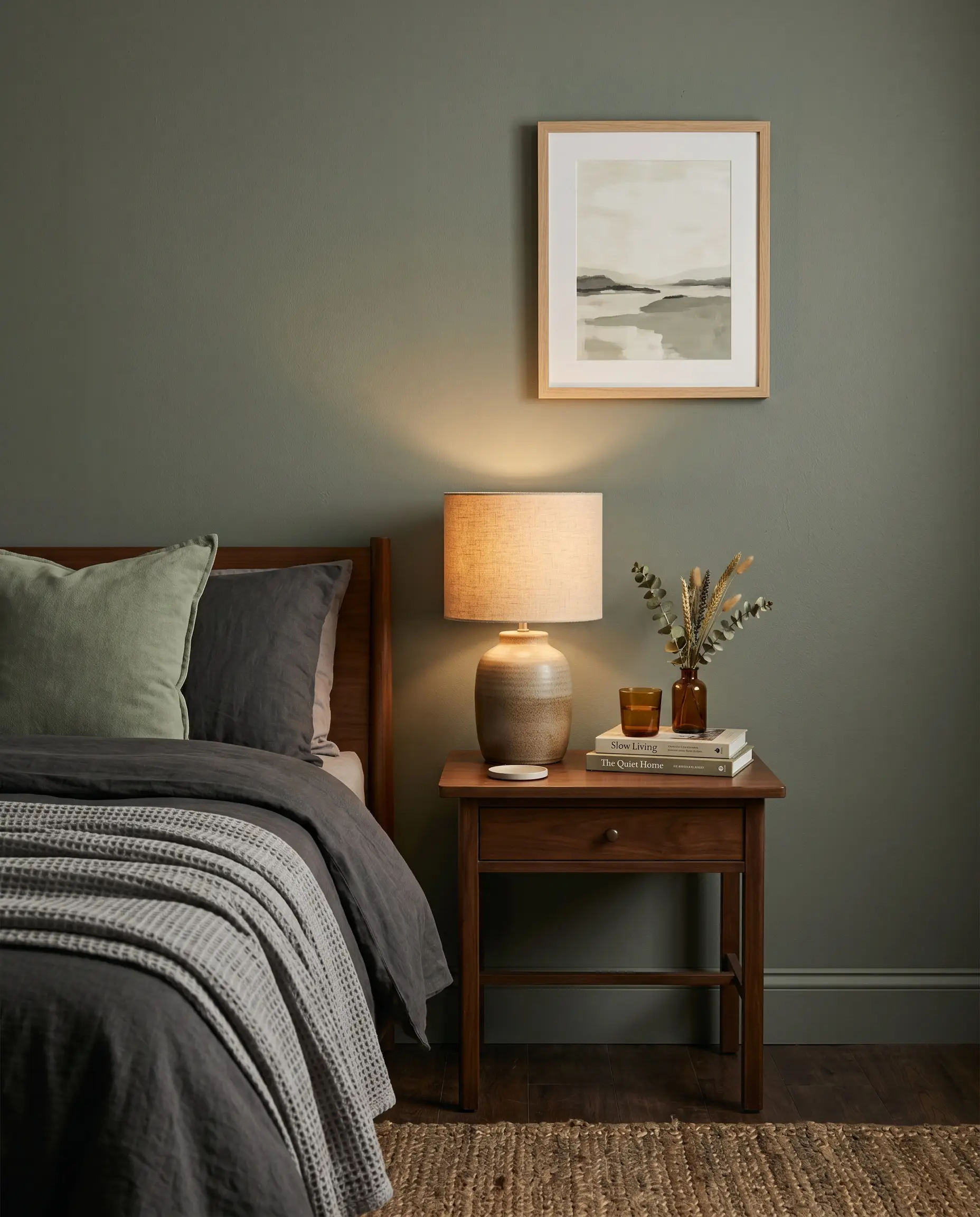
16. The Moody Transitional Primary Suite
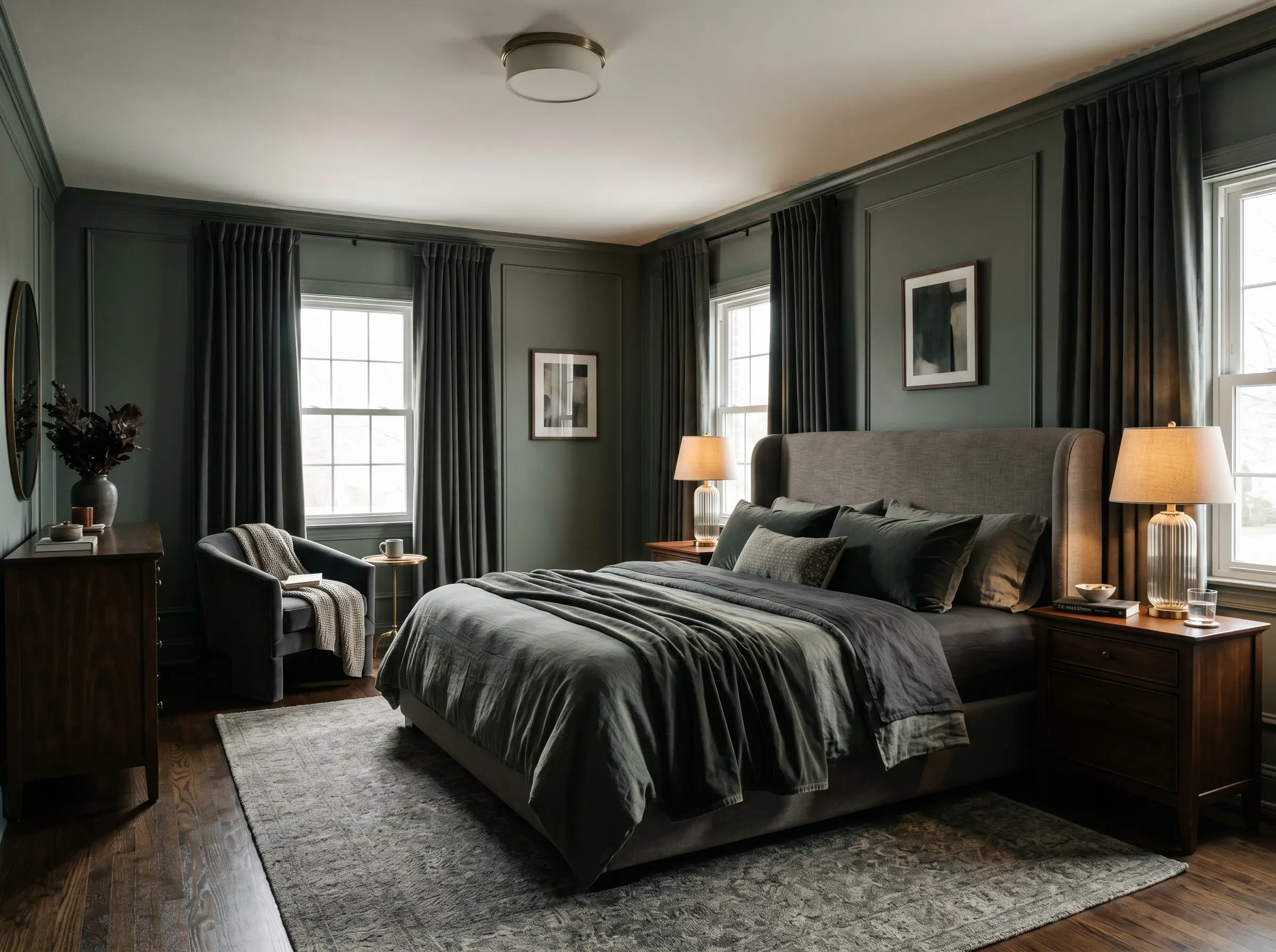
Opting for a darker, grayer sage elevates the room into a space of high-end luxury. This approach bridges traditional comfort with modern sophistication, relying on rich, light-catching fabrics to create depth.
- Key Textiles: Heavy velvet blackout curtains and a plush upholstered headboard.
- Lighting: Crystal or fluted glass table lamps to bounce light around the moody space.
- Vibe: Sophisticated, hotel-like luxury.
17. The Earthy Desert Modern Mix
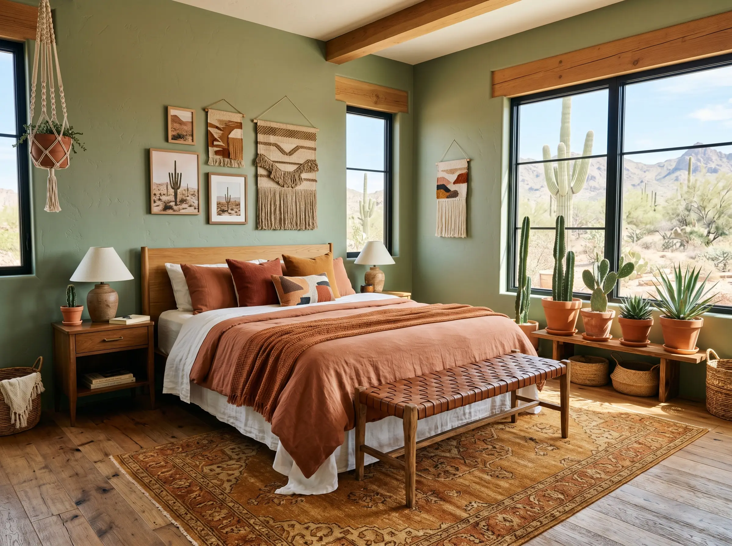
Pairing sage green walls with warm, baked earth tones utilizes complementary color theory to create a vibrant yet grounded space. Green and rust sit opposite each other on the color wheel, making them an undeniable design powerhouse.
- Accent Colors: Terracotta, burnt rust, and warm ochre.
- Key Materials: Rust-colored throw pillows and leather woven benches.
- Vibe: Sun-baked, organic, and highly textured.
The Designer’s Paint Rolodex: Best Sage Green Paint Colors
Navigating the paint aisle can induce instant analysis paralysis. To bypass the guesswork, here are the exact formulations and industry standards top designers rely on to achieve a flawless sage wall.
18. Sherwin-Williams Evergreen Fog (SW 9130)
This formulation is a versatile, slightly darker sage that carries significant visual weight. Its heavy gray base ensures it never reads as a bright pastel, making it an incredibly sophisticated choice for a primary suite.
- Best For: Color drenching a moody, enveloping bedroom.
- Undertone: Heavy gray with a subtle silver shift.
19. Benjamin Moore October Mist (1495)
A gentle, highly adaptable silvery sage that acts as the perfect neutral canvas. It provides enough color to feel intentional while remaining light enough to keep a small room feeling expansive.
- Best For: North-facing rooms that need a soft, illuminating lift.
- Undertone: Silvery gray with a very subtle, warm botanical base.
20. Farrow & Ball French Gray (No. 18)
Considered the ultimate chameleon of the paint world, this high-end standard shifts dramatically throughout the day. It flits between a rich green and a historic gray depending entirely on the angle of the sun.
- Best For: Heritage properties or rooms with intricate picture molding.
- Undertone: A complex mix of historic gray and earthy green.
21. Farrow & Ball Vert de Terre (No. 234)
This shade offers a fresher, softer approach to sage, leaning slightly more botanical without ever crossing into a harsh mint territory. It feels incredibly delicate and aged.
- Best For: English Cottagecore aesthetics and beadboard wainscoting.
- Undertone: Soft blue-green with an aged, earthy base.
22. Clare Paint “Money Moves”
A modern, direct-to-consumer option that delivers a perfectly muted, earthy green. It carries enough depth to ground a large space while remaining highly accessible and easy to apply.
- Best For: Bright, South-facing rooms that receive intense, warm sunlight.
- Undertone: Cool, muted olive with a gray anchor.
Bring Your Sage Sanctuary to Life
The most critical step in this entire process happens before you ever pick up a roller. You must purchase peel-and-stick samples—like Samplize—or physical paint swatches and test them on multiple walls in your bedroom. Observe how the color shifts from the cool morning light to the warm afternoon sun over a full 24-hour period.
Do not just commit to the color; commit to the texture, the architectural trim, and the material pairings that bring the space to life. By respecting the undertones and strategically pairing your sage walls with unlacquered brass and rift-sawn oak, you move past a basic paint job and step into true spatial design. Test your lighting, refine your materials, and execute your vision with total confidence.
The Hackrea Style Desk treats interior decoration as an exact visual science. Rather than focusing on demolition or floor plans, this desk masters the art of color theory, undertone matching, material pairings, and spatial proportion. From balancing the visual weight of mixed metals to finding the perfect bridging tone between disparate wood species, this desk provides the rigorous aesthetic rules needed to achieve high-end, editorial-quality harmony in any space.