How to Style Wall Art Pairs and Nature Prints at Home
Most people buy art one at a time. They see something in a shop, love it, and hang it on the nearest empty wall. That is fine for a statement piece, but it rarely produces a wall that feels designed rather than accumulated. Pairs or groups do what a single print cannot: they create rhythm, which is what makes a wall read as intentional.
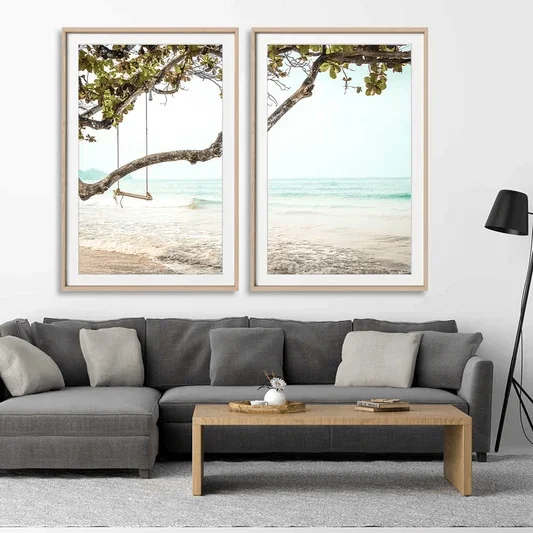
If you’re struggling with your choices, buying a set of 2 wall art is a quicker way to strike the balance than picking out 2 separate pieces that happen to match. For those who love nature, a collection of landscape photography prints gives you the same paired effect but with earthy tones and sky.
Choosing well matters more than choosing more. Two pieces that share a palette, a subject, or a series will do more for a wall than four that only happen to match. The goal is a wall that looks planned, even if you assembled it slowly.
Why Pairs Work Better Than Singles
A single large piece anchors a wall, but it also demands the wall be built around it: the right width, the right ceiling height, the right amount of surrounding negative space. A pair is more forgiving. Two smaller or medium pieces hung with consistent spacing create a horizontal line that the eye follows naturally. This makes them useful over consoles, sofas, and beds where the wall is wide but not necessarily tall. A ready-made set of 2 wall art takes the guesswork out of it, because scale, palette, and mood were matched before the pieces ever reach your wall.
The trick is restraint in the pairing itself. Two images from the same series, the same tonal palette, or the same subject matter read as a set. Two unrelated pieces just read as clutter that happens to be adjacent. If you’re pairing photography, keep the crop style and color temperature consistent: both warm, both cool, both black and white, both colors. Mixing those variables is usually what makes a pairing feel accidental instead of composed. Nature scenes make this easy: two landscape photography prints, say a misty ridge and a quiet shoreline shot in similar light, share a temperature without repeating the same view.
Where Landscape Photography Earns Its Place
Landscape prints solve a particular decorating problem: they add depth to a room without adding visual noise. Take a well-photographed mountain range, coastline, or forest interior. It has enough tonal variation to hold interest when viewed up close. However, it recedes to the background at a normal viewing distance. Contrast that with a busy abstract or a highly saturated graphic print. This will most definitely dominate a room, even from across it.
This makes landscape photography particularly useful in spaces meant for rest rather than activity: bedrooms, reading nooks, home offices. A horizon line in a photograph does something subtle to a room’s proportions; it echoes the line of a headboard, a shelf, or a window sill, which is part of why designers reach for landscape orientation prints so often in spaces with strong horizontal furniture.
Sizing and Placement Basics
A few practical rules keep pairs and groupings from going wrong:
- Match the width to the furniture below. A pair hung over a sofa or console should span roughly two-thirds of the furniture’s width, combined.
- Keep consistent gaps. Two to four inches between pieces in a pair reads as a set; wider gaps start to look like two unrelated hangs.
- Center on eye level. Aim for the vertical center of the grouping to sit around 57–60 inches from the floor. You can adjust slightly for very tall or low furniture underneath.
- Frame consistently. Matching frame material and mat width does more to unify a pairing than matching the images themselves.
The Simplest Upgrade
A simple change from one oversized, mismatched print to a carefully selected pair can give a room a polished look. You just need a wall that’s currently underused and a decision to treat two pieces as one composition instead of two separate purchases.