Your doors are the punctuation marks of your home. Whether it’s the “handshake” of a front door or the transition between a busy kitchen and a calm living room, a coat of paint is the single most effective way to change the feel of your space.
For 2026, the trends have shifted significantly. The era of the “safe” white interior door and the standard grey front door is ending. This year, we are seeing a move toward “Color Drenching” inside, nature-inspired “Quiet Luxury” outside, and creative techniques that turn doors into architectural features.
We’ve curated the ultimate list of 25+ door paint ideas, covering exterior curb appeal, interior flow, and the specific paint codes designers are using right now.
⚡ Quick Answer: Top Door Paint Trends for 2026
In a hurry? Here is the executive summary of the most popular door colors and trends this year.
The Top 5 Colors:
The #1 Interior Trend:
Part 1: Front Door Trends (Curb Appeal)
First impressions matter. In 2026, exterior doors are moving away from cool tones to warm, grounded, and organic shades that feel established rather than “trendy.”
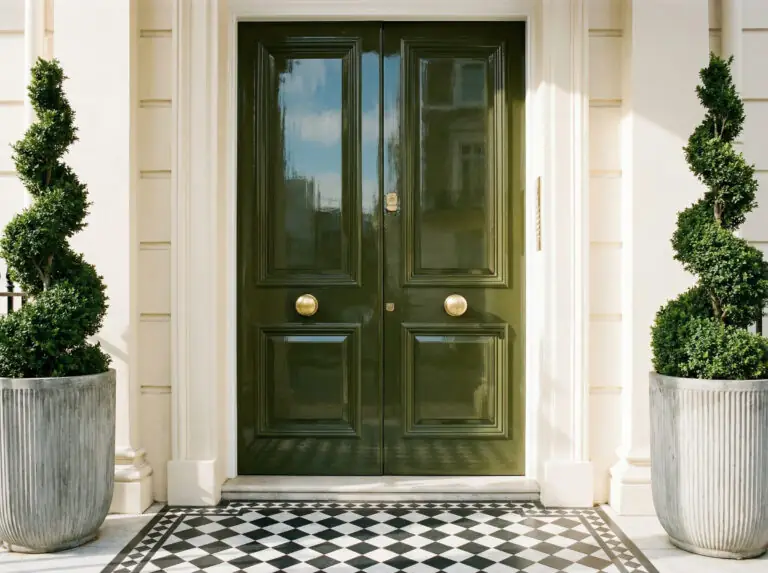
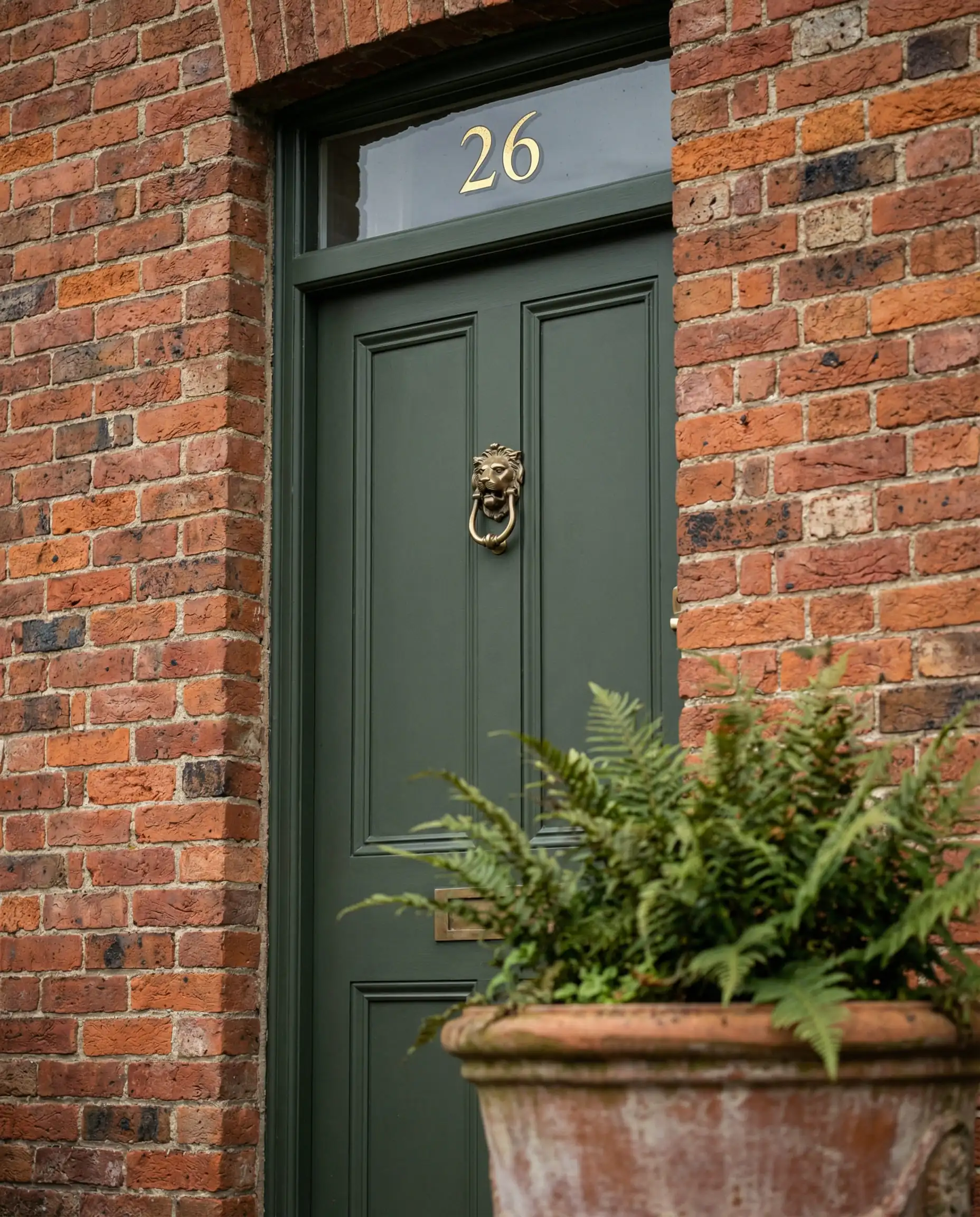
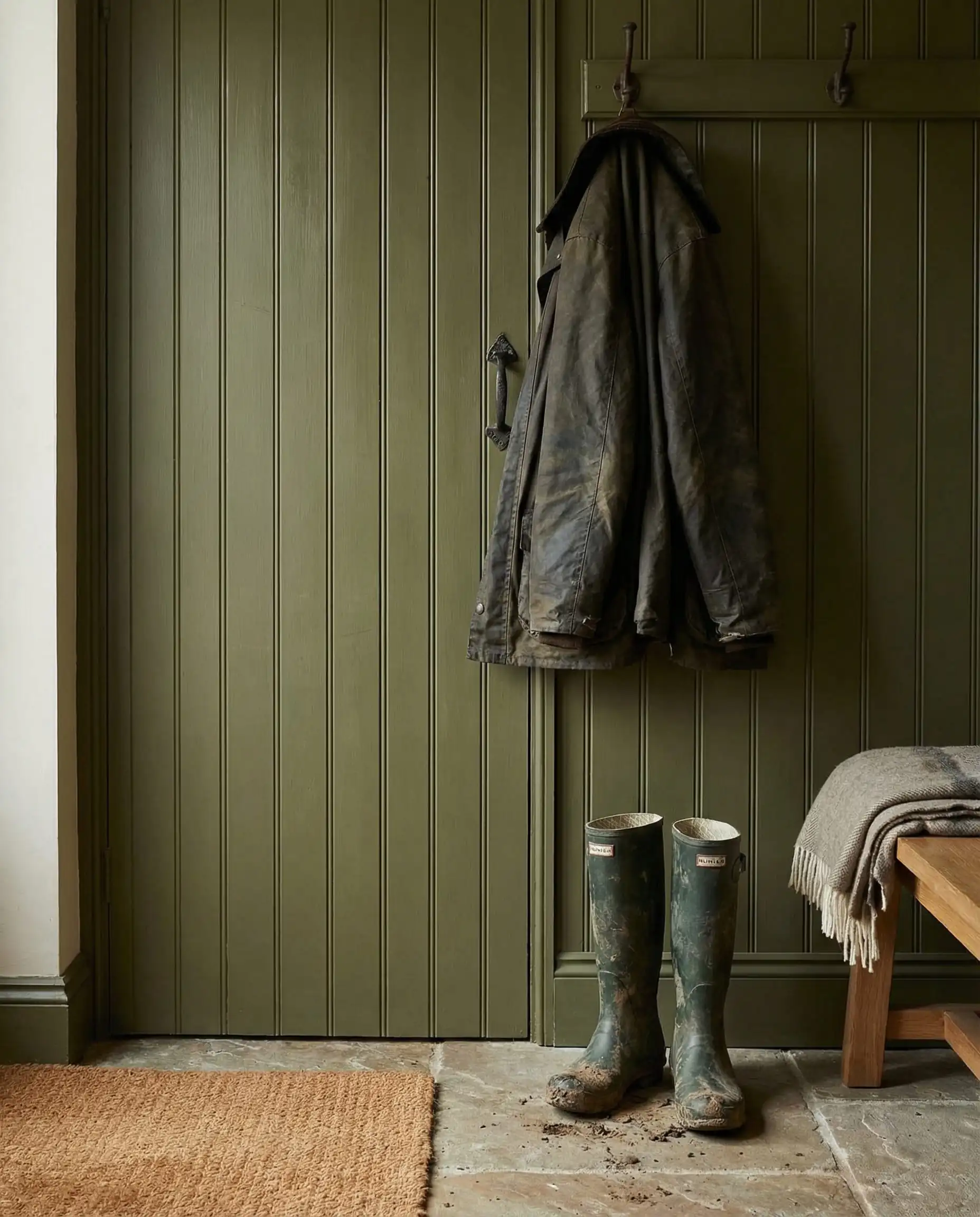
1. The “Old Money” Olive
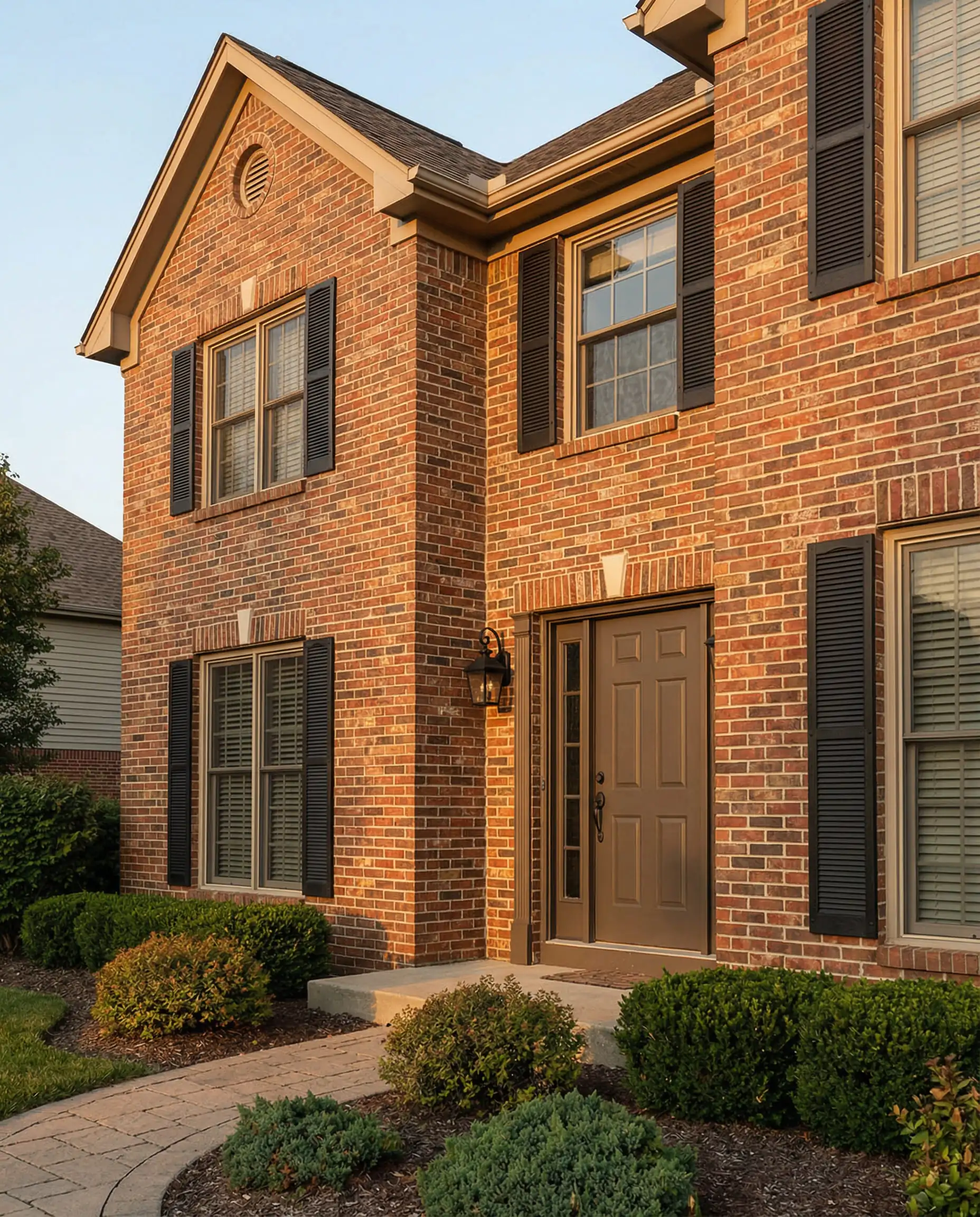
The definitive color of 2026. A deep, yellow-based olive green feels historic and established, even on a new build. It acts as a neutral, pairing perfectly with red brick, white stucco, or stone. Unlike the bright “grass” greens of the past, this shade is muddy and sophisticated.
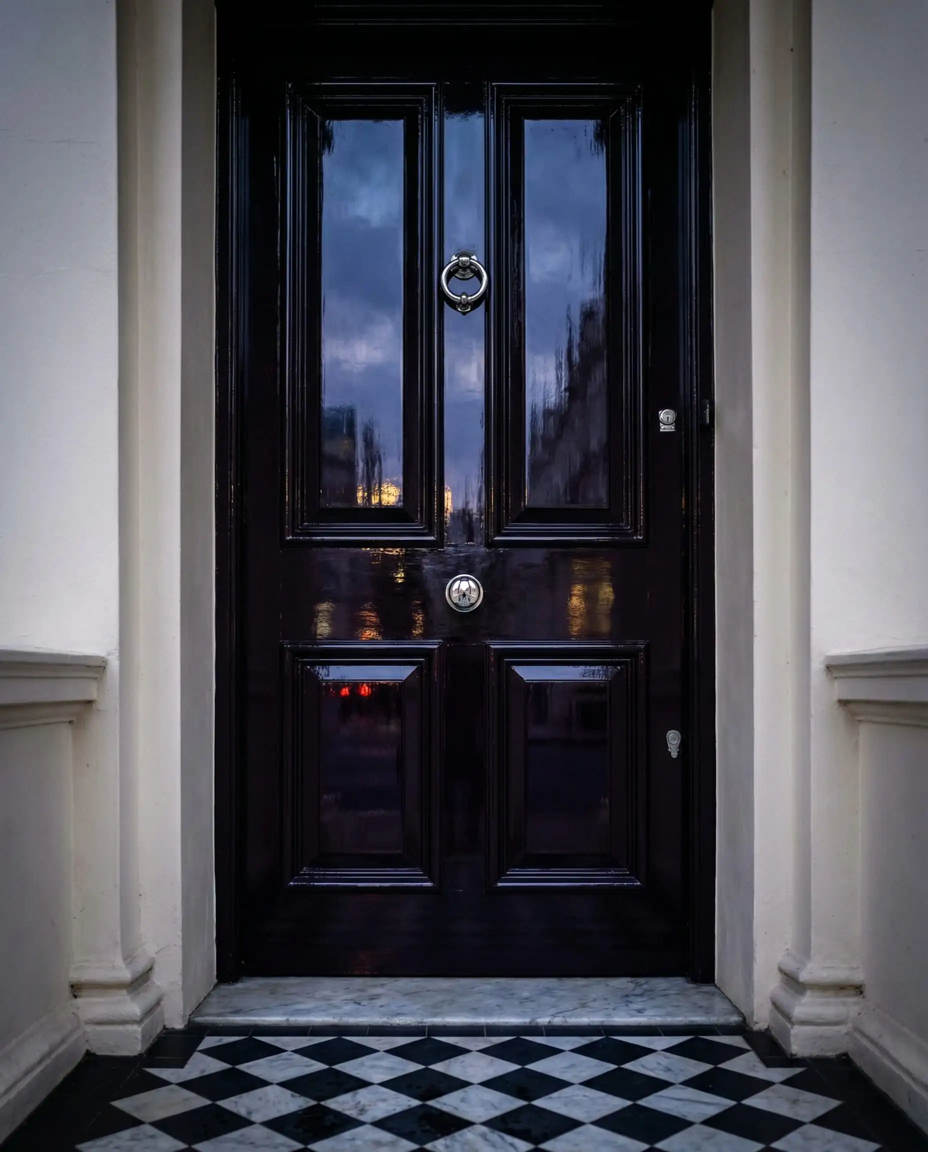
2. Deep Aubergine (The New Black)
If you want drama without the harshness of jet black, look at deep eggplant or blackened plum. From the street, it reads as dark and moody; up close, the purple undertones offer a stunning richness that feels bespoke.
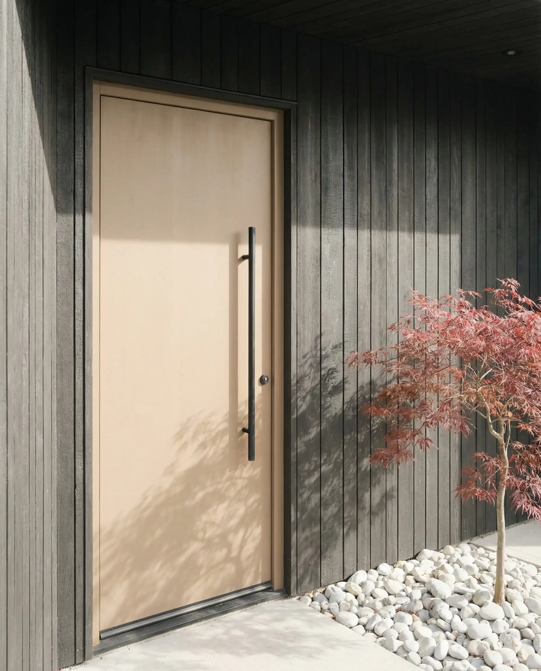
3. Warm “Universal” Khaki
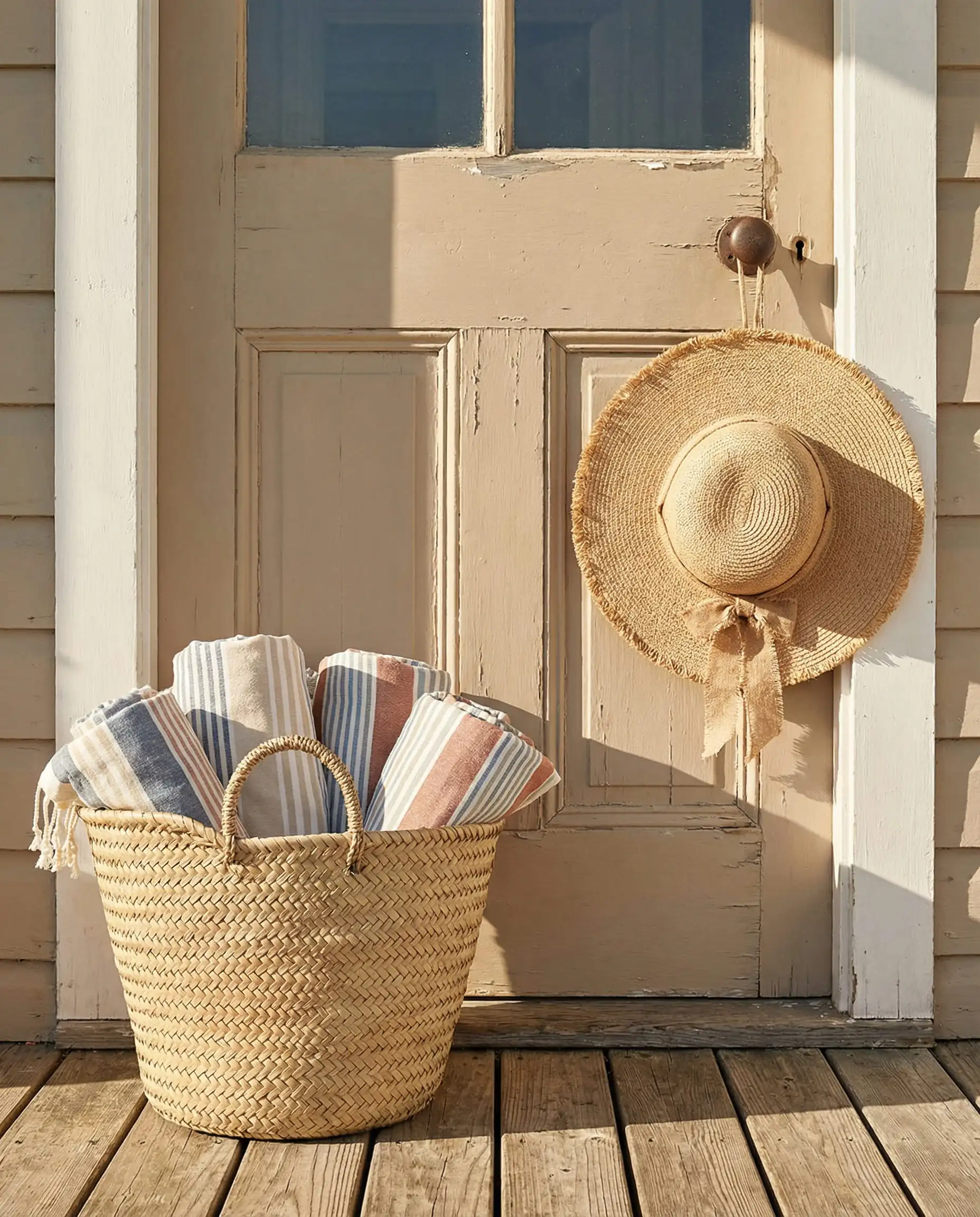
Replacing the cool greys of the last decade, warm khaki and sandstone shades are welcoming and bright. They reflect light beautifully, making a small entryway feel grander.
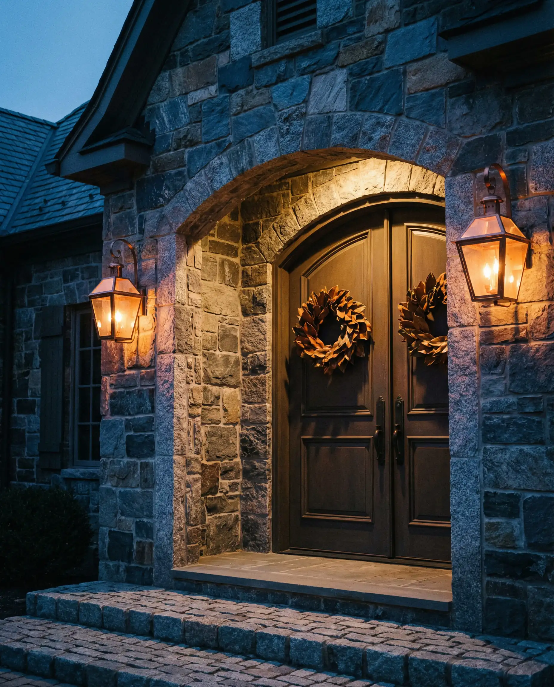
4. The “Soft Noir”
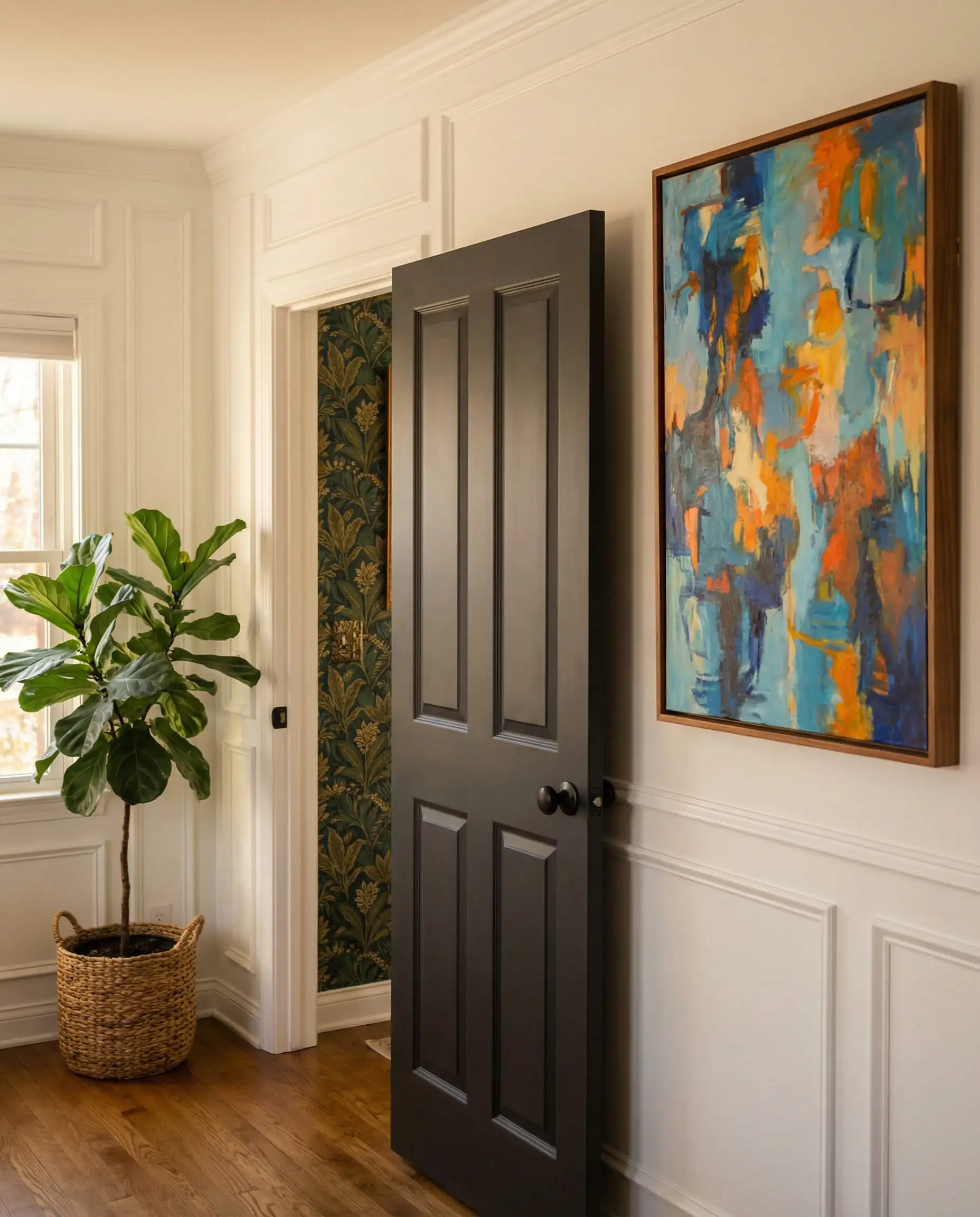
Standard black can sometimes feel a bit “plastic” or stark. The trend for 2026 is blacks with brown or bronze undertones. It creates a softer contrast that feels more organic and less industrial.
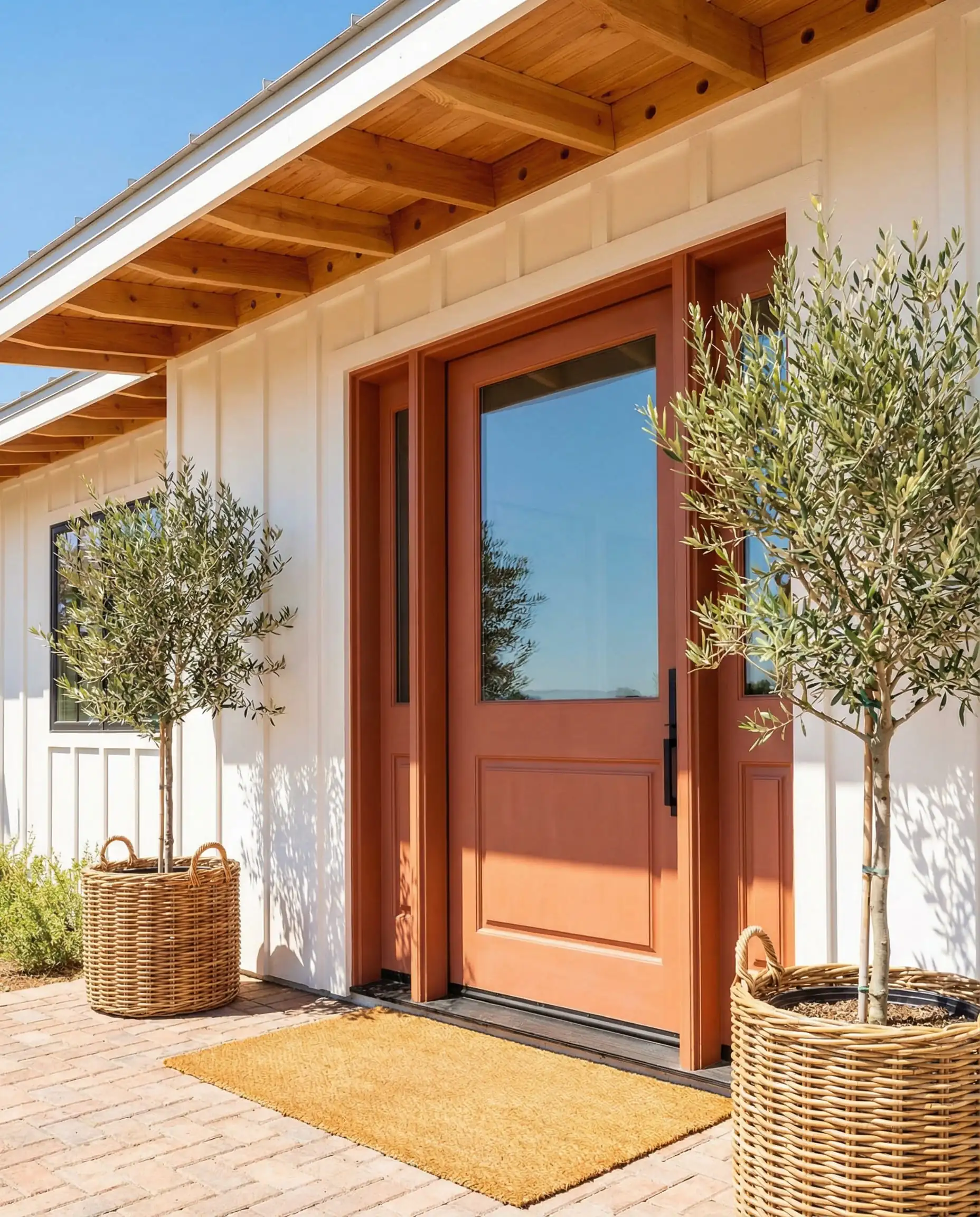
5. Terracotta & Baked Clay
A nod to Mediterranean warmth. This is perfect for adding a “pop” that doesn’t feel neon or childish. It works exceptionally well on white farmhouses or mid-century modern homes.
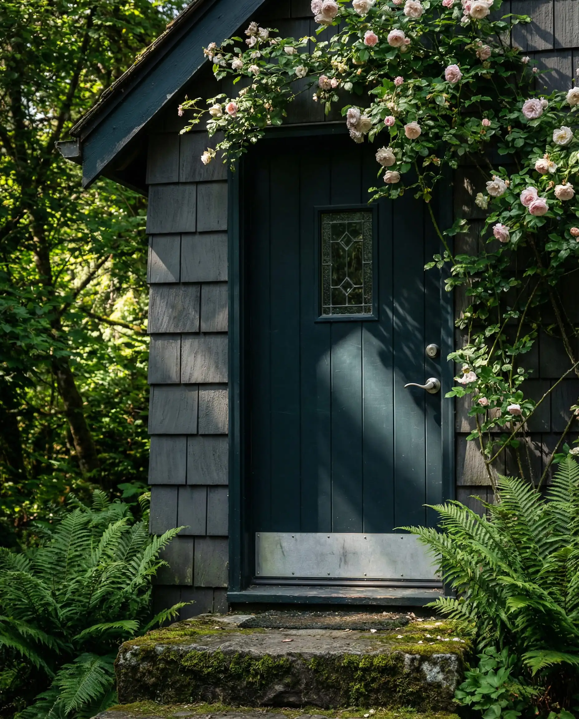
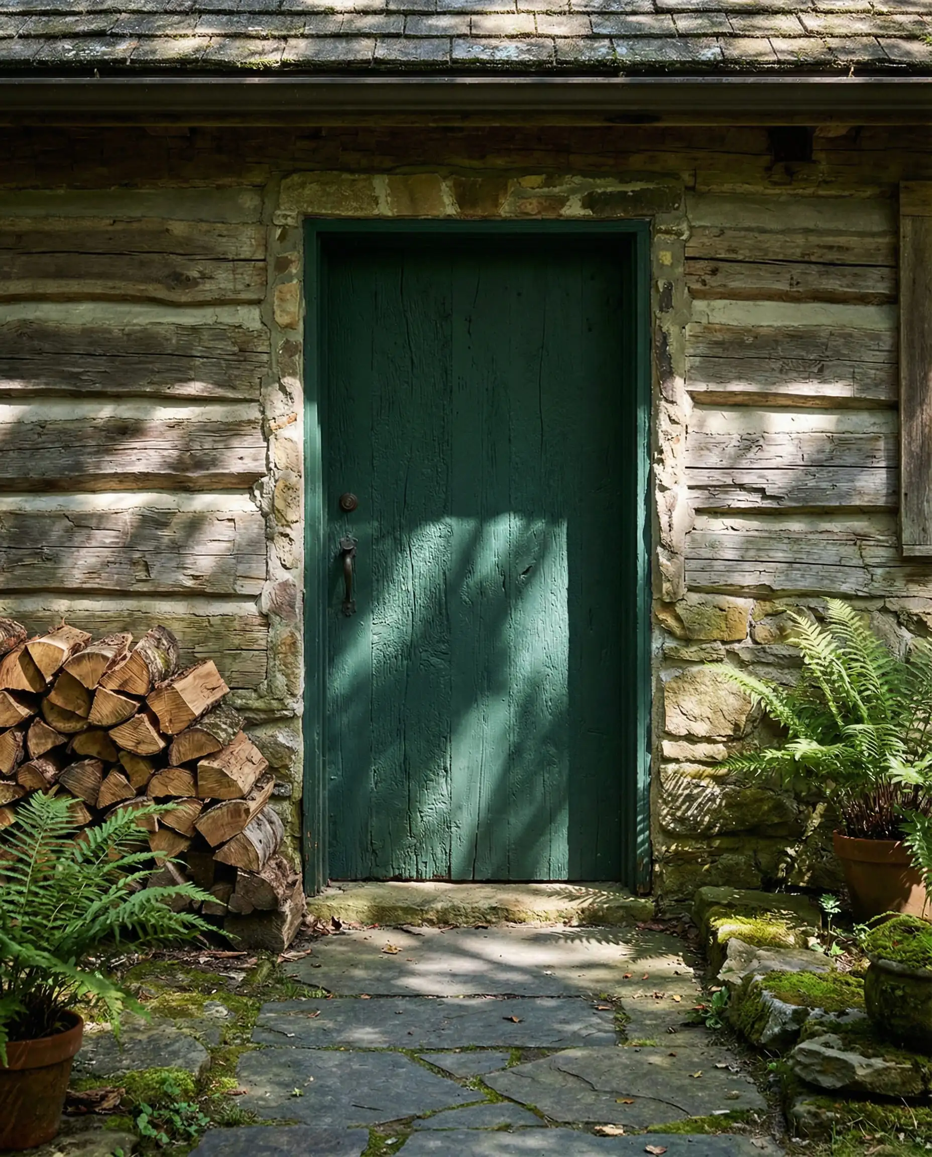
6. Midnight Teal
A very dark blue with green undertones. It connects your door visually to the garden greenery, creating a seamless transition from outdoors to in.
Part 2: Interior Door Trends (Room-by-Room)
Why should the front door have all the fun? In 2026, interior doors are becoming key design elements, breaking the rule that they must always be white.
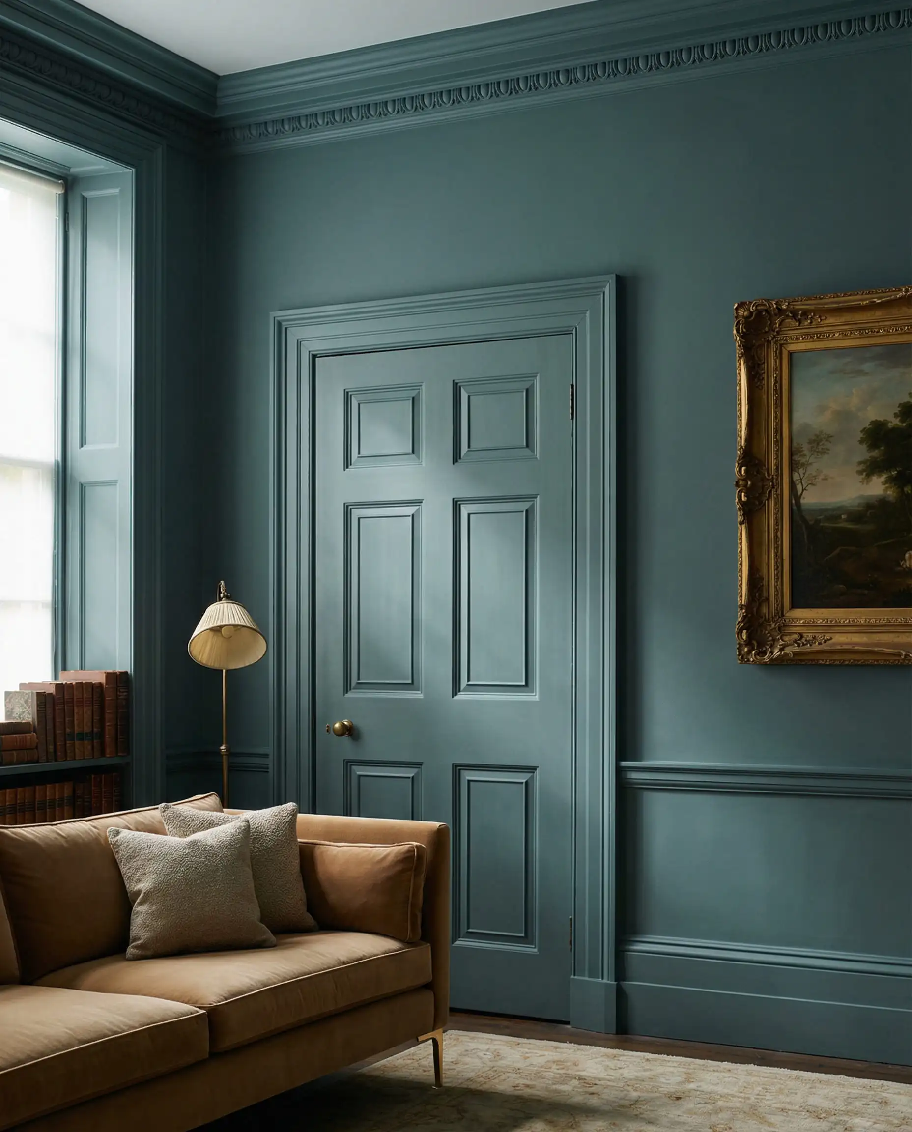
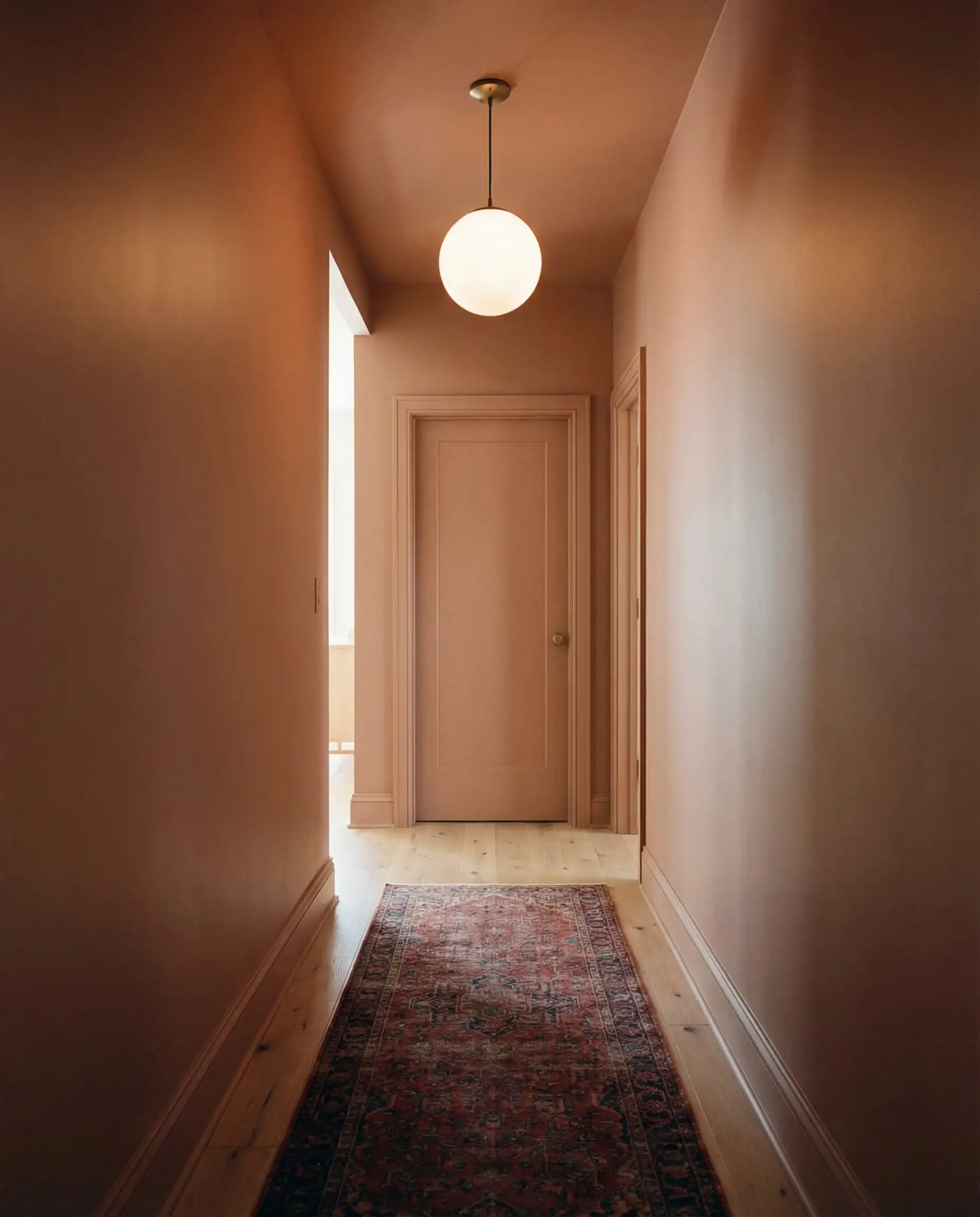
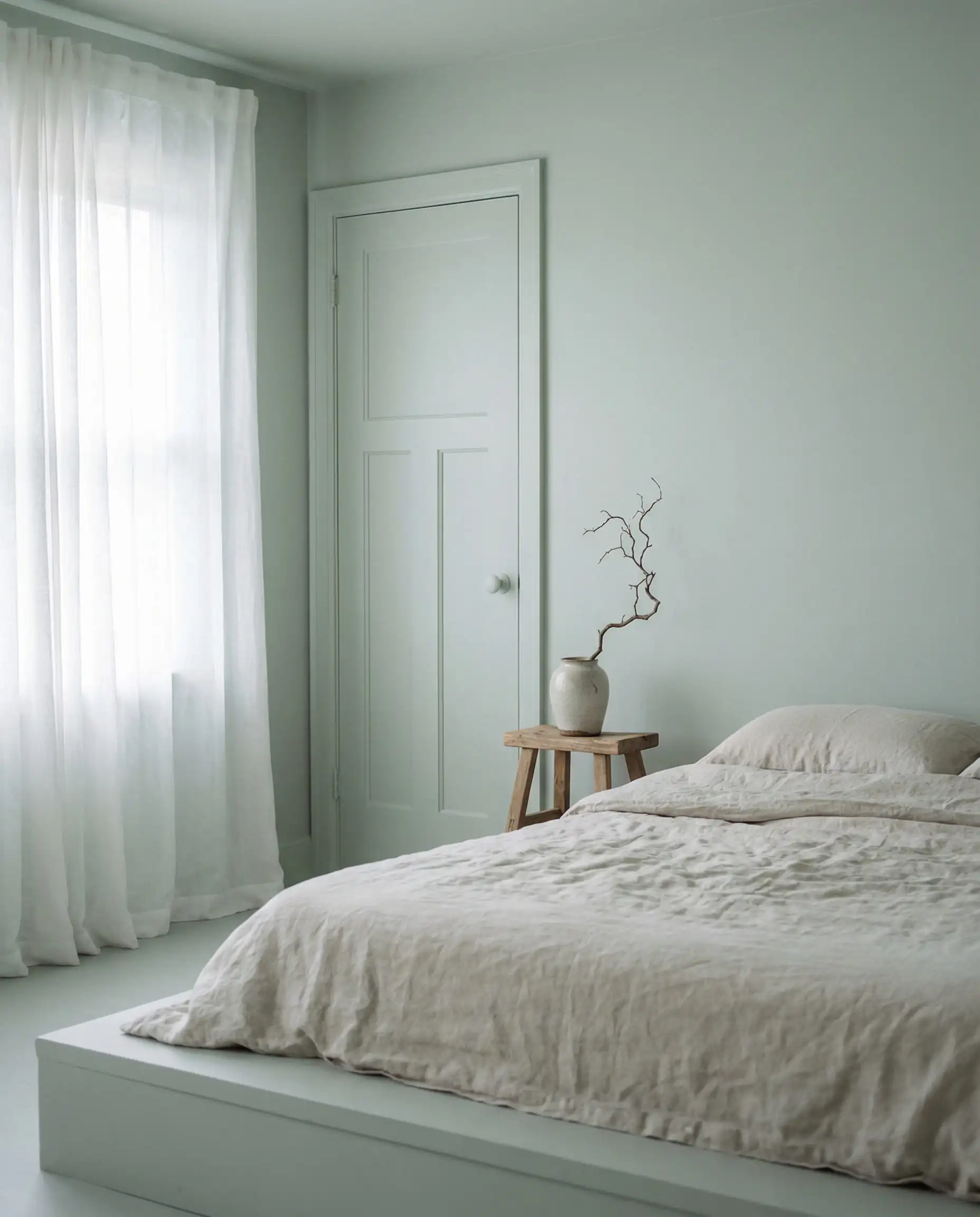
7. “Color Drenching” (The Invisible Door)
The biggest interior trend of the year. Paint your door, the trim, and the walls the exact same color.
8. The “Gallery” Frame (Black Interior Doors)
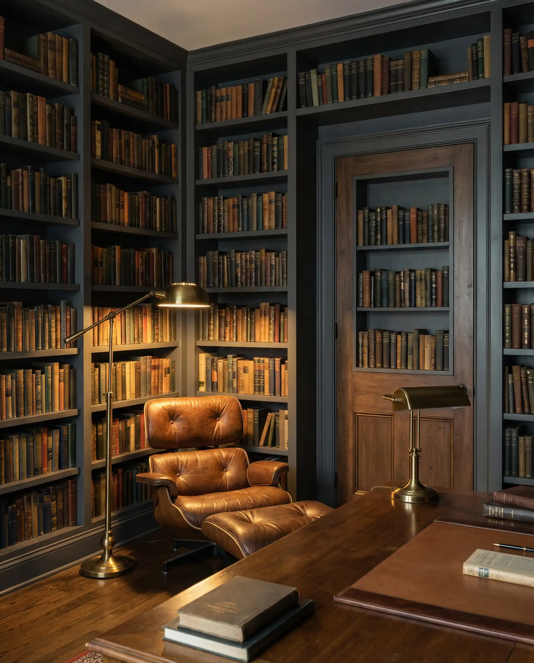
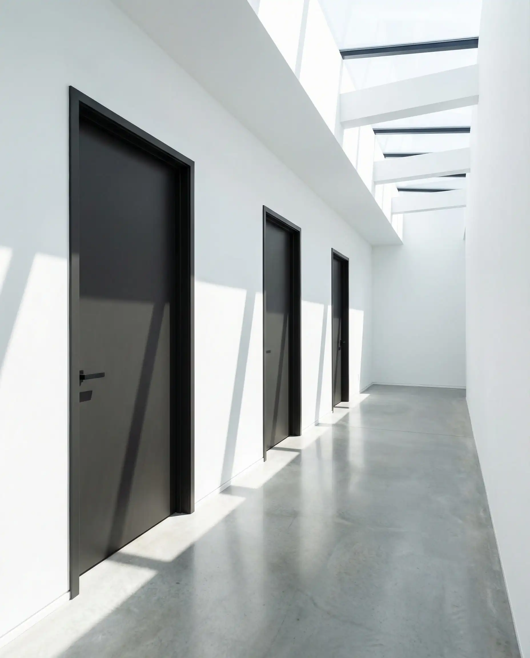
Painting all interior doors soft black while keeping walls white.
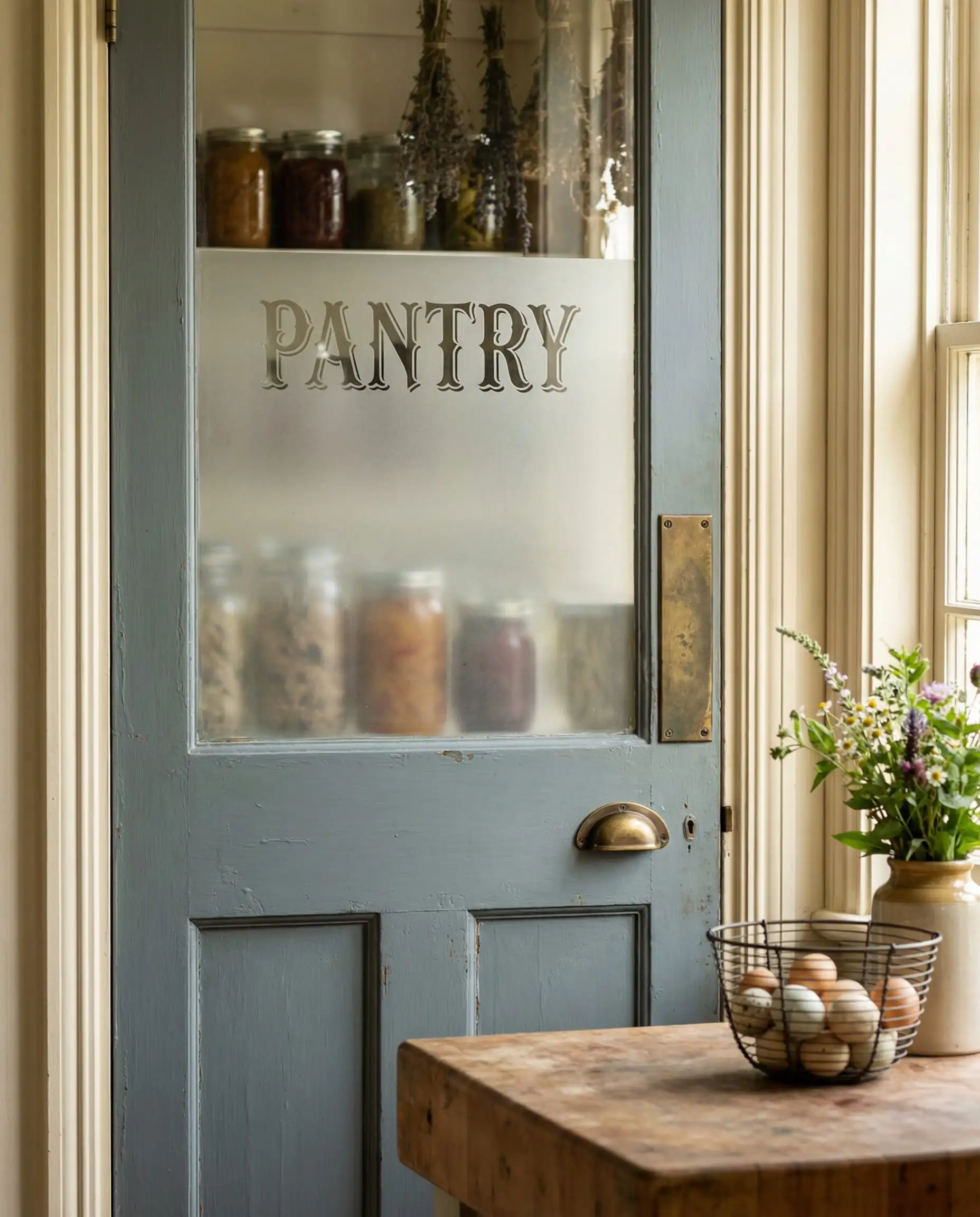
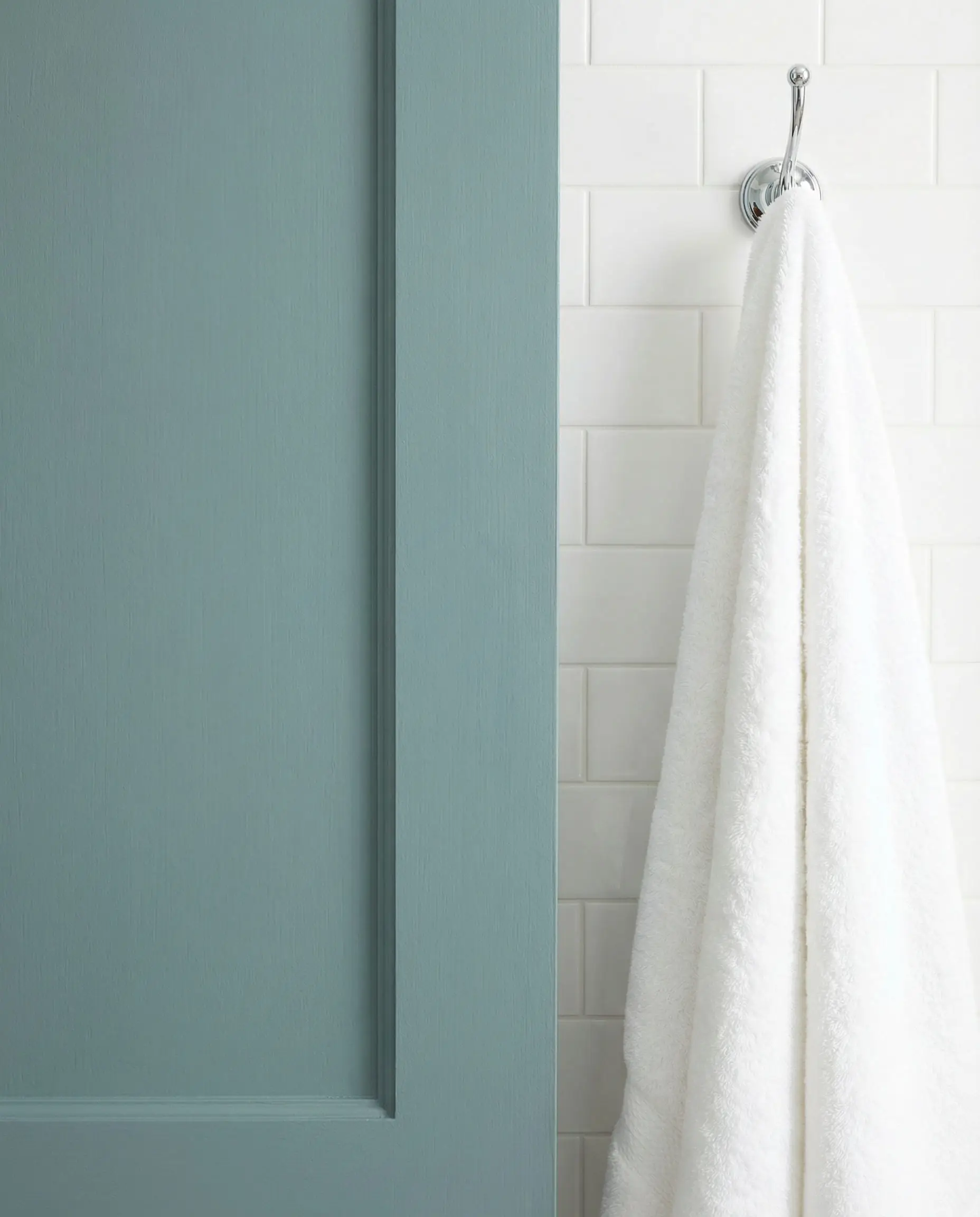
9. Pantry & Utility: Heritage Blue
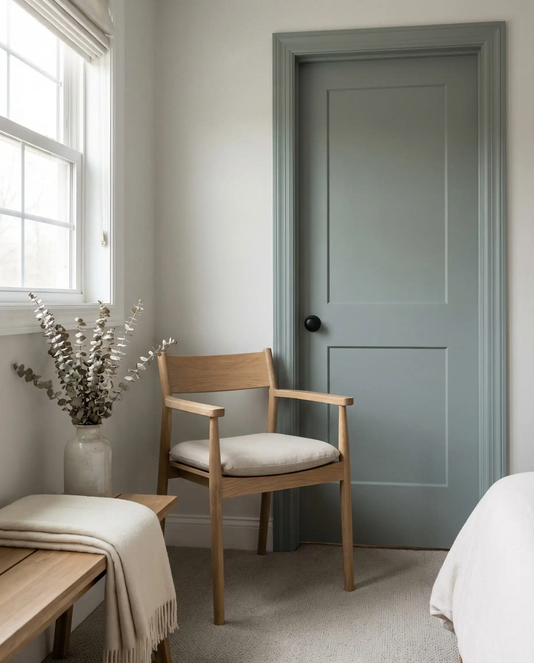
For “working” rooms like pantries, mudrooms, or laundry rooms, 2026 favors heritage blues—dusty, grey-blue shades that hide scuffs and feel clean.
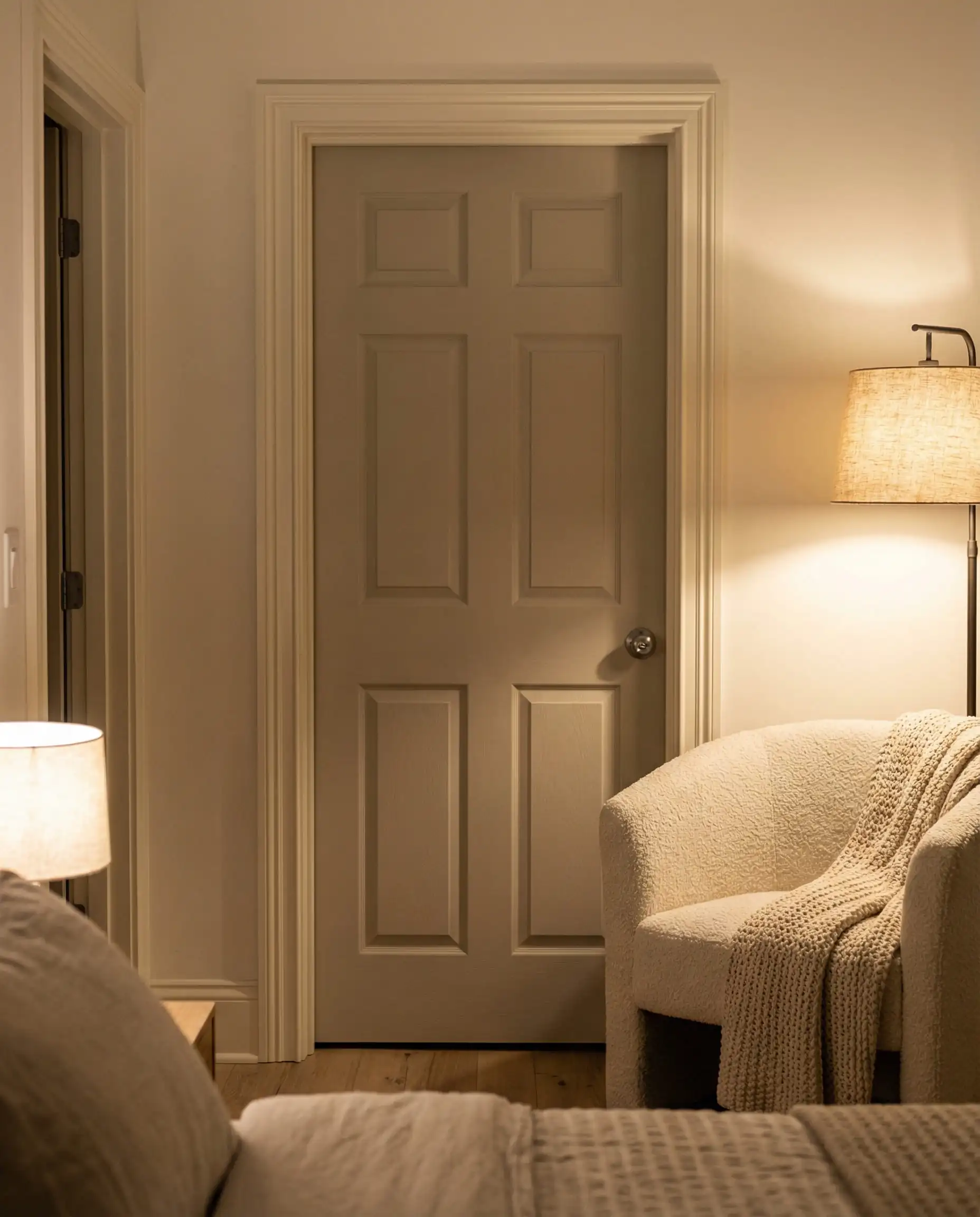
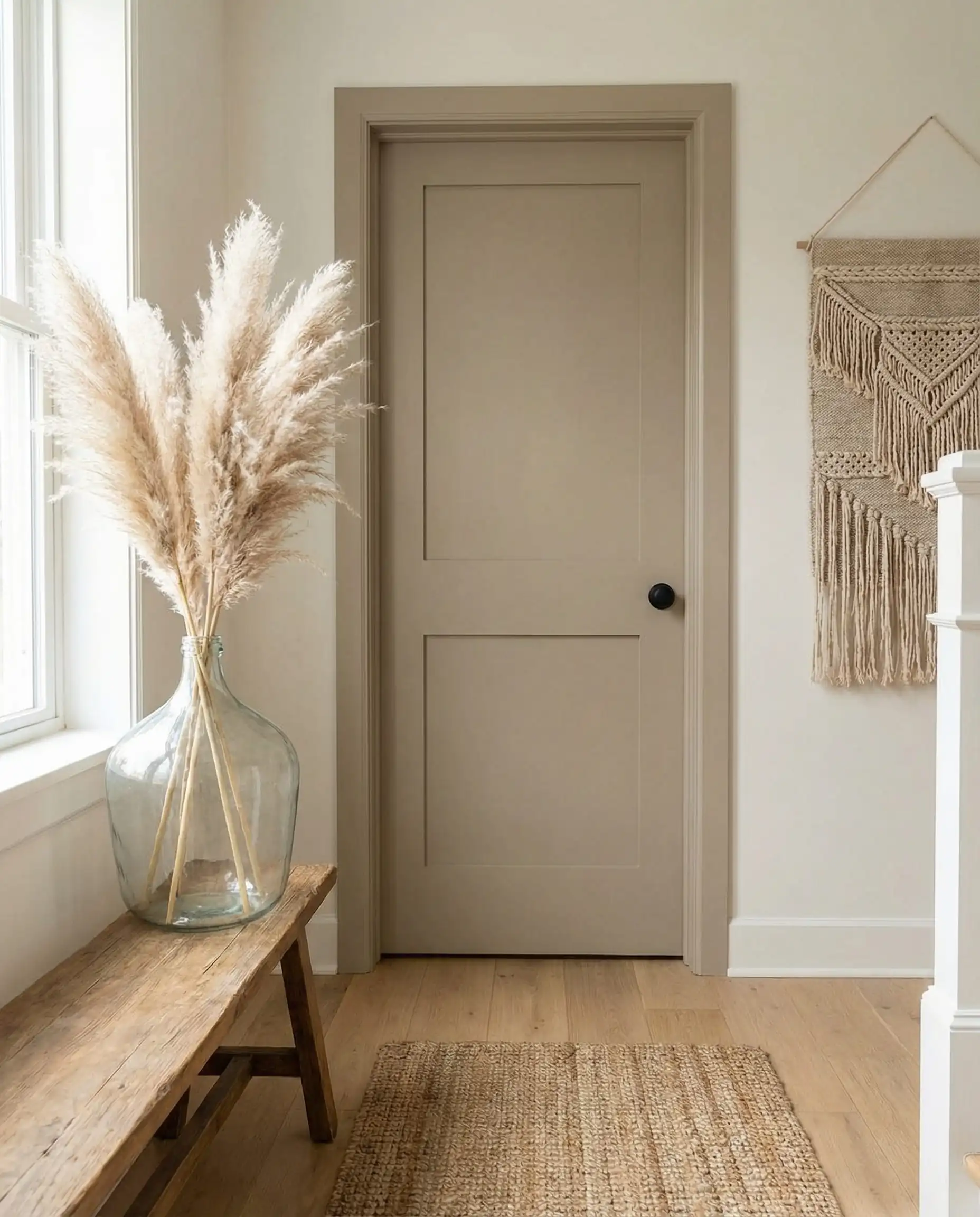
10. The Bedroom Sanctuary: Warm Greige
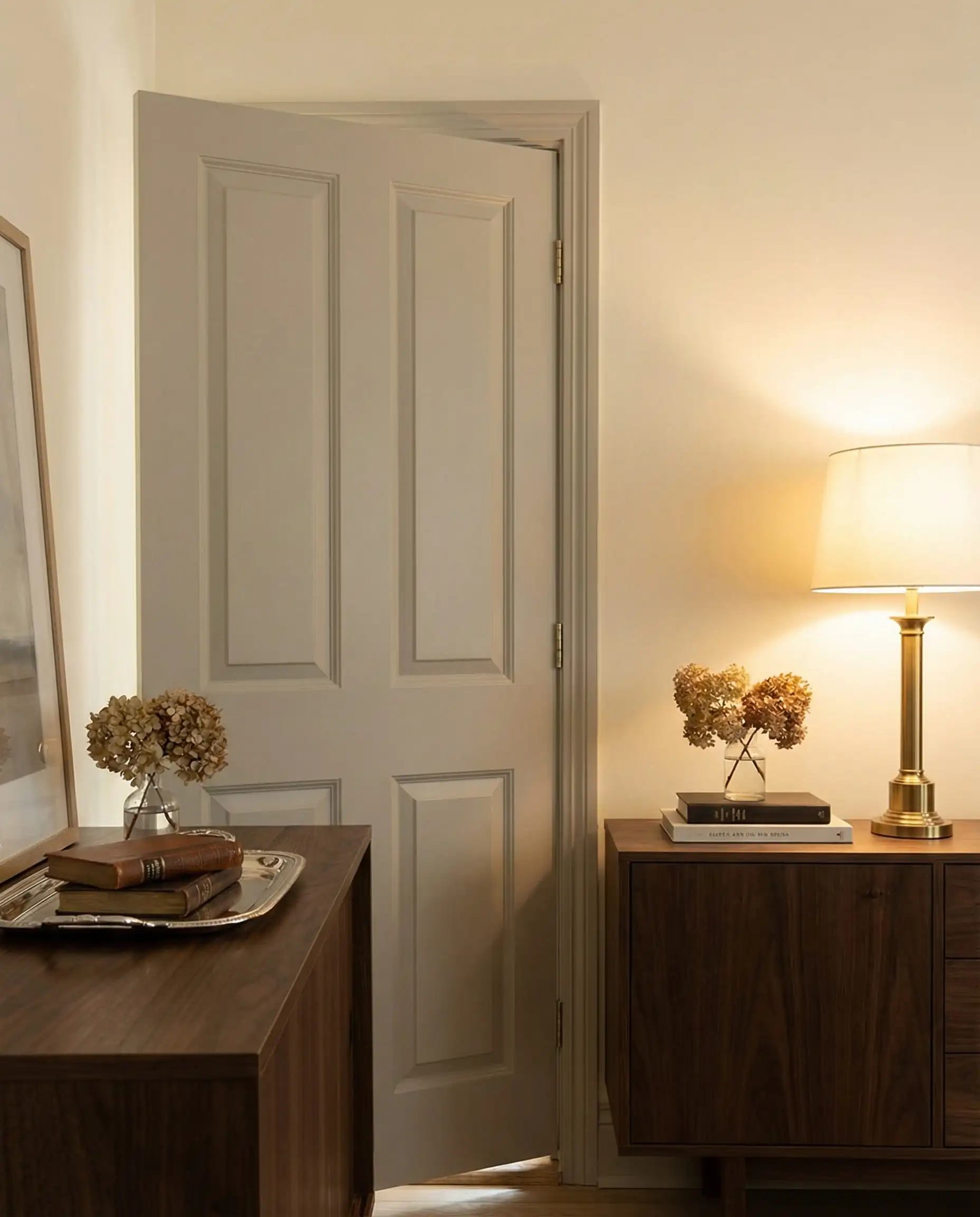
White bedroom doors can feel stark. A warm “Greige” (Grey+Beige) door creates a softer, more restful entry into sleeping spaces.
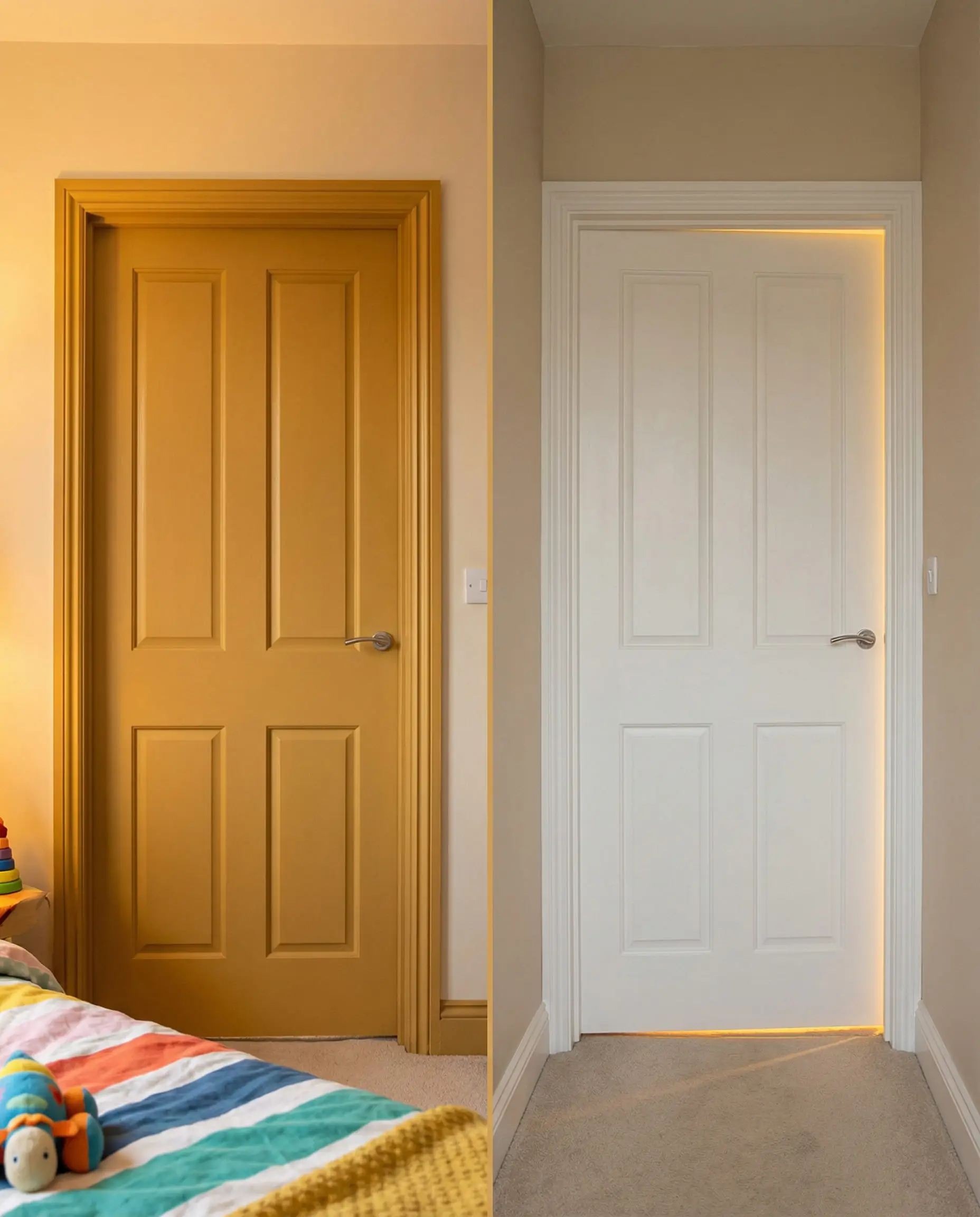
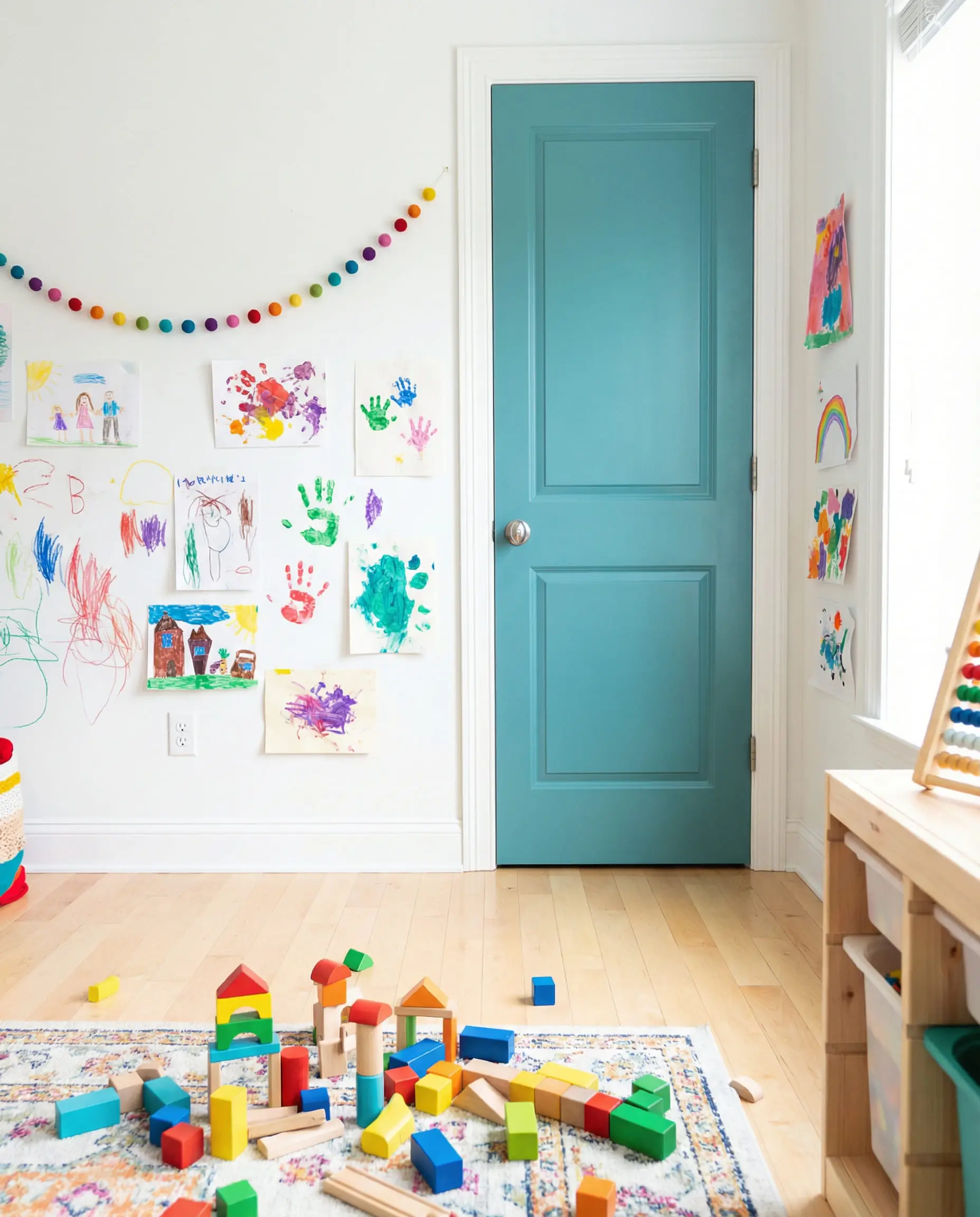
11. The “Surprise” Pop (Kids & Guest Rooms)
A door that is neutral on the hallway side but a bright, joyful color (like pale yellow or sage green) on the bedroom side. It’s a secret slice of personality that doesn’t disrupt the hallway flow.
Part 3: The Art of Hardware Pairing
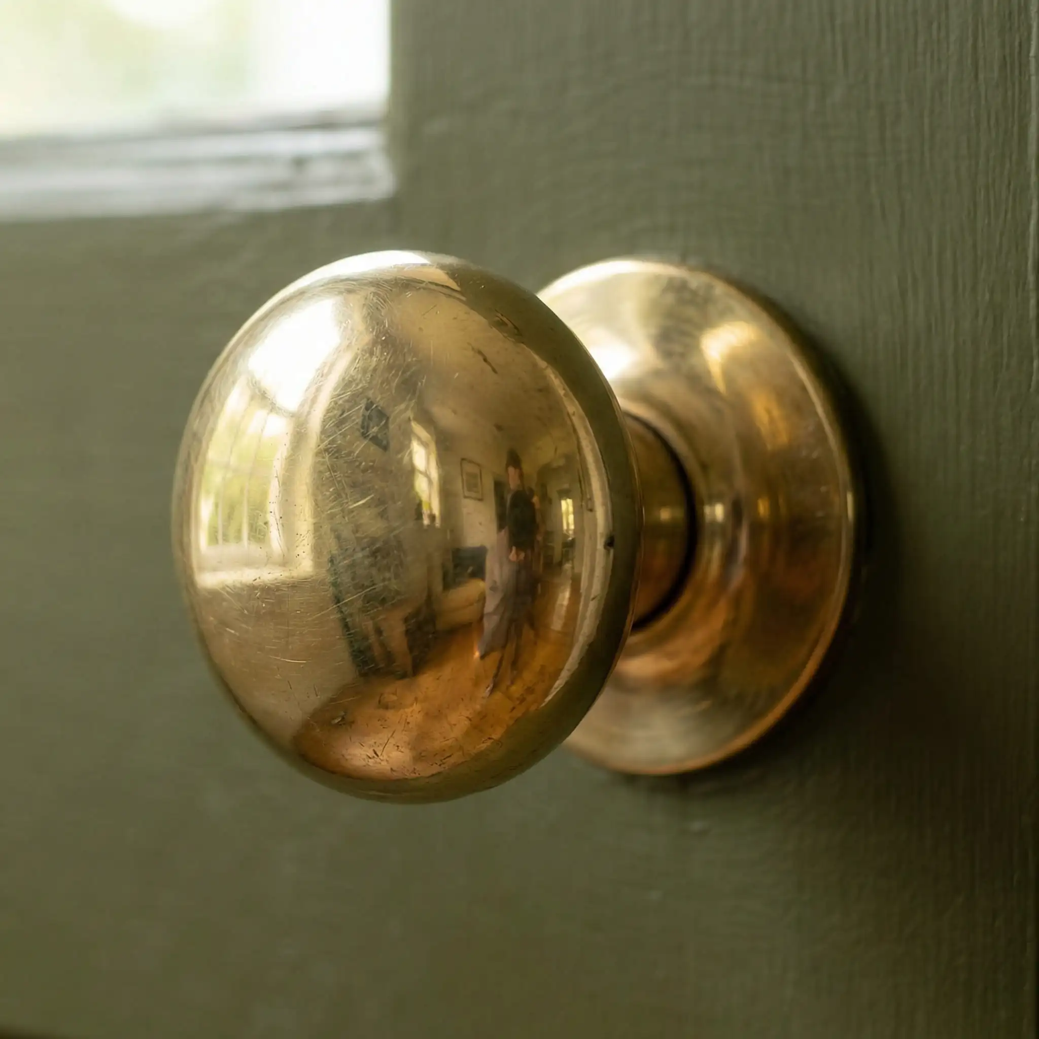
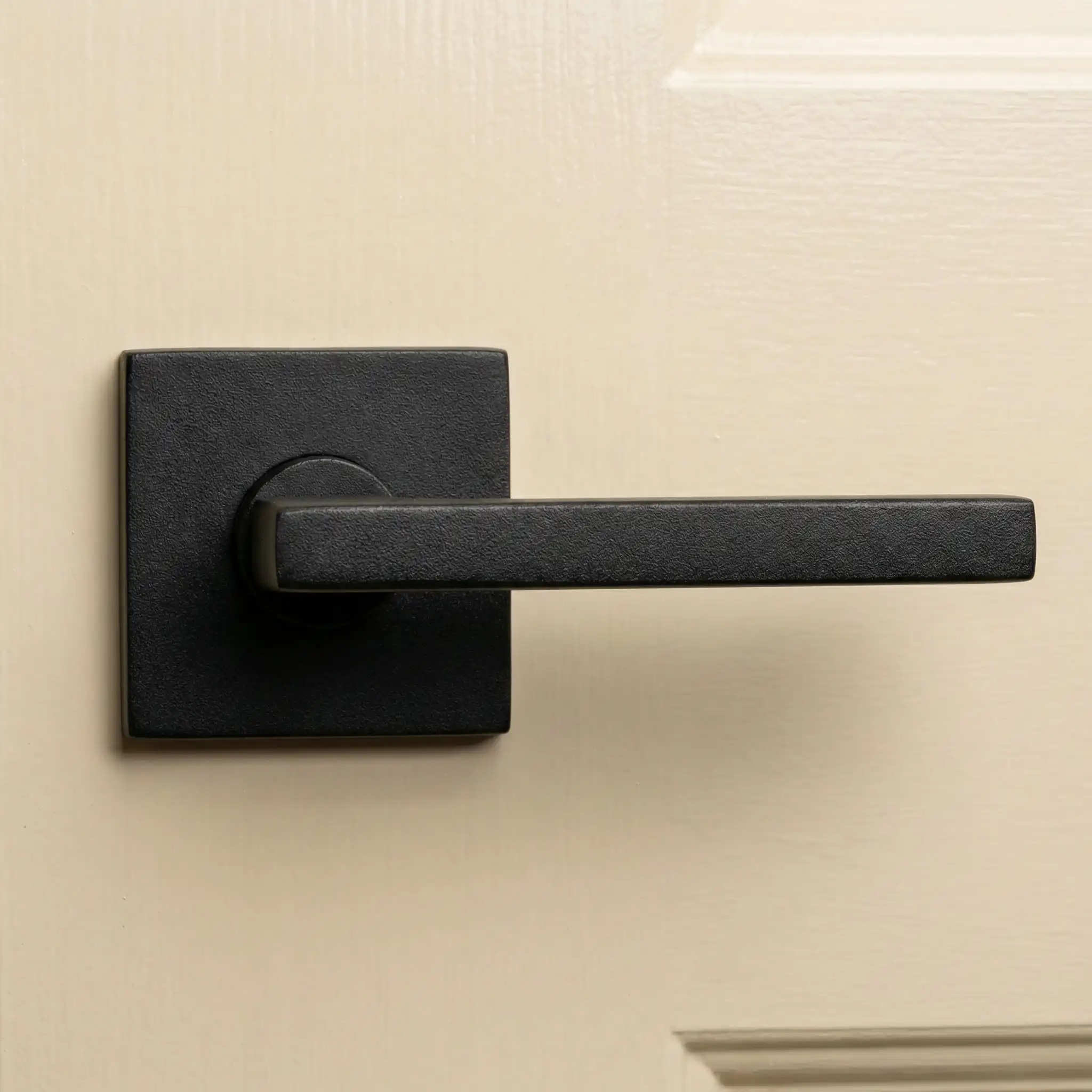
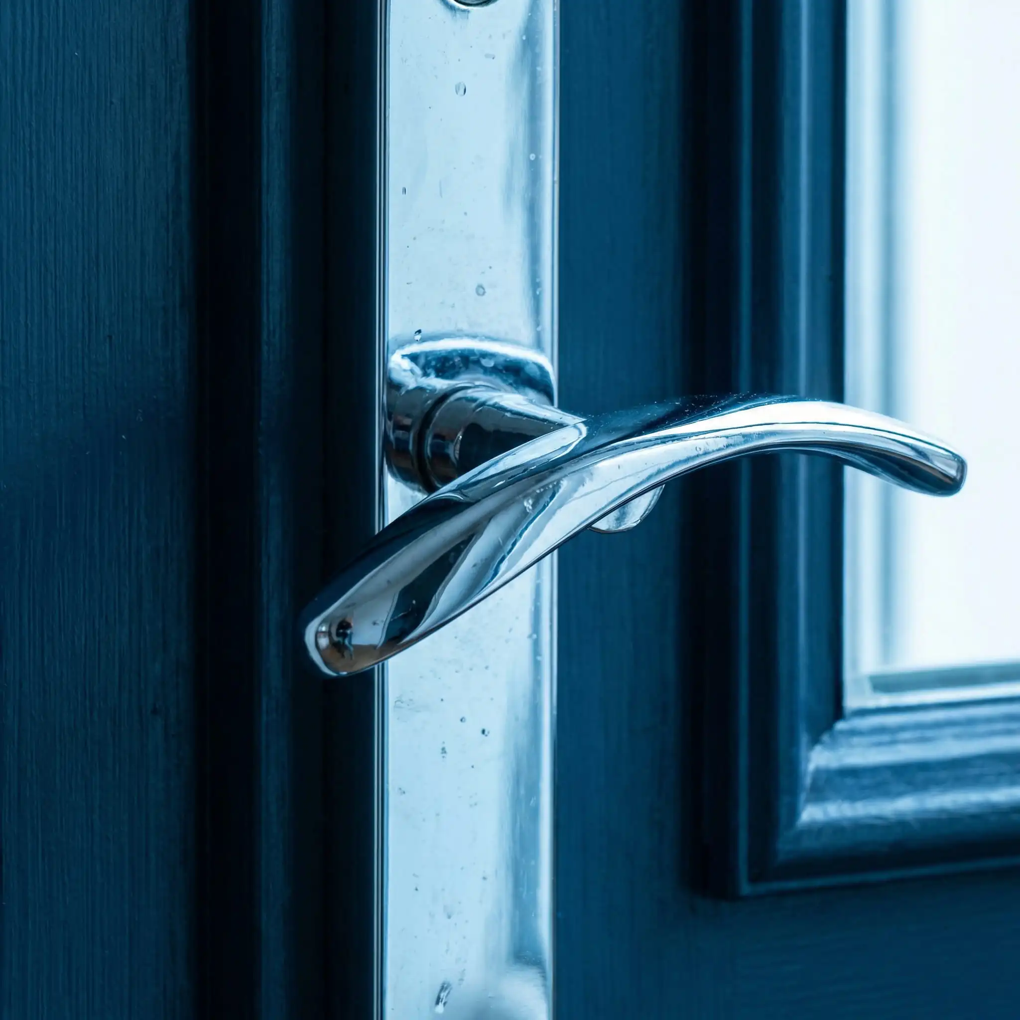
A paint color can look completely different depending on the metal finish you pair it with. In 2026, mixing metals is encouraged, but pairing them intentionally is key.
Polished Brass & Unlacquered Gold
Matte Black
Polished Nickel / Chrome
Part 4: Creative Painting Techniques
It’s not just about the color; it’s about how you apply it.
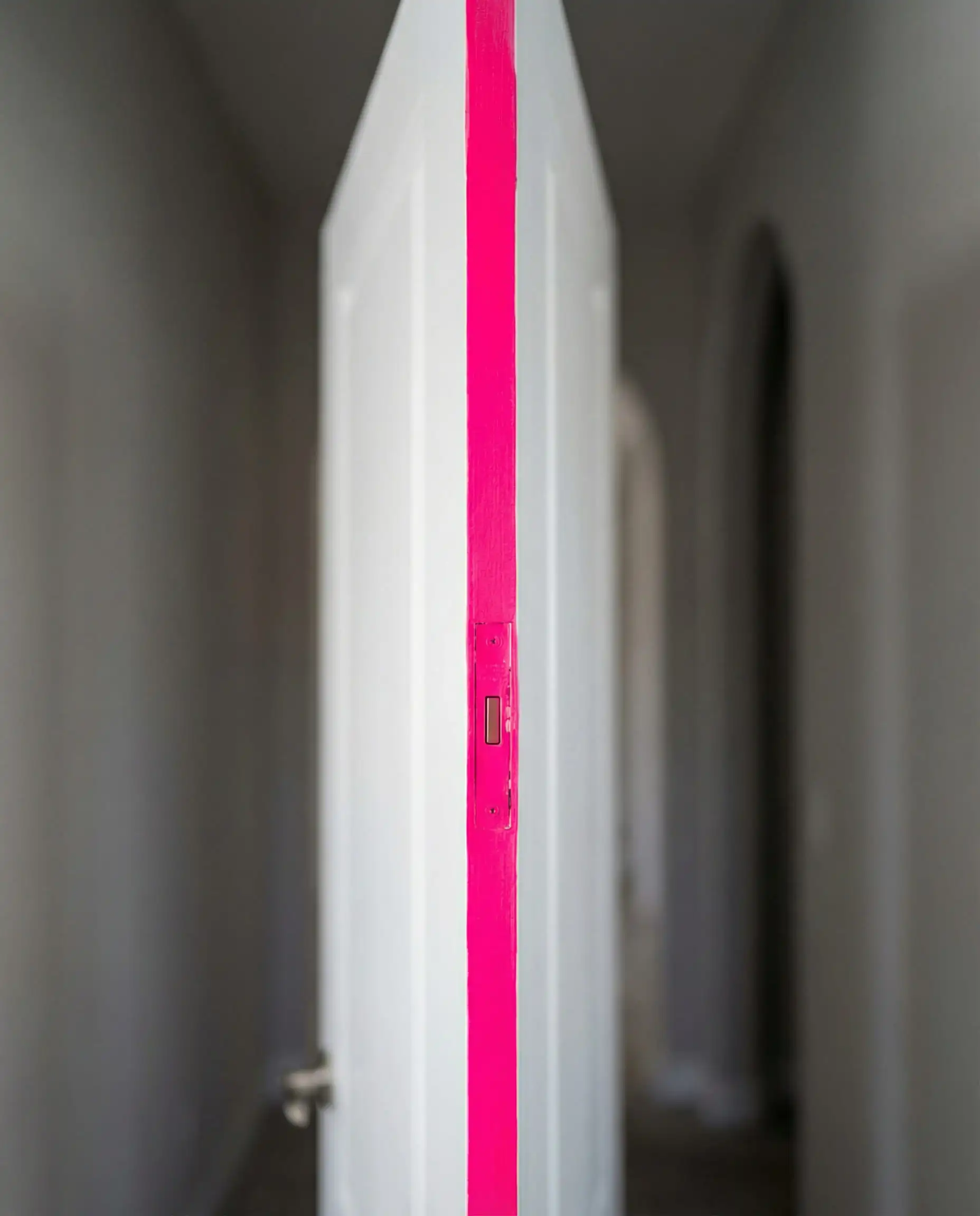
12. The “Edge” Pop
Paint the face of the door a neutral color, but paint the vertical edge (the part you only see when the door is open) a neon pink, bright yellow, or teal. It’s a subtle, fun detail that guests love to discover.
13. Two-Tone Doors
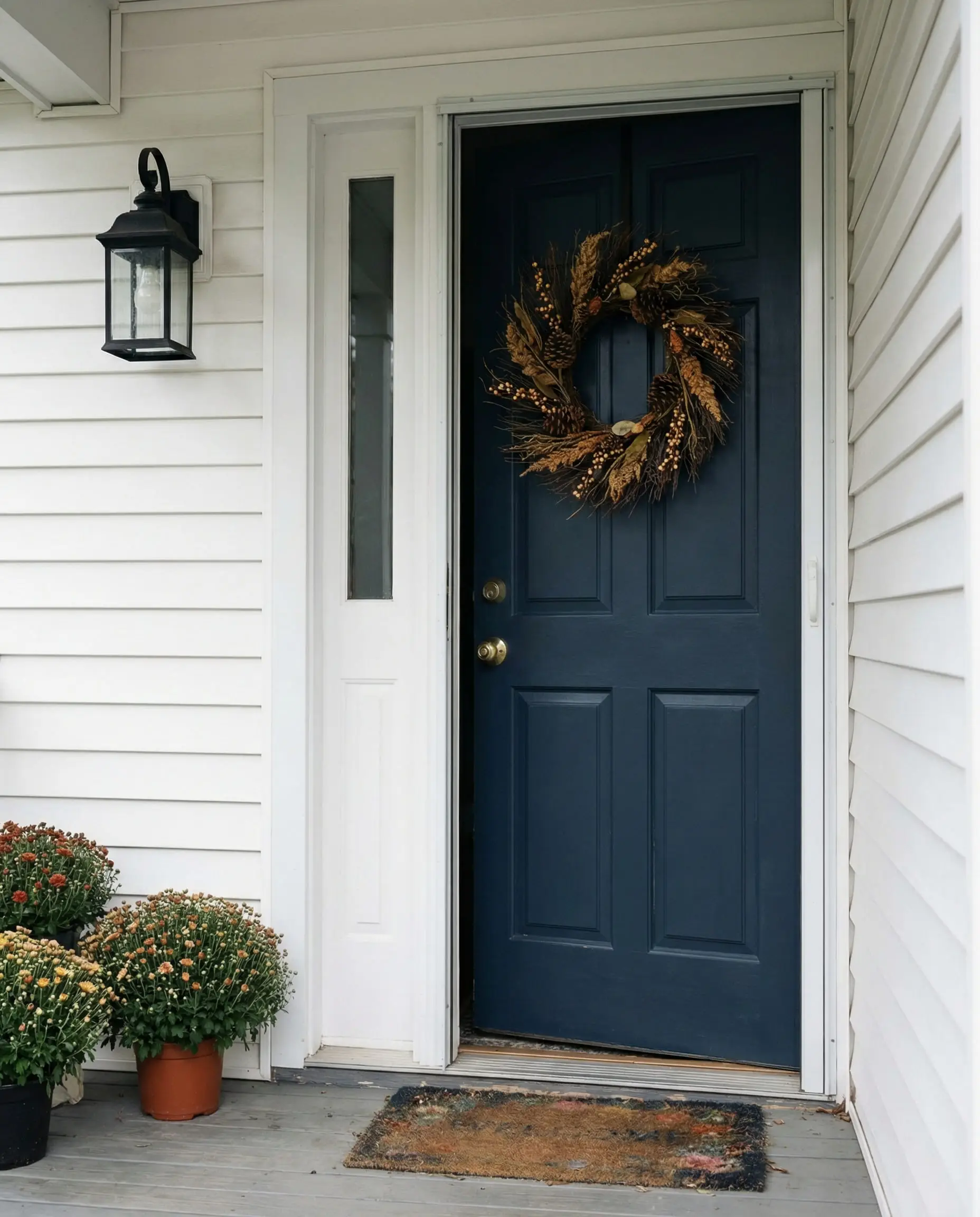
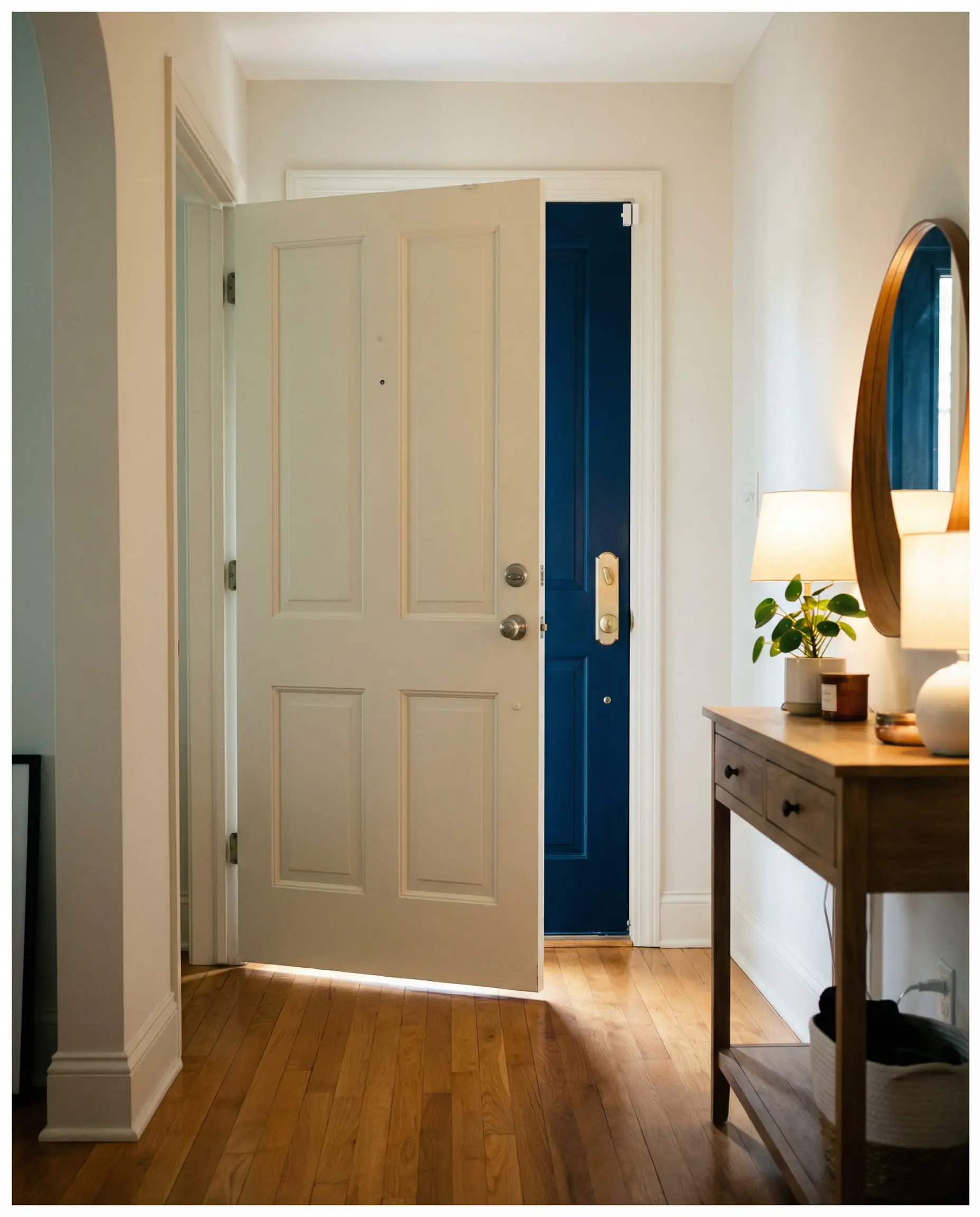
Don’t feel pressured to match the inside and outside. A front door can be Navy Blue on the exterior to match the siding, and Crisp White (like Alabaster (Sherwin-Williams)) on the interior to match your hallway trim.
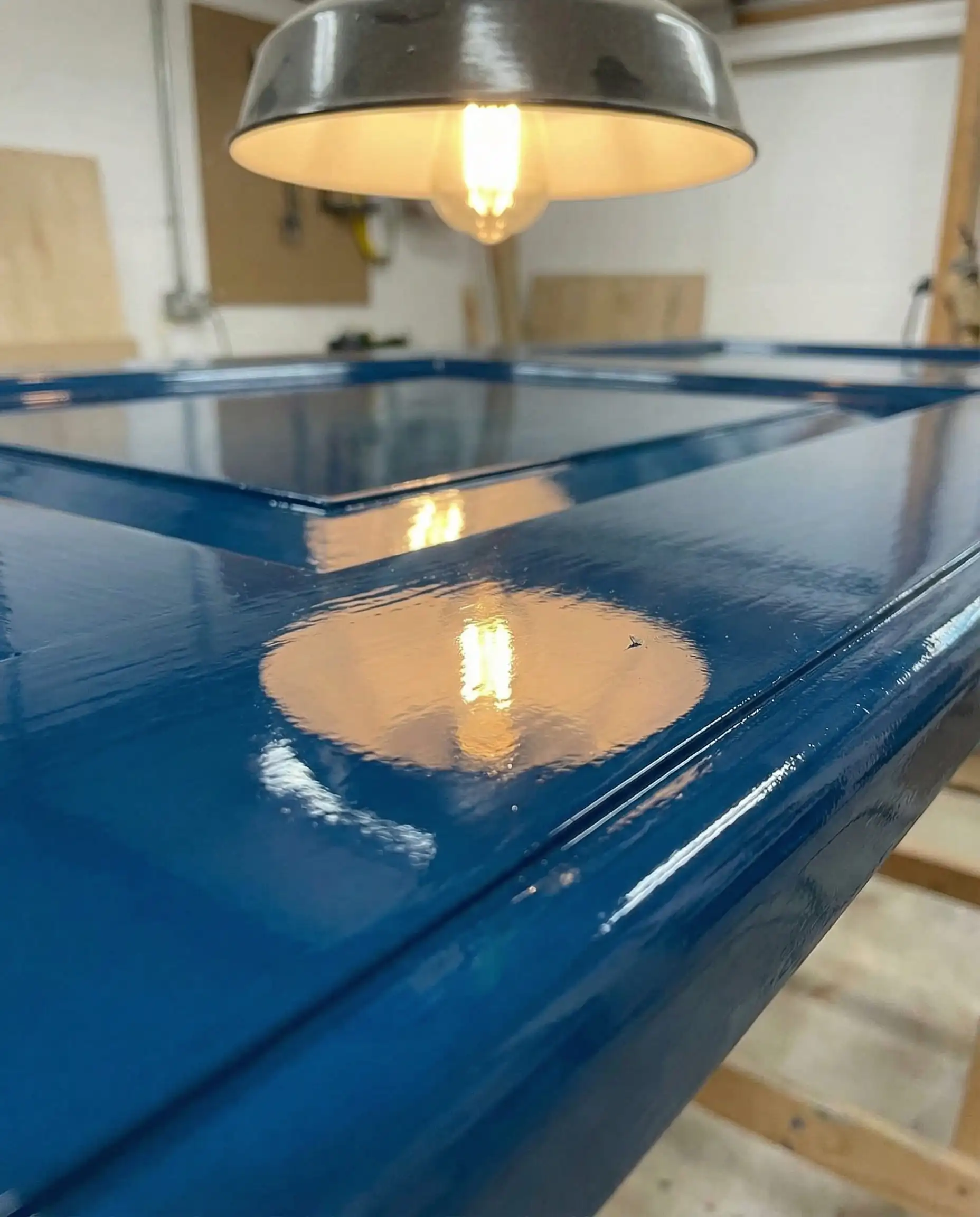
14. High-Gloss Interiors
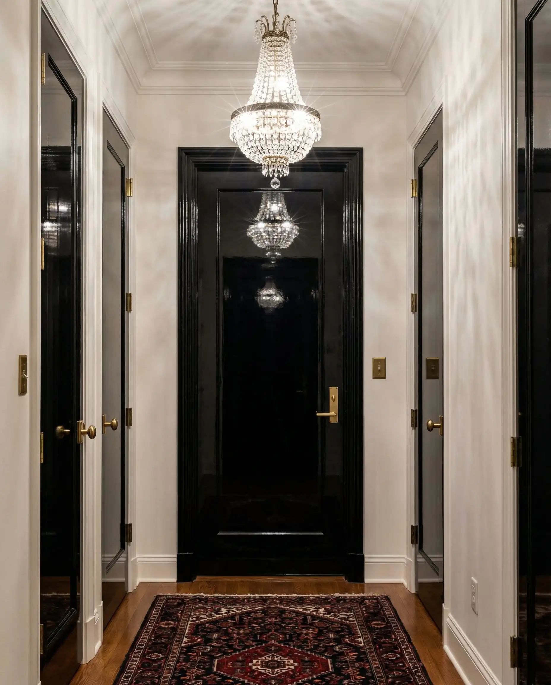
While matte walls are popular, High-Gloss doors are making a comeback. The reflective surface bounces light around dark hallways and is much more durable against sticky fingers and pet scratches.
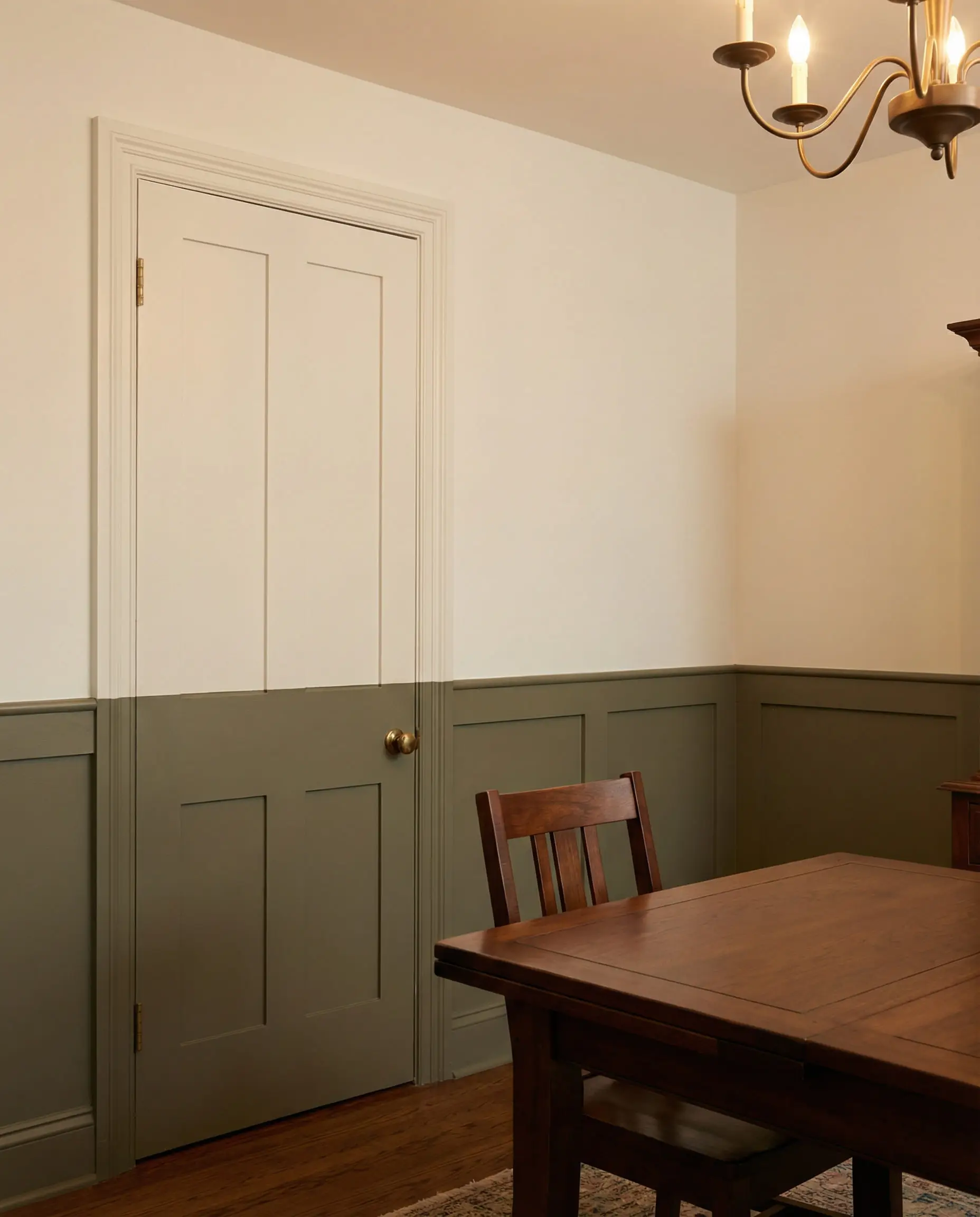
15. The Half-Painted Door
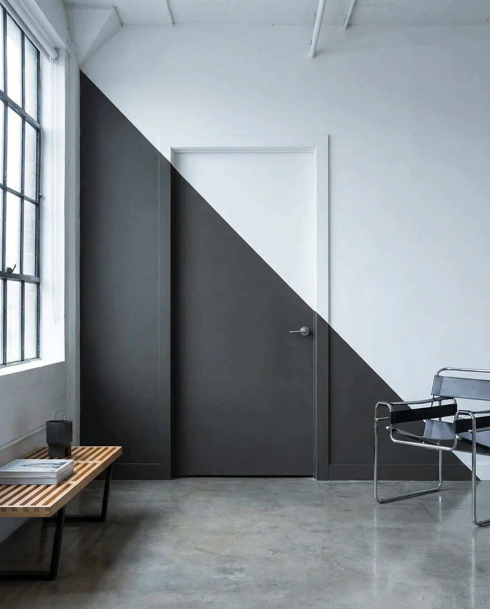
For a playful, modern look (great in studios or playrooms), paint the bottom half of the door a dark color and the top half the same color as the wall. It “hides” the door visually while adding a geometric element.
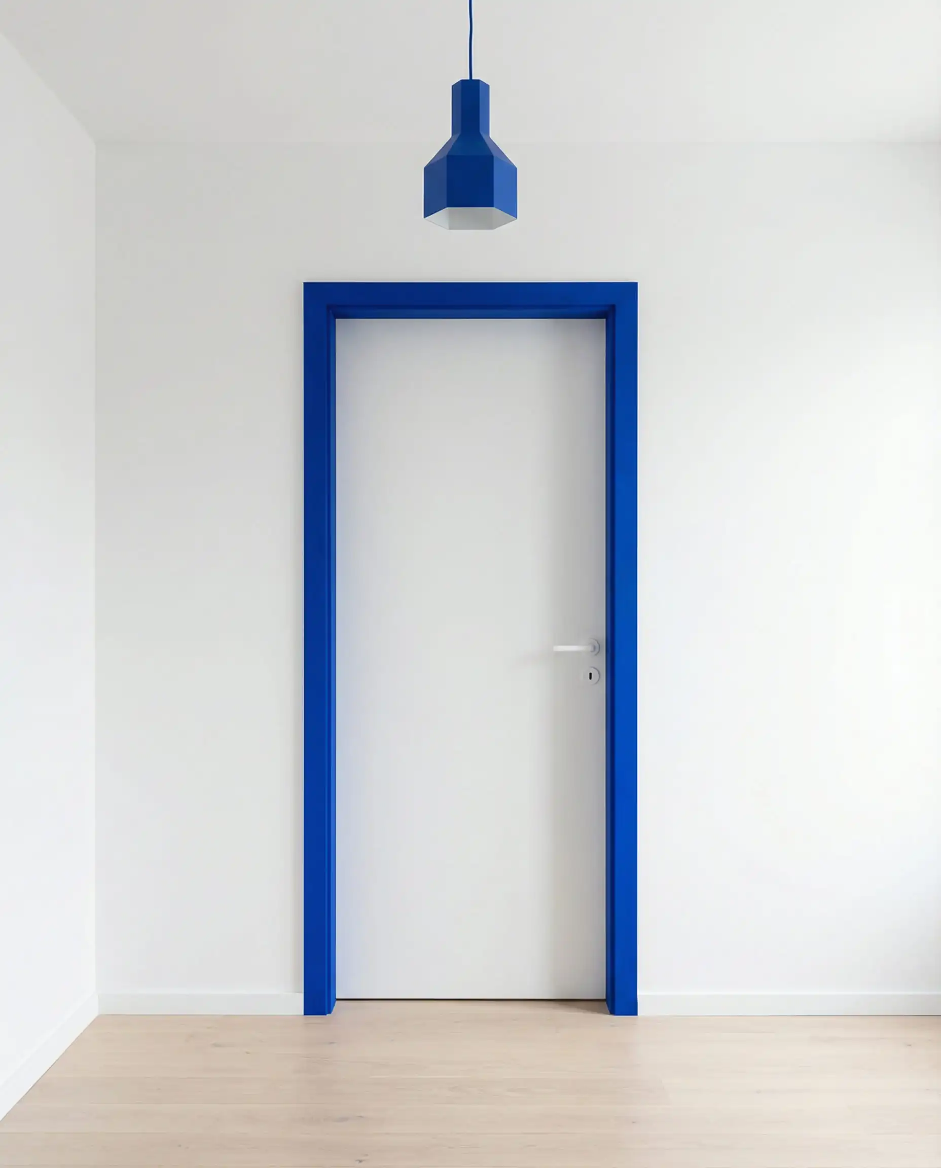
16. Painted Architraves
Instead of painting the door, paint the frame (architrave) a contrasting color while leaving the door wood or white. It outlines the entry like a portal.
Part 5: The 2026 Master Palette (Specific Picks)
The Greens
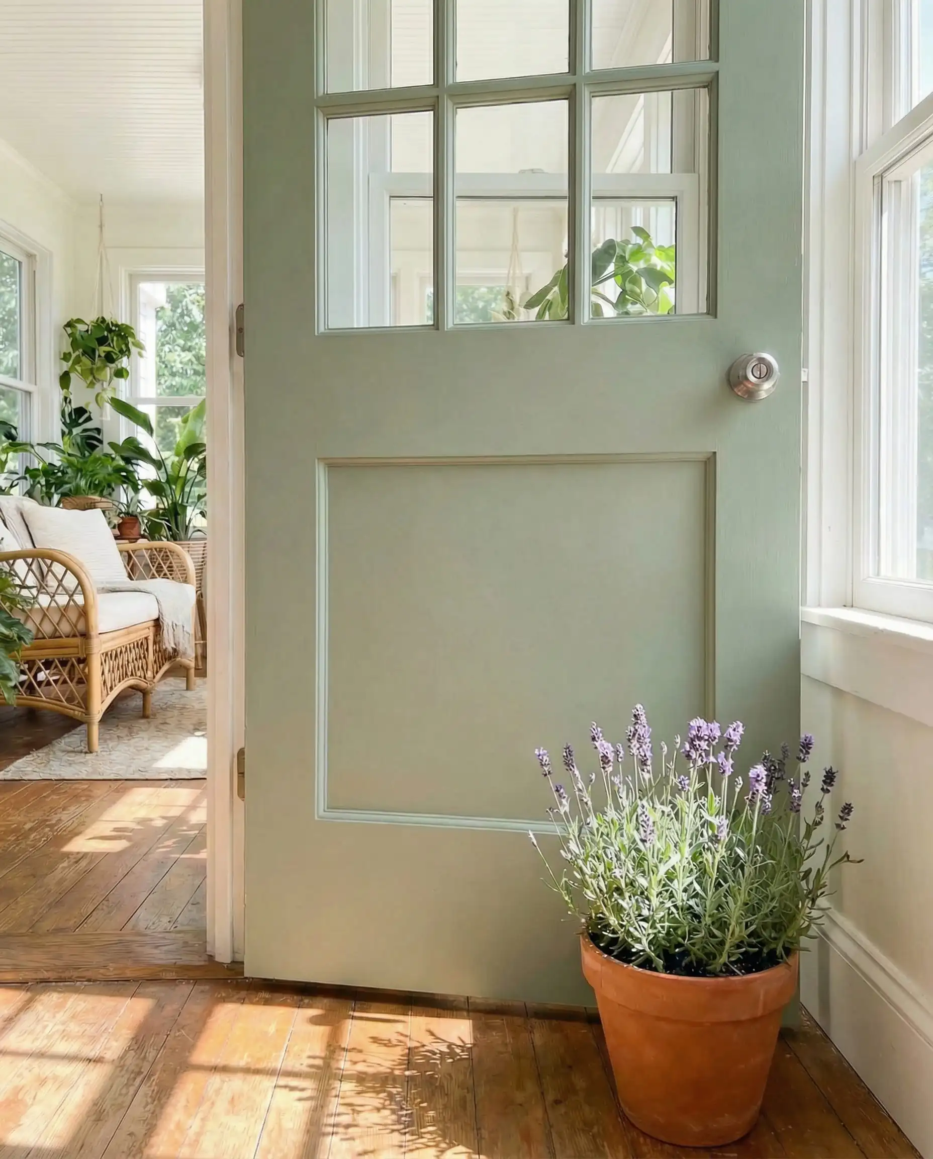
- 17. “Bancha” (Farrow & Ball): A protective, olive green.
- 18. Backwoods (Benjamin Moore): A classic forest green.
- 19. Evergreen Fog (Sherwin-Williams): A soft, organic sage with grey undertones.
The Warm Neutrals
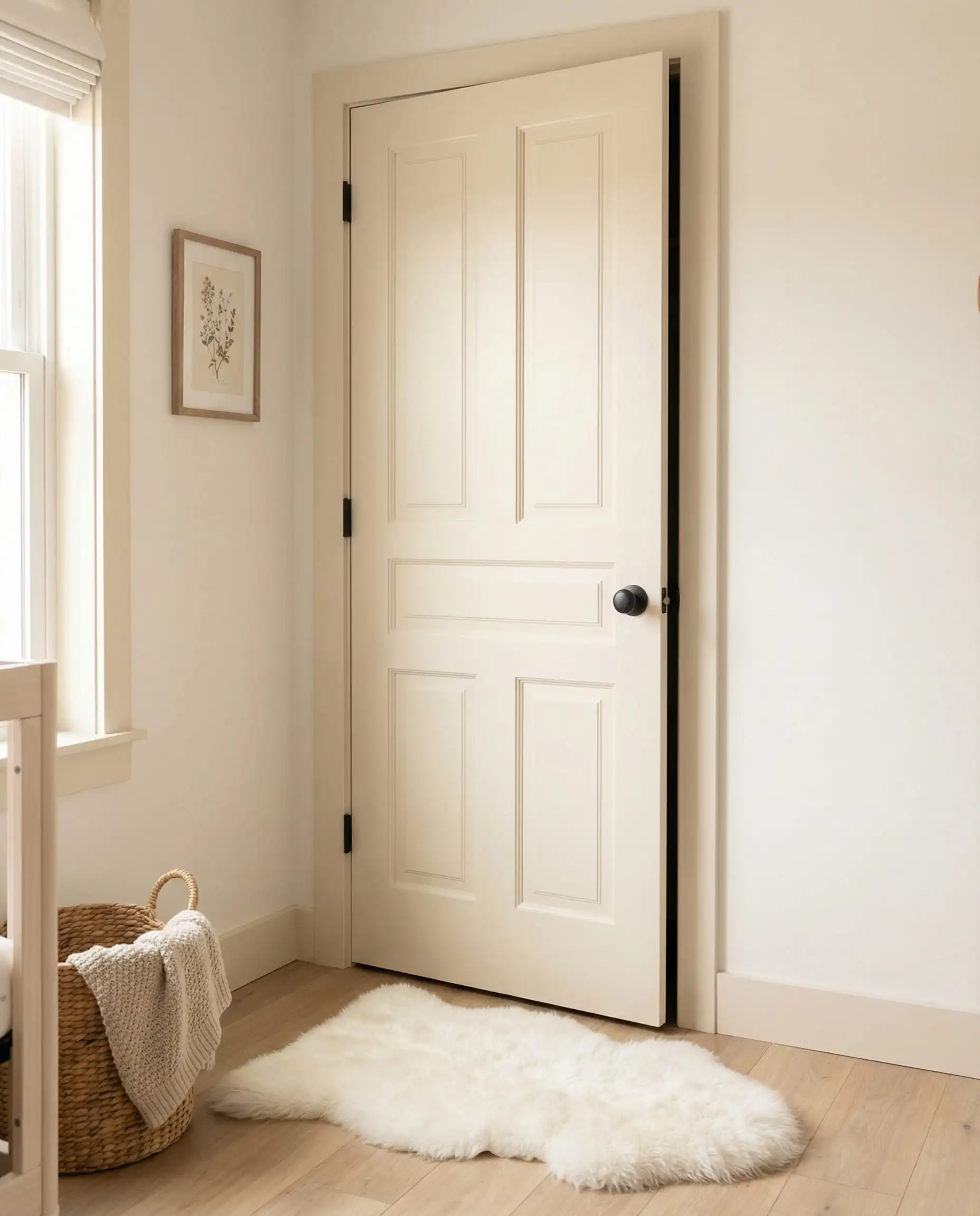
- 20. “Jitney” (Farrow & Ball): A relaxing, sandy neutral.
- 21. Revere Pewter (Benjamin Moore): The perfect bridge between grey and beige.
- 22. Natural Linen (Sherwin-Williams): Clean and airy.
- 23. Edgecomb Gray (Benjamin Moore): An earthy, organic neutral.
The Moody Darks
- 24. Hale Navy (Benjamin Moore): The absolute gold standard for navy doors.
- 25. “Railings” (Farrow & Ball): A soft black with blue undertones.
- 26. Urbane Bronze (Sherwin-Williams): A rich, brownish-grey that feels grounded.
- 27. Black Magic (Sherwin-Williams): A true, deep neutral black.
The Joyful Pops
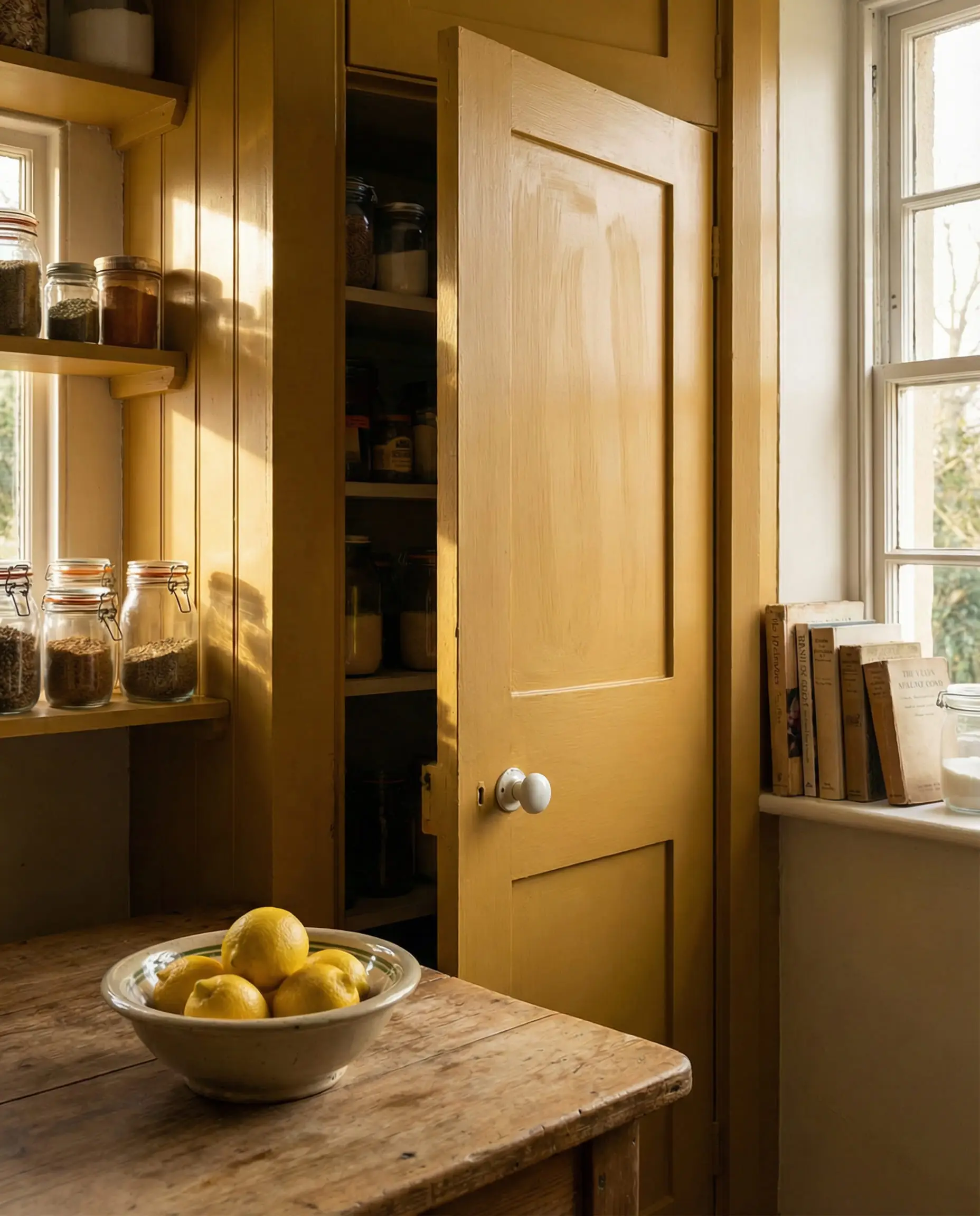
- 28. “India Yellow” (Farrow & Ball): A deep, moody mustard.
- 29. Aegean Teal (Benjamin Moore): A calming, balanced blue-green.
Technical Guide: How to Choose & Apply
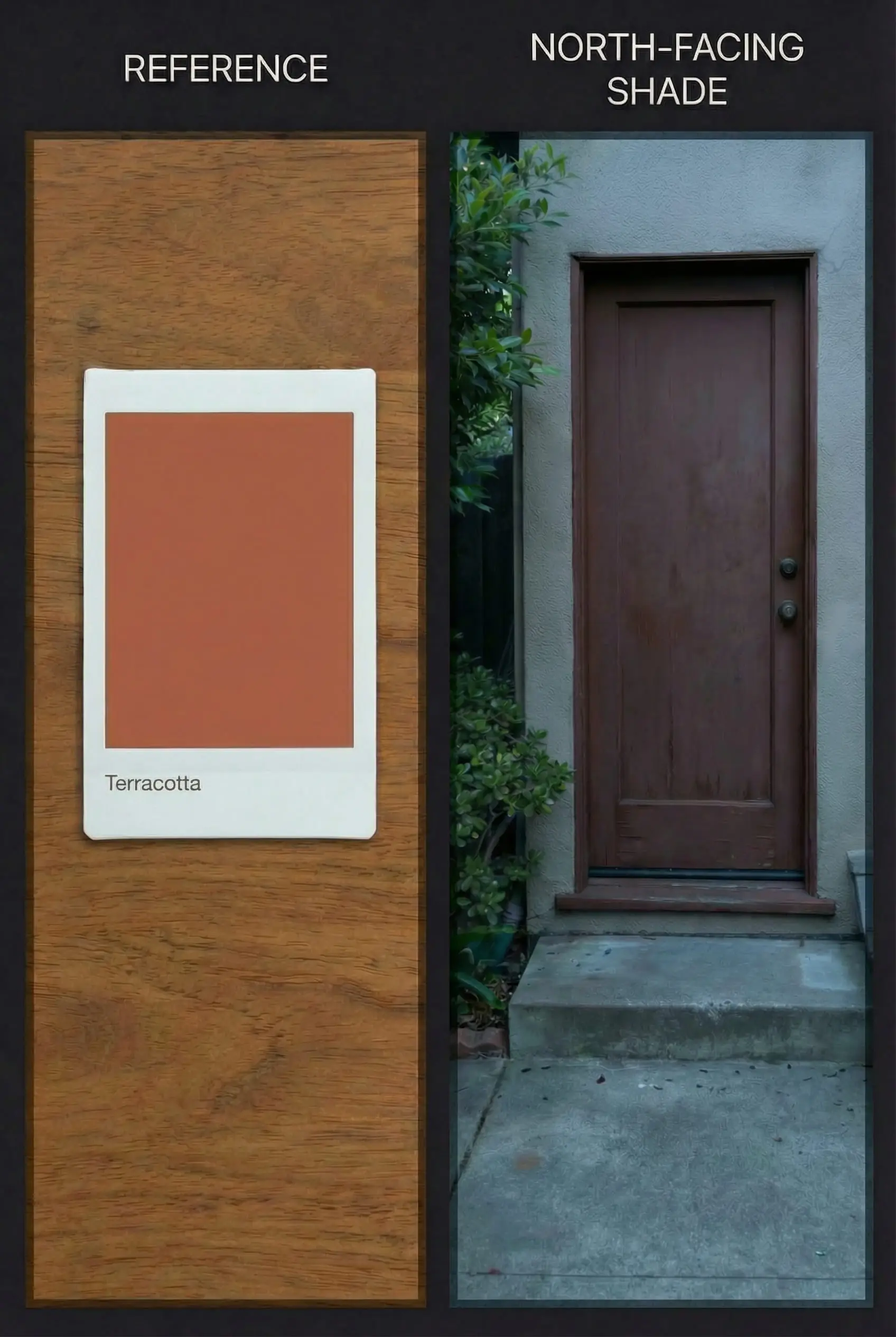
The Light Factor: North vs. South
Before you buy a gallon of paint, check your compass. The direction your door faces changes the color dramatically.
Choosing the Right Finish
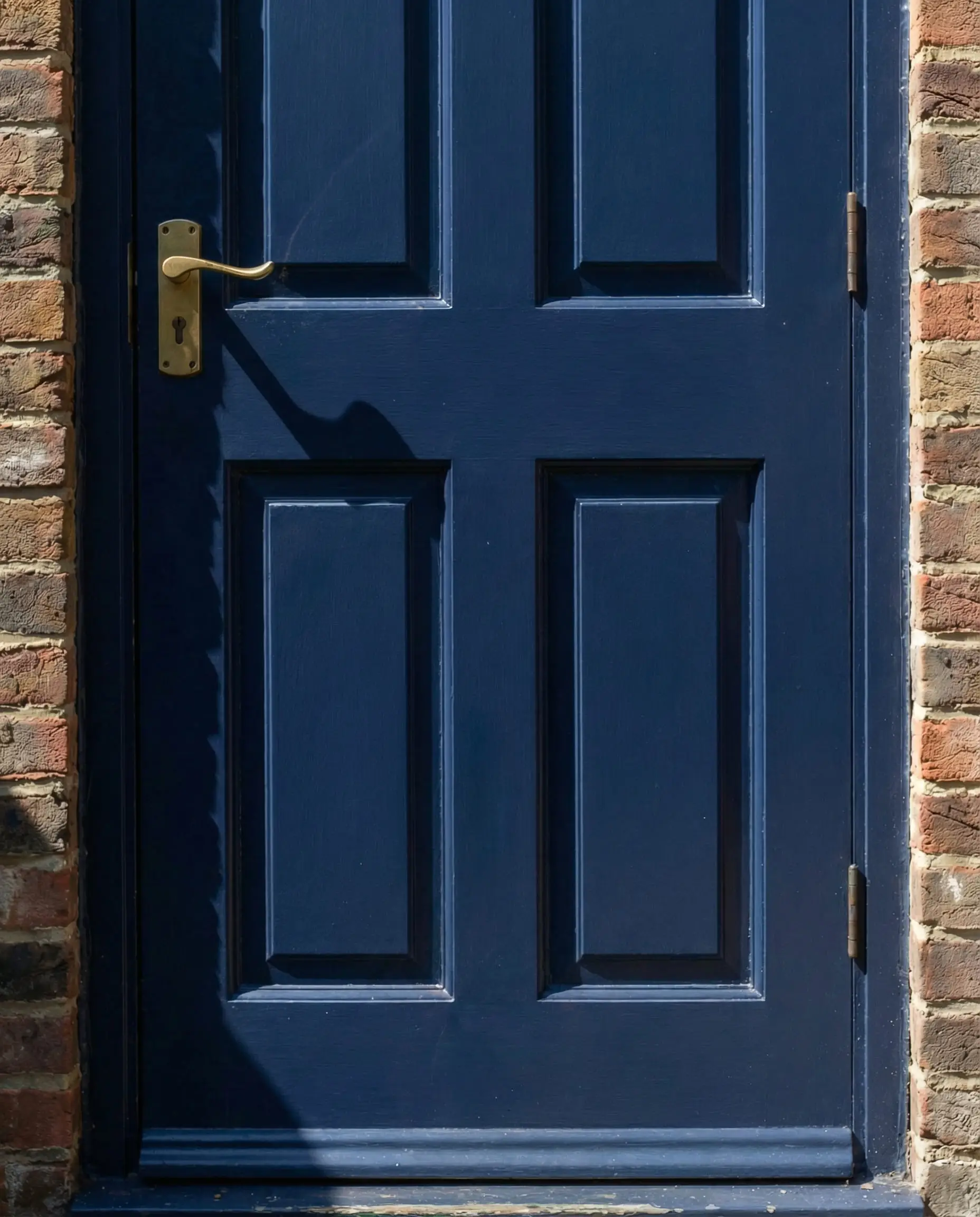
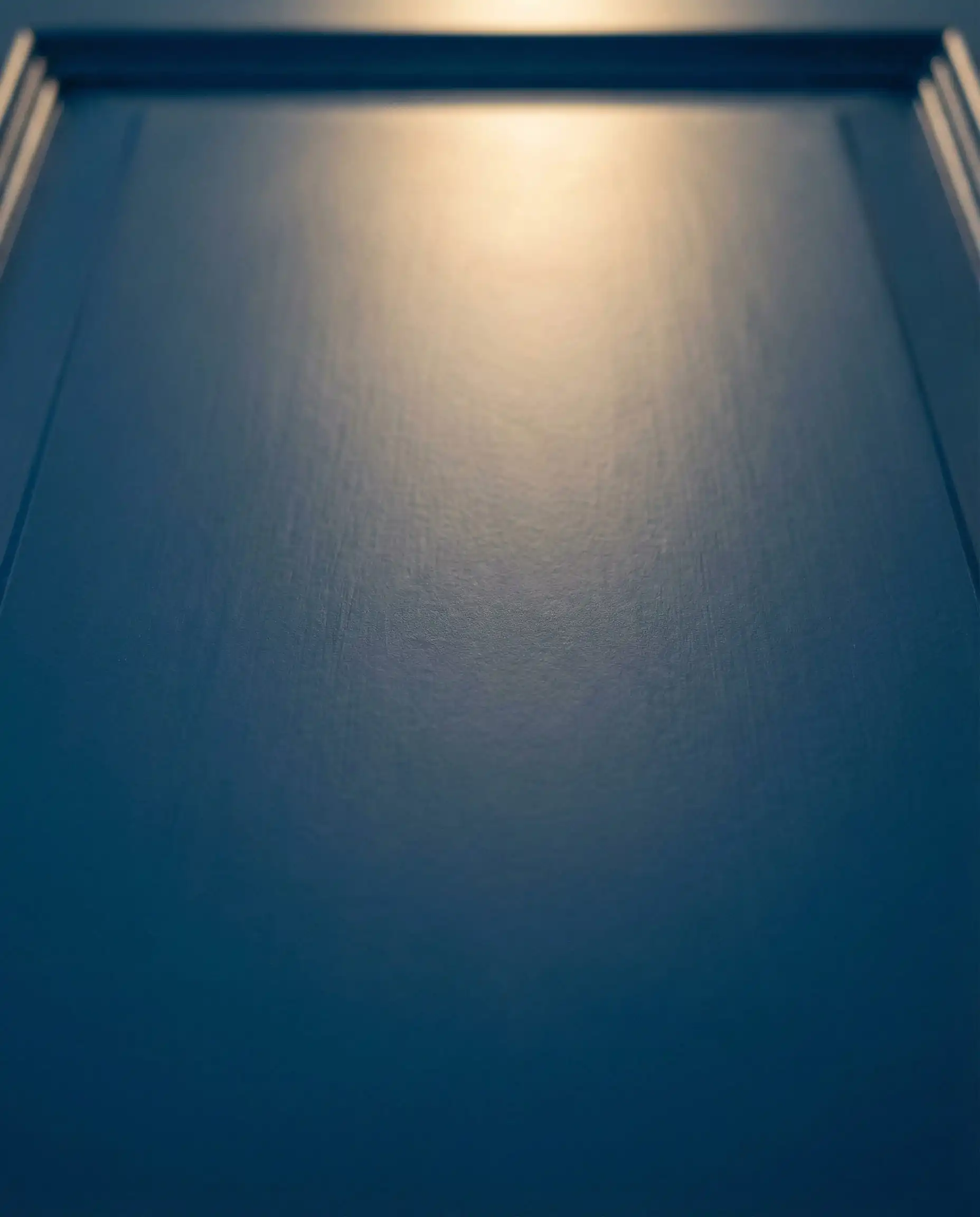
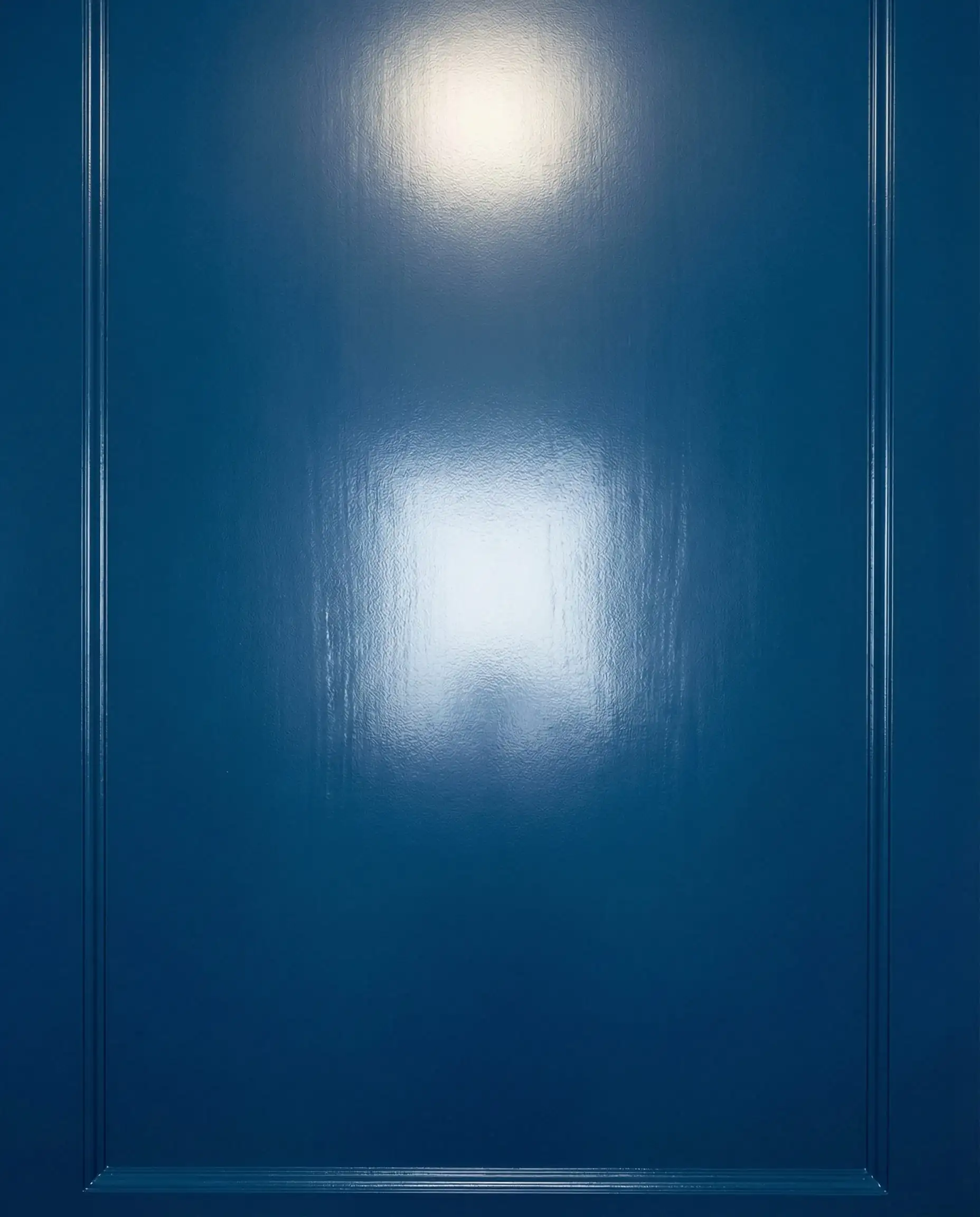
The color is important, but the sheen determines how the color reads and performs.
DIY Tip: Do You Need to Remove the Door?
For a standard refresh, no.
- Wedge it open: Use a doorstop so it doesn’t close while wet.
- Tape the hinges: Use high-quality painter’s tape to cover the hinges and handles (if you aren’t removing them).
- Sand lightly: Scuff the surface with 120-grit sandpaper to help the new paint stick.
- Paint in order: Paint the panels first, then the central vertical stile, then the horizontal rails, and finally the outer edges.
How to Match Your Door to Your Home
FAQ: Quick Expert Answers
A: In 2026, the trend is either darker (for contrast) or identical (color drenching). Lighter doors (like white doors on grey walls) can sometimes look “cheap” unless the trim is substantial and architectural.
A: Yes. You must use a “Multi-Surface” primer or a primer specifically for plastic. If you skip this, the paint will scratch off with a fingernail. Brands like Zinsser make excellent primers for this purpose.
A: Satin or Semi-Gloss. Never use “Flat” or “Matte” on a door—it holds onto fingerprints and is impossible to scrub clean.
If you only do one thing this year, paint your interior doors. It is cheaper than buying new furniture but completely changes the “vibe” of your home. Start with the bathroom or pantry door as a low-risk experiment!
Hackrea Verdict