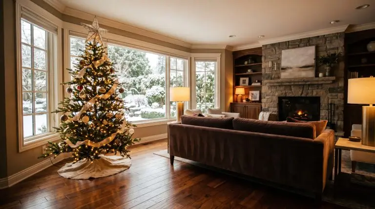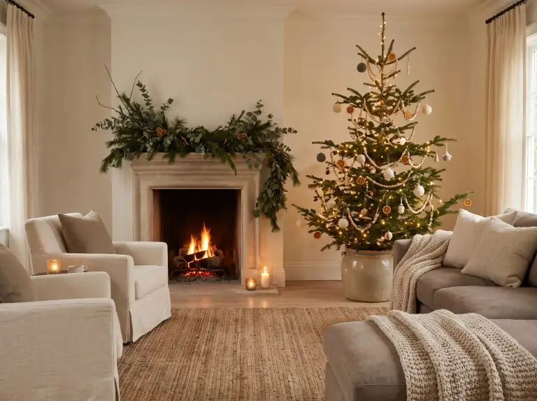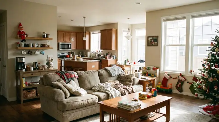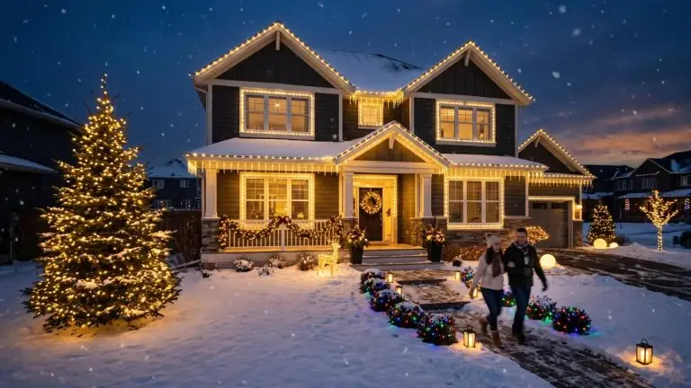
A Christmas tree can look beautiful in a showroom and feel strangely out of place beside your sofa. Often, the difference comes down to color. Your flooring, upholstery, wall paint, and lighting already create a palette, and seasonal decorations become part of it.
Choosing Christmas colors for 2026 starts with noticing those existing details. Whether you’re decorating on your own or working with a professional service like Trimmers Holiday Decor, gather photographs of your rooms and the ornaments you want to keep. That gives you a useful starting point for choosing colors, finishes, and focal points.
The aim is a festive home that still feels like yours. Here is how to turn seasonal inspiration into a scheme that works beyond the inspiration photograph.
Start With the Colors Already in Your Room
Look at the largest surfaces first: walls, floors, curtains, and furniture. These occupy more visual space than most decorations, so they should guide your choices.
Notice undertones as well as obvious colors. A cream sofa and honey-colored oak suggest a different palette from blue-gray upholstery and polished chrome. Compare potential ornaments directly with those surfaces; a white bauble may look ivory beside one fabric and noticeably cool beside another.
Next, identify an existing accent you could repeat. A burgundy stripe in a rug, green cushions, or a blue ceramic lamp can connect your Christmas decorations to the room.
Take stock of these three elements before shopping:
- Background colors: The shades covering your largest surfaces.
- Accent colors: Smaller details worth repeating in ribbons or ornaments.
- Existing metals: Brass, bronze, chrome, or blackened finishes that influence the overall scheme.
Put Christmas 2026 Color Trends in Context
Christmasworld’s Trends 26+ forecast presents several directions. Its “brave” theme features copper with rich reds and violets; “light” brings together matte silver, misty pastels, and darker natural shades; “solid” explores white, cool colors, saturated accents, and metallic finishes.
These are design forecasts, so use them as inspiration when choosing your own combination or planning professional interior holiday decorating. You can borrow a metallic finish or a single accent without adopting an entire theme.
For example, copper ribbon might refresh the green decorations you already own. A few pale blue ornaments could soften an existing silver collection. Small changes give Christmas 2026 color trends a practical place in your home.
Trending Christmas Colors 2026: Palettes to Try at Home
The following combinations are suggestions for adapting seasonal ideas to different interiors. Choose the one that connects with your furniture and finishes.
Cream, Forest Green, and Antique Gold for Warm Neutrals
In a room with beige upholstery, oak flooring, or linen curtains, try cream ornaments, deep green foliage, and restrained touches of antique gold.
Let greenery provide depth against pale walls. Repeat the cream through ribbon or a table runner, then use gold on a few ornaments or candleholders. If the room already contains brass lamps, the metallic accents will have a natural connection.
Misty Blue, Soft White, and Silver for Cool Interiors
For gray sofas, blue textiles, or chrome details, try misty blue ornaments with soft white ribbon and silver accents.
Mix matte and reflective surfaces to give similar colors more variety. A silver bauble, a frosted ornament, and a fabric bow can share a palette while catching light differently. Check the white against nearby upholstery before committing to a full set.
Burgundy, Blush, and Copper for Dark Wood
Walnut furniture and brown leather can provide a rich backdrop for burgundy, muted blush, and small copper details.
Use burgundy for substantial accents such as wide ribbon, then introduce blush in smaller ornaments. Copper adds glints of light. Against dark walls or dense evergreen branches, include enough lighter pieces to keep the arrangement visible from across the room.
Ivory, Natural Wood, and Green for Quiet Interiors
If your room relies on simple furniture and a limited palette, combine ivory paper ornaments, wooden decorations, and green foliage.
Vary the shapes and textures while keeping the colors consistent. Folded stars, carved ornaments, and linen bows give the eye something to explore. Leave some branches visible so individual decorations have space around them.
Existing Accent Colors for Eclectic Rooms
A patterned rug or colorful collection can supply a palette of its own. Pick two shades already present, then add a neutral such as cream.
For example, a rug containing raspberry and teal could inspire ribbon and ornaments in those colors. Keep wrapping paper and table linens simpler so the Christmas display feels connected to the room’s existing patterns.
Give Each Color a Clear Role
Once you choose a palette, decide which shade will lead, which will support it, and which will appear only in small amounts.
On a green tree, the branches already contribute substantial color. Cream ornaments might become the main decoration, burgundy ribbon the supporting shade, and copper the occasional highlight. You do not need equal quantities of every color.
Consider visual weight, too. A wide velvet bow can attract more attention than several small glass ornaments. Step back frequently and judge the whole arrangement.
For interior Christmas decorations across a room, repeat one accent at the tree, mantel, and table. Keep some surfaces clear to give each display definition.
Test Your Palette Under Evening Lighting
Before buying a full collection, bring together a few ornaments, a ribbon sample, and any existing textiles you plan to use.
Check them beside your furniture in daylight, then again with your lamps and Christmas lights switched on. Lighting can change how undertones and finishes appear. The combination you liked by a bright window may feel different during an evening gathering.
Also compare shine. Reflective ornaments can produce strong highlights, while matte finishes create a softer effect. If the display feels busy, try reducing reflective pieces before changing the colors.
Use the same light string during your test that you intend to put on the tree.
Connect Adjoining Spaces Without Repeating Everything
Rooms visible from one another benefit from a shared detail. Carry the same ribbon color, greenery, or metal finish through the living room, hallway, and dining area.
You can vary the proportions. A living room tree might feature burgundy prominently, while the dining table uses cream linens with burgundy napkins. The connection remains clear without requiring identical arrangements.
Make room for sentimental ornaments as well. Group a colorful collection on a smaller tree or display it together on a shelf. Repetition and placement can help varied pieces feel intentional.
Before shopping, lay out what you already own and identify the specific gaps. A new ribbon, a handful of ornaments, or a different table runner may be enough. Choose the colors that look right beside your furniture, hold up under your evening lights, and leave room for the pieces you enjoy bringing out every December.