Succulent S19H5
DuluxDulux Succulent (S19H5) is a vibrant, citrus-infused yellow-green. With a Light Reflectance Value of 69.5, it acts as a lively, energetic hue that bridges the gap between sunny yellow and zesty lime, perfect for brightening up kitchens, sunrooms, and playful living spaces.
Dulux Succulent: The Vibrant Chartreuse Redefining High-Energy Interiors
Some colors quietly recede into the background, politely allowing the furniture to do all the talking. Dulux Succulent completely rejects that philosophy. This energetic chromatic profile commands immediate attention, injecting a room with a visceral, sensory burst of pure sunlight.
When you apply this playful hue to a space, you instantly redefine its visual temperature and emotional pacing. It forces a brilliant tactile collision when paired with the right materials, turning a standard room into a highly curated, art-forward environment. The secret to mastering this citrus green lies entirely in how you manage its intense luminosity.
You cannot treat a color this vibrant like a standard neutral wall covering. It requires decisive architectural placement and intentional material pairings—think honed travertine, blackened steel, and rich walnut—to balance its inherent joy. Let’s break down the exact pigment structure of this botanical shade and explore how to execute it flawlessly.
Temperature, Undertones & LRV of Dulux Succulent
To directly answer the most critical question: Dulux Succulent is an unashamedly warm paint color. Its entire visual identity is built upon a radiant, sun-drenched foundation that actively heats up the surrounding architecture. This warmth dictates every material pairing and lighting decision you will make in the space.
Understanding the anatomy of this color requires looking closely at its specific pigment behavior:
Sitting at a Light Reflectance Value (LRV) of 69.5, this high-LRV architectural finish bounces a substantial amount of light back into the room. Because of its intense pigment saturation, the color never washes out or turns chalky, even in bright conditions. Instead, it acts as a luminous color structure that visually inflates the perceived boundaries of the space, making tight corridors or small rooms feel expansive and highly energized.
You can apply wallpapers, paints, etc. on walls and see how they look in various interiors.

Lighting Effects & The Chameleon Factor
The way this vibrant chartreuse cast interacts with shifting light completely alters its personality throughout the day. Because it sits precariously between yellow and green, the color temperature of your light source dictates which pigment takes the lead.
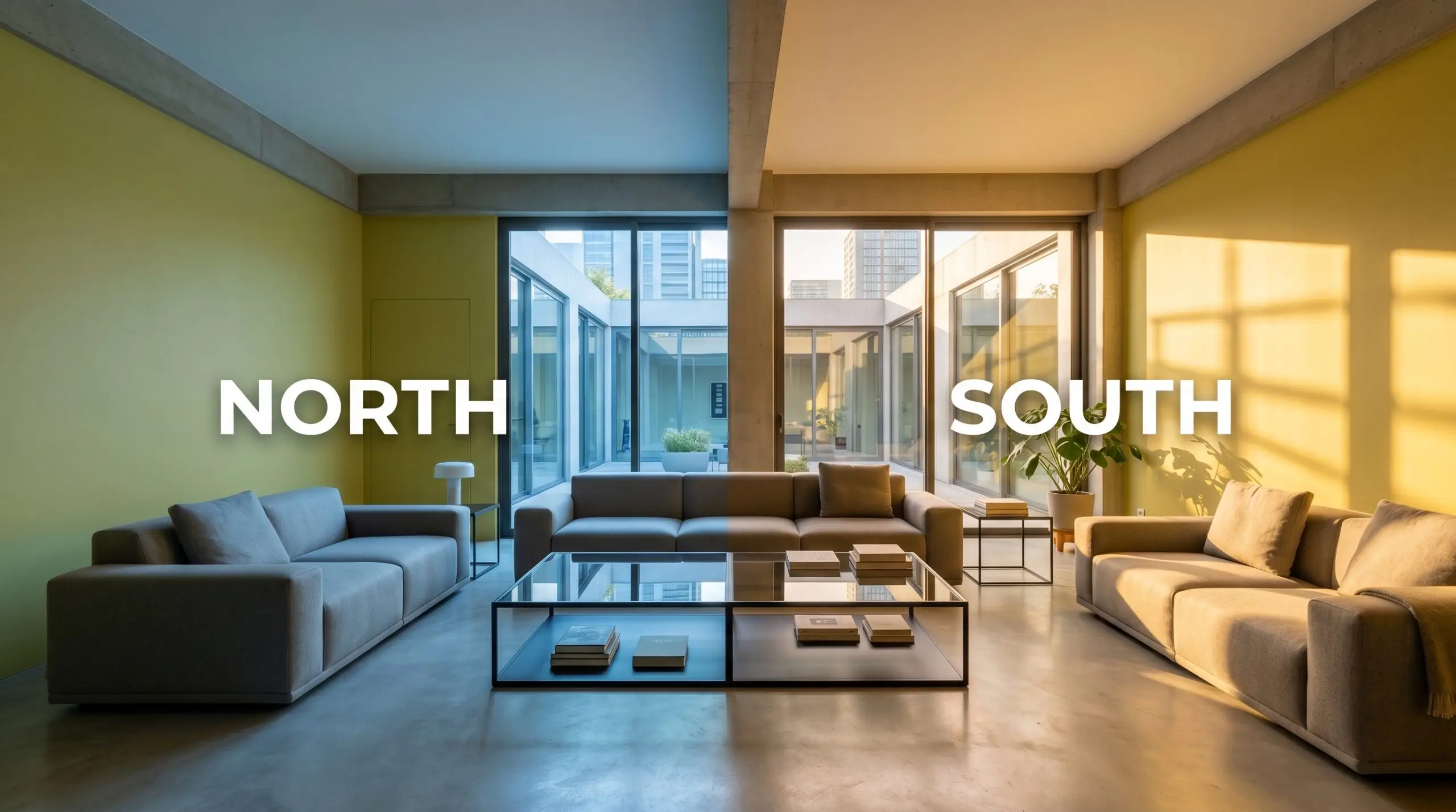
When applying this color to an exterior facade or a highly exposed sunroom, expect the direct, unfiltered sunlight to dial up the LRV significantly. The color will read noticeably lighter and more intensely yellow than it does on an interior swatch.
Hackrea Pro-Tip (The Exterior Washout Rule)
Popular Architectural Applications for a Luminous Color Structure
Because of its intense saturation and high reflectivity, this yellow-green base thrives when given a specific architectural job. Rather than defaulting to standard four-wall coverage, use this color to define specific zones, highlight custom millwork, or create intentional focal points.
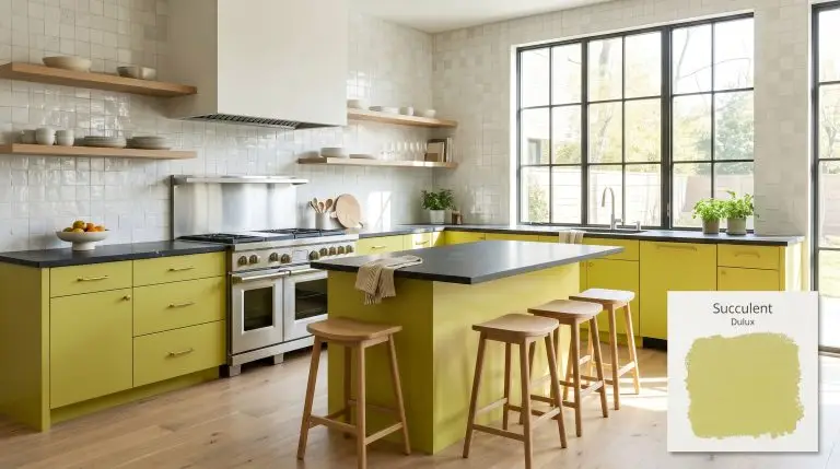
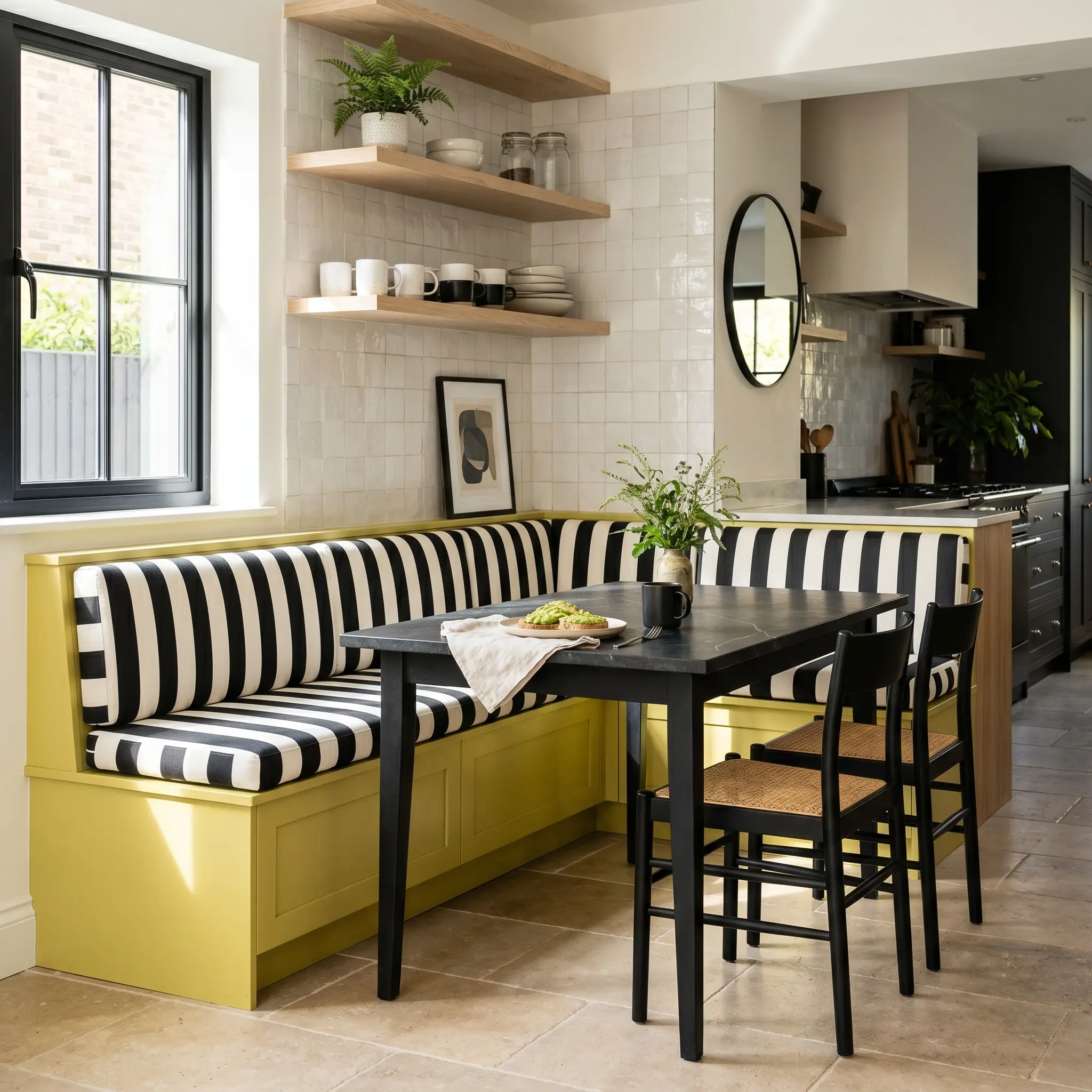
Transforming Kitchen Cabinetry and Breakfast Nooks
Applying this sun-drenched tone to kitchen cabinetry instantly modernizes the space, especially for an avid home chef looking to break away from predictable white kitchens. Pair the vibrant cabinets with honed soapstone countertops and unlacquered brass hardware. The dark, matte stone centers the room’s energy, while the living brass finish naturally echoes the warmth of the yellow-green base.
For a sleek, postmodern aesthetic, use flat-panel doors painted in Succulent alongside fluted glass upper cabinets and bleached oak open shelving. If you are updating a breakfast nook, consider color-blocking a built-in banquette. Paint the base seating in this energetic hue and pair it with a graphic, black-and-white cabana stripe performance fabric for a high-contrast, highly intentional dining zone.
When your lower cabinets carry a color this loud, keep your vertical planes quiet. A textured, white zellige tile backsplash provides necessary visual relief while adding a premium, handcrafted layer to the room.
Hackrea Design Secret (The Backsplash Balance)
Curating Sunrooms and Conservatories
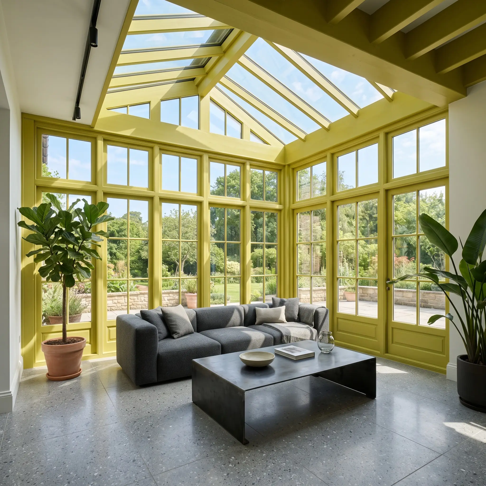
This botanical shade was practically engineered for transitional indoor-outdoor spaces. To avoid the predictable, wicker-heavy cottagecore stereotype, push the sunroom toward a sculptural contemporary design. Establish the space with poured concrete or large-format terrazzo flooring. The cool, industrial floor materials provide a necessary counterweight to the intense warmth radiating from the painted walls.
Instead of traditional wainscoting, paint the window casings, mullions, and ceiling in this vibrant chartreuse cast, leaving the main walls a crisp, gallery white. This application draws the eye upward and frames the exterior view like a photograph. Furnish the room with low-profile modular sofas in worsted wool and an oversized, blackened steel coffee table to give the indoor-plant collector a highly sophisticated lounging area.
Energizing Playrooms and Creative Studios
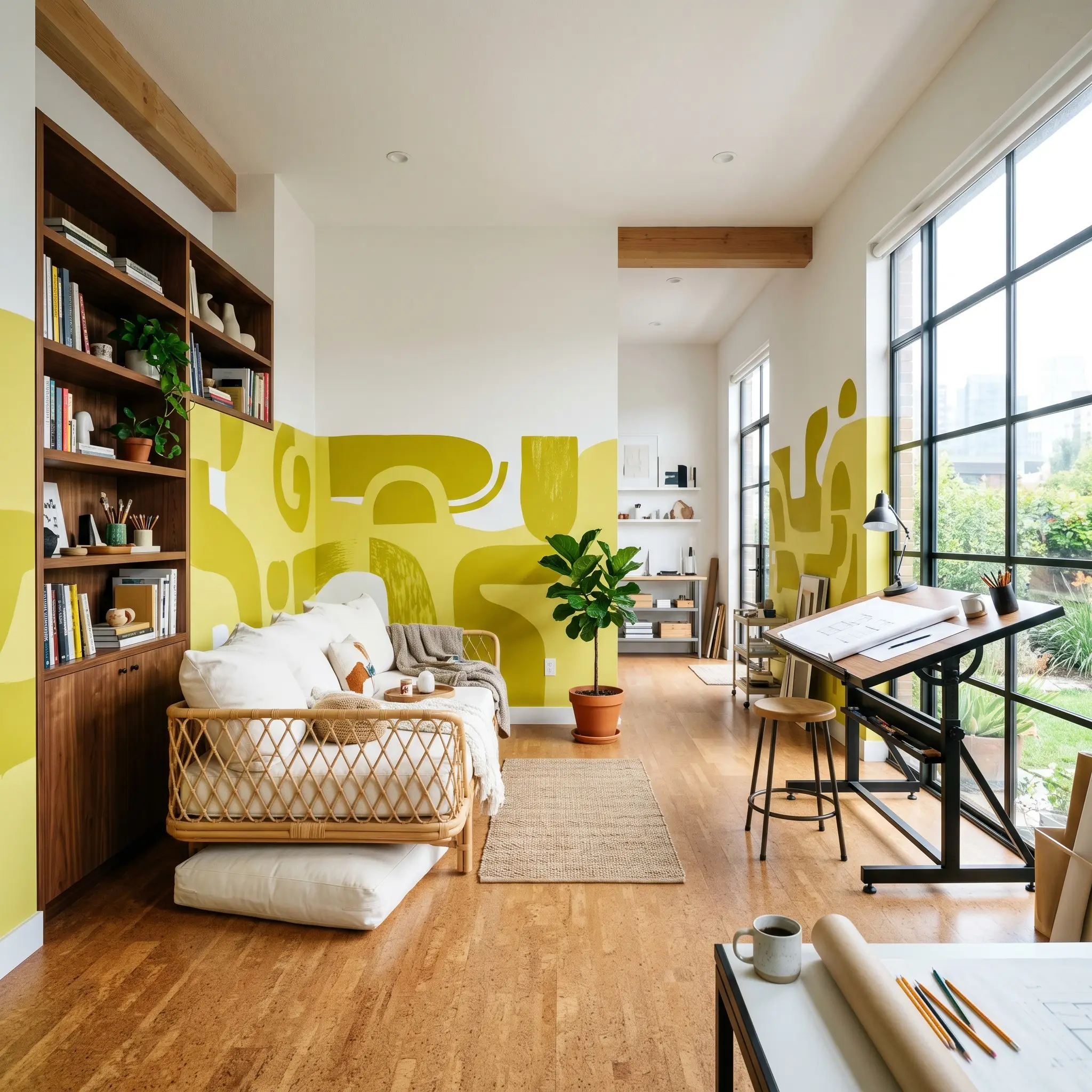
A playroom or weekend artist’s studio requires an environment that stimulates creativity without feeling aggressively juvenile. Use this playful hue to execute an abstract, color-blocked mural that wraps around the room, intersecting with functional architectural elements like floating shelves or a drafting table. Balance the intense wall color with warm, acoustic cork flooring.
To maintain a curated aesthetic, integrate natural materials that soften the room’s high-octane energy. Introduce rattan daybeds, oversized canvas floor cushions, and built-in bookcases constructed from rich walnut. The wood tones naturally absorb some of the color’s luminosity, ensuring the creative studio feels layered and professionally designed rather than resembling a commercial daycare center.
Striking Front Doors and Exterior Accents
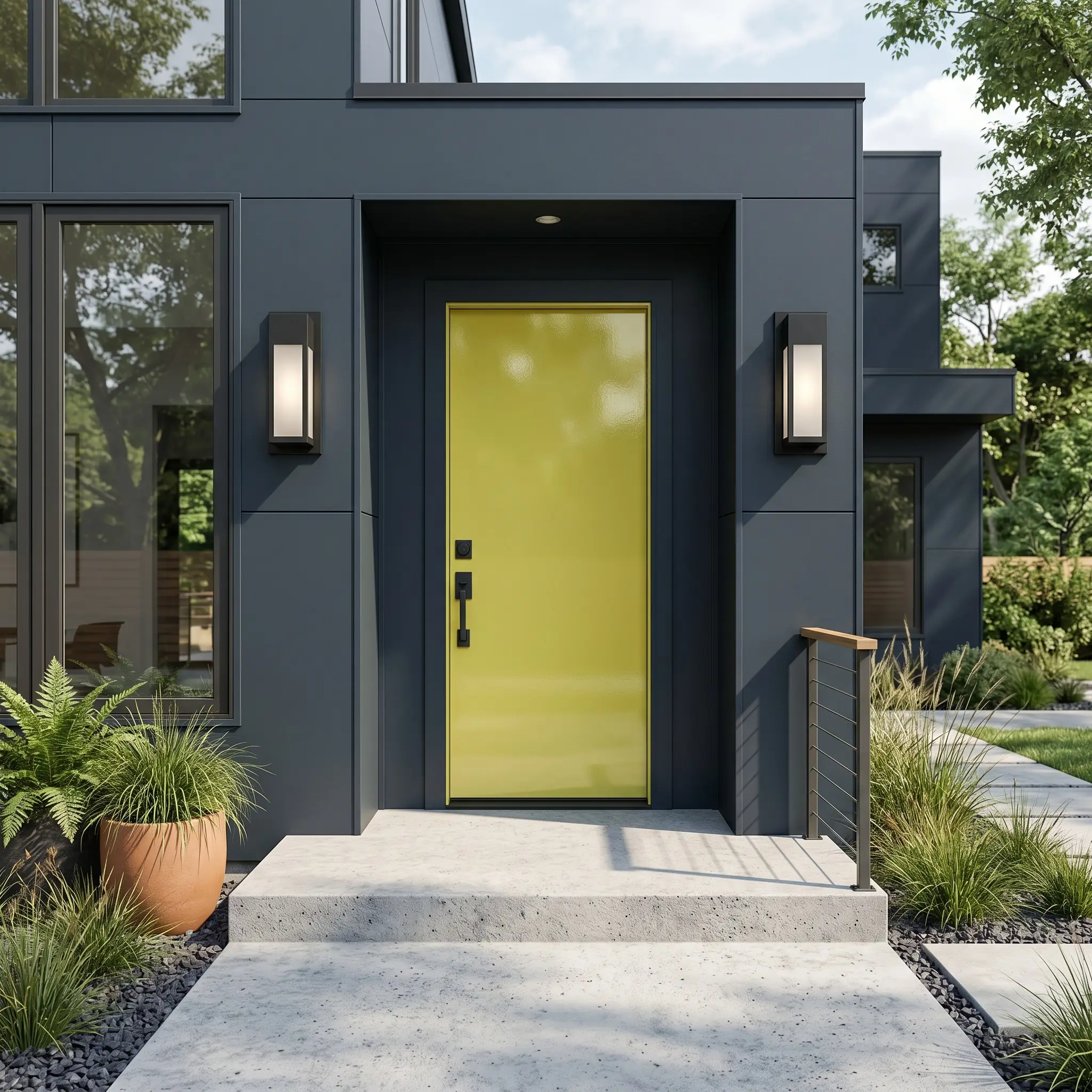
As an exterior accent, this zesty undertone delivers a massive curb-appeal upgrade, particularly for mid-century enthusiast homes. Apply it in a high-gloss finish to a solid slab front door. The reflective sheen amplifies the color’s inherent joy and creates a premium, lacquer-like focal point that welcomes guests.
To make the door truly pop, the surrounding architecture needs sharp contrast. Pair the chartreuse door with dark charcoal or muted navy exterior siding, and finish the entryway with matte black architectural hardware and oversized, geometric sconces. If you have a front porch, echo the door color subtly by painting the interior frames of your exterior windows, creating a cohesive, custom-built exterior palette.
Coordinating Colors for Dulux Succulent
This high-LRV architectural finish requires highly intentional boundaries to prevent it from bleeding visually into adjacent rooms. Its energetic chromatic profile demands either stark, high-contrast framing or deeply saturated, opposing colors to maintain its structural shape on the wall.
Crisp Trim & Baseboard Selections
Hardware, Wood & Material Pairings
Strategic Accent Colors
Curated Designer Mood Boards
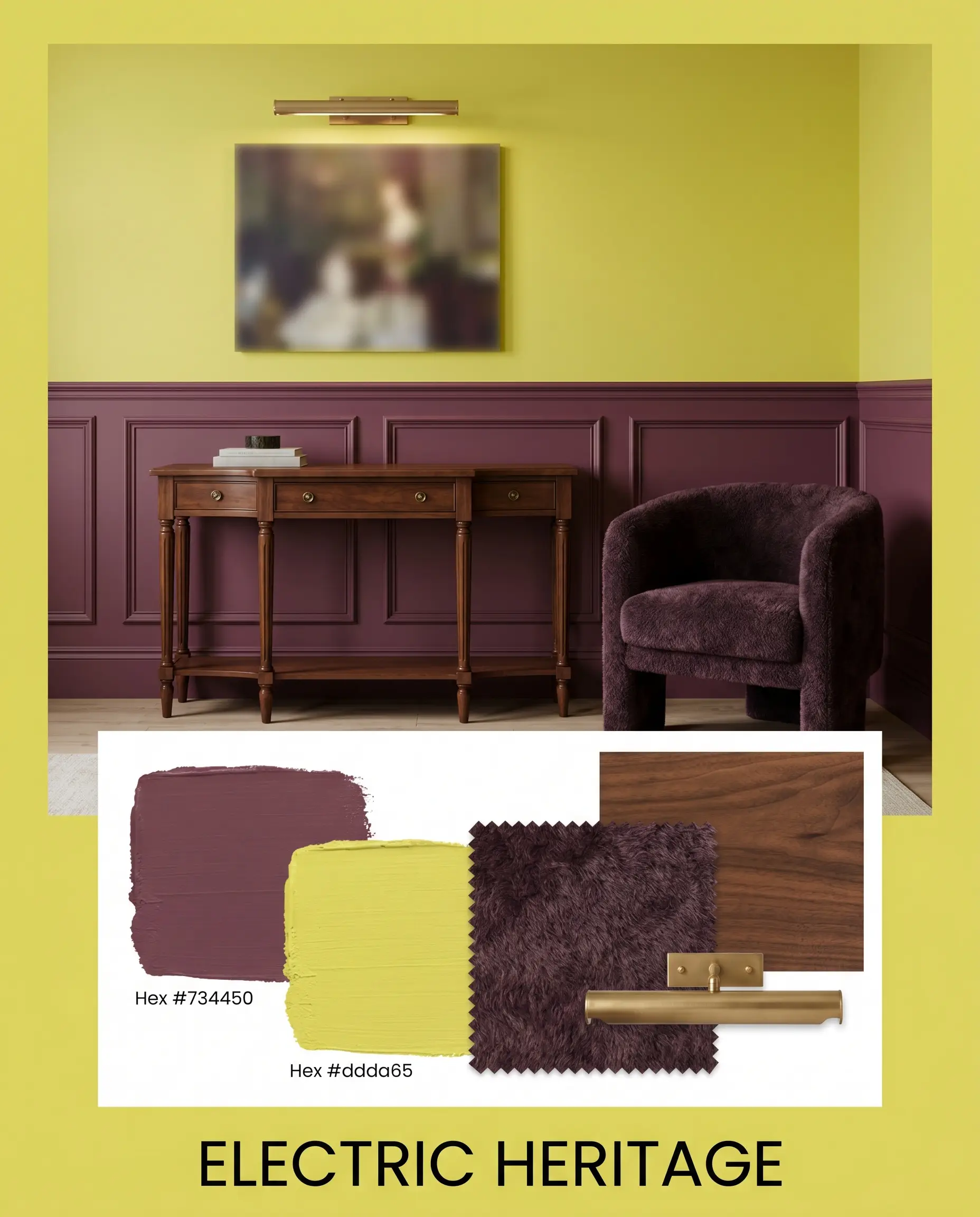
Electric Heritage Weave Carter Plum wainscoting beneath vibrant yellow-green upper walls to instantly modernize traditional architecture. Introduce rich walnut antique case goods and unlacquered brass picture lights to bridge the gap between historic silhouettes and contemporary energy. Finish the styling with dense mohair accent chairs to soften the room’s high-contrast boundaries.
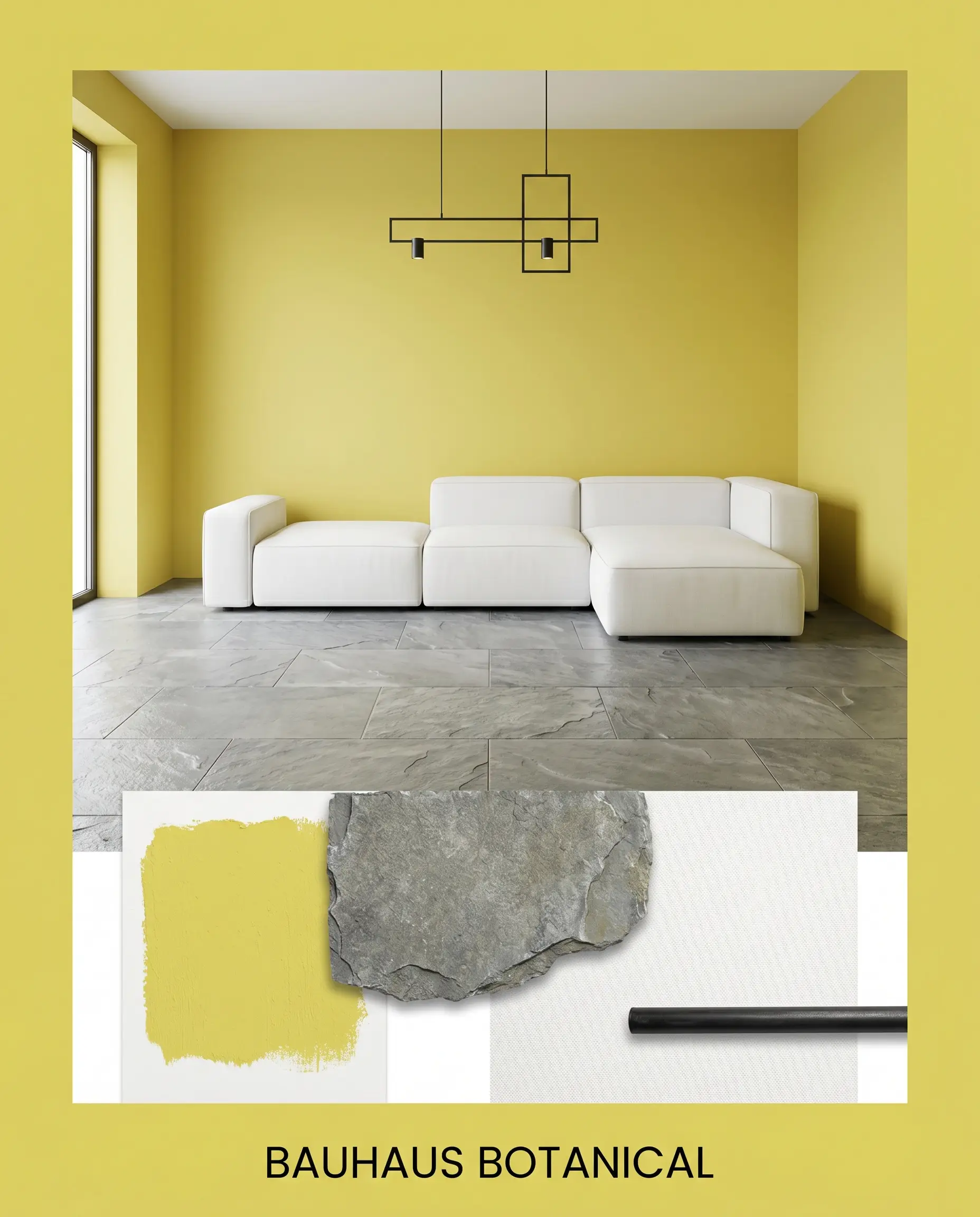
Bauhaus Botanical Anchor the room with large-format natural cleft slate flooring to absorb the intense luminosity of the painted walls. Introduce sleek, clean-lined modular sofas upholstered in crisp white canvas, paired with blackened steel lighting fixtures. The sharp geometric lines and industrial materials force the botanical shade into a highly disciplined, modernist framework.
Head-to-Head Paint Comparisons
Evaluating competing shades requires examining how their specific undertones react under different lighting exposures. If your room lacks natural light or features challenging fixed elements, a slightly modified yellow-green base might provide a more reliable finish.
Dulux Succulent vs. Sherwin-Williams Shagreen SW 6422
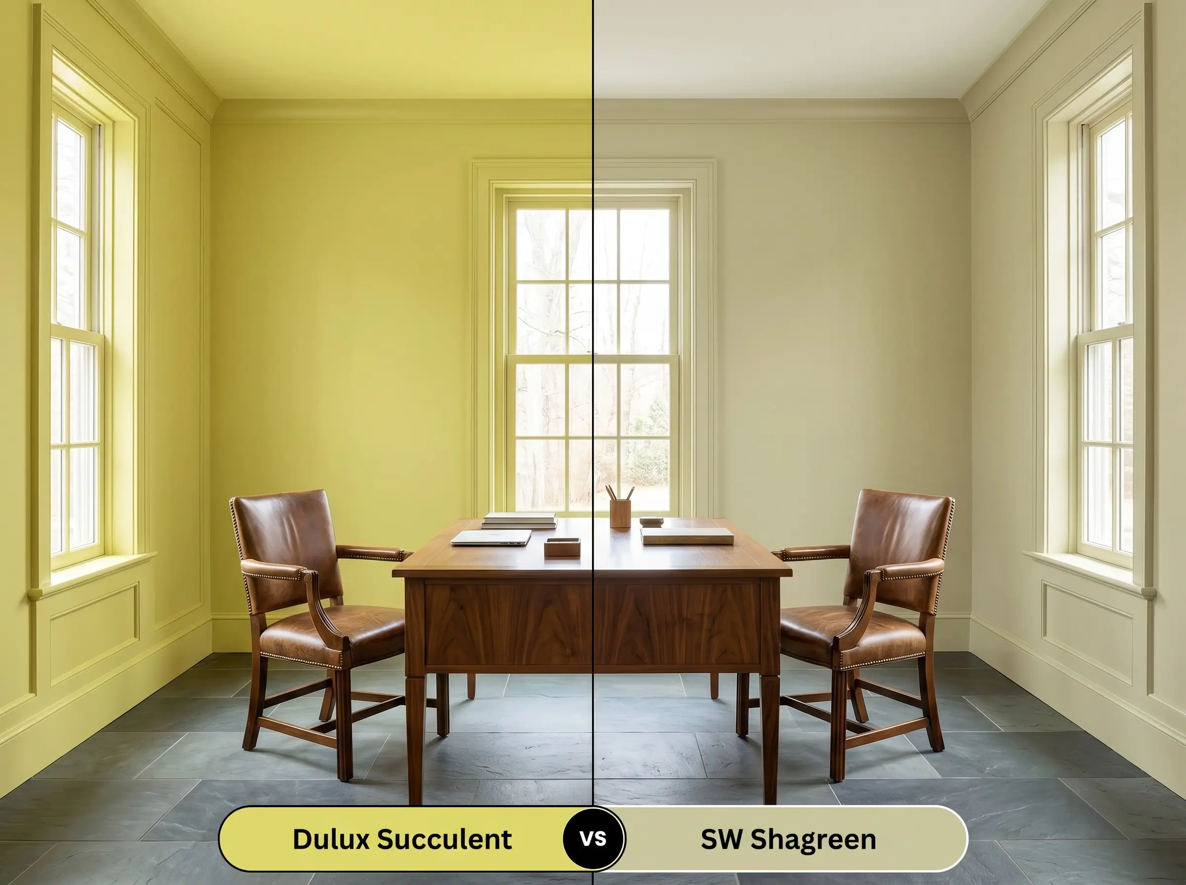
If you need a retro-inflected green but fear an overwhelming neon effect, Shagreen offers a noticeably lower LRV and a dustier, more muted profile. While Dulux maintains a sharp, zesty undertone, Sherwin-Williams introduces a subtle olive shadow that feels inherently quieter on the wall. Choose Shagreen for dimly lit studies where you want color without the aggressive bounce.
Dulux Succulent vs. Benjamin Moore Central Park 431
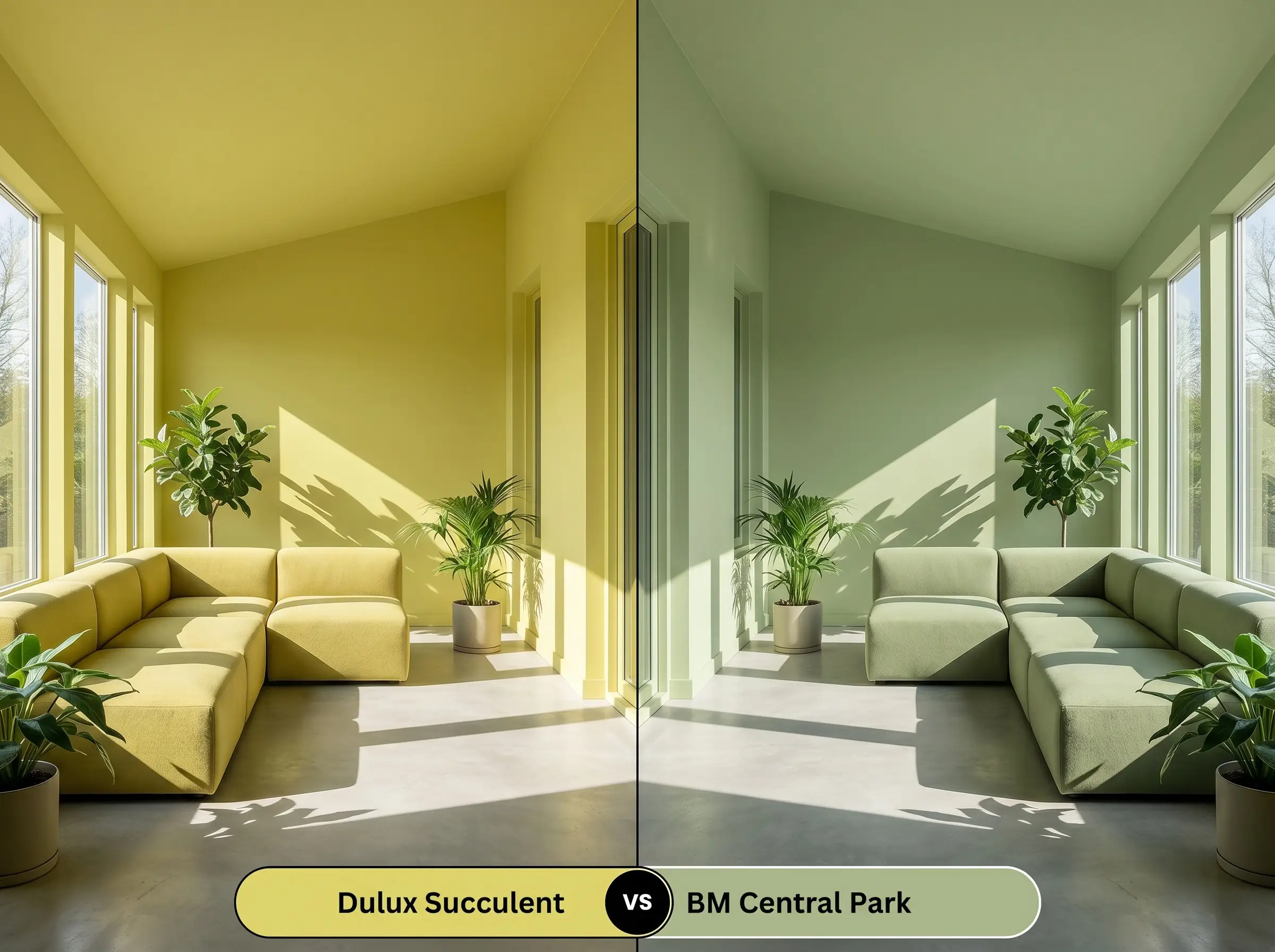
Central Park strips away a significant portion of the intense yellow warmth, leaning much closer to a traditional, leafy botanical shade. If your room receives aggressive south-facing light that might turn a citrus green overly sour, this Benjamin Moore alternative holds a steadier, cooler green shape. Opt for the Dulux option only when you intentionally want to amplify the room’s perceived heat.
Similar Colors & Alternative Brand Matches
When a specific paint color almost hits the mark but requires a slight tonal shift to harmonize with your flooring or lighting, exploring adjacent shades is crucial.
Same-Brand Alternatives
Cross-Brand Equivalents
Practical Application & DIY Advice
Transitioning this energetic chromatic profile from a digital swatch to a flawless physical finish requires strict adherence to professional application methods.
The Dynamic Sheen Guide
Primer Strategy & Coverage Tips
Frequently Asked Questions
Because of its high LRV and intense yellow-green base, this color actually cuts through deep exterior shadows beautifully. The surrounding green foliage will naturally pull out the paint’s botanical notes, preventing the stucco from looking flat or gloomy in low-light conditions.
The inherent red and orange pigments in traditional terracotta sit directly opposite this zesty undertone on the color wheel, which creates an intense, vibrating visual tension. To successfully pair these two, you must introduce a bridging color like a deep, muted navy to separate the wall from the floor.
Applying a luminous color structure to a windowless ceiling works brilliantly as long as your artificial lighting is calibrated correctly. You must use crisp, neutral LED bulbs (around 3000K to 3500K) to maintain the playful hue; overly warm bulbs will turn the space sour.
Low-E glass inherently casts a faint blue-green tint onto incoming natural light. This subtle cooling effect will slightly neutralize the sun-drenched tone of the paint, pushing the color away from a warm yellow and closer to a crisp, cooler lime.
Final Verdict & Expert Warnings for Dulux Succulent
Dulux Succulent is the ultimate architectural tool for homeowners who want to completely dictate the energy and mood of a space. It is perfect for accentuating modern, clean-lined architecture, revitalizing mid-century renovations, or establishing high-contrast contemporary focal points. When applied with absolute intention and paired with grounding materials like natural slate and rich walnut, this playful hue elevates standard rooms into highly curated, art-forward environments.
You must actively avoid pairing this vibrant chartreuse cast with cherry wood cabinetry, mahogany floors, or any fixed finishes featuring strong pink or red undertones. Because red and green are complementary opposites, placing them side-by-side without a neutral buffer forces the pigments to visually vibrate against one another. This specific interaction strips away the paint’s sophisticated warmth, leaving the room feeling visually chaotic and unintentionally harsh.
Clash Warning (The Red-Toned Wood Rule)