PPG Slippery Stone (PPG1080-7) is a dark, subdued, cappuccino-orange brown with a distinct coconut fiber undertone. With an LRV of 16, it is a deeply grounding, earthy hue that excels in cozy interior spaces and as a striking exterior body color.
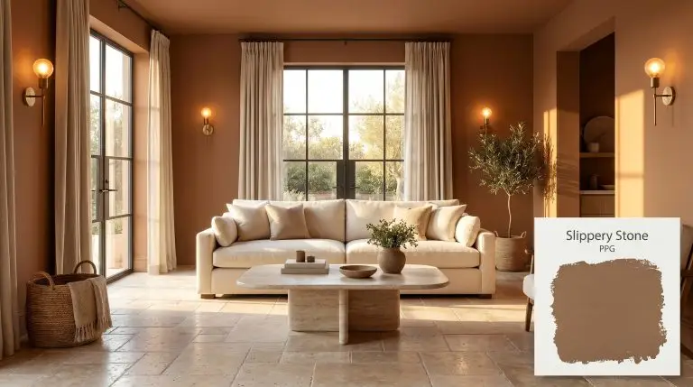
PPG Slippery Stone: Styling This Richly Rooted Terracotta Brown
Some colors simply sit on a wall, while others actively warm the room the moment you walk inside.
PPG Slippery Stone (#8d6a4a) falls firmly into the latter category, behaving less like a standard neutral and more like a tactile, sun-baked material. It brings the stabilizing warmth of fired clay indoors, wrapping a space in an undeniably rich, caramel base.
Rather than fading into the background, this shade demands thoughtful pairings. It thrives alongside raw, honest textures like tumbled travertine, worsted wool, and unlacquered brass. When you brush this color onto your walls, you are making a deliberate choice to prioritize comfort, intimacy, and sophisticated warmth.
PPG Slippery Stone: Undertones & LRV
When homeowners first test this shade, the most immediate question is always about its temperature: is this paint warm or cool?
Slippery Stone is a definitively warm color, radiating a baked, earthy energy that instantly raises the perceived temperature of a room. This warmth is entirely driven by its complex internal pigment structure.
To truly understand how this color will behave on your walls, we have to look closely at its underlying DNA:
The LRV Translation
Light Reflectance Value (LRV) measures how much light a paint reflects on a scale from 0 (pure black) to 100 (pure white). Slippery Stone sits at an LRV of 16.
This makes it a low-reflectance shade that absorbs a significant 84% of the light it encounters.
In interior spaces, this translates to a beautifully enveloping tone that creates an immersive, intimate atmosphere. It pulls the walls inward slightly, making large rooms feel cozier. On an exterior, this low reflectance is actually a massive advantage, allowing the color to hold its profound depth even under the glaring midday sun.
You can apply wallpapers, paints, etc. on walls and see how they look in various interiors.

How Light Shifts the Chromatic Profile
Every paint color is at the mercy of the light that hits it, but earthy orange-browns are particularly reactive.
Because Slippery Stone is built on a delicate balance of vibrant orange and subdued brown, the direction and temperature of your lighting will drastically alter which characteristic takes center stage.
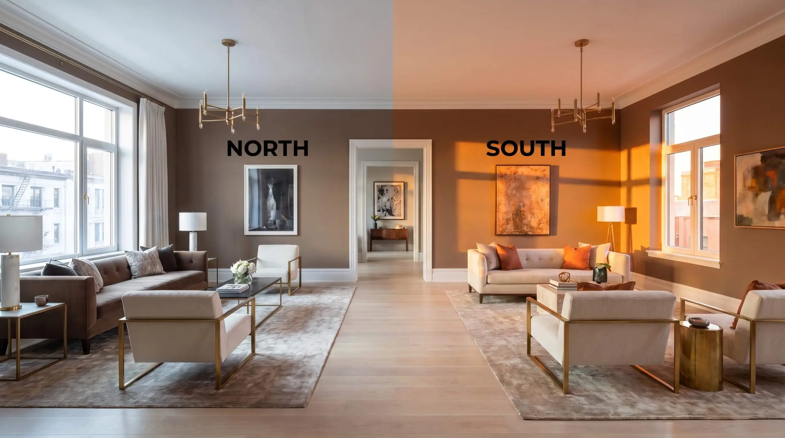
If you are using this color in a room with limited natural light, stick strictly to bulbs in the 3000K range. This provides a clean, neutral light that supports the earthy cast without turning it artificially orange or dulling it into mud.
Hackrea Pro-Tip (The Bulb Strategy)
Popular Applications for This Earthy Cast
Understanding the data behind a paint is only half the battle; the real magic happens when you apply it to a physical space.
Because it functions as a richly pigmented architectural finish, Slippery Stone adapts beautifully to a wide variety of rooms, provided you balance its low reflectance with the right materials.
Here is how to execute this color flawlessly across different areas of your home.
Home Exteriors & Architectural Facades
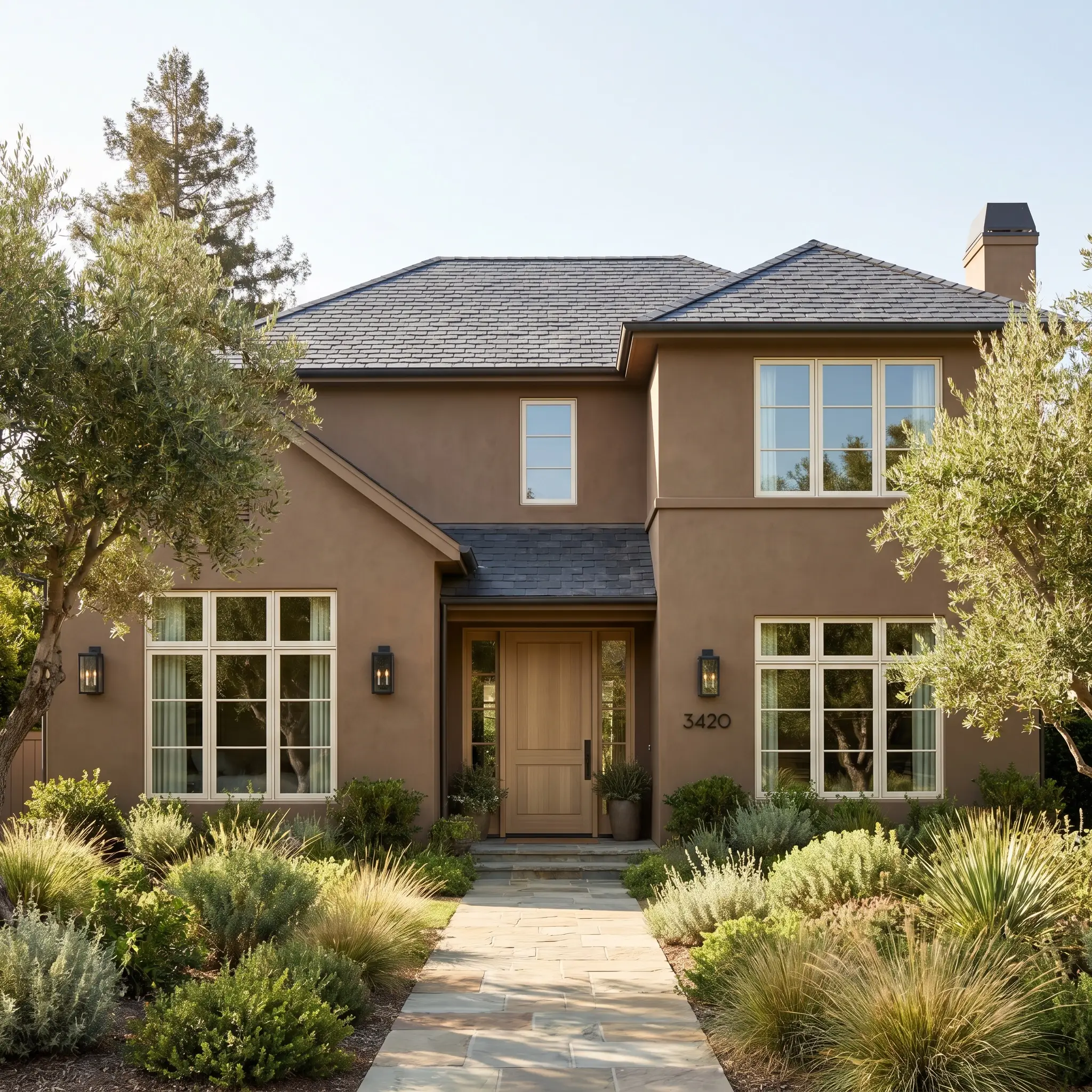
On an exterior, the intense natural sunlight acts as an equalizer, preventing dark colors from feeling overwhelming. This shade thrives on traditional siding, stucco, and architectural accents, holding its rich terracotta identity without washing out.
To modernize the look, pair it with crisp, warm-white trim and introduce blackened steel house numbers or exterior sconces. The dark metal provides a sharp, contemporary contrast against the earthy background.
If you have natural stone pathways or a slate roof, this color acts as a brilliant organic bridge, tying the man-made structure back to the surrounding landscape.
Cozy Studies & Home Libraries
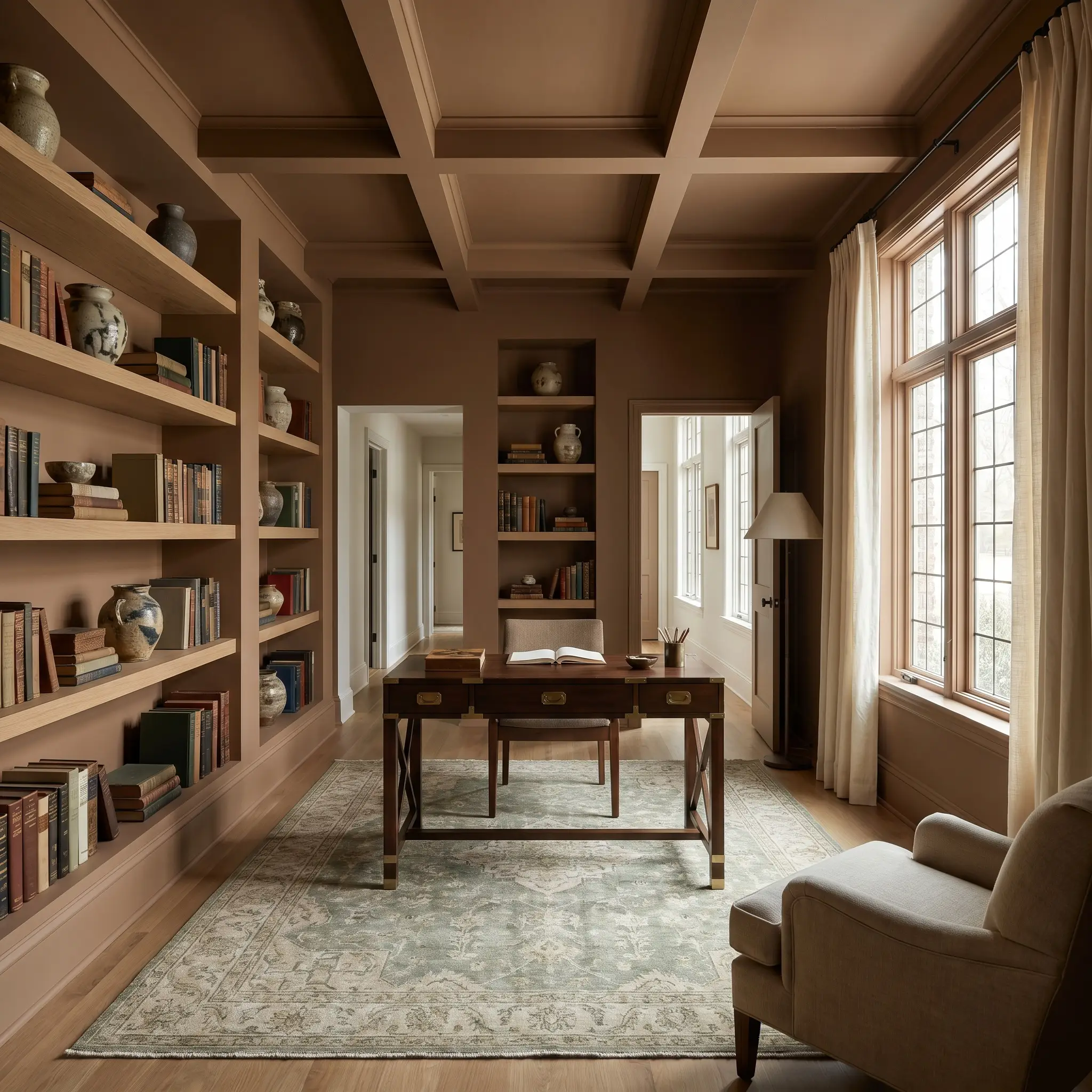
It is tempting to default to a predictable “dark academia” aesthetic in a study, but this color offers a fantastic opportunity for a more modern, eclectic approach.
Instead of heavy leather and dark mahogany, try color-drenching the room—painting the walls, ceiling, and built-in bookcases in the same continuous hue. Then, break up that enveloping tone with floating white oak shelves and a sleek campaign desk.
Layer the room with tactile, contrasting textiles. Think raw silk window treatments in a soft ivory and a vintage rug featuring subtle sage greens to complement the warm orange-brown foundation.
Dining Rooms
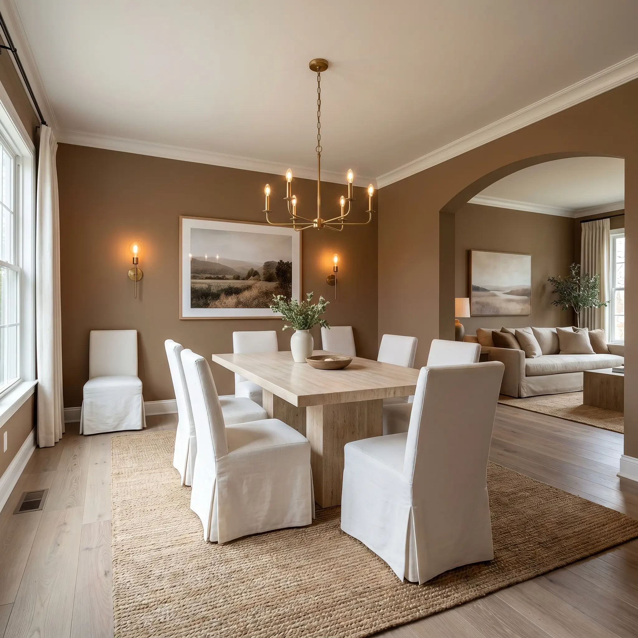
For homeowners looking to create an intimate, memorable dining experience, this shade is incredibly effective. It naturally encourages guests to linger.
To keep the room from feeling too enclosed, balance the saturating wall color with lighter, highly textured furnishings. A honed travertine pedestal table or slipcovered linen dining chairs instantly lift the visual weight of the space.
Be incredibly careful when introducing wood furniture into this specific room. Avoid cherry, mahogany, or any woods with strong red/orange undertones, as they will aggressively compete with the paint. Stick to ashy walnuts, pale oaks, or ebonized finishes for a sophisticated contrast.
Clash Warning (The Wood Tone Trap)
Rustic Kitchens
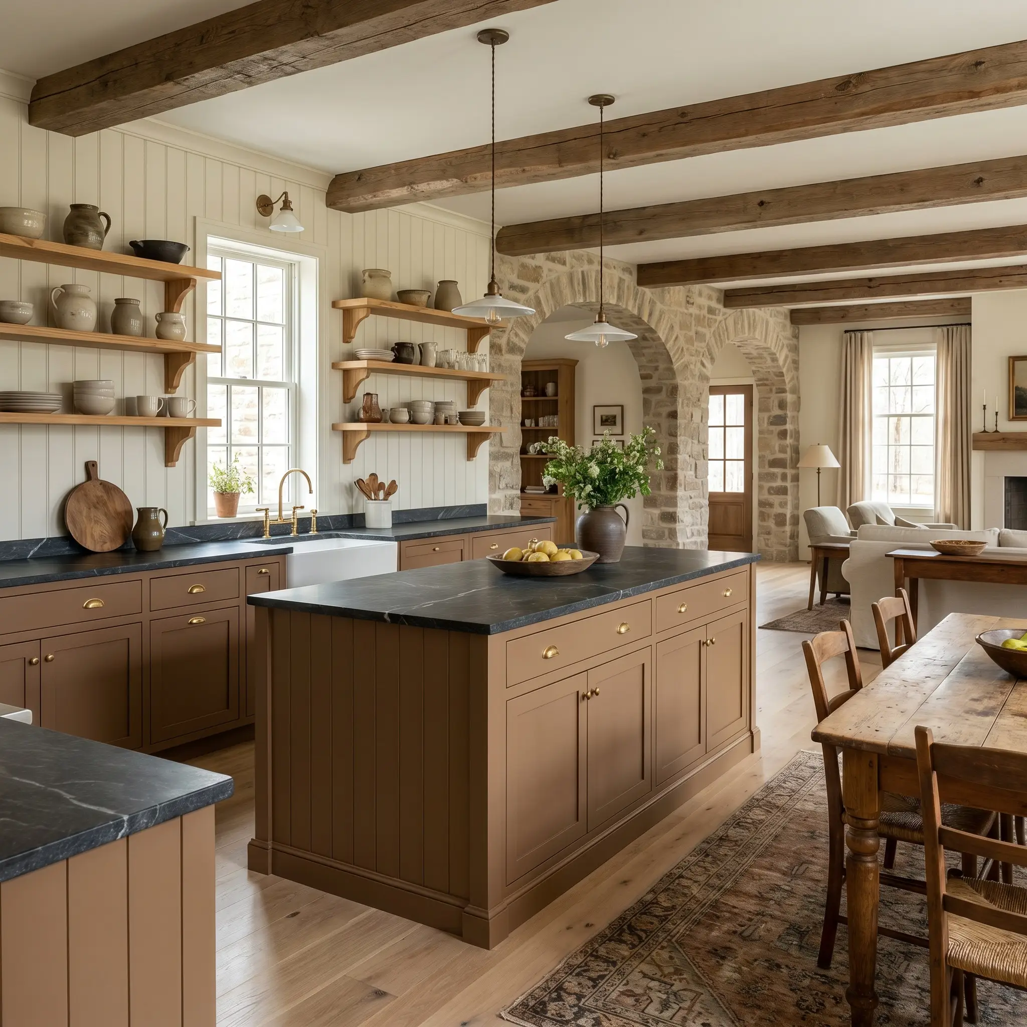
This color is a natural fit for a European farmhouse or rustic kitchen aesthetic, especially when used strategically on lower cabinetry or a central island.
Pairing it with an accessible, warm-white beadboard backsplash keeps the overall room feeling bright and family-friendly. To introduce that crucial high/low mix, invest in a premium soapstone countertop for the island, allowing its charcoal veining to ground the terracotta warmth.
Finish the look with unlacquered brass cup pulls and a collection of handmade ceramic vessels on open pine shelving.
Powder Rooms
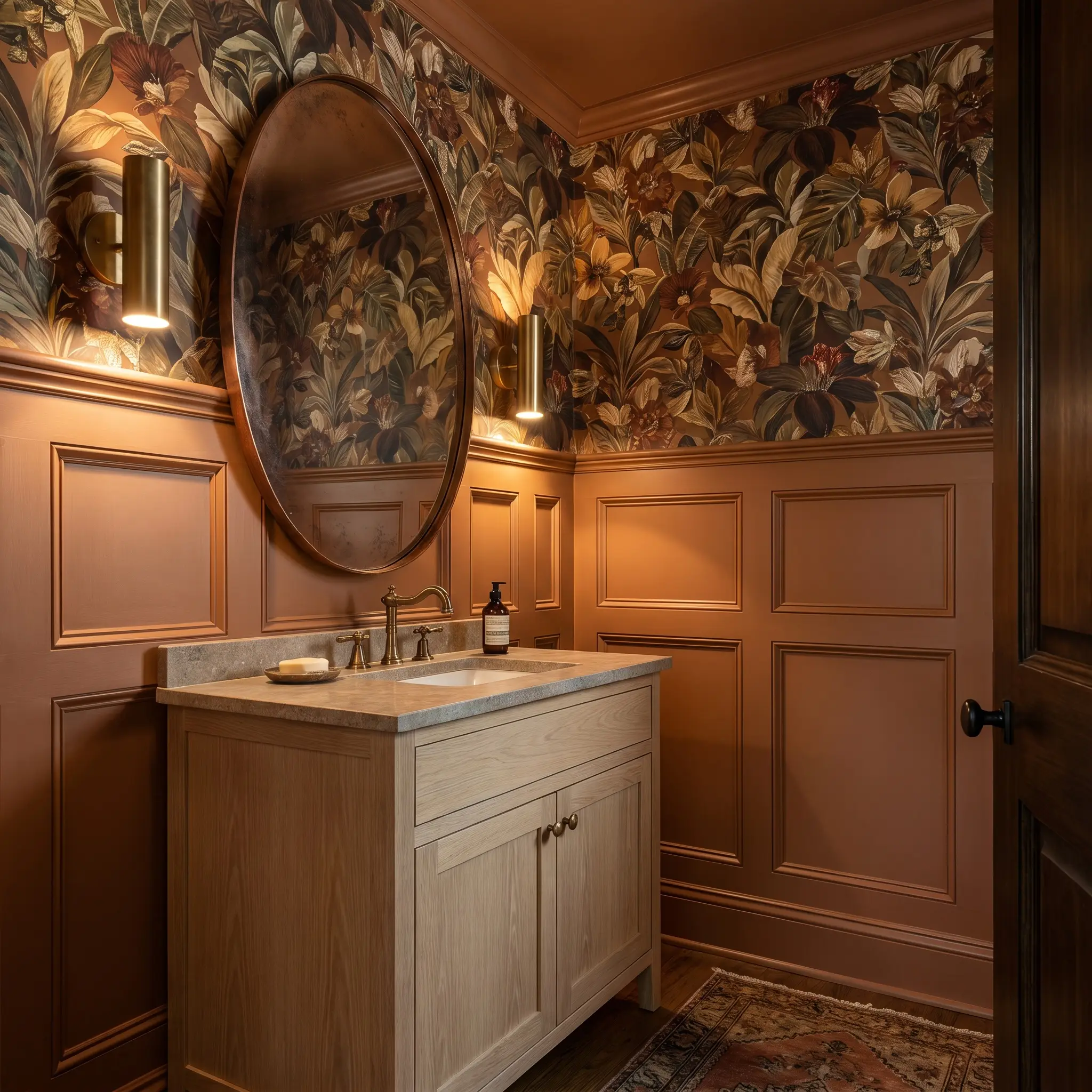
A small, windowless powder room is the perfect canvas for a dramatic, jewel-box application.
Embrace the lack of natural light by pairing the paint with a bold, botanical wallpaper. Install a classic wainscoting on the lower half of the walls, painted in PPG Slippery Stone, and run a densely patterned wallpaper on the upper half to draw the eye upward.
Add a patinated copper mirror and minimalist brass sconces to reflect a soft, flattering glow against the warm walls.
Styling and Palette Pairings for PPG Slippery Stone
This specific pigment behaves beautifully when it is allowed to bleed softly into other warm, organic tones. It requires supporting elements that share its natural warmth rather than stark, highly contrasting colors that shock the eye.
Finding the Perfect White for Trim
The architectural borders of your room dictate how the wall color is perceived.
Tactile Textures and Hardware
Because this color mimics baked earth, it looks best when paired with materials that have a raw, honest finish.
Harmonizing Secondary Hues
To build a cohesive home, you need secondary colors that either support the warmth or offer a refreshing, natural contrast.
Curated Design Directions
Seeing how these individual elements merge is the key to a successful renovation.
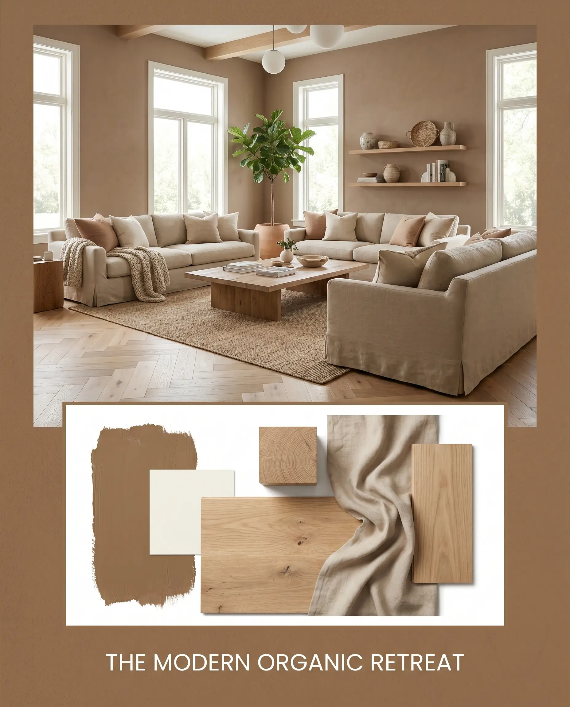
The Modern Organic Retreat: This approach uses the paint to anchor a bright, airy aesthetic. Combine PPG Slippery Stone walls with expansive white oak flooring and flowing, slipcovered linen sofas. Layer in accents of Benjamin Moore Swiss Coffee to keep the energy light, fresh, and deeply inviting.
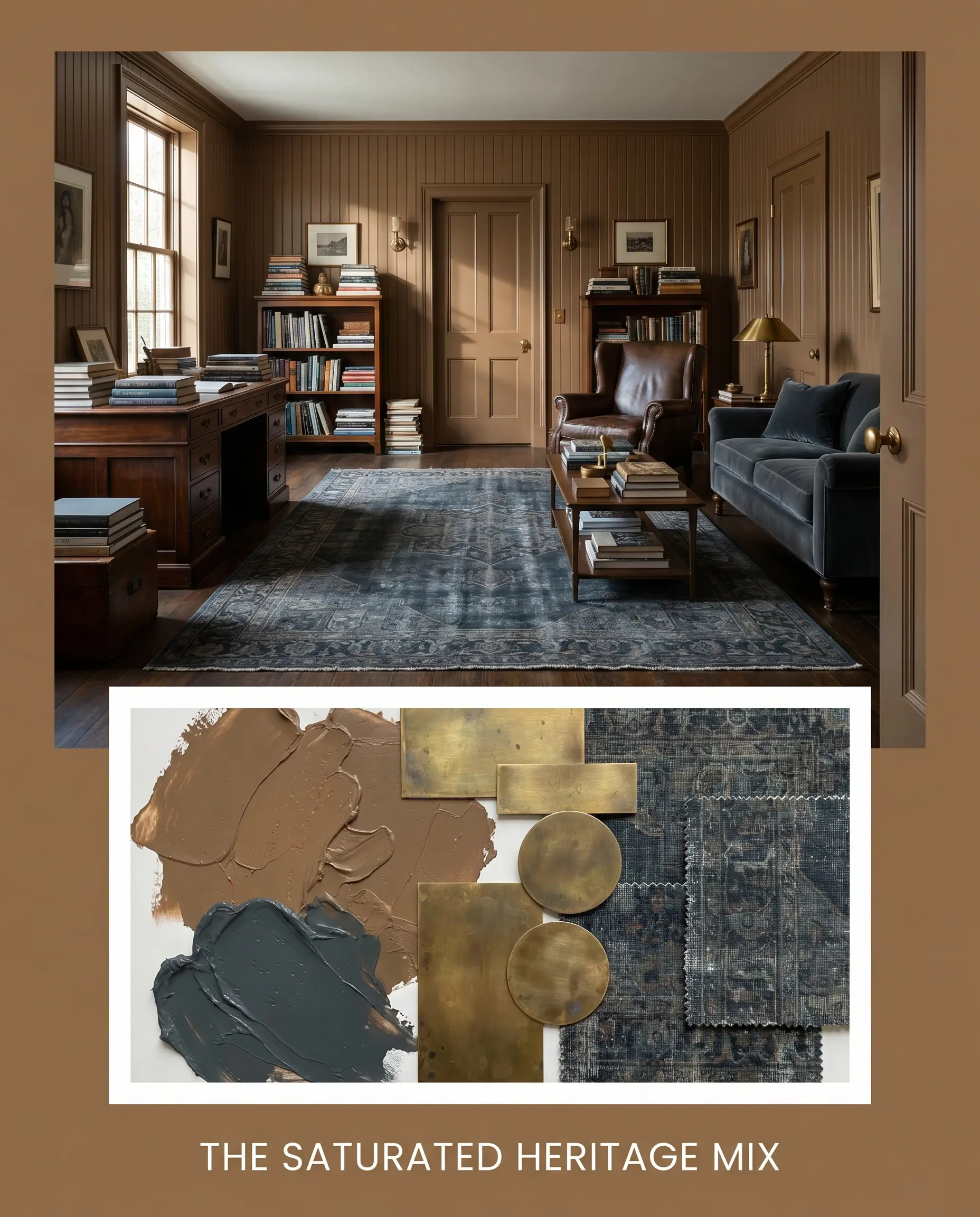
The Saturated Heritage Mix: For a more dramatic, collected vibe, lean into the color’s inherent richness. Pair the warm walls with unlacquered brass hardware and a vintage rug featuring deep tones of Farrow & Ball Hague Blue. Finish the styling with stacked art books and classic beadboard detailing for a timeless, tailored look.
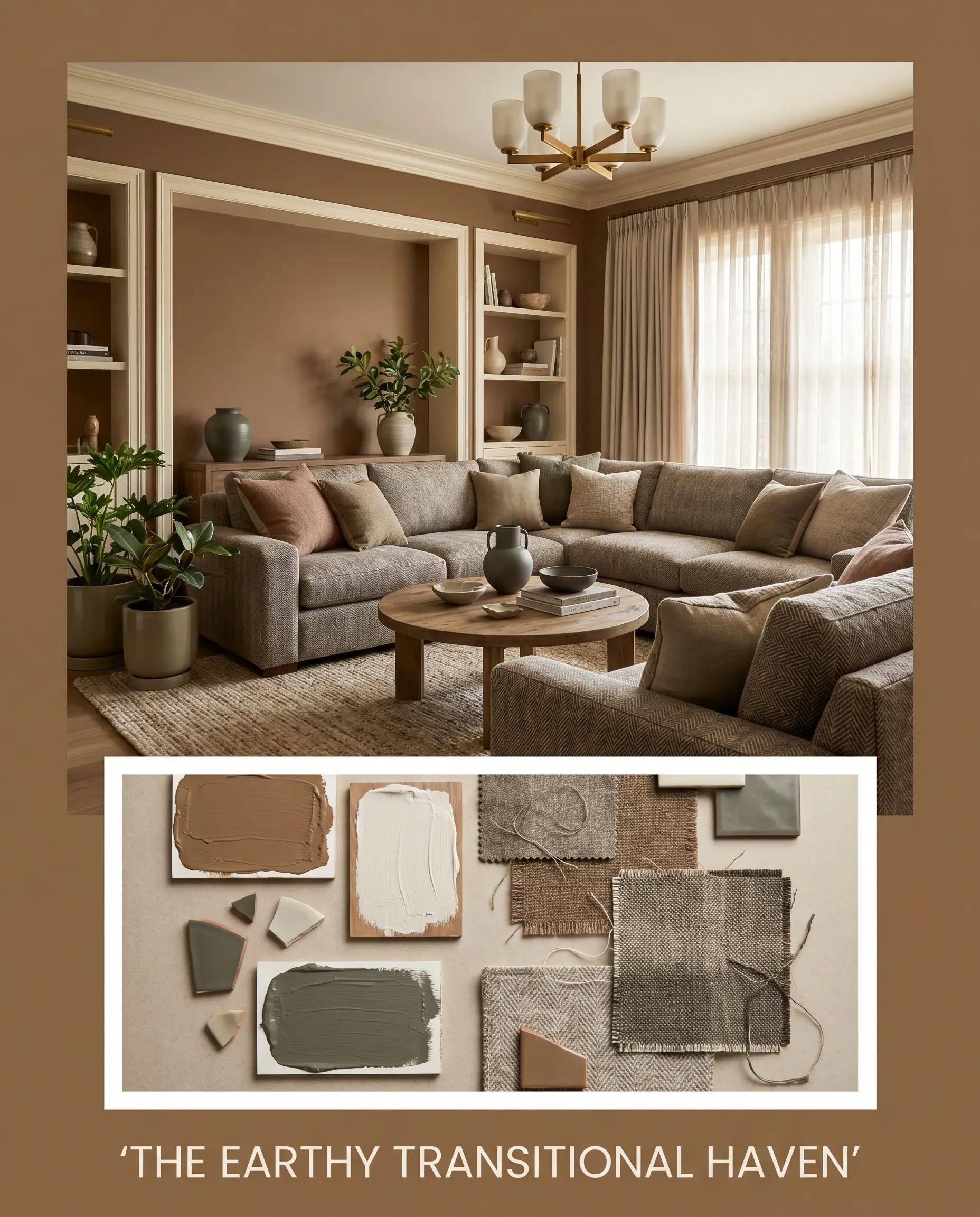
The Earthy Transitional Haven: This palette balances rustic warmth with clean, modern lines. Frame the terracotta hue with Sherwin-Williams Alabaster trim to create a soft, glowing border. Introduce worsted wool textiles and subtle accents of Sherwin-Williams Rosemary to bridge the gap between classic comfort and contemporary design.
PPG Slippery Stone vs. The Competition
Sometimes a room’s specific lighting or a home’s architectural style demands a slight pivot. If your space lacks natural light or you are worried about the orange cast becoming too prominent, a rival shade might offer a more reliable result. Understanding the precise differences in these pigments will help you make a confident final choice.
PPG Slippery Stone vs. Sherwin-Williams Turkish Coffee SW 6076
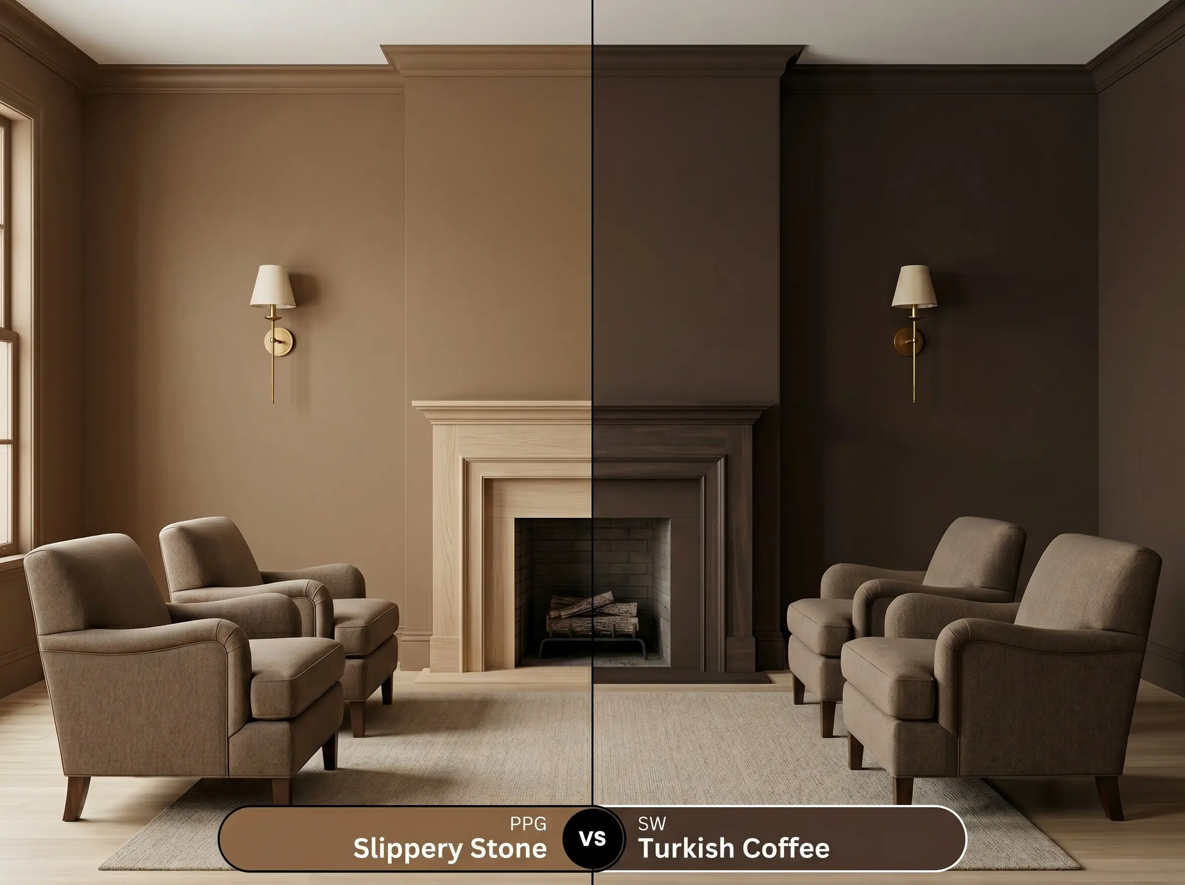
Sherwin-Williams Turkish Coffee SW 6076 is a significantly darker, more traditional brown. It lacks the vibrant cappuccino orange cast entirely, reading as a rich, roasted espresso. If you want a deeply grounding, classic brown without any fiery terracotta surprises in the afternoon sun, Turkish Coffee is the safer, more subdued option.
PPG Slippery Stone vs. Benjamin Moore Midsummer Night 2134-20
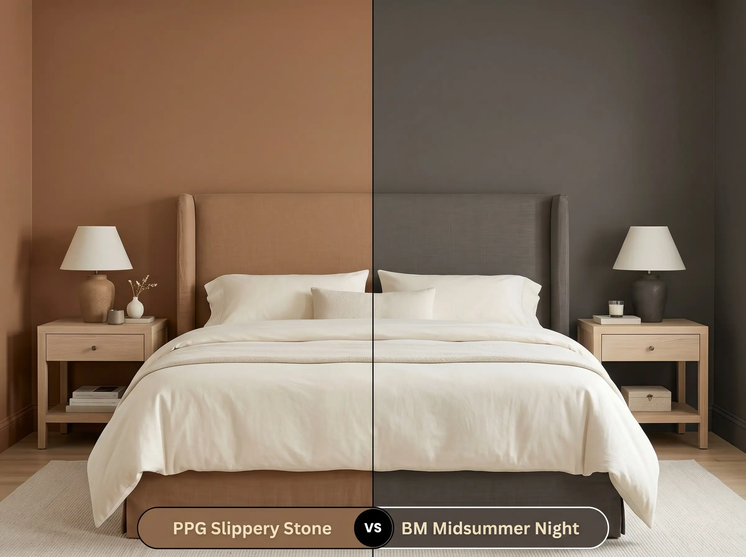
Benjamin Moore Midsummer Night 2134-20 behaves almost like a soft, brownish-black rather than a true brown. It is exceptionally dark and carries a subtle, ashy undertone that feels highly modern. If the PPG hue feels too rustic or warm for your contemporary aesthetic, Midsummer Night provides that profound depth with a much cooler, sleeker profile.
PPG Slippery Stone vs. Farrow & Ball London Clay No.244
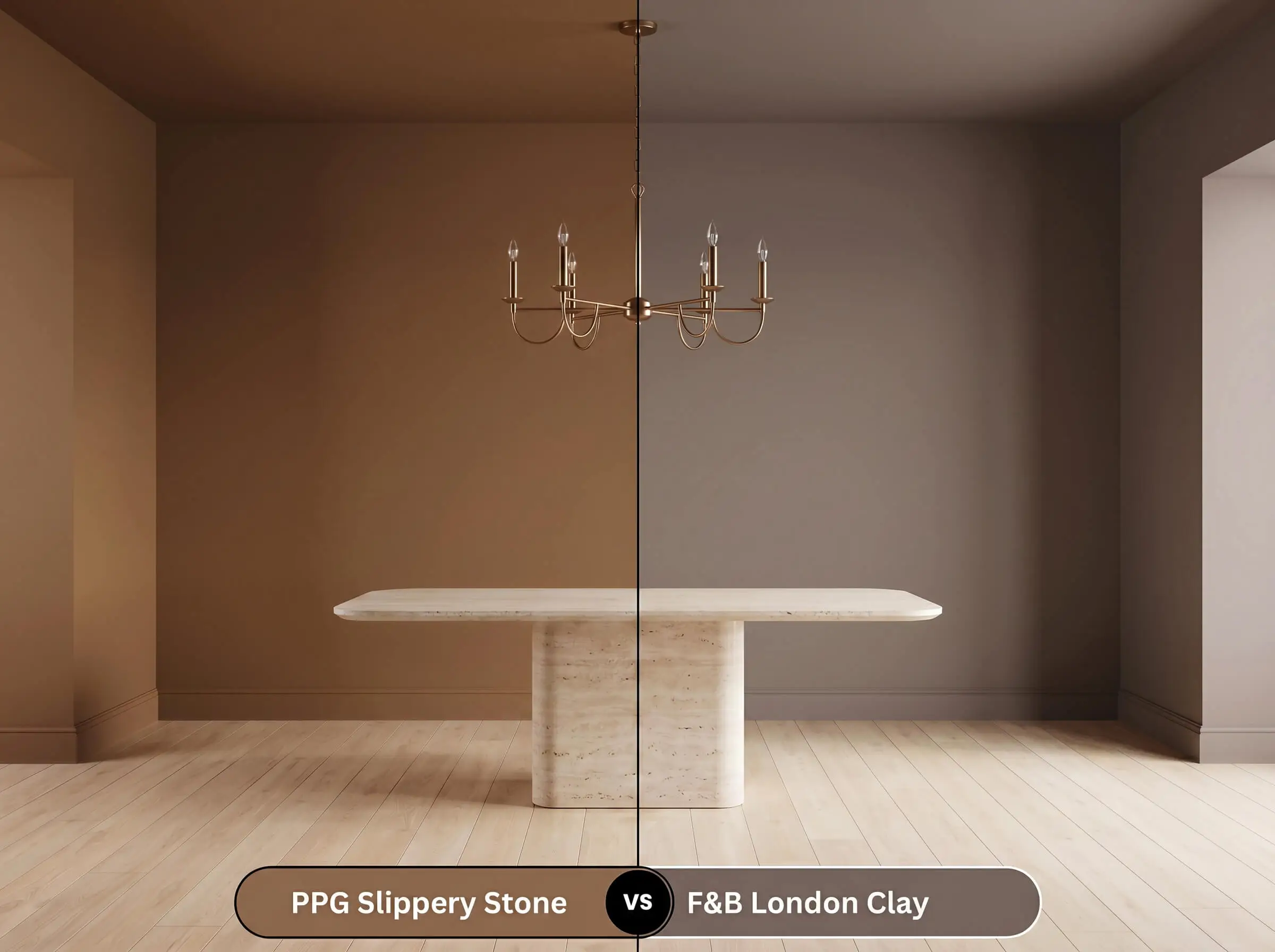
Farrow & Ball London Clay No.244 is an iconic, deeply pigmented brown, but it holds a distinct magenta or subtle purple undertone. This gives it a uniquely plush, historic feel compared to the baked-earth energy of the PPG hue. If you are decorating a formal dining space and want a brown that feels more like velvet than terracotta, London Clay is a magnificent alternative.
Exploring Alternative Caramel Tones
You might love the concept of this color but need a slightly different variation to suit your specific lighting. Whether you require a touch more light reflectance or are simply shopping at a different paint retailer, these alternatives are worth swatching.
Similar Colors Within the PPG Archives
Matching Across Manufacturers
Bringing Slippery Stone to Life
Transitioning from a small paper swatch to a fully painted room requires a solid execution strategy. Darker, highly pigmented hues demand specific preparation to ensure a flawless, professional-looking result.
Selecting the Right Paint Sheen
Priming and Coverage Strategy
Because this is a deeply saturated color, a standard white primer will force you to apply three or even four coats to achieve true opacity. You must use a high-quality primer tinted to a dark gray base.
Deep earthy tones are notoriously prone to “flashing,” which means your roller marks will remain visible if the paint dries unevenly. To avoid this, always maintain a wet edge while rolling and never go back to touch up a spot that has already started to dry.
Hackrea Design Secret (The Flashing Warning)
Expect to apply two full, generous coats over your tinted primer for a perfectly even, saturating finish.
Expert Answers for PPG Slippery Stone
The vibrant green foliage will naturally tone down the orange cast, acting as a natural complementary filter that cools the incoming light. This allows the paint to read as a much more balanced, grounding brown rather than a fiery terracotta.
Because of its low reflectance, painting a soaring ceiling this color will visually pull the height downward beautifully. It creates a much cozier, intimate atmosphere, wrapping the upper half of the room in a warm, comforting glow.
Dark colors on exterior stucco do absorb immense heat and UV rays, making them more susceptible to fading over time. Investing in a premium, UV-resistant exterior formula is non-negotiable to ensure the rich pigment holds its depth for years.
A 3000K bulb beautifully supports the warm caramel base, enhancing its cozy, baked-earth energy. Conversely, a 4000K bulb will flatten the nuance and strip away the glow, often leaving the color looking muddy and uninspired.
The Final Ruling on This Earthy Hue
PPG Slippery Stone is a stunning, sophisticated choice for homeowners who want to completely transform the sensory experience of their home. Its absolute best application is in spaces designed for lingering, such as intimate dining rooms, cozy studies, or striking exterior facades. This paint is perfect for the design enthusiast who loves the tactile warmth of organic modernism or the collected richness of a transitional aesthetic. It wraps a room in a stabilizing, sun-baked energy that standard neutrals simply cannot replicate.
However, this powerful pigment requires a thoughtful environment to succeed. If your home features predominantly cool, blue-gray flooring or stark, icy-white marble countertops, this color will actively fight those finishes, resulting in a chaotic, mismatched energy. The warm caramel base clashes aggressively against cool-toned, sterile materials, making the paint look artificially orange and the stone look incredibly dull. Stick to ashy woods, warm metals, and creamy stones to ensure this beautiful earthy shade reaches its full, luxurious potential.