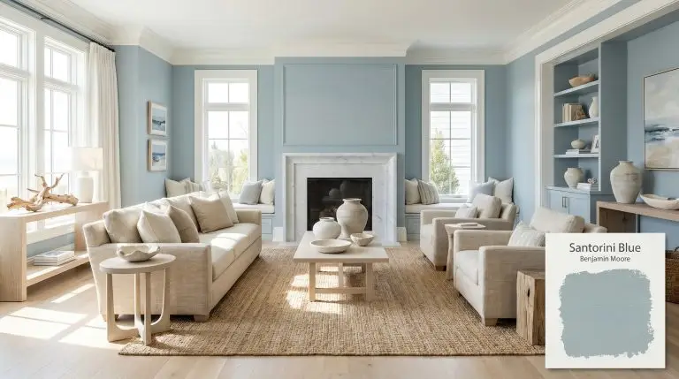
Santorini Blue 1634
Benjamin MooreBenjamin Moore Santorini Blue 1634 is a sophisticated, medium-toned dusty blue with prominent gray undertones and a subtle hint of green. This cooling, tranquil hue strikes a perfect balance, offering a coastal yet elegant feel that works beautifully on walls, cabinetry, and trim.
| Temperature | Cool |
|---|---|
| Primary Undertone | Gray |
| Hidden Undertones | Subtle green |
| Best Exposures | South, West |
| Best For | Coastal-Inspired Living Rooms, Kitchen Cabinetry, Primary Bedrooms, Spa Bathrooms, Accent Trim, Exterior Shutters |
Hackrea Review
Santorini Blue is a highly versatile, livable blue that avoids feeling too juvenile or overly pastel. Its strong gray influence provides an excellent grounding effect, making it a reliable choice for achieving a serene, coastal, or transitional aesthetic without overwhelming the space.Architectural Applications & Material Pairings
Coastal-Inspired Living Rooms
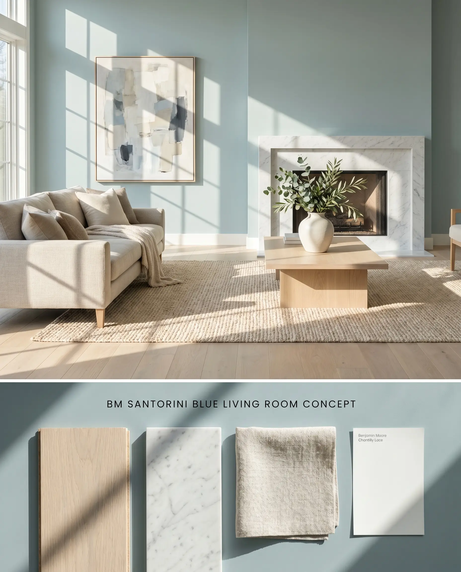
The medium-depth blue anchors expansive living spaces by absorbing excess glare from large windows while maintaining a crisp, coastal aesthetic. Pairing it with textured natural fibers and honed stone prevents the gray undertones from reading too cold against hard architectural surfaces.
Kitchen Cabinetry and Islands
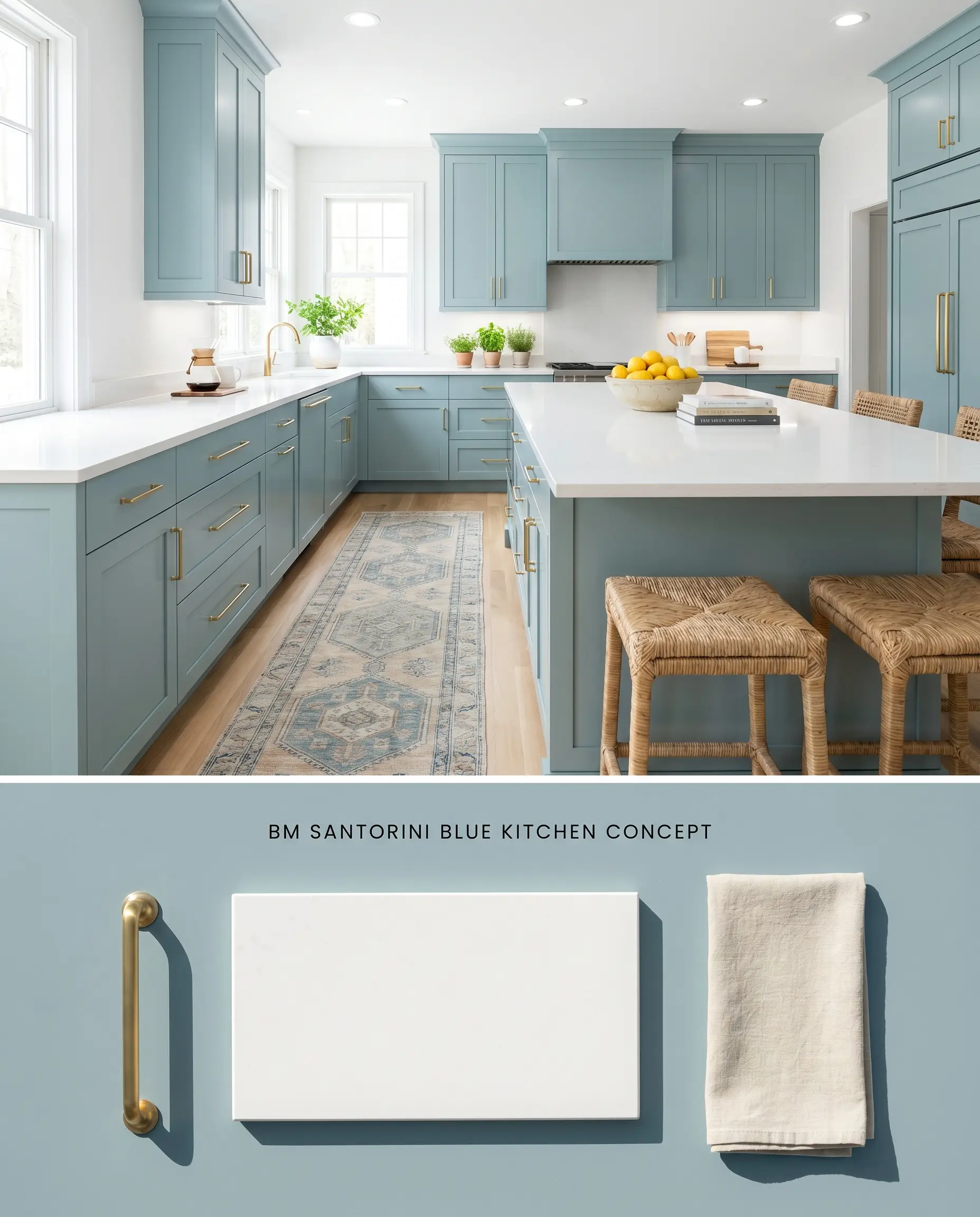
A cabinetry finish in this cool-toned hue acts as a grounding focal point against bright white perimeters, pulling the eye downward to balance tall ceiling heights. The color reflectance at an LRV of 44.67 offers enough structural depth to ground a large island without swallowing the ambient light in the kitchen.
Primary Bedrooms and Spa Bathrooms
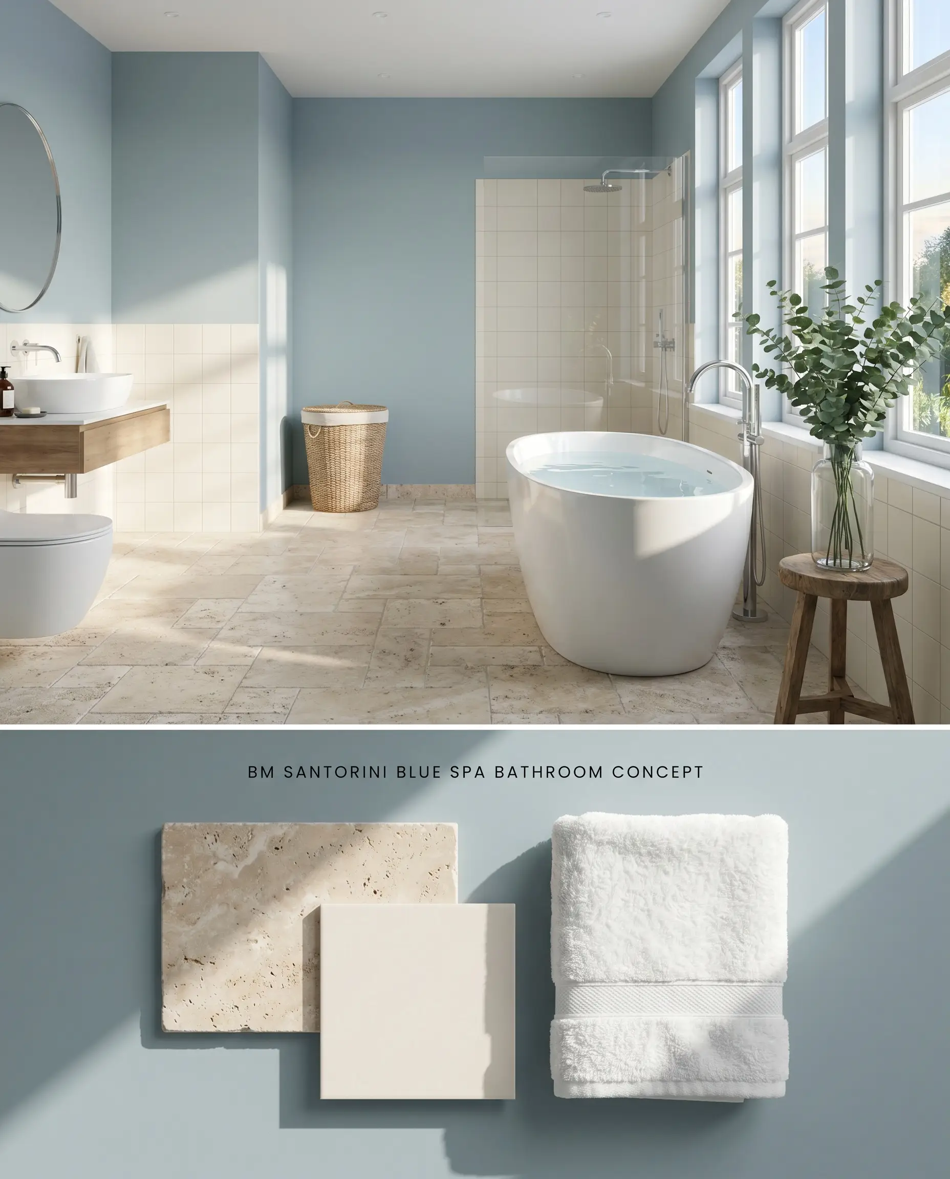
In personal retreat spaces, this dusty blue creates a recessed visual boundary that pushes walls outward, making the room feel larger. The inherent gray tones soften the contrast against white sanitaryware and ceramic tile, avoiding the jarring, hospital-like sterility of purer blues.
Accent Trim and Interior Doors
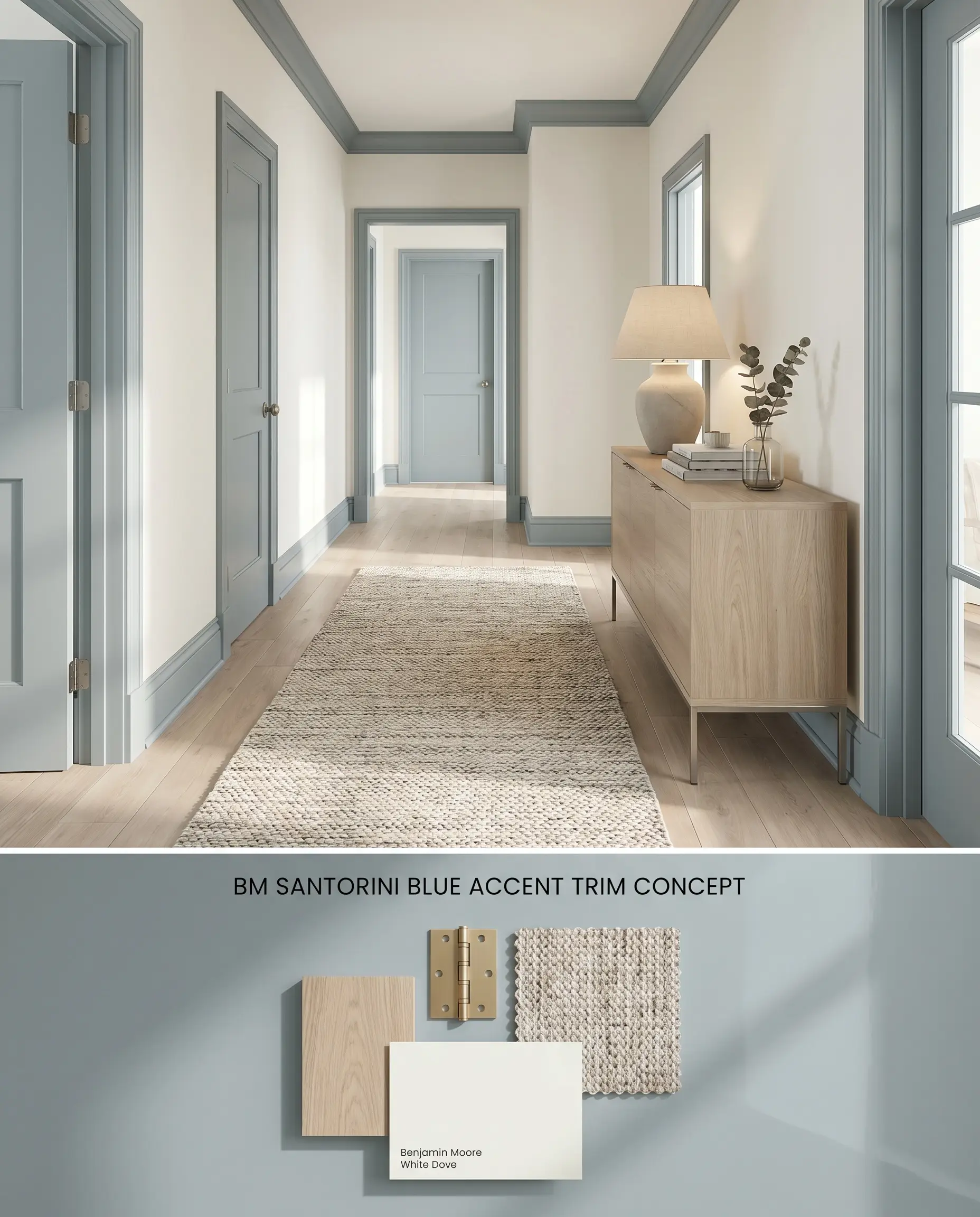
Framing transitional spaces with a colored architectural finish draws the eye through the floorplan, establishing a subtle rhythm without relying on dark, high-contrast black. The blue-gray framework outlines adjacent neutral rooms, enhancing their perceived warmth through direct color comparison.
Exterior Shutters and Front Doors
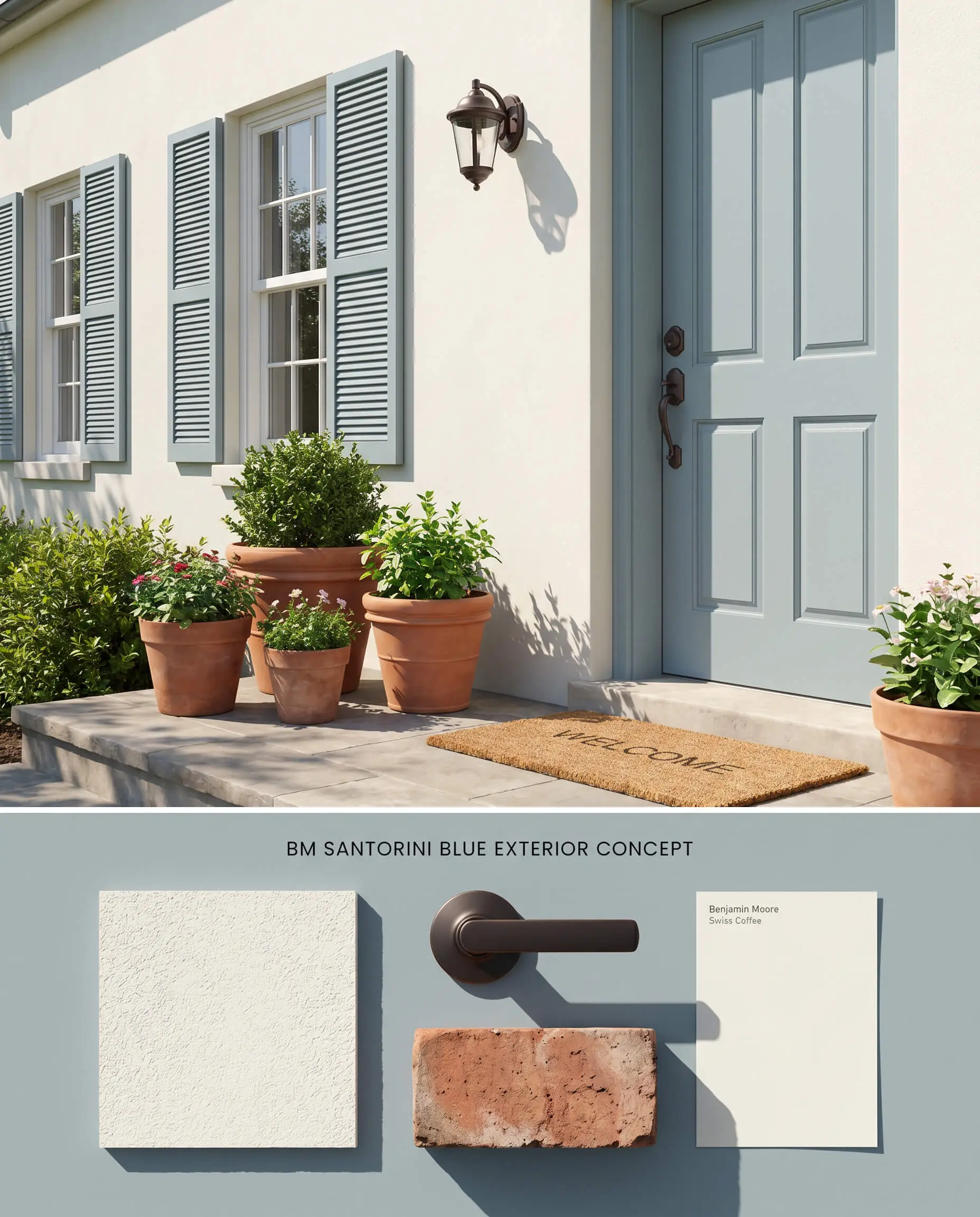
Against pale stucco or white cedar shingles, this paint provides a tailored, historical contrast that visually anchors the facade. The cool-toned hue absorbs intense direct sunlight, preventing the color from washing out while highlighting surrounding architectural millwork, aided by the fade-resistant Gennex Color Technology.
You can apply wallpapers, paints, etc. on walls and see how they look in various interiors.

Comparative Color Theory: Benjamin Moore Santorini Blue vs. Rival Blues
Benjamin Moore Santorini Blue 1634 vs. Sherwin-Williams Stardew SW 9138
Stardew SW 9138 sits at an LRV of 43, slightly darker than Santorini Blue 1634’s 44.67, but carries a far more pronounced slate-gray undertone. Under cool light, Stardew leans heavily into concrete territory, while Santorini Blue 1634 retains its core blue identity. Specify Stardew for ultra-modern spaces requiring a steely, industrial edge, and reserve Santorini Blue 1634 for transitional spaces needing a softer, traditional lean.
Benjamin Moore Santorini Blue 1634 vs. Farrow & Ball Lulworth Blue No. 89
Lulworth Blue No. 89 is a cleaner, more luminous mid-blue with noticeably less gray interference than Santorini Blue 1634. Farrow & Ball’s formulation reflects light with a brighter, almost periwinkle flash in direct sun, making it ideal for low-light rooms where Santorini Blue 1634 would flatten into an icy trap. Deploy Santorini Blue 1634 when you need to ground a sun-drenched south-facing room, and use Lulworth Blue No. 89 to artificially inject buoyancy into shaded, north-facing spaces.
Benjamin Moore Santorini Blue 1634 vs. Sherwin-Williams Upward SW 6239
Upward SW 6239 is significantly lighter with an LRV of 57 and acts more as a pastel blue-gray wash compared to the structural weight of Santorini Blue 1634. Upward SW 6239 functions exceptionally well as an upper-wall or ceiling color to lift the visual height of a room. Choose Santorini Blue 1634 for grounding lower cabinetry or wainscoting where you need a robust architectural finish to anchor the lower half of the space.
Technical Performance & Lighting FAQs
Yes. The cool, gray-blue undertones of Santorini Blue 1634 will actively fight against the heavy red and orange pigments in honey oak, creating a jarring visual discord. To maintain architectural harmony, pair this paint strictly with bleached oak, pale ash, or crisp painted white trims.
In north-facing rooms lacking direct sunlight, the cool ambient light amplifies the gray undertones, often causing the blue to read as icy, flat, or slightly muddy. It is highly recommended to reserve this color for south- or west-facing rooms where warm daylight balances its cool profile.
Under standard warm incandescent bulbs (2700K), the yellow light mixes with the blue base, causing a noticeable shift toward a greenish-gray cast. To preserve the crisp dusty blue appearance in the evening, utilize 3500K to 4000K LED bulbs.
With an LRV of 44.67, it absorbs a significant amount of light and lacks the high reflectance required for a continuous, whole-house neutral. It functions best when deployed strategically as an accent color for cabinetry, interior doors, or specific sun-drenched rooms rather than a ubiquitous wall color.
Similar Paint Colors
Same Brand
Cross-Brand Equivalents